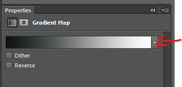
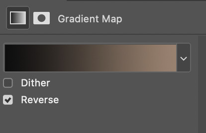
#and thank you gradient mapping for making things easy
Text
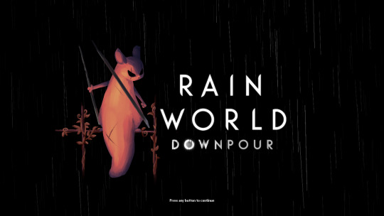
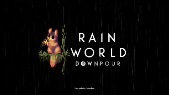

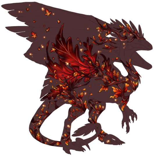
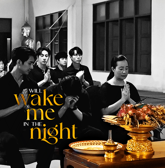
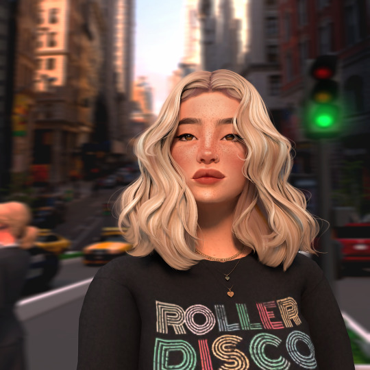
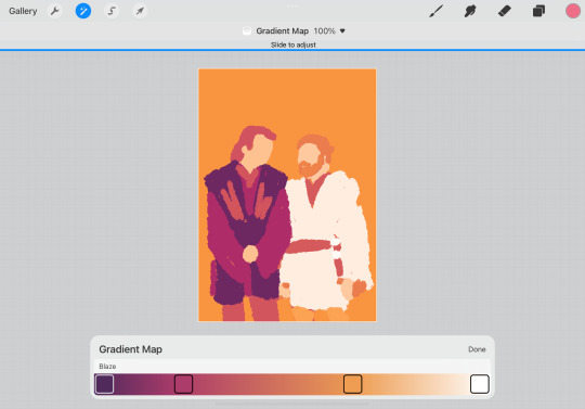
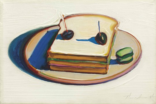
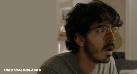
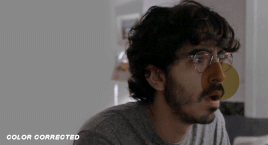
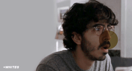
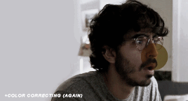
i finally finished these!! i felt bad that hunter and monk didnt have their own titlescreen art, so i started on making my own for them a few months ago. nailing the official rendering made this harder than i thought haha
also, when i originally made these, i had the idea of making this into a sort of challenge for other people to make their own title art for these two. im still standing with that! if you want to take a shot at making your own version of titlescreen art for these two, go ahead! hell, tag me if you want.
#thank you pansear for giving me the most comprehensible advice on rendering these ..... doing the whole thing in B&W first helped a LOT#and thank you gradient mapping for making things easy#my art#rain world#rain world downpour#the hunter#the monk#hunter rw#monk rw#slugcat
2K notes
·
View notes
Note
hi! Thank you for making your guide, it’s been so helpful as a new skin artist. I’m still confused about how to make good festival submissions (?) I thought my submission for Rockbreaker’s Ceremony fit all the conditions you talked about but no one seemed interested in my skin. Do you have any advice on how newer artists can make a good entry?
I'm happy the guide's helped! It is less of a checklist and more on how I personally approach the contest. There are a lot of things I don’t think I described well technique-wise, so I’ve considered making step-by-step tutorials to approach each contest that would better encapsulate the win conditions I described. But for now, here’s one way you can approach a contest, particularly if you’re a new artist.
1. Pick Your Breed (and Battles)
Breed variety, as I stated in the guide, is the Number One reason I win any contest. This is where I think I should’ve gone more into why I favored the Ridgeback F base - it’s important to pick a canvas that will not impede your ability to create and more importantly, a canvas that makes you comfortable as an artist. Ridgeback F has a big wingspace that serves as a good canvas and the anatomy is easy (for me) to design on, which is why this is the canvas I default to.
Here are some of the best “starter” canvases for new artists, in my personal opinion:
Wildclaw M and F: these bases, particularly the F pose, don’t get many submissions (look at their submission rate in the Gala!) They have a standard dino anatomy that’s easy to understand and work around.
Fae M: Fae rarely get entries. The big wingspace is a great canvas, and more importantly, the M Fae canvas is pretty small compared to the others, so it’s less daunting. The shrimp posture can be a bit hard to grasp, but you can honestly just do a wingcent.
Coatl M and F: Coatl is a great base for new artists if shadows and lines are disrupting your creative process, because they don’t have as much of those. (You can also turn shadows/lines off while you’re drawing. I usually have shadows off and lineart at 30% opacity. Just remember to turn them back on when you submit!)
2. Theme Your Skin: Canonical Elements
August goes into this better in his guide, but you generally want to stick closer to canon. Think of skin contests like an art contest for a fandom. If you were submitting to, say, a Percy Jackson art contest, you’ll probably draw inspiration from Greek and Roman mythology, not Aztec or Chinese mythology. Flight Rising is the same. So, here are canonical places you can draw inspiration from:
Past festival familiars and apparel
Existing vistas, scenes, and World Map locations
Artistic interpretations of the canonical lore
If you do want to go outside of canon, my suggestion is to pick a neutral element. This means something that doesn’t have any religious/otherwise connotations, and is still related to the flight. I.e.: icy mountains for the ice flight, different types of minerals for the earth flight, different types of plants for nature. You are making an official item for the site, so work with that in mind.
3. Skin Composition: Balance
Composition is how the elements in an art piece work together. I struggle a lot with it, so I am not the best person to speak on this. What I’ve found that works for me is focusing the canvas on one big thing and putting small elements around it. That big item is usually wings, which is a great neutral component that can take on attributes of different elements. If you look at my skins, they usually follow the equation of skin = 1 big element (wings, bones, crystals) + 2 small elements (gradients, sparkles, butterflies, leaves, flowers).
[RBC 2023 = bones + crystals + rocks] [TC 2022 = wings + gradient + wispy shadow things]


4. Skin Execution: Actually Drawing the Thing
The best part of festival contests is the skill bar is quite low. I am going to contradict myself slightly by saying you do need a basic understanding of how to draw, but aside from that, contests are forgiving if you aren’t an experienced artist. I had six months of experience when I won my first contest and more recently, I was drawing with zero wrist mobility. These are some of my recent skins that were created when I could not render the way I usually do or use line weight.
[TCC 2023 & ROR 2023]

In comparison, here are skins when I could render and line weight.
[WS 2023 & GG 2023]

Importantly, all of these skins won. So that’s why, from my perspective, whether you’re an experienced artist or not, whether you know how to render or not, is not the point.
I don’t want to imply that you don’t need any skill to win a contest… it is a contest, after all. I think what I’m trying to say is: to make the best entry you can, you need to know the skills that complement YOUR art style. It isn’t necessarily the skill difference between artists that determines who wins, it’s how you use the skills you have to bring out the most in your piece.
There is no one way to making good art. And the hardest obstacle as a new artist is finding out what enhances your art style. You may not even have an art style yet, and that’s okay. That’s why it’s vital you continue exploring - which contests are great for.
Again, everything in this post is only what I have personally observed. This approach will not work for everyone, since everyone’s creative process is going to be different. But I hope this is a good bare-bones, structured, guide as to what I personally focus on – and I hope that it’s good for reference, even if the specific steps aren’t helpful for you ^^
96 notes
·
View notes
Note
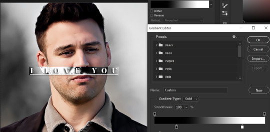
Hey, I love how you did the B/W strip + the text effect on your margaret atwood set, would you be willing to do a tutorial? 🙈
Hey Nonnie, thank you! Sorry this is a little late, but I did manage to hang onto this PSD for you.
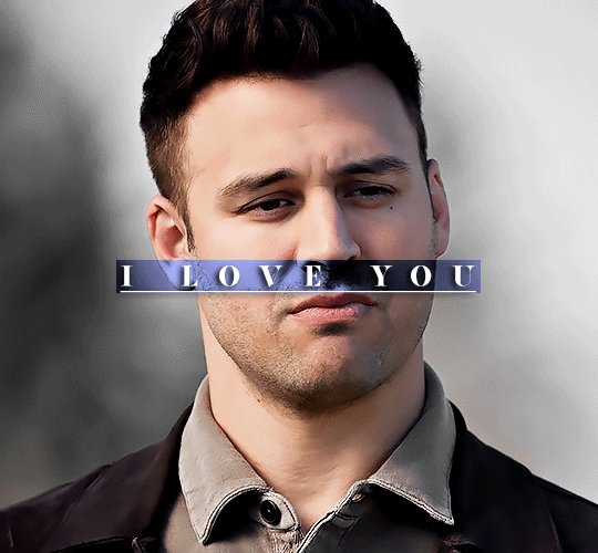
We'll be making this gif:

This tutorial assumes basic knowledge of gif-making, Photoshop, and coloring. I’ve only described the text tutorial in this, but you can reach out if you have any questions.
(This is a different version of my gradient text tutorial, but the same principle applies!)
Tutorial under the cut:
Couple things to note beforehand:
There is a lot of trial and error involved when doing any sort of effect, and this is no exception! You might have to play around with the colors and the settings before you find something that looks good and readable and that fits your set!
This text effect works better on big gifs (540px width) that have quite a bit of movement below the shape so you get that effect.
For this effect, I find that a simple font works better than a cursive one, but play around with what you like.
We're going to start with this gif:
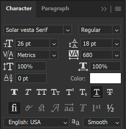
First, I'm going to add my text and center it. For this text, I used the font, Solar vesta Serif, with these settings:
Note: when you do letter spacing + underline, sometimes, the space after the last letter can lead the underline to stretch a little too far past the letter, making it look like the underline isn't centered properly.
To get past this, I just select the last letter separately, and put the VA setting to 0-10, depending on the font/letter.
We're also going to add a drop shadow here itself, and this is fully up to preference, but I used this:

All of that should give us this (yeah, it's the simplest thing because I'm lazy and I like easy things xD nothing too fancy)

Next, we're going to draw our rectangle around the letters. I like to keep even spacing around all the letters on all sides (in this gif, it's 4px on all sides) but just eyeball it initially, and then adjust accordingly.
I changed the fill to white (this color isn't important, I just used white because it's easier to show) and moved the layer in the back so the text is on top. It should all look like this:

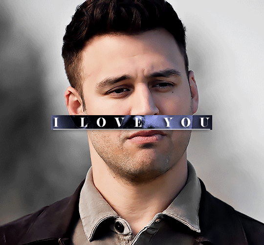
Next, we're going to add a gradient map between the rectangle and the text later. I simply used a black and white gradient, and my gif now looks like this:

Here are the settings:
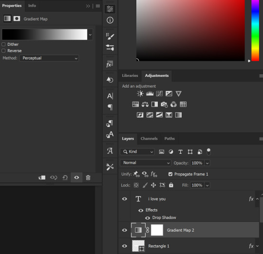
Next, we're going to delete that white box - the layer mask - next to the gradient map. Just click that and press delete (or right-click > delete layer mask). Your layers should look like this:
Now, we're going to add the rectangle as a layer mask. While pressing Ctrl, we’re going to hover our mouse over the square box next to Rectangle 1. Your cursor should show a white box with a dotted border. Click the square box with that dotted cursor and you should get a dotted selection line all around the box, like so:
Next, we're going to select our gradient map layer, and then create a new layer mask. At the bottom of the layers panel, you should see a box with a circle in it (denoted with a red arrow). Click that - make sure you have your gradient map layer selected, or you'll end up putting the mask on the wrong layer.

The black and white will disappear, leaving you with just the box again. It'll look like this:
Now, just hide the rectangle layer so it looks like this;
And you're done! This is my final gif:
Once you get this basic thing down, you can play around with it all. For example, I like to adjust my gradient sliders so they emphasize the colors:
You can also just change the colors;
Unlike my previous text effect, we're not going for inverse X-ray effect, so for this, I like to make sure the lighter shade of the gradient is on the lighter parts of the gif, and same with the dark shade.
(If that's confusing, here's a side by side comparison of what the "X-ray" effect vs normal color effect looks like)
Anyway - it's fully up to you!
Because of the effect I was going for, I didn't add a drop shadow underneath the rectangle itself, but you always can if you want to make that a little bit more 3D.
You can also do this with any other shapes, too, with the same procedure.
Hope this helps, Nonnie! Let me know if you have any questions.
#zee's tutorials#tutorials#gif tutorial#photoshop tutorial#resources#dailyresources#completeresources#itsphotoshop#allresources#dailypsd#userisha#userdahlias#alielook#userabs#tuserheidi#userelio#userjaelyn#userisaiah#usermorgan#usergert
168 notes
·
View notes
Text

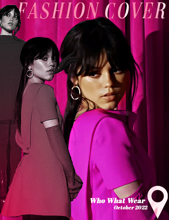
anonymous asked 💬 Hello there! Could you please make a tutorial on how you combined gifs and images in your edit THE RECENT FASHIONS OF JENNA ORTEGA? It's incredible. Thanks!
tysm for this ask 🫶🏼 below the cut is a step by step on how to do this kind of set. i will be using photoshop 2023 for this tutorial.
original inspiration was taken from sith-maul’s zendaya lookbook gifset !
step 1: cropping
for this style to work, your gif needs to be tall. the best dimensions are 540x700. make sure you don’t have too many frames because the bigger the crop, the bigger the file size !!
the other thing you want to do is crop it a little to the left or to the right, whichever works best. this is so you can slot in the photos of the outfit :)
step 2: colouring
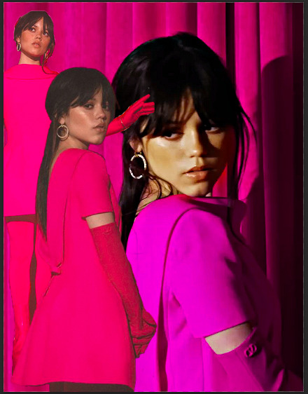
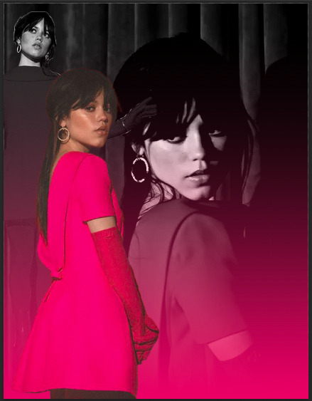
to make the whole thing more cohesive later on, how you colour your set is important. for the demonstration, i’m using a clip of jenna from her interview with who what wear, which has a lot of easy to manipulate colours. because the main colour is obviously pink, i’ll use a colour balance layer, a selective colour layer and a hue/sat. layer.
be mindful when using hue/sat and colour balance that you’re not whitewashing your subject or dramatically altering their skin tone. if there is low movement in the gif, you can use layer masks to prevent this.
you can see here that there’s a huge difference in the old vs. new colouring, which is what we want !!

step 3: source your pics
probably the easiest step. you can either just google search for pictures [person] [event/photoshoot] is the best way to search for that, or you can search for something on pinterest. you want one picture that’s ideally head to toe, plus another showcasing the outfit from around waist up.
step 4: edit the photos.
now that we’ve got our photos, load those into ps. once loaded in, you’re going to want to go to select > subject and then go option + cmd + x (for mac, i’m sorry idk the windows prompt !) and then just paste that on a new layer.
depending, the photo may select some of the background. but there’s really nothing you can do about that, so you just have to tidy it up manually using the eraser tool.
now my photo looks like this !

crop the photo to the same size as your gif and repeat the same process for the other photo.
step 5: placement of the photos
first off, duplicate your photos onto the gif. then, resize them to your liking. ideally, you want the full shot going from top to bottom on the gif, and the medium shot positioned down from it.
i also make the medium shot a little bit smaller, so we can highlight the head to toe. as well as that, put the head to toe shot behind the medium shot by swapping their layer orders.
here’s a ss of what mine looks like, just to give you an idea.
step 6: colouring the photos
first stop: add a black and white gradient map. completely ignore the fact the gradient map will go over everything; we’ll fix it in one sec ! colour the photos as normal: curves, levels, anything you do in your normal colouring process. just make sure all the layers are underneath your gradient map layer !
on top of it all, add a gradient layer and change it to a colour in the outfit. you can click and drag it in all different directions to get to a good point. don’t forget to change the angle of it so it fits best !
for example, here’s mine:
you can see that the gradient gradually goes up on the outfit, leaving it almost half half.
now, select all the layers that are over the first picture and right click > clipping mask. this clipping mask will make sure that all your colouring layers ‘clip’ only to your picture. DO NOT select the picture layer as well. this should be what you have:

the arrows show that it has clipped to the subject.
now, just repeat those colouring steps on the other pic so you’re starting to look like this:

OPTIONAL: i usually change the blending mode of my gradient layer to ‘colour’ so it blends nicer on the picture, it’s not compulsory, but the result looks better. you can also choose to sharpen your pictures if you like !
step 7: typography
there’s two main things you want: the title of it (this could be a fashion brand or maybe a show/film name if you want to do this for a character) which will be in a statement font as well as the location or the date (could be the episode and the episode air date or the film premiere date) to start, create your layer above the colouring layers for the gif, but below the pictures of your person.
for this tutorial, i’m using the font ‘magazine’ but you can really use any font you want, as long as it stands out against the cover.

next up, you’ll want to search ‘map pin point png’ on google and get your little pin point icon. this will be so you can add the location and the date, or whatever you want to add. i change the font that i use for the subheading, just to switch things up ! you can do whatever you like though.

here’s what i’ve got for my subheadings. make sure that you’re placing it in the empty space on the bottom corner, not on top of your pictures.
and that’s it ! you can add any other finishing touches that you’d like, or do any other effects that you want. this is simply a base for you to work off, but you can change things wherever you deem it necessary to improve upon. apologies for this being so long 😭 hopefully it helped a little though !
#*tutorial#asks#gif tutorial#clubgif#userriel#tusercat#usercim#usersmia#userv#thingschanged#userzesty#userlp#userpjo
39 notes
·
View notes
Note
hi ☺️👋 love chu💕 ❤️ I'm really new to gif making too for my favorite shows so I hoped to ask how you make the backgrounds look so smooth in your gifs?I'd appreciate any advice, it's just for practice. thank you if you answer in advance ❤️💕
Hello hello, and big love right back at ya! 💕😊
How exciting that you’re new to gifmaking – it’s so much fun to get to experiment with that and try all sorts of things. I learned a lot from following tutorials or talking with other gifmakers back when I first started out, and I’m definitely still learning new things now.
I think it’s a combination of factors that makes the background in my gifs so smooth? So I’m going to talk about some of those factors and show you a few things and hopefully that’ll help! I use Photoshop CS6 for gifmaking, but I think the majority of this advice also holds up in other versions haha.
First off, I always try to use video files of the 1080p variety. You can gif with videos that have 720p, too, but 1080p will provide a smoother and clearer image because there are more pixels in 1080p. (There’s also 2160p, which is even higher resolution, but I’ve personally found that unwieldy to screencap and 1080p looks very good already!) This is the technical reason why the gifs look smooth: work with a high resolution video and get better results, that’s just how it is.
Another technical thing is the type of scene you pick to gif. When the scene is very busy with a lot of people and objects coming into focus at once (group shots, shots in heavily decorated rooms, etc), there’s very little in the scene that actually fades into the background focus-wise. With close-ups of a single face, the focus is entirely on the face and the background will fade to some degree. This really has to do with how the show’s made, like how the director and camera people and everyone else chose to portray/film the scenes. As a gifmaker, you can always choose to crop some things out of the scene when you want the focus to be on a specific thing – you’re essentially choosing a new focus for the viewer in that case. But yeah, overall, the way it’s filmed affects everything else about the gif.
Now, onward to the actual Photoshop things…
When I gif, I also sharpen the gif itself. This will make some details pop more and help move the focus to where I want it to be most, which is usually either a face or something important happening in the scene. I do think it might affect how you see the background as well – when everything in the foreground is sharpened, the background will naturally have a bit of blurriness to it. I have a sharpening action I use for every gif, but I believe its settings are as follows.
This is Filter -> Smart Sharpen by the way.
First Smart Sharpen:

And the second Smart Sharpen (yes we do it twice!):

Most importantly, I think the way you choose to brighten and color the gif will affect how the background will look. A show like House of the Dragon unfortunately can be very dark, so the urge to brighten it and fix the filters they put on these scenes is immense. 😂 But it’s also really easy to brighten it too much with that urge to see what’s going on, lol, and that’s when the background’s going to look grainy or pixelated! So it’s always a fine balancing act and a lot of trial and error (seriously, the undo-button is my best friend) when working with scenes like these.
There are a few ways you can brighten a gif. My preferred method is with the Curves layer, but I also use Exposure and Gradient Map as additions to that sometimes. Mostly when a scene is so dark that I have to take care not to render it too pixelated by adjusting the Curves, really. When a gif gets too tricky, I use all three. 😂 Below are some basics of each layer, but it’s really about trying and clicking and trying and clicking and trying and… you get the picture, lol.
Curves
The little eye dropper tools I marked with white – grey – black in the picture below are the most important. Select the white eye dropper and click on the section of the gif that’s closest to white (but not fully white). Then, select the grey eye dropper and click on the gif section that’s either beige or grey or at least in that neutral color zone. Finally, select the black eye dropper tool and click on the darkest part of your gif. You should see immediate results, but it tends to take me a few tries to get the best version! It’s not uncommon for me to zoom in on an image to, like, 600% just to see which pixels I should be clicking. This takes patience, haha!

Exposure
Use it sparingly, cos it’s going to be an asshole about how bright it makes some things. My settings typically are:
Exposure: between 0,13 and 0,22 (this brightens certain areas)
Offset: -0,0009 or -0,0019 (please don't forget to add the - to the numbers, this will deepen the black areas a bit)
Gamma Correction: 1,04 (I’ve found it ‘marries’ the light and dark parts a tad more and makes it look more natural)

Gradient Map
Gradient map my beloveddd. It doesn’t always do the thing, but sometimes it really helps me add a bit of color correction or helps me lighten a certain part of a scene a bit more. Be careful with it, though, as using it too much might make the gif a bit grainy/pixelated (and we don’t want that). There are a few different ways you can use it, but my favorite way is the only good thing TikTok ever taught me (I’m old as dirt, y’all) and that’s this in a nutshell…
Add the layer and click on the gradient itself.
Now, this is going to make the gif look scary as heck but bear with me? Select Noise, uncheck Restrict Colors. Click OK. Don’t cry.
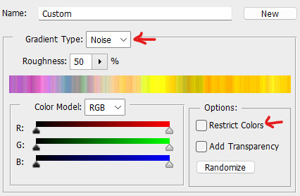
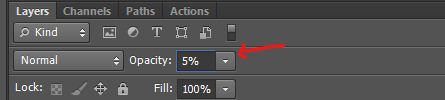
Go to the Opacity of your Gradient Map layer and set it to a percentage between 2% and 5%. Dry your tears.
If it’s not to your taste, go back into the gradient map itself by clicking on it again and selecting the nifty Randomize button you see on the screencap. Click and click and click until you find something that makes the gif sing.
Soooo. Very long story short, all of the above is going to contribute to how a gif looks and to how smooth the background is. I hope some of it is helpful to you! 💕 (And if anything’s unclear, please ask!! I know I get a little wordy and technical about some of the giffing sometimes, haha.)
23 notes
·
View notes
Note
I appreciate your art style! It’s very confident with strong shapes and great body language. Who are your inspirations and do you have any advice for drawing efficiency because I always get hung up on the small things and it keeps me held back
Aw thanks so much! Regarding my inspirations, I grew up on a lot of manga, animation, and video games, so many of my inspirations are Japanese artists in the gaming and manga industry. Included but not limited to: Takeshi Obata (the artist behind Death Note, Bakuman, Hikaru No Go, Ral Grad, etc.), Tetsuya Nomura (FF VII, FF X, Kingdom Hearts, The World Ends With You, etc.), and Akihiko Yoshida (FF III, Bravely Default, Nier: Automata, etc.)
But honestly? I kinda tend to just grab whatever I can learn from whoever's art I feel like studying. There are a lot of webcomic artists and modern digital artists who I've learned so much from over the years just by observing their art and identifying what they do that almost feels unique to them. Like, the creator of Two Guys and Guy? I always like how he draws elbows. Or the creator of Alfie, I love how he stylizes eyebrows and body proportions of all shapes and sizes! And of course when it comes to those aforementioned inspirational artists, Tetsuya Nomura's line quality is top notch, and I learned a lot about how to color from Obata.
I really rambled there, but inspiration comes from so many places! <3
In regards to the second part of your question, honestly, that confidence just comes from a lot of practice and drawing the same things over and over and over and over and over-
Anyways, I've been drawing webcomics for a number of years now, so along the way I've sorta had to learn tricks and shortcuts to make the process a bit more efficient and less headache-inducing. I think after all that, the core things I can recommend are:
Learn how to draw from the shoulder and elbow vs. the wrist. This will allow you new motions that can accommodate long, confident lines and shape structures. Tiny strokes are great for detailing, but long swooping lines are the best for getting in gesture, form, and line clarity! Plus it's just healthier for your body all around, helps engage your shoulder muscles and reduces the potential risk for carpal tunnel ;)
Keep your toolset simple! I know it's easy to sort of want to just collect and own every single brush out there (especially if you're a digital artist) but honestly, the best way to be efficient is to simplify your kit and process its strongest tools. You can accomplish so much with just a good ole' fashioned round brush, soft airbrush, and blur/blend/smudge tool of your choice - all the fancy ones are simply there to make your life easier after you've learned how to draw the fancy stuff those brushes are trying to replace, IMO (ex. I know how to draw things like leaves and bark with the round brush... so having brushes to do it for me is way handier nowadays! But it's only because I know how to draw them normally that I can ensure I'm using those tools properly, if I'm explaining that clearly ?)
Always be open to trying new industry tools, there is no such thing as 'cheating' (barring blatant theft lol). I don't think a lot of people realize just how many artists across every art industry use tools and techniques designed to make the process more efficient, like 3D models, photobashing, gradient mapping, color balancing, tone curving, etc. to help speed up the creation process and turn an okay drawing into a great one. Of course, none of these tools can substitute for actual skill, you still gotta learn how to use these tools properly in addition to learning your foundations, but those super efficient artists definitely aren't working from the same process that everyone else is, it's different for everybody and it's all about finding what tools work best for you! And the only way to do that is to try 'em :)
Remember that the core of creating and presenting art is expressing an idea to your audience. There's no pre-requisite to how 'detailed' that idea needs to be to be understood, because 1.) your audience may interpret it entirely different from how you intended anyways and 2.) your audience is way better at 'filling in' the details than we give them credit for! One such artist that I can recommend you look at is WLOP, their paintings are well known for being gorgeously rendered and almost 'hyper-realistic' but when you actually zoom in on their paintings, you'll find many of the 'details' are very basic, often times just splatters of a round brush. Here's an example:


From that first glance, it looks like an incredibly detailed hyper-realistic painting, but zoom in a little and you'll see all the messy brush strokes and where they used brushes that are all incredibly simple (I could recreate the same look of the owl with just the transparent watercolor brush in CSP!) Regardless of the details not being rendered out as much as we'd assume, we still assume that what were looking at is completely rendered down to the last pixel, because our brains are doing all the work to fill in those details. WLOP focuses on shape, color, and form first before worrying about nitty gritty details, and their art doesn't suffer at all even when they don't bother with detailing at all. Pretty neat, huh?
THAT WAS A LOT LOL But I hope that helps ? I try not to keep it at "just practice" because often times that gets misconstrued as just "draw a lot" when if you don't know what you're lacking or what piece you might be missing in the puzzle, then of course it's gonna feel like you're just bashing your head against a wall! It's like teaching someone how to skate or ride a bike or drive a car, practicing will definitely do more than not practicing, but there are additional things you can learn and apply to make that learning process work for you rather than against you.
That's all for now! Best of luck in your journey! Remember that the key is to just take it at your own pace, be comfortable with making mistakes (it's the only way to learn!), and have fun! Being able to make art efficiently is great and all, but having fun and enjoying yourself is definitely the most important thing! <3
39 notes
·
View notes
Note
hi, i'm that yannqi who asked you about making gifs, it really helped me to make yangyang gifs and upload them into tenor, thank you so much!! can i ask about the sharpness, smart sharpen, curves etc. settings for your gifs, you really helped me so much, I'm so grateful.
aw hi friend !! i'm so glad <3 and i hope you'll post your yangyang gifs here on tumblr too so i can see them !!! tag me !!! hehe
as for my settings - they are different with every gifset. i make all of my coloring from scratch and i adjust sharpening based on the source video depending on the quality, lighting, etc. but i'll try to share my most often used options, so you can play around and see what you like.
sharpening:
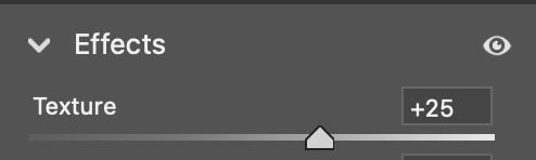
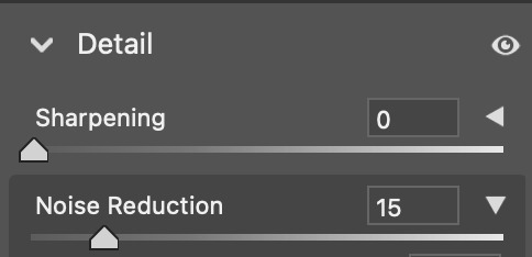
opt 1 (what i'm using most often currently, creates a smoothing and fine detail sharpening effect) - i use camera raw filter with texture to +25 and noise reduction to +15
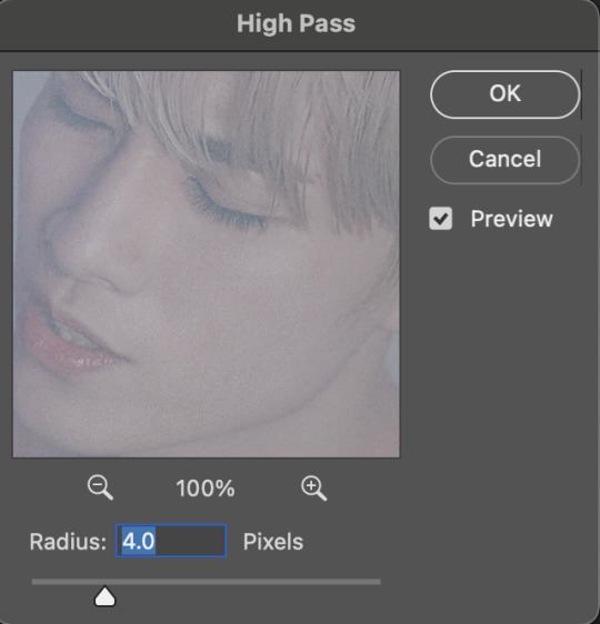
opt 2 (for a quick, easy way to create HD sharpening) - i use high pass at 4.0 px in soft light blending mode

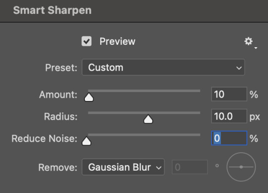
opt 3 (for a classic look with fine detail and definition) - i use smart sharpen in these settings

you can also combine some of these together! and if i am not using the camera raw noise reduction, i often will add a gaussian blur layer. usually just 1 px at ~20% opacity.
coloring:
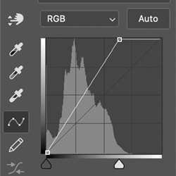
you can see some examples of my psds here ! they are not the most up to date for me now but they are a place to start. some other coloring things i pretty much almost always do:
set my darkest point with curves (always always my first step!)
increase reds and blacks in selective color
mattify / even out overexposure (esp of stage lights) with a gradient map layer in black&white, reverse box checked, soft light blending, 50% opacity 50% fill
color correct with color lookup, color balance, and/or color fill layers
add a top coat with an exposure layer set to multiply or soft light at 25% opacity
as always ... try things out and see what you like and what makes your own style come together :) if there is a specific set of mine you want the exact settings for, let me know, and i'll pull them if i have it saved ! i don't save a lot rip but i can also try to remember what i did ahbghsb . good luck, happy giffing, and PLEASE TAG ME IN UR YANGYANG GIFS 🫶🏻
#sorry it took a while to respond i was at work today <3#hope this helps u !!!#erimail#mail from: anonymous friend!#gif help#.resource tag
4 notes
·
View notes
Note
Hi, this is Dani (aka @5racha) and I just saw your "event 12: loss" gif set (which is a spoiler for me but i don't care) and I absolutely love the fact you can do black and white with the gold showing. Is there a tutorial out there how to gif black and white with a colour? I mean, an easier way than to just colour each frame individually. Do you have one or is there one? I've been wondering about that for a while now and your gif set is looking absolutely incredible.
ah hello!! thank you for liking my set ;u; <3 fair warning, i notably love talking about this kind of thing and i am incredibly longwinded so i'll get the direct answers out of the way first and then i'll ramble at you about my own gif process for a bit
here is a color isolation tutorial (found via @usergif, who have many such good things). i havent specifically used this one but it's good and im basically about to rephrase it for many words
and basically.... there are ways to do it and sometimes it can be genuinely quite easy (hue/saturation is your friend!) but if your scene is problematic (lots of movement, the color youre trying to isolate is a skintone, low contrast between colors etc) it's still going to be really hard, and in the end some things Will be an every-frame or close to it kind of deal if youre still determined to do it
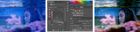
my eclipse prefects set basically demonstrates -- the blue ones were really really easy, since you just have to desaturate all colors except blue. the reds, because some of the backgrounds also contained red and because it's a skintone you then need to readjust, is much harder. you can kind of tell by the curtains in the first gif how this might cause a problem
and now im going to talk your ear off trying to explain applying that to the gaipa set in. far too many words. sorry
this set, being that the color is "yellow", is one of these problem children, some more than others -- for example, i tried to do the first one like this but gave up (check out the cool gray spots near his temple and his collarbone :'D)

the middle two were problematic using keyframes too, but a bit easier because they have less movement and the backgrounds are also darker, so ill try and show you, in case it helps??
here is the base coloring (ignore the orange skin, i knew i wasnt keeping this and also moonlight chicken is kind of like that)
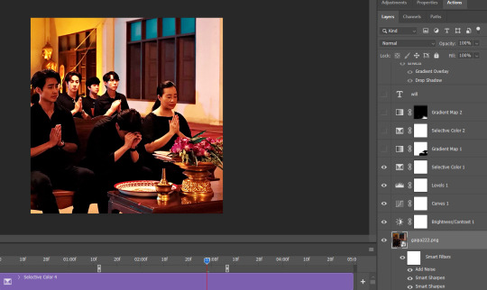
then, the bw layer is added (i use gradient maps for grayscale usually), and then i crop out the section i wanted to stay colored using the ps pen tool -> path -> selection and then use that to apply a layer mask. you can also kind of handpaint this sort of thing if that's easier for you
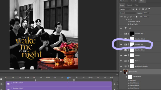
the next couple layers up are color adjustments for this section, to make the yellow that already exists at base brighter & tone down the red. i have four more layers at the very top to do this and adjust the colors golder & more vibrant.
now then the actual trick is in keeping the layer mask on the correct part of the gif. so if i just did the layer mask on the b/w layer like that and didnt keyframe, because this gif moves itd stop working - it isnt Super movement, so it's not actually that big of a difference, but you can see (no keyframes on the right:)

the gray creeps onto the vase, the table, and the upper part of the flowers. if you overcorrect in the other direction, the skin of the woman right behind the flowers will become visible. so ! problem solving: keyframes

that's how it looks like - you start at the beginning of the gif with your layer mask selected, then click the stopwatch next to 'layer mask position'. then i usually use the move tool and arrow keys just to shift it along with movement of the object, and you press the yellow diamond at each point you do so
this is not foolproof and im still sort of new at it, so it can sometimes look odd. case in point if youve spent as long staring at this gif as i have you probably noticed the keyframe movement (it kind of jumps.....) but i decided i could live with that. sometimes you just have to figure out where your standards for 'looks bad' are, too OTL
gif 3 is like this too -- the only notable difference is that, instead of just desaturating the colors i didnt want i covered over them with a gold gradient map layer


so, basically, all of these gifs do originally have yellow in them, but i bass boosted the shit out of it and also colored over it in some places, and i used keyframes to fix movement
i hope this is at least interesting & that you can get use out of the tutorial, hehe. thank you for asking! enjoy finishing moonlight chicken, my belovedest of series
#ro's ps adventures#rowan asks#long post#this is too much. i know. you can basically just take the link hehe#i enjoyed talking about it though !
2 notes
·
View notes
Note
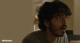
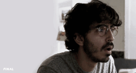
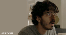
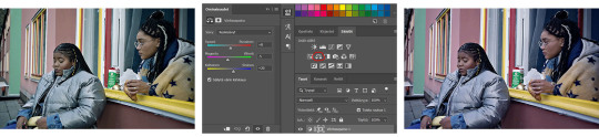
hi love! i legit just found your page yet i'm absolutely BLOWN AWAY by your edits, oh my gosh :O i love the gif you posted about your editing process and i was wondering if you'd be willing to post the different pictures in it side by side so i could more easily see the process? if that's too tedious that's totally okay and i completely understand :) thank you for reading dear, have a great day!! <3 (the post i'm talking about is post/683152127057641473)

Hello anon!
Thank you so much for the kind words! I’m so happy you like my edits and are interested in the process (truly my favorite thing to talk about)
I’m gonna number each part of the process, I tend to save a picture after I think I made significant enough changes and then continue so idk how organized this will be but I’ll happily upload a progress video of another edit if you or others are interested! Also for reference, I edit mostly in Procreate
1. Picture one is the render fresh from Blender! I immediately notice clipping issues I wanna fix and elements from the Sims that didn’t translate well into blender (like her nose and lip presets)
2. This shot is after I brought it into Photoshop and used my basic actions (topaz clean, smart sharpen, and camera raw filter). This is also where I separate the subject from the background for easy editing, and blur the background (I usually use tilt and field blur, I also added motion to this one since she’s in a bustling city)
3. I’m in Procreate now and use the start (and early motivation and excitement) to get the fixing work done. Smoothing the harsh lines of the clipping with the smudge tool and parts of her face that don’t look right with Liquify
4. The fun parts begin and I get started on drawing the hair (I also smudge the hair underneath to blend better with the hair I draw on) and begin pulling colors from her skin and drawing on top of them with a noise brush for texture. I made some adjustments to the background and the lighting as well since I was focusing on the skin and wanted the lighting just right
5. This was when the skin got FUN because I added the blushing and started really going ham on the cheek bones and her freckles. Fixed her features some more with liquify and really made sure the hair blended with the background as I drew a lot of it in myself. (At this point in the process I was both so in love with her and so fucking tired I knew I should stop before I went too far lol)
6. And then the final adjustments were made! I use Curves at the start, then I move on to using a Gradient Map to adjust contrast, and my favorite parts are using blurs and Ambient Occlusion to really make everything blend seamlessly. I love adding fog to my shots, it blends the subject with the background and really adds a more natural touch to the setting. I color the fog to match the mood, in this case a very desaturated blue. Final touch is sharpening the image and adding noise for that real picture effect I love. (Both the background and the subject get different levels of noise as well)
I don’t know for sure but I believe the time it took to finish her took about 5 hours total, and I hope this gives some insight into what I do! I’d be happy to answer any more editing questions, it’s truly my favorite part! Thank you again for reaching out and I hope you have the best day too! You definitely made mine ☺️
#seriously I will answer any and all editing questions#fucking love this shit#anon#LOVELY anon#asks#editing tips#editing tutorial#tutorial#sims 4 process#process#ts4 process
60 notes
·
View notes
Note
Hi Hannah, hope you're having a superb day :) 💜 I just gotta say, your colourings are very easy on the eyes and look very smooth and soft, reminds me of pastel colours when I look at them, they're just beautiful. So I demand a colouring tutorial asap pls 😭 But I appreciate if you already have one or you don't want to :') Have a great day!
That's so sweet thank you so much! 🥺💜 I'm going to do my best to make this make sense but if it doesn't I have a couple psd's here that are pretty much my usual process if that's easier to follow 😂
so I'm going to color this gif ✌️

So for the first curves layer I try to do a little bit of color adjustment/lightening by sliding the right part of the slider left, normally I keep the input between 219-230 (in scenes that aren't overly cold or warm I'll normally have the blue closer to 219 than the other ones)

For the next curves layer I drag the left part of the slider left to darken parts of the scene a little bit and to color correct some more. Normally I stay between 4-12 for the input, but it depends on what color you want to get rid of more so for this one there was more green tones I wanted to get rid of so the input for green is higher.

The last curves layer is the main brightening layer I use so I just drag the slider to the left until I'm happy with how bright it is.
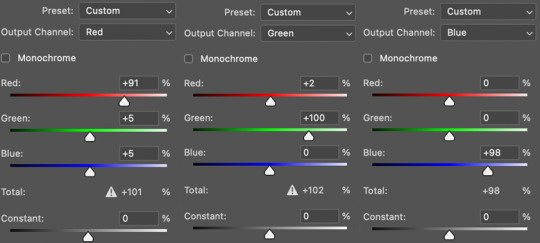
The next layer is a channel mixer layer which I do most of my major color correcting with. Normally I start with the blue channel and push more blue into the red (because I always prefer cold tones 🤷♀️), but this scene was pretty blue already so I started in the red channel and pushed more red into the blues and greens but I still lowered the red a little because his face got too red. And in the blue and green channels I only did a couple minor adjustments to balance it out a tiny bit. This is a really good channel mixer tutorial to look at for more detail about it
Next is the hue/saturation layer (which I don't always use but for this gif I wanted the background less blue) I normally use this to just lower the intensity of a color in a gif to make it more subtle and give it more of a pastel look just cause that's what I prefer so for this one I lowered the blue and cyans in the background.

Next is just a gradient map layer I set to hard light and normally put the opacity to around 10% or around there, and this kind of just helps add more contrast
The next layers after the gradient layer are pretty repetitive so I won't go through them in a lot of detail but this is the order

For the first selective color layer the only thing I change is adjusting the reds, usually I make the cyan % under red between -5 to 12 and depending on the scene I'll adjust the % of the other colors under red too.
For vibrance the only thing I do is lower the saturation to like -9 or whatever I think looks good
The selective color layer over vibrance is where I usually adjust the black and white colors, I normally up the black to around 6 or 7 because I think it makes everything look sharper.
For the brightness layer it totally depends on the scene, for this one it's at 31 but I think normally I set it between 20-40
The last selective color layer is the layer I use to adjust the colors the most, specifically neutrals, I always raise the % of black in the neutrals and use the other sliders to adjust the color tones in the gif like this:
the same goes for the other colors in the gif like red, blue, and cyan because this is the layer that I use to up the black in each color and make it look sharper or use the red adjustment category to get rid of extra red tones.
And that's pretty much it! I cant put more than 10 pics on this post so I couldn't show what the gif looked like after each process but I put the psd on mega if that's helpful 💜 and sorry if this makes no sense I've never been great at tutorials 😂
#sorry if theres a lot of ✨words✨ lmao#feel free to ask if something doesnt make sense i made this super quickly ✌️#coloring tutorial#resources#psd*#mutuals <3#ps*
30 notes
·
View notes
Note
every time I see your art on my dash it makes me :D because it's so colourful and joyful and expressive!!! Do you happen to have any tips on how to choose funkier colour palettes and arrange them in an illustration?
Ahh thank you! I absolutely adore your work so much!! :) I love any chance to talk about colours so I present..
⭐️ eliott’s guide to colourful illustrations! ⭐️
I genuinely know very little about colour theory so this method can be super easy to pick up, and the trick is using gradient maps! I find it pretty hard to visualise what colours I want to use and to start picking them out, so I usually start off by colouring my sketch very loosely in greyscale and getting the values right.
Then it’s time to apply some gradient maps! I use procreate but I’m pretty sure you can do this in other programs such as photoshop and clip studio too! I always duplicate the black and white version so I can go back and make lots of different versions.
Look at all these fun colour combinations! As you can see, I have a bunch of gradient maps that I just scroll between and some will really work, and some won’t, but it’s fun to try them out and play around with the sliders just to give you some ideas!
The next step is using the colour balance tool to adjust the colours a bit more to get something you’re really happy with. At this stage, I also like to separate the background colour to make sure that it doesn’t blend in too much, and also adjust anything that has to be a certain colour (sometimes skin shades might change too much or the coloured markings on Ashoka’s Lekku which I made more blue in the final illustration) This part can either be really fun or get super frustrating because (at least for me and my lack of colour knowledge) there’s no science behind it and I have to keep trying new things until I think it looks right.
Before and after of some colour balancing


If I don't want something with too much of a wacky colour scheme, I'll colour it in the real-life/accurate colours (rather than greyscale), and then just use the colour balance tool to nudge the colours to something a little more interesting!
So that’s kind of my main process when colouring an illustration, a lot of trying stuff out and seeing what I like the look of! Gradient maps have honestly been so beneficial to me for giving me a jumping-off point when trying to decide on colours!
I’ve got some other random bits of colour advice too if anyones interested, so I’ll add them under here! I hope you find this useful though!
For pieces with complex backgrounds I like to separate the characters from the rest of the scene and apply different gradient maps to each one. This way the characters stand out a lot more and you can easily tell which are the more important details to look at. I’ve noticed when looking back at some of my illustrations that I tend to use close-to complimentary colours schemes when doing this (it would be red/green in this example but I made it more of an orange than red) and have done the same with blue/orange (or pink) as well. It’s not something I ever did on purpose but the fact it’s happened a few times maybe means it’s a good tip?!
Picking warm or cool colours to match the mood and feel of a scene can be really important! Purples can be great for a night-time piece, but someplace with artificial light might use a much cooler/blue shade than a scene lit by a campfire which would be much warmer/red.
A lot of my colour choices are down to exaggeration too, brown and beige robes aren't too colourful, but pushing them to be pink/orange is a bit more exciting!! As long as the contrast between the different colours is okay, you can pretty much get away with anything!
A lot of my colour choices are down to exaggeration too, brown and beige robes aren't too colourful, but pushing them to be pink/orange is a bit more exciting!! As long as the contrast between the different colours is okay, you can pretty much get away with anything!
And lastly, overlay layers can be so much fun to play with too! I just chuck a random fill colour on top and then try out loads of different effects to see what it does- sometimes it will create something completely unexpected! Oooo and they can be good for special lighting effects too! Put a darker overlay layer on top, then erase sections that the light would be hitting and now you have some dramatic lighting! Or the opposite way, draw on just the highlights and turn that into the overlay!
Okay, so there we go! If you couldn’t tell, most of my technique is just throwing stuff together, hoping for the best, and adjusting things until I’m happy - but it works! I’ve never written an advice post like this before so I hope it all makes sense and that it might be even a little bit valuable!
#thank you for giving me an opportunity to talk about colours!#I got way too invested making this post!#and also annoyed that I almost always delete all the original colour roughs I make
21 notes
·
View notes
Note
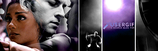
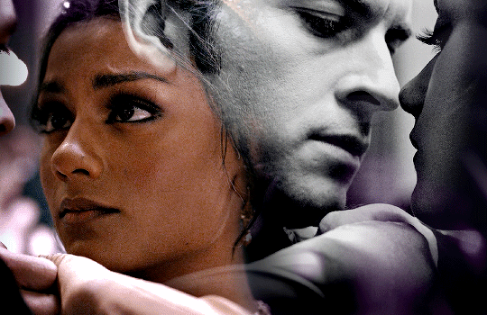
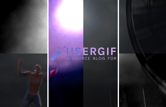
Hii, your blog is amazing!! Could I request a tutorial on how to make that text effect in the first gif of your pinned gifset (the one that says “welcome to” ft kanthony in the background)? And also (if it isn’t too much to ask) a tutorial on how to make the purple/black and white effect in the second gif of the same post (the three Spider-Mans)?
hi, thank you so much! I'd be happy to help! the effects from our welcome post are super easy, so this will (hopefully) be very straightforward. tutorials under the cut!
HOW TO CREATE:
fade-animated text & color-blocked layouts
for both effects, you'll need to understand the basics of gif-making! check out our resource directory for some helpful tutorials :)
🪄 FADE-ANIMATED TEXT
1. after you finish arranging and coloring your base gif, add a text layer and style it however you like (my font/style details at the end of the tutorial)
2. add a blank (white) layer mask to your text layer and then erase your text using a soft black brush (I just used the default brush with hardness set to 0%!) like so:

(I also did another pass with my brush set to around 30% opacity. that’s the light grey bit on the left. this was just so it looked super smooth and seamless)
3. be sure to toggle off the chain icon shown above ^ this will unlink the mask layer from the text layer. if you leave this on, your animation effect will shift the entire layer, instead of the mask only.
4. with the text now fully erased, create two keyframes (diamond icon) on the line called "layer mask position" (shown below). put one at the start of your gif and wherever you want to end your animation, like this:
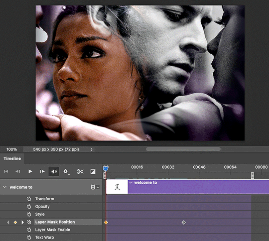
5. don't make any changes to the first keyframe. click on the second keyframe (where the animation will end) so we can move the layer mask position.
6. while the second keyframe is selected, go back to the layers panel and click on your layer mask. simply move the layer mask all the way to the right so your text is fully visible again. here's how mine looked:

7. and voila! when you play back the timeline, you should see the magic in action! if you think it's moving too fast or slow, simply move the second keyframe to another spot on the timeline. it'll keep your layer mask settings.
8. the last thing you MUST do is convert your timeline back to frame animation and delete the duplicate frames. when animating with keyframes, photoshop tends to put extra frames (I think as a buffer). if you don't remove these frames, your gif will not look smooth. here's the gif before deleting extra frames:
↳ you’ll notice it’s a little choppy as the animation plays. the base gif looks like it lags a bit or moves slower at the start.
here's the gif after deleting extra frames, ✨nice and smooth✨:

and lastly, here are more details about my typography:
font: lust script
warp transform: "wave" > bend = 50.0
blending mode: difference
gradient overlay: blend mode = hard light; gradient colors = #815dd3 -> #6549df -> #7e39c5; style = linear; angle = 137; scale = 150%
drop shadow: blend mode = multiply; color = #000; opacity = 20%; angle = 145; distance = 2; spread = 100; size = 1

🪄 COLOR-BLOCKED LAYOUT
1. start with your base gif, without coloring. unlike other multi-gif layouts, we’ll be using one gif and simply splitting up the canvas. for an overview, here are my dimensions and my layers panel:

* don’t ask me why it’s 154-225-153 instead of something balanced 🤦🏻♀️ i only just noticed that while doing this tutorial lmao
2. put your base gif in a group (command+G on mac) and add a layer mask. you could start with a blank mask or you can do what I do:
i like to map out my layout first. so I like to use the shapes tool to create rectangles in a new layer and see each section blocked off like this:

with this map in place, I just command+shift+click all the rectangle layers, select my group, and click add layer mask on that group! you should see black filling the spaces that you want to be transparent (see the group in the overview image titled “full gif”)
3. to block off your coloring, we’ll use groups and layer masks again! put your color layer adjustments (my group is called “center coloring”) and black and white layer adjustments (my group is called “outer coloring”) in separate groups
4. add your layer masks! you can use the same guide as your “full gif” mask. but this time, we won’t use all 3 rectangles at the same time. select the center rectangle only (command+click) and add a mask to your color group. your mask should look like a white vertical rectangle with two thinner black rectangles on either side
5. select the outer two rectangles (command+shift+click) and add a mask to your black and white group. (you could also just select the color group’s mask, add that to your bw group, and hit command+i to invert the mask!)
6. that’s it! make sure you have no background layer on your canvas, so your gutter lines stay transparent.
re: my coloring process — i have a process that i haven’t deviated from for years but mainly, i use a lot of levels, curves, selective color, and my fav for vibrant sets: hue/saturation <3 here’s a before and after:
also, the usergif team is filled with creators who are MAGIC with coloring. here are some extra coloring resources from our talented members:
elio’s coloring tutorial by spacedjarin
giffing and coloring tutorial by sashafierce
gradient coloring tutorial by sashafierce
isolating colors by sashafierce
the beginner’s guide to channel mixer by selinakyle
coloring yellow tinted shots by nobodynocrime
I hope this helps! if anything isn’t clear, feel free to send another ask! :) — nik
#ask#anonymous#completeresources#allresources#onlyresources#resourcemarket#gif tutorial#photoshop help#photoshop tutorial#resource#tutorial#animated#layout#typography#request#*usergif#*tutorial#by nik
689 notes
·
View notes
Note
If this is ok to ask do you have any tips on coloring art? Yours is amazing :)
thank u!! it's always okay to ask me abt art stuff!! I'm gonna assume that by coloring u also mean shading and rendering too. i have a post here explaining some color theory stuff i utilize a lot, so I won't talk abt that on this post. This, uh, got long......
first thing i’ll say is, if you struggle with color, don’t get too down on yourself. it's a deceptively complicated subject. It's easy to look at other people's art and get discouraged by how effortless they make it look, but chances are there was a considerable amount of effort involved. I still struggle with color, constantly. That being said, some stuff that helps me out is:
1. check your value structure. if your piece is turning out muddy or lacking depth, sometimes the problem is not necessarily the hues you've chosen, but that there's not enough contrast between lights and darks. I'll usually check this by throwing a black and white gradient map over everything just to see (this isn't a perfectly accurate way to do it, but it at least gives me the gist).
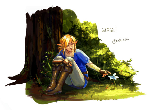
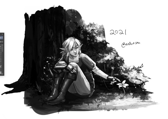
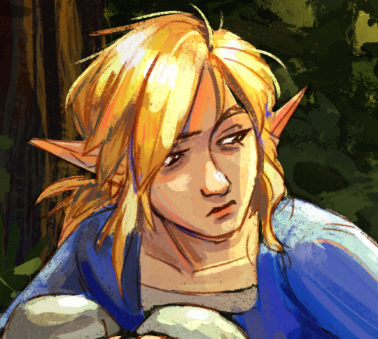
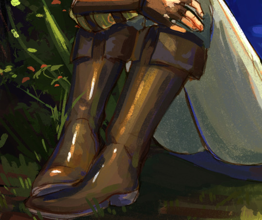
I was taught to thumbnail in 3 tones- black, white and gray. If your background is black, your midground should be gray and your foreground should be white. or any combination thereof, but the point is that they should contrast. These are general ballparks of what range of values each area should stick to. Here are some examples of ones I did in school (these have a bit more than 3 tones bc I do not follow rules lol):
I don't always thumbnail, but I do keep this concept in mind as I color. Basically, it's about making sure the eye knows where to go. In the case of that link piece, the general gist is, where the sunlight hits is the lightest value, shadows are the darkest, and link is mostly midtones where highlights don't hit. It keeps the focus on link and the flower. Even this piece is a little imperfect with the way the boots start to blend into the tree and dirt bc they're too close in both hue and value, but still.
Obviously, it's not value alone that makes the image work- Link's tunic is maybe a bit too dark in the black and white, blending with the tree, but it stands out in the color version bc it's so violently blue.
2. optical mixing!! basically, it's the way that adjacent colors blend to create a new color. It has a lot of uses in painting, but one of the best examples I can give is this Wayne Thiebaud painting:
Look closely at the edges. Look at the hints of bright red, magenta, blue, and green peeking through where they don't necessarily belong. you don't notice them at first, right? they blend in and aid in the overall light quality of the piece. they add life. they tie the palette together. that's one use of optical mixing! Wayne Thiebaud's paintings in general are great to study for this.
For a less perfect example, here are some places in my own painting where I use this. Look at where I place bright reds, blues, desaturated greens, etc. You can also achieve this effect by setting your background layer to a bright color, and letting it peek through (like an underpainting!)
Optical mixing is also related to the concept of avoiding overblending. I struggled with this so much lol. It's okay for your shadows and highlights to have hard edges. it's desirable even, because cutting them in the correct shapes can go a long way in describing form. All of this, of course, is a stylistic choice i prefer, and you can apply it however you like
4. make limited, intentional color choices. You don't always need the entire color wheel. Like i've said before, an apple doesn't have to actually be colored true red to read as red. Decide what tone and mood you want your piece to have, pick a general range of colors that reflect that, and try to stay within that range.
Like, this is a silly example lmao, but in this piece, everything is between yellow, orange, and blue-green. saturation and value varies, but the hues generally stay in that ballpark. it keeps things harmonious! if you color picked say, wild's skin, it'd be way too aggressively orange to be a real skin tone. but it works in context, because there's not a more accurate true-to-life color in the palette to compare it to. your brain just accepts it. This lends to the sense of warmth in the piece.
5. In digital painting, don't be ashamed of using gradient maps, overlays, etc. All of the above info can help minimize a reliance on them, but they're still helpful tools! I use them all the time for final tweaks and lighting effects. my personal secret is grabbing a bright yellow or orange, getting a big giant airbrush brush, setting the layer to add/glow (i use clip studio, not sure the photoshop equivalent) and just very lightly painting it in the direction the light is coming from. i'll turn down the opacity if its still too strong even with a light hand, because the add/glow layer can just shoot things to overexposed white really quick. It creates a nice glowy lighting effect :-)
6. this is gonna sound like total garbage, but, just, look at stuff. like, seriously, put on your artist hat in every day life and observe things. take careful note in your mind of what color shadows are, what shape highlights take on different materials, how objects change color when lighting conditions change. do some studies, from real life or from photograph. studies don't have to be perfect- just try to block in basic shapes and colors, and zoom out to check whether it's creating the right overall effect.
hope some of this is helpful!!
362 notes
·
View notes
Note
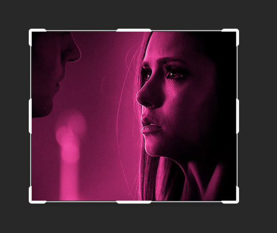
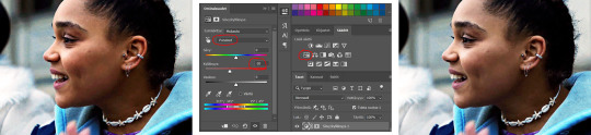
tutorial on making gifs nice and crisp? and doing that cool color thing on the elena set (the pink coloring)? pls
omg sure !! warning I am quite new to making gifs so there's probably a better person to ask but I'm happy to help. (I use photoshop 2021)
I'm assuming you're talking about this pink Elena set. I am of medium creativity so I do have more than one. But this one was actually very easy.
My general tips for making gifs as high quality as possible are
brightness !! literally turn that bitch as far up as you can it helps so much
smart sharpen. I vary my settings depending on the image size and what show/scene I'm working on but I generally turn Reduce Noise down to zero and Amount to 500 and then fiddle around with Radius from there. The amount of Radius varies from 0.7 to 1.5-8. It all depends on the scene.
As for how I did that pink Elena set I basically did the first to things just to get the scene set up and then I went into Gradient Map clicked the little box that said Reverse and picked

This Gradient- should be the first in reds. Then I edited it to make the light colour at the end pure white, the dark pure black and the middle a pink I thought looked good for the scene.

For comparison this is how just adding this gradient changed this random elejah gif I had open:

thanks for the ask <3 if you have any more questions feel free to message or send another ask I don't mind. Hope this helped :)
9 notes
·
View notes
Note
Hi! I hope I'm not bothering you, but I love your mood board edits and was wondering if you could explain how you go about making/colouring them? I see lots of places to find gifs but turning them into a set is so hard. Thank you in advance!
hi! first of all thank you so much and second of all it’s not a bother at all! i am happy to give some of my own tips even if my explanation probably isn’t super helpful. i won’t give like a ps tutorial but below the cut (since i included example gifs, it’s VERY long) is my process for my latest jily aesthetic:
i keep track of all my ideas/sets in a spreadsheet (which i won’t show bc there’s a lot of info i’d have to blur/black out) but i always have a list of what scenes i need to gif/what gifs i’m editing and where i’m getting them from. i also include a couple extra ideas in case the gifs i have planned end up being too hard to color or don’t fit in the set. i’ve found it’s best/easiest to start w the list bc there is literally nothing worse than spending hours on a set and then not being able to complete it.
as for actually finding the material, i have a pretty healthy number of scene packs saved in my giffing folder, esp. for things i know i will gif frequently. most of the time i will peruse youtube, vimeo, and instagram for any aesthetic scenes. i also have a lot of gif packs saved specifically for the purpose of making mbs (usually i mix my own gifs w gif packs), if you msg me i’m happy to direct you to some gif packs i use regularly or you can check my #resources tag. a couple tips for finding material:
always opt for download when possible, i used to screen record and the difference when i switched to downloading was astronomical. (it’s easy to lose quality and esp if you’re on mac, quicktime duplicates frames so either you have to manually delete those extras or you get sort of choppy gifs when you load them into ps.)
always use 1080p or better, 720p will work in a pinch for 268px or 177px gifs since you can make up some of that resolution loss with sharpening, but don’t go any lower than that, just love yourself.
for pale sets, look for the right colors. i tend to look for scenes w high color contrast especially if it features poc so it’s easier to color without whitewashing, ie if the subject is a person then i look for light colored or blue/green/violet/white backgrounds. it’ll make your life wayyyyy easier. this also means if you’re making a set try to find scenes with already similar lighting bc you won’t have to work so hard to make it look cohesive.
here’s a quick rundown of what i do before coloring:
import all frames and save all the files in a folder together!!
play around with frame delay so all the gifs are moving at about the same speed, usually keep it between 0.03-0.05s
crop and resize gifs (i use 268x145 most of the time)
convert to timeline
when it comes to coloring it can be really hit or miss, i’ve recently gotten back into my groove but i was having sooo much trouble earlier this year. in general, don’t stress yourself out!! sometimes it’s easier to just find a new scene/gif (hence my list of extras!) than to try too hard to fit a gif into your set. i color all my gifs by scratch (ie no psds) but i tend to follow the same pattern, i’ll explain using these gifs/psd as an example since then i can also explain how to fix white-washing:
first off when you’re coloring gifs with poc always always always make a layer mask so you can compare the edited and unedited skin tones directly! i use the marquee tool to make a selection in the middle of the character’s face, select the folder of my adjustment layers, and hit ‘add vector mask’ (the third button from the left on the layers panel, it’s a white rectangle with a circle in it).
i almost always begin by using hue/saturation layers to highlight and delete certain colors. here i highlighted red and raised the lightness on yellow by a lot since it’s a very yellow scene. then i use a combination of brightness/contrast, levels, and curves layers to brighten the scene. here’s what i have now:
i add a gradient map set to black/white, change the blending to exclusion, and lower the opacity to between 5-10% (depending on the scene) to lighten the contrast further:

then i add back a little depth with selective color in neutrals and blacks:
now i have two main goals: 1. add contrast between the background and the subject, and 2. brighten the scene into a pale gif. to do this, i use color balance to tweak the color of the background, taking out the yellows. this step works best if there’s at least some shade difference between your subject and background, otherwise isolating the two will be impossible. here’s what i have after adding color balance:

i use hue/saturation to selectively highlight the background color. in this case i chose to adjust magenta and used the color picker (the first eyedropper on the left) to identify the exact shade i wanted to lighten. now i have a fairly neutral background and a colorful subject, which gives a sort of pale effect:
and now i use a curves layer and a selective color (white) layer to brighten further:

before i go further, i start fixing white-washing. keep in mind that some variance is normal since you are naturally changing the lighting of the scene; this gif shows it rlly clearly bc of how yellow and dim the lighting is, so some lightening is to be expected. however, both because the vector mask shows a lot of whitening and because i’ve giffed dev patel before and have a general idea of what he looks like in this type of lighting, i know what needs to be fixed, so i go back in under the psd/adjustment layers with a combination of selective color (red and neutral) and hue/saturation layers to darken his skin again:

now that some more contrast has been added in, i can go back to working on the psd and use curves and selective color to play around with the background again:

i use another hue/saturation layer and a black/white gradient to tone down oversaturation:


usually i leave those layers on top, so if i want to make any adjustments (like lightening the background more), i go in under those two. in this case i tweaked the whites and reduced the contrast a little to get this:
again, you can see his skin tone has changed from the original, but variation is to be expected given how much brighter the room is, the fact that i took out a lot of yellow lighting, and the brightening effect of the computer screen in front of him. some other things to keep in mind when coloring:
when you add layers to correct white-washing, you’re likely to end up with overly red/orange skin tones (red-washing). this can be fixed by upping cyans in the reds, desaturating/darkening the reds, or adding b/w or desaturation later on.
when in doubt, it’s better to be darker than lighter (the issue with white-washing is that it promotes colorism, and there is nothing inherently wrong with a darker skin tone) but really. just put in the effort to color poc correctly.
when changing the lighting a lot it helps to look at pictures of the subject in natural/bright lighting, since you get a better idea of what their normal skin tone is.
don’t try to squeeze all your selective color layers into one. you’ll get less grainy gifs if you separate them out and work one by one.
TURN OFF NIGHT SHIFT/NIGHT MODE! yes i KNOW it’s bad for your eyes (especially if you’re like me and gif at night, when the lighting outside isn’t changing every 20 seconds) but your gifs will look VERY different under f.lux or night mode compared to daytime screens. especially if you’re giffing at different times of day, blue light filters can really change the way your coloring appears. best to keep it consistent.
my sharpening settings vary depending on what i’m giffing but in general i do two layers of smart sharpen (500% with radius between 0.2-0.4, 10% with radius at 10px) and then gaussian blur at 2.5px and adjust the opacity so it’s somewhere between 15-20%. i try to strike a balance between smoothing out the graininess from selective color, and sharpening details like clothes and hair. here’s what i ended up with for the gif above:

then i rinse and repeat for the rest of the gifs in the set! i tend to start with the gifs that i know will be hardest to color, which is usually the darker ones (coloring is limited by how much i can brighten the scene) and those that include poc (again, limited by how much i can brighten and adjust the scene’s lighting without white-washing). then i check set cohesion as i go, using those first few gifs as benchmarks. once i have all 8 (or 9 or 10) gifs, i play around with composition and try to balance and vary the subject, colors, and composition of gifs next to each other. i go back and make a couple of adjustments here and there according to what i observe and what i think might improve the overall appearance.
and that’s pretty much it! i hope this was helpful, if you have other questions feel free to message me and i’d be happy to help/troubleshoot. happy giffing!
#Anonymous#*#resources#answered#sorry this was sO long but i hope it helped on the coloring end#tbh i exceeded my own expectations with the dev gif lol#yeahps#completeresources#chaoticresources#tutorial#coloring tutorial
54 notes
·
View notes
Text

Okeyy here it is!! I decided to put together a step by step (gif) coloring tutorial where i list the layers i use and how i've so far made them work for me.
I've been giffing for 2 years now (i'm using PS CC2019, the example pics are in finnish but icons and placements should be the same) but it's an ongoing learning process.
My coloring style is quite natural, i don't do fancy stuff often and i mostly just want the colors to look as true to real as possible but better than originally. And for this kind of style i've found the steps below working for me.
I also don't have any base psds or anything that i'd often use. I always start the coloring for each set from the scratch because, to me, it's the most fun part of giffing. I have 6 layers I use every time and then some random additional ones that i often add too. None of this is me saying what you should do, this all just me explaining what i do and hopefully this can be helpful to someone.
Ok ok time to get to the point so:
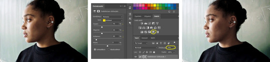
1. Curves
I always, like literally always, start with this layer
Sometimes i just drag the line upwards to brighten the gif but very often i use the eyedropper tool
Choose the white tool, pick the whitest (but not 100% white coz then it won't do anything) spot and it will make that the whitest part of the gif. It also works great at correcting the colors, sometimes you need to try multiple different spots to get the best result
The black dropper tool works the same way, only opposite, so clicking on the darkest spot you make that the blackest part of the gif
If the effect is good but a bit too much, you can lower the opacity of the layer, or the other way, so if it did well but not enough then duplicate the layer
Example: the difference between the left and right photo is 2 clicks and this, my dudes, is why i worship curves. I chose the white eyedropper tool and clicked on that light spot visible in the water, then i chose the black eyedropper and clicked on fatou’s hair and that’s it. Needs more work, but that’s a pretty allright (and easy!!) start (zoom to see better)
2. Levels
I drag the left and right sliders a bit to the center to get contrast (left ~5-20, right ~240)
The eyedroppers work on this layer pretty much the same way as in curves, but i'm more used to using them only with curves
3. Black and white gradient map
I set the blending mode to soft light and lower the opacity to ~10-30 %, this brings some depth to the colors imo
4. Vibrance
I usually add ~20-60, it really varies tho and you can just wing it most times
5. Exposure
I set the top one (exposure) to 0,1 - 0,2 and bottom one (gamma) to 0,97 - 0,90. This is an effective layer so better not do too much
6. Color balance
Owing my life to this layer
I add this layer at around this point of coloring but i drag it to be the bottom layer, since when it's under the rest of the layers it's more effective
In the midtones, i always drag the bottom slider towards blue, something as small as +2 might work, sometimes you need to go +15 or so. I might drag the middle slider slightly to the left to reduce the green tones, and the top one on either side depending on the tone of the gif
Example: this one doesn’t have any of those other 5 coloring layers i always use so it needs more work but also it shows how effective color balance is. I added more blue than normally, at least with one layer, but this one needed it imo. Love to see the green go whoosh
At this point the coloring might be done (jk it likely isn’t) but if it needs some more work then i might try one or some/all of these:
7. Photofilter
I mostly use either warm orange filter to bring some warmness to the colors or cold blue filter to correct yellow/green/red tones
8. Hue/saturation
I choose red and drag the middle slider (saturation) to -5 to -20, this helps to reduce the orange/unnatural skintones
Example:
9. Selective color
Playing around with whichever color i want to add or reduce, if i feel like the gif needs more contrast i choose neutral and/or black and drag the bottom (black) color to the right.
If sometimes the whites are too blinding, i choose white and then the bottom option (black) and drag it to the right ~10 -20.
If the skintones are too yellowish, i choose yellow and go -40 / -40 / -80 and leave the blacks at 0. If it does too much, i lower the opacity of the layer, or in case i want it to be more, i duplicate the layer
Example: (zoom and cry happy tears over the ugley yellowness being gone)
10. Gradient map
For example blue-white gradient to get to colder tones, yellow-white to brighten/soften the colors or smth like pink-blue if you want to get fancier (the options are limitless tbh)
I set these to soft light and lower the opacity, usually to less than 40%
If i want the color to strongly affect the entire gif, then i leave the blending mode to normal or choose color
11. Brightness
Adding this if some more brightness is needed (i don't use the contrast option here but go to levels instead, if needed)
_________
Tips with poc!!
Some things i've found to be helpful when wanting to bring color back to the skintone after brightening or other adjustments have taken some of it away:
a. Check the points 8 & 9
In selective coloring choosing neutral or black and then black in them and dragging it to the right helps to darken the skintone
Try choosing red or yellow and then yellows or blacks in them and dragging the slider either to the left or right, depending if you want to add or reduce the yellow/red tone
Honestly the best advice i can give with selective coloring is to just simply play around, choose a color, drag them sliders to the left 'n right and see what happens
b. Go to channel mixer and add a little bit of red (+101-105)
c. Add levels or contrast or vibrance layer
d. Choose a warm colored photo filter
e. Be careful with exposure and too much brightness
_________
Soooo yeah, these are the layers i use, sometimes you can't do everything with the same layer so for example i might add one or two more curves to get brightness, or multiple selective coloring layers or add another color balance etc.
Generally i like to do small changes with one layer and not everything all at once.
_________
As for when saving the gif for web, these are my settings. I translated the one’s that aren’t obvious but everything else i’m assuming doesn’t need translating since this view always looks the same.
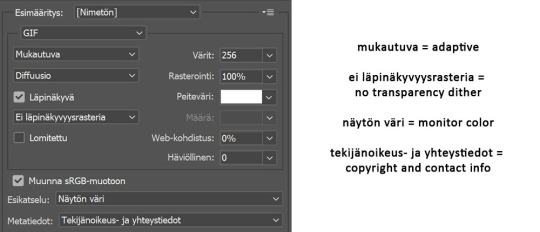
I use diffusion 90% the time, but when it doesn’t look quite right i try pattern. And sometimes when the gif has been really dark originally (😩) and has needed tons of brightening layers, noise might be the best option.
At the bottom i have the quality set as “bicubic”.
_________
So that’s it! If you made it this far, thank you, ily <3 Lots of stuff i’ve learned along the way and lots of stuff to be learned. Hoping that maybe you got to learn something from my way of coloring, too. And if not, thanks for reading anyway 😌✌🏻
#here it is 😳#i've never done posts like this but i tried to explain stuff as shortly but clearly as i could#hope it's easy to follow#and that i didn't forget anything crucial jdjdkdkd#gif tutorial#coloring tutorial#mp
49 notes
·
View notes
Last Seen Blogs
covehearted
ya like otome?
daisyfornost
Female-presenting Titular
severecatcolor
kitty bubbles
certifiedthemb0
no brain and no binary

chaoticllamapeanut
Untitled