#anyways hope this helps :3
Note
Hello, I read and love your Chained Series but only now noticed the Major Character Death tag on the second one, since I moved from part 1 to part 2 without checking the tags/summary. I normally really really really do not touch Major Character Death, it just... well it just makes me really sad in a way i don't enjoy, to keep it brief, even when it's plot or story wise fulfilling a purpose.
This is in no way me asking you not to do it, it's your story, and that's how it should be!
But I was hoping if you'd be willing to give me some information around the MCD, who for example (or if this'll straight up be a bad ending overall), so I can emotionally brace myself because I really don't want to stop reading the fic, because it's really good, but going further into it blind feels daunting, in a way. I will of course not relay anything regarding the fic to others, that you might tell me (since idk how familiar you are with tumblr: there is a way to respond to asks privately in the ask-post settings, if you prefer).
If you're not happy doing this I completely understand, it's your story, but i figured it's worth asking.
I hope you have a nice day, and that the writing will be easy 👌
I would be quite happy to explain what I've got planed with that! I deliberately read spoilers for similar reasons all the time; I totally understand wanting to be forewarned and forearmed. Also I'm just happy to ramble about my fic lol :3 If ya gotta drop it, no worries, glad you enjoyed the first sections and I don't mind anyone takin care of themselves
You're probably not the only one who'd want to know so I'll just put all the spoilers in a read more:
First of all, I don't consider this to be a particularly dark story (though granted I don't consider Death Note to be a particularly dark story so uh your mileage may vary) nor do I see it ending in tragedy.
The planned deaths:
The Joker - So, he's not really a main character in this fic, in fact, he might not even get speaking lines, I'm unsure right now, but he's major in the comics so I'm counting it. It's not going to happen for a VERY long time but it is so pivotal to the functioning of a main emotional plotline that I don't know how I'd write around changing my mind about this one.
Captain Boomerang - Like the Joker, I'm not really even sure he'll get speaking lines, but he's important enough to Tim's other canon stories he makes the cut. Unlike the Joker, I don't actually know if he's going to die yet! At the end of Red Robin Tim tries to kill him but fails. I don't know if my older Tim will do it, but I am certain he'll go at least halfway through a second similar plan. Much will hinge on what I read of his interactions with Huntress.
Other assorted villains, such as Darkseid and the Batman Who Laughs - This will depend a lot on, again, my reading of how Tim interacts with the kind of violence Huntress brings to the table. It also depends a lot on how a few in-fic decisions shake out. Tim has to make the decision as to whether or not they kill more people than just the ones on his small list from the first fic and I've got a more solid idea for if he does than if he doesn't.
Roy Harper (and a few other Heroes) - He's not gonna stay dead though, none of them are. So, due to hesitance and fear of fucking shit up Jason and Tim aren't going to make some key decisions in time to prevent the whole "Heroes in Crisis" plotline from happening. Once they learn of this they are immediately going to start doing mad science to figure out how to resurrect people safely. And, of course, they have the power to time travel.
Jason Todd... Kinda. - An increasingly large and loud elephant in the room is gonna be the fact that Jason doesn't have to have died. Ever. In any timeline.
Tim could save him.
But of course that would mean rewriting the Jason he knows out of existence. There really isn't a clear cut moral equivalent to doing this? But I feel emotionally it would count as this/our Jason dying.
On the other hand if Tim refuses, he is deeply morally responsible for Jason's actual already happened death... but will have saved our Jason's existence.
Tim's decision of whether or not to save Jason's child self is THE emotional climax of the story. One of the main purposes of Chapter 12 was foreshadowing how each character will react to this very situation.
I can't put another read more, so if knowing the two options is good enough for you turn back now! And if you wanna know what Tim's decision is (I sure would!) scroll passed the two big pictures!


Tim refuses to save Jason's childhood self. He loves this Jason too much to emotionally withstand losing him. I have had this story beat and the resulting fallout planned for absolute ages and I'm 100% certain on this one. Frankly, timeline erasing the Jason we know and love would make ME cry too much to keep writing it lmao, so this one I can guarantee.
#chained fanfic#chained: to wield the blade we have forged#jaytim#damian's tomfoolery#...I should probably put in my bio somewhere that my name is Damian#would make that tag make more sense lol#anyways hope this helps :3
12 notes
·
View notes
Text
I WANNA DRAAWW!! RAHHHGG!! Absolutely swamped with college work, im so tired TT (hence whatever tf this is lmao)
#posted this doodle on twitter yesterday but it's still very relevant today#fr cant do anything until I get 12 posters drawn make my homemade paper and finish/publish my 200 page book I'm gonna-#Send help#i miss being active sm :'((#SORRY TO THE 60+ ASKS IN MY INBOX I PROMISE ILL GET TO YOU SOON <333#anyway I hope everyone else is doing ok#sending love#(also husk please- stay off the internet lmao)#angel dust#angel dust fanart#husk#husk fanart#huskerdust#huskerdust fanart#hazbin hotel#hazbin hotel fanart#tribbleart#<3
4K notes
·
View notes
Text

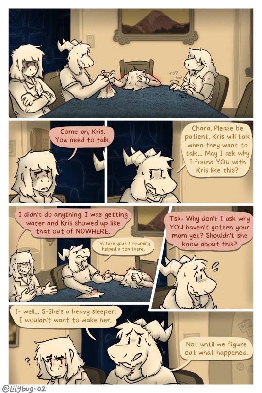
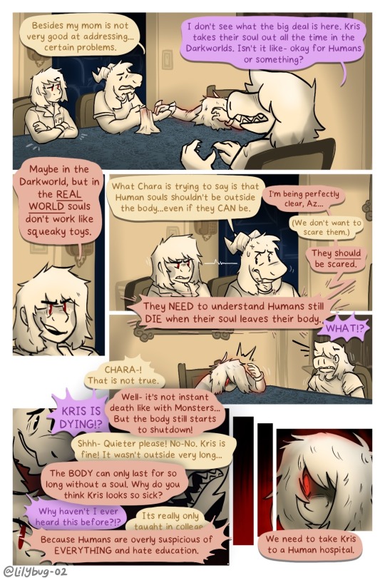
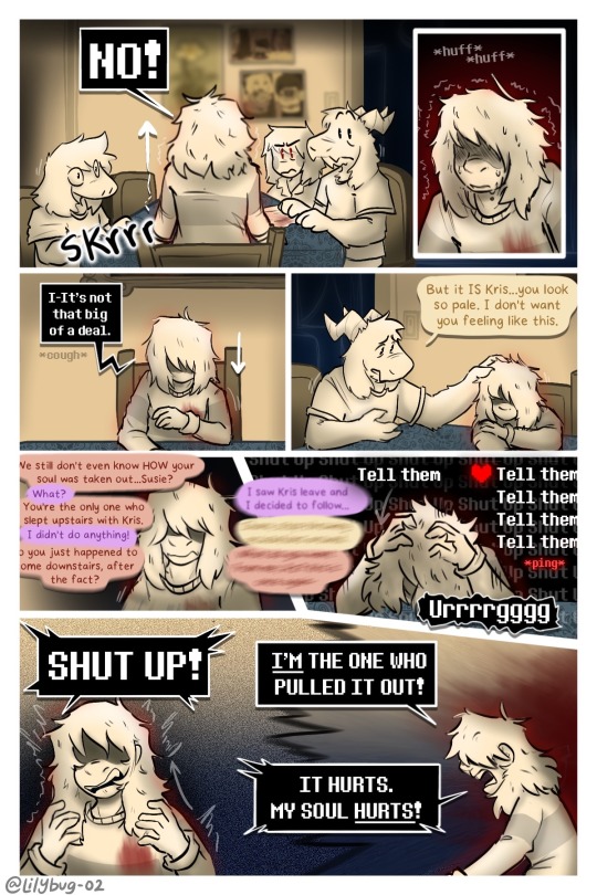
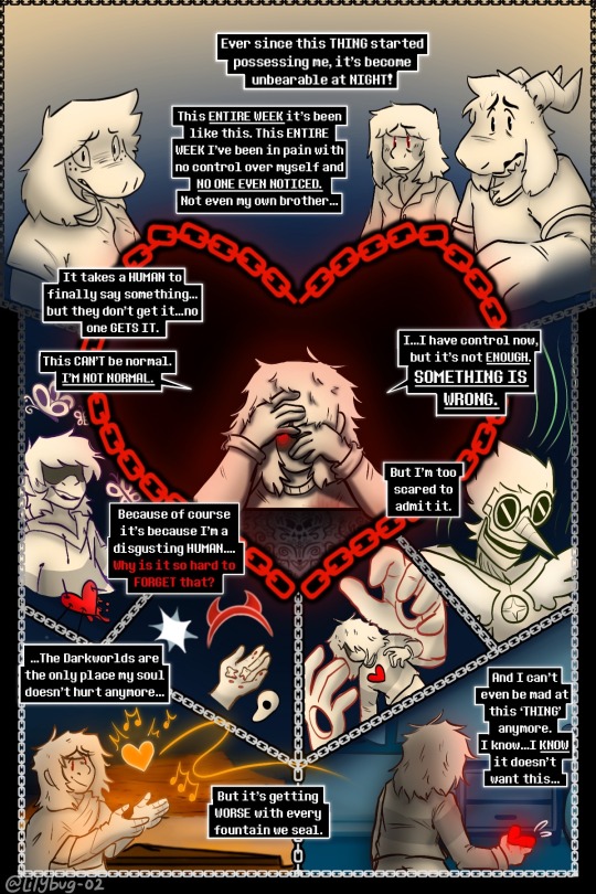
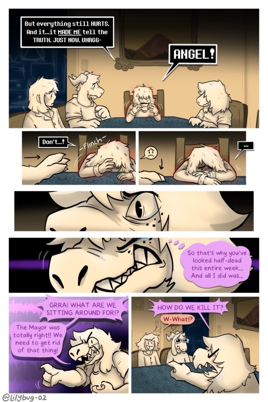
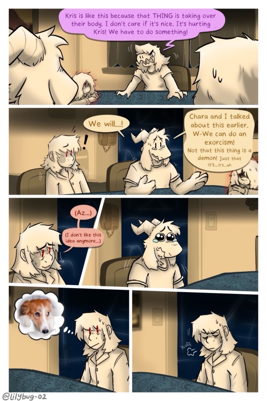
Pain is a great motivator…
Part 26 || First || Previous || Next
—Full Series—
Meanwhile Toriel:
(Loud noises don't wake her up usually.)
Artist note: I’m so proud of this :))) I know it’s a lot of dialogue and reading, but dialogue is grueling work for me. I’m glad with the art and for the amount of pages I made in such a relatively short time span -w- page 5 was super fun to work on. A lot of blood, sweat, and hours here... :) The backgrounds were a big bore tbh, but I finished them! Yippie!
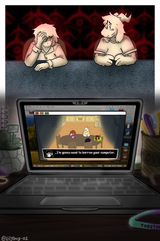
#CHARA WTF DO YOU MEAN “COMPUTER”????#lol i hope you guys dont hate me for what im doing in the next update.#IS THAT A MAC OS???#Yes......owo''#Kris and the Gang are LITTLE now. I've pixelated them and turned them into little game characters!#FINALLY!!#I never thought I would be going so far in the story to explain WHY Kris pulls out their SOUL and opens Darkfountains even when they killed#Berdly in Chapter 2. Pain can make people do horrible things.#Uhhhhhhhhh anyways. :3 I hope you liked it! I made this post a little too long for my liking and didnt get it out when i wanted too-#but thats okay! As long as people enjoy it :)#bread#art#deltarune chara timeline#deltarune chara timeline comic#seriously though#long post#man am I glad I switched over to the limited color palet! It helps me feel alot more relaxed uwu#This is....way over 16 hours of work q-q#chara#asriel#susie#kris#asriel dreemurr#kris dreemurr#kris deltarune#susie deltarune#deltarune#comic#my art
3K notes
·
View notes
Text
first base is wound tending second base is hand touching
#third base is marriage#this is abt calabby but applies to all ships i hope this helps <3#humor#ship dynamics#this has been a shitpost#windy#walker independence#im not being silly im not being funny it doesn't get nore romantic than this <3#its abt the tenderness and unresolved tension#also the yearning pining longing etc#anyway tropes that make me insane every time <3#1k#im being diagnosed as ace in the notes....interesting#im sorry but it doesn't get more tender and romantic and intimate than this#10k
37K notes
·
View notes
Text
being aromantic is like. hey btw you're going to live a life that is the culmination of most of society's worst nightmares. sorry lol ✌️ but then you turn around and take a really good hard look at it and it turns out that living in that nightmare is fucking awesome and you get to wake up every day and take that fear that other people have and laugh and hold it close until it's a great joy for you instead. and being happy is a radical act that you define instead of someone else. and you're sexy as fuck that's just a fact of life i don't make the rules on that one
#aromantic people are just sexy i'm not making the decisions here it's just facts#course ur hot as fuck. it came free with the aromanticism#being sexy is just default settings for aromantic people 👍#hope this all helps. anyway i'm on my 'i hope i die alone <3 i can't wait to die alone <3' kick rn#i think the existential fear that people have of Not Partnering specifically is so. well.#obviously that shit is strong and it is SO awesome to be free of it.#realizing you're aro and you don't Want a partner can be such a hit to the solar plexus#cause society says that's the only thing that'll make you happy. so either you go without that thing or you force yourself#into doing something you don't want which would make you unhappy anyway.#so you think it's a lose lose situation and you have to come to terms with what amatonormativity presents as the worst possible situation#but then! whoa! turns out personhood is inherently valuable in and of itself and romantic partnering is just a construct!#and that nightmare is now your life to do with as you please... define as you will... structure as you want...#best case scenario. is what i'm saying.#every day i wake up ready to spit all that amatonormative rhetoric back in life's teeth by being alone and being happy#and it's so fucking satisfying. every day.#fucking JUBILANT being by myself. and i love being a living breathing 'fuck you' to the romantic system#you need a partner to be happy? oh that's sooo fucking crazy guess i'll go be miserable then. in my perfect fucking dream life lmao#yeah obviously it's the worst possible outcome on earth to die without a partner. so terrible. can't wait for it :)#aromantic#aromanticism#aro positivity#aroace#arospec#sorry to bitches who are sad about not having a partner. i could not give a fuck though get better soon#you couldn't EVER pay me enough to go back to a mindset in which my inherent value wasn't enough by myself.#FUCK that shit. absolutely miserable and a bad life outlook in general. like genuinely do the work w/ amatonormativity and get better#life is something that can be so fulfilling whether someone wants to kiss you or whatever or not#i'm on antidepressants and i have people i care deeply about. what the fuck would i need a partner for lmao
8K notes
·
View notes
Text

Espeon, Dusk Lycanroc, and Sylveon ko-fi doodle for Kaitlyn!
I'm accepting pokemon ko-fi doodle requests here! ✨
#artists on tumblr#pokemon#espeon#dusk lycanroc#sylveon#gotchibam arts#ko-fi doodle#thank you sm for the request!! <3#i'm sorry this took so long ;_;#been having an art block for the past week so I couldn't finish any doodle#I think i'm getting back to it now tho esp. since the weather here is cooler now#w/c helps a lot (the past days has been terribly hot so yeah)#anyways i'll get back to ppl's msgs soon!!#also need to update stuff for my kofi members >_<#i'm getting behind a lot of stuff but I hope u guys can be patient w/ me ;o;
2K notes
·
View notes
Note
Monster Clover, like this is so awesomecool.
They're such a little beast and it is amazing and please i need more, like written text even i just need the juicy lore and emotional moments that are circling in ur brain.
HAT: RETRIEVED!!
#undertale yellow#uty clover#flowey the flower#chara dreemurr#frisk undertale#monster clover au#my art#as for emotional moments. hang in there for another day or 2. got a big batch of comics coming 😈#if i ever made a fic for this au i would not advertise it. i got irls following me#they can look at all my cringe ass art but if they read a WORD of fic i wrote i would have to end it all. hope this helps#anyways. frisk appears!! i wont be doing too many canon ut characters in this little au but i like frisk :)#theyre also important for the next part#narrator chara makes an appearance too bc i love them#cowboy (gender neutral)#SORRY I LOVE RAMBLING IN TAGS </3 i love Talking#BUT THANK YOUU i also love my little skrungly im so glad other people like them so much too#mcau comic#mcau art
620 notes
·
View notes
Text
this is my brother and i need a shovel to love him
(prints)
#death note#meronia#mello dn#near dn#mihael keehl#nate river#nearmello#i have a disease named 2008 yaoi and it is terminal. sorry#their 15 minutes of screentime and cain&abel slay have captivated me#hits that compelling dynamic that canon gives you just enough to extrapolate about spot#you should be addicted to shutting the fuck up / you want to fuck me so bad it makes you look stupid etc etc etc etc im predictable#i've decided to be proactively problematic and interpret their relationship as a brotherhood but also they kiss. hope this helps#anyway flamecon is approaching so im trying to bang out all the illustrations i didnt finish in the past seven months#is it -- yes it's all nearmello. sorry#as usual have this at 3 am the artist's natural unhinged hour#artists on tumblr#illustration#horreurart
2K notes
·
View notes
Photo


Kokichisake-onna
*Happy anime narrator voice*: “And thus, Kokichi has once again successfully evaded the dread of emotional openness!”
Also here’s a random selection of derpy concept doodles for this comic :)
Thank you byeeeeee
#gonta gokuhara#gokuhara gonta#kokichi ouma#ouma kokichi#kokichi oma#featuring shuichi xD#ougoku#awwgoku#my art#I wanted to post it on ougoku day but work and migraines piled up on me and I really wanted to give this one the time it needs!#If you know the legend you know why Shuichi is panicking XDD#Look into Kokichi's eyeballs in panel 3 and see the sad hope against hope and yet! he still actively sabotages any comfort coming his way!#Is Gonta just kind or is his compassion a warped mix of compulsive fawning and misplaced empathy that keeps inviting menace into his life?#there's a secret sadness to this silly comic lmao and it's those poor sods' autopilots#I say laughing but by god do they need help#anyway enjoy! I might try posting more of Gonta ships I like - like this one; or with Shuichi; and some others 8D#btw I LOVE Gonta's scariest sprite - fantastic detail bc it does look like a snarl and ofc a wild child would imitate animal expressions!#and 2 out of 3 times he uses it he's actually NOT angry but hyped or frustrated - both cases also smth I appreciate for certain reasons#his actual 'serious angry' sprite is far more toned down in comparison
2K notes
·
View notes
Text

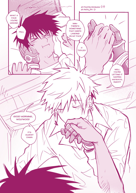


[WVW Exchange Event 2023!]
"The kisses on your lash, your ears, on the nose that keeps scrunching. The kisses on your hand, on your cheeks, and the exchanging soft words waiting for the break of day."
----- ID under break -----
A total of 6 pages of comics, starting with a close up shots of vash kissing sleeping wolfwood's nose, eyes, lashes, and he furrows them a bit. an overhead shot of the two of them in a motel room, on the bed with vash leaning over wolfwood from the left, laying soft kisses on him. their legs tangled. their normal outfits are thrown haphazardly on the floor, instead donning comfortable clothes. on the outside, the very first ray of lights are yet to shine.
"what a face you're making pfft" - vash says as he grabs both of wolfwood's cheeks, squeezing them a bit. wolfwood mumbles, "There's something that keeps landing on my face, it tickles." he grabs the hand that is on his right cheek. "Well you're letting it happens anyways right?" Vash muses, bringing the hand up to kiss on its knuckles. "Good morning Wolfwood. It's almost dawn"
"… Isn't it way too soon?" - wolfwood asks, but keeps to himself the prayers he's sending to god because the the boy on top of him was such a sight to behold. Vash flops down onto him, leaving the hand hanging and lace his own hand into Wolfwood's hair, peppering kisses to the side of his face. "Yep" - he answers - "But you woke up on your own tho" - facetiously. He giggles, saying that it was a joke after a beat of silence. A sigh, "don't make me upside you first thing in the morning." Wolfwood closes his eyes, hand combing through golden strands. "Heh, how merciful~" "We have a meet up with Milly and Meryl today, remember?" Vash reminds him, which does raise some vague memory. wolfwood hums, the other hand reaching around vash's torso, hugging him. " So, the sooner we arrive, the less likely she'll chew through my head." - Vash adds. "riiiight. And you were SO urgent in waking me up." in wolfwood's hold, both of them slowly turn to the right, towards the edge of the bed.
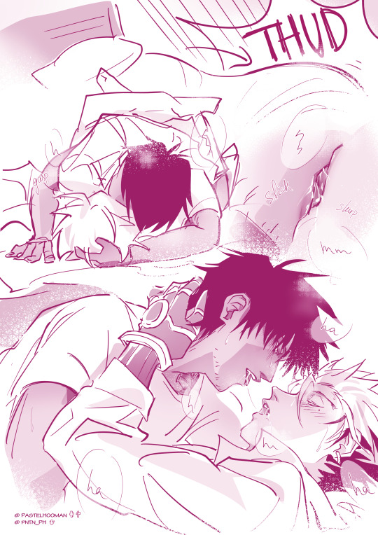
Well, you were just soooo cute, I couldn't help it! didn't thinkk you'll actually wakE UAA-!"
the bed creaks under the sudden shift in weight as wolfwood tosses vash over and under him, arms firmly hugging him, one at his back and one at his head, hungrily dives down to kiss. "!! Wolf-! Wait-!" Vash yelps, leg instinctively curls around the other's man hip to hang on, trying his damnest to grip on his shirt as HE is now half airborne, barely has any contact with the bed on his upper body. However, wolfwood seems to have another idea as he keeps deepening the kiss, pointedly holding Vash close, hands spread guarding the back of his head as both of them are sliding off the soft fabric.
"THUD!" a resounding fall, possibly enough to wake the room downstairs, followed shortly by laboured breaths amist wet smacks of lips. Heaves and huffs of air exchanging between the two bodies when the need to breath made itself necessary. They press close, cradling each other, and are lost to their own world.
After a while they had to part. Metal arm shifts through black locks, caressing down to his nape and they hold eye contacts there, with lidded eyes, strands of saliva thins then breaks.
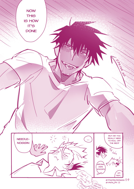
Wolfwood pushes up on his arms, looking smugly down at his now disheveled partner: "Now this is how it's done, Needlenoggin." he remarks. Vash tries to wrangle his thoughts back in order, but strings of Wolfwood's name and a wonderous question keeps filling his mind, of whether he should risk it all and have fun for a bit more. Regardless, snapping out of his trance, Vash sourly asks, with a wry smile and an aching head: "But did you really need to roll off the bed?"
"Wrong side, whoops" - Wolfwood anwers unseriously, laughing as he finds the situation quite amusing.
----- End of ID -----
#sorry if the ID is weird it happens everytime i tried to ID my comics it turned into psuedo-fics-#the cap is the prompt btw#the exchange is basically secret santa except it was in may lol#it was incredibly fun to work on this!!#and originally i drafted this to be like 4 pages and it got longer and l o n g e r and i was like oh no#all is good i made the deadline dont worry#yeah only some ten minutes left before it was overdue lol#oh and the event was last month i just procrastinated and didnt post it on anywhere except fb mb#half the reason was because i do NOT know how to ID and half way through it was feeling like writing a fic and that took. time#didn't help that i started writing when i was very sleepy and basically forgot about it for weeks#wElL aNyWAys#hope you enjoy this <3#i really really love the prompts that i was given there were 3 in total but i only did one#they were all superb#vashwood#woodvash#wvw#vwv#wv#vw#trimax#trigun#trigun maximum#trigun manga#vash the stampede#vash trimax#wolfwood#nicholas d wolfwood#wolfwood trimax#wvw exchange event 2023
2K notes
·
View notes
Text
why Aurora's art is genius
It's break for me, and I've been meaning to sit down and read the Aurora webcomic (https://comicaurora.com/, @comicaurora on Tumblr) for quite a bit. So I did that over the last few days.
And… y'know. I can't actually say "I should've read this earlier," because otherwise I would've been up at 2:30-3am when I had responsibilities in the morning and I couldn't have properly enjoyed it, but. Holy shit guys THIS COMIC.
I intended to just do a generalized "hello this is all the things I love about this story," and I wrote a paragraph or two about art style. …and then another. And another. And I realized I needed to actually reference things so I would stop being too vague. I was reading the comic on my tablet or phone, because I wanted to stay curled up in my chair, but I type at a big monitor and so I saw more details… aaaaaand it turned into its own giant-ass post.
SO. Enjoy a few thousand words of me nerding out about this insanely cool art style and how fucking gorgeous this comic is? (There are screenshots, I promise it isn't just a wall of text.) In my defense, I just spent two semesters in graphic design classes focusing on the Adobe Suite, so… I get to be a nerd about pretty things…???
All positive feedback btw! No downers here. <3
---
I cannot emphasize enough how much I love the beautiful, simple stylistic method of drawing characters and figures. It is absolutely stunning and effortless and utterly graceful—it is so hard to capture the sheer beauty and fluidity of the human form in such a fashion. Even a simple outline of a character feels dynamic! It's gorgeous!
Though I do have a love-hate relationship with this, because my artistic side looks at that lovely simplicity, goes "I CAN DO THAT!" and then I sit down and go to the paper and realize that no, in fact, I cannot do that yet, because that simplicity is born of a hell of a lot of practice and understanding of bodies and actually is really hard to do. It's a very developed style that only looks simple because the artist knows what they're doing. The human body is hard to pull off, and this comic does so beautifully and makes it look effortless.
Also: line weight line weight line weight. It's especially important in simplified shapes and figures like this, and hoo boy is it used excellently. It's especially apparent the newer the pages get—I love watching that improvement over time—but with simpler figures and lines, you get nice light lines to emphasize both smaller details, like in the draping of clothing and the curls of hair—which, hello, yes—and thicker lines to emphasize bigger and more important details and silhouettes. It's the sort of thing that's essential to most illustrations, but I wanted to make a note of it because it's so vital to this art style.
THE USE OF LAYER BLENDING MODES OH MY GODS. (...uhhh, apologies to the people who don't know what that means, it's a digital art program thing? This article explains it for beginners.)
Bear with me, I just finished my second Photoshop course, I spent months and months working on projects with this shit so I see the genius use of Screen and/or its siblings (of which there are many—if I say "Screen" here, assume I mean the entire umbrella of Screen blending modes and possibly Overlay) and go nuts, but seriously it's so clever and also fucking gorgeous:
Firstly: the use of screened-on sound effect words over an action? A "CRACK" written over a branch and then put on Screen in glowy green so that it's subtle enough that it doesn't disrupt the visual flow, but still sticks out enough to make itself heard? Little "scritches" that are transparent where they're laid on without outlines to emphasize the sound without disrupting the underlying image? FUCK YES. I haven't seen this done literally anywhere else—granted, I haven't read a massive amount of comics, but I've read enough—and it is so clever and I adore it. Examples:


Secondly: The beautiful lighting effects. The curling leaves, all the magic, the various glowing eyes, the fog, the way it's all so vividly colored but doesn't burn your eyeballs out—a balance that's way harder to achieve than you'd think—and the soft glows around them, eeeee it's so pretty so pretty SO PRETTY. Not sure if some of these are Outer/Inner Glow/Shadow layer effects or if it's entirely hand-drawn, but major kudos either way; I can see the beautiful use of blending modes and I SALUTE YOUR GENIUS.
I keep looking at some of this stuff and go "is that a layer effect or is it done by hand?" Because you can make some similar things with the Satin layer effect in Photoshop (I don't know if other programs have this? I'm gonna have to find out since I won't have access to PS for much longer ;-;) that resembles some of the swirly inner bits on some of the lit effects, but I'm not sure if it is that or not. Or you could mask over textures? There's... many ways to do it.
If done by hand: oh my gods the patience, how. If done with layer effects: really clever work that knows how to stop said effects from looking wonky, because ugh those things get temperamental. If done with a layer of texture that's been masked over: very, very good masking work. No matter the method, pretty shimmers and swirly bits inside the bigger pretty swirls!
Next: The way color contrast is used! I will never be over the glowy green-on-black Primordial Life vibes when Alinua gets dropped into that… unconscious space?? with Life, for example, and the sharp contrast of vines and crack and branches and leaves against pitch black is just visually stunning. The way the roots sink into the ground and the three-dimensional sensation of it is particularly badass here:

Friggin. How does this imply depth like that. HOW. IT'S SO FREAKING COOL.
A huge point here is also color language and use! Everybody has their own particular shade, generally matching their eyes, magic, and personality, and I adore how this is used to make it clear who's talking or who's doing an action. That was especially apparent to me with Dainix and Falst in the caves—their colors are both fairly warm, but quite distinct, and I love how this clarifies who's doing what in panels with a lot of action from both of them. There is a particular bit that stuck out to me, so I dug up the panels (see this page and the following one https://comicaurora.com/aurora/1-20-30/):

(Gods it looks even prettier now that I put it against a plain background. Also, appreciation to Falst for managing a bridal-carry midair, damn.)
The way that their colors MERGE here! And the immense attention to detail in doing so—Dainix is higher up than Falst is in the first panel, so Dainix's orange fades into Falst's orange at the base. The next panel has gold up top and orange on bottom; we can't really tell in that panel where each of them are, but that's carried over to the next panel—

—where we now see that Falst's position is raised above Dainix's due to the way he's carrying him. (Points for continuity!) And, of course, we see the little "huffs" flowing from orange to yellow over their heads (where Dainix's head is higher than Falst's) to merge the sound of their breathing, which is absurdly clever because it emphasizes to the viewer how we hear two sets of huffing overlaying each other, not one. Absolutely brilliant.
(A few other notes of appreciation to that panel: beautiful glows around them, the sparks, the jagged silhouette of the spider legs, the lovely colors that have no right to make the area around a spider corpse that pretty, the excellent texturing on the cave walls plus perspective, the way Falst's movements imply Dainix's hefty weight, the natural posing of the characters, their on-point expressions that convey exactly how fuckin terrifying everything is right now, the slight glows to their eyes, and also they're just handsome boys <3)
Next up: Rain!!!! So well done! It's subtle enough that it never ever disrupts the impact of the focal point, but evident enough you can tell! And more importantly: THE MIST OFF THE CHARACTERS. Rain does this irl, it has that little vapor that comes off you and makes that little misty effect that plays with lighting, it's so cool-looking and here it's used to such pretty effect!
One of the panel captions says something about it blurring out all the injuries on the characters but like THAT AIN'T TOO BIG OF A PROBLEM when it gets across the environmental vibes, and also that'd be how it would look in real life too so like… outside viewer's angle is the same as the characters', mostly? my point is: that's the environment!!! that's the vibes, that's the feel! It gets it across and it does so in the most pretty way possible!
And another thing re: rain, the use of it to establish perspective, particularly in panels like this—

—where we can tell we're looking down at Tynan due to the perspective on the rain and where it's pointing. Excellent. (Also, kudos for looking down and emphasizing how Tynan's losing his advantage—lovely use of visual storytelling.)
Additionally, the misting here:

We see it most heavily in the leftmost panel, where it's quite foggy as you would expect in a rainstorm, especially in an environment with a lot of heat, but it's also lightly powdered on in the following two panels and tends to follow light sources, which makes complete sense given how light bounces off particles in the air.
A major point of strength in these too is a thorough understanding of lighting, like rim lighting, the various hues and shades, and an intricate understanding of how light bounces off surfaces even when they're in shadow (we'll see a faint glow in spots where characters are half in shadow, but that's how it would work in real life, because of how light bounces around).
Bringing some of these points together: the fluidity of the lines in magic, and the way simple glowing lines are used to emphasize motion and the magic itself, is deeply clever. I'm basically pulling at random from panels and there's definitely even better examples, but here's one (see this page https://comicaurora.com/aurora/1-16-33/):

First panel, listed in numbers because these build on each other:
The tension of the lines in Tess's magic here. This works on a couple levels: first, the way she's holding her fists, as if she's pulling a rope taut.
The way there's one primary line, emphasizing the rope feeling, accompanied by smaller ones.
The additional lines starbursting around her hands, to indicate the energy crackling in her hands and how she's doing a good bit more than just holding it. (That combined with the fists suggests some tension to the magic, too.) Also the variations in brightness, a feature you'll find in actual lightning. :D Additional kudos for how the lightning sparks and breaks off the metal of the sword.
A handful of miscellaneous notes on the second panel:
The reflection of the flames in Erin's typically dark blue eyes (which bears a remarkable resemblance to Dainix, incidentally—almost a thematic sort of parallel given Erin's using the same magic Dainix specializes in?)
The flowing of fabric in the wind and associated variation in the lineart
The way Erin's tattoos interact with the fire he's pulling to his hand
The way the rain overlays some of the fainter areas of fire (attention! to! detail! hell yeah!)
I could go on. I won't because this is a lot of writing already.
Third panel gets paragraphs, not bullets:
Erin's giant-ass "FWOOM" of fire there, and the way the outline of the word is puffy-edged and gradated to feel almost three-dimensional, plus once again using Screen or a variation on it so that the stars show up in the background. All this against that stunning plume of fire, which ripples and sparks so gorgeously, and the ending "om" of the onomatopoeia is emphasized incredibly brightly against that, adding to the punch of it and making the plume feel even brighter.
Also, once again, rain helping establish perspective, especially in how it's very angular in the left side of the panel and then slowly becomes more like a point to the right to indicate it's falling directly down on the viewer. Add in the bright, beautiful glow effects, fainter but no less important black lines beneath them to emphasize the sky and smoke and the like, and the stunningly beautiful lighting and gradated glows surrounding Erin plus the lightning jagging up at him from below, and you get one hell of an impactful panel right there. (And there is definitely more in there I could break down, this is just a lot already.)
And in general: The colors in this? Incredible. The blues and purples and oranges and golds compliment so well, and it's all so rich.
Like, seriously, just throughout the whole comic, the use of gradients, blending modes, color balance and hues, all the things, all the things, it makes for the most beautiful effects and glows and such a rich environment. There's a very distinct style to this comic in its simplified backgrounds (which I recognize are done partly because it's way easier and also backgrounds are so time-consuming dear gods but lemme say this) and vivid, smoothly drawn characters; the simplicity lets them come to the front and gives room for those beautiful, richly saturated focal points, letting the stylized designs of the magic and characters shine. The use of distinct silhouettes is insanely good. Honestly, complex backgrounds might run the risk of making everything too visually busy in this case. It's just, augh, so GORGEOUS.
Another bit, take a look at this page (https://comicaurora.com/aurora/1-15-28/):

It's not quite as evident here as it is in the next page, but this one does some other fun things so I'm grabbing it. Points:
Once again, using different colors to represent different character actions. The "WHAM" of Kendal hitting the ground is caused by Dainix's force, so it's orange (and kudos for doubling the word over to add a shake effect). But we see blue layered underneath, which could be an environmental choice, but might also be because it's Kendal, whose color is blue.
And speaking off, take a look at the right-most panel on top, where Kendal grabs the spear: his motion is, again, illustrated in bright blue, versus the atmospheric screened-on orange lines that point toward him around the whole panel (I'm sure these have a name, I think they might be more of a manga thing though and the only experience I have in manga is reading a bit of Fullmetal Alchemist). Those lines emphasize the weight of the spear being shoved at him, and their color tells us Dainix is responsible for it.
One of my all-time favorite effects in this comic is the way cracks manifest across Dainix's body to represent when he starts to lose control; it is utterly gorgeous and wonderfully thematic. These are more evident in the page before and after this one, but you get a decent idea here. I love the way they glow softly, the way the fire juuuust flickers through at the start and then becomes more evident over time, and the cracks feel so realistic, like his skin is made of pottery. Additional points for how fire begins to creep into his hair.
A small detail that's generally consistent across the comic, but which I want to make note of here because you can see it pretty well: Kendal's eyes glow about the same as the jewel in his sword, mirroring his connection to said sword and calling back to how the jewel became Vash's eye temporarily and thus was once Kendal's eye. You can always see this connection (though there might be some spots where this also changes in a symbolic manner; I went through it quickly on the first time around, so I'll pay more attention when I inevitably reread this), where Kendal's always got that little shine of blue in his eyes the same as the jewel. It's a beautiful visual parallel that encourages the reader to subconsciously link them together, especially since the lines used to illustrate character movements typically mirror their eye color. It's an extension of Kendal.
Did I mention how ABSOLUTELY BEAUTIFUL the colors in this are?
Also, the mythological/legend-type scenes are illustrated in familiar style often used for that type of story, a simple and heavily symbolic two-dimensional cave-painting-like look. They are absolutely beautiful on many levels, employing simple, lovely gradients, slightly rougher and thicker lineart that is nonetheless smoothly beautiful, and working with clear silhouettes (a major strength of this art style, but also a strength in the comic overall). But in particular, I wanted to call attention to a particular thing (see this page https://comicaurora.com/aurora/1-12-4/):

The flowing symbolic lineart surrounding each character. This is actually quite consistent across characters—see also Life's typical lines and how they curl:

What's particularly interesting here is how these symbols are often similar, but not the same. Vash's lines are always smooth, clean curls, often playing off each other and echoing one another like ripples in a pond. You'd think they'd look too similar to Life's—but they don't. Life's curl like vines, and they remain connected; where one curve might echo another but exist entirely detached from each other in Vash's, Life's lines still remain wound together, because vines are continuous and don't float around. :P
Tahraim's are less continuous, often breaking up with significantly smaller bits and pieces floating around like—of course—sparks, and come to sharper points. These are also constants: we see the vines repeated over and over in Alinua's dreams of Life, and the echoing ripples of Vash are consistent wherever we encounter him. Kendal's dream of the ghost citizens of the city of Vash in the last few chapters is filled with these rippling, echoing patterns, to beautiful effect (https://comicaurora.com/aurora/1-20-14/):

They ripple and spiral, often in long, sinuous curves, with smooth elegance. It reminds me a great deal of images of space and sine waves and the like. This establishes a definite feel to these different characters and their magic. And the thing is, that's not something that had to be done—the colors are good at emphasizing who's who. But it was done, and it adds a whole other dimension to the story. Whenever you're in a deity's domain, you know whose it is no matter the color.
Regarding that shape language, I wanted to make another note, too—Vash is sometimes described as chaotic and doing what he likes, which is interesting to me, because smooth, elegant curves and the color blue aren't generally associated with chaos. So while Vash might behave like that on the surface, I'm guessing he's got a lot more going on underneath; he's probably much more intentional in his actions than you'd think at a glance, and he is certainly quite caring with his city. The other thing is that this suits Kendal perfectly. He's a paragon character; he is kind, virtuous, and self-sacrificing, and often we see him aiming to calm others and keep them safe. Blue is such a good color for him. There is… probably more to this, but I'm not deep enough in yet to say.
And here's the thing: I'm only scratching the surface. There is so much more here I'm not covering (color palettes! outfits! character design! environment! the deities! so much more!) and a lot more I can't cover, because I don't have the experience; this is me as a hobbyist artist who happened to take a couple design classes because I wanted to. The art style to this comic is so clever and creative and beautiful, though, I just had to go off about it. <3
...brownie points for getting all the way down here? Have a cookie.
#aurora comic#aurora webcomic#comicaurora#art analysis#...I hope those are the right tags???#new fandom new tagging practices to learn ig#much thanks for something to read while I try to rest my wrists. carpal tunnel BAD. (ignore that I wrote this I've got braces ok it's fine)#anyway! I HAVE. MANY MORE THOUGHTS. ON THE STORY ITSELF. THIS LOVELY STORY#also a collection of reactions to a chunk of the comic before I hit the point where I was too busy reading to write anything down#idk how to format those tho#...yeet them into one post...???#eh I usually don't go off this much these days but this seems like a smaller tight-knit fandom so... might as well help build it?#and I have a little more time thanks to break so#oh yes also shoutout to my insanely awesome professor for teaching me all the technical stuff from this he is LOVELY#made an incredibly complex program into something comprehensible <3#synapse talks
743 notes
·
View notes
Text
Hands are too shaky these days
#this is old art from july that i never got around to posting. think of it as a surprise treat :)#i wish i had the energy or the creative drive to draw more them i am still insane about them but idk idk#drawing things that are at least canon adjacent is taxing. idk. would you guys like if i went off the hook with it?#oh btw dw bout me guys I'm alright and when i say stuff like this^^^ im not like forcing myself to draw or anything#I've got a healthy relationship with these stuff i like to think. nust helps when there's extra motivation#anyway you didn’t ask for this rant uhhhh loss of fine motor skill post revival (re: disability) my beloved#hope you're doing swell and that you enjoy <3#dsmp fanart#cwilbur#cquackity#my art#ctntduo#fennec.art
901 notes
·
View notes
Text
I'm v glad I tuned out of the OFMD fandom during the hiatus. What do you mean ppl got death threats for liking a fun antagonist? What do you mean ppl justified that antagonists torture because it was carried out by their fave who can't do anything wrong and also because he "had it coming"?? What do you mean ppl sincerely thought the main characters romance issues would be resolved if they just killed the bitter abused ex???
How does it feel to have read a piece of media so poorly that the first scene of the new season openly mocks that last point with an absurd dream sequence showcasing how insane that take is?
621 notes
·
View notes
Text
some thoughts about astarion because i'm tired of the internet reducing him to one thing
when bg3 came out in early access, astarion was always seen as the extremely flirty, confident guy who enjoyed sex (or so we thought) and spoke about it like it was his favourite thing. he was also kinda marketed as the “sexy vampire”, so you can understand why many people saw him that way based on the little amount of content we had. even while playing act 1 and act 2, many players still might think of him like that because he does have a very charismatic personality and he asks to sleep with you very early on, so it just automatically makes you think he’s genuinely happy doing that and being totally serious.
BUT!!!!!!! we end up finding out later on that’s NOT the case and it was all part of a plan to seduce us in order for him to gain protection. he opens up about his past and his trauma and how he was forced to use his body to lure people back to cazador. he struggles with intimacy and relationships in general because of this. that’s why i really hope that people stop reducing him to “hot sexy vampire that loves flirting and having sex with everyone” when that is not who he is, he’s literally traumatised because of sex due to being forced into it and he’s slowly trying to heal. he’s also so much more than just “the hot vampire”, ya know? if you actually put in the effort to get to know him, you will see who he truly is underneath and he has many loveable traits to appreciate.
you may not see the “soft” side of him very often because he hides it, but it’s there!! one thing i noticed that really stood out to me was that when i gave food to an orphan in act 3 and he approved. back when you first met him, he probably would’ve done the opposite or had no reaction at all. i also saw a clip of someone trying to romance karlach and astarion and he literally told tav to choose karlach over him because he can see that karlach loves her. he said normally an arrangement would work for him but after everything karlach has been through, he doesn’t want to get in the way or see her hurt. letting tav go is also hard for him as well but he still thought about someone else. he could’ve whined or been possessive or jealous but he didn’t do that at all. where are all those people who reduce astarion to “the guy that flirts and sleeps with everyone” now? seriously. that’s not what he does, and when he was forced into it by cazador, he was trying to survive, he didn’t do it for his own pleasure. it’s not a “hot” personality trait of his, it’s literally trauma. and because he did it so much, he got used to it, and that resulted in him disassociating and feeling empty.
apparently if you ask him to join you and sleep with the drows at the brothel (something i will never make him do in my playthroughs), he only says yes because he struggles to say no. but he disassociates. and if you’re in a high approval relationship with him and he loves you, he will feel safe enough to express his feelings and say he’s not comfortable. this happens before you fight cazador. i’m not sure if he gives the same response after, but either way, if he joins in, he will always disassociate and it’s not something he wants to do despite what he may say.
that being said, it’s obviously still okay to appreciate his beauty and attractiveness, because he is very beautiful. he appreciates it and even likes being called beautiful. calling him “hot” and “sexy” isn’t a bad thing either, we know he can be and i'm sure he knows it too! it’s just annoying when people act like that’s ALL he is and they don’t even mention anything else about his character. the love scenes are beautifully done too (i personally prefer the second one after you’ve stopped him from doing the ritual, because that’s the one where he decided he truly wanted it and felt safe and comfortable because he genuinely loves you), and i actually would’ve been fine if they didn’t have any scenes like that at all because it’s totally understandable and valid if he didn’t feel comfortable, but i just hope that people don’t take things too far and over-sexualise him just because of how he appeared to be in the first half of the game and the way he’s often marketed on social media. and yes i know he’s fictional and nothing on the internet is going to hurt his feelings!!!! it’s more about the fact that he canonically has sexual trauma and many people still say really disturbing stuff even AFTER they find out about that, and it just makes me uncomfortable to think that people are okay with treating someone like a sexual object especially when they've said they're traumatised and it makes them uncomfortable. idk if this makes sense 😭
but yeah he doesn't want to flirt and sleep with everyone as i've seen people claim. and if in an alternate universe he did, and he did it on his OWN terms, and the other people he had relationships with enjoyed it too, then good for them! absolutely nothing wrong with that if there's consent, respect and honesty. however, that's not the case with what happened with astarion, because 1. he was forced into using his body WHEN HE DID NOT WANT TO and 2. he misled people and lured them to a miserable fate. it's so horrible and devastating for everyone involved. sex was never something fun for him, and it certainly isn't a "personality trait" of his. it was a survival tactic. he was forced to. he didn’t want to.
obviously when he becomes more comfortable, then it's totally understandable to get excited when he flirts and shows physical affection. he can be so charming, funny, sweet and romantic and i love that. it’s so beautiful to see him heal, genuinely find comfort in someone for the first time and experience intimacy that he feels ready and comfortable for. he deserves to love and be loved on his own terms instead of being forced. but again, he is so much more than the guy we were introduced to at the beginning. the internet just sees one thing and sticks with it but i really hope people start to actually appreciate him for who he is and the complexity of his character.

aaaaand i just had to leave this here <3
#astarion#baldur’s gate 3#bg3#sorry for rambling i’ve just been very emotional about him recently 😭#also i hope people remember that even if he NEVER EVER wanted to have sex again he is 100% valid#he does not have to change or force himself to feel a certain way#especially after everything he’s been through#and if you think he does then you’re gross. he doesn’t owe anyone ANYTHING#anyways#when he kept apologising for not sleeping with tav i wanted to cry#there is literally a scene where if you tell him halsin is interested in you he says it’s ok to go to him#but then he gets concerned and asks if it’s because he hasn’t slept with you for a while#and i wanted to cry#he should NEVER have to feel guilty for that#honestly the only reason why i think he might eventually feel comfortable with sex again is because ->#in act 3 after his genuine love confession after you help him defeat cazador he initiates it himself#and it feels like it’s something he truly wants after developing a strong emotional bond with someone for the first time#and i think that’s really beautiful that he chose to do it on his own terms when he felt ready#but also#for a while i wasn’t sure if he was repulsed and uncomfortable by sex in general and hated it entirely#or if he only feels comfortable after he develops a strong emotional bond#the only reason i think the second one now is because of what happened in act 3#but regardless whatever it is i just want him to feel safe and comfortable and happy#my posts
509 notes
·
View notes
Text

"And soda; runs off into the street..."
"...and soda... is totally okay!"
#jrwi fanart#jrwi show#jrwi suckening#cw blood#something something cracking open a boy w the cold ones#IF THERE ARE ANY MISTAKES I MISSED I SWWWEAR TO JEBEDIAH. IF I STARE AT THIS ANYMORE IM GONNA DIE IT NEEDS TO BE DONE#ALSO RRRAAAHAHHHGHGH CAN I JUST TAKEA SECOND TO SCREEAAMM ABT HOW MUCH I LOVE SODA AND EMIZEL.. LIKE THERYE SO CUTE....#THEY ARE HOMIES THAT KISS EACHOTHR GOODNIGHT. THEY CARE SO MUCH FOR EACHOTHER. SODA LOVES SODA AND SODA LOVES YOU#do u guys remember how willing he was to share blood w his vampire bestie. like cmon. remember when emizel memorized sodas Soda Schedule.#LIKE CMON.... they just have eachothers backs so much. ouhhh my god... ANYWAY SO THE ART HUH. I FEEL LIKE I SCRAMBLED W IT FOR A WHILE#DRAWIN IS HARD..... i think i did well in the end tho.. i like the lil heart beat effects. and i hope i made soda look Suffieciently Scared#i ALSO had fun w the teeth. i however did not have fun w the walls. if i had more drugs i mightve done every brick in more detail#but i didnt WANNA!!!! this will suffice.I HOPE IT FLOWS WELL&THAT ITS CLEAR... IVE STARED AT IT SO LONG IT IS NOW VISUAL SOUP. HELP!!!#i want my comics to have more Pauses and Space and Thought and Momence. i feel like normally they go so fast. but THIS time#i think i did good.... huuoouhhhh.... comics are HARD art is HARD but i am HARDER. or something. OH YEAH I HAVE MORE ART THINGS#soda was RLY HARD FOR ME TO DRAW FOR A MINUTE..but i like where his design is now. i wanted his hair to be curly swirly.like soda fizz#i THINK thats all my thoughts for now. if u have thoughts u should spill them in the tags i looooove reading tttaaggsss#have a goodnight i gotta go to work soon. maybe. unless the casinos power goes out AGAIN. OR SEOMTHING... UUGHHH MY SCHEDULE IS IN SHAMBLES#I THOUGHT I WAS WORKIN 3 DAYS INA ROW SO I RENTED A WHOLE DAMN HOTEL BC THE JOB PLACE IS FAR AWAY.. I HAD TO CANCEL THE WHOLE RESERVATOn#annd im MMMMAD ABOUT IT!!! like ill get over it ofc BUT IM PEEVED!!!! IM INCONVIENIENCED AND GENTLY AGGRIVATED. BUT OVERALL FINE.#hope yalls weekend goes well. sleep well. if u get the chance to.
152 notes
·
View notes
Text

#i love that they used daryl dixon as the bg lmao#anyways! this has been a long time coming. the positives abt social media have been starting to stop outweighing the negatives for me#and rather than offering the connection to others it once did it has begun to feel very disconnecting to me in a way i do not like#i will still pop in occasionally i think if only just to post poetry or answer asks. but i will no longer be opening this app daily or#uploading my queue so when whatever's in there now runs out that's it!#I'll still be active on patreon. slightly less active on substack and medium. and wolfgang and i will still be doing the podcast.#but i need to take my time back tbh and this will help me do that hopefully. hope ur all as well as can be <3#tcp
166 notes
·
View notes
Last Seen Blogs

hargapipagalvanis8inch
Harga Pipa Galvanis 8 Inch BERKELAS, WA 0851-7236-1020

robin-irl
Goddess Robynn
sherry-owl
GYJO be real
1giulia4
Giulia