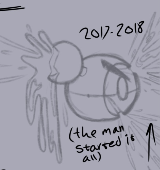
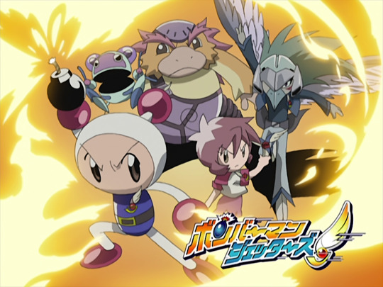
#bomberman Jetters anime
Note
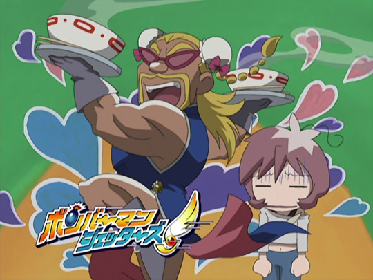
You should draw mighty and Birdy kissing with tongue
The moment I read this I had a vision

#bomberman#bomberman jetters#bomberman anime jetters#bomberman Jetters anime#bomberman anime#mighty bomberman#Birdy bomberman#artists on tumblr#artist#digital art#artwork#cartoon artist#digital artist#my art#art#fan art#mighty Bomber#mighty bomberman jetters
75 notes
·
View notes
Text
fucking hompfs him
374 notes
·
View notes
Text


Spooky boys
Happy Halloween!
#bomberman jetters#bomberman#bmj#bomberman jetterz#ボンバーマンジェッターズ#art#Animation#bmj mighty#why that demon kinda fruity tho
45 notes
·
View notes
Text
this is gonna be an insane thing to talk about to but one of the things that makes bmj so enjoyable to watch even as a very obviously limited animation kids show from the early 2000s is that it often surprises me in how colorful it is. one of the most consistent artistic elements of the show is the delicate mix of saturated nature tones combined with the often duller mechanical/alien ones, which bring to life a kind of washed, cel-like feeling to even some of the most mundane shots. see below


This is a kind of color grading and production quality that wasn’t even seen in a lot of more elaborate, higher budget productions in the 2000s. the transition to “digipaint” anime (aka digital animation over cel animation) often left many anime with drab, flat, and what I can only describe as “sun-bleached” colors in their final masters, which while probably deliberate for some productions, rarely looked good and resulted in a homogeneity of digital production stuck in the transition to new technology


Note the muted palettes, the lack of saturation in the skin, the grey shadows, the sometimes weird green color grading, etc.
I’m aware that this kind of groddy digital look has a place in anime history and also in the nostalgia and fondness of many people who watched anime in the early digipaint era. it can look good after all when the artists are more aware of color theory and how to properly utilize a more “degraded” color palette, such as the iconic soul eater:
But bringing this back to BMJ it’s just another of those subtle notches of effort in the show that peels back the love the artists put into the production. It gives a life life feeling to the characters and the lens through which the audience views the entire scene of events, a narrative steeped in automatic identities facing off against autonomy becoming itself and moving not just past grief but through it.
also it just looks nicer than 80% of the shows in the early 2000s and I think it deserves its chops
#BMJ#bomberman#bomberman jetters#soul eater#personal post#analysis post#if you’re here from my ultrakill shitposts wondering what the hell im talking about go watch bomberman jetters it’s really good#2000s anime#early 2000s
27 notes
·
View notes
Text

Finished my rewatch of Bomberman Jetterz 🎈
#bomberman#bomberman jetters#bomberman jetterz#shirobon#what a sweet little anime. its better than i rememberd
200 notes
·
View notes
Text

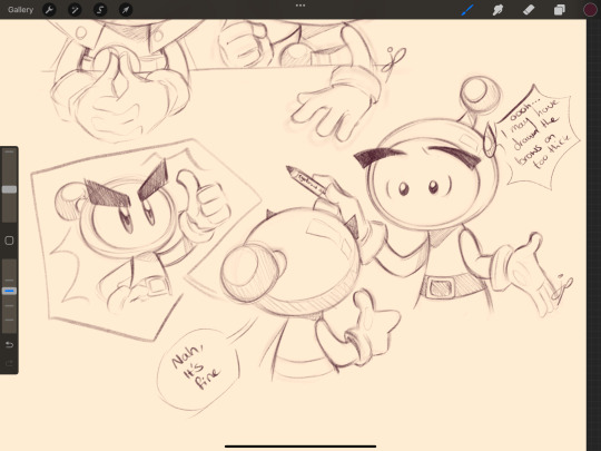
Binge watching bomberman jetters and b daman bakugaiden again. I honestly want a new bomberman anime someday 😭
Anyway, have some dumb doodles ✨💣
48 notes
·
View notes
Text


This relationship between Thunder Bomber and Max...and after all, Thunder Bomber won.

and now enjoy the golden Thunder Bomber

#bomberman#Bomberman jetters#Bomberman jetters spoilers?#I'm playing the Japanese version because the presence of the anime's original VAs
18 notes
·
View notes
Text
#aesthetic#webcore#pixel art#kidcore#pixels#bomberman jetters#bomberman#gba#gameboy advance#mighty (bomberman jetters)#pommy (bomberman jetters)#2000s kids#2000s core#2000s anime
13 notes
·
View notes
Text
Doodling humanized characters (minus Mighty on top right), also the years represent of who I like and trying new things :)

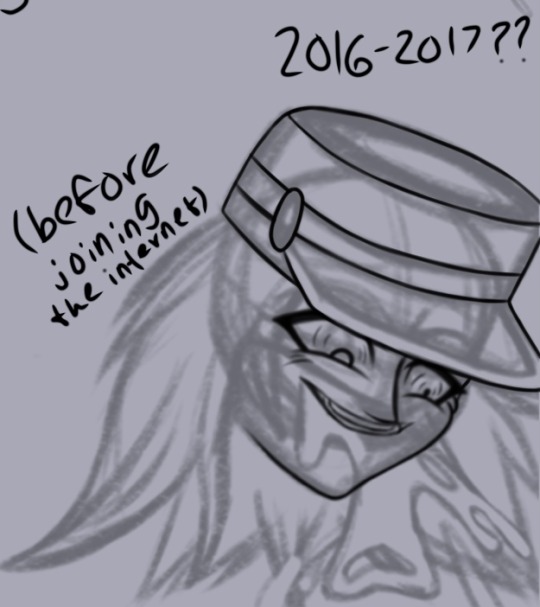
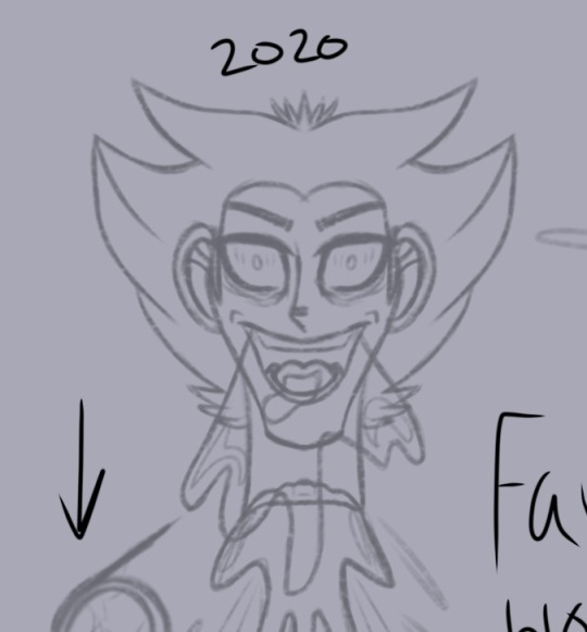
Can’t wait to finish lining and experimenting colors and other stuff too!
#lunarfeat’s art#transformers animated#this is tugs#bomberman jetters#thomas and friends#ttte humanized#tugs humanized#humanformers#tfa starscream#tugs hercules#bmj mighty#ttte henry#wip#Update: I redesigned Henry again and this is his old concept (along with Hercules)
14 notes
·
View notes
Text


I drew shirobon from Bomberman jetters in MagicalDraw
It was very challenging because I forgot to use the app and it was the first time that I draw him lol
Unfortunately the last drawing I could not finish it because the admin clean the canvas before I finish
#art#drawing#anime#fanart#fandom#cute#kawai#kawaii#bomberman#bomberman jetters#cute art#so cute#anime art#anime fanart#anime and manga#manga#manga art#shirobon#artwork#artists on tumblr#digital art#my art#ボンバーマン#爆弾男#white bomber#white bomberman#Bomberman jetters fanart#kawaii art
3 notes
·
View notes
Text
So I have this notebook to be my year's bullet journal, but I didn't really like this quote on the cover (I wanted a "get sh1t done" one for it sounded more accurate lel).
The quote:

So I have decided to put this alien sticker combined with the 'awkward' one.

When I showed it to my friend Brian, he immediately reminded me of Daibon's catchphrase: I'm an awkward man. I thought that was brilliant and decided to edit and print a Daibon polaroid and here is the result!
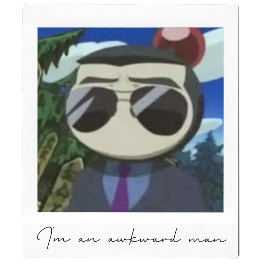

And this is my 2023 bullet journal UwU
#bomberman jetters#bmj#daibon#bomberman jetters daibon#bomberman#bullet journal#bujo#2023 bujo#animes#polaroid
15 notes
·
View notes
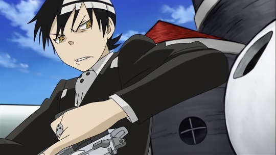
Text
Jetters Yaoi is wild guys
Context: Mightyand Birdy we’re sneaking around a Hige Hige base trying to recover stolen items when they fell into a trap.
Birdy is the first one to realize their position.
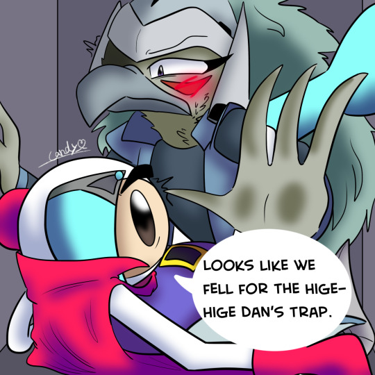

Also now accepting requests for Mighty x Birdy Yaoi and stuff! Added that to the request list!
#artists on tumblr#artist#digital art#artwork#cartoon artist#digital artist#my art#art#fan art#gay art#gay men#gayhot#gayboy#gayman#gay love#gay twink#Birdy#bomberman#bomberman anime jetters#bomberman jetters#bomberman anime#bomberman jetters anime#bomberman Birdy#Birdy bomberman#mighty bomberman#bomberman mighty#Yaoi#yaoi couple#bomberman yaoi#anime Yaoi
8 notes
·
View notes
Text


a few eyecatches from mid s2!
#bomberman jetters#too many characters to tag#and i have mixed feelings on the mujoe one but frankly with their other treatment of him#i'm pretty sure the animators wanted him in that outfit#and honestly so do i#i didn't say that
25 notes
·
View notes
Text
Spoiler warning for like, the entire thang. Heed my warning or I’ll be forced to bash ya until you forget so you can experience it properly.
I feel like I should also warn for movement, it might strain your eyes, but I didn’t think it was too bad.
I don’t usually do edits but this has been bouncing around in my mind for ages now, so I decided to give it a go. Was limited by free tablet apps but honestly all things considered I did pretty well, I think. Editing audio in iMovie is a pain.
Also, the editing file had absolutely no business taking up 7GB. SEVEN. SEVEN WHOLE GIGABYTES. MIGHTY WAS HUNGRY I GUESS. DAMN. A full 5% of my disc space 😭
I thought this song really fit him with the lyrics yah gah
#bomberman jetters#bomberman jetterz#bomberman#BMJ#edit#video edit#fan edit#anime#BMJ Mighty#perfect nothing#This took 10 attempts to post#ボンバーマンジェッターズ
7 notes
·
View notes
Text

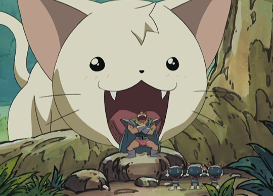
I love the look on this higehige bandit's face
Not a thought behind those eyes
6 notes
·
View notes
Text
Lookie who I made in Miitopia! Shirobon (White Bomber, but I call him Shirobon in Bomberman Jetters)
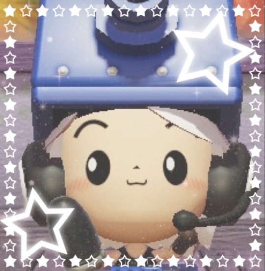

My access key is 16TPFH3
28 notes
·
View notes
Last Seen Blogs
bambooloading335
bambooloading
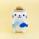
amigurumidaily
AMIGURUMI DAILY

yogafashionsworld
lululemon Lover
yogioli15-blog
the blonde vegan
pickled-paintbrush
Art has Layers