#but a 3D model has a texture map on it so like
Text
Okay, to counteract all my complaining, here are some (lore friendly) mods that I just like a lot (no animals, people, weapons/armors, mesh/texture replacers, etc. because there's too many and it gets boring.)
-
Ghosts of the Deathbells: adds a really rare, somber event to picking a deathbell flower.
Falmeroon: adds Snow Elf ruins to some remote edges of the map. I've made an unofficial SE port here.
Snow Whale Bones: adds the remains of Snow Whales in some mountainous areas (iffy canon but sorry they are Cool.)
Windmills of Skyrim: adds windmills with unique, custom-painted sails to farms.
Scarecrows of Skyrim: adds scarecrows to farms.
Scribes of Skyrim: makes books and notes use a variety of typefaces (any fellow Pentiment fans out there?)
The Old Ways-Nordic Religion: adds totems representing the Nordic pantheon around Skyrim. Has patches for the next recommendation.
The Great Towns/Villages series: overhauls the smaller, worldspace towns in a really cool way, includes voice-acted NPCs. Personally, I like Kynesgrove the best because it actually adds to the lore about the Nordic pantheon. For Shor's Stone, I recommend this mod as well.
Redbag's Rorikstead: I like this mod over Great Village's version because the houses have sod roofs and I'm a sucker for sod roofs.
Capital Windhelm Expansion: adds some really thoughtful lore touches (Dunmer refugees outside the walls, an Arena, and a cool vampire quest)
Relic of Dawnstar: adds a Gehenoth skull to the White Hall (requires Cities of the North), inspired by the lore of the Travels game
Environs series: thoughtful additions that makes certain places change over time.
WiZKid's mods: especially Lund's Hut, Lively Farms, Icy Windhelm, Pinewatch, Hall of the Dead Stained Glass Windows, and Pavo's House. Sepolcri is also pretty good but loses immersion points for using celtic cross gravestones. You can pry Lanterns of Skyrim II from my cold, dead hands, though. Lux? Idk her, LoSII is my bestie.
Fancy Sleeping Tree Replacer: the Sleeping Tree is supposed to be a remnant of the sentient trees of the flying city of Umbriel (from the novels.) It should be weird, is what I'm saying, and this mod makes it alien and beautiful.
Unique Culture Riverwood: a mod that gives Riverwood its own style of farmhouse and a little more personality. The author has also made a mod for Falkreath.
Immersive World Encounters: adds more and edits World Encounters, including encountering faction NPCs out and about (ex. the Companions outside of Whiterun doing Companion-y things in the wilderness).
Glorious Doors of Skyrim: adds some really cool doors. 'nuff said.
Redbag's Dragonreach: adds some unique flair to Jarl Ballin's crib.
Cultured Orc Furniture: replaces generic furniture in Orc Strongholds with custom furniture.
Lavinia's Memorial: adds some gifts from her grieving parents to the little girl's grave in Falkreath. Ouch.
Nocturnal Moths: adds moths that spawn around lanterns at night.
Moons and Stars: fixes the positions of the stars and moons, as well as making moon phases consistent.
DK's Realistic Nord Ships: replaces Skyrim's ships with some gorgeous new models.
Morgenstern's Mushroom Circles: adds more fairy rings in the wilderness. Delightful!
Bloodmoon Brodir Grove: makes the grove in Solstheim a little more like it was in the Morrowind DLC. The mod author also has more mods that bring Bloodmoon details and locations to Solstheim.
Ships of the Horizon: does what it says on the tin.
EVG Animation Variance: the whole animation series by Everglaid is nice (haven't tried Traversal yet, but that is some incredible technology) but I especially like this one for the old people animations
jasperthegnome's houses: these are SO cozy and comfy.
Arctic- Frost Effects Redux: makes frost spells have cooler effects (including 3D ice spikes)
Northern Roads- Let Me Guess Someone Stole Your Sweetroads: a plugin that cuts down on Northern Roads, removing all the landscape changes and bridges and just keeping the clutter. Way more compatible than the original mod.
Skyrim Bridges: this is my favorite bridge mod. There are many, but I like this one best.
Edit: forgot two tiny mods in my original post:
Nightcaller Temple Unique Shrine of Mara: replaces the generic shrine with a wooden shrine Erandur carved
Broken Tower Redoubt Unique Shrine of Dibella: similar to the above mod, but Reachmen carved this one.
508 notes
·
View notes
Note
Another shader on my mind if you're still doing them - A Short Hike! It has different pixel size options in-game that first glance look like just a filter thing, but things like powerlines and wind effects seem to display differently in each mode. Thoughts?

the wholee thing is rendered really small to a texture and increased in size without any filtering!!
apart from that, everything is toon shaded!! lots of common themes between all of these stylized games mapping their 0 to 1 lighting values to other values to achieve toon shading, here's a short hikes!!

just imagine it as the left gradient being the "actual light value" and comparing that to the right gradient. thats going to be your mapped value!! easy toon shading
each object also had its own custom values to mess with, just to make sure everything looked juuust right since there were so few pixels to work with
another thing that helped a lot with easy level building & prototyping, (something super important when youre a tiny team like adam. and also just in general) is that all the terrain used something called a triplanar shader
essentially that just means instead of needing to 3d unwrap all your terrain into uvs to put textures on them which takes forever and will leave you not really wanting to make any huge changes or youd have to unwrap things again, triplanar shaders just project the texture onto the material based on its world position, and what direction its facing
here you can see it in action - if the model is facing up, it uses the grass texture, if its facing to the sides, it uses the rock texture. and because this is terrain and it never moves, instead of using uvs you can just tell the texture to be mapped to where it is in the world

its sort of like the chowder effect, but instead of using screen position to drive the texture, it uses world position. but this let him build up the terrain incredibly quickly
and lastly the post processing!! just a bit of fog, edge detection, and some color adjusting

here's a little twitter thread on it, and heres a longer gdc talk!!
#if i make a long post like this its because ive already watched the gdc talk on it before agjhbfgjfhbgh#cedricredwood#ask#potion of answers your question#gamedev stuff
433 notes
·
View notes
Text
Updating... The Tattooer (ver. 3.4)!
Finally! Took me a while, huh. This is the updated version of the Tattooer project. It skips some steps, making the workflow much, much faster! Huge thanks to @applewatersugar for his
suggestion on how to bake textures while preserving the transparency. This is kind of a repost of the original Tattooer post, but it actually has some new stuff and a few changes here and there, so please take a look if you want to learn how to use this new version.
This is a series of Blender template files already set up to quickly bake textures from The Sims 4 to The Sims 2. The different Blender files will allow you to:
-Bake body textures from TS4 to TS2 (Female)
-Bake body textures from TS4 to TS2 (Male)
-Bake body textures from TS4 (Female) to TS2 (Male)
-Bake body textures from TS2 (Female) to TS2 (Male) [Bonus!]
-New! Bake face textures from TS4 to TS2 (Unisex) [Bonus!]
-Bake head textures from TS4 to TS2 (Face + Scalp) (Unisex) [Still experimental]
Check the file names to see which one is which, and the resolution of the baked texture it will give.
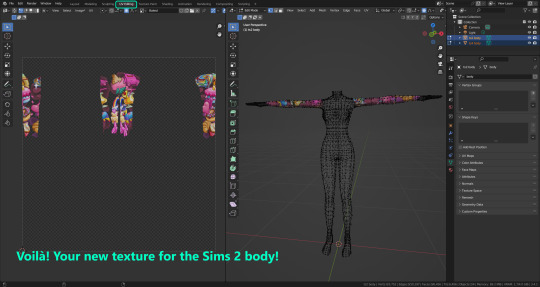
Everything you see in the render above was 100% converted using those Blender files.
Download here! SFS / GD
Update: Version 3.4.1 (27/08/2023) Fixed some issues on the shoulders for the AF-body-4t2-1024 and AF-body-4t2-2048 templates. Now the top straps on most converted underwear/swimwear should look right.
Update: Same version (13/12/2023) As requested, added a new spanish version of the included pdf guide!
These templates were made mainly to bake and convert tattoos, but there’s more you can do with them if you get creative. I have to say, these are NOT perfect. Results may vary depending on what you are trying to convert, so! With that in mind, this is all the stuff you will be able to convert almost seamlessly from TS4 to TS2:
-Tattoos.
-Other body details such as body hair, scars, freckles, supernatural/occult details…
-Body painted underwear and swimwear, as well as some other clothing that’s mostly painted on the body.
-Socks, stockings and maybe leggings.
-Even skintones! In some areas they will look weird, so I recommend editing and blending them with other existing TS2 skins.
-Makeup, eyebrows and beards. In the old version this was just a proof of concept, but now I’ve added a new Face file template which gives some pretty decent results!
-Hair scalps. Very useful when converting some hairs! Although keep in mind part of that texture might also need to be baked on the face mesh, you know, that hairline makeup stuff.
Got your attention? Nice! Editing some of the textures from TS4 to match the UV mapping in TS2 using a 2D editing program can be incredibly hard. That’s where texture baking in Blender comes to the rescue!
You will need to download Blender, at least version 3.4, but you could always use a newer version. It is only incompatible with versions older than 3.4.
-You can download Blender for free here.
-You will also need Sims 4 Studio to extract the original Sims 4 CC textures you want.
In the first version of these Blender files, there was a necessary step using Photoshop, but that’s no longer needed. However, there’s still a tiny extra step which requires resizing the newly baked texture on some of the high resolution templates, so you might need a 2D editing program like Photoshop. More on that later.
So, before we begin, let’s clear out some questions you might have. What the heck is this texture baking thing and what does it do? Well, let’s imagine you have a video projector and point an image into a blank wall. Then you pick up some brushes and start painting and copying that projected image in that wall. Texture baking is kinda like that when it comes to 3D models. You align two models and match them as closely as you can in shape and form, and once you adjust some parameters and values, Blender does the rest for you: it will give you a new texture for a new model with a different UV map. These files I’m sharing have everything already set up, so it’s a matter of plopping in that Sims 4 texture and you will get that new texture for TS2 in just a few clicks.
This tutorial assumes you know literally nothing about how to use Blender, so if you feel uncomfortable with it, worry no more! This will guide you with pictures showing where you need to click and explaining what is happening. For Sims 4 Studio and Photoshop the process might be a bit less detailed, but still this should be pretty beginner friendly. For this tutorial, I will use some tattoos as an example (properly credited at the end of the post). Alright, enough with the rambling. Let’s get started!
·EXTRACTING TEXTURES IN SIMS 4 STUDIO:
First things first, you will need to extract as pngs all the textures you want to convert from TS4 using Sims 4 Studio. It should be pretty straightforward. Just open the packages and export the Diffuse textures. Keep them organized in a folder for easy access.
·BAKING THE TEXTURES IN BLENDER:
PRELIMINARY STEP 1: CONFIGURING BLENDER’S GRAPHICS SETTINGS:
Open your preferred Blender file depending on what you’re going to bake and the desired resolution (in this example I’m going to use the AF-body-4t2-1024 file). Before we start messing around in Blender, there’s one thing you should set up. It is a onetime step, and once it’s done, you won’t need to do it again. So, does your computer have a dedicated graphics card? If you don’t know or you’re not sure, just skip to the next step. Configuring Blender so it uses your graphics card instead of your CPU will make the baking render much faster, so it is recommended you set it up correctly.
If your computer has a dedicated graphics card, click File (1) > Preferences (2) > and on the window that pops up click System (3) > and select CUDA and make sure your graphics card is there and tick it (4). I have an Nvidia Graphics card but your case may vary. Once you’re done, click on the tiny button on the bottom left corner and Save Preferences (5).
PRELIMINARY STEP 2: CHOOSING THE RENDERING DEVICE:
Click on the tiny camera button on the right, called Render Properties (1), and on Device (2) select GPU Compute if it’s not already selected. If you’re not sure if you have a graphics card or not, just select CPU. Then select the Material Properties tab (3) and Save your changes, either by pressing Ctrl + S, or clicking File (4) > Save (5). You might need to do this second step with the other Blender files, but once you have it done and saved, you won’t need to do this again. Okay, time to get into the good stuff!
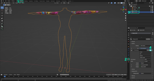
·STEP 1: LOADING YOUR TS4 BASE TEXTURE:
In the Material Properties tab, click the folder icon that says Open (1) and on the window that pops up, navigate through your folders and select your first texture. To navigate easily, the 3 buttons on the top right (2) are for the display mode. They will show your files in list mode, vertical and horizontal, and the one on the right will display the file thumbnails, pretty useful if you want to easily preview your textures here. The icons on the left side (3) will let you go one folder back and forward, go to the parent directory, and refresh the folder in case you just dropped something new in there. Double click on the image you need and that will load the texture into the Sims 4 body model, named “ts4 body”.
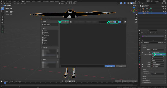
·STEP 2: SETTING UP YOUR SELECTION AND BAKING THE TEXTURE:
On the top right of the screen, you will see the names of the 2 models in the scene. Hold the Ctrl key in your keyboard and left click on the “ts2 body” model (1). If you did it correctly, you should see “ts2 body” in a yellowish orange color, and right down below, “ts4 body” should look more like a red orange. If not, try again by clicking first on ts4 body, and then while holding Ctrl click again on ts2 body. Then switch to the Render Properties tab by clicking the tiny camera icon (2) and click Bake (3). Depending on your screen resolution, you might need to scroll down a bit with your mouse to see the Bake button. Wait a few seconds for it to finish. You will see the progress percentage down on the bottom of your screen. Don’t panic if you notice your computer fans start ramping up, that’s completely normal! As I said in the beginning, using your GPU will bake the textures much faster than the CPU.

·STEP 3: SAVING YOUR NEW TS2 TEXTURE:
Once it’s finished, switch to the UV Editing Mode by clicking “UV Editing” on the top of your screen. And there it is: your new texture! You might have to scroll up your mouse wheel a bit to zoom in and see it in all its glory on the left side of the screen. We’re still not done yet though. You need to save it to yet another new folder (always try to keep your stuff organized!).
You can save it by pressing Shift + Alt + S, or clicking on Image* (1) and then Save As… (2). That will pop a window where you’ll need to navigate again and save it somewhere. Give it a proper name (3) and hit Enter to save it… well, Enter doesn’t always work for me for some reason, so if that happens just click Save As Image (4). And that’s it! You’ve successfully converted your baked texture. Congrats!
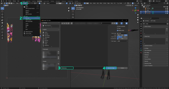
·STEP 4: GOING BACK TO STEP 1:
Alright! If you’re done with your textures, you can close Blender without saving and call it a day. But let’s say you want to keep baking other swatches. In order to go back to step 1 and start the process once again, click Layout (1), go back to the Material Properties tab (2), select “ts4 body” (3) and click on the folder icon (4) to open and load your next swatch.
Then it’s just a matter of repeating the process from step 2. When you’re ready to move on, close Blender without saving. If you see a small check telling you it will save some images, make sure you uncheck it, so you will be able to use it again in the future from the starting point with no issues. I don’t think it really matters if you accidentally save your progress in these files, but I like to keep it clean and fresh so I can do the process where I left it from the beginning next time I open it. And in case you mess up and save somewhere, you can always just delete the .blend file and download the template files again.
In case you’d like a video tutorial on how to use these files, the amazing @platinumaspiration recorded this fantastic video showcasing the process! You can watch it here.
One final note: some of the baking .blend files save the textures with a resolution of 2048x2048 pixels, as clearly stated at the end of their file name. That’s way too overkill, because TS2 only properly supports up to 1024x1024 for most of its textures and you should always resize your final product to that max resolution (or lower if needed). I just made those 2048 versions because there might be some really tiny and slim details on some tattoos that might look a little too blurry when baked into a 1024 resolution texture, so for those cases use that if you want and then resize them using your 2D editing software of choice.
In Photoshop, in the Resample mode of the Image Size menu, there are a few options to choose. For the fine details, I like the Nearest Neighbor (hard edges) option, which, even if it looks a bit pixelated, it still preserves most of the texture and quality.

For anything else, I would just directly bake them using the 1024 versions in Blender (512 for the face and scalp).
And for the folks who feel comfortable playing around in Blender, this is just the beginning! Texture baking opens a LOT of possibilities, so feel free to move stuff around and edit the models to your liking! If you notice the baked textures look warped or stretched somewhere, or don’t like where some textures are placed in the S2 body, poke around that area moving stuff and then give it another try. The main objective of the baking process is keeping both overlapping models as close in shape as possible. You may also edit and save new copies of the templates, or make new ones from scratch using mine as a reference (keep a close look on those Baking settings and values, I think they work pretty well) and share them if you want to. Go ham, do whatever you want with them! I still have plans on making templates to convert body textures from Sims 3 to Sims 2, but for now it’s not on my priorities, so we’ll see when that happens.
Whew! Hope none of this was too confusing. Need help or have any issues with these? Please ask/message me here and I’ll be glad to help when I’m able to!
Credits for the CC used in the render demonstration:
-Skin by Sims3Melancholic.
-Eyes by Northern Siberia Winds.
-Eyebrows by PeachyFaerie.
-Tattoos by xtc.
-Top by SerenityCC.
And the Tattoo I used for the tutorial can be found here, by ValhallanSim.
Last but not least, a huge thanks to all the people who somehow contributed to make this project and update possible, either by doing initial testing, finding issues to fix, or teaching me new Blender tricks to make the workflow way faster and easier. So thanks again to @elvisgrace @moyokeansimblr and @applewatersugar on Tumblr! <3
And thank you for reading! Hope you have fun playing with this (not so) new toy hehe.
#tattooer project#tattooer update#ts2 tutorial#ts2 resources#ts2 blender#ts2 overlays#ts2 texture baking#4t2 conversion tutorial#this took me so LONG to update#im really sorry for the delay :(
286 notes
·
View notes
Note
Hi! I saw a post where you had a game made in godot with old school rendering, do you maybe have any tips on how to make godot render a game like that instead of its normal rendering method?
I'd be right happy to!
I'll try to make this concise lol, I always end up overexplaining and then getting lost in the weeds. Buckle up, it's a loooooot of little little things that all add up.
First off, you should decide which look you're going for. N64 and PS1, the two consoles I'm emulating, both had drastically different specs. (plus, there's plenty of other early 3D systems I've not even touched!)
The N64 had texture filtering (textures were interpolated aka "blurry"), it had floating point vertex precision (points moved correctly), it had perspective correction on its textures (no warping)
The PS1 had no texture filtering, no floating point vertex precision (vertices snap and pop around), affine texture mapping (textures warp weird). I also think the color space they operate in is different? Don't quote me
So you can go hard one way or another or pick and choose what you think looks good! We don't have anywhere near the hardware restrictions they did in the 90s so go nuts.
RESOLUTION
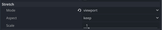
To get a low resolution window, I set the window size of the game and the window override size to different amounts

In green is actually how big the window is on my screen (4k monitor) and in red is the retro resolution I want. If you set the stretch mode correctly (an option a little further down the Window tab) then it'll make the pixels big
COLORS
Now the PS1 had the capability of showing you over 16 million different colors, but it could only display 50,000-150,000 at a time, so in order to get more fidelity out of it, the engineers implemented a dithering effect to better blend the otherwise sharp edges between colors.
I used this shader to achieve the dithering effect. If you don't understand shader languages, that's fine. There are a few different pre-built ones for looking like the PlayStation 1 out there.
TEXTURES
Textures for the PS1 could be as big as 256x256, but they were typically 128x128. And they would squish everything a model needed into there usually, at least with like player models and objects and such.
As mentioned, if you're not good with shader language don't worry. There are countless resources out there that people will either let you use or teach you how it works. But I'm gonna touch on it a little bit here.
PS1 textures had no pixel filtering, so you could see individual pixels.
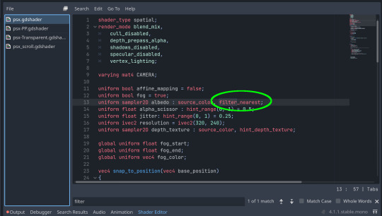
This is what determines that in the shader code. If you want it to look like the N64 (blurry lol), the proper hint is "filter_linear". Note that it won't be 1:1 with N64, cuz they used bilinear filtering (which kinda sucks and causes weird quirks) whereas now you'll only find linear or trilinear filtering. It's a negligible difference imo.
PS1 textures also were only saved using 15 bit color. I'm told that Photoshop's "Posterize" filter set to 32 can achieve this, but don't use photoshop if you can help it. I use GIMP, and while a newer version might have a posterize filter, or there may be a plugin out there, my version doesn't so I cluge it a little.
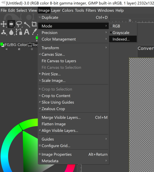

Change your color mode to "indexed", set color dithering to how you like it, and the number of colors in the palette to a number to get a good result. Usually I'll do 16, 8, 32, but occasionally I'll cheat and do a non-multiple-of-8 teehee >:3c
You can change it back to RGB after to make further editing easier.
LIGHTING
N64 and PS1 both implemented vertex lighting, as opposed to the more modern and (now) ubiquitous per-pixel lighting. Godot as it is right now (4.2 i think?) claims it has vertex lighting that you can set as a shader property but they're lying and it doesn't work yet.
The old consoles could only handle like, 2 lights though so it doesn't matter much.
The real star of the show, and in my opinion the one thing that makes a game most look like the 90s is the inclusion of vertex colors.
By multiplying the color of your texture by its stored vertex color, you can do all the shading yourself!
Plus you can reuse textures like crazy just by coloring them differently. The N64 also made heavy use of vertex colors by forgoing a texture on models entirely and just painting them using verticies. The only textures on SM64 Mario are his eyes, stache, hat emblem, buttons, and sideburns. Everything else is done with vertex colors.


Here you can see this level from my Crock Land with no vertex coloring, with some of the vertex colors only, and then with the two combined.
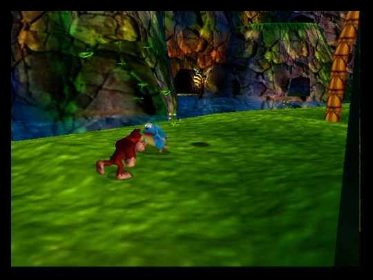
Rare loved this. Look at how colorful that cliffside is in Jungle Japes. It makes it so much more interesting than just a brown cliff face. Plus you can see the vertex coloration instead of textures at work on DK and the Gnawty.
My go-to example for PS1 is always Spyro, what a gorgeous game. All of those colors there are not made by a light or an environment. They're hand painted babey! Also! With spyro! The skyboxes are actually just huge domes made up of vertices that are colored in different ways! That's how they can look so colorful and "hi-res".
There's plenty more you can do, like adding a CRT filter or a little bit of chromatic aberration which I haven't gotten into yet.
The way I've learned all this is just by being curious as to how the old consoles did their thing, and slowly accruing the knowledge over time. There's still infinite stuff I don't know too.
I hope that helped! And wasn't too longwinded or confusing! Like I said, it's all about piling up tons and tons of little things, small details, weird graphical quirks that really bring out the retro 3D feel for me.
And I didn't even get into the modeling side of things! That's an entirely different "color-of-the-sky"-sized post though.
I'd be happy to re-explain or explain more about any of this!
136 notes
·
View notes
Text
something that has always fucked me up is the frankly terrifying exponential skill acceleration in the creative field. so many of the young artists I know now, even myself, are at a skill level that 25-30 years ago could have gotten them real jobs in animation or game design, even lauded as being top of their line of work, but are hardly even a blip on the radar in today’s industry where the skill ceiling is now miles above achievable for so many.
I look back at the kinds of art that was being made by the professional artists back in the 80s and 90s for comics and animation and some of it is downright amateurish compared to today’s work. It was roughshod, silly, scratchy, experimental. It wasn’t preoccupied with fitting into the bland Triple A standards or warping to fit what huge corporations expected, because those expectations simply didn’t exist yet in a world where video games and animated film and fantasy illustration were still in their infancy. The art in concept art felt so much more alive, more human. Nowadays I see people trying to get their feet in the door slaving for years trying to learn rendering techniques or portfolio tricks to even get their work in front of a recruiter, making stuff they don’t even care about just for the chance to be taken seriously. Strange how now more than even bigger studios are being ridiculed for their bland and uninteresting design/writing choices, where smaller studios with more creative control and more ready access to independent voices and visions are cranking out wildly popular, original titles left and right.
this sort of ended up longer than I expected, and rambling, but it’s something I’ve felt for so long as an artist who spent 15 years desperately trying to “get good enough” for a professional studio. The problem is that in the corporate capitalist hell we live in here in the US, “getting good enough” is almost never achievable, because those goalposts are always moving. You want to be a background artist? Well you need to learn how to do 3D modeling, texture mapping, physics simulation, how to use lighting in game engines. You want to be a character designer? You need to know rigging and clothing simulation and how to apply animation in X software. Also you need to do every style known to the world plus more, except in the end the studio will probably just ask you to photobash three dozen designs that all look the same anyway.
I understand there’s more to this than I’ve mentioned, that the world has changed in the 3 decades since the mid 90s, that there are millions of artists and only a few hundred thousand jobs in any creative field at any given time, that it’s reasonable to expect people to learn new things to better work as technology advances… but it seems so particularly crushing to artists, who oftentimes pour so much of their own heart and soul into what they do, and who are still expected to monetize, adapt, and distribute their skill like it’s some corporate tool and not a gift from evolution for us to record and express ourselves. Art and design are the building blocks for humans to understand and capture beauty and pain, joy and sorrow, and it’s disheartening to see that vulnerable creativity stripped away in favor of producing sterilized, corporate friendly “products”.
28 notes
·
View notes
Text
A Hat Full of Sky
Best viewed in 3D on Sketchfab: https://skfb.ly/oDOIH
I don't remember why I didn't post video of this here? Maybe the quality? But there you go.
Tiffany Aching fanart / personal work.
—
I also just tried Spline app: is super cool but lacking some of the features that make this look how it should:
Spline can't replace Sketchfab for me (yet)?
No alpha (transparent texture) or luminous map support
Controls could be improved
Other small stuff
But this would be awesome for models that don't need those things. It's super fast. And it has a lot of cool features besides, like animation & the fact that you can actually model in it! Only a few years ago 3D was still relatively difficult to get into, so this is incredible for a free web browser app.
—
Spline & Sketchfab were only used to render this model in a web browser / real-time. Tiffany was made with Zbrush, 3DCoat, C4D, RizomUV + 2D painting.
Folks have been asking about process. I didn't record video of this; it took dozens of hours over months. But I do always take screenshots & plan to compile something when I have more time.
#tiffany aching#discworld#3D art#3d illustration#terry pratchett#witch#witch art#c4d#zbrush#sketchfab#3dcoat#hand-painted
191 notes
·
View notes
Note
I really truly hate to ask but in your bio when it says map enjoyer the map part is not an acronym. is it??? or u mean the paper maps
ah. a normal map!
source. i think this is very pretty. this is a normal map. The idea is like. Suppose we want to have a 3d model of an old desk like this:
If we just throw that picture on a texture and hit render, we get something like this:
Which doesn't look particularly realistic! Notice how the light is staying in one place and all the highlights on the places where the pencil has dug into the wood don't move to catch the light. Our eyes automatically pick up a lot of detail about the texture of surfaces, and this doesn't look real.
in particular, the angle of the surface determines how much light is reflected at the camera. So we need a way to store the angle of every point on our surface! But it turns out we can use a neat coincidence; we see 3 primary colors and live in 3-dimensional space! To store the orientation of a surface, you can use the normal vector--the arrow perpendicular to the surface. (I like to imagine the object being covered in little tiny spikes sticking straight out at a right angle. We need a way to store those spikes.) Since we have 3 colors and 3 dimensions, we can encode the angle of the normal vector spikes as a color, where the red channel means the left-right angle, the green channel means the up-down angle, and the blue channel means the vertical angle sticking out at the viewer. So to go back to the old image:
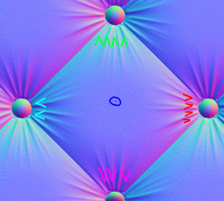
The cyan bits to the left (some green, some blue, no red) are spikes pointing to the left. The red/pink bits to the right are spikes pointing to the right. The neutral blue-grey color in the middle is a spike sticking straight up.
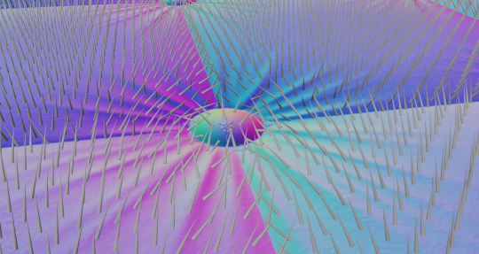
There's lots of ways to make a normal map. You can paint them yourself, you can model a really complicated geometry and then calculate a normal map to apply to a much simpler geometry, or you can create it as the "derivative" of a heightmap (a greyscale image where white is high bumps and black is dips). There's even cool neural network things that try to infer the height/normal map from a picture or video!
Here's that normal map I stole applied to a totally flat grey square, with the light moving. Look how convincing the illusion of depth is!
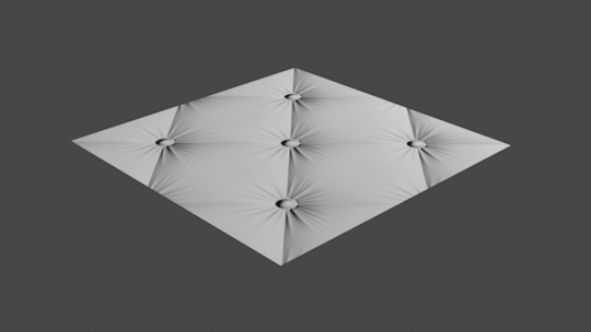
Here's two grey cubes smashing into one another except one has a normal map applied.

So I think this is a really cool technique! But I also think that normal maps, the images themselves, are stunningly beautiful. That's why the background of my avatar is a normal map!
Shoutout to gif.ski for making those gifs. I'm not really sure why its quality is 10x what i get from imagemagick or ffmpeg but it sure as hell is.
#thanks for the ask!#cw pedophila mention#re 'MAP' in the ask though. to be serious for a second.#thoughts alone (even pedophilia) cannot be bad in the absence of harm done. CSEM/molestation/sex w/ minors is very bad.#we stop CSE not by demonization but through better research/treatment and primarily thru structural changes to society/organizations.#(if this puts me on your DNI you are welcome to unfollow.)
23 notes
·
View notes
Text
Practice 1
assignment 8, Concept Art -Development assignment 02 Acquire 3D Technique
. Blog post
In addition to using images to tell stories, I would like to explore the use of 3D technology in concept design. With the advancement of computer technology, today's concept design is not only expressed in the form of 2D drawing, but with the popularity of 3D software (e.g.: zbrush; Maya; blender, etc.), more and more concept artists are beginning to use 3D technology as an aid to their own concept design, which not only improves efficiency, but also facilitates communication with the 3D modelling department.
So learning how to use 3D technology was the other main reason I came here.
I was going to make a 3D model of the bionic woman I designed in my first section of Creating "Concepts" (below).
However, once I had drawn the 'front view', 'back view' and 'structural breakdown' of the character(As shown in the picture below), I realised that the amount of work involved in this design was too much for me to do in a short three week holiday.

In my short three-week holiday, I couldn't do it all at once:
1. storyboarding of "knock".
2. digital media: source and significance.
3. 3D model of bionic woman.
I changed direction in time to explore 3D technology with another design project, 'human and inhuman', which is one of the most popular of all my blog posts. That's also the reason why I decided to continue with this project.

I used Zbrush to sculpt more detail for the monster character, especially the face (shown below)
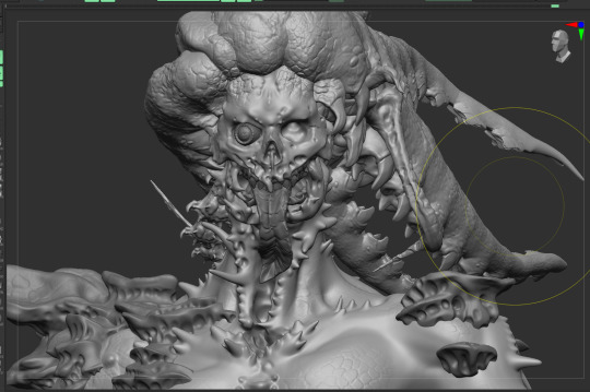
I chose the 3d software that most concept designers use: blender to adjust the material and render the model, in order to reduce the pressure on my graphic processing unit, I streamlined the model that has subdivision in zbrush to the minimum number of facets and saved the model and imported it into blender. But the result was not good, because the 3D model was streamlined in the number of faces, so many details that I had already sculpted in zbrush disappeared, and the edges of the model became so rough that you could see poly (as shown in the picture below).

So, I went back to zbrush and re-expanded the UVs for the "sub-tool" of each model.

Create a displacement map for each "sub-tool" and export it (as shown below):

Connect the displacement map of each "sub-tool" as a "texture map" to the material output of the blender (as shown below):

The final result was achieved by tweaking the lighting and material modifiers to achieve a highly detailed, lit and textured result, and rendering a Spinning turntable animation.

Thanks for watching~
27 notes
·
View notes
Photo
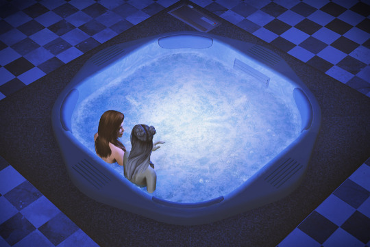
Here’s my replacement for hot tub water /and also water splash drops (it will affect some other water drops, like swimming pool splash).
TS2 Hot Tub water default
✦ Download (SFS)
Details inside readme.txt file

* Please note most custom hot tubs use custom water, but it’s very easy to change that. Mini-tutorial on how to enable default water for custom hot tub in SimPe (and also more pics) below the cut:
This is also included with the water default file.

Each material has to have “hottubsunken_” prefix.
This should work for any custom hot tub, unless creator went an extra mile and disabled water effects altogether (that’s the case with Witcher baths by Hodgekiss - my edit of those tubs is here).
Editing the material names will NOT change the direction of water flow. Water animation & speed is enabled through TXMT, but water flow direction depends on the UV-mapping of water model. Each corner should stick outside the texture area. Creators doing square tubs tend to use standard square texture, so it looks fine. But if the tub has different shape, creator has to use custom model and water flow might look wonky.
As long as UVs are layed out flat, all you have to do is open water model in 3D software and enlarge the UV-map, to move the sides very slightly outwards.
Original TS2 hot tub water uses morph animation - unfortunately it’s impossible to export the morphs to customize the shape. If you’re making a custom square tub, you might try to adjust the mesh to fit the water surface and simply do not touch water GMDC. Please note cloning hot tubs is tricky, clones need some BHAV work done, otheriwse do not work at all.
If you need a round hot tub water mesh with morphs, feel free to extract and use the one I’ve made. My edit of HL’s round tub can be downloaded here (SFS).
I might make a square one at some point as well.


Enjoy!
462 notes
·
View notes
Text
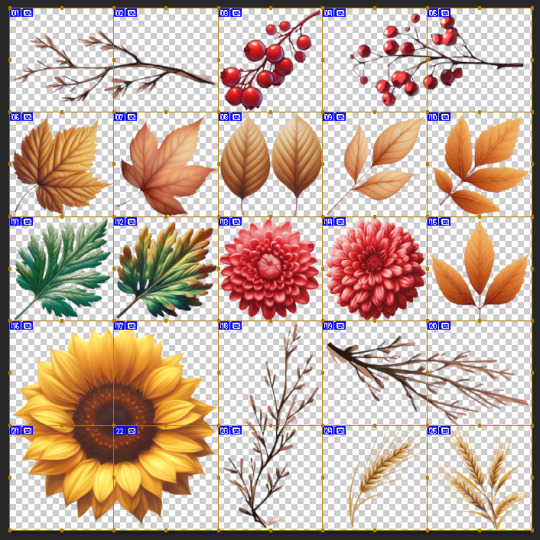
F2U Maxis-Mix Autumn Texture Atlas
Hey all! Thought this would be interesting to show and talk about.
So my harvest decor set will largely compose of various decorative items adorned with natural elements, as is common with harvest themed decorations.
In 3dCG, the problem that comes with doing items with high amounts of small detailed objects like sticks, flowers, leaves, and berries, is that if you were to model the shape and detail of every single stick, leaf, and flower, you would very quickly start to skyrocket your polycount, which can quickly add up if your item has a lot of these details repeated.
So the primary method that we see used for this in mesh where optimization is important, such as video games, you'll commonly see what is called a "texture atlas" being used. This is basically a grid consisting of various little details all on one texture map, to save both on vram (texture memory) AND polycount. That's what I've done above, by arranging all the little details, it functions as a palette to use while I actually make the items, and I can quickly pull from this grid and apply it to the mesh, and have all the details be only one texture map.
The actual textures I am using for this are modified images generated with the media synthesis model Dall-e 3, aka "AI" -- when you start to work in 3d, you come to quickly learn if you do not use stock images or other stock resources for the assistance in creating assets, you will drive yourself nuts painting every last leaf and detail. There's a very different attitude to the use of pre fabricated assets in 3d than there is in 2d, since 3d is largely viewed as a means to an end for a goal (in this case, custom content for a video game).
As for the actual use of media synthesis, and it's very understandably hotly debated status, I'm in the camp where I think it's indeed a man-made horror with terrifying implications for the public trust of media, but we unfortunately can't undo it existing much like a pandora's box, so might as well derive some human enjoyment out of it.
After making this atlas for this set, I've put some thought into making it as well as more texture atlases open source for community use based off different plants, flowers, etc, to help streamline the production of maxis-match plants and other decor for cc makers.
I've included the download of the above atlas below, lemme know what you use it for :)
As these were made with Dall-e 3, these cannot be used commercially. JSYK.
Download - SFS (.png and .dds)
34 notes
·
View notes
Text
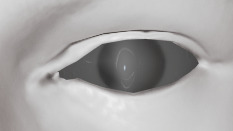
Skyrim Female Head UV: The Definitive Post
We begin as like a cooking blog's recipe, with a sort of vaguely related yet unnecessary anecdote. I've been thinking about putting modding stuff up on this blog, lately. I used to run into the problem on Discord where I'd be like: man, I'm spamming this channel, who even cares about this stuff anyway? So I made my own dev thread in which to spam these posts. As more and more people started joining, though, and still not replying to anything I wrote, I ran into the same issue where I've now become hesitant to post whatever I want in my own dev thread for fear that people will find it annoying. Silly, I know, but I figure that this here, tumblr, is the option with which I cannot go wrong, right? So long story short: this might turn into a mostly modding blog now.
I'm about to do an explanation of UV mapping as an introduction to this post, for those who know very, very, little about it. Many of you reading this may already be modellers or texturers who don't need this dumbed down, so you are welcome to skip to the big red UV map if you wish.
Without further ado: this is Nur.
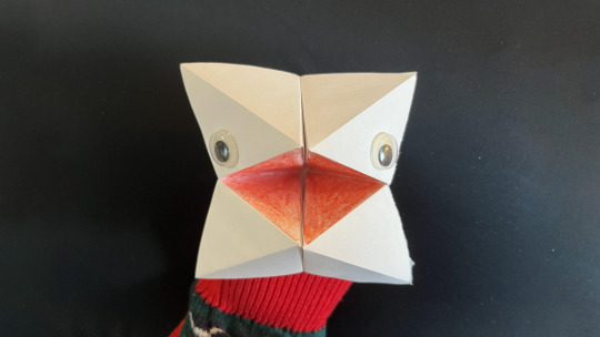
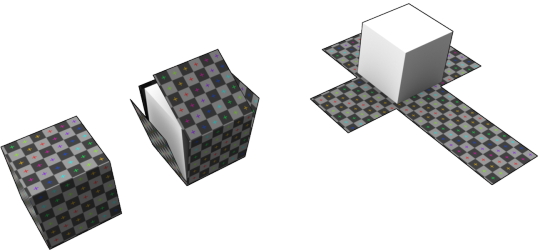
Nur is what I would call a 'chatterbox', but she was made in the same way as any paper fortune teller. One thing that you should note about her: she is three-dimensional. I have power over Nur's state of being, and I can unfold her.
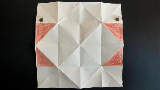
Unfolded Nur looks very different. We can see that her mouth, usually a triangular bipyramid minus a couple of faces, is now four separate triangles. We could also conceivably understand this as a '2D' version of Nur. It's flat, but it has all of the colour information that ends up on the surface of her 3D self; the area painted red is the 'mouth' part, the top squares on the left and right are the upper part of the 'face'.
Now, if we were to make a 3D mesh of Nur, we could use something like the second image for her texture and tell the computer which area of it should be shown on the surface of a given polygon. We'd do this by giving every point two dimensional coordinates, instead of inventing some kind of new format where every voxel in 3D space is assigned a colour—after all, it's only the surface that matters, right? This process of giving 3D vertices 2D-coordinates on a texture is called UV mapping. What you should really take away from this is the UV map holds the information of how to wrap a texture on to a mesh.
And, since all vertices already have X, Y, and Z coordinates, (and W is used for something else,) their two-dimensional texture coordinates are U and V.
Now, UV maps can be different from a piece of paper you fold in a few ways. What you mainly need to remember is that in UV Maps, we aren't bound by angles, length, or area – the lines making up a UV map are 'stretchy'. This mapping allows, then, for you to 'stretch' the texture over the surface of the mesh.
Now that everyone is (hopefully) on the same page, let's move on to the subject of the post!

This is the UV map of the female head mesh in Skyrim. Right away, a few weird quirks are going to stand out about it.
It is not truly vertically symmetrical along any X-coordinate.
It is kinda symmetrical along a line a short ways to the left of the centre.
Even along that line, the eye sockets are not symmetrical.
The symmetry along that central line starts falling apart towards the boundaries of the image, where there is not really very much symmetry whatsoever and what there is seems to fold more along the actual central vertical axis.
Now, if none of that stuff stood out immediately to you, or you are having trouble seeing it, that's absolutely fine! This image here should help to clarify the things I just mentioned.

The white line in the middle highlights the true centre of the image, from which (as you can see) the UV of the mesh's 'central line' is offset. The sort of lens-shapes either side of it trace the UV map's eye sockets, which are quite different.
Now, is all of this stuff fine? I mean, kind of. No, it's not really a good UV map (there are serious issues, for example, at the back of the scalp) and the symmetry problems all suck for working with it as a texture, but it's still useable and, for a high-poly to low-poly workflow, won't really impact things all that much for the creator. Painting on to the mesh, baking from a sculpt – all these will suffer for a worse UV map, but are still essentially the same process as with a different UV. The game's textures were made for this UV map, and Bethesda seem to have been able to manage fine with it.

Credit to Bethesda Game Studios. A section of the 'FemaleHead_MSN.dds'.
The issues come in more for people working on a 2D level. Making textures in photoshop? Painting some tintmasks? Then these things are going to annoy you, especially those darned eye sockets. So, is there a better way?
A Better Way
Sorry, that section header is kind of misleading. There's an extent to which this is subjective but, honestly, I don't think there really is a better way. I firmly believe that you can't fix Bethesda's UV because it's not broken. A little annoying to work with? Sure. But it wasn't meant to be another way, and it works with the textures provided by the game. There is nothing to fix.
On the 15th of March of 2012, Enhanced Character Edit (ECE) was published on Nexus Mods, in its description claiming thus:
Fixed asymmetry head mesh for Female.
Enhanced Character Edit had not 'fixed' issue of the off-centre axis of symmetry. What it had done was make the eye socket on the right symmetrical to the one on the left in the UV map. Behold, the ECE head mesh with the vanilla game's texture.
On the left: the ECE head mesh with the vanilla textures. On the right: the vanilla head mesh with the vanilla textures, as Todd intended.
ECE needed its own textures, made for the 'symmetrical' eye socket UV. There were already existing texture sets made this way (even reflecting the same eye; I suppose people preferred the left side), so it wasn't too great a problem—ECE was providing a fix for existing mods, really!
Except, well, it's a little more complicated than that. You can change the mesh, and the textures along with it, which works. This only affects the player character, however—generated face data for NPCs must be regenerated or, in the case of NPC overhauls, manually changed by the user, a thing few users actually know how to do. Pretty soon, though, people were using ECE in their character creation, and then for the NPC overhauls that they put on Nexus. Skin mods were being made specifically with use of this head mesh in mind, like SG Female Textures Renewal, which actually includes ECE as a requirement for this reason.
So everything is great and we can just use ECE, right? Sure, we have to regenerate all of our NPCs' faces which requires the creation kit and a lot of time, but that's workable. Well, not quite. Some mods have mismatched diffuse maps and normal maps when it comes to eye sockets, like Tempered Skins, which has ECE's eye sockets in its diffuse, but bases its normal maps mostly off of vanilla, including keeping its asymmetry. Mods like Mature Skin don't even use the ECE sockets, which means that those textures will look wrong on NPC overhauls based on the ECE head meshes. This issue ends up happening both ways, too—users of ECE-based textures have an even worse issue when using a mismatched mesh, to the extent that Enhanced Female Head Mesh was created, a mod that solves an issue that isn't in the base game. The ECE sockets are that ubiquitous.
Credit to DomainWolf. A comparison image from the mod Enhanced Female Head Mesh, showing the issue that ECE-based textures have when using the vanilla mesh.
Incidentally, this user has also created tintmask mods. Many of the textures included in those would have to be manually edited in order for them to look right on the vanilla head mesh.
We can see that the effects of ECE's change ripple outward without ever really becoming understood by the common modder. When installing High Poly Head, users are presented with the option of Symmetrical Eyes (Female). The average user probably doesn't know what this means, let alone whether the texture that they're using is based on ECE. If they choose the wrong option, many won't think to go back to the FOMOD. ECE itself has been far surpassed in popularity by RaceMenu on SSE—how many people would think to install it for its head mesh alone? Even Enhanced Female Head Mesh, which is specifically mesh-only and for SSE has only ~25 k downloads as of writing. Popular skin mods with symmetrical eye sockets have millions.
This whole thing impacts almost all modders. Most of them know barely anything about it. So, this stubborn ass who refuses to use the 'fixed' eyes and manually converts all of their NPC mods by painstakingly fixing things in NIFSkope wanted to write a post aggregating everything they knew about the subject, endeavouring to maybe improve people's awareness of it.
If you read all of this, thanks! I'm honestly surprised at how long it got. I hope you enjoyed my writing.
Hello, future me here. If you read this before this message was added, please note what I had earlier said about ECE not working on SSE was wrong. I have updated the previous sentence to reflect this information.
20 notes
·
View notes
Note
What are your thoughts on reselling assets in games? Criticisms imply that, if you bought the assets in a previous game, any other game reusing them should be reused n the base game already or be brought in via free updates, so that nobody has to buy for the same thing again, otherwise it’s money predatory, greedy, and shady in every possible way. But how do you and other devs see this practice?
The argument tends to break down if you poke at it. A single purchasable asset is never atomic - the purchased item is comprised of many parts like the 3D model, the diffuse textures, normal map, occlusion map, any other materials, rigging, animations, shaders, and so on. The vast majority of assets can't be dragged and dropped into a new game without some changes made to some of those elements in order to make sure the finished asset looks right within the new game. Epistemologically, it's a question of how many elements must be the same in order to retain (reasonably) the quality of "sameness" in the player's mind, and thus retain ownership of (or access to) that asset.
Regardless of opinions on partial ownership and whatnot, the reality is that players generally want value for their money and dislike it when we offer things they want at a price point they are unwilling to pay. In this situation, some players feel frustrated that their purchases don't carry forward, so they voice their opinions. Some game devs have listened and tried to address this - Call of Duty, for example, carried purchases from MW2 to MW3 and kept support for those purchased items in the new game. If MW3's carry-forward is wildly successful, other devs will take notice. If it is not, it is likely the initiative will be retired and developments will move on. Personally, I think it is unreasonable to expect that game developers must continue to spend their development time each game to support legacy player purchases for the rest of time.
[Join us on Discord] and/or [Support us on Patreon]
Got a burning question you want answered?
Short questions: Ask a Game Dev on Twitter
Long questions: Ask a Game Dev on Tumblr
Frequent Questions: The FAQ
14 notes
·
View notes
Note
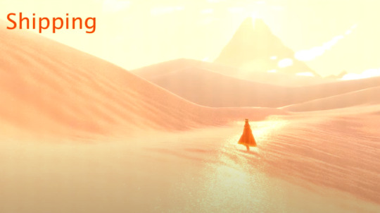
Oooh, what about Journey? I think the sand probably took a lot to pull off
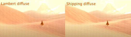
it did!! i watched a video about it, god, like 6 years ago or something and it was a very very important thing for them to get just right. this is goimg to be a longer one because i know this one pretty extensively
here's the steps they took to reach it!!
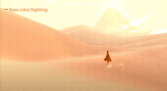
and heres it all broken down:
so first off comes the base lighting!! when it comes to lighting things in videogames, a pretty common model is the lambert model. essentially you get how bright things are just by comparing the normal (the direction your pixel is facing in 3d space) with the light direction (so if your pixel is facing the light, it returns 1, full brightness. if the light is 90 degrees perpendicular to the pixel, it returns 0, completely dark. and pointing even further away you start to go negative. facing a full 180 gives you -1. thats dot product baybe!!!)

but they didnt like it. so. they just tried adding and multiplying random things!!! literally. until they got the thing on the right which they were like yeah this is better :)
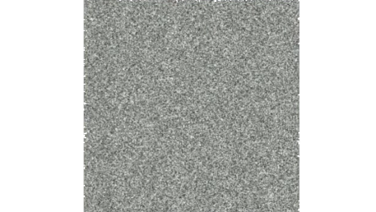
you will also notice the little waves in the sand. all the sand dunes were built out of a heightmap (where things lower to the ground are closer to black and things higher off the ground are closer to white). so they used a really upscaled version of it to map a tiling normal map on top. they picked the map automatically based on how steep the sand was, and which direction it was facing (east/west got one texture, north/south got the other texture)

then its time for sparkles!!!! they do something very similar to what i do for sparkles, which is essentially, they take a very noisy normal map like this and if you are looking directly at a pixels direction, it sparkles!!
this did create an issue, where the tops of sand dunes look uh, not what they were going for! (also before i transition to the next topic i should also mention the "ocean specular" where they basically just took the lighting equation you usually use for reflecting the sun/moon off of water, and uh, set it up on the sand instead with the above normal map. and it worked!!! ok back to the tops of the sand dunes issue)
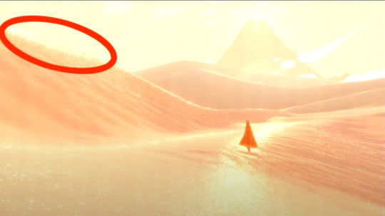
so certain parts just didnt look as they intended and this was a result of the anisotropic filtering failing. what is anisotropic filtering you ask ?? well i will do my best to explain it because i didnt actually understand it until 5 minutes ago!!!! this is going to be the longest part of this whole explanation!!!
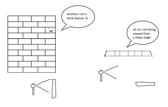
so any time you are looking at a videogame with textures, those textures are generally coming from squares (or other Normal Shapes like a healthy rectangle). but ! lets say you are viewing something from a steep angle
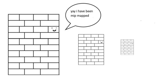
it gets all messed up!!! so howww do we fix this. well first we have to look at something called mip mapping. this is Another thing that is needded because video game textures are generally squares. because if you look at them from far away, the way each pixel gets sampled, you end up with some artifacting!!
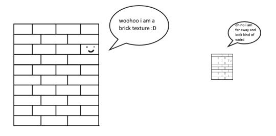
so mip maps essentially just are the original texture, but a bunch of times scaled down Properly. and now when you sample that texture from far away (so see something off in the distance that has that texture), instead of sampling from the original which might not look good from that distance, you sample from the scaled down one, which does look good from that distance
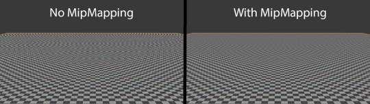
ok. do you understand mip mapping now. ok. great. now imagine you are a GPU and you know exactly. which parts of each different mip map to sample from. to make the texture look the Absolute Best from the angle you are looking at it from. how do you decide which mip map to sample, and how to sample it? i dont know. i dont know. i dont know how it works. but thats anisotropic filtering. without it looking at things from a steep angle will look blurry, but with it, your GPU knows how to make it look Crisp by using all the different mip maps and sampling them multiple times. yay! the more you let it sample, the crisper it can get. without is on the left, with is on the right!!
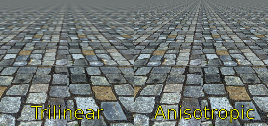
ok. now. generally this is just a nice little thing to have because its kind of expensive. BUT. when you are using a normal map that is very very grainy like the journey people are, for all the sparkles. having texture fidelity hold up at all angles is very very important. because without it, your textures can get a bit muddied when viewing it from any angle that isnt Straight On, and this will happen
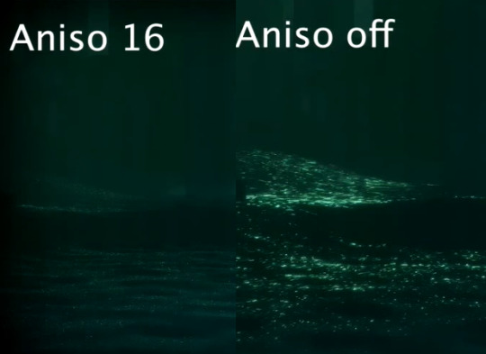
cool? sure. but not what they were going for!! (16 means that the aniso is allowed to sample the mip maps sixteen times!! thats a lot)
but luckily aniso 16 allows for that pixel perfect normal map look they are going for. EXCEPT. when viewed from the steepest of angles. bringing us back here
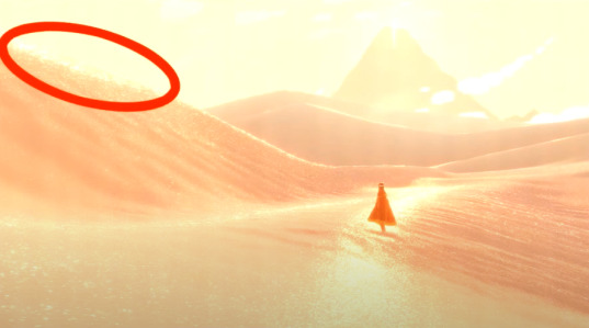
so how did they fix this ? its really really clever. yo uguys rmemeber mip maps right. so if you have a texture. and have its mip maps look like this

that means that anything closer to you will look darker, because its sampling from the biggest mip map, and the further away you get, the lighter the texture is going to end up. EXCEPT !!!! because of aisononotropic filtering. it will do the whole sample other mip maps too. and the places where the anisotropic filtering fail just so happen to be the places where it starts sampling the furthest texture. making the parts that fail that are close to the camera end up as white!!!
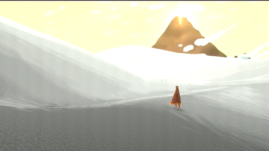
you can see that little ridge that was causing problems is a solid white at the tip, when it should still be grey. so they used this and essentially just told it not to render sparkles on the white parts. problem solved
we arent done yet though because you guys remember the mip maps? well. they are causing their own problems. because when you shrink down the sparkly normal map, it got Less Sparkly, and a bit smooth. soooo . they just made the normal map mip maps sharper (they just multipled them by 2. this just Worked)
the Sharp mip maps are on the left here!!
and uh... thats it!!!! phew. hope at least some of this made sense
433 notes
·
View notes
Text
About accessories and their secondary functions in Animation and Character Design
Well that title makes it sound way grander than it is, haha! I've no idea how this thing will go since I don't really have experience writing essays in english, but I'll do my best to give it some semblance of order. Shoutout to @haloheadhater who brought the topic out of me and showed interest in my sharing further!
Here's the TL:DR. Characters often wear accessories to complement their outfits, and these items don't just function as a visual representation of their personalities and interests (like real people); they also may have a "mechanical" function, so to speak. This function is much more secondary to visual storytelling, but sometimes designers will strategically place accessories on a character to facilitate their jobs on the long run. It is often a "two birds, one stone" situation, really.
Here's how that works in more detail.
Disguising Joints
Humans have joints all over their bodies, that's fact. It's what allows us to move and bend like we do. When designing toys, we try to imitate just that: articulated dolls, mannequins, marionettes, figurines and puppets have hinges and ball joints so they can be posed more realistically.
A sign of care and quality in manufacturing all these is how well these joints are disguised, so they look as "organic" as possible. Screws and hinges get covered up as seamlessly as possible, so these puppets may resemble people more accurately: obvious, open and visible joints quickly break the immersion (and often places them in the uncanny valley).
Compare these high-quality doll hands to your basic wooden posable hand models. Notice how the doll hands do their very best to imitate the natural curves of human hands and how the knuckles cover the joints as much as possible even when they're bent. Meanwhile, the joints in the wooden model hands are plainly visible, and the shapes are very stiff-looking, so they don't feel as human.
Animation is no different! A good animated character manages to suspend disbelief: for however long the character moves on screen, the audience has to feel like this character is alive and real enough to relate to them and their story. Human brains are really good at detecting when something moves wrong, so the more "natural" your character is, the easier it'll be to keep up with them.
In puppet animation (often called flash animation thanks to Adobe Flash, now Adobe Animate, popularizing the method), characters are made of cuts, individual pieces held together by joints, much like traditional paper shadow puppets.

Animators and character designers often place accessories to cover up these cuts between joints, so when the character moves there's less risk of seeing them. My favorite example is vambraces, wristbands, watches and bracelets! Notice how uncommon it is to find a character with naked wrists? Well now you know half a reason! As the years go by and animation softwares improve, there's less need for this trick, or rather, it is often less obvious.
Disguising Texture Seams
Now see, 3D models look gray by default: you have to paint them over, like one of those tabletop figurines, for them to look pretty and presentable. This painting process results in a 2D image (called texture map) that has to be projected onto the 3D model. There is a variety of other maps that control different things, like how the model's surface reflects light (specular and diffuse maps) or if it's a porous, creviced or bumpy surface (bump, normal and/or displacement maps), but let's just focus on the texture map this time.
The process of projecting a 2D map onto a 3D model is called UV Mapping, and it looks similar to sewing patterns. There's plenty of methods to hide the seams in maps, but computers can be a bit unpredictable, and all 3D renders require touch-ups and a post-production process (especially light and reflectiveness). Sometimes though, covering seams with accessories is frankly easier, so CGI artists always keep clothes and items in mind when UV mapping, as well as the natural folds and crevices in the character's model.

Here's a good example of what I mean (by Thora Tong). This 3D model's UV seams, highlighted in white, were placed in a way that they'd be easily covered by clothes and accessories. Notice the seams on the wrists and ankles, and how the other seams around the body are very similar to the ones you'd see on actual pieces of clothing.
Volume and Foreshortening Guidelines
Drawing perspective is hard as it is, but organic shapes are particularly complicated. Accessories can help disguise certain perspective errors, or help convey the volumes and shapes of the body much more clearly. They are especially useful as guidelines for foreshortening.
Anything you append to a character is a useful marker for later. The way these items bend alongside the body thanks to perspective is a useful visual key for later. If you're not sure how an arm will look from a certain angle, maybe imagining a bracelet on that same angle would be easier! The bracelets I drew over the naked arm serve the same purpose as the guidelines you see in the image above. This is especially useful for drawings with little to no shading, where conveying the volumes of muscles presents a challenge.
Bonus - Body Lines
When a human fetus is forming, its cells grow in a particular pattern; these patterns that the body cells follow determine the flow of muscles, nerves, and even how the skin folds or how pigmentation distributes itself. There's a variety of body lines, though the most known and studied (as far as I'm aware) are Blaschko's, Kraissl's and Langer's lines.
Langer's lines are particularly interesting: they're also known as skin tension lines or cleavage lines, because they indicate the best place for medical incisions on the skin, especially in the forensic field. There's many different models but here's a good example illustrating them.
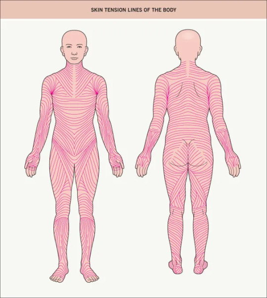
Placing accessories following Langer's lines can be really aesthetically pleasing. Since tension lines follow along muscle mass and fat, they also indicate how the skin warps and folds around them. Knowing tension lines is especially useful in terms of studying how the body creases when bending around (and subsequently, clothes too!), so discretely marking them out with accessories can be useful on the long run.

Japanese animation is especially guilty of using Langer's lines on skin-tight scifi suits. They're simply incredibly useful as design and anatomic guidelines, and they look so good, they easily survive the test of time!
Conclusion
Character design often involves following rules of practicality that viewers seldom notice. This is perfectly fine because they're not really meant to be noticed by anyone, except members of the team of course. Design of any kind should be done under the premise of aesthetics and function working together, and not against/in spite of each other, so it is no wonder that animators and character designers put some thought into meeting both when adding a little "spice" to their designs.
Anything and everything you can do as a character designer or animator to facilitate your work on the long run, or that of your team mates, is welcome. Covering seams and joints makes it easier for the guys in postproduction, as they have one less thing to look out for, for example. The animation industry is built on the backs of (often) exploited employees that sacrificed a lot of their time and resources into doing what they love most: deceiving the human eye and brain into believing for just a little bit that what they made is real. Truly wonderful!
So next time you're working on a character, try to think about the functionality of what you're including into them. Test your imagination, and see what comes out of your mindful placement of accessories with secondary functions.
32 notes
·
View notes
Note
how was ur banner made
oh boy now this is one we're excited to answer just because we love talking about behind the scenes 3D stuff so much!
plus we have behind the scenes stuff saved already because we talked about this on patreon back when it was first made. This will be a long one so strap in.

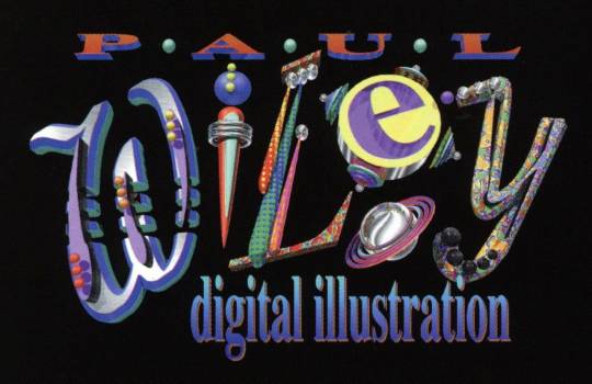
This is the closest thing we have to a "logo" which was made in a day Blender back in may 2021 so its coming up on 2 years old now! wow. (this is a raw render without the touch ups applied to the version used on twitter and tumblr, I'm not sure where that version went atm)
There were 2 Major sources of inspiration, the first one being this Paul Wiley logo render (who has inspired a Lot of our work tbh):
And the other is, comically, this logo for the Robots movie:

The inspiration from both should be pretty obvious. Doubt we have to say more on that one. We really have a love for these 3D logos made out of objects and wanted to make our own. So we did.
most of the ideas was done from the start. We knew for sure that the O had to be a planet, and that it would involve a paint brush of some kind given our art focus. M and R were the hardest to come up with ideas for, hence we gave up and just made them letters. But we still tried to go with a look for them that felt appropriate


The background was largely born out of accident. We were playing around with ways to direct the lighting in a way we wanted and after playing around with an invisible plane we made it visible and just played around with the colors quick out of curiosity. At some point it hit us that with a dark green color it looked a bit like a chalk board. We liked that idea so much it stuck around and we leaned into it more.
The earth was an interesting one. We grabbed an map image to use as a height-map texture and UV'd it onto a sphere with a displacement modifier while trying to give it a globe type look. Its a little high resolution from that method and could use with some mesh optimization but y'know. 2021 us didn't care.

The paintbrush had another weird specific form of inspiration, there was some video we watched on an nvidia RT demo (the one with marbles) from that time that had a paint brush in it that was impressively detailed. That kinda just got us stuck wanting to make a very detailed paint brush to see if we could.
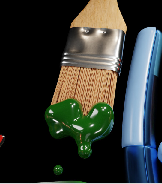
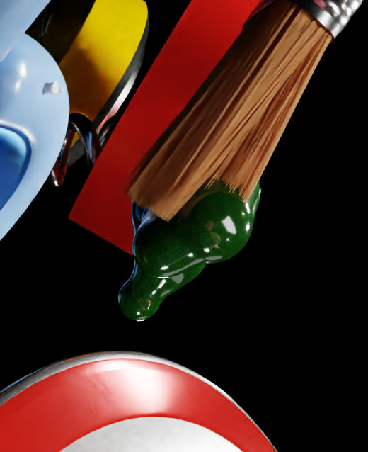
The nvidia one is still better, but for our knowledge of blender at the time its not too shabby. We were much less experienced with texture making at the time and relied more heavily on detail via raw modeling. The bristles are just using blenders built in hair system.
The paint on the paintbrush and coming out of the straw are just made using metaballs, lol. In part intentionally because we wanted it to have a fake looking quality to it like early 3d representations of liquid, but we cant lie and say it also wasnt in part from not caring to learn how to do any kind of fluid simulation. It was a win-win.
this post is getting very long so we'll spare you the details on the rest of it, but we hope you found this interesting! We've actually been meaning to go back and touch up the logo as its remain unchanged since its creation, but its still something were very proud of!

87 notes
·
View notes
Note
how does ink in splatoon 3 work? how it hits objects or the ground and covers them
Yay! I've been waiting for an ask about this, my partner loves the Splatoon series.
The Ink system is super interesting and also surprisingly simple, but to explain it we need to over a few things in 3D.
Firstly, 3D models need to be textured, back in early 3D days vertex colors were often used, this assigned a color to a point on a model, this was very simple and limited to the resolution of the model, in order to combat this, texture mapping was introduced. Texture mapping very much does what the name implies, it maps a texture onto a model. How is this achieved however? The most used method is UV mapping.
UV mapping is a little abstract, but imagine you have a cube, and you want to fit this cube into two dimensional space, well you'd probably try to unfold it like it was made of paper. This is actually the approach, a model is "unfolded" into a 2D shape(s) as to agree with the 2D nature of an image texture.
This unfolded map is called a UV map, the UV stands for the axes it uses; The U and V axes are picked due to X, Y and Z being taken by the 3D model space.
Now you can sample the texture onto model, by pretty much just checking where the UV coordinate is on a texture, and then mapping that data onto the face in 3D space.

Now how does the Splatoon ink system leverage this? I want to make it clear that this is just my educated guess, because Nintendo is notoriously hush hush about anything development wise usually, but let's get into how it might just work.
We now have a UV map, which can translate our 3D model into a 2D space, which is handy for putting a 2D texture onto a 3D thing, this also works in the other direction where we can take a 3D point and get it into the 2D space of a texture.
Now we have to shoot things, this is the easy part, the ink isn't actually a liquid simulation, it's just just heavily styled particles. These particles essentially just points in space, which are really easy to calculate when it hit somethings. I won't go into the depth of collision detection here, but in the case of these particles, they usually just a collision sphere, i.e. a radius where something is considered hit.
When something hit something else, you can figure out where it has hit, which leads to the painting process.
My leading theory is that when your shot ink hits a surface it goes through this process:
Find point hit in 3D
Translate 3D point to UV point
Add some "ink" to a texture at that UV point
Now it isn't just adding ink on top of the regular textures, this would be hard to work with, my thought is that we have a texture for each team. So when it adds ink to one, it removes ink from the other, this is how the painting over works. Another thing to note, is that these textures are monochrome, there's no need for color to be here, this can be added later
These images can serve as masks for different render passes, my idea is that Splatoon actually renders a surface a couple of time, once the main surface then once for each ink color.


Then it utilizes the painted textures as a mask between these surfaces, with a little extra shader goodness to achieved their excellent look.
Now Nintendo probably has some advanced and complicated way to calculate coverage, which I don't have to time to get into today, but perhaps some other day!
26 notes
·
View notes
Last Seen Blogs
waitingforgoldenhour
every seashell has a story

opuetos
𝐴𝑡𝑙𝑎𝑛𝑡𝑖𝑠 🐢
1111iza
liza

dawebimuso
Untitled

emilybettrk
☔🦋