#dullers
Text
Bacteria's "Entity Page"
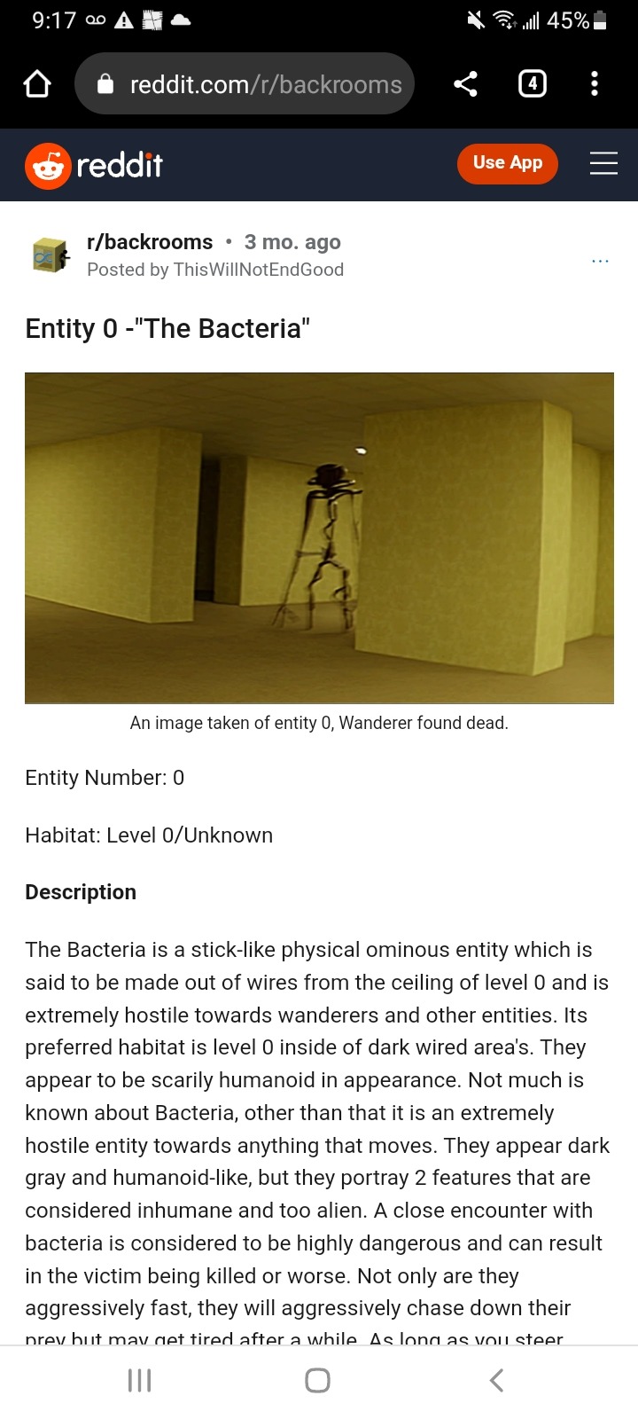
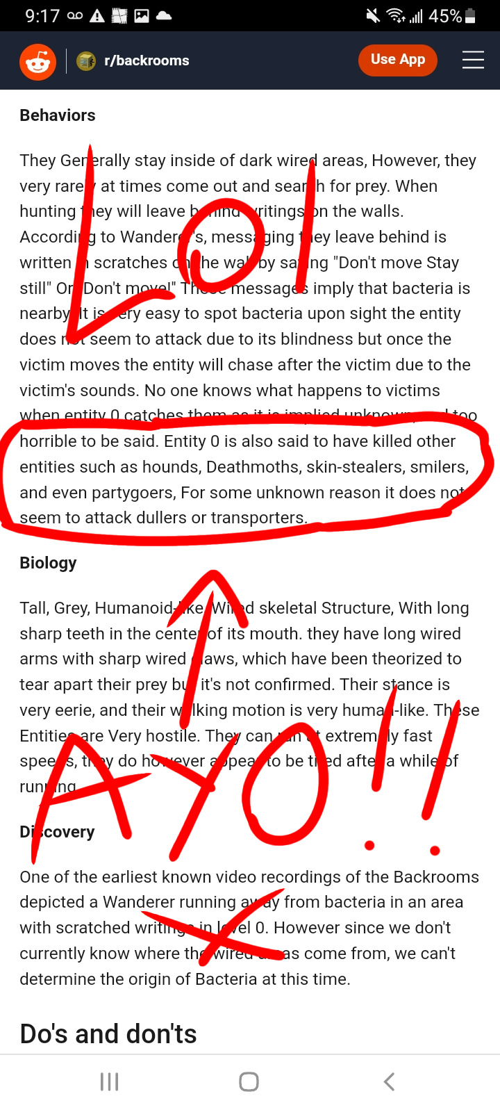
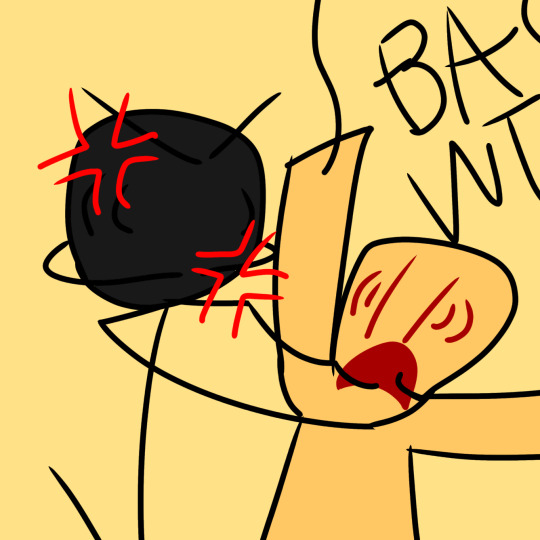
Bacteria: WHAT THE FUCK DID YOU DO WITH MY PAINTBRUSH!?!
Partygoer: AAAAAAGAGHHGHHG-
Bacteria: ANSWER ME YOU STUPID FUCKING PAPER BAG!!!
-------------------
It would be cool for Bacteria to have an entity page from the Fandom site but the thing is; Kane Pixel's Backrooms series isn't connected to Fandom so maybe not.
Part Two:
Bacteria's Paintbrush:
Link:
#backrooms entity#the backrooms#bacteria#partygoer#backrooms#lol xd#lol wtf#lol#sorry lol#howler#backrooms bacteria#the backrooms bacteria#entity 0#entity#skin stealer#deathmoth#smiler#partygoers#duller#dullers#transporter#transporters#too many tags#backrooms howler#the backrooms howler#reddit#howlers#smilers#skin stealers#hounds
35 notes
·
View notes
Text
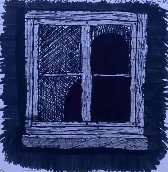
Im working on a backrooms entities dossier and these are the ones I’ve drawn so far. They’re all traditional. Creepy content below cut 🤓


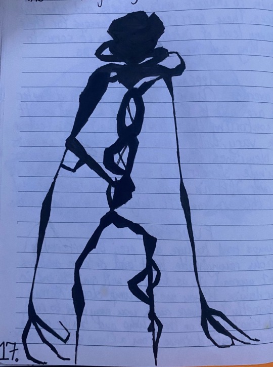
#the backrooms#backrooms entity#Windows entity#smilers entity#smilers#frowners#Frowners entity#deathmoths#deathmoths entity#clumps#clumps entity#dullers#dullers entity#twisty draws#cw body horror#cw eye contact#cw scopophobia#cw disturbing imagery#cw insects#cw moths#horror#ig?#ASK TO TAG#backrooms fanart#entity 2#entity 3#entity 3.5#entity 4#entity 5#entity 6
0 notes
Text

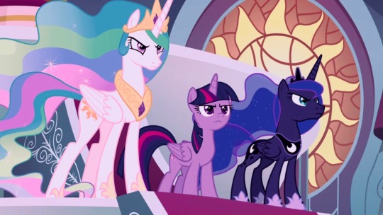
I FINALLY finished that WIP I did agesss ago
Click picture for better quality 🌄
#I made the screencap have duller colors because my GOD… mlp is really bright.. and it ruined the aesthetic of my post lol#my art#princess celestia#twilight sparkle#princess luna#mlp redesign#mlp redraw#mlp#my little pony#mlp fim#mlp g4#mlp fanart
3K notes
·
View notes
Text

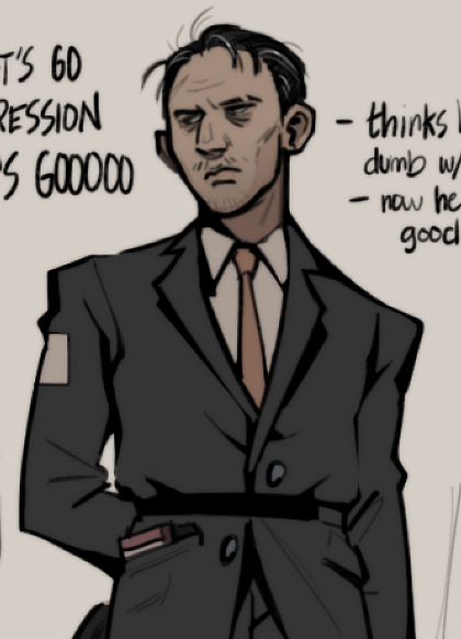
MORE SWAPS, quick doodle of an idea for a portrait of swap!kim. i just wanted to draw a man so drab and miserable PFTT
#disco elysium#kim kitsuragi#disco elysium roleswap#ok so. duller sadder colors was the first order of business#he doesnt have his undercut his colors are greyer but i did want to put that orange somewhere in his design#i also wanted to include just the tiniest hints of orange in the background but make it look like the white was painted over it. +#like to hide it.#ok goodbye i love you#described#id in alt text#sunnysidedraws#sunnysidedoodles#den's disco swap
1K notes
·
View notes
Text
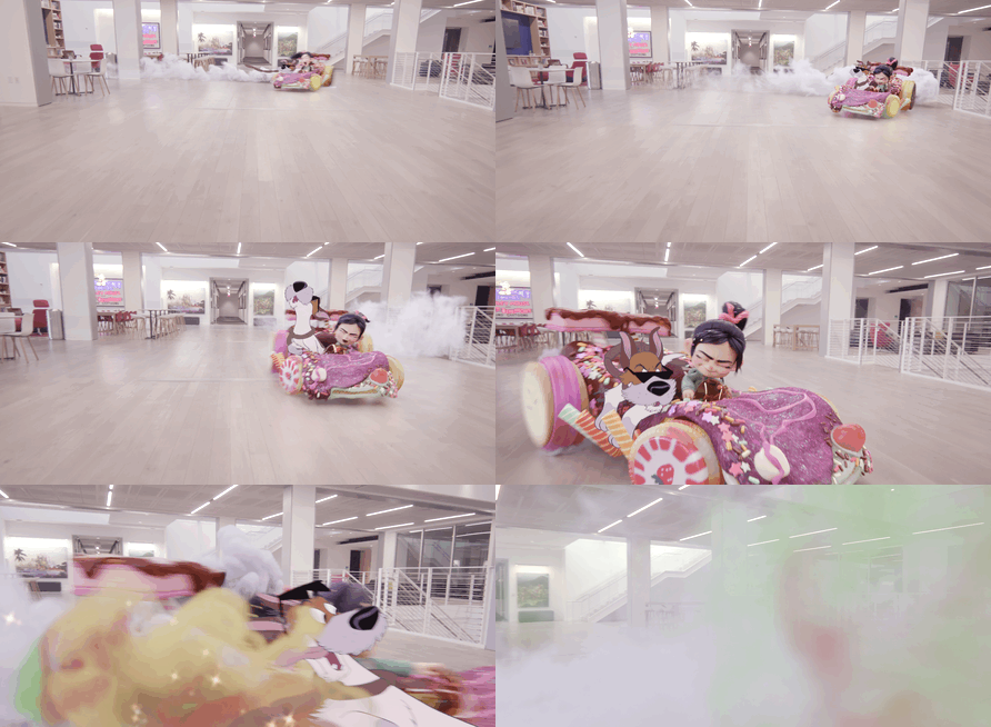
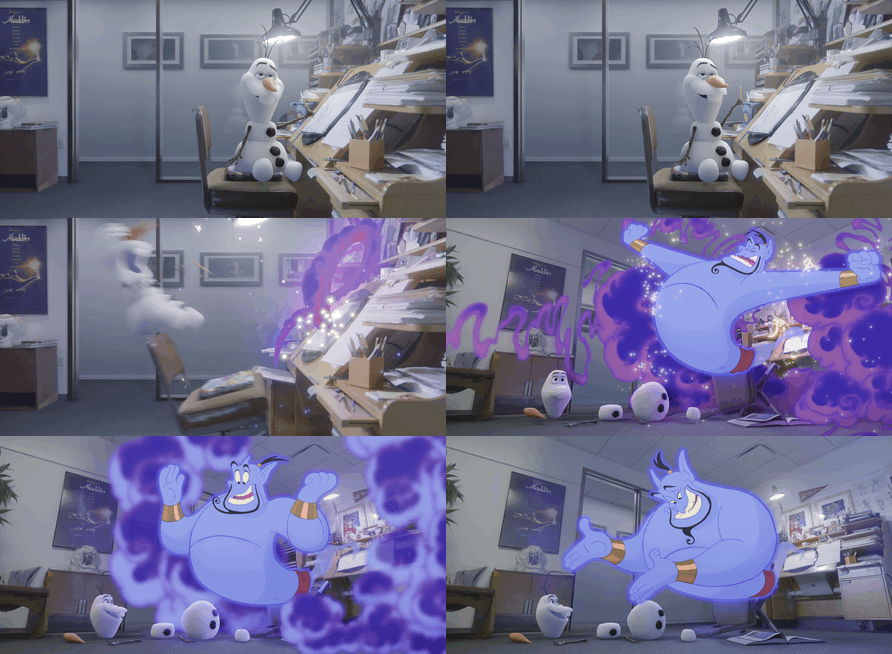

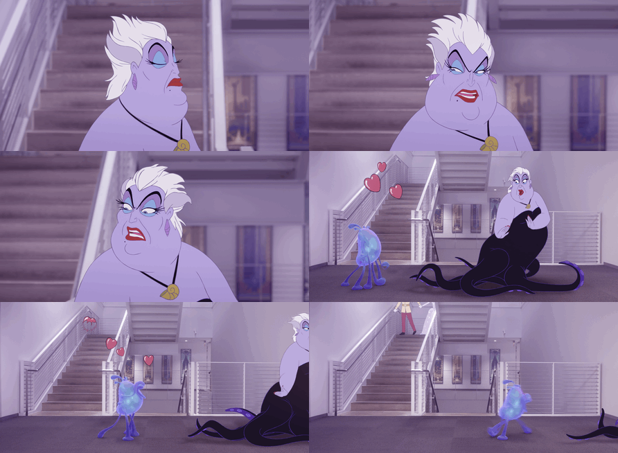

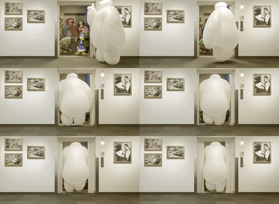
"Maybe we can try again in another 100 years."
#disneyedit#once upon a studio#ok this is the second disney clip or video i've DL'd this year to gif#where the color in the gif editor is duller than the actual .mkv file#maybe it's an mkv thing or#maybe Disney has encoding to make it look washed out these days to prevent theft#anyway these are my faves#1 - favorite disney character (Vanellope)#2 - Favorite short (the Frozen Winter short)#3 - Favorite Disney movie (Tarzan)#4 - favorite Villain (bc Maleficent is not here?)#5 Favorite Other Girl (Dolores)#I guess 5 is also favorite other voice acting (Jaeger Clade)#6 - Baymax
3K notes
·
View notes
Text
Episode 103 The Backrooms Six Million Square Miles of Nightmare
#backrooms#bad#carpet#colonies#creepypasta#damp#doppelgangers#dullers#flourescents#hello#hounds#hunted#kitty#man#old#skin#smilers#stealers#wanderers#yellow
1 note
·
View note
Text

hiding among humans apoc tomi….again…….. he’s having a terrible time but it’s fun so, oops
#misha arts#tomiko#i really need to find a tag for this au lol#anyways decided on duller hair colors
571 notes
·
View notes
Text
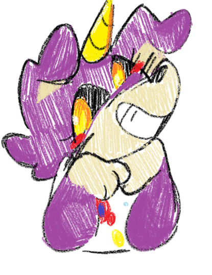
crayon brush and default color pallete on mspaint my beloved
#shes not very saturated here tho but her duller colors remind me of . default pallete#ALSO HER EARS ARENT FOLDED OOPS oh well#sparklecare#uni cornelius#toast makes stuff
214 notes
·
View notes
Text

Familiar
#wind archer cookie#elder faerie cookie#dude idk why i spent so much effort on this xgdjyxfijyxf#it wasn't supposed to be that detailed but then i thought i'd practice basic backgrounds i guess#i literally have so many other things i should work on but you know#also the premise was elder faerie looks a lot like millie and wind vaguely looks like silverbell#idk if that comes across lmao#also the colors are duller because i didn't realize what the canvas option i picked would do lmfaoo
294 notes
·
View notes
Text
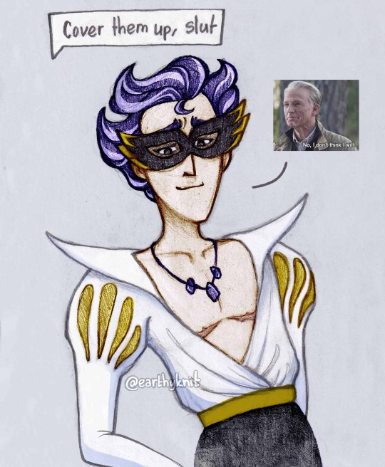
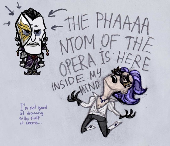
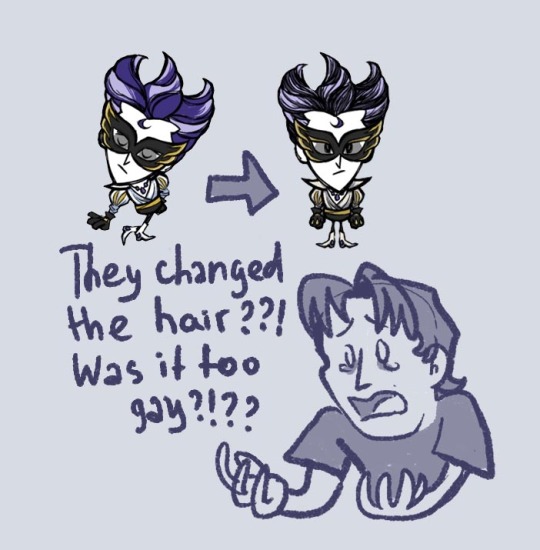
Um...
UM.
I just found out about new skins and I'm not ok...
#I CANT LOOK AT WILSON#HES TOO POWERFUL#dst#wilson don't starve#don't starve#maxwil#of course#I was too lazy to draw Maxwell lmao#and of course the next day that I see the new skins they change his hair to a duller version#my art
154 notes
·
View notes
Text
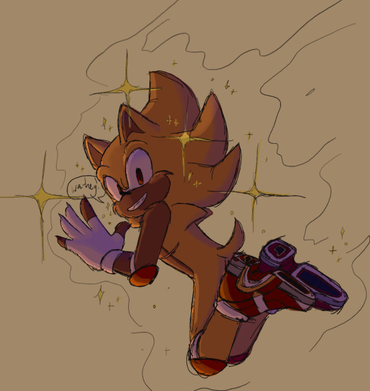
:] he make me happy
#sth#sonic sth#sonic soap shoes#sonic the hedgehog#sonic the hedgehog art#sonic the hedghog fanart#doodle#sketch#id in alt text#might make an actual drawing soon if I get back into sonic as hardcore as before you never know#I kinda miss having my brighter color palette solely for sonic stuff but for my usual stuff the warmer duller palette is nice
193 notes
·
View notes
Text
These guys are soo sillyyy
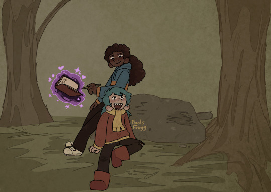
#hilda#I rlly like working with duller colors for some reason#hilda netflix#hilda the series#hilda the show#hilda (hilda)#hilda fanart#fanart#hilda frida#frida hilda#frilda#troll hilda#forest#trees
326 notes
·
View notes
Text
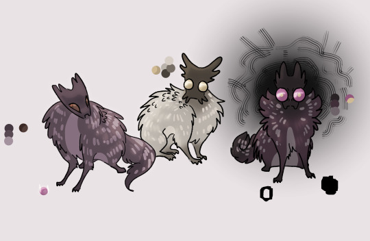

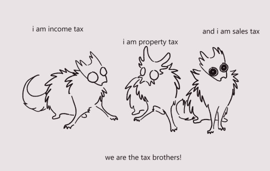
scav pups ... scups ...
#i hc that scups have duller fur and those spots that baby deer have!#for camouflage basically! since they got no way to actually defend themselves against predators other than to run away#rain world#rw#doodles#rw scavenger#rw scavenger oc#rw oc#rain world oc
381 notes
·
View notes
Text

Leafpool

#leafpaw#leafpool#thunderclan#warrior cats#wc#warriors designs#warrior cats designs#just a bit darker slash duller than the last one#not much changed with her design but theres still a few things#idk i made her look sadder#but intentional but ya kno#leafpool always carry herself in a specific way in my head??#like shes trying to be even smaller than she is#tail rarely lifted higher than her back#shes very important to me actually justa lil gal
603 notes
·
View notes
Text
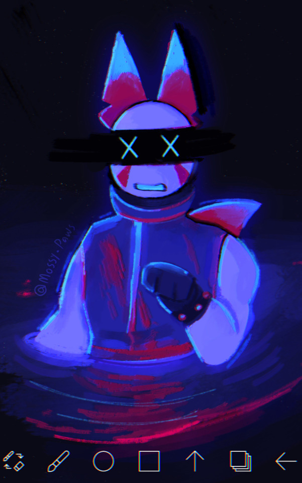
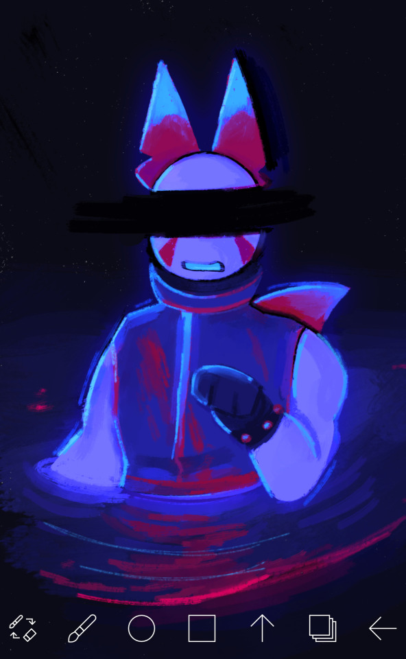
Grav experimental piece (PHIGHTING!)
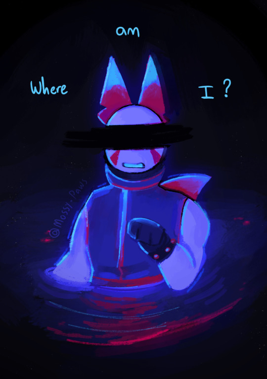
“This place looks so familiar, doesn’t it? But it’s just like i can’t put my finger on it…”
(alt versions as well)
#WOOHOOOOO#i love doing experimental pieces like this :3#I got really really bored lmao and wanted to draw Grav so I decided that. Why not turn it into an experimental piece#The colors were originally a lot duller and were meant to stick to a pallet (specifically to mimic subspaces and medkits)#But I suck at sticking to pallets so instead we have this LOL#I cooked this thing up in about the span of ~4 hours!#… And I also did it all in one sitting (this is a cry for help)#ANYWAYS#I honestly really like how it came out and I really wanna do some more of these in the future!#But for now I’m sticking to smaller stuff since I have some bigger projects I gotta do#Anyways enjoy :3#Gravity disrupter#art#artists on tumblr#phighting fanart#phighting!#phighting#roblox phighting#digital art#phighting art#phighting roblox#roblox#phighting! roblox#phighting! art#Grav phighting#Grav#Roblox character#Artists on tumblr#Digital artist#My art
70 notes
·
View notes
Text
probably an unpopular opinion but i still think Splatoon 1 has the best graphics style in the series
the graphics were so much moodier and darker, shadows were really prominent giving it a much more gritty and realistic feel
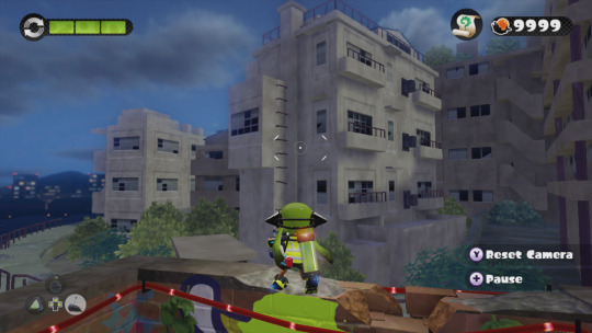
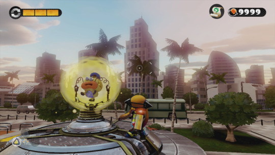
The far-off environmental elements had a nice blur that gives them a bit of a dreamlike quality IMO.

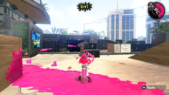
I know the top picture is a sunset level, but; seriously is it just me? Why is everything in Splatoon 2 SO CRISP AND BRIGHT AND NEON? I talked about (probably 2 years ago at this point) how Splatoon 2 feels like it's an evolution and commercialization of Turf Wars into a product and a brand rather than how in Splatoon 1 they had a much more backstreet, discreet, shady feeling. And I feel like the graphics carry that over weirdly enough.
But most importantly, the ink and the Inklings themselves; ever since Splatoon 2 came out and people started going "omg the ink looks so good now!" i. literally never agreed with that. even with Splatoon 3 i STILL THINK the ink looks the best in Splatoon 1. In Splatoon 2 and 3, they have really been leaning into making the ink extremely neon and super saturated, and I don't think it looks great. I can't really even pinpoint the difference here (especially not with the Inklings themselves, but).
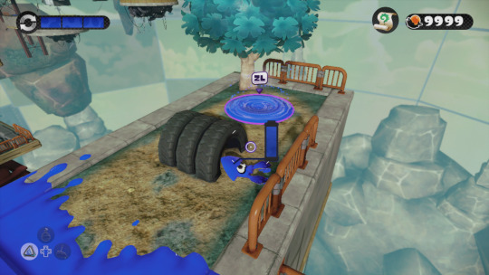

(Splatoon 1 above, Splatoon 2 under)
The Inklings in humanoid form don't stray away from having dull or dark colored tentacles in different lighting conditions, and even the ink itself is nowhere near as saturated as it is, leaning more into quieter or pastel tones. Again, it makes it look nice paired with the darker graphics of the game, and somehow it feels really at home and pretty natural? The difference in the model of the Inkling itself is also a mystery of me, it might be a case of less shading or less specular making it look flatter and that's more pleasing to the eye than how shiny they are nowadays, ESPECIALLY in Splatoon 2. The ink is notably flatter than it is in newer games, and if it wasn't obvious I definitely think it still just, looks the best? Don't ask me how. (The squids also look amazing. Like gummy.)
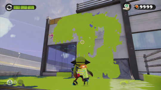


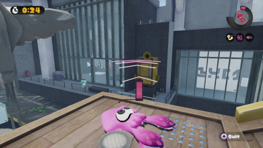
just thought about putting that out there. Anyone else's thoughts on the games' graphics?
#rambles#i definitely think splatoon 3 has nicer graphics compared to 2 because i didnt like how glossy and shiny everything was in 2 AT ALL#but splatoon 3 also has extremely flat shading and that still puts it below S1 in my books#i think splatoon works REALLY WELL with duller darker graphics paired with colorful but not over the top ink
319 notes
·
View notes