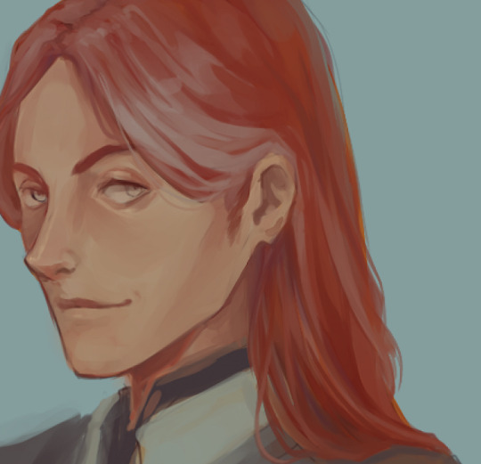
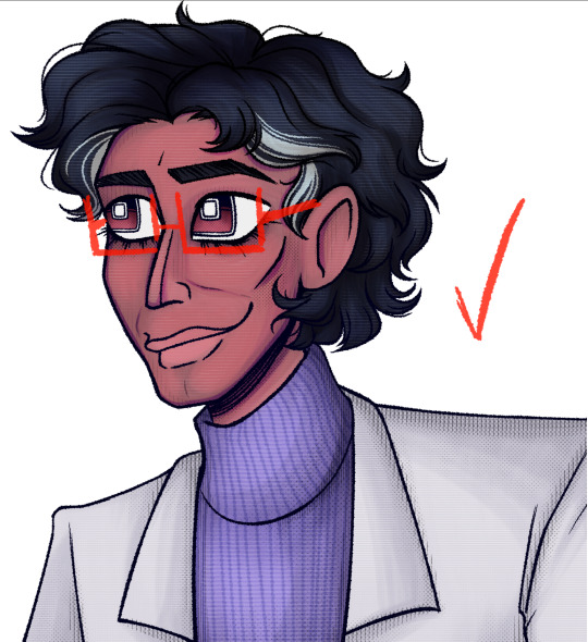
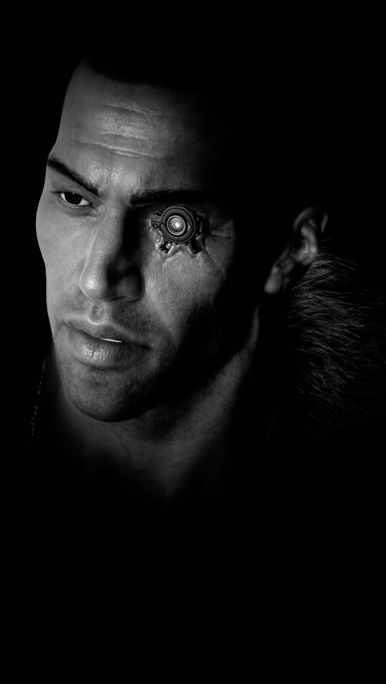
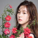
#just a generic portrait but I liked playing with textures
Note
As your not a big fan of fantasy books in general. What drew you into loving asoiaf? What got you hooked?
now that I'm invested in asoiaf I do genuinely like the fantasy elements of the story, but the stuff that really pulled me in was the human drama and political intrigue etc. I love the character work, almost all of the POVs feel fully realised and subvert typical tropes in really interesting ways (imo). I like the inter-generational drama (the reasons I like succession are v similar to the reasons I like the Lannisters), like if I want to understand Jaime and Cersei and Tyrion I can look to Tywin, and if I want to understand Tywin I can look to Tytos, and if I was to understand Tytos I can look to Gerold, like it's a russian doll of intergenerational trauma what more could a girl want.
and on that note I really like the scope! GRRM obviously feels this need to account for all details minor and major, so that even with everything that's already on the page there's room to extrapolate so much more. i mean here I am writing who knows how many words about a fake 20-episode long robert's rebellion tv series lol like this all happened before the series even starts and yet I hardly need to make anything up bc there is so much to draw on just based on all the random little details we've got here and there from characters reflecting on the same events from different angles, and trying to piece together portraits of the people who died based on the recollections of those on the page who remember them..... it is so fun)
and yeah usually I prefer to read about that kind of thing on a smaller scale but the drama that plays out in AGOT is so engaging that upon initiation I didn't find it so much of a chore to keep track of all the various houses and lands etc in order to understand the full implications of each thing that happened - it felt like it was worth the effort. generally it's the 'keeping track' of it all that I find grating about fantasy bc I really want to just get on with the story rather than keep on top of a hundred magic systems and sub-species of pixie.
and obvs asoiaf is low fantasy rather than high fantasy, i.e. there aren't intricate systems to the magic and or complicated genus for each of the creatures, so that made it feel a lot more accessible for me as someone who just isn't very interested in those kinds of details. Dany's magic is made up as she goes along, it's never explained, and that's the same for pretty much all the fantastical elements - it's very show don't tell. and even though when you count it all up there are quite a lot of fantastical features and subplots, taken together with the rest of the story it's more like.... seasonings I wouldn't usually choose but ended up liking just fine in this overall dish lol
and finally asoiaf just really appealed to me from a fannish perspective! I really hate when you're trying to dig deeper with a work and you quickly start to realise that the writer(s) just weren't thinking that hard. it feels like striking concrete with a spade, like it's a one-sided conversation rather than something both the writer and the reader are participating in. I think some fans are perfectly fine with that and good for them - who cares if the author built the work to sustain your analysis if you're just having fun doing it - but for me it's a complete killjoy, I end up v frustrated and like the work isn't worth my time
so here's GRRM who is so fixated on the finer details that he's churned out a history book like 700 pages long and a bunch of short stories and also another history book just to add a bit more texture to the main story. and I don't have to worry about network input or co-writers or actors' intentions or whatever other external conflict or influence cos for better or worse it's all his story. and that just suits me better lol, it's one guy and his shitty computer, and me reading the shit he wrote with it. pure and simple living in the moment no phones in sight
also jaime and brienne are everything to me xo
33 notes
·
View notes
Text
ALRIGHT SO, lets talk about text boxes, in almost every game, at least any that have a good story, have a text box where you can talk to the npc's. usually its a box below the screen with at least a name and then text in the middle, but i've been thinking about them a a lot, since the type of textbox for my game would impact the overall vibe A LOT, i want every chapter of my game to have a different vibe, my plans all have different themes for each town and place they go to. meaning that i want my text box to be simplistic and not to attracting.
So i went to toby fox! , i love toby fox and his overal vibe, his text boxes are very simple, it has a white outlining and just a general black and white vibe with a single image of the character you are talking too.
Deltarune does smth similair except more detailed portraits and those little thingy's at the corners. i do have to say, as much as i admire Toby fox, and love his music... i have never played any of his games because i am broke as fuck i have played a bit of a demo before but that was AGGES ago, but AS SOON as i have enough money i will try it out!
BUT i don't want to copy toby fox, so i will try and take inspo from other games i like (and also havent played because i am broke...)
That and i find the black and white vibe to be to simplistic for my maximalist mind.
So then another game i LOVE the art is great i have also been listening to its music before i knew it was from a game (and i also havent played it caus i'm broke..) OMORI!!

Omori also has a very simple vibe to it but it has multiple boxes 1 portrait that changes a lot! and a thingy where you can see the name of the person you are talking to! i also remember from a random jaiden animation stream i watched where she played Omori, that omori has a lot of cutesy text animations where it moves at certain words to give of better vibes, tone and emotions to what the npc's are saying.
Then one of the games i haven't played BUT i have seen almost every ending is the class of 09, the game that inspired me to make a game, then learn how to code, and decide to work on a completely different game lol
class of 09 is way different then omori and toby fox games. it has a very clear vibe to it, the paper and all is great, but it wouldn't work for me. something i LOVE is something that isn't rly a part of the text box, but the thing behind it. the fact that you can see 2 full body drawings of the characters (the player and the npc for example, just 2 characters in this specific one tho) and basic actions, and movements gives them SOO. MUCH PERSONALITY. i love pixel art, but its hard to animate emotions into them, and especially in my artstyle. so i always thought i'd learn to make more detailed images of my characters with a bunch of different poses and smash them together like pngtuber. that way you can see the person you are talking to and it would give them so much more personality and i would be able to draw all the little things i want to add to the sprites, but can't because its to small.
i also have Stardew in mind (A GAME I ACTUALLY PLAY) as just as omori it has a portrait and a name, then a text part, it has a wood theming just like all the ui in the game, and that fits stardew Perfectly! butt i don't know what that would be for my game.
So to make a conclusion, i need to design a simple, but interesting ui, with a place for a name, text and an at least torso and up image of the person you are talking to! then i either need to choose for a single colour and outline, or i can go the class of 09 and stardew vibe, and pick a texture and a vibe that fits the game, but since every chapter will be somewhere completely different (stardew is always in the valley and class of 09 is in a school most of the time so their textures fit)
so what would be a good texture that fits the vibe of the game, has a simple texture that won't class with completelly different themes of each chapter, has a perfect way to show the npc in the frame, and just... looks good.
the theming around my game is fairly simple, a kid's soul shatters into pieces and they try and find the pieces to find out who they were and how to ended up in the spirit world, meeting different people who all have differen story's on how they ended up in the spirit world, and spiritis themselves.
i have thought about maybe theming it around stars, since it is a MASSIVE part of the lore and aesthetic of the game, in the spirit world, there is no sun or moon, and stars float around that give off heat and light to the world.
so i could do a galaxy textured textbox? but i feel thats to themed.\
anyway what do y'all think!! this is a rlyyyy long post that i've been thinking about making for ages now! pls tell me what you think i should do!!
#pixel game#pixel art#pixel illustration#pixelart#game development#coding#game design#game dev update#indie game dev#programming#game dev#game dev stuff#game dev blog#indie dev#indie game#game developers#indiegamedev#sprites#sprite art#pixel sprite#sprite edit#my sprites#pixel#pixel aesthetic#pixel artist#pixel graphics#ocs#oc#oc art#my ocs
23 notes
·
View notes
Text
Been working on again off again on a Xenogears portrait mod for two years now, started in Sept 2021 right before I actually finished the game for the first time.
Some time ago I started adding upscaled (hand painted) versions of UI elements, so I guess its now a general texture pack I'm working on.
Its done through RetroArch's Beetle PSX HW core real-time texture replacer.
My goal with this is to make a texture pack that stays very true to the original look of the game. I don't want to redesign elements, impose too much of my own influence into it, and make the game look like it had an identity crisis. I still want it to look like Xenogears in the end, just upscaled, and where the portraits are concerned I want it to look as close to the original artwork as possible, with no scanning artifacts and low res quality- as if we actually had digital versions of Tanaka's original artwork.
Also, this isn't intended to be super high res 4k or anything, idc about that.
Figured I'd make a full post here going over everything I've done so far. I'm on the home stretch! Just a few more left.
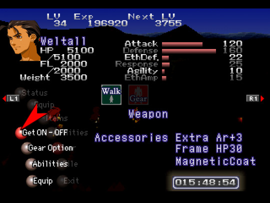

⬆ Starting with UI. I replaced the red selection arrow, the red/grey spheres, save block icon, save/load text/bar, Walk/Gear icons (more about that one later), compass cardinal points (was unable to get a proper dump of the circular compass texture), and the dialogue diamond and selection diamond within menus.
I totally get it if someone wouldn't want to use something like the dialogue diamond, as you see it all the time right beside the pixelated text and it seems to stand out more in dialogue vs the one in menuing bc your attention is typically focused elsewhere while menuing. In the end, all changes are optional and to remove something all you have to do is move/delete the equivalent img file from the texture replacement folder. Within said folder I have a sub-folder titled "alternate portraits" where I keep alts and things I want to "disable" without outright deleting.
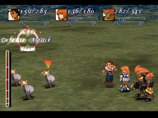
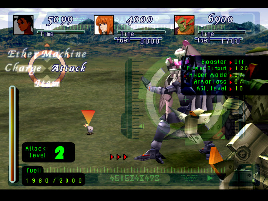
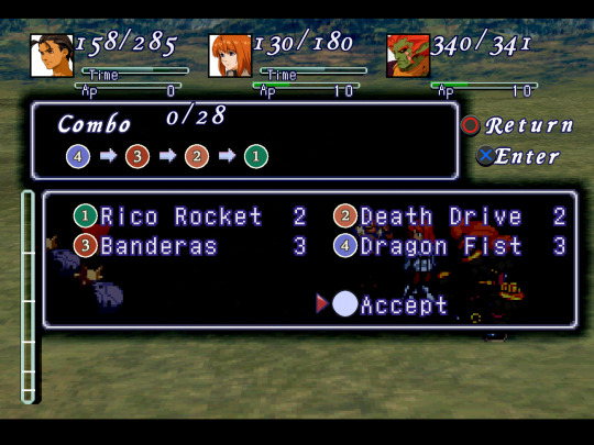
⬆ In combat UI I've replaced the HP/dmg numbers, the Time/AP/numbers, battle palette text (used for other text as well), the circle and tags of the battle palette, Time/AP/fuel bars, green Gear text and numbers, Gear attack level/♾ indicator, black Gear UI backgrounds, and combo icons.
The red arrows have been replaced, but unfortunately the black arrows around the red cannot be replaced based on how the game does it; it is not a texture you can change, it is a triangular shaped box that the game fills with the black texture from behind Gear UI.
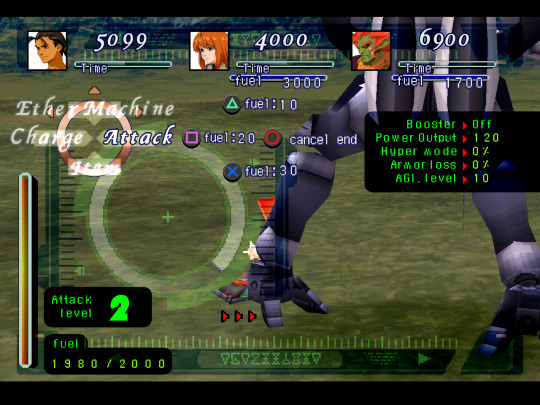
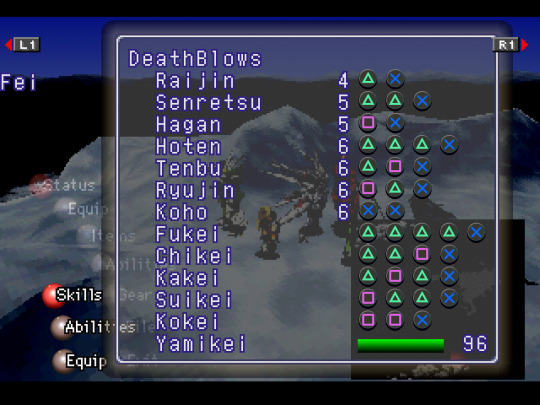
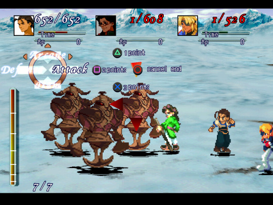

⬆ Menu/gameplay buttons. Also numbers/"points/fuel/cancel end"
Someone mentioned playing with a switch pro controller or joy-cons so I threw an ABXY version together as an alternate button display option. Used the same typeface as the combo icons to keep some consistency with a typeface already in-use as well as for overall clarity.
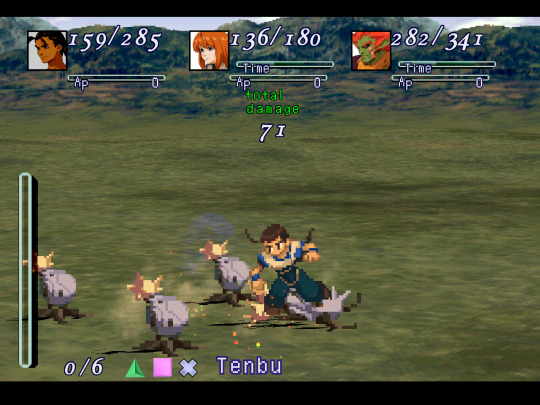
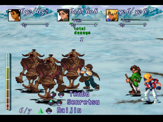
⬆ Also, DB icons, EP/Fuel/Miss text, and "total damage". Unfortunately, the other DB icons (showing the △🞪☐ highlighted) cannot be replaced as far as I can tell. The battle UI textures (the 17 or so textures of the same thing in varying hues) shows them on it, but changing them in each one of these textures does not change the icons. It does not pull from these specific texture dumps, in other words; its just one of those that doesn't dump, like the circular compass texture.
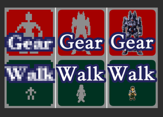
⬆ In working on the Walk/Gear icons I wasn't sure exactly how I'd go about doing it because the original is literally just that tiny. So I had the idea of putting a little Fei & Weltall in it, outlined by the same grey.
Thought it might be weird in the other party members' menus, idk, and I don't like changing things too much from the original, so I decided to just use Fei/Weltall as the grey silhouettes instead. Ill keep the Fei/Weltall one as an alt option if anyone wants to use it.
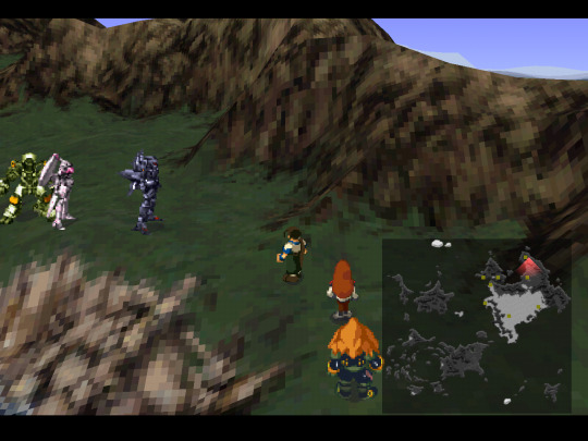
⬆ And the minimap.
Kept B&W so that the colored dots (indicators of where all you can enter an area) aren't difficult to see. I do have a colored version as an alt, though.
Credit to Adelinold for having ripped the 3D maps and made a bird's eye view "minimap" esque screenshot of the world map some years back because it is absolutely perfect for use here.
~~~~~
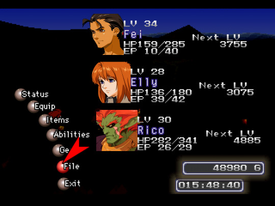
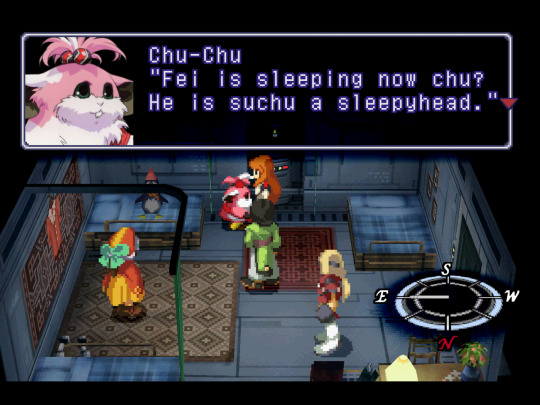
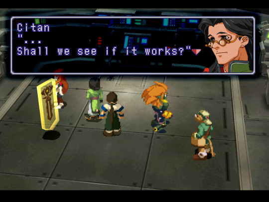
Now onto portraits, the main bulk of the work. This includes dialogue portraits, menu portraits, and gameplay portraits.
I go through each one individually, find the highest quality version of the art, and clean it up manually, painting over it to get rid of any jpg rot, scanning artifacts, or print dots from scans while keeping it as close to the artwork as possible. In order to keep colors consistent across the board (because scans of the artwork can vary) I'm picking from the sprites.
One portrait typically takes 2.5+ hours, not including testing them in-game. Each one needs to be tested in-game and edited to make sure semi-transparent pixels around the portraits don't result in black or white pixels in the area that should be transparent.
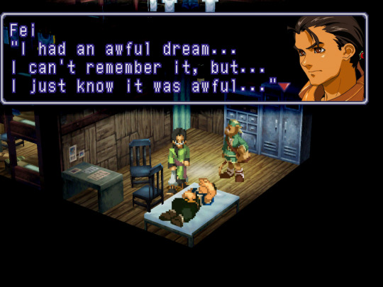
⬆ Direct comparison to the sprites. I'm not too strict about how I match how much of the art is shown, but in instances like this I like to show more of the character than the pixelated portraits allowed for. However, this wouldn't work for everyone as Fei's default portrait is also used when Kim is naked from the hips up.
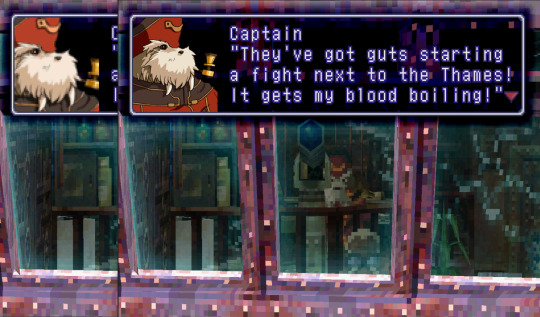
For the Captain I specifically wanted to get his pipe within frame. Typically the portraits end just behind their ear, have the eyes at 1/2 to 2/3 height, and end just above the clavicle.

⬆ Some portraits like Kim and Elly have no artwork equivalent, but were pretty basic to make with the artwork of Fei & Elly that we do have.

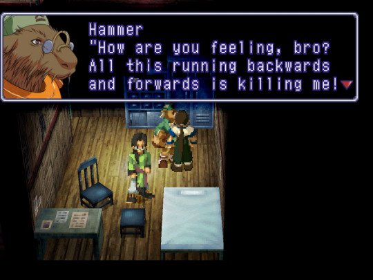
⬆ Other characters have no artwork equivalent whatsoever, like Stein and Wel-Gear Hammer. For Stein I had to take the collar from Stone's artwork and paint something from scratch using Stein's sprite as reference. This one was more fun to do than I expected because its a special case, entirely different from all of the other portraits.
For example, usually the artwork has 4 colors for skin- base color, shadow color, deep shadow color (usually seen directly under the chin, used sparingly), and a highlight color for on the nose or lip. But with Stein his skin had many different colors you could pick from the sprite and no equivalent artwork to limit yourself in how many there actually are. So in trying to get it looking just right it took something like 7 different shades of varying pink, red, and orange. It clearly has more dynamic shading compared to all of the other portraits.
For Wel-Gear Hammer... I did my best given what all I could see was even happening in the sprite.
⬆ I made a close eyed Elly portrait as there is no artwork of it and a bomb collar Fei and Hammer portrait using the bomb collar in Rico's art. Its fun playing around with them when there is no equivalent artwork.
⬆ Made an unsmiling Citan to mirror his unsmiling dialogue sprite vs his smiling menu sprites as well as alt Krelians to better match the expression of his mouth that the sprite has vs the artwork. (sprites are always a bit stretched compared to the artwork, btw. even when you rip them from the disc)
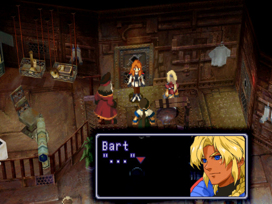
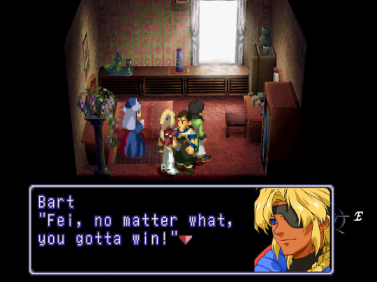
⬆ I'm also working on alternate versions, like a two-eyed Bart I did for fun.
~~~~~
It is finished! 1.0 anyway. Right in time for the North American 25th Anniversary! I just gotta get it uploaded somewhere.
I'll continue to work on the ones that I think still need more work, but for now even the ones that are in rougher shape are passable.
Ill have two versions of the mod- one with stretched and cropped portraits that work in 4:3 (much like the sprite portrait bmps in the base-game that end up looking fine in true 4:3. they kind of end up blurrier due to stretching the artwork) (with Crop Overscan set to None) and another version which isn't stretched or cropped so its as crisp as I could get them, but in order to get them to display the image exactly as they are in-game without squishing you need Crop Overscan set to Static (removes horizontal padding) which makes it just slightly off 4:3.
Honestly, to the untrained eye its hard to tell it isn't 4:3. 🤷♀️ The only thing you might notice it really affecting would be the animated cutscenes.
I'll make a master post for the mod itself, separate from this. This'll end up being a bit of a time capsule for me.
#Xenogears#xenogears spoilers#Xenogears texture mod#texture pack#modding#Playstation 1#PS1 classic#long post#oh cool this was my 100th post huh lol#updated 10/14/23
81 notes
·
View notes
Text
(long post ahead sorryyyyyy)
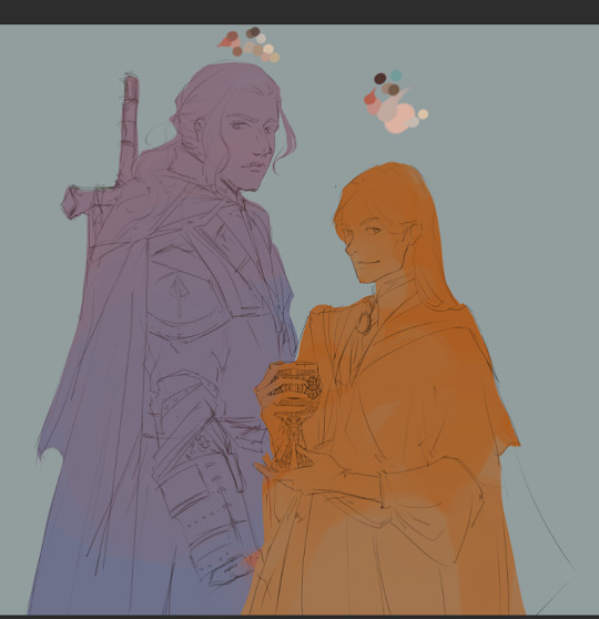
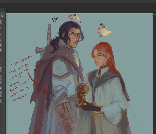
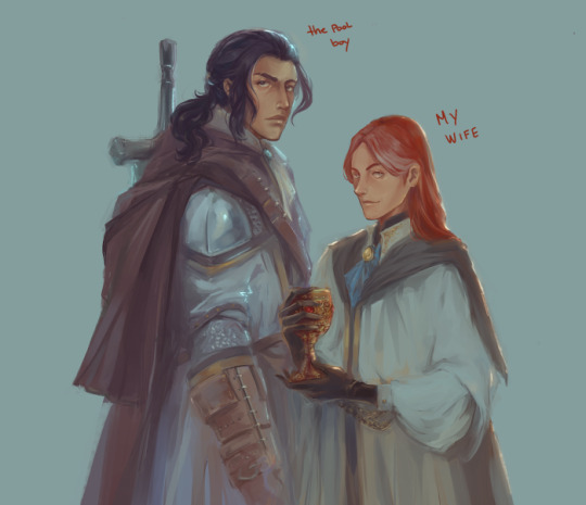
Some process shots at the request of @lizteaart :)
(sorry in advance - I was not struck with any impulse for originality, so you get these two posh mfs looking dumb and pretty.)
This is not meant to be a guide by any means, just a glimpse at how I (generally) build up paint and then colour correct. I work the same way unless I’m trying to achieve a particular style for practice or effect (like this piece, in which I strictly followed lineart and hated every second of it; or the Byrgenwerth portraits, done completely in greyscale and coloured with custom gradient maps).
I work in Clip Studio because there’s something about the colour blending that feels extra buttery, but I used to work in Photoshop; all of this applies cross-software anyway.
Step 1: lineart. If I’m not working stylistically for clean lineart, I leave it pretty loose. I almost always change things around while I’m colouring. I have about 3-4 rounds of progressive lineart until I’m happy (in a loose watercolour brush).
Step 2: I will have the lineart on multiply so I can work under it for a while. I sometimes (but not always) block in some rough colour underneath just for extra texture and in case I need to clip to layer later. I also put down a tentative palette (skin in this case) just so I can have a range for the colour dropper. I add and subtract from the palette while I work - but it also prevents things from getting too muddy, which can happen if you’re exclusively selecting colours from inside the work itself.

Step 3: (sorry, the screenshot is super small here) I do a VERY rough blocking in of colour just to see if things make sense (and so I don’t have to change my mind so much later). These are clipped to the colour-block layer from the previous image to save time. Sometimes I duplicate these layers and play around in modes to increase saturation, contrast, etc. Here I left them as is cause I’m going for a colouring style that’s a little more subtle.


Step 4 ad infinitum: refining. Here I’m starting with the skin and hair, since the focus of my work is always the character’s face. I try to work in a way that’s non-destructive: every time I establish a baseline of good build-up, I create a new layer and work on top of that. That way, if I over-render or muck something up, I can just delete that layer, and the previous state will still exist. In this work, I deleted at least one layer of rendering from both their faces, because at some point I felt like I’d over-rendered or lost some nice texture or good shape definition. But I still had whatever acceptable state saved beneath. I merge them as I go so they don’t get to be too many.

I’m trying to build a pretty smooth surface of skin here, which is a new thing for me, since I used to render with heavier, more textured brushes. Here I’m using about 3 different watercolour brushes. I work soft-hard-soft-hard: softening and blending, adding hard edges, and then going again until it looks somewhat convincing. I try to colour select as much pure colour from the palette so it doesn’t get too muddy, and I also like injecting some unexpected colour here and there, especially in shadows, like cyans, for a little more life.

Step 5: By now, I’ve started layering above the lineart. I only do this when I feel the facial structures are solid enough that I don’t need it anymore. But the lineart layers are still there, beneath, if I ever need to go back to it as a guide.
I also add a very low opacity gradient map at this step, for little more interesting saturation, and continue to work above it. I go back and forth between skin and hair so I don’t spend too much time on one thing, and give my brain a break to come back and notice things I would otherwise glaze over. I try not to over-render and still leave lots of evidence of painterly gesture.
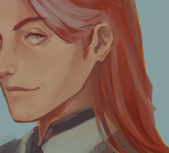
Closeup of the hair from base to almost-rendered. I add a sharpen filter to the hair often to get parts of it a little visually crispier.
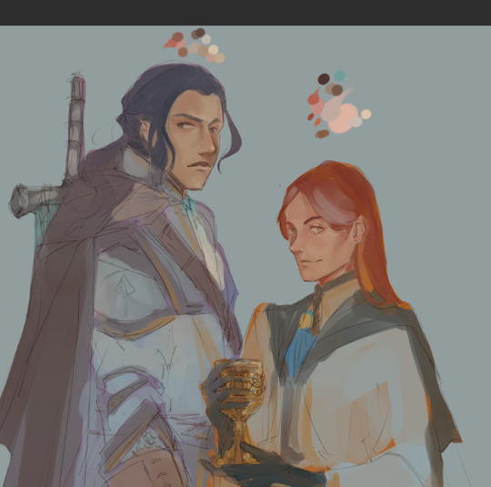
Step 6: the exact same thing but with fabric/armour/whatever. I mix my watercolour brushes with bulkier, meatier brushes for textile, since I can’t be arsed to render clothes with the same care as I do skin. These are the types I use (folks can DM/anon if they want the brush names, I have a million different sets and use maybe…ten).

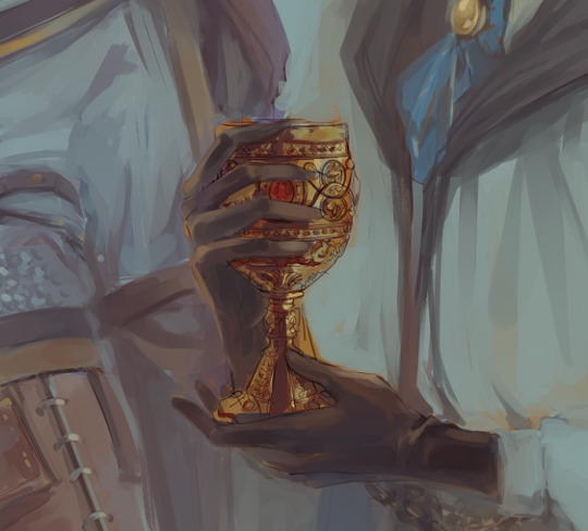
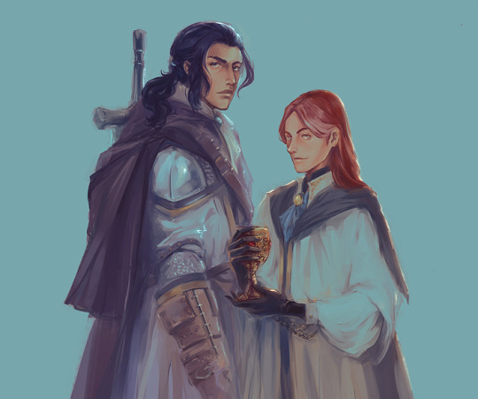
The chalice midway through render.
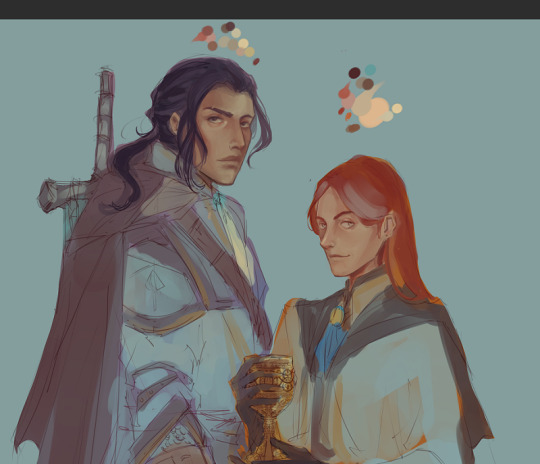
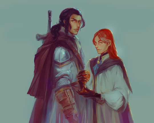
At this stage I will let it sit for a while longer. Whether it’s done is debatable and usually up to personal preference - you can render till kingdom come if you want something more realistic, but you might lose some lovely, sensitive evidence of gesture or interesting accidents. I also highly encourage playing with gradient maps if that’s something of stylistic interest. A good gradient map can do a bunch of things - change the whole temperature of a piece, push back certain details and pull others forward, etc (example here - this particular gradient didn’t suit what I was looking for, but it still manages to be visually interesting).
I usually come back and nitpick a few things before moving it into Photoshop where I’ll do colour management - another gradient map, fixing saturation/vibrancy, selective colour, etc - and anything structural that I may need liquify for. Then I’ll sharpen it one more time, slap a noise gradient on it if it feels like it needs some extra texture, and try not to hate it right after saving it LOL.
(I'll probably come back to this a few more times before posting something that feels more "finished").
Sorry for the long post - and hope this was helpful (•‿•)
#ask#wip#painting process#bloodborne#laurence the first vicar#ludwig the holy blade#digital painting#amateur hour
74 notes
·
View notes
Note
Hello! I was just wondering, because I've never created any form of modding in my life, if I wanted to create Ramona Flowers' hair from Scott Pilgrim, how hard do you think that would be? and what kind of tools would I need? I just see how absolutely jaw droppingly good you are at modding and I figured you might know 😅 Thank you!
Hi!
It might be a bit difficult at first as you learn, as most things are, but if I can learn it, ANYONE can.
What I recommend for achieving likeness when editing heads to look like real-life people:
first look through ALL of the different heads and their skin textures; who's bone structure looks the most similar? who's eyebrows are the most similar? do any have similar skin details (freckles, wrinkles, moles, etc.). Play around with putting different textures together in photoshop and trying your best to get a base that would look most similar to Ramona;
A LOT of reference photos. I recommend from all angles and constantly comparing them. I started a new process where i put my sculpt next to an image of the person I am using as a reference, and then if I am lucky, sometimes I can find a 3d sculpt someone else has done and I like to study that too, since it helps me understand what are the main aspects of the face that make it look like them (it could be the eye shape, lip shape, chin, etc.). You can also make some measurement guidelines to make sure you have similar proportions.
Portrait art of the person can also help since artists like to focus on general shapes over tiny details. Our brains can get too hung on small details and it ends up messing with how we are actually perceiving the face. When you look at artwork, you can see the general shapes of the face made simplified, which makes it a lot easier to sculpt the overall face structure.
Take breaks and step away from it for a bit. Looking back at it an hour or so later can help your brain "reset", as the longer we look at it, the less mistakes we notice. It is similar to artists who flip their canvas periodically to highlight any mistakes!
You can take a look at my tutorial on the basics here, where i also list the tools you will need to begin modding heads!
8 notes
·
View notes
Text
Hallmark’s Sense and Sensibility
Yes. YES. All I've ever wanted was an adaptation of Sense and Sensibility where Mr. Dashwood is white, Mary Dashwood is Black (or another race), so that the sisters are mixed and it causes even more tension between their older white half-brother and his wife.
As a mixed girl, I’ve been begging for this version of the story to be told.
I can't believe Hallmark is the one to do it, but I am ready and excited to watch.
Hmm... is Fanny mixed... is internalized racism going to be an issue for her too? If so, I am here for that.
Edward is Fanny's stepbrother... I don't think that was the case in the book. But I infamously hate Edward so maybe I just didn't pay close enough attention to him. (It's a change)
BONNETS. They have bonnets! They have natural hair (probably wigs but still, natural textures), and bonnets. I am actually super happy about the costuming so far.
Ok I might like this Edward... We'll see. We're not at the part where he makes me mad. But right now... he's ok.
"Right kind of woman" ok girl. Sure.
I really liked that scene between Mrs. Dashwood and Elinor, while Margaret played the pianoforte.
Oh Col. Brandon. Already smitten. I do have one complaint though: Mrs. Dashwood is supposed to be about 40, to make it so Col. Brandon being 35 offputs Marianne even more that he's close to her mother's age. But this Mrs. Dashwood (who I really really like so far) is being played as much older than 40.
YES CURLING RAGS. And am I crazy but are some of Marianne's clothes kind of leaning to wards 1820s transitionary styles? I sorta love that if that's the case.
OK Willoughby... ok. You cute. I love this "Who are you?" thing we got going on.
That painting of a Black man in Georgian-ish clothing. Someone remind me to look it up. I love the framing of this shot with Brandon and Willoughby, and the painting between them.
God I adore Mrs. Jennings. In generally but I really like this one.
God, fuck Willoughby. I always forget how much I hate him.
"A daughter." No no no you're supposed to say "natural daughter." Come on.
Oh poor Willoughby, what a coincidence he's called to London, while Brandon's already in London, dealing with an issue involving his "natural daughter." Such unlucky timing...
I can't wait to see Steele sisters. I hope their hair is blonde, so there's no doubt that the hair Edward has is NOT Elinor's. God. This is what I wanted from a S&S adaptation.
OOH the Miss Steeles are Black too! Ok. Ok. Fanny you absolute hypocrite.
OH MY GOD. THE PAINTING OF DIDO ELIZABETH BELLE IS IN THE BACKGROUND. Oh my god. I literally just squeaked. No random family would have that painting hanging, especially with the cousin cut out only showing Dido but STILL. And adding the fact that I once found an Amazon listing for an Austen novel using the cousin Elizabeth as the portrait and cutting out Dido (and also that the portrait is from 50 years earlier) made me so mad. This little easter egg of including Dido's portrait in this movie is like HEALING that specific moment's pain for me. Oh my god.
This adaptation, is far too good. It's so much better than I thought it would be.
Ah yes, the constant talk of "beau"s from Anne.
YES THE LOOP ON THE TRAIN.
This Lucy is diabolical. I don't think I remember her being so... almost mean. Annoying yes, but mean? Hmm...
Love all these Black paintings. I wonder if Juan will show up, though that's a Spanish painting not English.
Miss Jennings has white servants. Love it.
I think they made Robert worse.
"And I always keep my promises." You tell him.
I thought I was going crazy earlier, that a song sounded kind of pop-ish. But they're playing Kiss From a Rose right now on a string quartet, so they're going full Bridgerton with this. I didn't want to accuse it earlier, but now I must.
Ugh. Willoughby.
MRS. FERRARS IS BLACK. FANNY YOU SUCK. You're giving us light skinned mixed girls a bad name.
Edward didn't want to be in the same room as his main and his side chick. I forgot about the Mortons. He's got 3 girls. This is why I dislike him. And I really think this movie ended up playing up Robert Ferrars' personality in a way I'm not sure I liked, he was always charming but I don't think he was this rude.
Ok Marianne. You're not wrong. But I don't remember that. It's been over a year since I last read S&S, I really need to brush up on it I guess.
Wasn't Eliza married to Brandon's brother and then cast aside? I really need to brush up. However, god I'm reminded of how much I love Austen.
Well I enjoy this Edward's embarrassment a lot.
Ooh Fanny. I don't like Lucy but do not call her a peasant.
Ok fine, point to Edward. I will concede that this adaptation is doing a good job of making the watcher feel for Edward. I still dislike him the most of all Austen husbands.
This is truly a great Elinor.
They've been so careful with having everyone in gloves. And now Edward is thanking Elinor, taking her hand, and no one is in gloves. I see you costume department, I see you.
Yessss loose hair moment.
Oh my god, I always love Col Brandon when he says he won't rest until he brings Mrs. Dashwood and Margaret. Every single adaptation. It makes me so emotional.
Wow ok. This version is a very good Edward, a very good Elinor, a very good Marianne, a very good Brandon. Even a very good Willoughby. I can't believe they really made me actually want to forgive Edward. I usually still am salty towards him by the end. That alone makes this pretty amazing.
Costumes were fun. A little bit crazy but honestly sometimes Austen adaptations don't go crazy enough with the costumes. Minus some fit issues with the empire waists (same issues that Bridgerton is plagued by) and some weird closures in the backs of some dresses, it was really well done costume wise.
And I was surprised that race was not as much of an issue as wealth, though I still think that Fanny and Mrs. Ferrars had some colorism issues in there.
Really my only issue with the movie is that they didn't make clear how old Brandon was compared to Marianne. And I have some concerns about Robert's characterization. That's really all I can complain about though.
Dare I say... that Hallmark somehow created... my new favorite Sense and Sensibility adaptation...
7 notes
·
View notes
Note
A question for Woo. Would you enjoy an explorers DX getting revealed on the upcoming Pokemon Day?
// if this hypothetical proposes that this sort of explorers DX would be almost exactly the same in execution to rescue DX then I'd have to say................ no..............
before you bring out the pitchforks, let me explain myself. anyone who attends my streams or catches me in the wild in discord servers knows that I don't really like how the 3d games look. it's not as much a debate on "does pixel art or 3d models look better", but more "which style does chunsoft handle better", which I can sum up how I feel about in one screenshot

which is to say, my main problem with the 3D games is that the charm kinda got sucked straight out of them. it's true that pixel sprites have limitations- it's why we have portraits to more easily convey how characters are feeling, and your brain can fill in any missing details. but with 3D games, every aspect is able to be rendered out, and if you aren't going 100% all in, it's a lot more easy for the intended emotions to fall through. we have the ability to have pokemon emote like this now,

so why on earth is this the range that we're stuck with for PMD?

the simplest answer I can think of is that chunsoft is trying to apply the same strategy they used with sprites onto 3D models... which I think could work in theory, but not in the way they're applying it. as is, they don't have the models emote much and rely on portraits to carry the intended emotion through. the models also have some of the most stiff rigging I've seen in any game to date. I'm sure it has something to do with hardware limitations, but if that's the case I don't see why they couldn't create something that would fit their needs better like pokemon rumble's low poly models. well I know the answer is that they don't wanna actually render new 3D models for a PMD game and just use the library of models they got from gamefreak, but I like to think something like XY or ORAS's overworld models would make for a nicer looking game.

one pet peeve of mine is seeing folks praise DX for its unique look, which I think is true for the backgrounds!... but not really the models. I don't think putting an outline and paper texture overlay on the models is particularly revolutionary. it's a good direction to start, but far from peak aesthetic.
other problems I have with DX are how the main hub areas look (the grass for pokemon square is so blown out I have to play the game with lowered saturation and a darkened screen), and how the general UI looks in the dungeons. idk if it's because I'm neurodivergent or if it's just a "me" thing, but there's so much useless information being thrown at me at all times in a dungeon that it makes it really hard to focus on what's happening

I imagine this is mostly a side effect of losing the dual screen ability on the switch and I don't really have a proposed solution, but at least removing the text bubbles that come up every single time you get attacked or use a move would be a good start. maybe just save those for critical hits or smth idk, I don't really need to hear every single thought that comes out of my team.
I also think accessibility features like the auto-dungeon crawl feature are nice for those who want it, but it does feel a little overpowered by (seemingly) knowing exactly where the stairs are in a dungeon, which can take the exploration aspect out of playing the game. I'd also like the ability to disable that feature in a menu since I tend to misclick sometimes and accidentally activate things lmao
I just kinda tore into DX, but there are a few things I do like about it. the gummi system is vastly improved first of all (thank god I can stop grinding for one million gummis), and I think the dungeon environments are some of the best to come out of the series. I also think the models wearing scarves is super cute, I loved it in Super and am glad it made a return here. I'm sure there are other QOL features I'd like in theory but I kinda... didn't get very far in the game due to the aforementioned graphical and UI issues that felt like actual sandpaper to my brain.
if there was an explorers DX, I actually think one fun direction the series could take is something like pokemon cafe remix or paper mario, which is still the energy of a 2D game just using nice looking art assets instead of sprites. I just think a PMD game that looks like this could be really cute and charming...

and it'd probably be closer to chunsoft's wheelhouse since it'd take notes from how they put the sprite games together! just wishful thinking though. my current crack theory is that rescue DX was just to test the waters for how popular PMD still is and maybe to test out the engine on switch before releasing an original game, a la let's go pikachu/eevee to sword/shield. I doubt they'll make an explorers remake.
57 notes
·
View notes
Text
A little about me (condensed)
I'm Bambi! | Lesbian | transfem enby | 19 | she/they
My blog is a mix of memes, photography occasionally, and almost entirely wlw/nblw NSFT shit but also some SFT gay stuff too!
The love of my life and my dom @junipermead53 (she has a realllyyyy good blog btw <3)
I am only interested in monogamy so don’t fucking DM me if you want to flirt.
AUDHD, dyslexia, dyscalculia, ARFID.
Photographer and metalhead.
Switch with sub leanings
Kinks:
Praiseee | Praising degradation | Dumbification | Objectification | Humiliation
DNI LIST: racists, transphobes, homophobes, bigots, radical left or right mfs, ACAB lovers (don’t generalize an entire group, that’s blatant bigotry)
This is a safe space for faggots, trans peeps, also men, like idrc if you like my blog, you’re welcome here, but if you’re creepy, you get blocked I’m not gonna post furry stuff bc I’m not one but if you are, you are more than welcome here <3.
Hard no list: age play, slave stuff, knife/gunplay, rape. I think that’s it
Get to know me (expanded)
About ARFID, it’s an eating disorder that when boiled down could be categorized as extreme picky eating; like A LOT of textures and just foods in general I can’t have because they at the very least gross me the fuck out and make me want to curl in to a ball and die, if it’s semi bad I’ll get nauseous, and very bad I’ll throw up.
Metalhead; System Of A Down was my gateway band in 2017, since then I have fallen in love with almost all nu metal, deathcore, death, and little bit of black, metalcore, a bit of slam, pretty much all sub-genres. And A LOT of stuff outside of metal, https://open.spotify.com/playlist/4O1IOcEvkYuEZty34Ta3Pb?si=zah4hjStTJiV54jlXfD1hg my playlist for those who want to know what music I like <3 it’s very eclectic, and long. Like my di...
Photography; (as much as I want to show my photos on here I probably won’t for my privacy <3) I specialize in automotive, street, and portrait photography. (also I suppose you all will see my at least one of my photos bc I took the one on the cover of the playlist)
Kinks lol: Praise (so so much praise)
Praising degradation Eg “you’re being such a good slut for me aren’t you?” “Such an obedient toy for your dom”
Dumbification (when she tells me that I don’t get to think, just let her do all the thinking IEHEHWHDHWDIWBDJ, or she’ll say that I’m so dumb for her words, tell me that I’m just an object, her fuck toy OH. MY. GOD. THAT GETS ME SO MUCH
Objectification like I mentioned ^ I LOVE that I’m just an object to my dom, just a fucktoy, something to be used however she wants (not all the time tho, we’re not that kinky lol)
Cnc and freeuse
10 notes
·
View notes
Note
viiiic, what brushes do u use? 👀
hiii vin!
so i pretty much just use brushes that come with procreate. i have yet to really go looking for custom brushes. i only have two custom brush packs, one for freckles and a plaid checkered texture pack.
anyway, here are my most recently used brushes:
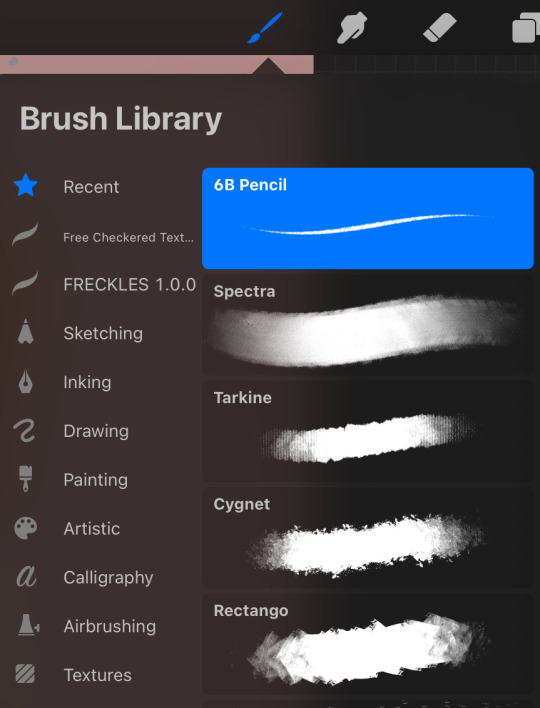
6B Pencil (located in Sketching) and Spectra (in Painting) are my go-to's for sure. I usually use the pencil for my lines and then Spectra for coloring. Sometimes I use Syrup (located in Inking), or another just basic fill brush to lay down flat colors. And then use Spectra for all the shading. Other times I just color with Spectra by itself.
the other 3 brushes shown above are all located in Textures and I've been using them recently for....textures! lol. mostly to clothing.
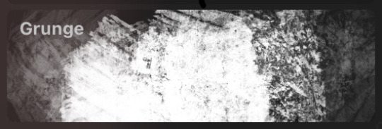
i also often use Grunge (Textures) and Heavy Metal (Industrial) when i'm doing textures on stuff like Dean's jacket or other things that are very worn.
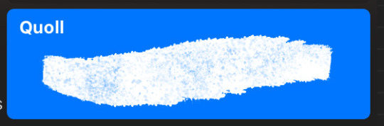
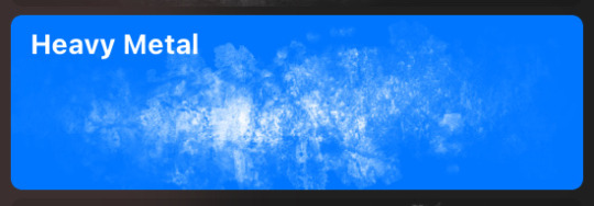
i like these two (Plimsoll and Quoll, both located in Artistic) also for textures on stuff like jeans sometimes.
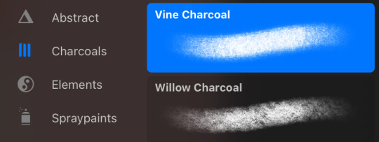
also all the charcoals in general for some textures from time to time. but these two, Vine and Willow, i use for when i'm doing more realistic pieces like this jensen portrait and this dean art because they blend really well.
lastly, freckles !!! so very important. i love my freckly boyyyy dean. i linked the freckles pack up above, and it comes with a ton of brushes, but my go to is Freckles 2.
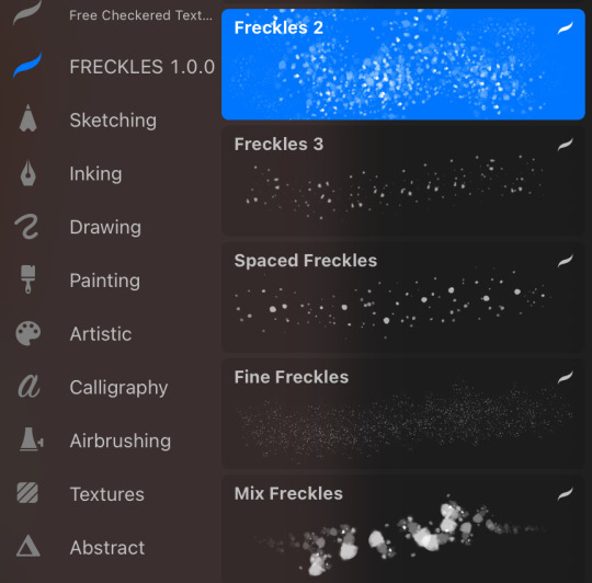
it gives a perfect mix of freckles and i just love it so much. sometimes i also use Spaced Freckles and Mix Freckles.
The freckles come out quite randomly though, especially with Freckles 2, like not always where you put your pen. So what I usually do is make a few different layers for my freckles and clipping masks to contain them to the skin layer. they i just lay down a bunch of freckles, different shades. and then go through and lightly erase some for a more faded look. or erase others completely if there are too many in one place.
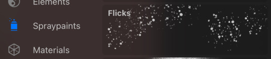
before i had this pack tho i used to use the Speckles (Spraypaint) brush.
anyway this got super long lol, but yeah these are my go-to brushes, though i love to play around with random brushes and stumble upon something new that makes a cool effect.
12 notes
·
View notes
Note
...just realized the ask i just sent you about the emoji ask game was from a year old post (sorry lolol) so here's the questions that went along with that:
🎨 - What colors or textures do you associate with the wip?
🥀 - Do any characters (even minor) die?
👀 - A piece of lore you’ve been waiting for an excuse to share
Aha, I see! I was wondering for a moment like "did I reblog an ask game and then forget?" xD But thanks for sending one in anyway! I don't usually get many but they're always fun :D
On to the questions!
What colours or textures do you associate with the WIP?
I feel like it's cheating to say all of them haha, despite rainbow (Asteria) and the deliberate colour dualities being a prominent thing for Starglass Zodiac. Colour in general is very important to this series, particularly for the magic system, and all three of the complimentary colour pairs appear in some way:
Red & Green - Cassie and Ophiuchus, or Libra and Ophiuchus
Blue & Orange - Solaris and Lunaris, and the Starglass for each
Purple & Yellow - The duality between Light and Void magic, and Scorpio and Scutum
I'd say the purple/yellow duality sticks out the most to me for the series overall, as it's the most prominently seen colour combo.
As for textures, I've never really thought about that before! I think maybe whatever texture there would be from the smoky/wispy appearance of the Unsigned spirits, it might feel a bit like air flow or water flow if you touched it.
Do any characters (even minor) die?
Unfortunately, yes. :') Considering this series mostly takes place in a spirit world, the concept of death and its duality with life is a prominent theme. How individual characters cope with it (or don't, in some cases) is of importance as well.
A piece of lore you’ve been waiting for an excuse to share
Hmm, I really had to think hard about this one! Of course there's a ton of lore that I could share that's heavy on the spoilers, but I want to keep at least some of it under wraps, haha! I guess I can talk a little bit about some lore I've made for the Star Fragments though.
Star Fragments, even prior to being made into full portraits by Aranea, have memories contained within them (not of their mortal lives but of their spirit lives, to clarify). As one might expect though, they're only fragments of the original constellation's memories until they are reunited with their other pieces.
Faint sounds or voices of these memories can sometimes be heard when close enough to a fragment (or several), and if touched, the memory will play in the mind of the person who touched it. When constructed into portraits, the full life of the spirit can be seen by walking into it.
It was quickly discovered, however, that only Ophiuchus could do this. Only he could hear the voices coming from the Star Fragments and see their memories, but only after he was given the Sun Starglass. This later increased the incentive to find the fragments in the first place, outside of general preservation of course. When Cassie finds out that she can do this as well, it is assumed that this is an ability shared by bearers of the Starglass, but the reason why is unknown.
Constellations of objects can still produce Star Fragments and are preserved in portraits in the same way, going through the same reincarnation process as the others as well. But unless those objects are actually sentient in some way when they were alive, their portraits do not have memories attached to them.
#this isn't nearly as long as the other asks I've done but I put it under the cut anyway lol#thanks for the ask! :D#asks#tabsters#Starglass Zodiac#SGZ#ask game
3 notes
·
View notes
Note
Do you have any drawing tips?
•When it comes to digital art, if you struggle making lines clean or sharp enough, using a textured brush erases that struggle because the whole point is not being clean or sharp.

^left is obvious where mistakes were made and had to be erased, looks choppy and needs cleaned up. right does not need cleaned up much. saves time and energy!
•if a drawing looks a little too bland or unfinished, but you don't know what else to do about it, adding a texture overlay does a lot, especially for solid backgrounds
•For both traditional and digital artists, do👏art👏studies👏. No, this doesn't mean sign up for expensive art classes, it means spend a page in a sketchbook just practicing one thing. So instead of drawing say, a character portrait like usual, have a page that's just full of hands in different poses (use references! Very important for studies!)
2016 example, but you can tell which ones had references (hint: only 3 of them did,but they're way better than the rest)
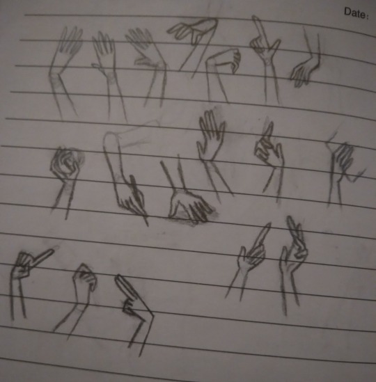
the only recent example I had was an unfinished page of bird skulls :/
Which brings me toooo
Learning to draw realistic skeletons can also really help with anatomy, if your character looks wonky, think "could a skeleton fit in there?"
Thinking abt how their skeleton looks can help notice things like the eyes being too high up or the mouth being too low, or having no room for a brain
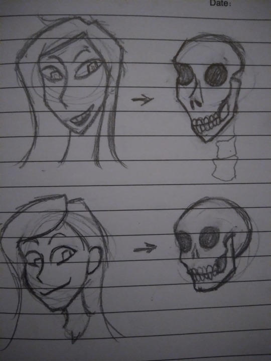
*this is not a dig at people with this style! It's okay to have more exaggerated features and you don't need to draw realism! The skeleton rule does not apply to cartoony characters obviously. Just some advice from someone that used to put the mouth too low all the time
•if you get stuck where you feel like you aren't improving, try different art styles out.
•If you have art block and don't know what to draw, try the 'dtiys' or 'draw this in your style' tags and pick something there, or do screenshot redraws from games or shows
•If you usually listen to music when you draw but it's just not doing it atm, switch to something like long YouTube commentary videos or documentaries, and vise versa. Sometimes the brain wants music, sometimes it wants information or gossip. When you get burned out from one go to the other
•this applies to traditional and digital art too! If you have art block on one medium, switch to another! If digital isn't working, grab a pencil or paintbrush, or play with some clay! Sometimes the brain isn't bored of art, it's just bored of the medium.
•If you're trying realism and struggling, break it down to simple rules.
And I don't mean the shape thing everyone suggests, I mean things like "the inner corner of the eye lines up with the mouth, the outer corner of the eyes lines up with the ears, your nose bridge leans into your eyebrows, feet are the same length as your elbow to your wrist, use the collar bone to guide the shoulder position, the armpit curves into the breast, etc.
*this doesn't apply to everyone or every expression! Remember the mouth moves around and comes in all shapes, it's a very loose "rule", and people's eyes aren't always the same distance or angle, just keep the ear around that general eye area
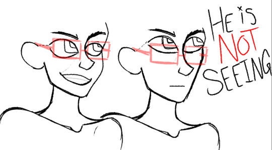
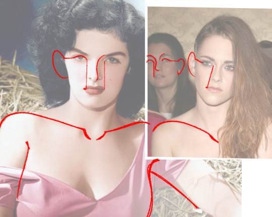
Glasses test: can your character wear glasses?
carlos passes glasses test-
a better rule for mouths is to imagine smile lines, even if whoever youre drawing doesnt have wrinkles, theyre a good guide for mouth placement
•doing color palette challenges can help practice composition and shading with abnormal colors, and helps understand color theory
•for digital, you can overlay colors over a drawing to make the palette more uniform. Don't be shy abt messing around with it

•Watch speedpaints! Watch pencil animation clips! It helps
•don't be afraid to use your art supplies. Ik the struggle of "but I don't wanna waste it", but that paint will go bad if you keep it on a shelf for years! Use it already! Doodle in the "fancy" sketchbook! Yolo!!
•use cyan and magenta for mixing paint, not blue and red. The "primary colors" rule doesn't always apply to all mediums.
•keep your old art! Do not tear it up or throw it out just because you're not proud of it, it's cool to reflect or even redraw it years down the line (backup your digital art somewhere, even the ones not posted online because your computer could just die one day for no reason and take everything with it. It sucks)
•IF you sketch on paper and then digitalize it later, you can draw the pieces seperately and photoshop them together. So dont worry if you drew a really good hand but it's at the slightly wrong angle, or too far away from the body. You can put it where it needs to be without having to erase and redraw it
11 notes
·
View notes
Note
How about 2, 23 and 25 for the ask meme??
2. 5 favourites of your own work?
we're gonna exclude the ric one (grey i can't believe you're making me look through my old work like this /joking) cos we already know about that one. in no particular order:
ourple landscape. there's just something about it i keep coming back to (+ the tags people left on it are probably some of my favourite) ! may get it printed out to put in my room
this theron portrait for neon background texture reasons. nar shaddaa aesthetic
sil's empathy/shivers disco skill portrait (which was meant to be a series but stopped after ry when i got re-obsessed with fh). came out pretty much how i envisioned it :D
rom's shiloh - probably one of if not The Best portraits ive done so far + i liked the rendering making it all blend together
reserving this last spot for a panel in the steelsnap comic wip (i forgor i didn't actually post it for a wip wednesday so you guys will need to wait and see for it.) but essentially i tried something new out and REALLY liked the effect
23. Do you listen to music or watch shows while you work? If so, what’s your favourite?
yep! generally prefer to draw with background noise rather than silence. of late my favourite is mostly the songs on sura's/juno's playlist (or my surawei one). nonexhaustive list of artists i like to listen to:
half-alive
bastille
fall out boy
baths
mashrou' leila
florence + the machine
tame impala
mika
hozier
marina
the hoosiers
young the giant
arctic monkeys
mother mother
IDKHOW
two door cinema club
everything everything
also any new songs i really like that i play on loop until im physically sick of them lol. or i'll put on an audiobook (murderbot diaries or locked tomb, i really love kevin r free and moira quirk's narration) or podcast (wonderful with griffin + rachel mcelroy or literature and history by doug metzger, on that note PLEASE PLEASE TRY LITERATURE AND HISTORY OUT OMG it's so well researched and presented.) or a video essay, depends on how i'm feeling on the day
25. Based on your recent reference searches, what would the FBI assume about you?
possibly into nigerian dwarf goat keeping, obscure meme-loving weirdo???? fdsjkgk idk
4 notes
·
View notes
Text
D&D Character: Caerrak

Just felt like putting together a little thing for the characters I’m currently in a homebrew campaign with. This is my primary.
Homebrew element of note here that I can actually mention are his age because elves and half-elves age differently from normal D&D here. Half-elves reach physical and mental maturity in equivalent years to their mother race. So a half-elf with a human mother reaches maturity at human rates but half-elves with an elven mother do so like an elf though their total longevity remains the same regardless.
Aside Note: The DMs preference in play-style that PCs are “people of extraordinary talent” so players are allowed to either be a jack-of-all-trades type (average or above average in all stats but nothing 18 or higher) or a master-of-one type (allowing one stat to be 18-20 at the sacrifice of another stat).
Appearance: Caerrak is a young male half elf. He stands at 5′ 8″ with a lithe build. He has shiny deep black hair that gains a subtle iridescence very much akin to crow feathers in direct light. It has a very fine silky texture and always has an untamed quality that gives it a permanently messy appearance. His eyes look like they belong on a bird instead of a man in the shape of the iris and pupil. They are also heterochromatic, with one eye being a bright robins egg blue and the other a deep black. His pointed ears are pierced several times each though he doesn’t often have the patience to wear jewelry in all of them. Caerrak wears a lot of clothing dyed in various colors of blue under a long jerkin made of animal hide dyed almost black. Long black feathers have been sewn into the jerkin around the shoulders and across the back.
Backstory: Caerrak was marked at birth as being god blessed because of the appearance of his eyes, a feature that had long been a symbol of favor from his home regions patron deity. Despite being told this his entire life Caerrak lived most of his life showing none of the supposed abilities those around him claimed he should have. As a child he would argue this fact but was so often ignored that he eventually gave up and simply learned to fake it. He began learning various ways to fake the miracles he was meant to perform, learning to throw his voice, mimic sounds, and perform various sleight of hand tricks. In addition he became very proficient at telling fortunes through the use of cards and using basic alchemy to cure various ills. Both real and perceived (or suggested).
Then...one day...it all changed. Magic he had formerly faked became real spells and he could lay out his cards and actually understand them, and what they told him was the truth...and it wasn’t good.
Personality: Caerrak is very kind at heart, and while he can lie, con, and steal without batting an eyelash...he does his best not to harm those who seem undeserving. On the flip side...he absolutely can’t stand those who choose to be hateful or cruel without reason as well as general rudeness. He particularly loves cheating those who meet these criteria...even if the end result doesn’t lead to much gain. He can be a bit greedy and has a hard time turning down opportunities that could lead to making himself money...though he will just as eagerly spend or give that money away. His joy seems to be in the making or taking of it...and not so much the need for it in general. He is prone to making decisions on a whim and rarely takes into account possible consequences, even in dangerous circumstances.
A fun extra: These are Caerrak’s dice sets and some cards from his tarot deck which doubles as his divine focus. The clear dice have UV activated glowing sparkles and the darker set are blue galaxy dice.
Portrait Art Credit: Myself <3
Custom Character Sheet Credit: Liath

4 notes
·
View notes
Text
Cyberpunks' Guide to Low Key Photography with AMM

Low key photography is a term used to describe a style of high contrast, dark tones and shadows. It was commonly used aesthetic to add drama, depth and dimension into an image.
Normally, this is achieved through lowering the ISO of a camera and increasing the exposure. But for Cyberpunk 2077′s Photo Mode, the stylised image can be produced within the frame.
This guide will use only AMM without using any post-processing techniques outside in-game Photo Mode’s settings.
Sakuran’s Dark Studio

(Yes; it is a screenshot of the area!)
This is a pitch black outdoor area at Arasaka Tower with little to no ambient light at night (like 10pm?).
You can reach there with Cyber Engine Tweaks’s console :
Game.TeleportPlayerToPosition(-1347.3859863281,140.73120117188,545.84606933594)
Or download the AMM’s location from the Discord server.
There are three customizable light source within AMM’s decor panel :
Area Light (Fluorescent), Point Light (Spherical), Spot Light (Flat)
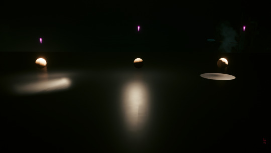
Personally, I prefer Customizable Spot Light for my general photography. It have a uniform direct lighting that can be fine-tuned and shaped.
You can also use Otis_Inf’s CyberLit if you have them.
Three Principles of Light in Photography
1. Direction
Refers to where the light(s) are coming from in relation to the camera.
2. Intensity
This is how much light is hitting any aspects of your scene or subject.
3. Softness or Hardness
This is the subjective quality of the light that can add drama or natural look to a scene.
In lighting for photography, we used an Inverse-Square law that stated the intensity of the light vary with distance.
This mean; the closer the light source, the harsher it will be. And vice versa; the further the light source, the softer it will be.

I also used the Photo Mode’s composition grid to determine the direction and placement of the light source.
This is called One Light Portrait Setup ;

At this stage, I adjust the Field of View and the frame’s composition.

For this photo shoot; I used in-game Black and White filter and increased the exposure and contrast. I also accentuated the texture within the frame by increasing the highlights.

(This is just eyeballing what I like and how I see on my monitor. It was entirely subjective.)
My goal for this photo shoot :
I want to create dramatic black-and-white portraits that exude emotional intensity and the personalities of the subjects. I want to familiarise myself with lighting techniques and using the light to sculp and enhance features. More eye lights!
Play time!


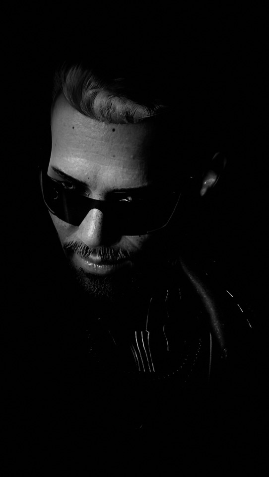


Low Key photography is a valuable toolset especially for a portrait photographer. This is an old artistic technique with many uses for both in-game photography and in real life. It required some understanding of lights, shadows, values and contrast to create dynamic frames.
Overall, I’m very satisfied with today’s session. I had a slight trouble with my multiple characters’ workflow; I should’ve posed characters with the same height first before switching to taller characters.
In the future I will attempt more advanced lighting setup; coloured lighting (think John Wick 2) and rim lighting.
And of course, practice!
Need more guides with AMM? How to Pose with multiple NPCs and types of NPC Poses.
#Cyberpunk2077#Cyberpunk 2077#Cyberpunk 2077 Photo Mode#Appearance Menu Mod#Virtual Photography#Photography Techniques#Low Key Photography#Johnny Silverhand#Keanu Reeves#Female V#oc: Mawar#Alt Cunningham#Rogue Amendiares#Kerry Eurodyne#River Ward#Goro Takemura#Panam Palmer#Judy Alvarez#Jackie Welles
14 notes
·
View notes
Note
One thing that I did not like in Engage was the 3d modeling remplacing the portraits. Like : the 3d models were really bland compared to Pikazo's artstyle. the only one that looked good to me was the twins' model. the others are.... bland
tbh, and its something i stand by even after playing the game and generally really enjoying it and its looks as a game [seriously engage can look gorgeous at times], the 3d models just aren't good overall. they're weirdly proportioned, they dont quite catch the magic of pikazos artwork in terms of texture, colouring and lighting. and well the animation especially in battle is vastly improved and a joy to behold, in the in between text box talking scenes [ya know, the scenes that make most of the game] they still dont move quite right for the style they have.
2 notes
·
View notes
Text
Do you wish to draw Crazy Hyper realistic Portraits? If the answer is a big YESSSSS! Then let’s go ahead to knowing every detail you got to know about it!
Realism is a learnable skill. You can develop by learning in detail and practising consistently. This is a blog wherein you get all the information at one place. However, for structural learning, you can check out our online drawing course which is a no shortcut, detailed, structured process of learning just within 8 months!
Materials:

Materials are extremely important as we begin with the process. For black and white portraits, you can use charcoal or graphite or use both. Graphite is shiny and hence while combining both, you will notice that charcoal wouldn’t work on top of multiple graphite layers.
Check out my Material List and a detailed description about my experience with each brand and strongest recommendations.
Always keep a rough book handy to make small thumbnail scribbles of your imaginations, ideas and concepts. It really helps in the most unexpected times. Also, even if you are into hyper realism or wanting to get started, it is extremely important to sketch daily. Daily sketching must include drawing from life, doodles, anatomical studies, gestures, colour study, creative expression etc. It could be anything that you want your mind to dwell into! Daily sketching develops rhythm in your art and serves a collection of your ideas.
Shading with Pencils
Graphite and charcoal includes a variety of materials like sticks, chalk, and powder. Every type has its own advantages yet using a pencil helps in creating extreme minute details and textures.
Methods of Shading
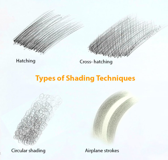
There are various methods of shading any hyper realistic portraits. For hyper realism, the texture has to look realistic, hence it is preferred to shade either by blending or layering or combining both. My personal opinion is layering as the uniform texture grain is appealing and creating textures becomes easy! In the process of shading, it is extremely important to understand and develop a strong observation on tonal values.
One side Hatching
Cross hatching
Blending
Layering
Blending and Value scale

Value means the darkness or lightness of anything. How dark or how light it is, is defined by Value. Between black and white lies various shades of grey, and there is no exact count of these in between. We can develop the value scale as a step-by-step or transition of tones. The actual struggle in bringing realism is the struggle of application of graceless. When the exact tone is rendered in the exact place, automatically the artwork looks realistic. And once this skill is mastered, you can apply the same in colour medium. Generally we look for shortcuts such as blending due to which we miss accurate placement of tonal values. You must be thinking, then how to blend or shade? Check out our guide to learning hyper realistic portrait drawing which has all the information you need!
Reading References
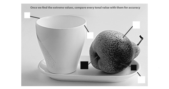
Do you draw a black and white portrait using a colour reference? If yes, then I think it’s a better idea if you convert the reference into black and white by desaturating the image. How? You can edit your image using the saturation tool and make it -100. Then, you can adjust the brightness and contrast and get started. I am sure this will impact much more than you think just by changing this simple thing. Now comes, how to read the references?
Understand the play of light on form, Learn to see big masses of light and shadow first, rather than individual features
Make a judgement of the direction of strokes,
Create the Base layers
Add textures in the later stage
Use a magnifying glass to understand the abstraction of textures in detail
Bonus Tip: Mark the lightest and the darkest tone in your reference and create the same in your drawing too. And always compare the tones with these two extremes. This will help you in consciously creating depth and repetitive practice will refine your ability to master this subject.
For such more bonus tips and in depth learning, check out our realistic pencil drawing coursewhich is appropriate for absolute beginners too.
Let’s Discuss some important aspects of drawing portraits!
Understanding the structure and anatomy of every feature is extremely important.
Hyperrealism is not just copying the exact reference, It is a skill which needs to be tactfully applied. Many of us rush to learn realism and not focus on learning drawing or understanding how an actual human face is designed, its structural anatomy. This negligence will affect you in the long term.
Every line of your drawing must be a part of conveying the form and shading to add the mass to the form.
Every line you draw must have a purpose, a meaning. So do not draw randomly. Similarly, every stroke of rendering serves a purpose to reflect third dimension and depth. Some may fear to shade it dark and so they keep the overall portrait light and others render so dark that eventually they have to spend most of their time in repairing.
Do not get confused. Use a value scale and follow it. Then emphasise on anything that inspires you. Example, I like to create emphasis in the highlight of the eye by increasing its contrast.
Perceptual errors
We all have this ability to make a perpetual error of overemphasising individual contrast. Learn to observe relatively with elements around. This error is actually an error of perceptions. When drawing hyper realistic portraits, as much as you focus on individual areas, apply the same focus to observe the overall areas of the portrait. Do this often.
Our eyes often get tired seeing the same detail repeatedly. Take breaks to analyse, to summarise every step of the process.
No shortcuts
There is a greater amount of patience required to create hyper realistic portraits. There are going to be times where you feel it is better to ‘finish it off’, that eagerness to post on social media, or several other reasons. Decide to create the best out if you. Commit to it even if it takes weeks, months or even years.
Commit to Light and Shadow
Light is everything. It gives anything a structure, it shows our eyes how the object is seen, it helps us to develop a perception, focus to capture, capture that feeling or emotion through art. The illusion of space and depth can be achieved only after a technical study of light and form on every texture, every single form, every detail you look into. The stronger the commitment, the better the results!
Artistry with Edges
I still believe there is no camera equivalent to the power of the human eye. What we look at (directly) is the most detailed whereas the rest are blurred and general. Aim to mimic this! Drawing is all about creating a balance and a focal point. Aim to create areas of detail and sharp edges and areas of simplicity and soft edges. Remember, there are no outlines.
Creative decisions
In the process of realism, there are many intentional, intuitive, advanced and creative decisions that take you back to the fundamentals and concepts of drawing and painting ; experiment with it to create what is ‘beyond realism’.
Learn the fundamentals as they are the core to any creative expression. We have a structured roadmap to deepen your understanding and simplify the process. Check out our online sketching course with affordable mentorship!
#skecthing#best-drawing-tutorials#online-drawing-lessons#pencil art#drawing#design#art#how to draw#sculpture#sketch-drawing#portrait-drawing
4 notes
·
View notes
Last Seen Blogs
heart-eyes-motheracker
I'm a romantic moron loser

xpatriciahopex
Patricia Oliveira
jona-rose
JoRo's blog but for art
skykid-34
にゃんこ と その他
snusnuart
BottomObiWan