#best-drawing-tutorials
Text
Do you wish to draw Crazy Hyper realistic Portraits? If the answer is a big YESSSSS! Then let’s go ahead to knowing every detail you got to know about it!
Realism is a learnable skill. You can develop by learning in detail and practising consistently. This is a blog wherein you get all the information at one place. However, for structural learning, you can check out our online drawing course which is a no shortcut, detailed, structured process of learning just within 8 months!
Materials:

Materials are extremely important as we begin with the process. For black and white portraits, you can use charcoal or graphite or use both. Graphite is shiny and hence while combining both, you will notice that charcoal wouldn’t work on top of multiple graphite layers.
Check out my Material List and a detailed description about my experience with each brand and strongest recommendations.
Always keep a rough book handy to make small thumbnail scribbles of your imaginations, ideas and concepts. It really helps in the most unexpected times. Also, even if you are into hyper realism or wanting to get started, it is extremely important to sketch daily. Daily sketching must include drawing from life, doodles, anatomical studies, gestures, colour study, creative expression etc. It could be anything that you want your mind to dwell into! Daily sketching develops rhythm in your art and serves a collection of your ideas.
Shading with Pencils
Graphite and charcoal includes a variety of materials like sticks, chalk, and powder. Every type has its own advantages yet using a pencil helps in creating extreme minute details and textures.
Methods of Shading
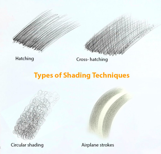
There are various methods of shading any hyper realistic portraits. For hyper realism, the texture has to look realistic, hence it is preferred to shade either by blending or layering or combining both. My personal opinion is layering as the uniform texture grain is appealing and creating textures becomes easy! In the process of shading, it is extremely important to understand and develop a strong observation on tonal values.
One side Hatching
Cross hatching
Blending
Layering
Blending and Value scale

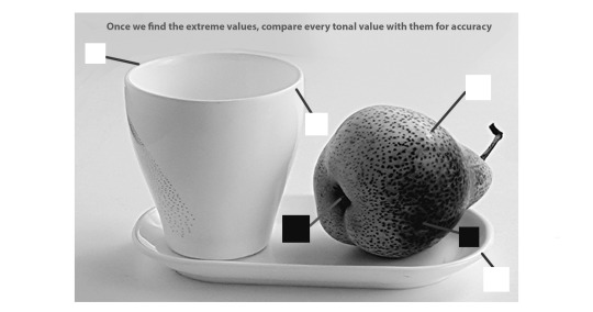
Value means the darkness or lightness of anything. How dark or how light it is, is defined by Value. Between black and white lies various shades of grey, and there is no exact count of these in between. We can develop the value scale as a step-by-step or transition of tones. The actual struggle in bringing realism is the struggle of application of graceless. When the exact tone is rendered in the exact place, automatically the artwork looks realistic. And once this skill is mastered, you can apply the same in colour medium. Generally we look for shortcuts such as blending due to which we miss accurate placement of tonal values. You must be thinking, then how to blend or shade? Check out our guide to learning hyper realistic portrait drawing which has all the information you need!
Reading References
Do you draw a black and white portrait using a colour reference? If yes, then I think it’s a better idea if you convert the reference into black and white by desaturating the image. How? You can edit your image using the saturation tool and make it -100. Then, you can adjust the brightness and contrast and get started. I am sure this will impact much more than you think just by changing this simple thing. Now comes, how to read the references?
Understand the play of light on form, Learn to see big masses of light and shadow first, rather than individual features
Make a judgement of the direction of strokes,
Create the Base layers
Add textures in the later stage
Use a magnifying glass to understand the abstraction of textures in detail
Bonus Tip: Mark the lightest and the darkest tone in your reference and create the same in your drawing too. And always compare the tones with these two extremes. This will help you in consciously creating depth and repetitive practice will refine your ability to master this subject.
For such more bonus tips and in depth learning, check out our realistic pencil drawing coursewhich is appropriate for absolute beginners too.
Let’s Discuss some important aspects of drawing portraits!
Understanding the structure and anatomy of every feature is extremely important.
Hyperrealism is not just copying the exact reference, It is a skill which needs to be tactfully applied. Many of us rush to learn realism and not focus on learning drawing or understanding how an actual human face is designed, its structural anatomy. This negligence will affect you in the long term.
Every line of your drawing must be a part of conveying the form and shading to add the mass to the form.
Every line you draw must have a purpose, a meaning. So do not draw randomly. Similarly, every stroke of rendering serves a purpose to reflect third dimension and depth. Some may fear to shade it dark and so they keep the overall portrait light and others render so dark that eventually they have to spend most of their time in repairing.
Do not get confused. Use a value scale and follow it. Then emphasise on anything that inspires you. Example, I like to create emphasis in the highlight of the eye by increasing its contrast.
Perceptual errors
We all have this ability to make a perpetual error of overemphasising individual contrast. Learn to observe relatively with elements around. This error is actually an error of perceptions. When drawing hyper realistic portraits, as much as you focus on individual areas, apply the same focus to observe the overall areas of the portrait. Do this often.
Our eyes often get tired seeing the same detail repeatedly. Take breaks to analyse, to summarise every step of the process.
No shortcuts
There is a greater amount of patience required to create hyper realistic portraits. There are going to be times where you feel it is better to ‘finish it off’, that eagerness to post on social media, or several other reasons. Decide to create the best out if you. Commit to it even if it takes weeks, months or even years.
Commit to Light and Shadow
Light is everything. It gives anything a structure, it shows our eyes how the object is seen, it helps us to develop a perception, focus to capture, capture that feeling or emotion through art. The illusion of space and depth can be achieved only after a technical study of light and form on every texture, every single form, every detail you look into. The stronger the commitment, the better the results!
Artistry with Edges
I still believe there is no camera equivalent to the power of the human eye. What we look at (directly) is the most detailed whereas the rest are blurred and general. Aim to mimic this! Drawing is all about creating a balance and a focal point. Aim to create areas of detail and sharp edges and areas of simplicity and soft edges. Remember, there are no outlines.
Creative decisions
In the process of realism, there are many intentional, intuitive, advanced and creative decisions that take you back to the fundamentals and concepts of drawing and painting ; experiment with it to create what is ‘beyond realism’.
Learn the fundamentals as they are the core to any creative expression. We have a structured roadmap to deepen your understanding and simplify the process. Check out our online sketching course with affordable mentorship!
#skecthing#best-drawing-tutorials#online-drawing-lessons#pencil art#drawing#design#art#how to draw#sculpture#sketch-drawing#portrait-drawing
4 notes
·
View notes
Text
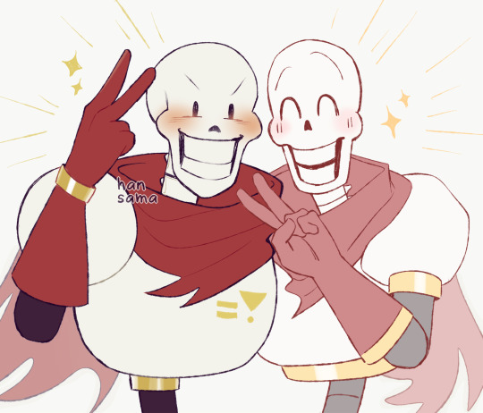
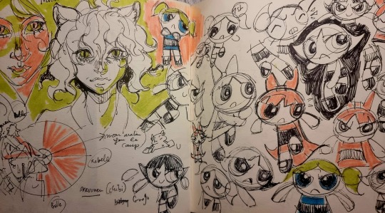
I tried to sketch Papyrus in both my art style and @skull-otaku xD
#undertale#papyrus#undertale papyrus#i was going to do a warm-up sketch#i remembered the papyrus tutorial skull-otaku made#so i did paps in both our styles xDDD#this was very spontaneous LOL#anyway the truth is i'm not sure if this really IS my style of drawing paps ASKDLHGLKDHG#I DON'T HAVE ONE?? X'DDD#but at least this is how i draw the head! i think!!!! x'DDDDD#also paps is still not easy for me to draw ==;;#he problem isn't with the head i think but rather with the body???#Also the mouth sometimes ASDGDJ#idk idk xDDDD#have a drawing of two papses!!!#they're cute!#i don't think i did Skull-otaku's art style justice but i tried my best x'DDD#their whole artstyle is nice i like their sans as well#also this made me realize how wide I draw pap's head in comparison to other artstyles x'DDDD#their paps head is very long/vertical/thin?? XDDDDD#it's really cute
1K notes
·
View notes
Note
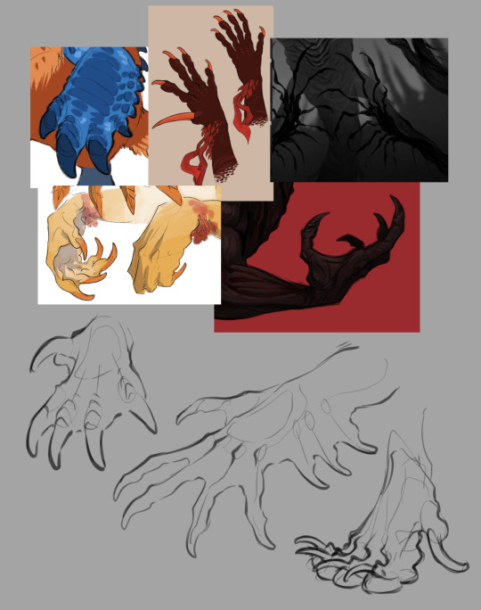
:V Do you have any tips on how to better draw paws/claws/monster hands?
To me this is a very broad question. I don't understand exactly what you're asking for. So I'm gonna throw some thoughts and hope that at least some of it is useful. X3
(btw I don't want to call this a "better way" to draw, it's just some tips and thoughts. I'm not an expert. :p)
There's no right or wrong way to draw monster hands and anatomy. You can do whatever you want with it, it's wonderful!
But if you want to know how I like to think when drawing and designing, here ya go!
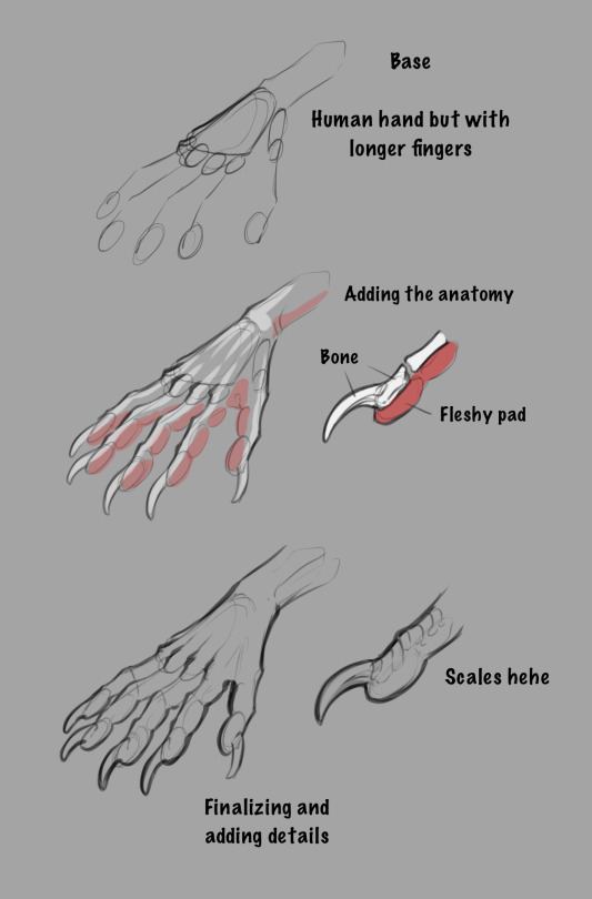
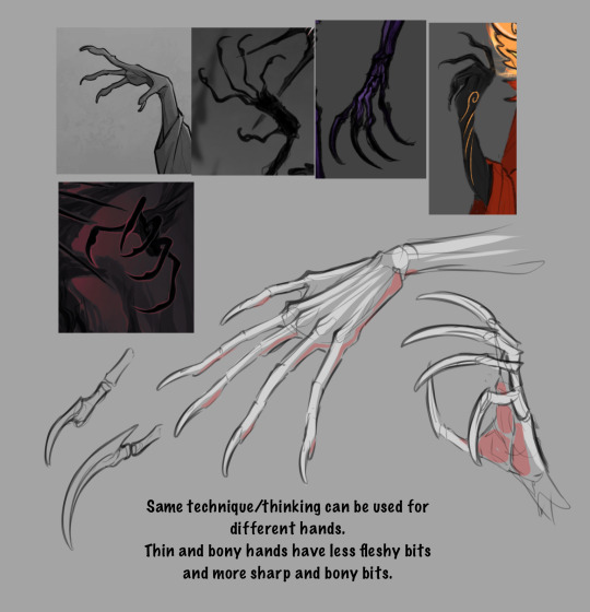

(The anatomy can of course be completely different, these are just more human like hands as easy examples.)
For me, having an understanding of human hand anatomy along with animal paw anatomy is the key to designing and drawing believable monster/creature hands.
There are so many weird and cool clawed hands/paws out there! Getting inspiration from them and using them as reference is always helpful!
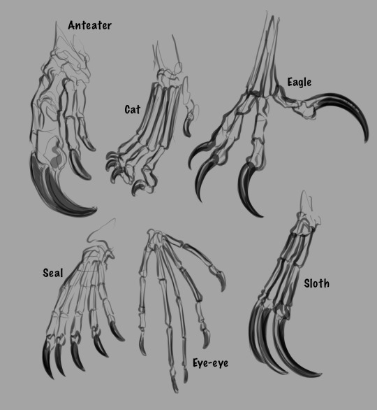
But remember to have fun! Experiment! Play with the anatomy or throw it all out the window, all approaches are valid as long as you're having fun! :3
#hope any of this was helpful pfdhfhfj#if you got any more specific tips you'd like to get. please don't hesitate to ask for them!#I'll try to answer them to the best of my abilities! :3#also thank you for making me draw so many hands! i really enjoyed drawing every single one#asks#anatomy#creature design#tutorial#art tips
811 notes
·
View notes
Note
Helllo! I am always truly amazed by your art and it never fails to put me in a trance with all the extra things in the backgrounds of them too! I do wonder how you went about studying anatomy and such, it always is such a tedious task for me to focus on and learn about each muscle if I want to draw some beautifully handsome military men, you know?!
ahh thank so much! I try to add some special stuff to each piece, so I'm glad it's appreciated 🥰
as for anatomy, I haven't done that much *actual* study (don't ask me where the latissimus dorsi is 😔) I'm more of a visual learner. This can be achieved through figure drawing exercises, or just learning how to *perceive* (by this I mean--what is it you're actually seeing as opposed to what you expect to see?) Understanding proportions and weight and pose are all very important, and these come more from analyzing real-life people as opposed to a medical diagrams.
I think getting a good idea of where various muscles are is a good start, but I often find that when drawing a figure 'less is best'
an example here:
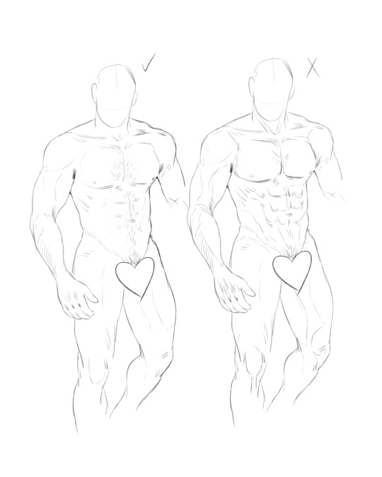
Sometimes, *too much* anatomical detail makes a drawing look exaggerated and more like someone's peeled his skin off, lol
I lean towards a more subtle approach to musculature, choosing which areas to highlight and which to let fade into the rest of the form.
Biggest piece of advice--use references! ALWAYS! I don't care if I've been drawing for years, I almost always have a reference on hand that I constantly refer back to. It's necessary if you want to draw something realistic, or else you might just start inventing new body parts 😭
And if all else fails--just throw some hair all over it to hide the mistakes 💅
#asks#tutorials#sorry I tried to explain this as best as I could#I'm just not very good at teaching art 😔#still--the best thing you can do is draw A LOT#and you will get better at it 💪
191 notes
·
View notes
Text
Something to post for the meantime that I can't draw anything new! This patreon request from 2022! They have a little more anime-ish facial features for some reason. (Must be my inspiration at the time.)
They're dressed up because of some important event. It was Connie's day, (a promotion? Idk what specifically tho.) but she just wanted a simple makeup so Steven toned down his own to hopefully not take the attention away from her.
Page 2 might be confusing. There's a headcanon that Steven can store a couple of things in his gem, and here he positioned their hands over his stomach to place the glow bracelet.
To disclose!! (if I'm using the word correctly?) , there's a NSFW continuation of this. So be warned.
#I completely lost interested in finishing that continuation. ^^;#connverse#Connie Maheswaran#Steven Quartz Universe#my shiz#patreon request#Man I sucked stinky buttcrack on that whole Patreon thing. 🤦🏾♀️ It just isn't for me.#comic#SU comic#steven universe#I remembered this after looking back at my last post. I have had considered making a fanart for “Chiptune” in this format.#Wow I kinda draw hands better back then. I mean it's not the best but I'm sure I drew them in only a few times.#You kno what... I think I got worse with hands after watching tutorials in how to draw hands???#SU#🤔A thing I woul've changed if I actually wanted to. Is the pacing or at least the framings on the third page.
272 notes
·
View notes
Note
girl help i can't draw sonic :(
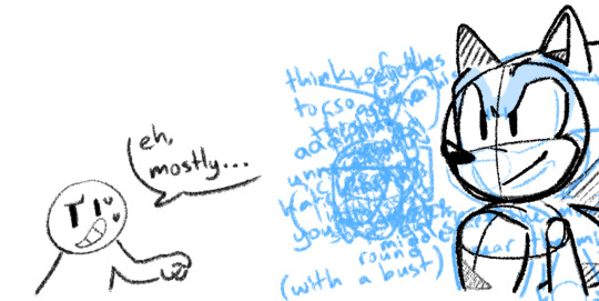
ill try my best to help !
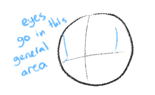
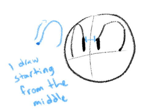
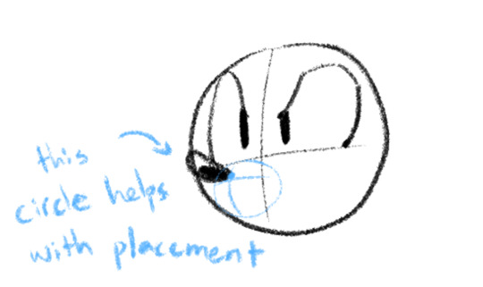

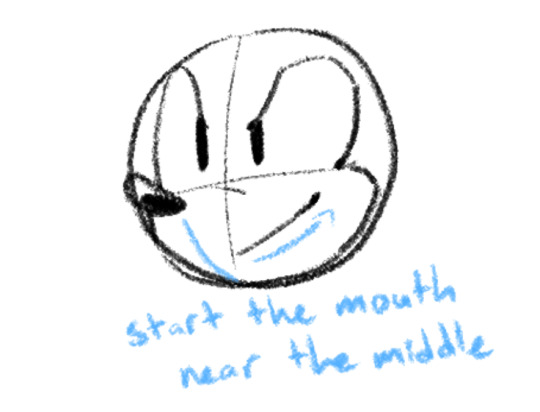
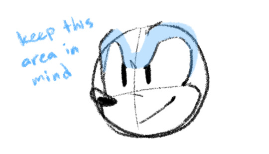
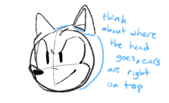
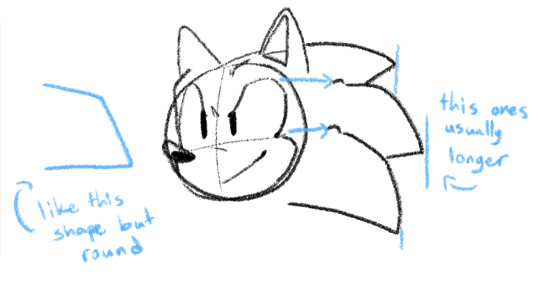
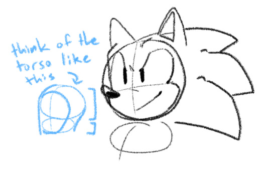
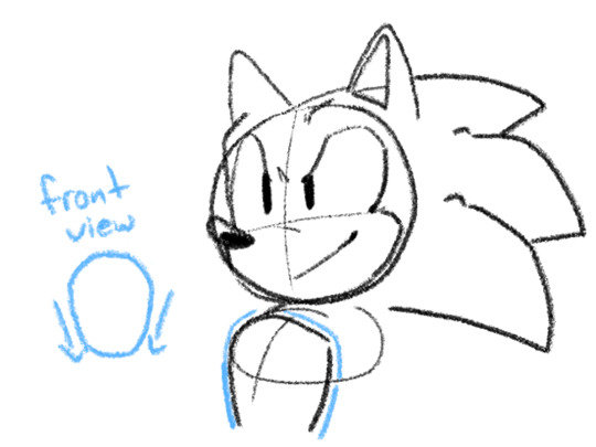
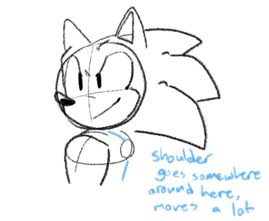
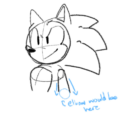
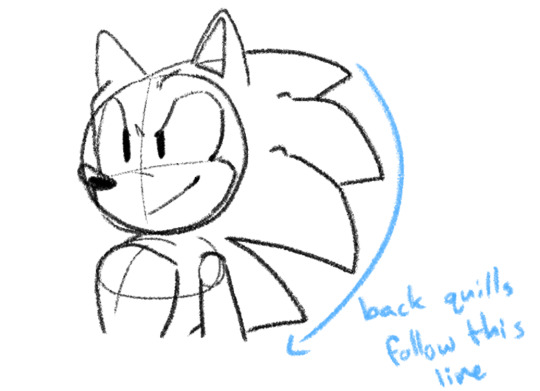

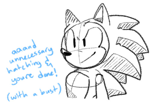
not a full-body because that would take ages but! these are my thoughts. hope you can get something out of it ?
#this is just one angle but i apply the notes to pretty much anything#the design is flexible!! everyone draws him differently!! and thats the best part honestly#sth#doodles#sonic the hedgehog#tutorial#?#anyway. back to uhhhh. more of this guy skjdsb
237 notes
·
View notes
Note
Pls help how do you draw eyess(or faces in general)💀💀 like what do you dooooo help my faces always look so weird and the same whenever I draww
Hi !
I'm learning with Proko classes but he has a Youtube channel with free cool lessons for beginners (perspective, shading, construction lines) he does have lessons for the head too I believe ! Of course, drawing your faves on the side, many times, helps.
It's very important to understand the basics first. I also do figure drawing too thanks to this website ➡️ https://line-of-action.com/
I also have the Michel Lauricella Morpho book that I have since I'm 21 (he also did one for the clothes, it's really nice)⬇️
When it comes to style unfortunately there's nothing more I can do, you make it, as you go 🎨🖌️I'm sure you have favourite movies, shows, books, artists, good strong influences that can help you craft it. The best way to get better at drawing is to have solid knowledge of your fundamentals. Understand how it works, why the bones are build that way and why they're called that way too ! (same thing for the muscles !) You can't draw something if that something doesn't have a name. Identify your weaknesses, keep pushing and working ! You'll see, it pays off ! ⬇️ (there's the Proko channel link down there)

Another very important advice would be to keep a sketchbook and fill it with doodles (no pencil !! only marker) we humans have this reflex of erasing our mistakes and then not learning ! Using a marker allows us to draw, fail, fail even more until we're on our knees crying, asking for mercy. But it's good, failure is good. Failure means you're learning, it's proof of your artistic journey. Like footprints. I understand fear can hold you back too but you can't do anything with nothing. You're not trying to reach for absolute perfection, that is not the purpose of this type of notebook, you can draw whatever you want!
(like this !! look at my THOND silly doodles ! no one can judge me this movie is a masterpiece)⬇️

I'll leave you with the 4 P's of life : Passion, Patience, Persistence, and Practice !
#ask box#anon ask#personal#to be deleted later#i'm sorry i'm not good at tutorials i'm an idiot#and i'm still learning#so it's best to recommend real masters !!#maurice lauricella was my figure drawing teacher's mentor#i'm sorry anon if that wasn't what you were expecting...i'm not very good at giving advices#i think you messaged me twice i was very busy i tried to be quick
259 notes
·
View notes
Text
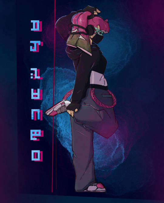
Been wanting to draw her for literal years, I hope I did her justice. 🥺
Meanwhile Eight:
#digital art#splatoon#agent 3#dj sango#i really wanted to draw her in her dj sango fit#or at least#what i think it would look like when shes older#i tried a new rendering style#hmu if you want the tutorial i followed#i didnt follow it 100% but i still like how it came out :)#agent 24#agent 8#as she tries her best to pretend she doesn’t know#it uh#really isn’t hard to figure out 🤭#but shhhhhhh#let her have this#honestly#i need more 8 gay panicking content#theres not enough 😤#agent shenanigans#also three having the sanitized ink streaks is the best decision i’ve made in a while#also i was listening to pink venom by blackpink for this drawing#seriously#go listen to it#but the way i feel 3s music style would be very similar to them lol
80 notes
·
View notes
Text
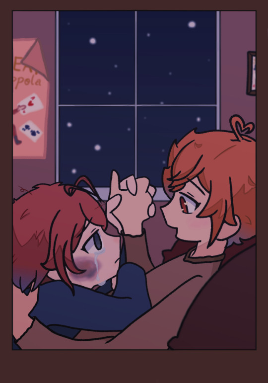
cause everything means nothing if i can't have you
the first coffeeshop au art i've made... technically not The first but the first i've finished and actually posted so. yippee!!
#my art#twisted wonderland#riddle rosehearts#ace trappola#ridoace#angst#tw semi-realistic bruise#aka my best attempts at drawing one with a tutorial#also this may just be a me thing bc i drew it but. the difference bt the little hearts in ace's eyes and the no light in riddle's GETS ME#actually can u even tell that those are hearts. idk#and yes that is a makeshift poster for ace's family magic shows in the back. yes it says the great ace trappola#but in his defense he made that when he was seven#offtopic but i keep finding too many good refs on pinterest. PLEASE I HAVE PROJECTS DUE AND I THINK I'M GNA FAIL A CLASS
34 notes
·
View notes
Note
How do you art your art
lesbianism maybe
#UM TUTORIALS??#UM HYPERFIXAIONS?#IDK MAN I JUST KEPT DRAWING UNTIL SOMETHING LOOKED GOOD#i could make tutorials on stuff if yall want it 😭😭#its not gonna be the best tho 😭😭
33 notes
·
View notes
Text
i am sooooooooooooooooo normal about them ……
#ppkm#butterfly soup#butterfly soup 2#roi draws#sketchbook#uuuuuuuuhhhhhh (explodes)#yesterday my best friend balls-on-my-face gave me a very informative procreate tutorial and also this brush thank you balls-on-my-face <3#anywho. peepee ketchup man one of the first things i drew obviously. ummmmmmm and this sketch is making me loose my mind#good brush…. good for my autism. colors :)#my best friend balls on my face
210 notes
·
View notes
Text
Realistic drawing is a learnable skill. You can drastically improve your drawings with proper instruction and practice. Apply these various tips step by step to transform your portraits drawings. To learn in detail, you can check out our Online sketching course which not only covers the fundamentals of drawing and shading but also helps in developing a strong foundation to draw any portrait or subject!
Check the course details here. For short comprehensive learning, you can check out the Ultimate Workshop Bundle which explains every step of this blog in depth with detailed demonstrations at an affordable fee!
#skecthing#art#drawing#drawing-lessons-online#best-drawing-tutorials#online-art-classes#online drawing classes#how to draw#online art classes#drawing tutorials#learn to draw#pencil sketch#pencil art#pencil portrait#online-drawing-courses#online-sketching-classes
1 note
·
View note
Note
Just want to say I love your art, especially how you convey emotions on characters faces so well even with your art style being more minimalist. I wish I had your talent 💜
aww thank youuu!!!! its rlly funny i used to be super bad at expressions so its always nice to hear ppl say i'm definitely Not That anymore!!!!
and wishing won't get you anywhere my friend!! this is all hard-earnt skill, not talent!! if you've got pens, paper, and an internet connection, you don't have to wish you could draw, you can learn!!
#youtube has a WEALTH of free tutorials by very very good artists!!!!!!!!!!!!!!#tbh i have some here but theyre not the best LOL#thanks for the ask!#AND REMEMBER YOU HAVE TO BE BAD AT SOMETHING TO BE GOOD AT IT#WHEN YOU START DRAWING YOU WILL SUCK. BUT THIS IS GOOD BC THEN YOU HAVE A COMPARISON FOR WHEN YOU'RE AMAZING#THERE IS NO LIGHT WITHOUT SHADOW AND THERE IS NO BEING GOOD WITHOUT BEING DOGSHIT!!!#⋆
48 notes
·
View notes
Note
hi!! wanted to ask if it's not too much trouble, how you approach drawing hair, I'm obsessed with how you draw L's hair 🥺🥺 if not it's ok tho!! ty anyway 💕💕
Aaaah, thank you 🥺💕 It makes me so happy to hear that even tho my secret to draw the hair is to draw it at random

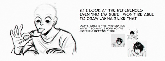
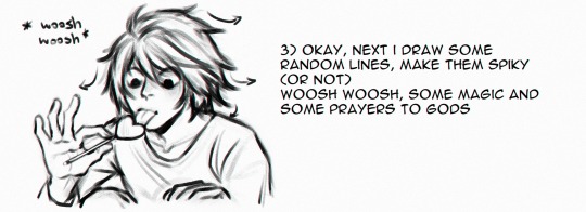


#death note#l lawliet#ask#hair tutorial#grajek tutorial#if I even call it that I draw everything at random : D#but the best way to learn how draw things is to just draw a lot and enjoy the process <3
396 notes
·
View notes
Text
i’m really normal about the fact the lightreaper has a tail

#no offense but how have the monsterfuckers/demonfuckers not found him yet#and/or what is the best way i can direct them to him immediately#i need to draw him so bad but he’s so. complicated#anyway i’ve barely passed the tutorial level so expect more posting when i get farther#picture taken from the art book btw! i just got it today#lotf#lords of the fallen#lightreaper#THE lightreaper#speaketh
39 notes
·
View notes
Text
[APOLOGIES FOR THE DELAY- check end notes for explanations- example images should be coming in future edits]
alright, another week has passed, another anatomy class was attended. this one was actually a lot more vague than the previous, with a lot of notions previously mentioned coming back in a way or another, and based itself a lot on showcasing examples. i wasn’t able to take that many “concrete” notes this time unfortunately, but i can still distill what i have written down.
anyway. here goes:
SCENE O-2: BLOCKING IN SHAPES
repeating once, when in front of your support of choice, whether it be a sheet of paper, your sketchbook or a digital canvas (or anything, really), there is a certain series of events leading to the existence of a drawing. these events are influenced by our own personal methods when drawing, such as how you start, what do you always draw first, etc. often these are patterns you follow without noticing.
once you’ve noticed your own patterns, you may start to question them. if you always start by drawing the head, ask yourself, why do you do that?
these may come from a more subconscient part of yourself. maybe that’s how you’ve always done it, maybe you saw an artist you love do it once and that affected you so much you now do it too.
an interesting exercise you may want to do to try and break away from these habits is starting to look at the world through different filters of perception (as mentioned in the previous post). teach gave us the example of looking at strangers in the commute with a single point of view: only focusing on their ears, their nose, maybe look at them like colored shapes. (if you do not commute/use a public transports system regularly, i suggest you try looking for references online, whether they be youtube videos or life model sites like quickposes or lineofaction. these two will be linked below.)
but, in any case, during this class (the one i am attending, i mean), there is one big first step which is: drawing the whole model in its simplest form.
usually, when doing just that, there are twoe factors to keep in mind:
Composition
Setting things up
to start, let’s talk about composition.
when composing an image, yet again, you have to think about certain factors (subfactors of factors! wow!). these generally are:
the 2D-3D perception of your drawing
knowing how and where to place your drawing within your canvas
negative spaces and the void
when drawing in structures (aka using inner “skeleton” lines at the very start) the drawing itself is existing only within a single dimension (1D). when drawing using “shapes” (aka at least three points connected to each other) the drawing transforms to become 2D. 2d adds a dimension of “thickness” to the piece, since you’ve now added a new dimension.
seeing the world in 2d is similar to seeing it like certain painters do: with the aforementioned “shapes” now colored flat, before starting to add in lights.
when drawing, proportion checking is actually done in 2D, and not in 3D (as you might, maybe think). think of it as very simple forms bound by lines. adding in volume is a very risky move, since it adds the notion of distance (“what is closer/what is farther away”), which can be too detailed for the simple block-in stage.
when thinking about this, you should also think about where you place your drawing within your canvas. when you are drawing, you are composing an image. drawing a character close up and standing in the bottom right corner of the page gives a whole other impression than if you were drawing it small, in the middle of the page.
when creating images, these images usually have a meaning, and this whole meaning and wanted feeling you want to transmit is heavily affected by composition.
when a more “academic” artist first thinks and thumbnails their piece, they may think “where will i place the horizon line?” which in itself is the very first step of composing your drawing.
the way you place your horizon line gives away most, if not all of your intentions with this piece.
finally, “void” and “negative spaces” in a drawing are part of what makes it legible and interesting. it is heavily tied to the concept of “silhouette”, and, with good placement within the canvas, adds a lot to the piece. but when drawing a model, these “negative spaces” are here to help you draw the correct proportions: the triangle formed by the arm and elbow when a hand is placed on a hip, the space between legs when the model is standing up, all this should be taken into account when drawing.
but, when drawing, you should pretty much mostly worry about drawing the “general shape” of the model, but accurately, as always, which in turn transforms into a general view of your drawing. in terms of additional things you may want to do when thinking about the composition and proportions of your drawing, you can always
try drawing “over” your model (simply put, hold your pencil over the model while trying to see important lines to draw, whether they be action lines or countour lines)
thumbnail your drawings using your fingers (putting them in a square shape framing the part you want to draw) or a template (like a card that’s been gutted to form a thumbnail viewer)
if you want to transfer your drawing to another surface, you can trace a grid over the sketch and use it as a guideline for the transferred piece (this technique is called “mise au carreau” in French and i cannot for the life of me find the english term, i’m afraid). this is a technique that’s been used since pretty much the beginning of “western fine arts” (aka stuff from the Renaissance era).
now, let’s get to the meat and potatoes:
setting up your drawing
when setting up your drawing, the ideal should be to do so with as little lines as you can. this can prove especially hard, especially when drawing a model from life.
what you can do is stop seeing the model’s body as a body, and more as a series of geometric shapes set one next to the other. (this does sound fairly dehumanizing, but don’t be afraid! the humanity should still exist within the shapes you draw, and will appear even more once the proportions are corrected and the details are added in.) the moment you add another line, you are adding in measures, proportions, and direction to your drawing.
your base should have a limited number of lines, but, as always, they should be proportionally accurate.
“i am simplifying and always checking my shapes”, pretty much.
(i think i am going to make you hate the concept of proportional accuracy with all the emphasis i put onto it… sorry!)
a small tip when drawing these shapes: draw them lightly! the block-in should ideally be very light for the later parts to be drawn with more force. (teach compared it to an architect’s plan, but i yet again cannot attest to the validity of this claim as i completely lost interest in architecture the moment i found out about Bravely Default and how cool the Job designs were. anyway,)
alright, so the rest of my notes are mostly about “mistakes you should avoid”, and given this is coming from only one person, whose ideas are being transferred by another (who is obviously much less skilled) to a post to be seen by others, you can see that this can rapidly become an opinion-piece about “what is good in drawing and what is wrong” (you know, kinda like youtube thumbnails with two drawings, one “bad” and one “good” posted by certain art youtubers…you know what i mean, right?)
so, i am going to share them, but do keep in mind that these are even more subjective than anything written before, so, as always, take them with a spoonful of salt.
so, these are:
drawing using very short lines, the kind that makes for a “hairy” looking drawing
pushing too hard on your pencil (see the paragraphs above for reasons, with the added reason of being really hard to erase afterwards and often leaving a dark mark after having been erased the best possible)
relying solely on lines for proportions, aka using one line as a reference, then adding up more lines until you think you are done, which nets you the risk of having a badly proportioned drawing by the end. (this is something weirdly common when drawing as a whole, but that especially shines when drawing architecture, in my own experience both drawing and looking at my classmates’ drawings).
fuzzy/blurry lines, which can strip the drawing of precision, adding noise where it isn’t needed. this doesn’t really apply if you only draw over the line only a couple of times, or is rather moderate, doing so has its own name in French which is a “repentir” (masculine word, i wonder if there is an English equivalent. “repentir”, aka repenting your other line with a more accurate one. “repent motherfucker!” )
a final note that i think is worth sharing is this one:
there is a whole system of proportional setups, multiple methods, but the more important thing is
i understand what i am doing
well, that should be about it for this week (or rather last saturday, oops). for some reason i have gotten exhausted these last handful of days, and i don’t even know thanks to what god i was able to wake up to attend class this week. it was only the second, too!! really would’ve been upsetting if i couldn’t have attended. but it didn’t happen, fortunately. next week should be about correcting your mistakes and proportions.
and, just like last time, all these notes are from a class by Mr. Francis Buchet i am attending to at the Académie de la Grande Chaumière. if you live close to/in Paris, i suggest you look up what classes he is going to be teaching, as a live class is always a lot better than simple notes written down by a student.
and, may i remind you (again): these notes are only here to showcase one approach among many others, so they don’t mean much in the grand scheme of things. i myself am in absolutely no way a professional, so please, take all of this with a grain of salt (or a spoonful, even). draw how you enjoy drawing, and find happiness in the way you want to draw.
Francis Buchet's instagram: x
[NOTE: this was written last weekend, in the hopes of being posted during a weekday with some added visual examples, but due to school as well as health related issues (physical exhaustion among others) i couldn't get to draw said examples in time, so i decided to just go ahead and post it without any and add them later via edits. is this a good idea? no, but i do not think i can give good examples when my shoulders feel like they'll drop from my torso. i cannot say when part 0-3 will be posted but i hope it will be quick. exhaustion is a bitch but i hope i can still manage eventually.]
#art tips#artist tips#art tutorial#art help#drawing tips#wow this ended up being even less concrete than the last one#ooooooh the magic of basing yourself off examples#teach mostly showed us Klimt; Egon Schiele and Degas as well as a bit of Sargent#i still apologize for the lack of personal handmade examples#and the huge delay#breating feels more difficult than it ought to sometimes yknow?#ah well#will do my best to get part 0-3 up before next weekend#no promises tho. sorry
24 notes
·
View notes
Last Seen Blogs

faychived
faye

yang-xiao-long-search-history
How to deal with PTSD

reveilletoi--idiot-blog
détective privé
inspiredbydaimao
同じ空の下で

dayandnightmemories
Never regret anything that made you happy