#lets say 1 is lined and 1 is lineless
Text
Mello people!!
I took notice on how some folks don't know how to color non transparent bases around here
They end up somtimes having "rat holes" (which are small uncolored parts) or looking lineless/shadeless
Which there's nothing wrong with, especially the lineless and shadeless part, everyone has their own style they prefer!
But I bet some of you would like to have their base art look more solid and not have to finagle with it so much, so that it looks like how they want
But how can ya do that you ask?
Fear not!
For I have made a little tutorial on how to for Ibispaintx☆
Passing down the knowledge I got from DianaTHEchicken on Amino (and the tips I learned over the years on my own)
1. First, you import the base of your choosing!
I'll be using my HiveWing Medowhawk as my example

2. Now, you go and open up the layers, add one below your base, click on the bases layer, then press where it says "Normal"

3. This opens a menu on Blending Mode
4. Now pick the Multiply option

5. Go back down to your color layer below and presto, it colors without messing with the the lines or shading!

(The reason it is below the base is because on top makes it uh... come out like this lol)

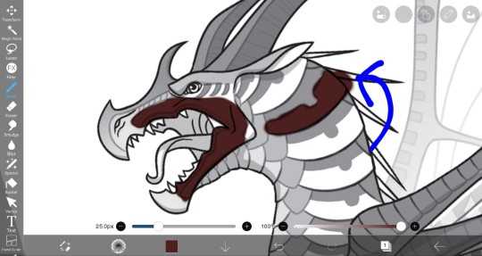
"But Thumper!
What about when it gets outside the lines? Erasing it is SO annoying and tedious!"
6. Well, that's when we go look at the side (for phone users you'll be clicking the pen on the bottom) and click the "Magic Wand" icon
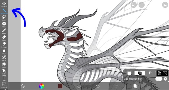
This brings up a tiny menu that says "Gap Recognition" and it is pre-selected on "Add", which you want, and moving lines around the canvas and base appear
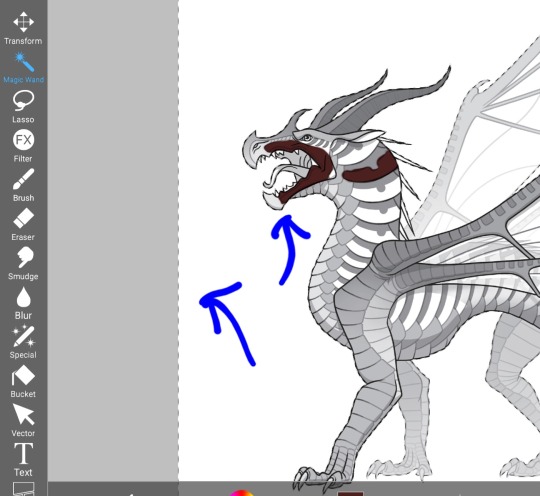
Now that on its own lets you color behind the base without touching the color you put, or the base

10. But to color without anything going outside the lines, you click the boxes that have two arrows next to them

This is the first part!
Here is the second part of the tutorial☆
15 notes
·
View notes
Text
𝕀𝕟𝕥𝕣𝕠𝕕𝕦𝕔𝕥𝕚𝕠𝕟

I'm Hinako Mukuhara. You may know me as Kazui's wife. I'm very pleased to meet you! 🙂
I work alongside Kazui in the NPA and I am 38 years old. When I'm not working, I love to read and write! I have a big soft spot for fantasy and sci-fi material.
I have the tendency to be awkward at times, so please bear with me. When I get flustered in social situations, I have a habit of taking jokes too literally and correcting them, so I can only hope that doesn't deter anyone.
If there is anything else that someone should know about me (I'm letting you in on a little secret here), it is that I faint when I am too overwhelmed with emotion, and I am afraid of heights.
My inbox and DMs are open! Feel free to send an ask and I will respond as soon as possible.
-Hinako ❤️

𝕒𝕤𝕜/𝕣𝕡 𝕚𝕟𝕗𝕠𝕣𝕞𝕒𝕥𝕚𝕠𝕟
Please be aware that almost everything that is said here are headcanons! In canon, there is hardly any information about Hinako. When more details about her are revealed, I will adjust headcanons if any are contradicted.
There are several AUs that will appear on this account and they will be tagged with emojis. If there is a certain AU that you would like to interact with through asks, please include one of the emojis (or the number) below within your message. AU 1 will be the default, and AU tags will be added on each post.
🍎 = AU 1 (Hinako before her death)
🕊️ = AU 1 (Hinako after her death)
☀️ = AU 3 (Fantasy AU with Hinako, Kazui, and bartender)
Please do not submit NSFW asks or anything that might be controversial.
This account isn’t ask exclusive, it is also a roleplay blog, so feel free to start roleplays here as well!

𝕞𝕠𝕕 𝕚𝕟𝕥𝕣𝕠𝕕𝕦𝕔𝕥𝕚𝕠𝕟
i won't be saying anything out of character on this account aside from this post unless it's really important 😅
things about me:
main account is @himawari-candyy
i am 20 years old and my pronouns are she/her
my art style is mostly lineless but if i am in a rush, i will use lined sketches 👍
i'm really excited to start this! it has been on my mind for a while! 😊
9 notes
·
View notes
Text
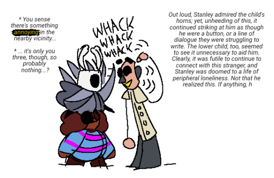
[I.D. 1: Frisk (from Undertale), Ghost (from Hollow Knight), and Stanley (from The Stanley Parable). Frisk is a small, fat child with warm brown skin, a dark red-brown afro, and a blue sweater with pink stripes. Ghost is a small child with a square, two-horned white skull for a head, wearing a silvery robe and holding a large nail as a sword. Stanley here is a paper-flat stick figure man, with peach skin and a gray nose and ears, a hollow masklike face with ripples radiating from it, a beige-yellow button-up shirt, and shapeless gray legs. All of them have large, round black eyes.
Ghost is standing on Frisk's head while Frisk watches them, and is rapidly whacking Stanley's face with their nail. Stanley, leaning forward to be at eye level with Ghost, seems unharmed, and is happily pointing out the back of his head, where Ghost's own horns are.
Text left of Frisk and Ghost in the style of Undertale's flavor text reads, "You sense there's something annoying in the nearby vicinity... it's only you three, though, so probably nothing...?" Annoying is in yellow.
Text left of Stanley reads, "Out loud, Stanley admired the child's horns; yet, unheeding of this, it continued striking at him as though he were a button, or a line of dialogue they were struggling to write. The lower child, too, seemed to see it unnecessary to aid him. Clearly, it was futile to continue to connect with this stranger, and Stanley was doomed to a life of peripheral loneliness. Not that he realized this. If anything, h". End I.D. 1]

[I.D. 2: More drawings of Frisk, Ghost, Stanley, and now Kris (from Deltarune). Kris is very similar to Frisk in appearance, but a teenager; they usually have a shadow over their eyes, and wear a desaturated green hoodie with a yellow stripe and a brown hood, and brown patchy pants.
Drawings described from top, left to right: A fullbody of Stanley facing the viewer, next to a silhouette of a Stanley-like figure that's blacked out and labeled "spoilers", and also has "fuck this" written next to it with an arrow.
Scribble of Kris against black holding a knife to the sky, determined yet tired; text under them reads, "Oh, Kris. That's your name, right? I don't mean to be a cruel host, but you're in for quite a disappointment. What kind of story would let itself be interrupted, interfered with? Not this story, that's for sure.
The words "kris falls into the backrooms". Kris and Stanley looking at a fern; Stanley looks mildly delighted, and Kris is looking straight at the camera, deadpan. Text in the style of UTDR flavor text above them reads, "It's a fern. There's not much to say about it. There is no reason to look at this. You see no reason to continue standing here. Stop. Stop looking at the fern. There is nothing here for you. Stanley seems enamored with the fern. You wonder if this is why everyone left. Smells like dry fern."
"Now, if you'll put the knife down, we can go on with going up to Stanley's boss' office, and then the both of you will be able to escape, don't you understand? I'm trying to help you leave.
"And you're leaving. With that knife. Alright, sure. Let's see where this thread goes."
Continuing with image descriptions: Ghost's face with a bubbling agender flag under it, Frisk's contented face with a looping yarnlike nonbinary flag under them, Kris looking up at both of them and smiling with "they/them" written in transgender flag colors under them, and a tiny Stanley waving a straight ally flag.
Lineless, tiny pixel sprite of Kris holding a pencil as though it's a sword, in battle; the Red Soul floats at an angle to the left of their head. Above them are the words, "> CHECK. The Stanley Parable Ultra Deluxe, t [...] expanded re-ima [...] the critically [...] award win [...]".
Frisk falling asleep against Kris in a gray sunbeam; Kris is expressionless, but has a hand around them. Frisk and Ghost's canon sprites next to each other. Ghost looking down at themself as though surprised; they are now wearing a green-blue striped sweater sized to them and black pants, and text next to them with round dream spirographs floating about reads "...green..."
Kris and Ghost looking into a mirror with Ghost wearing said sweater; Kris has one black eye open to look down at them, and flavor text next to them reads, "(It's admiring its horns.)" Ghost looking up at Frisk; Frisk is smiling proudly and holding an enormous sword with little effort. Under the sword is the final drawing, Ghost and Frisk and Stanley in a line; Stanley looks down at Frisk, curious, and Frisk solemnly shakes his hand. They are also holding Ghost's hand. End I.D. 2]
silent
#personal#described#Have I Mentioned I Care For Silent Video Game Protags With All My Heart ok surely i have#for all my complaining stanley was so fun to design#and all this was so fun to draw
20 notes
·
View notes
Note
1, 2 and 22 for the art ask game :)
Thank you, Andy!
How would you describe your style.
Oof, that's tough. I guess my style is somewhere between realistic and cartoony? Maybe comic book-like, I'd say. Realistic proportions with a few cartoony quirks, and strong, clear lineart! With my colors, I'm trying to lean a bit more into a painterly style with like visible (digital)brush strokes, but that's still a work in progress.
2. What’s your favorite thing about your style.
I really like my lineart! I always look at how beautiful other people's lineless art is and I really want to emulate that, but then it feels so different and there's something that brings me joy about all my clear lines.
Also I've begun to let the lines for the face details be just my sketch lines because that always looks better than the redone lineart, and that compared to the crisp lines of the rest gives such a cool effect, I really like it.
Oh, also the thicker outline, I love that, too.
22. What inspires you.
Sigh...blorbo.
I'm not sure where I grab inspiration from, really! I guess being here and seeing all the amazing art people make and share definitely gets my creative brain going.
Ask me art stuff!
#ooh tough to answer especially the last one as i think it's very subconscious#like i like mucha and leyendecker and stuff just like the next guy and i sometimes try to emulate that#but i think it's all the great art i see everyday here and on twt that inspires me to make my own stuff#juli answers#ask game
2 notes
·
View notes
Text
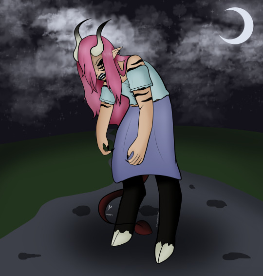
Commission Me! | Full body, lined, full shade. Complex lineless bg
remember how i said meira is a shapeshifter? here's that other form of his. it's a dark gift called "second skin", and it lets him shift into a different form. drawback is that the shift can be involuntarily triggered by silver, so he usually says he's allergic.
he gets taller, his fur gets darker and coarser, and his horns, teeth, and nails all sharpen. his tail also gets longer, as you can see by the fact it's visible from under his skirt now instead of hidden like in the ref photo.
personality-wise, i decided that it depends on why he shifted. if it was involuntary, it takes whatever emotion he was feeling at the moment of contact and mixes with anger, heightening the negative aspects of whatever he was feeling. the anger comes from the fact that he avoids silver, so if he touches it it's usually for one of three reasons: 1) someone attacked him with it, 2) someone ignored his boundaries and touched him with it even after he told them he was allergic, or 3) he was careless and accidentally touched something silver (the anger would be at himself, for that one). as for voluntary shifts, he gets a bit more serious and self-conscious, especially if someone he loves and/or trusts saw him shift, because he's used to people only sticking around so long as he hides his less humanoid traits. if he shifted voluntarily for a fight, he's serious, determined, and a lot more reckless, rushing in to engage the enemy on the frontline rather than hanging back for support.
this is less due to it changing his personality, and more of like, destroying the mask meira usually puts up. he's usually masking himself as this sarcastic, kinda kooky and mystical joker, hiding what he truly feels and lying about his emotions at any opportunity. the second skin represents his truest self in the sense that it gets rid of his masks and walls, exposing him for what he truly feels at the core.
#dungeons and dragons#dnd#tiefling#shapeshifter#meira pavau#ty's oc box#my art#how much torment can i fit into one man before he explodes?#dnd: curse of straud
3 notes
·
View notes
Note
i luv ur art, bro - may i ask how u do the lineless art? (or whether that sort of drawing is reccommended for a beginner on digital art) hope thouest having a greateth dayeth!
Hello there! First of all, thank you very much!! I really appreciate when you guys ask my advice, because it helps me reflect on how I do things and improve ♡
I am a strong believer in that you can make art in whichever way you enjoy, beginner or not. It’s all about having fun, so if you try lineless and you like it, that’s great! I personally like the clarity of it and it looks great with the anime/cartoon aesthetic I aim for.
Now let’s get through the process. I use SAI, but I’m sure you can do this in any popular art program.
Step 1. Sketch what you want to draw. It can be as defined as you want! my sketches are usually very messy:
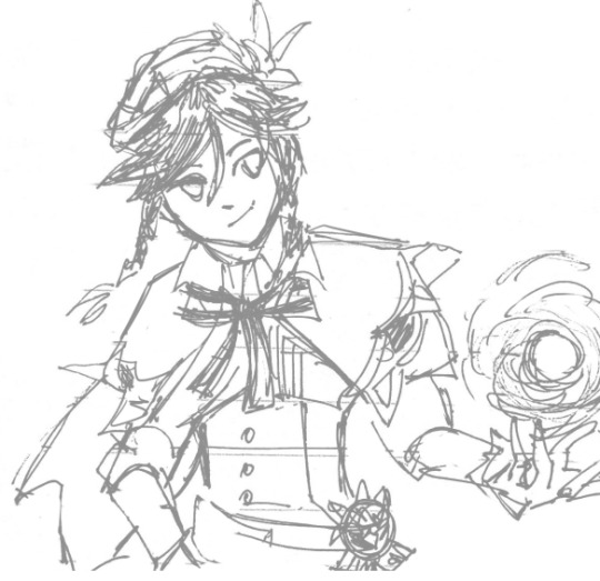
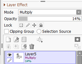
Step 2: Set the sketch layer to multiply and adjust transparency so that the lines are visible but not too distracting. Put the layer on the very top:
(you can skip the sketch and draw inspiration just from shapes and color too, there are no rules)
Step 3. Put down the flat color shapes on different layers. To make the process easier (and more fun) I mapped my bucket tool to a shortcut:


The process itself is similar to a paper applique. use the sketch as a guideline:
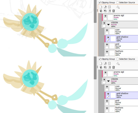
because my sketches are not very defined, I spend most of my time figuring out the shapes as I go ^^”
getting lost in layers is a thing.. keep them organized if you can.
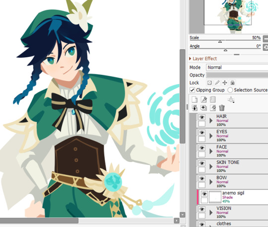
That’s it for the basics! You can manipulate your layers as you like, adding gradients, shadows and highlights ✨
There are so many artists who make amazing lineless and paintings to look up to, too! and a lot to learn from their process. furanse, lostgalaxyart, fortisselle, cwilock, just to name a few.
oh and watch this video about shapes!! it’s very helpful and inspired me along with sully-s’ speedpaints (check them out too!)
I'm not an expert by any means, but hopefully this was helpful!!
31 notes
·
View notes
Note
1, 6 and 10 for the community ask meme!
What artists/writers inspire you? What is it about their work you admire?
The artists that inspire me are no longer in this community but I do love a lot of artists here! I wouldn’t say they inspire me, but rather, I really appreciate seeing their art on my dash. For example, I really adore @norts-trolls adoptable designs and their lineless art. I also immensely enjoy @morgombie’s soft art or @fantrollrumpus artstyle in general. Honorable mention to @skegulium fucking fantastic bold lines too.
There’s a lot of people I forget about and im sorry because im very tired but just. This community man. So full of artists and you are all beautiful. Your art is beautiful. Never let anyone make you believe otherwise.
What are your favourite themes to explore in your art/writing?
Already replied!
Which characters – your own or others – do you think deserve more love?
Already replied! Thanks for sending :)
2 notes
·
View notes
Note
Hi, This isnt about the butterfly au but i was wondering do you use any apps to draw your art on and if so which ones due you use? also do you have any tips?
Hey there! No worries I'm happy to talk about art in general as well!
I use Procreate (I think currently V5) on a first gen iPadPro to do most of the art and photosh*p cs2 for any edits, or compiling files when my layers overflow. (I'm not gonna lie, that is the major bummer with Procreate, but the app is well priced and I got no complaints about it otherwise.)
As far as art tips, go I wanted to acknowledge that these are tips I would and also do give myself, so it I am not an expert in any of these, but they are cool things to strive for.
1. Find the workflow for what makes sense for you. Not everyone has to do 2 sketches a lineart, flats and render in that order in every single piece. Experiment around, find what works for you, which parts of the process you enjoy, most importantly. I do very clean sketches on top of loose pose puppets and hate lineart. So I usually don't do that, but I get away with it bc I like doing the detailed sketch phase and "line sculpting" so I just go straight to colouring most often. Maybe you don't either, but for you a lineless style would work better. This is also how you can build style very easily!
2. Experiment with programs and find the one that supports your workflow best. I started off with a pen-tablet and PS/Corel painter and that didn't work for me for the longest time - I guess I never had the necessary hand-eye coordination for laptop and pen-tablet setups. Drawing ON the screen however, whoo boy my improvement skyrocketed. So I would urge everyone to look at what they struggle with while making art bc it might not be you, it might be the setup you use. Sure I could have spent a million hours fine tuning my lines to be straight, but I cold have also switched to a program that supports stroke stabilisation, you know? Also look into available shortcuts and pre-sets: the better you know your program the faster you are, the less likely you are to burn yourself out on a piece.
3. Build skills, but let your interests dictate what skills to focus on. Sure practice is key and you need to draw a thing a 1000 times to understand it, but I'm saying you are only going to draw something that many times if you like it. When I was into series that featured many male characters I beefed up on male anatomy; when I was crazy about a live action show I practiced copying the features of real actors; now I am neck deep in fashion refs and drawing different types of fabric. Find your passion and let it drive you! It does make sense to identify shortcomings and get comfortable with art basics like shape, light and colour, but if you don't find a way to apply it it a way that sparks joy, you risk your hobby turning into a chore (so this advice is mainly for hobbyist), so try not to do that and instead focus on eating your "veggies" and "dessert" as well if you can. Do sketches all day if you want, but you will need to face drawing the other eye or that hand on the hip if you want to see eventual improvement.
4. Collect inspiration with a goal in mind. It's fair and well to have endless lists of inspiring art and photography saved in your likes, pinterest or wherever, but it is good to sit down sometimes and examine why you saved a pic. (This is not for direct references btw). Ask yourself what you like about the individual piece and whether what you like about is something that just appeals to you as a beholder or whether that is something you would like to reproduce in your own art? It's actually a huge difference. I am drawn to stylised shapes and bold colours in art, but I like to paint like that? No. On the other hand I like looking at guache paintings and really taking apart how they were painted, bc that is the rendering style i like to push for in my art. It's a good idea to go cross-media in your inspiration: from traditional art to photography to industrial object design, you can find a lot of things to learn from outside your native art medium. If you found something you really like, you can do a master study of it (absolutely fair to share with public domain, classical pieces, if you copy a contemporary artist, do it for the sake of study and don't post it).
5. Don't compare yourself to others. Yes, I know this is the hardest. If you find yourself unhappy with the reception of your art online, it impacting your joy in creating art in the first place, it might be worth taking a step back. That's what I did. I was doing winx doodles for almost a year for myself only before I made this blog, (and this is far from being my first art blog on the internet btw). This may not be the right decision for everyone, but I wanted to say something other than "just don't give up", bc when you are in that spot it feels like utter bulsh*t. Social media has us comparing our skills and success to a million other people every day, and as harsh as it sounds, it's just not worth breaking yourself up over it. There is also no need to monetise every hobby you have and become the absolute best in it, especially when you are young.
So, to sum it up:

#art tips#art suggestions#art tipp: draw a fuckton make it make you happy#wow I even used that tag before see I really do mean it#locally sourced art#adjacent#procreate
3 notes
·
View notes
Text
My Top 10 Posts Ever
I’m @gemshine and I’ve been posting art on Tumblr for five years. Over those five years, I’ve had ten posts gain over 100 notes. Here I will talk about each one of them, their story, and how I think they got popular. If you like any of them you can click the link to take you to the original post, I really appreciate likes and reblogs. If you want to see more of my art please follow @gemshine.
1). How to Make a Comic Infographic - 237 notes - Mar 27 2020
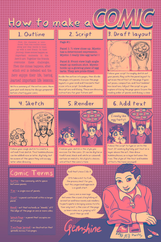
This is my most popular post. It is a how-to infographic I did for class and I am really proud of it. Comics are really hard to complete, there are so many steps that without organization it is easy to get lost and give up. So, I thought letting others into my thought process would help.
I haven't made that many comics, but I do love making them. I love storytelling and character development so much, so as a visual artist comics are an amazingly creative medium for me to play around with and tell my story. Here is my short story about an elf lawyer named Cherry Elliott I made in 2018 for another class, that made me fall in love with comic making. I dream of writing and illustrating a graphic novel one day.
This was my first time doing the equivalent of a colour palette challenge, I think it turned out pretty well, I love the colour combo of pink, purple, and yellow/orange. The comic I used as the example was a comic made specifically for this infographic, featuring my original character, Mystic. I’m the person in the bottom right, illustrating a comic about “Some Elf Thing”, aka my original story passion project @mysticsrealm. My Mystic’s Realm stuff has not gained much traction yet, so it’s pretty wild that a post with an illustration of myself and my oc has gotten 237 notes and been reblogged 68 times.
Most people finding this post are going through some sort of “comic reference” related tag and I’m glad my experience is actually helping people start making comics. The majority of people tag it with “comic tutorial” or “reference”.
TLDR; this post is helpful for people looking to start making comics and it’s very aesthetic
2). Dad Hank Comic From Detroit Become Human - 205 notes - Aug 21 2018
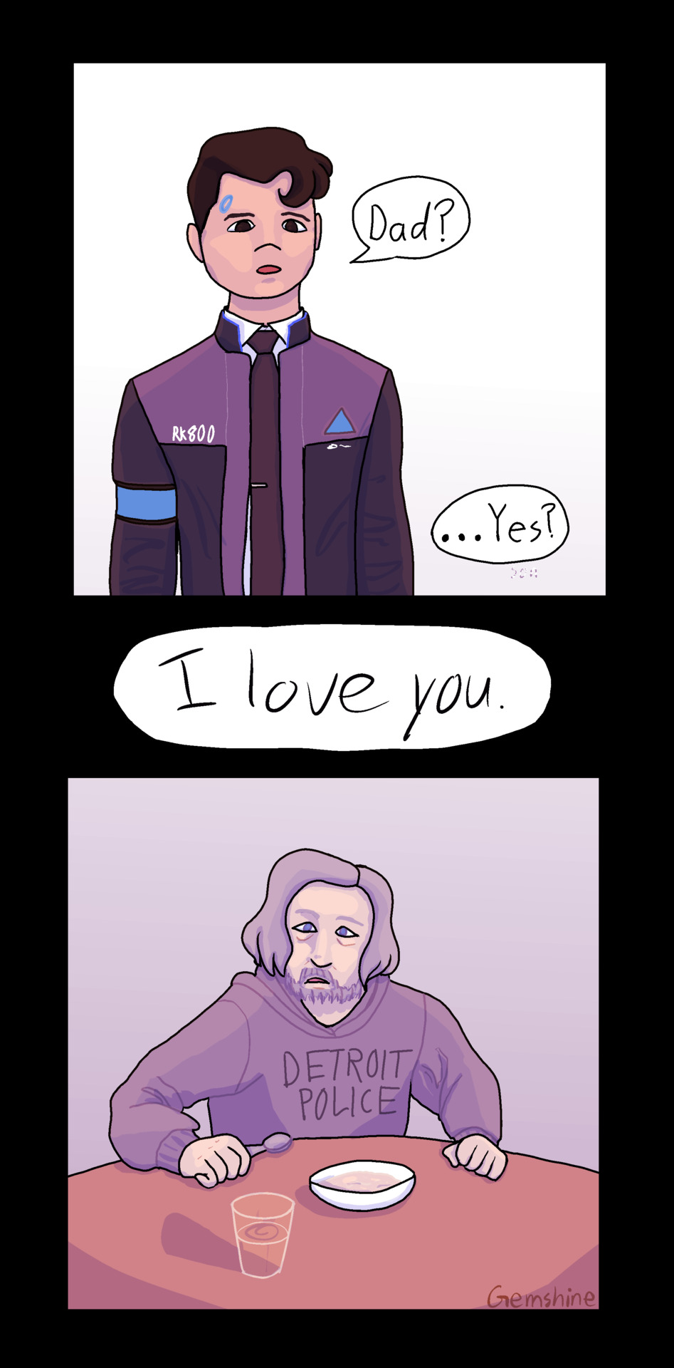
At the time this post felt like it was blowing up by my standards. It is still my number two post. It gained traction because I posted it in a big fandom at the right time (#connorarmy). If I posted it now it would have maybe 20 notes. A lot of getting notes is posting at the right time of a fandom, but I don’t really know the science.
This post is nice and simple, I like the purple wash. I like Hank’s expression. These two and their dog are a really sweet little family and I cashed in on that angst, like I am one to do. At least it was kinda wholesome angst, I guess. We love found family.
3). Ladynoir!Opal Comic From Miraculous Ladybug and Steven Universe - 188 notes - Feb 26 2019

I was and still am really proud of this one. I was inspired to try lineless by @sneakysscribs‘ lineless art. Lineless art is a pain, but so pretty. This piece was made by having lines, but then colouring them in. I love how I was pushing the comic format, making the two gems flying in the beginning and Ladynoir!opal really pop out of the page. I also love that I actually made backgrounds for once in my life, they’re SU inspired and very aesthetic.
I call this AU Miraculous Universe, and it has been in my head a long time, starring Ladybug!Pearl and Chat Noir!Amethyst. It is not very fleshed out, but it is very fun. It also makes no sense. This concept is so oddly specific it’s hilarious. But I’m also rewarded in my uniqueness in that there’s nothing else like it and I got to work both the SU and ML tags.
4). Adrinino Dancing Comic From Miraculous Ladybug - 177 notes - Aug 15 2019
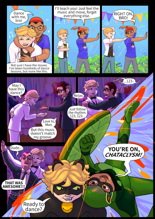
I just noticed my top 4 all had to do with comics. Hopefully, that’s a good omen for my future in graphic novel.
This piece was for the first and only (so far) zine I’ve been in, @theninozine. That is where the majority of people found this post. It was nice to create something knowing that people were going to see it. It was also nice to have my work displayed among so many talented and passionate artists. Drawing ships for ml is funny because to have to tag the same exact ship four times to account for their love square. Anyways this piece is very sweet and gay.
5). Viperinoire From Miraculous Ladybug - 166 notes - May 7 2020
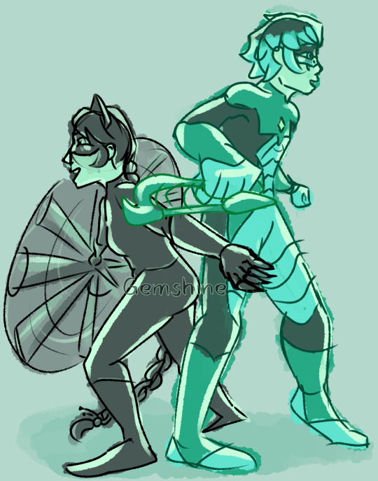
This is my most recent post above 100 notes. And it was posted during the ML offseason. I’m not that big of a fan of the show, but I love the fan content a lot. We lot just kinda take elements from canon and do whatever we want with them. This Viperinoire post is a great example steering far from canon.
This post succeeded despite the last episode of Miraculous aired having been in Dec 2019 because of the active Lukanette fanbase. I have a theory that the reason ML is still so popular on the internet, despite a large crowd being disappointed with the show, is because the fan content gets a ton of interaction, encouraging creators to keep making more, keeping the fandom alive.
6). Christine Canigula From Be More Chill - 141 notes - Feb 4 2018
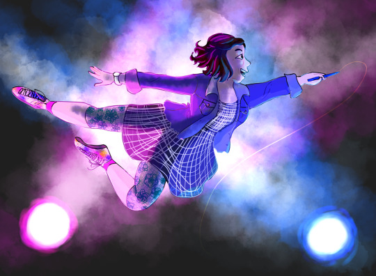
This was my second post to gain over 100 notes. I posted when the Be More Chill fandom was very popular. People were really nice in the notes, they really love ChristiiIIIIIIiine. In this post I was practicing posing and using a glowy tutorial I found for the stage lights. This is the scene during More Than Survive where she is lifted up and signs the sign-up sheet for the after school play. When I look at this piece I can see the progress I made to get that point, and how I’ve grown since.
7). Heather Chandler From Heathers The Musical - 120 notes - Feb 19 2017

This was my first post ever to get over 100 notes. I still think it’s pretty good actually, I really like the hair. This post was copied directly from a photo, which I think is pretty good practice for shading. During this time, I didn’t have a drawing tablet so I was posting traditional drawings. This post blew up over all the ones before it because it was at a good time in the Heather fandom and it looks pretty great tbh.
8). Green Diamond From Steven Universe - 108 notes - Aug 15 2018
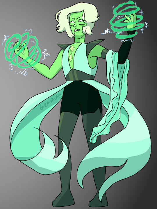
Someone asked me to imagine two diamonds fused so I did. I think I did a pretty good job combining the aesthetics of Blue and Yellow to create a new gem with their own identity. This post got popular because of Bellow shippers. One thing I would change is that underneath her left arm you can see a little looseness of her top, I would have changed that to be form fitting to match with the SU style of drawing gems.
9). The Zen Garden From Detroit Become Human - 103 notes - Aug 27 2018
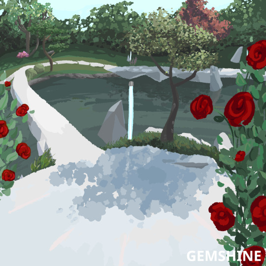
This is one of the only times I’ve ever practiced drawing a background. Came out pretty picturesque if I do say so myself. The Zen Garden from DBH has always been very pretty. This was really just an exercise for me to come out of my comfort zone and draw a place instead of a person. Actually, at first, it started as a background for [this post], but the background came out nicer than the subject, so I posted it on its own too.
10). Pearls From Steven Universe - 100 notes - Aug 14 2019
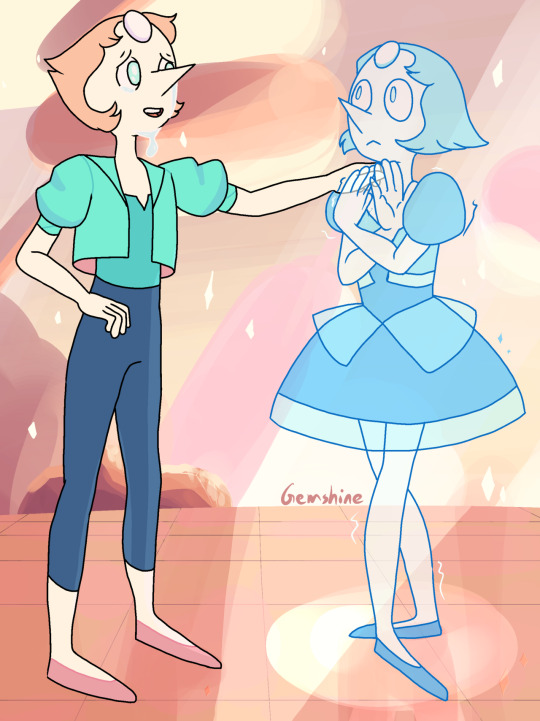
This post just got 100 notes, which lead me to making this post. I think I captured the SU art style for Pearl quite well. When I was younger I found a tutorial for how to draw Pearl and she became my go-to doodle. This post was made years later, but I definitely used the muscle memory I had for drawing Pearl. Though the Pearl I drew was in her bow outfit, this was my first time drawing Pearl in either of these outfits. This post was made before the SU movie a pretty good prediction might I say. I love Pearl a lot.
Thank you, everyone, so much for supporting my work, and may there be lots more in the future.
#artists on tumblr#my art#ml#su#personal#my post#okay to rb#id actually love it#it was weird to talk about myself for so long#gemshine#tumblrnotecounter
21 notes
·
View notes
Text
time for episode 5 because i’m bored as heck
• just thoughts during the theme song but i wish we got to see more of aleena
• the extras in this opening scene look passable for mobians which is a surprise
• sleet explains something to dingo while looking directly into the camera
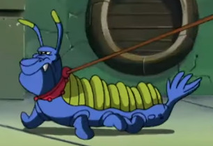
• WHAT IS THIS CATERPILLAR DOG THING UGH
• it’s a legal requirement for thief children to have wack hair
• kjsdgsd max snapped
• i think i remember some people shipping manic with this kid
• what animal are any of these characters supposed to be
• that bungee jump thing makes no sense at all which is terrible
• who gave sonic a drivers liscence
• sonic your whole thing is to help people and then some poor kid comes in your van like “help me” and you’re like “why should i” what is the truth
• shit dude that van turns on a dime
• nobody in this show knows how to drive do they
• this little goblin dude juggling is kinda cute, his design ain’t bad. weird colors but that’s a given
• what sleet turns dingo into reminds me of the koopalings right down to the voice
• is manic older than max or does he just say “little bro” because max looks even shorter than manic does
• manic: stealing’s wrong
max:
• max brings up a good point about like... how are they gonna survive without money from the shit they stole
• i think i redesigned max at one point? i think i made him a xoloitzcuintli (those weird mexican hairless dogs)
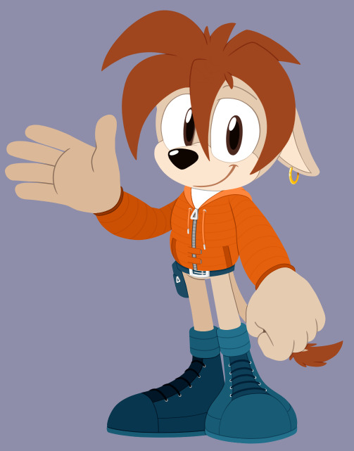
• OH I DID, this was back when i mainly did lineless art (it was easier doing art like this rather than lined art with a mouse, i haven’t tried this style with my drawing tablet yet), i really like what i did here skjdgs small boy
• there’s two background characters with names, there’s a girl named allegra with a huge nose and some pig looking gremlin critter named clifton, i think that’s interesting
• is it like a cultural thing for all the thieves to have earrings or did the character designers just go “yeah only punks have piercings”
• sonia’s being really mean about their music for no reason when it doesn’t sound awful, just let these kids play their accordions and violins in peace dude
• manic is a gross boy and spits all over this girl to show off one of his little tricks, disgusting
• the headcanons about dingo involved something about this episode i think, i’d have to go digging through dms to remember tho
• there’s this bird character between allegra and clifton who looks depressed as shit
• sleet looks ugly enough to be a passable spore creature and i might just try that if i have to look at his nasty face any longer
• i understand what manic means when he’s like “haha this whole thing reminds me of when i was little and stole shit all the time” because i was a little kleptomaniac when i was a kid and like... getting away with it is fun as shit. of course i feel bad now but like... hey i get it
• for once the siblings yelling out of surprise has some energy to it, though i wish it was less like “oh aah” and more like... y’know, actual startled sounds, it’s not super convincing
• sleet is standing there with his gaping maw wide open pointing in one direction with no animation like a statue and it’s weird
• swatbots are on the same level of aiming as storm troopers
• what even are these lasers? are they lethal?? do they hurt??? i don’t think anyone’s gotten hit from what i remember so like what’s the danger
• sonic just fucking... vaccums up all these children with wind from running, he’s gonna hurt someone, he’s so damn reckless
• WHERE’D THEY GO
• the little animation where manic takes out his drums doesn’t look half bad! it’s a pleasant surprise when bits of animation are higher quality than normal
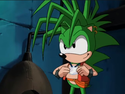
• after saying that i realized his gloves disappeared in the shot i was just praising sndkgjds
• how was the production of this show? did they color digitally or was this still in the time of hand-drawn animation cells? i wonder how rushed production was
• is “amigas” proper spanish?
[googling]
yes it is nevermind
spanish class as a required class was pointless apparently because i don’t remember jack shit from it
• dingo you aren’t allowed to steal the “main man” title from manic (my nickname in our discord server was “my main man, manic” for the longest time sjkdgbs)
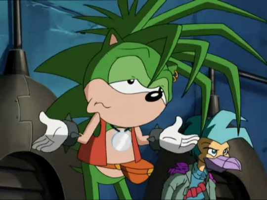
• it’s kinda neat seeing where all these pics my boyfriend gave me when i was looking for refs came from
• i’ve thought that a song was gonna play tiwce now so now i’m wondering when it’ll come in and if it’ll be plot relevant
• bummer majores
• i get the point of “aw man i can’t believe you have to give all this money to robotnik because he’s evil and demands taxes” but hey either tax the rich or eat them dude
• this old man’s outfit is horrendous
• sonic and sonia just hid behind behind a thing hanging on the wall and that just wouldn’t work
• manic and max both like drums... ;v;
• why are manic and dingo just throwing glass bottles and shit back and forth at each other, is this a game
• DINGO YOU HURT THE BOY
• god what are these masks
• SONG TIME
• again, manic’s just talking in the middle of the song, and i get it’s for plot but the visuals are, again, sickeningly distracting, i can’t tell what’s happening
• how does nobody notice the drummers changing place in the middle of the performance? how is there not a gap in the drum/cymbal beats?
• these poor children, wow dingo
• it’s really sweet that this old man helped the thief kids find parents and homes to go back to, that’s very nice
• manic has one (1) coin and everyone takes that as evidence that he robbed the old man of all his money when that also doesn’t make sense, yes he took it from the vault thing but he didn’t take the whole thing?
• why does manic just let the robot handcuff him, i know he feels guilty but like he isn’t an idiot, he knows what’ll happen if he does that so why does he???
• why do sonic and sonia immediately believe what sleet says about manic, shouldn’t they be on guard whenever this fuck’s around and have some suspension of belief here
• this man went from 0 to 100 real quick huh
• SONG TIME???
• i forgot that the song already happened because of my confusion during the sequence and now i feel like an idiot
• anyway the song was like a 5.5/10, it has the energy i think they were going for and it doesn’t sound awful, it’s a little better than alright, though i wish the scene was more coherent and easy to follow
• sonia’s classist as hell damn
• sonic’s faith in manic being honest is nice to see
• the thief children didn’t get their homes after this?? i’m upset
• two bros laughing manically in the sewer in front of a very small crowd of children, as you do
• manic talking to himself in jail kinda reminds me of movie!sonic but like... slower and less interesting, also why do they just throw him in jail? doesn’t robotnik roboticize everyone?
• that one kid dares to look in max’s direction and he’s like ShShHhH like your hushing is gonna get you caught dude not that kid
• MAX IS THROWING METAL THINGS IN THE BACKGROUND WHY??? YOU WERE SHUSHING THAT KID FOR SAYING NOTHING
• max should be like... directly in sleet’s line of sight rn
• of course they gotta very clearly explain the plot directly to the audience
• everyone’s so shitty to these poor kids, damn
• you’d think that huge laser blast would have injured manic in the process of blowing a hole in the wall
• why’s sonia so concerned about the police chasing them? aren’t the police chasing them all the time?
• manic nyooms again when he gets out of the van
• these robots aren’t observant at all are they
• for once, reusing animation makes sense
• yay the poor kids get homes now
• as nice as this ending is, it isn’t easy to kick bad habits like thievery, especially when it’s like... part of your nature at that point? it’s odd
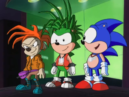
• god the perspective
• also, this is exactly why i give everyone on this blog extended muzzles and more clear divides between their eyes when they’re looking to the side, otherwise they look cursed
• IT’S TIME TO JUICE AND JAM
16 notes
·
View notes
Note
Have you ever considered making a YouTube channel? I would love to see the process of making your art!
I do think it’d be nice to make speedpaints but I currently don’t have any kind of video recording or editing programs with which to make them, ahah… also I can’t imagine anyone wanting to watch a speedpaint without some music on said video, and there is the small issue of youtube and copyright and all the songs I like presumably being Very Copyrighted
so it’s not a possibility I’d write off forever, but I don’t know how I’d make it happen right now :’>
but if it’s my art process you’re interested in, I can at least go through that step-by-step with some screenshots!
step 1: draft! usually either a very tiny chibi or barely more than a stick figure, my art always starts like this so I can figure out the pose without spending like an hour on a full-sized sketch that doesn’t even work in the end

this then gets resized to whatever size I want the final picture to be:
drawing at that size usually means the anatomy is pretty wonky though, and the lines are too thick and blurry to be much help for the actual lineart. if a background is vital to the whole piece it’ll get drafted here too, but with space backgrounds like in this I can just fit it in around the characters. (that’s generally terrible art advice though, please do not do as I do :’D)
step 2: sketch! still very rough, but a lot easier to work with later. I do anatomy sketches as I go but there’s rarely any need to keep those layers
I don’t usually “colour” sketches like this but knowing I’d be sharing this I wanted to make it more readable, since this is still what I would consider an unpresentable mess not worth posting uvu;;
(also if I’m doodling, this part sorta gets skipped in favour of just letting the lines be a bit sketchier and rougher than usual)
step 3: lineart! literally the worst part always.
it’s worth it in the end, but… yeah this isn’t ever the point where I’m like “yes this is a Good Picture that I Will Be Happy With :)”
(I do lineart with SAI’s default pencil brush at a size of 3 to 5, opacity around 75%, if that’s of any interest)
step 4: flat colours! I have probably the slowest possible way of doing this, but after how tiring lineart is I find it pretty relaxing taking my time filling each colour in under the lines. every individual colour gets its own layer so they can all be shaded individually too
if I’ve drawn the same character in that same outfit before this is also where I’ll do the line colours, but those rely on being darker than the shading of each colour, so for a character or outfit I’ve not drawn before that can’t be done until after the shading. fortunately not the case here!
generally shading would be next, but there also comes a point where I have deal with the background now or I’ll be even more frustrated by it later, so - step ???: background! whether I do it lined or lineless pretty much just depends on if there’s any straight lines involved
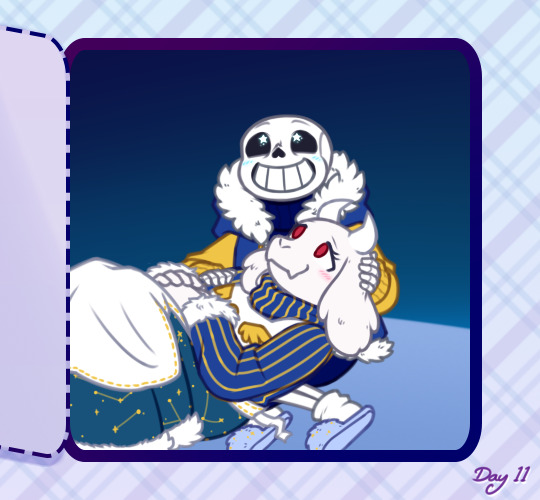


…backgrounds are kinda too individual to explain in general, but for this specific one all the starry details are luminosity layers. stars are done with this brush but I do quite a bit of erasing and hand-drawing stars too, and I use SAI’s default brush set to spread for galaxies
step 5: shading! aka the best part, the point where I go “oh hey this looks decent actually. when did that happen”
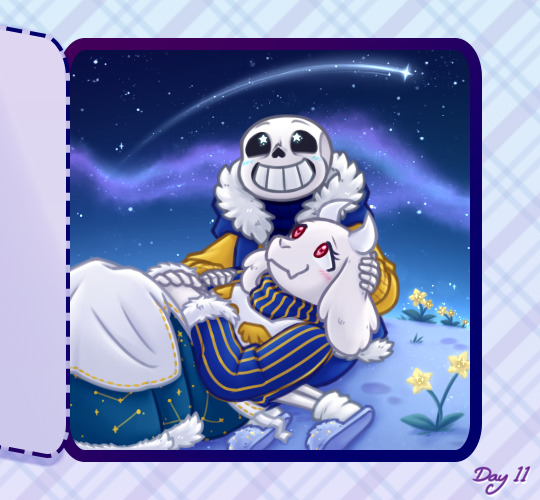
my usual shading style is every colour gets 2 darker shades and 1 lighter shade, each shade getting its own clipping layer attached to each colour. this was more obvious when I used to cel shade but soft shading makes my art look so much better ahah
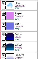
step 6: layer effects! multiply and luminosity layers have been my go-to for the past 4 years, but I can’t believe I only realised how good overlay layers are in the last year and a half. they’re so good
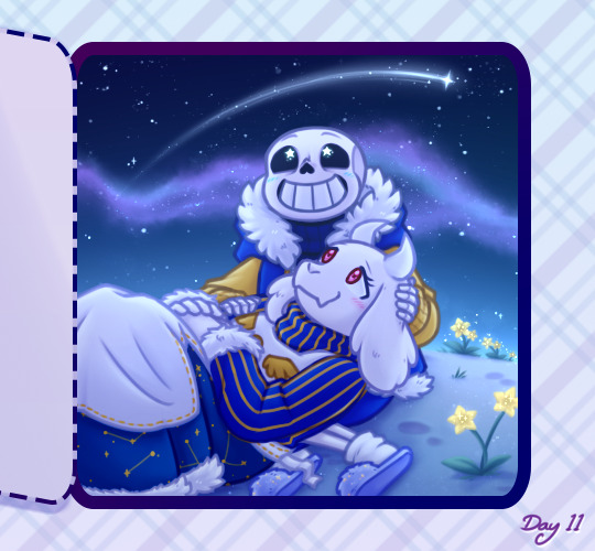
here’s the specific effects being used here:
aaand step 7: final touches! usually consists of any glowy outlines, text or things that need blurring in photoshop, a final luminosity layer at around 10 to 20% opacity for extra highlights (especially needed for dark scenes like this, those darker layer effects tend to make the regular highlights from the shading less vibrant), slap a watermark on there and call it done
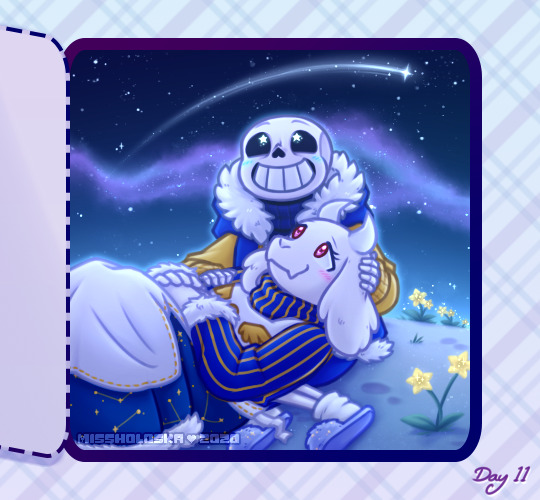
and then you’re ready for step 8: spend an hour staring at every pixel for mistakes, before spending another hour fighting the anxiety about posting it
bonus: even though I can’t make a speedpaint I can throw all those screenshots into a poor quality gif for you to watch, at least!

one final thing I can mention: not including the draft and sketch layers or all the parts of the advent calendar windows, just the finished art itself - this is made up of 102 layers. and that’s with me merging a lot of layers because SAI has a layer limit and takes an eternity to save if there are too many. people who can draw a whole piece on a single layer confuse and frighten me
#anonymous#holoskart asks#holoskart rambles#honestly my art process is just a bunch of weird habits I wouldn't recommend imitating :'D but I hope this is interesting enough??#also sorry for taking a while to answer this! I probably could've used a piece I'd already finished to explain all this#but it seemed better to work on something with the intention of showing each part of it#long post //#wip
32 notes
·
View notes
Text
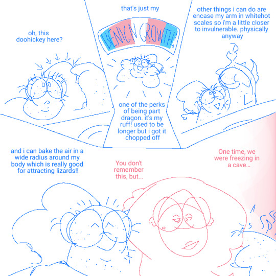
[I.D.1: Lineart comic of Fold and Tangerine, OP's OCs; all lines here are drawn in blue, except for Fold, who's drawn in pink.
Tangerine, pointing to the round ruff on the back of her head and neck (as are a bunch of informative arrows), says in all lowercase, "oh, this doohickey here?"
She happily jazz-hands and says, "that's just my Benign Growth!". The words "Benign Growth" are on a banner above her head, which has a background of the trans flag. Tangerine continues, "one of the perks of being part dragon. it's my ruff! used to be longer but i got it chopped off". She lifts up her arm, which is now covered in triangular scales and on fire, flexing it, and continues, "other things i can do are encase my arm in whitehot scales so i'm a little closer to invulnerable. physically anyway".
Tangerine puts her (still steaming) arm around a suddenly appearing Fold and cheerfully continues with eyes closed, "and i can bake the air in a wide radius around my body which is really good for attracting lizards!!" Fold, who's looking at Tangerine's arm with a fond, distant expression, says, "You don't remember this, but... One time, we were freezing in a cave..." The screen subtly darkens into a gradient of pink. End I.D. 1]
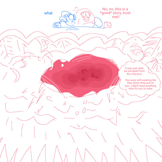
[I.D. 2: The background goes back to normal white, and the two are drawn very small. Tangerine, looking dismayed, says "what", and Fold, with a nervous, frantic smile, quickly says, "No, no, this is a *good* story, trust me!!"
The next panel is drawn in pink and cloud-shaped, as though going into Fold's memories; it depicts a cave that's overgrown with wild plants and spikes all around it, and grows darker the further inside one goes, stabbed with stalactites and stalagmites and going into a lineless style. Fold's speech bubble is next to the cave, and says, "It was just after we escaped from the mansion. You were still wearing the blue dress they put on you. I didn't have anything else for you to wear." End I.D. 2]
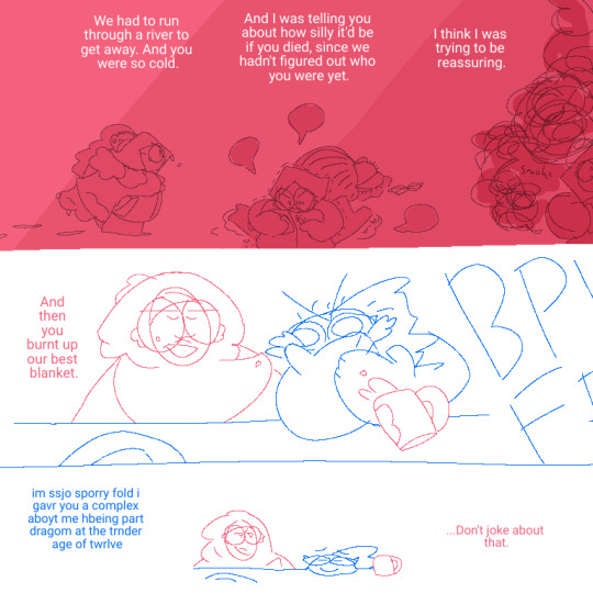
[I.D. 3: Continuing in the cave, Fold's dialogue has turned white to show up against the darkening and darkening pink. She says, "We had to run through a river to get away. And you were so cold." Below, a much younger Fold carrying a much younger Tangerine and dripping with water strides into the cave, looking determined.
Fold continues, "And I was telling you about how silly it'd be if you died, since we hadn't figured out who you were yet." Below that, young Fold is shown doggedly attempting to light a match against a matchbox with shaking hands, blank dialogue bubbles surrounding her, while Tangerine sleeps behind her with a blanket.
Fold says, "I think I was trying to be reassuring." Below that (and cut off by the end of the canvas), young Fold looks up in alarm as dark red smoke begins billowing around her...
The canvas cuts back to its normal white sketch. Fold says, "And then you burnt up our best blanket." Tangerine lets out an enormous "Pffbbbt" of laughter with watering eyes, covering his mouth, and almost knocks over Fold's mug.
The last drawing is very small. Tangerine, chin lying on the table as he smiles serenely, says with dialogue riddled with typos as though too emotional to type right, "i'm so sorry fold i gave you a complex about me being part dragon at the tender age of twelve". Fold, looking off to her left with a knowing, dry smile, says, "...Don't joke about that." End I.D. 3]
#described#long post#HOO WHEE this is long#to be honest i'm so proud of this 3)#fold and rina hit the spot of being very easy to draw very easy to characterize and very dear to my heart#my cave creatures
7 notes
·
View notes
Note
Hi! First of all I love your art! All of your pieces have nice colors and they're all so cute! I'd just like to ask about your lining process though! It's interesting and it works really well, I gotta know do you draw the shapes of the character and then line or do you line the entire image and then erase some? (Mainly the examples of the moon witch and your Howl art) 💕
Thank you so much!!!!!! ❤️💕💘💖💞❣️ thats so nice of u to say
Heres my process in screenshots
1) clean n detailed sketch to make it easier to line later

2) black lineart
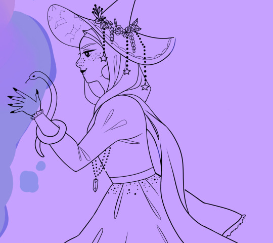
3) coloring
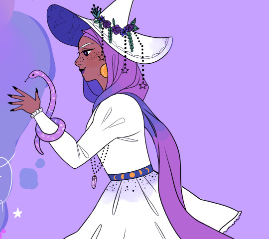
4) changing the color of the lines
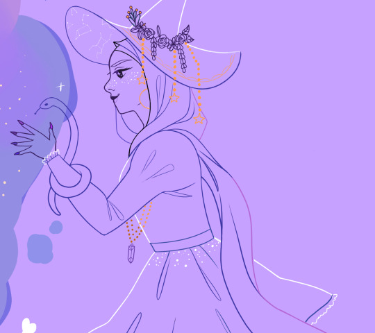
5) once the color layer is turned back on, the piece looks lineless in some parts without actually being lineless :)
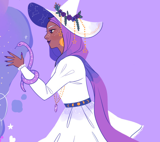
However sometimes im rlly lazy and just skip the lineart and go straight to coloring on top of the sketch. Afterwards id put in a few lines for like facial features, clothing folds, etc
Hope that explained your question! If not then let me know! :)
31 notes
·
View notes
Photo
I will be with You
When you go, just know that I will remember you
If living was the hardest part, we'll then one day be together
And in the end we'll fall apart, just as the leaves change in color
And then I will be with you, I will be there one last time now
--My Chemical Romance, "It's Not a Fashion Statement, it's a Deathwish"
____
It's rare that I'm this proud of an artwork I've created. ^_^
Usually, there's some glaring issue or just an assortment of small things I'd still change if I had the patience and/or artistic ability to do it. Or even just some things that I feel like could've been done better, even if I know it did the best I could.
This time? No. Not right now, shortly after it's been completed, anyway. I'm sure years down the line from now I'll look back and feel at least slightly different. But as it stands now, while I'm sure it has its faults, I am truly happy and truly proud of what I've created here and whatever faults are there aren't bothering me at all.
So what then is this, exactly?
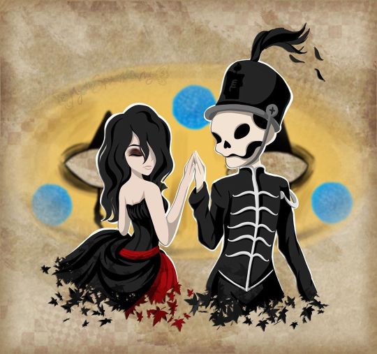
This my dear Sparklers is a visual love letter to the band I discovered just a little too late but was still there for me when no one else was all the same.
Earlier this month, I uploaded a different piece of art to celebrate the announcement of My Chemical Romance's Return, but even when I uploaded that one I was already thinking of doing another one, this time something that was more obviously fan art. But not just fan art as I've done for them in the past (Exhibit A, Exhibit B, and Exhibit C), but something extra-special and fun. I really did go into creating this wanting it to be as I described it above; a visual love letter to this band that I love so much and could not be happier that they're back.
As such, I've squeezed in as many references as I could:
1. The female figure is molded after Helena from the album Three Cheers for Sweet Revenge
2. The male/skeleton figure is supposed to be Pepe (that's what Google said his name was, anyway), the icon and seemingly marching band conductor from The Black Parade album
3. On Pepe's hat, I replaced the usual symbol with the Candle symbol that's been featured in the band's Return artwork
4. They fade into leaves based on the line from It's Not a Fashion Statement, It's a Deathwish (a song from Three Cheers) that I quoted at the top of the description
5. behind them is Party Poison's mask, as featured in the Danger Days music videos
6. on the mask, I replaced one of the black triangle shapes with the hanging man silhouette from I Brought You My Bullets, You Brought Me Your Love
7. The rest of the background is inspired by the covers for the Conventional Weapons releases (which in my mind I count as essentially an unofficial fifth album)
(Debatable) 8. Their touching hands could be an indirect reference to the line "And as we're touching hands, and as we're falling down" from Demolition Lovers, a song from Bullets.
That's at least one reference each (Three Cheers technically got two) for each of the main releases, plus one directly related to this new era we don't know much about yet. It's not an exhaustive "spot the reference" game, but I'm glad I was able to incorporate as many as I did.
Now that I've explained them, maybe I can talk about my process without having to stop to re-explain each reference as they come up.
After some brainstorming, I got this image in my head of Helena and Pepe in this pose (inspired at least partially by this pre-existing fanart I've seen many times before) , which to me is a "renaissance dancing" pose but I'm sure there's some other better way to describe it I haven't thought of. I tried for a very long time to find a reference image of this exact pose to help me get the proportions and general anatomy right within my own stylization, but for the life of me, I couldn't find anything close enough to suit me and I really didn't want to have to settle for something else. As such, I'm sure the proportions and anatomy are off, but even so, I think I did pretty good considering.
The main issues I ran into during sketching were mainly balancing the energy between the two characters--which I do think I managed in the end--Helena's skirt, as she's supposed to be holding onto it with that hand you can't see, and Pepe's torso. Originally, I was planning on doing this piece traditionally, but once the sketch was finished it almost immediately clicked into place that I'd be better served to do it digitally, considering what I wanted to do with the mask in the background already, as well as the leaf-fade. (The Conventional Weapons reference hadn't been planned yet, and it was technically only made possible later on by this piece being digital.)
Luckily, doing things digitally meant that Pepe's torso was fixed pretty easily. It was too thin in the sketch, but all I had to do was select the right lines and move them out a bit in Photoshop. He's still a bit thin and not super buff, but personally I'm letting that go because...I mean, he's at least part if not all skeleton. If anyone's going to be too thin, wouldn't it make sense that it's him?
Helena's skirt I did end up happy within the sketch but...we'll come back to the skirt in a moment.
Pepe's...face? looked a bit odd in the sketch, but other than that, once I was happy with that foundation, I scanned it in and got to work on digitizing everything.
I went over my lines for Helena and Pepe the way I normally would for something like this if a little intentionally messy instead of trying to get them super clean--as I thought that might be appropriate here--and then I paused with them to work on the mask behind them.
The mask admittedly came out very poorly in the sketch, just because I bothered to look up no references for it whatsoever once I decided I was going to make this digital and I knew I could just draw half of it and flip it over. And I'm glad I didn't start trying to follow my sketch lines for it at all because looking up actual references showed me that would've been way off.
While I had my reference up, I ended up going in and basically full-coloring and detailing the mask right then. That's the beauty of digital work; a lot of steps can be done basically out of order from how you'd have to do them traditionally and it doesn't matter because you can just move layers around and adjust effects later.
I went with this pseudo-soft shading based on the colors and shadows I was seeing in my references, even though I wasn't sure yet exactly how I was going to shade Helena and Pepe. I figured that even if I used a different method for them that I could either go back and adjust the mask as necessary or that it wouldn't matter since the mask was part of the background anyway.
Once that was done, I went back to ponder my two figures and the leaf effect that I wanted to do with them.
And again, I went a little out of order here, as I ended up filling in the silhouette of Helena and Pepe with a blanket layer of gray so I could see how them blocking the mask was going to look (and I figured based on past experiences I might need the blanket layer in white later). From there, I went into working on the fading-to-leaves effect. My logic was that I'd need mostly the silhouettes of the leaves and then I'd get what I wanted after playing with layer effects or something. This assumption ended up being correct, but we're not there yet.
As I worked, I kept looking at my "finished" messy lines. Something just didn't feel right.
Honestly, I couldn't tell you where the idea to do this lineless look came from, but it got in my head as I was working and I kept looking at the lines I had and not being happy to just color those in as I normally would, shade it, and call it a day.
I tried. I tried really hard to ignore the urge to at least try it and carry on as I was. I'd already come this far, and I'd be done so much faster if I stuck to the plan...But!!
Clearly I lost that argument with myself.
You know what though? I'm glad I did!
I don't think I've ever done lineless art like this before, not counting my watercolor work where that's just part of the process to me. But digital? Certainly not. Human figures? Also no.
I've come close in the sense that I've shaded my art before, turned off the line layers before, and thought, "oh hey that almost works without the lines because of the shading," but not much farther than that.
Naturally, I wasn't even sure how or where to begin, so I went with what came naturally to me. I started by just filling in the lines as I normally would have, and then I went back layer by layer and went back and forth between having the line layer (with the opacity brought down somewhat already so I could sort of see what I was doing) on and off to try and balance the shapes between what they looked like with and without the lines. It's weird because if you ever try this, it's a little like having to figure out a bunch of individual silhouettes that make one whole one, except you need them to be a little more defined if you want them to make visual sense.
That step and the next one, the shading, are tied in my mind for which one took me the longest.
For the shading, I really just went in blind, using hard-edge cell shading, though originally I planning to come back with some soft shading in certain areas later. The soft shading ended up not happening partly because I liked it much better than I thought I would without it, and I thought the hard-edge shading made the figures pop a little more compared to the background. The thing about this was the same issue I run into with my lines nowadays; to get smooth shapes I spend a while going back and forth between putting color down and erasing it, and sometimes undoing and redoing the same line a dozen times to get it right in one stroke. But that's really my own fault for being stubborn and trying to work solely within Photoshop and not use other programs, as I know good and well I'd have less of that issue if I'd hop into Paint Tool Sai and use the linework layers in there.
What can I say? I live up to my Capricorn sign by being as stubborn as a goat.
Anyway. The biggest challenge to figure out the shading for was Helena's skirt. I think I would've still had issues with that though even if I colored and shaded my normal way, with the lines and everything. It's just the position it's in that complicates things.
I actually did a good amount of shading in reverse here, where I'd make the base layer the shadow color and then the layer on top would be the regular color, as in some cases it just seemed easier to do that than the other way around. The part of Helena's dress around the top, for example. Or Pepe's pants (what little you can see of them).
Additionally, I ended up leaving the feather attached to Pepe's hat alone and not really smoothing it out, as I thought the roughness and inconsistencies worked really well to make it seem more feathery.
With enough patience and persistence and much back and forth among the various layers, I made it through all of that. I was a little concerned at first about some of my color choices and if the shading was too harsh in some places or not, but I mellowed out as I worked and ended up not making make adjustments after the fact. For instance, originally I thought I'd go back and make Pepe's...skin? closer to a true white and this fleshy off-white color was more of a placeholder, but the longer I worked with it, the more I didn't want to change it. It actually makes sense, given that his hands are normal (as they are presented in official artwork and other fan art not made by me) and that bones usually are naturally more of an off-white color. And I also think it just looks really good next to Helena's pale skin.
The hands were a special challenge in regards to both shading and coloring, as hands like to be the more complicated part of a drawing more often than not, but even that I managed to get through with a lot more ease than I would've bet on.
The other thing about that is that I was surprised once I got through the steps at how much better Pepe's face looked in comparison to the rest of the drawing. As I mentioned before, it looked odd in the sketch. But one I had most of the colors for him and Helena filled in digitally, the contrast or something just made it look infinitely better. (Combined with a hefty dose of earlier back-and-forth making adjustments to his jawbone area.)
Originally, I thought I might use the same cell shading for Helena's eyeshadow. However, while I was still thinking of adding some selective soft shading, I added it using one of the brushes I'd used on the mask earlier. It looked so good to me that even after I tried added the soft shading with it like I planned and decided I didn't want/need it anywhere else, I kept it.
And for the record, Helena's hair is kind of the wrong texture (it's officially more straight than this) and she's missing this little netted veil thing she's supposed to have, but I had a very specific vision in mind, so those were the two creative liberties I took with her design. I say it's fair game since I took a liberty with Pepe's hat to get the Return reference in. And besides, those two details being off doesn't make her totally unrecognizable if you know who Helena is in the first place.
Once they were done, I spent longer than I bothered to document playing with the leaf layer I'd made earlier to try and figure out how to get the effect I wanted.
Sparing you the boring details of my trial error, as I'm sure this description will be long enough without them, I eventually determined the best thing to do was to have one layer of the leaves on top set as an "overlay" layer, and another behind/beneath Helena and Pepe. Then I went back and extended my color and shading layers to extend down over the leaves, and I arranged and clipped the layers accordingly. Technically, the overlay layer wasn't necessary, but it added a little extra dimension that I really liked.
By that point, it was my second day of working digitally and getting late, but I had to do one more thing before I could go to bed with my mind at ease that night.
With Helena and Pepe done, I turned the mask back on (I'd turned it off so I could focus on them without it distracting me or otherwise getting in the way) and I felt like they weren't standing out enough against it. The bright yellow color was competing too much for my eyes' attention.
So, after trying the "stroke" blending option in white and that looking God-awful, I added a new layer between them and the mask and manually gave them a white outline.
It wasn't a perfect solution, and I knew that even then, but it was enough that I could sleep soundly knowing how far I'd gotten with the artwork.
The next day I had to take a break from working on this to bust out a painting for the challenge I decided to take on this month, but I went back to this as soon as I could after that was taken care of.
When I came back to it, I acknowledged that I technically could've left it as it was and call it finished. But I still didn't like how obnoxious the mask seemed for a background piece and it felt...I don't know. Almost hollow, in a way. It was a cool graphic, sure, but I wanting something more than that.
Again, I'll spare you most of the nitty-gritty details. But long story short, I played around with layer effects and filters for a while until I had blurred the mask out just enough that it wasn't so obnoxious but also so looking at it directly didn't make me nauseous, and the edges were softened so it felt more like a true background piece and not just an accessory that had been plastered carelessly back there.
It was only after I started saving off versions with different backgrounds--one with no background, one with white, one with black--that I realized I was missing a golden (semi pun intended) opportunity to incorporate a Conventional Weapons reference/allusion. Which was exciting because I'd previously been disappointed that I couldn't think of a good way to do that.
I went back and forth on layer styles and adding texture with brushes and things for a while on that too, but you can see what I ultimately settled on. It's not a 1:1 to the CW covers, but I'm really pleased with it anyway.
I did end up adding a bit more to the white outline in a few places and adding a drop shadow to Helena and Pepe so they'd pop a bit more (it almost makes them look like paper cutouts to me!), but really the only other thing I had to do after that was add my watermark.
It took roughly 3 days of work from start to finish, but I was honestly surprised by how fairly smooth the process went. Especially considering the new things I'd tried along the way. I can only assume it's because of just how much my heart was really into making this piece.
As I said before, I am truly proud of how this piece turned out. I love it. I love it, and I love the band that inspired its creation. Even the title says a lot here, I think. I picked this line that's repeated at the end of It's Not a Fashion Statement, It's a Deathwish, as it was a leading inspiration with the leaves and everything, and after looking at the lyrics I realized how fitting that line is for this.
I discovered My Chemical Romance two years too late, two years after they broke up in 2013, but I've stuck by them ever since, and I will continue to do so, with whatever the unwritten future holds. They've changed, as anyone would over the course of six years, but they came back anyway. Even if it's just for a few shows and they're gone again. Or if it's going to be so much more than that. They. Came. Back. And that's not an easy thing to do a lot of the time.
And so, I show my solidarity. I will be with you, MCR, no matter what comes next. You were there for me, and now it's my turn to be there for you, even if it as just another fan among the crowd.
And that's really all I have to say on the matter.
____
Artwork © me, MysticSparkleWings
____
Where to find me & my artwork:
My Website | Commission Info + Prices | Ko-Fi | dA Print Shop | RedBubble | Twitter | Tumblr | Instagram
#mcrmy#mychemicalromance#mcr#helena#the black parade#three cheers for sweet revenge#danger days#thetruelivesofthefabulouskilljoys#killjoys make some noise#conventional weapons#return
2 notes
·
View notes
Text
Current Project Talk [August 2019]: Part 2 - Moth to the Flame
This is Part 2 of my project talk for this month, Part 1 is here!
This part will focus on Moth to the Flame, the second of my active comic projects. This particular project has been on pause for the past month or so as I worked on revamping Starglass Zodiac, but I hope to get back to it soon. I’ll talk a little bit more about the plot of this one as, compared to SGZ, this story is less well-known even amongst my friends and family, much less my followers. SGZ had the luxury of being developed over my time at school and thus had more exposure in that regard.
Alright, let’s do it! :D
If you’ve read part one of this talk, you’ll know that I consider Moth to the Flame the smaller of the two projects, as the scope of the story and characters is much smaller than that of Starglass Zodiac.
And unlike SGZ, Moth to the Flame is not currently being uploaded in a webcomic format (at least not right now), but I still consider it an active project. It likely will have a digital release at some point, but the timeline for this project differs from SGZ. If I can manage it, the timeline will be much faster, as I hope to publish this story in some way within the next year or so. SGZ may be my first comic, but MttF will likely be the first one completed. Digital first, then hopefully a physical release somewhere down the road. The ultimate goal for this project is, like the others, getting it published and holding the book in my hands someday.
As I mentioned earlier, the scope of MttF is smaller, meaning that overall the story is a lot simpler. The cast is smaller, and the world itself is far less relevant to the story at hand, (i.e. less “lore” involved). That’s not to say that I want to get lazy with the world or lower the stakes, but rather to focus on the characters themselves.
Fundamentally, the world the protagonists live in (a giant forest) serves the narrative as a source of danger in their travels. There isn’t a deeper meaning to the world like it would be in SGZ, where the Astral Plane and how it functions is integral to how the characters interact with it, and the history of the world is important to the present plot. In Moth to the Flame, it’s more about the individual, in this case Kiida and, later, the Z-Squadron. SGZ has importance in the characters too of course, but the actions of the characters in MttF do not have a grander purpose to the world at large. They are individuals trying to find their way in a world much bigger than them, and I felt this was appropriate for a story about insects.
The core of Moth to the Flame is the interactions and relationships between the protagonists, and the struggles that they overcome together. You’re not really supposed to question why other insects in this world are not anthropomorphized in this universe, as that is not relevant to the story either (think DuckTales). The predators that hunt them are just that: predators, and narratively speaking they aren’t more than that. I thought about expanding the world multiple times in the process of writing this story, but I felt that distracted from where the heart of the story was in the first place.
If I write it well enough, the reader will have a deep connection to the characters and their relationships as they grow and develop over time. Kiida’s initial goal in this story is simple: find her way back home. How she became separated from her home and why she acts the way she does is initially hidden from the reader as it is to the rest of the characters, and the journey to revealing that takes up a good chunk of the story along with returning Kiida to her home at Willow Bush.
Moth to the Flame may have simplicity in overall scope, but the same cannot be said for the art style I wish to have for it. I’m planning on a lineless storybook-esque feel to it, for both the backgrounds and characters. SGZ may have more complex locations, but the character designs and art style are much closer to my baseline when making art. It’s the style I gravitate to the most when I don’t have a specific one in mind. That said, I think the lineless style really lends itself to the general “feel” of Moth to the Flame in the tests I’ve done so far. Somewhat whimsical with a nice focus on colour, but also simple enough to convey expression without complex lines and textures.
Overall, this story feels a lot less daunting compared to Starglass Zodiac, but I love both of them equally. I think that’s why I like doing both at the same time, to strike a balance between the large and small when it comes to storytelling and the learning process along the way. The heart of all of my stories will always be the characters, and I hope that remains true through both of these projects.
2 notes
·
View notes
Text
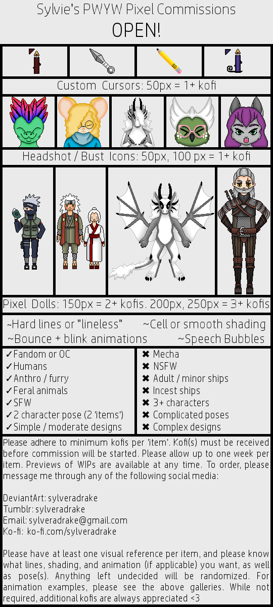
Pay What You Want commissions are open!
Active Slots:
1. [ Open ]
2. [ Open ]
3. [ Open ]
4. [ Open ]
5. [ Open ]
Reserved Slots:
1. [ Open ]
2. [ Open ]
3. [ Open ]
4. [ Open ]
5. [ Open ]
Frequently Asked Questions (Please Read!):
[ ? ] What does pay what you want mean?
[ A ] Pay what you want (pwyw) means that, beyond a minimum, you can pay whatever you want for the commission! The minimums are listed on the sheet, and anything above that isn't necessary, but greatly appreciated! If an item says 1+ kofi, you must pay at least one kofi, but you can add more if you're feeling generous!
[ ? ] What is a kofi?
[ A ] Ko-fi is a website that allows you to support your favorite creators, a bit like a way to tip them by "buying them a coffee"! A 'kofi', as I call them, is each unit of support you give an artist ($3US). There is of course a small chunk taken from each kofi, so the artist doesn't get the full $3 (just something to bear in mind). You can give as many kofis at once as you'd like, hence these commissions being pwyw so you can give whatever you feel like giving!
[ ? ] Are these all the options you have for commissions?
[ A ] These are primarily just examples of things I've done consistently in the past! If you have a more 'custom' idea, we can certainly discuss it! I've been doing pixel art for about 3.5 years, so I have some decent experience, but like every artist I have limits to my current abilities. You can see both my Tumblr and DeviantArt galleries for more examples, including the options for the line styles, animations, and shading!
[ ? ] What ARE all those options under the examples?
[ A ] Hard lines means the piece will have "hard", solid black lines between each "section" of the piece: the outline, and between all the different colors, etc. Lineless means that rather than having that solid black line, I use a slightly darker shade of each color to outline them, like the fullbody dragon! This gives it a softer, 'lineless' look.
Cell shading means that there's just one color used to shade, rather than a blend. The Kakashi doll on the far left has cell shading: just one color in a hard shape. Smooth shading means what it sounds like: a few colors are blended from dark to light to make the shadows smoother!
I do a few very basic animations for certain dolls or icons when requested. Typically this refers to a one-pixel "bob", and a blink cycle. I can also have a doll open its mouth and bring up a small speech bubble if you'd like them to say something! Please bear in mind that animation takes additional time and effort, and though not required, additional support is appreciated for animated pieces!
[ ? ] Why are there things you refuse to draw?
[ A ] For the most part, it's simply a matter of preference. For others, it's a matter of ability. Some things are just a bit too complex for me to feel I can pull it off in a fashion consistent with the rest of my work, and therefore being worth your money! Hence a limit on complex poses and the number of characters per shot, or complex designs, like mecha. Other things like the ship limitations are just personal preferences that make me uncomfortable. The NSFW ban is mostly due to most hosting sites not liking to host mature artwork...and also a matter of both my ability, and personal preference.
[ ? ] What constitutes NSFW?
[ A ] For me, this includes any nudity that shows genitals - nipples and / or breasts are fine. This also includes anything sexual, including any and all fetishes, even if genitals are not shown. I also do not do heavy gore. I may expand this umbrella term if anything not already covered comes up!
[ ? ] I can't afford a commission, but I'd like to help! What can I do?
[ A ] You can share this comm sheet and / or my art with your friends! Getting the word out might mean finding someone able and willing to order a comm, which of course is a big help!
[ ? ] Do you do requests?
[ A ] Unfortunately, not at the moment. If you'd like me to draw something for you and the comms are open, you're more than welcome to order something! While I do do personal art for myself and for friends, I can't make free art for everyone. In the future I may do something akin to raffles, but for now, we're starting with the commissions!
[ ? ] Can I donate without ordering a commission?
[ A ] You most certainly can, and it's very much appreciated, and would be a huge help! Of course it is NOT an expectation: no one has to donate if they can't or don't want to. But if you just want to throw some general support in to help me keep creating, you're more than welcome, and I'd appreciate it tremendously :heart:
[ ? ] Do you accept DeviantArt points?
[ A ] I do not. To put it bluntly, DA points can't pay my bills. I have nothing I need that DA points can buy, so I only work with money. Sorry!
[ ? ] Do you do anything like art trades?
[ A ] For the moment, no - but I might in the future! I'm open to the possibility, but for now (and for this post's purpose), I'm working on commissions! If I ever open up art trades, I'll be sure to make another about it!
[ ? ] How is best to contact you?
[ A ] Any of the above listed social media! On DA, please send a note with a subject line about pwyw commissions. On Tumblr, you can send an ask (off anon) which I will reply to privately. You can also send an IM! Email also works: just include the pwyw commissions in the subject line. I do my best to check all of these sites a few times a day, but there may be times where I'm limited. I'll try to post ahead of time so you know why I'm not responding promptly! Otherwise, it could take me about a day to get back to you. Please be patient! I have other responsibilities. I may also take hiatuses if I feel the need. If I go more than a few days without responding and haven't given any warning, there's probably something keeping me from my messages, and I'll do my best to get back to you as soon as I'm able!
[ ? ] What's your policy on refunds?
[ A ] So long as I haven't finished flat coloring your piece, you can get a full refund, of course! But once the piece is lined AND colored, I've put in a good bit of work, so I'm afraid I won't be able to refund you. As stated on the sheet, you can ask for an update on the piece any time! And I will send you the cleaned sketch once it's finished to see if there's anything you'd like changed. Though please bear in mind some things can differ between sketching and lining, especially when shrinking down to pixel. A sketch is a general outline, not the full product!
[ ? ] Are there any other circumstances where you might refuse a commission?
[ A ] Honestly it depends. I hope not to encounter any other reasons beyond my general rules, but I DO retain the right to say no to any commission for any reason, which I don't have to disclose. If I do say no, please respect that decision. It's never anything personal.
[ ? ] Where does the art go once it's finished?
[ A ] Any commissioned art, by default, will be posted to my DeviantArt, my Tumblr, and on Ko-fi! I'll also send you a copy / link through whatever means you contacted me with. If you'd like your art to be private, you need only ask. I will then only send YOU the art, and it will NOT be posted anywhere else. I can also post the art anonymously if you’d like it posted, but your name not attached to it.
[ ? ] How can I use my commission(s)?
[ A ] Any way you like UNLESS it's commercial - in other words, if you make any money using the artwork. Please also do not trade or sell the artwork. Otherwise, feel free to use it for any personal use you'd like! You can also repost the art so long as you provide a link to my original post. If your comm wasn't publicly posted, a link back to any of my social media will suffice! Just always be sure to use proper credit so people know where the art came from! That way they can find my pages, and maybe get a commission of their own!
[ ? ] Do you do fanart?
[ A ] I do! My commissions are all one-off, unique jobs, and I'm hardly about to impact any IP markets. So long as it's a large fandom (no Disney, though - that's one I won't touch), and my art wouldn't greatly impact the profits and livelihood of other creators, I can do fanart. But I DO prefer to do original art! It's great to work with new designs, and help give original characters more art for them! Gimme OCs to draw!
[ ? ] Can you design a character for me, like a custom adoptable?
[ A ] I can! Just bear in mind that I'll need as many details as possible to make something that fits your vision! I'll also need to work with you more than typical to be sure we get it as accurate as possible, so be prepared for a lot of communication until we get it looking as you want!
[ ? ] Can you do gifts - in other words, can I order art for another person?
[ A ] I do, and you certainly can! Just be sure to let me know who the gift is for, so I can tag them! If they don't have any of the social media I use, you can just give me a name or screen name to post with it. A gift will just cost you the same as any art you'd order for yourself! Also please do be sure you have permission to commission art of characters owned by another person!
[ ? ] What do you mean by 'item'?
[ A ] Each individual pixel piece! One lone pixel doll of 150 pixels would be a minimum of two kofis! But if you want two dolls interacting, it's two kofis minimum EACH. So at least four kofis. That's because I still have to sketch, ink, color, shade, and possibly animate EACH doll! Twice the effort means twice the price.
#commission#commissions#pwyw#pwyw commissions#pay what you want#pay what you want commissions#pixel art#pixel cursor#pixel icon#pixel doll#long post
8 notes
·
View notes