#more knitting
Text
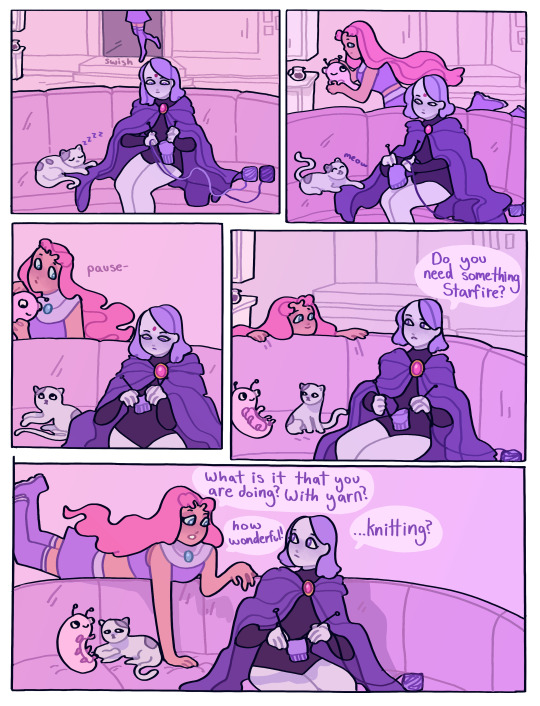
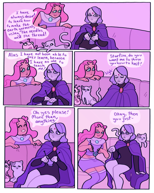

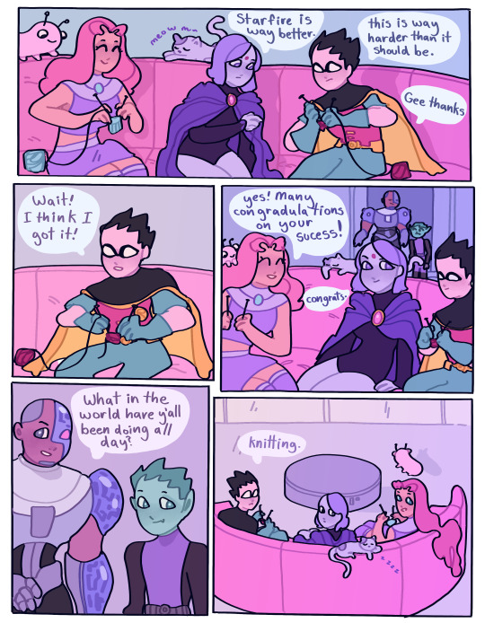
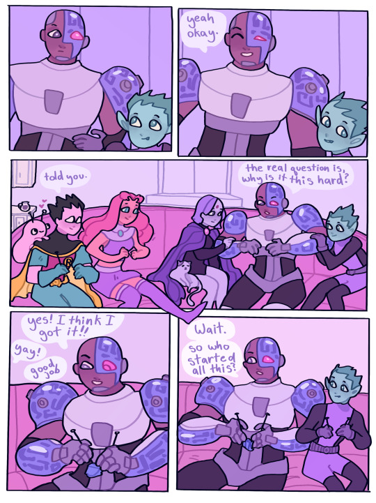
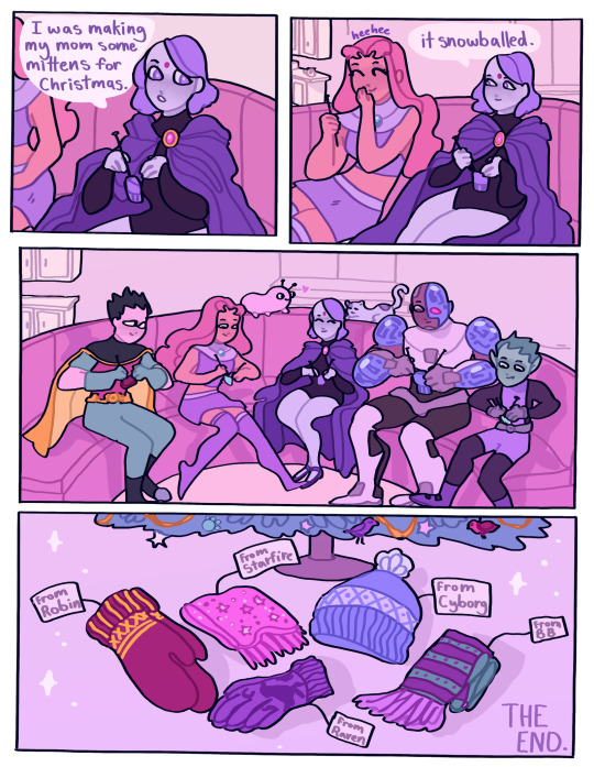
knitting
#happy holidays yall#teen titans#raven#starfire#robin#cyborg#beast boy#more knitting#my comics#teen titans comics
6K notes
·
View notes
Text
I can’t wait to develop and grow even more🤞🏾
#fiber art#fibre arts#knitblr#knitting#hand knitted#knitters of tumblr#hand knit#handmade#crochet artist#crochet art#more crochet stuff coming soon too don’t worry
16K notes
·
View notes
Text
i am thinking how much poorer, how much less colorful the world would be if art was only made by "professionals." if all the music, all the stories, all the sketches & paintings & craftwork of the world was created only by the small category of people able to make a decent living from their art. imagine if the only people allowed to create were the experts & the renowned & those aspiring to the top. what a grey world that would be. how much joy would be bleached away! i love you people who create for the sake of creating, i love you artists who do art for tiny audiences, i love you people who make things even just for one person, even just for themselves, even if no one's watching, thank you thank you thank you for decorating the world in which we all exist
#not a shitpost#related: the most powerful crafters alive are crocheters who spend 7+ years making an intricate table cloth no one is allowed to eat on#all that arcane magic into making a display object primarily for their own enjoyment#and that of the blessed few lucky enough to be invited into their home to behold what is by rights a sacred object#if you spend a certain number of hours crafting something u have the right to have it put in a shrine or museum of your choosing i think#you have imbued it with your Life Essence by sheer force of concentration and obsession it is Holy now#anyways. old ladies who knit/crochet/embroider etc are a thousands times more powerful and intimidating#than old white dudes who are obsessed with war memorabilia or whatever#i have nothing but respect awe and appropriate amounts of fear towards crafters. my liege
11K notes
·
View notes
Text
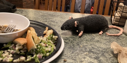
I’ve knitted myself a beautiful rat daughter and here she is in her natural habitat (midwestcollege dining hall)
#em makes stuff#her name is EGLANTINE and she is so incredibly holdable#currently making her a friend so expect more rat knitting soon
2K notes
·
View notes
Text
happy and proud!!
✷(print shop)✷
#mine#original#sm how managed 2 miss pride month....but its pride month every month in this house hold#ive read two bad YA books so far this month as a break from th 2nd farseer book but now.....i am back.........i am reading th 3rd one#its gna make my brain explode i can feel it#n then idk what i will read. maybe th hands of th emperor#could i read smth other than 800 page epic fantasy pls#the YA books werent too bad for YA but they hve that YA cringe 2 it. idk how u people read it constantly#if i hve 2 read th word 'heck' one more time#also theres always like. disney channel vibes. like i read gay YA romance n its so sanitised n vanilla. its so superficial#like i get this is for 16 year olds but were is the longing. the yearing. these guys are fanfic tropes stuck 2gether 2 glue.#also. what is with nearly every mlm romance / fantasy being YA not adult fiction. whats up w that#anyway hve a good evenin im gna do knitting!!!!!!!!!!!!
4K notes
·
View notes
Text
isn't it weird how if you get up at 7 or 8, do your work all day, then have free time and go to bed at 11 that's absolutely fine
but if i said i get up at 10, do fun stuff in the morning then work in the evening and go to bed late, i could be called lazy, nevermind that i'm getting just as much or MORE work done as i would in a traditional work day
#ramble#idk if this is a me problem or not#i've tried to do the early rise early bed thing again and again and it just does not work for me doing freelance right now#maybe it's bc i used to work at a bar so i'm more comfortable being active in the evening#i love working at night because there's less going on to distract me#what used to happen is i would get up early then fight executive dysfunction all day saying i couldn't do fun stuff until i did my work#then my will to work would hit at 10pm and i'd be up till 2am anyway#right now my routine is waking up later and playing a game or knitting for an hour or so and then working in the afternoon and evening#something something capitalism and 9-5 and adhd don't go together#this sounds like i'm just making excuses but it works and i'm actually getting shit done and sleeping enough so i don't see the problem#i just figured i'm probably going to sit and do nothing for a few hours in the morning anyway so i might as well give myself permission to
1K notes
·
View notes
Text
*notices I have more stitches than I’m supposed to*
…
……
*knits 2tog and moves on with my life*
#no fandom#knitting#IM NOT UNDOING THAT ROW#WHAT IF IT’S MORE THAN 1 ROW???#I REFUSE#I don’t know how people drop stitches I always seem to pick up extra instead :/
2K notes
·
View notes
Text
"I enjoy playing the MMORPG called World of Warcraft" *immediately turns off trade chat, blocks guild invites, sets status as invisible, never enters voice chat, avoids group content as much as possible*
#i'm sorry#it is fun to be in a small tight knit guild though#world of warcraft#this goes for E/S//O as well and I think it's a lil more solo friendly even?#split up the tag cause this is mainly about WoW
650 notes
·
View notes
Text
the rise of AI art isn't surprising to us. for our entire lives, the attitude towards our skills has always been - that's not a real thing. it has been consistently, repeatedly devalued.
people treat art - all forms of it - as if it could exist by accident, by rote. they don't understand how much art is in the world. someone designed your home. someone designed the sign inside of your local grocery store. when you quote a character or line from something in media, that's a line a real person wrote.
"i could do that." sure, but you didn't. there's this joke where a plumber comes over to a house and twists a single knob. charges the guy 10k. the guy, furious, asks how the hell the bill is so high. the plumber says - "turning the knob was a dollar. the knowledge is the rest of the money."
the trouble is that nobody believes artists have knowledge. that we actively study. that we work hard, beyond doing our scales and occasionally writing a poem. the trouble is that unless you are already framed in a museum or have a book on a shelf or some kind of product, you aren't really an artist. hell, because of where i post my work, i'll never be considered a poet.
the thing that makes you an artist is choice. the thing that makes all art is choice. AI art is the fetid belief that art is instead an equation. that it must answer a specific question. Even with machine learning, AI cannot make a choice the way we can - because the choices we make have always been personal, complicated. our skills cannot be confined to "prompt and execution." what we are "solving" isn't just a system of numbers - it is how we process our entire existence. it isn't just "2 and 2 is 4", it's staring hard at the numbers and making the four into an alligator. it's rearranging the letters to say ow and it is the ugly drawing we make in the margin.
at some point, you will be able to write something by feeding my work into a machine. it will be perfectly legible and even might sound like me. but a machine doesn't understand why i do these things. it can be taught preferences, habits, statistical probability. it doesn't know why certain vowels sound good to me. it doesn't know the private rules i keep. it doesn't know how to keep evolving.
"but i want something to exist that doesn't exist yet." great. i'm glad you feel creative. go ahead and pay a fucking artist for it.
this is all saying something we all already knew. the sad fucking truth: we have to die to remind you. only when we're gone do we suddenly finally fucking mean something to you. artists are not replicable. we each genuinely have a skill, talent, and process that makes us unique. and there's actual quiet power in everything we do.
#also pay plumbers more. and electricians. and other devalued occupations#idk that this makes sense#but im like#people being so fucking pleased with themselves about the fact they can ''fake'' art#n im like#sure#but what if we stop making things for you huh#what if we stop giving u this stuff anymore#what happens to ur ai art? does it keep growing? does it keep making choices?#why do u need to see us as machines?#''i want X to exist but i don't have the skill to do it''#okay spend literally years of your life studying#''i don't want to do that''#okay pay someone who DID do that#''no i don't think it's a real skill''#okay so. YOU can't do it. and a LOT of people can't do it. but you think WE should be able to?#FOR FREE?#either it has value or it dont baby make up ur OWN mind#btw studying here is not used academically. i think if ur like. constantly knitting.#thats studying#do u spend hours reading and find urself taking notes and learning about writing#ur studying#do you follow other artists and spend a lot of your time trying new things (even unsuccessfully)#that's also studying#etc#was weird to write this thing about choices and then be like. wait why DO i like that
7K notes
·
View notes
Text
Knitting (and all crafts really) PSA:
It is not normal for it to hurt.
If you have pain while crafting, take a break, and if you still feel it, find some stretches (searching “knitting stretches” or whatever craft you’re doing will give you some great things to do!).
If there’s a pattern of pain occurring while you’re crafting, change the movements you are doing. There are loads of methods to get to the same results and different things work for different people.
(For knitting, some styles include English knitting or throwing (yarn in the right hand); a subset of that is flicking; Continental knitting (picking) is a style with yarn held in the left hand, and similar methods include Norwegian purling and Portuguese knitting. There are infinite personal variations but those are the big categories, so you have many many options.)
I’ve seen far too many people say that pain is normal and you should just keep going. NO. STOP IT. You’re not nobly suffering for your art, you’re risking setting yourself up for long-term pain and possibly needing surgery. I’ve been knitting since 2009 and have carpal tunnel from my barista days, so I know how this goes over time, and it’s a) constantly kind of ouchie and 2. has to be managed all the time: I held my phone too long? no knitting today! I typed at the wrong angle? Guess I’ll be recovering for a couple days.
Find a form that is comfortable for you and you’ll be able to craft longer and enjoy it more while you do.
*Please note: if you have physical disabilities and/or chronic illnesses, you know how to manage this and where your own pain thresholds are, and you know what it’s like to pay for having overdone it. I’m screeching more in the direction of people who aren’t used to managing that kind of thing. Carry on!
2K notes
·
View notes
Text

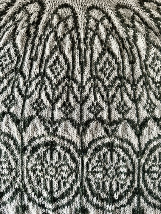
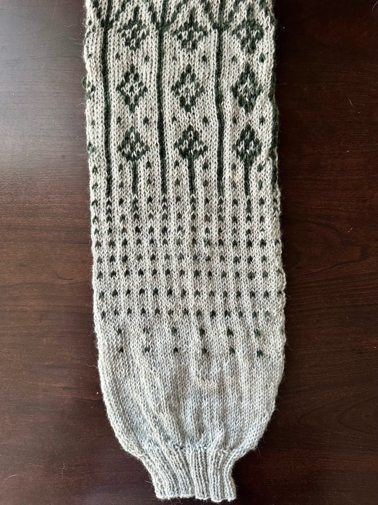
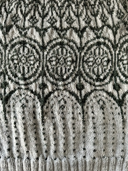
knitting but make it ✨dark academia✨
#knitting#wip#knitblr#the pattern is dark academia on ravelry🫶#the gothic catholic cathedral vibes are off the chart here😅#also every time I do an all over colorwork sweater I remember how much I don’t actually like doing them but the pattern is always worth it#I love the way the sleeve decreases worked out! the pattern calls it a bishops sleeve decrease so the more you know ya know?
507 notes
·
View notes
Text
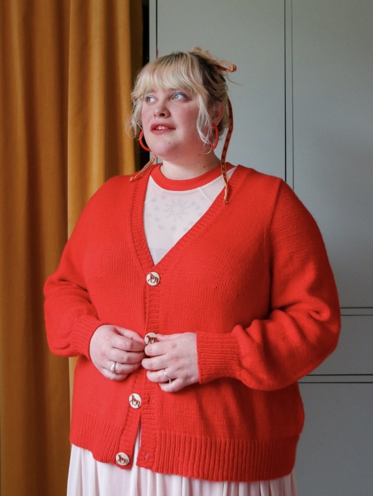
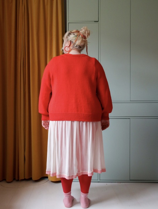
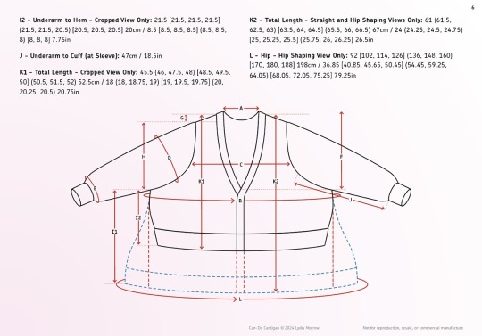
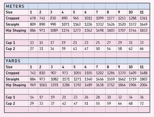
Lydia Morrow has come out with my dream cardigan! It has optional bust and hip shaping, as well as a crop version, with button band or icord closure options. As with all her patterns, there is also a sliding pay scale to make it accessible for all who wish to knit it.
Lydia works really hard to make sure she’s putting out patterns that prioritize fat people—not just fat afab! Her husband tries on all her designs and they’re made so one can have a little, a lot, or no bust room. The project language reflects that, and it is described neutrally.
If you’d like to support her work without even buying anything, follow the ravelry link to the project to help it trend!
If ravelry is inaccessible for you, the pattern is available on her website as well.
#Lydia morrow#can-do cardigan#can do cardigan#knitblr#knitting#knit sweater#knit cardigan#inclusive sizing#cardigan pattern#I love her patterns and want more inclusive sizing options. especially for garments that aren’t giant tube socks with a hole for the neck 🥲
575 notes
·
View notes
Text
why Aurora's art is genius
It's break for me, and I've been meaning to sit down and read the Aurora webcomic (https://comicaurora.com/, @comicaurora on Tumblr) for quite a bit. So I did that over the last few days.
And… y'know. I can't actually say "I should've read this earlier," because otherwise I would've been up at 2:30-3am when I had responsibilities in the morning and I couldn't have properly enjoyed it, but. Holy shit guys THIS COMIC.
I intended to just do a generalized "hello this is all the things I love about this story," and I wrote a paragraph or two about art style. …and then another. And another. And I realized I needed to actually reference things so I would stop being too vague. I was reading the comic on my tablet or phone, because I wanted to stay curled up in my chair, but I type at a big monitor and so I saw more details… aaaaaand it turned into its own giant-ass post.
SO. Enjoy a few thousand words of me nerding out about this insanely cool art style and how fucking gorgeous this comic is? (There are screenshots, I promise it isn't just a wall of text.) In my defense, I just spent two semesters in graphic design classes focusing on the Adobe Suite, so… I get to be a nerd about pretty things…???
All positive feedback btw! No downers here. <3
---
I cannot emphasize enough how much I love the beautiful, simple stylistic method of drawing characters and figures. It is absolutely stunning and effortless and utterly graceful—it is so hard to capture the sheer beauty and fluidity of the human form in such a fashion. Even a simple outline of a character feels dynamic! It's gorgeous!
Though I do have a love-hate relationship with this, because my artistic side looks at that lovely simplicity, goes "I CAN DO THAT!" and then I sit down and go to the paper and realize that no, in fact, I cannot do that yet, because that simplicity is born of a hell of a lot of practice and understanding of bodies and actually is really hard to do. It's a very developed style that only looks simple because the artist knows what they're doing. The human body is hard to pull off, and this comic does so beautifully and makes it look effortless.
Also: line weight line weight line weight. It's especially important in simplified shapes and figures like this, and hoo boy is it used excellently. It's especially apparent the newer the pages get—I love watching that improvement over time—but with simpler figures and lines, you get nice light lines to emphasize both smaller details, like in the draping of clothing and the curls of hair—which, hello, yes—and thicker lines to emphasize bigger and more important details and silhouettes. It's the sort of thing that's essential to most illustrations, but I wanted to make a note of it because it's so vital to this art style.
THE USE OF LAYER BLENDING MODES OH MY GODS. (...uhhh, apologies to the people who don't know what that means, it's a digital art program thing? This article explains it for beginners.)
Bear with me, I just finished my second Photoshop course, I spent months and months working on projects with this shit so I see the genius use of Screen and/or its siblings (of which there are many—if I say "Screen" here, assume I mean the entire umbrella of Screen blending modes and possibly Overlay) and go nuts, but seriously it's so clever and also fucking gorgeous:
Firstly: the use of screened-on sound effect words over an action? A "CRACK" written over a branch and then put on Screen in glowy green so that it's subtle enough that it doesn't disrupt the visual flow, but still sticks out enough to make itself heard? Little "scritches" that are transparent where they're laid on without outlines to emphasize the sound without disrupting the underlying image? FUCK YES. I haven't seen this done literally anywhere else—granted, I haven't read a massive amount of comics, but I've read enough—and it is so clever and I adore it. Examples:


Secondly: The beautiful lighting effects. The curling leaves, all the magic, the various glowing eyes, the fog, the way it's all so vividly colored but doesn't burn your eyeballs out—a balance that's way harder to achieve than you'd think—and the soft glows around them, eeeee it's so pretty so pretty SO PRETTY. Not sure if some of these are Outer/Inner Glow/Shadow layer effects or if it's entirely hand-drawn, but major kudos either way; I can see the beautiful use of blending modes and I SALUTE YOUR GENIUS.
I keep looking at some of this stuff and go "is that a layer effect or is it done by hand?" Because you can make some similar things with the Satin layer effect in Photoshop (I don't know if other programs have this? I'm gonna have to find out since I won't have access to PS for much longer ;-;) that resembles some of the swirly inner bits on some of the lit effects, but I'm not sure if it is that or not. Or you could mask over textures? There's... many ways to do it.
If done by hand: oh my gods the patience, how. If done with layer effects: really clever work that knows how to stop said effects from looking wonky, because ugh those things get temperamental. If done with a layer of texture that's been masked over: very, very good masking work. No matter the method, pretty shimmers and swirly bits inside the bigger pretty swirls!
Next: The way color contrast is used! I will never be over the glowy green-on-black Primordial Life vibes when Alinua gets dropped into that… unconscious space?? with Life, for example, and the sharp contrast of vines and crack and branches and leaves against pitch black is just visually stunning. The way the roots sink into the ground and the three-dimensional sensation of it is particularly badass here:

Friggin. How does this imply depth like that. HOW. IT'S SO FREAKING COOL.
A huge point here is also color language and use! Everybody has their own particular shade, generally matching their eyes, magic, and personality, and I adore how this is used to make it clear who's talking or who's doing an action. That was especially apparent to me with Dainix and Falst in the caves—their colors are both fairly warm, but quite distinct, and I love how this clarifies who's doing what in panels with a lot of action from both of them. There is a particular bit that stuck out to me, so I dug up the panels (see this page and the following one https://comicaurora.com/aurora/1-20-30/):

(Gods it looks even prettier now that I put it against a plain background. Also, appreciation to Falst for managing a bridal-carry midair, damn.)
The way that their colors MERGE here! And the immense attention to detail in doing so—Dainix is higher up than Falst is in the first panel, so Dainix's orange fades into Falst's orange at the base. The next panel has gold up top and orange on bottom; we can't really tell in that panel where each of them are, but that's carried over to the next panel—

—where we now see that Falst's position is raised above Dainix's due to the way he's carrying him. (Points for continuity!) And, of course, we see the little "huffs" flowing from orange to yellow over their heads (where Dainix's head is higher than Falst's) to merge the sound of their breathing, which is absurdly clever because it emphasizes to the viewer how we hear two sets of huffing overlaying each other, not one. Absolutely brilliant.
(A few other notes of appreciation to that panel: beautiful glows around them, the sparks, the jagged silhouette of the spider legs, the lovely colors that have no right to make the area around a spider corpse that pretty, the excellent texturing on the cave walls plus perspective, the way Falst's movements imply Dainix's hefty weight, the natural posing of the characters, their on-point expressions that convey exactly how fuckin terrifying everything is right now, the slight glows to their eyes, and also they're just handsome boys <3)
Next up: Rain!!!! So well done! It's subtle enough that it never ever disrupts the impact of the focal point, but evident enough you can tell! And more importantly: THE MIST OFF THE CHARACTERS. Rain does this irl, it has that little vapor that comes off you and makes that little misty effect that plays with lighting, it's so cool-looking and here it's used to such pretty effect!
One of the panel captions says something about it blurring out all the injuries on the characters but like THAT AIN'T TOO BIG OF A PROBLEM when it gets across the environmental vibes, and also that'd be how it would look in real life too so like… outside viewer's angle is the same as the characters', mostly? my point is: that's the environment!!! that's the vibes, that's the feel! It gets it across and it does so in the most pretty way possible!
And another thing re: rain, the use of it to establish perspective, particularly in panels like this—

—where we can tell we're looking down at Tynan due to the perspective on the rain and where it's pointing. Excellent. (Also, kudos for looking down and emphasizing how Tynan's losing his advantage—lovely use of visual storytelling.)
Additionally, the misting here:

We see it most heavily in the leftmost panel, where it's quite foggy as you would expect in a rainstorm, especially in an environment with a lot of heat, but it's also lightly powdered on in the following two panels and tends to follow light sources, which makes complete sense given how light bounces off particles in the air.
A major point of strength in these too is a thorough understanding of lighting, like rim lighting, the various hues and shades, and an intricate understanding of how light bounces off surfaces even when they're in shadow (we'll see a faint glow in spots where characters are half in shadow, but that's how it would work in real life, because of how light bounces around).
Bringing some of these points together: the fluidity of the lines in magic, and the way simple glowing lines are used to emphasize motion and the magic itself, is deeply clever. I'm basically pulling at random from panels and there's definitely even better examples, but here's one (see this page https://comicaurora.com/aurora/1-16-33/):

First panel, listed in numbers because these build on each other:
The tension of the lines in Tess's magic here. This works on a couple levels: first, the way she's holding her fists, as if she's pulling a rope taut.
The way there's one primary line, emphasizing the rope feeling, accompanied by smaller ones.
The additional lines starbursting around her hands, to indicate the energy crackling in her hands and how she's doing a good bit more than just holding it. (That combined with the fists suggests some tension to the magic, too.) Also the variations in brightness, a feature you'll find in actual lightning. :D Additional kudos for how the lightning sparks and breaks off the metal of the sword.
A handful of miscellaneous notes on the second panel:
The reflection of the flames in Erin's typically dark blue eyes (which bears a remarkable resemblance to Dainix, incidentally—almost a thematic sort of parallel given Erin's using the same magic Dainix specializes in?)
The flowing of fabric in the wind and associated variation in the lineart
The way Erin's tattoos interact with the fire he's pulling to his hand
The way the rain overlays some of the fainter areas of fire (attention! to! detail! hell yeah!)
I could go on. I won't because this is a lot of writing already.
Third panel gets paragraphs, not bullets:
Erin's giant-ass "FWOOM" of fire there, and the way the outline of the word is puffy-edged and gradated to feel almost three-dimensional, plus once again using Screen or a variation on it so that the stars show up in the background. All this against that stunning plume of fire, which ripples and sparks so gorgeously, and the ending "om" of the onomatopoeia is emphasized incredibly brightly against that, adding to the punch of it and making the plume feel even brighter.
Also, once again, rain helping establish perspective, especially in how it's very angular in the left side of the panel and then slowly becomes more like a point to the right to indicate it's falling directly down on the viewer. Add in the bright, beautiful glow effects, fainter but no less important black lines beneath them to emphasize the sky and smoke and the like, and the stunningly beautiful lighting and gradated glows surrounding Erin plus the lightning jagging up at him from below, and you get one hell of an impactful panel right there. (And there is definitely more in there I could break down, this is just a lot already.)
And in general: The colors in this? Incredible. The blues and purples and oranges and golds compliment so well, and it's all so rich.
Like, seriously, just throughout the whole comic, the use of gradients, blending modes, color balance and hues, all the things, all the things, it makes for the most beautiful effects and glows and such a rich environment. There's a very distinct style to this comic in its simplified backgrounds (which I recognize are done partly because it's way easier and also backgrounds are so time-consuming dear gods but lemme say this) and vivid, smoothly drawn characters; the simplicity lets them come to the front and gives room for those beautiful, richly saturated focal points, letting the stylized designs of the magic and characters shine. The use of distinct silhouettes is insanely good. Honestly, complex backgrounds might run the risk of making everything too visually busy in this case. It's just, augh, so GORGEOUS.
Another bit, take a look at this page (https://comicaurora.com/aurora/1-15-28/):

It's not quite as evident here as it is in the next page, but this one does some other fun things so I'm grabbing it. Points:
Once again, using different colors to represent different character actions. The "WHAM" of Kendal hitting the ground is caused by Dainix's force, so it's orange (and kudos for doubling the word over to add a shake effect). But we see blue layered underneath, which could be an environmental choice, but might also be because it's Kendal, whose color is blue.
And speaking off, take a look at the right-most panel on top, where Kendal grabs the spear: his motion is, again, illustrated in bright blue, versus the atmospheric screened-on orange lines that point toward him around the whole panel (I'm sure these have a name, I think they might be more of a manga thing though and the only experience I have in manga is reading a bit of Fullmetal Alchemist). Those lines emphasize the weight of the spear being shoved at him, and their color tells us Dainix is responsible for it.
One of my all-time favorite effects in this comic is the way cracks manifest across Dainix's body to represent when he starts to lose control; it is utterly gorgeous and wonderfully thematic. These are more evident in the page before and after this one, but you get a decent idea here. I love the way they glow softly, the way the fire juuuust flickers through at the start and then becomes more evident over time, and the cracks feel so realistic, like his skin is made of pottery. Additional points for how fire begins to creep into his hair.
A small detail that's generally consistent across the comic, but which I want to make note of here because you can see it pretty well: Kendal's eyes glow about the same as the jewel in his sword, mirroring his connection to said sword and calling back to how the jewel became Vash's eye temporarily and thus was once Kendal's eye. You can always see this connection (though there might be some spots where this also changes in a symbolic manner; I went through it quickly on the first time around, so I'll pay more attention when I inevitably reread this), where Kendal's always got that little shine of blue in his eyes the same as the jewel. It's a beautiful visual parallel that encourages the reader to subconsciously link them together, especially since the lines used to illustrate character movements typically mirror their eye color. It's an extension of Kendal.
Did I mention how ABSOLUTELY BEAUTIFUL the colors in this are?
Also, the mythological/legend-type scenes are illustrated in familiar style often used for that type of story, a simple and heavily symbolic two-dimensional cave-painting-like look. They are absolutely beautiful on many levels, employing simple, lovely gradients, slightly rougher and thicker lineart that is nonetheless smoothly beautiful, and working with clear silhouettes (a major strength of this art style, but also a strength in the comic overall). But in particular, I wanted to call attention to a particular thing (see this page https://comicaurora.com/aurora/1-12-4/):

The flowing symbolic lineart surrounding each character. This is actually quite consistent across characters—see also Life's typical lines and how they curl:

What's particularly interesting here is how these symbols are often similar, but not the same. Vash's lines are always smooth, clean curls, often playing off each other and echoing one another like ripples in a pond. You'd think they'd look too similar to Life's—but they don't. Life's curl like vines, and they remain connected; where one curve might echo another but exist entirely detached from each other in Vash's, Life's lines still remain wound together, because vines are continuous and don't float around. :P
Tahraim's are less continuous, often breaking up with significantly smaller bits and pieces floating around like—of course—sparks, and come to sharper points. These are also constants: we see the vines repeated over and over in Alinua's dreams of Life, and the echoing ripples of Vash are consistent wherever we encounter him. Kendal's dream of the ghost citizens of the city of Vash in the last few chapters is filled with these rippling, echoing patterns, to beautiful effect (https://comicaurora.com/aurora/1-20-14/):

They ripple and spiral, often in long, sinuous curves, with smooth elegance. It reminds me a great deal of images of space and sine waves and the like. This establishes a definite feel to these different characters and their magic. And the thing is, that's not something that had to be done—the colors are good at emphasizing who's who. But it was done, and it adds a whole other dimension to the story. Whenever you're in a deity's domain, you know whose it is no matter the color.
Regarding that shape language, I wanted to make another note, too—Vash is sometimes described as chaotic and doing what he likes, which is interesting to me, because smooth, elegant curves and the color blue aren't generally associated with chaos. So while Vash might behave like that on the surface, I'm guessing he's got a lot more going on underneath; he's probably much more intentional in his actions than you'd think at a glance, and he is certainly quite caring with his city. The other thing is that this suits Kendal perfectly. He's a paragon character; he is kind, virtuous, and self-sacrificing, and often we see him aiming to calm others and keep them safe. Blue is such a good color for him. There is… probably more to this, but I'm not deep enough in yet to say.
And here's the thing: I'm only scratching the surface. There is so much more here I'm not covering (color palettes! outfits! character design! environment! the deities! so much more!) and a lot more I can't cover, because I don't have the experience; this is me as a hobbyist artist who happened to take a couple design classes because I wanted to. The art style to this comic is so clever and creative and beautiful, though, I just had to go off about it. <3
...brownie points for getting all the way down here? Have a cookie.
#aurora comic#aurora webcomic#comicaurora#art analysis#...I hope those are the right tags???#new fandom new tagging practices to learn ig#much thanks for something to read while I try to rest my wrists. carpal tunnel BAD. (ignore that I wrote this I've got braces ok it's fine)#anyway! I HAVE. MANY MORE THOUGHTS. ON THE STORY ITSELF. THIS LOVELY STORY#also a collection of reactions to a chunk of the comic before I hit the point where I was too busy reading to write anything down#idk how to format those tho#...yeet them into one post...???#eh I usually don't go off this much these days but this seems like a smaller tight-knit fandom so... might as well help build it?#and I have a little more time thanks to break so#oh yes also shoutout to my insanely awesome professor for teaching me all the technical stuff from this he is LOVELY#made an incredibly complex program into something comprehensible <3#synapse talks
743 notes
·
View notes
Text

Tricot Comme des Garçons: ‘Bore Me More’ Wool Knit Sweater (2013)
4K notes
·
View notes
Text
If somebody in your life offers to knit or crochet or, really, create anything for you, please be an active participant in the creation of the piece they are making. I adore making and gifting things, but nothing bums me out quicker than a person who passively just goes "okay," to my ideas about what I'm making them - it can send the message that they won't like it, or that they don't care, even if they're happy about my offering. The back-and-forth feedback is a great way to make sure that you are being gifted something that was truly worth the time, effort, expertise, and money that will inevitably go into the gift!
I know it's really hard to be an active participant, believe me, I'm an anxious ball of horror, but it will only do good for both parties to interact in this situation. It is a big deal to be offered a hand-crafted gift, but it's also something we want you to love and use, and that can only happen if you tell us what would make you fall in love with what we create.
#advice#relationships#art#fiber art#knitting#crochet#i always try to remember that some people's responses to something big is to clam up and become more passive...#..i just want to remind you that you aren't in danger of Ruining Everything by suggesting things or asking questions or saying what YOU wan#like i asked my dad specifically how he would feel if i made him items SPECIFICALLY so i could gauge if he would like them for instance#i don't just want to create something i want the recipient to actually LIKE it#which is why i typically (not always) ask how somebody would feel about me giving them a specific gift#i know some people genuinely don't care in the sense that they would appreciate ANYTHING but sometimes that doesn't always translate i gues#im crocheting a set of coasters for my dad and i really hope hell truly like them because i'm not sure based on how he responded to my ideas#it makes me so happy to gift things but it's with the caveat that the recipient will think it is An Amazing Gift That Is SO Good And Useful
485 notes
·
View notes
Note
Love your bg3 comics! I hope you don’t mind some world/lore building questions!
I was wondering why Kit looks so much more like Dorian than Astarion, and it got me thinking about how vampire genetics work. Do you think that the only physical traits that get passed down are ones from before becoming a vampire? That said, what do you think Astarion looked like before he was turned, and did Kit inherit any of those traits?
i think that would make sense!! i feel like pre-vampire astarion probably looked about the same but less pale and gaunt (personally i hc that he just went grey really early and i’m also in the brown-eyed astarion club)
honestly though, the real reason kit didn’t get anything from astarion is because the redleaf genes are too strong and they all look exactly the same
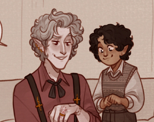
(he still got the teeth and the fluffy hair though)
#ramble#bg3#dadstarion#dorian comes from a family of sentient photocopiers#kit could still have astarion’s eyes though in this case#i think he inherited more personality than looks#he’s an introvert and likes to steal things#also i just realised his little outfit in the last one is the perfect dorian/astarion combo#the big poofy shirt with the knitted vest
948 notes
·
View notes
Last Seen Blogs
liesweliveby
evidence suggests i am too tired for this shit

killian-whump
Killian Whump

kookaburroww
Kookaburrow

jerrykalman
Jerry Kalman
wizardled
🌻sleepy mind🌻