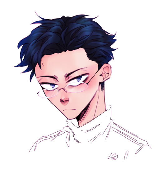
#my edit and small redraws
Text
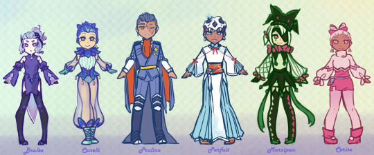
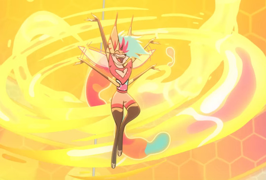
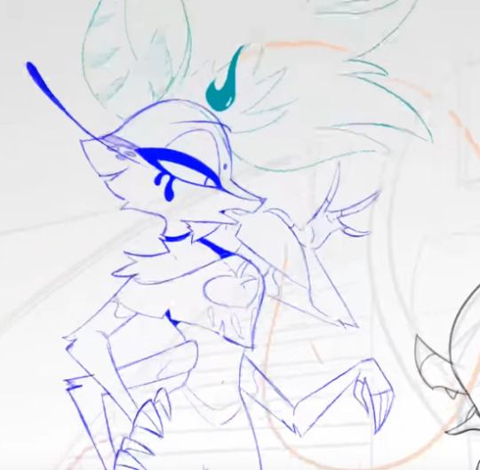
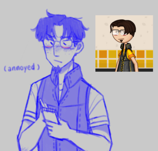
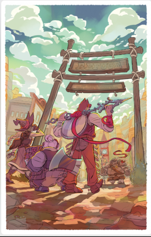
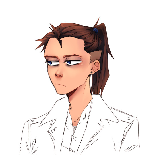
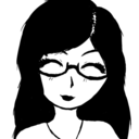
the fruits of my labours.... violet chibi champions lineup! organized by colour, the most important categorization.
Brulée | Canelé | Praline | Parfait | Marzipan | Cerise
Substitute team members lineup here!
it seems like once you go past 6 characters in a lineup it really just gets crowded; I will eventually get around to finishing another of these... probably. the theme of all the names for my pkmn violet run is, you can probably guess by now, desserts!
#pokemon gijinka#pkg#pokemon gijinka ocs#pokemon violet#my art#my ocs#made some small edits to praline#a very approximate height/body shape comparison#... marzipan remains off because I did not want to redraw a whole new chibi#character lineup#violet celebrity ocs
13 notes
·
View notes
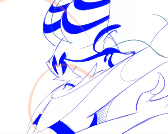
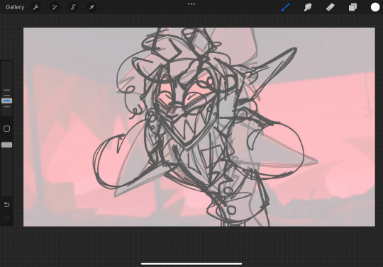
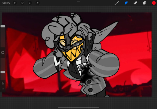
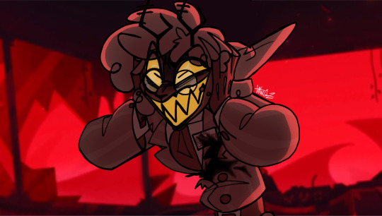
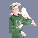
Photo

art enough and you will start arting better
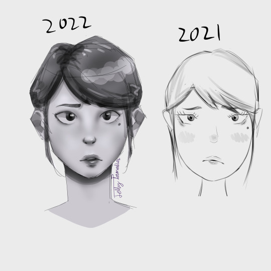
#these are kinda redraws#but also not#because i started them by editing and resizng the faces#but then i got carried away#i know they can be better#but i didn't look at a referance so cut me some slack#2021 me would absolutely lose their shit over this#faces#drawing#my art#aaaaaaaaaaaaahhhhhhhhhhhhhhhhhh#the nose is too small#JamDraws#JamStuff
0 notes
Text
You have got to be joking!
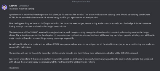
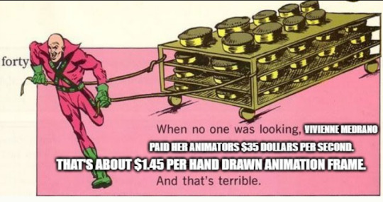
35 dollars for seconds of animation? The usual pay is 60? When they need to do 24 by hand drawings, to get an entire second?, of this overcomplicated designs???
Bro have you seen the animation of Bee's song??? The shit ton of details the characters have and complicated designs is hellish.

THIS???
Did the killing scene in Truth Seeker's had the same pay???

(legit question, does this apply to the Stolas "look my way" animated song or no? Cause if it is- shit)
Liar

EDIT:
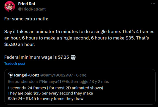
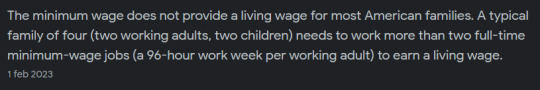
Minimum wage, in the USA, no longer provides enough for the average American Family.
(the Hazbin is the spot offer up, is the 35 dollars, the usual helluva is 60) Each drawing takes a lot of time to draw, specially for this complicated designs with so many shit going on. Clean up artist, have a really hard front of the job. (also bento is not the same, this is about Spindlehorse pay)
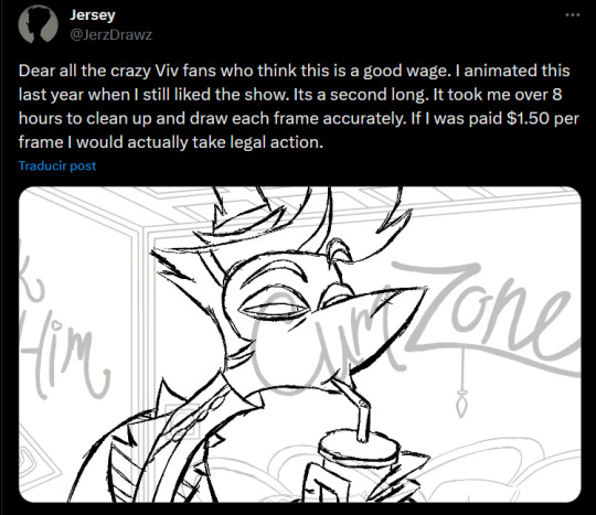
Cleaning this over design girl seems like a nightmare. Cleaning and redrawing these characters is a lot, many marks many, small details, two arms, the anatomy, shapes (that need to be keep consistent in movement, and have different weight) and she also spins around and shows many angles too.

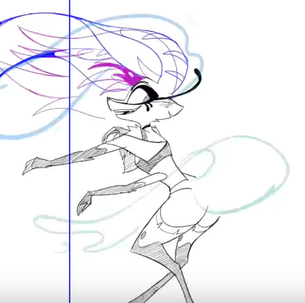

This up is rough work, the cleanup artist does the main lifework. They clean the lines
Here is an example of clean up work:
Some examples clean up work in HB:
EDIT:
These kinds of problems happen alot, sadly. This is not exclusive to Spindle horse/HH/HB.
This is about anime and the problems with it, and it's a bigger industry over all. And connects back to the shitty work culture in JP.
youtube
A video going over Japanese animators:
youtube
(this are mainly japanese animation, cause i consume this content- and my inspiration as an animator is anime)
youtube
youtube
youtube
+in this documentary, you can see many stress sad animators working. And many of the process of animation.
youtube
It's been difficult for animators all over the work to deals with many issues. It's sad this happens both in industries and indie. There is a need to get a better situation for people over all in these positions!
#vivziepop critique#vivziepop critical#helluva boss critique#helluva boss criticism#helluva boss critical#hazbin hotel critical#hazbin hotel criticism#anti vivziepop#hazbin hotel critique#Youtube
268 notes
·
View notes
Text

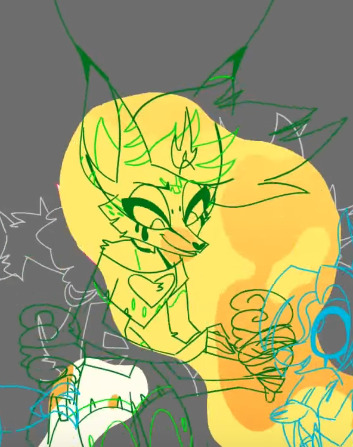
So today I just drew a whole page of my old character Vanilla Powder Cookie
I was on the page with Snow Fungus, and one of the characters there was Vanilla Powder, with her design seen in the top left there. I was looking at it, and I was like “I’m not sure it makes her look like a proper small child”, and since I’ve been trying to figure out how to make a character look distinctly like a child, I decided to redraw her on a new page just for her
And surprisingly, for once I actually finished one of these
So now I feel like listing some things about her, some of which isn’t exactly new, but I still feel like reiterating
So as you can tell, she’s Pure Vanilla’s daughter, one that he had before he got his Soul Jam and his kingdom was founded. She was a baby or toddler when it was founded, so she spent almost her entire life as the Vanillian princess. In addition, she’s the direct ancestor of the Custard family (though I don’t know what her kid’s name would be). However, she unfortunately is not around during current day, as she was baked up to a thousand years prior to current day, so she crumbled a long time ago. Though she lived a long life and simply died of old age, so things didn’t go that bad for her
Oh, also I feel like I should show the original version of Vanilla Powder, just for posterity

She looks entirely different, I think for the better
The younger version of her is mostly just based on the previous version, with an entirely new outfit. I feel like the outfit looks closer to something a kid would wear, but I’m not sure
Then I decided to finally give her a proper adult redesign, and I think I did quite well, much better than the original
I mostly used this one picture from a development commentary for her outfits
Her three cones were because I wanted to convey her status as the princess in some way. They were originally all next to each other, but I felt like they didn’t look particularly special like that, so I instead but the side two further down on her head. But then they reminded me more of hair clips like what Saiki K has, so now I’ve decided they’re possibly magic things that help her control her magic. And also they come off when she uses it. She probably got them as a teenager
Also her eyes are now brown since it fit better with vanilla extract (aka what I think Pure Vanilla is supposed to be), and also because while she’s the Custard ancestor, she’s from long before them, so she doesn’t have to keep the same blue eye color as them. Also, I’ve now decided that Vanilla Bean, aka my OC that’s Vanilla’s dad, has brown eyes. Though I do wonder if I should have given her blue eyes, to break up all the browns and yellows. That’s what the blue on the page is for
Edit: so I ended up changing her eyes to that blue. It’s not PV’s blue because I didn’t really think his light blue works on her. I think it looks nice
Also in her original design, she was going to have a design that looked ambiguously like she could be a purelily kid, but by this point she’s mostly just based on Pure Vanilla, the hair style’s really the only thing somewhat similar to White Lily
I think that’s about it for her, I hope you like her!
#cookie run#cookie run kingdom#pure vanilla cookie#cookie run oc#vanilla powder cookie#my ocs#my art#redesign
76 notes
·
View notes
Text
stuff i never finished and why
hello and good night . i'm just gonna ramble about stuff so yeah
swings
oh man i really loved this drawing . but it was a PAIN IN THE ASS .
i had a bunch of problems with this one . i spent an embarrassing amount of time doing the line . then after i started painting it on Ibis paint i realized that i should've done the line with a textured brush .
then the background . i really couldn't make it look nice even if i tried . i spent so long just trying stuff and searching for references but i just couldn't get it right . the colors and the lightning kept looking weird .
and just when it was looking decent , oh no the file is corrupted !!! and if i wanted it back i would have to go through a speedpaint of a drawing that took me 28 hours ( i actually tried it 😭😭 but it was taking so long and after some time the app crashed )
so , i decided to just give up . i was already fed up with it . maybe some day i'll try to redraw it or something
edit : oh wait a second . this drawing makes no sense without the background . edgar looks like that because there's supposed to be a puddle under scriabin's swing and he's trying to get edgar wet with it
otgw x chapter 20 / 21
i just said i loved the other one but THIS ONE . this one is SO PRETTY and i was so excited to try some new brushes and overall just finish this . excited enough to start painting edgar without even finishing scriabin's line .
i was using a small tablet my friend let me borrow . it was actually so helpful because i could draw on my phone with it !! i used to work on this when i was at school .
then i started having problems with the background . again
then my friend told me that his mom didn't agree with him giving me the tablet and that he should give it to his sister instead so i had to give it back . great . at that point i didn't feel like finishing it so
random reference i found in pinterest
this is like a month old maybe ???? i just thought " oh this would be such a fire pfp " and after finishing the sketch i was like " alright i'll finish this tomorrow " ( i never finished it )
mostly didn't finish it because i didn't have any idea to make it look lifeless and tragic . oh well . maybe i'll try it someday i still think it's cool
papa's cheeseria
this one isn't really unfinished . i just wanted to make a doodle sheet but never drew anything else so now he's just there . alone in a blank space . poor guy .
so yeah . everytime i play papa louie's games i always make the workers look like edgar and scriabin . i thought this default outfit looked pretty cool so so i had to draw it
#there's probably more stuff to add here but i lost a bunch of files when i changed my pc :((#also i have another one i really wanted to add but it's oc related so so nope#i tried so hard with the swings one but after some time i just felt like the drawing expired ?????? somehow#like that just wasn't how i used to draw anymore . so i just gave up#the same thing happened with the otgw x 20 / 21 one and it makes me so SAD#i don't even know how that one popped in my head .#one day i just remembered over the garden wall existed thanks to a friend posting some art about it#and idk i just had to draw them like wirt and greg#anyways back to rambling about my life woohoo#i'm i'm doing so bad rn#but let's pretend i'm not . alright#this year will be tough .#vargas#vargas zarla#scriabin vargas#zarla s#edgar vargas#sunny's rambles
61 notes
·
View notes
Text
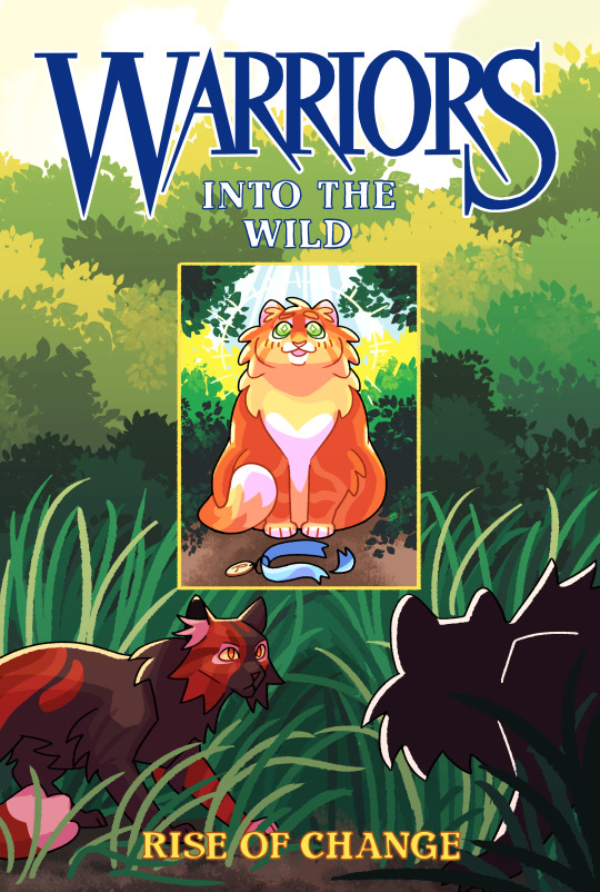
Warriors: Into the Wild, Rise of Change au edition! (aka. my spin on the iconic old cover)
I want to redraw some of the Warriors covers i my style! and also change them up to match my au and designs!
I didn't change much on this cover, except! I had the cats at the bottom be Redtail and the shadow of Tigerclaw! since Redtail’s death is so important I thought it would be cool if the moment before he was killed was on the cover and you cant tell who the other cat is since its supposed to be a secret!
I am absolutely amazed with how this came out! Idk how but I drew this so fast and in one sitting omg. Special thanks to the Photoshop leaf brush
Image ID below v
[Image ID: A digital illustration, which is a redraw of the original Warriors: Into the Wild cover. At the top of the cover is the Warriors title written in navy blue, and below it is written Into the Wild which is white and lined in the same navy blue. Below the title is a portrait style frame centered in the middle of the cover, this frame depicts Fire(paw) sitting perfectly centered and looking up in awe, he is a small chubby long furred bright orange tabby, at his feet his his kittypet collar which is blue and has a tag with the letter R on it. The background behind Fire is bushes in differing shades of green leading up to a blue sky. Behind this frame, filling up the rest of the cover, is a illustration of mostly green bushes and trees leading down to grass, with a cloudy sky overhead. At the bottom of this illustration are two cats, one cat, Redtail, a sleek black and red tortoiseshell tom, he is crouched on the left side of the cover, looking at the second cat on the right side. The other cat is a silhouette of a large long furred tom. At the bottom of the cover where the author is usually listed, is written “Rise of Change” in yellow text./End ID]
#cryptidclaw's warriors au#rise of change#warrior cats#into the wild#warriors cover#warriors into the wild#rusty#firepaw#fireheart#firestar#redtail#tigerclaw#warriors redraw
1K notes
·
View notes
Text
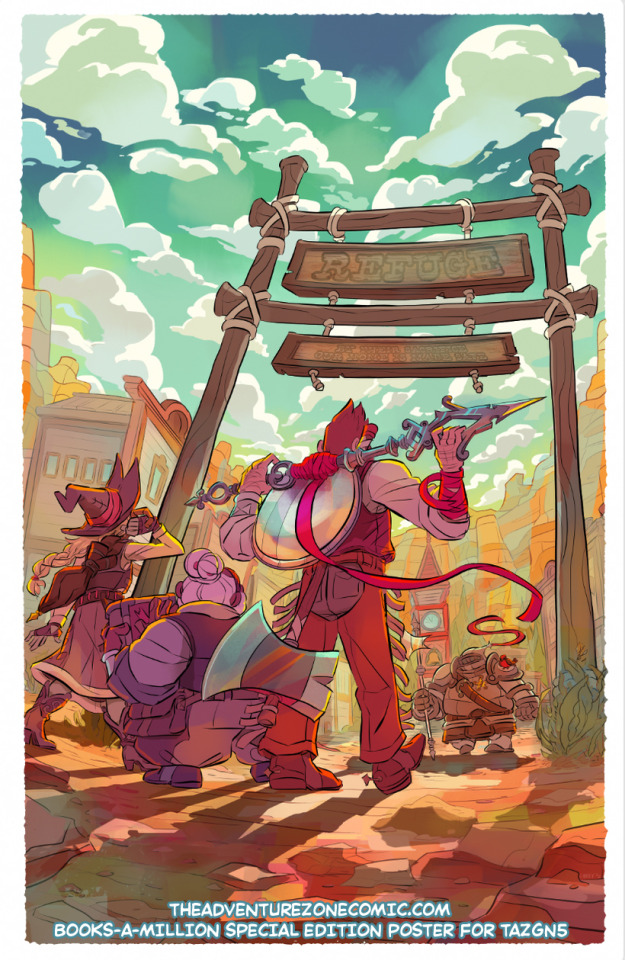
Here's a writeup about the process of making this 12x18" poster that's in the booksamillion special edition of TAZ: the Eleventh Hour GN! It looks like there are still some available for preorder!
Long post about how I got from the initial options I sent to my editor to the final below the cut (or unlocked on my patreon here).

We found out pretty late in the life cycle of making the actual book artwork that we were going to get to do a special edition that included a poster, which was nice because it meant I had a good sense of what cool moments in the book we might want to highlight... and what existing art I might be able to use as scaffolding, because these books are on extremely tight deadlines and there was not a separate timeline for painting a whole poster. So when we can avoid doing that, it saves me a lot of time and heart/wristache... but it's not always possible! spoilers: it was not possible this time around.
I started out by sending my editor two options for poster designs: one that would save some work by letting me reuse cover & interior elements that happened to be drawn at a large size, and one that was loosely based on a page with a fun splash panel, but would require total redraw and repaint. As I said in an email,

...Unfortunately, we both agreed that the one that was going to be more work (A) was the cooler choice & would make for a better poster. Also, by this point I was thinking about doing a version of the cover for a lenticular, and I didn't want to double-dip with fun promo materials. So it goes!
The composition was off, since this was based on a comics page with, y'know, dialog and other panels on it. We talked about whether adding some kind of a text treatment might help balance it out, but ultimately,

[narrator: she would later regret this.]
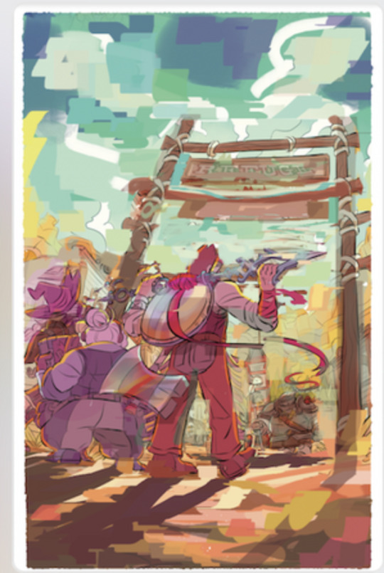
ANYWAY, once I was all-in, it was time to get goin! First, I made a small color thumbnail, then scaled it WAY up for print and took it back to pencils to space out the trio & give everyone a little more room.
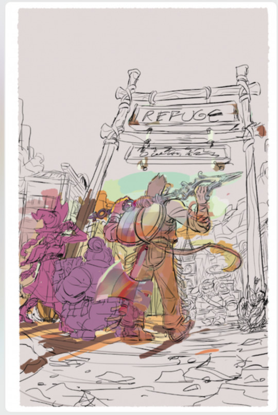
Next I inked and flatted it! Flatting is the only time I can really zone out & watch something while I work, it was a nice break.
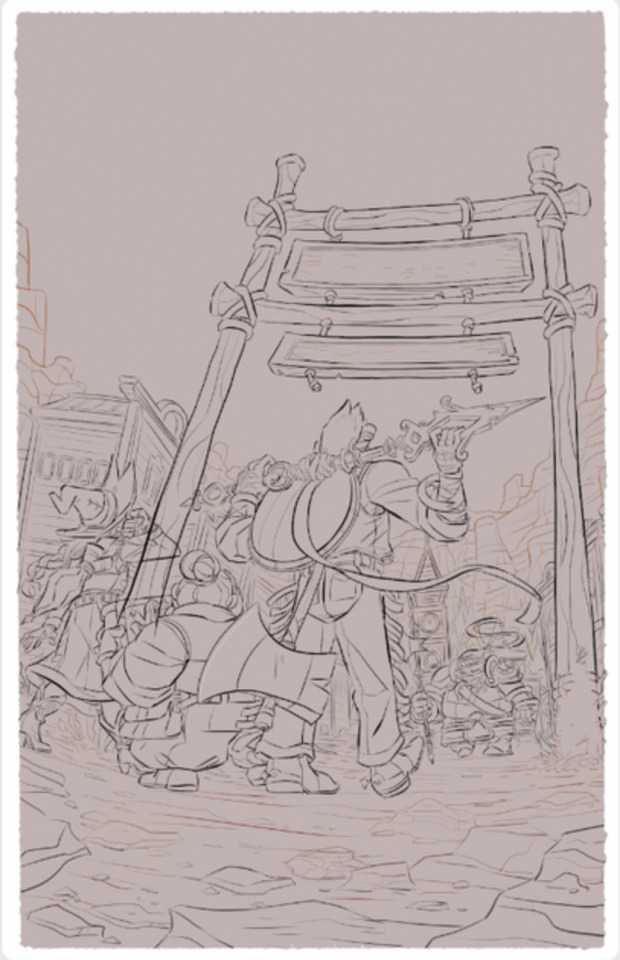

Then I blocked in big hue shifts for the ground and sky; painted big shadow shapes, and drew in the text; and finally added some details like bounce light and atmospheric perspective blue shifts.
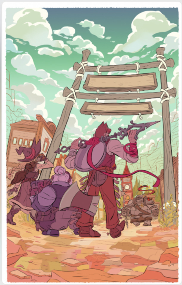
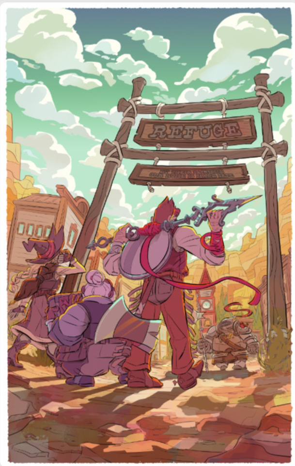
One final touch-up pass with some additional cool tones-- If I were to do this again, I might tone it down a LITTLE bit on the reflections on Magnus's gear… but then again, it looks cool, so I might not.
And there it is!
Next time I do this, I want to try to keep the initial color thumbnail much looser- I got frustrated at the rendering stage because I'd done most of the fun work of thinking about color already, and ended up feeling like I was treading the same ground twice. It's tough to find a balance between enough planning to be ready and not so much that I lose something in the work!
I'm always happy to get process questions over on patreon, it's fun to talk more about this sort of thing!
312 notes
·
View notes
Text
“When I held you, actually saw you for the first time, I fully realized how vulnerable you were. You’re such a small thing, can’t see or hear, just have to trust the people around you are friendly, won’t hurt you. I… thought of hurting you, Skip. It would’ve been so easy to have crushed you, to have killed you and never have to worry about you taking over my body again. But you were there in my hands, trembling, terrified, and despite where my thoughts travelled, all I wanted to do in that moment was protect you.”
Was looking at some of my old doodles of these two and wanted to redraw this one. Never posted the original cus I didn’t like how it came out, but I still liked the little paragraph I had next to it, so here :-]
Edit: Speed paint here :)
#my art#described#dimension 20#a starstruck odyssey#norman takamori#skip takamori#skipperskip#they are so everything to meeeeeeee#Norman vs intrusive thoughts: Norman 1 IT 0#I love thinking of the hypothetical moment norm actually sees Skip for the first time and is like. ‘oh my god. small lil guy……….’#norman is constantly checking in the med bay after to see if Skip’s okay. ‘still breathing? okay good good. good.’#and while Skip is unconscious he can minorly detect norman’s psychic signature. and it’s a big comfort to him. the rest of the crew notice-#-skip seems… more at ease whenever norman’s checking on him. they’re not even sure if Skip knows he’s doing it or if it’s entirely subconsc.#anyway. *points* I like the slug and his man
95 notes
·
View notes
Text
Kiss Kiss Fall into another old hyperfixation
Anyway, I randomly wanted to redesign the main cast of Ouran in my style/ with headcanons and my own embellishments
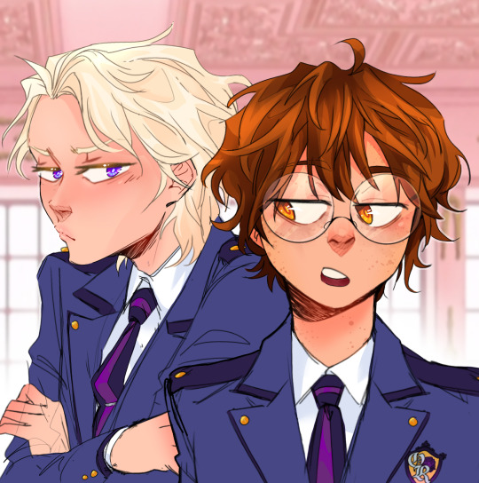
Here's a screenshot redraw, I'll put all the redesigns below the break bc I did all the main characters & wanna talk about the choices I made. Also I made up that uniform redesign on the spot bc I when I was doing the characters I just put them in casual clothes lmao
(I might do some others later, like Renge, Kasanoda, Yasuchika, Benibara, etc.)
Going in order of my least favorite to top favorite. And dont mind that I didn't color the clothes, that's not whats important here lmao
Mori is only at the bottom because I don't like the drawing that much, I still think the design is pretty good. Though, like right when I finished coloring, I decided a bun/top-knot would look better so it's a bit disappointing there. In my head, Mori is kind of struggling to figure out who he is & what he wants to do, which is why he follows Honey around and doesn't talk much. He does genuinely like being around the other hosts though.
Also, the undercut because A) he has the reputation for being the scary one & it kinda suits that, B) uh do I even have to say it? ...its hot He does lowkey look like Sokka from Avatar tho, especially with the blue accents
(edit: I accidentally deleted Mori's file so now this is the only copy so 😭)
Honey is next because again I think the drawing itself is a little off and the design is pretty close to Basil from Omori, which i didn't notice until it was too late lmao. One of the main things I didn't like about his character in the show was obviously how childlike he was & how girls still flirted with him even though he looked and acted 6; So now he still acts a bit childish but doesn't play it up as much & definitely has a more normal voice, not a fckn child's.
Haruhi! I definitely had to keep her glasses cuz they were really cute and kinda sold the whole 'commoner' thing in a way. But other than that I mainly wanted to balance out her femininity and masculinity to make her more androgynous/nonbinary/gender-fluid since she definitely has some of that going on in the show as is. I also gave her dark circles under her eyes to kinda show that she worked really hard to get into Ouran with low status.
Next up is Tamaki of course, getting into the characters I'm most happy with the designs of. One small thing I tried to do for each of them was give them varying hair tones; so even though Honey and Tamaki are both blond, I went very platinum-blond with him. When I started drawing him, my only real thought was "he has to be a pretty boy" so I dont have much to say about my choices, but i do think I succeeded. Don't mind the modern mullet thing, I can't stop it
Kyouya is definitely one of my favorite characters as is, seeing as he has one of the more fleshed out & heart-wrenching backstories in the show. I think the only thing I really wanted to change was getting rid of the Anime Bangs, so I just gave him this kinda sleek, kinda messy pushed-back look with a blue tint. Even though it's simple, I really struggled to come up with anything, until I found a page from the author saying smth like "I don't like the idea of him wearing neat clothes" with a picture of him in like a track suit so I did kinda the same outfit
My absolute #1 favorites, Hikaru & Kauru. They're honestly the ones that started it all because Kauru has been my favorite since I first saw the halloween episode (iykyk).
I don't know why, but I wanted their hair to be fluffier/curly and more of a natural(?) ginger color. I knew I wanted Kauru's to be redder and Hikaru's a bit lighter/blonder, but only subtly. I also gave Kauru a scar on his cheek from that time in Karuizawa, but most notably, I gave them blue and pink eyes as their signature colors. Lastly, their expressions are slightly different, because no matter how much they are in sync and try to match each other perfectly, Kauru's a much gentler soul than Hikaru, so I made Hikaru's smile a bit more snarky while Kauru's is soft.
Thank you for looking at my art/ reading my thoughts, here's an extra little design edit & comparison

(lol, I think they're mimicking Kyouya in this panel idek) (Also here you can see I tried the bun hairstyle w Mori, I think it looks good, but this is a really simple drawing so.)
#ouran high school host club#ouran hshc#haruhi fujioka#tamaki suoh#kyouya ootori#mitskuni haninozuka#takashi morinozuka#hikaru hitachiin#Kauru hitachiin#character redesign#my fanart#my art#screenshot redraw#im hyperfixating again#ouran redesigns#33xhausted art
64 notes
·
View notes
Text
Sensitive content I guess? 🥲
I made a redraw of something I had somewhere around my things and I'd just leave the context to you (but I guess everyone understands the topic)
EDIT: I repainted it because I hated the previous one, and fixed small details! ❤️
75 notes
·
View notes
Note
kind of a dumb question but how do you redraw a frame? im just wondering how you completely draw over the character and get the same screen effects as the show
It’s not a dumb question, dw!
I know you asked specifically about screen effects, but I’m just gonna go over my whole process just to clear all bases.
So first, I start out with the frame I want to redraw. I’ll be using this frame as an example.

So I go onto my desired drawing program and insert the photo onto my canvas. I usually scale it up quite a bit since these screenshots tend to be pretty small and I don’t want my brush strokes to be bigger than I like.

Next I trace over the character’s basic shapes, just so I can get a grasp on how they’re posed, their expression, and figure out how to translate that into my own style better

Then comes the actual redraw part. I sketch over this layout with my own design and style, altering details like proportions and a bit of posing as I see fit to capture the same energy while keeping true to my own style choices.
Then I do line art and color.

Then I carefully edit out the parts of the original character so they’re not peeking out behind the redraw. This mainly just comes down to color matching and blending in order to make it look natural and not obviously edited. My editing tend to be pretty crappy, but it’s good enough to not be noticeable at first glance I think lol
Then, to get the character to look like it actually belongs in the scene, I add several overlaying layers and shading.

And then it’s done!
I think the only screenshot redraw I’ve had to try a different tactic on was this Sir Pentious redraw, cuz the shot had a camera effect over it. For that I just added a purpley pink overlay and a bunch of horizontal lines that I later blurred a bit

Hope this helped!
#ashedwings post#ashedwings art#hazbin hotel#hazbin hotel redesign#hazbin alastor#hazbin pentious#hazbin sir pentious#hazbin hotel redraw#hazbin hotel fanart#art tutorial#i think?
49 notes
·
View notes
Text
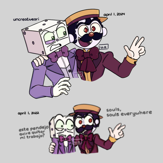
rushed redraw of an old doodle from an au i made around april 1st 2 years ago
here are some old doodles of this au (I'm sorry if the second picture is bad quality, I don't know where my sketchbook is so this is the only picture i have from 2022) (i might edit and delete these two since i hate my old stuff :v)


small summary if you’re curious. i titled it 'number one au.' basically, the Devil shapshifts as the carny from the first season to troll King Dice. He lies to King Dice, claiming he found someone better to be his number one after the last failed attempt to capture Cuphead's soul. So now King Dice meets the carny who is his partner in capturing souls, making King Dice petty over his new competitor. But the carny (the devil) is just messing with King Dice and making him annoyed along this prank of his. (i’m sorry if this explanation was bad, i haven’t slept all night)
tldr: King Dice is in a fake rivalry he is unaware about
#cuphead#cuphead show#cuphead fanart#king dice#cuphead devil#my au#number one au#ew old arts#king dice got pranked on april fools day#i’m tired lol
47 notes
·
View notes
Text
yuumori: the remains ch1
Now on: Cubari / Mangadex
Thank you so much for waiting! This chapter was one huge trip for all of us 🏃🏻♀️ Shoutout to @willymoly for their amazing work on the redrawing, and ashas for proofreading this long chapter 🙆🏻♀️
Also, do note that The Remains is being posted on brand-new Cubari and Mangadex pages! The page links have been updated across this blog — and you can always find the direct links to the latest chapter in these update posts ☺️
Twitter news
Miyoshi-sensei mentioned in this tweet that due to scheduling constraints, there are some panels/artwork that are of lower quality than usual, and these will be fixed in the tankobon release
The tweet also mentions that they will be “carefully selecting” the chapters to adapt from the light novels, which may imply that only selected portions of the light novels will be adapted
There is a clean poster version of the Jump SQ. cover here
Correction to Ch65
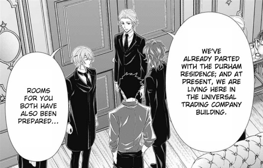
As mentioned in the footnotes for Ch76, this bubble on pg26 of Ch65 has been corrected to “We’ve already parted with the Durham residence…” instead of “The Durham residence has already been sold…”. As Ch1 of The Remains has clarified that the mansion is in disrepair, it is now clear that the previous translation made too eager an inference, and so it has been edited to be more conservative.
Corrections to the novel TL
There are also some small errors in my original TL of the novel, which I’m only now discovering as we go through the stories again. These have now been corrected in the tumblr posts, but I do expect to find more along the way — my sincere apologies in advance 🙇🏻♀️
The new credits page
You may have noticed that the new design uses the Strawberry Thief pattern by William Morris 🍓 His patterns were really popular in the late Victorian era, and I’ve always headcanoned that some of them were used in the Moriarty family residences in some form or another (๑˃ᴗ˂)
Where’s the story going?
The story so far has been a faithful reproduction of the first light novel. But many have pointed out that if we’re currently reliving the light novels through Louis’s flashback, then how will we get to the light novel stories from William and/or Sherlock’s POVs?
Notice that William was mentioned to be looking for something in the mansion: maybe he’ll also find something that will spark memories of his time with Sherlock? (I’m pretty sure Forbidden Games will be adapted; it would be such a missed opportunity if it wasn’t 😆)
As for the stories that are completely from Sherlock’s POV, it remains to be seen how those will be handled (if at all?) — excited!! x)
164 notes
·
View notes
Text
ೃ༄༊·˚ˏˋ୨⎯ "Masterpost!!" ⎯୧ˏˋ*ೃ༄
ೃ༄༊·˚ˏˋ୨⎯ "About Me!!" ⎯୧ˏˋ*ೃ༄
whoa!! hey there! call me Mikey or Turglez! im a small artist, my old blog was @orang-urtle, im also the creator of @the-forgor-four-rottmnt, if you follow that blog make sure to follow this one since this is the blog I will now be posting on! my pronouns are They/Them!! I mostly like to be called by my name though, if you send me art requests I might take a REALLY long time to do them, so if your impatient then id say you dont want to shoot a request!
ೃ༄༊·˚ˏˋ୨⎯ "current hyperfixations!!" ⎯୧ˏˋ*ೃ༄
Tmnt, Rottmnt, Hilda, Tmnt Shredders revenge, Cuphead, Voltron, Gibli studio, Glitch Techs
ೃ༄༊·˚ˏˋ୨⎯ "DNI IF YOU ARE/SUPPORT:" ⎯୧ˏˋ*ೃ༄
Homophobia, tcest, NSFW, proships, ect!
ೃ༄༊·˚ˏˋ୨⎯ "Art links!!" ⎯୧ˏˋ*ೃ༄
All about Mikey paper doodle <;- doodle redraw!
rottmnt (first screenshot redraw!)
YamYam's Christmas gift
"I Want You!" meme
FMB character design WIP!
NOTE!!
I know my ask box is open but dont send anything that isn't family friendly! thank you! cursing is aloud!
ೃ༄༊·˚ˏˋ୨⎯ "TRIGGER WARNINGS!!" ⎯୧ˏˋ*ೃ༄
flashing lights (in videos), cursing?, gore, angst, (maybe) character deaths, neon lights
[if you see any other triggers please let me know!]
ೃ༄༊·˚ˏˋ୨⎯ "DMs!!" ⎯୧ˏˋ*ೃ༄
please keep in mind, my DMs will only be available to people who are really close mutuals with me, I know them and they know me and we've been mutuals for a long time, if I find anything disgusting in my Dms or ask box I will find you and block you.
ೃ༄༊·˚ˏˋ୨⎯ "Role play blogs!!!" ⎯୧ˏˋ*ೃ༄
(with @the-forgor-four-rottmnt) @mikey-the-mischevious
ೃ༄༊·˚ˏˋ୨⎯ "NOTICE!!" ⎯୧ˏˋ*ೃ༄
if you ever use my art for pops, banners, etc, please @ me and give me credit! and if the post says "do not use" please ask me if its okay to save it or use it! thank you!
ೃ༄༊·˚ˏˋ୨⎯ "tags!!" ⎯୧ˏˋ*ೃ༄
#Turglez talks turtles- talking about hyperfixations
#Mikeydraws - any form of art I do!
#FMB AU - For My Brother AU tag!
#FMB AU fannart - FMB AU fannart tag!
#Mikester madness - talking to moots
#turglez asks -ask box answers!
ೃ༄༊·˚ˏˋ୨⎯ "AU's!!!" ⎯୧ˏˋ*ೃ༄
For My Brother AU
<-Chapter 1, Arc 1: Loss of a beloved->
Part 1
Part 2 ||coming soon||
FMB Character designs:
the turtles
FMB comic ver (will start once written version is done)
[this will be edited in the future!]
32 notes
·
View notes
Text

This is the first proper thing I've drawn in ages (and first are I think I've posted in over 5 years?)
I just needed to draw the opening to Act 5 and my reaction to it.
Nothing has gripped me in such a way and forced me to finish an art piece like this in so fucking long.
I see far too much of myself in him. I just want them to be ok after this is all over.
STARS, this is just Asriel all over again isn't it. But WORSE!/pos
…I guess that could make this vent adjacent? ¯\_(ツ)_/¯
I also made a shitpost edit that I posted separately here.
There are so many things covered by each other and I just need to share and talk about them.
Bonus details and rambles under the cut.
Siffrin's expression was like the first thing I drew and if it didn't turn out as good as it did I probably wouldn't have spent almost 10 days slowly adding to this and I just need to show it because his hands/arms end up covering most of their face.
Nothing much else to say about him, I'm just super happy with how everything about him turned out (I did have to go back and redraw some of his hair towards the end because the line thickness wasn't consistent with everything I drew after.
Next is ME yippeeeee. I have no idea why I spent so long adding details even tho I knew alot of it would get covered by Sif 'cause of how I was posing this.
I even designed a little button based on the Change Ornament + Star (the Change Belief and Lost Belief in The Universe really spoke to me in so many ways)
The gloves are an Archery Glove on the right hand and a Drawing/Writing Glove on the left.
The cloak is based on the style of cloak my mom made for my family for SCA events when I was young. It's just a simple hooded cloak but it has a slit in each side so you can stick your hands threw without needing to open up the cloak.
I imagine it being stylized like, the opening doesn't exist until you stick your hands threw and then it can just freely glide around the face of the cloak to wherever it's needed, stopping at the elbow only letting threw the forearm, below the slit beginning to hang off the elbow with gravity while the part above begins to move with the upper arm.
I didn't even try to draw the outfit under the cloak because dealing with the folds of a thick wool cloak was enough for me (you can see how I gave up at the knees because I KNEW Sif was gonna cover them up). What I imagine the outfit being is this big baggy tunic and pants that are tied down at the forearms/calves to keep from getting in the way, it's also supposed to have a big baggy turtleneck thing that can be pulled up as a(nother) hood (iirc, this sorta thing was used so someone could wear a chainmail hood without it grabbing your hair(there ware also like stand alone cloth hoods that did the same thing too but eh, my memory is bad I might just be misremembering this)) but I couldn't figure out the folds and ended up just doing a simple button up thing (which then got covered by Sif's big head anyway.)
I spent soooo long trying to draw my eyes, trying to figure out the shape, and ended up just doing a bunch of small tests to the side before finding one that actually looked right. Drag it over the face and see that it fit EXACTLY, didn't even need to redraw it or anything.... unless you're talking about the other eye in which case I just duplicated it, flipped, and did some perspective warping until it looked ok because I could NOT draw that again especially at a different perspective (can I just say I have no idea how I drew that creepy eye but I love it, it was the first eye I drew and I just threw 4 lines down what the fuck how. Also the Mira-ish one looks cute too but didn't fit the expression.) I also needed to figure out what the hell was wrong with the expression I had before so you get 2 faces from me figuring that out (turns out I had the eyebrows facing the wrong way.)
I ALMOST FUCKING FORGOT MY FRECKLES TOO AAAAAAAAA (they're actually missing from the version I posted in the official ISaT server.) It was super weird trying to add them at the obscenely low resolution I was drawing at and they're probably gonna get compressed to hell and back but I think they're cute.
final thing.

Why is my hair so similar to Sif's but longer? Like, you can see I was sketching over my drawing of him to make sure I'd keep the proportions right when I started working on myself but in the process I realized that I was basically drawing over his hair but longer for mine (drawing I was using as ref here made by @leemak)
Add that to the uncomfortably long list of things I have in common with Siffrin I guess.
#In Stars and Time#ISaT#ISaT Spoilers#ISaT Act 5 Spoilers#Siffrin#ISaT Siffrin#vLink Art#oh hay this is the first time I can finally use the tag I thought up for art of myself yay#technically the fan art tag would be 'fArt' instead but eh
27 notes
·
View notes
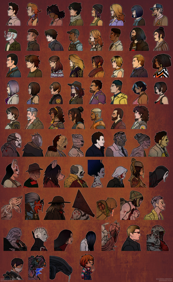
Text
EDIT: Fan of the icons? Wanna to say 'Hey, good job!' And support me? Consider buying a sticker!
Greetings lovelies, I've been busy with another project and it's finally time to share.
As you can see, I've taken it upon myself to redraw my entire DbD Icon Pack.
This was no small task, I had a total of 73 characters to redraw, colour and format to work in game. (and not a whole lot of free time to do so)
I've been working on this icon pack since 2016, and as time has passed, both my skill as an artist, as well as the way I render certain things have changed, so I decided to go ahead and redo the entire project in a more cohesive style, as well as more closely reference official models when making the initial sketches, as quite a few of the old pieces were just me eye balling things and saying "close enough", so while you'll see some characters that look the same over all with minor tweaks to fix mistakes like Meg or Trapper, you'll also see some art that was completely redone for characters that I just wasn't happy with the quality, like Jeff of Doctor.
That being said, I made a point of eye dropping all colours used directly from the previous version of the icons, along with reusing the same textures.
I wanted the icons to feel as close to the originals as I could make them, while still taking into account that the new UI features the icons on a dark background, which caused some visibility issues with the previous version, which were made with (at the time) lighter colour background in mind.
The new versions now have a white outline which keeps the icons from blurring into the background and getting lost.
I'm really happy with how this has turn out, and I hope you like it too!
That being said, while I will only be updating this version going forwards, I'm not going to delete the older version, so if you're a super fan of the previous version and would prefer to keep using them, you absolutely can!
The 'New and Improved' version can be found on NightLight app under "Sketched In Profile.", as well as here as a [Mega] if you'd prefer that.
If you wish to use the previous version of the icons, you can click the Mega and find them located in the folder entitled "!Legacy Icons." They'll be at the front of the list for easy access.
Feel free to take a peak at what they look like in game below!
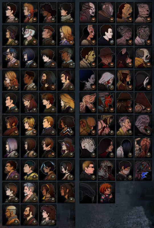
As always, if you have any questions or concerns about using these, feel free to reach out!
#Custom Icons#Dead By Daylight#DbD#Killers#Survivors#UI#Icon Pack#Steam#Download#Workshop Never Ever#Traditional Lines#Digital Colour
24 notes
·
View notes
Last Seen Blogs
maals
...
illmoo
ILLMOO.COM
xxlelaxx
Fuck everything
lovestillaround
light through the wavetips
dirty-xenobladeconfessions
alvis and the chipmunks