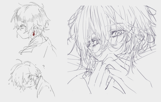
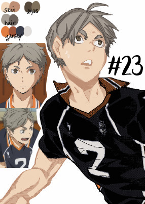
#so every time i redraw this it gets further and further from the original
Text
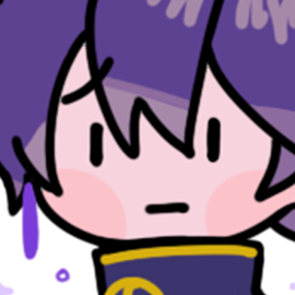
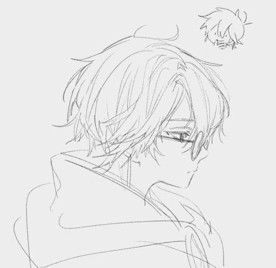
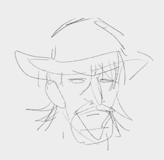
Sketchbook 9 complete!!!
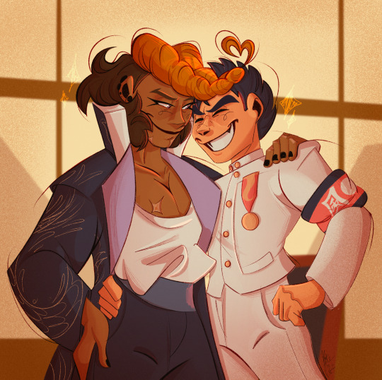
As per usual, redrawing my OC Misfit <3
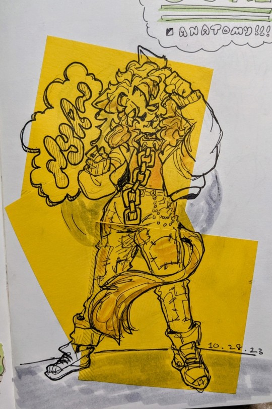
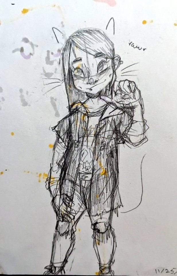
[ID: A pen drawing of a cat person with long unruly hair and a cat tail and ears. They're wearing a half-length jacket with poofy sleeves, pants with patches all over, and a spikey choker with a chain running down to their hips. Their hands are posed up like cat paws and a speech bubble on the left reads "Nya" with a tilde at the end. A date at the bottom right marks October 28, 2023. \End ID]
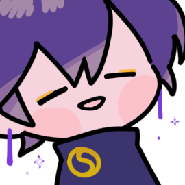
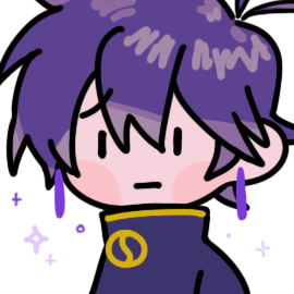
Older versions under cut:
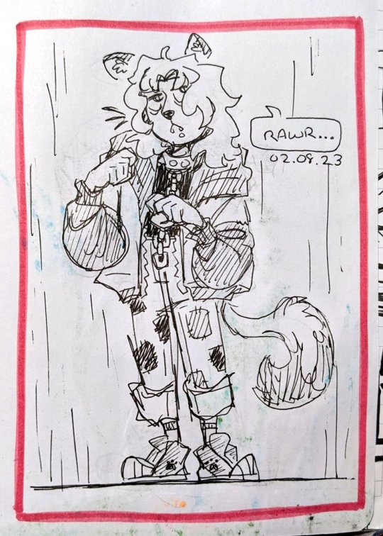
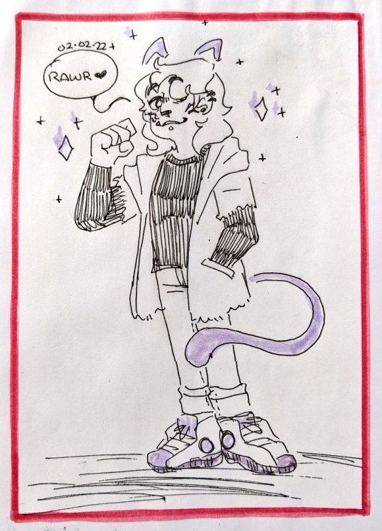
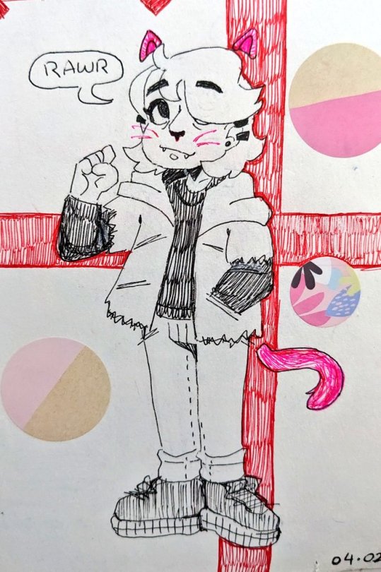

[ID: Five of the same drawings as above, with varying levels of difference. Each still remains a person with cat ears and tail wearing a jacket. They are dated as follows:
February 8, 2023
February 2, 2022
April 2, 2021
July 25, 2020
November 25, 2019
\End ID]
#i love how the character has evolved through these redraws. as if theyre aging with me and discovering themself#they started off as this closetsd fem presenting person only beginning to explore the internet and recently introduced to the punk world#and have evolved into a fully realized heavily sleep deprived out and proud nonbinary person that dresses how they please#the fun thing about this challenge is that i never look at anything besides rhe previous sketchbooks version#so every time i redraw this it gets further and further from the original#its lovely#my art#redraw
12 notes
·
View notes
Text
announcement: after hearing some people’s concerns, i’ve decided to get rid of the due date!!! still. i’ve decided i still want to reward those who post their entry before the 21st. so i’ll keep an eye out for that!!
okay… i sat on this idea for a while now… but i guess it’s about time i officially start it..
as some of you know, i’ve been redrawing my first ever ishimondo art every year for the past two years. i like to do it because it marks another year of me being in the dangan fandom while also seeing how my art has changed and improved over time.
i wanted to do something special this year, and the couple times i’ve mentioned this, i had some people respond very positively. so here we go.
i’m hosting a dtiys!!
i’ve just always loved doing things that spark interaction and participation among the ishimondoblr community, and this annual redraw really set that in stone for me. so i thought i’d take it a step further and give you all the opportunity to see how your artistic lenses apply to this artwork.
da rules:
- there are no requirements to participate. this is open to anyone and everyone.
- you can change the original composition if you want, just keep mondo and kiyotaka as the main focus.
- you can always tag me if you post your submission, but i’d also prefer if people used “#nitepuffdtiys2024” to help me find it as well. please at least do one or the other so that i can find your art.
- if you prefer to, you can dm me your entry, but it’s not required by any means.
- one entry per person.
- !!!no time limit!!!
- have fun!!! that’s what this is all about!!
and that’s it!! i’ll put better quality versions of the images above below the cut so you can see and reference them better. i wish you all luck and that you all have a ton of fun with your entries!!
until then, that’s it from me! take care!!
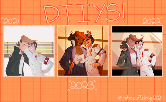
2021
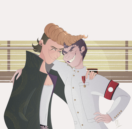
2022
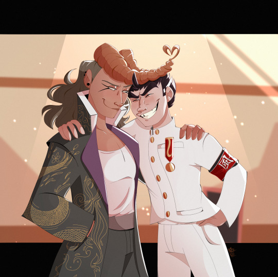
2023
#yea okay here we go#really encouraging people to participate#it’d also be really appreciated if you guys reblogged this to spread the word. that would be great#i’ve always wanted to do one of these. and i thought it’d be a great way to sort of mix up how i do the annual redraw this year#danganronpa#danganronpa trigger happy havoc#mondo owada#kiyotaka ishimaru#ishimondo#mondoblr#doodlepuff#ramblepuff#dtiys#nitepuffdtiys2024
75 notes
·
View notes
Text
Traintober 2023: Day 18 - Blueprints
Crovan's Gate Works is Home to many Blueprints:
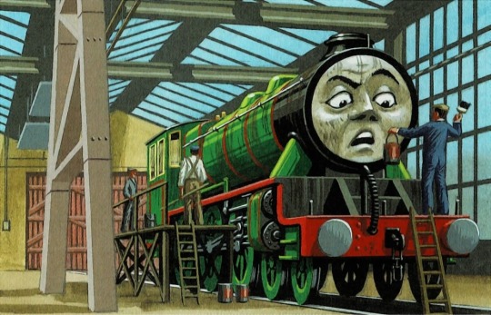
Crovan’s Gate Works is one of, if not the, largest steamworks in the United Kingdom – and the single best equipped. It services steam locomotives from all four of Sodor’s railways, as well as engines from across the country and further. Many of the engines who appeared in the infamous ‘The Great Race’ movie – especially those from Europe – were actually engines being overhauled at Crovan’s Gate when Mattel sent people to do research for the film. The works has machines that can make any part needed for an engine on the Fat Controller’s railway, and beyond – but that’s not all they have.
In a dark, slightly dusty room underneath the main offices, there are filing cabinets. Row upon row of the things which stretch out through the basement. And in these filing cabinets are the blueprints. There are thousands of these blueprints carefully sorted and filed away in this room. Everything from the designs of the A1X Terrier through to the Streamlined Coronation class. It’s all in this one room.
And it was originally the folly of Sir Topham Hatt I, back in 1897.

When he was the CME of the Tidmouth, Knapford & Elsbridge Light Railway (TK&ELR), Topham Hatt began collecting old blueprints. Some people collect stamps, others collect coins – but Topham collected blueprints. He had already copied many of the Great Western’s blueprints during his time as an apprentice at Swindon Works, and these he kept with new plans sent to him by his friend William Stanier in his office.
When building the TK&ELR Coffee Pot engines, he consulted a huge number of blueprints, trying to find something he could build considering the extremely low amount of resources he was allocated. And he did utilise some ideas from the various blueprints he had acquired – specifically a redrawing of the ‘blueprints’ used for the Novelty from the Rainhill trials… only the blueprints Hatt had were extremely well-drawn fakes, which did a bit of messing with the exhaust system. Topham Hatt mixed these blueprints with several others, but the exhaust system became infamous for spewing out dirty brown water.
This led to Topham Hatt deciding that the best way to avoid such an embarrassment in the future was to get more blueprints. He managed to bargain the blueprints of almost every engine he ever bought into the deal, with one notable exception: Henry.

Henry was built using stolen blueprints which were muddled and half-right. Hatt never managed to nab the stolen blueprints for himself, which made diagnosing Henry all the more difficult. It was actually Richard Hatt – Topham’s great grandson – who found the formerly stolen blueprints. He managed to find them in a garage sale!
Percy was another engine whose blueprints did not fully arrive with the engine. The warehouse Hatt bought him from had a grand total of around 59% of his original blueprints, with the other 41% being scattered across the West Country, the Midlands and Wales. If you can believe it, Topham Hatt went on the hunt for these blueprints all throughout the 1930s, and was able to snag the last one from the wreck of a bombed house in Cardiff in 1941.
When British Railways was formed in 1948, the now Sir Topham Hatt utilised his new position on the board of the company to gain access to every blueprint British Railways had under its control. Carriages, trucks, engines – even railway adjacent lorries, ships and buses all had blueprints that Sir Topham was able to have copied and sent to Crovan’s Gate. These were all placed in a special room and have been updated since.
Sir Charles Topham Hatt also added to this collection – but for a very different reason. In the 1960s, as Sodor gained more independence – and more diesels – it became increasingly clear that the island had to repair its engines on its own. To this end, Sir Charles began having copies of engines he bought sent to Sodor so that in the event of repairs, the works at Crovan’s Gate would be able to use the original blueprints before beginning the overhaul, saving time and allowing the workers to know what parts the engine might need. Sir Charles also had updated blueprints of all of his engines drafted, as many of his older engines had been heavily modified since arriving (such as Edward, Henry and Gordon), meaning that new, accurate blueprints were required. The first of these would be Edward’s when he went in for an overhaul after his ‘Exploit’ in 1965.
Today, there are thousands of blueprints kept at Crovan’s Gate Works, with new ones added each year. These are often copies of blueprints for locomotives built outside of the UK, as it is believed that Crovan’s Gate Works has a copy of the designs for every British locomotive, carriage, and wagon to have ever run – bar those which never had blueprints.
Back to Master Post
#fanfiction writer#weirdowithaquill#railway series#thomas the tank engine#railways#traintober 2023#traintober#crovan's gate works#thomas the tank engine analysis#ttte henry#ttte coffee pots#ttte sir topham hatt#Sir Topham Hatt I
69 notes
·
View notes
Text
Jello's cat
-
some emojis


actually he can hold any signs
-
▶ Razziez
SV Wizard has particularly diverse appearance
compared to other NPCs
and I know some popular versions of those
and they are all intrinsically cute
▷Chaekal / Gigi's
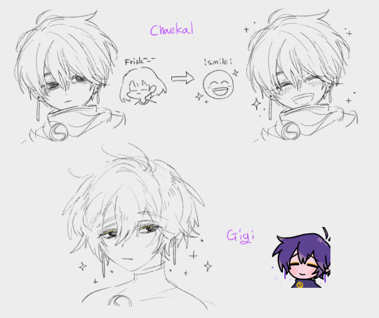
if I try to follow the exact same track as the original, they would be like this
maybe this one is most popular for RRRR users
because RRRR gives you hi-res Gigi portraits / 64px Event portraits as the default
I like how Chaekal's wiz smiles
by default, his expression is somewhat grumpy and distant
but when he smiles, he suddenly kanda radiates the brightest smile in the world
and he even literally sparkles lol
and I like the golden deco on Gigi's wiz
when I first saw it, I didn't know what it was
since razzy isn't a person who puts on make-up every day, I simply merged the deco into his eyes when I drew the rrrr-compat-portraits
like this:

anyway, confronting my past me's work is quite challenging for me
nexus says I drew this on November 16, 2023
but I've quite changed a lot in the past 1.5 months
I'll redraw it one day, when I have acquired enough skill and courage to confront my past _(:3 」∠ )_
-
▷Whos'

first time drawing a whos' wizard
quite easy to draw
he's even simpler than my own OC...
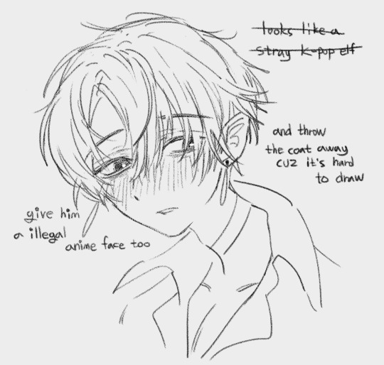
except for the clothes
I failed to comprehend them

I'm too exhausted to even complete this doodle
and he somewhat gives me a floating extravagant notion of 'the unfortunate vampire lord now locked himself in a very forsaken, stark, lonesome place of exile who once was a very ordinary cute chestnut boy (and still cute)'
his strawberry-ish color would be the culprit
anyway it's quite true except that he doesn't drink blood
▷if razzy were a vampire
- and vampires are not common, so he can't just buy blood from Amazon
> he would just buy a bunch of animals and drink their blood, not a single drop of a human's
- if vampires could only drink human blood, without causing lasting harm to prey
> he would starved to death because he can't afford ask people, 'May I drink your blood? It won't cause any harm.' /j
> or he would still survive in this case:
1. if he starve, he'll driven insane, causing the bloody massacre and further cursing his guilty conscience. Or simply a government aid for those in need
so the ministry decided to offer some food for everyone's sake (anyway nobody gets hurt)
2. look for applicants who wants sell their blood
meet the super hot, sexy and shy vampire and get paid
...
what if: 'your family just sold you to the vampire lord to get some money and reduce the number of mouths to feed-
razzy tries to send you back to your family
but you don't want to go back because they will just happy that they can sell you again and receive the price twice
so he is convinced and allow you to live in his lair'
this is quite a sort of fanfic idea
I believe someone will write it one day during my lifetime
anyway, his clothes never allow me dare to comprehend
so I think this would be the last time I draw him unless I have a reason to draw :ded:
-
▷vanilla
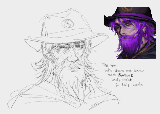
I call him 'oldzrd'
in my head, he has a face that has faced the years of agony head-on
and never knows the razor
even he cannot escape from the wizard's intrinsic cuteness
cuz he is still a dorky genius who is unable to act appropriat to his age as other razzy does plz don't make me slap you, all razziez
but I hardly draw him
the biggest reason is that he is hard to draw
and I have a habit of imitating the expression while I drawing
so my face becomes like this whenever I draw the oldzrd:

I won't draw him again...
-
▷Parrot's (mackrelka)

orange
original portraits mod : link
when I draw him, I think about greek statues
he looks like a living greek statue orange elf
and also reminds me a Hades(game) and Jojo(manhwa)
drawing his hair is super-ez: just draw as it comes to my mind, and it suddenly becomes hair
but the rest parts of the face is super-hard: quite more masculine than my usual style, yet not so straight lines at the same time
so he is the most challenging to draw :3
-
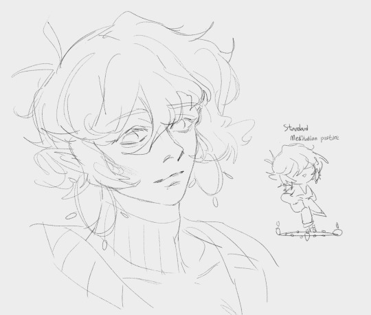
▷my OC
I amalgamated my OC W with RRRRRazzy
when I draw him, he looks too childish, but his actual apparent age is 23~27 in my headcanon since he's my OC, it's a canon
half-officially, every razzy should have at least 20% dead eyes /j
and it seems my Wagnus Razzy's eyes don't even appear alive

anyway, I shall redraw my portraits one day for my sake...
-
when I draw razzy, I usually draw:
Chaekal-Gigi-Jello based everyone's purple razzy, when he is alone
Wagnus razzy, when he is with my OC Enn

super boring mid-age math teacher with glasses razzy is still floating in my mind
when I actually draw purple razzy in my way, my OC W somewhat succrently stealth into my drawing
this would be why I keep failing to get his appearance
life is harsh
-
dorky sketches
-

me already getting tired while sketching
I think I picked wrong color for my oc
too difficult to color
-
it seems I have only two level:
never say a single symbol
say a bunch of sentences
I want say just some symbols~ few words

22 notes
·
View notes
Text
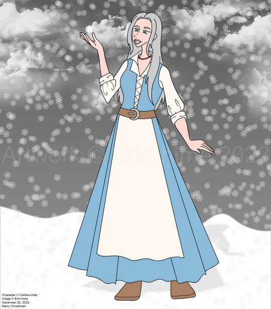
Okay, look, I decided to redo the Christmas picture I had done for @callistochan87 ten years ago after giving her the idea to do the same for me. Now, I'm obviously not sure at the moment if she actually went through with it, but I figure, hey, why not? I mean, she did a computer colored piece for me for m birthday, so I figured it was okay for me to do one for her for Christmas.
The problem was that, well, I basically sketched it out and inked it before she put up the official design sheet of the character, so now it's not really accurate. I took the parts I liked from each of her designs (the one from when she first turns human and then a year later), and sort of made ti a transitionary thing? IDK.
I didn't want to make this a straight redraw. I had already drawn Aoide/Coral in her fancy dress, so that was out. So I figured I'd make it, you know, less dumb? Yes, she's still out in the snow with bare arms, but eh - I might not have drawn her with the correct body type, but she does have extra protection going for her. :P
I know she's probably experienced snow before - I kinda get the impress that where she was from originally was a lot colder than the main kingdom. But this is the first time she's experiencing snow as a human. (But at the same time, if she's anything like the Coral of the past, it wouldn't matter - she'd be excited to see snow every time it happens. :P)
I do plan to further the present by streaming it's completion. Just need to figure out when I can, lol.
Hope you enjoy this!
8 notes
·
View notes
Text
so I took a break from goncharov on Reddit and okay I’m gonna be called a hater for this post and it’s generally not a comilfo to redraw other peoples art but I was wondering why the hell does this one popular reddit artist annoy me as hell specifically and after some consideration and the fact that their art gets more updoots and patreon money than I’ll ever will so why not do some critique lol. Here’s the comic with all its awards and upvotes
And beside ah my obvious jealousy over their popularity I could wrap my head on when they reuse the same pose in every four-panel comic and that’s what annoys me, but what was hashing my mellows with this one so much.. and then I figured every since panel had the same expression. Comic art relies heavily on knowing hot to draw and use expressions to pass the idea further, otherwise a comic like this could have been a text post until the last panel.
So I’m not a comic artist but I did a really quick redraw trying to copy op’s style but with more expressive faces (I tried to keep as most of the image original and edit only a bit). Here it is to compare


My changes:
First panel is fine, I only changed eyebrows because they stay the same the whole comic. Also made the character look more at the audience because saying “we” while she’s looking away is kinda weird.
Second panel, character’s eyes are closed. Different expressions would suffice but whatever. More relaxed expression gives the reader a break from the highly energetic first panel.
Third panel, the Bank’s face is very relaxed and their eyes are not even looking back at the main character, they don’t care about at her that much. It’s a mundane task with a quick answer.
Fourth panel, the expression is almost the same with strained open eyes and wide mouth as in the first, more boisterous panel, but this time the character is clearly stressed or desperate. And again she looks at the reader because “we” learn the lesson.
Think of Tin Tin, Nancy, Peanuts, a face can be draw very simple yet it has its own simplified expressions. Obviously sometimes characters have same stone-cold expression but again that depends on a style and themes blah blah. In this case every panel is energetic which reads as a little exhausting. By softening the expressions and getting rid of wide-ass smiles in the middle panels you create for readers a moment to rest before hyping it up again in the last panel. Or so I think.
14 notes
·
View notes
Text
Digging Through Works-in-Progress (Digging Through WIPs) - Introduction
This is a series that started as News posts on my Newgrounds account where I showcase art I left sitting in my files, never to be finished for one reason or another.
Below is a recap of all the previous posts I've done along with links to the original posts for more details. I debated on making these individual posts but decided to have them together instead.
Future installments of this series will be posted on both Newgrounds and Tumblr simultaneously.
Everything will be under the tag: #BluS20WIPDig
Volume 1 - "Week 7 Looks Different" (August 2021)
This drawing was what I was going to make my Newgrounds debut with. I was going to fill it with references to characters who have heavy ties to Newgrounds in a blatant parody of Friday Night Funkin' Week 7.
Volume 2 - "Blu's Miitopia" (June 2018/July 2019)


A large, ambitious group picture I wanted to make to showcase my 3DS team. This was back when I still kind of used my Deviantart account so I have a Journal about this work here. Many members of this team would return for the Nintendo Switch port but more on that further down...
Volume 3 - "Yotsuba Redraw" (February 2020)


A redraw of a Yotsuba picture I wanted to do with Hero B, Teruteru, and Bowser Jr. I got too frustrated getting the poses right so I gave up.
Volume 4 - "Not Dr. Mario World / Blu's Nurse Land" (Summer 2019)


A collection of drawings more characters as doctors inspired by the aforementioned mobile game. Why should only Mario characters easily get medical licenses?
Volume 5 - "Zenura the World" (Janurary 2020)
[Warning: this news post has an A rating (and cannot be viewed without a NG account) as it contains non-sexualized nudity of a female figure... Though there's not much detail I was being safe rather than sorry.]

Magical Drop was one of the many arcade games I played as a kid; it was my first exposure to Tarot years before I knew about Persona. I have drawn many of my favorite characters as Magical Drop's depictions of the Major Arcana for a long time and this is one example.
Volume 6 - "Pocky Teruteru" (Februrary 2020)

I don't know how many Teruteru enjoyers are still out there; especially of this variety. This drawing spawned after being shown that Pocky hoodie in a Teruteru focused Discord server.
Volume 7 - "Blu's Miitopia Encore" (October 2021)

This post in particular is really long, as I go into detail about every party member per-area. Many faces from the 3DS team return; I mainly reduced the amount of South Park characters. This one had the highest chance of returning but I cut it off as I already have a large pile of stuff on the backburner already. Who knows, I may retract that statement in the future...
#WIP#the drawings of blushrooms#long post#work in progress#scrapped art#BluS20WIPDig#artists on tumblr
1 note
·
View note
Photo
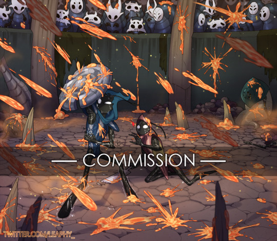
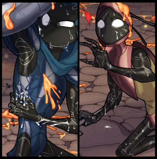
Full body, full-colour illustration commission for sahlor_ (on Twitter) featuring Tiso & God Tamer facing off against a dangerous beast in the Colosseum of Fools!
Worry not, they do manage to defeat the beast, & then take good care of each other! God Tamer does most of the aftercare, though, since Tiso sustained far more injuries than she did lol. I even have a (badly) written thing involving said aftercare, & who knows, maybe I'll draw it sometime~ 😏
Thank you again so much for commissioning me, it was fun and challenging!
Commission info: lrstudio.tumblr.com/post/183548269032
Ko-fi: ko-fi.com/leaphy
I want to talk at length about this commission and what went into finishing it so if you’re curious about that, it’ll be under the cut!
So, this commission was originally going to pretty simple, just Tiso and God Tamer, being pelted by a barrage of infection, against the usual white bg with a circle frame, like so:
but the more I worked on it, the more I wanted to add to it, and this desire was only fueled by a snippet of context my client provided to me after I showed him the 1st rough draft. I was inspired to take it much further than I planned but I didn’t know if it was something he’d be down for, since it would make the commission that much more expensive and time-consuming
Later, in a tweet, I lamented about wanting to to more with a commission than what I was initially paid to do, and he saw it and somehow caught on and approached me about it. after some discussion, the commission was upgraded to include a background, and audience members. I added the fools later on because the arena looked empty otherwise.
It would have also included the beast but the composition didn’t allow it so it stayed out of frame. and for anyone curious about what looks like, my client wanted it to be this nightmarish hell-beast, also known as
The Primal Aspid Boss

(Source)
With a background now, a lot of redrawing/redrafting took place. I even ended up redrawing Tiso as well because by the time I had finished with all the inking, my style of drawing him had changed a bit and his outdated look was driving me nuts lol
So, what would have taken me a month to complete, ended up taking me about 7-9 months of work on/off. Mostly due to the p*ndemic making life much more hectic & stressful to really focus on art, plus experiencing frequent burnout, coupled with even more stress. On top of that, the commission involved a very large, very detailed background, with multiple characters, and I wasn’t (and am still not) very confident when it comes to drawing both of those things (much less at the same time) but I wanted to take on the challenge of drawing my two faves in an actual setting, and not just an empty void
But lets be real, it was mostly the p*andemic
That said, I made good progress on it but the burnout got really bad just before I started inking, so in an attempt to fight it off, I decided to start streaming the rest of the commission. Turns out, having an audience to keep me company ended up giving me the much needed push to get through the tedious parts of the inking stage i.e. inking every bit of cobblestone floor and anyone who tuned in to watch my streaming that part can tell you just how tedious it was lol
I managed to get to the point of laying down flats before I took a break from streaming, and ended up finishing the rest of it offline because as helpful as it was to stream my work, it was also very distracting and I really needed to focus on the colouring part.
There was also the added hassle of Paint Tool Sai’s memory limitations making it so that I had to separate the file into 2 (foreground and background) and constantly switch between them.
So yea, that was essentially the process of this commission, on and off, over the course of almost a year!
There was many a time when I felt that I bit off more than I could chew, and even contemplated giving up and refunding my client but I just couldn’t bring myself to do that, I had to keep trying. And despite the many hiccups, delays, and uncertainty I faced, I’m really damn proud of how this commission turned out!
This was one hell of a project to work on, and I honestly can’t thank my client enough for being so patient and so understanding throughout it all, it’s really more than I ever expected him to put up with but he did. The man’s a saint, I tell you, and I’m so glad to have worked with him.
I don’t know that I’ll ever take on such a big commission again in the future, but if I do, I feel a bit more prepared.
#hollow knight#god tamer#tiso#colosseum of fools#shielded fool#sturdy fool#heavy fool#primal aspid boss#illustration#commission#linas art n stuff#god tamer x tiso#blood#injury#tamertiso#artists on tumblr
601 notes
·
View notes
Note
any trivia about untitled you would like to get out there
Here’s all the stuff that immediately comes to mind:
- Red and Blue use he/him pronouns just like me
- they’re kissing in that last panel
- by stick figure beauty standards, Red has a massive ass in the last panel. I was treading a fine line between invisible and comically large, either of which would have ruined my artistic vision
- the Creator is an optimal tumblr sexyman because he’s me and I’m a white twink and we all know how tumblr rolls
- the title of the comic is Untitled because I’m pretentious like that. Also because originally it was never meant to have a plot so I saw no reason to come up with a title
- they’re in stasis, or perhaps a time loop, only existing while being read and incapable of changing their course
- there will almost certainly be no sequel, as any further strips break the aforementioned stasis/timeloop, plus I can’t come up with a better plot. That doesn’t mean there won’t be a sequel but it’s VERY unlikely
- while I love the fanart y’all make and am fine with you going off of canon, quite literally none of it (that doesn’t quote the canon directly) is canon-compliant seeing as the characters’ existences are restricted entirely to the original strips and do not exist between or outside of those strips (see time loop/stasis)
- despite that, canon is to be taken or left as you will and don’t let my interpretation get in the way of yours. We’re all at least a little right. Also I really love fanart.
- i’m a slightly better artist than just squares and stick figures (tho not by much), but (a) i’m lazy and (b) the plot/Creator’s arc revolves around how bad the art is, which is why any offers to “redraw” the strips will be rejected instantly and forcefully
- I read almost every single reblog, comment, or tag that gets left on the comic. I see your sins
- that multiverse thing in that one panel has no bearing on the story and was just a cool visual i came up with before i had the whole plot nailed down.
- the plot could have gone even darker maybe but it felt icky being quite that much of a bastard. A lil villainy I’m capable of, but I’m too attached to my psudoreal colored squares to abuse them too much
- I’m vaguely contemplating doing a print run but y’all are broke which doesn’t lend itself to buying silly lil comic books by local internet funnymen
- it fills me with rage when people compare it to Homestuck or Supernatural I have no experience with either and my opinions on them are forged from weapons-grade idontgiveashitium
- I’m very proud of it and very happy it’s my biggest post
- I considered putting some Read More buttons in there but then I realized I could piss people off by making a Do You Like the Color of the Sky and I AM the villain of this story after all.
- I have no shame or decency and encourage anyone who read and enjoyed Untitled to read more of my writing in the form of my original story The Thief and the Gun (there’s a link in my pinned post right near the Untitled link). It isn’t a comic but it’s a fantasy Western with demons and magic and capitalists getting shot. People say it’s good but obviously it gets less than 1% of the attention Untitled gets because it isn’t an easy-to-absorb comic
- I have really toned biceps and nice hair (unrelated but important)
108 notes
·
View notes
Text
Hi everyone! I'm back yet again with another lengthy design deep-dive post, this time having to do with Override! It's been a short while since I've discussed anything Override related, and since I've been wanting to talk about it and its cast of characters again for quite some time, I settled on the perfect topic: how its main character designs have evolved over the course of two years!
Since I first unveiled Override as a concept to my tumblr (Which you can find linked in the paragraph above), a good few touch-ups have been made to all four protagonists— including a complete redesign of Casey! Check it out!
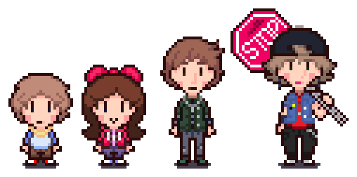
I find that the differences in design are most prevalent with Casey, though effectively, the remaining three have also had pixel-perfect alterations made to their sprites. I'm also just now realizing that this is the first time my followers are getting to see their default sprites, something I'm very much acquainted to by this point.
Below, you will find not only explanations as to what's changed for each character's design, but also their full design timelines (And developmental names!) which includes sprites I made for Casey and Lauren back in 2019! Without further adieu, let's get into it, because we're in for a long ride!
As I've mentioned in Override's two year anniversary post, Override was once a completely different concept entirely compared to what it is today, and given this, each member of the chosen four have had quite a rollercoaster ride in just about every aspect of their design, be it their looks, name, or personality.
And who better to start with than Casey?

Casey was originally going to be named either 'Weston' or 'Colton' early on in back when the project was called MOTHER: Into the Unknown, but 'Casey' was settled to be his final name once I drew him for the first time.
As you can see above, the tried and true Earthbound 'striped shirt and shorts protagonist' combo in Casey's design was used to its fullest since day one. At first, I wanted him to have a red shirt with orange stripes, but after noticing this made him look too similar to Lucas, it was changed to a blue shirt with cyan stripes.
Fun fact: Casey's dull brown hair color and the color scheme of his shirt for a while were in direct reference to one of Lucas' Smash Bros. alternate palettes, which was where I got the inspiration from (Plus, blue is my favorite color)! He was going to have red shorts as well, but that was much too on the nose.
Casey's scarf also went through a few color changes! I think the reason it was white in the first design was just for placeholder reasons, though I recall it being red for a little while before I switched into yellow for two reasons: one, the color yellow is associated with both optimism and cowardice (Both being big personality traits of Casey's), and two... well... this guy.
Lastly, let's touch on Casey's most recent design. Because Override is now its own entity separate from the Earthbound continuity, I wanted to opt for a design that was... more of my own, if that makes sense. I ended up giving him a long sleeved light cyan shirt with blue sleeves, referencing his previous design, as well as completely redrawing his hair so that it wouldn't be too spherical.
Now, how would you react if I told you that Casey's design timeline has the least number of sprites?

Enter Lauren, who I've given the distinction of having the second most changed design since her first version! My original vision of Lauren was to have her be more of a 'girly girl' type (Look where that ended up lol), and while she had several preliminary names, the only ones I distinctly remember are 'Madison' and 'Hannah'.
Because I didn't bring it up in Casey's section, you might notice that Lauren's sprite style changes drastically by the third design, opting for a bigger sprite with room for more detail. Early on in, this visual style lined up with Oddity's quite a bit, and became its own thing soon enough (Plus, Override's character sprites have four pixel tall eyes. Big difference.).
For like a very brief while, Lauren's color of choice was a mint green, though that was swapped out for a shade of orange quite fast. I also wanted Lauren to have a bow, kind of like what Paula wears in Earthbound, and I also wanted her to wear a dress... before long, I realized I had just designed another Paula.
So, the dress aspect of the design had to be changed, but I first wanted to see if I could hammer out a good hairstyle for her, which doesn't come into full effect until the third-to-last sprite. Lauren eventually began to sport her trademark ruby red color, and instantaneously after that change, she switched out the dress for something marginally less lady-like; a t-shirt and overall combo.
By now, Lauren's 'nine-year-old tyrant' personality was beginning to take shape, and while her overall design was her final design for a while, I then remembered that Override takes place early on in the year, so it might make a little more sense to have her dress in something warmer (Like how Casey gained a sweater)!
Thus, Lauren was given her standard jacket, as well as keeping the pink shirt aspect of the previous design! I find that Lauren had the smallest amount of changes between the Override reveal post and this one, as all I did were give her the little hood pullies and a hood for her jacket.
And that's a wrap for Lauren! You know how I said that Lauren had the second most changes to her design since her initial concept? Well, do you want to know who couldn't keep a consistent design for the live of him for the longest time?

Bradley.
With a whopping eleven different design sprites, it took me an extremely long time to settle on how I wanted Bradley to look, as well as who Bradley is as a character. Named 'Oliver' originally, his design didn't start making the rounds until I had started to round out the designs for Casey and Lauren.
Initially, I envisioned Bradley as more of a 'social outcast' type (Much more so than his present version, funnily), though I also wanted him to be kind of a nerd type who plays video games a lot and does well in class, but I also wanted him to be a 'cool guy' character who would skateboard everywhere... oh, boy, this wasn't going to be easy.
Bradley, for a while, wore glasses, as a subtle nod to the glasses Jeff wears in Earthbound: the only difference being that you could actually see Bradley's eyes. Jeff was a big inspiration for Bradley's character, too, seeing as both were blonde (At one point), had glasses (At one point, again), wore green (At some point) and didn't use magic.
It was when I did away with his glasses that his current design began to form. I briefly brought back the hoodie his first design has before giving him a red dress shirt with a black overshirt jacket (Though the hoodie was repurposed for his best friend's design, who ended up looking a lot more like how I first wanted Bradley to).
I then tested out a different palette for his new outfit by making the overshirt jacket green and trying out a long-sleeved black shirt underneath, and since that design change, Bradley was pretty much finished, save for small changes from then on (Such as his military dog tag necklace).
His current design changes two things from his previous design: one, I finally got his hair how I wanted it to look— noticed best by his bangs and the addition of a cowlick— and two, he now sports an undershirt like this, which I find has a particular 'late 90s/early 2000s' feel to it.
As for Bradley's character, it was eventually decided he would be a mix of the personalities I wanted to give him: he's mostly known as an unassuming and awkward teenager, but also likes skateboarding and playing video games. With perhaps the most design-intensive character out of the way, let's move on to our last but certainly not least team member...

MacKenzie! Oddly enough, I'm pretty sure MacKenzie was like the second character I began to think of ideas for. In the Into the Unknown days, my basic idea was for her to be the standard 'early 2000s gothic girl' without going too overboard in terms of the usual dark and complex clothing.
She was named 'Destiny' at the start, but I then changed her name to 'Kenzie', as it better fit the era Override takes place in... but then I felt like Kenzie was too feminine of a name for the type of character I was aiming for, so she was promptly renamed to MacKenzie thereafter.
MacKenzie is noteworthy for having her first design line up pretty closely to her current design, though plenty of changes were made in-between. She started out with an extremely basic, placeholder look: a jean jacket, deep red shirt, black pants... boom. MacKenzie. However, for a while, MacKenzie had two things the current MacKenzie does not: a hair bow, which has a crescent moon in the middle, and bright pink wrist sleeve braces.
Most of her early sprites were focused primarily of detailing her first sprite, while experimenting some with color choices. Somewhere down the line, though, a humorous idea came to mind— what if she carried an entire stop sign for a weapon? I had wanted MacKenzie to be more of a masculine type of girl, similar to MOTHER 3's Kumatora, so it was a perfect addition to her design!
For a little while, the sprite where she first has the stop sign was her current design, before I tried out giving her the black jeans I had initially drawn her with. I liked the design, though I felt that it was a little lacking, like it was missing something... maybe if I gave her different headwear?
Her crescent moon bow was replaced with a black snapback with a purple brim (That's why MacKenzie is always represented with a purple color, by the way!), and I saturated her jean jacket a bit so it wouldn't be so flat. She also now wears a black wrist sleeve brace (Though it could also be a Psiometer... up to interpretation!) on one of her arms, as a nice callback to her starting design.
Thus, MacKenzie's design was complete! ... or, so I thought. It was when my good friend @minxxikuo took a huge liking to MacKenzie and began to draw her that I found that I really like how he portrayed her. Knives' portrayal of MacKenzie featured a shorter hairstyle that juts out to the side a bit, as well as giving her all kind of earrings.
We ended up agreeing that this interpretation was now canon, and the only other addition I made that you can find in her latest sprite— which is an extremely easily missed detail, mind you— is the addition of two little pins to the front of her jean jacket. Oh, also, her stop sign has a dent in it now, implying... previous melee use.
Well, I think that's about everything! This post ended up being much longer than I expected it to be, but knowing a good few of my followers do like when I get lengthier insights to whatever I make, I'm not sweating it too much! I hope that you've enjoyed this deep dive of the Override cast's designs— these four have come a long way!

#Override#Casey Treverton#Lauren Henley#Bradley Snider#MacKenzie Connors#Sprite Art#Character Design#Concept Art#Deep Dives with Star#Coolness#Cool-NESS?#(It is even FUNNIER a third time!)#This straight-up might be one of if not my longest post yet#Local Star goes off about his OCs#I think it's absolutely evident that Override's been around for two years with everything that's in this post#The Override quartet is without question a few of my absolute favorite characters I've ever designed#So it's nice to finally be able to say that they're just about finalized in terms of their designs!#I still have one other faux Override screenshot to post though I have to fix a few things in it before I do#Namely how Casey looks since it was drawn prior to his redesign as well as some color fixes#Said screenshot is like... one of my most tileset-intensive sprite works yet though. Really excited to post it!
12 notes
·
View notes
Text
The Anti-Democracy Vein of America
It is 2021 and we are in one of the most important stages in American politics: Redistricting. Every decade, after the nationwide census, each body of government in America gets to redraw the lines of voting districts to accommodate changes in population, growth or loss, and comes with a chance to put the opposing party at a disadvantage. Not only can it be used to gain a party advantage, but it is also used to disenfranchise the poor, minorities, or religious populations. Redistricting is a crucial process in our democracy because it determines the fairness and accuracy of the people’s representation in government. It is a highly difficult and contentious process that our Founding Fathers never intended to deal with.
We were all taught that the Founding Fathers were amazing visionaries that fought for the freedom and power of the people over the evil Monarch. Truth be told, our Founding Fathers were only fighting for the elite and only took small steps away from the tyranny known under the Monarchy. Today people often mix up the words republic and democracy and think they are synonymous because of the government we have today. However, a republic is only a form of government that uses representation. Voting is not an automatic component and some of our Founding Fathers were highly against it.
Something you have to understand about the philosophy of their day was that freedom did mean the same to them as it does us now. Liberty as part of freedom was a new and growing idea, but freedom in western history was always something for those with power. One identified themselves as free because they had liberties and rights that others did not have. To not be a slave was to be free, but the assumed right to freedom was always for the White aristocracy. Our founding fathers were terrified of democracy, because they knew full well the common people would demand to be seen as equals. They saw this as an attack of their freedom, and on their property. John Locke originally stated that all men had the right to Life, Liberty, and Property. That idea was adapted in our founding and changed to Life, Liberty, and Happiness. The colonial aristocracy that became our American government were not shy about the fact that they possessed so much and others so little. They were terrified that democracy would lead to redistribution of wealth and property. The key ideas behind anti-democracy were the belief that having property and power others do not is part of being free, the concept that true freedom is not for everyone, and the idea that anything that would raise the common people up toward their level is an attack on their freedom.
This line of thinking thinking can be followed easily throughout American history. Since the founding of our nation there have been 15 laws passed to expand our democracy and access to voting. Now there is yet another law, which is desperately needed, to further protect our rights to vote. Each law passed required decades or more of fighting, which included massive amounts lobbying, protests, and community action.
We can still see anti-democratic influences alive and well today. The Citizens United decision to declare money free speech was an obvious move to silence the voice of the people so that the wealthy once again have a massive advantage in influencing our nation. Attempts to legalize discrimination against LGBTQ people and religious minorities, all while rejecting immigration is all in line with the concept that having freedom means possessing rights, liberties, and opportunities that others do not. In fact, just as with slavery, they see the power to discriminate as a prime factor of being free. Poll taxes, a tactic that literally restricted the poor from voting, were only abolished in 1964. That’s around the time my parents were born. That was not very long ago. Furthermore, in 2013, Republicans managed to roll back a section of the Civil Rights Voting Act, which they’ve been fighting to rip up since the 60′s. This removed extra measures that ensured access to voting.
However, the greatest threat to our democracy is act that is performed during this time redistricting. That is of course Gerrymandering. Gerrymandering is the act of drawing voting districts in a way that always give you constituents a majority, even though the lines are supposed to be drawn so that all people will be represented equally. During the last redistricting, Republicans employed a massive Gerrymandering campaign that disenfranchised, minorities, the poor, and anyone likely to vote democrat. The result was that in state and presidential elections the Republicans gained more power than their actual percentage of votes could account for. This essentially renders large swaths of voters as meaningless, as if they did not get to vote at all. Right now, a battle rages over redrawing lines and Republicans are being called out for unfairly disenfranchising minority communities as they do every cycle. America never wanted minorities to be able to vote, which is part of the concept of freedom where restricting the rights of others makes you more free.
While conservatives have always carried on the anti-democratic position, after a presidency full of attacks on democracy and our ethical foundation, we are facing an unprecedented attack on the the people’s ability to vote. Conservatives argue that these measures are to improve election security, but that is a thinly veiled lie and we know this for two reasons. The first is that they claim to be fighting an issue that does not exist, massive voter fraud. Republicans have complained about this for years and years, but have never been able to produce any evidence that it has ever happened. Second, is that the laws they enact have been proven to disenfranchise mainly minorities and low-income voters. Again, these are the voices that have always been targeted by the American government. Trying to pretend that it is by coincidence that these practices only have a profound negative effect on these vulnerable populations is nothing but deception. .
Now, when I say this attack is unprecedented, that means that if a majority of these restrictive bills are to pass, then we will live in the most difficult time to vote in the last 50 years. Here are the states that are passing new restrictive voting laws:

Here are the laws proposed so far:

Republicans are trying to push us back in time and regain the disproportionate power that our founders had intended for the white, wealthy, elites. Check your state and your counties to see if someone is trying to pass restrictive voting laws near you, and fight like hell!!
#voting rights act#VOTE#Redistricting#gerrymandering#politics#Republicans#conservatives#Liberals#Progressives#US politics#racism#fascism#anti-democracy#Freedom#Liberty
20 notes
·
View notes
Text
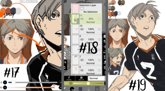
basic manga cap tutorial || ibis paint x

I got a request on how I color my manga caps (you can check them out in #morgan-colors-bnha and #morgan-colors-hq), so I thought I’d do this step by step tutorial that walks you through my process!
I color and draw on my phone (Samsung Galaxy Note10+) using the stylus provided with the phone, however you can use your finger. For manga cap coloring, I use Ibis Paint X, which you can find HERE for the Google Play Store, and HERE for the Apple App Store! It is a FREE app, and actually really helpful for a number of reasons, which I’ll show you down below! It does go without saying - there are a limited number of brushes that you get with the free section, but I haven’t found them to be too limiting, however I’ve only done basic manga cap coloring. You can watch short ads (I haven’t watched any, so I can’t vouch for the obscenity of them) to use the non-free brushes for a short period of time, though.
The first part of this tutorial is going to be showing you how I took THIS SUGAWARA manga cap and turned it into the one you see HERE (both as pictured on the header image). The second part of this tutorial, attached at the bottom, is a timelapse video where I show you how to turn THIS BOKUTO manga cap into the one you can find HERE.
Alright - without further ado, let’s get into the tutorial! As always, if you have any questions, please feel free to drop by my ASK BOX! Hopefully this is in depth enough without being too confusing. ❤
I’m doing this in steps so it can be in depth and informative enough, but I know that can become a little confusing, so I’m going to do my best to explain each step. I’ve also highlighted using little yellow boxes where I’m referencing, as pictured below.
To start, here are the ways I usually find manga caps:
1. Google searches, Pinterest searches, etc. Sometimes they’re already transparent, other times they’re not. I’ve found that I’m able to use the non-transparent ones because of the tools that are within Ibis Paint X.
2. Tumblr blogs - there are some blogs that are meant purely for transparent manga caps.
3. Manga scans. I, personally, haven’t used manga scans, but I know others that use them! They usually require some extra clean up, which can take extra expertise. Removing speech bubbles, backgrounds, etc.
Please remember to provide credit if it’s requested from the original poster!

Step #1: Open IP (Ibis Paint - I’m not going to say it every time because WOW that would get repetitive) and click on “My Gallery”.
Step #2: This is your gallery - as you can see, all of my prior caps are here, and this is where you will either open an old cap and keep coloring, or start a new one. In the bottom lefthand side, you see I’ve highlighted the “+” sign. This will bring you to the next screenshot.
Step #3: This is where you can choose if you want to create your own canvas, or create a canvas based off of the imported photo. Since I don’t do many “official” manga cap posts where I create a full image set from them, I usually just click on “Import Picture”, and go from there! However, if you want to create an image canvas, and import the picture once you’ve gotten the canvas open, please see Step #6 for how to import the image once you’ve already created a canvas!

Step #4: This is the screen that should pop up every time you import an image. When you’re doing manga caps especially, you’ll want to hit “Ok”.
Step #5: I believe these are the automatic settings, however if they’re not on your app, these are the settings I use when selecting how to extract the line drawing. Black at 0%, White at 100%, and Middle at 50%. This will remove the background from the manga cap, and only leave the dark line art remaining.
Step #6: This is what the layer should look like once you’ve extracted the line drawing. See highlighted the “+” button - this is how you will add new layers. I chose to add a new layer, which you can see in Step #7. However, if this is where you want to add an image, see the highlighted camera button. This will let you choose an image from your camera roll and import. The “Extract Line Drawing” option will appear each time that you import an image, so don’t worry about triggering it! It will trigger itself!
Step #7: Here is the new layer! I cut out the screenshot from before, but each new layer shows up on top, so I had to use the three little lines on the righthand side to drag it beneath the layer of the Sugawara manga cap layer.
Step #8: I used this new layer to import a photo of Sugawara in his uniform from a quick google search. I actually end up grabbing another one just to make sure I know what the bottom half of his uniform looks like, but I don’t show it just yet. Because the layer is behind, it shows up underneath Suga’s face. I end up erasing the parts that interfere with the cap here in a bit.
Step #9: When you click the brush button down at the bottom, this selection screen comes up. There are a ton of brushes to choose from, but for the base colors, I use “Dip Pen (Hard)” at 100% opacity. I’ve shown it highlighted here!

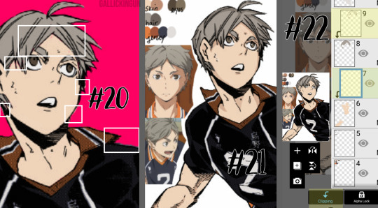
Step #10: Now we’re going to create our color palette. Sometimes I will find color palettes online And import them, but for the sake of simplicity, I’m going to use this photo of Suga along with another one that I nab later to create the palette. The way you use the “dropper” tool (if you’re familiar with Photoshop) to select the colors from another portion of the image is to press down rather hard, and then this circular selection tool will pop up. You can keep the pressure and drag it to the specific spot you want to pick up a certain color for. I’ve found that it’s best to do this with my finger instead of my stylus. I’m not sure if it’s because the heat of my finger and the change in pressure is easier to pick up, but that’s what works for me!
NOTE: It is important to note that if you have the eraser tool selected instead of the brush tool, you won’t be able to use the color selector. This might come as second nature to some of you, but it STILL makes me screw up from time to time, haha.
Step #11: Using the dropper/color selection tool from Step #10, I create a small color palette, as you can see in the upper lefthand corner of the image in this step. I grab both the lightest and darkest shades from the different things I’ll need to color in for the cap. I picked up the highlights and shadows of Sugawara’s skintone, eyes, hair, and jersey. I just draw in little overlapping circles so I can switch back and forth between the colors
Step #12: I added an additional layer in the very back of this image, and colored it in completely using a blue shade. This will allow me to make sure that I’ve filled in all of the space behind the manga cap. It’s important to note that in order to color the line art in later, you’ll actually need to “overdraw”. We’ll touch on that more later.
Step #13: As I show here, I have a layer where I use the singular skin tone shade and color in behind the manga cap, filling in all the spaces where Sugawara’s skin is showing. I usually use a different layer for each different shade/color just in the event I need to do a bunch of erasing, or if I need to change the layer style later.
Step #14: Here is where I show how I “overdraw”. I’m not sure if you can see it very well here in these screenshots, but the way that these manga caps are drawn, sometimes the line art isn’t “clean”, it looks more shaded/scratchy. So, in order to combat white space, I usually overdraw and then go back in with an eraser. You can see in Step #15 the size brush I usually use - somewhere between 2.0-4.0, but most of the time I use a 3.0 size brush. I’ll go back in with the eraser with a similar size on the easy parts, and then all the way down to the smallest size - 0.3 for really close quarter erasing.
NOTE: It’s important to realize that the smaller the eraser, sometimes the circumference of the eraser can be really light in opacity as well. You can help this with the intensity of the pressure that you use with your stylus/finger, but I’ve found that sometimes using a really small eraser can be counterproductive. There are times where I’d rather “over” erase in which I actually erase into the cap and then redraw using a small brush size. You’ll have to play around with eraser/brush size and such to see what works best for you!
Step #15: Here is the skin all colored in! You’ll notice I colored in his eyes and mouth, which are going to end up being white in the end. I do this because usually it’s easy to forget that you need to color things in white if you’re doing it against a white background. I oscillate between the colored background and the white/transparent one because sometimes it can be tough to look at that bright color all the time. I’ve found that this is more of a tip/trick for me to be able to remember to color in his teeth and eyes and even sometimes the brow or other features! In the end, this just works for me. You don’t have to do this step!
NOTE: As I stated in Step #14, using pressure can change things. The same goes for this specific pen type - the dip pen. I use about size 3.0 most of the time, but I can actually do really detailed work with this size pen (see Suga’s ears, the spaces between his hair, etc.) by using lighter pressure. I do have a stylus, so this is a lot easier for me. The pressure was a little tricky for me to get down in the beginning, but once you realize how soft/hard you need to press down, you can use bigger brushes for even smaller areas. I find that makes it a lot easier for me, since I don’t have to keep changing the brush tool - which you can do using the sliding bar at the bottom of the screen labeled “Thickness”. The thickness of a brush is the circumference it has when you are using the hardest version of pressure you can muster, so keep that in mind!

Step #16: Here is where I do the basic coloring for the skin, hair, and eyes. These colors will be relatively the same as the colors from the palette, because there is not a “gray cast” caused by the line art sketch from the manga cap. This means that the skin color that is showing in the manga cap that I’ve colored is pretty close to the original color from the screencap from the anime/the palette that I’ve got in the upper lefthand corner. I do FLAT coloring for this - aka NO SHADING YET. So I only use the LIGHTEST shade for the hair and skin - the ones farthest to the left on the palettes for each section. I do use the DARKEST shade for the eyes, but that’s because usually the lighter shade is the one you use most sparingly, where as with skin, the darker shades are used for shadows only and aren’t used in excess.
NOTE: As previously stated, I do a separate layer for each different color. At this point there should be six layers, as follows (from the bottom up):
Layer 1: Background Layer (Mine is blue, but for the sake of easy viewing, I made it white.)
Layer 2: “Notes” Layer - this is where I keep my notes, as in the reference photos, color palette, and any other things here and there.
Layers 3-5: These are the colored layers - skin, hair, and eyes.
Layer 6: Manga Cap Line Art
Step #17: Here’s where I’m showing the two different orange tones. This is what I meant in Step #16 - The original orange shade is the lower part of Suga’s collar - as you can see, the line art shading makes the color a lot more muted. I used the color wheel to find something brighter, just for a comparison shot. I still choose to use the traditional palette that I pulled from the anime screencap.
Step #18: Now that I’m ready to color the manga cap pieces that are skewed by shading (i.e. his jersey here), I usually turn the manga cap down in opacity, so I’m able to recognize where I need to fill in! This is where I fill in the blue of the jersey, the orange of the collar and other accents, as well as the off-white shade for the number and the line accents.
Step #19: Using the eraser and smaller brush sizes, I fill in all of the flat colors. No shading yet!
Here comes the time consuming, nuances...
Step #20: I’ve turned back on the colored background layer - sometime between when I started and now, I changed it from blue to pink. If you can zoom in on the image, you’ll see the boxes in white contain “errors”. This is areas where there are “holes” in the coloring, or where I’ve gone outside the lines. I’m going to go back in and clean this all up with the eraser and some more brush work.
NOTE: This is very important, especially if you’re trying to make this a transparent image, or if you’re going to do the extra steps and color in the line work. Any holes, overdrawn, or underdrawn areas will make the final drawing look a little funky.
Step #21: Here is the shading! Honestly, this cap kind of shaded itself, haha. Some manga caps have “built in” shading, as you can see on Sugawara’s arms and neck. I added some shading to his hair and face, trying to use the anime caps as a reference. I’m not very good at shading yet, but I wanted to show it here so you guys could see!
I used the darker shades from the palettes on the eyes, hair, and skin. I didn’t do any shading to the jersey because the manga cap lines already skew it so much, that it didn’t really seem necessary. This can be a really hit-or-miss time, both with areas that you choose to shade, as well as the colors that you use. I would really suggest searching for skin tone palettes if you’re not using the anime screencaps for reference!
Step #22: For my shading, I actually use “clipping” effects. As you can see, the two layers that are highlighted are clipped to the layers beneath. This means that the coloring on the clipped layer will “attach” aka clip itself to the layer beneath and that layer only. So, for the shading of the skin, hair, and eyes, I chose to clip the shaded parts to the base coloring, that way even if I over drew, the colors wouldn’t bleed together.
I did more of what’s called “cell shading” for this manga cap, as well as the Bokuto one that I do in the timelapse video below. What is cell shading? This wiki page explains it pretty well, but basically it’s more “harsh” shading where there’s not necessarily an airbrushed quality to it, it’s more blocky. You can see I only chose to use one color of shading, which makes the contrast much more stark. IP does have several airbrush tools, I’ve used them in my Bakugou manga caps for his gauntlets, and they work really well!
I brought up earlier that it’s important to color your base colors all the way to the edges of the manga cap line art. This clipping effect is why. On Suga’s neck and ears, the darker shade that I used for his skintone goes to the edge and actually underneath the line art of the cap, because it is clipped to the base skintone layer beneath. Had I not made sure to go all the way to the edge of the line art, this would be much more choppy, and there would be white space between Suga’s ear and his hair!
Step #23: Here is the extra step - line art shading! This can be tricky, depending on the complexity of the line art, the shading, etc. Usually, in choosing a shade to color in the line art, I grab the darkest shade for that section, and then grab something even darker. As seen in Step #18, there is that drop down box that is currently listed to “Normal” - this will need to be set to “Screen” for the current line art coloring layer. You’ll also need to “clip” the layer you’re using for the line art color to the manga cap, meaning it will need to be on top of the manga cap layer - and therefore, should be the highest layer in the image.
For this image, I only did line art coloring on Suga’s face, hair, arms, and neck. I was really satisfied with leaving the jersey alone so far as coloring. I did this mostly because of the sketchy quality of the cap, the line art would be really involved and complicated, and it just wasn’t worth it to me (so sorry lol), and I liked how it looked with the darker color outlining it anyway.
Also, I added little details like making the sweat on Suga’s face outlined in white! And yes, I do know that missed Suga’s beauty mark, but we’re going to pretend I didn’t just do that. I love you, Koushi, please forgive me.
And that’s it! I’m sure there are easier ways to do things, or better ways, haha. But this is my beginner tutorial (as in I’m the beginner, lol). I hope that this helped anyone whose doing it for the first time! I stated this before, but if you have any questions, please feel free to hop into my ASK BOX and ask me! I’d love to help anyone out! And I’ll do my best!
See below an additional manga cap coloring - Bokuto Koutarou this time! I thought doing a timelapse video of me actually coloring in the cap would help you guys out!
PLEASE BE AWARE: This video is in 2x speed so it could not be forever long and really boring lol. With that being said, I do spin the screen around several times while coloring in the cap - this could make you nauseous, so please beware of that before you watch!
Here is a link to the time lapse video on YouTube!
A special thanks to @cutesuki--bakugou who helped me a lot while I was coloring my original caps, and also to @writeiolite who nudged me in the direction of finally starting to color manga caps! And a little thanks to @rouge-heichou since I bugged her about a couple of things as well. And then as always, a huge thanks to @candychronicles because she keeps me sane. Also a special mention to @pixxiesdust because she does really cool gifs and has done a wonderful job in the bookclub of trying to share her knowledge with everyone else.
Disclaimer: I’m no artist, this is just for fun! I’m sure my shading and line art can use some work.. but I’m not focusing on that! Instead I’m just going to keep playing around and having a good time ❤
#haikyuu!!#haikyuu manga#haikyuu manga cap#sugawara koushi#bokuto koutarou#manga cap color#manga cap coloring#manga cap tutorial#coloring tutorial#manga cap coloring tutorial#morgan colors hq#morgan colors bnha#morgan does tutorials
159 notes
·
View notes
Text
Random musings for today

It’s funny how in my almost nine years of blogging, I never actually persuaded anyone to read my blog—aside from my closest friends, though. Gotta be honest. I mean, I don’t really force them, but I do encourage them to read if they have time or if something catches their attention—or the occasional baiting of me, saying, “Yow, I blogged about you.” Most of the time, I’m inclined to believe that all my readers read my posts on their own volition.
Anyhooo...
I was going through my drafts the past week and saw this. It was just one paragraph then and I obviously never got back to it until now. The reason why I started writing the said paragraph was because last year, a lot of people went into vlogging and there’s this person on Facebook that made me feel like he/she wanted to shove his/her vlog down everybody’s throats—the publicity stunts are ridiculous yet the content is cringeworthy.
(Look, I’m down with supporting anybody’s vlog as long as it’s worth watching. There are a bunch of people who support this blog of mine, and, as someone who makes content myself, I’m totally fine with redirecting the love given to me—no matter how small that love is—to other creators. Just please make something that’s worthy of people’s time.)
I’m not wallowing on that story any further. Although, I do get their desperation to have more subs and views in order for their channels to get monetized. The thought of making money from my blog has always brushed my mind. Heck, I even thought about making a Patreon account that’s related to my blog.
But I always end up going against it, all in the name of the sanctity and my loyalty to my original intention of making a blog.
This is a space for me to write about my life. An avenue where I can tell my stories and hone my creativity. A virtual friend I can scream my rants to—never minding that all things I say can be seen by everyone on the internet. It’s a piece of me that’s not bound to a promise of meeting the clients’ brief and demands.
When I started sharing this blog on my Facebook account, it was not primarily because I wanted more viewers—the higher numbers are useless since I don’t earn anything from it. It’s for me to be more mindful of the things that I write and to force myself into making better content at a time when everything I posted was hideous.

Now... Uhmmm... I need a transition for a different topic but I can’t think of anything. Haha!
My post Redrawing my 2010 Caricatures – no. 03 garnered the most views on my blog so far this year—thanks to my friend who shared it on her Instagram. I’m not sure if it’s the most views I’ve ever had, so I might need to verify that first.
And... I just wanna share this. I have two or three avid readers from the US who read my blog literally seconds or minutes after I share them on Facebook. I don’t know who they are. Sometimes I think they might be robots who check if I’ve written something against the government (I can fantasize, right?). Or they might be stalkers who wanted to spy on my every move.
I’m kidding. If they’re reading this, please don’t get offended.
Nevertheless, I find this really fascinating and I’m curious about their utmost interest on my life. I’m unaware of their intention, but... yeah. They’re my silent followers. If they wish to continue being silent followers, I see no problem with that.
And there’s also no problem with letting me know what you think about the stuff that I post. You can react or comment on the Facebook post, give a heart on Tumblr, or even message me.
One of the nicest things anyone ever said to me was that my blog isn’t full of shit. I don’t even know who said that. I just know that it’s someone from work. I never considered changing the name of my blog. For me, it’s a tribute to the 18-year-old, self-deprecating me who believes everything he does is shit. My blog’s name reminds me everyday of how much I’ve grown.
I don’t ever want to change the username either—even when people have a hard time reading it at first. It’s supposed to be read as ako·si·omike. I was twelve when I made that (for YouTube), so forgive me.
I’m ending this here. It has become longer than I intended it to be. Have a good day!
2 notes
·
View notes
Text
Redistricting battle heats up - Houston activists fight for fairer maps

The lack of representation provoked that during Hurricane Harvey, neighbors were not properly assisted by local governments.
Activists in Harris County, Texas, mobilize to make the once-every-decade redistricting process fairer to communities of color and low-income neighborhoods.
Every time Myrtala Tristan recounts her experiences during devastating Hurricane Harvey, she relives the scenes of relentless rain that turned her neighborhood’s streets into rivers and her home into a floating furniture museum.
“They never told us that we would have to evacuate or that it was going to be so terrible,” Tristan, a resident of Houston’s Lakewood suburb for nearly 40 years, recalled at a June 30 briefing on redistricting. “I live with my husband. For five hours I was calling (emergency) 311 and they never answered. We were up all night.”
Early the next morning Tristan left her house with just her driver’s license and some money, packed in a Ziploc bag. Outside, a boat was rescuing people from the fetid waters, prioritizing children and senior citizens.
“We were navigating those dirty waters all day. They didn’t give us water or food … I think this is very unfair and that the government should be helping us in a different way,” said Tristan. Almost three years later, “we are still applying for some help. Nothing ever came.”
Tristan joined the Northeast Action Collective, a group of advocates and neighbors that emerged in response to the lack of public investment in drainage and flood mitigation in her community. “It is time for our voices to be heard.”
Right now, Tristan is focusing on a county-wide effort to engage communities of color and low-income neighborhoods in redistricting – a process of redrawing political boundaries that determine what candidates people vote for.
“Redistricting is about drawing lines on a map to represent who is going to vote for certain elected officials,” explained Nina Perales, vice president of litigation for the Mexican-American Legal Defense and Education Fund (MALDEF). “It is a very political act to create groups of voters, so it is very important to get involved.”
Neighborhoods are grouped into districts that are redrawn every 10 years based on census data. Depending on what the electoral district is, those lines are drawn by the city council, the school district board of trustees, county commissioners, and ultimately the state chamber.
In places like Pasadena, a suburb in Harris County, these lines have effectively segregated the Latino from the Anglo population: Latinos live in the northern area that has historically received fewer services than the southern area – where Anglos live – making it more prone to floods and natural disasters.
When the Texas House of Representatives drew other lines within the northern zone that further divided the Latino vote, MALDEF filed a lawsuit and won, regrouping them in District 144 .
“The representative of that district, who was Anglo and conservative, lost his election. And he was replaced by a progressive Latina woman in the House of Representatives,” Perales said. “Our increased political participation is strongest when the political lines that are drawn around our neighborhoods are fair.”
Lost in translation
For Miguel Rivera, the Redistricting Outreach Fellow at the Texas Civil Rights Project (TCRP), one of the challenges is that the Hispanic community is still not familiar with these processes, starting with terms such as “gerrymandering” and “redistricting” that are difficult to translate.
“I first came upon this conundrum when trying to explain to my parents, who were both born in rural Mexico, what I did for a living,” Rivera said. “They understood the fight for voting rights which had a lot of translatable terms, but their understanding of the census and redistricting was very different based on what they knew in Mexico versus in the U.S.”
Now the TCRP is doing educational campaigns for the Hispanic community to coalesce behind a specific term: redistribution.
Cassandra Martinez, who just graduated from high school and will attend Columbia University in the fall, first heard the term in census workshops organized by Mi Familia Vota.
“Hispanics don’t know the specifics behind redistricting and census counting, but the community cares about income inequality, about the schools children go to, about the construction projects that never quite get done,” Martinez said.
“A lot of us come from immigrant households; our parents…feel disconnected from politics,” she added. “There is this whole mentality of ‘my vote doesn’t matter.’ What really helps people in my age group is connecting voting with the future of our families and communities.”
Deborah Chen, an attorney and activist with OCA-Greater Houston, relates a similar experience with Asian Americans and Pacific Islanders whose numbers are growing faster than Latinos in Texas. She said her organization knocked on more than 221,000 doors to make sure AAPIs were counted in the census. “You don’t have to be a citizen or registered voter to participate in redistricting,” she emphasized.
OCA uses “opportunity maps” to demonstrate how majorities and minorities in those districts receive services such as sewers, electricity, pavements, pipes, and so on.
“Everyone who got counted in neighborhoods in the greater Houston area is worth $15,700 in federal money, and districts determine how that money is spent,” Chen said. “You want to live where multiple communities are evenly balanced and they have an even chance of having representation.”
African-Americans also have suffered discrimination in how lines have been drawn mainly by Republicans in power, and for this reason organizations such as Pure Justice promote their participation in electoral map drawing.
“Everybody wants to crop the map out in a certain fashion for certain beneficiaries,” said Roshawn Evans, co-founder of this organization. “At the top of the political food chain, Republicans are on everything, but we still can make suggestive maps and draw them ourselves.”
“We want to keep together people who have the same kinds of problems, so I just want to emphasize that voting really matters,” he concluded.
Originally published here
Want to read this piece in Spanish? Click here
#English#redistricting#Harris County#Houston#Texas#Latino#Asian Americans#African Americans#Census 2020#Hurricane Harvey#maps#redrawing districts
1 note
·
View note
Text
Making a Quasi-1895 Skirt in One Weekend!
Hey friends! Jessie’s here, with some more badly taken pictures from her trashy phone!
So for my drama class we’ve been studying American Theatre, most specifically, Our Town by Thornton Wilder.
For our assessment we were asked to preform a short extract from one of the three acts. My group chose the cemetery scene and I chose to play Mrs. Gibbs. Lovely woman.
We were told that Mrs. Gibbs died while visiting her sister, which means she’d be wearing simple travelling clothes. Which means old travelling clothes (The story is set in small town Massachusetts, I doubt she’d have a bounty of new travelling clothes). Which means my mum begrudgingly let me make a new skirt.
I used the pattern found on this website. It’s free, if a little weirdly measured. I had already cut out my pattern pieces in November of last year, wanting to wear the pattern to a dinner I was to be attending. I’d also found this gorgeous periwinkle fabric Mum had planned to make into a sheet but never did to cut out of.
The Process:
I started by drawing a thread to cut one 160cm length from the 3ish metres I had (That doesn’t sound like a lot but this fabric is
really wide
). I neglected to take pictures, however. The process is simple enough, you cut a slit in the cut edge of your fabric, select one thread to grab from your fabric and pull on it. In my case, I slid the fabric off it, but po-tay-to, po-tah-to. You keep this up until you reach the other side with a gap in the fabric enough to cut a straight line from. Your thread will snap, you will want to give up ten minutes in, but you simply hunt down your thread and, in my case, engage yourself in some D&D with Discord friends.
Once the fabric had been cut enough to start drawing on my pattern pieces, I did just that. Kicking my brother off of the table, I lay my fabric atop it, weighed my pattern down with my laptop and got to tracing.
I should note that pencil outlining is strongly advised, as pen will want to bleed through your fabric and will stain once washed.
I gave myself about an inch of seam allowance because I’m still deathly terrified of felling tiny seams.
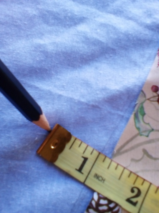
Then it was the simple matter of connecting the dots and cutting out!
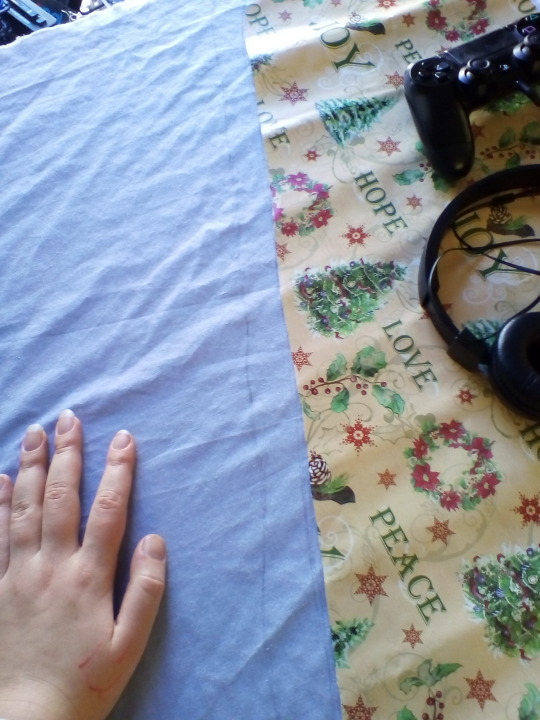
I did not, in fact, film the cutting of the pattern.
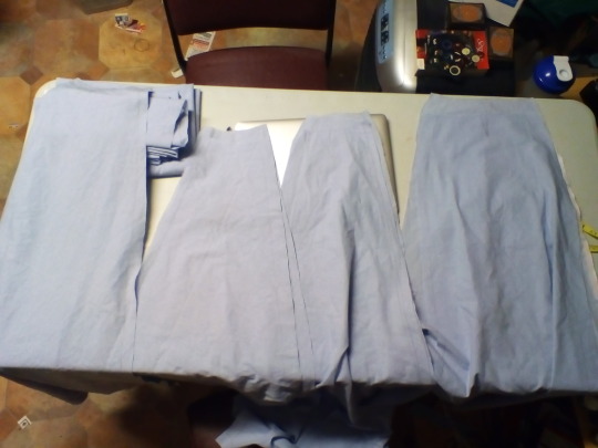
The cut pieces! They’re all doubled up, please don’t ask me which is which.
And then I pinned the front and side front panels together, just to get a feel for the outfit.

Boy am I glad I did that! Look at this!!!!
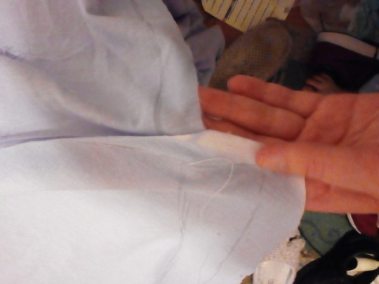
That’s probably an entire inch out of alignment! I originally just tried to redraw the pattern to fix it but! Through the power of re-arrangement, more pins, Gryla and her Yule Lads, I figured out I just had the panels the wrong way around. The pattern was still unaligned, but this time not as badly
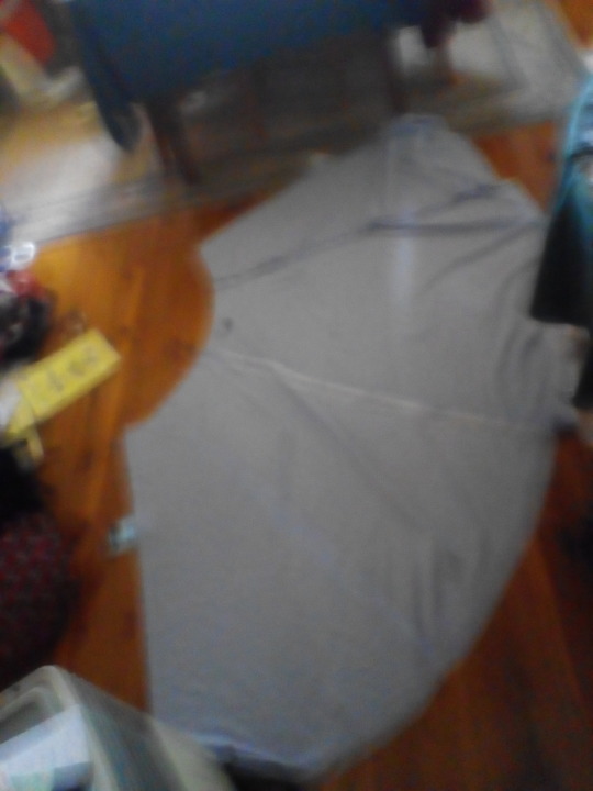
I’m super sorry about the blur, but if you look closely you can see that the pattern matches up much better now.
Once that had been figured out, I tacked the panels together it and it was time to hit the sewing machine!
My dad had suggested that instead of lugging out our 7 kilo 1990′s Janome, I use a tiny sewing machine we were given by a neighbour a few years ago. It’s so cute!

Sadly, we couldn’t get it to work and got the old Janome machine out.

Sewing sewing sewing.....
I’d gotten all the pieces together rather quickly and was able to start getting the hem worked out by about 7pm on sunday.
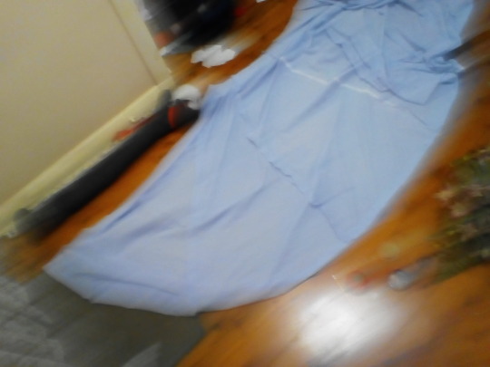
(Again, sorry for the blur) Here I also got to pinning up the excess fabric that would be cut away in my trueing of the hem. Seriously this pattern is whack. I’m not sure if it’s my fault for being bad at counting tiny squares or whoever drew the pattern for making it so whacky.
The First Try-On!
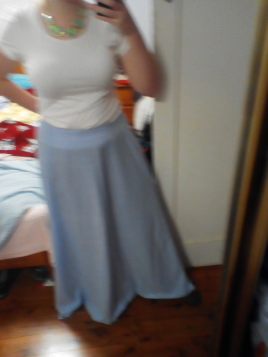
At this point I was actually super happy with how it was coming along! I liked what it looked like, and even though it needed a bit of manipulating, the hem was looking really great as a trapezium when I moved it around a little. I’m going to need to starch it in future but it’s looking great so far!

This is the amount of fabric I’m going to have to gather. Yeesh.

Okay upon further reflection it’s not that much. I sewed two lines of running stitches close to the top edge and pulled them to gather the fabric. Two lines of stitching is so much neater than just the one and not to mention easier to attach a waistband to.

Here are the two back panels gathered and held together. this actually turned out to be not enough gathering! But at the time I was struggling to tie a knot close enough to the gathering and getting stressed about it. There was no way I was doing the gathering again.
Here’s where we had a crisis.
See, Mum had told me she had a strip of pre-cut and ironed bias binding to use as a waist band. I was overjoyed because I didn’t have to try and fail to make my own bias binding.
It turned out i didn’t have enough. It was too short.
Cue half an hour of stressing and ransacking every sewing stash I could find in my house. That ended up fruitless because making bias binding really isn’t that hard.
I cut 4 inch strips from some scrap fabric, pinned them thusly:

(You have to pin the edges in an A shape otherwise the strip won’t come out straight)
Sewed them:
Ironed the edges inwards, then ironed it in half and folded it around the top edge of the skirt.

Sewed that on, ironed and sewed the hem and she was done!
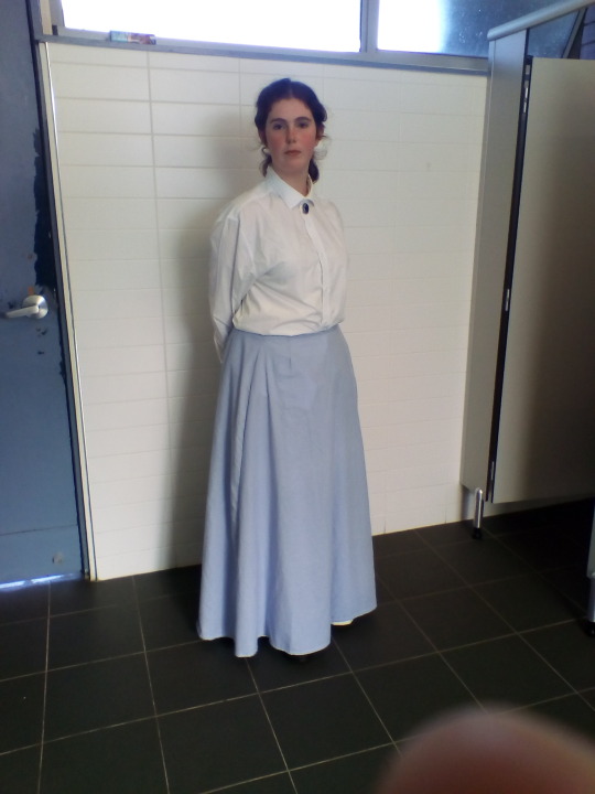
Here she is! Mrs Gibbs in her full, mistakey glory! I borrowed my brother’s old shirt and an earring from my mum, so I look kinda trashy but I’m really proud of how it turned out in just three days!
Seriously there are so many mistakes but I’ll probably make a second post when I finally get around to rectifying them. I need to re-do the gathers, the hem and finish the seams. First, it needs a wash because in my rush to English class it got a bit muddy.
But that’s for another, assessment free time. Goodbye for now my lovelies!
4 notes
·
View notes
Photo
Some notes about Sharpy’s facial features
I meander for a while about drawing facial features, my novice sketching process, and the best drawn male eyes I’ve ever seen.
For fun, and because he is so adorable (sigh, I can’t trick anyone into thinking I’m not a girl gamer for five seconds--not that I want to but it’s pretty funny that I couldn’t for the life of me do it, oh well), I wanted to point out some things about this sketch (and a few Sharpen sketches I’ve done so far). I’m sure that others do this as well... To make Sharpen more unique and seem like an individual, I’ve placed some tell-tale features in every art of him that I do.
Curl in left eyebrow
“Elvis” curl at his hairline, helps make him seem playful and even himbo-ish, since that’s his personality
And I can’t explain it but the imperfect hair makes him seem more approachable, like any one of us
Tiny scar on his top lip on the left side. I haven’t decided headcanon for that scar yet; it’s just something that I really wanted to do. I think my pencil slipped once and I was like ‘Yaaaas, don’t change that!’
Square-ish forehead. You see the lines there as he turns his head
Some musculature over the eyes
Extremely careful little dots in specific places to indicate more musculature on face. Getting annoyed and erasing the dot and putting it back a milimeter further out is like... WHY do I do it? But I keep doing it, I want them
Lightly defined, high cheekbones (Trixany’s are so strong, I had to really train myself out of giving him super stand-out ones)
Boxier eyes... they do not at all resemble the original inspiration for these eyes when I started sketching him, but I maintained a little of the ‘mystery’ of unusual eyes and strong lashes on a guy (see more below)
Eyes set wide apart
Together, the larger, wide-set eyes give him a kind of baby face? That happened on its own, it wasn’t planned. Sometimes I can see the lil’ Gerber baby in there
A little divot at the top lining of his ears
What else... Well, Tumblr is here to let us indulge in our art and our creativity. I guess I just wanted to say I like how small details like these work together, almost as a unique fingerprint, to keep your character, especially their face, looking like... well, themselves.
Just curious--anyone out there want me to draw Sharpen in a specific setting? I’m getting better at it; I think I can take on a request, though I’m kind of intimidated. I don’t think I’ll do commissions at any point in time. But a prompt for sketching practice? Hell yeah.
These art pieces take me a really long time to do, but the way. I’ll outline something then get kind of exhausted or this uneasy feeling? Like I’m not sure if I really want this, or if it’s right? If it does feel right, then I’ll come back weeks later when I have free time, and at that point, sit for hours sketching and filling in everything else.
Then I get mad when all the little nuances I put on paper get lost when you scan... anyway.
Hope you guys are enjoying it!

Image source: Basilisk Wiki
Okay so I almost forgot--these are the prettiest, coolest eyes I’ve ever seen on a male character, ever. EVER. Obviously, I didn’t re-create these all the way (and not really at all) for Sharpen, but I did go with a boxier style, rather than completely round almond eyes. Gennosuke’s eyes were actually central to the plot of Basilisk, I found out later. Here’s another great pic of Gennosuke--now this wallpaper is badass. I remember I had this one for a long time; it was too, too perfect.
Now that’s the power of detail. Yes, there’s a sword and it shines and it’s at the heart of the picture. But the only thing you need, the only thing that matters in this entire artwork are actually those eyes. Blue and white coloring throughout, but then wow, those golden eyes. And the gold isn’t what does it really, it’s the powerful dark lashes that encircle them more like calligraphy, the eyebrows that unite with those... less human, more wild. The man is practically a tiger. That’s the kind of ferocity you’re hit with, the kind of wonder you’re filled with here.
Image source: hip wallpaper website
Someone also clearly sat down and thought about how breathtaking it is when you’re right across the table from a guy with eyelashes longer than yours and then you feel that stab of jealousy, along with admiration. Sounds odd, but I think some folks out there know exactly what I mean...
It’s that split second before the instant crush happens. I try to make Sharpy’s eyes do that penetrating ‘instant crush’ thing whenever I draw him. Less because it’s sexy, more because it’s... personal? This is hard to explain. But it feels like he’s having a conversation with you and it’s okay that you’re there with him. He expects you to respond and participate; he thinks he’s your friend. I believe I draw Trixany’s eyes the same way if she’s not posed doing something over-the-top. If she’s just relaxing and sharing herself with you, then it’s a friendly, loving gaze.
The gym t-shirt sketch is the first time I didn’t make Sharpy ‘penetrate the camera’ as they say. It was hard not to redraw it so that he was... decided he was looking in the mirror or something instead.
When I look at Sharpen’s sketch at the very top of this post, I keep wanting him to stop looking elsewhere and look right at me. Right at the viewer. What a cool effect that is. What is that? I don’t know if it’s the context of the other drawings or what. Well, it’s not some magical work of art, only something curious I noticed.
Okay, I could ramble forever. I like art and I like to write so that’s a super-intense combination. I’d love for other artists on here to talk about their process, actually write it out and blather on creatively like I just did. It’s fun. And you learn about somebody’s personality too.
Yes, it’s definitely nice to talk about sketching and the special rainbow of things that go into it sometimes.
Tah!
4 notes
·
View notes
Last Seen Blogs
nooneinparticular11111111
they/them/its
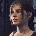
hamoujii
Aki
inkyjake
Just, Jake
unheavenly22
This is Madness
bredgur
(^_^)