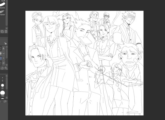
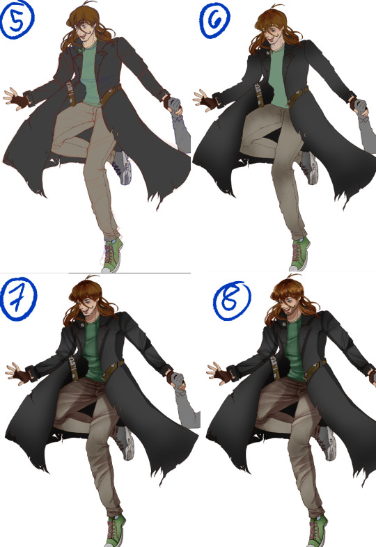
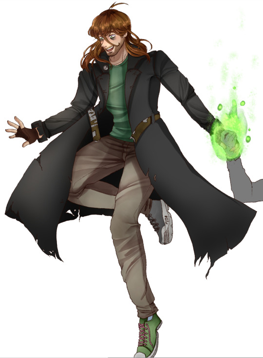
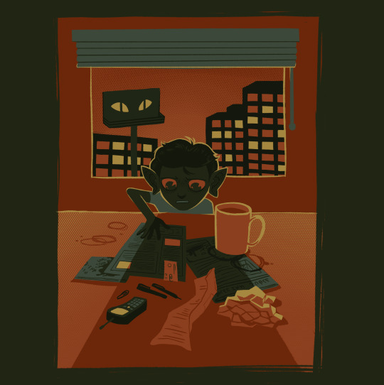
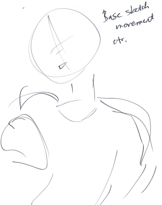
#super rough sketches but i dont feel like cleaning it up
Text
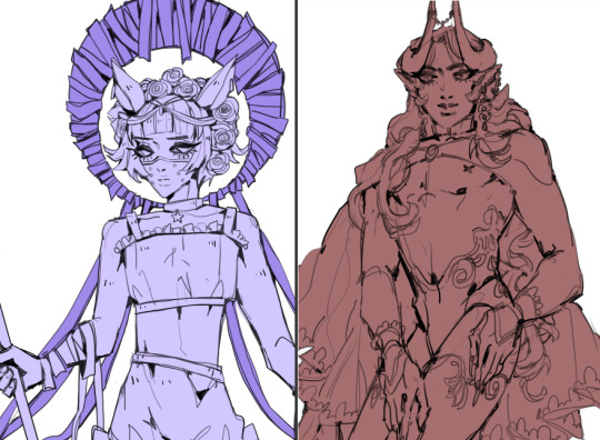
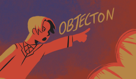
some smerds
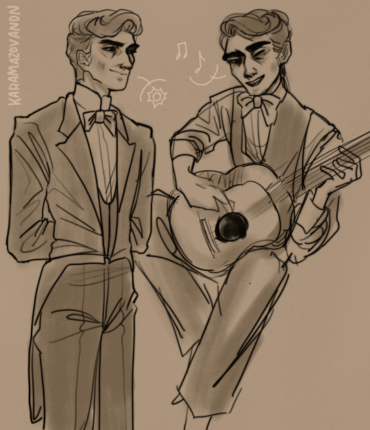
#pavel fyodorovich smerdyakov#the brothers karamazov#still working out a design.............sans man bun#super rough sketches but i dont feel like cleaning it up#no references no lineart just vibes#ill do a better one of smerdyakov with a guitar at some point and actually look at a picture of a guitar instead of going#uhh yeah that seems guitar shaped#anonart#his squinty eye is very good#i hated him SO MUCH when i started reading but i turned into a smerdyakov apologist by the end. is that a hot take#i just think hes neat (tormented by societal dehumanization and finally snapping and reclaiming the agency hes been denied all his life)#tag rant over it is simply wild how much this guy grew on me#smerdyakov
53 notes
·
View notes
Note
Hii! First off i just want to I'm such a big fan of your art and animatics! Your art is just so expressive and unique its addicting to look at 💞💞
I was wondering if you could go over how your process or tutorial in making an animatic? Whenever I try to start to make one, I get jumbled up and end up ditching it lol
I'm sorry if you get this question a lot 😭
So sorry it took me so long to answer this- I was in a Busy time (diseaseridden with covid and being punched by finals) when I got the ask and wanted to answer it with some stuff Im using for my next TOH animatic!!
I'll say one thing first: I get jumbled up and ditch so many animatics. For every one animatic I release, there are three to five more I have that have NEVER seen the light of day (yet). And that's okay!! It's fun just to make them for me, and I hope it is for you too!! Animatics are scary because if you're working on it alone, it can be really hard to be your own cheerleader to keep up the mojo to keep going. So that makes it really special when there is that project that makes it to the finish line- cuz you can look at it and go "holy crap I made this. holy crap i MADE that look how SICK that is dude!! all that work and look at the turnout!!"
The following stuffh is just my personal process and is by no means representative of a professional animation pipeline, but this works for me as a Lonely Artist! It all begins with the idea - whether it's a song, or just a story you wanna tell. In the case of the one I'm gonna demo here with , I wanted to animate Hunter's first day as Del's apprentice!
The first thing I did was write a script. Not fancy or AO3-quality, but enough that I understand the pacing and the visuals of each shot. I usually just put this in a doc or put it in a script format, if I feel fancy.
Then, I take that script and find music that I think would fit for it- and remix it (if needed) to fit the pacing/mood/etc! This is what this new animatic looked like before I began ANY artwork- this is a me thing because I'm super inspired by audio as opposed to visuals first. But you might be different- this is just how I like working personally!
Then begins the research! I find references for characters, background layouts, and create a style guide for the animatic that tells me how thick lines will be for characters, backgrounds, if there'll be tons of value or no. I make a turnaround for each character so I can refer to them because Im gonna be drawing them over and over a LOT and want to be consistent! Luckily TOH has no shortage of references, so I based my work off them.
THEN, I can begin drawing. I'm a little,,, (a lot) ADHD and may not always do this process, but if you're new to animatics or daunted by the task at hand, make beat boards of the entire project.
This is just a page of rough thumbnails that get your visual idea down - look how rough and quick these are!! I try not to spend over a minute on each beat board if I dont have to, unless it's a particularly complex shot.
When it gets to the stage where you're ready to begin the actual scenes, I personally tend to do backgrounds first because I like to set characters into backgrounds - and for every animatic, I have the Awkward Blue Sketch Stage which is basically my beat boards timed out as an animatic.
I used Storyboard Pro for this (Toonboom, not free ): icky), but the process can be replicated across most art platforms in whichever way you feel most comfy with! This is so I can time the drawings before I devote time cleaning them up-- which can make for some Pretty Funny looking little guys but theyre important!! trust!!
Once a big sequence of shots is cleaned up (I usually do 40-60 second chunks at a time), I export the .mov and send it to my editing program (which in this case is still Premiere Pro) - and then repeat this process again and again until.. it's done??
Here's like a TL;DR list of basically everything I said summed up:
• Make a loose script or bulletin of the idea! Do your research!
• Depending on what kind of animatic you're making, time it to music!
• Make a beat board of very loose gestures for your shots, and time them - then move on to refinement & cleanup!
• Combine all shots, refine music cues and timings, add any last needed VFX, and export!
There's no secret recipe or anything, it's just learning a pipeline that best suits you, whether it is for something professional or something you want to make for fun because you just love to make!!
#riley talks#long post#SORRY ITS LONG but i couldnt just put a bulletin list like “this is the ONLY method that works” bc thats not true!!!#everyone works diferently especially artists#and this is just my specific method of working#im very fortunate to have programs that make animatic-making a little easier#so i hope whoever wishes to make one in the future finds something that works well for them!! i have a blast making storyboards/animatics!!#text post#ask#tutorial#idk how to tag this lol
326 notes
·
View notes
Note
Is there a genre/story you want to do for your future webcomic?
I think your use of color is fantastic! Do you often rough in colors before finishing your lines? Was peeking at the wip you posted, and was curious about your process(👀👀👀)
my planned comic story, if I ever end up working on it, is gonna be fantasy, horror, tragedy!
These three are my main characters:


And Maheloas is currently getting a redesign because I want him to be more asymmetrical but jfc its hard. I'm capital S Struggling.
And thank you so much!
Hm my progress really depends on how serious I take the drawing I work on and how easy it is for me to draw in that moment!
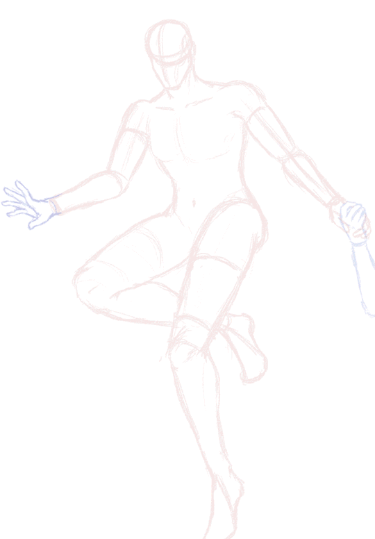
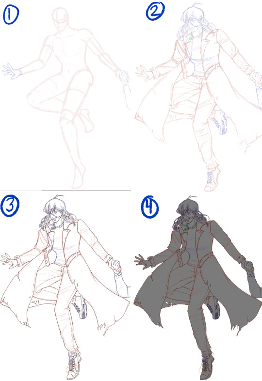
For example for that one og trilogy AA fanart I did recently I only did this very rough sketch here:

and then I went into the lineart already without doing a clean sketch. Or I guess in this case my clean sketch is the lineart lol.
So for this drawing I didnt do any color blocking at all!

I then colored everything in. I usually just pick whatever color feels right so during this step I usually dont even fix much at all unless its super off.
And then I start adding effect layers.
For this one the amount of layers I put on top is very limited as I wasn't trying to do any crazy mood setting so this is what I did:
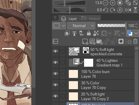

I usually put a light beige color on top of my drawing and then try out various layer settings and copy and paste it and then I play around a little with gradient maps, this purple to orange one being my favourite. Then at the very end I add a paper like texture on top and put it on 50% soft light to get that grainy look.
Since you asked about me doing the color blocking in my wip, I usually do that when I draw something that is more out of my comfort zone to establish the shapes or when my sketch is becoming too incomprehensible for me so I need something to tell things apart.
I hope this was helpful and thank you for the interest in my progress! :]
27 notes
·
View notes
Text
Curious how you guys feel about this! I get a little self conscious about my rougher/looser sketches and sometimes just dont ever clean them up/put them out but I know personally I love other blogs that put out a ton of rough b&w sketches but I feel like my own aren't super readable/as interesting as the more finished ones, what are your guy's thoughts?
For reference here's what i categorize as my "loose" sketch style:

25 notes
·
View notes
Photo
Since I’m still stuck at work and cant do anything, I thought it would be fun to post my drawing process for my semi-serious style, using the latest fanart I did with Edd and Edu but only featuring Edd :3c Maybe one day I’ll make a speedpaint but thats not today.
If you’re curious, one by one below the line + me talking about the process (as best I can)
1. Preliminary sketch. These are my roughs, this is the start after I had my brainstorm and planning phase. I’ve found all my references and did the pose myself as well so I know what it feels like and if its bodily possible.
2. Clean sketch. This is where I loosely put in all the nitty-gritty, where the folds are, details of the hair, etc etc. I change the pencil colour so I can differentiate certain parts.
3. Line art. Like it says on the tin, but for my semi-serious style I tend to avoid lining folds because I prefer to paint them in this style.
4. Grey out. I need this layer so that I don’t get blinded/confused when I lay down the colours,
5. Flats. So all the colours needed, usually when I draw backgrounds they would also depend on the lighting, so I would colorize them if needed, but for standalones I just put in the basic colours.
6. Soft shadows. I tend to use multiply layers for this step, but sometimes I also do normal layers, in case I feel as though the colour should be more relative to its surroundings since multiply wont let me do that. It all depends on how I want the shadows to feel on the piece, but when I’m lazy I just do multiply (lol). Soft shadows also include the colour on the planes of the face, so = yellow for forehead, red for middle, blue for the lower part aka jaw area. Of course also the reds on the skin in other areas like elbows and knees, but since Edd is fully clothed, its just the tip and inner part of his ear, and the tips of his fingers.
7. Hard shadows and minor highlights. For my style, I gear more towards a watercolour style kind of shading, so I follow that principle when I decide where to put and how to render my shadows. Typically I have at minimum 4 layers for this type of hard shadow shading. The minor highlights here are just the lights in the pupil, and a soft large airbrush going over the spaces where shadows cant reach.
8. Missing details and overlay highlights. Near the end I put in all the little details I missed, so in here its Edd’s 5 o’clock shadow, and some scuffs and scrapes on his clothing and shoes. The overlay highlights are super subtle but make the drawing feel a bit more alive, for me at least, these highlights are the ones on the “bumps” of the clothing folds, and the hair highlights.
9. Hard highlights and atmospheric lights. The finale! This is where I just put in the brighter, harder, highlights in places they should be, and then clip a Luminosity/Overlay layer on top of the entire drawing, using a large soft brush I go over the drawing to put a bit more brightness into it.
And there! Thats how I render in my semi-serious artstyle. But...eh, dont be fooled, I know this step by step makes it look like I would jump around all the parts of the drawing and render things equally, sadly thats far from the truth. My perfectionism flares up badly and it often leads to me obsessing over a singular part before moving on, so the process would look more like this:
yeah......
19 notes
·
View notes
Note
what program do you use to do animations? ive been wanting to get into it but im not sure how and i know you draw in photoshop which i do too. thanks!!!
it really depends!! for longer stuff, i use adobe animate, just because photoshop tends to start chugging if i do animations longer than like, 20-ish frames. I do all the compositing and tweening for my animation memes in animate as well.

in addition to roughing frame-by frame stuff for my animation memes, (such as tirona's dance for the fortnite one haha) i like to do sketching/doodly animations, like this lil kitty, in photoshop, since it feels most organic drawing-wise to me. BUT, photoshop animation is a bit tricky, and deff opaque to anyone whos never done it before. heres a basic guide, under a cut cuz it got long LOL
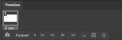
create a new canvas. you can do whatever resolution you want but keep in mind, larger canvases will lag more. i do 1920x1080. if you select window>timeline, a new menu will pop up at the bottom of the photoshop interface
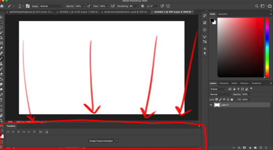
you'll notice a dropdown menu, that has two options: "create video timeline" and "create frame animation". i use create frame animation , just because it's more fitting for what i do.
selecting that option will give you a timeline with frames and everything! each frame's delay can be chosen individually. during playback in photoshop, it will play a little slower than the actual speed when exported as a gif, so keep that in mind
i would advise you to think of layers (or layer groups, if you plan on cleaning up and coloring) as frames for this. a layer's position, visibility, and style can change from frame to frame.
pay attention to these following options, they will appear over your layers menu on the far right once you create an animation timeline.
Unify: can be applied to position, visibility, and layer effects. it will change all the other frames to match what the layer is like in your currently selected frame.
Propogate frame 1: if this box is checked, any position, style, or visibility changes made to a layer on frame 1 will be applied to all the frames. unchecking it disables this.

editing a layer with the eraser or brush (or any other tool) will apply the changes to every single frame. so to create the next pose, you will have to go to the next frame, hide the first layer, and draw the next pose on a new layer. I've colored the layers in 2 different colors here for clarity.
the blue is layer 1, and the red is layer 2. on the first frame, i will make layer 2 (the red pose) invisible and leave layer 1 (the blue pose) visible, and then on the second frame i do the reverse. You kind of have to do this manually for every single frame, so it gets a bit arduous if you have more than like 7 or 8 poses.
AND, exporting as a gif is also ridiculously silly and opaque too. go to file > export > save for web (legacy)


that will bring up this menu that is super complicated. the only stuff you really need to pay attention to is near the bottom, as everything else will work just fine on default settings (i've never messed with them in the 9-10 years ive been animating in photoshop, lol)
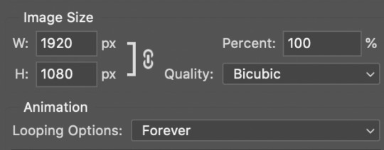
down towards the bottom you can change the export size, which is useful if you drew it on a big canvas but dont want the gif file to be enormous. also, you can choose how many times it loops. i usually just keep it on "forever", so i can watch it over and over again lol
and finally, make sure you click "save" and NOT "done". if you click done.. it does not export the file. i will not tell u how many times ive been in speed mode and click "done" and then get frustrated when the file dosnt appear in my folder. i am not smart.
anyways hopefully this is helpful.. ive been using ps so long i have extreme tunnel vision re: mentally filtering out all the useless extra stuff in photoshop's interface so i have no idea if this is confusing or not to someone who's never done it before. if you have more questions just let me know!!
76 notes
·
View notes
Note
the way u draw faces is so lovely & distinctive!! especially the blushes... do u have any tips to share? :D
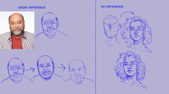
so i change my process for when i use a reference vs when i dont-- (more)
using reference- so with my iroh, i still need practice drawing older, wider faces so i rely on a reference (this case, being paul sun-hyung lee) i know a lot of people don’t like using references bc they feel it weakens artist integrity and i get that! but as someone who does this for free i find it super helpful when i have characters that challenge me, bc i rather use a reference and have iroh look like paul sun-hyung lee than not, and have iroh look skinny, ya feel? eventually, when i’ve drawn the character enough, i begin to move farther and farther away from the reference and incorporate more of my own design.
anyway, rant over: i begin by breaking down the shapes, starting with the forehead and working down. the forehead here is a pointed pentagon, that goes into a thick brow line. i separate the brow line from the eye line (i know not everyone does) because of how much i rely on brows for expression. i mark the beginning, the point of the arch, and the end. then i rough out the cage for the nose (see here) and use that as a point of reference for the cheeks. paul has round cheeks, so i sketch those in circles-- the bottom of which marks the beginning of the beard.
from those shapes, i define the features - eyes, lips, nostrils -- i do this all on the existing sketch. THEN, i start a new layer and draw those final lines from scratch, using that 1st sketch as a guide.
not using references is a much easier process for me. again, i begin with shapes but far, far fewer. i use an oval to determine the width of the skull and the height of the forehead. the bottom of that oval is the beginning of the eye rectangle, and then i determine the bottom with another line. i also sketch the length of the nose with a simple square and define the cheekbones. ive been drawing for so long and i draw pretty fast, that i’ve found these are the only lines i need to sculpt out a face. then, i can draw the rest of the features in loosely.
the biggest difference is also, i do not use a new layer for my final lines. i like how messy and story book my style is, so i usually don’t do a new sketch layer for the lines-- instead, i clean that first sketch up. again, i know this isn’t for everyone, but what works for me and i love it!
(for how i do blush, i have a coloring tutorial that is not that old! i also have a tutorial tag for some other tips)
i hope this made sense -- ive never been an artist with a well defined process, so its always hard for me when i have to put it into words lmaoo i mostly just trust where my hand takes me, which sounds pretentious lmao
#tutorial#this is super super super quick so im sorry!#i will do a more defined face tutorial later#im working on one#but here's a bare bones description bc i get asked this a lot!#ask#anon#not art#long post#read more#art response
846 notes
·
View notes
Note
hi wilt, sorry if this is a weird ask, but do you have any advice on working faster? ive been drawing for a while, but i feel like even relatively simple things take me a long time to do well compared 2 other people. But whenever I try and force myself to work faster, i think my art suffers for it. I'm just drawing for myself rn, so there's no outside pressure or anything, im just unsure how to draw/paint faster without sacrificing the quality of what i'm working on.
i can speak from my personal experience, at the very least!
first off i want to preface that taking longer than other people to make art isnt a bad thing at all. some artists that i admire a lot have said that they take days or weeks or even months to make a single art piece. the fast paced pressure of being a modern ‘social media artist’ does us more harm than good, i think. and there’s really nothing wrong at all about taking your time, especially if you like your art better when you go at your own pace.
personally i have gotten significantly faster at art over the past 3 years, but that wasnt ever actually my intention. in fact my goal was just to simplify my sketches to make the whole process easier on my hand. but by simplifying my sketches, i ended up cutting back severely on the amount of time it would normally take to overwork and cleanup my sketches, as well as reducing the amount of time i needed to clean up my work while coloring. so it became a positive side effect of my original goal, rather than my main focus.
for example, this is what my sketches looked like in 2016
i would spend so much time and effort on them that i would often end up just using the sketch as lineart and coloring underneath.

lots of artists do this, and it isnt bad at all! but this was very stressful on my hand. i literally got tendonitis so bad i had to see a physical therapist and rethink my whole life, and i was hardly able to make actual paintings because it would take so long and the rendering/cleanup process was hell. in 2017 i tried to mitigate the problem by letting myself be messy in both the sketch + painting process. thus the start of the wiggly era.
but it wasnt enough. i still didnt like how much time i was spending on cleanup/rendering. so began my 2018 journey to simplify my sketches and i forced myself to do this by completely removing my ability to use pen pressure by using the binary tool. i also started laying down silhouettes first, which is something i still do to this day.
i’ll admit it was a rough period of time, but i kept at it! i liked how i had more freedom and maneuverability with the painting phase. and eventually i adapted to it and became more comfortable with it and my art started to look and feel decent again.
i became so comfortable with it that i decided it was time to set aside the binary tool and go back to my good old friend the marker tool, because i missed having the ability to make sketches that looked good on their own too. but by now i had the ability to quickly and effectively make sketches that held the bare minimum information i needed to work with.

and right now im really happy with my current art process. its super flexible and im satisfied with splitting up my time as 10% sketch 90% color/painting. plus my hand pain is at an all time minimum! so i guess what im trying to say with all this is that as long as you’re happy with your process and your art, it doesn’t matter how slow or fast you are. if you’re not happy with your process, then by all means try new things. but i dont think speed is in any way an indicator of skill.
“im just unsure how to draw/paint faster without sacrificing the quality of what i'm working on.”
if you dont want to change the way your art looks then there’s no need to force the issue. but if you are still interested in trying to speed up your work, there will most definitely be a dip in quality for a while while you figure things out and learn new techniques, as i think ive shown with my journey. but that dip will be temporary.
as far as how to speed up your work, ive only shown my approach to it and there’s dozens of different ways to do it. some people force themselves to do 5 min / 1 min / 30 second figure studies. other people use multiply/overlay effects to speed up the coloring process. its a highly personal matter and i would recommend asking other artists or looking up tutorials! best of luck and i hope this helps in some small way.
451 notes
·
View notes
Note
what brush do you use for your lineart? it looks so good ;;
AAHDSHD;;;; TYSM FOR ASKING IK THIS IS A SIMPLE QUESTION BUT I WILL USE ANY CHANCE I GET 2 RAMBLE ABT ART TECHNIQUE & WHATEVER BC ITS MY FAVE FUCKING THING IN THIS WHOLE WIDE WORLD
My brushes r actually quite simple !!!!!!! I built them to compliment my very freehand/sketch style. If someone is interested, feel free to ask, I can check how to make them downloadable/whatever, but really I have just a couple things that I focus on when it comes to them!!!
Square tip. I use one in CSP called quadrado, I think its in the original set, I'll have to check that out later? But yeah I feel a square tip allows for some fun angular spots to really come through !!! This is also super popular in painting I think, angles & sharp edges r super important there
Shape dynamics. The super basic stuff. I have two main brushes; my basic square, which is for draw flow stuff, and a rough square, which i mostly use to fill in bigger areas / do some extra shading with. My basic square has more flexibility (a bigger range, a lower minimun value) and the rougher one is less flexable and most of the time chunky.
Density. I find density options more appealing to me compared to opacity, but I cant tell why? exactly???? yk???? But yeah. Again, basic square has more flexibility, and rougher less. I find the flexibility & range in my basic brush SUPER important, since i like sketching within my linework and erasing it away/cleaning it up. (difficult to explain- if someone wants a video feel free to ask)
Basically:
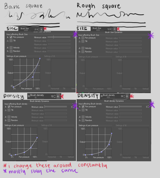
oSoOther settings go a bit more into semantics. I also use a blender tool to sometimes soften areas, and often my eraser is set to erasing on all layers so I can kinda build my linework ON my sketch layer and use it in the back as some extra flow.
My current style of drawing is inspired by som rly specific artists that I can talk abt if someone wants 2 hear. I do intend to experiment w stronger lines, im just a wuss and like all... squishy stuff ; v ;
U DIDNT ASK, but again bc i just loooove rambling abt this shit, some additional things that have personally helped me w linework!!!
Those super basic linework practices !!! Just drawing straight lines endlessly, drawing a squicle and trying to replicate it now w a slower stroke
Forcing urself to sketch fast; croquis !!!! I recommend croquis cafe for anyone looking to do this kinda stuff online, its GREAT. Just focus on the time, not how good the sketch is. Croquis is FANTASTIC. it helps u develop muscle memory for unique strokes, develop understanding of what u need to pay attention to (are you paying attention to shadow, light, where the weight of the body is, the squished parts, the stretched out parts, the skin, the muscle, the hair, etc) (ive personally done sessions just focusing on darkest shadow, midtone shadow etc, or light, or the stretched out parts, or just like, a few lines to give the idea of the pose ((eg 5 sec croquis)) ((tho i havent seen those in any web stuff, i had a class where we had those and they were fantastic))) anyways DO CROQUIS AND ALLOW URSELF 2 SUCK AT IT DO IT UNTIL UR HAND HURTS AND UR HEAD HURTS (dont actually do that please) (drink water, take breaks, stretch ur hand)
Warmups !!! before i take on a serious linework, I ALWAYS DO WARMUPS. Some lighter line stuff, flowier line stuff. I often do croquis for this. If i dont do this i get more severe hand cramps, because.... yeah
Traditional sketches w different pens. Preferably ones that u cant erase. Kinda similiarly to croquis, this is super good to just develop more confidence w ur lines. U cant go back and erase them so... U just have to learn to get them right. Im bolding this bcs this is probably the one tip i heard that has helped me the most. All my traditional sketches w pens r ugly as hell but they seriously have helped me so much to get some more freedom and have more fun when drawing & not worry all the time, and its made the process way more enjoyable !!!!
Also please take breaks and stretch ur hand !!! THeres a lot of good guides for artists to stretch their hands :> Seriously. Take care of urself.
#ask#anonymous#u thot u could just ask me for my brushes u wrong !!!#*infodumps*#i fucking#love art process#I k u didnt ask but this stuff is so exiting to me
89 notes
·
View notes
Note
have you ever recorded your process/are willing to share the steps u take to complete a piece? i love your art nd am super curious!! thank u, dont feel pressured to even answer this if you dont want to
hello, i'm honored that someone was curious about my process :O thank you for the ask!
i don't really have a set process since i like to experiment a lot with my art, but i can provide a brief run through of what i tend to go for in a piece!
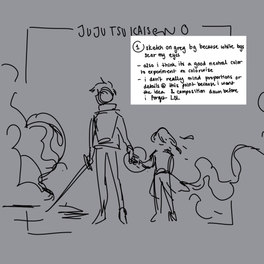
1. sketch on grey bg because white bgs sear my eyes
- also i think its a good neutral color to experiment on, colorwise
- i don't really mind proportions or details @ this point because i want the idea & composition down before i forget LOL
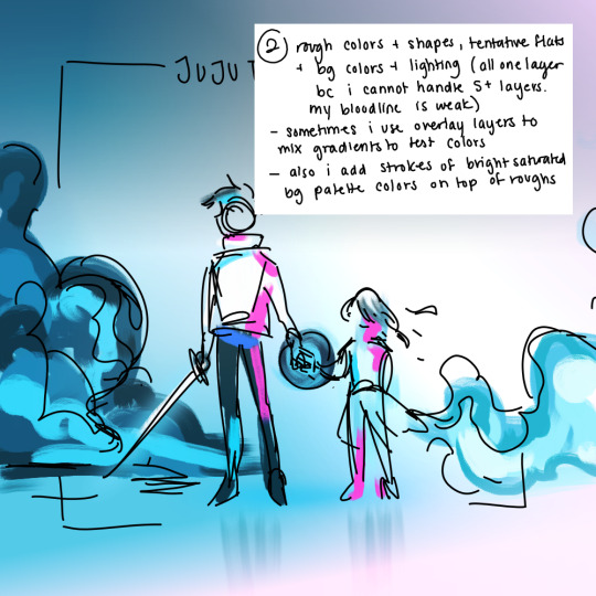
2. rough colors + shapes, tentative flats + bg colors + lighting (all one layer bc i cannot handle 5+ layers. my bloodline is weak)
- sometimes i use overlay layers to mix gradients to test colors (for this one it was pastel blue/pink)
- also i add strokes of bright saturated bg palette colors on top of roughs (for highlights)


3. lineart using an edited medibang marker brush (either marker or marker 2, i can't remember)
- i scribble in shapes during lineart for higher contrast and fun textures :)

4. i color by filling in random shapes (within the lineart or otherwise) using the same brush. takes forever but i like the texture. i don't paint over already colored areas to preserve that texture
5. i add bright strokes of color for some contrast :)
not shown is the time that i leave the piece alone to come back later with fresh eyes to check over any details on coloring or lighting! i might recolor the lineart/add noise filters/mark extra details/clean up certain sections.. i think a lot of my art is based off "feeling" the right idea rather then any sort of logic, bc i can confidently say i have no idea how to apply color theory or proper composition LOL i just like bright colors and shapes that contrast each other
hopefully this answered ur question... thank u again, i really appreciated ur ask 💖 have a nice day anon!
#soap speech bubble#art process#my art process really changes depending on how awake i am... hopefully i remembered to put everything i usually do 😪#this is so messy im sorry anon LOL
17 notes
·
View notes
Text
Honestly the amount of people who say artists and writers should do stuff for free, or try to rip them off on comissions still royally piss me off.
I think the worst part of it is the entitlement, I dont want to make this too much about generations but a lot of commissioners are millenial/Gen z's who grew up on the "steal and pirate everything" mentality, take everything that you can because no one else is going to hand it to you. which I can get behind, when you are screwing over MULTI BILLION DOLLAR COMPANIES. NOT THE STRUGGLING ARTISTS AND WRITERS who are trying to keep food on the table as desperately as you probably are!
It's simple, you wouldn't walk into a restaurant, order food and tell the server "sorry I don't have any money, but I've got like a few thousand followers on social media, I can get your name out there, get the restaurant some exposure" NO! They don't need "exposure" they need you to pay the damn bill!
On top of that, most of these artists and writers ALREADY HAVE FOLLOWINGS. They already have thousands of people following them, waiting for the chance to get a commission, who are willing to pay for said commission, they don't need "exposure" when they're already out there! He'll even the artists and writers with a few hundred don't need it, they'll get more followers as time goes by, their skill alone will see to it.
And what is with people trying to get free art and writing? It's not going to work! You can't harass someone until they cave, trust me, you'll be long since blocked before you even have the opportunity. I don't do comissions, online anyways, but my own friends and family, people who actually know me STILL PAY ME whenever they ask for me to do art for them because they KNOW it takes TIME AND EFFORT.
How many times do we need to have this discussion???? Like when is it going to finally click that people who need to pay their bills just as much as you do AREN'T going to do this shit for free!?
Here's the thing about art and writing, that you've heard a billion times but still aren't getting; IT. TAKES. TIME. AND. EFFORT. TO. GET. DONE. the art isn't going to magically appear and the writing isn't going to suddenly write itself, if either were so convenient YOU WOULDNT BE ASKING AN ARTIST OR WRITER IN THE FIRST PLACE!
Look at that, you see that? The first picture I did back in 2012-13, the picture beside it? I did that TWO YEARS AGO. I didn't suddenly know exactly what to do, or had anything close to a god given talent for drawing (I'm not that talented). The first picture WAS THE ABSOLUTE BEST I COULD DO AT THE TIME THAT I MADE IT. In the time between these two drawings I admittedly took a break from art, but then I got back into it four years ago. EVEN STILL that was four YEARS of starting over from the basics, relearning everything, learning new things, wanting to actually improve my art.
Which, guess what, DID NOT HAPPEN OVER NIGHT. It was HOURS UPON HOURS of my limited free time as an adult drawing over and over and over and over again, every single goddamn day to get to the point that I was able to make that redraw look as good as it does in comparison. He'll, my art now puts them both to shame! Because I spent the time improving my quality!!
Now look at these artists doing comissions, they've probably put EVEN MORE of their time to get that good! They've put in LITERAL YEARS of sweat, blood, tears, frustrations and dedicated hardwork. Some did the same as me, self teaching and lots of practice, others probably had to go to school, which definitely wasn't cheap. But all of us put in that time and effort TO REACH THESE POINTS. Of being better artists, developing our styles, getting faster at drawing.
And maybe you think that this is super easy, right? That I or every other artist can just fire some art off and boom its good and done in like an hour?
FUCK. NO.
Even now it takes me several hours a day OVER MANY DAYS to make something exceptionally good! It doesn't matter how good an artist is, it still. Takes. Time.
Maybe the issue is that you don't understand how much actually goes into art, let me break it down for you, the steps that most people follow to finish ONE drawing.
-Rough draft: general character outline, get a feel for what I want to draw.
-Rough sketch: I start doing a bit of pencil to start filling in details like mouth, nose, eyes, hair, clothes. Ect.
-Penciling: I go over the rough sketch and clean everything up, maybe do some editing, this is when you can start making out all the details.
-Ink: I trace over the finished pencil with a pen tool and actually have the line art, everything looks clean, presentable, it actually looks like a character now. I'll spend time editing this and possibly redoing the inking many times over to get to a point where I like it.
-Flat color: I decide on which colors to use for skin tone, clothes accessories. Ect.
-Shading/highlights: I figure out where my light source is and how strong it is, I then apply the correct amount of lighting and shadows to the color to give it depth, I also have determine the texture of skin, clothes and accessories to make everything look real and natural.
-Blending: I smooth out the shading and highlights so that it looks more natural and isn't too hard (noticeable difference between color) so that it looks as natural as possible.
-Finish: I go over last minute details, finish any editing or corrections that need to be done. Once it's good I call it a day.
Each process is longer in length then the previous, with the exception of the final editing (as long as everything looks good) and even the rough draft can take some time. Over all this is SEVERAL HOURS of work for a SINGLE DRAWING.
So is it sinking in yet? How much is put into doing even a single character drawing? God forbid if its done with background. This isn't a "scratch a pen around and be done with it in ten minutes" kinda deal, no, this is SEVERAL HOURS OF SOMEONES LIFE BEING PUT INTO THIS
And if you still have the AUDACITY to try and wrangle free art from an artist then there's no helping you, you're just a selfish piece of shit, no question and I want nothing to do with you.
Someone might say "But I got free art/writing from.-" look I don't give a shit if someone did something for you THAT ONE TIME, these other artists and writers? Totally seperate and different people. You're one freebie experience does not, and should not apply to other artists and writers.
"But what if I really want this commission but don't have the money right now?" Well, that's tough shit. Save up and properly commission them when you can, it's not their problem.
"But what if I'm in a really bad financial situation and really want it?" That sucks, and I'm sorry, but again, not their problem. Chances are this is their only source of income and they need to make money so that they don't end up in a similar situation.
"They have a gift! They should share it!" What kind of cheap ass- LOOK, just because someone is talented or really good at something does not automatically obligate them to do anything for total strangers in anyway shape or form. These are living, breathing people, the same as you. They need to eat, they need to pay rent/mortgages, they need to pay vet bills, send their kids to college, do their taxes and everything else that YOU YOURSELF need to do. Asking anyone to spend their time doing something for free, when that something is how THEY ARE SURVIVING is beyond asinine. Not only that, this obviously isn't a hobby to them, it is very clearly THEIR JOB. Would you want to do a job where you didn't get paid at all? Doing a shit ton of work for absolutely nothing? No? Didn't think so.
"It shouldn't be about the money!" Well unfortunately, as with almost every other job, it is. We live in a world where we desperately need to make money in order to survive. That's the painful fact of the matter. If money never had to be an issue ever again then this would be a very different story. But it's not, plain and simple as can be.
Look, these people are just like you, artists and writers who are just trying to get by in a shitty ass world, using the one thing they have that let's them have an income. Leave them be, don't try and trick them, guilt them, or cuss them out when you don't get your way. Either properly comission or leave them the hell alone, plain and simple.
2 notes
·
View notes
Text
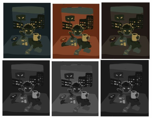
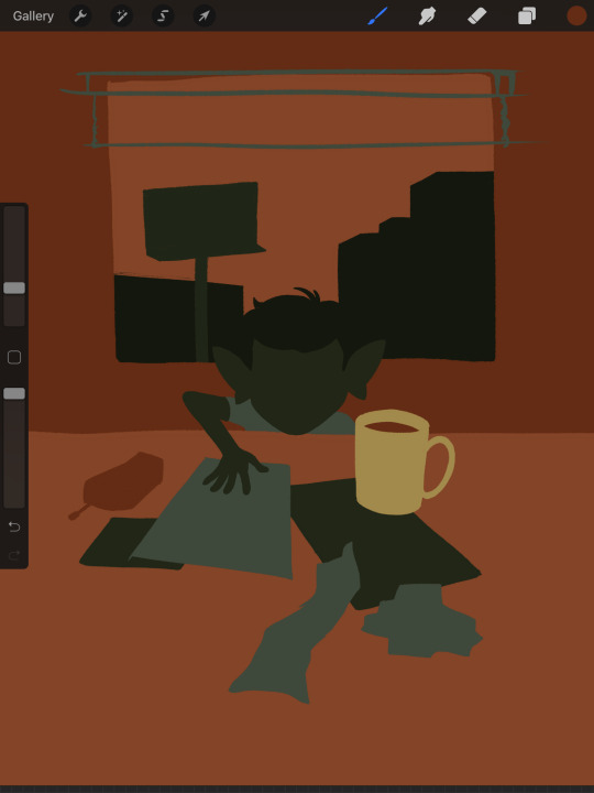
My approach to flat colors + limited palette drawings
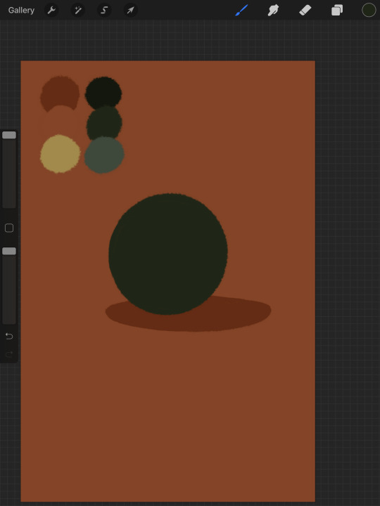
This is a follow up to this post i made about how i go about figuring out a color palette for my limited palette drawings. an anon asked me about my actual technique of finishing them so this is gonna be an explanation of how I work in a limited palette with flat colors. I ended up with these thumbnails for a sketch last time so we’re gonna work from here and I’m gonna sort of walk through how i got to the finished version

first things first: every part of this process is just developed as a result of me messing around. take my advice with a grain of salt and if you think you know a way to do something better/that makes you more comfortable. go with that over what I say.
I’m honestly a little surprised when people express confusion about how i draw like this because it’s SUPER simple - literally all you’re doing is just stacking solid color blocks of shape. its very imprecise despite how sharp everything ends up looking.
First things first is that you want to decide how you will be handling your edges throughout the duration. Do you want your shapes to be ultra-sharp and precise, or do you want a little bit of a wobblier, grainier edge? Both can look good but it’s VERY much a matter of situational basis. i’ve been favoring looser and grainier shapes so that’s how i’m going to be working on this.
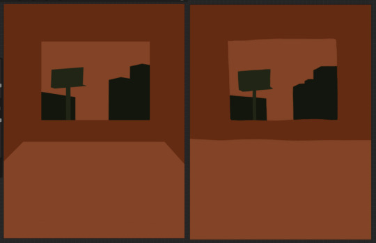
on the left here, you can see the shapes made with precise rectangular selections and an untextured pen, on the right, freehand drawn shapes and a grittier pen. There’s something immediately pretty different feeling about them. So play around with that first - its not something that’s fun to change halfway through! But lets step back a minute. It helps to work large to small. The two biggest shapes here are these orange chunks and everything gets stacked on top of them so i’m gonna do that first.
Now, a key feature of what i do: clipping masks. almost all digital art programs have them. What a clipping mask does is it constrains the pixels of a layer to the transparency of the layer below it. Here I have the light orange layer, and then on top of it the buildings and billboard are clipped to the orange. Most of you probably already know this and I’m overexplaining a bit, but there was a time when i didnt know how clipping layers worked and someone had to explain it to me.

now you’ll notice the shapes of the buildings are rough, and sloppy. here’s the fun part: since this is all about stacking shapes, only your exterior edges matter. this all gets filled in. be as sloppy as you want when you’re making your shapes. in fact, the outside edges get trimmed out a bunch to when i do this - i go in and erase them clean. Don’t be too finnicky about drawing perfect and precise! its a waste of time. As long as the silhouette is what you want, the interior can be a nightmare.
Working this way, it’s important to keep your layers stacked in a way you can make sense of. Right now there are four layers here: the background dark orange, the two main orange rectangle shapes, and then the buildings on one layer and a billboard on the other. I rack up a LOT of layers doing this and it makes it annoying in some aspects, but being able to freely recolor any one chunk without losing my detail is a key aspect of this.
So, I block those out
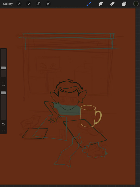
Next, I do the same for the smaller chunks that are still main shapes. There are once again, a lot of layers here. The top layer is the hair - you can see the head showing through it. The head and arm underneath the hair, same layer. Then the cup. Then the light green pieces of paper. Then the dark green ones.
The cup is technically farther forward than the head and arm so you would think it’d go on top, but the point isnt to recreate the foreground and background hierarchy with layers so much as it is to group things in a way i can work with. The cup goes underneath so it can be grouped with all the other objects on the table.
now, i just go and fill in all the shapes. i forgot to do the blinds but i get them later. you might notice a lot of these shapes are pretty rough, which was harder to notice before they were filled in. Now that I can see better, I go in with an eraser and clean up the edges until they’re the shape I want

sometimes erasing leaves little bits of ‘noise’ around objects like on this napkin here. i like to keep a little bit of this noise for texture, but if you dont like it make sure to get rid of it! if you’re working very crisp this will stand out a LOT
Next up is to add some detail onto the objects
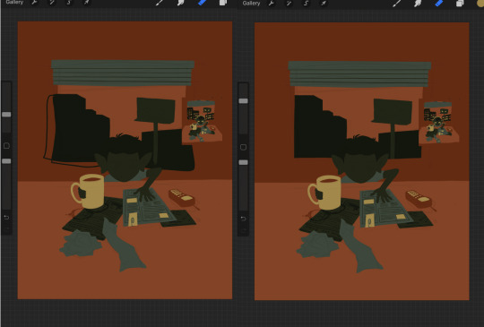
I flipped the canvas here because the head shape was wrong - the ears were uneven and i wanted to fix it. I want to go about adding detail onto the billboard and buildings. i do all detail with clipping masks - but the objects are clipped to another layer and so nothing can be clipped to them. instead, i unclip them and just erase by selection for the same effect
all of the text on the papers is clipped to the papers below it. the buttons are clipped to the phone. the yellow photos and card are actually another independent layer on top, in case i want to recolor them separately. im indecisive and end up recoloring things a lot. For the most part these objects are starting to become recognizable as more than just shapes
i go in an add the details on the background and character now. theres some more stuff on the table. the lines of the face and ears are on one layer, and the flats of the eyes below that. Here’s what each group of layers is, and what they look like on their own

The background/bottom chunk. Just the table, window, and shirt.
The middle bit. All the stuff on the table and the blinds.

Finally, the top, which is just his head and arm.
now this stage is the bare bones of the drawing. you can more or less tell everything that’s happening. it reads. but its very much lacking in something - it doesnt have a ton of depth or interest. and adding that additional detailing, the dept and interest, is where stuff starts getting REALLY tricky and subjective.
im gonna take you to a much simpler scenario to show the sort of options i go through at this stage
ahh its our dear friend, sphere casting shadow. this is, more or less, the kind of image we have. you can tell whats happening but it’s lackluster. there are TONSSS of ways frm here that you can go add interior detail to a shape once it has been established. here are some quick and SUPER rough examples
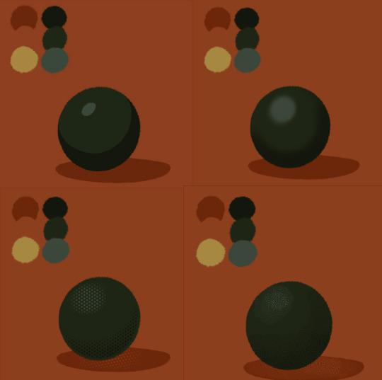
from top left to bottom right: flat cel shading, softer airbrushed/gradient shading, halftone, and a textured brush. Each of these has their strengths and weaknesses. They can also be combined.

for example, here’s the solid cel shading being used to contain a gradient/airbrushed detail. This image - probably the single oldest piece of my art i still willingly show people - is entirely colored with gradients being contained in cel-shaded chunks. It has a sort of soft, luminous quality but without losing its crispness.
here’s a super quick bust with some variations of stuff going on. obviously this is no masterpiece but you see how different types of detailing can interact with each other and be used to distinguish materials too.

With the mob psycho comic I did, the detailing that wasnt line was done using a variety of halftones of different shapes layered on top of each other


by contrast parts of my ace attorney comic use a textured brush and have a sort of blended, papery feel
any of them can work for pretty much anything as long as you are using it with intent. practice around. mix styles of finishing together. find a comfort zone. the more you do it the more intuitive it becomes and at the heart of it this process is a very intuitive way of drawing because of how far removed it is from realism.
Now here is the trick - light and shadow.
Everything up to this point has been very flat and adding detail helps but there’s only so much that can accomplish. To get HEAVY light and shadow you need to think about things differently. I think if there’s any part of this process that’s complicated, its this one.
To truly get the most out of your palette, you need to pick chunks of an image to be in higher/lower light and then either ‘step up’ or ‘step down’ the colors in that chunk. here’s what I mean.
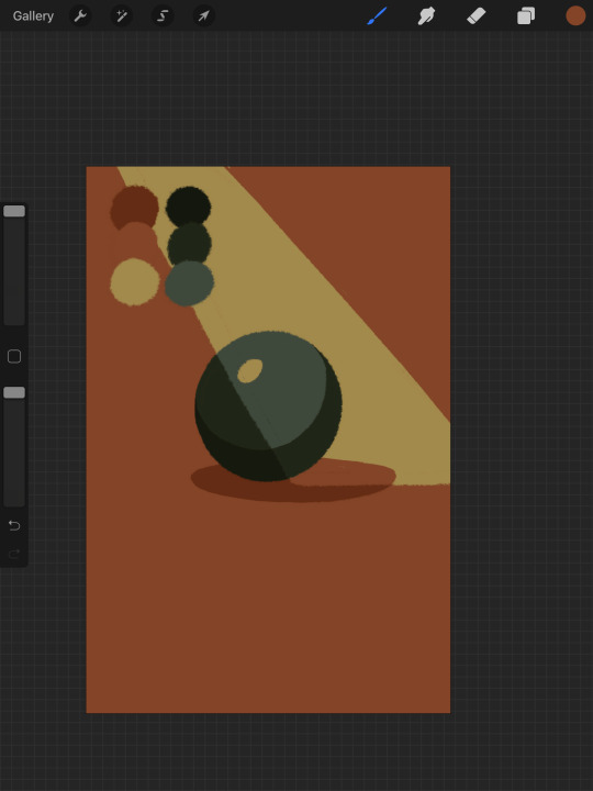
Here’s our ball with a beam of light on it. Everything Within the beam of light is one step in our limited palette lighter than anything outside of it. Here’s how I go about doing this: the shape of the beam of light is below everything else. Then, once I have the shape blocked out, i select it. With that selection in place, i go to EVERY SINGLE LAYER that’s effected, lock the opacity, and recolor that chunk. So what’s going on here is that there is only one more layer - the beam of light, below everything but the background, and the rest of this effect is just caused by every layer above it now being two-toned following the exact same silhouette. THIS is why it’s so important to keep your layers separate - if the shadow and highlight had been painted onto the base directly, i would not be able to do this without significant effort.
This works with all of the finishing techniques I talked about above
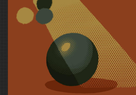
A combination of cel shading and half toning, all stepped up to give the appearance of heavier light on one area.This is also how I go about rendering transparency in this style. All of my layers are fully opaque and I allow the colors to do the work of conveying transparent material

Here’s our ball with the patterned/textured brush shading, being viewed partially through a window
it’s obviously not a very representational way of working, but as long as your audience UNDERSTANDS what you’re trying to convey, then you’re executing it successfully.
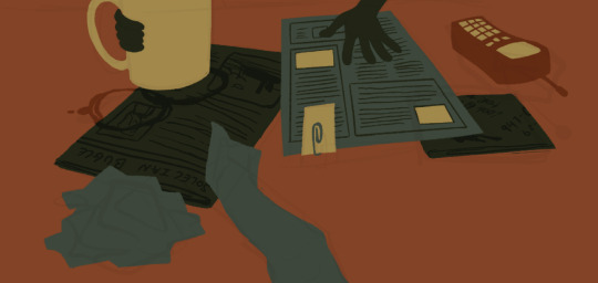
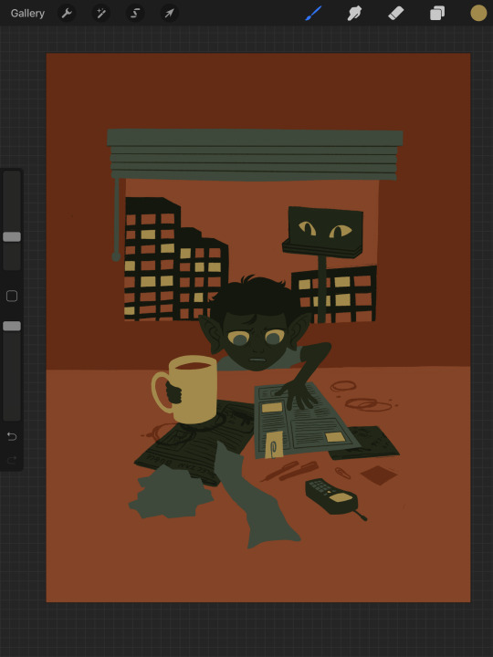
So with that, now we’re gonna go and finish this drawing.
For this one, I decide a big central shadow is necessary. In the original thumbnail, he was backlit, which I still plan on doing, and that wouldn’t make sense without casting a shadow.

I’ve had to change the colors of some objects entirely in order to get this to work right. This is what I mean when I call this an intuitive process - some stuff felt weird, so I changed it. This also involves a bit of problem solving. The newspaper is now unable to be separated from his hand. Sometimes changing the color of an object makes that object look better, but ruins its relationship with the objects around it. It’s up to you to learn how to adjust and finagle things until you get it where you want.The paper he has and the napkin underneath it also all blend together now.
The next few parts of this process are REALLY just trial and error, where I toss a bunch of spaghetti at it until it works. It’s hard to decide what to screenshot, because I don’t know what will or will not be part of the finished drawing. To that end, you can watch the recording of this drawing here. This video isn’t edited at all so it contains a couple of minutes of really shitty sketching, and then all of the color thumbnailing work i did in the last post. Actually getting started on these final colors begins around the two minute mark. It is also sideways, I am sorry I don’t know why.
Now, here you can see where I’ve more or less worked things out. His hand’s not on the cup anymore because my friend pointed out it didnt have an arm attached to it. I added some halftoning to make a gradiating effect in the sky and on the table to give the impression of a sunrise. His eyes are different but as of posting this, I don’t like them and am probably about to go back and change them again. The Cup now has a shadow and some rim lighting. His hand is in shadow. The stain on the napkin is big enough to define the edge of the paper on top of it.
Little things like that.
The more you draw like this the more the way you need to think about your space becomes natural. I hope this helps and I wish you all the best of luck!
117 notes
·
View notes
Text
How To Make a Kitchen Knife
Stage 1: Designing, Steel Cutting
Before you do whatever else, you should think of a plan for your blade. I based my plan off of a few kitchen blades I previously had. I made a few changed like the rakish part by the tip rather than a smooth bend, and Im utilizing an African rosewood called bubinga rather than the dark wood/plastic for the handle piece. Something else, its essentially a similar blade: 1/8 inch thick sharp edge, 5.5 inch handle, 6 inch edge. My first sketch was half-scale on a designing cushion, and afterward I did a full scale one to ensure the size felt right, and so forth As should be obvious, it took me a few attempts to get the handle shape right.
There are additionally a few contrasts in the metal itself. Most importantly I'm utilizing 0-1 device steel, and different blades are spotless, however different blades additionally have some metal rib things at the front of the handle, an element that is difficult to make on the off chance that you are simply utilizing a bit of level bar stock as I did.
When you have your plan, you should arrange or obtain your steel and wood. I purchased my steel from Mcmastercarr.com (I love that site). I got 2" x 1/8" bar stock that was a foot and a half (18") long, I think whenever was $35. I had some piece bubinga (the wood I utilized for the handle) laying around so I utilized that. Additionally, in light of the fact that language is cool, the wood pieces for the handle are actually called scales, recollect that. For the metal handle pins I utilized around 1/4" mellow steel dowel (you can get this at any nice home improvement shop).
Utilizing estimations from my full scale drawing, I scribed my blade diagram onto the steel with a sharpie. Notice how I got steel that was actually the correct size so I didn't need to make numerous cuts. NOTE: If you just have one "valid" straight edge in your steel that you can utilize, make this straight edge the edge, not the spine (the spine = level top edge of blade where you can push down with your hand while slashing watermelon). At the point when you get around to honing, you will perceive any reason why you need as straight an edge as workable for the cutting edge.
Stage 2: Belt Sander Rig, Cleaning Up the Rough Cut
The following stage is to tidy up the cuts, and remove the material right to the sharpie layout. After this progression we will have our last blade shape.
To tidy up the front of the cutting edge (the bend on the edge and the two point cuts on the top by the spine) I utilized a belt sander which I flipped over and zip tied and braced to the work seat. I dont have a genuine belt sander like this one, so I needed to extemporize. I utilized 80 coarseness sand paper for this.
You will get extremely acquainted with this apparatus when you make your blade edge too, so on the off chance that you choose to utilize this rearranged belt sander technique I recommend making it tough.
To tidy up the handle and the back edge of the edge I utilized a drum sander bit on a drill press, a sanding drum on the dremel, and a seat top processor.
Stage 3: Making the Edge
The edge of the blade is the base segment of the cutting edge (the piece of the blade that isn't the handle). Pretty simple, I know, I simply need to be certain all the language is straight. All things considered, since we are grinding away, I'm simply going to list the language:
Handle = part that you snatch
Edge = everything except for the handle
Edge = base piece of the edge, its sharp
Spine = top piece of the edge, inverse the edge
Scales = wood pieces that sandwich the metal in the handle and give the handle some meat to clutch
Pins = the metal dowels that experience the scales and look cool (for this blade they give no auxiliary significance)
Alright since that is cleared up, its opportunity to begin making your edge. The ideal activity here is to eliminate material on the sharp edge so it begins 1/8 inch thick by the spine, and tightens directly with the goal that the width goes to zero at the edge. Duh, isn't that so? As a matter of fact, its harder then it sounds. Props to you in the event that you accomplish this! Mine wound up being around 1/8 inch thick till mostly down, an inch from the spine, THEN it began tightening to an edge. Also, the shape wasn't even direct (straight line from start of tighten to edge), it bended. I didn't stress over it to much until I completed it and took a stab at cutting things like onions and apples. Since the sharp edge gets thick very soon in the cut, as connected to gradually getting thicker as the cut advances, you need to push a ton of the thing you are removing as you cut. This makes it so the cut requires a ton more weight then it should. Thus, in the event that you can, get that tighten quite straight, and make it take up the all out hight of the sharp edge.
In any case, first I denoted the centerline of the edge so I realized where to sand to. In the event that you can copyist it directly in the metal that is better, at that point what I did. I just utilized a bit of tape that ran down the whole edge. On the off chance that you dont put some centerline marker and simply attempt to figure, your edge will presumably wind up screwy and not level. Like, when you put the edge on the cutting board there will be holes, a.k.a. you won't carve completely through certain pieces of the stuff you're cutting. Hitting that centerline on either side with the shape is vital! All things considered, you dont need to go right to the centerline. I left around 1/64" on either side, which gave a 1/32" level area directly at the edge. In the event that you hone right to a fresh sharp edge, it will be demolished when you heat treat your blade, and afterward you should sand it down and restart.
When utilizing the belt sander to eliminate material, consistently point the edge against the heading of the sanding belt. It sounds somewhat strange, yet this is the best approach to do it. To emphasize, you need each bit of sand paper that passes by to initially sand the edge, and afterward the spine.
Stage 4: Making the Scales
I had some extra bubinga from a past task, so I chose to utilize that for the wood scales. Most blades have handles that are .75 ish inches thick, which is 48/64". The metal in the handle is 1/8", so 48/64 less 8/64 is 40/64" of wood. This is partitioned into two scales so each scale should be 20/64" thick. I cut mine around 1/8" or so to enormous so I had some squirm room. Its simple to remove material, its difficult to add it. Continuously blunder on the enormous side! The bit of wood I began with was to enormous so I tore it down on the band saw. I chose two areas which had decent patters and were level on one side (this is significant with regards to sticking the scales to the metal, if the outside of the wood isn't level, the paste won't bond too and you will have less surface zone holding your scales to your blade). At that point I followed the state of the handle onto the bits of wood, and cut and sanded them so they were close. Once more, blunder on the greater side, dont attempt to coordinate the layout of the scales to the metal at this time. In the event that you stand by till they are stuck with the wood hanging out over the metal, its simple to sand down the wood straight up to the metal, it takes into account a very flush, professional looking completion.
When I had the unpleasant handle shape in the scales, I bored 1/4" openings where I needed the pins (I'm utilizing 1/4" metal dowel for the pins). For the interim however, I utilized transitory wood dowels to hold the scales together. I continued to penetrate out the openings in the metal as well. I began with a little pilot touch, and moved to a larger than usual opening so I would have some space to play with when it came to adjusting the scales and sticking. On the off chance that you have a feeling that you definitely know precisely how you need to adjust the scales on the metal, don't hesitate to utilize the best possible size boring tool for the 1/4" pins.
Stage 6: Heat Treating the Blade
Like I stated, the metal I began with is B95, and we need something between a C55-C60. This is a decent hardness for a utility kitchen blade. Hard enough that it keeps an edge, however not to hard that it snaps under tension, it will simply curve and flex a bit. As an examination, blades are commonly too hard and overly fragile with a higher rockwell tackle. You never need to hone them cause they keep an edge perpetually, however they chip without any problem. Then again, excoriating blades are a lot milder and in this manner super bendy, however require successive honing.
Due to the compound structure of steel, you can just dependably solidify steel to its greatest saddle. Along these lines, what you need to do is solidify the blade however much as could reasonably be expected, which makes it about a C65 on the rockwell scale, and afterward you relax it by treating it. Its a lot simpler to dependably temper to various outfits then it is to solidify it to various hardnesses.
To solidify the steel you should initially warm it up to around 1500 degrees F and afterward rapidly chill it off. At the point when you heat it, you are changing the translucent structure inside the steel, and when you cool it rapidly you "lock" that structure set up. On the off chance that you let the hot metal cool gradually (by, state, simply forgetting about it at room temperature), at that point the structure you have made by warming it up will gradually change once again into its underlying structure: a lot gentler structure. By rapidly lowering the hot steel into something with a great deal of warm mass, similar to room temperature oil, the steel will cool [almost] to the touch in a few seconds. This "extinguishing", as its called, keeps that translucent structure from changing once again into what it was previously, it secures it as it were.
To temper the steel you need to warm it up to around 500 F, let it 'splash' at that temperature for 20 or so minutes, at that point let it cool gradually. This low-temperature measure gives you considerably more command over how much the compound structure of the steel changes once more into that gentler arrangement, on the grounds that the steel changes much more slow at lower temperatures. Typically one 'douse' at 500 F for 20 minutes is sufficient to bring the hardness down from a C65 to a C55 or C60 for full information Visit here.
1 note
·
View note
Photo
it’s been a while but here’s another batch of asks!! thank you for sending them in

photoshop and a wacom cintiq! i’ve had it since 2016 and i love it very much
thank you!!! hmm i’m not sure if i have any tricks to it, but i think that getting in the bnha fandom has been the best thing for my art and motivation in a long time. having a passion for something helps a lot! i kind of have a problem on the opposite end where i get too excited about drawing and draw hours into the night, which isn’t good for my health;;
something that works for my art process is gathering all my drawing ideas and cool reference pics on my phone and then sketching whatever i feel like sketching! it helps so that i always have different things to draw and i don’t feel obligated to force myself into finishing a piece if it’s just not working, but it also means i have a bunch of months old wips lying around ahaha
i still get artblocked though, i think that’s goes for everyone. when it feels like nothing’s coming out right in a drawing i’ll go work on a different wip, doodle silly things i’m not going to post anywhere, or go take a walk/watch some videos/read a webcomic and return when i’m feeling up for it
for your other question i don’t think i’ve ever had trouble with confidence posting things, even at the beginning where i wasn’t very good haha. it could be helpful to think of it as just posting for yourself to document all your artwork, and think of positive feedback as a bonus!
usually i’ll get stuff from google images, but sometimes i take my own! nothing fancy, just setting up my phone camera on a timer and taking a pic if i need a pose reference
i look really weird doing it jgfdsf but it’s very helpful
i think people think of it different ways but i use it to describe the clean up stage! like in this post for example –– first i start with a rough sketch, color it with flat colors and sometimes a bit of shading, and then merge the layers and start defining areas, redrawing lines, adding filters. it’s easier for me to start with different layers so that i can fix stuff quickly, and then begin rendering with the final touches on a single layer when different layers become more troublesome than useful

ahh i’m probably not the best person to ask because i focus a lot more on deku :’) i think bakugou’s still very immature but he’s getting there? maybe? i’d have to reread
i’m glad his classmates at UA aren’t totally accepting of his behavior like his middle school lackeys, hopefully that helps him grow up a bit. i haven’t watched all of naruto but something that bothered me was how everyone took sasuke seriously even when he was being ridiculous. someone please make fun of this dude and his terrible judgment,,
for me bakugou’s in this weird grey area where his actions are too exaggerated to really think of him as a real person and seriously analyze his character (which sounds silly because they’re all cartoon characters, i hope this makes sense haha) so the way i depict bakugou and his relationship with midoriya + his classmates is more jokingly, or maybe idealized? idk i think this is a complicated way for me to say that i like to draw comics that make fun of bakugou HGFJH (which is probably why i like bakusquad stuff the most out of all bakugou content)
i’d really like a scene where bakugou apologizes or directly faces the consequences of how he treated midoriya but i have the feeling we’re not going to see that;; he’s probably going to stay a bit of a turd for the rest of bnha
also since i think it’s relevant to my thoughts about their dynamic, here are the tags from my last drawing of them! #edit: i got a few messages asking me if i ship bakudeku and i dont. sorry to mislead!! #i drew them more friendly than usual which is probably the closest i’ll get to actual ship content #to be honest i don’t draw even the few pairings i do like more explicitly romantic than them standing next to each other bhfjgh #drawing romance is usually less fun than drawing people doing friend stuff #or in this case #bakugou getting bullied by a pomeranian

ahh i’m actually wondering that myself :’) i think the big question is whether to go for a company that handles most of the work themselves and gives you a bit of profit, or open a store yourself and have to spend time packaging your own things. i’d really love to do the latter since i want to be able to control the quality, but i’m not sure if i have the time to manage it the way i’d like

not currently but i finished the ones i already had, so possibly in the near future! the last time i opened them was just on instagram, so i’ll remember to let you guys know here as well :D
@madeline-makes-stuff i’m not super active on discord but i’m in this bnha art server!

ahh i feel kind of weird talking about follower counts so probably no raffles or events like that, sorry;;
i’m currently attending carnegie mellon university in their school of art!! northeastern is pretty close to my home though so i’m familiar with it –– i was actually accepted there as a game design major and they sent me some valentines candy in a husky box, it was really sweet :’)

aw i haven’t listened to any episodes in a while but it’s still very dear to me! i’m planning to draw some taz this month B) i love all the stuff the mcelroys make, especially monster factory!
and that’s it for now!! also wanted to say thank you so much everyone for your kind asks, they’re all really appreciated HFJGHF;; i keep them all in my inbox and in my heart
#ocs#i'm sorry this has taken so long ghdjg#they've been piling up#maybe i'll stop doing the batch system ? or stop putting so much effort into the drawings i post them with because it takes so long :')#if i didn't see your question please feel free to message me!!#or check my about or previous asks since there were a couple repeats#asks#art questions tag#my art#Anonymous#fin
759 notes
·
View notes
Note
Sorry to be a bother again but I was wondering if you have any tips for drawing clothes and folds and such. I have a super hard time with that. I also wanted to ask how one should go about drawing if one is in a situation where they don't have any pose refs. Like, how should someone draw a pose from their brain? Sorry for polluting your blog with boring asks, you don't have to answer or put it up. I feel like it would ruin your blog. I'm sorry. I want to draw like you too
asfjjhk omg its okay shh dont worry about it !!!!! I don’t really care for blog aesthetics whatsoever so it’s ok!!!
erm, Im unsure how to answer this, but lemme draw a thing and post the process under readmore? I hope it helps (:3;;
a 3 sec sketch; basically outlines what the pic will look like; sort of lik a gesture drawing!
I usually skip right to drawing the skeletal base drawing, but it helps to understand how to simplify the body parts. This is how I break the body down to make it easier for me to digest and draw.

when you can simplify the body down like this, you can easily deconstruct photos/references! when you have a repertoire of poses in your mind after studying a lot of poses, that kind of stuff become easier to draw from your mind cus you’ve drawn it before.
disclaimer: “anatomically” correct is really subjective; some artists will bend anatomy, as such, not every human has the same anatomical body proportions, so that’s really up to you to decide. (Ive never done art school so Im not the person to ask about this.)

I start loose and then slowly tighten the details all around. Work on drawing holistically (keeping in mind your entire picture) rather than zooming in and working on one part to another.
ok, back to my sketch;
since ive already defined the person’s body structure, I skip right to drawing the clothes on top of them; some ppl will actually draw the body structure neatly before they put clothes on them; it really is up to you!
keep note that this hasn’t been anatomy checked or whatever, just still roughing it out and cleaning it up as I go.
for clothes fold, i saw this rly cool tip where you imagine shower curtain rings
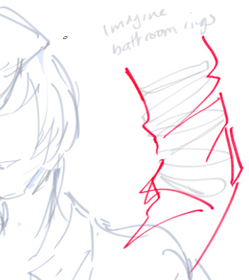
and sorta draw around the movement of it (ofc this is like.. the wrinkles around the arm/sleeve etc.) AGAIN please use reference of real cothes to get a better feel of how to draw it (:3
andddddd ofc, cus im a wishy washy person, the anatomy changes overtime the more details I add in, so it’s……. iunno. yeah. it’s a nightmare to horizontal flip it, but it does help you catch a lot of things that are wrong (like I know the head tilt is gonna be a problem here lol.)
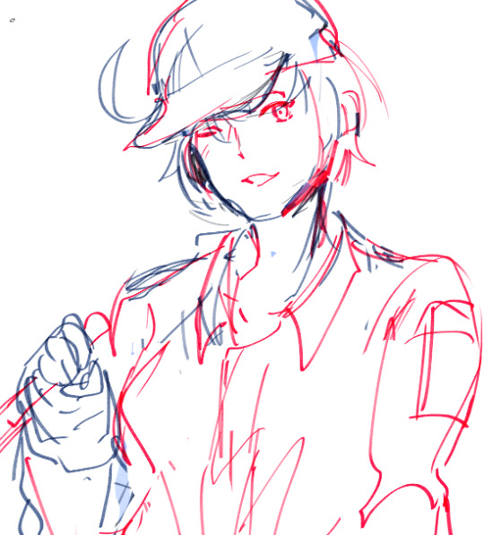
and well. it’ll be touched up a lot more, sketched better/cleaned up; so yeah. i’m at the brink of passing out rn, but this is just the base drawing process !! I guess (?)
sorry i wasn’t able to give a better explanation ;;;;;;;;;;;;!!!!!
91 notes
·
View notes
Note
hey man your comic stuff?? fucking amazing do you have any tips for a novice child artist such as myself
hmm!!! thats a good question if i have any advice at all…i dont really draw things in comic form that often because of how slow i am…its a whole project for me lol
also natch im just an amateur at all of this vs people who like…pay attention to how to do things really well and/or draw comics on a regular schedule &/or get paid for it and all. so seeing this i was immediately trying to think of like, advice ive seen from random professionals on twitter & stuff & i’ve tried to moreso shake it down to the stuff I’M actually doing when i draw a comic. which is a bit tricky because of my small sample size & the fact that i dont have any kind of consistent process or technique unifying all the comic-type stuff i draw
like sometimes its just a few floating sequential drawings and other times is definitely more like, really thinking of it in terms of how i’m going to structure it in Comic Form & use the format to adjust my presentation of whatever idea i have
like i know ppl whose Job (officially or just by their own standards) to do a bunch of comics pages will do a script of scenes to decide what goes on what page and sort dialogue / action into panels & describe how things will look etc…and then do like maybe really rough layout pre-sketches, then the first rough sketch for a page, an optional more cleaned up sketch layer on top of that, and then the final lineart
i sorrrt of do a version of that, in that i am generally sitting on a Comic Idea for a while before i even start getting into the business of thinking through how it’ll actually work. i have to make sure that im “committed” enough to the idea to wanna make more than one drawing for it, and that i think i have at least a vague notion of how i could put it into a comic. sometimes i DO end up just putting the notion into a single drawing or condensing it into like, 2-3 lil floating drawings or w/e. coz a lot of the times the idea starts out really vague, often with one “moment” that serves as the whole inspiration & that i then try to build a scene/sequence around….a lot of the details beyond that can be really vague in my mind, like the setting or dialogue or who’s involved or what happens or the pacing or extra events or etc…basically Everything is real amorphous for a while
so yea step 1 is me having this one idea and trying to decide if building a scene around it would be a better way to present it vs just having one drawing, & if i think i can actually effectively carry it out….which is in reality even less fancy than it sounds…i just sit on an idea for a while & never get around to actually focusing on it / putting down any of the thoughts abt it that im formulating. but the upshot of me putting it off for forever is that i do end up with a kind of mental script / layout for a comic before i start it…..but even the extensiveness / format of these unwritten scripts varies a lot for me
like, a few times when i have made something that’s maybe longer than just one page &/or something ive been mulling over for an extra long amt of time (which tends to be stuff that is starting out w/ heavier than usual ideas) i’ll like, actually write down what happens page by page, even plan out specific panels, maybe even put down a few rough sketches of certain parts. i’ll have the Main Moment which is the idea that started the whole thing in the first place, but what tends to happen is i’ll come up w other moments that i think could lead up to / frame / follow the main moment, and i pretty much just decide how they all fit into one cohesive piece. so what my “rough drafts” look like for these more extensively planned ones—still really not that exhaustive, i only put things to paper when im basically done enough w my ideas to be just about ready to start actually making them—can vary in their actual formats (e.g. simple chronological bullet points of events, a few drawings, a rough sketch of how the whole thing might look), the core of it is basically just me finding a way to nail down how i’m going to arrange the Moments i have and how i’m going to lead one into the other…….like for things with enough pages / panels, i’ll tend to focus on which Moment will end each page &/or each line of panels, then have an idea of which other Moments i’ll need to put on which of those pages, and kinda figure out how to pace things
again that all sounds like maybe i have a real process…..I Do Not
im kinda lucky in that i think i have a decent sense for composition without having to struggle over it too much. so a lot of times i can leave a lot of that up to be felt out as im actually doing the rough lineart for the first time. i also often don’t nail down panel arrangement that carefully & also make it up as i go along a bit, which is probably not something anyone should emulate. someone was saying something about how some certain page layout of like, 3-something-something panel rows looks best, i dont know. i’m guessing, as with all things, nobody can say “always do this / never do that,” but i think staggering odd/even numbers of panels in each row is always a good guess. just makes it easier for them to read more distinctly at least, surely
sometimes i DO think about certain panels when i wanna frame a certain “shot” in a very specific way. but im just kind of doing whatever. i know vague rules like that wide shots / negative space slows down the pace, vs tightly cropped / small panels / packed w a lot of visual info tends to read as a faster pace, more chaotic. i dont quite go too wild about that sort of thing tho, because for me as a reader, a lot of times really tight shots that are like cutting between 5000 different angles rly fast all in a row, sometimes it is absolutely unreadable to me, as in i do not understand the visual info at all. it feels like the equivalent of how action movie editing keeps hanging on to the “incoherency = intensity” vs just me tuning out until the scene is over & missing details b/c i just am not getting anything out of it
thats not much of a factor for me coz i dont really ever do things with extended sequences of movement / action or whatever. i’ll keep things in one place. i’ll like to do smaller, “quicker” panels moreso to like, show simultaneousish details / to extend one moment…..occasionally i do Big Panels for a moment of higher intensity / impact too. btw putting a High Intensity moment in a super tiny panel is always really funny for the contrast of it all. i dont think ive ever done it, but it is
ummm…….also planning where your speech bubbles will go is good. i dont do that enough, but i should. most of the reason i dont have a more proper, organized process to anything i draw is that i just dont have the focus / patience to slow down for More Planning vs just going ahead and drawing it. jokes on me, since some quick vague planning can make it a lot easier on yourself vs just diving in and struggling w something for ages
uhhh also since im not that fantastic or mindful of panel layout? sometimes i’ll make a point of just having uniform rectangle panels of the same size/shape, so i only have to really worry about the layout within the frame. this is mostly good obv for things with not that much shift in pacing throughout it or action or whatever…you lose the advantage of how panel sizes can affect the tone of a shot or something & probably cant get that detailed in ur drawings but that is often Fine By Me
when i do use the uniform rectangle structure though, i kinda have to focus more on each individual panel, vs like, knowing ok, these three moments are going on this page, i have a vague idea of what’ll connect them, just make up the individual panels as you go along. this does mean that i have to kinda think more about what justifies each panel….how its different from the ones before & after it or how i might want it to be similar to “hold” a shot for a beat or w/e or draw focus to a small movement, what’s actually going into each panel, if i can/should condense two panels into one, etc. its still a lot of playing it by ear, i dont have solid rules of how i think i should do it each time
even when i do have a like whole plan for something im drawing i’ll often make more changes as im actually making it. sometimes its deciding something would be more effective, sometimes it’s just “hey this would work too & be easier,” and thats definitely fine. nobody knows the change you made, and Easier isn’t necessarily Worse anyways. convenience is good where you can get it
ive also definitely had specific comic artists formatting/framing styles in mind when i specifically wanted to use that while drawing my own stuff. like the way i’ll draw maybe a kind of horror vibe (more diagonal lines / “fractured” panels than i’d normally use, quick tiny shots of different smaller details, that kinda stuff) is gonna be different from when its a calm & quiet tone. where i dont really get too creative with the panels really & keep them pretty steady
and then that one time i did a largely nonsequential sort of panel collage b/c the marge simpson anime gave me great inspiration for how to combine & present a bunch of vague notions i had floating around all into one page. it was a good accomplishment & thats unsurprising because the inspiration i was using was That Good. thank god we can all benefit from each others good ideas and knowledge & work & all that. it does help to jump on a feeling of “wow what a cool comic i wish i could make something like that.” just go ahead and make something like that…
ummm this is all on the technical side-ish still but i dont really know what to say abt the kind of stuff that makes me wanna draw a comic in the first place vs just putting the idea into a regular single drawing…usually it Is kind of a more nuanced moment that i think would be better presented within some amount of context and buildup and all that. i basically exclusively draw emotions….and sometimes theyre better shown with some amount of action/dialogue, or at least a few different shots or something. i dont know if this area is helpful information or anything anyone would benefit from knowing about, or even if i have anything to say about it…is it all self evident maybe? idk! i do think i communicate emotions best through comics…not that each one is “here is my mood!” or talking about me at all, but i was for example trying to communicate about an abstract emotion, i think i can draw about it better than talk or write about it or anything. i DO sometimes draw more directly from my own specific feelings/experiences for things, but mostly when i think it can be relevant…i cant really do anything all that directly autobiographical, even casual diary comics or whatever. thats what my text posts are for… but i have been interested in how to convert these huge emotional issues that i’ve been v familiar with into a few pages or panels and how to present its impact in the simplest, straightforward ways i can manage…sometimes i think its worked for sure…..i feel like i gave a more Relatable sense to a certain experience by putting it in comic form than any of the times ive discussed it as a personal thing at length via text. like i said i communicate best via comics probably, despite not drawing them all that much coz im too damn slow lmao
speaking of, i’ve kind of been like “what a waste” abt the fact that i dont have like, a proper approach or regular strategy to thinking up comics before i draw them, but i think theres something actually okay to be taken from that lol……just that i know if i got too caught up in trying to plan it all out perfectly before getting into actually drawing it, i’d be making it into a bigger project and slowing myself down even more & i’d risk dropping it partway through or just never getting started at all. so if i have a less than perfect end result, at least i have an end result, and ive finally got that one idea out of my head in some way. and i feel like some of my comics do work out decently enough….a good handful of times ive been surprised w how well some ppl receive them
so i think it is good to just go ahead and dive in. i did that once w an idea i’d been sitting on for like half a year, and i think it turned out good enough. i just knew i could easily spend months and months more turning over all the details, which might make it Better, but would also mean that yknow, i’d never actually get around to making it b/c of feeling like it had to be ideal. so i simplified it a bit, used a uniform panel layout, did little drawings, and just got it drawn out in an afternoon or two. and now at least it exists lol. and ive sort of come back to the same idea in a way…if i feel like it turns out i wanna elaborate on something more, i can just make another pic/comic built on the same theme, who’s gonna care or stop me
i also try to focus on what lines are/aren’t necessary to avoid things being confusing or just pointlessly cluttery….this isnt a big issue b/c i dont often bother w bgs. dont emulate that either lol…….but im not doing any Serious art so its no big deal to me if im not “good” or not progressing as spectacularly as i might. i dont need my drawing abilities to be that amazing here. but bgs still serve a purpose beyond being a “skill” or whatever so im trying to include them more, aka occasionally, at all. still hardly ever. but sometimes you at least need like one halfassed establishing shot yknow. anyways
mmm this has all been kinda vague and i’m trying to think if there’s anything more specific i could/should talk about!! i dont know. i dont have a good perspective on what its like to look at my art while not being me lol & what ppl might think or what stands out to them or whatever. rip
sorry this is so long, i dont really have ppl wanting to know abt my Processes or drawing thoughts or whatever so i’m kinda jumping at the chance to talk about this sort of stuff after having been actually prompted to. but i dont know if i’ve said anything at all!! i dont know if any of it has been helpful
“tldr; i dont really know what im doing, but go ahead and jump into actually making them as opposed to feeling like youre ready / you know the best way to make a page, because nobodys ever ready or can say This Is The Best Possible Version so just go ahead and use whatever process feels like it makes your life easier, while still actually making the damn comic” is my whole thing, i guess
i dunno, if there was some specific thing you wanted to know abt that i didnt talk about / talk about well here, feel free to ask me to specify because i totally will, which is both an invitation and a warning obviously
sorry this is so long everybody…….writing an essay & by the end of it not being sure if ive given any info at all is part of my whole Thing
#long post //#jfc this is even longer than i thought#i dont know if theres anytning helpful about this at all#maybe its that ‘’if you think i’m good its good news for you b/c you probably know what youre doing just as much if not more than i know#what i’m doing’’
3 notes
·
View notes
Last Seen Blogs

nahasst
Untitled

ggqby
Bangtan space

resh-boy1994
✴KING MAKER✴
gac228
Days of ...

crystalprepshadowblogs
SHADOWBOLTS RETURN!