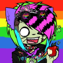
#no references no lineart just vibes
Text
some smerds
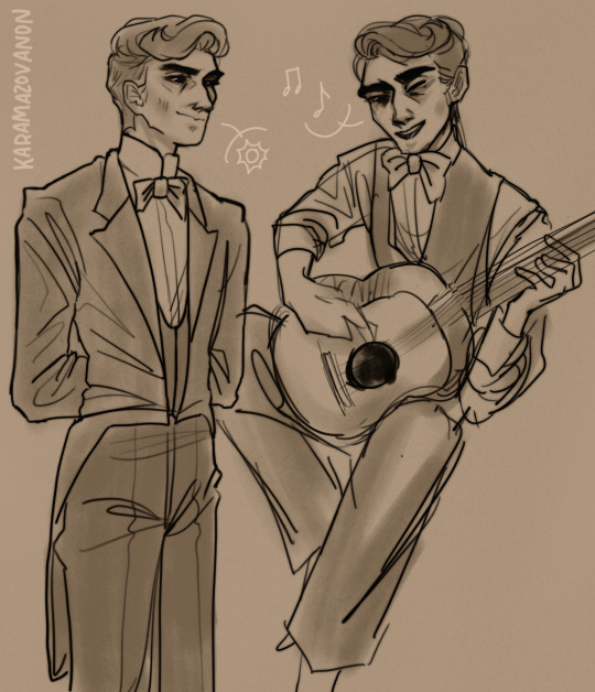
#pavel fyodorovich smerdyakov#the brothers karamazov#still working out a design.............sans man bun#super rough sketches but i dont feel like cleaning it up#no references no lineart just vibes#ill do a better one of smerdyakov with a guitar at some point and actually look at a picture of a guitar instead of going#uhh yeah that seems guitar shaped#anonart#his squinty eye is very good#i hated him SO MUCH when i started reading but i turned into a smerdyakov apologist by the end. is that a hot take#i just think hes neat (tormented by societal dehumanization and finally snapping and reclaiming the agency hes been denied all his life)#tag rant over it is simply wild how much this guy grew on me#smerdyakov
53 notes
·
View notes
Text

practicin with a few zeldas and posting this before i convince myself to change something else
#we're here for vibes not details#sketching is so weird. and lineart. and coloring. and references???#maybe drawing is just weird#legend of zelda#legend of zelda fanart#zelda#breath of the wild#legend of zelda animated series#zelda fanart#twilight princess#ocarina of time#skyward sword#botw#tp#oot#ss#mine#softie draws
48 notes
·
View notes
Text

art block ibaba time (he is judging me)
#i need to draw more so bad#this is prob my favorite style to draw in tbh#no lineart. no sketch. just vibes#unfortunately that means im limited in what i csn actually do with it since tracing/references are difficult#to clarify on the tracing part: ever since i downloaded a 3d model poser on my phone i have never started a serious drawing without it#i need to move away from it so i can learn to develop varied body shapes and stuff but#tbh its a miracle whenever i draw at all so#ehh#my art#ibara saegusa#enstars
2 notes
·
View notes
Text
completely normal and trustworthy guy
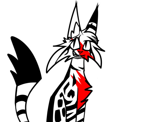
#she has jonny dville vibes. i created her; references and all; and as such am the authority on this#cw blood#cw bright colors#?? just in case#wcrw lynxheart#funfact all the lineart + the sketch was done on the same layer#the only thing i did on a different layer is the bloodstains#spire's wc rewrite#warriors ocs#art#my art#ocs#my ocs
3 notes
·
View notes
Text
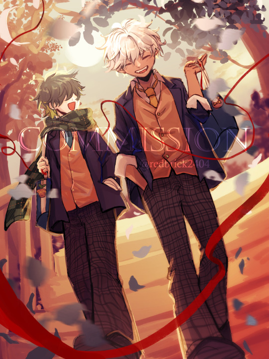
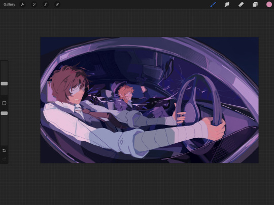
Commissioned by @/ Đức Nhân (FB)
I got the chance to draw his MC (Troy) with Mammon in student uniform this time. The high school romance trope is used so many times but it always have so much potential, I love the carefree vibe of Mammon and Troy in their student days. Thank you so much for commissioning me! ヾ(≧▽≦*)o
Process below the cut:
1. Ideas:
The client sent me some references including high school uniform and sunset and stairs background so I came up with some ideas for the prompt. I tend to sketch out the thumbnail before going into any further detailed sketch. The 1st one was picked in the end.

2. Detailed sketch:
I roughly worked on lighting and composition of the artwork but in more details. Since they're walking together in the sunset, I added an orange overlay to get the overall vibe.
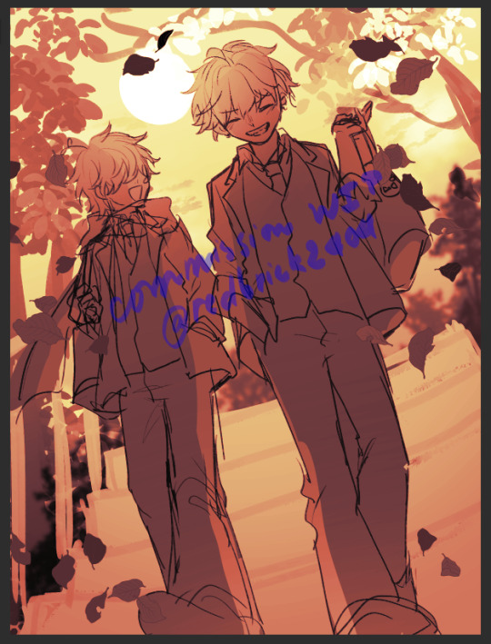
3. Lineart, flat color, shading, and final rendering:
I actually didn't make a completely new lineart with this one as usual because my sketch is good enough, I only cleaned it up a little and continued with the shading. If there was anything I'm not happy with, I would just paintover and use the liquify tool for corrections. The more loose painterly look also suited the carefree vibe of the piece better than the clean lineart and shading look.
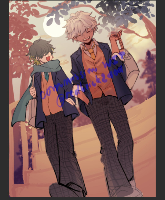

The red thread wasn't there in the first sketch but I think it makes the piece much more dynamic, glad that my client loved it too.
And that's the end, thanks for reading! (o゜▽゜)o☆
133 notes
·
View notes
Text
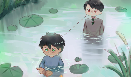
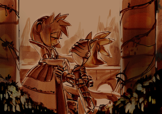
{ AN ART TRADE & ART CHALLENGE WITH/BY @weepinglilvessel }
[Iterator - Murky Luminescent Seas]
Apparently the idea came before the recent comic about her and it fits to the story kinda well
So I guess it can be called a cannon XD
PLEASE CHECK OUT THIS COMIC I BEG YOU
This piece contains a week of forcing myself to do anything more about it but sketching and lineart XD

[ HK Vessel - Hex ]
ALSO A PART OF AN ART CHALLENGE
⚠️ BLOOD WARNING BELOW⚠️
That's one of the old OC's before Weepingvessel (a.k.a. "Stel") made Tumblr account so that's a bit of nostalgic vibes .
Besides that I really wanted to test my skills with limited colour pallette to see how much I've improved. You tell me, I don't think I should judge my stuff
I did it in less than four hours just because I really wanted to finish it...
(Sometimes I don't understand myself...)
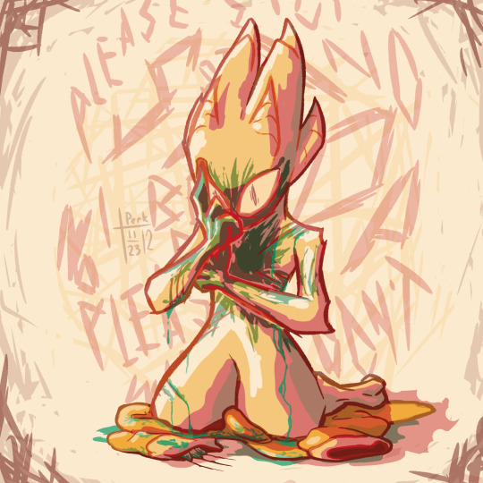
Also the references:


So yeah that's all!
I hope you enjoy it, especially Stel! ❤️❤️❤️
Check them out please they're doing a great art
#weepingart#hollow knight#hk#hollow knight fanart#rw iterator#hollow knight art#rain world#rw iterator oc#hk vessel#vessel oc#oc art trade#art trade#rw art#rain world downpour#rw downpour#rw dp#hollowknight#hollow knight oc#rain world original character#oc art#oc artwork#other artists#art challenge#color palette#colour palette#color challenge#the sillies#hollow knight vessel#cw bl00d
121 notes
·
View notes
Note
OK I NEED TO KNOW WHAT YOUR ART PROCESS IS
HOW DID YOU GET SO GOOD?!
I love your art sm it’s the best thing I’ve ever seen!!!
awww thank you!! i’m too lazy to figure out how to make a timelapse so im doing a step by step thingy
step 1 : open pinterest and find a reference
this one gave me sayori and natsuki vibes so i chose it
step 2 : make a rough guide line sketch using the reference
i don’t usually worry about the first sketch being 100% accurate because the clothes will mostly hide the imperfections anyway, especially in this case where the clothes are so thick

step 3 : make the main sketch
the reference isn’t in the picture but i still use it if i can tell something is wrong, like a eye is too left ect

step 4 : colour
i usually skip the lineart because i don’t have the patience for it lmao, but honestly letting my art be more messy has helped me a lot since i don’t focus on every single detail and instead just have fun
step 5 : colour the “lineart”
i just like how it looks :)
now all that’s left is the background which i just kind of wing it and tadaaa

#ddlc#ddlc natsuki#ddlc sayori#asks#art process#this isn’t a tutorial by any means just how i personally go about it#thanks again for the compliments :D
39 notes
·
View notes
Text
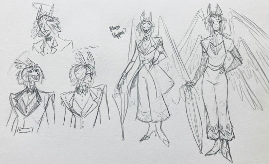
I finally finished the piece for @prince-liest's OC, Tzafael! this really reminded me of how fun character design is (and also that I've completely forgotten how to make digital art, but that's besides the point...) <3
credit to @hogbogglerspirits for the umbrella design! I kind of butchered it so please look at the original and throw lots of love at them
LOTS of notes, draft sketches, brainstorming, etc. below the cut. enjoy!
(note: a lot of what I'm talking about is based on posts prince made under their #tzafael tag, so take a look at those if you haven't yet!)
thanks for joining me below the cut! here's the sketch without the colors as a treat (in case you want to color it yourself or something, idk).
notes about making the digital drawing:
holy shit this took me forever -- I was not kidding about forgetting how to make digital art lmao. I forgot how much less forgiving digital lines are and genuinely lost the spoons to even attempt lineart, hence just a sketch below the colors.
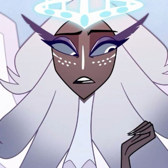
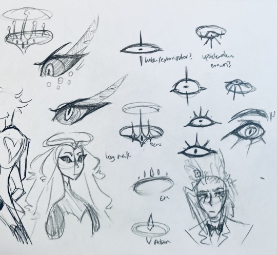
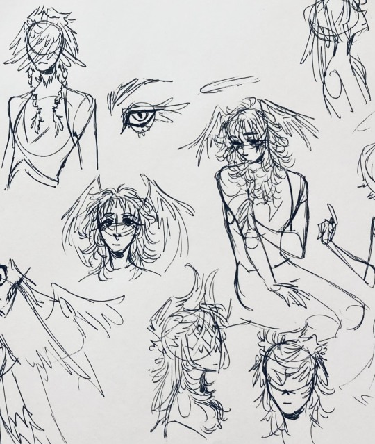
some of you might've seen the original sketch I sent to prince, which the digital version diverges from just a little. it's mostly the halo which I'll explain later, and I finally caved and drew the sixth eye (you can tell I drew and erased it multiple times in the sketch lmao -- still don't know if I prefer it with or without)
here's the original color ref by the lovely @gendermeh! my color scheme ended up looking really different, so some notes about that:
I was looking at references for magpies like this
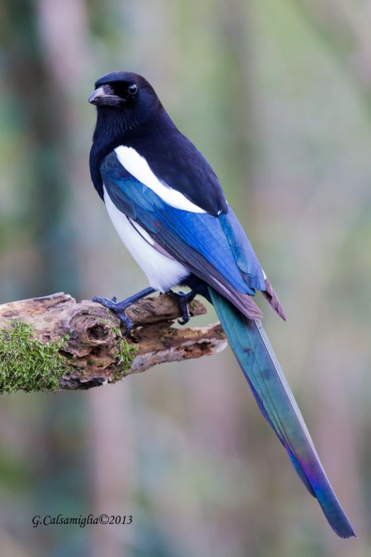
and I wanted to basically follow that color scheme while also being somewhat similar to the original -- dark head/shoulders --> dark top of the jacket, bright blue wings --> bright blue bottom of the jacket, greenish tailfeathers --> green pants, hints of purple --> purplish sleeve and pant ends
I also tried (and mostly failed, let's be real) to capture the iridescence of the feathers -- they look like oil spilled on the pavement or iridescent hematite to me! I think the key ended up being adding bright greens/purples and roughly blending them into the blues or vice versa but I didn't really figure that out until I got to the pants lol.
I'm gonna be honest; I don't remember why I went with this shape for the tailcoat. I just remember being unhappy with the sketch and then trying a bunch of different shapes that mostly looked worse lol -- I think I landed on this because a split tail kind of looks like wings?
KEPT the shoes -- absolutely magnifique. I wish I knew how to color gold better.
added lots of jewelry! they like shiny things :)
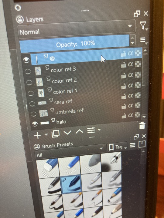
ALSO PLEASE LOOK AND APPLAUD ME. I FINALLY REMEMBERED TO LABEL MY LAYERS!! NO I DON'T REMEMBER WHY THE HALO HAS ITS OWN LAYER.
alright, time for some more design notes/explanations + draft sketches!
but first, a couple disclaimers:
I want to make it very clear that I LOVE everything about the original design. I made a lot of changes based on personal preference/the way I interpreted the character. I was actually planning on making a digital piece that was more faithful to the original design too, but I was just out of spoons for it cause of life stuff.
you probably shouldn't try to read the notes I made in the sketches I'm about to show you unless I say otherwise. most of it is incoherent brain vomit in illegible artist handwriting and I'll transcribe/explain the stuff I think is important :) (the stuff in quotes are direct transcriptions of my notes)
I know my sketches are very messy lol. I only draw for fun, so I usually don't force myself to make stuff any neater than necessary unless it's supposed to be a formal piece. try to bear with me.
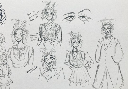
1:
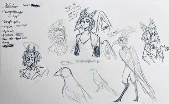
my first few sketches of them! (I think?) this was before I sent prince a laundry list of questions so I was still trying to get a vibe
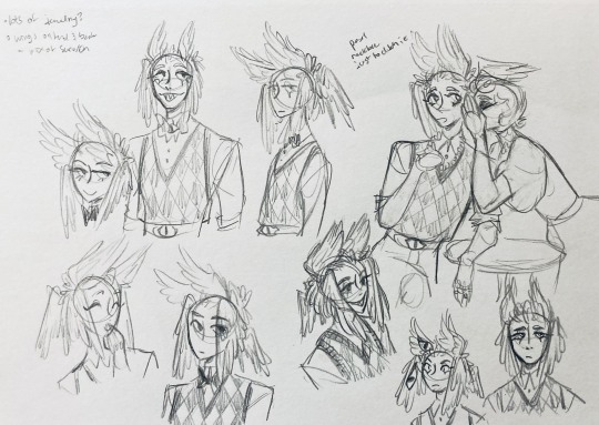
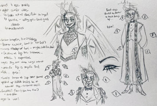
"magpie -- beak lips?" -- you'll see this in a few sketches; I considered giving them the lipstick design that velvette has since it looks like a beak. I still kind of think it's cute, but 1) I'm pretty sure velvette is the only character that has them, so I didn't want to make it seem like they were related somehow and 2) I thought it might be distracting with how much other crazy stuff I ended up including in their head/face
also, sidenote since it's relevant to what I said about vel: something I realized was important is how one character's design relates to the designs of the rest of the cast. I wasn't sure how much I should've gone for what looked good in a vacuum, how much should be based on what other characters looked like canonically, or what other characters would look like if I also designed them. it ended up being mostly the second option, but it was honestly still a struggle. should I take away some of the tumblr-sexyman-ness (no shade to tumblr sexymen; I love them) because there are other characters that already have it? should I relate their design to sera's and emily's in the show or should I think about how I would've designed sera and emily? should I follow some of the design philosophy of the original show and just throw stuff on there because it looks cool (the answer is yes btw)? decisions, decisions ...
I don't think this showed up really well in most of the drawings, but they actually have a black line down their nose! let's take a look at sera:
since they're siblings, I wanted to include some similar facial markings. the nose line ended up being the only thing I kept though -- I was going to include freckles, but I have a compulsive need to give every character giant bottom lashes so there ended up being no room T.T I like that the magpie's hints of purple kind of match hers tho!
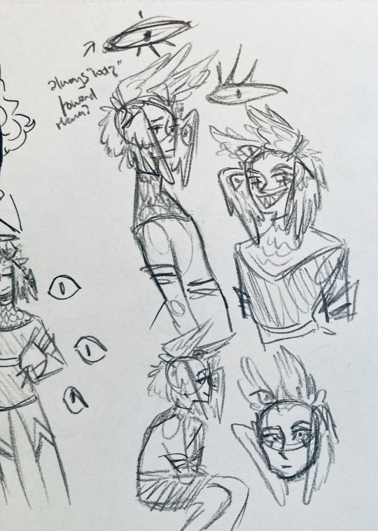
the wingification of the hair begins! I was still unsure of it at this point, but it was an idea I had since I was kind of struggling with how straight the feathers were in the original.
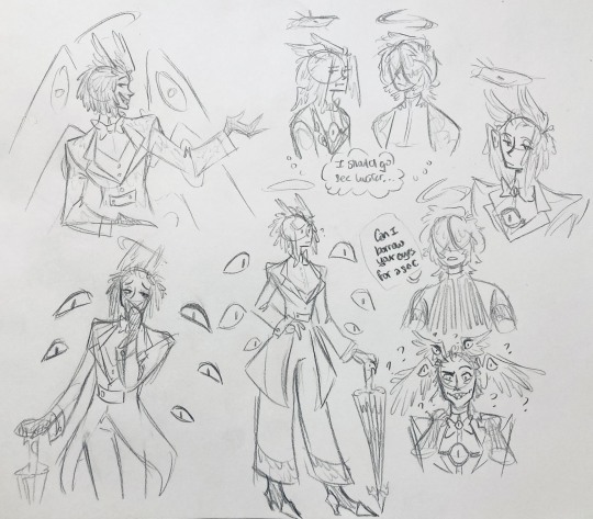
"maybe the ones on their head count as wings (so only one main pair)" -- I originally just had the 2 pairs of wings on their head, so I was thinking of just giving them 1 pair on their back so there would be still be 6 total. also this middle drawing of them is meant to be their exorcist outfit (I wanted it to be a cross between what the other exorcists wear and sera's outfit)
at this stage, I was thinking of giving them more magpie-like characteristics, so I looked at some references and tried to emulate them in a more human design. this ended up being really awkward so I scrapped it, but I still like the idea that their exorcist mask looks like a bird (kind of like a plague doctor's)
2:
peekaboo! I love the idea of them using the wing hair to cover their eyes lol. (ended up using that idea for my own seraph OC since that's their biblically accurate purpose: to cover their eyes/faces in reverence/humility -- doesn't really fit with tzafael tho lol, so they show their face most of the time)
an eyeball in the bowtie -- pretty self-explanatory. the eyeball motif is important.
the one in the middle is just me practicing drawing the original design, and the one on the right is another exorcist outfit I think. I wanted to include the diamond motif/points that sera has on her dress (the diamonds on the bottom turn into eyeballs, which is why the final design also has eyeballs on tzafael's sleeves/pants)

3:
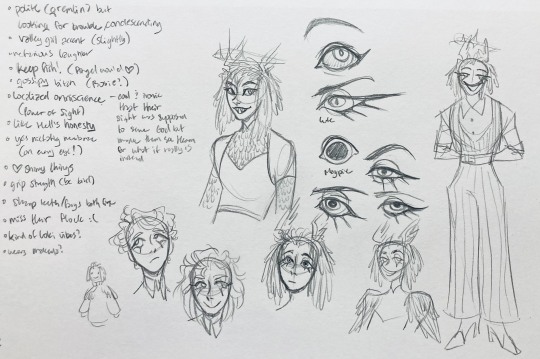
lots of notes on the side based on what prince said in response to my ask
"localized omniscience (power of sight) -- cool + ironic that their sight was supposed to serve God but made them see Heaven for what it really is instead"
another exorcist outfit, this time including the feathers
I was also experimenting with the halo; I was trying to make it look sort of like sera's crown, but that didn't feel right ...
some practice with eyes -- my style is pretty flexible with eye shapes, so I try to make them suit the character. I drew lute's eye and also an actual magpie's as references -- lute's because of the exorcist background and also because they looked appropriately sharp, magpie's for obvious reasons. once again, my compulsive need for giant bottom lashes strikes
there was honestly a lot to balance with the eyes -- I wanted them to look condescending/bored (lowered top lid) but also amused (raised bottom lid) and like a magpie (round) but also harsh/mischievous (sharp, maybe slit pupils like a snake) and similar to sera's (but not too decorated -- also does it make sense for them to look like sera's if emily's don't even look like sera's?)
considered having wings on the shoulders -- the magpie pattern is super cool, so it would've been nice to have that somewhere more explicitly in the design. I still think that might fit in an outfit they would wear in heaven (maybe for formal occasions)
the introduction of the sweatervest! honestly I kind of love this for the way it captures more of the preppy, spoiled old-money upper-class vibe some heaven residents have, but it was scrapped since I couldn't imagine them wearing that while trying to scare the denizens of hell. maybe something they wear casually though.
"yes nictating membrane (on every eye!)" -- AHH I'm so sad I didn't end up putting this to use. I just feel like the whole effect is based on actually seeing them blink, and I don't animate lol.
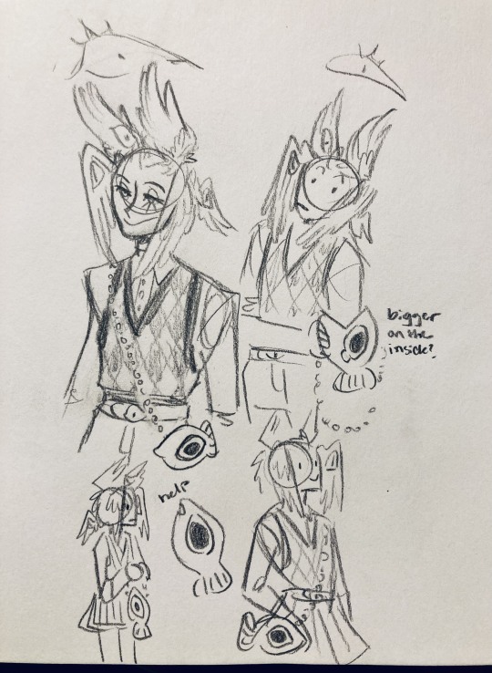
4:
ugh, the nefarious laughter one ... don't worry I tried harder on a sketch later on lol.
"like the diamonds on Sera + Em" + "diamonds turn into eyes?" -- I draw the diamonds on the sweatervest turning into eyes later.
tried an actual bow instead of a bowtie -- very cute but didn't fit the vibe.
a skirt! I think they would wear a skirt sometimes.
5:
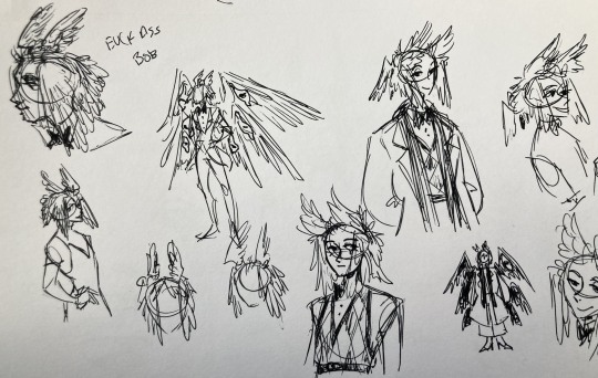
"FUCK ASS BOB" -- asghdk the wingification of the hair continues. unfortunately, I'm realizing at this point that the silhouette of the hair is starting to look a lot like alastor's. I gave a very half-hearted attempt at mitigating this, but it goes back to the thing of how much I am obligated to the original show's designs and what looks cool to me -- I think the wing hair fits them and I didn't want to change it because of alastor, plus my alastor design actually has completely different hair anyway. I did add a third pair to the back to look like a ponytail though.
introduction of the scarf! I was actually going to include this in the final design but uh,,, I forgor. are you starting to see a pattern.
the reason for the scarf is that the "tzafael going to places they know they'll draw attention/can incite chaos" reminded me of that scene in avengers where loki walks into a fancy building looking pretentious af and just casually stabs a guy's eye out. not really the same thing but I felt like the vibe matched. hence, loki's funny little scarf fit.

6:
uaoughdfjh it was SO FUN to draw the wing hair, and it was at this point that I realized they had to stay even though I wasn't sure if it was too different from the original.
gossiping with rosie cause that's the first person I thought of -- tzafael also summoned a pearl necklace to clutch because of the sheer drama of it all (your ex-husband did what??)
also started drawing the rings on their hands. magpie like shiny.
7:
lots of notes cause I was trying to compile the things I still needed to think about/incorporate into the final (I thought this was gonna be the last draft ... haha)
trying to include more bird/eye motifs
"fish ... purse?" -- ha! I forgot I was gonna give them a fish purse. I think I drew that in a later sketch, but not them wearing it.
"picked up Hellish traits bc of extended stay -- existential crisis?" -- I asked prince about the sharp teeth, and their answer implied that they became sharp as they stayed in hell longer, which got me thinking ... I feel like that's actually a great body horror concept. lucifer falling and looking like a normal angel at first, eventually waking up to more and more devilish features and feeling more and more like he's lost his home and his past self ... spooky.
another exorcist outfit -- I actually really like the eyes on the ribs! I never made a final draft for the exorcist uniform, but it would probably look close to what I drew here.
the one on the bottom was meant to be similar to the feathered shoulder pad idea, but this time with the whole magpie (with giant eyes). tried putting the "freckles" (really just dots in this case) over their brows, but that ended up looking kinda weird.
the eye is pretty close to the final design
the one on the right was supposed to be the full final design, but I was totally off lol -- the long trench coat really doesn't give off the right vibe at all
8:
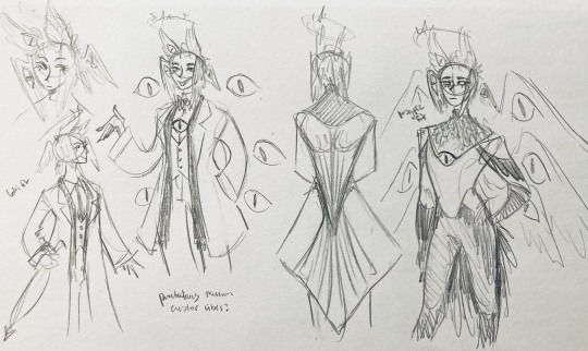
playing around more with the loki vibes of the scarf, also added an eyeball to the chest
I never got happy with the design of the back of the coat -- I think it should probably just be blank at this point. but the sketch here is meant to look like wings/tailfeathers.
yet another exorcist outfit, this time with more magpie motifs. I actually like this one a lot, but I probably should've added the eyes on the ribs from the last sketch. I think I also considered giving them actual tailfeathers at this point.
9:
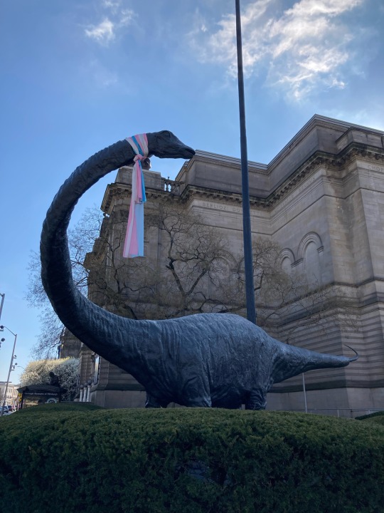
thanks for sticking with me! I promise we're almost done. have a trans dinosaur I saw while I was travelling as a treat <3
10:
this is after I finished the sketch for the final piece and realized I didn't like the halo design. I drew lute's, sera's, em's, and adam's as refs. (honestly I love the show's idea that each person/people of each rank have a different kind of halo -- I wonder if they can switch them out?)
my main inspiration ended up being the exorcist halo, but I made it look more like an eyeball -- since it always points toward heaven, we can say it's always "looking" at heaven.
(also sera's feather lashes! they're so cute)
11:
EVEN MORE EXORCIST DOODLES
12:
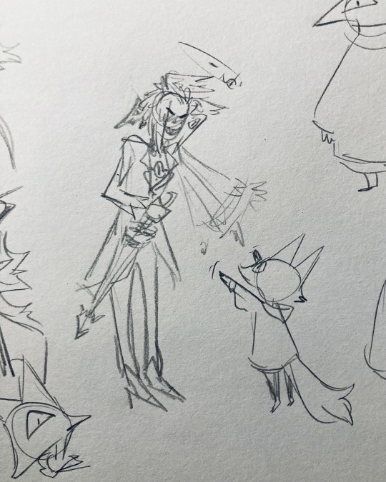
tzafael shooing away my fox demon OC
13:
these are actually sketches for my own seraph OC (raguel), but I wanted to include it since it has even more wing/feather hair variations. I also think the idea of the eyelashes being feather-like could've been cool for tzafael.
14:
some more OG design doodles
tzafael and raguel together because self-indulgence is the name of the game babey (also wanted to draw tzafael freaked out with their wings flared)
(raguel's blind btw, hence asking for eyes -- tzafael has so many!)
you can probably read the dialogue here so give it a shot. I believe in you.
15:
you know what? the fish purse deserves some doodles
16:
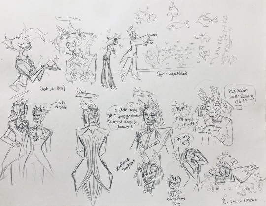
putting them in Situations! I was reading over prince's posts again and I realized there were some funny things I could draw them doing/saying
again you can probably read the words here
angel dust also loves fish (but is apparently bad at taking care of them, hence the suffocating blobfish), so tzafael shows him their aquarium (complete with live fish and flora ofc)
I thought alastor was 8 ft but apparently he's 7.3 ft? so tzafael is enjoying the .2 ft they have on him
trying and failing again to come up with a design for the back of the jacket lol
THE crowley quote
apparently the halo still sends signals from the exorcists -- thought their reaction to the battle at the hotel would be funny
the nefarious laughter (take 2) that I promised -- based on a doodle of alastor viv did that I found
them being sad and curling up in a pile of shiny things like a dragon
OKAY I'M DONE. huge, huge thank you to prince for sharing their OC! this was a lot of fun and clearly inspired me a lot haha. please check out their writing; it's literally so good that I can't read anything else these days. I am chewing on their thoughts constantly.
this was an absolute monster of a post, so if you're still reading, I am both impressed and bewildered at your patience. I hope you enjoyed! (I certainly did!)
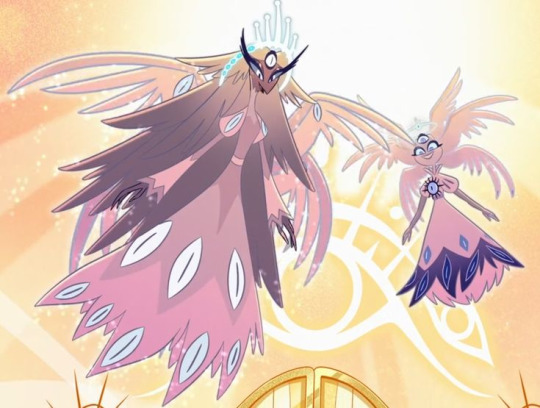
#prince (because they are very sweet): I'm excited to see your thoughts!#my thoughts: magpie like shiny hehe#hazbin hotel oc#prince-liest#hazbin hotel#my art#character design#sera hazbin hotel#em hazbin hotel
45 notes
·
View notes
Note
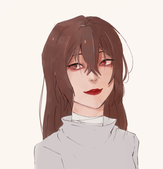
They still feel off specially the eyes i could feel them about to manifest their own life and run off
Even my linework is ... Idk what's wrong and it's the problem maybe I'm staring too much but I don't think so
Sorry for bothering alot but i loved your last advice ty
i think the main problem with the first picture has to do with the proportions and anatomy of the lower body area aka the neck and shoulders. i'd make the shoulders wider and add some sort of form to the neck so that it looks believable instead of a flat rectangle shape ( maybe make it slimmer a bit too? although that might be just a stylistic choice so you do you). That's the first thing i'd fix because otherwise the head looks too big in comparison to the rest of the body, and it can throw you off
I actually think you did a great job with the eyes, they have a lot of life and that comes from the fact that they are the most rendered part of your piece, which is not a bad thing. The thing is, while it is true that the eyes are the main focal point of a face and portrait in general, that doesn't mean you can neglect the other parts, so i think it is also a consistency issue or not figuring out exactly what sort of style or rendering you want to go with that holds you back (which is totally fine and normal ofc). So let's pick a semi-realistic stylized rendering style for this since this is the vibe i'm getting from this piece.
If that's the style we're going for, then the face should have a bit more form. You have to remember that our facial features ( eyes, nose, lips) are connected with each other via the planes of the face, right? So, for a semirealistic style, revisit your reference and try to idenitify what those planes are and how they connect to those features, and most importantly, where the shadows hit, and just accentuate them more, because at the moment they look like 3rd forms plastered over a 2d surface which is not right, our skin has form as well. Color-wise, don't be afraid to go darker with the shadows, they really make your drawings pop. Without looking at a reference, i'd def add some shadow under the lips, a bit where the lips connect to the nose, under the neck, and in the lower body area.
I'm really trying to avoid the most basic answer which is " practice anatomy !!1! " because everyone can say that however, at the end of the day, this is the main thing the face lacks. And tbvh you don't have to actually know anatomy, you just gotta know some proportions things that make the face look believable enough. I feel like the features are mostly just drawn from the reference without an understanding of the structure behind it. Something tells me that in the reference picture, the person had their head tilted a bit upwards, but here it's kinda flat and the features are just painted without following the motion. Try to draw over your reference picture the vertical and horizontal lines and make up the head shape behind it to figure out the way it is tilting and facing, because the lips, eyes nose, etc will follow that same sort of flow, they're not stationary. I'd also make the eyes a bit smaller, or maybe make the skull bigger bc i think they are touching the outer edge too much now, and also narrow the distance between the nose and lips just a bit. Kinda hard to explain without actually doing it myself. But really, try to play with that, and try getting comfy with drawing 3d forms i know it's easier said than done but..... there really isn't any shortcut unfortunately
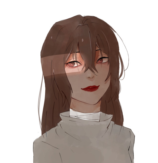
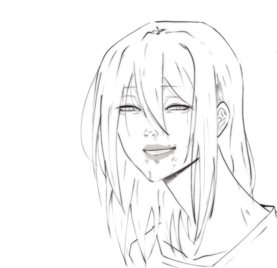
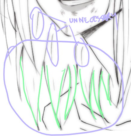
As for the lineart drawing, yes it's actually pretty solid, i like that duplicate blur thing you did, i'm familiar with that technique and it def has its perks so that's great. Im not an expert on lineart, however here i think there are too many " unnecessary" lines that could easily be omitted (purple). Less is more and all that~ The hair strands at the end feel too stiff and identical (green). If you notice, they all just end in this " V" shape and they rarely overlap thus making the image look flat. Try to break this pattern by introducing more spontaneity aka random hairflies, making the strands overlap, adding more shape variety etc
Make sure that the lines connect properly whenever they meet, and also although you already did it and i think that's great, you can make some lines even thicker, go even further and add even more lineweight. As a general thing, usually, the exterior or contour lines are thicker and whatever it is inside is thinner so experiment with that, you can start from the nose- thicker lines for the nostrils thinner for that nose tip i forgot what it's called and also add thin lines that just hint at the form. Lineart is hardd so i don't blame you, but if you're gonna keep the lineart in, try "shading" with black blocks so to speak, make sure the lineart layer can stand on its own, and pay more attention to the lower part area (neck and shoulders) even if it is less exciting to ink
#ok i lied it's long again#these are pretty fun to do can u blame me#ask iztea#you should also check in with other people don't take my word for everything#but since you asked my personal opinion here u go#sorry for any typos if there are any i'll fix them later#long post
69 notes
·
View notes
Note
What is your process for creating comics?
I love your art and the stories you tell <3
Thank you! ❤️
To be honest, it's a messy process and I don't recommend it lkdjsalkdjas
The idea
You know, those prompt that live inside your head and you daydream about it. I get inspiration by the things I watch, things that happen in my life and things I'm into at the moment. Which it's dangerous because I could lose interest in the thing that inspired the story and then it becomes a wip forever... And I write those ideas and snippets in my phone.
2. The script
The ideas and snippets in my phone become a coherent script. Sometimes I add descriptions of how I want to draw the scene or what expression the characters have. I do this by chapter. When a chapter is defined and with an outline, I go to the next stage. I don't worry about the future chapters lsdjakldj
3. The doodling
I actually make doodles of the panels in my notebook. I even add the dialogue planned so I can get a feeling of how it's going to look like at the end. In this stage I make changes in the script and dialogue, delete scenes if I get a better idea or realize it's too much work, decide what I want in the panel so it conveys feelings better (Do I show his entire face or just his eyes?). I don't think about composition, it's more about the vibes
4. The sketching
I make a new file and I start sketching the doodles. Sometimes I make changes lkajsdklas nothing is set in stone. So it's a loose sketch but I add the dialogue to get a feeling of how all the panels look together. I usually sketch 3 pages before going to the next stages (lineart and coloring) because if I sketch the whole chapter, I get overwhelmed.
5. Lineart, detested
I make the lineart. I have no comments, it's boring. I look for references here.
6. Coloring, beloved
It's the fun part! I take the opportunity to experiment stuff and try to find ways to be more efficient.
7. Beta
I update the script with all the changes, I try to make it more readable and less messy, and then I send it to my beta so they can correct my grammar and stuff because I don't trust my English (love you, Amanda).
8. Final touches
I make the corrections and export the pages. Because the way I work, sometimes the transitions of the pages look awkward, and I try to correct that too. I always leave the cover to the last and it is at this moment that I make it (when i'm tired)
9. Posting!
I usually reply to the previous comments before posting (I'm sorry to all people I haven't reply to because I haven't posted and now it's too awkward... I love you). But yeah, that's basically everything.
32 notes
·
View notes
Text
Hazbin Hotel Episode 1: Live reaction
The animation of the intro was pretty good. It looked simple and cute. The story about Lilith and Lucifer sort of make sense now? It feels like an info dump to new comers (if any new people are even watching this). Also what's the obsession with Songs?
The floating key looks a bit weird? Like they just pasted the image and decided to key frame it. But honestly I'd do the same-
Vaggie's voice sounds monotone. Not in a good way but it sounds flat? Stephanie Beatriz is a good voice actor and singer, but her role in this under utilizer her talent in my opinion.
7 years of Lilith being radio silent? (haha get it. If the theory ends up being true). Didn't they say in the leaks that Alastor also disappeared for 7 years?
The commercial scene starts...
Katie Killjoy still doesn't look like a Mantis but oh well... Alastor is talking about Charlie's daddy issues... WAIT HE'S FROM THE 20s HE SHOULD NOT BE SAYING THAT?!. It should be more like "as she works through her personal problems relating to her father by making sure that you're fixed enough to get sent to heaven!"
WHY DOES ALASTOR KNOW MODERN SLANG?! I know it sounds nit picky but I just want him to say old timey words-
Oh finally, they added back his radio voice-
I thought it'd just be that flat voice again. Did they actually listen to fans or was it an issue with the trailer.
I'm only 4 minutes in-
This is gonna be a long ride.
What the hell is the perspective, and what the hell is going on with Vaggie's legs.
So much swears. Lol, Alastor's pretty pissed about them trying to make him do a commerical.
Oh, it's been a week since the Pilot.
Hey, what's with the music when Angel Dust pops up.
Angel Dust's voice is uhhh.... It sounds like Crimson but higher pitched. The accent feels off. Why is his entire personality sex sex sex.
Why are his legs longer than his body. Alastor's chin is very pointy.
Why is Lucifer calling Charlie-
The ringtone sounds funny and the duck profile picture is cute, I'll give em that.
Angel dust's face looks a bit weird. Does anyone else agree with this?
The phone's outline went from white to dark red (which blended into the couch), then light red?
WHY DOES THE LINEART OF EACH CHARACER CHANGE COLOR EVERY FEW SCENES
Keith David's voice doesn't really fit with Husk...
They reduced Angel Dust's personality to keep spewing sex jokes. Why.
I'm only 7 minutes into this. There's 15 minutes more.
Finally, Vaggie says something fire. (She calls Angel Dust out and tells him to let Husk do his job)
Vaggie's mouth looks kinda weird in one scene.|
Why is Charlie's face stretching.
Charlie just cuts Vaggie off when she's asking legitimate questions through song-l
The cuts are making me dizzy- (It's the Happy Day in Hell scene)
Oh, a helluva boss reference. (There's a truck with the label "Helluva Post" with the IMP logo)
The song transitions feel a bit off, you get what I mean?
Why does Adam sound like Michael Cera. (This is not an insult towards Michael Cera, I love his acting but I am serious when I say Adam sounds like him)
Adam is a hologram I guess. Wait, if that leak is real then... Oh no
WHY IS ADAM'S HEAD SO BIG.
A commerical side plot?
Alastor magics up a vintage camera and the camera looks like a png. Like it's not actually a png but it gives off that vibe since the lighting is different and the lineart thickness is way too thin.
The new camera (a video camera) Alastor magics up looks like it fits in with the characters now because the lineart is consistent with the characters.
If I ever see an Angel Dust scene (especially if it's with Husk), I'll just mute the episode because it's just a bunch of sex jokes (again).
Another sex joke. Hilarious. Hahahaha. You can totally feel the genuine laughter in my laugh (/s). Dick joke after dick joke.
The Nifty scene was pretty funny I guess, until Angel Dust ruined the moment with another sex joke. Nifty just stares into the camera.
7 MORE MINUTES, I CAN DO THIS
Another Dr. Facilier and Alastor thing I guess. We can really tell how much Vivzie researched on Vodou.
Vaggie and Alastor make a deal that Alastor helps the hotel while he never interacts with television ever again. The lighting and colors in this scene look really good.
Angel Dust has an unnecessary small hot pink heart on the back of his suit. I pray for the animators.
Why do they swear so much. Also the costumes are something.
I'm skipping through the song.
Adam's design looks so complicated.
Vaggie's voice sounds so monotone.
Alastor's staticy effect looks cool though.
Charlie's demon form looks so... underwhelming.
Katie Killjoy's old voice was better. Now we're just stuck with a knock off Bryce Tankthrust and Blitzo sound-a-like.
A headless corpse of an exterminator. That's something. Also heaven has sci-fi tech? Oh and Angels bleed gold?
Also doesn't Adam mean to kill all sinners? What?
End of Episode 1. I'll organize my thoughts on a different post later. Also when the full season releases, I'll add photos.
36 notes
·
View notes
Note
Would you ever consider doing a colouring tutorial?
Heyooooooo
I've done a coloring post before (a few months prior), but somehow, my coloring/painting process has changed a lot since then lol. I'll give a breakdown of my process (and go into specifics on coloring) here, but please do take it with a grain (or a spoonful) of salt... I'm still very much learning, and though you can use my process as a guide, experiment on your own to find what works for you! This post got a little long I'm ngl so. open at ur own risk. it's really just me rambling and being a bit too pretentious for my own good
using my recent post as an example, my process is basically just:
first i get a clean sketch (after many hours of pain finding detailed references lol), not gonna go into that since you asked abt coloring
then i immediately go to block out shapes over the sketch. For big paintings, I don't do lineart (because i find that it eliminates a lot of depth that can be achieved with shapes and shading) — for smaller sketches and pieces, i'll do lineart tho.
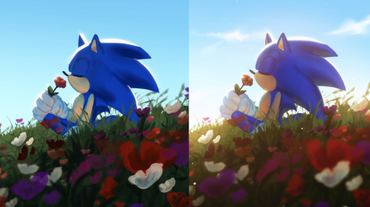
I started darker to lighter in this painting because I knew I wanted harsh light. For me, it's a lot easier to project "additions" onto a surface — ie, if there's a harsh light, that's the addition vs. a shadow in neutral lighting as the addition. dunno if that makes sense, but breaking tones down like that helps me understand how i want to chronologically color smth and choose my bases:
for example, since I knew I was gonna have harsh light here, I felt comfortable with just getting the tones for my shadows down immediately. There won't be many midtones due to how extreme I saw it to be, so there was no point in finding a neutral base tone.
how i choose colors varies from painting to painting, but for this one, I decided to lean purple-blue because skk are just one of many red and blue gays (same reason why most of my other skk works lean red-blue-purple), and also because I knew I wanted my light to be on the warmer side — thus, the shadows and unlit areas will be cooler.
i also wanted it to recede (to emphasize the perspective and for depth), so for the base colors, i made them cooler + darker as they went back. This wasn't as clear in the finished product, but i think it did a good job at reminding me the vibe i wanted as i rendered
By how much I've written for this step, I guess you can assume that it's the step I put the most consideration into — and you'd be right. I think base colors really determine the vibe, and it sets you up for the rest of the painting. Sometimes I have to color adjust my bases over and over (with hue adjustments, color balance, curves) until I'm satisfied. I think that satisfaction is obtained w/ more ease as I've painted more and more. Alongside the sketch, this step takes me quite a while. Sometimes it's fun to mess with really wild color combos, but that's another topic.
Then I block out the lighting, which is probably the most drastic step but also somehow the quickest for me. Once you understand how light affects color (warmth, tone, etc) and you gain confidence with it, blocking out values in relation to base tones isn't too hard. That ofc takes practice and a lot of fundamental understanding of Shapes & Colors but there's a lot of stuff online abt the theory specifically from professionals, so I'm not gonna lecture y'all as a fanartist for glorified literary author rpf

then i just start rendering, layer by layer. above is a screenshot i took mid-rendering; at this point, dazai's clothes were basically done but I later worked on the face + hair more and textured the tie.
I try to do the stuff I want people to focus on first, because at least for me, that's when I have the most energy to make smth detailed — the more detailed an area is, the more naturally drawn you eye is to it (this is because the brain likes areas of high contrast, and details are entirely founded on the placement of contrast).
My art has never been too extremely detailed — I enjoy flatter + bigger shapes, styled texturing and silly patterns, but I find that "detail" still translates into "effort". When I look at paintings, it's very clear where someone put most of their effort — and when I can't tell, then I know I have a very confident + experienced artist who can effectively distribute their workflow (goalz). So yeah, I render in my very silly poly style but still keep that in mind.
eventually, I finish rendering. This part is kinda a blur tbh, and it always varies from artist to artist. I'd say the things I keep in mind are:
shape + form (making sure my rendering doesn't mess up gesture or vibes, and that it keeps things loose)
composition (making sure i don't overdo areas where i don't want people to focus on)
and tone (ensuring that the depth and believability of the scene stays intact so that my non-realistic style can work)
I added the bullet because i wanted a reason for the goofy expressions, just a bit more pizazz so that skk's drama was also believable lol. also visual storytelling or whtv (but that's not something i usually prioritize, it mostly comes with the concept and sketch).
I also added the bullet for some compositional spice. the dark shadow on dazai's arms was there to also emphasize the warped perspective, but it also left a weirdly empty vibe that I didn't enjoy lol. So yeah, bullet! and ofc my favorite, weird flowy line pattern thing that doesn't adhere to the laws of physics
I think a lot of my traditional painting experience leaks into my digital painting practice. I don't like lineart too much, and since I mainly work with acrylic, I rely on opaque color blocks, layering, and "carving out" shapes. probably explains my affinity for solid flat brushes in Procreate,,,,, but yeah. It's a little all over the place, but at its core, it's a lot of technical stuff mixed with habits after finding what works for me.
Dunno if this helps at all, or if it was interesting lolol. Thank you for reading until the end if you're still here! I appreciate it. I'm still learning but I've definitely learned a lot since I started this blog so it's exciting to track my progress. I'm sure I'll see this in a few years and laugh lolol.
#pleuart#pleucas#casasks#sorry it got a little long#i did Not proofread this so there will prolly be a bunch of typos. just shout at me i'll fix it
67 notes
·
View notes
Note
Hello 👋🏽 Any tips in making the transition from more traditional art mediums to digital art? I'm great with a pencil but I suck in procreate
use references
flip the canvas
don't be afraid to take breaks every now and then to come back to your work later with fresh eyes
don't start with a low quality canvas. it's always better to start with a hq canvas size and dpi, and resize it down, than being stuck with a low quality piece. 3508x4961 (a3) may be a good place to start, with at least 300dpi
be careful when you're zooming in - make sure to have the navigator in another window so you can see if you're making any mistakes. like this:
don't be afraid to experiment with brushes until you find one that you vibe with!
you can draw traditionally, take a picture of it, then import that picture into your art program of choice and trace over it. don't think you have to completely start from scratch for your digital art to be valid
make use of your layers. you don't want to draw everything on one layer when you're starting out. separate layers for sketch, lineart and colour/rendering is a good start.
save regularly!
learn shortcuts like undo, redo, new layer, delete layer, mask, etc.
it can make working a lot faster/easier
have fun! and you don't always have to post what you draw. sometimes it's fun to just draw random stuff that will never see the light of day. experiment with styles, brushes, techniques, etc.
you will eventually find a style and workflow that suits you!
if any artists that follow me want to add onto this then please feel free!
45 notes
·
View notes
Text
Process of my HEX Gift
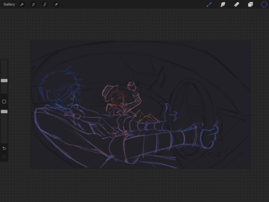
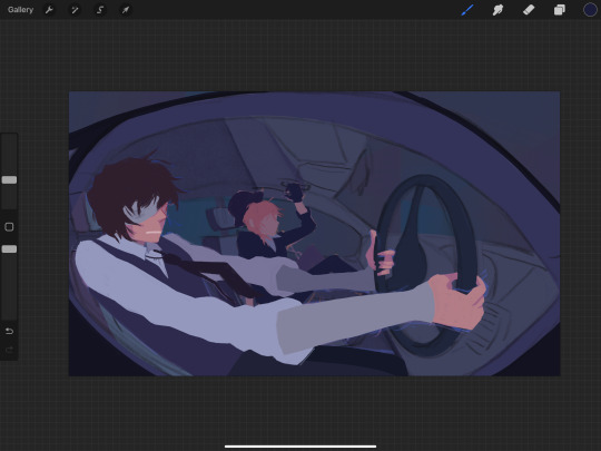
I finally remembered to take a few screenshots of my progress stages and I always wanted to do a walkthrough post so here we are!!
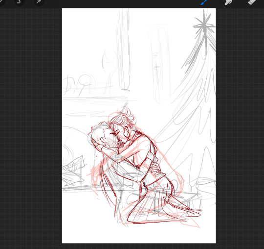
I did not have a specific prompt from my giftee, except for the ship which was Silrah so I decided I wanted to draw a cozy romantic Christmas scene.
Which totally showed in my first sketch...definitely...
My first sketches mostly look unrecognizable and there is no real system for them because it's just lines for my brain to visualize where I want everything to be. Sometimes they look like this, sometimes they are more light/shadow inclusive. The next step was to work out the poses for Farah and Saul and as you can see, I was struggling. 🤣

When I finally found the pose I was looking for and fleshed out some elements in the background it was time for one of my absolute favorite parts.....that I forgot to screenshot....THE VALUES
Which is me trying to figure out the lighting by blocking in light and dark areas with various shades of grey. But because I forgot to take a screenshot (and the value layer that I normally keep until the end for reference disappeared into the void of procreate) we will skip straight to the colour! I very roughly block in the areas with the colours I have in mind to see if everything fits and change what I don't like yet. When that is done I now have a finished concept which I need to refine and then paint!
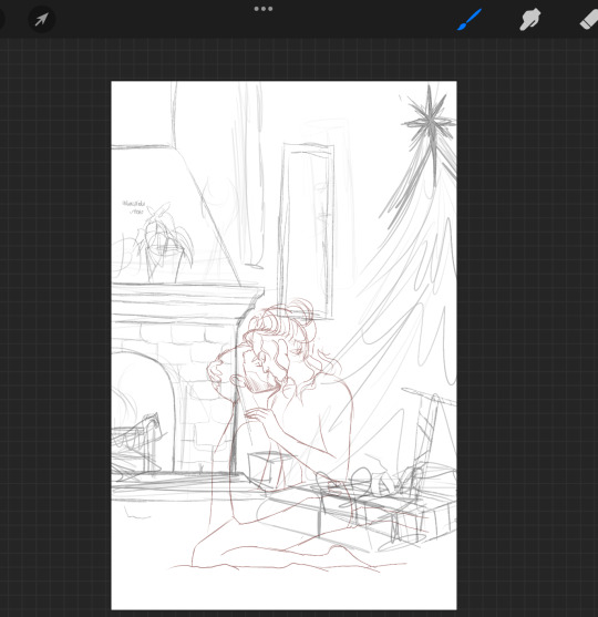
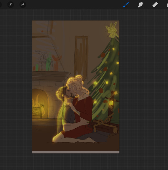
And now I reached the point of actual background design which was HARD. I looked at many pics of Farah's headmistress' office to try and get a feel for what items might be in her private suite.
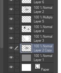
The mantle of the fireplace looked very empty even after I added the little astrology magic thing and the flowers so I decided to add a circle just like the ones in her office as @septemberrie deducted. I also played around with the design of the fire guard because I wanted it to have that elegant whimsical fairy vibe. I added a lamp inspired by one from Sims 4 and a book in the foreground to hide the awkward angle they are sitting at. For the frame on the wall, I wanted a moon-themed design but it took me a while to figure it out, which is why I left the frame empty for now. Then it was time for lineart and actually sketching in the elements I wanted to be in the background. I usually set my colour or value layer and the sketch layer to 20% and draw over it.

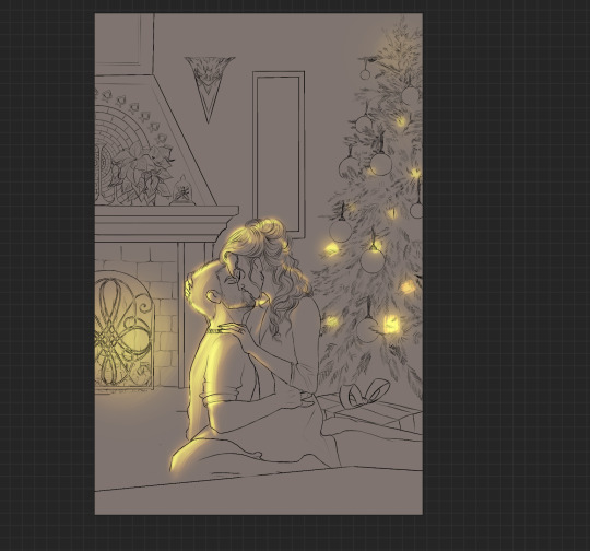
You might also notice that the wrapped sword disappeared...which I regret to this day because I simply forgot to paint it into the rough lineart and only remembered when Skye asked what's supposed to be in the remaining present. Maybe I will add it at some point because now Saul has no present...except for Farah. But the square box present was meant to be Saul's present to Farah and originally I wanted a jewelry box but it was too small to see so I just....put a bigger box. Creativity *sparkles*
Another thing is that from the rough line-art to the nice line-art (yes I always draw my line-art two or three times.....even though line-art is my least favorite stage probably) the Christmas tree is losing a lot of ornaments. Originally I wanted to put in way more stuff like small straw stars or figurines but after painting a million tiny branches I started regretting every life decision that brought me to this point so I simplified the tree. A lot. In the end, I don't regret that because I think it fits them even better. Silrah don't strike me as people who go all out on Christmas and rather just decorate small and tastefully (given they would even celebrate because Otherworld= different culture, but we ignore that piece of worldbuilding for this Christmas-themed drawing)
Next I block in every area on a separate layer so I can alpha-lock them for the painting process. At this point I was getting too annoyed with the tree because painting it was a pain in the ass so I started shading and painting in textures and finishing everything else before even continuing to block in the tree.
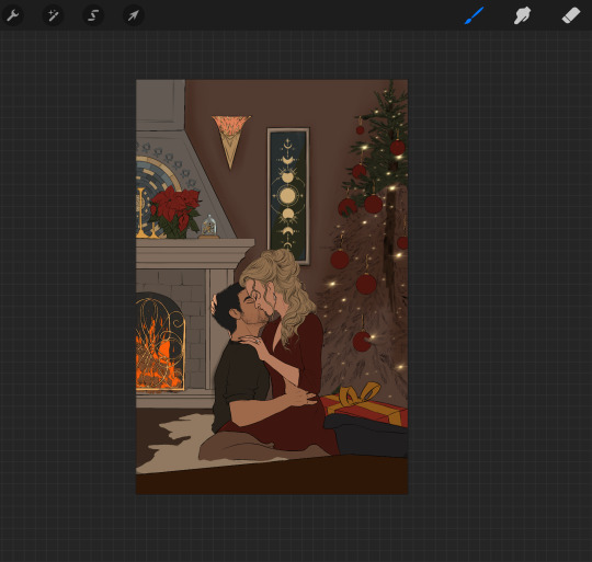
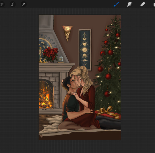
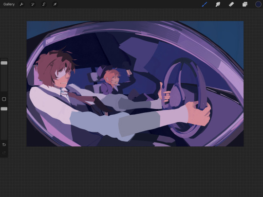
The whole image was still too cold at this point so I went in with one of my favorite parts: atmosphere and then lighting bringing it all together and making the painting shine! Painting light is so much fun and I definitely want to learn more about lighting and structure to get better at it but I really love it when someone compliments the light in my art!!


I also finally added the title of the book in the front. I wanted it to be something about magic that Farah would read and looked at various old book covers with pretty lettering. I decided on "The Story of Magic" because I found a very pretty-looking reference cover with exactly the letters that I needed to spell.
And then....something was still missing......THE TREE. (I didn't take a progress picture at that stage that's why it's already in the pics up there but in the end I still had to draw the light on the branches and after doing about four or five of them I decided the effort was not worth the result and did the light reflection very very roughly. But I don't think anyone except me really notices.
And tada the finished Christmas drawing!
#my drawing process#fay draws#was this coherent? I hope it was coherent#I actually love sharing my process#it's so much fun to talk about all the work you did after you already finished lmao
22 notes
·
View notes
Note
Any tips on how to emulate isat's art style?
Hi!
I am but a humble mimic, I sense there are folks who can tell you more accurate details BUT I also love explaining steps I make while making my own art so I'll tell you how I improvised~!
Firstly, I found the wiki (no, not the Fandom one) for all the references. I tried to study how the characters work and I used a lot of just color picking to get the grayscale hues accurate
The lineart is obviously much thinner than what I went for and it seems to use a crispier brush for it to resemble pixel-esque kind of vibe but I wouldn't know which brush it is, I assume it's a custom/adjusted brush!
What I used was "Real G-Pen™" in Clip Studio Paint!
What's fun about this brush (and superior to G-pen brush) is the fun little texture it has that also resembles some of the crispiness but I think the ISAT one has a much finer texture, to give it the aforementioned pixel like vibe.
The thick line I used was just my preference but if you use Real G-Pen with smaller scale and basically only mild pen pressure, you get similar results to the OG style:

(some of the Sif's images has their lineart thicker in some places to give just a smidge of lineweight feel, enough to work with the depth but I demonstrated here how it looks with basically no pressure applied, it has a bit of that crisp and you can probably get a better one if your canvas was bigger than mine here (just under 1200px lol))
I then color picked from the original images to get the flat colors in!
What I did for shadows is just use the layer set on multiply above all the flat color layers, color pick from the white base gray (that Sif mostly has haha!) and use the that shadow for just about anything. I think I also played around with Overlay in the bigfrin image? you can play with layer settings too and see how it works! You will notice that depending on the mood of the scene in the game and the emotions of the characters take priority over how all of this works.

This isn't 100% as it is in the official artwork but I rolled with it most of the time!
You can throw some adjustments and extras here and there if you want it to resemble the dynamic party portraits even more (the extra line strokes, adding a bit of weight to the line, the white line strokes on clothes and hair...)

You essentially end up with something like this!
For the white outline, you can either copy the base color layer (if it covers the whole form) or the lineart layer but move it under the base color and use the border option:
Regular portraits don't seem to have that outline but I like it a lot personally, it makes the image pop XD
That's basically it! I love how simple and effective it is!
How you stylize the character and how you draw them is all up to you!
Many credits to insertdisc5 since I basically just tried to mimic their style with some liberty sdhjdfg
15 notes
·
View notes
Note
Hello! Do you have any advice with painting? Every time I start I end up just doing lineart with colours underneath, and when I do kindles art it looks kind of like plastic. Am I supposed to merge the two layers and then start shading? What would you recommend?
Hey anon!! I actually do have some advice for that!! I'll shove it under a cut because it got way longer than I thought it would, sorry for the infodump everyone _(:3 」∠)_
quick tl;dr: painting process should consider both personal taste & the desired aesthetic of a painting, & to avoid plastic-y colours, make sure your hues vary within your values (and layer modes are ur friend) ♥
there's a million ways to start paintings & its all down to personal preference -- the end goal for the illustration can often influence the approach you take; a crisp digital painting might call for meticulous layering & sharp edged flats, but if you want something to look like an oil painting, you should try and mimic that process as close as you can! here's some examples:
this is the sketch for my FYR zine piece from last year; i intentionally approached it in a way that looks like traditional underpaintings so that when I worked directly on top, those orange tones would peek through like this:

after doing that undersketch, i manually painted everything -- no fancy layer modes, just me, one layer, and screaming ಥ_ಥ it was hard but it worked for the vibe i wanted!!
now v.s something like this:
simple shapes, roughly blocked in shading that just gets merged and painted over, as well as lots of layer modes on top for those colour changes! this is by far the easier one & the one i'd probably recommend, solely because it lets you keep more control. i go more in depth here on that -- but to quickly answer, i personally block everything (including shading) in before I merge & render!
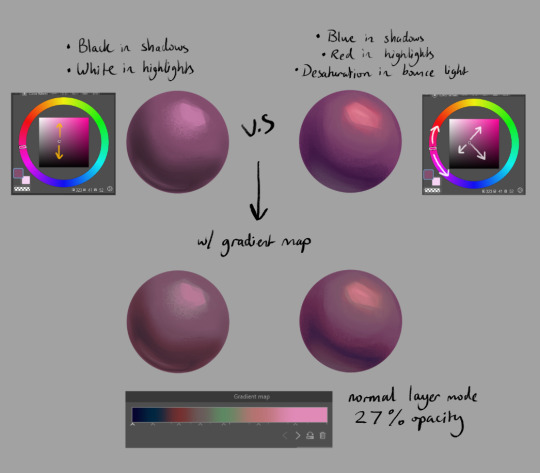
for the other thing you mentioned, a lot of the times that 'plastic' feeling can come from either a lack of transitional shades or only using white/black for your value tones. this tweet thread (direct image links 1, 2 & 3) by frozensoba demonstrates it incredibly well -- by adding certain colour shifts in your values, it can create extra depth which is what makes stuff look more alive!! don't be afraid to really push it and get wacky
an easy way to add it while you're learning is using gradient maps to add richness in your midtones. It's not perfect since different surfaces & materials diffuse light differently, but adding one at the end of a drawing can help tie everything together. If you can do both at once though it always looks best; here's some very quick 2 minute orbs as an example:
ok I'm almost done (and im so sorry for how long this got... special interest moment TM) -- one last thing is to try varying your brush strokes & adding textures if you want. using only an airbrush or heavily relying on blurring brushes can make things look plastic too; sometimes you want that, but for the times you don't, adding some texture & leaving brush marks in can do a lot!!
lastly, since this is just me rambling, here are some artists that are incredibly talented & i highly recommend looking at for their advice & processes because it will be much more coherent than this:
Marco Bucci -- amazing educational content. if you check out any of these artists, he's the one to look at first imo. his 10 minutes to better painting series is a great place to start
Sinix Design has some amazing tutorials on anatomy & the mechanics of painting! This video & the intermediate part 2 are super
Dao Trong Le -- a veritable goldmine of speedpaints
Bo Chen & any of the riot splash artists. If that's the vibe you're after, you can't go wrong with the LoL splashes as reference
i hope that helps!!!
#tutorial#any time i have the opportunity to barf out art talk i will do it#tysm for the question too ♥#not art#asks
91 notes
·
View notes
Last Seen Blogs
xxm0nzt3r-b0yxx
🌈💜🏳️⚧️>:3🦄🏳️🌈🌸
rubyfairy
Scarlet Art Fairy

lookatmehwhores
Live life like no tomorrow(:
everyone-deserves-tea
that's a lot of fireflies

eatyourweight
Eat Your Weight