#And for traditional you can always google the pose reference you need
Note
Your art is absolutely beautiful. I'm currently working on my own story, and want to draw a comic for it someday. I want to improve my drawing, what steps would you suggest I take?
First of all Thank you so much WCEOIEWN!!!!
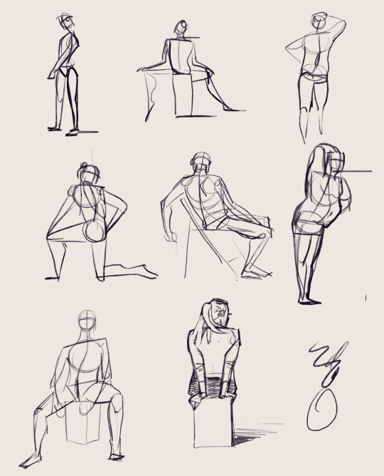
Oh that's a good question. For overall improvement if you wanna draw people I'd always suggest practicing by taking photos of people, best in poses, finding the anatomy in them and seeing the way clothing and stuff looks on the body, influences shape. These practices can be really fast and simple.
I keep suggesting using Line of Action for that since it sorta forces you to draw fast, makes you figure out these things quickly and even teaches you the basics as you go and it's free!
Here's one of the sheets I filled using the website:
For comics the way I go is to draw down a bunch of things that I want to happen and then I try to move them around and push them into panels, making in-between panels for a better flow (my flow needs serious work). When I'm unsure how to pace something or how a scene should be built in comics to make it more readable, I look at other comics from for example Marvel and DC or other artists i really like.

Also REFERENCES!!! Find a way to hold referenc images. Every artist should use references, it's not a shame, it's a MUST!! (at least for me). On PC I use PureRef which is a programm that gives you a canvas to drag and drop you pics. It's free but if you donate you get a cool doggo gif. For finding and saving good pics I use Pinterest a lot. If it's something very specific I just google it.
I see you work in traditional, so I suggest first write down what you want to happen and then start sketching panels very lightly to figure out where goes what and go from there.
I hope that helped! If you got any more questions, my dms are wide open! If you want me to look over a piece of yours or even that comic and give you pointers, that's cool too!
Have a great day!!! :D
28 notes
·
View notes
Text
domicofo commissions | OPEN!


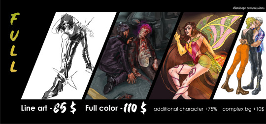


I would be really happy if you would commission me or signal boost this post!💕 Please read the following rules!!!!
What I WILL draw:
Your OC
Canon characters
Real people
Pets (only together with person/character)
NSFW & SFW, nude
Preferable fandoms: Cyberpunk 2077, Winx Club, The Witcher, Dragon Age, but I can draw on every other fandom you’d like ^^
What I WON’T draw:
Mechs, hardcore gore (blood & injuries ok), furries
Inc*st, r*pe & anything else that feels weird (kinks are ok)
Some ships, which make me uncomfortable
NSFW art rules:
price on NSFW drawings from now on is indexed on 10% from full price
nude doesn't count as NSFW, I love drawing naked people
masturbation (1 char) and sex (2 chars) count as NSFW. Kinky stuff too
And some more things you need to know:
Every additional character +75% to the price
+5$ to the price for detailed clothes and tattoos (I won’t charge extra for Kerry’s tattoos, but if any other char has complicated tattoos you:
a) give me their tattoos as flat png images so I can slap them on their body;
b) pay extra for me to draw them by hand
c) don't pay, but I simplify them)
+10$ to the full price for complex background (I won’t do something too complex like complicated perspective, only nature, rooms, blurry townscapes etc.)
The style of fullcolor may vary from lineart+color to color-no lineart (you can request the preferable one)
Line art can have one/two spot colors
I'll send you a sketch of commission if I won't be sure about composition
I can draw you traditional art commission too, if you want it :) It will cost the same as digital one though (i do watercolors and pencils)
I accept payment by Boosty, 50% of the price no refund ahead, the rest 50% after I finish. FOLLOW THIS TUTORIAL ON HOW TO USE BOOSTY or WATCH THIS STEP-BY-STEP VIDEO
Tell me, if I have any deadline to which I should hurry up, but usually commission takes me 2-4 weeks
Price can always be negotiated ;)
NEW! Character sheet
Consists of one character full body, 8 quick sketches of outfits (OR sketches of poses OR sketches of facial exressions)
Can consist of more elements like turns, rendered face and etc, but the more you add the more it will cost
PLEASE let me design you an OC from zero (moodboard or description) I can do that!!!!
If you wanna commission me please DM me here on this blog, write to my e-mail [email protected] or contact me via Discord - Domicofo#0080 . I’ll need descriptions of what you want to see and as many references as you can provide~ Would be perfect if your references would be collected in one Google Drive folder beforehand.
DM me or leave a comment below this post if you still have more questions. You can see more examples of my works by the #my art tag, for more examples of NSFW works stop by at my Twitter
Stay tuned, gonna announce more fun stuff soon ;)
#commissions#commission#domicofo commissions#art commisions#cyberpunk 2077#cp77#johnny silverhand#kerry eurodyne#cyberpunk edgerunners#cyberpunk v#winx club#winx#my post#my art#art#cp2077#judy alvarez#panam palmer#river ward#cyberpunk male v#male v#fem v#kerry x v#johnny silverhand x v
114 notes
·
View notes
Note
Hi!! I was just thinking about your Very Sad piece for day 23 and wondering about your drawing process, particularly because of the complexity of the water - do you sketch in pencil first? If you have the chance and feel comfortable, do you think you could share a couple of in progress shots of your beautiful art? <3
ARGHRHGH okay i had MOST of this answered and then my page suddenly crashed, so I'm very frustrated, but I'm DETERMINED to type it all up again!
First of all thank you for the ask! :D I don't usually take very many in-process photos, although I might do that for today's so I can give you a better look. :)
For this piece, I started off filming myself dragging around a body pillow as reference footage for the pose. Meet Chat Noir!

(My room's a mess because I still haven't finished unpacking, don't mind it lol)
If the poses I want are very simple, or don't interact with each other, or I've drawn similar ones, I don't always need a reference. In most cases though, I'll either spend some time on Google Images or photograph myself to help. I went through my footage and found some frames that I liked, and sketched some of them out in a different sketchbook. It's bigger and I like using it for planning and reference practice. Here's that page!
Because I draw with traditional media, and I'm trying to do all of these pictures back to back in one sketchbook, I try to plan it out in a fair amount of detail before starting on the actual page. Once I get going, it can be tricky to shift things around, especially because I always sketch in colored pencil. (I think it looks nice, it's not as messy as graphite, and it also has a subtle bearing on the mood of the final piece. This one is a dark blue-green because I wanted it to look really waterlogged, but I've used pink, purple, or yellow for a lot of Marichats so far.)
The pose here was something I put a lot of thought into because I wanted it to be close enough to show how protective and intense Marinette was, but also with enough distance that I could clearly show the strain on her body and his weight in her arms.
The story is also important to all of this, especially in the sketching stage. I knew Chat would be floating partially, so that would affect his weight. I knew Marinette had been looking for him for a while, so her hair was plastered to her face - and she'd gone out in a hurry, so her raincoat was unbuttoned. Chat had been slumped in an alleyway for a while as the rain fell, so the blood was diluted and darkened. etc etc I picked the Place des Vosges for the background because a) it was simple b) trees and fences are pretty easy to wreak havoc on! (this is so long sorry)
I sketched the people first, to make sure the pose fit into the frame, then added in some background markers, and a few directional lines to remind me of the water flow direction (I knew I wanted her fighting against the current to bring him home). I lined the people first too, leaving out the pupils and mouths til later, because those are the main indicators of emotion, and I wanted to make sure they would still work if the mood of the piece shifted.
From there I lined the people in ink, added more detail to the background sketch to make sure it fit around them well and was still clearly readable, and then inked that. For the water...idk what to tell you, I was winging it which is funny because that's the part everyone's commented on the most sdflkjdf
I did use some references (I googled like, "water moving past rocks") to see how water responds to obstacles, but water is really difficult to draw, so I just kinda...wung it and tried to create something genre-appropriate! I steered clear of realism bc I knew I wouldn't be able to pull it off very convincingly and would get bogged down in all the deatil it's possible to include. (@davey-in-a-minivan of the very big brain pointed out that the water looks like peacock feathers)
After that, I think I lightly colored the people first, then the background, so I could keep a handle on how they affected each other. Again, the story is important here too, because it makes the clothes shiny, and darker if they're absorbent, and the water darker and with more debris because of the turbulence. I do have a picture I sent to a friend part way through:

After that, I just kept going until I was happy! I like dramatic shading, so I added in a bit more as I went, but because light on a foggy day is pretty diffused, I didn't do as much as usual with that. I added more detail to the trees and sky behind because it didn't fit well with the rest of the piece, and eventually I got here!
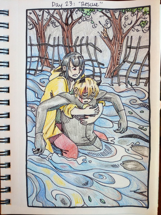
And voila!! I hope that offers some insight hahaha - thanks again for the ask :))) (I might take more progress pictures of today's project for the future)
32 notes
·
View notes
Note
do you have any advice on how to level up like your physical appearance and mentality? like i struggle with discipline and codependency issues and I hate it but when i try and change i fall back into my bullshit real quick
Becoming #ThatGirl

The above quote is from Saweetie. First and foremost, your energy will speak before your looks do.
1. Inner Work
Be sure to work on mindfulness from the inside. I always recommend that my followers look into how to be more mindful and spiritual.
-> Do a 15 or 30 minute yoga session. Look forward to learning poses everyday.
-> Journaling — a diary, gratitude journal, prayer journal, etc will help you think more about your goals, release balled up emotions, and set your intentions. Always refer to your journal first before a person. It will help you analyze your thought process.
- Digital: Day One, Google Docs
- Buy a physical notebook.
- Best pens: Pilot 0.38 and 0.7
- Best highlighters: Zebra Mildliners
-> Check in with your emotions daily.
- Mood trackers: Daylio, eMoods
-> Be grateful. List 5 things you are grateful for
-> Eat mindfully — cleaner foods and not just junk. Drink your body weight in water.
- Cleaner eating: no soda (if you must drink something drink ginger ale.), no dairy (cheese occasionally. I never drink real milk...), drink more teas and more smoothies. Eat oatmeal. Rice, fish, salad.
- Buy a reusable water bottle, or a mason jar with a lid from Amazon and refill it. This way you will drink your water.
- Take your multivitamins.
-> Have a list of affirmations you say daily: “I am beautiful, I am blessed, I am blossoming.”
-> Meditation to relieve your anxieties. It will clear your mind completely and leave you refreshed. Download Headspace app!!
-> Exercise and watch your mental health improve.
-> Watch less mindless TV. Read books or listen on Audible.
-> Have a steady routine. This is how you create discipline. Always have a morning routine and night routine. You must have good hygiene. Have a structured schedule so that you’re always in order.
-> Sleeping at least 8 hours, wake up early and start your day. If you have a decent bedtime routine that relaxes you you will be able to do this. Meditate, listen to chill or binaural beats, and avoid naps.
2. Outer Appearance
After you have envisioned and began to achieve what you want your inner self to look like, it is time to think about your outer self.
-> What does #she look like?
- For example: A high value girl will be put together — impeccable fashion sense, hygienic, and glowing radiantly.
- What is the style that you have always dreamed of having? What is your signature fashion sense? What is your It Girl Aesthetic? Is it traditional feminine, old Hollywood, 00s glam, tomboy girly? A mix of everything???

- Invest in high quality pajamas. I notice that when I have my silk robe on I transform into a baddie and I feel elegant at the same time.
- Wear clothes that fit to your body.
- Have signature jewelry, a signature bag, and a signature perfume scent. Make it fun.
-> What are the things #she does to upkeep her look?
- Teeth Whitening: Crest 3D whitestrips, toothpaste, and mouthwash. Flossing always!
- Nails: Always upkeep your toes and nails, at least have them filed/shaped and coated with oil. If you decide to paint them: Sally Hansen Gel Polish, preferably white on the toes because it is classic and goes with everything. white, Tiffany blue, baby pink, red are all flattering colors.
- Makeup: Light Foundation, blush, brows, lashes, lipgloss is actually enough, less can always be more. If you decide to wear heavy makeup be sure to set it with setting spray, Urban Decay or NYX.
- Skin: Have a skincare routine. Face wash -> toner -> serum -> moisturizer -> SPF* morning. Exfoliate twice a week. Aztec clay mask twice a week. Find products that work for your skin.
- Tree hut exfoliating scrub before shower. Lip scrub before lipstick. Burt’s Bees chapstick is the best and Aquaphor is super moisturizing for skin as well. Dr. Teals bath salts for a relaxing bath.
- Moisturize your body with cocoa or shea butter then oil after showers.
- Hair: Castor oil for eyelashes, eyebrows, hair. It’s a god send
3. Mindset & Overall Improvement
-> Grow your confidence. Know that you are a one of a kind individual and nobody can be like you. Affirm yourself... start saying things like, “I’m a living angel.” / “There’s only one me and I’m the baddest.” / “I’m a dream girl.”
It’s not overzealous, it’s confident. Trick your mind into thinking this and it will be internalized the same way you internalize negativity.
-> Maintain strict boundaries with yourself and others. Don’t tolerate less than what you deserve, and always do your best.
-> Develop your individuality. If you are putting someone on a pedestal, you will never glow up. Be independent and stop needing others approval for things, and learn how to rely on yourself first. Do more things on your own and fall in love with the new you. Buy yourself flowers, pamper yourself always.
-> Deep cleanse your life. Delete old contacts. Clean your space always and keep it appealing. Donate clothes you’re not going to wear. Delete old photos that do not make you happy. Focus more on yourself, and disconnect from social media. Always block schedule your apps. 20 mins per day on the ones that drain you the most.
-> To create more discipline, create goals worth fighting for. Create goals you look forward to at the end of the day. Look forward to the new life you’re going to have. Be gentle with yourself while also having the maturity to check yourself when you’re lacking. Don’t just look at the end result, look at where you are now. Appreciate the now, anticipate the future. Don’t just wait to be motivated, just start.
-> Always remind yourself that being human takes failures...ups and downs, but you will always come out on the winning side because you will be working towards flourishing and blossoming into a high value, high maintenance baddie.
You got this! ❤️
4K notes
·
View notes
Note
I've always loved how dynamic your poses are and the way you use varying angles, do you have any tips for that? (Other than using reference and practising, though they do help a ton!)
Oof, that's a hard one!
Okay, so, I've drawn for most of my life, kinda ever since I could hold a pencil (gonna ding to 34 later this month, for reference), almost a decade of that was spent going through three different art schools, I've got couple entire degrees in this, and a lot of that means that drawing is second nature to me. I don't really have to consciously think of what I'm doing at this point anymore, so i don't know how good an explanation I'd be capable of giving.
So, uh. Couple of tips I could think of?
Practice
Yeah, yeah, practice makes a master, but don't just churn out drawings without thinking. Try to have a purpose in what you do. Draw from photos, draw from real life. Really THINK what is it that makes something look like it does. Watch a lot of videos of things moving. Dogs frolicking. Horses jumping. Google Eadweard Muybridge and study those image sequences. What makes the movement look like moving. How can you convey the weight of the thing you're drawing. How's gravity affecting it. Draw from a photo of a moving thing, and then again, but exaggerate it. Photos on their own can look stiffer than the thing they portrait, as they freeze the time, so thinkbof pushing things further to make the impact feel bigger. How about a video? Ever seen someone get punched in the face in slow mo? See where all the squishy flesh is going.
Perspective is evil, but studying it can make you so much better at drawing things.
Study from art. How have other people portrayed movement before you? Look at classical art, but also animation. Your favourite comics and cartoons. What's exaggerated? Squash and stretch? (note: it is absolutely fine to trace art for practice. Kids do that to learn, and most artist have done, and still do that. BUT! It's polite to not publish these practice drawings online without permission from the artist you copied from. And remember to credit if you do!) And don't just stick to one artist, or you risk learning their shortcuts without knowing WHY they use said shortcuts, you don't want to end up adopting someone else's mistakes in your own art by accident. Watch movies, specially animated. See how and why they work. Frame by frame if you have to or can! (Kung Fu Panda movies are visual porn, just saying)
Study composition and layout. See if you can find storyboards of good looking movies, or just watch a movie and try to draw storyboards from it. Try to find key poses
Don't worry about having a style. Most artists can't actually see their own style (I know I can't! I still have a style, I know I do, but because style is formed from muscle memory, habit and my way of seeing things, my style is inevitably mine, but I can't recognize it, as from my perspective I can only see the mechanics of what make said style, not the results on their own)
Keep a sketchbook!
(traditional artist point of view here) Have a designated place for your doodles and studies. Whenever you draw something that doesn't need to be on it's own paper, draw it in a sketchbook. Fill the sketchbook with anything and everything. Doodles, studies, notes, life drawing, two dozen faces of your favourite anime character, that one eyebrow you saw in another artist's drawing that really spoke to you, and you wanted to understand it (my sketchbooks have sometimes disembodies body parts in them, drawn in other peoples' styles because of this. I don't share them, but I absolutely do them). Date your drawings, so looking back you can easier see your progress? You probably can't see your progress while it's happening, but the hindsight of a sketchbook can help. Don't delete them, just move on. Ruined a page? It's okay, it's just a sketchbook. Turn to the next page and continue. You can learn from your mistakes, but you need to make said mistakes first!
Try different materials or mediums.
Draw with pencil. Draw with marker. Pick a watercolor and try that. Did you know you can paint with coffee? Learn how different materials feel, how they work. Not every medium will be your friend, but you won't know if you don't try.
Try drawing on black paper using only white or light colors. Carve its shapes out of the blank darkness!
Get some playdoh or modelling clay and make something. And then maybe draw what you made. Combo the 3d of the clay with the 2d of the pencils.
Like, it's not just learning to draw, as in make lines on paper. It's also about training your brain to SEE. That's the impirtant bit.
My brain works visually anyway, so I've gotten it trained pretty good at visualizing things before I even pick the pencil up.
Uhhh, is this helpful in any way? I don't know how to advice.
33 notes
·
View notes
Text
September 17: 3x07 Day of the Dove
I am incredibly discombobulated today—usual weekend nocturnal shenanigans I guess! Anyway it’s somehow midnight. Gonna try to write up these note on the Classic episode The Day of the Dove in as efficient a manner as possible.
Hmm, a planet with wavy pink Fraggle plants. I like it already.
But where is Spock? Very suspicious.
I really appreciate Kirk giving a little speech to set up the overall question/issue for us. (I know he does this all the time with the Captain’s logs but this is out loud and so… more obviously expository.)
Oh no, it’s our old friends…the Klingons.
I will admit that this ONE TIME, the Klingon is being reasonable. Like, it is reasonable to think that Kirk and the Enterprise attacked his ship, given that his hip WAS attacked, and who else would it be?
Three years of peace between the Klingons and the Federation? That is inclusive of the show so all this tension must technically be “peace” and also implies there was something more like a direct war going on, like, right before Kirk got the captaincy.
Zoolander voice: What is this, a colony of the INVISIBLE?
“We have no devil. But we understand the habits of yours.”
No takers? No takers on the torture? No volunteers to be mercilessly tortured by the Klingons?
Star Trek Beyond could have had Kirk and Chekov bond over being brothers! I mean, to other people.
They’ll kill 100 hostages at the first sign of treachery. He does know there are only 400-some people on the ship right? Maybe you should pace yourself, Kang.
Kirk’s so badass he needs MULTIPLE guns trained on him just to use the phone.
Oh-ho secret message to Spock. Which version of the iPhone will be capable of doing THAT?
The Klingons are “suspended in transit” is an awfully nice way of saying they’re just dematerialized atoms in space. Philosophy major and/or Bones nightmare fuel.
How did Kang not see this coming, by the way? Like, he just says “I’m taking your ship now, me and my 6 men versus your 400-some men, and I’ll do this by simply declaring it to be so. Now let’s beam up to your ship, where I’ll be greatly outnumbered, and there are armed security guards all around me.” Guess he’s been reading The Secret!
WIFE AND SCIENCE OFFICER
Aka the most important part of this whole episode.
Kirk’s face is very ?????? You can have both????
It’s legitimately not even important for her to be the science officer tbqh. Like that is so gratuitous. That’s just in there to drive me insane.
"We're prisoners, somehow, after I demanded to come on the ship, assuming they'd just give it to me without any kind of fight. How DID this happen?”
Federation death camps lol—someone’s been watching Fox News.
I do kind of wonder… is this an actual rumor that goes around the Klingon homeworld or is it something that the alien entity put in her head specifically to make her angrier right now? I mean it really could be either.
I also appreciate this episode for being pretty much the only one to actually attempt to give the Klingons a reason for being as they are. The Romulans… maybe aren’t well-described, but they do have a sort of regalness to them, appropriate for being related to Vulcans, and you can kind of imagine that they are the way they are because they’re Vulcans without the intense self-control. Plus they’re literally only in 2 TOS eps and in the second, the Federation are the aggressors. But the Klingons show up a half-dozen times only to be depicted each time as just like Cartoonishly Bad, aggressive, violent, and selfish for basically no reason. And I mean, some people really are!! But TOS has so much nuance in other places, that it always seemed a little disappointing to me that the Klingons are really just like ‘well we’re just bad and we hate everyone and we really like killing I guess.” At least in this ep there’s a little more added to that: that there is poverty on their world, that they feel aggrieved, that they feel unprotected, that taking and conquering is how they look after themselves…
I think that’s later in the episode though.
He’s detaining them in the LOUNGE lol. With their favorite dishes available to them to eat. Absolutely barbarous conditions.
I can’t believe Chekov is hanging in the elevator with the cool kids. Like, one of these things really isn’t like the others.
Kang is officially sure of himself for someone currently imprisoned in the lounge, that most fearsome of Federation death camps.
Hmm, could the glittery light alien have taken over??
You know what, that's a lot of tasks for Johnson to do all by himself: search the whole ship, fix the engines, and free 400 people.
Sulu would love this: everyone gets a sword!!
“Bridge. I gotta show this to Sulu immediately.”
Klingons have maintained a dueling tradition. That’s interesting. Finally some characterization going on.
Spock is really living up to his logical nature today. Everyone else has gone off the emotional deep end and he’s like “have you considered this completely rational explanation that accounts for the actual, observed facts??”
Whoops Chekov is actually an only child. Scratch that previous Beyond headcanon. (Interesting that his dead brother does really resemble Sam though—killed on a research colony??)
Love that Sulu knows that about him though.
Oh, that’s a pretty schematic picture of the Enterprise. I want that on a t-shirt.
Lol the pan out to the armory, now filled with… swords!!
Do ALL of these men have a fetish for swords? Sulu and fencing, Spock displaying swords in his quarters, and Kirk in his San Francisco apartment, and Scotty salivating over this Scottish blade.
“Klingon units.”
Finally Sulu gets his sword! It’s what he deserves.
Love that the shiny light alien also has a fetish for swords.
Oh no, it’s our old adversary, an alien life force.
What is the alien’s purpose? Um, I’m pretty sure its purpose is to start shit.
“An appropriate choice of terms, Captain.” I don’t even remember what this is referring to but I think it’s pretty clear that Spock is enjoying himself during a crisis again.
Bones, being so dramatic. Were there atrocities? He’s talking about the Klingons as if they were literally hacking off limbs—it’s a few stab wounds here and there, chill.
Oooh, time to behave like military men—strong words. (But I thought it wasn’t the military?? @ S**** P****) (This might not even be my best argument, given the context of this episode, but I’m sticking with it.)
This is like a giant game of capture the flag.
AU that’s just about the Enterprise crew playing capture the flag with the Klingons.
Sulu in the background standing guard with his sword
Damn, turning on Spock with the slurs now!!
Spock was absolutely ready to kill him. Like he would 100% have taken him out with a blow to the head. And he’d been doing such a good job of not feeling the alien’s effects so far! Admittedly, that was a strong provocation though.
Honestly, I really like this scene. It’s uncomfortable and tense and you can really see how the alien is bringing out the worst possible influences of their respective races. And I liked how Spock was definitely full on pre-Reform Vulcan for a minute there. It was a more effective portrayal of what that might have looked like than All Our Yesterdays tbqh.
A result of… stress?
Kirk got himself out of it first. He’s so strong. He knows himself so well, he cannot be outsmarted by any alien.
“We’ve been taught to think in terms other than war.”
“The alien brings out the worst of us—patriotic drumbeating…even race hatred.”
He’s so sad; he can’t imagine thinking like that about Spock :(
Sulu in a Jeffries tube! A man of many talents. It’s okay bb, take credit for turning on the lights.
The alien must have been getting bored. The Klingons must have been doing too well, and the playing field needs to be leveled for maximum shit-stirring.
“Let’s find that alien.” That’s how I ALWAYS feel.
Oh, Kang, you’re so close—“What power supports our battle but thwarts our victory.” So, so close to getting it.
ALIEN DETECTED.
Spock takes his sword, of course.
“Jim.” Obligatory Jim moments hit differently when they’re not so obligatory.
“Jim—stop hitting my protégé. And put that sword down.”
Kirk looks so sad, picking Chekov up to carry him bridal style.
Also in addition to ‘race hatred’ I think we need to add ‘rape-y tendances’ to the bad stuff that the alien is inspiring here.
“A brief surge of racial bigotry. Most distasteful.” Spock winning for understatement of the year.
They're assuming the alien is trying to test out their relative powers but I think it just wants entertainment. I mean, doesn’t it look like a naughty little thing?
Mara’s outfit is… little shorts? Interesting. Usually not my style but she makes it work.
Spock doesn’t even look at Johnson as he falls lol. Another one bites the dust.
“It exists on the hate of others.”
What does this remind me of? Oh, the Vast of Night and the whole “aliens made us do every bad thing ever” conspiracy theory. At least this one makes more sense, in part because it is not quite so overwhelmingly broad!
All hostile attitudes must be eliminated, he says, and there's Mara right behind Kirk giving him a death stare lol.
Kang is so obviously posing. Google Earth, always taking pictures.
Only a few minutes before drifting forever in space becomes inevitable? Good thing Kirk works well under pressure.
“Well… do whatever you can, Scotty. You know the drill.” Doesn’t even bother giving real directions anymore. We’ve been in this scenario before.
“So we drift in space, with only hatred and bloodshed aboard.”
And the 392 people below just get to…live in Enterprise prison, I guess.
Star date: Armageddon. So dramatic!
I’m not even making that up; that’s an actual quote. Can you imagine being an Admiral listening to this?
“Stop the war now.” An actual line, really aired on television.
Spock wants to threaten the wife lol. That's the old pre-Reform Vulcan seeping through. Surak who?
Damn, Kang is cold. “Eh, she gets the concept of being killed in battle.” They’re gonna need marriage counseling after this.
“There is another way. Mutual trust and help.” Yes that’s my hero!!
“No one can guarantee the actions of another.” Can’t remember the context of this entirely anymore, but great line.
The entity is loving this—multi-person choreographed sword fight!!
"Those who hate and fight must stop themselves. otherwise it is not stopped.” Another baller line. Spock has a lot of deep thoughts today. And so does Kirk. And Kang.
Kirk tries to reason with the alien. Nice try.
“Shoo. Shoo, alien. Off the ship, go away.”
Omg that last moment—Kang slapping Kirk’s back way too hard, Spock’s completely ridiculous wide-eyed expression when he does, like some sort of combo of amusement and confusion, and then Sulu just passing on by in the background….
Then the alien just yeets itself into space. And that’s the end!
Always feels weird when there’s no wrap up on the bridge.
Also, what are they going to do with the Klingons? They have no ship. They really did come out of this a lot worse than Kirk and co. No ship, huge casualties—and no one to blame even, but the alien.
I feel like the alien messed up a little in killing so many Klingons. Like, it could have accomplished its purpose, angering the Klingons and turning them on Kirk, by attacking the ship a little less violently—you know they’d react to 5 deaths pretty much the same as 400, and then there would be many more people to fight forever and produce that sweet sweet anger!
Maybe the alien’s powers aren’t strong enough to influence 800 people though. Also it wants equal forces and 800 people wouldn’t fit on the Enterprise, one assumes. So it still makes sense.
That was, of course, an excellent episode. 100% agree with is classic status, even though the main things I remembered going in were the wife + science officer bit, and everyone laughing at the end in a really forced, fake way, in order to make the alien go away.
I thought the Klingons were a lot better/more interesting today than usual. First, I think Kang is a better character, or a better actor maybe, than the others; he has a certain way about him that is… more watchable, more sympathetic. And he’s always saying these really dramatic things that make it seem likely he writes patriotic Klingon war poetry in his off time. Also, including his wife made them seem more… not human obviously, but normal. Not just cardboard cut-out villains. And of course the actual lightly specific motivations I earlier mentioned helped too.
Also, the plotting was very good: it built up slowly but surely over time, so at first the alien’s influence wasn’t that obvious, and then it became more so, and then it became horrifically obvious and extreme. And then you had to re-evaluate earlier moments: was that the alien changing facts in their heads, or a real part of the animosity between humans and Klingons? And it wasn’t always clear, which I appreciated. The tension when the people were at their worst wasn’t overdone, like in that moment with Scotty, Spock, and Kirk—or even in Chekov’s assault on Mara, tbh. The various strategies of the different sides were very entertaining too; there was never a dull moment, and they fit in a lot of straight-up actions and twists into 50 minutes.
The possible threat was truly terrifying, also: stuck in a space ship, forever, unable to die, feeling the worst possible emotions all the time, besieged, angered, despairing, fighting a war that can’t be won, being injured and suffering only to recover and fight again, and it never stops… A perfect nightmare mixture of insanity and violence and pain. And the alien, in encouraging hatred and anger, doesn’t discriminate between sides: they turn on each other just as much as on the Klingons, breeding paranoia and infighting. For eternity.
The episode also felt much more strongly anti-war than I remember tbh. Like it was not subtle. Kirk literally says “stop the war” in so many words. He has a part in his speech where he talks about the possibility of other aliens out there, encouraging other wars. And while I do think “maybe the aliens are making us do it” is a cop out explanation, or would be if it were real, the scenario gave the show a lot of room to say, like, pretty ballsy things: to include “patriotic drum beating” along with “race hatred” in a list of corrupting feelings they were experiencing; to show how the same instincts that lead to warring also lead to sexual assault and the aforementioned ‘race hatred;” to reveal the true horror of an endless war by making the participants unkillable and sticking them in a singular space ship in the middle of nowhere; to imply that the combatants of war gain nothing from it, but outside or third-party entities will pull strings of their own design to profit from the conflict as long as possible; even to make an impassioned plea to camera to stop the endlessness of the conflict. Like I can’t even totally unpack this but it is a lot!
Finally, it was also a great Kirk episode, which of course is my most important factor. He’s smart; he’s strong; he’s so sure of himself and his values that he cannot be manipulated to mindless hatred, he represents the values of the Federation, and the show itself; he treats even his enemies with basic respect and humanity; and ultimately, he saves the day.
Okay I was not efficient in writing this up at all! It is very late!!
5 notes
·
View notes
Text
i yearn for one(1) thing only, and that is to have a nice, simplistic, cartoonish artstyle. an artstyle that doesnt rely on anatomy, but the "movement" of the drawing, if you get what i mean.
i dont want realistic proportions and traditional colors and basic poses and gradient shading, i want funky lil dudes in funky poses with funky styles littering my sketchbook :( but alas i havent figured out how to develop that kind of style yet, my brain wants anatomy to look nice but also i dont want to draw eyes. i dont want to take time out of my day to learn how to draw lips i want to draw a line that extends past the characters face. i dont want all my characters to have pointy chins with curved cheeks i want their heads to be round and friend-like or full of sharp edges depending on their personalities and styles. i want to give them all not-quite human ears, blob feet, simple faces, but at the same time i want enough detail to convey the story or emotion im trying to tell.
ive spent so much time recently agonizing over how to use 3d model websites, using real-life references and tracing over them for practice, color-picking from real images to try and do realism and failing miserably, but you know whats easier than that? funky little dudes. little dudes who do not care if their legs are too long or their hair is too bouncy. i dont want my characters to look human.
ive spent enough time on the artfight website to realize that most people who classify their characters as "human" have the most basic ass designs (no offense to people who like basic human designs its just not my thing) or its like dnd-medieval style outfits which i cant draw for the life of me (ive tried). again no offense to people who actively enjoy and draw characters like that. i just need my dudes to have that certain,,, off-ness to them. tails are cool. wings are swag (especially if they arent even like,, fully attached,, ), elf ears are so wonderful to me no matter how much theyre overused, horns are so much fun to draw, and colors!! i have no knowledge in the color theory department so this works great for me!! the only thing i really know is dont shade with black, other than that i just colorpick from references usually but i dont want to do that!! i want the colors to hurt people's eyes but in a satisfying way. like the character's design is so nice to look at that you dont mind your eyes hurting a bit. like how im enjoying writing this post even though its 2 am and the brightness on my computer wont go any lower.
and then another thing ive noticed from being on the artfight website is that a lot of people classify their characters that are anthro/have anthro features under humanoids/monsters. like i made a google form to find some people to attack and someone sent me in a character with some sort of animal (wolf? idk) arms and legs. like dude!! peak character design i love her. but me personally? i cant draw that shit, its so hard for me. i tried a while back and its just Not my thing. nothing against furries i just. cant. and i dont want to either.
and i got another submission that i accidentally deleted that was like full anthro/wolf-like like my comrade,,, i cannot draw animals what makes you think i can draw an animal who acts like a human lmao. i can do like. very basic tails, and also animal ears but i cant do the arms and legs and such i just dont know the anatomy, and i know i was talking about how i dont want to care about anatomy but i feel like for anthros you really do need to know at least basic animal anatomy so you know how the limbs look and shit and i dont have that knowledge and dont feel like gaining it.
and then there were some submissions that i absolutely adored. there was one that like, was vaguely human shaped but definitely was not a human. they had a dark-ish lavender colored skin and horns and tusks and like goat ears and a sorta fluffy tail with spikes on it and they had wings and such and they were such a pleasure to draw i love them. and they had a fairly simple outfit too, nothing too complicated. and then i also enjoy object head characters, theyre so neato to me. i got one of those and i really wish i had the motivation to work on it cause it looks so fun.
i want to make funky characters but id have nothing to do with them because the only book i ever tried writing (key word tried - never got past planning it out) had strictly human characters in it, and most of the books i read are humans/humans with powers in situations specific to them so id have no idea what lore to make with the dudes. assuming i have the motivation to make lore and backstory because honestly i just really enjoy character designing its super duper fun.
(side note a song about trucks doing the deed came on just now and its interrupted my flow, apologies).
i only have three actual characters right now. one is an original roleplay oc whos design is literally athletic shorts, an oversized long sleeved grey sweatshirt, long purple hair, and demon horns. the second one is my persona whos design some sorta medival knight outfit kinda thing? but not ugly it looks really cool (idk one of my friends designed it bc i won some contest from him but the drawing was on a super small scale so idrk the details,,,) with a plague doctor mask and crown, and shoulder length wavy brown hair, dyed bright pink at the end. and then my last one im not too comfortable using other places because theyre a character my friend is using in the story hes writing, and thats really the only place theyve been used. but theyre easily my favorite and im already writing a ton so ill talk about them too.
they're a sorta elf species thing from another planet, with pale green skin and pointed ears. they also have a tail, its like,, super thin, but with a feathery bit at the end. probably not the texture of a feather but i dont know how else to describe it. they have short, curly, almost-draco-malfoy-blonde hair that when it gets too long they can put in a man bun. their eyesight is kinda shitty so when they got to earth, they were exploring some supply closets around the airship. drop off area. thing. like airport but for rocketships and also fancier. yeah. they were exploring that area and found a nice big pair of round glasses with grey frames. and they also found a cowboy-style hat and a sharpie so they wrote their name on the underside of the brim of the hat and stole the hat and glasses (but left the sharpie in the supply closet).
yeah theyre my favorite, my absolute beloved, my child, so cool. i want more characters like them but with maybe a bit more snazzier designs. theyre super cool and all but they could have more pizzazz if they werent in a story where its too late to give them more pizzazz. i just want to be able to give my characters thigh-high boots with a bunch of buckles and fluffy hair with tons of accessories crammed in and abnormally large and long ears that can harbor many piercings and horns that can hold rings on them and special little details on their outfits like who knows what but i dont have any characters to do that too, so i have to make them from scratch, which is always hard especially when you have artblock.
and i also have like 17 characters i need to fully draw, line, and maybe color for artfight before august 1st. so i dont know. i have many things to do and plenty of time to do it but instead i spend my time halfway watching repetitive youtube videos that get boring or sleeping all damn day because i stay up too late doing things like this or i just do nothing at all and its tiring and frustrating but i also feel nothing about it like theres no consequence if i dont do it besides you know. not doing it, not gaining that experience, not making something i enjoy.
so i should do it but i dont for whatever reason, i think its called executive dysfunction but im not sure. this post started out very differently than it ended and i said somewhere up there that i was writing this at 2 am but now its almost 3. this is so many words why couldnt i have put this energy into something productive
#long post#sorry its so messy but like i said its almost 3 am and i dont want to go back and format all this#i might come back and make it look nicer in the morning#maybe not who knows#i just checked and this is 1.5k words what the hell
3 notes
·
View notes
Text
How to Create a WordPress Blog For Your Internet Business Opportunity
Your blog is a form of website maintained by using regular entries of commentary, descriptions of events, graphics or video. Your blog is certainly a simple way for promoting your individual internet business opportunity with practical and valuable content; content which can be placed on any company whether offline or online. Sketch to WP
The information you post on the blog is called a "blog post." Your site posts can instruct in the various search engines connection between Google for particular keywords which are within your posts. For instance, should you wrote your site post about "the difference between top tier direct selling and MLM," your website could make an appearance in Google's results if someone else searches for "top tier direct sales". Short article entries are generally displayed in reverse-chronological order.
Blogs provide commentary on a particular subject or perform as increasing numbers of personal online diary. A normal blog combines text, images, and links with blogs, websites, as well as other media related to its topic. The power for readers to leave comments is a part of many blogs. Most blogs are generally text, although most will even include photographs and videos. Micro blogging is yet another type of blogging, featuring very short posts.
This list provides some incredible statistics and the value of your blog for today's online marketer.
Blogosphere Stats
133,000,000 - Quantity of blogs indexed by Technorati since 2002
346,000,000 - number of people globally who read blogs (COM Score March 2008)
900,000 - Average amount of blog posts in the Round the clock period
There are various varieties of blogs, differing installing the type of content, but also in the manner that content articles are delivered or written. Listed below are only some examples:
Personal Blogs
The personal, traditional blog is the most common form of blog. It becomes an ongoing diary or commentary by somebody. Few personal blogs rise to fame but a majority of personal blogs quickly obtain a widespread following. Microblogging is kind of a private blog which can be extremely detailed and seeks to capture an instant over time. Sites including Facebook allow bloggers to share with you thoughts instantaneously with relatives and buddies and so are considerably quicker than e-mailing or writing.
Corporate and Organizational Blogs
Your blog post might be private or it could be for used for business purposes. Blogs useful for marketing, branding or pr purposes are called corporate blogs. Similar blogs for clubs and societies are classified as club blogs, group blogs, etc.; typically utilized to inform members and your customers of club and member activities. Sketch to WP
By Interest
Some blogs give attention to a certain subject, like political blogs, travel blogs, house blogs, fashion blogs, education blogs, music blogs, legal blogs, etc. Two common varieties of genre blogs are art blogs and music blogs.
By Media Type
Your blog post comprising videos is known as vlog, one comprising links is known as linklog, a site containing a portfolio of sketches is known as sketchblog or one comprising photos is termed a photoblog. Blogs with shorter posts and mixed media types are known as tumblelogs.
Your blog is usually a website that lets you efficiently add fresh content if you wish. Blogs are really simple to publish (you only need to understand how to type, no problem finding (your audience can certainly find your posts), social (the best way to create a presence in the online community), viral (your site posts may be virally distributed), as well as simple to url to and from. Blogs do require frequent and ongoing maintenance because the inclusion of fresh content - writing, photos, video, etc. - is essential for a blog to keep effective. The information should be relevant, informative, thought provoking, etc...
There are many different blogging platforms. If you're a new comer to blogging WordPress.com is an extremely simple platform for ease of setup. WordPress provides flexibility, tutorials and support and you may easily migrate your articles derived from one of blogging service to another if you undertake to exchange platforms in the foreseeable future. Do be aware WordPress.com are listed ads on your website. However, this is often avoided if you opt to use WordPress.org If you are paying for you hosting, which is marginal on price, you will get total power over your entire content without unsolicited advertisements. And most importantly you avoid the probability of never being suspended.
The actual following are a few basic action how to begin you blogging experience:
1. Enroll in a WordPress Account
2. Decide on a theme
3. Pick a hosting account (this can be accomplished at a late time)
4. Write A Article
Easy Methods for getting Article Ideas:
- Write down 5 items you learned today, and post it on your own blog.
- Once you learn something new, post it on your blog.
- When you make a move fun, post it on your own blog.
- When you make a video, post it on your own blog.
- Whenever you take new pictures, post them on your blog along with a description of what you did.
- For those who have a solid opinion about something, post it in your blog.
- When you submit a new article or press release, post the url which has a summary on your blog.
- If you possess solution to a common problem in the industry, make a post.
5. "Ping" It
Once you "ping" your blog you are notifying search engines like google that you've new content in your blog.
- The first step: Go to Pingomatic.com
- The second step: Enter the name as well as the Link to your website.
- Next step: Click all blog services to Ping.
- Next step: Be sure you ping each time you update your blog with new content.
6. Manage Comments
Comments are good; it indicates you have active readers. Make a point to respond to the future prospect taking enough time to leave a remark. If a person makes a general comment you can respond with "Thanks on your comments. They are valued." If you disagree using a comment one of your readers make sure they know WHY you disagree. You shouldn't be defensive or confrontational. Most probably to joining the conversation and supporting your opinion inside a rational effective manner. Remember, you want to provide your readers a reason to regularly go back to your blog.
After you are moving toward learning to be a professional blogger. Several basic tricks and tips.
- Don't plagiarize. If you are quoting content from another source make sure to cite your references and can include any appropriate links.
- Often be yourself and turn into original.
- Share your notions.
- Avoid clichés.
- Provide Fresh Content
- Provide real content, not only sales' pitches. Your blog posts shouldn't seem like sales' pitches. You have to be sharing valuable thoughts, ideas, and opinions along with your readers. Typically in blogging along with marketing generally speaking, you need to provide 80% content for every 20% sales pitches.
- Take part in meaningful dialogue together with your readers through comments. Your audience increase because your readers share your blog post using their circle of influence and they can be likely to do this for time to realize their curiosity about your blog post.
- When sharing your notions, consider framing your opinions so that you acknowledge that one could be wrong. If you come across as being close-minded to new ideas or any other viewpoints you have the chance of turning your readers off. However, in case you pose your thinking from your "here's what I'm thinking right now" perspective, you might encourage some healthy debate inside your comments. With that in mind, one of the most successful blogs are highly controversial and unapologetically opinionated.
- Take a look at other blogs. Examine other blogger's styles and ascertain what you like along with what you don't like.
Listed here are several more advanced suggestions:
1. Blogging Etiquette
Once you add a url to another site inside your blog post WordPress will automatically "ping" this website allowing them to know you only linked to them. If both blogs are stored on the identical platform you need to go to a experience of your trackback link of their comments section. If somebody links to your blog you should always go have a look at their blog as well as leaving a thoughtful, intelligent discuss their blog. Add your blog's URL with your name within the comment which will not simply foster two-way communication between your other blogger, but probably encourage their readers to also have a look at your blog post.
2. Submit Your Blogs to Blogging platforms.0 Sites
You will get ranks to precise keyword posts with the keyword by submitting your posting to all the world wide web 2.0 sites using a service called Socialmarker.com. When you input your title, URL, descriptions along with your account to each site, Socialmarker will submit this page to 20 to 30 Web 2.0 sites to suit your needs with one-button simplicity.
3. Optimize Your Blog for Search engines like google
For those who have a post you want to push-up within the position in search results you should have keyword phrases inside the title of one's post, in the first paragraph as well as in the closing or concluding paragraph.
A fairly easy trick to add your keyword or search term with your title is usually to build a title for example "How to find/do (insert keyword)".
As you get proficient with blogging you may want to consider advertising all on your own blog. To achieve this you'll have to setup a self hosted blog i.e. WordPress.org. This allows to place your own text or banner advertising on your own site in order to make the most of a promotional network for example Adsense. A self-hosted WordPress.org site may also present you with a lot more flexibility using the layout, design and advertising options on your blog post.
1 note
·
View note
Photo

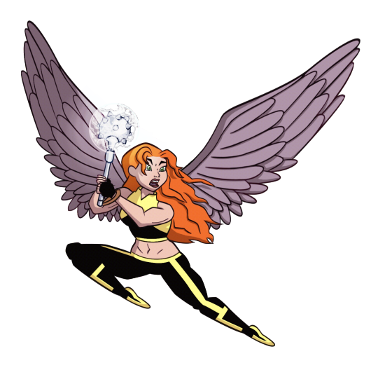
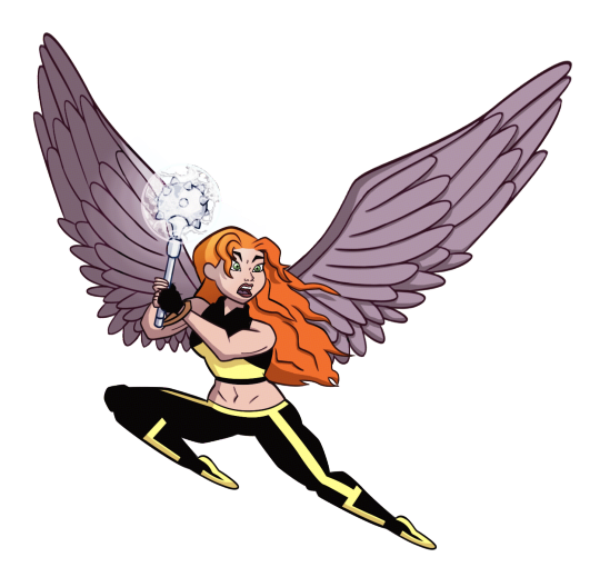
HAPPY BIRTHDAY to tumblr user “i love a woman who can kick my ass” @shxyerahol! i’ve been waniting to draw this for your bday for a REALLY long time, and i’m glad i can finally share it with you!!!
i love you so much and i treasure all the time that we’ve been friends! here’s to another 6 years!~ ❤️🎂🦅🎉❤️
here’s the section where i dump a bunch of art and ramble for a while! to start off: i made alternate versions of the costume.. ultimately i couldn’t decide which one i liked best, so i made 3. here’s the other two (and transparents in case you like that):

such as classic shay

and the original colour scheme i was gonna go with until a miscommunication made me pick the first one

now here’s where you should stop because i’m going to babble about how i started drawing this in the first place and the art is...... not refined lol
since i’m more of a casual+traditional artist, i knew i would need a lot of time to prepare for this to look good... so i started drawing for your birthday in january
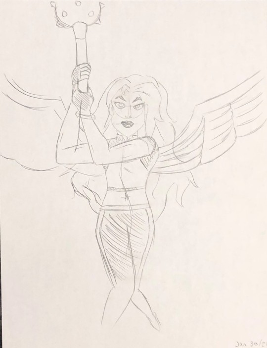
this is the first piece! when i draw something i’ve never drawn before, i do a practice piece—except this time i really liked it! i was contemplating going with this one before i thought “it needs more action”
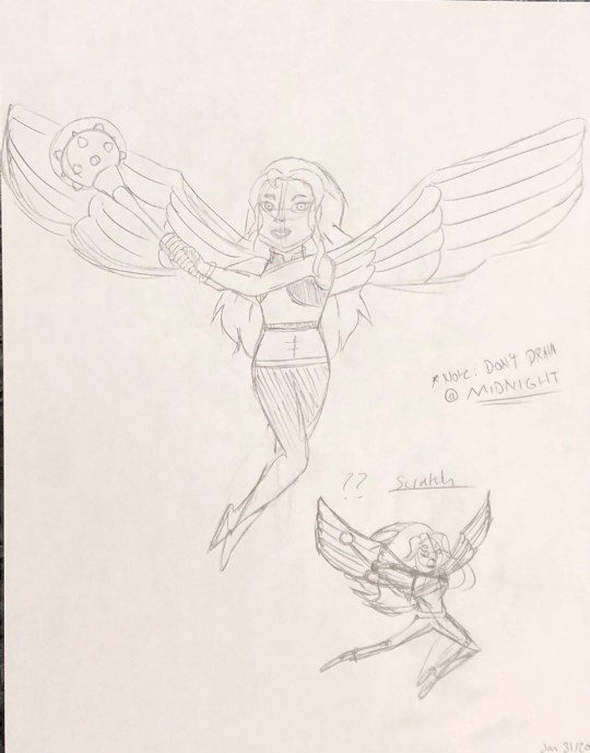
this one... ehh..... the “*Note: DON’T DRAW @ MIDNIGHT” really sells the exhaustion of the art, so i did a rough sketch at the bottom corner of an action pose that i think would work better
and... it could have worked? i nailed the face and hair, except i really don’t have much practice with drawing action as i write “I am new to action poses... and muscles 👀”
i drew another rough sketch at the bottom corner of a different pose that i could try
until then, i took a break. however, that didn’t stop me from doodling shay all over the house. this one i drew with pen on note paper and left it in the kitchen by mistake. my mom says she loves the angel!
i drew this on the boogie board we keep on our fridge. i must have pressed hard enough on it that even when i erased it you could still see what i scribbled
yet none of these were coming out right. there was always something off about them that i just couldn’t cling to. the break ended up continuing for about a month before i had to sit myself down and go “WE ARE DOING THIS”
one try. one more try was all i needed before i knew this was the one. this piece was made with the help of various references such as: screen shots from the show to understand her movement when she flies to baseball players to mimic how to hold a mace (google did not give me references on how to hold a mace)
it’s an art style much sharper than what i normally draw, but it gave me vibes of reading a comic book
i transferred the drawing to photoshop where i went to work. since i don’t have a tablet, i drew this with my laptop touchpad. the touchpad itself isn’t a problem. i’ve mastered using the pen tool to get the image i want, yet i’ve always struggled with finding the right brush to do it. my lines always come out too stiff since i don’t have pressure...
i tried a different brush, “flat fan” at size 1. my worries were gone! it was just the brush i needed to give shape to the line art. occasionally i would change the size to 2 for lines i wanted particularly thick
colouring is harder. i’m just generally not good at it? colours look dull and flat, i don’t know how to blend, etc. despite all attempts, i managed to find myself satisfied with what came. i did add a filter called “Color Halftone” for the comic book look (the spots that you can barley see), and i maaay have messed with levels+selective color to brighten everything up after i finished... imafilthycheater maybe one day i’ll learn proper colouring!
until then, i hope you have an amazing birthday! here’s a mistake that happened when i hid a bunch of layers:

i call it “HELP”
#i realize that your birthday is technically in an hour#but because of the magic of time zones you get this early!!!!!#happy birthday sab!!!!!!!!!!!!!!!!!!#dc comics#shayera hol#justice league#shxyerahol#qulo talks
16 notes
·
View notes
Note
Can you share any art tips? I wanna learn.
Now imma keep it real w you… I am not the best person to ask this lol I don’t do art professionally. I did study traditional art at GCSE and A level though, but my digital drawing skills are all self taught over the course of the two years that I’ve owned a stylus and wacom pad. But I’m very flattered and happy that you’ve asked and I’ve done my best to answer this!
Plus there’s a lotta aspects of art and I have many thoughts and tips for each.. And I work in a lotta different styles and each one has different stuff you need to consider… So if you want more specific tips from me you will have to ask a more specific question.
w that said
Charlie’s general tips (also obvi these all have a time and a place and aren’t unbreakable rules you HAVE to follow or you’re a bad artist. These are just things I personally try to keep in mind):
-When you pick colours while colour theory can be impt focus more on the mood. Like… muted, blue tinted colours for angsty art, warm gentle colours for more light hearted stuff. If you find choosing colour palettes hard, just colour how you want and then do another layer over the colouring, colour it in yellow/orange/pink/blue etc and lower the opacity to tint your art.
-shade by choosing a different colour, not a different shade. E.g. shade blue with purple, shade red with purple or reddish brown. And shade yellow with orange or green not by shading yellow with… greyish yellow.
-Use black as a lineart colour only if necessary, generally I use brown lineart though for stuff like clothes I make the lines the colour of the fabric. Like for jeans I use blue lineart. IDK why but unless you’re going for a comic book style or you feel like black lineart is super important to the picture, coloured lines tend to just feel better.
-also for lineart… u do not have to but experimenting w varying ur line length can be good. Thicker lines make things look closer while thinner lines make things look further away, and having a mixture of thick and thin lines makes ur art more dynamic.
-Also try out lineless art if you want! It changes how you colour and shade and I personally found it really helpful to try for a while.
-draw backgrounds lol. Even simple shitty ones add so much. (I am guilty of not doing this for most of my art but all my favourite pieces had carefully constructed backgrounds so I personally am a bit of a sucker for a sexy background)
-If you are drawing backgrounds… try not to do that thing I always do where I draw a person and then have to cobble a background together around them. Try to preplan and sketch stuff out, even a little bit.
-use a reference for poses! I honestly sometimes trace over photos lol. Even if you’re drawing super stylised and cartoony having an example of what the pose you’re drawing looks like on a regular human body can be v helpful. Especially if you’re drawing stuff like hands, shoes, clothes folds or anything that looks the same on a human and cartoon then I recommend like… googling hands lol. I personally use pinterest to find references. I especially like using older photos and vintage illustrations.
-Use the stabiliser lol… I didn’t know this tool even existed until like… several months after I’d started drawing digitally and it has saved my life. If you look at my older art and think “wow… this lineart is fucking shit…” that’s bc it was all done freehand babyy!!
-ALSO try out different brushes… learn how to make custom brushes on ur program (most of the textured brushes I use are ones I made myself or downloaded) and go buck wild.
-In terms of drawing drawing (as in what to include) think about lighting and don’t be afraid to mess around w shadows and dramatic lighting. Also think about composition. Having stuff in the foreground and background creates a cool illusion of depth.
-Also just think about what you love about your favourite artist’s styles - is it their brushes? Colouring? What the drawing is of? And think about incorporating that in ur own stuff.
-Also... I’m gonna say it. If you caption all your art with shit like “here’s another bad piece of art from me” or “here’s something I threw together I don’t like it” “this is shit but you guys can have it” then...
stop.
That’s all I have to say. Get some help for your low self esteem. It’s just as important to pinpoint what you like about your art and work on that as it is to acknowledge what could be better. It especially saddens me when people post pictures they’ve clearly spent a long time on and they caption it with nasty things. Like... why are you insulting your hard work? It’s okay to let yourself be proud of what you can do right now, even if you wish you were better. The art police will not break down your door and kill you for being proud of the work you’ve done so far, even if you have a long way to go.
That’s all I can think of off the top of my head! If you have any more questions about the process behind specific pieces go ahead and ask!!!
1 note
·
View note
Note
i keep reading 'orion' as 'onion' so thats. who they are to me now
ONION……………………….. now im picturing orion as onion from steven universe and i am very stressed out by the thought
MORE ASKS UNDER THE CUT!!! (a lot of asks im sorry)
1) D..DONT DIE YET ANON……….. SOON!!! I have a break coming up and i wanna do more comics stuff 😭
2) LOL omg IM SORRY !!!! I Messed up the layout a couple of times while editing it so it must have been weird 😨
1) Hiya! Honestly I think it would be best to get comfortable with more realistic proportions before you branch out into cartoon/anime style! I did it the other way round and I regret it a lot, bc I think it made my foundations really shaky and inconsistent. THAT’S NOT TO SAY u have to master the traditional art style before u start drawing any cartoons though!! I think it’s fine to do them together, just don’t neglect traditional anatomy and all that, bc it will help you a lot in the future regardless of the style you eventually choose to stick to!
2) LKMKLDS ANON STOP NOW IM GOING TO THINK OF THE STORE WHENEVER I THINK OF JC ………… he would be Mr penney???? MR..PENNEY..

thank YOU for enjoying my drawings!!!!!!!!!!!!!!!!
ahhhh thank you so much for such a sweet message oh gosh ANON YOU’RE MAKING MY HEART GROW 3 SIZES!!! Messages like this make me want to share everything with everyone!!!!!!!!!!!!!!!!!!!!!!! I’M HONESTLY SO HAPPY that my silly little tips and stuff can make drawing fun for you BC THERE IS NOTHING BETTER THAN HAVING FUN WHILE DRAWING!!! MAY YOU INSPIRE LOTS AND LOTS OF PEOPLE and most importantly I hope you always find joy in your own art!!!! THIS MESSAGE MEANS THE WORLD TO ME AND YOU DO TOO ILU ANON!!! IM GONNA KEEP THIS FOREVER
1) A NERD AND A PUNK!!!!!!!!!!!!!!!!!!!!!!
2) omg I have thought about basically every combination o f my ocs at least once anon lKMDLskdlj they would be cute!!!!!!! and a very calm couple… I feel like emmett would be patient enough to handle fay though it would take a lot to get there bc rn emmett is low key terrified of fay LOL
1) IM NOT SURE U WOULD WANT TO MARRY THEM ¾ OF THEM ARE A MESS!!!!!!!
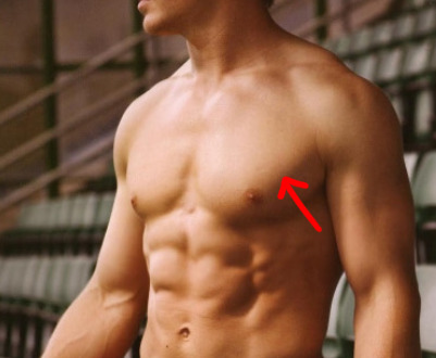
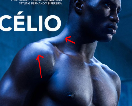
2) OH I googled around a bit bc tbh I have no idea what they are called too, and I think it’s called the terminator/ half tone?? it’s basically the bit of colour between the light and the core shadow (the darkest part of where the shadow starts)

THe coloured outline of shadows that alot of artists do is an exaggeration of how it looks in rl but it is pretty neat bc it makes the object look like it’s glowing haha
1) AW THANK YOU ANON!!!!!!!!! it’s so sweet that you’ve stuck around for so long and that you take the time to do that!!!!!!!!!!!!! I HOPE I’LL KEEP DRAWING AND MAKING ART THAT YOU ENJOY FOR YEARS TO COME!!!!
2) OH no that plant is a random plant that I made up hahhaaa
1) HELLO AGAIN AND thank you ahhh it means a lot to me that you take the time to interpret and think about my art in such a thoughtful manner😭😭😭 It’s really sweet and it makes me look at my art in a different way? I was thinking that the redrawn version seems more stiff and I wasn’t sure if I liked them more than the old ones, but after seeing this message I was like ohhh that is true I did try different things with the new versions and that is something I should appreciate and be proud of !! so thank YOU for the lovely words, it is my absolute pleasure to share my art with u!!
2) HE IS YOURS PLEASE TAKE CARE OF THIS WHIRLWIND
1) I like using poses from magazines to study anatomy!! I either follow blogs that post magazine scans or I buy them myself when i can! Another thing I’ve found rly helpful was using fitness books/ videos as references… like those for muscle-building/ weight lifters, where there are diagrams of which muscles are working for a specific exercise. YOUTUBE has a lot of fitness videos, just type xxx workout, pause the video at any random frame, and u should be able to get a nice reference to study muscles with!! If u want references for the muscles themselves, some good books I’ve found helpful are: Strength training Anatomy and Anatomy for sculptors (I can give them to you off anon if you’d like)!
2) I HOPE YOU ARE enjoying the brushes !!! NO WORRIES AT ALL I’m happy to share my brushes with anyone who might want to try using htem!! SENDS YOU ALL OF MY LOVE BACK I HOPE YOU ARE ALWAYS HAPPY AND INSPIRED ❤❤
1) omg this is so hard bc there are 213213 options and I could picture them as more than 1 type of fantasy creature tbh ……… BUT FIRST ONES THAT COME TO MIND WOULD BE : some kind faerie for fay haha, werewolf for tyler, centaur for emmett, vampire for jc, some kinda elemental spirit for cyrus, an orc for wade, and UHH some kind of wise gate guarding creature for parisi LOL
ILY TOO AND thank YOU for loving my silly boys!!!!!!!!!
2) AHHHH thank u anon I WISH YOU ALL tHE BEST AND I HOPE YOU KEEP DRAWING AS WELL ALWAYS 💞💞💞💞
1) OR PERHAPS PARISI IS JUST ENORMOUS but also yes it’s true baby tyler is a tiny baby bean
2) LSKMDLKSM HOW CAN I NOT SAY I LOVE YOU BACK TO YOU THE SWEETEST ANON OF ALL TIME 💖💖💖💖💖
1) omg anon this is a lie I am terrible at drawing anything symmetrically and if I somehow produced anything to make u think so, it’s probably because I spent 10 hours on getting it to look ok LOL I.. TRY TO USE GUIDELINES and flip my canvas to check that things are balanced… that helps me out a lot :’D
2) thank u anon for this ask it is beautiful and I will frame it and keep it in my room to encourage myself to start drawing batfam art again
1) HEY ANON and thank u! I have a list of resources that I’ve found helpful here (at the bottom of the page) !! I hope some of that might be useful for you and feel free to drop me another msg if u need more/ want something more specific!!!!!!! ALL THE BEST
2) omg I havent replied to asks in so long that I didnt even rmb what picture this was referring to and I had to go back and look LOL HE’S TRYING HIS BEST ANON!!!!!!!!!!!!!!!!! HE CANT HELP BEING AN AVERAGE MAN SURROUNDED BY MODELS HOW RIDICULOUS OF THEM !!!!
#thank u for ur patience i will try to be better with replying ..#ILU ALL#sometimes i wish i knew who theese anons are so that i can befriend them#kelno#Anonymous
57 notes
·
View notes
Photo
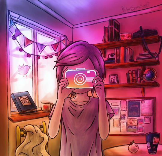
Behind the Screens
Oh, look, a reminder of why I don't do detailed backgrounds often!
Okay, okay, this is actually an entry for projecteducate's All Mediums Contest: From Logos To Art. It sounded like a fun challenge, so I thought I'd take a stab at it.
(Hopefully obviously) My primary logo choice/inspiration was the Instagram logo, largely because I had a strong visual idea for it in my mind right away. However, if you look closely there are logo inspirations hiding in there, too. Some of them I think are more obvious, while others are more subtle. In case you'd rather try to find them on your own, I'll list them in small text so you can skip to the next paragraph and not be spoiled.
Moving left to right, top to bottom: Outside the window is the Twitter bird, tweeting away; Then we have a literal FaceBook propped up against the window, and next to it a "Ko-Fi" Coffee cup; below the window we have a chair, the SnapChair, based off the SnapChat logo/ghost, which I am particularly proud of. On the right side of the art, we have a globe with some plastic bits that's inspired by the Google Chrome logo; then a PinBoard as a reference to Pinterest; and side-by-side on the table we have an Apple-apple and a Tumblr-tumbler. Fun fact: Because of that apple I now know there are in fact real apple species that have white skin, the most common among them seeming to be the "white transparent" variety.
You'll notice all the logos have something to do with the internet/computers/social media, and though I did think about sneaking in a couple of other logos like Dominos or the NBC Peacock (since those logos have good visuals), I ultimately decided it was better to stick to a more cohesive theme. This is also where the title came from, as the idea is this is the reality behind the screens of a perfectly poised Instagram photo.
And therein lies the further theme/message you can take away from this; Notice how the figure is holding the camera so that we can't see their face at all, like a mask. And how the other logos have crept into the rest of the scene, in a way that a lot of them you probably wouldn't notice as internet icons if it wasn't pointed out to you. Both of these are realities for a lot of people. On the internet, we put on a facade like a mask. We control the narrative of what people see of us. And our online presence and habits sneak into our lives in ways we might not notice right away. Both things happen for better or worse, and they can and do happen to anyone, regardless of who you are.
To that end, I consciously tried to make the person holding the camera little androgynous, so that it could be a boy or girl, but since this is me we're talking about I'm pretty sure it leans more notably on the feminine side. And it doesn't help that for the positioning of the hands I had to use reference photos of myself when I couldn't find quite what I was looking for online.
Speaking of which; to make the art I started out with a traditional sketch of the figure and the background bits that were inspired by logos, except for the Pinboard and Kofi/coffee cup. And it's kinda funny because I wanted to base the camera design off of one of the newer instant Polaroid cameras (as that seemed the most fitting to transform into the Instagram Logo camera), and fortunately when I was taking the reference photos my phone is sized just so that I could use it as more or less a stand-in or base. This worked out even better because it meant I could just take the photos in front of a mirror instead of having to set a timer and hope I could pose correctly from a distance.
I scanned the sketches in, and then came the trickier part: That background. Especially since a lot of the concept here relies pretty heavily on it.
I used a lot of reference photos I found online for this. I did have a basic, rudimentary sketch of my own that I made without any references, but I knew to get the lighting and perspective right I was going to need some actual photos to go off of, and I don't personally have a room that looks like what I had in mind for this.
Based on these photos, I did end up putting the shelves over the pinboard, as opposed to putting the pinboard higher on the wall, but other than that and some slight adjusts to the perspective, my general idea for the room stayed the same.
And, given my tablet situation, I gave myself a bit of break and decided not to do perfectly clean, solid linework for anything other than the human figure and the camera they're holding. The camera kinda had to have clean lines for this to work, and I thought the figure would stand out from the background better if they were done with clean lines. (And I'm pretty sure I was right about that.)
For once in my life, I mostly started in the back and moved my way forward. The walls and ceilings, then the window, then the shelves and the stuff on them, then the banners over the window.
And my process reminded largely the same throughout: Loosely line the object, give it a base layer of color, then go back and shade/lighten as necessary. And I was using semi-realistic colors, though I knew they were going to get largely disguised later on when I did the all-over overlay to really drive the Instagram logo inspiration home.
Naturally, all the stuff on the shelves was a largely more annoying undertaking than I'd anticipated, but it wasn't quite as bad as the multitude of books I had to do for World in a Book. It's not even that drawing in a bunch of objects like that is hard, necessarily, it just takes a while to get through if you want it to look right.
Anyway. Once all of that was done, I took a break to work on the figure and camera, getting the lines done and then moving on once again.
Then it was the other logo bits' turn. Once I had them all lined and properly arranged/placed (as they were drawn as separate, individual items from the rest of the scene), I colored each one using the actual logo colors first, then went back to shade them, and then fiddled with some adjustments to bring the saturation down a little and make them blend a bit better with the overall tone. I would end up having to undo some of this after I added the overlay, and as otherwise with that in place some of the logo-inspired things would've either blended in too well or stood out way too much, depending on which one it was. (The camera is a bit of an exception here as instead of getting proper shading, I opted to line it only and just use my home-made gradient inside of it.
Once those were taken care of, I back-tracked to color in the figure. Which went similarly to everything else, save for this time I'd use multiple layers for the shading/highlights until I was happy with it, then I merged all that onto a layer about the base color. And then, because I have one solid blue-gray base color for them, I then went back and separated the hair, skin, and shirt with their own unique colors.
That was all the coloring done, so I moved on to filling all the blank "photo" spaces I'd left everywhere; the pinboard, the tumbler, even a little picture on one of the shelves. For this, I simply used my own artworks as that seemed like the fastest and easiest way. I just went through my gallery, found pieces I thought would fit properly, then copy & pasted them in and adjusted them to size. A few I did a little perspective warping on just to be thorough, but nothing too crazy.
Finally, then I could move on to arguably the most important part: The overlay.
Actually, aside from the overlay making the whole image look a little bit too dark, a little too saturated, that went a lot smoother than I thought it would. I just had to turn the saturation down a bit and bring the lightness up to fix that.
Or, that's what I thought. I must've saved this thing 6 or 7 times thinking it was finished before spotting this, that, or the other thing (usually related to lighting or shading) that needed to be fixed.
First, it was just fiddling with the overlay layer because it still seemed too dark overall, then it was tinkering with shading in various places, and then I decided to drop the ko-fi cup in there because it felt like that spot on the windowsill needed something else and I really wanted just one more logo reference. And then the bottom left corner I thought I fixed earlier now seemed too dark, so I had to un-fix/re-fix that.
And of course, even after all that back-and-forth, I thought I was finally, finally done when I noticed the black checkerboard squares on the SnapChair were too dark of a black compared to the blacks/darks elsewhere in the photo, especially considering how light the area around the chair is. I'm sure I could've left it alone and it would've been okay, but my own brain wouldn't let me. So I fixed it! It's not even that noticeable of a difference, but it makes my brain feel so much better knowing it was indeed fixed.
Fortunately, after that (at least for now) I stopped noticing things to tweak/fix. It's still not completely perfect, but the things I could continue playing with are at least to my satisfaction to the point I'm comfortable calling it finished. Though, honestly, it already feels like this description should be a lot longer when I think about the 3-4 days I spent working on this.
It was a lot of work, but just like I thought it would be, it was fun and I'm really happy with how it turned out. It was a real challenge as far as shading and perspective go, and obviously, for as strong of an image I had in my head when I started, it wasn't exactly a cakewalk to get it there. A lot of the lines are rough up-close, but they don't look so bad when there's so much else going on in the picture to distract from them. Maybe I'll try the "softer" lines like this more often.
I do know one thing, though, I'm going to be avoiding detailed backgrounds for a while. They always take a lot out of me.
____
Artwork (c) me, MysticSparkleWings
I do not own any of the logos that inspired parts of this artwork
____
Where to find me & my artwork:
My Website | Commission Info + Prices | Ko-Fi | dA Print Shop | RedBubble | Twitter | Tumblr | Instagram
2 notes
·
View notes
Text
Underworld Ultimatum: The Quest for the Hottest Hades
So I mentioned in a previous big text post that I have some Very Strong Opinions on the interpretation of Greek god Hades shown in Disney’s Hercules film, and now I’m gonna talk about those opinions dammit! But let’s make it a little interesting. I always believe that if you can’t say something nice you shouldn’t say anything at all, so I’m also going to use this as an opportunity to talk about a Hades that I do enjoy. It’s a competition, babey! The Underworld Ultimatum! Or, if you’re preferring to reference a property one of these guys is in, the Hades Cup! (though to be fair this is less of a true competition and more of me showing why I like one and not the other)
First off, it’s the guy who inspired this, give it up foooor...
Disney’s Hades!
First of all, the guy’s design might’ve seemed cool back in the day, but looking back on him he’s kinda bland. Grey toga with accents of other greys, blue deathly pallor, nasty teeth... The flame hair is a pretty good concept, but considering the ancient Greek idea of the underworld probably wasn’t fire-themed I don’t know if it was an appropriate choice. ❌
Speaking of that flame hair, he commits the crime of “blue fire is totally cooler than red fire you guys what is physics?” nonsense. Anyone who puts even the tiniest bit of research in knows that, disregarding chemical compounds that affect flame color, blue flames are hotter than red/orange/yellow flames. Yeah, from an artistic perspective it seems counterintuitive, and blue flames work better with his standard palette, but even with that in consideration they couldn’t’ve made it so his flames turned white when he got angry rather than orange? Lazy... ❌
This is a problem with the Hercules film overall, but this feels like a christianized take on the ancient Grecian pantheon, with a much less horny Zeus in the place of the christian god and Hercules as sort of a Jesus figure. In line with this, Hades is portrayed as an equivalent to Satan and thus is shown to be undeniably evil. This is inaccurate to the actual mythology of Hades, where (and someone with a better scope of Greek mythology can either back me up or refute me on this) he was just a dude who ran the underworld and had no real malicious intent. But of course, a character is themed around death, they have to be a completely irredeemable villain. ❌
AND continuing the villain thing! He ugly, at least according to western society standards and especially compared to the hero and leading lady who are conventionally attractive by those same standards. This is continuing a long Disney tradition that a villain should be ugly. He’s evil, thus he doesn’t get to visit the dentist. ❌
His goals are basically just the same as every other villain, take over the world with some big strong brutes that are locked away by a supposedly benevolent horndog. Well, specifically Olympus, but considering that’s where the gods live and his brief rule subjugates the GODS, if he’d been in the head for longer he’d basically rule the world. Boring, bland, think of something else for once. Or at least have a good reason other than “I’m the villain, world domination for me!” ❌
There’s no real satisfying tension between him as a villain and the hero! His initial direct action against Hercules happens when he’s an infant (speaking of, dude actively tries to kill an infant), and then the next direct interaction between them is like nearly 20 years later and Herc has no knowledge of who this guy is and how big of a threat he’s been this whole time. Call me crazy, but I feel a villain is more effective when the protag is aware of the threat they pose for longer than just “oh he showed up today and apparently he’s been trying to kill me since I was a baby and now he’s got my girl??? guess he’s a bad guy” ❌
Following this point, there’s no satisfying confrontation between Hades and Herc that works to finish off the conflict between them. The major battle that Herc has against him is mainly against the titans, and iirc the only thing that he does to him in the “grabbing Meg’s soul from the soul pool brb” section is punch him in the face. I don’t remember any direct action that Herc does to cause Hades to fall into his soul pool. ❌
He’s voiced by James Woods, who is a major jerk. I’m not going into detail here as this is already long-winded enough, and Google is free. ❌
He’s got Cerberus, as any good interpretation of Hades should. That’s a plus! ✅ Though this Cerberus seems to be based on the “generic mean dog breed” aesthetic, and also I hated fighting this guy in Kingdom Hearts (the original, not the final mix with updated controls, OOF), which leads me toooo...
The guy THEN proceeds to smear his presence all over nearly every Kingdom Hearts game! Like, you’re not needed! Get out! Leave some room for better Disney villains!!! ❌
So nine bads, one good, and that “good” only comes from me liking dogs.
Next up, we have a more recent contender to the Hades mythos in modern media. Showing up outta nowhere in the first entry into a classic series for 21 years, let’s bring our hands together fooooor...
Kid Icarus Uprising’s Hades!
First off...look at this man. Look at this man! Hell yeah that is my aesthetic! Look at all the chaotic colors, the wild anime-esque hair, aaaaa! Amazing design! I would ask someone to get me the name of Uprising’s character designer so I can shake their hand and tell ‘em they did a wonderful job on the Hades look, but they’re probably Japanese and I don’t know a lick of it. Maybe someone at NoA could pass on my compliments... ✅
He does have a flame head form at some point with blue flames, but it doesn’t become red to show his anger so there’s no more of a violation of physics then the rest of his insides are. ✅ And that’s the real problem I have with Disney’s Hades for this particular point, if you’re going to violate physics at least have some damn fun with it instead of just thinking that cooler fire is hotter just because it’s made of warmer colors.
While this Hades is also irredeemably evil, there’s no weird christ-washing of Greek mythology going on here, because the Japanese generally don’t do that sort of thing when throwing a bunch of other culture’s mythologies together. Sure, Kid Icarus includes a lot of Greek mythology elements (Medusa, Thanatos, Pandora, arguably Palutena being based on Athena, among others), but it also incorporates a lot of original elements, such as the Forces of Nature who are not based on any specific Greek gods, the Chaos Kin, the Aurum, freaking space pirates?! And in regards to the Aurum, this Hades is able to put differences aside in order to help the other factions around at the time defeat the Aurum so there’s that! ...though he’s not exactly the best team player, hehehe... ✅
While he does show up out of nowhere after the defeat of the initially perceived villain, Medusa, once he debuts Hades is a constant presence. He’s almost always poking his head into the dialogue to taunt Pit, make some quip or joke, flirt with a female character, give a dastardly threat. Everyone’s always aware of exactly what kind of threat he poses! Good villain writing! ✅
But yeah, speaking of that, he does do the whole “initial villain wasn’t the real villain SURPRISE BITCH” thing that I’m not that fond of. Call it lingering resentment from Twilight Princess where Zant was basically thrown away in favor of bringing Ganondorf back. ❌
This Hades also doesn’t seem to have a Cerberus. Twinbellows is a Thing, yes, but they never show up in the same instance in time. The real Twinbellows is dealt with in the first chapter of Uprising, and the fake version of Twinbellows that shows up in chapter 9 is dealt with LONG before Hades reveals himself. ❌
His goal is to use the souls of everyone and everything that’s died to increase the ranks of his army and in the process throw off the natural order of things, which honestly makes sense as a goal for a malevolent death god. It’s helped by the fact that there’s really no one “good” faction in this game, everyone has their own self interests and Palutena’s just the one that’s most kind to humanity and Pit, who is the protag we experience the game’s events through and thus passes on a little of his bias. ✅
Oh, you want satisfying hero/villain confrontation? The boss battle against him takes up a whole chapter and oooohhhh boy is it a good’un. Do yourself a favor and look up the battle on YouTube, or to avoid a lot of spoilers and gain a lot of context, do yourself an even bigger favor and look up Chuggaconroy’s whole Uprising playthrough. The man goes into detail about everything of this game, not just its characters and basic gameplay. ✅
He eats Pit at one point, and then that whole chapter takes place in his innards. Ew. Gross. ❌
He’s voiced by S. Scott Bollock in the English dub and Hōchū Ōtsuka in the Japanese original. I don’t know whether either of ‘em are jerks, but I doubt they’re as bad as James Woods soooooo... ¯\_(ツ)_/¯
Setting aside cameos like being a spirit in Smash Ultimate, this Hades has only had a significant appearance in a single piece of media. Even though it’s a tad bittersweet, he doesn’t overstay his welcome, unlike another Hades. ✅
That’s 7 goods, 3 bads, and a shrug. The winner is clear! KI Hades is the victor! Or at least it’s obvious that I prefer him over the Disney version. Rant over, thanks for sticking through my ramblin’ goofballery. It was fun at least, right? I had fun. :D
#disney#disney hercules#disney hades#kid icarus#ki hades#jess discusses character stuff#and how differently two different sets of people can interpret the same core concepts
23 notes
·
View notes
Note
so i'm trying to draw a picture of a dude in a bathing suit... i was wondering if you could give me some pointers? especially in the anatomy lol
Sure! Excuse me if I go into too much detail. Or not enough! Feel free to message me again if you still have questions after this.
Short version:
1. Find a reference picture or two
2. Copy or analyze/reconstruct the image(s) to the best of your ability. (If you’re going to share your art publicly, you should use a license-free image, or credit/ask the owner – assuming that your art and the reference are clearly similar.)
3. ???
4. Profit
Long version:
1. Gather good reference
Tumblr, Pinterest, Instagram, Youtube, Google… the internet is full of attractive people. Find some pictures that look close to the result you want. I like workout videos or TV/movie scenes because it’s always useful to see your subject from multiple angles, and I can select the exact frames that look best to me.
Sometimes I use little action figures, or 3D models in apps like Skelly or Handy, when I’m trying to figure out a pose. You can also use pics of yourself or friends. A big mirror or a smartphone is all you need to be your own model.
Don’t hesitate to take inspiration from art you really like. Instead of copying it, analyze why it appeals to you, and see how you can apply that in your own work.
2. Draw the pose first!
One of my favorite general principles in art is to work from big to small, or general to specific.
Try to capture the basic shape and position of the pose before you consider individual muscles. Place the head, torso, and limbs as flat boxy shapes using straight lines or simple curves.
At this stage it’s still easy to make changes and correct things. Don’t rush ahead to the muscles before you’re satisfied with the pose.
This is more or less how I start a figure:
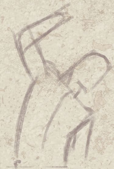

(Both of these dudes are missing a cranium, and there are other proportion issues, so don’t mistake this as reference for anything but the overall drawing approach.)
3. Think of muscles as flat shapes
Muscles are complex interlocking 3D forms, but you don’t have to think of them that way in the beginning, especially if you’re sticking close to your reference. It’s easier to map the positions of the muscles onto your blocked-in pose with straight lines and basic curves, just like you did for the head, torso, and limbs. (See the chest of the second figure I posted above.)
This step is all about creating a clear guide for your final lines.
4. Final lines (or) additional steps
At this point you can make the contour more realistic, get the muscles just right, and add in more details from your reference, because you’ve got the pose established and you’ve figured out where all the major shapes are placed. If you tried to do this all at once, without blocking in the pose, you’d probably end up with a figure that’s way out of proportion.
For the final lines, work on top of your sketch. If it’s a traditional drawing, erase the sketch with a kneaded eraser until you can barely see it. If it’s a digital drawing, just lower the opacity of your sketch layer and make a new layer for your final lines on top.
If you’re familiar with constructive drawing (using perspective knowledge to translate your 2D drawing into basic 3D shapes, like wireframes), now is a good time to take your sketch further, using cross-contour lines and more accurate forms to define the figure in 3D space. Then you can do the final line work, or move on to the lighting or coloring phase.
Art is hard, so try to keep things simple and focus on one thing at a time. I try to think in a step-by-step way even when I ignore my own advice and rush to finish a drawing.
Generally speaking, the pose and overall proportions are much more important than detailed anatomy. Anatomy is the icing on the cake.
Resources for learning!
I should say that the main thing I covered in this post is an approach to blocking in a figure from reference. I left out a lot of the form building stuff that I rely on for most of my work, because it’s a huge subject, and you can get great results without all the complications if you use good reference.
To get the most out of your reference, it helps to learn observational drawing. Dorian Iten’s accuracy guide has some very useful tips.
In addition to observational drawing from reference, I use a constructive drawing approach, which I learned from resources like this:
Draw a Box - A great intro to constructive drawing. Highly recommended.
Figure Drawing: Design and Invention by Michael Hampton - Great to study after you know basic form construction, and before you dig too deep into anatomy.
My all time favorite figure drawing teacher is Steve Huston. Brilliant teacher and equally good artist. His book, Figure Drawing for Artists: Making Every Mark Count, is the single best guide to figure drawing that I’ve found. Also check out his lessons on New Masters if you want to get really serious.
Bryan Lee has posted a lot of great figure drawing tutorials and notes on his DeviantArt page. You can dig up most of the good stuff in his Tutorials section, and by searching his gallery for notes.
—
My ego is forcing me to add a disclaimer: More experienced artists will see that the work I post here doesn’t really do justice to the principles I mentioned. Trust me, I know my doodles are a horror show of errors. This is my fanart blog for chillaxing and trying very hard not to be the perfectionist who hates everything that’s not fit for a professional portfolio.
16 notes
·
View notes
Text
How to choose a wedding photographer
liam smith photography
Top tips on how to choose your wedding photographer
Know your fine art from your reportage
Look at lots of complete weddings, not just portfolios
Meet in person
Make sure you like them!
Understand what's included in each package
It's an age old question, how do you choose a wedding photographer...this is a long one, let's start with some LOL's...
Understanding the different terminology used when describing wedding photography style is integral to narrowing down your searches.
I spent hours trying to define my own style. My work is fun, and it's also documentary.
Wait... I've got it.
'Funcumentary'
Don't you love a good portmanteau?
Blend two styles of photography to invent a brand new one, how about, fine art and documentary? "fineocumentary" or "docart". Liam Smith – best docart photographer in the world (n.b, Liam is the only docart photographer in the world and wins by default)
To answer my own question, how do you choose a wedding photographer?
The answer is choose me...I'm obviously hilarious.
What are these stupid words I keep reading, what styles are there? What do these words mean?
I believe in creating great images. I've read endless blog posts and magazine articles trying to define what a photography style is and what it means.
In my years of experience I have found that there are essentially two types; posed and unposed.
Unposed can be referred to as candid, photojournalistic or documentary, essentially they are the same thing; capturing people unawares.
Counter to this there are posed images; fine art or traditional. These images are orchestrated and the photographer is in complete control of the outcome.
So who cares?
It's easy for people within the wedding industry to forget that there is a world outside it. Phrases are coined and banded about and then thrown at the customer expecting them to know what they mean.
If I question these terms objectively, fine art sounds like each image is going to take as long as a painting and photojournalism sounds like my wedding is going to be photographed like a war-zone. This is of course me being dramatic, but I hope you can see my point.
Documentary/Photojournalism/Candid
Documentary wedding photography (sometimes called photojournalism) refers to capturing natural moments, no staging or posing. The intention is to provide the couple with a narrative of the day, it doesn’t matter what happens on the day, your photographer will record it.
Grandma falls over; click. Grooms scrunched up crying face; click. This is the real stuff. Pure emotions. No pretending. Great documentary photographers are masters of composition. Patiently waiting to create artwork out of serendipitous moments.
Timing is everything. You have to be in the mix, switched on and up close and personal with people. Documentary photographers will also take couple portraits and group pictures. I've written in more detail about documentary wedding photography here
Here's an example of being in the moment. Documenting events as they happen.
Fine art
Fine art wedding photography focuses on recording your day in the most beautiful and elegant way possible.
Lots of bright colours, clean whites, couple portraits and details. Stunning pictures that would look amazing on the mantelpiece or in an album.
Fine art wedding photographers are masters of light and styling. Being able to find soft, even light is a must and a keen eye to arrange details to capture that editorial feel is a sure sign of a good fine art photographer.
The main man of the fine art world is Jose Villa, his work is exceptional, “For me, it is all about making something beautiful, even if I have to insert myself into the situation. Ultimately, my goal is to craft vibrant, energetic, fine art images that are as unique as the people in the photographs.”
N.B Fine art wedding photographers often take photographs using old school film - expect their fees to be considerably higher if they do.
Takeaway/What to Google
Documentary/Photojournalism/Candid wedding photography – beautiful images, story telling, documenting not posing, people focused.
Fine art wedding photography – beautiful images, posing where necessary, lots of details.
Should I meet my wedding photographer before booking?
In short. Yes.
For me, this is the second most important factor after the images themselves when deciding on who should photograph your wedding.
I always say at client meetings that they have to like me. How much you can like someone in an hours meeting may sound silly, but your gut instinct is rarely wrong. If the vibe isn't right, go with someone else.
In order for you to relax, you need to like the person who will be spending the day with you. Of course they won't be partying and socialising, but if you don't feel like you trust them, then ultimately you won't relax, they won't get the pictures you want and everybody loses.
Knowing when it's not a right fit is an integral part of the process. A wedding is a collaboration, you have to be able to work together. Even if you choose a documentary wedding photographer who won't be posing you, you still need to trust them. There may be a moment happening right in front of you and the photographer nowhere to be seen. If you can't trust that they are off somewhere else capturing an equally important picture, then you won't relax and you won't enjoy your day to it's fullest.
Meet them. It's one of the best investments you'll make in your wedding.
What defines a good photographer?
This is also tricky as it is so subjective. Awards are difficult to judge a photographer by as some are more valuable than others. Certain awarding bodies use client feedback to judge the photographers quality of images and service. Others prioritise certain styles, so it's worth investigating whether or not the wedding photography award has come from a relevant and established source.
Who are these sources? WPJA, Fearless Photographers, Masters of Wedding Photography. Directories have their own awards, but only award to those who advertise with them. 'Top 50' round up posts are a technique used to get links to websites. Some photography bodies give you an award for submitting which means you can then call yourself 'award winning'. I have won an MoWP award, of which I am immensely proud.
If I were to pin such a big decision on a question or statement, it would come down to this; when you look at their work, do you feel something?
Great images move people. They stir something in the soul. Whether laughter or tears, if you can feel a connection to the images, and the people within them without even knowing them, then it's a great picture and you've found yourself a great photographer.
Look at the blog in serious detail
Portfolios are there to give you a wow. The blog is there to tell you the whole story.
A portfolio could be made up from 100 or more weddings. A blog is one day.
Even if a photographer only blogs the most insane weddings it will still show you what they delivered to the client. If you are happy with that then add them to your shortlist.
Important frequently asked questions and top tips
A few thoughts and important questions to consider when trying to choose a wedding photographer.
How much should I budget?
This is of course dependent on your personal circumstance, no one should ever consider stretching themselves financially for the sake of a wedding.
I love weddings, I think they're truly magical. But life is long, your family grows and develops, magical moments happen on multiple occasions. Whether it's a wedding day, the birth of a child or buying your first house and rolling around on the carpets, life is full of joy, pay what you can afford.
Between £1000 and £2000 is realistic for someone who is good. “Define good” some may cry. Well that's subjective, and I can't. You have to use your judgement on this one and trust your gut. An iMac with the same spec laptop that I'm currently typing on would be one thousand pounds more expensive. Some products are more expensive because of their quality, some are based upon branding.
Look at the photographers portfolio and then examine their blog posts in detail. Only then will you be able to gauge what a full days wedding looks like and then make a judgement on call on whether that represents good value.
Do I need two photographers?
If you love documentary wedding photography, consider this; with a single photographer shooting in a photo-journalistic style, there is no guarantee that all of your guests will be captured in an image.
Does this bother you? Maybe it doesn't.
Keep in mind that the photographer won't know how your most treasured guests are. A second photographer can be a valuable asset as although it goes against my documentary ideology, the second photographer could arrange formal photographs to make sure that your most important persons are photographed in some capacity. If you're a purist like me then ignore that bit, I like to give both sides of the coin. If your budget will allow it aim for two, more pictures is never a bad thing. Note, this is likely to push your costs up to the £2-3k mark.
How many hours coverage do I need?
When whittling down the shortlist, working out how exactly how many hours you need might save you money.
Magazines for some reason say from bridal prep to the first dance. WHICH I HATE.
Many couples don't have a first dance. And what if you don't want photographs taken in the morning?
Ten to twelve hours should be about right for the vast majority of people. I always say to clients the best way to judge this is based upon the general vibes of the day. If you know that your crew is going to rave until the early AM, then twelve hours might be a good idea to make sure you capture all the madness. In my experience, ten hours is usually plenty. It gives you approximately an hour and a half of getting ready and another hour or so of the evening dancing.
What's included?/what do I need in a package?
One photographer, ten hours, £1000-£2000 is the average cost in the UK.
With that in mind, ignore books in the first instance - you can always buy one later.
I always recommend to clients that they book as many hours as they can if cost is an issue, they will always have the photographs and can save up for albums and prints at a later date.
Do I need an engagement shoot?
I think the question should be asking yourself is why do you want an engagement shoot?
If the answer is 'to get used to the camera', then it may be worth considering the reality of that for a moment. If you prefer documentary style images, there's no need to pose, so no need to get used to the camera.
Documentary photographers are skilled at being unobtrusive and capturing people off guard. Practising poses will not put you or the photographer at ease as you're both engaged in an activity that neither of you want.
IF however, you love fine art style images, then engagement shoots are perfect. It gives you a chance to understand your best body position for posed photographs and gives you an idea of likely how long your posed pictures will take on the day.
Gut instinct shouldn't be ignored.
It exists for a reason. It's not a random part of your brain making decisions. It's a combination of all of your thoughts, feelings and experiences coming to the fore at an important moment. Trust it.
The wedding is in the evening/winter etc. will lighting be a problem?
You need to know the answer to this when choosing a wedding photographer if it applies.
Any wedding photographer worth their salt will have equipment that can deal with low light levels. It is however, something to consider.
Shooting in low light is difficult at the best of times. It's near impossible without high end equipment.
-If your photographer is cheap, chances are, they won't have high end gear and will struggle to shoot in low light.
If you are having a candlelit wedding ceremony, then these are questions you will have to ask.
I received this message from a bride and it is a fantastic question.
“Our ceremony is in the afternoon and will be by candlelight. We both don’t like staged photos and are looking for a creative photographer that can shoot gorgeous photos in a candlelit/fairy light environment. We are very aware good photos depend on lighting etc. and are very keen to hear your take on this. Would that be something you would be able to help us with? Do you by any chance have some photos to show from other night weddings?
The plan is to create a fairy light backdrop for the ceremony (which will take in a separate area) with candles in the aisle next to the chairs. In this scenario there would be no light coming from above. Do you anticipate that being a problem? There is a beam that runs the length of the aisle that we could always wrap in more fairy lights if you think that might help.
In the barn where the dinner and party will take place there will be a festoon light ceiling and a festoon light backdrop behind the main table. On the tables there will be candles, additionally there are loads of lights all over the barn that can selectively be turned on and dimmed.
I look forward to hearing from you!"
Here is my reply:
There are two main considerations when working in low light.
One – the images will be grainy
Two – candlelight only from below can cast unflattering shadows
I’ve attached a few images for your consideration.
The first image is an example of how low light levels (only lit by the fairy lights) will result in what’s called ‘grain’ on the photographs. It’s simply unavoidable, but something you should certainly be aware of. Personally I don’t think it matters and often adds character to an image, particularly black and white photographs.
It's worth noting that when light only comes from below the shadows can be unflattering.
Image two I photographed in a particularly dark barn. This is a combination of fairy lights and ‘candle light’ bulbs worked very well to produce well lit photographs whilst maintaining the ambience. The bulbs fill in the shadows and provide more even lighting across the face.
My recommendation would be to have a combination of the two, candles for ambience and fairy lights to add to the ambient light.
Another consideration is the heat from the candles if they will also be your primary light source. I’ve seen the Gentlemen get quite hot in a three piece woollen suit stood next to candles!
To reflect
Low light equals grain. Grain is not indicative of bad pictures, only low light. If you are having a candlelit wedding ceremony you should definitely ask if the photographers you have shortlisted have example images to share with you.
How do I approach the day? – Blending the styles
I believe that weddings should be photographed with care and compassion as well as integrity. Capturing the narrative of the day, true to events. Weddings are an opportunity to dress up. Thought goes into every outfit, from the bride to the second aunt, everyone considers how they will look and wants to look their best.
I believe that the bride and groom should also have a series of images that document the connection between them and have them looking amazing. This is possible if you shoot in a documentary style and I believe gives more genuine images than pure fine art.
By mixing the two you have the benefit of controlling the location, the light and the basic body positioning, but then you let your confidence as a documentary photographer take over and let the moment unfold naturally.
Believe me this takes serious practice and belief in yourself as it can feel super awkward at first, but you have to be bold, if you’re confident, then your client is confident in you. Continue as if this is absolutely normal. I've found if you stand maybe twenty feet away and say "I'm going to shoot this one quite wide so feel free to chat" something magical happens. All of a sudden they feel free to express themselves, everything becomes more relaxed and the real people emerge, not the 'people in that pose'. Then, because you told a fib and you actually have a 50mm lens on, you can shoot at f1.4 and capture those dreamy fine art style images which have all the blown highlights and shallow depth of field, AND capture a natural moment. Hazaahs all round.
Here's the magic
Here's an example to demonstrate my point.
Here we have a beautiful couple and a beautiful location and an outrageously sunny day. The control part from me is placing them in this location under the willow tree. I have used my knowledge of light, environment etc. to place them in a setting I know will look good.
The boughs of willow trees create a perfect canvas of elegant greens to create a couple portrait. Next, my instructions are thus "enjoy yourselves, the wedding flies by so take this opportunity to be together in the moment". They look great, the light looks good and everything is peachy. Then I say "I'm going to shoot this one quite wide so feel free to chat!".
Then the most extraordinary thing happens.
It's as if people feel like they’re no longer being watched and the most intimate moments happen. I've heard of some photographers who say to their clients "imagine a comet is about to hit earth and these are your last few moments, what would you do?". Whilst this may work for some, having to enact a scenario isn’t real to me, plus my clients would probably tell me to fuck off, after all, they did hire me because of my documentary *ahem* unposed style :).
The recent image that went viral is a beautiful example of how inviting clients to interact can work. The instruction in that image was "whisper in her ear why you married her". The sentiment is beautiful as is the resulting image, but if we're going all purist, is that a real moment? If my one aim is to show clients images of themselves that they recognise, will they look back on that image and say 'that was the most amazing moment of my life' or 'that was when the photographer instructed us etc. and I cried'?
Here is the magic moment. No instruction from me, everything apart from the location is spontaneous. Even the holding of the dress looks amazing, but had nothing to do with me. For me this is the perfect blend of fine art and documentary. The image is absolutely them, this is how they interact, how they stand, how they hold each other. Its magic.
The one thing clients always say
The second best thing about this image? We were only gone from the crowd for fifteen minutes. Everyone tells me they hate it at weddings when the bride and groom disappear for the entire drinks reception for photographs. There's simply no need. Find a nice spot, be calm, relax, let the magic happen. It's a moment, it only lasts for a few seconds and then it's gone, so you have to be ready.
So Liam what do you do for the other 99% of the day?
I take pictures like this:
Liam Smith is a documentary wedding photographer from mars (probably)
If you like the look of my work and my philosophy, hey, why not get in touch?
https://www.facebook.com/liamsmithphotography/
https://twitter.com/smithlphoto
https://www.linkedin.com/in/liamsmithphotography/
http://youtube.com/channel/UCDRq0noH6kh0afzWK0zt_qw
https://www.instagram.com/liam_smith_photography/
1 note
·
View note
Text
An Art Hack Thread:
So, art as a hobby and job can be expensive; but if you know a thing or two, it can be a lot cheaper.
**This is mainly for digital art, but a tip or two can be used for traditional art!!**
POSES:
Sometimes, those wooden mannequin things don’t work. They suck, like a lot. An alternative could be dolls! I’ve made a post before on this, but you can take any doll and use them as a reference to make poses! Especially ones with joints- that way you can bend them however you like to pose how you want! Barbie has some “Made to move” dolls, and has new diverse body types!
I love using dolls, because they have hair (For hairlines/styles), a factory face (For anatomical placement), and there’s so many companies, with so many different styles and proportions of dolls; if you wanted to play with your anatomy for different styles! Another thing is- you can dress them! If you don’t know how a shirt would lay, or how a vest would fit- put your doll in one! Don’t know how a logo would stretch on a shirt? Slap a graphic tee on your doll! Don’t draw women? There’s boy dolls, and action figures! There’s so many posiblilities!
ART APPS:
My top two are both free, and easy to use! Medibang Paint - All purpose! You can do pixel art, any size canvas, comics/mangas, and add strokes to the outlines of art.
Autodesk - Mostly all purpose! It doesn’t have a premade comic option, but that doesn’t mean you can’t make them still! The smallest canvas size is 250X250, if you download fonts, you can use them in this app, and you can organise your art by naming them and sorting them in labelled folders!
Both are free, and both need an account to use to their full potential— which is also free!
KEEPING THE CANVAS CLEAN:
We’ve all seen those listings for art gloves. But what if you don’t have $10-$50 for one? What if you draw with short sleeves and rest your wrist-forearm on your tablet/paper? What if you’re left handed?
Simple: COSTUMES!! Go to a store and hunt down some gloves! I suggest looking for ��Opera” gloves! They’re long, which keeps my arm from messing with the screen, and usually really cheap! As long as they’re made of polyester, they’ll work fine!
I bought one, and cut off the middle, pointer, and thumb sleeves. If you know how to stitch, you can stitch the edges to keep them from unraveling. Or use fabric glue. If you’re left handed, you can comfortably fit in the left glove and ditch or donate the right one!
STYLUS/SUPPLIES:
There’s plenty of art dupes online for far cheaper. I bought a micron pen for $1 off wish and it was honestly really nice! If you do some research, you’ll be able to find some cheap alternatives in no time!
As for a stylus, you can always opt for the dollar store stylus/pen! They’re cheap, last well enough, and write lol. But if you look online, sometimes you can find places that sell bulk styluses for cheap! That way you’ll have 99 back-ups if your 1 breaks! Or you can save up and buy *ahem* The Blackweb Active Stylus! They’re $20, light, with a fine tip, and material nub, and also rechargeable!
BACKGROUNDS/ENVIROMENTS:
Room planners, dollhouses, your home, google images— all are great places! I have an app called RoomPlanner, its free, it has basic furniture and appliances, you can set up your room in 2D, view it in 3D, set your height, your angle, and move around in your room!
I like room planner, because in 3D, you can colour everything! So if you need to distinguish two walls from each other, or counters and countertops- you can paint them all random colours! The app also includes shading! It’s an open world ordeal too, so in one save you can make multiple rooms for different drawings!
You can also use a doll house if its big enough- or use a cardboard box with doll furniture instead! If you don’t like either, just take a picture of your own room, or search ‘room’ on Google images!
- - -
If you have any tips to add on, reblog with it or comment it! Help someone lol
#astronautturtle#digital art#ksureme#art#drawing#drawing tutorials#drawing tips#drawing hacks#art tips#art hacks#traditional art#tutorial
22 notes
·
View notes
Last Seen Blogs
acutepromyelocyticleukemia
Sick Vampyre

marswed-blog
Untitled
tag3slicht
‘☄️+ Astra +🪐’

jme3003
Jme3003
jme3003
Jme3003