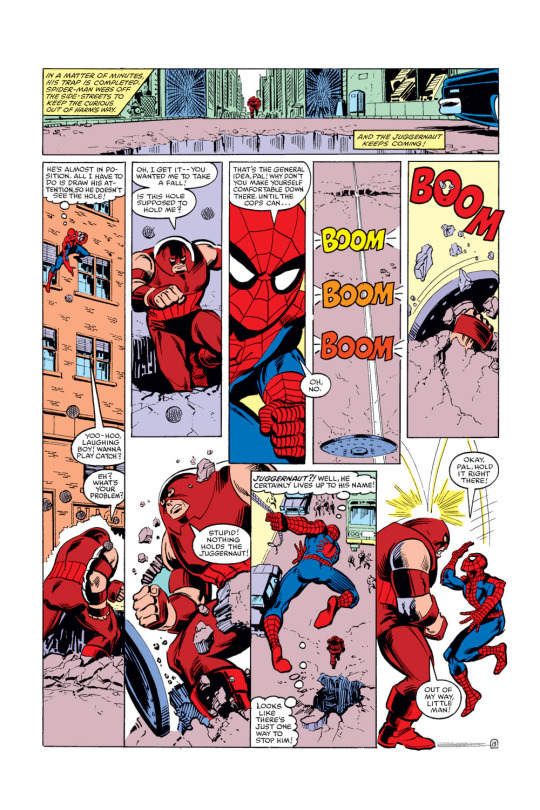
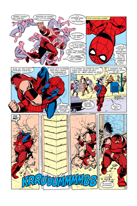
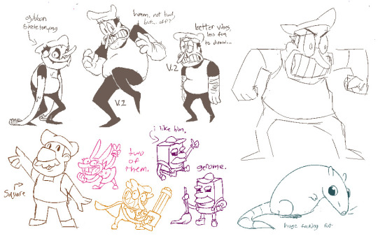
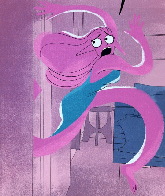
#THE ONES IN THE COMIC ARE VERY EXAGGERATED ANYWAY...
Text
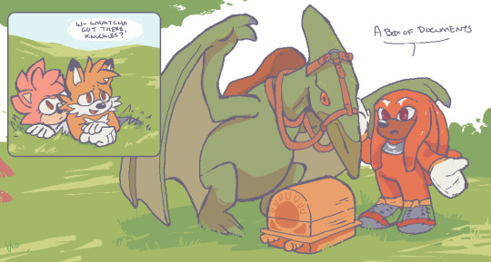


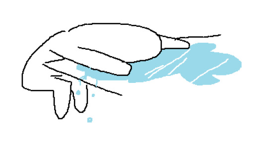
knuckles and his dinosaur friends :)
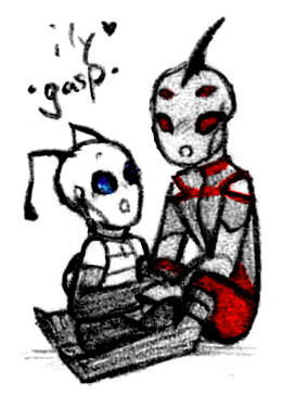
#sth#stc#knuckles the echidna#fleetway knuckles#sonic the hedgehog#sonic the comic#miles tails prower#amy rose#fanart#comics#id in alt text#ft pterodactyl. unnamed theropod thing. and the kohenyu#do u think after the ancient knuckles reveal he was ever like oh FUUUCK the kohenyu were right i did do that :(#kinda ruins the point of that story but not really. oh well#anyway the only time i draw dinosaurs is when i mail samples for sequencing so BE NICE....#THE ONES IN THE COMIC ARE VERY EXAGGERATED ANYWAY...#speaking of. very fun that dinosaurs are just. extant modern animals in stc.#oh yeah um these r referencing issues 94. 179. and 69-72#the graveyard is one of my favorite stories. i have issues with it. but i do also love it. ANNDN its beautiful soooo
345 notes
·
View notes
Photo


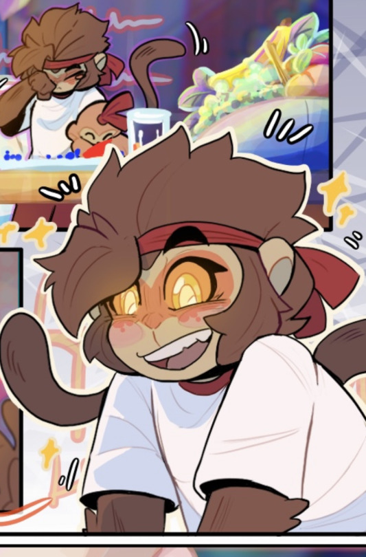
Just thinking about @10yrsy’s Things, y’know, casually (Patreon)
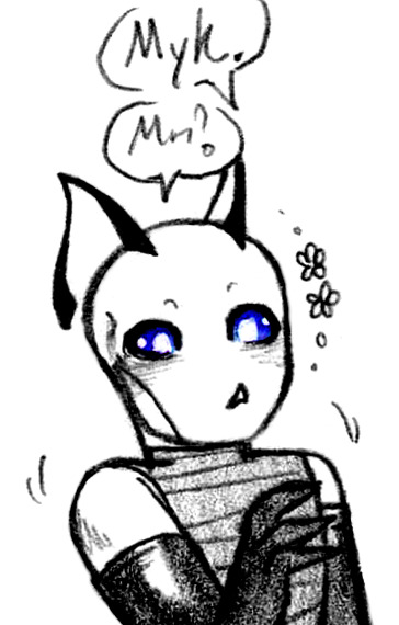
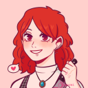
#Doodles#IZ#I know Things is long dead but I've been feeling rather nostalgic lately#Man let alone Irkens when was the last time I doodled a Latrodectus haha - and 10's style of antenna! It's all quite nostalgic#I'll try not to get Too sappy but it's hard when I was so inspired by Things! It had a big impact on me#Without exaggeration Things helped shape the trajectory of my life for quite a while - it's interesting to think about artistic influences#But gosh heck I don't think I've doodled anything of any of them since the song contest all those years ago lol#I like to think I've improved a bit since then lol ♪ Though the medium is quite different haha#Finally drew Nid! Only took a Very long time lolol#I do remember having doodled some Extreme roughs for a comic concept ages and ages ago but that's really all I remember lol#Maybe hunting down those old notebooks sometime would be fun haha#ANYway lol - enough reminiscing! There's all this current silliness!#Snarp was my favourite back in the day and I still like him a lot haha#He's a prickly little so-and-so! A cute and spicy lad! Always a fun ♪#If ''little meow meow'' had existed as a term back then I would've used it for him lol he deserves it#It really is about the [unforgivable nature] paired with [unconditional love] hhh their friendship is still really cute <3#Myk! He's always had the most gorgeous design <3 His eyes! My word!#Beauty like that really doesn't age - I was always a fan of the close up of his eye and his skin texture ahh#Probably no one remembers this blog's original icon but hmm ♪ Inspiration down many many avenues haha#Hopefully I did his eyes justice with my limited traditional palette haha#Had to show off his muscles a little too <3 Those gloves man he's just a pretty dude!#I did a bit of editing magic with Nid so if his eyeline doesn't quite match up just sshhhshshshh it's fine lol ♪#Who's saying which and who's gasping hmmm who knows it's a mystery hehe#And ending off with those two again <3 It's their dynamic I swear I just jdslfdsf it gets me bad lol#Squish him hold him (gently (maybe not that gently)) haha
20 notes
·
View notes
Text
I think webtoon is bad bc artists are forced to put out mass amounts of content a week and you can tell. 😐
#duck talks#sorry not sorry I'm the world's number 1 webtoon hater#you want me to read comics on my phone???#i have a post sitting in my drafts from a while ago where i go on at length about what i don't lilt about webtoon#but i don't want to post it bc it's very ranty and rambly#okay but one more thing I'll say while I'm here. webtoons use csp assets or similar things sooo much and it looks soo bad#not all of them ofc but it's a byproduct of being made to make so much content in a short amount of time#so a lot of them do#ALSO. The story changes I've seen be made to webtoons that get selected to be originals make no sense to me so often.#i could give a few examples of this if ppl asked by generally just exaggerating the genre and convoluting the plot is what I've seen#Also. Why are webtoon originals required to be in color? (I mean I know WHY but also like. Why? Cmon.)#aaughhh. anyway.
7 notes
·
View notes
Text
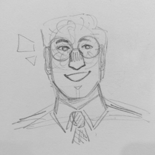
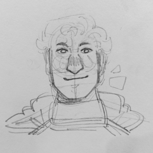
quick sketch of my best friends clark kent and superman
[image description: two pencil portraits of clark kent (also known as superman) from dc. the first drawing is him as clark kent while the second is him as superman. he is smiling in both portraits. /end description]
#clark kent#superman#dc#kal-el#<= i think that's his kryptonian name but i might be wrong don't correct me <3#oh look - a star!#made these designs up but i do think superman is one of those designs where it's like. Iconique. no notes <3#you don't stray very far because you don't need to <3#i don't keep up with the dc universe by the way i just like the idea of superman i've built up in my head <3#like a genuinely nice guy with superpowers <3 who's also jewish and bisexual <3#i don't think i've read any superman-centric comics. i've read the Big dc comics like the killing joke and the dark knight returns and#swamp thing the original one. i'm actually reading the first comic where superman appears right now actually <3#i like how instead of flying he used to jump and run i like seeing little quirks that come up when a character premieres and they're trying#to figure out what works and what doesn't that's neat to me <3#anyways they should stop having gritty movies where superman is mean because power corrupts or what the fuck ever.#just make him a good guy like a genuinely good person maybe it won't make a good movie for some people. i'll have a great time though <3#maybe i'm just behind on Superman Lore. i don't know i don't watch movies or shows or read books <3 (exaggerating for comedic effect)
18 notes
·
View notes
Text
i really want to speed up my process for the last few bits of this zine... my comic making has gotten a lot faster this year, but i still wish i weren't overthinking/overworking the pages so much 😭 re-animator yaoi zine is perhaps pushing 45-50 pages but i'm like... it could have been longer..... if we were just cooking a little bit more.........
#txt#totaled up the amount of comic pages i have so far and was like actually kind of floored#its like 36 pages just counting the comics and not the illustrations...#that's. and i am not exaggerating. more comic pages for one single project than i have ever done before. in my life.#anyways seeing the insane bg3 doujin artists cranking out like. incredible volumes of pages.#that are a little less refined but very very technically good. is like. inspiring me.#ive gotta let loose even further
4 notes
·
View notes
Text
guy who has been getting really into character acting and focusing on it in their comic work: really appreciate the character acting in here. loving expressions. enjoying the poses.
#it feels silly to say HOWEVER i've seen a few ppl discuss how it seems there's been a somewhat noticeable loss#of highly considered character acting in some more recent comics. this isnt to say this is a current time exclusive issue of course#many many many comics through every single era of existence have had extremely unconsidered character acting#where expressions and body language are simply not considered. it is in fact very much a skill to do good character acting#like it's easy to do in a very basic sense everyone can. but to do it particularly well is on the same level of making it feel#like characters are TRULY interacting and touching on a page physically. which like seems easy. seems like everyone drawing can do it.#but once you see it REALLY pulled off especially well your standards get raised. and you notice little things like that a lot more.#what feels truly interactive vs what looks interactive vs what feels like placing stickers on top of each other.#which again. everyone can notice. but it also is a skill for sure built up over time.#but anyways. it's on that level where you start to notice what feels like just a throwaway pose bc someone needs a character standing#vs that character really would have their hands on their hips or arms crossed bc it fits who they are. silly as it sounds#it's like posture. not every character is the type to idly arm cross or hip hold the way others will stand up straight while others slouch#choosing if a character leans forward with their chest vs with their hips. do they typically keep themselves open? closed off? etc#it sounds silly to take so seriously. but like. it is a skill. it really is.#it is one that can take a character from just someone you have a sense of thru the text and can see them on a page#to feeling like you know them bc you see their mannerisms in tandem with their personality all in what the text is telling you.#so having the skill to nicely handle both subtle and exaggerated expressions and posing really does make a difference!!!#it really elevates it.#sorry to be so silly about all this i know it isnt that serious but i dont know. i like expression my admiration of it.#every artist can do character acting. but it is still in fact a skill to handle it really well bc not everyone does#i think my good hater example is like. why i have some bleh feelings towards certain popular pump it out fast webtoon styles.#bc it's so pump it out quick (which is another issue entirely) it loses a lot of stuff like this. characters are slapped onto a page#with slapped on expressions. and it feels like character acting isn't super considered. like theyre drawn fine and stuff.#but it doesnt always feel fit to the character or the situation etc etc from stuff i've seen.#like would a character express and stand like that? or is that just ur default go to bc it's a very easy way to show that.#silly nitpick but it's a real one i think that is valid to consider#and disclaimer no not all of them are like that clearly. but i dont think it's a close to zero number either. from my observations.
0 notes
Text
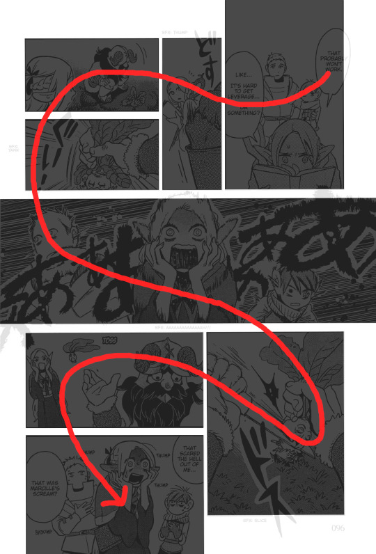
As a comic artist myself (read @ikroah), something that I keep stopping to admire about Dungeon Meshi so far is its use of vertical bleed in page composition. It's usually just used for extra room on complicated panels, or for emphasis, like this spread demonstrates quite well:

And usually these vertical bleed panels are just one or two per page, but sometimes they'll be the main type of panel on a page. On the page below, you can see the way that the vertical bleed both exaggerates the descent in the top row of panels and gives extra room for very narrow "camera angles," and then crucially, the vertical bleed on the bottom row of wider, more square panels balances the overall composition. If you remove the bleed from the bottom panels, not only do you crucially iss out on half of Laius' pose, but the whole page seems like it got misaligned at the printer:

Vertical bleed panels will very often be used as the first or the last panel on a given page because they can have a transitory effect between pages or scenes, especially when used to introduce a new location or scene. These two pages from the first chapter, and then the two pages that immediately follow the page above, demonstrate:
And horizontal bleeds, while less common, are also present (see the above page on the right, and the top page on the right). This next page has a particular use of a full horizontal bleed combined with vertical bleeds that really impresses me because of how elegant it splits the page composition artistically and tonally, with vertical bleeds on opposite corners of the page for balance. You can see how without the full bleeds, not only do those panels feel way too tight individually (even the first one, where the bleed was mostly empty space anyway), but the whole page gets a lot more claustrophobic. And while it's not bad, it's definitely a bit more staid and boxy than the dynamic, full-bleed version in the actual comic.


The shape of Senshi's knife and the (implied) trajectory of the mandrake head are incredibly subtle eyeguides built into the artwork!

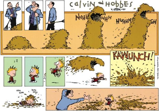
One final note about full vertical bleeds is that their use often reminds me of the way that newspaper comics will elide panel borders entirely for similar utility: more space in the individual panel, more interesting composition overall, and that effect it has on establishing or transitioning to a scene. Here's come Calvin & Hobbes strips that do it, for example:


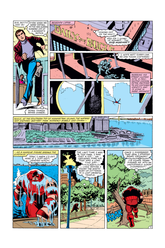
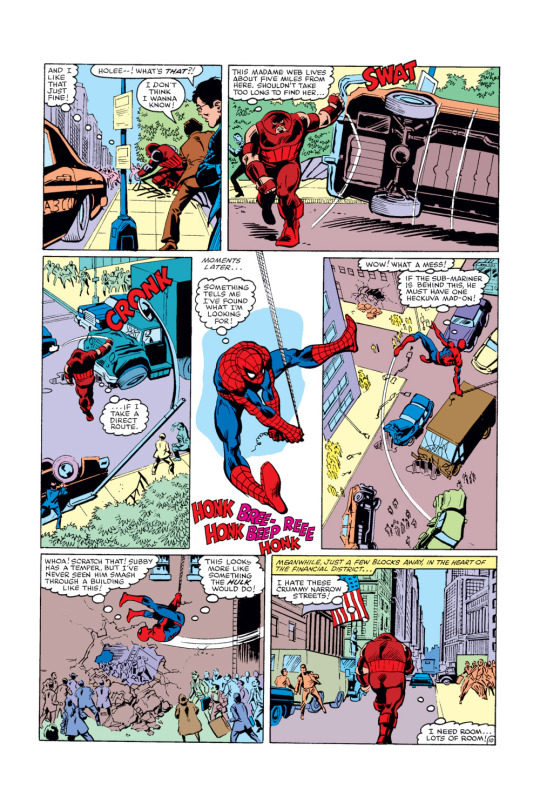
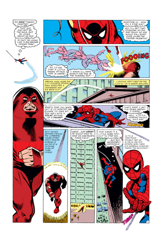
And while full bleeds (except occasional splash pages) are much less common in my own mother tongue, classic superhero comics (mostly due to how they were and to a degree still are printed, I figure), you can still see some of these principles displayed in this sample of incredible pages from one of my favorite single comic book issues, Amazing Spider-Man #229.

227 notes
·
View notes
Text

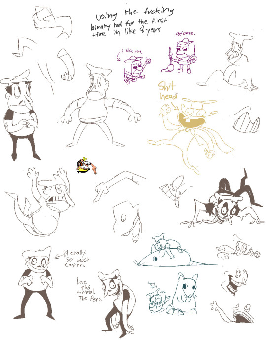
a year!!! as of today i have now been drawing these funny little pizza freaks, to the exclusion of almost everything else, for!!! an entire year!!! i wanted to do a nice group shot/lineup of everybody to compare to when i first started trying to draw them because oh boy were they bad. i never even posted most of them anywhere because they were so bad. but im posting them here, now, to see how everything's changed/evolved.
this is probably the hardest time i've ever had trying to figure out how to work with a style, but we got there eventually; i'm pretty happy with the handle i've got on everybody now...dont let ur memes be dreams. lots of unimportant journaling and idle thoughts abt it below.
older pics
the first one is the VERY first time i drew them, before i thought i was going to actually have any interest in drawing them [lmao]; it was just the one isolated image, for my friendserver, to illustrate the funney message, so there was no attempt to make it Good or actually understand anything going on w/ the designs or style.
second is the original run of practices sketches to start trying to figure them out for real; done after i started having ideas for the comics and such and realized oh god maybe i am actually gonna draw fanart for this. [again, lol, and lmao.]
third one is the first pt art thing i posted on here. there were a couple weeks of sprite studies between this one and the previous image. the one on the top right wasn't part of that post i just threw it on as space filler; i'd intended to shift to doing Sprite Redraws But Stylized to explore tings more, but that was the only one i did. ¯\_(ツ)_/¯
individual characters
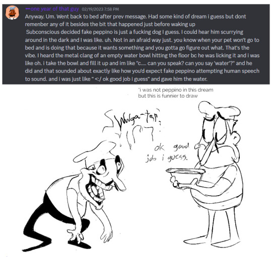
peppino: by far the hardest dear god. bro what ARE your shapes how DOES your face work. jesus christ. everything i have trouble with this style for, peppino has it in excess. i draw in polygons! i need consistency! and that is the last thing this kind of style is concerned with. they are made of squarshy clay and i do not understand how to mold them. i was really hoping trying to learn this game's style would GIVE me that kind of flexibility for fun exaggerated facial expression but i don't think much came of it in the end 😔. anyway on the bright side all this means once i got peppino figured out a little bit everybody else clicked way easier.
fake peppino: honestly i never did anything with him on purpose except for how his eyes work + the perma-smile thing. i figured ok hes supposed to look weird and off model so whatever happens with him happens. and it did. and it kept happening. it is still, in fact, happening.
noise/ette: somehow, for every bit that peppino was the least natural thing i've ever tried, these two worked pretty much right off the bat. i still don't understand it, seeing as pretty much all the things at play for peppino are also at work for them. i think the new sketches are actually a little worse than older ones but not enough that i care.
gustavo: really funny bc i drew him on model twice and just went 'okay, cool nice, easy, um. he doesn't have any fucking legs?' fortunately he was the only one i had a strong idea for how to stylize him [square] and it worked exactly as i was hoping so wahoo.
brick: is an animal and therefore 5000x easier and more natural for me to draw/stylize than anything else in the cast. that is Just a rat bro. i can draw a rat.
gerome: i think the funniest one here. the most drastic and least necessary change imo. i was gonna have him be really small at first, like smaller than the noises, but then i just... didn't. he's just peppino-sized now. also i gave him like. actual human facial structure, which is funny bc in most cases i'd do anything to avoid, but it works well for his being A Rock to give him some angles and definition like that+ to differentiate his vibe from the rest of the cast who are all very squishy. also since he is essentially Just A Head it's good to emphasize that too ig.
john: i only drew john a couple times but he gets to be here because i like him. and because most of the stuff i applied to gerome was readily applicable to john, though i did try to keep him a little more uncanny because he is a Huge And Lanky Freak. i hate that he is barefoot btw but idk how to make his color balance look right with shoes.
pizzahead: i did not want to put him on here honestly but i Have drawn him a handful of times and more importantly i didn't know what i was gonna do with john's pose if i didn't have him there to be glared at. the only thing that's different with him is giving him wider-bottomed pants, which i got from when i tried to draw these guys in clone high style [i never posted that one either][i will eventually]
snick: he gets to be here because 1. he's like 6 lines 2. i like him and 3. ive scribbled him a few times offhand and it went pretty well
misc
there are some guys missing because those are guys i didn't draw enough [or at all] to have gotten comfortable with them. sorry
i would have Liked to shade these but for the time being i have accepted that my grasp of light/shadow has decayed to the point im not going to be happy with anything i try there, so For Now i am working on my presentation with flats i guess. gerome has a shadow only because he's shaded like that ingame and looks naked without it
anyway if you are still reading [hi?] i get to shamelessly plug now. i'm over the hill of my pizza run now, and while i still have plenty of things i want to make here, most of the bigger more in-depth ones have passed. pizza tower was the first thing in THREE YEARS to get me out of my oc groove to doing fanart, and once i am done with my ideas here i will be going right back to it. if you like my art or how i write characters/interactions you should check out my oc/webcomic blog @jamverse . i can't promise people who like pizza stuff will be terribly into my designs, but i can guarantee i treat my guys with the exact same sort of tone i handle the pt guys with. and hell, i've mentioned it a few times before, but like 70% of my characterization for fake pep is just copied off one of my characters, so if u are going to miss him... he will still be there in spirit >;p
and if you dont care about any of that and are still reading thank you anyway. actually making these comics + seeing how shockingly well-received they've been has done a lot for my confidence, and for seeing that my kind of stuff IS something people enjoy :')
#pizza tower#peppino spaghetti#fake peppino#gustavo and brick#the noise#noisette#pizzahead#arting#pizzaposting
175 notes
·
View notes
Note
I hope this kills you and makes your day at the exact same time. I'm winging this btw and it's all improv in mah brain so it might be longer than expected, idfk, we'll see.
Thanks so much for existing and giving us this comic in the first place now suffer-
-{###}-
Leo watched as Donnie continued talking, his movements exaggerated and his words ecstatic. The holograhic screen lit up every surface within a 2-foot radius, the words big and bright against the darkened atmosphere. Beside himself, Mikey and Raph shivered on each side, looking anywhere but at Donnie's face. And even though Leo understood why they couldn't bare to look their brother in the eye right now, something deep inside of him still burned with annoyance. Because despite everything, it was still Donnie! They just couldn't see it yet!
Not like Leo could see very well past the hard, stable shell that his twin had built around himself. Not like he could tell how Donnie was really feeling. Not like his tireless efforts to reach out and help did anything noteworthy.
All it got him was...
"...Oh! And how could I forget the infirmary machinery as well!" Donnie continued, his voice raised in a professional manner that would make anyone else think he was just giving a regular presentation. "The infirmary duties will obviously be passed onto you, Leo, since aside from Casey, you're the most medically knowledgeable. Plus, I know you won't disappoint."
Of course, Leo wasn't anyone else. He could hear the manic cry for life and freedom and pain in his twin's voice, no matter how quiet. It was there, faint and far away, somewhere that not even Donnie could find it, but it was still there and it needed answering.
Donnie just kept refusing to look in the right direction.
---
It was well after midnight when Donnie pulled Leo aside for a chat about the affairs of taking on three positions at once. The leader of the resistance could barely piece together what Donnie was saying though, his words muffled by the bigger picture.
In the dead of night, as expected, Donnie's demeanor took a complete 180 shift, his expression barely masking the exhaustion and weakness he undoubtedly felt. His eyes were half-lidded and cloudy, a look that Leo's only ever seen thrice in those yellow and red irises. His shoulders, despite getting bonier and bonier by the day, were slouched in a lazy way that made the soft-shell look like a corpse. The purple hoodie he so much adored nearly reached his knees, the lost fat and muscle making the article of clothing seem bigger than it actually was.
But one of the worst aspects about Donnie's appearance didn't have anything to do with any signs of death or sickness. No... The thing that made Leo really want to throw up...?
Donatello was now shorter than Leonardo.
"C-come on, Donnie... Why would I need to learn any of this... Nerd... Stuff, if I already have you?"
A stupid question. Idiotic, dumb, foolish, stupid, demeaning, disgusting, stupid, gross, stupid stupid stupidstupidstupidstupid-
"Riiiiiight... Anyway, you'll need to remove that panel right there to get to the inner-workings of..."
But even though it was a stupid question, Donnie would've usually gone out of his way to answer it.
Why wouldn't he answer?
---
Two weeks.
It had only been two weeks.
But it felt like a lifetime.
Donnie wasn't dead yet, thank whatever god that's still out there that he wasn't, but Leo still felt like he was. Donnie was literally just there, he was just right in front of him, talking about the schematics of something or other, running his mouth like he's been doing for the past few days. Nothing truly notable about Donnie's health had really changed, no weakening brain cells or crippling disabilities. The only things that had changed were Donnie's height again and his now inability to walk.
His inability to walk. Just two weeks ago he was bouncing off the walls and biting people's noses off.
However, despite all of the physical evidence that Donnie was very clearly still here and alive, Leo couldn't help but feel like a part of him was gone. Dead, deceased, whisked away by the winds of time... It was hard to explain, even for him, how something inside of him just kind of... Faded away.
The Death, as Leo pessimistically liked to call it, was a slow and agonizing process, beginning all the way back when Donnie first revealed his worsening condition and then continuing on until now. It began with just a little click, a little pinprick of emptiness and loss and HURT that Leo didn't know how to fix. Then that pinprick slowly grew into a scab, then a paper cut, then a scratch, then a hole, and then finally evolved to a gaping wound that would take years to fix. It was just this... This agonizing feeling of emptiness and loneliness that Leo hadn't even felt when Raph first died. (Haha, funny. He's already died twice by now. Hilarious.) And no matter how hard Leo tried to heal it with potions and bandages and medicine and melatonin, it never went away.
Not even when Donnie stood directly in front of him.
And isn't that just hilarious? Isn't that great? Isn't that just Splendid? Isn't that just the coolest Revelation That LEO'S EVER FELT?? ISN'T THAT SO INTERESTING????
Isn't it funny?
---
Leo watched as Donnie continued talking, his movements exaggerated and his words ecstatic.
He watched the ghost wave goodbye with a dramatic flair and a little giddiness in his step, the small soft-shell turtle barely able to show his hand from inside the giant sleeve of his favorite hoodie.
Leonardo waved back, a sad, forced smile and a train track of dried tears gracing his face.
Red enveloped Leo's vision one final time, and soon enough...
The half of himself that somehow still remained...
Faded away.
-{###}-
Haha get Disaster Twin'd idiot-

DLFNRJRIFJJTG3OFOFJEVDKDOSGDEKEBSIFJEIBDJDJDNFBFKFBFKRBRJRJRJRJD

I mean. Thank you. This is amazing and I love it with all my heart💜💙
#What horrible person would put characters through such trauma???#looks in a mirror#ah.#right.#dies casually#collapses#*$&=(@₩#heekoeiejdbxno#fic tag
968 notes
·
View notes
Note
Can you share any thoughts/headcannons about Ty Lee's sisters?
i’ve talked before about how i think that aang would date one of ty lee’s sisters and it would really freak katara out because she’s terrified of ty lee and she thinks that nothing good can come from involving himself in that family. but aang is actually like best friends with her whole family because of their air nomad ancestry and he’s trying to get them all into embracing their culture more and teaching them about their heritage. and maybe even one of her sisters does have latent airbending powers (ty lee has like, very minimal airbending ability, but her sister can actually move the air and all that) so he’s just overjoyed to help her hone that skill.
also this isn’t really about her sisters but i think that the chi-blocking girl from the legacy of yangchen who gets relocated to yangchen’s air temple for her own safety is a distant ancestor of ty lee’s. not because ty lee like epigenetically discovered the ability to chi-block (if anything i think ty lee discovered it on her own) but because i just think that’s a fun intersection and i do feel like fc yee incorporated it deliberately. anyway back to her sisters.
one of them dates aang, one of them is an airbender (possibly the same one?), at least one of them is also gay (just, statistically speaking), and unlike what the stupid comics will tell you, just because they all look identical does not mean that they wear matching hairstyles and outfits. they definitely each have their own sense of style and a complex about being unique and distinguished in their individual field. if anything i think ty lee incorporates their insecurities into her persona during her confession on the beach because she knows firsthand that the desire to distinguish oneself runs rampant in their family. like she’s clearly exaggerating as a deliberate performance of vulnerability, but it does come from a real place, if only through borrowing the anxieties of her sisters.
one is an accomplished musician, one is an accomplished mathematician, one is an accomplished engineer, one in an accomplished artist, one is an accomplished poet, one is an accomplished architect, and ty lee is the accomplished performer(/acrobat/fighter/liar). she could also probably be good at all those things too if she put her mind to it, but they all tacitly respect one another’s boundaries.
they come from a family that cares about nothing more than entrenching themselves within the fire nation aristocracy, and so their parents never really cared about their wellbeing as long as they were excelling. and ty lee was particularly favored because she’s excessively charming and knows how to get her way in any situation, and also, of course, because she’s the chosen playmate of the princess.
the pressure to always be perfect and provide an “in” for her family gets to be too much for her so she runs away to the join the circus, and she kind of assumes that they won’t even notice because she left behind six identical copies, but they get really worried because what will happen to their family now that they no longer have a direct link to the palace? so they’re really relieved to hear that ty lee is once again working with azula after news of the coup on ba sing se reaches the fire nation. and then they hear that she betrayed azula and got herself imprisoned and they’re furious. they actively consider disowning her, but then they figure if she’s already in prison for life, why bother. but then a few months later, they learn that now she’s friends with the avatar and the new firelord, which is even better than being friends with the princess, so they accept her back.
not that she wants to go home, but aang has suspicions about her ancestry that he wants to confirm so he makes her take him to her house and introduces him to all her sisters and her parents. they all show off their various talents to aang because they’re so nervous to be meeting the avatar, but he’s literally impressed by every single one of them. any time any of them do anything he’s just like “wow that’s awesome!!!” completely sincerely. he thinks ty lee’s family is so cool and has dinner with them whenever he can.
after the war aang gets really intent on finding all the remnants of the air nomad legacy through tracking down the air nomad refugees whose families assimilated into other nations over the past century. and he and ty lee (and her sisters) embark on this really in-depth archival project to collect all the traces of her family and families like hers as a way to honor and commemorate their cultural heritage. ty lee learns a lot about her family and what they had to do to survive (and how that mirrors her own life). and even though it’s nothing like it was before, aang finds a community of people who want to reconnect with their heritage and piece by piece, he slowly rebuilds what was lost.
#the-wright#asks#ty lee#aang#aang&tylee#postwargaang#sorry this turned into aang central#but in my mind ty lee and aang are like this 🤞#which katara HATES btw#she’s like ‘couldn’t the air nomad heritage belong to anyone other than THE WORST GIRL ALIVE?????????’#and aang’s just like awww no she’s nice#to which katara is like that’s just what she WANTS you to think .#she’s fine w aang dating just NOT IN THAT FAMILY
129 notes
·
View notes
Note
I love your art style so much. 😅
Do you have any tips for coloring/shading or just tips to draw bodies (I can't do any without them being weird) ??
Have a nice day, :)
I’m glad sweetie
And of course I can give some tip I use!
I have to say I have many ways of shading and lighting so I will share my usual and then add some new one I have been experimenting
First: don’t do shadow on multiply ,that’s for later, shadows and lights are made on a mask layer and they are not just the darker shade of the colors, but a different color entirely
Same with lighting.
Some colors are easier than others for me tbh, like I love shading red and purple but blue not that much.

I also usually put blue everywhere cuz it looks pretty but it’s on me honestly
(Obviously I decrease the opacity of some layers, there is not really a rule, I just go as I like)
If it’s a style choice I also do shadow in light blue multiply, but just if I am in a rush or working with flat colors
Second: choose how you want to smooth your shading and light.
Over the years I picked up my own way to do it but lately I have been a little experimenting.
Anyway i always start of with defining shadows then get to smoothing, it’s tempting but I don’t advise the use of the airbrush, just use it for lighting maybe.
( I want to be clear. This is my style, other artist may say the contrary)
I am one of those artists that clears the shadows from the inside to the most exterior part

Just how you can see here.
All the cleaning is made with a soft brush cuz it doesn’t have to be too definite.
In my latest comic tho the shooting was made the other way around with a water color brush to give this kind of 3d effect.
You essentially have to make some tests and find the one that you prefer.
Third: apply a layer of shadow in multiply to give more volume .
Usually when the work is done I add another layer of multiplied shadows that won’t be smoothed, just in the places that would cast a neat shadow, like a cape on the body, some fabric folds and some body shadows.
It really make things pop.
Four: don’t exaggerate, simpler is better, in both shadows and lighting, experiment , find your way but don’t rush , there is no need to exaggerate
Five: the subject of your drawing should be affected by the atmosphere.
For example if it’s night you can put a blue multiply layer over and erase where the soft light is, or don’t be afraid of adding some gradients of light is it’s a bright day outside, make the character be a part of the backgrounds
Six: you can color your lineart, it make the drawing very fine
That’s it mostly, I mostly go on the flow and I always test and try new stuff and you should try too to find you preferred way to do this stuff.
I want to say again that THIS is MY WAY of doing stuff, you can totally disagree and have your own way, I hope this way useful
237 notes
·
View notes
Note
Ahoy, captain!
I just wanted to let you know that I love your work! all of it! I first started seeing your owl house stuff on instagram, and then eventually wound up here to find your fics (I'm slowly making my way through TGB, it's very good, I'm obsessed with were-grimwalker huntlow), and, of course, IBWR!
IBWR has been on my list for a while, but I haven't really been much of a webcomic person since, like, middle school (omg). But I decided to read it just last month, and, let me just say...
It's ABSOLUTELY GORGEOUS!!!!!! I'm not exaggerating when I say it is probably one of, if not the, most beautiful comics I've ever read. Your art is so beautiful, there were many pages and panels that I just had to like. look at. for a long time. because they were so pretty! I especially like your unique and creative ways of making the panels -- adding extra flair by making the fates and spirits spill out of the panels, the gilded details, it's so breathtaking and awesome!
and of course,,, Theo and Oliver! They are so cute! I am not lying when I tell you I had your comic on my mind for a solid week after I finished reading it. I suggested it to one of my friends, who read it and agrees it's fantastic. I've even tried my hand at some fanart, though I'm not really confident in my art to post it anywhere yet.
Anyways, I hope you are having a good day! stay awesome!

Hrblrgh-! Thank you for your kind words and for reading IBWR.
88 notes
·
View notes
Text
woag character design notes

[i.d.: a drawn line up of the half life vr ai characters, from left to right, gordon, dr. coomer, tommy, bubby, gman, and benrey. /end i.d.]
yeah i skipped some guys , i dont draw some of them enough to have much unique designs and some of them are a png of a dog
trust me i am just surprised as the rest of yall that i am doing hlvrai art . design notes below (very long, mind your step)
gordon:
wow this guy dont got no head
i didnt want to give gordon a face because of how unexact the person is as the fandom engages with it. is it wayne rtvs? (well as presented to an audience, yes) is it gordon freeman? (well as seen from an in game perspective, yes) is it a whole new guy entirely? (well as
i cut the confusion and took it a whole new direction: guillotine
hlvrai being treated as a very broken game is fun to me as a design perspective, so if you (the audience) are not supposed to see his face, what happens when you see it anyways? missing texture time
there are eyes drawn over because i did not have confidence in my expressions at first and then it grew on me
i think if i were to draw (and i have drawn) an actual person under the mask i would still censor the eyes because that is where the vr headset sits!!
(i do not like putting an actual flesh to gordon though)
though i really like seeing how other people interpret gordon hlvrai it is not . my gordon ? we are talking about the same guy . but this is my gordo . i made this one . this guy my guy . maybe i should draw other gordon designs
i can draw the hev suit from memory and it is also the entire reason why i can render metal confidently
i liked how people changed the lambda to read ai :] i also have no clue if i wrote the lambda correctly
(i did, i just checked)
dr coomer:
as much as i draw/drew him i find it more fun to not stick to one set design :)
so a lot of my takes on dr coomer tend to jump from idea to idea, especially from what other people are doing, though they could be fitted to the left and right designs!
the left design is mainly based off what i saw in fandom spaces
we see rounder shapes, making for a more friendly and welcoming appearance
i think of this as straying from the more professional uniform of the actual scientist models
enter swimming shorts and bright yellow socks, for some reason
so now he kind of looks like a cool science teacher :)
it might be the lab coat
the right design is mainly based off thumbnails for hlvrai itself
these use a more angular appearance
i want to push how comically buff he is because of strength he shows at times, especially since his left design seems to completely down play it as a comically not buff man who is still very strong
the shadows on right design coomer get so much more harsh and exaggerated because i have comic books on the mind :)
he really does look like a dehydrated comic book character huh
tommy:
stick bug (he gets it from his dad) (this thought process is explained at gman section)
i pushed a lot of the saturation of colours in her design because i think tommy gets to be a little silly with it
fun art story of the day! when you color, try messing with hue! you might notice you can get away with a lot as long as your values are about right
i like pushing this with white because you can get away with a lot of things reading as “off white”
old faithful for me is cool shadows with a warm transition colour to keep things visually interesting
i keep making white objects the trans flag
happy pride
tommys design looks a little like a school boy, with the tucked in button up shirt+suspenders+shorts+jacket tied around the waist . and the primary colours . but like it is really fun to dress up so brightly
i actually was strongly inspired by medieval babies if that is a weird descriptor? i wanted him to both be a middle aged man but also a young adult
do not be like tommy, who has their finger on the trigger of the gun while not even looking at where it is pointing and good god he is squeezing the trigger . top ten firearm safety of all time
bubby:
the absurd part is that i think bubby is tall . he is just between tommy and gman who are exaggeratedly lanky .
i wanted to make bubby a pointy kinda guy, so he is the only one actually wearing the lab coat proper . and the only one actually wearing dress socks but not even wearing dress shoes
i wanted to give him a novelty tie but i was running low on ideas and running high on boreds so we dont get a tie
he does have crocs though!! in attack mode!!
i do think we all kind of saw his model and collectively decided it works for him because i have honestly not seen major divergences from his model?
gman:
stick bug
i wanted to stress the more spooky and unknowable nature of him and took it in the dark souls direction of “make bigger than player character”
maked too bigger
he cannot walk through any doorways but you will have to crane your neck to look up at him
in the opposite direction of tommy, i pulled a lot of the saturation in gmans design
it feels important to make them both not fully match the rest of the slightly less broken npcs because there was so much work to make them look cool so i have to respect that
actually a lot of gmans and tommys designs are made in opposite to one another
gman has a largely stationary face and very stiff line work
while tommy is pushed to expressive as possible
thats pretty fun, way to go me
benrey:
benrey also has two designs
and in both of these i keep getting too lazy to use a reference so the vests are super plain (forgetting the badge and black mesa logo) . i think the helmet is supposed to be darker actually .
the design ethos of benrey was “built like a brick shithouse”
a friend of mine took this cooler and interpreted it as a shield/wall/barrier as a physical (and narrative) obstacle
again the first uses fandom designs
most notably the overcast shadow (seen in video thumbnails but i never noticed it or understood why so many people did it until someone pointed it out to me)
i think hlvrai is such a great medium because it acknowledges it is a game and is able to play into that to great effect! i think the shadow is fun to imagine as solid black as a small reminder of the impossibility of the space :]
benrey is a smug cat in the body of a human . to be honest . and this is the full range of emotion i have ever drawn him with
the second was mostly because as fun as taking creative liberties are, i just really wanted to see benrey as is: the half life security guard model in all its slight wonk :]
i actually do prefer this design . it is a little more uncanny because i choose the worst translations of the model . i like it because it is a little more uncanny !
that can be said for like . every single design in this line up huh .
#hlvrai#my art#gordon feetman#dr coomer#tommy coolatta#dr bubby#gman coolatta#benrey#half life vr but the ai is self aware
402 notes
·
View notes
Text
Who has been screwed over by the fandom more?
Propaganda below the cut
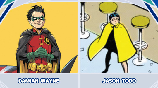
Damian Wayne:
HES JUST A LITTLE BABY GUY!!!!! Little baby man raised as an assassin and learning how to be a real person <3. But because he was kind of a dick and also a little stabby early-on, especially to the fandom's main "so sad uwu depressed baby" blorbo (and also he's not white), people treat him like he's satan incarnate
Jason Todd:
Robin, Jason Todd, THE hated child character. In the 1980s, Batman comics had become increasingly dark and gritty. According to editor O'Neil himself, the courted audience wasn't kids but 19-40 year old men with disposable income. Batman's child sidekick, Robin, was offensively campy and childish. Fans called him wimpy, annoying, dumb, bratty, etc. Also people complained that Batman acting like an affectionate dad was unmanly and gay. Robin acts violent and emotional and people are like "ew he's so childish and emotional"—and then Batman literally acts just as murderously and emotionally within literally the same exact story and people are like "wow he's so dark and tortured". So in 1988 (after brutalizing Batgirl to get rid of her for being too bright and nice and kid-friendly), DC held a paid poll for fans to vote for Robin to live or die. O'Neil claims he heard a fan (a grown man with a dayjob as a lawyer) programmed a phone to spam kill votes. One fanguy claimed that he sold his Mercedes to buy kill votes (probably an exaggeration but still). By less than 1% margin, the vote decided to kill Robin in a spectacularly violent way. Anyway the 1989 Batman movie brought in a huge wave of new child comicbook fans who liked the new Robin (a very cool teenage high school Robin with a driver's license and a girlfriend), and DC started a separate Robin-less Batman series called Legends of the Dark Knight to make the anti-Robin writers and fans happy. But to this day, many fans agree it was a good idea to kill off the other Robin so that his foolish death reminds other characters to never be childish and stupid again. Bonus: the current Robin (usually a traumatized 10-year-old) has also been facing some pretty loud hatred for over 15 years.
#yall hate kids tourney#round 1a#dc#dc comics#batman#batfamily#dc robin#batman comics#batman and robin#damian wayne#jason todd#cw child death
97 notes
·
View notes
Text
Scott Pilgrim Takes Off: The Gay People
Okay so I watched the show a few days after it came out and there's some things I wanna talk about.
First off, I just wanna say I've never read the comics. I've seen the movie a couple of times and that's it.
But the show did the characters so much better. Really, it should've been a show from the very beginning, because you can't flesh out characters in two hours.
Anyway, let's talk about Wallace Wells. I like him in both the show and the movie, but there's something about his movie portrayal that kind of... grossed me out, to say the least. Yes, he's one of two gay characters in the main cast (hi Roxie), but it was super exaggerated. I don't know, it said he had a boyfriend and then he was sleeping with other guys the entire movie?? It was obviously supposed to be a joke. However, in the show, I think he hooks up with Todd (i love u episode 5) a few times and meets Mobile at the end, but that's it. And there's a reason they changed it.
Next, Roxie Richter. I saw someone make these connections about her, so I wanted to put it here. Yeah, in the movie, she's treated like a joke. Ramona writes her off by saying "it was just a phase" which was really fucked up to include in the movie. But in the show, not only is she a badass half-ninja, she's the first ex to make up with Ramona. Ramona actually apologizes for just leaving her like that, and we even get a backstory for them. Roxie makes up with her ex and then immediately makes out with Kim Pine before leaving, now all friendly, which is a pretty fucking cool exit.
Honorable mention: Todd Ingram. I fucking loved him in the show and he basically was just some random vegan guy in the movie. I'm so glad Wallace spread the Gay to him.
So yeah, as a gay person, this show made up for how lesbophobic the movie was.
#roxie richter#ramona flowers#scott pilgrim#scott pilgram takes off#scott pilgram vs the world#wallace wells#todd ingram#wallace x todd#wallace x mobile#gay people#gay
99 notes
·
View notes
Text
On today's episode of "Rachel exaggerates things to make herself sound cooler-"
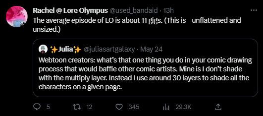
Soooo this is a lie.
No seriously, this has to be a lie. I don't make these kinds of accusations willy-nilly. This has to be a lie.
First of all, if her file sizes are truly 11GB for each episode, that would mean her file resolutions would have to be stupid high, and I just ain't buying that when so much of her art comes out looking like fried chicken.

But again, look at the backgrounds. Crystal clear. Which supports my theory that Rachel has her assistants draw the characters flat and exports them as PNG's so that she (or another one of her assistants) can slap the backgrounds in afterwards which is why when they pinch and zoom, the backgrounds look fine (as they're added in afterwards) and the characters look like they've been drawn with chalk. The shading itself isn't deep fried though, which is, again, because Rachel adds in the shading in post after her assistants have sent her all the flats.
Anyways, moving on from that, if her file sizes are actually 11GB per episode, that would mean her resolution would have to be STUPID high and that would mean there's no excuse for panels to look like this. This is not a Webtoons compression problem, Webtoons does compress images for you if you don't do it yourself but they don't result in specifically deep fried textures like this, that's ALL happening on Rachel's side. If it were a Webtoons' problem, the entire comic would look like that, not just select panels.
This is also what the panels tend to look like in book form. The book art is clearly very compressed and blurred from being too low of a resolution for print, which means either the editor is not being provided the root files, or the root files weren't ever that crisp to begin with. Either one is plausible and either one isn't good.
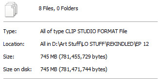
But of course, I'm not going to make these claims without my own proof. So here's the file sizes for Episode 12 of Rekindled, the longest episode in the series so far by panel count and page length, clocking in at 42 panels and an average of 25 layers per page (and that's including the text layers which adds a good chunk on its own, the actual art layers are like, half of that).
Also, here's what a pinch and zoom panel in Rekindled comes out looking like:

You can still pick up on some fuzziness, but the lineart doesn't look straight up chunky like it does in LO.
Meanwhile, one of my longest episodes of TIME GATE: [AFTERBIRTH] has a file size that honestly shocked me with how small it was.
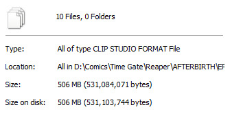
Guess how many panels that episode had?
Go on, guess. Take a second. Compare it to the file size of Episode 12 of Rekindled, take your best educated guess. Time Gate: [AFTERBIRTH] is also a full color webtoon with full shading and rendering that I used to upload once a week. Go ahead, I'll wait.

Ninety-seven.
Ninety. Seven.
Not only is that more panels than what LO dishes out on a weekly basis, but its overall file size doesn't even come out to be 10% of what Rachel is claiming LO's file sizes to be.
This is what Time Gate: [AFTERBIRTH] looks like, by the way:

(don't mind the blurriness that's working against my point, that's Tumblr, not me LMAO)
But, let's face it, I didn't want to just use my own examples as a comparison, because that seems unfair. I'm not an Originals creator, I just put myself under similar pressures as one because I'm an idiot who tries too hard.
So I asked one of my Originals pals. I will not disclose their name, but they are someone who works for Webtoons Originals and has similar panel requirements and deadlines. They also work with a similar flatting + shade workflow as LO, they have cel-shaded colors and bold flat coloring.
When I asked them how big their file sizes were, they said that at 2500px width - similar to what I draw at, 2400px width - and 200-300k pixel length (again, they're drawing an entire episode on one canvas) their episode file sizes come out to roughly one gigabyte, very rarely much bigger than that.
Rachel is full of shit. This is some Tommy Tallarico level shit, exaggerating stupid things that don't matter to try and make herself seem impressive. It isn't impressive. It makes her look like an unorganized dunderhead at best, and at worst, makes her look like a flat out liar who needs to prop herself up on the dumbest shit to make herself look good. File gigabyte size isn't impressive or indicative of anything, you can achieve high quality art without your file size amounting to 11 GB, and let's face it, Lore Olympus is not high quality art. You're telling me art like this:
amounts to 11 GB?
Now the only way I can see this happening is if maybe, maybe she had like, a bajillion layers full of garbage-
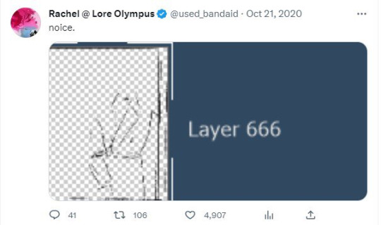

Oh. Oh no. Lore Olympus. Is a sprite comic.*
(*edit for clarification: I've had people confused over what I mean by sprite comic because LO clearly isn't made with 16/8 bit sprites. Sprite comic was a term universally used back in the day for comics that reused the same body parts, heads, expressions, etc. much like how sprites are designed, often keeping an entire file full of different layers made up of these assets to make for easier development. This technique was utilized in comics like CTRL + ALT + DEL. LO is definitely not literally a sprite comic but the way its layers are designed feel very much like something that's being cobbled together like 'sprite' comics were. I'm old.)
Even with these pics for proof, with 600+ layers on one canvas, if there's barely anything on those layers, then it still wouldn't make up that 11GB file size because the amount of layers doesn't necessarily add to file size on its own, at least not by that much, unless they're actually filled with stuff. And again, Rachel's art in LO doesn't scream "highly detailed with many layers". It only had many layers because for some reason she insists on working that way even to its own detriment.
From the looks of it, Rachel's importing all of her assistants' PNG's as separate layers and adding all the shading and the extra details on their own separate layers and basically dividing everything up into tiny bite sized pieces. That's the only clear explanation I can come up with. But if so, that means she's being INCREDIBLY inefficient with her workflow that it's amounting to SIX HUNDRED+ LAYERS AT 11 GB PER EPISODE. THAT IS ABSURD. THIS COMIC IS WAY TOO LOW QUALITY TO JUSTIFY THESE FILE SIZES AND LAYER COUNTS. RACHEL DOESN'T KNOW WHAT THE FUCK SHE'S DOING-
She's also very clearly using the cloud as a way to backup her work and work with her assistants. God knows how much she's spending on cloud space because of her own incompetency.
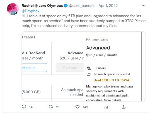
Honestly, at this point, as I sit here playing the Photoshop equivalent of Cookie Clicker, clicking the 'new layer' button over and over and over again with my mouse to truly understand what it would feel like to operate at 600+ layers per episode of a webtoon, I'm more inclined to believe she's just lying. Capping. Pulling shit out of her ass. Straight up making shit up. It wouldn't be the first time she's done that. But also because the alternative is a lot more grim - the #1 best selling webtoon on the platform is being operated like the world's worst group project and still coming out on the other side looking like deep fried garbage despite its stupid high file size.

#hoo boy i wasn't expecting to write an essay today#but i got tagged in this discussion in ULO#my 10+ years of being a deadbeat washed up webcomic creator with zero street cred finally pay off#lore olympus critical#lo critical#antiloreolympus#anti lore olympus
231 notes
·
View notes
Last Seen Blogs

nat2me2
18 Plus
darkyaskblorg
Darkside
smuckers-n-jif
(Coffee's For Sad Boys Who Need Moral Support)
pumpkin-spice-whump
I like when fictional boys cry
total-drama-takes-takes-2
TOTAL! TAKES! WORLD TOUR!