#and it would be nice to have a design for the character separate from myself
Text
.. perhaps we should make a Native Cecil design
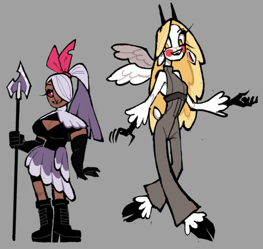
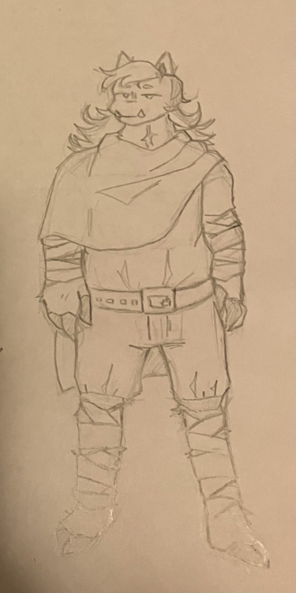
#this is a response to a recent ask Bulk got#like. we’re Native. i’m a Native Cecil fictive#and it would be nice to have a design for the character separate from myself#give us a few days since we can’t figure out Procreate and are out of town so don’t have Krita rn#and we may figure something out#i mean i’d want it to look at least kinda like me just cause i think it’d be fun#white hair in a braid maybe??? or maybe not white but like. black and white? black and whitening?#i will absolutely specifically make him Métis like us and find a way to incorporate that into the design like#OH I COULD FIND WAYS TO INCORPORATE A SASH OR FLORAL BEADWORK INTO HIS OUTFITS!!!!#maybe Hudson’s Bay striped blankets like. those stripes but on some other article of clothing as a subtle nod#i Will give him scars because i have a ton and i think it’d be neat#i’m not going to give him the extent of mine like. i’m genuinely more scar tissue than untouched skin. but one or two or so#tattoos…… i’ll need to do more research but i think i’d like him to have tattoos#black eyes. not like completely black but normal and dark dark dark brown to the point they look black eyes#high nose bridge probably?#i’m going to make him short so i feel better about myself. i’m 4’10 in the headspace. anyway he should get four eyes i think#i want to do something with furs considering we just got some recently but like. desert. hmmm.. rabbitskin pouch or something?? i’ll figure#it out later on. also i want to give him a cane. i am Going to give him a cane#the temptation to give him facial hair is strong thank you Mx Hummus but also you#don’t see a lot of Native men with it and also i can’t fucking draw it. we’ll see#bookmark#rambling#Cecil's tag
6 notes
·
View notes
Text
ᐯᗩGGIE ᗩᑎᗪ ᑕᕼᗩᖇᒪIE ᖇEᗪEᔕIGᑎ
These two are simpler than the angel dust design I did since I didn't have a lot to go off of. Posted on Valentine's Day because yes I can.
I don't think Charlie is significantly different from her Pilot design because I genuinely think it was the best design from the cast (before the redesign).
Thoughts below, though TW for the creepy charlie image at the end:
My issues with their Original designs:
Vaggie:
The giant "X" over her eye is really distracting and even world-breaking because
1. Why had no one put 2 and 2 together that the only character in Hell who has a visible 'X' mark on her face might be related to the angels who also sport that X mark on their faces.
2. Why is it shaped like an X? Her eye was taken out via a single slash.
3. If the hair's purpose was to cover it, why would it show through it? What's the point of the hair then?
The hair that was supposed to cover that wounded eye looked so ugly and confused as to what it should be doing. I mean every shot that showed that thing in a sideview shot of Vaggie felt like the animators had to make their own guesses as to how that was supposed to look like. It was distracting for me personally and I hated it so much.
It's been said over and over again, but her clothes look like she works at McDonalds. I get needing to change her outfit so that she looks like she works at the hotel, but it's just been poorly designed.
Why change her clothes' colors from white to red? the white helped her stand out from Hell and the Hotel's majority red background. (In the finale, she at least has a non-red attire)
She's also one of the very few women in HH and she falls under the skinny stick side of it despite being an angel exterminator.
Her hair is kind of hard to visualize looking at in any way other than what it is when it's static. However, when it changed into a ponytail or a bob, it's actually really nice to look at.
Unsure of what that bow's purpose is for the design.
Charlie:
Charlie is a simple but very confused design. The pilot design was a lot more coherent than the current show design
It's disappointing to see the bouncy Pilot hair go and be replaced by that boring bubble braid of all things.
Her undershirt peaks out of her tuxedo.... why???? to separate the top jacket and the pants? You wouldn't need to do that if her pants were a different color like the pilot design.
Thought about it and was confused, as a demon with an angelic father, why didn't she have wings as well? She didn't need the 6 wings like Lucifer but maybe a pair of one would appear?
Out of all the characters for the show's redesign, Her's was by far the MOST infuriating to me. Her pilot design wasn't perfect but it was good, they had to downgrade her for some reason.
I didn't have much to say about Charlie. it basically sums up to "the Pilot design was better".
On to the thought process for these two:
Valerie the fallen:
Yes, she got a rename. Sue me.
I had to remove the moth aspect of her design because it doesn't seem like it makes sense for a heaven-born to follow the sinner's rule of "gaining features based on the life you lived" since she basically never lived right?
In this redesign (and eventual rewrite), Valerie is not ashamed of her exterminator background. In fact, she was known as the most recent "fallen" in hell. her short stature doesn't make her less of a threat to the demons.
She's also visually thick with muscle because why not let one of the show's women have a body type that isn't stick-thin?
She's using the wings that were torn off of her as both an interesting article of clothing and as a way to remind others and her that she is (or more accurately 'was') an angel who could kill them if she wanted to.
Her clothes are pure black underneath the pale feathers to show that while she is an "angel", deep down, she is far from a good person.
She's also getting an actual skin color because from what I gathered myself from the show's heaven. Most of the souls there still retain a human appearance (Adam, Lute, St. Peter, and the other random human angels up there still look human..... but just don't mind the fact that most of them are white.)
Her hair is that ponytail she had in the finale because as much as I didn't like that episode, some designs looked actually decent.
Also, her hair actually covers the eye scar properly.
I wanted to keep her ribbon as a splash of brightness on her design but the OG ribbon looks a little out of place on a warrior so It became that (Plus it pays homage to her OG moth influence with its shape looking like the fluffy antennas of the moth)
Gave the spearhead a little bit of detail on it plus a chipped side so that it has a bit of charm as an old weapon she still decides to keep around.
A note about Valerie's design is that I haven't tackled the armor of angels yet so I was unsure of what pieces of the undesigned armor to give Valerie as of now.
Charlie:
I honestly actually enjoyed her Pilot hair, so I tried to put it back and also simplify it a bit so there are not a lot of strands for me to keep track of. Plus it was a genuinely cute design for her. (There's a reason that version was used in the Verbalase video.) <- I'M JOKING
Replaced her button nose with a goat's because a friend has commented how it looked like the noses of the women in a Goofy Movie and I will never be able to unsee that.
Her hair is also a lot brighter compared to her washed-out blonde color.
She has the same design thought process as Valerie, Covering the darkness of her true nature with white fluffy fur which is stylized like feathers at its ends. She has pitch-black skin underneath and looks like a proper nightmarish demon like the image below.
I ditched the tuxedo look, since almost all the cast has a similar outfit already, and gave her a jumpersuit instead. (Idk what it's really called but that's what I think it is). It's a light grey because she's a mix of bad and good (though a bright grey because she prefers to be on the good side)
Her horns are there and visible because yeah it's cute but also helps her read as the half-angel/half-demon character she is.
Tiny goat tail because can you imagine every time Valerie holds the rare angel smile of approval, her tail is visibly wagging in glee and excitement???? My heart would die. I love these lesbians with my life.
Has wings from her father.
Anyways, those are my thoughts and redesigns... I wanted to add more details to them but I didn't really know what to add that didn't feel unnecessary.
Also bonus! Concept art of Charlie's true form:

#vivziepop critical#hazbin hotel redesign#hazbin hotel criticism#hazbin hotel critical#deadbeat motel rewrite#deadbeat motel redesign#deadbeat motel charlie#deadbeat motel valerie
426 notes
·
View notes
Text
📖FREQUENTLY ASKED QUESTIONS📖
Regarding asks, I typically avoid:
stacked questions (asks that have more than one question, so honestly, sending them one by one is better than writing a bunch in one go)
hyperspecific scenarios (while I enjoy answering these, some can get incredibly specific to the point where it doesn't even feel fun anymore)
questions that have already been answered (obviously)
To manage the blog, I usually queue up asks instead of posting them instantly, so it might take several weeks for me to respond. Please be patient! And while I appreciate the time and thought taken to writing me a message and the growing interest in the game, understand I'm still one person and will sometimes leave a message unanswered. Thank you. ❤️
Below is a compilation of questions I get a lot, so if you have a question feel free to check if it's already been answered! The list will update as needed:
🎮 F.A.Q ABOUT THE GAME 🎮
1. What is Mushroom Oasis❔ What is the rating❔
Mushroom Oasis is a visual novel made in Ren'Py that was initially released for the 2023 Yandere Game Jam. It's currently still in development as a solo project. I post updates almost exclusively on this tumblr so if you're interested in the game, you're in the right place. The rating is 16+. How did I come up with the concept?
2. How many days will the game have❔ When will it release❔
I initially planned it to have 4-5 days! But with some new ideas and routes I'm considering, it might extend to 5+ days. As for a release date, it's done when it's done. So please allow me the time to develop it at my pace <3
3. Will the game be translated to other languages❔
I'll be honest, I had no plans to. However, a few people have reached out volunteering to. I'll say for now I'm open to the idea, but I prefer people asking permission first. First and foremost, ask first.
4. Will the game be available for mobile❔
For now, a hard no. I have zero clue how to make it available for mobile. Maybe I'll consider it once the game is fully released, but it's only for PC and Mac for now, as those are the default builds in Ren'Py.
5. Is NSFW content allowed❔
Considering the main love interest is an adult, that's fine. However I'd appreciate proper filtering of NSFW content considering the game's age rating means there's more than a few minors in the fandom. NSFW questions aren't allowed on the blog.
Keep it where it's meant to be with proper tagging separate from the '#mushroom oasis vn' tag. Using '#mushroom oasis nsfw' should be enough? I hope.
NOTE: Now, I understand some people are really passionate about Mychael being asexual, but I can't bring myself to police people for mischaracterizing his asexuality, nor would I want to gatekeep him either.
He's a fictional character first and foremost, and while representation is important!!!/gen /srs I don't want to bring attention to any such content in case it brings unwanted harrassment on that creator for posting such content.
Please don't do that. Let people make what they wanna make. It's unfortunate, but fandom will be fandom.
6. Will there be other love interests? Will it have multiple endings❔
Due to project scope, the only romance-able character for MO is Mychael himself. The game will have multiple endings however, ranging from romantic ending, platonic ending to creepy/bad endings (because, y'know, yandere).
7. Will there be official merch?
As a college student and soon-to-be fresh graduate, the income would be nice haha. As I keep working on the game (and once I'm done with college in March) I'll definitely look into making them someday!
🍄 F.A.Q ABOUT MYCHAEL🍄
1. What are his pronouns and sexuality and age❔
He identifies as male, uses he/him pronouns and is a panromantic asexual. He's older than you think. ::-)
2. What is his height❔
He's 6'2. He used to be 5'8.
3. When is his birthday❔
Initially it was 15th February! Simply because I happened to start designing him that day, hence his 'creation'.
I might pick another date though; for now, his birthday is undecided.
4. Favorite food and drink❔
He loves fried mushrooms and tomato juice! He hates spicy food though, as the smell and taste makes him physically ill.
5. Do you have a voice claim for him❔
Initially it was Jonathan Groff, specifically his role as Kristoff in Frozen. But nowadays I'm not sure. Feel free to give suggestions! Do note I imagine him sounding as an older male in his late 20s.
6. What is Mychael's love language❔
I explain it in-depth here!
TL;DR: He likes giving gifts, and likes receiving words of affirmation.
7. How is Mychael's affection towards MC (blog-centric only)❔
So for context, as I manage the blog sometimes Mychael makes an appearance in answered asks. His answers can change depending on when you ask at the current state of the demo:
Day 1:
Day 2:
It's just something for fun as I manage the blog when answering asks. (Though don't expect a solid implementation of this anytime soon, as I'm busy with college until March 2024. Until then!)
EXTRAS:
Mychael's Character Ref
Firefly (MC)'s Character Ref
Mychael's Playlist
Mushroom Oasis' Playlist
Bad Ending 1 Explained
257 notes
·
View notes
Text
About Separate Ways (Spoilers)
Wow, guys. I was super excited to get gameplay footage/input from friends about Separate Ways (too broke to own the base game myself) to put into my longfic, but aside from some super cute Luis/Ada moments, I am... dissapointed.
Capcom hire me, at least I can keep the plot consistent because what the actual fuck.
Will discuss below to avoid spoilers (much more story than gameplay, but gameplay wasn't great either), but I'm not going into insane detail save for some things. READERS BE WARNED!
I'm also specifically looking at this through the lens of my own fanfic, Simulation Swarm, which is my take on how Las Plagas works and infected!Leon (in addition, infected!Ashley and a lot of Leon's unacknowledged trauma and relationship issues throughout the game series). I was majorly excited about Separate Ways because it implied that Ada also gets infected- which I really want to still implement even if it changes a LOT of major things about the fic.
I'll go over the good stuff first. AKA, stuff I'm keeping, and not retconning.
1- Luis' characterization was still amazing. It was really nice to see his character balance out Ada's, how he's still as chipper as he can be. Additionally, it's VERY clear how much he cares for Leon and Ashley alike, and he goes out of his way to get Ada the suppressant and still respects her throughout that process.
2- Pesanta/IT/U-3's design with slightly more of a scorpion shape. That was sick!
3- The fact that Ada was aware of most of Leon's movements and a lot of what happened, and in a way was following him around and handling things he couldn't/wasn't aware of. *
4- Ada didn't help Leon into the chair, Ashley did. But that scene isn't even shown.
5- Luis and Ada def had chemistry, and it was so cute!
Well! Short list.
Now for the bad stuff. AKA, shit I'm retconning/ignoring/pretending never happened (most of the DLC).
1- Ada's infection is weird as fuck. She got... shot? And infected? And then, infuriatingly (because I've spent WAY too much time thinking about the physiology of Las Plagas and researching w/ the help of others how the infection would work) PUKES UP her plagas?!?!? HELLO!?
This in particular drives me insane because like. Las Plagas nests and develops behind the sternum, between the lungs, where it can attach to the nervous system along the spine. It is TOO BIG for a human body to fight against, it's growth shoving lungs out of the way is why people cough up blood. It's nowhere near the throat or stomach and clearly it's extremely well engineered/evolved for human hosts not to end up in conveniently the wrong location. And if she did puke it up, at that point, miraculously, after two days? Her intestines are fucked. She's dying of internal bleeding. I don't fucking care how much of a bad bitch Ada is because at that point Wesker wasn't gonna help her. The fuck?
Capcom, know your own lore challenge.
2- We got NO backstory, not even HINTS about Ada's past and origins. Again.
3- * Seriously made Ada's character into a very flat character and removed a lot of the urgency/clear want for her to help Leon from the original DLC. Seriously, she does not gaf about anything but her mission and making it more convenient for herself. Everything she does to help Leon is sheerly coincedence- which, honest to fuck, does not line up. Especially considering she appears to completely lack empathy until... uh oh, Wesker wants to kill a bunch of people? Like sure, she has that BRIEF conversation with Leon in the boat but like... what happened to the people she has history with, the people she could've ABSOLUTELY been saving to spite Wesker and allow her to have her own motives until whoop-de-doo, uh oh, gotta stop a genocide! Be so for real.
4- Bonus: After Luis helped her and she'd made the deal to get him out, he, still dying, calls her with a warning about Krauser. It took a long time for him to die. She SHOWED UP after witnessing the fight and pretty much just... left him. Despite all of that. Which I get from a 'not fucking with canon' standpoint, but seriously. 0 effort.
5- Krauser literally fucking gets away when she fights him????
6- Wesker keeps making appearances. For some reason. It's not even clear why, he literally just shows up to be intimidating and to threaten Ada into doing the job but like. At that point, honest to fuck, he could've done it himself? Also it was majorly hard to empathize with Ada considering we STILL KNOW NOTHING ABOUT HER OR HER MOTIVATIONS.
7- Luis has no distinct fire trauma. (Okay. Revoking this after the discussion, I just had a no media literacy moment after everything I was taking in. Luis' response was actually pretty good and honestly? Should be appreciated. Though it does bring up another point- while I love Luis, I guess I was walking in with it more being an expectation for it to be 'Ada's Story'. We didn't get that, though the Luis background was great!)
8- Ashley's interaction with Ada was a single line asking for help and Ada just. Walks off.
Anyway, everything I've seen first hand and have discussed with others has left a sour taste in my mouth. Boo, @Capcom. Good thing I can make up my own stupid little stories and pretend that none of that happened.
#resident evil#biohazard#leon kennedy#leon s kennedy#infected leon#ada wong#aeon#adis#luis serra#las plagas#separate ways#separate ways dlc#resident evil 4#resident evil 4 remake#residentevil#re4#re4r#re4 make#re4 remake#re4make#re4r leon#re4 leon#re4 ada#review#capcom
108 notes
·
View notes
Note
How do you usually pick your color palettes? I love how vibrant your drawings are without been intense to the eyes
I went over a couple things in a previous ask. So I’ll include some different ones this time.
A big part is just having an archive of 'things' in your head that develops your intuition when choosing colors. Not necessarily other illustrations/characters, but also logos, buildings, irl stuff? They all give you not just color palette ideas, but also color distribution. You can simplify both trees and bushes as green/brown, but if you picture their colors in abstract, the distribution of each differs. And that helps a lot in recognizing areas where your colors seem lacking, or areas where they *should* be lacking (and thus not attention-grabbing).
In general though I look at a char and decide on a 'main idea'; usually a 2-3 color scheme based off the original design that everything needs to revolve around. Pink/Blues, Green/Orange, Black/Red, etc.
From there my first pass at colors is splitting the piece into different elements (hair, clothes, skin) and giving them a high-max brightness base color with arbitrary saturation, and the lineart a notably higher saturation (and maybe darker) version of the base, usually hue shifted a bit to the left or right (Note this often won't be enough).
Some elements won't fit cleanly in the 2-3 color palette, or would blend in too much with the surroundings (especially with stuff like accessories or clothing patterns). In those cases I mess with the saturation, or use one of the other hues I've limited myself to in order to make it pop out more (outlining the object or giving it a shadow with the opposing color, coloring the lineart surround it, removing the lineart, etc).
Basic shadow colors is usually higher saturated and hue shifted versions of the base color.
The limited pallette creates situations where I'll use pink to act as highlights on Miku's blue hair. Or the pink is used to create extra hair strands for more volume. Limitations force creativity kinda deal.
Trial and Error 🙃. Get used to putting sets of shadings on separate layers so you can lock transparency and change the whole color at once. Same for having a dozen layers clipped to the lineart. Clip has a 'take me to layer this is on' button under Operations that's quite nice for this.
Choose a base level of brightness (usually max for me) and don't deviate too much. Brightness is a powerful part in how your art 'reads' so making something notable darker/brighter than the rest should be a deliberate decision that you make several other choices around. On that note, when I do make something dark, I make sure the lineart around it feels bright and saturated against it.
A buddy told me this trick where you have a layer of pure black on top of everything else. Have the layer setting to "Color" and it gives you an alright idea of how well your brightness reads.
Ok I wrote a lot.
23 notes
·
View notes
Note
spare some thoughts on hi part 2 ?
tldr; Mostly concerned! Trying to be optimistic.
I'll start off with the new UI (user interface) because it's probably the easiest to discuss. The Ui pretty much just lost a lot of personality. Sure, it fits with the game's aesthetic (in some ways), but it's lost most of its charm. While the old UI looks somewhat outdated, I think the current (to-be old) UI of hi3 feels very personal and unique. I suppose it's unfair of me to have previously wanted the UI updated and be this whiny about it actually being updated though. To be fair, many changes may take place about the new UI, especially with how the community has been critiquing it, so I'm hopeful they'll take valid critiques to heart and adjust it to not just melt into another generic rpg gacha design.
My biggest quarrel would be with the way characters are displayed, but as for the way they changed the interference for the story selection and all of that, I like it. It's not *too* different, and it looks clean (albeit dull in colour)
Now, the thing I find myself the most concerned with would be the Part 2 story. The characters, the setting, and the aesthetics. For starters, the MC... I think she's very pretty. However, I really dislike the sort of nameless "self-insert" main characters. I think it's a boring cop-out, and it takes away from a lot of the overall story immersion (ironically enough). Kiana, from the very beginning, had a very strong personality, and the way her story progressed would be near impossible to accomplish effectively with a self-insert MC (taking how they've written self-insert MCs before with Genshin, HSR, APHO into consideration) It's a lot more challenging to write a compelling storyline with consistent immersion if the main character, the core of the story, lacks some sort of "self". I'm absolutely not saying it's impossible, but I can't say I'm especially optimistic about the Part 2 MC with how it's looking right now.
The overall character designs for part 2 are a bit of a far cry from the part 1 ones, especially the ones for the most recent arcs. However, this is not an especially bad thing. While it's different, I think it's good that they're straying away from having too similar character designs like the last Herrschers of part 1 (even if it makes some sense story-wise.) I don't especially love the new character designs (except for the female MC. Again, I find her very pretty (even if she looks a lot more like a HSR design). But that's unrelated and doesn't really take away from my point lol). They feel a little too out of place with the established aesthetics of HI3, and even though it is nice to have some separation from the part 1 and part 2 designs, they should keep it similar enough to be recognized as a HI3 design.
Overall, with the designs and aesthetics, it seems that they are going for a do-over for the entire game instead of creating something new as a continuation of what's already there. There's too much left unsaid or unused from part 1 that I feel that it is justified that they move on entirely (even if there appears to be a few references to part 1 in part 2, with Einstein's adopted child, as well as speculated Elysia connections to Part 2 characters iirc)
While the majority of Part 2 is pure speculation currently, I just hope that they don't neglect Part 1's story and characters like I suspect they might. I hope they use what's already there, and refrain from making HI3's lore so much more convoluted than it has to be, merely for the sake of moving on from what nearly no one in the community wished to move on from entirely.
Continuing a little with my worries for the plot, I worry they may dilute the intensity of the plot by a lot, or neglect the writing a bit. I myself find that one of the most, if not the most important parts of HI3 for me is the story, so the thought of it turning generic concerns me. I do feel like the recent chapters have been a little lackluster in comparison to chapters like Thunders over Nagazora or Set Tomorrow Ablaze, but that may just be personal preference, and i do enjoy that they have been reincluding characters like Schrodinger!!!!!!, Shigure Kira and Niggurath. Honestly, if they do go in the direction that they neglect Part 1 for the most part, it feels like an awful choice considering the buildup they've done with all of these reintroductions, as well as the major exposition they've done for the Sea of Quanta. With one of the quotes from the Part 2 teaser, I worry they won't make the story "gritty" at all. Honestly, something I adore about the HI3 story is just how dark it can get, and if anything, I hope they don't hold back in Part 2. It feels like the story has been getting a little lighter in that sense recently, and I feel as if it takes away a bit of the intensity in the story, as well as the stakes or even consequences.
With the way hoyoverse has been updating games recently, it seems that if one thing in one of their games sticks, they feel the need to apply it to their other games, even if the change is unnecessary. While this has brought some good changes to the games, with HI3 Part 2, it feels like they're only trying to cater to individuals who don't play HI3, but play HSR or any other of the newer HYV games. Biggest worry about this point: they'll go back to pushing Hi3 to be Open World. (Although that is very unlikely with how much the Hi3 community has critiqued previous open world gameplay in Hi3)
In general, I just really hope HI3 puts effort and love into the Part 2 story, characters and world. I pray that I am to be proven wrong in most of my concerns, and that speculation will remain speculation, and that my worries will be near nullified once Part 2 is out (over-optimistic thought). Everything I write here is undoubtedly thoughts that will change drastically, or at the very least, a little when there is more information known. I'm having a lot of trouble articulating myself at all with this stuff, but that’s just how it’ll be, I’m afraid. Keep in mind that this is all very subjective, and I'm merely speaking from my own thoughts. Some of which I feel that I didn't manage to express very well.
Anywho! I really like answering, or even just pondering my orb (asks like this) cause I just love Hi3 and thinking about Hi3 and all of that teehee
so likee,,, if people want to ask me more stuff about my interestst, please do
#hi3 please never lose your doomed yuri plots#honkai impact 3rd#hi3#honkai#incoherent ramblings#long post#ask#civettictis ask tag#erm#what the scallop
23 notes
·
View notes
Text


🏮 "FEAR NOT! So long as I am by your side, no harm will come to you!"
🔅 "For as long as you are willing to have me, I hope my skills will be of use."
- monty / amani
- huang / nia [here]
🏮 HUANG
A colorfully dressed AI with too much of a presence. Versed in staff-fighting, they are capable of summoning three other Imaginary-element selves to protect others in battle. To others' chagrin, Huang has an overly loud personality.
Although they have a storied past, some of Huang's memories are inaccessible for reasons they cannot recall. They seek their original creator, a talented engineer from the Xianzhou Luofu who has not been seen in years.
🔅 LAVENIA FAIR
A young woman who offers her services as an astral navigator. She possesses an assortment of disjointed skills, knowledge she applies to get by in the vast cosmos. Though she dislikes combat, she will take on a supporting role if it is truly necessary.
Nia has recently been forced to go on the run. She speaks little about her pursuer, only revealing that said person had orchestrated an attempt on her life that she narrowly escaped. As for what would happen if she gets caught…
… …
hello again !! the promised second half of my main hsr au group is finally here!! while i had these designs solidified well before i actually did these sketches, it was still fun to draw them in motion and try to create more interesting silhouettes with them. just as we had monty and amani in the previous grouping, we're rounding out this little quartet with huang and nia!
huang and nia have been intertwined since huang's conception, although i gave nia a lot more agency in later iterations rather than just a side-character to huang's overall history. i will always hold a soft spot for huang and nia in their original fantasy setting, but it's been delightful seeing how their story shifts bit by bit in each iteration! formally, this hsr au is both of their third incarnations!
since i colored everything in monochrome, it might be harder to tell this, but huang dresses in a Lot of different colors that i tried to make distinct in different shades. this originally was going to have 3 other full-body peeps in huang's summons, but i found a way to skirt about that for my own sanity... i'm still super happy with how this turned out, i think of all my splash arts, huang was the most involved and i think truer to what i envisioned for them. i made a 1st attempt at a splash art for them a few months ago, but didn't feel happy with the results until i tried again recently!!
nia's outfit took more time to work out beforehand, mostly because i had trouble with her sense of fashion / what would be most flattering on her. i eventually skewed more towards a sci-fi magical girl kind of vibe, not dissimilar to outfits like pela's or even bronya. (she's also descended from people who used to live on jarilo-vi, so i thought that'd be a good nod to that as well.) her trailing fabric used to be a full vest, but i felt that muddled up figure and layered things a bit unnecessarily. so i converted it into more of a shoulder pieces, and that way it showed off more of her dress without losing details. some extra belts and bags were added for practicality. my favorite personal addition is the higher socks going up to her knees, i think it made for a nice distinguishing fashion preference that separated her from every other boot-wearer in the quartet (which... would be everyone else, huh).
this was a REALLY satisfying mini-project to give myself, especially since i'd been feeling down about my art in recent days. i hope everyone else enjoyed, and thank you so much for viewing !!
#huang#nia fair#riverin oc#riverin art#honkai star rail oc#hsr oc#honkai star rail#hsr#I LOVE MY BEBLORBEDS SOOOOOO MUCH AUAUHRHURUAUHGH..#niahuang lives rent free in my brain and i cannot wait to delve further. these two have History#as in i cannot wait to actually write for them#gaaah and in general... having this trio all done makes me happy ...#also ! these two are Frequently Bought Together#do Not separate them!!#platonic romantic some secret third thing it does NOT matter#they are linked and they would do anything for each other and the people around them ...
7 notes
·
View notes
Note
If you had an unlimited budget for your shows, what would be something you would want to do? Like, was there anything in either taopp or adamandi that you would add or anything you would do differently if you didn’t have any restraints?
Great question! So far, we've been super lucky to have the resources we have had (Adamandi, especially, was pretty close to an ideal production for how we'd like it staged!) We did have to leave a few ideas on the cutting room floor, though, because of time/resource constraints. Here's a few fun ones from each show!
Adamandi
Marbing: We experimented with one or two different ways to achieve the 'Marble transformation' effect on the Marmorei and Ambrose during Me, Myself, and I, but if I had infinite money I would've loved to have them with whiteout contacts and a fleet of makeup artists waiting in the wings to make their skin more marble-colored (and cracked!) I'd also love if we could've done the same to Ambrose as he transformed (maybe with projections?)- we'll see for future productions! ~Mel
Saints: If I had dream-levels of SFX makeup, I've always sort of wanted the saints to start posed in front of stained glass windows, with their halos almost two dimensional and their faces already in profile- and then when they 'come to life' in Litany of the Martyrs, they turn their faces towards the audience and we see the other half of their faces is a heavily injured corpse- according to their martyrdom stories, of course. It would emphasize the message of the allure and revulsion of these stories, I think! ~Mel
The Skask (skin mask): We had an artful solution to the skin mask from our costume designer that looked amazing onstage (nylon stretched over a catcher's mask- which is also super fun because of Ambrose's jockliness)- but I've always dreamed of a hyperrealistic latex one, held together with stitches... just to make the audience really gasp when Vincent turns around in the final scene. ~Mel
MORE GHOSTS! In our original vision, we wanted more and more ghosts to join Vincent in Oh! Ms. Reporter, and wanted these ghosts to accumulate like the Marmorei as he kills more and more students. However, because many of the ghosts in Oh! Ms. Reporter had other roles, we couldn't have folks accumulate and join Vincent's ensemble. - Elliot
The Pyre: in our original conception of Vincent's pyre, it was built by the ghosts out of the set pieces onstage- literally taking apart the symbols of academia and burning oneself on them etc etc. We decided on this version of the pyre for cost and also legibility onstage, but wouldn't it be cool if it was a huge pile of desks, books, and chairs? -Mel
The Art of Pleasing Princes
This wasn't budget so much as the limitations of a college production, but more people in the cast/ensemble like Adamandi is something we're looking into for revisions! Having courtiers who are separate from the main 5 (and attendees at Rowan's party) would help clarify it and make those songs sound so much richer (while our cast is amazing, learning five-part harmony for all the group songs isn't really ideal) ~Mel
Similarly, we would love to have a bigger band (and more rehearsal time, obviously, to allow all the actors to memorize it and make it a fuller production!) - Elliot
With a fuller production it would also be fun to have more of a palace set that the characters could explore! I loved the different fabrics for the settings of the rooms, but having a luxurious Palace-style set with different backgrounds for everyone's rooms would be nice. I'd envision a set with either a sectioned-off part or a different level for character bedrooms. - Mel and Elliot
32 notes
·
View notes
Note
*About your Rustout AU*
So. You have this awesome A.U. and I require further information and to gush about it
First and foremost, compliments.
Your designs for Ranboo and Charlie are incredible?? They fit the characters really well, and they remain pretty unique, which I think is lovely. I genuinely adore Charlie's outfit. It really seems like something that fits him, and something that would fit this kind of world (even if you don't think of it at first). Ranboo's scarf/hood thing was a really creative way to incorporate his mask as well!
Your handle on proportions is incredible! Everything looks really nice, it's the type of art I want to put in a snow globe and vigorously shake around for three minutes straight and then stick on a mantle for the next five years of my life.
Your backstories are all really neat! If you had handed anybody else on Tumblr that same list of characters and the idea of nuclear fallout set in the 80s/90s I don't think that anybody would have come up with the same ideas. I want to specifically mention:
Ted - him as a serial killer is genuinely insane. I really don't think anyone else would have thought about that, it is such a cool concept. I don't see him often in fan content, so it's really neat to find him here, and I think this does him justice!
Wilbur - his backstory is a great set up to his character, and it seems really fleshed out. It fits both him and Fundy as characters, and I think it would be really interesting to see how this event impacted him and his future interactions with others.
Charlie - again, such a unique idea. And it fits. Former front man of a pop group stranded and separated from his friends while on a burger break? Pretty much insane but swears up and down that he is normal? Silly billy but also, like, clinically insane? Literally Charlie. The perfect backstory.
Quackity and Schlatt also sound like they're just. Crazy. I find their backstories kind of hysterical, like, 'We'll get married to look good and adopt this thirteen year old gremlin for the news but hey we're attached to him and now we just murdered everybody in the 1% bunker. huh.'
Absolute perfection, those two.
Anyway, you said that asks were welcome, so I have a few questions (if you have answers, or if you're willing to share).
Character stuff (pretty short, but I wanted to ask anyway):
Does Niki/Nihachu have any role in this?
What's Jack up to? Do you plan for him to be close with anybody in particular in this, or is he going to be something closer to a loner?
Do you have a specific age in mind for Fundy? Is he a younger or older teenager, or is it still up in the air?
General Questions:
What character design are you most proud of?
Which character backstory do you find most interesting, out of the backstories you have created?
Any specific plot points you want to share?
Thanks for reading through all this, I hope you liked the ask, because I adored your original post.
OMG THIS IS THE FIRST TIME IVE EVER GOTTEN A FOR REAL ASK AAAHH... thank u so much this means everything <3 both me and my partner (who helped a lot on this au) (@belovedstilldear) adore everything about this ask and it means a lot
esp about ted, cuz the serial killer thing was my partners idea :3
ANYWAYS, TO THE QUESTIONS
Does Niki/Nihachu have any role in this?
i didnt think about niki until you asked this and OH MY GOD IM SO MAD AT MYSELF FOR NOT CONSIDERING IT, im thinking for her she could run some sort of a hostel or sanctuary faction including such characters as bbh and condificition ^-^, she knows her way around a blade and isnt afraid to defend those she is protecting. honestly she probably goes out of her way to attack first, esp when wilbur and his motley crew roll around
What's Jack up to? Do you plan for him to be close with anybody in particular in this, or is he going to be something closer to a loner?
hes gonna be some sort of a raider or pirate type of character (courtesy of my partner AGAIN for this idea). a lone grifter who wanders from settlement to settlement, taking whats not his, and hes definitely not afraid to fight back if confronted. hes a little jackass
Do you have a specific age in mind for Fundy? Is he a younger or older teenager, or is it still up in the air?
deffo around 14-15ish, he really cant navigate the world like he thinks he can
What character design are you most proud of?
CHARLIE CHARLIE CHARLIE, i think i hit a sweet spot with his designs esp with the super big glove
other than him im super happy with ted and tubbo, esp with tubbo having schlatt merch :o
Which character backstory do you find most interesting, out of the backstories you have created?
the most interesting i feel is techno who i didnt go into too much detail with -- hes a college student whos majoring in mythology studies and english. when tommy goes missing, phil calls up his old buddy techno and asks if he can come along with him to look for tommy -- phil and techno essentially adopt these 'wandering criminal' identities and don these kickass gas masks that obscure their faces. ill totally go into their history more when i post their designs
Any specific plot points you want to share?
i dont wanna reveal too much cuz i might make some short comics about these fellers, but i do want there to be some major character death (ao3 style) along the line, it always hurts to lose a character in apocalypse fiction and we'll see where that goes :3
again thanks so much, this means everything to me -- both me and my partner (@belovedstilldear again) answered these on vc at like 1 am BUT THATS LIKE SUCH A VIBE
ALSO I NEED CHARACTERS TO ADD AS WELL SO IF ANYBODY HAS MORE CHARACTERS TO SUGGEST PLZZZ HAND THEM IN!!!
#steelspeak10#rustout au#mcyt#mcyt au#dsmp#dsmp au#dream smp au#thanks so much for sending this ask#ur literally the best <3<3<3#casual infodump#dsmpblr#mcytblr
5 notes
·
View notes
Note
Hi !
I saw your Aether doll, and I was just wondering what's your process for the hair and the clothes? A friend's birthday is coming up (very) soon, and they really like Aether, so I'd love to know how to make this kind of stuff.
I think you're really talented! :)
Hi! Thank you for your kind words :)
My process is largely on a ‘trial and error’ basis, but I’ve done my best to make a guide for you (using Aether as an example, since you mentioned him specifically). Unfortunately right now all of my stuff is in storage due to unstable living conditions, so I hope you’ll forgive me for only being able to offer pre-existing photos and hand-drawn diagrams. When I get access to my stuff again, I might do a step-by-step process for hair (for Lumine, since she’s my current WIP) but that could be quite a while yet.
Stuck under a read more because this is gonna get long lol
I’ll start with clothes because I always leave hair til last.
The first thing I do is hoard as many references as I possibly can, from as many different angles as possible. These are the one I used for Aether (made myself because I couldn’t find any online that met my needs), though I did also sometimes log into my game and rotate him in the character menu haha
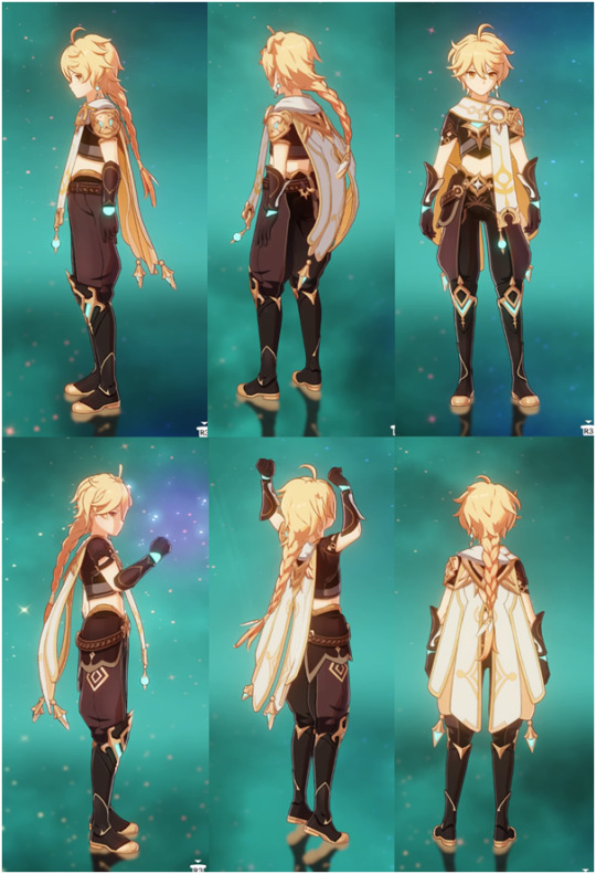
From here, the next step is to start dissecting the layers. Work from the base up, and break it down specifically into what you would make as a single piece, rather than say the shirt base AND the sleeves AND the decal. If that makes sense.
I don’t normally draw diagrams or anything like I will be for this, but if that helps you visualise it by all means do!
(I also tend to go really ham on the details because I’m a perfectionist, but please don’t torture yourself unless you really want to. Making things a little more simplistic is perfectly fine and valid.)
I won’t do the whole thing or I’ll reach image limit but here’s an example of how you might break it down:


The more you simplify it, the easier time you’re going to have.
The next step for me, after I raid my cupboard and the local craft store for the right colours, is to work out which pieces of the clothing I’m going to incorporate into the doll’s base body and which will be separate.
For Aether, for example, the ‘hand’ part of his gloves are the actual doll’s hands, but the bit that flares up his arm isn’t. The boots are part of his actual legs up until the part where it flares up over the top of his pants, which I made as a separate piece. The seat of his pants are the bottom half of his base body, but the pant legs themselves are add-ons. Does that make sense?
Next, make your base body! If you’d like to use my pattern, you can find it in my pinned post :)
Once you’ve got the base doll, I start adding layers of clothing. I always use a smaller hook size for the clothes than I do for the base body. In my case I like 2.5mm (and a teeny tiny 1.25mm for fine details and thin layers – but we’ll get to that later). I normally start with the pants.
My normal method of doing pants is this:
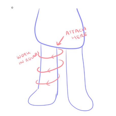
Essentially, I crochet directly into the base body in a circle around the base of the leg (so I am not chaining, but actually single crocheting through random stitches on the base in a loose circle shape), and then work in rounds until I reach the length I want.
Because Aether’s pants are puffy at the bottom and have two colours (*shakes fist at hoyo designers*), though, the process ends up being a little different.
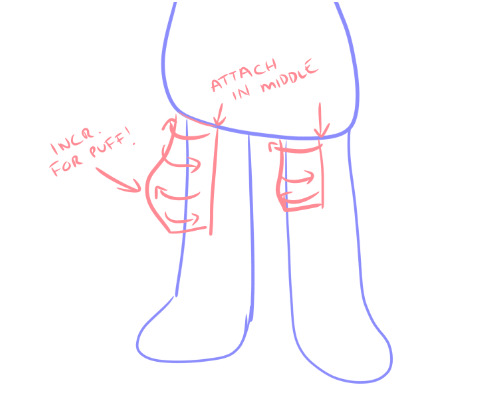
I made his pants in two pieces: the outer side and the inner side. So instead of rounds, it ends up being rows. To get that nice puff, just do some standard increases in the right spot and make sure to decrease on the lower rows to taper it back in.
Once you have both pieces, you can just sew the two halves together.
The flare of the boot over the top of the pants is exactly the same process. Attach and single crochet directly onto the leg from the top of the boot, working up towards the waist.

For trickier shapes like the gloves, it’s sort of just familiarising yourself with what kinds of effects different stitches do and allowing yourself to get it wrong about a dozen times before it actually works lol
If you break down the gloves properly, you end up with a shape similar to this:
(this is not great i am so sorry – I am realising once again my reference was awful for the gloves)
But you can kind of see how it’s largely bulb shapes for the brown part, which is easy to do with increases and decreases. The white part I made separately and attached afterwards. Yes it was a huge, tedious pain in the ass.
For finer details, like his jewellery and, like, the shoulder armour, etc etc, I use the smallest hook I can tolerate. Please do not attempt this unless you lowkey hate yourself because it is torture.
So when you look at yarn, you can see that it has a bunch of smaller strands wound together, right?
You gotta split em.
Like this.

(image borrowed from http://illuminatecrochet.blogspot.com/2015/03/what-is-ply.html)
And then. You are going to use that tiny ass hook. And crochet those individual strands. It sucks. It breaks constantly. It makes you want to commit a crime. But damn if it doesn’t look good.
On a similar note, don’t be afraid to use the 2.5mm/whatever hook you use for clothes with less than the full ply of the skein you’re using. For Aether’s cape, I did the outer facing white part with only 2 of the strands in my 8ply yarn, and the inside orangey part with the 1.25mm and one strand. It’s still a little fatter than I’d like but it’s better than doing the whole thing in single strand torture mode lol
I’ll wrap up clothing here but if you want some help with anything specific just let me know!
On to hair!
For hair, I use felt square sheets that are like $1 each. Except for Aether because he has to have a Very Special Hair Colour that my craft store doesn’t stock so his cost me $7 :/
It’s a similar kind of deal for hair as it is for clothes. Break down the shapes and start from the bottom up.
(This is not a good look for him rip)
Layers are your friend! As are sewing pins! For real, do not glue anything down until you’ve got the whole thing pinned down because once you glue you’re in for a bad time if you need to fix something.
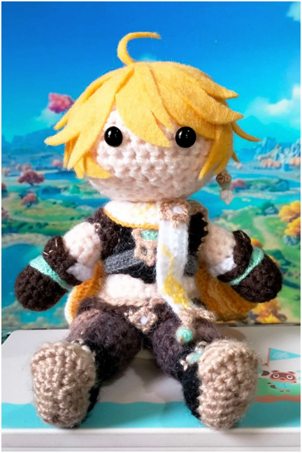

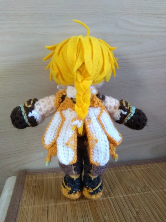
I’ve made two Aethers (one as a custom gift commission, one for myself) and they’re both a little different from each other, but this should help give you an idea of how I translated it to felt. I like to simplify if I can, purely because larger pieces tend to look a bit neater and less chaotic than a bunch of smaller ones.
For his braid, I found the easiest way to do it was to just cut three really long straight pieces, braid em, and then trim the end to the length I needed.
My absolute biggest #1 tip for hair:
If it looks bad but you haven’t finished, do not stop and restart.
It will always looks stupid as hell in the early stages. Don’t make a judgement call on whether or not it looks right until you’ve at least got the whole front part/fringe area fully pinned in place. Trust me.
I think that’s probably about all I have the energy for right at this second, but again if you have any questions or want help on anything specific, my inbox/DMs are always open – and that goes for anyone reading this! I’m always happy to help :)
3 notes
·
View notes
Note
I unfortunately lack the time right now to go through the list, so use this as an excuse to answer any of the OC questions you want. If none in particular, answer every single one.
(cracks knuckles) Here we go :)
This is the OC ask list, by the way!
I’m gonna answer them all so…. Be prepared.
And, Doll and Grace, if you’re reading this since you got pinged, hi. Forgive me, there’s a lot of text under this cut.
Doll, you were mentioned because I discussed shipping OCs.
Grace, you were mentioned because I wanted to share your Sketch design with the world.
Love ya. Sorry. Let’s get on with it.
Your Oldest OC:
That title would probably have to go to Rynne! I’ve had her for several years now, and she originated as a cringe sona-but-not-it’s-like-me-but-a-sadist-with-a-scythe sorta characters. Gosh, she’s so old, I have no relevant art to show of her!
Your Newest OC:
It’s been a while since I’ve developed a truly new OC…so it’d have to be Drisco and Castarian. They debuted in the mind at the same day, but Castarian made an appearance later so technically he’s the newest!
Favorite OC:
I don’t have an overall favorite… but I do pick and choose favorites from each story I have. A couple of my favorites include Maroon, Jay, Switch, Dislan, and Rynne.
Any Villain OCs?
Go read Masked.
Plenty! Outlander, of course, but we can’t forget Dhá-Aghaidh, Jynx, or Dr. Kruger, now can we?
Main Reason For Making OCs:
Mostly for story reasons that spawn. However, I do have fandom OCs, (and some of them happen to be the most well-known!) but I will inevitably end up working them into a story. OCs spawning from roleplay is a rare sight, and it’s only happened once… believe it or not, that’s how Karmin came into existence!
Describe Your Character Creation Process:
Step 1: Concept for a silly guy comes into my brain.
Step 2: Come up with a basic design for them to be changed later.
Step 3: Inflict soul-crushing pain.
Step 4: Have so much fun inflicting pain that I have to remind myself that it’s supposed to be a story. Suffer without coming up with actual story elements.
Step 5: Receive divine inspiration and everything comes together and I’m so fucking back baby.
Repeat Steps 5 and 6 until done.
Fav OC Ship:
Castarian and Drisco. They’re not a couple, but they have feelings for each other. They each blame each other for their deaths and refuse to see the other’s way. They separated themselves and feel the crushing loneliness l, but when they’re together they can’t stop arguing.
Drisco wants nothing more than to HURT Castarian, but only HE can hurt him, no one else, since he is the only person Castarian has wronged.
Castarian hates Drisco’s facades, violence, and methods, but those are what helped him in life. Drisco holds the power to make Castarian feel good about himself… and he’s dependent on that.
Do You Ship Your OCs With Someone Else’s OCs:
For everyone else who doesn’t know, my OC Jaide gets to be in a doomed yuri with Sky (the asker’s OC!! Hi Marci <3)
But I do have quite a few characters shipped with those belonging to @corrupted-tale. Like my OC Dislan and her OC Pix. And my Narrator with her Lady Luck.
Weirdest OC:
I’d have to say Bi Solomon earns that title. He’s a fascist furry who reinvented capitalism in a post-apocalyptic world. (And by furry I do mean he’s a Creature btw).
Favorite OC Design:
I REFUSE to let that achievement go to Drisco so Night! ILY Night!!!! You’re so cool and gender and badass!!
Not the greatest picture of it, since it actually has 4 arms and a cool-ass sickle… but oh well.
Would You Consider Yourself Nice To Your OCs:
Go read Masked.
Haha, not at all. They all suffer underneath my thumb, no matter how beloved they are :)
An OC You’ve Killed:
The easy answer are OCs like Jaide, Levi, Drisco, and Castarian, since they’re ghosts and that’s their whole gimmick.
It’s actually rare for me to kill off OCs and leave them forever, since I feel like they die before their potential is fulfilled. But the previously mentioned fascist furry Solomon dies (good riddance), and I have a pantheon of gods that get slaughtered in a different story!
Are Any Of Your OCs Parents:
Go Read Ma
Besides Jaide, I do have some others! I have a royal family group of OCs, with King Leonard and Queen Beatrice being parents to a chaotic group of kids.
Dr. Kruger, while not physically being a dad, is burdened with being a single father as punishment for being too William Afton core.
Are There Any OCs You Find Yourself Neglecting:
Each OC has gotten their time in the spotlight, but I haven’t developed all of the characters from that royal family. And I have waning interest if the cast of Ora and the Rift in Time…
There are concept OCs I neglect since I dunno what to do with them. Like Brittlebrine. He started off as a cool concept for exactly one day and then I never thought about him again. And I’m still conflicted on Devon…..
An OC that’s difficult to write/draw/rp:
Vipsi’s hard to write, despite having little screentime. She lost her mind, but I don’t entirely know how to write insanity arcs. Not to mention that I didn’t really know how their story should go…
My entire godly pantheon is difficult for me to draw (except for Lux, since I’ve had her design figured out). I don’t have finalized designs for some of the less important gods, but the design ideas are difficult…
Out of the few OCs I’ve roleplayed, Karmin has been the most difficult (which is ironic, considering she originated from one). I have to actively consider what is going on in her brain and how to present it in a good way. But it’s okay since she’s only ever been in two rps ever.
Your Tallest & Shortest OCs:
My shortest is probably Gemi! He’s less than 4 feet tall. Truly a little guy.
And my eldritch being OCs are the tallest. In their most incomprehensible forms, they’re about 40-70 feet tall? It fluctuates, since they’re impossible to comprehend. But they’re very large.
Your Oldest and Youngest OCs:
As much as I’d like to say my youngest is Levi, he was born 500 years before Masked present! That means that Ora is likely my youngest, being 7 or 8.
Just like with height, my eldritch being OCs take the cake for being the oldest. They’re all billions of years old, except for Thirio and Tsumi. Epithymia is the oldest of them all, but if Nova were still alive, he would’ve won the crown.
Do You Dislike Any Of Your OCs?
Mr. Bi Solomon deserved that bullet to the brain. See you in hell, you corporate motherfucker.
Have You Ever Made A Self-Insert?
Oh yeah. My sona Doodle doubles as a self-insert when I don’t want to make an entirely new character with a flat personality since they’re based on me.
Branching off of Doodle thanks to some sort of evolution is a self-insert named Sketch. Sketch is what happens when I want to ship myself with characters, but they will be the star of the SPM fic I have planned!
Here is the current design for them, made by the lovely @gracebeth3604! (Cropped to avoid spoilers </3)
An OC Regret:
I have OCs that spawned from ideas that I didn’t fully know how to handle well, or problematic media. They were all from when I was younger, though, so all is forgiven and those OCs have been sent to the fiery oblivion.
Weeeelp that’s all of it! If you’ve read this all, I’m super impressed! Thank you so much, but you’re gonna forget all this. I hope it was worth it to you! ❤️
#artbabble-tm#ask game#ocs#cosmoknightchaos#oc: Rynne#oc: Drisco#oc: Castarian#oc: Maroon#oc: Jay#oc: Switch#oc: Dislan#ahit oc outlander#oc: Dhá-Aghaidh#oc: Jynx#oc: Dr. Kruger#ahit oc karmin#ahit oc jaide#friends’ ocs#oc: Bi Solomon#oc: Night#ahit oc levi#oc: King Leonard#oc: Queen Beatrice#oc: Vipsi#oc: Lux#oc: Gemi#oc: Ora#oc: Thirio#oc: Tsumi#oc: Epithymia
5 notes
·
View notes
Text
A turtle and a monkey meet in an alley - Monkey!Yokai!Reader and Rise!Michelangelo
GN
Pairings: none
Characters included: Michelangelo
Warnings: n/a
Series: No
Summary: Mikey is out checking out the hidden city on his own only to meet a fellow artist. A badass monkey yokai artist to be exact. Yeah they will be friends for sure.
Word count: 2220
Authors Note: I just love monkey humans designs so much, I was specifically thinking about how people draw monkey king like characters. The character design is so funky + they gotta be mischievious right?
Honestly this whole situation sounded like a setup for a very bad joke.
A turtle and a monkey meet in a bar. Only that the turtle was technically a turtle mutant, and the monkey was a yokai. There was also no bar involved. It was an alleyway right next to a bar in the hidden city though, so, close enough.
The two didn’t know each other, it was a chance meeting.
Mikey, the aforementioned turtle mutant, was in the hidden city just to explore the place a bit. His whole family was here on business, but somehow, he got separated from his family when he began inspecting the place. He only wanted to take a quick look at a stall that seemed to sell magic rocks or whatever and suddenly his family was gone.
He wasn’t too worried though. If anything happened, he could phone them and he knew how to get back home. Besides he was old enough to go on a little sightseeing adventure on his own.
It was when he passed a fancy looking bar when he heard a rattling. A rattling he knew all too well. Someone was using spray cans. That was weird. Mikey figured that if anyone wanted to do wall art or something similar, they would use magic. Seemingly everyone here used magic for everything but no, there it was. A rattle and then the telltale sound of someone using a spray can.
In fact, it was so close that Mikey only had to look to his left to see a figure in the alleyway right next to the bar. The figure was definitely spraying on the wall, jumping and wildly flailing their arm around as they began to trace some sort of design on the wall with orange.
The figure was a yokai. Of course, they were a yokai this was the hidden city after all! But Mikey has seen at this point a lot of different yokais but this was the first time he saw a monkey yokai. They had a long tail that was holding on to a different spray can, fur was growing along their arms and was even along their throat and grew a bit into their face from the outside. Their nose was flat and had V-shaped nostrils.
As Mikey kept staring at the design that the monkey was drawing on the wall it slowly began making more and more sense. They seemed to be depicting dusk. There was the sun low on the horizon and currently they were working on drawing very abstract looking orange and pink clouds.
Whenever they needed a different color, they only took a quick glance at their cans at their feet, then their tail would dart forward and grab the color they would need, already shaking it so its ready for use. The turtle mutant couldn’t help but think how cool it would be to have a tail like that. Doing a lot of his hobbies would probably be easier.
Oh! He could play video games and use his tail to drink, no need to pause the game so he had one of his hands free.
“You like what you see?”
A yelp escaped Mikey’s mouth as he was suddenly pulled out of his thoughts. The monkey yokai had a shit eating grin on their face as they were staring him down with narrowed eyes. They looked like they just saw their younger sibling grab a cookie from the forbidden cookie jar.
Not that Mikey would speak from experience.
Mikey quickly tried to relax his body again and look like he was in truth unbothered by the yokai noticing him despite the sound he emitted earlier “Well, I- I guess. I’m an artist myself so I was interested to see what you were drawing.” Nice recovery, Michelangelo.
The yokais face contorted as they seemed to think. Their tongue slightly slipped out of their mouth as if this was a really straining thing to do. Just as Mikey cocked his head to the side with a raised eyebrow, amused with the face they made, they suddenly nodded and slapped their fist against their open palm.
“Eh, you seem to be chill. I like to think I have a good sense when it comes to people.” They moved a bit to the side to open their arms in an inviting gesture “You may come into my dojo and take a closer look at my art piece.”
Mikey chuckled at their behavior but gladly took the invitation and stepped closer to take an even better look at their art. It surprised him to see how intricate some lines were, seeing how they used spray cans. Taking another look at the spray cans he soon found that some had custom caps on that probably helped with controlling the flow. So, this was definitely something they had done for a while.
The art piece was abstract but not too abstract that you couldn’t tell anymore what was going on. It was mostly going for very clear and defined shapes. There was also definitely an inspiration of these old Japanese art pieces that depicted water and waves. He could tell that the yokai tried to replicate it a little bit within the clouds.
“Wow, this is amazing.” Mikey beamed.
The yokai next to him giggled in delight “Really? You think so?”
“Absolutely! I couldn’t take my eyes of it and now that I’m closer I’m even more impressed!”
The smile on the yokai’s face brightened “Aw, getting a compliment like that from a fellow artist means a lot to me. Oh, that reminds me! Do you have any art pieces I can take a look at?”
It was so rare Mikey actually got the chance to show off his art or even talk shop with another one, hence why he didn’t hesitate to pull out his phone and show off his own art pieces.
The eyes of his new friend, he just decided, widened in astonishment “Oh my god! That is so cool! I can definitely see so much character in there! Just from the art I would say you are energetic, optimistic and beautifully chaotic!”
Now it was Mikey’s time to put on a huge smile “Aw, shucks. That’s what you can see from my art?”
They nodded energetically at his response “I said I was pretty good at judging people, right? Art makes this so much easier, but I bet you know that! Even if you go for a different style than your usual one, there is still a piece of you in there no matter what. That’s what is so great about art!”
Yep, this is his new best friend for sure.
Mikey stretched his hand out. The yokai didn’t even hesitate to shake it.
“I’m Michelangelo but call me Mikey.”
“I’m Y/N! Nice to meet you Mikey.”
“Aw, is Y/N making new friends.” A gruff voice suddenly appeared from behind them.
A big crocodile yokai stood at the entrance of the alleyway with two smaller crocodile yokais behind him. They were obviously blocking the exit and they knew Y/N? Well, whatever. Mikey would make sure that no one would hurt his new best friend.
Before Mikey could even react Y/N already began sauntering over to the group. No ounce of fear or hesitation in their movement. He would say that he was impressed by their demeanor, but it was clear there was something more going on. Donnie would probably say something like “Observe then act.” Or something like that. Maybe he’d be more dramatic and say “Observeth!” Nah, that wasn’t right but the mental image of Donnie yelling that out was comical to him.
Either way, Mikey would observe but be ready to jump in if things got hairy.
Y/N stopped in front of the biggest crocodile yokai, crossing their arms in front of their chest, jutting their hip out. They looked confident and almost bored.
With a lazy smile they leaned forward “What? Still around, Artie? I was sure I saw a very nice purse in one of the shops and thought it was you for sure! The scales looked so much like yours.”
The big yokai growled in anger “Stop calling me that! My name is Arthur!”
“Yep! His name is Arthur! You know our boss has a complex about it!” the two smaller yokai mumbled as they nodded along. They clearly only wanted to help their boss but in return he just took one angry look at them which shut them up immediately.
Either way Arthur looked back and made sure to tower over the monkey yokai “You did it again, Y/N. Stop drawing over our territory tags!”
Arthur was obviously way stronger and taller than Y/N, seeing how he made sure to tower over them with squared shoulders, but all Y/N did was push their tongue out of their mouth and blow a raspberry at him.
“Ugh, they are so ugly. You guys have no sense of style and aesthetic.” They groaned.
Y/N then turned around, their arms now behind their head. Mikey couldn’t help but think this was a bad move on their part but almost as if they could read his thought, they gave him a self-assured wink. Yeah, they knew what they were doing.
“That’s it!” Arthur growled in anger but before he could even throw a punch, Y/N threw their tail up, a red spray can in their grip. They pressed down on the cap, the colorful spray going right into Arthur’s face, coloring it red. He reared back in pain and surprise.
And almost as if this was a practiced choreography, Y/N immediately leaned forward into a deep bow as both of the smaller henchman yokai went for a punch themselves as support for their boss but all they hit was the air. Since they didn’t make contact with their intended goal, their bodies collided.
Mikey had no time to be in awe at this display because Y/N grabbed his hand and yelled “Run!”
They were now at this point giggling and laughing and Mikey had to admit this was contagious, he too begun laughing as they rounded the corner. That was when he had an idea. Time for him to show off.
“I’ve got an idea!”
Mikey got his nunchaku out and threw it out against a metal pole of a staircase that was outside of one of the buildings, the chains extending in a golden glow. This time it was Y/N who looked at awe at Mikey, who just gave them a playful wink, wrapping one arm around them as he jumped and swung up into the air.
Just as they did, they could hear Arthur and his goons yelling something, but it was drowned out by the sound of the wind rushing and their combined laughter.
Once they landed safely on one of the roofs, they immediately took off. Both Y/N and Mikey jumping from roof to roof. Making poses in the air to impress or make the other laugh.
After a few minutes Y/N stopped, out of breath they pressed their hands on their knees, their head hanging low. Mikey came to a stop as well, taking a few deep breaths. A big smile on his face.
“You good?” he asked.
Y/N immediately looked up, their face was lit up in amazement. Mouth in a bright smile and he swear he saw stars in their eyes “That was-“ they threw their arms up in the air “amazing!”
Both broke down into giggles again. When they calmed down Y/N took a glance at Mikey’s weapons “So, how did you do that?”
Mikey just shrugged “Eh, I don’t really think much about it I just do it. I just know it’s some mystic mumbo jumbo but that was not as cool as you outplaying these three people! That looked so cool! Honestly, I felt like I was watching a movie!”
Y/N smiled proudly “Oh that was nothing. I have been dealing with them for a while and it’s just really easy to predict how they will react. I always had a knack for that. Besides dealing with them without throwing a clear punch their way is so much more satisfying because it’s so much more humiliating for them.”
“You are quite the trickster aren’t you?” Mikey mused, stroking his chin with a raised eyebrow.
This seemed to somehow trigger something within Y/N since their eyes widened and they suddenly begun looking through their pockets of their outfit. That’s when they suddenly pulled out a brown wallet.
“I’m surprised your wallet looks so… boring.” Mikey said as Y/N held the wallet out to him for some reason. “I mean I would have guessed you would have at least something colorful.”
But Y/N just rolled their eyes “This isn’t mine, dummy. This is Artie’s.”
Mikey’s eyes widened “What? When?”
“Oh, when we ran past him.” They just answered nonchalantly. “Anyways, want some ice cream? It’ll be on Artie and don’t worry I’ll return the wallet to him with the rest, I just think after this whole ordeal he put us through we deserve a treat on his costs.”
“You are officially my new best friend.”
Y/N giggled “Oh same at you. A fellow artist and a badass? Yeah, we will be awesome friends for sure.”
#rottmnt#tmnt#rottmnt reader insert#reader insert#tmnt reader insert#michelangelo reader insert#michelangelo x reader#rottmnt mikey reader insert#rottmnt mikey x reader#rottmnt x reader#rottmnt!mikey x reader
74 notes
·
View notes
Note
I hope Lemoncritiques remakes. It was nice to have a critical blog that was chill and not a straight up hater, still having things they liked about Hazbin.
So as far as I'm aware, there was... some situation involving Lemoncritiques. I never encountered their posts, personally, I don't even think they were active by the time I made my blog and I never cared to look further into it as a result. So no comment on that part.
It's true that the critical tag can be a very negative place; I can feel myself get a bit overwhelmed when I peruse it too much too frequently. It's fun to pick on things and dissect them, but you've gotta be careful about striking a healthy balance in your media consuption (whether the one you're critiquing or other stuff you enjoy, because we all enjoy other things, of course, and just because we tend to be negative in this tag doesn't mean we're never positive elsewhere). Which is actually why I used to post background design appreciation (I still have that one ask in my inbox, don't worry, I haven't forgotten and I'll get to it), and behind the scenes I like to craft a lot of worldbuilding and minor/original character lore for my own enjoyment.
I would say that several episode analyses make a point of listing the "pros" AND the "cons", some of which I've even reblogged here. I tend to appreciate that. I also find plenty positivity in the creativity of certain redesigns, which I also have a tag for.
I think the bitterness comes from most of us having relatively high hopes for these shows at the beginning (with Helluva at least), and then just seeing the acres of wasted potential, careless worldbuilding and the creator picking her obvious favorites making a huge mess of it all. Plus the deep dislike for Vivzie as a person and how her views are leaking into her work. Which I can't say is entirely unjustified, even if it does show in the tone of the critiques.
Apologies for the ramble and a half, I wasn't even gonna answer this one at first.
But I wanted to make an announcement, as a bonus:
I'd like you all to stop sending me confessions about IRL drama. From the crew, from the fanbase, from other criticals, from anyone. In my pinned post I have pointed out that I prefer to just discuss the cartoons themselves on this blog.
This is not necessarily @ you, Anon, but something I felt the need to reiterate since I have now gotten two separate asks indicating some people missed that bit of information.
11 notes
·
View notes
Text
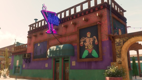
Actually Reviewing Saints Row [2022] - Part I
A little while ago I made a post regarding my first impression of the game. At the time whatever impressions I had were from other reviewers. Most didn't seem to enjoy the game. So I decided to play it myself. So, as a warning, this will be a bit of a long post since I tend to ramble.
[TL;DR: Despite having a pretty bad first impression I mostly enjoyed what I have experienced so far.]
The release of this game was probably a disaster for the game company. I believe the main issue is that a lot of fans wanted a game to be like the first two games. I was one of them as Saints Row 2 is one of my favorite games.
But when it was revealed Volition was going in a different direction there was some backlash. Then some employees of the company shot back. So unsurprising some players like myself would have a pretty early bad impression.
Not only was the hope of having a game like Saints Row 2 dashed this game wasn't even on Steam at first. I didn't like the idea of shelling money to a platform I didn't even use for a game I didn't know if I would like or not. So, I waited until I learned that it was on Steam and on sale. I pretty much bought the game the day before writing this at about $10 [Thank Gabe for seasonal sales.]
Out of the gate, I really love the range of options for character customization. The customization was always a big draw for me. Some options might seem stupid but there were quite a few I did love. Though was sad that my favorite face scar from 3 and 4 wasn't in this game.
When playing through the opening I did have a hard time getting into it. Partly from the main character acting like a badass while not really being so. A big cringy but not too bad. After that first part, I did actually enjoy the game. [I didn't get too far into yet. So I'm just going to post my thoughts as I progress.
Surprisingly the part that many people complained about was either cut or I was trying to drive normally so I didn't actually get to trigger it. Hard to say either way. I'm glad I didn't have to sit through it. [Boss just saying nonsense while driving. Mostly cussing.]
The music is nice. The design is not bad either. At least what I've seen. I also don't hate the characters [friends] I am hoping the bugs most people complained about have been ironed out that playing today might actually be a better experience than it had been closer to launch. [One of the reasons I prefer to wait.]
I think the best thing to do is kinda separate it from the past games. Though it's called Saints Row it's still quite different.

2 notes
·
View notes
Text
Apartments For Rent: TEN-YEAR RETROSPECTIVE
Ooooohhhh man, this… This is fucking me way up, big time… I don’t even know where to begin with this… I should definitely be using this free time I have today doing my homework, you know, the thing with a hard deadline? That was technically due yesterday?? Well, how about instead of that, I take a walk down memory lane…
Do you remember the 21st night of September?
Picture this: It’s 2013. It is your sophomore year of high school. You have more friends than you ever have in your life and they are all so wonderful to you (this wouldn’t always be the case and they all wouldn’t stick around but you didn't know that yet). One of you proposes the question: If you were a monster, what would you be? A witch. A vampire. A werewolf. A mermaid. A ghost. A selkie. A dullahan. (You had to look those last two up.) You are so inspired by this that you want to make a story for these ideas to live in. You create a fantasy. Where all your best friends get to live together under one roof. A slice of a life you know you’ll never have. It’s actually the 20th night of September that you created the tumblr blog where most of what comes out of this will live (your first post says “why do i do this to myself”) but it is the 21st night that your creations get their names. Their genders don’t all stay the same but their cores haven’t really changed. “a very dramatic/theatrical witch who loves animals and sass master. a bubbly and happy mermaid who gets really scary when u cross her. a passive, nerdy vampire who isnt so out spoken. a moody selkie who loves to learn and lost her seal skin. a strong beautiful fairy girl who doesnt take shit from no one but is v nice to her friends. a strong beautiful fairy girl who doesnt take shit from no one but is v nice to her friends. a ghost girl from the 1920s who is forgetful and not really confident but really likes her new friends.” You put a disclaimer at the bottom of the post, clarifying that these descriptions shouldn’t be taken as a description of your friends but separate characters entirely. This is also the birth of Marvin, the human man created to navigate this world of chaos, not based on anyone you know in real life. The straight man in this goofball circus. Your Original Character. (Who, you now realize, was designed as the boring main male character in the harem anime.) This was the genesis. And you would never know peace in your life ever since.
And then what happened?
Bro, so much. A lot can happen in 10 years. You develop the characters further. You make a small town for them to live in (even though you’ve never even been to a small town in your life). You make (bad) art. You make sims because you hate the way you draw but you need a physical version of them to exist outside your head, as you see them. You apparently make a rule where no one outside of your little group is supposed to know about these characters (because you “had an experience” and “don’t wanna repeat it”). You make Alternate Universes for these Alternate Universe selves to populate, again and again. (As of right now, your “AU of an AU” list stands at 26 but there are probably more dumb ones not yet counted on the doc you made.) You try to make a one-shot comic collaboration with all your friends but no one seems to agree on how it should go so nothing but a script and panel formatting ends up getting made. (You know that your script was worse with many unnecessary details but you were bad at killing your darlings and stubborn about your ideas being the best. You’ll learn eventually.) You love and appreciate all the things your friends make for this story you start to feel full ownership of. (You haven’t noticed yet how much of a control freak you are.) Their writing and art give you life, especially considering they are doing The Most while you mostly just come up with ideas. The setting goes from apartment building to boarding house and back again before a year has passed. The first anniversary is a blast! You actually wrote something! And drew something you were proud of! Others wrote and drew and it was great. (How would you know it would never be like this again?)
And the years go by and by…
After the first year, you decided you wanted to make a dating sim with these silly characters because you just loved them so much. You shipped the characters (not realizing that your friends did it as a way to express they had crushes on each other, conveniently shipping your self-insert with the only man/only character not based on a friend.) There were still a lot of headcanons being made and posts being shared. But noticeably less and less. Then the second anniversary hit. Not much fanfare. After the second year, more characters started popping up based on more friends you make. Some of the friends that were there in the beginning weren’t anymore and you try not to think about it. After all, these characters aren’t your friends, they are separate and distinct from them. So it’s still OK to play with them, right? (The answer must be yes; ten years later you still do.) Then the third anniversary happens, with 4 posts between them. It was understandable. That was your senior year of high school. Everyone was getting ready to go their separate ways. You were moving clear across the country. Your friend group was getting smaller still and this big shake-up would prove who would stick around to still be a part of this thing and who would remain a memory for you to look back on in ten years. 2017, though, was a big year for the blog. You were unemployed and not yet going to college so you had A LOT of free time on your hands. It was probably the most number of posts you made since the first year of the blog. It was magic. Then you got a job. There have been 16 posts in the last 6 years. 2019 had none. 2020 and 2021 had one each. They were all made by you. There has certainly been less activity on the blog but that doesn’t mean these kids have been lying dormant all this time. You haven’t stopped thinking about them since they first popped up into your head. In 2019, you rewrote the story you had written for one of those anniversaries; the first chronological beat. (You haven’t read it since then; You have no idea if it’s good or not.) In 2020, you attempted to write the actual story (like fr fr) for NaNoWriMo -- you didn’t get very far but it’s the thought that counts? 2021 was a quiet year as far as actual writing goes - as was 2022 - but trust that your brain definitely didn’t forget about them.
The Retro part of the Spective
Alright, enough second-person POV.
Ten years.
Ten years.
Talk about hard pills to swallow (thanks FOB).
I’ve had this “story”, these characters, banging around in my head for ten years and what do I have to show for it? A couple thousand words and a blog full of half-thought ideas? Around this time last year, I was excited about this anniversary. I made a new Twitter for it (before that died) and was planning on actually publishing something to do this story justice… and I chickened out. I convinced myself, once again, that I wasn’t ready. That other things were more important, they took precedence. Do I have even that much to prove I was right? No, I don’t because I really haven’t changed all that much in ten years, if you can believe it. I know, a real shocker. (I still like all the same things I liked back in high school for crying out fucking loud!) I wanted to reach out to the people I used to do this with, to see if they still wanted to be part of it. (I’m sure that wouldn’tve been at all hard, I wonder why I didn’t follow through?) I wanted to have something so I would be able to say, “I did it.” So that maybe, I could finally move on. But that’s the thing, isn’t it… I don’t want to move on. I’m stuck in this arrested development because I refuse to change, to give up any past part of myself. Because if I don’t have that, I don’t know who I am.
So now what? What’s all this for? One big, sad diary entry reflecting on the parts of myself that I already know very well?
Honestly, I don’t know. I was hoping I could come to some sort of conclusion by writing this but as it turns out, it only made me want to cry.
I wanted this to end on a good note.
I spent all day writing this, I can’t end it like this.
So let’s instead talk about all the things that have changed about these goofballs over the years:
Mystic Cove is a city in a Northern California town. It started out in Florida, it almost ended up as a mountain town. I also briefly considered straight up placing it in San Diego because there are some nice, beautiful, old-ass buildings downtown that juxtapose the cold, sleek skyrises in such a way that I thought about writing something about being lonely in a city and finding your own family.
Vast Acres has been an apartment building, a boarding house, Mediterranean Revival, Victorian, Queen Anne, even briefly considered a Bed and Breakfast. All I know is it has to be the place where this family gets together. At one point under the ownership and operation of Marvin’s dad Alejandro, it is now bequeathed to Marvin by a mysterious, freshly dead uncle/great uncle.
Marvin is a wholeass person to me, in that he’s not completely knowable to even me anymore. Marvin is probably the person in Mystic Cove I know the BEST and that like doesn’t mean anything to me. Like yeah, I’ve written pages and pages and answered so many pointless questions about him but… I don’t know how else to describe him other than, “He’s an enigma.” The most significant thing about him that’s changed is I’m considering undeading his mom? Just because I feel like we’ve had enough dead mom media and it’s not something I can speak to truthfully. Briefly considered making her a runaway mom? But we’re still thinking about it. I think her name is Lily?
Mel’s name went from Melinda to Melody because I decided Melinda was a weird name? And Mel likes music so I thought I would be clever. She went from “Marv’s sister” and side character to basically co-lead. Mel was even almost briefly considered as the real main character for a time when I thought to lean into its roots as a product of a high schooler’s imagination and go full YA coming-of-age adventure. It was actually the subject of my 2020 NaNo attempt. I decided against it because I loved Marv too much to push him to “supporting character” and if there’s something about me that’s developed, it’s that I don’t much care for YA books anymore.
Amber is unsurprisingly my favorite because I’m a Leo. I think I finally decided on a backstory for her that I like and she’s not white anymore? Like, not fully anyway lmao. Before she was like, from someplace in England with like Spanish parents so like tan? But now we’ve decided that she’s from colonized Mexico and her father is a white devil. :) I’ll let you figure that one out. Over these ten years, I’ve grappled with the fact that an immortal is almost impossible to understand. I’ve gone back and forth on whether her immortality is on purpose or by accident or a curse or what. Honestly, I’m still thinking about it, I don’t know for sure what I’ll end up picking. Right now though, it is an involuntary immortality with her life being tied to her sister’s (yes, the cat). Details are fuzzy. I’d have to finish the main story first but if I were to make a spin-off, I would make a prequel story about Amber’s life because it is QUITE eventful.
Lucas is a man now lmao. And so is Will. And they r gay. For each other. But that’s been that way from the beginning lol. I think Luc’s story had to do with self-worth and Will… Will didn’t have much going on in my mind. My instinct was to make him a himbo but Will has always been very smart in my head so I don’t think that will work? Dude’s beefy asf and mad respectful so perfect man tbh? No notes.
Jenny’s been my way to try to break down the trope “Born Sexy Yesterday” because that’s just the kinda guy I am. No, but fr I think I was making a very infantilized version of Jenny initially and that’s why I shipped her with Mel in so many AUs?? I’m not against skewing Jenny younger to make that ship viable in canon but I don’t know if that’s the story I want to tell. I don’t think Jenny ever had a goal beyond “Get to the surface” which she gets when she makes her appearance in the story so?? Where do we go from here? Things to think about…
Rohen was fat (like a proper seal should be) before they lost their skin on the beach to some snot-nosed kid and became depressed. When they start healing on their depression journey, they start to gain weight again and it's a good thing. :)
Everyone else I haven’t mentioned yet hasn’t changed much (ie. I haven’t thought about them much). It’s not that I have favorites (even though I just said that I did), it’s just that I basically go down a list whenever I think about these guys, and, due to my short attention span, I never make it all the way down the list. AND honestly, it’s probably for the best because looking back… there were WAAAY too many characters to keep track of ngl… Like it’s a slice-of-life thing, I know. Not every character has to be involved in every storyline but like… At some point, you have to draw a line at, “How many named characters with their own plotlines can I insert into this story?” YKWIM? Especially because at one point there was a whole roster of other people who lived in the apartment building when there were like 20 units. That was (rightly) reduced back down to just the core cast.
You can pry Jonesy from my cold, dead hands, tho. He’s perfect. He can stay.
This post took me literally all day.
I’m tired.
I don’t really expect anyone to read all this but if you are not me and you made it to the bottom, congratulations! You now know me on a much deeper level! :) I hope I can convince myself to buckle down and write, straight up. Maybe NaNo this year? No promises. I’m trying to apply for university this year and living situation issues might take precedence but such is life, right?
Thank you.
I love you all.
For giving me this gift.
Even if you never intended to give it fully to me.
It’s mine now, bitches. >:)
Here’s to 10 years! And many (but hopefully not too many) more…
Cheers. 🥂🍾
❤️
5 notes
·
View notes
Text
17 of the Best New Font Releases: March 2024
New Post has been published on https://thedigitalinsider.com/17-of-the-best-new-font-releases-march-2024/
17 of the Best New Font Releases: March 2024
Check out the best new font releases for March 2024! Often new fonts are released with some nice discounts, so it can be the perfect time to pick them up when they’re fresh out of the font foundry. Some of these typefaces have up to 60% off, and certain fonts can even be downloaded free!
[embedded content]
Up first is an expertly designed font called Garrison, it’s a nice modern sans serif with a humanist style, a little like the classic Gill Sans. This one comes packed with 21 individual fonts in a variety of weights and styles, and what’s more it’s currently 60% off as part of its launch sale.
Next up is a great looking new condensed sans named Entropia. It’s another family of loads of styles, including a rather unusual backslant version, for those rare occasions you might want an italic but leaning the opposite way. The full collection is quite pricey at almost £300, but you can pick up 3 versions for free. You could even combine them with a selection Regular, Bold, Black and Heavy fonts to build your own much more cost-effective bundle.
Petrov Sans is another highly ranked new release. This modern sans has quite a futuristic look to it and includes 19 styles ranging from Thin and Extra Light all the way to Black and Extra Black. It’s another font that is currently on offer at 60% off.
Greater Neue Condensed… Or ‘NOIER’ is if I was to pronounce it correctly… is a nice new industrial style condensed sans that’s right up my street. I can see myself only using this in its heavier weights and only in all caps for logos or headlines, so the full price of £200 probably wouldn’t be worth it for me, but it just happens that you can pick up the individual Greater Neue Condensed Heavy font for free.
Script fonts have been in trend for several years now, but this new Retro Script named The Original stands out with a pretty unique style. It’s based on vintage car badge inscriptions, so it’s much slimmer than some other scripts and has a large selection of elegant swashes to completely customise its appearance.
Font Duos take the hassle out of having to find two separate typefaces to pair together. Hajime is the perfect combo of bold condensed sans and a cursive script. You can use them individually in your regular design work, or together to create cool quote art. At the $10 discount price it’s definitely worth adding to your collection.
Brush scripts are one handwritten lettering style that fully makes use of SVG font technology. With SVG Fonts like the new Beast Mode you can include the authentic texturing of hand painted lettering directly into each glyph, rather than it just being a solid letter shape. Several of Sam from Set Sail Studio’s fonts are amongst my go-to favourites in my library so I think Beast Mode definitely needs to be added to the collection, especially with such a memorable name!
The name of Qumer Pefolijqey probably *isn’t* one of the most memorable font names, but this new script font needs to be one to remember for when you need a cursive, monoweight typeface. With 363 glyphs comprising of multilingual characters and several ligatures it’s capable of displaying whatever words you need it to. This is one of a few fonts in this roundup from Envato Elements, so it can be downloaded as part of your subscription if you’re a member like me. Check the link in the description to sign up to the biggest creative library out there.
Millaris is another font with extensive multilingual support, but the reason I chose it for this roundup is its lovely design. It’s described as a modern retro serif. It doesn’t come in any other weights or styles, but with a decent selection of alternates and ligatures it would be a great choice for logos or even editorial titles.
Kirgina is a Modern Condensed Sans with a cool unique style. It has some really high contrast in its letter shapes and tight angles which makes it almost a display font, but it comes in plenty of styles from Light to Extra Bold. This is another font that’s available to download from Envato Elements.
Brickers is a really narrow condensed sans that doesn’t come in any additional weights, but some of the ligatures do transform this font with some quirky and unusual layouts that would make great logos or quote art. It’s available in an inline version too, but to be honest you could save some money by just picking up the main regular version and apply your own stroke.
The Brucken is another brush script, but this one is more in the style of the popular brush script fonts with its fatter appearance and simpler swooshes. There are loads of these kinds of brush scripts out there but the best ones are those that include lots of stylistic alternates so you can tweak it to perfectly suit your wording. The Brucken has plenty to choose from!
If you already have some of the classic Swiss neo grotesque fonts such as Helvetica, Univers or Akzidenz then there might not be much reason to spend $360 on Solidus Open as a newcomer in 2024 compared to those timeless typographic icons from centuries past. But if you look closely it does have some really nice features, namely the opened up terminals which gives it a really cool appearance. It also comes in a huge selection of 19 styles with weights from Hairline to Black.
Massivemoon is one font I wasn’t going to include in this roundup with it being more of a display typeface, but I really like its retro style and it has some unique alternate characters that can inject ludicrously stretched out letters. I’m not entirely sure when you might need to create such a typographic layout, but the main reason it made the pick was its bargain price at just $5 for the main desktop version.
Variable Fonts are the latest typographic technology. Rather than have several separate font files for each weight, variable fonts combine them into one so you can essentially stretch the font to the exact size you need and the font will fill the space with the relevant weight without affecting the typefaces proportions. Check out Graveur as a classy looking serif that’s ideal for headings and even small book text.
Corsario is another variable serif font, but this time with a much more modern style. This was designed with magazine and editorial use in mind, so if you’re in that field of graphic design, it could be a great choice for a headline, especially with it being easily accessible directly in InDesign via Adobe Fonts.
And to finish off this first roundup of the best new fonts we have another variable font choice from Adobe Fonts named Picholine Antique. This one is a slab serif with some nice curves that help soften it up compared to many other hard slab serif styles. What’s great about the Adobe Fonts library is not only are these hot new variable fonts available for use directly in your software at no extra cost, they’re also cleared for commercial use too.
#2024#adobe#Art#badge#book#bundle#Design#desktop#display#editorial#Features#fonts#Full#Graphic design#hand#icons#it#italic#layout#Light#Link#Logos#mind#money#namely#News#One#opposite#Other#price
2 notes
·
View notes
Last Seen Blogs

tbdabirajea
𝐀𝐣𝐞𝐚
sergizava
Frases y relatos
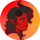
kelemvorr
i say we follow the winged freak
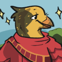
creaturesofozeum
Creatures Of Ozeum
ask-prosecutor-gangrel-blog
The Mad King Prosecutor's Office