#but clip studio paint is a boon
Photo
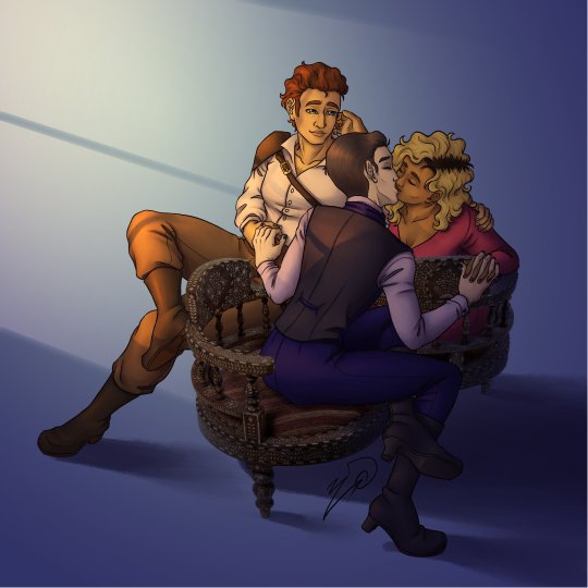
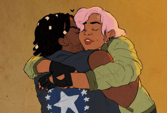
[Image Description: a photo of a "chaperone chair," edited to have three illustrated people sitting on it, with a vague blue background, and implied window lighting coming from the left. The chair is comprised of three connected seats arranged facing counterclockwise. In the front seat is Vlad, who is leaning forward to kiss Sue, and reaching to hold both her and Nathan's hands. Sue is sitting in the right chair, leaning to kiss Vlad back, and petting Nathan's cheek with her other hand. Nathan is sitting in the left chair, his other hand on Sue's shoulder, and he's leaning back to gaze lovingly at the other two.]
(Source link for photo and the following tags from @thebibliosphere : https://thebibliosphere.tumblr.com/post/682553115340406784/nae-design-til-kissing-bench-loveseat )
#I need someone with skills to draw the chaperone chair with the Phangs trio #doesn't matter who is leaning in to kiss who in the center #but the other should be leaning back to watch with a look of fond contentment
This idea was too cute, I couldn't not draw it.
(Also y'all should go read Joy's novel Hunger Pangs, where these three glorious queer, supernatural, polyam folks feature! https://thebibliosphere.tumblr.com/post/681950338715090944/in-a-world-of-dwindling-hope-love-has-never )
#Hunger Pangs: True Love Bites#phangs#Joy Demorra#thebibliosphere#my art#fanart#phangart#Vlad Blutstein#Ursula Brandr#Nathaniel Northland#chaperone chair#I didn't want to draw on a white background#and grey made the chair look bad#but playing with colors gave me lighting ideas#so what was to be a doodle Escalated#also the perspective on the photo is a nightmare#but clip studio paint is a boon#I had to sort out 3d chairs and characters to make sure everyone looked fine#alas Vlad's covering the center of the chair#so it's not immediately obvious it's all one unit#but everyone's cute so it's fine#also the chair is situated so Vlad's facing away from the window#and is generally out of direct light if he's not leaning into it#so he doesn't have to worry about the light being so bright
788 notes
·
View notes
Text
holy shit this year marks 10 years of this blog and moz!! i can't remember the exact date i started posting here - my archive says i have one post from november 2013 but let's disregard that - but i do remember it was around late 2014/early 2015 :)
^ one of the very first moz art pieces i ever drew, for fallout week 2015!!
memories and art through the years under a read more bc it got long
2014 → baby's first rpg!! i started playing fnv on my cousin's jailbroken xbox late 2013 and finished mid 2014 and i loved every minute of it. i remember waking up at 8am and playing almost nonstop until 2am the next day haha!
i didn't play moz on my first playthrough - but i did start creating a character that would eventually become her: a shorthaired ex-boxer who punched her way through obstacles when diplomacy failed. i remember she spent a lot of time with boone. i liked him then, because he saved my ass more times than i can count. but i digress. this is draft 1 moz essentially
2015 → this is the year that i was doing my thesis so i could graduate but i was so depressed and stressed about it that i distracted myself by replaying fnv on pc, where i played through the dlcs for the first time. i fell in love with the dlcs' oversarching story; particularly ulysses, who i became obssessed with, especially since i couldn't find any content of him at the time. in the game, i played as moz; i had most of her personality and choices down, but her backstory was still up in the air.
fun fact: this was an existing sideblog that i remade to be a fallout blog so i could look for ulysses content, and when i couldn't find any, i made some myself, featuring moz as my main courier six. originally, i didn't ship them, but eventually i ended the year as a courier/ulysses otp shipper.
this was the year i started drawing digitally - my uncle let me borrow a drawing tablet and i used an old copy of photoshop i pirated hehe
2016 → i graduated this year!! and promptly fell deeper into my depression. this was the year that it got so bad that i had to be medicated. through it all, this blog and moz and ulysses and my fandom friends were with me. and for that i am truly grateful :) this was the year i figured out how to lock transparent pixels so that i could color my lineart lol
2017 → i started hammering out moz's backstory this year i think. there's a lot of sketches of her and her family in my files. i experimented with shading and backgrounds here but that experimentation was pretty short-lived
2018 → i started using references seriously!!!! i did a lot of oc on oc kissing this year, featuring mostly moz and many friend ocs haha

2019 → didn't draw much this year. actually this year was a blur and i can't remember much from it except from it being the year of my terrible no good bad copywriting jobs... anyway i did manage to continue my courier/ulysses brainrot and make this piece, which i'm still proud of
2020 → pandemic time. i spent a lot of time asleep at home and i think this was also the year i started doing commissions?? shoutout to anyone who has ever commissioned me - thank you so much, i truly appreciate it!!

2021 → i switched from my old-ass pirated photoshop to clip studio paint and never looked back. also i did a bunch of commissions for my grandmother's surgery, which failed, and i distracted myself from the sadness by drawing my ocs over and over and playing disco elysium

2022 → by this year, i've got moz down pat and have started vaguely developing other ocs instead. but she's still always at the back of my mind

2023 → i bought new brushes from true grit texture supply and immediately found new favorites that i started using for everything. i tentatively started incorporating background elements in some pieces!
2024 → while it's still too early to say where this year will lead me art-wise, i will say that i started experimenting in realistic paint studio (which i bought in 2021, the same time as clip studio paint) a few days ago and i'm liking the results so far. we'll see!

all in all, these last 10 years have been quite a ride, but i'm glad i stuck around and i'm glad you guys stuck around too!! much much love 💖💖💖
#shh peri shhh#god. look at that old art... i took the ones that i still kinda liked but the rest...#well i don't hate them. but they're old and of their time and i wish i could redo them lmao#my art#moz
83 notes
·
View notes
Note
I hate to bother but do you have any advice to someone who's trying to improve at drawing? Tbh you're one of my favorite artists online and every post you make is a treat so even just having a fraction of the skill you do would be a boon. Also, what art program do you use and do you have any favorite go to brushes?
AAAAA888888 you're not bothering me at all i'm gonna explode i'm really so honoured to hear that HELLO!!!!!!! thank you so much, it really means a lot to me!!! ;;;;_;;;;; I'M GONNA DO A READ-MORE JUST IN CASE i have a feeling it'll look long
i'm self taught but the process was not the best so it took a while to get here and i had no planning laid out for myself but with what i know now, i think if i could start over, i'd do it like this (since i cannot in good faith recommend u to just stumble for over a decade):
find something you really like drawing (get addicted to ocs. seriously!!!),
follow enough artists to get inspired but not discouraged (ik a lot of people who would treat it as some sort of race or competition or something that's out of reach, and it would bring them down, it's good to have inspiration and goals but u gotta keep ur mental safe!!), but also
do studies, some artists post their studies which is really nifty But it's probably better to do some on your own too bc you'll get a better understanding of things (it sounds boring but i think it's fruitful and fulfilling, i don't do them often but when i do it's a good feeling) also whether you're doing clothes studies or pose studies, do something that will make them fun for you, like drawing an oc or character you really like in that pose or clothes
have fun and take your time with things and do not be hard on yourself‼️‼️‼️‼️‼️‼️‼️‼️‼️‼️‼️‼️ pace yourself and draw for yourself!!
i use clip studio paint, it goes on sale every couple of months, every time for 50% (though you could probably yoink it somewhere for free?? but i'm not sure if that'll allow you to download new brushes)
speaking of WHICH these are the brushes (and tool) i use most often (there's a lot of brushes on csp for you to download and play around with so you should do that and test em out to see what works best for you!! there's a LOT of fun tools/brushes to test out)
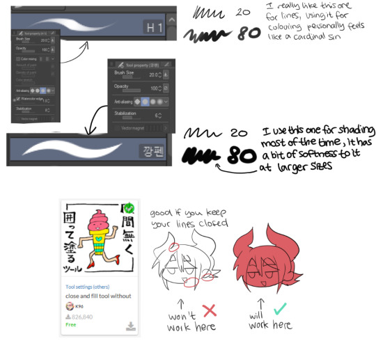
download links
first: https://assets.clip-studio.com/en-us/detail?id=1746109 (50 clippy, csp sometimes gives that currency away through login bonuses like gacha (i'm not even kidding))
second: (i've been trying to find a link for over an hour now and i can't find it i'm really sorry abt that BUT i think any brush works, it looks easy to replicate or to find an alternative!!)
third: https://assets.clip-studio.com/en-us/detail?id=1759448 (it's insane and it's FREE, it also has clear instructions on how to use it within the link)
i hope that answers everything, thank u again!!!
#ask#anon#;;;;;;;;_;;;;;;;;; waht the hell......unchained kindness on this beautiful sunday morning.....
10 notes
·
View notes
Text
My two favorite companions are two sides of the same sad bald sniper coin
#my art#fallout new vegas#fallout 4#fallout#craig boone#deacon fo4#fo4#fonv#digital art#tablet drawing#clip studio paint
2K notes
·
View notes
Photo
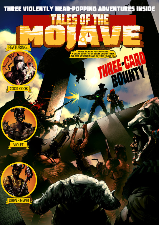
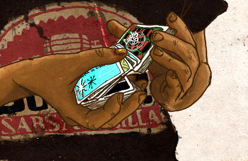
"Three violent psychopaths. A great bounty for every one of them. All this courier is their heads in THREE-CARD BOUNTY."
THREE VIOLENTLY HEAD-POPPING ADVENTURES INSIDE. FEATURING COOK-COOK, VIOLET, AND DRIVER NEPHI.
This was a commission, for an EC comics/2000AD style cover for the Fallout New Vegas quest "Three-Card Bounty", where you're tasked by the NCR to hunt down and take the heads of three lieutenants of the local Vegas known as the Fiends. In it you face against the sadistic pyromaniac Cook-cook; insane dog lover Violet; and killer golfer Driver Nephi. You're paid a great amount of money for bringing their heads as proof, and likewise are given a small amount if you shoot their heads (or have the Bloody Mess perk) and thus ruin your chance at a huge reward. It's a fun quest, but is difficult not just for how many Fiends there are around these targets, but also how you have to avoid going for the more effective head-shot to take them down easier.
#Fallout#fallout nv#fallout new vegas#illustration#drawing#clip studio paint ex#clip studio paint#fanart#digital drawing#digital illustration#comic cover#fiends#boone#the courier#courier#rex#violet#driver nephi#cook-cook#new vegas#my art#eyeofsemicolon#semicolonthefifth#the5thsemicolon#tales of the mojave
572 notes
·
View notes
Text
weeps weeps weeps I just discovered perspective, curve, line, etc rulers in clip studio paint. This is what I get for using 10 year old outdated software, I had no idea such boons to humanity were a thing. I am having an epiphany about the nature of life and existence
#not katakuri#not op#text post#text#clip studio paint#i weep#does this mean i dont have to be afraid of drawing buildings anymore
2 notes
·
View notes
Text
Pre-Working with Gallery Checklist
Is your gallery worth the 50%?
Communication: Excellent communication, rapid speed reply. Doesn’t dodge your questions
Personality: Doesn’t necessarily have to be someone you get along with. Hustler who will make sure all your art is sold. Is friendly, personable, and accessible to collectors, artists etc. Someone who will get the job done!
Character: Honest, has good ethics. Not Mary Boone.
Psychology: Is not manipulative and doesn’t mess with your head.
Social Media: Excellent IG/Twitter/FB/TikTok game
Press: Gets you good press for your show
Artist Roster: You respect the other artists on the gallery roster
Pay: Will pay you on time, and not use your money to invest in other things. Not Thierry Goldberg / early Gagosian.
Location: Depends on you and where you want to show.
Target Audience: Who is the gallery’s target audience and would they connect with your work?
Consignment Form: Make sure you have a paper trail for any show you do. Most of the art world works on handshakes, but that’s also how people get fucked over, cause this industry has no rules or regulations...
Tax Form: Can the gallery get you the correct tax form so that you can properly do your taxes at end of year.
Gallery Size: Are you happy with the size of the gallery? Do your paintings fit in the gallery? If your paintings are too big, do you need to un-stretch and re-stretch the canvas, and is that something the gallery can cover cost wise?
Gallery Budget: What costs can the gallery cover for you?
Gallery Events: Can gallery cover speaker honorariums? Food and drinks for reception?
Opportunities:
Art Fairs?
Placement in Group Shows?
Production/Publication of Exhibition catalogues?
Additional Exposure? e.g. Advertising in magazines
Other:
Archives: How does the gallery manage its archives? Manage: gallery archive, inventory management, digital database, collect catalogues, books, press, clippings of all gallery artists.
PR: Requests info and distribution of communications (in-house or uses PR company)
Additional Questions to ask:
Who packs the work at the studio?
Who covers packing and shipping to the gallery?
Who will cover any additional costs for framing?
Who unpacks the work at the gallery?
Is there an art handler who will install the show?
Who sits at the gallery every day?
Gallery Basic Responsibilities: photographing artworks, sell art, shipping and customs, write press release, press, social media
Who pays for shipping any unsold artworks back to the artist?
Will your gallery bring you up? Would they themselves invest in your work?
Artists run the wheels on the bus! No artists = no galleries, curators, museums, auctions, collectors, art world etc etc !
Negotiate for yourself, especially if you’re a woman. Do not settle!
0 notes
Text
Hyperallergic: Beer with a Painter: Suzanne Joelson and Gary Stephan
Suzanne Joelson “Crackrakecrate” (2016) paint, vinyl graphics on wood panel, 50 x50 inches (all images courtesy the artists)
Gary Stephan and Suzanne Joelson live and work together in a building in TriBeCa. Within the building they each maintain individual floors, so my suggestion of a “couple” interview was a bit of a radical experiment. We had to decide how and where to stage our visit. Luckily they were game, ready with Captain’s Daughter IPA, and an array of cheese and snacks.
Their zones are distinct: Stephan doesn’t keep anything extra around — leaving only some minimal, modernist furniture, a vintage rowing machine for exercise, and a fantastic rotating easel. Joelson’s area is full of color, with layered collections of fabrics, textiles, and clippings in full use. Stephan says he’s lucky that he can borrow supplies from Joelson when he needs them; he refuses to buy anything in advance. They use examples from domestic life to illustrate their aesthetics: Joelson apparently doesn’t like closing closet doors — it denotes a system of closed deductions. More than anything, I’m struck by their open, inquisitive nature with each other.
This rigorous but open questioning permeates both of their practices. Joelson asks what happens when two unexpected elements or techniques bump up against one another: collaged, industrial fabrics and the painterly, handmade gesture. Stephan refers to a formalist vocabulary, but turns any lingering obsession with the “framing edge” upside-down. There’s a curiosity in their work about different permutations of “meeting in the middle,” which is, in fact, echoed by the terms of our three-person conversation.
Stephan was born in Brooklyn in 1942, studied at Pratt Institute, and received his MFA from the San Francisco Art Institute in 1967. He has had solo shows in New York at Susan Inglett Gallery, Bykert Gallery, Mary Boone Gallery, Hirschl and Adler, and Marlborough Gallery; in Los Angeles at Margo Leavin Gallery and Daniel Weinberg Gallery. He is currently represented by Kienzle Art Foundation in Berlin, where he will be the subject of a solo exhibition in the fall.
Joelson was born in 1952 in Paterson, New Jersey. She received her BA from Bennington College in 1973. She has exhibited at galleries including Nature Morte in New Delhi, Fernando Alcolea in Barcelona, and White Columns in New York. She was the subject of a solo exhibition, Slipping Systems, in the fall of 2016 at Studio 10, Brooklyn, New York.
* * *
Jennifer Samet: Suzanne, can you tell me about any childhood memories you have of making art?
Suzanne Joelson: My mother was a painter. When I was twelve I helped her paint scenery for a local theater group and got to keep the paint. When friends came over we painted the walls of my bedroom with stripes and dots in clashing colors right over the patterned wallpaper. My parents were fine with this and I continued to alter the room until I left for college. All these years later I am back to combining paint and print.
Suzanne Joelson “First Back” (2012) interior of wood panel/hollow core door, 40 x 30 inches
I did not have many toys but I remember breaking, cutting, and reassembling the ones I had. Doll houses got major overhauls. At some point my mother hid the nicer dolls either to protect them or avoid cramping my style.
In high school I had a geometry teacher who did not like me. But I was oddly good at geometry. I just got it and did not need the class so she let me spend the time in the art room.
I went to the Noguchi Museum recently and thought that it was a bit like the art that I grew up seeing. It is beautiful and essentialist, and yet it’s not enough. There’s always a sense of Noguchi being a little too good.
JS: Gary, where did you grow up? Were you into drawing as a kid?
GS: When I was a kid living in Levittown, on Long Island, like a lot of guys, I loved drawing planes and cars. I remember that in the fifth grade, I was very enamored of this other kid’s drawings. His planes looked so much better than mine, but I couldn’t figure out why. I befriended him and finally said, “Bill, let’s be candid, your planes are much better than mine. Why?” He said, “Rivets. I draw all the rivets.” I realized that was it. He had all these little dots, so it felt like it had been built like a real plane.
We would go to Mass in Levittown Hall, where local artists put their work up on the walls. The work was full of the tropes of late 1940s art: caulk balls dipped in white paint, held together with sticks, on a ground of sandpaper. It was slightly Miró-ish, or like Picabia drawings — quasi-mechanical things. I did not understand what they were but I was attracted to the physicality of them, and the curious form-making. So the plane drawings and my interest in that work run along next to each other.
Gary Stephan “Untitled” (2008) acrylic on canvas, 32 x 32 inches
I had flunked 7th, 8th, and 9th grade. Eventually I got an art teacher who saw me drawing cars all the time and said, “You know, there’s a name for that. It’s called industrial design.” I decided that was it, and that I would go to Pratt for it. But then I fell in with the painters and, before graduating, I went out to the West Coast. I went to the San Francisco Art Institute for my Masters. Eventually, the two forces came together. A lot of my approach to painting is still with that clear, coherent, “What’s the project?” mindset of a designer.
JS: Gary, I wanted to ask you about your Catholic background, because you have said Catholic imagery, like the cruciform shape, has infiltrated your painting.
Gary Stephan: Although I’m now an atheist, I still have some of the Catholic furniture. Every once in awhile, its forms appear, or ideas about above and below: the spiritual plane and the bodily plane. I don’t resist it, but I don’t embrace it. I just let it roll into the mix and then it rolls out again.
When I was in first grade at Catholic school, I read a story called “The Prince’s Dessert,” which was the beginning of my fascination with paradox. The prince asks for a dessert that’s hot and cold at the same time. The punch line was that it was a hot fudge sundae.
I was disappointed with the outcome of the story — because a sundae is alternately hot and cold. It isn’t simultaneously hot and cold. As a boy I felt tricked by the answer. Anyway, these kinds of polarities have interested me since childhood.
As a Catholic, I never thought of the concept of shades of gray in ethical, moral, or emotional questions. That idea did not occur to me until I was well into my second year of college. It was uncomfortable for me, because it didn’t come to me naturally. I was constructed by my parents and by my church to be fundamentally binary. I know the world is not like that. It is fascinating how disappointing that is.
JS: Did the two of you meet originally through art? Suzanne, you were working for Robert Rauschenberg, right?
SJ: I worked for Merce Cunningham as the liaison between Rauschenberg and Jasper Johns, and Merce. I was hanging out in that period with Ross Bleckner, Julian Schnabel, and David Salle. Gary had an opening at Mary Boone, and I went to the opening with Julian. Gary and I talked for about an hour. I was completely smitten and thought I’d made a big impression. But I wasn’t even invited to the after party.
Then, two weeks later, Gary came to a Cunningham event at the Joyce Theater. I was with Ross, and after we took him to Studio 54, I took Gary home. He didn’t even remember me.
GS: It took a while for it to click, but once it clicked it was crazy great. We’ve been together for an amazing amount of time — 38 years. I’m incredibly lucky.
JS: Suzanne, do you think your use of recycled fabrics and materials from the street is related to the experience of doing costume and set design?
Suzanne Joelson “Broken Cocoa” (2016) paint,vinyl graphics on wood panel, 24 x 54 inches
SJ: I hadn’t thought about it but one of my favorite tasks working for Cunningham was recreating Rauschenberg’s set for “Winterbranch” (1964). At some point in the nocturnal piece Rauschenberg would drag what we called “the monster” across stage. It was usually a rolling ladder with an array of battery-operated lights and things he would find on the street. I loved doing it, even though I wasn’t as good at it as Rauschenberg was. He always had a more unlikely thought.
There is something about working with preexisting materials, adapting things outside one’s control. After Hurricane Sandy, I carried my wet paintings up six flights of stairs in the dark, with two assistants. The paintings were on hollow-core doors and water was sloshing around in them. When I ripped off the backs, a roughly applied cardboard substructure was revealed. Its diamond pattern was almost like African Kuba cloth but by different means. We arranged the paintings around the loft to dry with all the backs ripped off, and took photographs of the arrangements.
The effect of that experience was an idea of being very transitory about the work: being less caught up in the craft of it, less concerned about permanence. For a long time, I was a “pure” painter. At some point I started bringing the world back into the paintings. I don’t believe in zero-degree formalism.
JS: I am curious what you think about this, Gary: the idea of pure painting and formalism.
Gary Stephan “The Future Of Reading 5” (2016) acrylic on canvas, 20 x 20 inches
GS: My elevator pitch for my work is that I am using the tools of formalism to build the house of surrealism. I see formalism as a set of appearances designed to create something that’s visually dependable. The contribution of Surrealism is that it problematizes the reading of the world. If you take the appearance of formalism, but bang the cues into each other in such a way that the picture space wobbles or flickers, or doesn’t work properly — you are making a surreal proposition about formalism.
When I came to New York, the big division was between the sharp guys who made serious, formal objects, and the crazy aunt in the attic — of surrealism. Richard Serra would say, “The problem with Donald Judd’s work is that it is surreal.” He was referring to the concealed surfaces – things you can never know. Anytime you conceal, you’re essentially making a surreal object. That’s why Serra’s sculptures are solid steel. Anything that existed outside our vision would become secretive, mysterious, and romantic. The work has to be in plain sight and experiential.
But I could not just blow off de Chirico and Magritte. The contribution of de Chirico is that, for almost the first time in history, aside from Caspar David Friedrich, concealment is content. It is subject matter.
In my work, I try to have enough dependable information that there is a way to compare it to the missing part. The purpose is to re-engage viewers so that instead of them passively taking in the work at the level of style, you offer them the opportunity to engage the problematics of the picture space. In engaging them, they become co-constructors.
SJ: There’s also a lesson in that: that nothing is reliable. Your paintings seem like an inoculation for our collective anxiety about the contradictions of the world. You practice not being able to depend on a predictable space.
GS: Absolutely. It gets to the Russian idea of defamiliarization and the Brechtian idea of alienation. What they want to do is get the viewer into the pain of responsibility in a difficult world at the level of play. You are making art, so it should be fun, but it is also dealing with essentially difficult questions.
It has to do with the citizen’s relationship to the world. For example, I think one of the reasons Trump is appealing to people is that he is saying, “Only I can solve this problem.” It is essentially a paternalistic model. The academic model of painting was essentially paternalistic. It says, “We’ve got all the cards; we know what art looks like; we’re in charge; you’re in good hands.” It’s very Trumpian. What happens with the Impressionists is they say, “Who knows how this works? Get involved, maybe you don’t like it, maybe you don’t trust it. You can co-construct this if you’re so inclined.”
JS: Suzanne, can you tell me about how you deconstruct order and sequences? I know you utilize the Fibonacci cycle in constructing your paintings and multi-panel pieces.
SJ: I tend to start with an order, which I resist. But sometimes it is the other way around and I tug the visual cacophony toward a system. I utilize the Fibonacci cycle, but contaminate it with a degree of lived life.
Suzanne Joelson “Massaging Kale” (2016) paint, vinyl graphics on wood panel, 48 x 84 inches
My cousin who lives in Paris visited recently and we had a sort of French night out in Soho. On our way from Lucky Strike to dessert at Balthazar, we passed the biggest mass of rats I have ever seen in New York. On a shop-filled block we crossed the street to get out of their way. In the context of that evening it was the most exciting part.
GS: Wow. There’s a unique take — “Dessert was great, but the rats were even better.”
SJ: I’ve had lots of great desserts but how often have I seen that many persistent rats? They were undeterred by gentrification. I think about the fact that now, psychologically, so much is colored by what is happening with the Trump presidency. I constantly contend with the question of how much news and information I can digest.
GS: I’ve thought for a long time that if I paid really close attention to politics and then didn’t say to myself, “How can I consciously translate this into a work of art,” but let it leach into the groundwater of my brain, it would show up on some level. I think it does. The conversation I’ve been having with friends is basically, “What can be the relationship of abstraction to politics?”
Gary Stephan “Untitled” (2009) acrylic on muslin, 60 x 42 inches
JS: So this has to do with an idea about incorporating experience and contaminating “pure painting” with daily experience?
SJ: The interest in the Fibonacci sequence and spiraling goes back to the way I have thought about experience, which is as a coil. You go on a route and arrive at a shard of light, and recognize where you are. Then you keep going, and get back to that part again. But you are not going in circles, you are constantly staging a step up…or down.
In Proust’s Remembrance of Things Past, the narrator describes traveling from Balbec in a stagecoach. The coach is going up the hill and away. As it turns along the switchback, he can see back toward the town he has just left. He keeps looking back toward it, but from a little farther, as he is heading toward the future. Then, on the switchback, yet again, he looks back on where he just was, but now he is turned even more. That becomes a metaphor for how memory works.
Thomas Nozkowski came to my studio once when I was working on something that was overly coordinated and he said, “Jump cut.” That was all he needed to say. Now it is my mantra.
GS: It is related to the mosque you loved so much in Turkey, I’ve also always thought that a lot of Suzanne’s work had to do with translation.
SJ: Yes, the interior of the Rüstem Pasha Mosque in Istanbul is beautiful and perfect. There are four doors outside, and the door farthest from the entrance is completely broken up. The original tiles were found and put back on, but not in the original order. I love that kind of patching. It is similar to the Winchester Cathedral in England, where one rose window on the north transom was broken into smithereens and reassembled out of broken bits.
I consider different materials and methods of application in terms of translation. The model is conversation. For example, this format of today’s conversation is unusual for all of us. We can’t anticipate each other’s questions or responses, or the gap between what is said and what is felt or experienced, and how it will read on the page or screen. These change in the context of the situation. I am interested in how the familiar becomes strange, and the structure becomes fallible. A new thought emerges or an old thought can be re-imagined.
JS: Gary, you have described having “two masters”: the object and the painting. Can you explain what that means?
GS: That phrase, “serving two masters,” came from a chapter heading in an old fundamentalist Christian primer that I found. In terms of painting, at one end of the spectrum, you have the master of the concrete object — someone like Robert Ryman. At the other end of the spectrum, you have somebody like Frederick Church — the illusion of a space that can be entered. With Church, you want to experience Niagara Falls uncontaminated by the resistance of the object. With Ryman, you want the clarity of the object without any of the froufrou of the picture space.
Everybody conducts his or her practice along that continuum. That is what is meant by the serving two masters. Anytime you show fealty to one, you’ve weakened your fealty to the other. I was once given a hard time in print for “being compromised”: for the work vacillating between its allegiance to objects, and its allegiance to picture space. That vacillation was seen as a failure of nerve. I think times have changed enough that now it is considered a good way to look at things.
JS: You work on paintings from all directions and sides, and use a rotating easel to turn them around. Is that related to these ideas of concealment and moving between the object and the image?
Gary Stephan “Untitled” (2017), acrylic on Canvas, 30 x 30 inches
GS: The circular easel allows me to mess with expectations about gravity and the punch line. Sometimes I give way to the more obvious expectation, because I don’t see any reason to be obscure. Sometimes, it is too easy, so I turn them backwards, so to speak. Then they are slower. When you finally get to the punch line, it is more of a surprise.
JS: You think of the paintings as having punch lines? What does that mean?
GS: I definitely do. It is a term I got from Tom Nozkowski years ago. He would say, “Well, the gag of this painting is…” Some people see them right away, and some people never see them. I’ve had any number of people think they’re simply delightful, flat designs, and I think, “Okay.” I’ve gotten over the artist as educator part of my life.
SJ: Whereas Rothko hoped that people would fall to their knees and start to cry in front of his paintings, you want to hear people chuckling.
GS: Yes. I want them mildly chortling under their breath.
The post Beer with a Painter: Suzanne Joelson and Gary Stephan appeared first on Hyperallergic.
from Hyperallergic http://ift.tt/2vfyUgI
via IFTTT
0 notes
Text
This can be interpreted as a very out of character vulpes inculta or a very in character courier
#my art#doodle#fallout new vegas#fnv#vulpes inculta#craig boone#the courier#i like to think its the courier being an idiot after taken down the legion#and boone lookkng at them like ....this dumbass...this absolute fool...#fallout#phone art#sketch#clip studio paint
563 notes
·
View notes
Text
it’s tradition to draw Boone when I play New Vegas
#my art#digital art#phone art#fallout new vegas#craig boone#fonv#blood#blood tw#blood cw#doodle#sketch#clip studio paint
244 notes
·
View notes
Photo
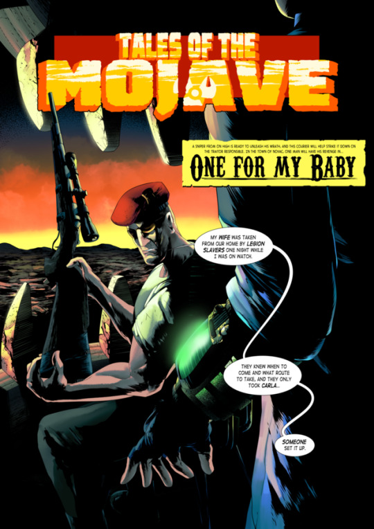
"A sniper from on high is ready to unleash his wrath, and this Courier will help strike it down on the traitor responsible. In the town of Novac, one man will have his revenge in... ONE FOR MY BABY"
This was a fun project to work on, which was basically taking the story of One for my Baby (a Fallout New Vegas quest featuring the NCR sniper Boone) and present it as an old pulp magazine that probably would've been popular at the period before the Fallout universe's nuclear apocalypse, though in a style similar to the 80's and 2000AD comics. Boone looks more intense than he usually does, but I feel that's matching to the style itself with those comics.
I''d like to do more quests from Fallout New Vegas and show them in this similar style. If there's a quest from New Vegas you'd like to see in this style, feel free to leave a comment and I'll respond as soon as I can.
#fallout#fallout new vegas#illustration#digital art#comic#fan art#craig boone#the courier#mojave wasteland#novac#my art#eyeofsemicolon#semicolonthefifth#the5thsemicolon#clip studio paint
1K notes
·
View notes
Text
Hyperallergic: The Idiosyncratic Oeuvre of a 1970s Nut Artist
Of Dogs and Other People, installation view (all photos by the author for Hyperallergic)
OAKLAND — Of Dogs and Other People, the first major exhibition since 1974 to examine the work of painter and sculptor Roy De Forest (1930–2007), is a boon to those who count themselves among the De Forest faithful. Four decades of stagnant assessment have left just enough time for misinformation to infest common perception of the artist. While there are good sources for biographical information readily available (an expansive oral history from the Smithsonian and a series of clips on YouTube from the di Rosa Preserve among them), the usual line about De Forest’s aesthetic boils down to: His art is humorous and he loved dogs. This is not exactly untrue, but it certainly lacks context. The apotheosis of this was a casually lobbed phrase in a New York Times review by Hilton Kramer, who enigmatically described De Forest as “Marx Brothers Fauve.”
Roy De Forest, “Marble Man” (1990)
The curatorial team behind Of Dogs and Other People have reversed this dearth of good scholarship and, in the process, forged a spellbinding journey for their exhibition. The show is fun, innovative, and ambitious, but its most impressive coup lies in the way that the art is grouped together in themes. Chronology is thrown out in favor of displaying paintings and sculptures, separated by decades, side by side. Because of this, motifs become immediately apparent, as if the whole thing were being viewed on a live feed of De Forest’s creative consciousness.
At the tail end of the exhibition, for instance, in the section “All Aboard Down the River,” two paintings in particular seem to benefit from this approach: “Steamer to the Interior” (1969) and “A Coasting Horse” (1976). “Steamer” is basically a “greatest hits” of the ideas that unfolded across the second half of De Forest’s career. The center of the action is occupied by a dog whose mouth extrudes a speech bubble containing the image of a steamship afloat. Several characters witness the dog’s story or, perhaps, see the ship itself — a person made of bricks presenting as male, someone watching from the window of a distant home constructed of atrament flowing out of the brick person’s mouth, a face that doubles as a landscape feature, and a busty woman with a ponytail. That final figure is an homage to a lover who left De Forest for a husband her parents deemed more appropriate. In this piece, we find De Forest deftly blending autobiography (although, perhaps, he is nonobjective) with a personal mythology rendered such that it feels universal. Anyone is welcome to stop and stare and supply their own baggage to this seafaring yarn. As the figure in the window looks at the ship from a distance, we look on this scene and know instinctively that this is just one small part of some larger world.
Roy De Forest, “Dog in the Night” (1976)
“A Coasting Horse” plays on the same idea as “Steamer” but remixes the composition. The prone dog–slash–storyteller is replaced with a mute pooch sitting up for an undiscernible master while watching a ship sale within/on a horse. The horse’s face occupies the brick person’s position and stares in the opposite direction. A new brick person, who presents as feminine, makes up the horse’s hindquarters. The steamship itself sails on a river flowing across the horse and onto the rest of the canvas, freed from the confines of a thought bubble and moving the locus of acting from the past to the present. If “Steamer” is about the stories we hear and take with us, stories that have implied conclusions, then “A Coasting Horse” acts as a sequel that plays with the composition of its forebear to describe journeys into the unknowable.
Roy De Forest, “A Coasting Horse” (1976)
On the opposite side of the exhibition, in the section “A Walking I Will Go,” is “Wise Horse’s Dream” (1972), on loan from the Whitney Museum in New York. This piece utilizes an important motif common in De Forest paintings, where eyes are augmented with beams to convey a sense of magic and power and gravity. De Forest made these beams with daubs of acrylic paint up to the size of a Hershey’s Kiss. These daubs essentially serve as structural elements, anchoring the painting in the world of the viewer. Their subtle shadows give a “jumping off the canvas” effect that is wholly lost when viewing a digital facsimile of the art, providing an added value to viewing the paintings in person.
Roy De Forest, “Wise Horse’s Dream” (1972)
The exhibition is as successful as might be hoped — even dreamed. Fans and the uninitiated alike will find something to appreciate in their journey to discover the Easter eggs scattered about De Forest’s idiosyncratic oeuvre, particularly the dogs promised in the show’s title. Conceptually, his use of dogs was a way for De Forest to challenge expectations about what is and can be considered “fine art.” He so anchored his craft to dogs that he even created the persona Doggy Dinsmore during his Nut Art years. The artist also always kept a pup around for companionship. One of the more famous of these was Ratu, a Queensland Heeler who accompanied the artist everywhere, including the studio. One day (according to legend), Ratu urinated on a painting by another artist. De Forest’s only response was to coolly say, “Ratu knows,” leaving everyone to guess whether his critique of the painting was praise or condescension.
Of Dogs and Other People continues at the Oakland Museum of California (1000 Oak Street, Oakland) through August 20.
The post The Idiosyncratic Oeuvre of a 1970s Nut Artist appeared first on Hyperallergic.
from Hyperallergic http://ift.tt/2rVLyio
via IFTTT
0 notes
Last Seen Blogs