#but i still want to add colour and effects rip
Text
i started this a year ago for fun and then forgot about it for several months, but after many hours the cleans are done!
character animation for Frequency
music is Smokey Eyes by Lincoln
#my art#animation#dc#frequency fic#too many thads au#thad thawne#thaddeus thawne#inertia#bart allen#impulse#this took forever#but i still want to add colour and effects rip#which may or may not happen#im gonna try to focus on writing for now tho#aaaa ok posting now so i dont talk myself out of it
893 notes
·
View notes
Note
hi! i was wondering if you could share the overlay and/or explain how you made the first gif in the last set you posted? thank you very much in advance <3
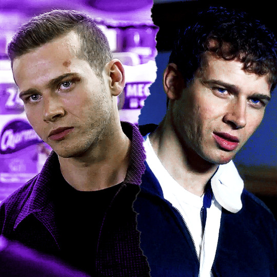
Hi anon! I'd be happy to share how I created the ripped paper effect in this gifset !

You’ll need a basic knowledge of gifmaking and photoshop, and I’ll put the rest of this under the cut.
1) Creating your gifs
So to start off you're going to create your gifs in separate canvases. I work in timeline mode and I add my sharpening and colouring, and I put both gifs in groups (explained here).
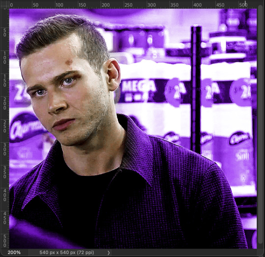
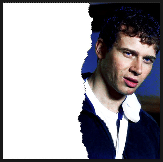
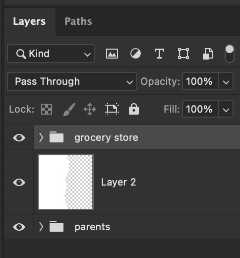
Here are my gifs on separate canvases. For reference, I've called the one on the left "grocery store" and the one on the right "parents".

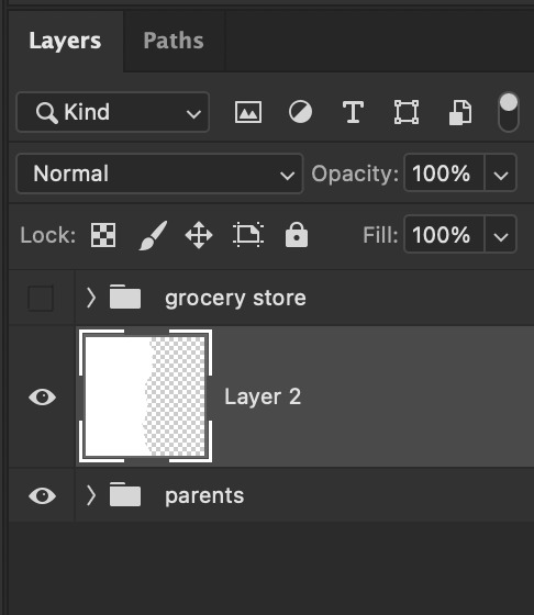
You'll then want to copy and paste your gif groups onto the same canvas. This is what my canvas and layers panel looks like once that's done. From here, you're ready to start the ripped paper effect.

2) Ripped paper overlay
For this step, you want to obtain your ripped paper overlay. You can find various ripped paper textures/overlays using google, but I used these overlays by @peytonsawyers !
You open up the overlay you want to use, and either copy and paste or just drag it onto your gif canvas. You can then resize and rotate the texture and orient it where you want.
I then drag the ripped paper layer so that it's placed between my two gif groups. I also hid the top group just so that I can see the overlay, but this is only temporary. Your canvas and layers panel should now look like this:


2.5) Filling in the overlay
So as you can see we have an issue because the ripped paper doesn't cover the entire area where we want our top gif to show. To fix this, I just use a white brush at 100% hardness and paint in the area that needs to be covered, making sure the ripped paper layer is selected (this doesn't have to be perfect, just make sure that the entire area is filled.
Now this is what it should look like:

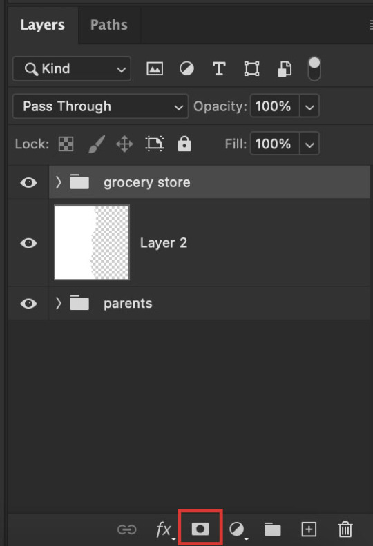
3) Masking the top gif
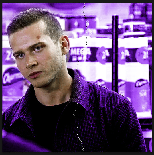
Use the command (or ctrl) key and click on the thumbnail in the layers panel for your ripped paper layer (the square highlighted in white in that last screenshot). You should get a marching ants selection around the ripped paper like so:
Now reveal your top gif group (by clicking on the eye icon), and make sure you have the group selected in the layers panel. You should still see the selection around where your ripped paper is, like so:
Now go to the bottom of your layers panel and click on the little mask icon:
And now you should get a mask on your top group in the shape of the ripped paper, and you should be able to see both gifs simultaneously on the canvas:

If the black and white areas on your layer mask are flipped after you click on the mask icon, just click on the layer mask and use the command + i (ctrl + i) keys to switch it back so that you can see both your gifs.
4) Final touches
Now if you're happy with the result so far, you can absolutely stop here. However, I wanted to show the uneven rip (like how when you rip a piece of paper you can see some white bits on the edges).
To do this, select your move tool (shortcut: click the v key on your keyboard) and making sure your ripped paper layer (NOT the mask) is selected, use your arrow keys to move it slightly until it shows between the two gifs.


It currently looks a little too clean for my liking, so I like to move it slightly up/down as well so that it looks more uneven and natural. If your overlay is too small, just use the transform function (command + t or ctrl + t) to resize it so that it fills the canvas. This is what mine looks like after I mess around with it:

And you're done! If you want to adjust any colouring, just go into the gif group and you can edit the layers from there.
Hope this helps anon! Let me know if you have any questions!
#answered#Anonymous#*tutorial#alielook#usernik#userdean#usersalty#userriel#userraffa#usershreyu#userbess#userrobin#usercats#tuserheidi#userkimchi#userelio#usershale#usercharisse
278 notes
·
View notes
Note
hi becca! it's your usergif style swap anon here! how are you doing? i wanted to ask if you could share what some of your favourite gif effects to use/see are and what you like about them?
hello lovely ❤️ i am doing well thank you and i hope you are too and are looking after yourself!!
oooo yes okay great question! so i guess my big ones are use of colour, i rarely make anything these days that isn't colourful in one way or another because i just have such fun doing colour manipulation. also, i absolutely adore blending, blending just makes a set special to me. there's something super special in pairing up scenes and it really brings a gif to life! it's something i adore in giffing myself because there is something so satisfying in pairing scenes together and when a blend works it's just magic. and if you can get a good shot that adds texture to the gif of even a triple blend i'm literally just 🤯
and if i have time for it, then i love making use of shapes and such to create 'multiple gifs in one' so to speak. one of my favourites lately is ripped paper (like this!) because i think it creates such a perfect contrast in one gif when you're making a set. i also adore geometric shapes in gifsets, i have a weakness for interlinking geometric shapes and i still think one of my fav sets i made was when i made shapes out of shapes (here) because there's something so satisfying about it. i have a very neat and organised brain i guess so the use of symmetrical patterns makes it happy!!!
i could probably go on because honestly i love all giffing effects because giffing is just so cool ok and people are so creative and amazing and wow with what they can do!!! but those are some of my faves so hopefully that will help ❤️
2 notes
·
View notes
Text
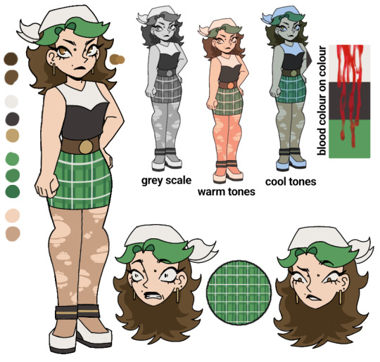
GORETOBER OC!!!
For once I'm going to participate in this year's goretober! And since it's still September I thought I would make an oc I could use through goretober :D
I honestly don't rly have any ideas for her name n shit- literally just made her randomly only for goretober (aka to go through hell)
Day one of goretober:
But there are reasons for why I gave her that pallet/design!
To point out first is the white, black and green on her clothes (and hair). This being so the blood would have different effects on each colour! (As seen in the 'blood colour on colour'). It would stand out a lot on the white and green, with the white being well... white, therefore the blood would be a lot brighter and stand out more, while the green is more of a contrasting colour to red, making it stand out a lot when there's a lot of blood (but normally the blood would look more brown on the green). And the black would not change much with the blood, but if theres a lot, oh boy will it be visible
The pattern on the green skirt was mostly done for the detail (and the skirt being too plain before), also cause the way it would fold/react with different poses and... well... blood would probs be fun to do, since the whole point of goretober for me is to get better at art!
I mostly tried to give her clothes that would be easy for me to draw, but also wouldn't fully cover her- since my main idea for this OC is that with each day she would have scars left behind from the past days, therefore I would want them visible
The ripped tights were mostly there for the style of it, but I added the tights specifically cause it just looked a bit too plain without em- I wanted the whole design to be relatively cohesive and work together well
Not much to say abt the heels other than I made them to match the top, so the white and black and shown through the design
Another spot white Is used is in her bandana! It mostly being there since I don't like drawing tops of heads, and I can probably try some cool stuff with it for the drawings! Btw I did make it white since the hair was fairly dark and if i used black it would just blend in too much, and there was already green in the hair, so white was the best stylistic choice
The long earrings were added since they would be fun to draw at different angles to help show how the character is positioned better! Also cause it just adds more detail. That being the primary reason for the addition of the other ear piercing and nose bridge piercing (I think that's what it's called, correct me if I'm wrong)
The hair was colours brown since it's fairly basic and matches the belt and eyes well! While the green fringe was added to bring more green into the design, and cause it looks cool
The final thing I will mention is the face design- the nose being fairly simple and pointed (cause it's fun to draw and gives the character more sharp points which is seen throughout), also I did only define her top lip (making it a black lip) mostly for design reasons and cause it looked too crowded if I did add a bottom lip. Finally I made the eyes a bit far apart cause it looks cute, and made the liner quite sharp and long (cause yasss queen) also did add cute lil bottom lashes! Next thing to mention is the eye colour, I made a Goldy brown colour cause it matches the hair and belt, also cause in light it would reflect/look very golden. Finally I added a small mole over the left of her top lip, mostly cause I need to see more of it- it just looks so cute for no reason
If you have read to this point- I thank you for it, and I hope you enjoy my lil rant :)
Good night/day/evening! :D
#goretober#gore#october#art#draw#drawing#digital illustration#oc#character#orginal character#fall#art challange
2 notes
·
View notes
Note
oh my god with the whole white-whashed fanart . . . please its the only thing i see and whenever people do draw jack, he gets white washed too a lot of the time and i'm just staring at the screen like "🙂 what was the need for this?" why can't people just get the skin tone right, colour picking exists for a reason 😭🤚
Yeah..... I know the jp fandom has some problems of it's own but to me the most unreasonable one is all the whitewashing, it makes me so mad when the style is cute or pretty but the artist's coloring is so shit 🤡🤡
And I wouldn't say color picking is mandatory, (although I do it a lot bc I prefer to work with canon colors and then add shadows, lighting and color effects with the layer modes) since some artists have a preferred color pallete to work with, and the colors don't need to be 100% like canon, BUT that still doesn't excuse using pale and greyish colors for the dark skinned charas, like pls it makes them look like wax dolls or smth, I can't understand how they aren't bothered by it 💀
U know I think it's funny how some ppl color the light-skinned charas almost white as a sheet and then the dark skinned charas gets colored with a PEACHY or greyish tone just to look darker in contrast im 🙃🙃🙃 I've seen that SO MANY TIMES (there's this one kinda famous jp artist on twitter that makes art of all the charas, and Jack......... Jack not only is peachy-skinned but is also SKINNY it's like they butchered his essence it makes me want to RIP OFF MY HAIR)
But I agree, if its SO HARD for them to actually pick the right tone of dark skin then just use color picking and then adjust it with layer modes smh at this point there's no excuses
48 notes
·
View notes
Note
You've already seen this, but this is me formally giving you permission to rip it to shreds with critiques ✨️

Have fun hehe
Honestly I've been dying to actually be okay at art so im getting my notes ready 🧎♀️
Okay hi I was blocking some lighting for a drawing and now I'm making tea before bed and I'm ready to go. This is gonna get lengthy so cutting here for everyones convenience
I like the general vibe of it. You set the tone of the drawing very well and I can see the type of imagery you're going for! That's really great because understanding vibes and emotions is something that is harder to teach and easier to have an instinct for. I don't know if thats what you're going for but if it is congrats and also a huge part of my comments will be based on this because my goal in a critique is to understand your intent and help make that come through as best as possible
Also, hands are hard and these are not bad at all. I feel like they're probably referenced which is excellent, always use references if you can't get it right and use references even when you think you can (i say, knowing i don't use references like half the time rn). Building your visual library is the one of the most important things to learn as an artist.
I think my main overarching theme for my critiques is that its taking the middle road (hear me out).
This is a very common thing for a lot of people which is that they don't go super detailed, but don't go super simple. They don't go super dark, or super light. Everything is kind of low contrast, wishy-washy, if that makes sense. You wanna go one way or the other. If you want it to be detailed go detailed, if you want it to be simple go simple. Right now it's in this middle ground between simple (with the blurred airbrushed blending and the light lines on the hands) and detailed (with the folds of the fingers and on the creases on the thumbs and the nails).
Similarly, you want to make a definitive decision on whether or not you are using linework on your drawings, or if you want to use some linework but not everywhere (like on the rest of the hands vs the nails) you want it to make sense with the image.
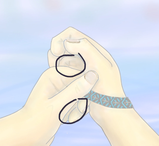
If we're talking values (as in light and dark) of the image, the creases on the hands should be darker than the outlines (fold ur hands the same way as the image, you'll notice that these are the darkest spots).
Personally I definitely mix line-work and paint over in my art but if you take a look at this hand from my Blackjack drawing you'll notice that the line-work is either lighter or not present where the light hits on the back of the hand.

it's probably a little more obvious what i mean in my cheerleader annabeth. when I do leave lines on my work i actually alpha lock the lineart and colour over them with a lighter colour where the light would hit.
while we're on the topic of middle roads and values, i'm gonna segue into my point about contrast.
i totally get the like washed out light vibe but even images like that need dark darks and light lights. some people post pics that totally wash the image out for the aesthetic but when you're drawing you generally wanna have contrast.
these spots (marked) should have your darkest shadows. especially if you're looking out onto water which would generally add a slightly backlit effect to the lighting because water reflects a helluva lot of light and usually have pretty harsh shadows as a result (you can fold ur hands like this and put it against a light and see what I mean). personally would recommend a super dark shadow there with a touch of rim lighting.
i know the lighting isn't quite the same but if you take a look at the polaroid of my late night talking drawing you'll see what i mean when i say that washed out soft vibes still have dark darks. the dark darks are actually what make the light lights pop and make it feel purposely washed out.


stealing this from carries moodboard but as you can see, waterfront image with a washed polaroid aesthetic still has dark darks and light lights.
My second point about contrast is sort of a comment on sharpness (?). This is another thing that's common with a lot of digital artists is that they will simply airbrush/smudge/blend until they die and this results in super soft shadows. IRL does not always have super soft shadows. Here is my rendering process if you're curious
I think you could use some harder shadows (especially given the setting) in particular around the creases of the hands. Especially with the blurred background (which, same so true) you want the focal point of the drawing to be less soft. This is why the bracelet looks so good. It's got all the darkest darks, and highest contrast, and it's the sharpest. If you look at my work (when will i shut up about myself smh) you should be able to see a healthy mix of soft shadows and sharp shadows. Its about the balance 🤌
Another point that is also about contrast (ugh i know, but art is all about balance and contrast unforch). Is that I think you need sharper lines and shapes overall. Again this is why the bracelet is so nice to look at because of the sharp lines. Fingers have bones and therefore have hard edges. If you look at someone with their hand balled up you'll see that the knuckle is a much sharper edge than the curved line you're currently using on the left hand. It's so key to find a balance of sharp lines and curves (if you go back to the real time video of me inking you'll be able to tell, especially in the hands, how I mix curves and hard lines).
Some other minor comments:
i think the fingers on the right hand are a little off, it should be a little more tapered and you should see some of the nail from this angle
the composition is super centered so i think you should straighten out the horizon line a little bit. the hands are already asymmetrical so you want to balance that out with a perfectly straight horizon
personally i would make the sky a slightly more sky blue shade than you've got going right now. skies are often actually closer to white on like an overcast day and don't usually hue warm/purple until sunset.
i think you're using black or something to shade? i won't be that type of person to say you definitively can't use black to shade (and to you're credit i think i see a tinge of orange and blue around the shadows) but you should know that most shadows aren't black and that using black can grey out or desaturate your image and make it feel flatter and more lifeless. personally i use deep blue/purple on shadows but if you want to learn to make black work for you more power to you.
Anyways this is a behemoth. Thank you for letting me do this 🫶
17 notes
·
View notes
Note
How do you make your headers? I really want to learn how to make headers but I'm so confused by all the different sizes for desktop and mobile, where to get images to add textures to for still headers, and how to do the torn paper cutout thing for gif headers
hi! happy to help out, although i’ll preface this by saying i only recently made headers so please excuse any mistakes in my explanation! :)
so when i make headers, i tend to set them to mobile dimensions. mobile dimensions are 640px x 360px. for reference, desktop header dimensions are 3000px x 1055px. i’m actually not sure if this is better than setting it to mobile dimensions, so if anyone knows the answer and wants to help this anon, go for it!! using mobile dimensions have never given me any trouble personally!
there are a lot of texture packs out there that you can download. most of these can be found by googling “header texture pack tumblr.” here’s a big compilation list i just found with a quick google search, an animated pack, and another one. you can also just search up a specific texture you want in google images (i.e. “paint splatter texture background”) and you’ll get tons of results. play around with the blending mode for these textures; you can try setting them on screen, soft light, etc. experimentation will yield the best results :)
i followed this tutorial to learn how to do the torn paper effect.
this tutorial also explains how to do the ripped effect but transparently — which means the ripped area’s colour can be changed by the hex code you set your tumblr background theme to!
i hope this explanation and the linked tutorials help you!! feel free to reach out again if you have more questions :)
9 notes
·
View notes
Note
The way you colour your gifs/art is sooo amazing! I always love seeing it! as someone who's still learning the in's and out's of gifmaking/photoshop do you have any advise? 😊😊
Hi!! Thank you so much, it means a lot!! I’m trying to put together a tutorial on how I personally gif, but in the meantime
Truly it all comes down to the quality of the footage you’re working with. Try to find the best quality footage available. The better the quality, the better the gif will look
Looking for footage can be challenging. There’s some places you can try, but sometimes you have to t/orrent. If you do, get yourself a good vpn and antivirus. I use W/indscibe
Not all 1080p look the same. It depends on the size of the footage
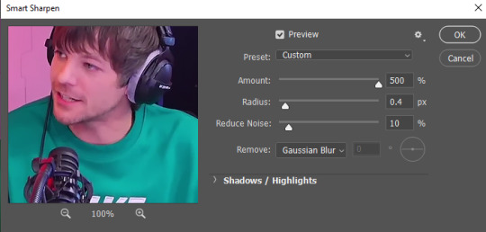
YouTube 1080p is not true 1080p. The quality will still look sort of weird. One thing I like to do when working with YouTube videos is add noise, as that will make the gif look better and get rid of some of the blur and weird looking lines. Here’s how I add it. But be careful, noise makes the gif size bigger (tumblr gif size can’t be bigger than 10mb)
Sharpening settings are super important! I add two layers of smart sharpening with these settings:

Familiarize yourself with photoshop. Look through all the adjustment layers, settings, etc. I’ve found new things the more I look through
Curves are your best friend. Always start with it. It will set precedence for how your gif will turn out. I like bringing out the darkest points of the gif so I do a normal curves layer with the black point and white point, and a second one with only a black point
Channel mixer is your second best friend. It can help get rid of any weird coloring and tint that the footage comes with (especially helpful when you’re working with yellow tints). Here’s a tutorial on how it works. It may look complicated but once you get a hang of it it’s pretty easy
To color I use selective coloring. Sometimes I add as many selective coloring layers until I get the result I want
Not every single idea will turn out exactly how you picture it. That’s just something that happens. Maybe the coloring isn’t perfect. Maybe the blending is hard. That’s okay. Try your best, or you can find other ways to do it. For example, I originally wanted to blend these gifs together, but some of them looked weird imo, so I went with the ripped paper effect instead
Don’t be afraid to ask people for help, or search for tutorials
If you can, join creator servers. Those are very helpful. You can find footage, get ideas for gifsets, ask for help and collaborate with others
Experiment!!! Sometimes the best ideas come out of experimenting for hours, but also don’t get stuck on something. If it’s not working and you’ve tried, move on
6 notes
·
View notes
Text
Film Project - Longboard Nights Shoot
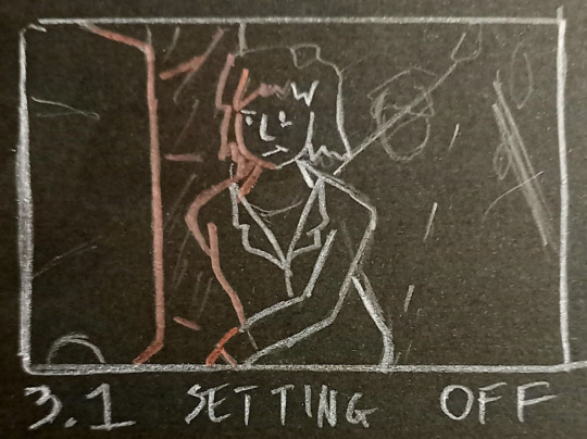
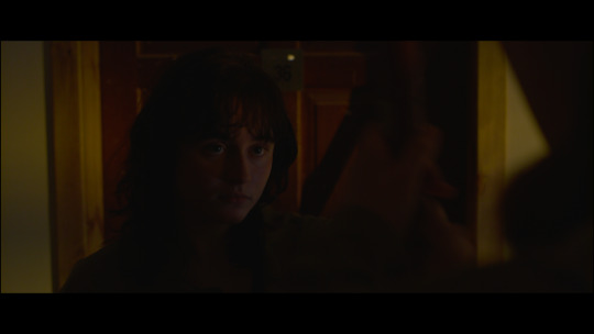
It’s been a while since my last update and things have been moving at quite a clip. I ran out of time to do more tests, so instead I made sure that the lighting plans and shot lists were up to scratch and the whole team would be on the same page when we were on set. I finished the storyboards, on black paper, so I could add in colour and direction of light and give a better idea of the dark environments. We got rained out on our first exterior shoot - the rain made it unsafe for our actors to skate so we had to call an early night. After reviewing the footage, we decided that because we needed to schedule another shoot night anyways, we may as well reshoot what we had as there were things we could improve upon.
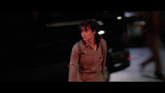
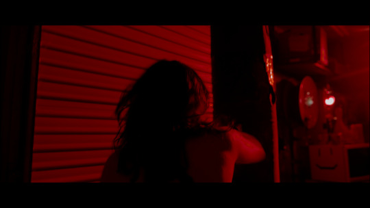
(A still from the first shoot)
We realised we had to change our approach slightly. In this shot, I was using an LED to create this red light in order to tie it into the garage scene which we’d already decided to light most entirely by red light. However, it doesn’t offer much of a transition, so for the actual shoot, I had the red LED come from behind Claire (our main actor) to imply the light from the garage and emphasise the forward movement of the scene.
The second issue with the first shoot was the difficulty of the operating of these shots. As we’re on a night exterior on a public road, I was unable to rig lights that could give enough of a kick to allow us to shoot at anything other than T1/2. This combined with not having a monitor or wireless follow focus, meant I was having to pull some pretty complex movements, panning and focus-pulling with fast-moving subjects. So, of course, it was taking quite a few takes for me to get anything totally clean. For the second shoot, we simplified some of the camera movement and used more wide lenses that have a more forgiving focal distance. (I love the 14mm, she took care of me). {Quick aside: one of my main inspirations for the look of the film was the filmography of Terry Gilliam and I was worried we didn’t have the right length of lenses for the warping effects I wanted but in my research I found that the 14mm Zeiss Master Prime is often nicknamed “The Gilliam”. It’s one of my dad’s favourite films so I’m excited to see what he thinks of my borrowing of aesthetics.}
The last problem to solve was how our other actor wasn’t very confident on a skateboard - she could skate, but not at the pace that Claire could and the pace we wanted to go at to sell the frantic energy. Ben made the call that we steer into this and have Claire skate off ahead, something totally true to the character of Alex and the themes of the film - the neglect of friendship due to rage and obsession. This meant that after the first shot, we would just shoot Claire as she zoomed through the streets. And man, I was very happy after this second attempt. The shots were looking great, the team was working incredibly smoothly and it was all so positive. Jack was clear about what could be done in the public space, what the safety precautions were and what our schedule was. And, seeing the actors in costume for the first time was so exciting. Bonnie has taken so much care with her work - I love the way the two jumpsuits show their individual characters. Alex’s is all ripped and grimy, fit for purpose but showing that she doesn’t take care of it whereas Casca’s has little lace frills and she’s taken care to sew patches over any rips.
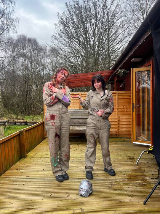
(From the end of the shoot, so slightly hard to see with all the blood and that, but you get the gist)
I have a confession. Despite the fact that I didn’t do the comparison tests, I shot with a 270 degree shutter angle anyway. Reckless and arrogant, yes, but (no buts!) having watched all the rushes from the shoot, I really feel it was the right choice for the film. Not good practice at all, I really should’ve listened to the advice of an actual experienced cinematographer. I knew it was the wrong thing to do at the time and I didn’t know enough to be doing it, but Ben was on board and I really wanted to do it, so I went against my better judgement anyway. I guess I just feel that there are so many different aspects of an image you can play with to create a look and create meaning and to shoot in accepted standards for safety feels a little boring to me. I should’ve done the tests, but I’m glad I now have something I’ve shot that I can use to better understand how shutter angle affects the final image.
(A still showing the effects of the 270 degree shutter angle)
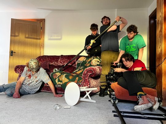
For this first night of filming, I had Kushal from second year as my 1st AC - he was on for the whole shoot and I can’t be too complimentary, boy was incredible, start to finish. We had clear communication and trust, allowing us to work quickly and efficiently. Joeseph, also from 2nd year, was there for the exteriors as part of the camera/lighting team and then for the interior shoots I had our very own Tom Spurin as 2nd AC/Grip. Working with a team, even one this small, was really rewarding, being able to get things set up faster and just overall elevate the quality of the work. I think I worked well with my team and made sure they were able to do their best work. Tom had a good time, his first time in the camera department, and I think I was clear on what was needed from him and was encouraging. As I used to say in my high school rugby team: “Team work makes the coach happy”.
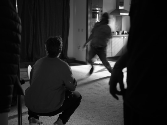
(Camera team at the wrap)
On to the interior shoots. Again, Jack was totally on it, organising our kit pick up and travel up north to Inverness to a T. We arrived with plenty time to set dress and pre-light for the opening scene - the garage home. Again, Bonnie’s production design was so inspiring, making the world feel real and lived in, leaving me to focus on capturing it. She had Juno from 4th year as a production assistant as there was a lot of work to get through - another absolute team of a department.
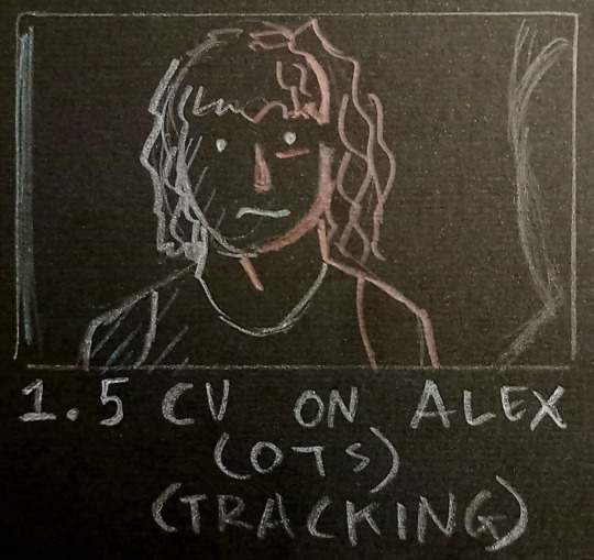
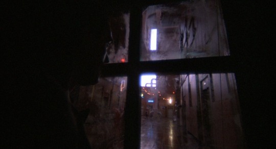
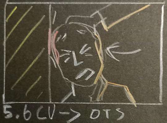
So, first scene: the garage. This was the scene I had done the most tests and preparation for, so it ran pretty smoothly. Ben, Bonnie and I had already shot it on a phone in a space we’d measured out. With this and the storyboard and the lighting tests, we were flying. Pre-lighting was a gift from the scheduling gods (Rosie Playford), I was most entirely set-up by call time on the Friday, just needing to build camera. I had my lights up, wired, gelled and in position as well as the tracks for the dolly laid out. Kushal and I had some trouble with the Nucleus in the morning, but due to being so prepared, it didn’t stress us out too much and we were still way ahead of schedule as a department. The first day was a little stressful as we were still getting into the swing of things, so set-up for the second scene took quite a wee while with all the tweaks I hadn’t been able to foresee. But, we pushed lunch a half-hour and cut one shot in the second half of the day to no real detriment to the film. I’m mostly happy with the first scene, aside from the opening shot as the framing wasn’t quite as intense as I had planned it, as we had to adapt to the space. My test is more how I wanted it to look. Instead, her hands are a little further off and we see more of the projection, taking a little of the edge off the shot.
(Test still for garage scene)
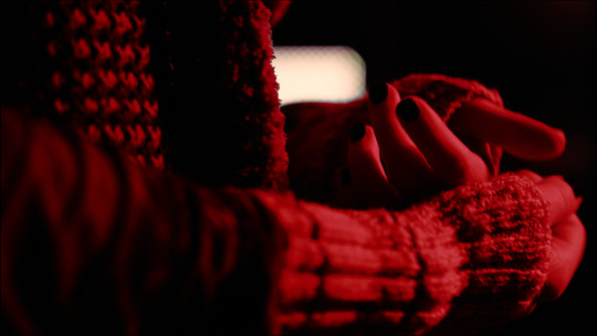
The second scene: arriving at flat 36. This one was a lil bit stressful, we had a short turnaround from the opening scene and needed tracks laid and a light outside, wired and gelled. I’m quite happy with this - the wide is a little meh, but I can live with it, but with cutting the 2-shot, we developed our insert of the phone so it incorporated a close-up on Alex which, despite not having lit for a CU ended up looking quite gorgeous if I say so myself...
(Low light and eye lights)
I had a rule to make sure we were always able to connect with the characters, despite the dark lighting of the world - always have an eye-light. The lighting here is a bit of worry for me, as I feel it could be easily read as sunset light, when I was trying to have it be motivated as street lighting coming through the window. I’m gonna have a play about in the colour grade, maybe bring out more blues in the shadows and change the hue to be a little more yellow.

(The greasiest DP you ever did see)
We finished our first day quite knackered but were revived by Orla’s cooking and Juno’s baking. We pre-lit the fight scene, then had to bring all the lights in overnight, but we still had a better idea of what we were going to be doing the next morning.
The next morning being the fight scene.

This was the biggest challenge for me - unlike anything I’d ever filmed before. But luckily, we’d done our homework - Ben had ran it through with the actors many times so they had their choreography down. Bonnie had tested her blood-splats and padded cardboard walls. I had my lighting set, my framings designed to hide our stunt padding and my camera choreography timed to the movements of the characters.
One idea we had to communicate the progression of Alex’s character was the change to handheld camerawork at the point she sees the photo of the Husk and his daughter, in order to draw the link to the flashbacks (trauma) which are all handheld. Showing how Alex loses her control. This worked well as it not only added to the visual storytelling, but also meant we could be faster with set-ups and turnarounds. This day went very well, we finished early so added a shot at the end of the day which I ended up really loving. There’s the odd shot that has some dodgy framing when I’m trying to follow action, but I’m not going to be frustrated by it - there wasn’t much of a way round it given time constraints and the speed of the action.
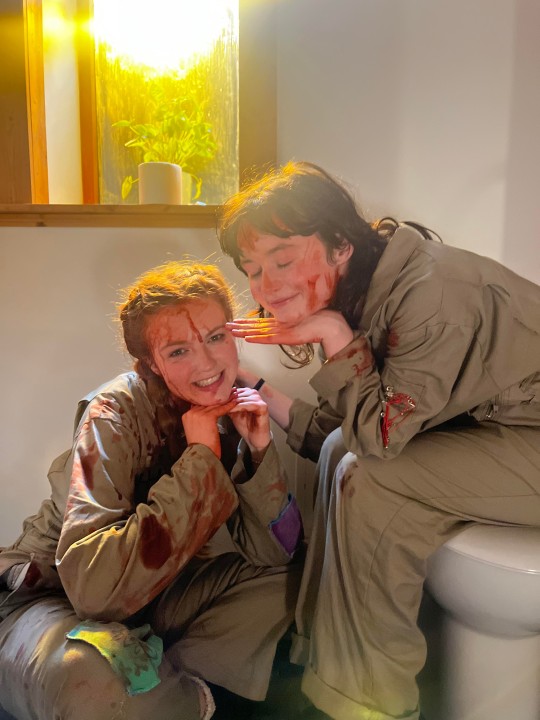
We took the time where it was needed however, so for the blood spatter where we only had one take before the costume was stained, we did a rehearsal, two takes without the blood and then one final take with the blood added in. Building up to it helped everyone get the ideal take and we managed to pull it off. We used this technique throughout the rest of the shoot for any complex shots, mainly the bathroom.
The actors were incredible throughout this scene - Eva gave her all for the head smash shot and Claire, och, Claire, she’s something else. I was asking ben throughout if we could slow down the beats so we could get clearer emotional moments. I think this really helped me to capture Claire’s performance - in one take we see her right before the final stab, looking so incredibly tired and upset and it’s the best acting I’ve seen in a short I’ve been a part of. You just totally believe her. Stuart, our husk was absolutely terrifying, his movements alien and animalistic, his scream, incredibly disturbing. Rowen and Tom in sound were working well with me, despite the complex choreography and occasionally quite wide framing, they managed to get a boom in and get clean sound out.
(A renaissance painting)
I’m still quite amazed we managed to pull it all off and for it to actually look good as well. It really is a testament to how much work the whole team put in, that this day went so well, despite everyone being reasonably inexperienced with filming fight scenes.
Finally, the final day: the final scene.

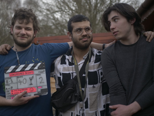
(Just two boys making movies)
This is where I finally realised exactly who I was working with. Ben McMorran’s passion and interest is just incredible. I knew he’d put in a lot of work with the actors in rehearsals and was taking the time before takes with the actors, but seeing the performances he was able to pull out of the actors was still ridiculously impressive. Claire, not a trained actor, only been in a couple of student shorts, was full-on hysterical crying as she tries to save her bleeding friend. He’s taken the time, not just with the actors, but with every department, to makes sure that people can do their best work. I felt supported, believed in and inspired. He knows all this, we’ve all had the euphoric late-night conversations about it all, but yeah, again, hell of a director, collaborator and friend.
The lighting for the bathroom worked well, the Gilliam was staying gorgeous and Bonnie’s blood dripping was phenomenal, so proud of that scene. I did get a little bit of the blue light in the window which I was unable to flag off totally which is kinda annoying, but I’ll see what I can do with that with masking in post. The camera work I was also really proud of, there’s some frames in that scene that I think are really quite good, with Claire haloed by this yellow light and crying.
The flashbacks went smoothly - our cardboard wardrobe seemed pretty convincing and the Husk tearing them down was pretty terrifying. This was also a lot fo fun to light as I had to expose for the reading of the book, the total darkness after the power cut and for the arrival of the angel. I had my lovely crew help me out, with Tom holding a bounce we didn’t have a C-Stand for and Bonnie and Juno on the light switches ready to simulate the power cut. I used the little natural light that was spilling past my blackout and a wee low powered LED to expose the pitch-black room. I used the Celeb on TV mode as well which was quite fun and because we were using the 1k Arri Fresnel, with a wide open aperture and 360 degree shutter angle (for the flashback effect) it was easy to overexpose the angel and have Russel, our actor, disappear into the light.
We finished on time in high spirits. We ate cake and watched the rushes together and talked about how happy we were. Then I got drunk and ranted about politics for a bit (sorry Rosie) before going to bed, with the kit all packed up ready to ship out in the morning. It ended the way it started, incredibly smoothly with no hiccups.
(My favourite photo from the shoot: a director at work)
So yeah, I feel like I just need to reiterate how much I enjoyed shooting this film. I never felt stressed or frustrated, tired or sad, I just felt excited, the entire time. It’s the first time really where I think my work has been up to scratch and I’ve just enjoyed every second of being on set. This isn’t just a fulfillment thing, it’s also down to the team, a lovely group of people who were always encouraging and clear about all being on the same side. No egotism, no timidity. We’ve already all been talking about working together again ASAP. Here’s hoping.
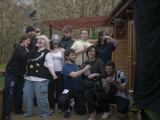
(some lovely people)
{I’ll update on the shoots for About That One Time in a seperate post, just now, Bethany has started the edit for Longboards and I’m just dying to see what we’ve got. Thank you everyone, it’s been so much fun so far}
4 notes
·
View notes
Note
mimiiii 🥰 one of these 🎨 please?
Hello my love. I am so sorry that I took so long to reply to this. 🙈🙈
And I am not going to lie, I already knew which one I was going to choose before I even went through your tag. haha
So my current fave of yours is this PatPran edit (no surprise there). I LOVE THE QUOTE! It fits them soooo well. That uncertainty about their relationship because of their parents, but them not wanting to give each other up, give up their happiness. its perfect! I also LOVE LOVE LOVE the typography and the fern borders! And the colouring and blending is gorgeous. The scenes and the pink/blue just makes it so soft and subtle, despite the contrast with the harsh and brutal reality of the quote. So yeah, i think I've rambled enough. That is my current fave!
Honorary mentions to these as well!
BlackWhite edit: I love the detailing in this! The B&W effect, which I still stand by that it is not cliche and works beautifully! I love the polaroid images, the typography in the first, the stars in the second and the flowers in the third! You really know how to add details that fit in beautifully.
Bad Buddy Main 6: Because you confirmed for me that I am Pran and Pran is me. Hahha But I love the tarot card layout and the colours you chose. Also can't imagine the amount of research you would have done for this.
DanYok edit: I know this is more than 10 edits ago, but I am in love with this. I love the purple colouring and the layout with the ripped texts. Such a clever idea, and so beautifully executed.
I always love looking at your creations, and you know how much I scream at you about them. Thank you for all the hardwork you put in, and sharing your stunning works with us!!
CREATORS SEND ME 🎨 & I’LL TELL YOU MY FAVORITE OF YOUR LAST TEN CREATIONS AND WHY
3 notes
·
View notes
Text
@immortaljailor jump scared me with this "9 People to Get to Know Better (Tag Game)" thing. How dare you perceive me. Will it stop me from doing it though? Of course not. So here, take my nonsensical rambles.
3 ships you like:
I've never been big on shipping or romance in general, but I have, over the years, grown fond of a few relationships. I could absolutely go with popular ones that everybody knows, however to spice things up I'll go and add some very niche ones.
First up is Jenniver Aristeides and Snnanagfashtalli from Star Trek novel The Entropy Effect, by Vonda N. McIntyre. I'm positive neither were meant to sound as in love with the other when it was being written, but I was struck by the realisation that there's no fully platonic explanation for these two. Like, we are first introduced to them when they are beamed back in the middle of a bar fight that Fash started because a group of men were laughing at Jen's appearance (seven feet tall, all muscle, every part of her silver in colour, is equal in strength to Vulcans, but too shy to stand up for herself). She was fully prepared to kill them. And then there is a whole conversation where Jen is completely devastated she wasn't able to save someone due to being incapacitated and Fash comes in like the overgrown cat she is and rubs her cheek against and then cuddles Jen And then theres this quote.
"Snnanagfashtalli, she felt about as she had naver felt about another being in her life. Perhaps it was gratitude for friendship and consideration; perhaps it was love. But she never experienced love, as a giver or receiver, so she did not know."
They're always together when we see them, and when Jen wants to be transferred to botanical sciences instead of moving rank in combat and defense, Fash is only ever supportive. They play chess late nights in the rec room while smiling at eachother and laughing. They are the most relaxed in eachother's company. Like, please tell me how I could possibly be normal about them?
Tied in second is Siri Keeton and Sarasti, and Daniel Brüks and Valerie, both being human/vampire relationships from Peter Watt's Firefall series. "Oh, not another human vampi-" shush. Vampires are different in this one. It's set in the late 2090's where humanity has reached the point where it's borderline posthuman but also not and theres been first contact and it adheres to actual science instead of inventing things like warp drive and wormholes and hundred of species of humanoid aliens (sorry star trek). I cannot describe the worldbuilding any further than that because it's just so in depth but the point is humanity has brought back an extinct branch of humanity that's referred to as vampires because evolution left them only being able to eat human flesh. For science of course. They are described so terrifyingly viscerally It rewired by brain. What I really vibe with about these two ships is while the humans, Siri and Daniel, are fighting against the prey instinct to flee and hide so they can work with their vampire companions to slow the decent into ruin humanity is steadily marching towards, the vampires, Sarasti and Valerie, are trying to fight their instinct to rip them apart and eat them, knowing if they do they'll go extinct, and also try and navigate the fact that they have grown attached to their human crew (set in space for the most part) even though they don't experience affection while the humans are still terrified of them. I explained that poorly but please go read the books. The first one, Blindsight, has been published online for free here. Echopraxia, second book, unfortunately has not gotten the same treatment but your local library might have it, and if not you can always request it be ordered. They've been translated into other languages as well.
Third and last in line is Connor and Tina Chen from Detroit: Become Human. Tina has exactly no lines in the entire game and if we are lucky 5 minutes of screentime. There are, as of my last check, twelve fics on Ao3 of them, half of them being a single chapter in oneshot collections, and no art. A shame, but expected given it's obscurity. Anyways I just vibe with them, though really only the AU version I crafted in my fic planning daydreams.
First ship ever:
I was about to say I couldn't tell you if the universe's existence was on the line, but looking back I'm pretty sure it was either SCP-049 and SCP-035 or Malicoda and Ererbus from the Gameknight999 series by Mark Cheverton that made me actual think, "huh, they seem... closer than just friends." Of course that ended up with me thinking "Oh! they're best friends!" because romance simply does not render in my poor little autistic aroace brain unless explicitly stated. Art I saw when looking up those characters of course helped.
Last song you heard:
As I write this I'm hearing the lovely tune of more soup by Gerald Fried on loop. It's been four hours and counting.
Favorite childhood book:
How dare you make me choose. uhhh.. uhhhhh,,,,,,,, hhhh,,,
Lets just go with The Hobbit by J.R.R Tolkien and The Days Are Just Packed: A Calvin and Hobbes Collection by Bill Watterson. I read so much during my childhood that I cannot possibly choose, but those two stand out as being some that I still come back too.
Currently reading:
A lot of things but most recently Life in Ancient Egypt by Adolf Erman, published in 1886 and translated in 1894 by H. M. Tirad, with the copy I have having been republished in 1971 with minor notes to correct things that have since been proven false. Unless of course you want to count all the fanfiction. There's been a lot of that too.
Currently watching:
Trying to get though all of Hermitcraft, starting from season 1 and working up to the current season while also attempting to not forget to document the time and dates each and every video was published.
Currently consuming:
Lots of water :)
Currently craving:
Ginger tea (I ran out of the kind I like)
Tagging:
No thank you, but if you see this and feel like doing it then by all means go ahead. :)
[Apologies for misspellings, grammatical errors, and this rambley wall of text]
1 note
·
View note
Text
Welcome to My Channel FINALE
Prev | Masterlist
cw: body horror, gore, psychological horror
You thought it was a one-off, but the next thing Cassie does makes you scream. You remember her squeezing something out of another bottle. She’s talking about its effects, but you’ve become complacent and decide it’s okay to zone out.
You find out what it is soon enough.
It’s a scrub.
And it hurts.
Cassie’s fingers and the product have both come to life this time. You feel each of those small granules and beads rolling against the pads of her fingers—and against your skin. It adds to the other sensations you’ve been feeling from her. From the fall of a stray strand on her face to the sweat running down her neck—you’ve been feeling all of it, more and more by the second.
You scream when Cassie, still all smiles, keeps scrubbing, scrubbing, hurting.
“—exfoliates all those dead skin and gives you a fresh layer!” She exclaims and laughs shrilly, the sound mixing with your sobs. It sounds like a song just for you. It is. “I don’t know the specific specifics about it, but I know it worked for me!”
It worked. It’s working. She’s working her way through your skin. Maybe even into your flesh because that’s what it feels like. She’s going at it harder this time to get all those dead skin out, out, out—
You wonder if she’s going harder now because she knows that you’re feeling it more at this moment.
Something rips. Something drips. You raise a trembling hand to your face and keep it there. Your face is wet.
You don’t have to check to know whatever on there’s red.
Despite everything, you held onto the tablet. Not even once have you let go. The tablet has done nothing to glue itself to you. It’s your skin that has physically morphed into hundreds of tiny hands reaching for the device with the hunger of something inhuman.
That is what you have never been. Human.
You yearn to feel and die if you don’t. There is too much of your kind and so someone made this device that makes and churns many imaginary people who you can leech from—who you can feel humanity from. It is supposed to help people like you. It is helping you.
Who is the human here? Is there a monster here?
An infernal question, you quietly answer.
The video is still playing and, even with a bleeding face, you struggle along the blood-streaked floor to keep watching. You have to. You want to.
You need to watch it to the end because only then you’ll be satisfied. Only this can bring about a true sigh of relief from within. You didn’t know you wanted this until you were covered in this beautiful shade of red.
Cassie is innocently smiling at you. She has washed her face of the scrub and her skin glows from whatever light is shining from behind the camera. Your own glows, too.
You smell iron and choke through a smile back.
She brings up a tub. The label, this time, you can read. Pore clay mask. There is no brand. It’s indecipherable, but something you can read which means you’ve connected again. You’ve empathised again. Deeper, deeper, more, more, more.
“Now, this—” Cassie says, all smiles (oh how you return them so so) and giggles. “—is the product of today, guys! I think I’ve shown this on my Tok multiple times, but this is the first I’m actually talking about it.”
She opens the tub. There’s powder inside and you cough when it goes straight into your nose. It smells of ashes and you aren’t surprised if it turns out to be ashes.
Is it the remains of the past you? Or of the past Cassie? Perhaps it is the innocence that this ceremony aims to break, steal, and burn.
It’s going well based on what’s happened so far.
Cassie places a bit of the ash-coloured powder in a bowl and brings out a bottle. Apple cider vinegar. You don’t need to see the label to know. You immediately smelt it the moment she cracked the top open. Rancid. Fangs sinking into your nose, digging in and out.
Something’s spurting. You think it’s a river, stream, or spring, but where did it come from? You’re lying on your side now, curled up with your arms out and trembling for the invisible ghost-touch to stop, stop, please!
It does. For a while. It leaves you moaning on the now red-white floors, shaking hands clutching at your nose that’s—it’s… it’s gone.
Gone. Gone. Gone. Gone. Gone.
…Gone.
It’s there. You see it. You blink away the mix of blood, tears, and sweat from your eyes and see the wrangled piece of flesh a foot from you. That’s what the river-stream-spring was. A strangled cry breaks through Cassie’s background tirade and shatters the ‘silence’ of this damned (curse, you are a curse—) room.
You made the sound not because of your missing nose. It is not because of the still bleeding wounds on your face nor due to the assaulting smells of ash and vinegar emanating from the tablet that you’re still clinging onto.
You cry because you’re feeling so, so much, and it is more than any empath should endure. It is much more than the feelings you’ve leeched from your family and far-off relatives. You thought that was it. You thought that was your world.
But you are coming of age, and it is time for the world to break you.
Cassie’s voice rings out from the tablet. You focus your gaze on her again.
Her face is covered with a paste—assumedly from the powder and vinegar—and she looks… straight at you for the first time. Right through the layers of code and magic that make her up and the screen separating you both, her eyes truly meet yours.
“Sorry, guys,” she breathes. You whimper. “This is gonna hurt.”
You get a second before you feel something thick—a liquid?—emerging from where your nose used to be. It is slow at first, tendrils reaching out to test the air. You only get a moment to wonder what it’s looking for. Then it explodes outward and you see nothing.
Darkness. A squirming dark that does not just cover your eyes but seeps into them, replacing the white sclera. You cannot see what colour it is now.
You’re aware it matches Cassie’s face paste.
At first you cry. You struggle. You flail about the floor, even attempting to stand up to—what? There is nowhere else but this room. Nothing but four corners where you are always seen and reachable. The door is gone. It’s as white as the walls and is now camouflaged among them.
How do those behind the cameras see you now? The thought is a welcome distraction.
It does not last.
The thick sludge reaches your mouth, and you don’t get to shout their names.
You think it hurt at first. Cassie’s words are still ringing in your head and it is the only thing that you hear; the truth that rings out above your tries to scream for help, help! She said it will hurt, so you are hurting.
It takes a while before you forget that. The sludge that’s covering your entire face, reaching down your throat, eyes, and even your ears has finally made you forget Cassie’s words. You forget the hurt. You are not hurting. What a silly thing to consider.
No hurt. No hurt. Doesn’t hurt. Nope. Nope. No.
It doesn’t hurt and you let the darkness cover you in its shushing embrace.
When the darkness ebbs and you see the room with its blood splattered walls and scratches on the floor again, you miss it. You look down at your hand—the tablet is still there, snug against your palm, with Cassie talking and moving like a person. Regret nags at you. The dark had been simple. It was muted and pulled from you every worry that you’ve ever had.
“Ah,” Cassie says, drying her face. Somewhere-some time in the darkness, she washed her face. “Feeling better? See, guys? Not that bad, was it?”
No, you say. Not bad at all.
Nothing is better for an empath than oblivion. Someone should make a device that does that instead. Maybe you could. You can. You will, once you finish this.
For the rest of the video, as Cassie layers on products on her face—toner, serum, eye cream, spot treatment, moisturiser—you zone out. It’s fine. You’re numb enough that even if you get caught unawares like the first time, it won’t surprise you as much. What does that say about you?
At present, you’re wondering about your appearance. Your eyes fixate on a distant corner of the room. You still can’t spot the cameras, so you imagine it’s right at that spot instead. Are they still watching you? Did they leave the monitor room for the bathroom or kitchen snacks?
That’s what you did when you watched. You even fell asleep sometimes, dozing off because nothing was happening and you didn’t like the room because why can’t I feel brother anymore, Dad?
Dad. You had your dad’s nose. You are proud of that, but now it lies a foot away from you as a wrangled mess of flesh. Can it be fixed? Will you get it back? You’ll have to ask (who, who, when—?) once the ceremony ends.
Cassie must’ve noticed that you aren’t paying attention because she suddenly stops talking and there’s a sharp sting on your scalp. You focus back on the video and she’s pulling at her own hair.
Cassie’s still smiling, a feral look in her kind eyes.
“Still with me, right guys?” She asks so, so sweetly, that you feel you can’t lie. You shake your head. She pouts. “No? Why? Is this topic too uninteresting? Ain’t you the ones who requested this from me?”
You want to say no. You want to explain to her she’s not real. Can she really see and hear you through the screen? How would she react? Would you feel the denial that would pump into her heart? Would you taste the existential crisis that will drip through her sweat?
You don’t answer because you’re just meant to be a bystander. A spectator. It’s taboo to interact with the ‘people’ on the screen. As an empath, you only take and don’t give.
It is another infernal question; you think.
Cassie seems disappointed that you don’t answer any further. You blink and she’s back to her bubbly self. Your scalp still stings a bit.
She’s at the end of her skincare routine. You feel gentle pats on your face and watch as Cassie does to same to her face. Is she done? She’s smiling at you. Is she done? She’s talking about something. Subscribing? The next video? Is she done? Are you done?
“—and that’s it for today and from me, your girl, Cassie!” She says, waving at the screen and even winking with her pretty eyes. “See you next time!”
The screen freezes on her face. It glitches for a moment and finally fizzes out. It’s black again and you feel the power go from the tablet.
Your hand lets go, and it clatters to the floor. How anticlimactic. Will there be a next time? You’ll miss her, you think.
You slump back down, too. You’re still at the centre of the room, so you wonder what you’re leaning against. Oh. There’s nothing. You don’t—can’t think too much about it.
You can hear someone speaking through the speakers in the room. You can’t hear them. There’s still some sludge in your ears. How were you hearing Cassie? She had such a sweet voice. Maybe that’s how.
Such a sweet, sweet voice is so much better than the calls for your name as the door (ah, just behind you) slams open.
So, so much better.
Taglist
@wildthingsandmagic @starbuds-and-rosedust @alexsidereus @adorable-bookworm
#bee writes some stuff#writeblr#writing#short story#twas short but impactful no? hehe#second person pov
0 notes
Text
Review: Max Edwards’ newest easy-listening tune ‘This Is Where I Leave You’ carries a bittersweet post-breakup story, encased in vibrant synth and scattered beats
The up-coming singer, songwriter, and producer Max Edwards hails from Canada, creating easy-listening pop and indie-rooted tunes from his bedroom that you just can’t help but feel comforted within the familiar feel of. Since his first release in 2020, Max has only continued to grow and advance in his musical endeavours, carefully curating his own signature sound recognisable anywhere. With this year seeing a handful of powerful singles from him, Max now shares his latest in the form of ‘This Is Where I Leave You’, an impactful tune with a vibe you feel at ease within.
With a sound that feels centred around it's own vast universe, 'This Is Where I Leave You' sees an atmospherically lingering nostalgia in every deeply echoed note, bearing an indie-pop aching experience that's much more than just a song to be listened to. From vibrant keyboard keys that ring out into the open space along with pops of electronic sound effects, 'This Is Where I Leave You' immediately floats through an air of intimacy and openness, transporting you into the floor of an empty arena to experience an ethereal unravelling like no other. A simple beat soon kicks in, adding an easy-going sway to the song's intimate layering of sound that's wrapped around a lyrically painful experience, all the while Max makes it feel more bittersweet than overwhelmingly heavy in his clean, charismatic spoken-sung verse vocals. Gliding into more of an emphatic chorus hook, his words spill into more powerfully sung moments you can't help but be mesmerised by, while the sound slightly builds to complement the impactful moment. Continuing strong beats, synth pops and adding multiple reverberated backing vocals for an added depth, 'This Is Where I Leave You' slowly but surely builds throughout its three and a half minute hazy journey. The bridge incorporates a new, scattered electronic beat and haunting lines that pull you in for one final cathartic chorus explosion.
Moulding into the track’s tender bedding of sound is a message that’s raw but grateful all at once as Max sings of a relationship he once treasured finally turning sour, pained by the loss but still holding love in his heart for what was once shared. As he opens with the hard-hitting revelation ‘you can’t swear to God that you can be what I want when I need ya’, it’s clear to see that ‘This Is Where I Leave You’ revolves around the realisation that he’s giving 100% to someone who’s only giving him 50%, yearning for a partner who truly offers him everything. Knowing he’d give everything he has to keep them afloat, lyrics like ‘I can’t be the guy, if I rip my heart out to save you, you just put it in a bag in the back of the ride’ are ridden with a sadness that he’s willing to do so much for someone that’s happy to discard everything he’s handing them like it’s nothing. But Max is gracious through it all, singing ‘I’m not saying it was all bad… baby I would never trade that, but maybe you don’t wanna see the real thing’ , knowing that what they once shared was precious but that he’s deserving of more from someone willing to reciprocate the effort he’s giving. Left up to him to walk away, the chorus hook rings out in the line ‘this is where I leave you, this is when I don’t wanna say goodbye’ , with ‘This Is Where I Leave You’ all in all entangling itself within the cathartic processing of Max’s emotions, perhaps in a way being his attempt to push himself to jump ship while his heart seems to still desperately cling on. As most can relate to the pain of half-hearted lovers and broken hearts, ‘This Is Where I Leave You’ will surely be an anthem for letting go that’ll be a must-needed add to any playlist.
Check out ‘This Is Where I Leave You’ here to appreciate Max’s personal storytelling and a sound that’s ladened with colourful indie pops and easy-listening beats.
Written by: Tatiana Whybrow
Photo Credits: Unknown
// This coverage was created via Musosoup, #SustainableCurator.
0 notes
Text
Instagram
Category:- Coursework Development/ Production
To avoid having a lot of people posting at the same time, same things, as well as to prevent miscommunications I appointed rutvi to handle social media so all of the posts went to her and she was the only one who posted on the main account.
As the director, I had a few posts that I knew I wanted on social media and so I created this list of posts that sort of became the baseline of our planning for social media. Later Rutvi, Aaryaa and I sat down and discussed post ideas, such as types of challenges we can have the actors do, types of reels, interviews etc. then rutvi and I came up with the idea of creating a calendar to stay on track for posting. Aaryaa helped rutvi take all of the posts divided them and create a calendar for our posts to indicate which post goes up and when. This was particularly helpful as it not only helped us stay on track and ensured constant engagement for our audience, but it also created deadlines for us to come up with the posts.
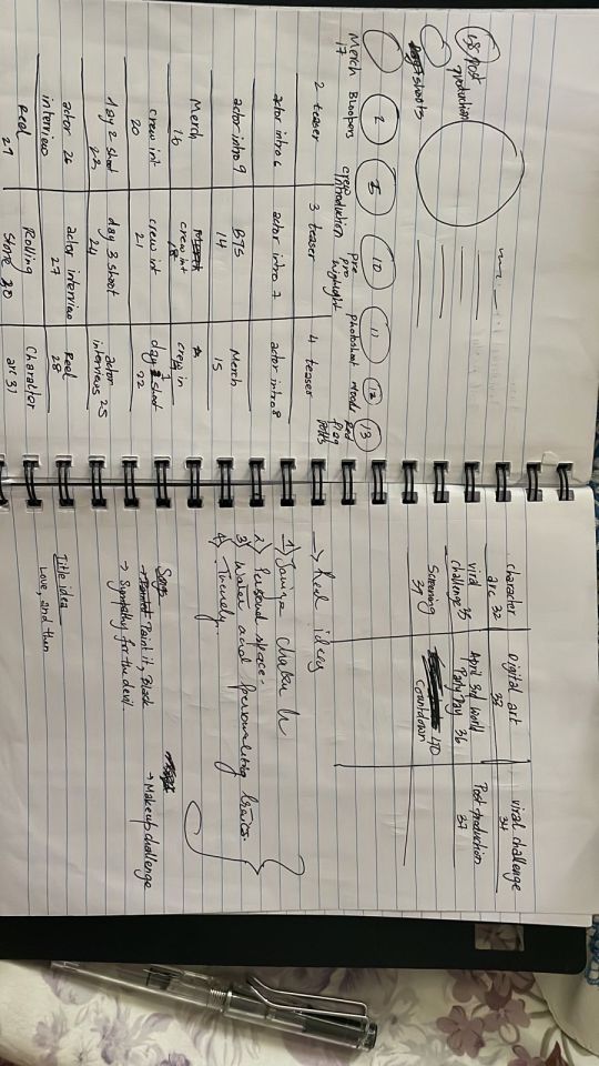
With each different type of post, I gave Rutvi a template of a sort- for eg for the stories I told her to use the same shape if she was adding more than one picture if it was a mood-on-set type of post. This was to try and ensure uniformity as well as to make it look more aesthetic. From early on we made sure that we use reds, blacks and whites as the main colour for our Instagram and overall brand.
So for the initial posts, we wanted to start by teasing the film and adding a poster. I worked on these posts I used Canva I tried taking inspiration from some of the templates and mixing and matching elements to make something more custom and unique. One of my main ideas for the teaser was the paper that I spoke about before during the photoshoot. I faced a lot of issues making. I originally wanted to have Jiya’s face as the main thing but then there is a ripped paper effect around her eyes that would actually reveal Rhythm’s eyes. The lining of the face took a while but no matter what I did it looked off it looked like we put a Snapchat baby filter on Jiya. I even tried to add a black-and-white filter on jiya and let the eyes be the only colourful thing but that again didn’t fix much. I then tried scrolling to try and find an effect that I could use and then came across the vertically torn paper effect. This worked out really well, the only thing that was a little hard was to line the face. I added the black and white filter on jiya because I liked how it indicates that she is the one stuck in time because of that moment. I then made 2 more posts like this one of them was a poster so I didn’t add any animation to it. I made multiple variations to give us choice. We choose the one that we like the best and rutvi posted them.
For the introduction to the actors, I wanted to play off of the newspaper that we incorporated in our film to introduce them it would be a simple layout with a catchy smart and funny headline about them and a byline saying that they are playing which character. But aaryaa and rutvi weren’t fully on board with this plan and so we dropped it and went with the Polaroid idea. I like it as the template that we created was still linked to our film, the polaroids being a part of vivan’s room. All I told Rutvi was to add the background as red. When she was done with it I told her to add a black-and-white filter on the actor’s picture to tie it in with our grid a little more.
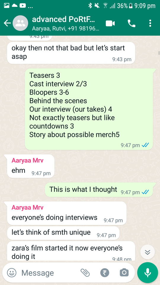
We then needed interviews and challenges. When discussing these I had given rutvi all the control over the fun walking interviews while I handled the longer ones. Rutvi had already gotten one of the shorter ones with Jiya and Aaryaa filming a longer interview but the questions weren’t up to the mark as well as some of the questions gave away the ending. Since we needed to fill all of these interviews we needed to call the actors again to school, so we fixed a date that I then informed the actors about. Since we were filming at school I informed our media sir as well as our coordinator about the same. Originally we wanted to film in the studio but since it wasn’t available we went with one of the free classrooms. Aaryaa and I came up with questions for the interview. And then I would ask the questions or interview the actors while either Aaryaa or Rutvi filmed. The fun walking interview was done by rutvi(asked questions) and aaryaa(filmed) the editing for the same was handled by Aaryaa, Rutvi and Samarth. For the crew interviews I came up with the questions and asked them. Rutvi edited and posted all of the videos.
Samarth worked on the merch Rutvi and I explained to him how we wanted the merch to look and then he followed. We also made a list of what items we want for merch. While Samarth worked on the rest of the merch, I handled making stickers. I used our logo as well as used some iconic lines from our project to use turn into stickers. I used our red and black theme to incorporate in my design for the stickers. We also wanted a logo for our film which Aaryaa and Rutvi worked on. They gave multiple options but in the end, we went with a skeleton holding a dead rose. The dead rose symbolises sadness and grief and in a way, both Isha and Vivan’s lives are kind of sad because of how their struggles have a tight grip on their actions. Isha still grieves about the child that that man killed that day by doing what he did and again how sad it is that she is just too broken to understand her feelings. The skeleton hand symbolises the grip that her assaulter still has on her and her actions even though he is long gone and all is him in the past but how it still haunts her.
Since our film sort of highlights sexual assault and how it can affect the survivor, we wanted some informational posts about the same. Aaryaa and I worked on the same. We decided what we wanted these posts to be, I sent her the content and then she edited it. We choose sos and emergency protocol/precautions, basics of consent, sex education. We then started working on the content and added that and made slides for the same.
To bring uniformity to all of these posts I told Rutvi to add a grey filter to the cover page for all of the videos and the informative posts would either have a black background with the text in red or visa versa. I also made cover pictures for the highlight. I also helped Rutvi organise and post some of the highlights.
The link below is to our Instagram:
0 notes
Text
How to Choose a Developer for Your Small Business Website

I get asked to do website estimates a lot, and sometimes, it’s downright heartbreaking to hear from people who are struggling with how to choose a developer for their website.
Whether they’re aspiring entrepreneurs or small business owners, I get contacted all the time by people who feel they were ripped off by their previous webmaster and are very reluctant to hire someone new for fear of the same thing happening again.
Some of these people have decided to do all the work themselves, and they’re struggling terribly trying to learn a whole new profession. Then, they end up calling me out of sheer frustration, as nothing is working, and things are worse off than before.
One time I was having a conversation with someone on a completely unrelated topic, and he asked me what I did. When I responded, he blurted out, “I hate web developers.”
I cringed.
But I didn’t take too much offence to this, as no matter what you do for a living, there are always going to be people in your industry who are really great at what they do, some who just do enough to get by, some who only think they know what they’re doing, and still, others who are intentionally ripping people off!
Sadly, the web development industry is certainly no different.
So, if you’re unhappy with your current web developer, and you want to learn more about how to hire someone to build a website, then you should definitely keep reading.
In this article, I’m going to explore several different options you may want to consider, discuss the benefits and drawbacks of each option, and provide some valuable tips that will help you find the perfect complement to your team.
READ: What Kind of Website Does My Business Need? Pre-designed or Custom?

When you’re thinking about what kind of web developer to hire, it helps to know what kind of website you actually need.
So, if you want to learn more about what kind of website your business needs, then this article is definitely for you.
It explains the difference between pre-designed and custom WordPress websites and explores the pros and cons of each option.
Keep reading here.
If You Want to Know How to Choose a Developer, You’ve Got to Know What Kind of Help You Need
There are many different kinds of web developers out there, and some are more worthy of that title than others.
That being said, making the wrong choice can be very costly.
So, if you want to prevent this from happening, you’ve got to understand all your options.
With this in mind, below I look at four potential options, including the benefits and drawbacks of working with them, and why they might be the right choice for your small business website.
1. The WordPress VA (Virtual Assistant)
This person has figured out WordPress pretty well. They know how to install a WordPress theme (either free or purchased) and can make some modifications to that theme to help match the colours of your brand. They will probably have a pretty good understanding of what plugins are available to match your needs, as well.
The Benefits: Typically, hiring this kind of developer will cost you considerably less per hour than someone who’s qualified to work as a full-stack web developer. Putting together small-sized sites is their specialty.
The Drawbacks: Often, WordPress is all that they know, and rarely do they know any HTML or CSS, which would allow them to customize your website, or add any extra bells and whistles that you want to have. So, if you’re going to choose this option, don’t expect anything spectacular.
Also, keep in mind that oftentimes, purchased themes are so rigid that even moving an element from one part of the page to another is impossible to do for someone with this type of limited knowledge.
Another drawback is that VAs tend to have limited knowledge of all of the aspects that make a successful and effective website. For instance, they are not experts in brand positioning, design, copywriting, SEO, or content marketing. If they were, they would be charging more and promoting themselves as such.
When to Hire Them: You would want to hire a WordPress VA when you are not interested in a fully branded/customized website. If you accept the fact that your ability for customization is going to be severely limited, and you’re okay with that, then this option might be for you.
But remember, if you’re working with someone who only has this amount of knowledge, you’re basically going to get whatever the theme preview shows, aside from some minor colour, text, or image changes.
Below, I’ve included a couple of examples of these kinds of WordPress themes.


As you can see, when you look up these themes, you’ll find screenshots of how they’re going to look on a finished website.
But don’t forget – if you’re working with a WordPress VA, then what you see on the screenshots of these themes is pretty much what you’re going to get.
You could also make this choice if you are already well-versed in marketing strategy, copywriting, and branding, and can simply tell your VA what needs to be done.
In any case, you should anticipate them having limited knowledge in some or all of these areas.
2. The Programmer
This person is what I lovingly call a tech geek. We have a few of these types on our team and we would not be as successful as we are without them!
The Benefits: They know programming inside and out. They live, eat, sleep, and breathe this stuff, and will therefore be able to customize your website however you see fit, at least in terms of how you want it to look and function.
The Drawbacks: They can build you a fully functional website, no problem. But don’t expect it to look pretty! When it comes to branding, marketing, copywriting, design, and layout, most of them are pretty much clueless (sorry, tech geeks).
This means you will probably need to hire someone else to help with those areas if you are not equipped to handle them yourself.
When to Hire Them: If you have a complex website in mind that needs to be customized to fit your needs, then it wouldn’t be a bad idea to hire this kind of developer.
Whether it’s an eCommerce engine, membership site, or a database-driven tool, a fully trained and experienced programmer will be able to deliver what you need.
But don’t forget, they’re not going to have design acumen, or be able to help you build your brand, so if you don’t have this stuff fully fleshed out, you might have a problem.
3. The Freelancer
Typically, freelance web developers have more than enough knowledge to be able to design and develop a decent website.
How do I know this?
Well, besides the fact that I’ve worked with my fair share of freelance contractors over the years, if they weren’t able to do this, they certainly wouldn’t be able to make a living as a freelancer. And even if they were just doing it in their spare time, if they were completely inept, it wouldn’t be worth their while.
However, locating a reliable freelancer is often like finding a needle in a haystack. If you can find one, that’s amazing, but they’re usually few and far between.
In any case, some of the best places to find freelance web developers include Fiverr, Upwork, and Guru.
The Benefits: First off, hiring a freelancer could cost considerably less than some of the other options out there.
Moreover, freelance web developers will usually have enough programming expertise to be able to handle most customizations and challenges that come up, and will not need a plugin for every single function (which could bog down your site’s performance).
As I said above, if they didn’t have this level of expertise, it would be practically impossible for them to make a living, which is why most of them tend to be pretty competent.
The Drawbacks: Even though they may appear to know a lot about web development, it’s not possible for one person to be really good at everything.
As I already mentioned, it’s rare to find a really good designer who’s also a great developer (they do exist, but they are a rare breed), so you’re probably going to have a particularly tough time finding someone with all these skills.
That being said, you will likely need to have someone else on your team who is well-versed in marketing and copywriting, so you can offset any weaknesses the developer may have.
When to Hire Them: If you’re able to find a knowledgeable and reliable freelancer, then you will undoubtedly have a great asset on your team, and they can probably save you some money, as well.
But don’t forget that you’ve got to be aware of what their limitations are so you can offset those areas with other people on your team.
So, make sure to take stock of their skillsets, or lack thereof, and consider what the real cost will be, if you do have to compensate for any of their shortcomings.
4. The Web Development Agency
There are several different types of web development agencies out there, but for the sake of this article, I’m going to focus on the category we fit into, which would be boutique web development agencies.
I mean, if you’re looking for a big-name agency that only multi-billion-dollar corporations would use, then you probably wouldn’t be reading this article anyway.
In any case, if you’re interested in hiring an agency, and you want to learn more about how to choose one that’s right for your business, you should check out our article on How to Choose a Marketing Company That’s Right for Your Small Business.
The Benefits: A boutique web development agency is not just a one-man show, and it’s not focused solely on building websites. It’ll consist of a team of professionals that can offer all of the different areas of expertise your business needs for an effective marketing strategy.
Typically, these areas include:
Copywriting
Brand Design
Graphic Design
Strategy Consulting
Search Engine Optimization
Website Design and Development
Content Marketing and Lead Generation
Social Media Marketing and Management
So, the main benefit of working with a web development agency is that you’ll have access to a team of people with various areas of expertise that can work together to create a seamless strategy.
You don’t have to hire a separate individual or company for each aspect of your marketing, and as a result, everything should be more comprehensive and consistent.
In addition, once you let them know about your needs, goals, and the nature of your business, they will already know what is needed and can discuss options with you to create something that is a perfect fit.
This prevents you from having to know what is needed yourself or spend time keeping tabs on every member of your team, which will allow you to focus more on building your business.
Another benefit is that collectively, the team will have in-depth knowledge of your brand and brand voice so that no matter what your needs are, they can consistently deliver that brand messaging across all mediums. This consistency has a powerful impact on how your business is perceived and the amount of trust it elicits.
The Drawbacks: Depending on which agency you want to hire, the price point might be outside of your budget. That being said, no matter what agency you choose, make sure to do your research.
Always ask for referrals, and spend some time talking to them, so you can decide if this company’s going to be able to deliver what’s promised. If they are expensive, but they have a good reputation for being on time and on budget, then the extra costs could balance out in the long run.
When to Hire Them: Hiring a web development agency could be one of the best things you’ll ever do when creating a new business. It will give you peace of mind that your new venture is going to get going on the right foot, right off the bat.
It may seem pretty expensive, but if you look at the bigger picture, it will likely save you a lot of time and money in the long run if you make this initial investment in your business.
My final piece of advice is to do extensive research on any agency or developer you’re thinking about hiring.
Why do I keep harping on this point?
Well, just like every other industry, the world of web development is full of scammers and charlatans just waiting to pull a fast one on you.
Many people will claim to be developers, when in reality, all they know is how to use a website builder like Wix, Weebly, or Squarespace.
As I already mentioned, references and reviews are very important in this industry, so if there’s an agency or developer you want to work with, make sure to speak with their clients, and scour the Internet for reviews, so you can have a better understanding of what it’s like working with them.
As you can see, on our website we have a ton of testimonials from clients, and we wouldn’t hesitate to put potential clients in contact with some of them if they made that request.
Whatever you do, if you’re looking to hire an agency or developer, you’ve got to do whatever you can to ensure they have a high level of experience and skill, so you know they’re going to build the right website for your business.
This is vital, because at the end of the day, the quality of your website – both in terms of its design and how it’s coded – is incredibly important on so many levels.
With that said, you have to ensure that whomever you hire understands how to design and build a quality product for you.
Otherwise, you could end up wasting a lot of time and money and be faced with having to go through the whole process over again.
Are you looking to hire a web development agency to build your small business website? We’ve been building websites for more than 20 years. Contact us today or schedule a free 30-minute consultation with me to learn more about what we can do for you.
To your business success,
Susan Friesen
0 notes
Text
SHE-HULK Review
I like the first episode so far! I like the main character, the interactions feel believable, and it seems like there was at least some women in the writer’s room, and it shows. There are some small elements I would change, but the overarching story and plotline is very enjoyable to watch.
MASSIVE (hahaha) SPOILERS for the TV show UNDER THE CUT - (but we wish they were more massive) .
SPOILER SPOILER SPOILER SPOILER
I liked how the story is focused on her life as an attorney, and the Hulk stuff is introduced with the same attitude as a ‘so-this-one time-I-went-to-Bali’ flashback that isn’t particularly relevant to the rest of her life. What’s important to her is her lawyer-work, and it seems like she’s doing a lot of good there. Just because she CAN turn into a strong-woman verdant pro-wrestler doesn’t mean that she WILL turn into she-hulk. Instead, she’ll be a kickass lawyer, like she planned to, and use her powerful skills of making logical arguments.
Personally, I would have set up the end of the first episode as her hiding behind the desk until the danger goes away without turning into the Hulk at all, because I think her message would have been stronger for that. Also she doesn’t have the training necessary in de-escalation/combat/non-lethal takedowns/ avoiding civilian casualties/maintaining the structural integrity of buildings. Still, we get it, the audience wants a she-hulk, and they get a she-hulk, and the scene with the shoes at the end was heartening.
They handled her interactions with her cousin (Guy-Hulk) well, and the clash of worldviews was nice to watch. Guy-Hulk is “unable to live a normal life due to his weak-ass genome and steroid-enhanced anger-management issues [i’m paraphrasing], so he has no choice but to be a government-controlled superhero”, and it is refreshing to see him being called out by our protagonist, who does not see state-sponsored violence as a viable world-improving career. AND SHE IS RIGHT! Also taking down heads of mega-corporations that endanger/kill people to increase their profit margins though the law is more effective and as uncomplicatedly morally correct as it gets. Though if He-Hulk also punches that ceo in the face a few times, I wouldn’t complain, and didn’t see anything.
---
One thing that bugged me is that she’s not buff enough as the hulk (thanks Marvel). Hear me out, this is She-HULK. You have the chance to make your main female protagonist the size of a brick wall with the presence and strength to match. I’m talking Massive Muscles. Go all out! We’re not expecting supermodel waist or long legs or whatever. We care about power.
Here it seemed like the creative team had this wonderful concept (just look at the upper arms!) and then someone up top went “She’s not attractive enough to sell dolls of , so narrow the waist, narrow the legs, make her skin baby-smooth, and add some eyeliner”.... dude, come on! If He-hulk can get ripped, so should she! Also on that topic, it’s kinda weird that her hair gets less curly and changes colour, but if whatever chemical reaction that turns her skin green also destroys Hydrogen bonds that curl hair, who am I to judge?
Overall, a wonderful TV series, I hope there are many many many many more shows that have an interesting female protagonist who PUTS HERSELF FIRST, and stays true to what she believes in. My dream is that there is no boyfriend involved for the rest of the series, because I am much more interested in her caseload. I can’t wait to watch what comes next!
0 notes
Last Seen Blogs


this-nightmare-doesnt-exist-yet
Word salad farm

aceskzworld
StrayStay

desserts-in-the-dark
ShadowBaker

palettegen
palette generator bot