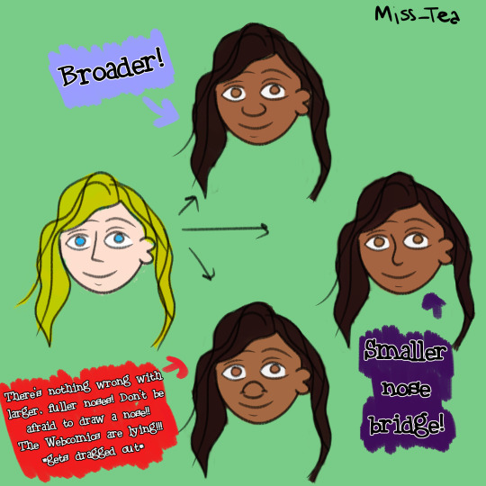
#changed some colors added texture
Text
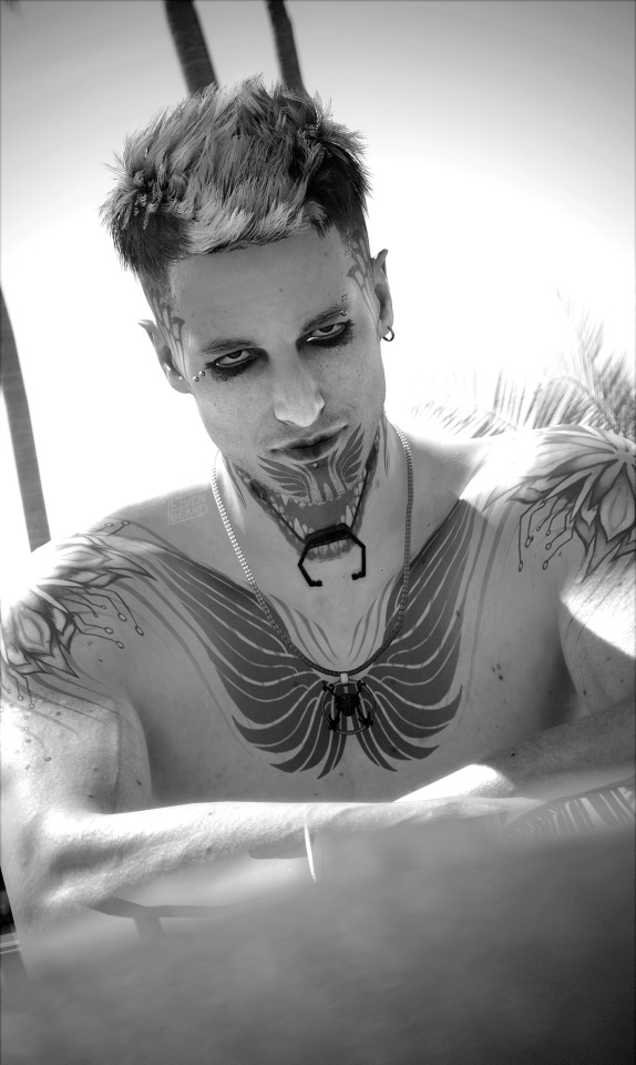
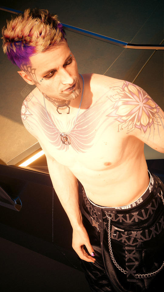
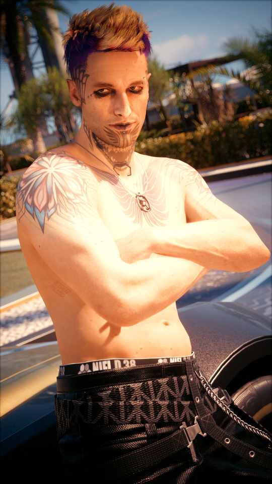
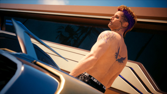
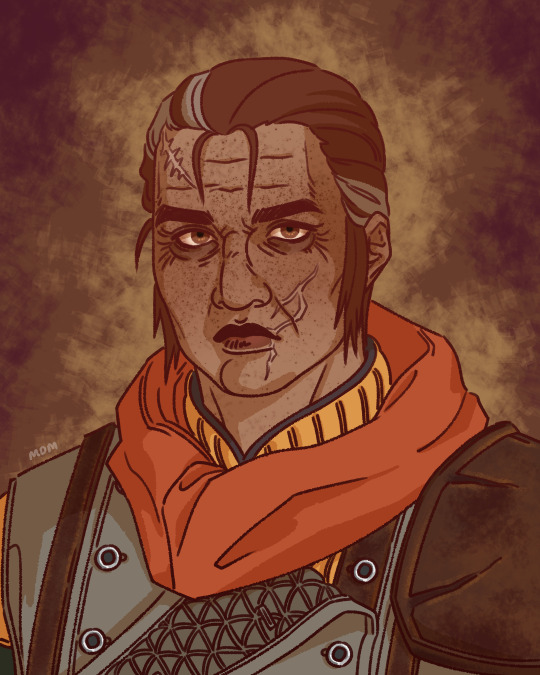
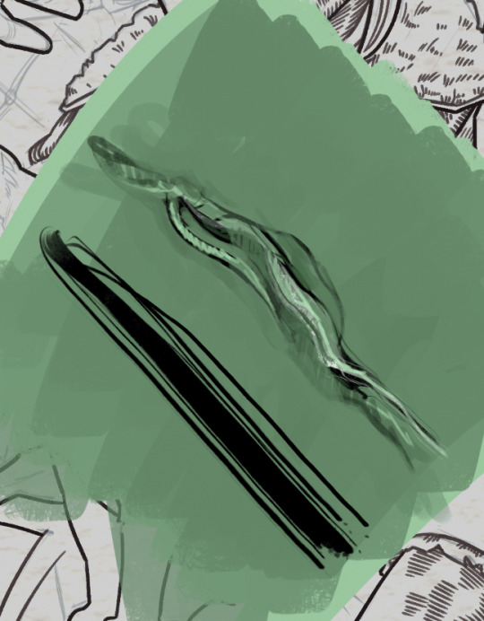
Did some blorbo modding this past weekend and updated Vince's shoulder and back tattoos a little bit :3 still the same design overall with some minor tweaks in coloring etc, because while I liked my original idea, some things I'd been meaning to adjust forever. And now I finally got around to, and that warrants a topless photoshoot of course \o/
#cyberpunk 2077#cp2077#cyberpunk v#male v cyberpunk#cyberpunk vp#cp2077 vp#cyberpunk photomode#vincent ezaki#my vp#still not quite there 100% but I'm happy with the new look for now :3#changed some colors added texture#and with the back tattoo I changed the font to something a bit different and also adjusted some details#to have everything tie in a bit better#and very slightly changed his chest piece - just made the edges a bit less harsh - or tried to#but with that one I'm still so fucking happy XD and with how it aligns with the bullet necklace#next time I redo them it'll hopefully be for his NPV XD
49 notes
·
View notes
Photo

⚡️2/7☀️
---
mdz
#nyoka#nyoka ramnarim wentworth iii#Zora Blackwood#outer worlds#the outer worlds#daud draws#fanart#the first 2 of 7 portraits im doing of my favs 😳#i was gonna hold off until i finish all 7 but figured ehhhhh better if i post one by one as i finish#id caption this 'lesbians on monarch' but theyre not the only lesbians from monarch im drawing in this series of portraits#n that lesbian from monarch is still a wip. so#i added some age lines n scars to nyoka. i know she canonically wears makeup but i can nvr make it look right >:(#also i deserve nyoka w scars n age lines. u cannot change my mind#i also based zora's looks from the loading screen art !!!!! she looks rougher there n i made her rougher here too#outer worlds is alrdy a goldmine of rough women but i deserve to hv them rougher :)#alternate crew portraits#alternate crew tag#UPDATE: fixed some uneven colors n THANKYOUUUUUU SO MUCH FOR THE LOVE !!!!!!;-;<3333333#UPDATE2: I FOGROT TO TURN ON ZORA"S TEXTURE FSJSKJHKSJFHKSJFHKSJHKJGHKGS#art#artists on tumblr
66 notes
·
View notes
Text
thank you guys sooo much for reblogging and commenting on my recent art project i appreciate it so much and it makes me so happy. I haven't done anything like this in a while and i feel really proud of them all. Thank you!!!! I love you.
#broken pencil#I have made some minor adjustments to 2 but havent changed their posts#i think when i decide im either done or have enough ill post them all in one post and then youll see the adjusted versions#i moved the blood stain on red murder's because there was too much color focus on one area#and i just added another texture element to my first one that I forgot to but had thought about when making it
5 notes
·
View notes
Photo

recent brexes
#petz#petz 4#these are all on tfm at the moment#if i haven't said so before: to ''brex'' a pet is to take a mixed breed pet and then modify things on top of the appearance of the bred pet#like changing colors or in most of my cases adding new markings and textures and such#it comes from ''hexing'' which is what modifying petz is called due to the fact that it was originally done primarily using hex editors#and ''bred'' because it's modifying bred petz and petz hexing was traditionally more often done on breedfiles#i remember brexing being looked down upon to some extent in the community for awhile#mostly because it was sometimes used to give a pet something like eyelids that match the fur color#but we didn't have the information necessary to edit the genetics of a pet at that time so the eyelid color would not pass down#also some people saw it as ''cheating''#it doesn't seem like anybody really does it to pass off petz as having different genetics as they have anymore though#and it seems to be more recognized as another fun offshoot of petz hexing nowadays
9 notes
·
View notes
Text
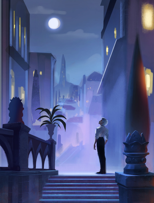
Here are some of process snapshots of this piece of Astarion in Baldur's Gate.

I am a messy painter and I often adjust and change the designs as I paint. (Mostly because I don't have the patience to do proper line art haha)
I start out with a rough sketch, I usually sketch ideas out on my ipad and move to my cintiq to work with colors.

Next I block in rough color thumbnail. I keep this part messy as I just want to figure out the value structure and the overall mood.
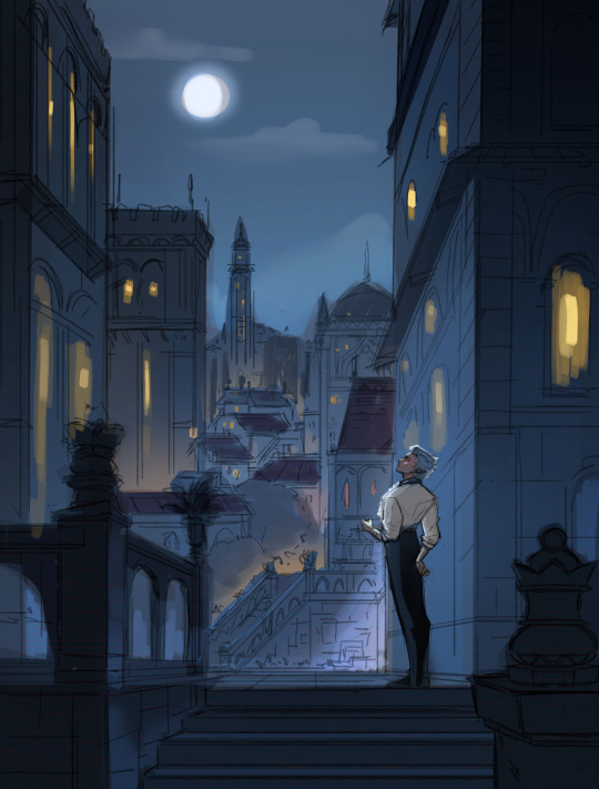
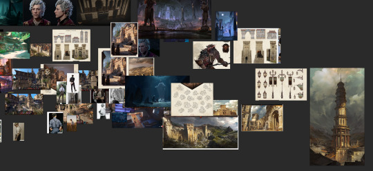
At this point, I have collected a myriad of screenshots and reference images from the game, pinterest, and also from artists work that inspires me.
With the references on one screen, I start to paint the details, I work from foreground to midground to background. (Sometimes I'll bounce between the depth when I get bored from painting one thing for too long)
Sometimes after I block in the colors I'll make adjustments. I didn't like how warped the perspective was getting on the building on the screen right side, so I adjusted the vanishing point and added more tiers to the design. I went back into the game and looked at more how the stairs were designed and figured it out more thoroughly with a sketch on on top.
I think sitting down and doing the details is the most time consuming part. I still want the focus to be on the character despite all the detail going on the background. At this point I'm toggling on black & white filters constantly to check the value, grouping everything in the background together, making sure the lighting frames the subject in focus. At this point I realized, I forgot to paint Astarion's hair LOL, and that the bg was getting a bit too detailed, so I used a more textured brush and painted away some of the edge details of bg buildings.

Last, I make final adjustments, and I make a overall lighting/fx adjustment folder. Adding in some noise, adjusting the contrast, color balance, and lighting over all and call it done!
Link to Print shop!
#astarion#astarionfanart#bg3#baldurs gate astarion#baldur's gate 3#artprocesses#art tutorial#astarionpainting#bg3art#bg3fanart#art process#artists on tumblr
7K notes
·
View notes
Text
I’ve decided to post all of the progress here as well, not just on instagram. Some people have asked to be tagged once I post some progress, but I can’t remember who they were. So if you wanna see future progress, let me know and I’ll tag you!
This one may not look too different from the previous one, but nothing really turned out the way I intended to.
The colors, the textures, the focus, the sounds, the camera, everything just seems so off, and oh boy the animation… this is the result of rushing and not knowing what I’m doing, just inserting keyframes, tweaking the graph editor and hoping for the best. So maybe signing up for this project wasn’t a great idea after all lol. Plus the datapad’s not even fully textured, you can literally see where I started adding details on the front, then for some reason I just left off lol
One thing I’ll definitely work on in the future is the menu itself, because if this project is for a graphic design thesis, then I might as well try to make the only thing that has something to do with it look more presentable. I’ll definitely be changing up the fonts, and I have some other ideas for the background as well.
But for now, I’ll move on to the remaining 5 character menu animations. Originally there were gonna be 5, not 7. At first I was randomly picking out the characters I wanted to make one for, then I realized, it’d probably be best, if each squad got one animation. The 501st gets Rex, the 212th gets Cody, the CG gets Fox, the 104th gets Wolffe, and the 241st gets Tukk. CF99 got Hunter but I really wanted to make one for Tech as well, since modeling and texturing him took the longest 💀
Once all of that’s done, I can finally move on to animating the trailer video. Which I’m terrified of, but oh well lol
#star wars#star wars fanart#clone wars#clone wars fanart#bad batch echo#bad batch tech#bad batch hunter#bad batch#bad batch crosshair#bad batch wrecker#the bad batch fanart#tbb#tbb animation#tbb fanart#3d modeling#game design#game development#game concept
2K notes
·
View notes
Text
My Favorite Cheap Art Trick: Gradient Maps and Blending Modes
i get questions on occasion regarding my coloring process, so i thought i would do a bit of a write up on my "secret technique." i don't think it really is that much of a secret, but i hope it can be helpful to someone. to that end:

this is one of my favorite tags ive ever gotten on my art. i think of it often. the pieces in question are all monochrome - sort of.

the left version is the final version, the right version is technically the original. in the final version, to me, the blues are pretty stark, while the greens and magentas are less so. there is some color theory thing going on here that i dont have a good cerebral understanding of and i wont pretend otherwise. i think i watched a youtube video on it once but it went in one ear and out the other. i just pick whatever colors look nicest based on whatever vibe im going for.

this one is more subtle, i think. can you tell the difference? there's nothing wrong with 100% greyscale art, but i like the depth that adding just a hint of color can bring.
i'll note that the examples i'll be using in this post all began as purely greyscale, but this is a process i use for just about every piece of art i make, including the full color ones. i'll use the recent mithrun art i made to demonstrate. additionally, i use clip studio paint, but the general concept should be transferable to other art programs.


for fun let's just start with Making The Picture. i've been thinking of making this writeup for a while and had it in mind while drawing this piece. beyond that, i didn't really have much of a plan for this outside of "mithrun looks down and hair goes woosh." i also really like all of the vertical lines in the canary uniform so i wanted to include those too but like. gone a little hog wild. that is the extent of my "concept." i do not remember why i had the thought of integrating a shattered mirror type of theme. i think i wanted to distract a bit from the awkward pose and cover it up some LOL but anyway. this lack of planning or thought will come into play later.
note 1: the textured marker brush i specifically use is the "bordered light marker" from daub. it is one of my favorite brushes in the history of forever and the daub mega brush pack is one of the best purchases ive ever made. highly recommend!!!
note 2: "what do you mean by exclusion and difference?" they are layer blending modes and not important to the overall lesson of this post but for transparency i wanted to say how i got these "effects." anyway!
with the background figured out, this is the point at which i generally merge all of my layers, duplicate said merged layer, and Then i begin experimenting with gradient maps. what are gradient maps?
the basic gist is that gradient maps replace the colors of an image based on their value.

so, with this particular gradient map, black will be replaced with that orangey red tone, white will be replaced with the seafoamy green tone, etc. this particular gradient map i'm using as an example is very bright and saturated, but the colors can be literally anything.

these two sets are the ones i use most. they can be downloaded for free here and here if you have csp. there are many gradient map sets out there. and you can make your own!
you can apply a gradient map directly onto a specific layer in csp by going to edit>tonal correction>gradient map. to apply one indirectly, you can use a correction layer through layer>new correction layer>gradient map. honestly, correction layers are probably the better way to go, because you can adjust your gradient map whenever you want after creating the layer, whereas if you directly apply a gradient map to a layer thats like. it. it's done. if you want to make changes to the applied gradient map, you have to undo it and then reapply it. i don't use correction layers because i am old and stuck in my ways, but it's good to know what your options are.

this is what a correction layer looks like. it sits on top and applies the gradient map to the layers underneath it, so you can also change the layers beneath however and whenever you want. you can adjust the gradient map by double clicking the layer. there are also correction layers for tone curves, brightness/contrast, etc. many such useful things in this program.
let's see how mithrun looks when we apply that first gradient map we looked at.

gadzooks. apologies for eyestrain. we have turned mithrun into a neon hellscape, which might work for some pieces, but not this one. we can fix that by changing the layer blending mode, aka this laundry list of words:

some of them are self explanatory, like darken and lighten, while some of them i genuinely don't understand how they are meant to work and couldn't explain them to you, even if i do use them. i'm sure someone out there has written out an explanation for each and every one of them, but i've learned primarily by clicking on them to see what they do.
for the topic of this post, the blending mode of interest is soft light. so let's take hotline miamithrun and change the layer blending mode to soft light.

here it is at 100% opacity. this is the point at which i'd like to explain why i like using textured brushes so much - it makes it very easy to get subtle color variation when i use this Secret Technique. look at the striation in the upper right background! so tasty. however, to me, these colors are still a bit "much." so let's lower the opacity.

i think thats a lot nicer to look at, personally, but i dont really like these colors together. how about we try some other ones?

i like both of these a lot more. the palettes give the piece different vibes, at which point i have to ask myself: What Are The Vibes, Actually? well, to be honest i didn't really have a great answer because again, i didn't plan this out very much at all. however. i knew in my heart that there was too much color contrast going on and it was detracting from the two other contrasts in here: the light and dark values and the sharp and soft shapes. i wanted mithrun's head to be the main focal point. for a different illustration, colors like this might work great, but this is not that hypothetical illustration, so let's bring the opacity down again.

yippee!! that's getting closer to what my heart wants. for fun, let's see what this looks like if we change the blending mode to color.

i do like how these look but in the end they do not align with my heart. oh well. fun to experiment with though! good to keep in mind for a different piece, maybe! i often change blending modes just to see what happens, and sometimes it works, sometimes it doesn't. i very much cannot stress enough that much of my artistic process is clicking buttons i only sort of understand. for fun.
i ended up choosing the gradient map on the right because i liked that it was close to the actual canary uniform colors (sorta). it's at an even lower opacity though because there was Still too much color for my dear heart.

the actual process for this looks like me setting my merged layer to soft light at around 20% opacity and then clicking every single gradient map in my collection and seeing which one Works. sometimes i will do this multiple times and have multiple soft light and/or color layers combined.
typically at this point i merge everything again and do minor contrast adjustments using tone curves, which is another tool i find very fun to play around with. then for this piece in particular i did some finishing touches and decided that the white border was distracting so i cropped it. and then it's done!!! yay!!!!!
this process is a very simple and "fast" way to add more depth and visual interest to a piece without being overbearing. well, it's fast if you aren't indecisive like me, or if you are better at planning.

let's do another comparison. personally i feel that the hint of color on the left version makes mithrun look just a bit more unwell (this is a positive thing) and it makes the contrast on his arm a lot more pleasing to look at. someone who understands color theory better than i do might have more to say on the specifics, but that's honestly all i got.

just dont look at my layers too hard. ok?
2K notes
·
View notes
Text
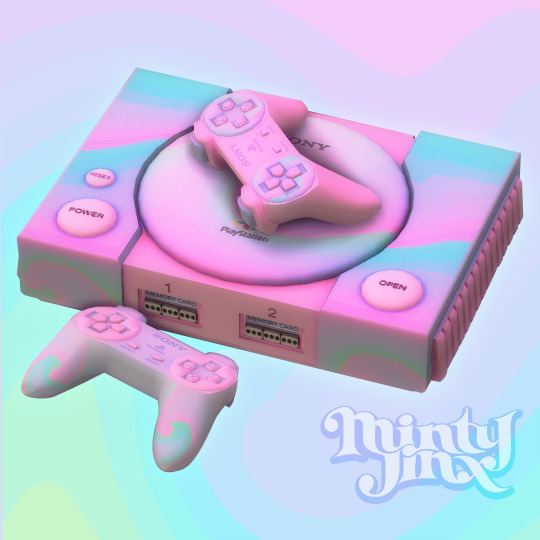
(Retro & Vintage) Gaming Consoles #1 - PlayStation 1 (PS1) - Updated & Fixed

So, Mr. Procrastination has been squatting with me for a good while now. I have so much CC to upload but for some reason I never get around to it.
I’ll be making a collection of retro/vintage gaming consoles and thought I’d start with a tribute to the Sony Playstation 1, dedicated to my Hubby who grew up playing on the O.G. gaming consoles!
This is a set with a total of 5 items!
1. PlayStation (PS1) Game Console - Decorative
2. PlayStation (PS1) Game Console - Functional (Requires City Living EP)
3. PlayStation (PS1) Controller / Gamepad - Decorative
4. PlayStation (PS1) Controller / Gamepad - Functional/Override for “Game Console Controller” from City Living EP. (As Shown in the picture below) ⤵️
5. PlayStation (PS1) Controller / Gamepad - Functional/Override (in Simlish)! (install EITHER the simlish override or the regular override, not both.)
This set also has a few colorful swatches for those of us who are more whimsical 🌼
More Preview Pictures:

All files have been updated as of 2023-11-17. Delete all your old PS1 files and re-download the new ones linked below. Keep in mind that you can only have 1 override file for the controller though. (For more details on what's been changed, read "Updates & Fixes" further down)
Download (SFS) (free)
Updates & Fixes:
✦ Fixed texture & Shadow issues with PS1 Console (Functional), PS1 Controller (Decorative) & PS1 Controller (Override).
✦ Added Simlish swatches to the decorative controller and consoles (both decorative & functional).
✦ Added a new controller override in Simlish.
------------
I also want to give credit to the amazing CC creators who’s items are shown in the preview pictures ⤵️
CREDIT(s):
★ @mechtasims: Y2K Set: Heels, Cyber Girl: TV, Bathroom Set: Lotion, Pluto Set: Table,
★ @grayvixen: Neon Flamingo Sign
★ @savagesimbaby: Sweet & Sexy tattoo
★ @cecesimsxo: Cherry Ombre Nails
★ @joliebean: Ballerina Nails Matte
-----------
Note(s):
For any questions, requests, or if you're having any issues with my CC; leave a comment or ask me anything HERE.
Notes For CC creators wishing to edit my CC:
You may absolutely recolor my CC. If you share the recolor then please do not include the mesh but rather provide a link back to this page. (Unless it’s for personal use, obviously.)
You may edit any and all of my meshes. All I ask is to credit me with a link that leads to this page stating that you’ve used my mesh as a base/source etc.
For more detailed notes regarding this, click HERE or contact me directly.
#ts4 custom content#s4cc#simblr#ts4#ts4 maxis match#ts4cc#ts4 cc#Ts4 mm cc#ccfinds#sims4cc#maxis match#ts4 retro#ts4 decor#ts4 bb
3K notes
·
View notes
Text
Lesson 1: "White Man Painted Black"?
Okay, I recognize that this is a strong foot to step off on! But! If you learn nothing else from this series, if you decide for whatever reason to forsake me: this is the ONE perspective I'd like you to take away!
You may have heard this quote before, when Black fans deride a character design as 'a white man with the brown bucket tool'. On its face, it means exactly what was said. But specifically, what it means is that we recognize that whomever designed the character drew the way they normally draw for a 'default' character in their mind- default usually meaning White/Eurocentric features- and they added a shade of brown within the line art to make that character now 'Black'.
Now if you're feeling defensive, wait just a moment! This discomfort is not inherently a bad thing!
I'm going to use both a 'real world' example first, to show you what your Black fans and peers are seeing, and perhaps you will also understand our discomfort!
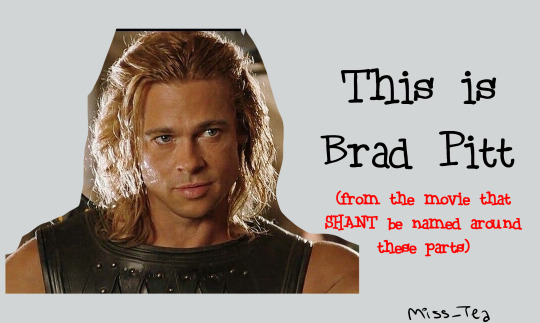
(if anyone was curious, my folder for this lesson is titled 'brad' lmao and you'll see why)
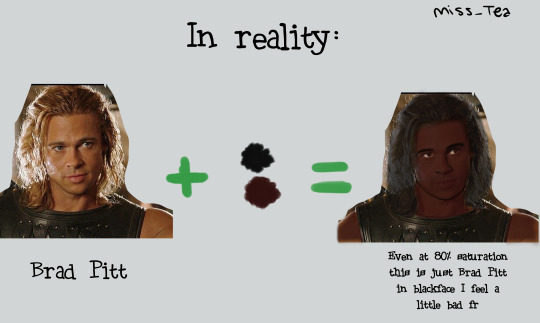
(I'll have y'all know that I actually worked very hard to make Blackface Brad look mildly presentable lmao I'm sorry, I'm wheezing, I can hardly breathe looking at him 🤣)
You see how, despite knowing where this was going, and using one of the darkest shades of brown in my Skin Tones arsenal, you still know that that's Brad Pitt? That nothing about his hair texture, his lips, his nose, or really anything other than the palette change... changed? And you can still see that?
It's incredibly hurtful to be told that that's supposed to be you. You know it's not, you know why it's not, but rather than hearing how it makes you feel unseen and what they could do to be better (since they wanted to draw a Black character!), the artist lashes out at you.
And as an artist, you might have worked VERY HARD to do this! That might be a real handsome guy you drew!! But... is he really Black? Did you walk into it with the intention, that you were drawing a Black Character, or did you draw a character that just happened to be Black? It seems like a silly thing, but it matters!
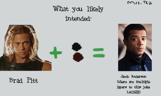
Okay. I just finished laughing over Brad. Now let's get into some more perspective changes:
Now, imagine you drew a character. You want to make her Black, so you change the hair and skin colors. All right! You have your Black character... right?
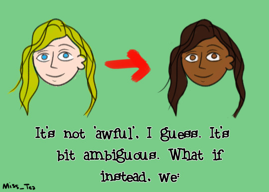
Changed ONE feature about her? (You should obviously change more than one feature, but let's just go with the simplified example.)
What if, instead of just changing her palette, we changed her:
Hair?
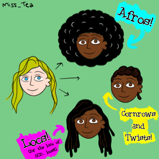
There isn't nearly enough time in the world, let alone in this little scribble and blurb, for me to describe the IMPORTANCE of Black hair in Black character design. There are so many ways to do curls, afros, braids, twists, locs, SO MANY HAIRSTYLES!! Get used to searching in the 3C-4C hair textures!!!! I plan on doing an entire lesson or two on hair alone, but suffice it to say, Hair Texture is thee BIGGEST giveaway that you 'painted a white person Black'- from cartoon styles to realistic! It reveals itself in your writing as well- just based on how your character takes care of their hair, how your describe the texture, how other people might perceive it... it lets me know just how much research was done. Because we can have straight hair! But again, that's a conversation for a whole 'nother lesson so- come back later 👀?
Lips?
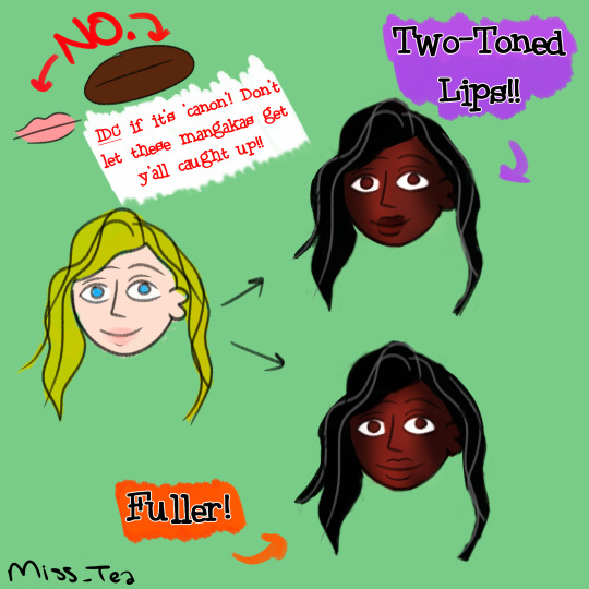
I love our lips, I really do. There's a long history of shaming Black women in particular for the way our lips look. So when I see them done in all their glory, it makes me very happy. Two-toned lips vary in shade and intensity, so make sure you're using references if you want to be 'realistic', but it doesn't have to be that hard. Even a little subtle shift like this in the design/story description lets me know that a creator was thinking about me.
Nose?
One thing I've noticed ever since I starting drawing is that... people in a lot of mangas/manhwas barely have noses! I admit, out of all the features on the face, the nose isn't the most important. I think they should be, especially when you want to emphasize that your characters look different! People have different types of noses! I especially want to gear this towards those with a goal of drawing realistic portraits and the like- there, the nose is ANOTHER dead giveaway. There are Black people with aquiline and straight noses- we aren't a monolith- but is that why you drew it? Consider why you went for that nose specifically. That's part of the intent, in all this!
Now, you might be looking at me and going "Ice... this is just character design". To which my answer is: Yes! It is! It feels so basic, and yet if you ask your Black friends/peers how often they've come across this feeling of not being properly drawn/written, from fanart to professionally produced works, it's unfortunately common despite how simple of a concept it is.
I hope that you can walk away from my first lil lesson with new eyes. Remember, it's the thought that counts, but the action that delivers!
1K notes
·
View notes
Text
G'morning all! Its nice to get back things,. Theres been some roadblocks with med shortages and life, and also with the material for these recipes. So far we've covered a lot of pastries, not because theyre mentioned more often in the series, but because being mentioned lends them more specificity in flavor than things like gravy, peas, or various meats. The latter can be prepped, seasoned, and served in so many different ways that it feels harder to make them 'faithfully' because a packet of instant potato mash is just as faithful as a pot of buttered potato mash. Baked goods tend towards 1, maybe 2, 'base' recipes that get altered and added to.
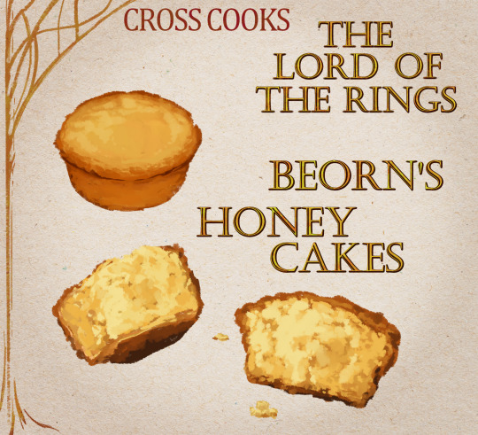
Today, we'll be making Beorn's Honey Cakes! A dish from one of my partners favorite characters- a delectable little treat befitting the… warm personality of the character.
(As always you can find the cooking instructions and full ingredient list under the break-)
MY NAMES CROSS NOW LETS COOK LIKE ANIMALS
SO, “what goes in to Beorn's Honey Cakes?” YOU MIGHT ASKSimple stuff! Simple sweet stuff!
All-purpose flour
Baking powder
Salt
Ground nutmeg
Unsalted butter
Whole milk
2 eggs
Honey
Vanilla extract
The veins of honey cakes ancestry can be traced back to any moment where people began baking bread. Honey is a natural preservative, and sweeter still on its lonesome.
AND, “what does Beorn's Honey Cakes taste like?” YOU MIGHT ASKLike your aching muscles repairing themselves
Tastes like a honey graham cracker
But the texture is softer, wetter- somewhat like banana bread
Oh, and this will make your house smell So So Good
If you can resist the temptation of eating them immediately, they taste even richer the day after baking
Would pair well with milk green tea
Would also pair well with fresh orange slices (or those chocolate 'orange slices' candy)
Genuinely don't forget to flip them upside down when they go to bake the second time, not sure what it is but i was curious and did a test where i flipped half of the batch upside down and kept the other half of the batch right-side up like they cooked in the muffin tin. The ones i flipped upside down universally had a more consistent texture and the honey was able to permeate further.
.where honey called for, used clover honey
-----------------------------------------------------------------------------------------------------------
From start to finish this recipe takes about an hour of work, give or take some negligible time for prep.
The batter is perhaps the babybird of all cake batters. The gloopy, protruding crumbs of butter, not unlike a squabs beady pupils visibly dark under its skin, break up the mass of sickly smooth and reassuringly sweet-smelling oak-colored liquid. You can feel the confusion of bees outside your home, wondering if this your attempt at making royal jelly.
Just like a babybird, it becomes more than the sum of its parts. Layer on that honey drizzle, layer it on thick, theres no risk of drowning subtle flavors. Its crisp edges will keep its form, springy and warm, inviting you as if you're not the one who crafted it (food you didn't cook always tastes better). The bees are sooooooooooooooo jealous of your opposable thumbs and muscular strength.
If you dont have eggs you could try substituting with apple mash. I can't vouch for it in this recipe but replacing eggs with mashed up apples for pancakes gives it adds a nice fruity flavor without changing the texture, and in theory should work here as well.
I give this recipe a solid 10/10 (with 1 being food that makes one physically sick and 10 being food that gives one a lust for life again.)
🐁 ORIGINAL RESIPPY TEXT BELOW 🐁
Ingredients:
270 grams all-purpose flour
1 1/2 tsp baking powder
1/2 tsp salt
1/4 tsp freshly ground nutmeg
1 stick unsalted butter
160 grams milk
2 eggs
110 grams your favorite honey
1 tsp vanilla extract
Muffin tray and parchment paper
Method:
Preheat oven to 350f
In a medium bowl, whisk together the flour, baking powder, salt, and nutmeg.
Add the butter and rub it into the flour with your fingers until the mixture resembles coarse crumbs.
In a small bowl beat the eggs until just combined. Pour in milk and then vanilla extract while stirring. Keep stirring vigorously while slowly pouring in honey.
Stir until the mixture is consistent in color.
Pour the liquids over the dry mixture and stir until just combined.
Pour the batter into a greased muffin tray, don't use any muffin paper/lining/cups.
Bake for 16 minutes, or until they reach their full height.
Carefully remove from the muffin pan and place the muffins upside down on a parchment lined tray.
Using a silicone pastry brush, generously cover the tops of the cakes with honey. Allow to sit for about 5 minutes to let the honey soak into the cakes.
Bake for an additional 8-10 minutes, or until the cakes are golden brown.
Remove from the oven and allow to cool.
2K notes
·
View notes
Text

as a cc creator you often look back at your old creations and think "yea i could've done that so much better lmao". that's kind of been my mindset for the last couple of months. so i decided to clean up and revive (yet again) some of my older cc collections!
meshes have been fixed (some objects didn't even have all lod's or shadowmaps smh) or moderately edited to conform to my current aesthetics
textures have been hugely improved along with better color palettes, neater normals and speculars
please delete all old files before adding these! they will replace in-game but you cannot have the old versions and the new versions installed at the same time.
~~~
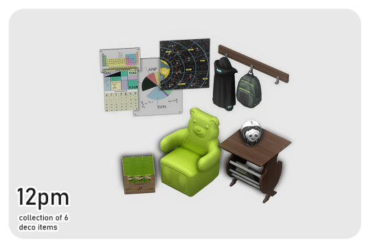
12pm includes 6 items just as the originals. the panda bank is now functional if you have ravasheen's 'in your safe piggy bank' mod installed.

fps includes 3 items. (you can find the originals here) both video game consoles require city living.

home includes 8 items, originally 6. both the shelves and desk have way more slots for extra storage!
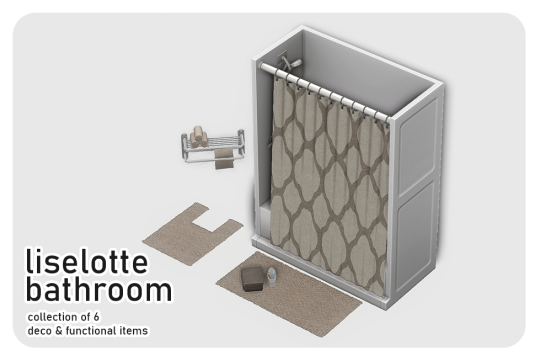
liselotte includes 6 items. the original set is still available here if you prefer that instead. not a lot has been changed except for minor edits to the folded towels and a mesh replacement of the toothbrushes. also i've left out the bath robes since i personally don't have a use for them since that one bg recolor update lol.
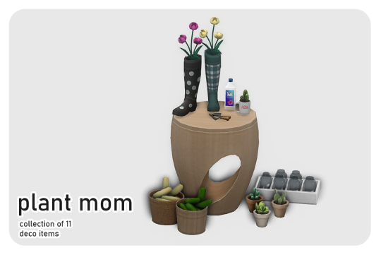
plant mom includes 11 items. one of my all time fave sets, which can be found here, again if you prefer that.
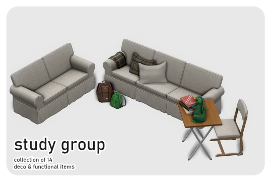
study group includes 14 items now, 6 more than the originals. i've added accessory backpacks for all ages except infant and toddler. and now the deco backpacks can be used as storage if you have ravasheen's 'hoarders simnonymous' mod installed.
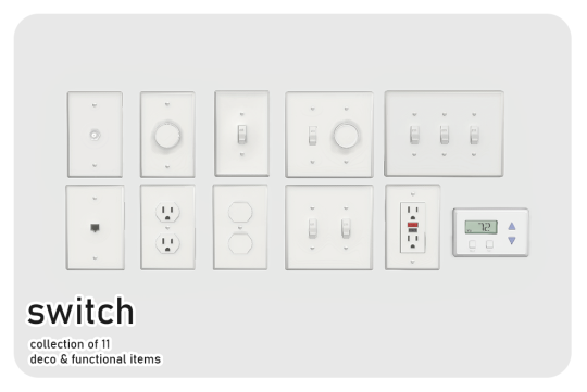
switch includes 11 items. everything is basically the same as in the original post. only a few minor touches here and there. i added a thermostat, which requires seasons. and a newly added electrical outlet with safety plugs. all light switches are functional if you have the bathroom clutter kit and littledica's functional light switch override.
~~~
download (always free on patreon)
2K notes
·
View notes
Text


Basic Reduxe Kitchen
CC Set of 14 BGC Items
A combination of my Back to Basics and Basic Luxe kitchens, because I really liked my mesh for the Luxe ones, but I will always love butcher-block tops more than any other kitchen surface. It's a pretty standard kitchen and I think the file names are self-explanatory, so here are some bullet-points-of-interest:
Like my Basic Luxe kitchen, the counter's end pieces have been changed to an alternate full-tile model and a half-tile model for more customization.
The cabinet also contains half-tile end pieces
This color palette draws a few swatches from the Basic Luxe palette, but I changed the hardware color slightly, and grabbed a bunch of colors from sforz's various palettes
The dining set packages come in two standalone versions: one set that matches the rest of the kitchen's swatches, and another set of 18 solid wood tones (bottom two rows of palette image)
Disclaimer: I re-mapped the UVs for the island tops and some counter tops, so the dirt overlays may be funky-looking. Since you're supposed to clean them when they're dirty anyway I decided it wasn't worth the effort to figure out a seamless texture for them (if you saw the uv map you would understand)
Download link below the cut!
There isn't really much to say about this one! I thought it was going to be an easy project (when will I learn?) but I found some mistakes in the original meshes (nothing big but I'm a perfectionist) and fixed them along the way, which took extra time. And then I spent forever trying to decide on colors, and then trying to trim down the count (I cut 2 whole wood tones which helped decrease the number by about 30%).
I also decided to do custom thumbnails for these, because I liked the way they came out in my Basic Luxe set. I spent about three days manually generating, exporting, editing, and importing thumbnails (and even set up an auto-clicker program to help me!)... only to find out that S4S added a "catalogue thumbnail underlay" option in one of their updates. I'm still mentally recovering from that (read patch notes!!) 😔
Anyway, at least I got to play with ReShade a bunch! I've been mostly using it for screenshots in ESO, which is an online game that I can't pause, so being able to take my time and play with shaders and get juuuuust the right look was a real treat!
I use Peacemaker's No Occluder mod to prevent weird shadows from appliances/cabinets.
Credit: Kitchen Clutter | Solid Wood Texture by @myshunosun
Download (Patreon) Always free, no ads.
683 notes
·
View notes
Text
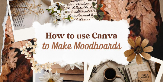
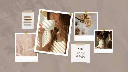
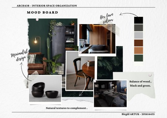
—HOW TO USE CANVA TO MAKE MOODBOARDS

I got a kind message asking how I make moodboards in Canva, so I wanted to do a little tutorial! Canva is a free graphic design app/website, and I use it for everything.
To start - open the app/page and use the search bar at the top to search for a template. I usually use: photo collage, scrapbook, aesthetic moodboard - all of these will pull up pre-made templates for you to use.
[I have a couple linked below that I’ve used and liked, or have bookmarked to try:]
one | two | three | four | five | six | seven | eight
Anything with a crown is for Canva Pro members - you used to be able to use the templates as a free member (just not the paid assets) but that changed recently. The linked templates above are all free ones that you can use right away.
PHOTOS:
Once you’re in the template, you can press the + in the bottom corner to bring up the menus. The Elements tab have items you can add in (more on that later) - for now you want to go to Uploads, and add the photos you want to use. I mostly get mine from Pinterest and Google Images.
[If you are writing an x reader fic and are looking for tips for creating an inclusive moodboard, there are some awesome resources here: one | two !]
After that, go back to your template and click on the different photo frames, and use the Replace button in the toolbar - it will let you replace the template photos with your own. Double tap to move and resize your image within the frame, (and there are also filters you can use if you want!)
When working on moodboards, I like to move things around. You can replace the frames they use by clicking on the item and then clicking the Trashcan. Then go back to the + menu, and then Elements, and scroll down to Frames. You can scroll through them all, but my fave keywords to use in the search bar is: polaroid, torn, and ripped.
Once they’re added, you can move them wherever you want. There’s a button on the toolbar that says Position, and you can shift the object forward/back between the items around it.
DETAILS:
Once you add your photos, then comes the details! You can change the background color and add/change the fonts (or upload your fave font to use!) Try out all the tools on the toolbar to see what you can do, there’s a lot of options.
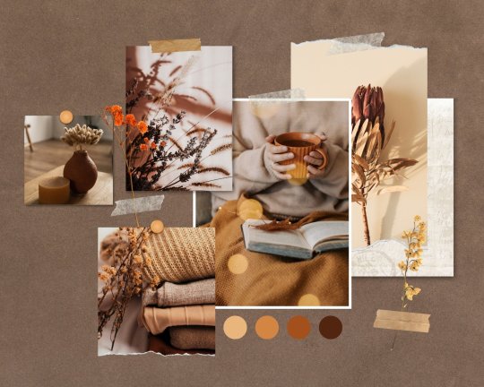
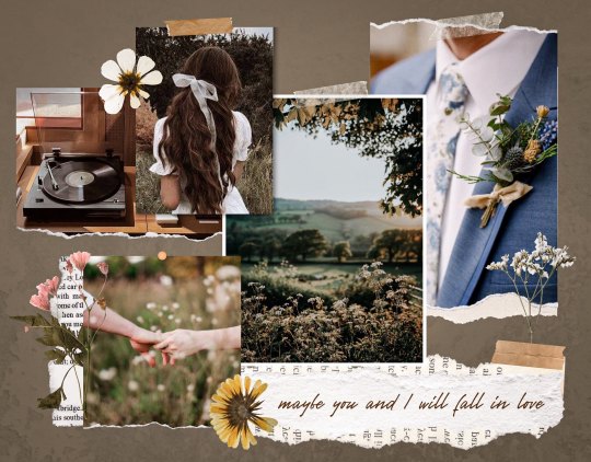
I love love layering with my moodboard, so I will go back to the + / Elements tab, and then search for things to layer in. My fave searches for Graphics recently are: ripped paper, grunge patterns (to use in the background), star patterns, dried flowers, and dried leaves.
You can use the Position tool on them to fit them in-between or in front of your photos. I usually use them to hide harsh edges or in places that look a little empty.
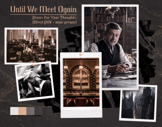
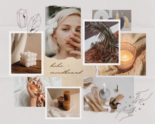
I also like adding fabric texture to the backgrounds, to fill the space between the photo frames. There isn’t an easy way to do this - the best way I figured out is to find an image of the texture you want, and then to add a photo frame with a torn or jagged edge in the very back (and then use your new texture there). You can duplicate and move it, to cover the space (you can see some examples below - the beige flower pattern in the Din one, the black velvet for Alfred).
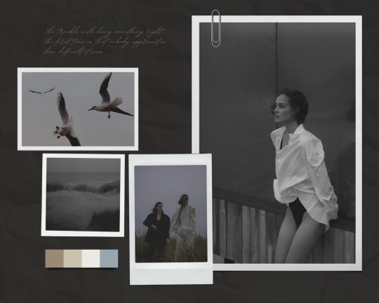
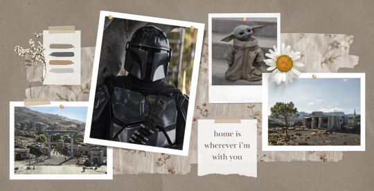
Here are some examples of the original templates, and then what my finished ones look like. You can see what I swapped out, moved, and added:
original image | my moodboard

EDITING:
Once I am happy with the design I download it, and then edit. I love this part - pop it into your fave editing app, and play around with the exposure/contrast/hues/sharpness. I will mess with the color balance & vibrancy as well - this can really take a moodboard I like, to one I love.
Here’s some gifs I made showing before /after editing - both are pretty before but I think the after has an oomph that I really appreciate.

[When you finish with one and want to use the same template, you can click Make a Copy, and it will duplicate it. I began with templates but everything I do now are copies of heavily/edited templates or ones I’ve made from scratch. But for starting off, I think a template is the way to go!]
And that’s it!! I would really suggest just opening it up and seeing what you can do. Not all of mine turn out great, but each time I think I get a better handle on all the different options and what my moodboard style is.
I really hope this helps! And feel free to tag me if you post any you make, I’d love to see them (or drop me an ask if you have any questions!) 💖💕
#please give this a reblog if it was helpful! 💖#and just a note the 4th example is an OC x Character fic moodboard#moodboards#graphics#tutorials#aesthetic moodboard#resources#fic moodboard#fan fic meta#fic writing#writing resources
671 notes
·
View notes
Photo
CDD ~ Fresh Start Styled Look
If you’re like me, the first thing you do in CAS is clear everything off the sim for a nice fresh canvas. This custom styled look (when coupled with Mizore’s hider mod) is intended to make that take as few steps as possible every time.
Download and info below the cut for future updates
Item Details:
Base Game Compatible
Toddler Infant - Elder; Masc & Fem frames (Added infant support on June 16, 2023; please redownload)
1 Variant (per frame)
Custom thumbnails
Needs @mizoreyukii’s Styled Looks Hider to truly be worth it. If you’re overly attached to EA’s styled looks, this cc probably isn’t for you.
Removes all accessories, clothing, shoes, makeup, skin details (excluding acne and scars), tattoos, facial hair and hair (changes color to dark brown for adultFem + children, blonde for AdultMasc, red for toddlers for all of them now I believe (I can’t remember tbh 😅 - if anyone knows how to remove the hair without changing the color, please hmu)
Does not change teeth, eyebrows, eye color, acne and scars (I couldn’t get it to remove these last 2 categories)
Tagged for all outfit categories
Added overrides (June 16, 2023) for shoes/bare feet and masc frame nude tops to resolve the look not applying to those categories after one of the recent patches. If you want to use an alternate override from someone else and it isn’t compatible automatically, (only do this if it’s not working otherwise) open your desired alternative in Sims4Studio, navigate to the warehouse tab, tick the setting box for “ShowInUI”, and save the file. (Edit June 6/20) I’ve been informed by @asixteenthrose that even with changing your desired override to have the showinui checked, you still need my overrides for the styled looks for some reason, and the desired override can’t be in a subfolder/must be in main mods folder.
Added “Stripped Start” (June 16, 2023) which affects the accessories, makeup, facial hair, clothing, and shoes, but does not affect hair, body hair, skin details, or tattoos. You can have both Fresh Start and Stripped Start in your folder at the same time or not; they should not conflict with nor do they depend on each other.
Downloads:
> SFS < (Current Version is a zip)
> Google Drive < (Current Version is a zip)
Needs: > Hider Mod for EA Looks < (by MizoreYukii)
Notes:
There is no way I would have been able to figure out this project without MizoreYukii’s How to Make Custom Styled Looks tutorial, so huge thank you to her.
This look is mainly for simmers who want nothing on their sim when they start in CAS. If there is enough demand for a version that keeps existing tattoos, skin details, and maybe hair; I might make that as a v2 down the road. After receiving nonny asks, I went ahead and added a version like this while updating the original.
I timed myself clearing every outfit category for a new sim using just this look as fast as I could, and it only took 15 seconds total.
I have added patch numbers to the files in case someone needs the outdated version.
Kijiko eyebrow texture defaults cause the fem frame teen-elder not to show Fresh Start.
1K notes
·
View notes
Note
How the heck do you get Ashton to actually look like a rock? Signed, a fanartist who has tried every brush under the sun but still cannot nail it the way you brilliantly have.
ahhh thank you so much for the kind words!
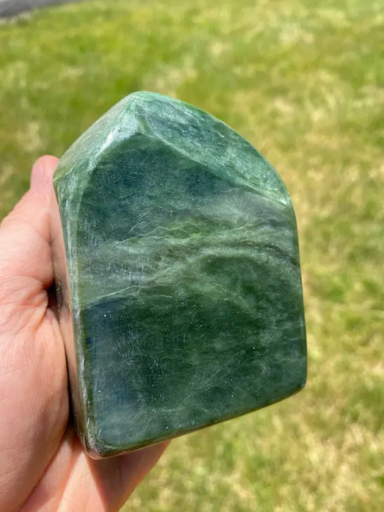
Answer (sort of)- Ash's palette was hugely up in the air for a really long time. I kept pitching random bits of color at Taliesin, but his write up did not have any specific coloring in it from the get-go. And because I knew they were made of rock, I trended towards something to the left or right of grey (his working/code name had the word grey in it, as well, which def influenced me).
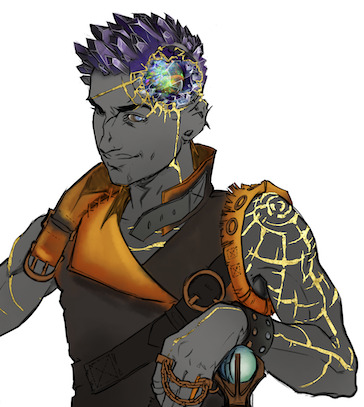


This went on for a while, until one day Tal did his Tal thing and just sent me plans for the finished Ashton. He painted over one of my sketches with the colors he wanted, included refs of some textures. The textures for the skin included nephrite and serpentine (nephrite is one form of jade, serpentine is a whole other thing.)
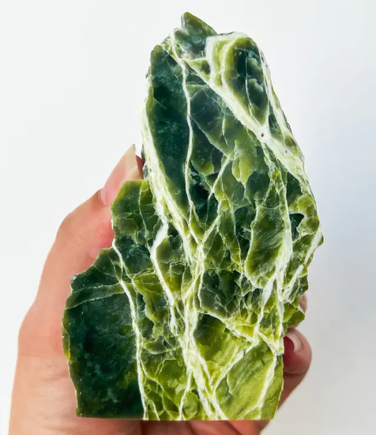
The serpentine reference had these really bold lines running through it, and I was worried I wouldn't be able to replicate them, so i just... dropped the texture into the sketch. I think I was just checking to see if it was gonna make them unreadable, but it actually looked pretty great. I painted over it a bit to work out where the lines should fall and how to get them to bend around the figure. And then when I was doing the final render, I made a brush that made the fucky line effect. There's one key element to the brush that I will show you-

The shape of the brush is just a random splatter shape, but the angle, size, and roundness change in response to pen pressure, so that as you draw, you can increase the size with added pressure, and some lovely, 3-D helix shapes will start appearing as you go.


From there it's easy- Make an extreme dark and an extreme light in your little texture space, then paint over in variations of green to push things deeper into Ash's "skin" while maintaining a slight transparency.
Here's some other little tips-
- Before you add intense, lined texture, start with a textured base. This can be anything. Once I used a picture of the amazon rainforest with heavy color correction. Sometimes I use sponge brushes. Have fun with it.
- Try to make the larger textures support the underlying figure. My go-to is large, lazy spirals that shimmy up and down their limbs.
- Don't fight the lighting too much. To increase readability, try to use elements of higher or rougher texture to frame the features, while keeping the immediate area of their eyes, for example, less busy.
Good luck, and thanks for the ask!
519 notes
·
View notes
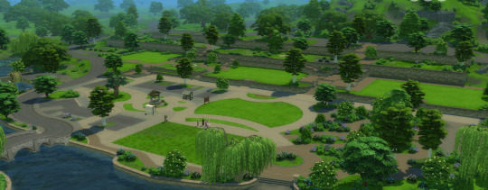
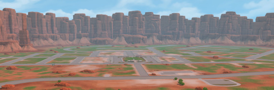
Text
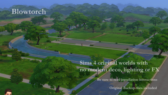
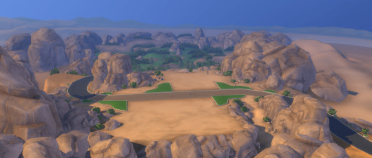
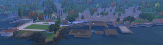
Blowtorch!
Maxi's worlds emptied of era specific stuff – made for simmers who wants themed hoods of their choice.
So, you found T.O.O.L, the super useful mod by Twisted Mexi, and learned how to decorate your sim world.
But there is this problem with Maxis houses and items, which do NOT fit in your sim world. So far, the most used method has been to hide them, as in either move them away (if even possible) from sight or use a hider/override to make them invisible. That method has its limits, is very tedious (need to find, make an override, ect, and there are SO MANY items)
Blowtorch has another approach. It takes out the items (houses, vehicles, modern deco, well - all silly deco really) from the world. You can then place nicer deco or game items instead.
The items are not hidden from catalogue, so you can place the same items back but in a different place if you so wish. Or use cc deco. Make the world medieval, or Victorian, or sci-fi, or whatever.
HOW DOES THIS WORK?
This mod edits the preloaded deco in the world. It changes game files – and the changes will affect all your saves, old and new. If you decide that you want the deco back, you can do it either with the GAME REPAIR function or using the backup of the original folders that I included in the mods folders.
You can either use all my edited files – or the ones you want. If you for example want Willow Creek to be as it always has, but want a blowtorched Oasis Springs, just delete the Willow Creek files before installation, and keep Oasis Springs.
I have blowtorched almost all the hoods in the worlds, both EP and GP: s (See list in Documentation PDF for exceptions.) If you don’t have all EP/GP I recommend to delete the ones you don’t have before installing.
(Save the zip with the mod somewhere safe so you can add new worlds when you add a new EP/GP with a world.)
Here are some general rules I went by:
- All landmarks, architecture deco, street deco, vehicles, with special effects - blowtorched
- Functional objects: outside tables, playground items, and such – blowtorched. Place them again where you want them!
- All lights, both streetlights and built in hood lights, blowtorched.
- All palm trees, ever pink trees, wispy modern beeches, and other modern plants, blowtorched. (I of course kept the palm trees in Sulani and Selvadorada)
- ALMOST ALL THESE THINGS (not the built in lights) are still available in the catalog (debug, live edit) items though. So, if you still want a modern, but DIFFERENT hood, you can place them again, as you want them. This is a big advantage compared to hiders – those usually hide the items also from the catalogue.
- Visual effects belonging to vehicles and other stuff mentioned above, blowtorched. No modern yachts, no airplanes.
- The lights are gone. The world will be dark at night if you don’t place streetlights or such.
WHAT I KEPT
I kept the seasons stalls, where they are available (if you have the Seasons EP.) They can also be placed, but as they are in conditional layers (changes with the seasons) this can't be done by placing them manually.
I kept all spawners. All the fishing spots and all the bugs, frogs, dig sites, wild growing plants.
Lighting mod included
This mod also includes the Sunblind lighting mod by Softerhaze. Lighting mods also change these files, so I added Sunblind with the creator's permission. Read more about their mod here.
(You do not need to download or install the mod; it is included in the Blowtorch mod.)
If you want another lighting mod or no lighting mod, you need to edit the files manually.
This is done by replacing the resources “Sky Box Texture Data” and “World Timeline Color”.
ECO LIFESTYLE NOTE!
Unfortunately, the Evergreen Harbor world that came with Eco Lifestyle (EP 9) has some special evil magic and the deco needs hiders anyway. If you play with that world and want it to be BLOWTORCHED, install the file ELHoodHidersMerged in your Mods folder.
Other recommended mods:
Check out T.O.O.L and Twisted Mexis other mods here:
https://twistedmexi.com/Mods/
To add deco stuff outside lots:
T.O.O.L – at Tmexis page you also find information about his CAW-project, still in alpha testing.
I also recommend his Better Build/Buy mod, and his toggle mods, especially the Strangerville Story Toggle on if you want to use Strangerville as a normal world. And also his that enabled build/buy on the Secret Lab lot – in new saves.
Zerbu has a couple of super useful mods:
All Worlds are Residential
https://zerbu.tumblr.com/post/173398784785/the-sims-4-mod-all-worlds-are-residential
Venue changes
https://zerbu.tumblr.com/post/160347810775/the-sims-4-mod-venue-changes
Twelfth Doctor has a great mod for travelling to all the hidden/special lots, so you can edit them:
https://td1sims.tumblr.com/post/635457539495084032/travel-to-venue
This mod is also useful if when you work with TOOL:
Clickable worlds by Awingedlama
Q&A about Blowtorch mod
1. Can I use this on my old saves?
Answer: Yes. The mod does not affect the saves, or your CC, or anything other than the game files in the Windows directory. You can easily uninstall the mod by using the backup files (included) or do a Game Repair.
2. Why are there stuff not deleted? Annoying modern fences in Windenburg Ugly Modern Business district, for example?
Answer: some items are a part of the world mesh and is not yet possible to edit. If there will be a solution later, I will update the mod.
3. Will I have to update the mod after patches and new expansions?
Answer: Yes. If the patch/ep/GP does not include a new world, you just reinstall the mod (see instructions below) as you installed it the first time.
I will make updated versions asap when new worlds are released.
4. I don’t have EP X or Y – can I use the Blowtorch mod?
Answer: Yes, but I recommend deleting the folders for EP/GP you don’t have. See list in the PDF-file with documentation.
5. Does this mod clash with Timeless mod?
Answer: No, but it makes Timeless obsolete. Timeless hides stuff - Blowtorch removes the same stuff.
6. How about mods like Nandos Egypt (Strangerville) or The Sense Medieval's Medieval Windenburg?
Answer: if you have a mod that changes one hood or one world, and want to keep them as they were, don't install the Blowtorch files for that world/hood.
The Senses default replacements are not affected.
7. Should I keep my hiders of stuff used as hood deco?
Answer: Better to take them out. This mod eliminates the need for hiders.
Even more detailed explanation here.
Where to find nice themes hood deco to use with Blowtorch?
You can basically use any item, from game or CC, to decorate hoods. Try out the options with T.O.O.L to change the size of objects!
I already posted some Hood Deco CC – and I have much more to come. I have been converting/editing/creating and preparing hood deco from Sims Medieval, Sims 2 and Sims 3 and other games – my CC is medieval/historical themed but I hope for other creators to add to the hood deco options in the future.
Due to filesize all the downloads can be found on Patreon (of course for free):
Download Blowtorch (Patreon, always free)
There seemed to be some problems loading the Patreon page so I added a SFS-folder also with the same files.
Download Blowtorch (SimFileShare)
657 notes
·
View notes
Last Seen Blogs

mediaindonesia
Mediaindonesia

askddpc
Ask Doki Doki PinkTale Club!
sukea69
💜
manish123sworld
MANISH SAREE EMPORIUM
beachpeachez
BeachPeachez