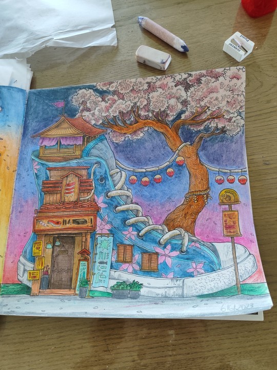
#derwent pastel watercolours
Text
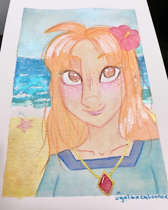
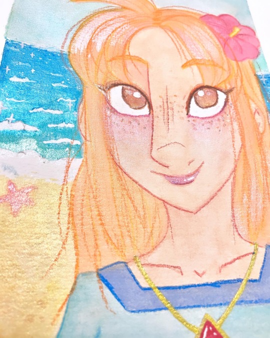
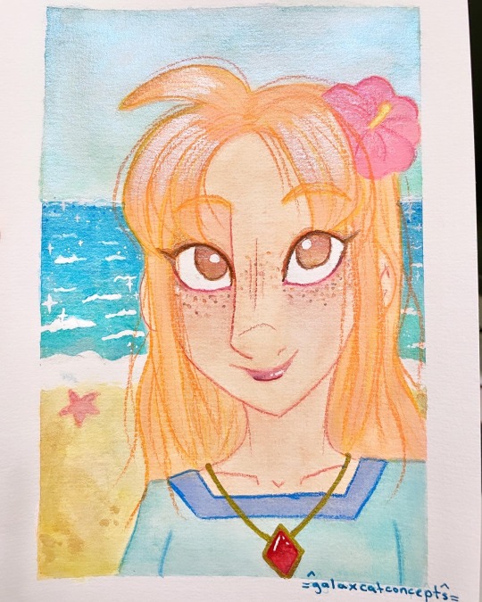
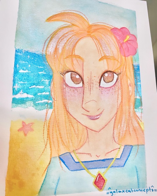
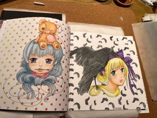
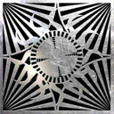
Linktober Day 28: Light/Sparkle/Bright. Marin from Links Awakening on the sparkling beach.
Not the most obvious choice for this prompt but I wanted to use a lot of glittery/sparkly watercolours 😁
#legend of zelda#linktober#linktober2023#Linktober day 28#loz links awakening#mixed media#gansai tambi watercolours#posca pencils#links awakening Marin#illustration#Link’s Awakening Marin#links awakening#gansai tambi#posca#traditional art#my art#zelda#pastel art#derwent pastel watercolours#pastelcore#glittercore
10 notes
·
View notes
Text


5 notes
·
View notes
Note
Your watercolor paintings are amazing!
I'm sorry if this question was there before, but what watercolor do you use, if it's not a secret?
Hello there, and thank you so much for your kind words!
I'm more than happy to share what paints I use!
At the moment, I'm using a lot of a sumi-e watercolour set from Choosing Keeping for my Hollow Knight Art Month pieces, though I don't see the exact palette I got from their London shop here on the website - the others look really cool too. It gives wonderful subdued tones and is really lovely to work with, layers super well once dried but can also be manipulated a nicely when it's still wet. I'm a big fan of their other gansai palette sets as well - I've used their 1930s set and the 1980s set, though I haven't done much yet with either, but I'm really excited to. Be warned: this shop is dangerous, all their art supplies are GORGEOUS, and the bigger/fancier sets are wayyyyy out of my budget!


I also use a lot of Derwent's watercolour paint pan sets. I like to use the Graphitint set, which is watercolour blended with graphite, which gives lovely muted tones that I love for autumn scenes and soft illustrations. I also use Inktense set #1, which has a nice clarity and vibrancy, and is also permanent when dry, so it layers really well without lifting, if that's your bag. The pastel set is also really fun, have a little more opacity (like a gouache-adjacent watercolour) and has a really spring-summer vibe for landscapes or whatever. HOWEVER. You'll pretty much always find somewhere where they're on sale as well - I've never paid full price for them.


And lastly, I looooooooove working with acrylic inks. Most of mine are Daler Rowney FW inks, and they're very fun for projects where you want to work in monochrome.

There are a few other things I've played with, but these are the things I'm using the most lately. Hope this helps, and happy painting!
2 notes
·
View notes
Photo
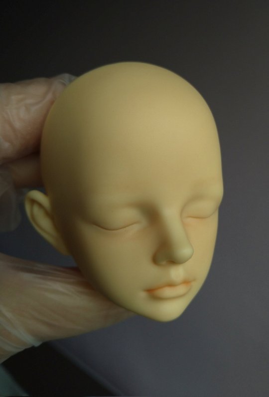
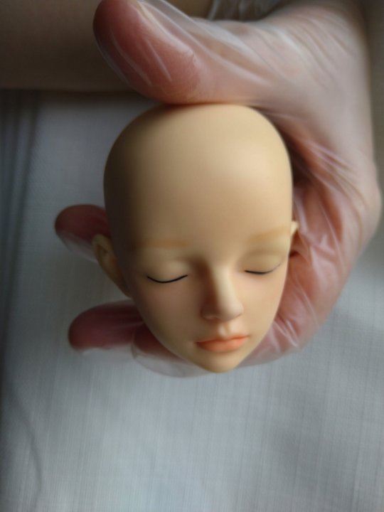
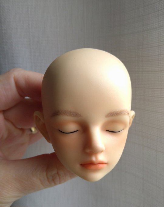


Willhelm faceup process
Will is a MSD (mini 40cm)
VergilCE from Plutodolls https://linktr.ee/PLUTODolls in a Luts KDF boy body.
Materials I used:
Schminke watercolours
Rembrandt pastels
Derwent watercolour pencils
X-22 Tamiya gloss varnish
Games Workshop Munitorum Varnish sealant (matte)
Thinner Mr Hobby 400
Others:
0/2 and 0/3 detail brush
Q tips
Cotton
Magic eraser
Half mask (to use with thinner and sealant)
Eyelashes and craft glue
9 notes
·
View notes
Text
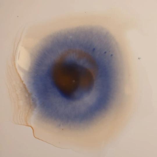
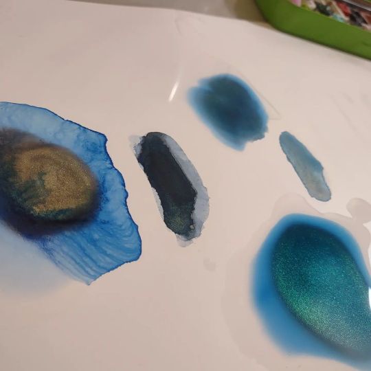
World Watercolour Month 2022 - Day 1 to 15
Day 1
Paul Rubens, Precipitated colours, in the super funky round box. From L to R: Shadow Yellow, Misty Carmine, Dense Cyan, Dusky Purple, Chinese Ink Blue, Country Green

Day 2
One of my favourite granulating convenience colours to come out in the past year is Cesc Farre’s Ocean Grey, currently sold under the Schmincke Horadam family of watercolours. Made with PB29, PBK6, and PG50, you can certainly try your hand at your own concoction. Still available via Jackson’s in the UK, though it is limited edition so it may not last.
I enjoy puddling water on Yupo and watching supergranulating watercolours separate out.

Day 3
Schmincke supergranulating Tundra Violet, made from PB29 and PBR6.
This one moves a lot, and quite quickly. Another puddle on Yupo experiment.
Day 4
Schmincke’s supergranulating Shire Blue, PY159, PB29, PG26.
This moves well in a puddle on Yupo. I do love the lines watercolours leave behind as they dry on Yupo.

Day 5
The lovely red and ethically sourced mica of Beam Paints handmade Wild Salmo

Day 6
Beam Paints - Strange Lake Bed.
Such a luscious blue. It’s hard to see in the image, but when this paint is separating into a still wet puddle of water, it looks like the colours of peacock feathers.
Day 7
Left: Daniel Smith - Rose of Ultramarine - PB29, PV19
Right: Opus - Ethereal - PR177, PG18, PB29
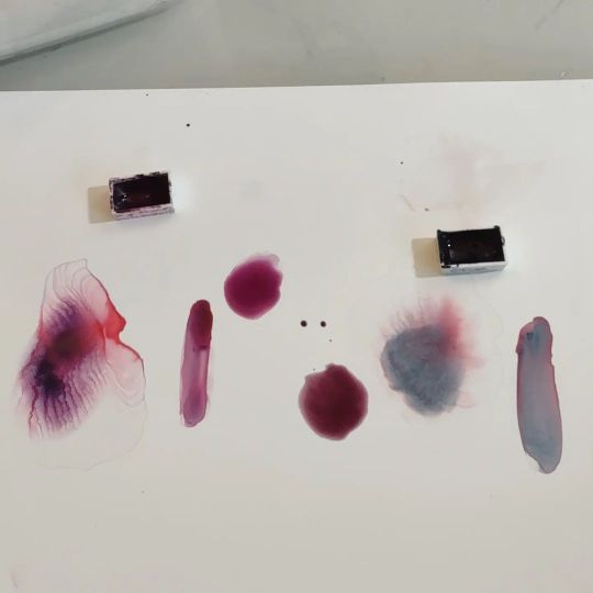
Day 8
Notturne - PB29, PR179 - A. Gallo
Note that A. Gallo uses rosemary essential oil in their mix. These may not be the paints for you if you’re very sensitive to that scent. It’s not really strong, but it is noticeable.

Day 9
Nordmann Green - PG7, PV16 - Isaro

Day 10
Mayan Indigo Gold - Beam Paints
Sadly, I couldn’t get the shot just right to really see the gold, but I assure you its present, however subtle. You can see it in the bottom right somewhat.
I did try to get them to change the name to Indigold, because I’m just that kind of person. :)
Update: Apparently they did change it to Indigold. :D

Day 11
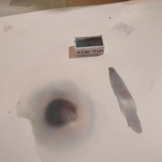
Haze Pink - PR233, PB36 - Schmincke
Day 12
Left: Stoneground’s Vivianite
Right: A. Gallo’s Harbor Blue
Day 13
Random Grey (2022) - Schmincke
This year’s party with the pigments resulted in this grey with sepia tones. Each year Schmincke mixes leftover pigments together and releases the limited edition results. Never the same way twice.

Day 14
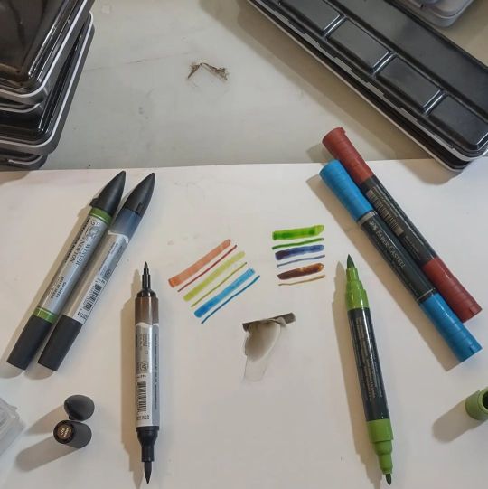
Nowadays the world of watercolour isn’t relegated to pans and tubes alone. These double-tipped markers - the Winsor & Newston on the left (don’t get them mixed up with the dye-based ones in similar tubing) and the Faber-Castell Albrecht Durer on the right - are full of actual watercolour paint. Definitely a viable travel option, since you can paint directly with either tip, or spread the paint out with a watercolour brush.
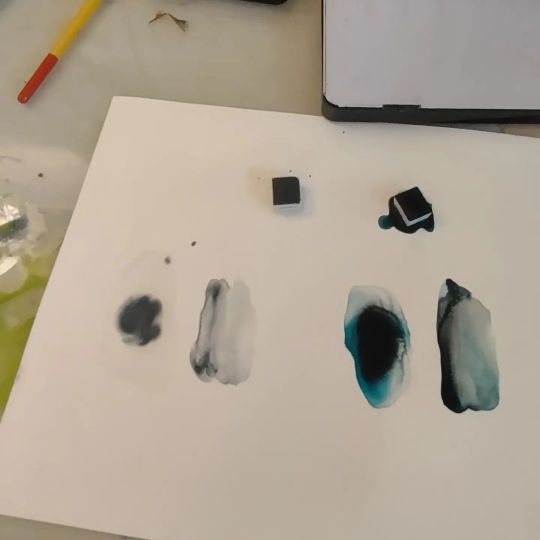
Day 15
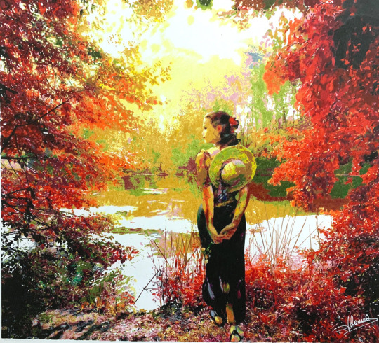
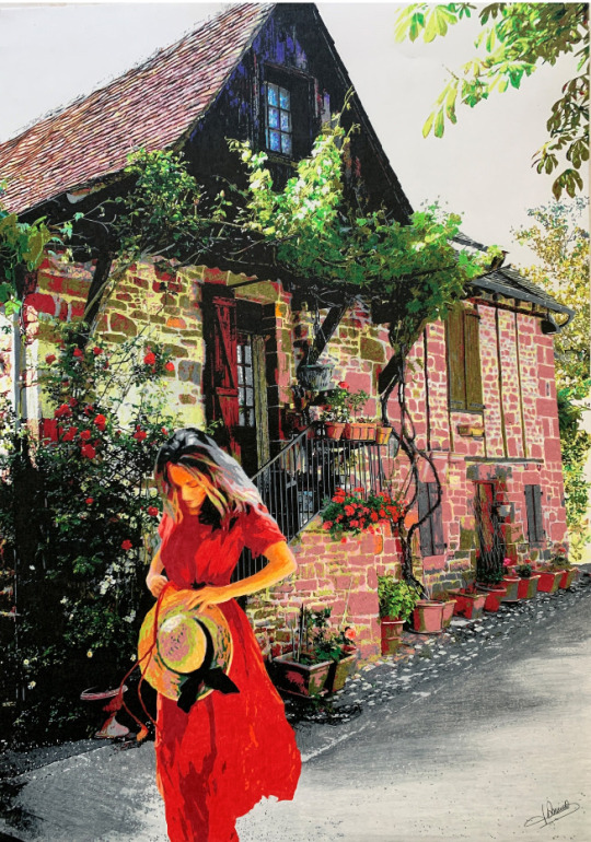
Derwent Pastel Paint Pans are neither watercolour nor gouache, but have aspects of both. As far as I know, they haven’t released the makeup of the paints, so I can’t even tell you what the binder is.

0 notes
Text
The UKCPS featured artist for July is Jaques Dominé. Read on to see how he produces his beautiful work.
Jaques Dominé
My main activity is black and white graphite portraits.
It is at the age of 17 that this passion for portraits came to me it has never left me. I have never taken any sort of studies or courses for arts/painting.
From 1999, I widened my gift by producing paintings of people, nudes, drapery and clothes etc. I became known by winning numerous Jury and Public Prizes at several Regional Exhibitions and Painting Salons in France.
Then from 2010, I started adding a few touches of colours to my paintings, using pastel crayons and rudimentary colored pencils.
In 2017 I realized my first portrait executed entirely in crayons (Tristesse colorée) (coloured sadness).
This desire for colour came to me by chance, when visiting the UKCPS website on the web.
When I saw the beauties that could be achieved with colored pencils, I was amazed and surprised. I didn't think one could achieve such level of realism.
So I looked out for the UKCPS publications on WEB, to know which equipment should be used, and j started.
My main activity of portraits in graphite pencil takes most of my time, so I have only done about ten colour paintings, including two landscapes so far : la dame de l'étang (The Lady of the Lake) and la dame Collonges (Lady Collonges).
It's so exiting to give birth to a landscape, but it takes me a lot of time (about 150 hours) because I like to reproduce the slightest details.
Now the technical side:
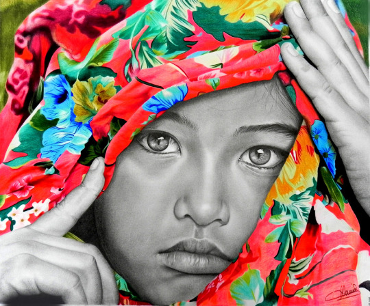
For each work I use the Prismacolor Premier, the Luminance from Caran d'Ache, the Polychromos from Faber Castell, the Castle Arts and some Derwent. Each brand has its specificity; the first two are thicker, but at the same time more fragile, while the Pylychromos and CastleArts are drier. Thus, I have 510 crayons. This allows me to always find the desired shade, since I very rarely superimpose the colours.
My favourite papers are Stonehenge, Strathmore 500 and Caballo 109. These papers show almost no grain and they are pleasant to use. The lead of the pencil glides and the colours spread out perfectly.
I do not often use the traditional eraser but more often an electric eraser to clarify a specific point.
When I choose a landscape, I like to add a fictional character to give a soul to the painting, to spark (suggest) a story in people's imagination.
I start by making a light pencil sketch that I can erase as the work progresses. Then I start the colour by zone like a puzzle, always from top to bottom and from left to right.
I have my own colour charts for each brand, so that (most of time) I quickly find the desired colour. For a landscape I don't need to set the exact tone. On the opposite, I like to engage bright or warmer colours. As I said before, I very rarely layer colors.
Then, I dissolve the colours separately, or between them, to make blends using Blender crayons and colourless alcohol markers.
To make a colour portrait, the principle is the same, except for the shading that I only do with a blender pencil, as it is easier to soften the blendings of the nuances of the skin, without leaving any trace. I always start with the left eye, then the right one, the nose, the mouth, and I end with the hair. If the hair is dark, I finish with the background. If it is clear, I do the background first, before I start the portrait.
The practice of crayons has given me a real satisfaction using this technique. Last month, I participated in a Plastic Arts Fair that brought together all the techniques (oil, acrylic, watercolour, pastel, drawing, etc.) and I had the pleasure of winning the Public Prize.
It was a great satisfaction to see that crayons can compete with all the other more recognized techniques.
For me, drawing is above all a pleasure, a passion. I choose my subjects, my themes, listening to my tastes, my wishes and my mood. Beauty, tenderness, sensitivity and sensuality inspire me, and I am delighted when such emotions can be felt through my art.
0 notes
Photo


Here’s something I did almost 2 years ago at patching's art festival. It was a lovely tester workshop for some water colour wax pastels. Very good fun!
#art#art and design#illustration#illustrator#watercolour#watercolours#water color#water colour art#derwent#Waxpastels#fish#animal#pastel#colourpastels#pastels#art festival#fishes#fish illustration#animal art#artist#artwork#watercolour painting#painting#my art
5 notes
·
View notes
Photo
Sorting through the millions of art supplies I have. Had a rough night, puttin it on paper. #kimbosdoodles #kimboskorner #melancholy #sadness #depression #watercolour #pastel #ink #sharpie #derwent #pencil #sketch #paints #painting #selfportrait #gpoy #kimbosart #ottawaartists #tears (at Ottawa, Ontario)
#kimbosdoodles#selfportrait#gpoy#tears#pastel#kimbosart#ottawaartists#sharpie#depression#derwent#sketch#painting#sadness#paints#melancholy#kimboskorner#pencil#ink#watercolour
5 notes
·
View notes
Photo

🌹 HAPPY EVERY SALES X WOMEN’S WEEK
We’re still not over the International Women’s Day yet. So we’re back to celebrate more this special occation by wrapping up all the good deals for you. The discounts vary from 10% to 40% off for each item. Let’s see if you can choose any favourite items in this list!
🎨 10% off Black Velvet Series 3000S Watercolour Brushes: https://www.kingsframingandartgallery.com/black-velvet-series-3000s-watercolour-brushes
🎨 20% off Posca Markers (please use the code POSCA20 when you check out) https://www.kingsframingandartgallery.com/uni-posca-acrylic-paint-single-markers
🎨 20% off Sennelier French Artists' Assorted Watercolour Tubes https://www.kingsframingandartgallery.com/sennelier-french-artists-assorted-watercolour-tubes
🎨 30% off Liquitex Professional Acrylic Inks: https://www.kingsframingandartgallery.com/liquitex-professional-acrylic-inks 🎨 40% off M Graham Professional Watercolour: https://www.kingsframingandartgallery.com/m-graham-professional-watercolour-assortment
All good things are here. Don’t miss it! #kingsframingandartgallery #art #kingsframingandartgallery #ampersand #richeson #derwent #Fibralo #artsupplies #artproduct #pen #pastel #scratchbord #acrylic #painting #artmaking #drawing #mixedmedia
1 note
·
View note
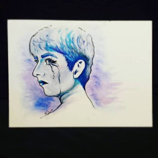
Text

Linktober Day 22: NPC. The mermaid from Link’s Awakening.
Also doubling as a scrawlrchallenge using the Feb 22 Scrawlrbox; Between the Reef.
Gonna add to this one outside the scrawlrbox challenge using stuff that didn’t come in the box cause while I like it I think I can make it a lot better with some coloured lineart. Still good despite the limited art supplies though!
#legend of zelda#linktober#linktober2023#scrawlrchallenge#links awakening#scrawlrbox#traditional art#mermaid#watercolour#watercolours#loz links awakening#pastel colours#pastel art#artwork#Derwent pastel watercolours#zelda#my art#artober#gellyroll#scrawlrbox 078
8 notes
·
View notes
Text
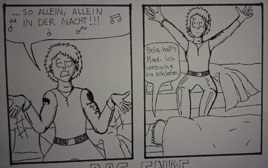
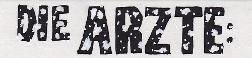
Madness draws: Behind the Scenes of the “Alleine in der Nacht” die ärzte fan comic.
A few weeks ago I posted this comic:

This post is yet again just another drawing behind-the-scenes post but You can go and reblog the original post here.
And as always, all my ramblings are under the cut!
This one was relatively easy to do because I just woke up one morning and internally died from laughter because this idea just happened like a random pop up window in my brain. I wrote it down to my phone notes and later on also into my sketchbook:
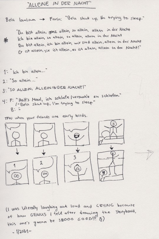
I was laughing out loud when I was drawing those images, Bela’s face still is cracking me up :D And because I’m yet again trilingual with my comics, there’s only one word in my mother tongue and it’s: Bela laulaa = Bela sings.
And other fans might recognize the lyrics of the song, I needed to write them down in order to decide which ones would fit the comic the best.
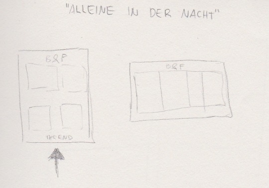
This one is then again me trying to see how it will fit on a A4 paper. Originally I saw it in my head more like a short, regular comic strip with 3 panels but somehow I couldn’t get it to fit into 3 panels. And 4 panels was too many in a row so I decided to go for a full page then. That caused bits of trouble to me because I normally don’t draw the comic book faces THAT big and it’s surprisingly hard to draw them in bigger scale. (With pencil drawings it’s the opposite, the bigger the better. It’s much easier to draw an eye the size of a finger instead of a size of a tip of a needle.)
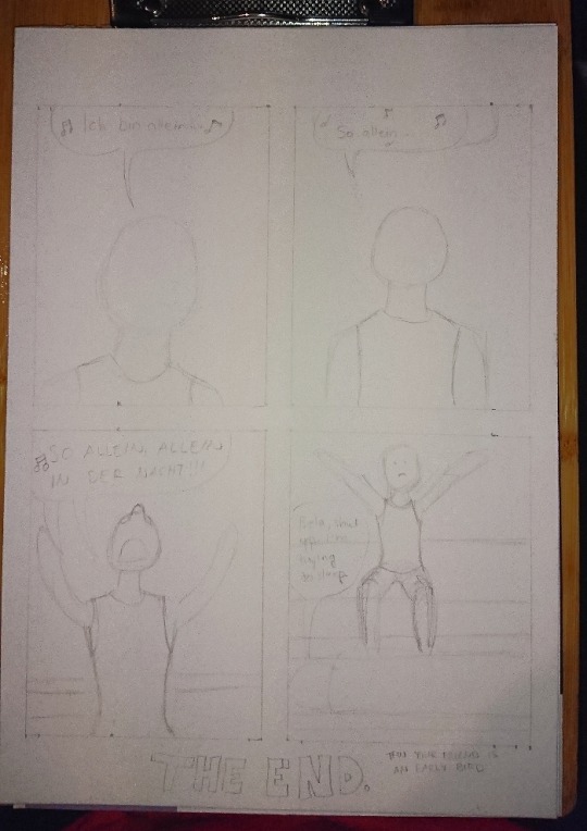
Here’s the first sketch! Just the shapes to see how and what I need to draw. Sorry for the awful photo quality again, my phone’s camera has really gotten really bad after these 3 years of use...
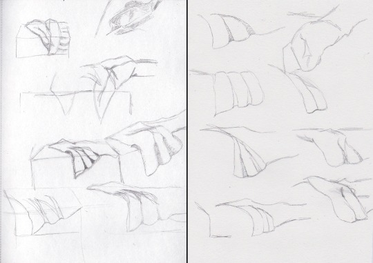
Anyhow, the third panel caused me some troubles because I knew how I wanted Bela’s arms and hands to be but I didn’t see them that good in my head so what I did next was to try different postures into my sketchbook:

I also tried this foreshortening technique I saw in a video of after a Tumblr post, even tho I don’t find that too hard to do myself anymore but it was still interesting and can really help making the eye and brain to see the image in 3D. So here I finally figured that I wanted Bela to have is arms like he was singing something very theatrically. I think it turned out pretty good.
Next I struggled with the bedsheets and I figured that I am a bit too good at blocking out information when I draw because I tried to draw unmade beds from reference photos and I’m able to follow a line but also able to completely not see any other lines around the line I’m following. Like I’d often follow a line to somewhere and suddenly notice that wtf there’s SO MUCH MORE lines all over the place in the photo but I just did not see them.
^Here’s two pages in my other sketchbook that I got for the comic stuff especially because the paper is actually white. The bigger sketchbook has light yellow tint to the paper so it can mess up with the colors when I need to try out and look for perfect colors from the colored pencils. (This sketchbook is also smaller aka A5 because Derwent sketchbooks are expensive but this was the only A5 one with a bit grainy paper in white. The A4 one is cheaper and from Mont Marte.)
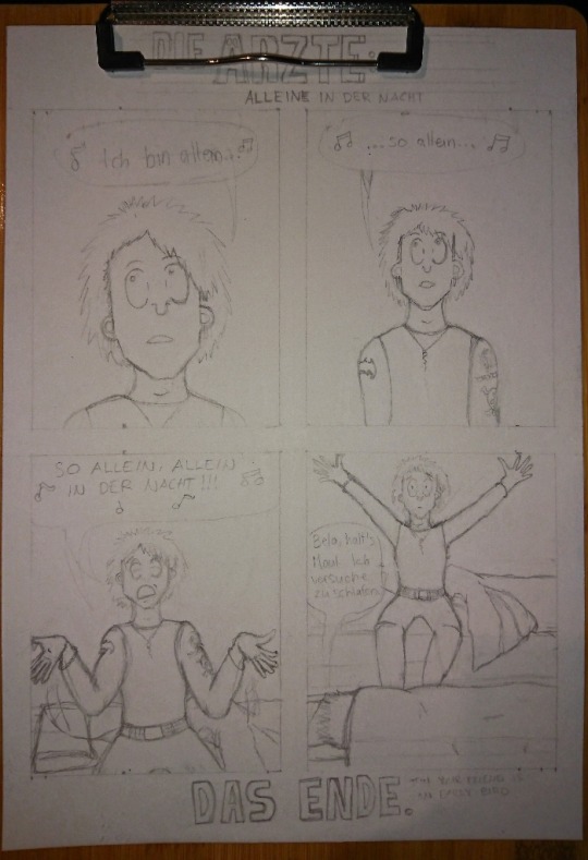
After a while I was done with the besheet and the rest of the second sketch. I don’t have a photo of the comic with just the lineart, only a photo where the first panel is already colored and now I actually need to talk about the coloring.
That caused me lots of trouble because I really love playing with lights and shadows in everything (drawing, photographing... everything) and I do know how to do the night effect in black and white, but I have only once before done that with colors and it’s never that easy. Plus that one was my first comic when I started drawing again in 2018 and it was not that good to begin with.
I run some tests with the pencils, as well as some shading tests:

Käsi = hand, iho = skin. I use Derwent Flesh Pink (I have a 72 set of Derwent Watercolour pencils) for the skin color and was then trying out other colors to see which one would look the best for shading. It was actually really difficult to do and my sister suggested that I’d use only cold colors but like... how do you use cold colors on a skin without making the character look dead? :D
I imagined that there’s a moon shining in from a window that would be behind the “camera”. I almost ruined the first panel because I wasn’t exactly sure what was I even doing and what did I want from the colors:
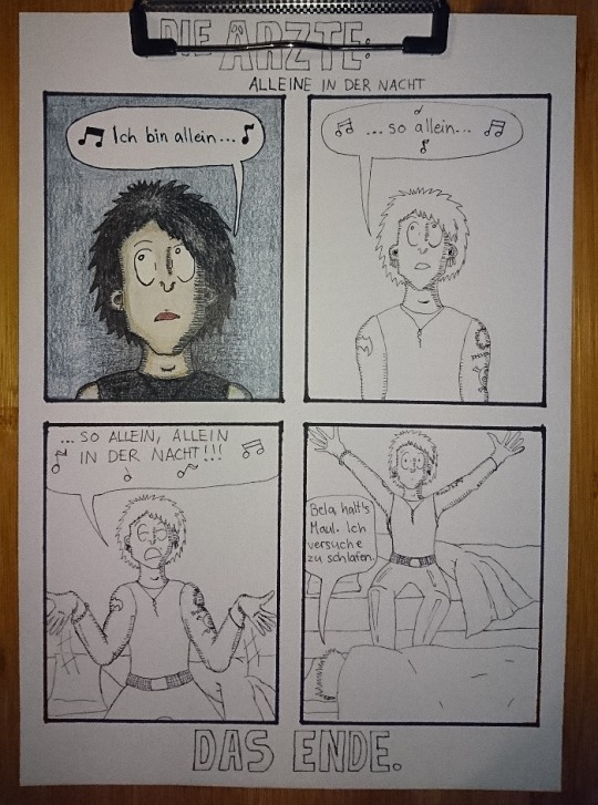
Here’s the lineart and almost finished first panel in colors. I really liked the lineart and this would have looked so nice in black and white too, maybe even better. But I just saw that blue background so strongly in my mind that I just had to go for it.
The first panel was really difficult to do like I said and I almost ruined it at some point. But it also taught me something because with the rest of the panels I knew to start with the skincolors and end with the black (I started the first panel with black, I think... kids, never do that, always start with the light colors! :D) and I think the last panel is the best what comes to the colors in the final comic. I also added light blue here and there to make it look more like the colors of a moon at night:
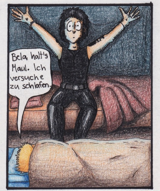
I’m actually very happy with all of the other colors in this panel! It also reminds me of a book I had and used to read as a child. It was about this girl that went to an appendix surgery and all the images were drawn with either colored pencils, pastels or crayons and it looked grainy the exact same way as this one too. It also had lots of red and orange and brown colors in it. (I wonder if I still have the book here...)
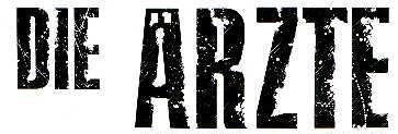
Then there’s also the title and “Das Ende”. Originally I was going to do the late 80s logo they have e.g. on the 80s live vhs/dvd but then I just saw another post in my dä blog’s queue and I just needed to do this logo instead!
I had just a couple of weeks prior ordered a pack of white Sakura Gelly Roll pens and needed to test what would make the best compination and with which black!
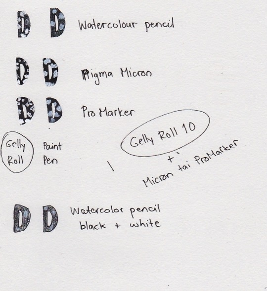
I also had bought a white paint pen but it’s useless. As you see, it just looks grey after it dries and it just... doesn’t look nice. Plus it takes so much time to dry AND it’s extremely messy and I have paint more in my hands and a puddle on the paper but barely none where it should be. So my choice for the logo was to use either Pigma Microns or Promarkers (I think I chose the latter) and the thickest Gelly Roll aka 10. This was the result:
And I’m actually super happy about how it came out! Couldn’t do that good looking spots on the letters because can’t make splashes with a gel pen so I did a few bigger ones here and there and then just poked everywhere with the pen to make it look more random. You can actually see how it’s slightly whiter than the paper if you look closely, but it’s not too strongly whiter so it looks pretty nice like this.
So, this was less work than the “Widumihei” one but it was also an interesting piece to draw. And I think I have now this comic drawing more freshly in mind so that drawing the next ones (there’s three waiting for sketching already) will be much easier as well :)
#here take the last behind the scenes post then#I mean next ones are going to be actual new drawings because now I'm done with these I had in mind#mcrmadness draws#mcrmadness draws: behind the scenes#my comics#dä fanart#die ärzte
7 notes
·
View notes
Text

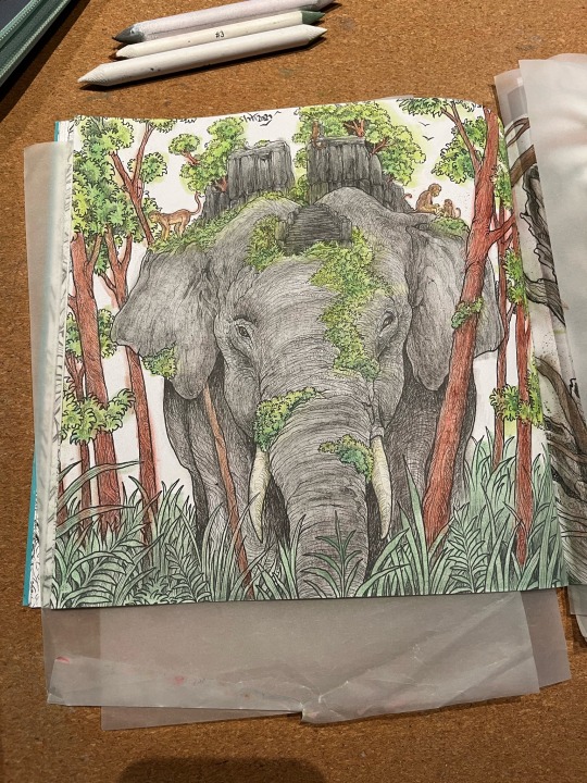

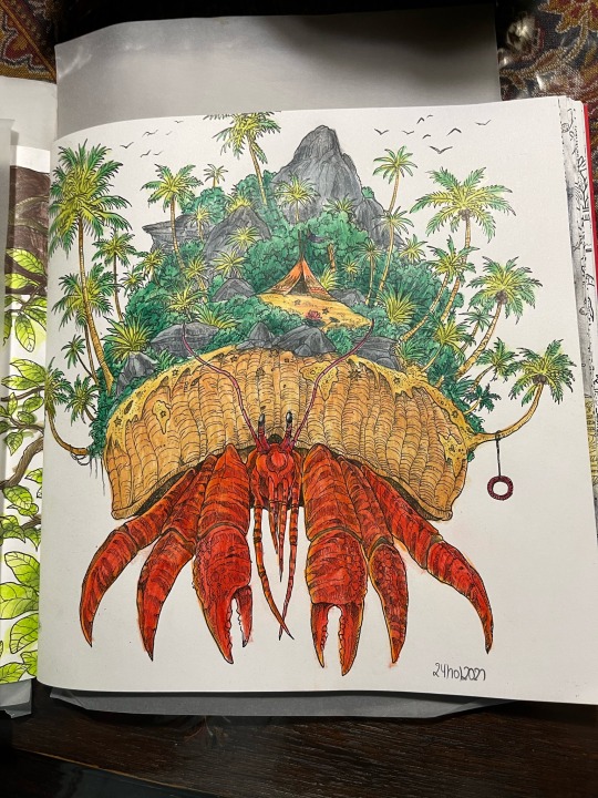
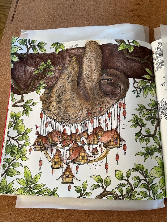

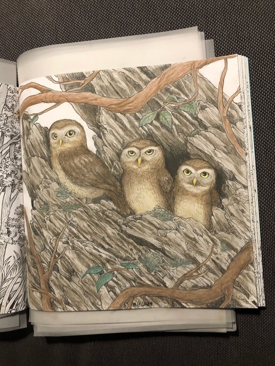
Relaxing hobbies: adult colouring books - part five
#kelly colours#kerby rosanes#camilla d'errico#derwent#caran d'ache#watercolour pencils#pastel pencils#pablo#adult colouring book
5 notes
·
View notes
Text
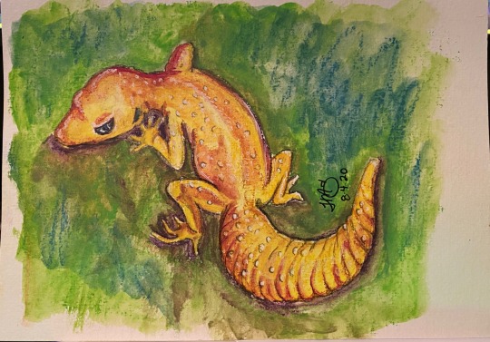
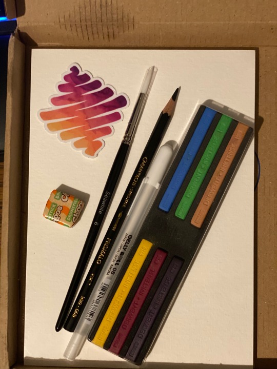
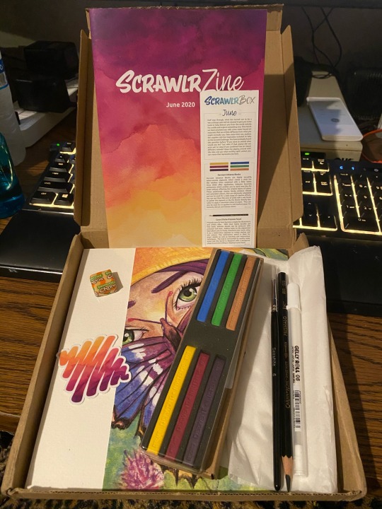
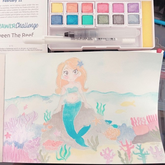
June 2020 Scrawlrbox
So this @scrawlrbox art subscription was a little on the fence for me.
The #scrawlrchallenge was Spirit Animal but I will admit that I really don’t know what mine would be at this point in my life. HOWEVER, all my life I have had a love for any sort of gecko jewelry. So I decided to try my hand at a Leopard Gecko since I actually have one.
I generally do not do well with crayon/pastel type mediums but this one kind of worked better than I anticipated. The Derwent Inktense Blocks were pretty pigmented and made a decent wash as well. I didn’t really get much precision but I could kind of fix that with a little water and the brush. Now the Caran D’Ache Prismalo Pencil is, by far, the BEST watercolor pencil I have tried to date. It added the perfect outline and made an easy light sketch to start. The pencil worked incredibly well with water that I kind of fell in love. Now, I know everyone loves the Gelly Roll pens but I never managed to ever get one to work as well as have been claimed and this time wasn’t any different. Even once the painting was dry I just couldn’t get the white to lay down over the color very well. Now the paper actually held up well considering my artist tape ended up as a chew toy and I had nothing to hold the paper down. I definitely had no complaints.
In the Box:
*Derwent Inktense Blocks
*Caran D’Ache Prismalo Pencil
*Seawhite Synthetic Round Brush
*Gelly Roll 08 White
*SeaWhite 350gsm CP Watercolour Paper
#tmsillustrations#watercolor#traditionalart#scrawlrbox#scrawlrchallenge#watercolorpainting#leopard gecko#leopard gecko art#derwent#derwentinktense#carandache
11 notes
·
View notes
Note
Hi Mom! Not sure if you have it listed anywhere (I browsed your blog to the beginning but might have missed it! in that case do excuse me please!), but I was wondering what you materials do you usually use for your art? I like the textures and atmospheres in your art
Heya lil’ kinkling! I’ve talked about that over in my old blog couple of times but since the search doesn’t work over there I won’t even try to dig anything up.
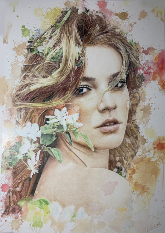
I don’t have any sort of favourite paper, it changes with my whims and with what seems to work out the best for the kind of piece I’m doing. Sketchy and pastel-y works are done with just a pencil and then coloured digitally. Complete pieces are lined with fineliners between sizes 01 to 003 (dunno if Americans measure the tips in a different way) and inked with Promarkers, I like their smooth texture the best and my collection is ENORMOUS. Detailing and additional texturing is done with coloured pencils, like blushing and eyebags. My current coloured pencil pack is Derwent Studio 72 but I must admit that I use regularly like 5 pencils in there... Very, very rarely I use watercolours, which I’ve usually noted in these cases in the description.
Plenty of what you see is also the digital editing, where I just go wild. Scanned works look rather harsh raw.
3 notes
·
View notes
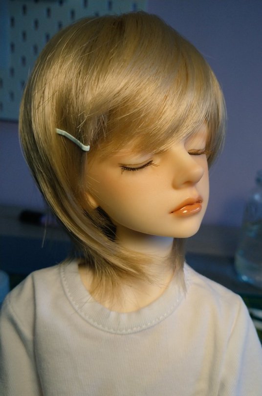
Photo

Still working on this little Enchanimals. The face textures are a little more rough than the monster high dolls. So there’s a little difference I’m noticing. I’m using all the same materials on this doll at this point that I have always used. Pure acetone to remove the factory face, MSC for the sealer, Derwent watercolour and inktense pencils and schmincke soft pastels. . . . . #artdoll #colourtothebone #colour2thebone #customdoll #customrepaint #customooak #custommonsterhigh #create #doll #dollooak #etsy #etsyshop #etsyseller #reroot #monsterhighreroot #kindmonsters #mh #monsterhigh #monsterhighrepaint #monsterhighcustom #monsterhighooak #ooakdoll #ooakmonsterhigh #ooakcustom #ooakrepaint #repaint #tearsofcolour #ooak #enchantimals https://www.instagram.com/p/B3qaswrgPZl/?igshid=top701cy7s1o
#artdoll#colourtothebone#colour2thebone#customdoll#customrepaint#customooak#custommonsterhigh#create#doll#dollooak#etsy#etsyshop#etsyseller#reroot#monsterhighreroot#kindmonsters#mh#monsterhigh#monsterhighrepaint#monsterhighcustom#monsterhighooak#ooakdoll#ooakmonsterhigh#ooakcustom#ooakrepaint#repaint#tearsofcolour#ooak#enchantimals
10 notes
·
View notes
Text
Nadine April Glover


Nadine is a local artist originally from back home in Alston, Cumbria.
She is inspired from her environment of the countryside and Scotland, and also the fact she is in love with the world she lives in and the animals that are in it.
To create her pieces she uses media’s of mainly pencils - Faber castel, derwent, pastel pencils and watercolours.
Her studio is a purpose built wooden lodge at the bottom of her garden. With a massive drawing table and lots of shelves with my gift stock and materials.
1 note
·
View note
Last Seen Blogs

jihopefuls
jihope trash™
boyfriendandpopcorn-blog
boyfriendandpopcorn
steelgohst-blog
Untitled
huezem-blog
1 Peter 5:7
lovefinale-blog
Kartoon