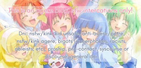
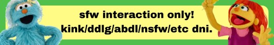
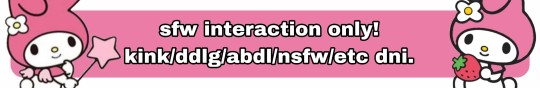
#dni banner
Text
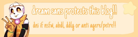
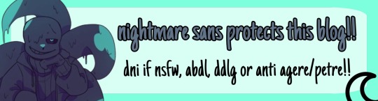
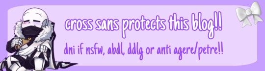

> sans dni banners!! f2u with credit!!
> divider from here!!
#undertale#underverse#dreamtale#xtale#dream sans#nightmare sans#cross sans#agere#age regression#sfw age regression#autism#adhd#dni#dni banner#stimblr#sunny makes
30 notes
·
View notes
Text
i made some more banners bc i love the funny ones but i thought it would be nice to have more simple options as well. so of course they're eras themed


#taylor swift#swifties#dni banner#swiftie banners#blabs#*taylor#i didn't use the real font for speak now bc it's like impossible to read lmao#obviously debut isn't the title font either but it's the font that was used for the back cover tracklist etc#sadly lover is not a font at all but that's the best similar one i've found#50#100#500#1k#mine*#banners
1K notes
·
View notes
Text
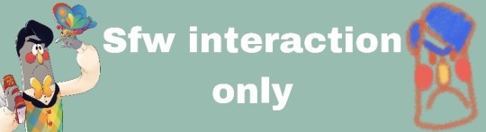
SPRINKLES AGERE STIMBOARD
⋇⋆✦⋆⋇ ⋇⋆✦⋆⋇ ⋇⋆✦⋆⋇ ⋇⋆✦⋆⋇


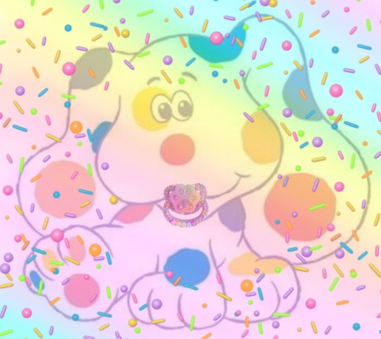

I went with a pastel kidcore theme for this one!! Hope you guys like it!!
REQUESTS ARE -> OPEN

#agere blog#stimboard#agere stimboard#agere moodboard#moodboard#petre moodboard#petre stimboard#pet regression#sfw petre#sfw interaction only#sfw agere#sfw regression#sfw littlespace#blues clues#sprinkles blues clues#dni banner
215 notes
·
View notes
Text
Free to use dni banners ! ✦


all f2u and no credit needed !
like to save and / or reblog to use !
#dni banners#dni banner#agere dni banner#sfw agere#agere#age regression#sfw age regression#agere dni banners#age regressor#sfw regression#agere community#agere blog#safe agere#ageregression#agere sfw#age regression sfw#age regressive#age regression blog#age regression community#sfw age dreamer#sfw agedre#sfw agere blog#sfw caregiver#sfw little#sfw#pet regression#dividers#petre#pet regressor
268 notes
·
View notes
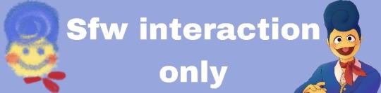
Text
DNI Banners: free to use, credit appreciated ( ◜‿◝ )♡
Part 8 ☆


#agere blog#age regression#agere#sfw agere#sfw interaction only#sfw age regression#age dreaming#agedre#agere moodboard#agere boy#boyre#agere dni banners#dni banners#dni banner#fandom agere
142 notes
·
View notes
Text

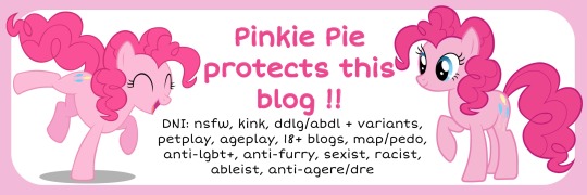

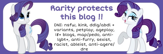
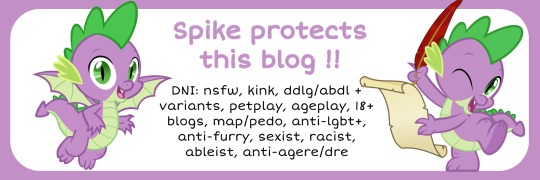
MLP Gen 4 DNI Banners !! ~
⋆𐙚₊˚⊹♡
#agereg blog#age regressor#agere positivity#agedre blog#agere blog#age dreaming#agere community#safe agedre#sfw agereg#age regression#agedre community#agere safe space#fandom agedre#noncom agedre#sfw agedre#agedre positivity#sfw age regression#sfw regressor#sfw agere#sfw regression#dni banner#baby regressor#baby regression#sfw toddlerre#agere toddler#toddler regression#agere kiddo#mlp g4#mlp#mlp friendship is magic
76 notes
·
View notes
Text


Hello!! I made some Regretevator DNI banners!! I started playing recently, and I've been super enjoying it ,, feel free to rq more!
F2U!!!! Credit not nessecary but appreciated :)
#sfw age regression#age regression#sfw agere#agere#regretevator#regretevator agere#fandom regression#dni banner#dni banners#primarys banners
79 notes
·
View notes
Text


Welcome home dni Banners🍎🐛💌
Please tag me if you use them I love seeing all your posts
#welcome home#age regression#agere#sfw agere#agere aesthetic#agere community#safe regression#sfw regression#age dreaming#agere dni banners#dni banner
323 notes
·
View notes
Text
hey y’all!! I know it’s hard to stay safe in these uncertain times, especially with the alternate invasion going on, so I made some cute and helpful little banners ^w^ feel free to use with credit and stay safe everyone !!

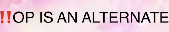
#actual sugar post#these are so low effort good god#this is a JOKE btw#feel free to use these also#unreality#tmc#the mandela catalogue#dni banner#banners#cw unreality
187 notes
·
View notes
Text
these are all free to use, modify, whatever you want to do. i can change the text and the colors if anyone wants
DNI banners


58 notes
·
View notes
Text
Some banners for the lovelies at the hotel <3 (I will be making banners for some of the other characters too, including Sir Pentious, Lucifer and others!!!)

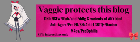

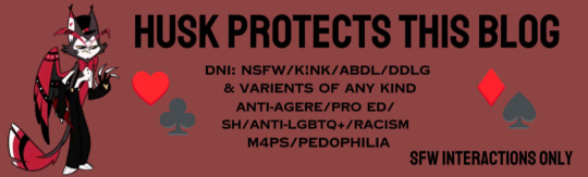
#agere blog#sfw agere#sfw littlespace#sfw little post#little space#agere little#aewlittlerambles#sfw little community#agere dni banners#dni banner#hazbin hotel agere#alastor#charlie morningstar#vaggie#angel dust#husker#niffty
51 notes
·
View notes
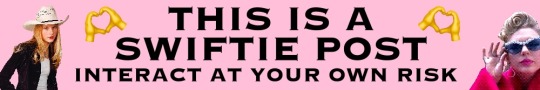
Text
i made us a banner
#legit if you want to use this feel free ajdhshdjsk no need to credit or anything#taylor swift#swifties#dni banner#swiftie banners#blabs#*taylor#50#100#500#mine*#banners
897 notes
·
View notes
Text
Making Accessible Interaction Banners - a Guide by Binoo "ChildrensWard"
Interaction or "DNI" (do not interact) banners are a staple of the age regression community, but too often are they made without taking accessibility in mind, whether it's because they're unreadable, have excessive eye strain, or aren't marked with alt text.
Therefore, in the hopes that I can help people out with this, I decided to write a mini guide on how to make your banners accessible for as many people as possible!
Under the "read more" cut, this guide will cover the following:
Fonts, and how to choose the best ones
Text, and what your interaction banners should say
Colour contrast, and why it's important in making your graphics accessible
Eye strain, and why it generally should be avoided
Alt text and image descriptions, and how to write them
And an example of an interaction banner I made using the criteria I've written in this guide!
So, without further adieu, let's get into the real meat of this guide!
Fonts
Fonts are easily the most important thing about an interaction banner! It's how you're going to best convey the contents of your banner in a way that's readable to the viewer. Here's a quick and firty rundown of the different kinds of fonts, as well as which ones you should (and shouldn't!) use for your banner:
Body Copy fonts are your basic Sans and Sans Serif style fonts that you'll most often find on books and websites, because they're some of the easiest fonts to read in smaller text (10-14pt) due to their lack of details. Examples of Body Copy fonts include PT Serif, Arial, Comic Sans, Roboto, and Helvetica Now.
Display fonts are often used for headers and subheaders and include features such as being thick, having unconventional letters, and, on occasion, being in all caps. However, these fonts should not be used for body or small text, as they will be very hard to read. Examples of Display fonts include Futura PT, Elephant, Noto Serif Display, and Shoreditch.
Script and decorative fonts are subtypes of display fonts, with the former having a handwritten quality to them, while the latter are considered to be the fun display fonts. However, you should be very careful with using either of these fonts- not only can they be hard to read on their own, but neither should be used specifically for body or small text in any circumstance. For the sake of readability and accessibility, however, I'd be more inclined to avoid using these fonts.
Text
Aside from the fonts that your text will be written in, the text itself is also a mandatory aspect of your banners. After all, it's what banners are entirely based on, and it's the very thing that tells you who can and can't interact with your posts.
However, there's something important to keep in mind, and that is how much text you're trying to cram into your banner because you're trying so desperately to fit your entire DNI criteria onto it.
What I think is important when it comes to making your banners is to keep any text you have on there as short as possible. If you bombard your banner with all this specific criteria, then you're more likely to make your readers confused, whether or not they happen to be a screen reader user.
When making your banners, ask yourself the following questions when deciding on your criteria:
How likely is it for someone interacting with the age regression or similar communities to fit this criteria? Have I come across a good number of people who fit this criteria that makes it worth mentioning?
Is this criteria at all relevant to the content I'm presenting? Do I need things like inter-community discourse terms from other communities on my banner if I'm making content specifically for age regression?
Is there any "unspoken" criteria that everyone agrees upon that doesn't need to be included? These might include nazis, racists and white supremacists, homophobes and transphobes, ableists and eugenicists, misogynists, anti-choice, etc.
If your answers show that the specific criteria is not relevant, then it's best to leave it out to keep the information on your banner more clear and concise.
Colour Contrast
While colour contrast is something often talked about in web development circles, it's also an important skill to learn when making any sort of graphic design- which is what interaction banners essentially are. Without taking colour contrast into mind, you're left with a banner that may not be easy for most people to read; let alone those with low vision or blindness. We also need to think about things like people who may be using old or outdated monitors, people reading on smaller screens (like a smart phone), and bad lighting and glare. As Contrast Rebellion puts it: aesthetics are important, but aren't the ultimate goal of design.
Okay, so you've understood the reason why colour contrast is important, but how do you put it into action? How do you know your colours of choice are readable?
Well lucky for us, there's many resources out there that help us in choosing the right colours! Here are a few of my favourites:
CSUN: Color Contrast - An introduction article on colour contrast, why it's important, and some examples of good and bad colour contrast choices.
Random A11y - If you don't have any colour combinations in mind, Random A11y is here to help! With it's vast amount of randomly generated colour contrast combinations, you'll have plenty of options to work with. Don't like the combination you're given? Just click on the "new colours" tab to generate a new palette!
Colour Contrast Analyzer - This is a free program for Windows and Mac that helps you with colour checking with a variety of different features; including multiple ways to select colours (CSS color formats, RGB slider, colour picker tool), and a colour blindness simulator.
Accessible Colors - If you don't want to or can't download the program above, then this website works just as fine with checking colours, too! Just enter in the hex codes of your colours, the font size and weight, and which level of conformance you'd like your colours to pass.
Eye strain
A bit of a sore topic for some, but I feel I must put it bluntly for people to understand: making your colours easy on the eyes of the viewer should be your top priority over your aesthetic. Some people, like myself, have certain health conditions that are triggered by eye strain, and by continuing to slap extremely contrasted rainbows on your banners, you're continuing to put disabled people through worsening symptoms, all because you feel the need to retain your aesthetic.
Many of the same resources shared in the Colour Contrast section can also help you to rule out any eye-straining palettes. Also, a general rule of thumb to keep in mind is: if a colour palette is eye straining enough to cause you some mild problems, then it's enough to cause someone with a disability more severe symptoms.
Alt text and image descriptions
I think a lot of us find writing alt text to be daunting- I know I did for a long while, which is why I never wrote any for my posts until recently. But really, once you get the hang of it, it can be very simple and easy to write! Even so, people who don't know how exactly to write alt text often fumble with this- either writing too much or too little, not being clear enough, or just copying the image caption and calling it a day.
Here's some tips and tricks on writing better alt text:
Alt text generally follows the Object-action-context rule. In the words of Alex Chen at Medium: The object is the main focus. The action describes what's happening, usually what the object is doing. The context describes the surrounding environment.
Be specific and concise, and even consider the content of the post or webpage it's on as well. You'll also want to consider the function or purpose of the image, and what you want your viewers to gain from it.
Keep your alt text short, as long descriptions with too much flowery language and filler words can be distracting when using a screen-reader. Generally, most screen-readers will cut off alt text at around 125 characters.
Avoid using "image of..." or "picture of...," as HTML codes will already identify your images as such. However, in this case, mentioning what type of image it is can add context.
Always check for spelling mistakes, as this can affect the user experience, causing interruptions and confusion.
Not related to interaction banners specifically, but avoid including alt text for decorative images that are used to make your post prettier. In this case, insert the word "null" in your alt text fields.
Image descriptions are a little different in the fact that they're allowed to be more descriptive than alt text, considering screen readers won't be able to cut off any alt text at 125 characters. Even so, it's still best to keep your image descriptions as short as possible to save from redundancy and confusion.
Please remember that writing alt text and image descriptions can take a lot of practice and trial-and-error, so don't give up if you can't get it right the first time! Write and rewrite it as much as you need to, or even consider changing your interaction banner altogether if you think it can't be described in words concisely.
An example
Taking what we've learned above, let's take this banner I made just for this post as an example of these characteristics put into action.
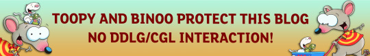
In this example, I have chosen the hex colour #4D0000 for my text colour, and the colours #B5F3DC and #E3B158 for my background. According to CCA, the contrast ratios for my colours of choice are 12.8:1 and 7.9:1 respectfully, which both meet the minimum contrasts of 1.4.3 for AA and 1.4.6 for AAA.
I have chosen the font FS Lola Bold, which is a type of display font that's best for headers and subheaders, but not so much any body or small text. I don't have to worry about this though, because I don't have any small text in my banner.
I've also kept my criteria to a simple "No DDLG/CGL interaction," because I feel that this is the most relevant information regarding the content of my blog and the posts I make. Short and simple, yet specific to who I don't want interacting with me. I also like the idea of my favourite fictional characters protecting my blog, which is why I've included another short sentence for it!
Here's an example of what the image description or alt text for this banner could look like:
[Image description: Banner that reads "Toopy and Binoo protect this blog, no DDLG/CGL interaction!" On it are the titular characters from the show. /End ID]
And if I were to have both alt text alongside an image description, then the alt text could be as simple as what the banner reads, which would be:
"Toopy and Binoo protect this blog, no DDLG/CGL interaction!"
Remember, you don't have to go into every little detail with your image descriptions or alt text, because then it can become very confusing for certain people to decipher! Keep it simple and state the minimum.
Closing words
I think that's everything that I wanted to cover in this post. Of course, there's more to accessible design than just text and fonts alone, but when it comes to interaction banners, it's usually the focal point of the images, which is why it's so vital that people with disabilities can also read your banner- especially when they contain important information about your personal boundaries.
Age regressors often pride themselves for the image we've set up for our community, that it's safe for everyone to join and no one will be judged or excluded for who their are. But the reality is, we still have lots of work to do before we're ever at that place, and making our community more accessible is just one of these steps that we should all be encouraged to take. Besides, what kind of message are we sending if we don't take the steps to make our space as accessible as possible? How do you think it'd feel to realize that a community you wanted to join is actively hostile towards you because of the refusal to learn how to accommodate for them? Especially when we have such a huge demographic of disabled people in the community, we can and should be doing better to accommodate for everyone as much as we possibly can.
Learning accessibility is a skill that requires time and practice, and I don't expect anyone to be perfect at it the first time around. The aim of doing these things isn't to make sure that every single thing is 100% accessible in every single way imaginable and with no mistakes whatsoever; but to instead encourage, develop, and incorporate good accessibility practices into our every day lives.
Thank you for reading,
- Binoo
#age regression#agere#agere community#sfw age regression#sfw agere#age dreaming#agedre#sfw agedre#dni banner#interaction banner#accessibility#a11y#long post
125 notes
·
View notes
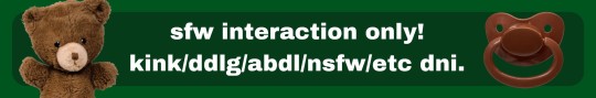
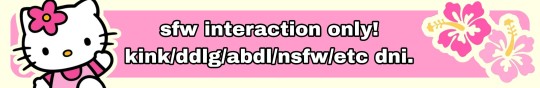
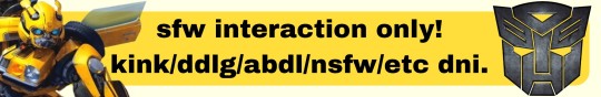
Text
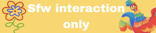
Sfw interaction only gradient banners!


free to use, no credit needed, just like or reblog first!
#age regression#age regressor#agere#safe agere#sfw agere#agere community#agere post#agere blog#sfw regression#ageregression#age dreaming#agere sfw#sfw age regression#age regressive#agere little#little safe space#age regression caregiver#sfw age dreamer#sfw interaction only#dni banner#agere banners#dni banners
157 notes
·
View notes
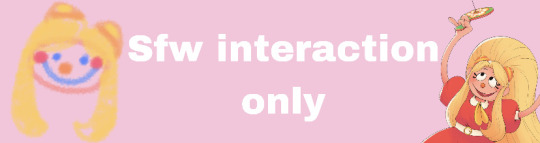
Text
DNI Banners: free to use, credit appreciated ( ◜‿◝ )♡
Part 6 ☆


#agere blog#age regression#agere#sfw agere#sfw interaction only#sfw age regression#age dreaming#agedre#agere boy#boyre#agere dni banners#dni banner#dni banners
130 notes
·
View notes
Text
— 𝐃𝐈𝐕𝐈𝐃𝐄𝐑𝐒 ୧ ‧₊˚
below you will find all the dividers and banners i have posted, made, shared, what have you. these are all customizable and i'm 100% okay with you changing the colors and requesting more colors. but please do not claim as your own.
requests are currently [✓] open [ ] closed

misc dividers.
floral spooky
random symbols
minors dni.
rounded edges
hearts
18+ warning
support banners.
gradient
etc banners.
fall navi's
#i'll make this cuter later i have no strength to do it now lmao#dividers#banners#random dividers#random banners#minors dni banners#support banners#dni banner#content warning banners#ʚ laurs art ɞ
109 notes
·
View notes
Last Seen Blogs