#green light spectrum
Text

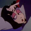
made these edits for the age swap au. dies
#there were supposed to be like two others#accompanied by sketches of my own#but i ended up pushing them so far back that they never saw the light of day#so i was like fuck it#i’ll take the one thing that’s actually presentable and post that#so here you go#for tome’s suit i took the blue from her seifuku and picked a color from the opposite end of the spectrum. which turned up a nice brown#if she had a tie i’d make it green#cnp rants#mp100#reigen arataka#tome kurata#mp100 ageswap
263 notes
·
View notes
Text

Bad Sansuary Day 16: Fragile
Yeah bones sure are
Killer -> rahafwabas
#Star’s Scribbles#badsansuary#Killer Sans#UTMV#Saucer#UTMV Oc#QUEUE#the colors for this one made me want to fistfight the light spectrum#RED AND GREEN ARE LIKE. OPPOSITE#the compromise is the colors u see here#this is fine 👍#Wait oh my gah#happy birthday to my little sister when this posts!!!
40 notes
·
View notes
Text
My pet peeve is when I see a cover, a colour spread or an anime adaptation of a manga, and the characters' hair and eye colour don't match with I thought it would be, based on how they were represented in the manga
#this is a stupid pet peeve but 🤣🤣🤣#I don't mean specific colours btw but like on the darker or lighter spectrum of the colour palette#why would you “colour” the manga characters' hair and eyes with dark ink just for them to have a light hair/eye colour in the anime 😭#sorry I don't know the correct terminology#I thought Hiyori and Toki would have black or dark hair and dark eyes... and in the anime they're light mint green and blue#same thing with Boa Hancock and now Doll.. what do you mean they have blue eyes???? no fuck you they don't.. they have black eyes thank you#also with characters in naruto... jjk... etc..#like why does Karin have darker hair and eyes in the manga but has bright red hair and eyes in the anime...#while Gaara and Sasori have lighter hair in the manga and yet in the anime their hair is darker than Karin's!!!!#how does this work 😭😭😭😭#I know there were other examples but I cant think of them rn 😭#i hope I'm not the only one thinking this tho...#guya posts#one piece#naruto#jujutsu kaisen#anime#manga
23 notes
·
View notes
Text

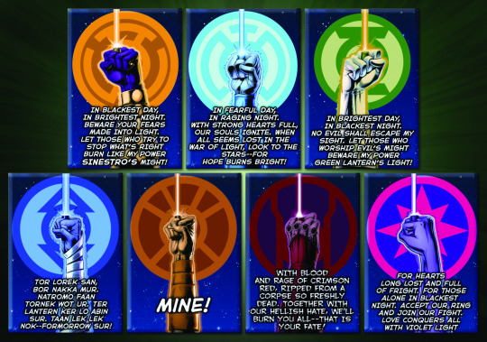
Lantern oaths. What’s your favorite?
I added the different version of the red lantern one that Razer says. I didn’t add Aya’s cause hers didn’t actually work :(
Sorry I also didn’t add the black or white lantern oath. Maybe I’ll do a separate post for those.
And here’s the English version (or a version so to speak) of the indigo lantern oath.
I think my favorites are the red and green lantern oaths. :D
#dc comics#dc#dc universe#razer gltas#lantern oaths#green lanterns#red lanterns#orange lanterns#blue lanterns#star sapphires#yellow lanterns#sinestro corps#indigo tribe#hal jordan#emotional spectrum#color spectrum#hope will fear love rage greed compassion#death and light too
29 notes
·
View notes
Text
Atsushi's back in the game!!! ۶( ˆ o ˆ )
#And Kouyou!!!!#Also. I can say Steinbeck is kinda 👀👀👀#King of the specific category of “I forget I like him until he's on screen”#I'm seriously unlocking memories with this rewatch. Like I haven't thought about it in two years–#but I just know when I was watching the anime for the first time I was being like#“Of COURSE the villains need to spend several minutes each episode explaining in detail how their own superpowers work so that the–#protagonists can get a perfect idea of how to best counter them. Why are villains made so freaking stupid in this show” aljhvwslchvqliyqwb#But. Eh. I guess that's just bsd to you.#Alsoooooo random thought of the day: I don't really favour how Tanizaki's ability was adapted in the anime.#I very well understand they were going for this green Matrix-like illusion effect‚ but every time someone says “... Snow?”#I'm like please explain where do you live that has snow glowing green.#Aamsjgvfaskjhfv sorry this is me being very. Cranky and nitpicky and having terrible audience etiquette in refusing to–#engage in suspension of disbelief. It just bugs me akvakcvqkyb I just feel like... Green is such a non-snow color–#that quite of completely disrupts the Light Snow / Sasame Yuki aesthetic. I would have liked it much better light blue or simply white.#What else. The way the Guild just goes on at stereotypes still troubles me a lot. The “usamericans can't be touched by laws–#because they use money to corrupt anyone” “foreign criminal organization come in our country to corrupt our pure and untouched soil”#Idk. Maybe all of it is true. Can it still be deemed a stereotype when it's objectively something that's happened before–#and will probably keep happening?#I suppose I'm just not a fan of the constant hostility against any foreigner. Idk.#This situation besides is extremely ironical. If you meet me irl it probably won't take long to see me being very outspoken about–#how much I despise usa cultural colonization of all other countries. It's something that really bothers me‚ how rooted and pervasive–#their influence is. So in a lot of ways I can relate to the author's sentiment#I just feel that. If you start treating them as stereotypes and ignore the complexity of a country and the wide spectrum of causes–#that contribute to its attitude in international relations. You end up practicing precisely what you're trying to criticize.#Okay this is the last time I'm getting into the politics of the Guild arc lol#random rambles#This time I took watching the episode slow I feel a little late
10 notes
·
View notes
Text
My mom's doing a kinda craft project with her students (they're making a can with sensors to launch from a rocket anyway that's not the point) and she's going to make the parachute for them because she has a sewing machine and they want to get the name of the school on it so she did a trial for that today and she showed the result to me and. You guys. I have to show you the result.

This is perfect.
#mine#aromantic#happy aromantic spectrum awareness week everyone#aro#any idea what i should do with it she gave it to me when i asked#it's an old piece of fabric about 1 hand in height and 3 in length#it might not look like it here because the light is shitty but it's sky blue and the ARO is pale green#processing vortex#image description in alt text
6 notes
·
View notes
Text
If we know what colour the solution appears, we can determine which colour is being absorbed using a colour wheel, like that shown in figure 13.37.
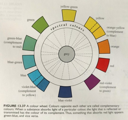
"Chemistry" 2e - Blackman, A., Bottle, S., Schmid, S., Mocerino, M., Wille, U.
#book quotes#chemistry#nonfiction#textbook#color wheel#light absorption#light#visible spectrum#gray#yellow green#yellow#orange yellow#orange#red#red violet#blue violet#violet blue#blue#blue green#green blue#green#complementary colors
4 notes
·
View notes
Text
Red: The longest wavelength on the spectrum of visible light, often identified first in the rainbow. Humans have cones in our eyes for reading it. Used as a primary colour in painting. Is a secondary colour in printing and can be achieved by mixing the primary colours magenta and yellow in equal amounts. Considered a “warm” colour. Often associated with fire or heat in general. A colour that stands out in nature as sign of edible fruit, a warning of poison, approaching autumn, sunrise and sunset, a wound, or inflammation owing to a burn or infection. Often the first colour named in a given society.
Vermillion: A long wavelength on the spectrum of visible light, rarely if ever identified in the rainbow. It is shorter than true red but longer than orange. Considered a tertiary colour in painting as “red-orange” by mixing 75% red with 25% yellow as primary colours*. It is a quaternary colour in printing made with colour values in ratio of 75% magenta to 100% yellow. Often referred to as a “brilliant red”. Rarely distinguished linguistically from red or orange except in fields of work dealing directly with colour. May otherwise be called a “reddish” orange or an “orangey” red.
Orange: A long wavelength on the spectrum of visible light, commonly identified in the rainbow. It is shorter than vermillion but longer than amber. Some humans have cones in their eyes for reading it, but this is very rare. Most human brains read it by making an approximation between red and what we see as yellow. Considered a secondary colour in painting by mixing the primary colours red and yellow in equal amounts. It is a tertiary colour in printing made with colour values in ratio of 50% magenta to 100% yellow. A relatively recently linguistically distinguished colour, previously simply subsumed under red or yellow. Most associated with the citrus fruit from which it gets its name.
Amber: A long wavelength on the spectrum of visible light, rarely if ever identified in the rainbow. It is shorter than orange but longer than yellow. Considered a tertiary colour in painting as “yellow-orange” by mixing 25% red with 75% yellow as primary colours. It is a quaternary colour in printing made with colour values in ratio of 25% magenta to 100% yellow. Sometimes considered a “golden yellow”. Most often associated with the fossilized tree sap from which it get its name, though this material can also be varying shades of white, red, or brown. It is also associated with honey.
Yellow: A long wavelength on the spectrum of visible light, commonly identified in the rainbow. It is shorter than amber but longer than lime. Used as a primary colour both in painting and in printing, but humans do not have cones for reading it, instead making an approximation between red and green. Considered a “warm” colour and the brightest, being indistinguishable from white when colour images are converted to a gray scale. Often associated with the sun. Considered “cheery”. One of the first colours to be distinguished after red, perhaps owing to its brightness, as another sign of autumn, infection, wilt, ripe fruit, or sunrise and sunset.
Lime: A wavelength on the spectrum of visible light, rarely if ever identified in the rainbow. It is shorter than yellow but longer than chartreuse. Considered a quaternary colour in painting as “yellow yellow-green” by mixing 87.5% yellow with 12.5% blue. It is also a quaternary colour in printing made with colour values in ratio of 25% cyan to 100% yellow. Though it takes its name from green citrus fruits its colour is more often seen in very young leaves or shoots in springtime. Rarely distinguished linguistically from yellow except perhaps to be identified as “greenish”.
Chartreuse: A wavelength on the spectrum of visible light, rarely if ever identified in the rainbow. It is shorter than lime but longer than harlequin. Considered a tertiary colour in painting as “yellow-green” by mixing 75% yellow with 25% blue. It is a tertiary colour in printing as well with colours values in ratio of 50% cyan to 100% yellow. It takes its name from a French liqueur whose shades vary between yellow and green. In nature the colour is observed in young plant growth in the springtime. Often simply subsumed under green.
Harlequin: A wavelength on the spectrum of visible light, rarely if ever identified in the rainbow. It is shorter than chartreuse but longer than true green. Considered a quaternary colour in painting as “green yellow-green” by mixing 62.5% yellow with 37.5% blue, and in printing with colour values in ratio of 75% cyan to 100% yellow. Rarely distinguished linguistically from true green except perhaps as “yellowish” or “bright”. A common colour in nature.
Green: A wavelength on the spectrum of visible light, commonly identified in the rainbow. It is shorter than harlequin but longer than erin. Humans have cones in our eyes for reading it and can distinguish more shades of it than our digital devices can. Despite this it is not the first colour named, likely because of its consistency as a background colour. Considered a secondary colour in painting by mixing yellow and blue in equal amounts, and in printing by mixing cyan and yellow in equal amounts. Most often associated with plants or with nature in general. It mostly has positive connotations, but can also be a sign of rotting food, infection, or a severe storm.
Erin: A wavelength on the spectrum of visible light, rarely if ever identified in the rainbow. It is shorter than green but longer than spring. Considered a quinary colour in painting by mixing 43.75% yellow with 56.25% blue. It is a quaternary colour in printing made with colour values in ratio of 100% cyan to 75% yellow. It takes its name from the country of Ireland, which is associated with lush green as a result of frequent rain. It is rarely distinguished linguistically from green except as “bluish”, “cool”, or “turquoise-ish”. Considered an attractive shade of green for gardens.
Spring: A wavelength on the spectrum of visible light, rarely if ever identified in the rainbow. It is shorter than erin but longer than aquamarine. Considered a quaternary colour in painting by mixing 37.5% yellow with 62.5% blue as “green blue-green”. It is a tertiary colour in printing with colour values in ratio of 100% cyan to 50% yellow. It likely gets its name from the colour of some healthy plants after the spring rains, such as tulip and hosta leaves, but can still be a confusing name due to shades of yellow-green being commonly associated with spring. May also be referred to as “seafoam”, “aqua-green” or even “turquoise”. Considered an attractive shade of green for clothing or jewelry.
Aquamarine: A wavelength on the spectrum of visible light, rarely if ever identified in the rainbow. It is shorter than spring but longer than cyan. Considered a quinary colour in painting by mixing 31.25% yellow with 68.75% blue. It is a quaternary colour in printing with colour values in ratio of 100% cyan to 25% yellow. It takes its name from a colour variety of the beryl gemstone that is most often a light cyan to azure, but sometimes the shade described here. Used much in the same way spring and cyan are in clothing and jewelry. A very uncommon colour in nature outside tropical regions where it is viewed in shallow seas.
Cyan: A wavelength on the spectrum of visible light, sometimes but not always identified in the rainbow. It is shorter than aquamarine but longer than capri. Considered a tertiary colour in painting by mixing 25% yellow with 75% blue as “blue-green” or “teal”. True cyan cannot be made with the RYB colour model+. It is therefore a primary colour in printing, but humans do not have cones for reading it, instead making an approximation between green and blue. The physical colour is considered “brilliant” or “neon”. As a secondary colour of light, its brightness is only succeeded by yellow. Often referred to as “aqua”, “turquoise”, or simply subsumed under blue. A very uncommon colour in nature outside tropical or polar seas.
Capri: A wavelength on the spectrum of visible light, rarely if ever identified in the rainbow. It is shorter than cyan but longer than azure. Considered a quinary colour in painting by mixing 18.75% yellow with 81.25% blue. It is a quaternary colour in printing with colour values in ratio of 100% cyan to 25% magenta. Often subsumed under blue or cyan. Rarely referred to as “aqua”, sometimes referred to as “sky-blue”.
Azure: A short wavelength on the spectrum of visible light, rarely if ever identified in the rainbow, but commonly seen in the sky. It is shorter than capri but longer than cerulean. Considered a quaternary colour in painting by mixing 12.5% yellow with 87.5% blue as “blue blue-green”. It is a tertiary colour in printing with colour values in ratio of 100% cyan to 50% magenta. Often subsumed under blue, most often as “sky-blue”. Considered a calm colour, as indicated by the sky on a clear day.
Cerulean: A short wavelength on the spectrum of visible light, rarely if ever identified in the rainbow. It is shorter than azure but longer than blue. Considered a quinary colour in painting by mixing 6.25% yellow with 93.75% blue. It is a quaternary colour in printing with colour values in ratio of 100% cyan to 75% magenta. Often subsumed under blue. May occasionally be referred to as “sky-blue”. Most often associated with large bodies of water.
Blue: A short wavelength on the spectrum of visible light, commonly identified in the rainbow. It is shorter than cerulean but longer than indigo. Humans have cones in our eyes for reading it and can distinguish countless shades of it. Used as a primary colour in painting. It is a secondary colour in printing, consisting of equal cyan and magenta colour values. It is a considered a “cool” colour, especially when contrasted with red. True print blue is sometimes seen as more on the “purple” side when compared to azure. Blue is often the last colour range to be named, likely due to the consistency of the sky and that it doesn’t signify warning, seasonal change, and only very rarely ripe fruit. It also doesn’t stand out on a landscape of green. However, it is a common favourite colour perhaps because of the positive connotations of water and a clear sky. In gardens it does stand out among red and yellow flowers and is a popular colour choice for clothing and jewelry.
Indigo: A short wavelength on the spectrum of visible light, commonly identified in the rainbow. It is shorter than blue, but longer than violet. Considered a tertiary colour in painting as “blue-violet” by mixing 25% red with 75% blue. It is a quaternary colour in printing with colour values in ratio of 75% cyan to 100% magenta. While often subsumed under blue or violet, it is still more frequently identified than other tertiary-quinary colours, perhaps owing to the availability of dyes that can produce the colour. It is associated with twilight and often confused with or synonymised with “navy blue”, “midnight blue”, or “aubergine”, owing to the relative darkness of its most saturated shade compared with that of other colours.
Violet: The shortest wavelength on the spectrum of visible light, commonly identified in the rainbow. Humans do not have cones for reading it but our brains make an approximation of blue and red, more on the blue side. Considered a secondary colour in painting by mixing equal amounts of red and blue. It is a tertiary colour in printing with colour values in ratio of 50% cyan to 100% magenta. Relatively recently distinguished due to at-the-time rare dyes giving it an association with royalty, it was often and sometimes still is subsumed under blue or rarely red. It is a well-liked colour associated with grapes and plums, twilight, or flowers, some of which it share its name with.
Purple: Beyond the spectrum of visible light, rarely if ever identified in the rainbow unless as a synonym of violet. It is an approximation made by our brains to go between what we see as violet and what we see as magenta. Considered a quaternary colour in painting as “violet red-violet” by mixing 62.5% red with 37.5% blue. It is also a quaternary colour in printing with colour values in ratio of 25% cyan to 100% magenta. Often considered synonymous with violet, though side by side the two are quite distinct, with violet being more “cool” and purple being more “warm” or “pinkish”. May at times be subsumed under magenta. In the past it was subsumed under red or rarely blue.
Magenta: Beyond the spectrum of visible light, yet often identified in the rainbow as the last colour or even sometimes the first before red. It is an approximation our brains make between red and blue that is opposite to green, since green light is absorbed by “magenta” objects. Considered a tertiary colour in painting as “red-violet” by mixing 75% red with 25% blue. True magenta cannot be made with the RYB colour model. It is therefore a primary colour in printing. Also called “fuchsia” or “shocking pink”. Though often associated with pink, pink is more accurately a pale red. It is considered an extremely feminine colour in modern times owing to branding targeting women and girls. Has been subsumed under red in the past. In sweets it is often associated with strawberries, cherries, or raspberries. But the fruits with a “true” magenta colour are some dragonfruits, some gooseberries, some currants, and others not commonly found as flavours in sweets.
Cerise: Beyond the spectrum of visible light, rarely if ever identified in the rainbow. It is an approximation our brains make between what we see as magenta and what we see as rose. Considered a quinary colour in painting by mixing 81.25% red with 18.75% blue. It is a quaternary colour in printing with colour values in ratio of 100% magenta to 25% yellow. It is almost always subsumed under magenta with the same associations with candy flavours. Also called “fuchsia” or “pigeon’s blood”.
Rose: Beyond the spectrum of visible light, rarely if ever identified in the rainbow. It is an approximation our brains make between red and what we see as magenta. Considered a quaternary colour in painting as “red red-violet” by mixing 87.5% red with 12.5% blue. It is a tertiary colour in printing with colour values in ratio of 100% magenta to 50% yellow. It is often subsumed under red or sometimes magenta. The flower from which it gets its name is most often associated with a red-pink-magenta-white colour range, though they can also be yellow, green, or even violet. It is sometimes called “fuchsia”, “pigeon’s blood”, “watermelon”, “ruby” or “pinkish red”. It is considered an attractive colour for clothing or gardens.
Crimson: Beyond the spectrum of visible light, rarely if ever identified in the rainbow. It is an approximation our brains make between red and what we see as rose. Considered a quinary colour in painting by mixing 93.75% red with 6.25% blue. It is a quaternary colour in printing with colour values in ratio of 100% magenta to 75% yellow. It is often subsumed under red or sometimes rose and rarely distinguished from either except as “pinkish red” or “rose red”. It is sometimes called “blue-red” or “ruby”, and confusingly its name “crimson” is often also given to dark red or “blood red”.
This is far from every hue of colour we can visibly distinguish and did not include dark versions or pale versions. And I could have left it at red, orange, yellow, chartreuse, green, spring, cyan, azure, blue, violet, magenta, and rose. But it didn’t feel right to leave out yellow-orange, red-orange, indigo, and purple, and if I had those I had to include the rest.
*This is a baseline, but painting in art rarely involves exact amounts, and in printing digital colour values often don’t reflect the amounts of inks being used.
+Though the RYB model is used in art for basic mixing, artists are not limited only to the shades that model can create. There are many pigments an artist can use directly, and even the CMYK model of printing has its limits in brightness, which is why six-colour printers exist and why press printers may apply PANTONE inks directly.
#colours#RGB#Red Green Blue#CMYK#Cyan Magenta Yellow blacK#RYB#Red Yellow Blue#light vs paint vs ink#visible spectrum#wavelengths of visible light#post no one asked for#except they kind of did#because so many of you assholes keep being like#define the colour red!#without using the word red in the definition!#I did#don't challenge me#colour is literally my job
48 notes
·
View notes
Text

8 notes
·
View notes
Note
Yea I don’t care much for the joker I was just thinking what a horrible idea it would be to give him any power lol.
Also I was surprised when I found out there was different lanterns, I thought it was only the green ones but now there like red and blue and a bunch of random ones. Idk if it’s just me but that feels overly complicated lol
TRUE!!!! I think someone should give him the power of being 6ft under the ground for ever and ever that would be cool and epic I think.
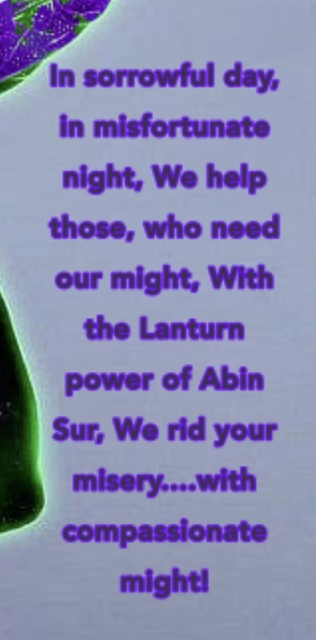
The broader emotional spectrum is a bit confusing and it's kinda daunting from like a newcomer's perspective to try and understand it all, I will not lie! I do really like the existence of other lanterns bc it just makes sense from the whole green wavelength power perspective. I'm kinda iffy on the existence of white and black lanterns tho, that's a bit overly complicated for me
#asks <3#ty for the ask!!#im only iffy about it bc i haven't read the run yet so i dont know how they were handled#but imo black and white lanterns should not be able to control the ring At All. like ever. full stop.#green was chosen bc its the center of the wavelengths and its the most stable so it influences the bearer the least#the further you get to the edges of the spectrum the more the ring influences the ring bearer#since white light encompasses the entire spectrum. i feel like it should be the most unstable and influence the bearer the most#but like i said i haven't read the run so idk how they handled it
16 notes
·
View notes
Photo

Another Celestial Spectrum OC I’ve introduced but never gave a full ref for: Celestite!
They’re a nonbinary lesbian (they/she), very prominent idol, and eventually become Matilda (The Mechanic)’s girlfriend.
#mvf art#celestial spectrum#Celestite#character sheet#character ref#gave her those ankle spikes too#the lore i gave her is that she used to be a violent pop star#and her species are a group of apex predators#of course her redesign now is that her species has evolved#but retains much of their predator traits (claws. strength. night vision.)#she can even change her skin color to pink and green but i never mentioned#that before. like her neck is supposed to be a pattern akin to#freckles that can light up or flash on command to confuse prey#but yeah i never brought it up.#anyway: YAY!! ref!!
10 notes
·
View notes
Photo

2 notes
·
View notes
Text
Saw someone classifying the rainbow colors as ROYGIBV instead of RMYGCA again and I must restrain my rage.
#orange and purple BEGONE#it's#RED#MAGENTA#YELLOW#GREEN#CYAN#AND AQUA#this is the stupidest hill to die on#but I don't care#you can't mix the colors you want when you treat purple and orange as primary/secondary colors#they're in between on the spectrum#white + aqua will not make cyan / ''light blue''#etc. etc. etc.#the way we teach colors is just plain wrong#and I'm mad about it
2 notes
·
View notes
Text
tired of keeping this to myself so it’s time to finally say it
tory’s eyes are SO fucking pretty
#[ooc]#jk I can't stop talking about them obviously#also I'm so upset at how a lot of pics of p.eyton drown out her actual eye color#that's why it never looks consistent bc her eyes will be brown in some pics grey in another and then green in the next#but that's because her eyes are really#SO many colors#idk what it is about lighting + photography that washes it out so much but like#everytime I find a pic that doesn't wash her eyecolor and has the full spectrum I'm !!!#like seriously once you notice the difference you'll never not notice it again#pretty sure she has sectoral/segmental heterochromia
3 notes
·
View notes
Text
The long wavelengths of the light spectrum—red, yellow, and orange—can penetrate to approximately 15, 30, and 50 meters (49, 98, and 164 feet), respectively, while the short wavelengths of the light spectrum—violet, blue and green—can penetrate further, to the lower limits of the euphotic zone. Blue penetrates the deepest, which is why deep, clear ocean water and some tropical water appear to be blue most of the time. Moreover, clearer waters have fewer particles to affect the transmission of light, and scattering by the water itself controls color. Water in shallow coastal areas tends to contain a greater amount of particles that scatter or absorb light wavelengths differently, which is why sea water close to shore may appear more green or brown in color.
Follow @scienceisdope for more science and daily facts.
Video credit: Kendall Roberg
42K notes
·
View notes
Text
Consider for example the octahedral [Ti(OH2)6]³+ ion, the UV/visible spectrum of which is given in figure 13.38; if all the [Ti(OH2)6]³+ ions in the sample exhibited identical octahedral geometry with all Ti-O bond distances the same, then the d-d absorbance band would indeed be much narrower than observed.
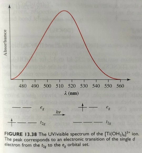
"Chemistry" 2e - Blackman, A., Bottle, S., Schmid, S., Mocerino, M., Wille, U.
#book quote#chemistry#nonfiction#textbook#ligand#octahedral#transition metal#metal complex#titanium#green#green light#oxygen#uv light#visible spectrum#light absorption
1 note
·
View note
Last Seen Blogs

sauzkronee
sauz

ovilltrdx
Untitled

burntmatchesx
Seduce and Destroy.
lovecore-goth
anti-hero

hipsthetic
hipsthetic