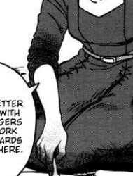
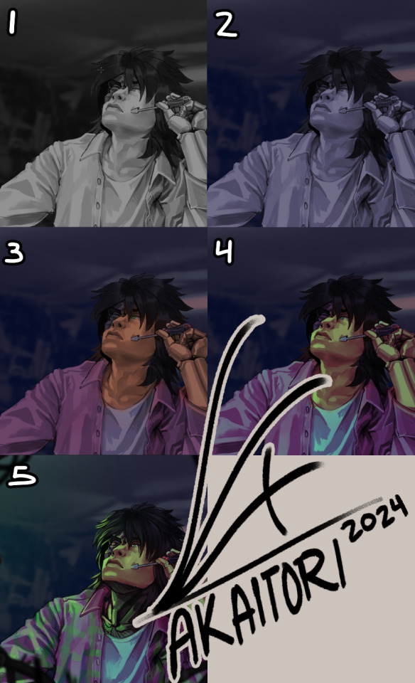
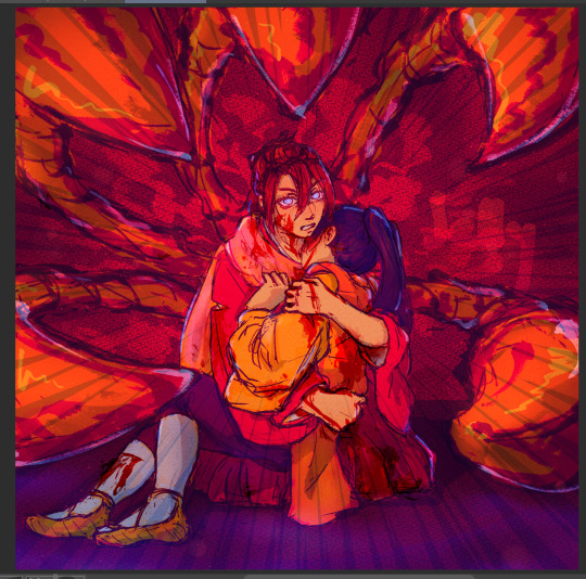
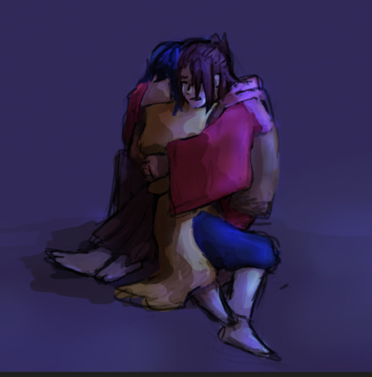
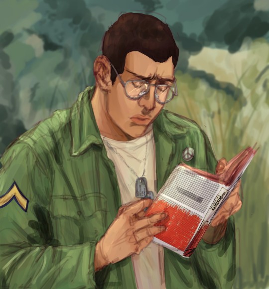
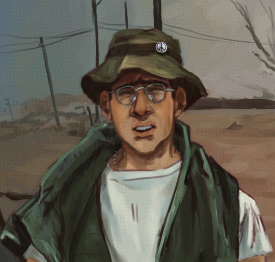
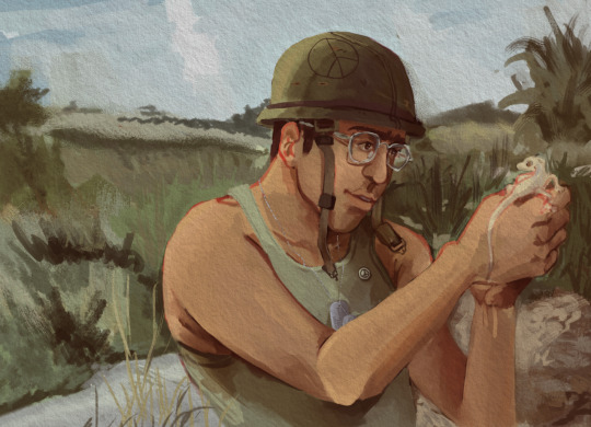
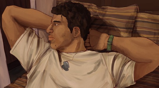
#have all 3 grayscale pieces in one!
Text
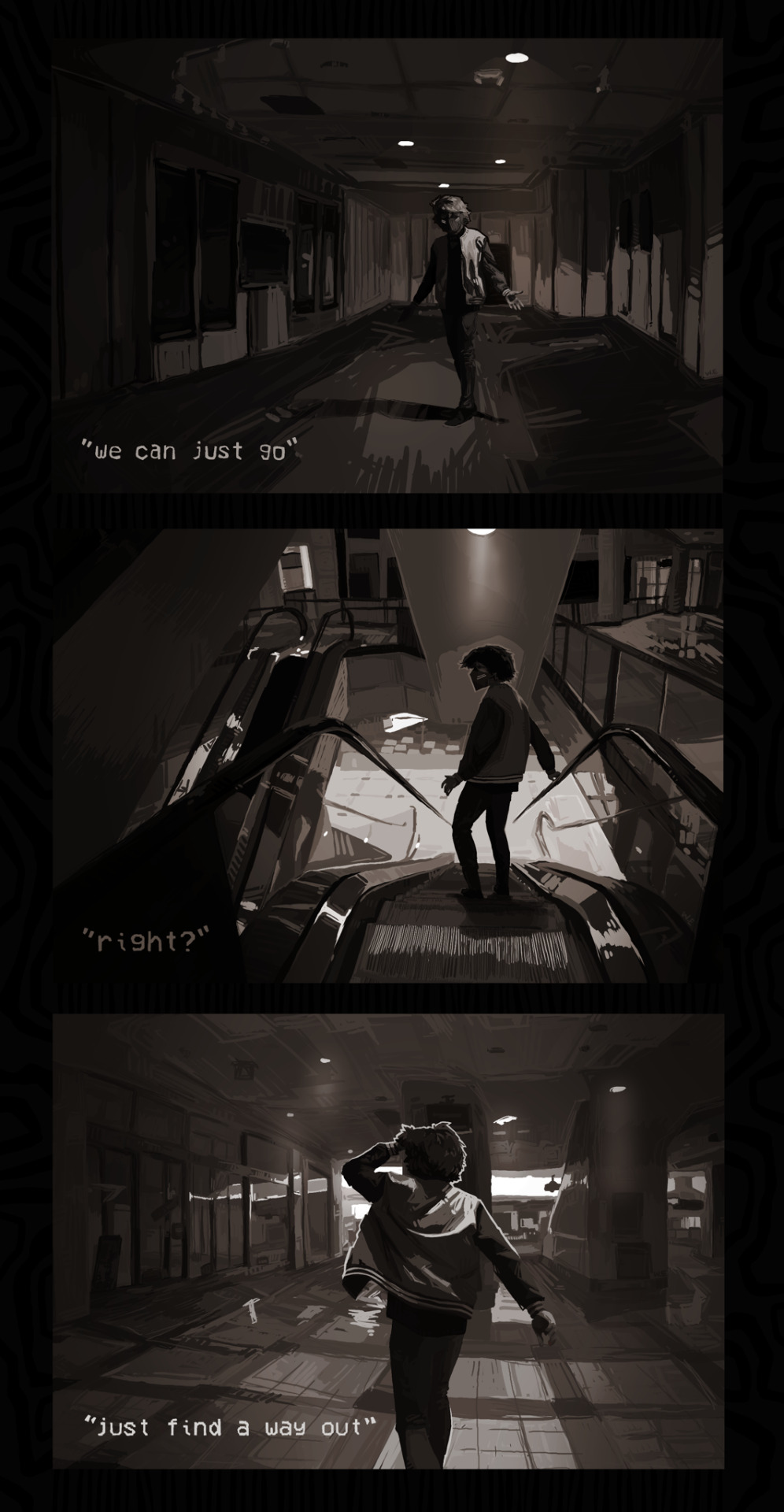
we can just go, right? just find a way out.
#generation loss#generation loss fanart#ranboo#ranboo fanart#genloss#digital art#generation loss the social experiments#genloss tse#have all 3 grayscale pieces in one!#while I work on some other things :D#also! I really liked this series!#studying environments and adding my own personal touch#very enjoyable project!#might do similar stuff in the future!
3K notes
·
View notes
Note
is it ok to request some headcannons with the team? if so, could you do a reader that’s covered in tattoos? like heavily tattooed. even their fingers. right? anyways, the reader is always covered during missions (like ghost level covered) and the team have subconsciously created this image of them under it all but haven’t really seen them until one day reader is wearing normal clothes and they’re like 🧍♀️ what? you have tattoos and like barely any skin 🧍♀️ IDK I JUST THOUGHT IT WOULD BE CUTE NVM THOUGH IF U DONT WANNA WRITE ❤️ NO ISSUE IF YOU DONT!
[Task force 141 and Laswell with reader who has a lot of tattoos)
A/N: I am not heavily tattooed yet but I did love this request sm soooo here this is :) Ty for the suggestion and I hope you enjoy!
They can’t really be blamed for not knowing about the tattoos, y’all are all covered typically in heavy gear and clothing and weapons most of the time. And they don’t question it when you’re covered up even more than usual bc yk, Ghost exists walking around in a Halloween costume 365 days a year. They’re used to it so they won’t prod.
Most task force members have tattoos of their own, it’s not a strange concept but they just assume you have none, they see you covered up and that’s that.
But then one day, let’s say there’s a mission and you guys get fucking d r e n c h e d in water, and you’re in a cold climate so leaving your clothes on is not an option. They need to dry by the fire and you cannot catch hypothermia.
Whatever reason you cover up, you know it’s only logical so you shyly take off your gear, quickly going by the fire while the guys quietly stare at your figure, staring at the ink decorating your body. Yes you’re beautiful and yes it’s their first time seeing so much of your skin but is that a fucking narwhal on your arm-
You have to snap at them to quit their staring bc you think they’re only staring at your chest or at your underwear but soap just blurts out “YOU ‘AVE TATTOOS?” And everyone else nods.
~
Individual reactions:
Ghost:
Ghost fucking loves it so much, he could stare at your tattoos for hours on end. He rolls up his sleeves to show you the ones decorating his forearms, letting you trace your fingers over the skull and withholding a shudder.
He immediately brings his hand up and traces yours back, asking questions about them and how long they took with you sitting in the chair, grunting in response as he zones out.
Asks why you cover them up as often as you do but when you send him that look he quickly says never mind.
Soap:
He immediately asks you about the meaning (if you have any for them). He admires them and thinks they make you look beautiful and badass.
He also will take a marker and draw ones on your empty bits of skin and color any grayscale tattoos you have.
If you were to ever get one of his doodles or drawings tattooed he would probably tear up on the spot. Also maybe kiss you stupid bc wow you have something from him on your skin forever and he loves you sm.
Would design y’all matching pieces, in your line of work tomorrow isn’t guaranteed so if you’re down, he’ll make the appointment for you both.
Price:
I personally don’t think Price has tattoos or would ever get any bc he doesn't care for them but he has an appreciation for yours.
Everyone would think he would be the type to talk down on them but all he said to you was “do you like ‘em? You do? Then why the fuck would I care?”
In between breaks, he’ll casually ask if you got any new ones and that he’d like to see them.
Gaz:
Gaz doesn’t have any but that’s just because he can’t fully decide on what he’d get, he’s young like you and cannot handle the commitment.
Therefore he lives by you and eagerly encourages all your ink and will always go with you to your tattoo session if he’s free.
He’s the best kind of person to have come along esp for long sessions bc he’ll go get you food, drinks, etc while he sits with you.
He always says he’s gonna get one when he goes with but always said never mind lmao.
Bonus <3 Laswell:
Now she's no stranger to ink, she's not covered up but she does have a matching tattoos with her wife and a few small patches of her wedding flowers on her.
She absolutely adores your ink and will not hesitate to defend you and it if someone were to disrespect you bc of what you've done with YOUR body.
She's a mom what can I say, she knows her authority and won't be shy to use it.
Taglist:
@devilsfoodcake22 @simon-rileys-princess
@stupid-ninja @milkmily
@lune-la-chanson @tamayakii
@teacupcollector @sweet-as-an-angel
@perilous-pasta @ihatethisappsomuchitpains
@marsbar127xx @baddump
@xncasi @king-cookiex
@palomaxaxaxa @amatchasky @wolfyland07 @diejager
@hailstrum18 @pretty-little-bunny382728 @mzfandom @solarslushee @areislol
@cluelessyasmin @sesshomaruwaifu @chaos-unchecked @kalamataolivesssss @arunasmisfortune @tbrfic
#ghost <3#soap <3#price <3#gaz <3#call of duty#call of duty x reader#simon ghost riley x reader#kayla asks <3#ghost x reader#soap x reader#john soap mactavish x reader#john mactavish x reader#kyle gaz garrick x reader#gaz x reader#kyle gaz garrick#laswell <3#kate laswell#john price x reader#captain price#price x reader#cod headcanons#kayla writes <3#call of duty headcanons#call of duty x you
1K notes
·
View notes
Text
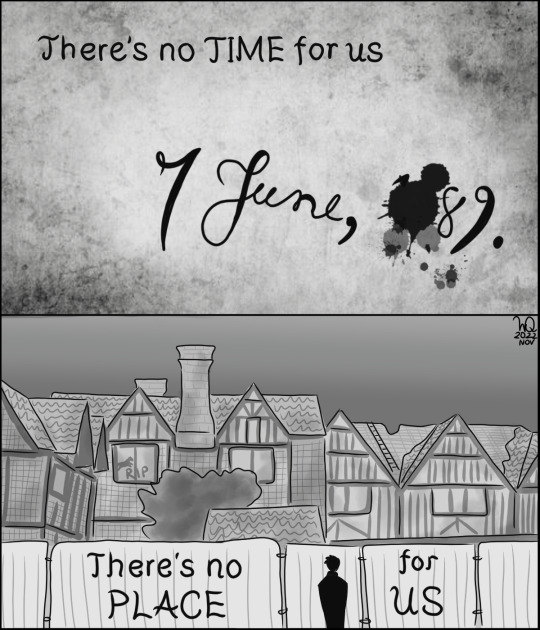


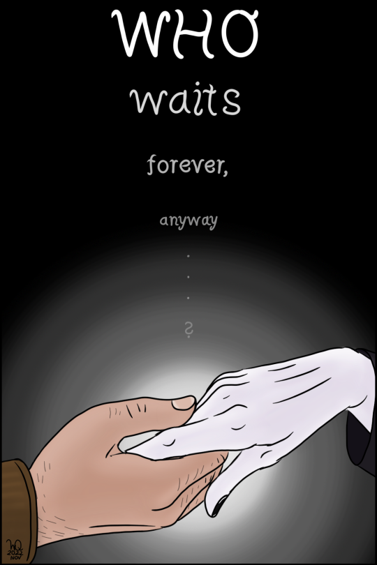
Dreamling + Queen’s Who Wants To Live Forever
(Image ID under the cut)
[Image ID:
A 17-panel Dreamling (Hob Gadling/Dream of the Endless from The Sandman) comic featuring the lyrics of the Queen song “Who Wants To Live Forever”. After the panel number, the referenced lyric will follow, and then description of the panel.
Panel 1: “There’s no time for us”, with “time” in all caps. The panel shows a piece of parchment in grayscale, with a date written on it: 7. June 1689, but with the 1 and 6 blotted out by an ink splatter.
Panel 2: “There’s no place for us”, with “place” in all caps. The panel (still in greyscale) shows Dream standing outside a barrier in front of the dilapidated shut-down White Horse tavern.
Panel 3: “What is this thing that builds our dreams, yet slips away from us…”, with “dreams” and “away” in all caps. The panel (in greyscale except for the red ruby at Dream’s neck) shows Dream in the foreground, walking towards the viewer, as Hob calls after him in the background - it references their falling-out in 1889.
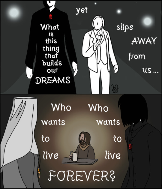
Panel 4: “Who wants to live forever”, repeated once, with “forever” in all caps. In the foreground, Dream and Death stand, turned away from the viewer and looking at Hob in the middle of the panel, who is sitting and drinking with a mug of beer in his hand - the 1389 scene. A warm brown glow emanates from Hob. The words are arranged in a circle around him.
Panel 5: “There’s no chance for us”, with “chance” in all caps. A greyscale panel of Hob sitting and waiting in 1989, smoking and drinking. He is sitting on the left of the panel, the background going from white to grey towards the text on the very right.
Panel 6: “It’s all decided for us”, with “decided” in all caps. A greyscale panel of Dream sitting in the glass prison. He is situated at the right of the panel, the background going from black to grey towards the text on the very left.
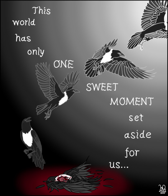
Panel 7: “This world has only one sweet moment set aside for us”, with “one sweet moment” in all caps. The panel’s background is black, with a light source at the top right corner. On the very bottom of the panel lies Jessamy the raven, dead, in a pool of blood - though she is drawn in an almost ghostly-glowing way four more times on the panel, showing her as she takes flight and flies off towards the light source. The text creates a sort of helix shape with her flight path, leading back down to her corpse.
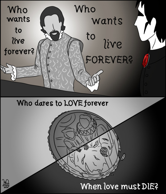
Panel 8: “Who wants to live forever,” repeated once, with the second “forever” in all caps. The 1589 scene, in greyscale except for the red of the ruby, Hob telling Dream cheerfully of his life, arms spread out in satisfaction while Dream looks on doubtfully.
Panel 9: “Who dares to love forever, when love must die” with the first “love” and “die” in all caps. The greyscale panel is split diagonally, half of the text in the top left, the other half in the bottom right. The split passes through the miniature painting of Eleanor and Robyn Hob shows Dream, but on the “when love must die” side the frame is fractured, and Eleanor and Robyn’s hand have turned skeletal.
Panel 10: “But touch my tears with your lips”, with “tears” in all caps. A greyscale panel of a closeup of 1989 Hob from the shoulders up, holding a smoking cigarette and with tears streaking down his face. The text replaces his facial features.
Panel 11: “Touch my world with your fingertips” with “world” in all caps. A cut through Dream’s glass prison, his left hand reaching from out of left frame towards the glass. In the darkness beyond it, the text hovers in the air.
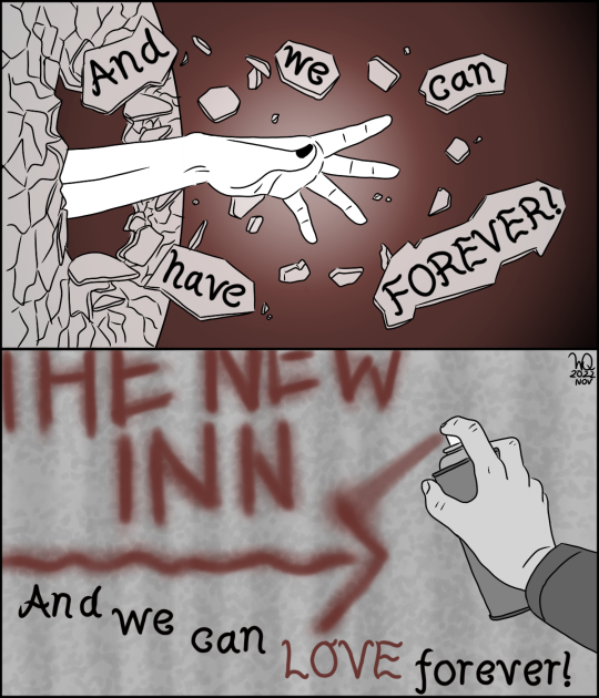
Panel 12: “And we can have forever!”, with “forever” in all caps. The panel now has a red tinge to it. Dream’s hand has broken through the glass, which has been shattered, shards flying around his arm with the force of it. The text has been written on selected glass fragments.
Panel 13: “And we can love forever!” with “love” in all caps and in red. The panel shows Hob spray-painting an arrow and text reading “The New Inn” as graffiti onto a grey wall.
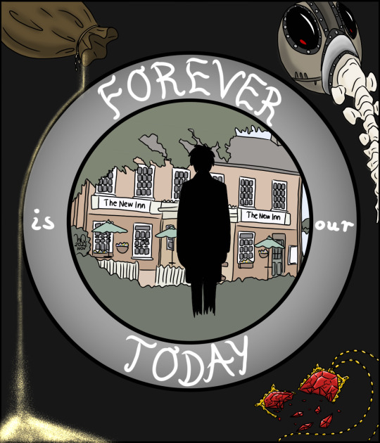
Panel 14: “Forever is our today” with both “forever” and “today” in all caps. The text is written on a circle in the panel, which frames Dream walking towards the New Inn, in soft pastel colours. Around that circle, Dream’s tools are arranged: in the top left, sparkling gold sand spills from a little bag, in the top right is Dream’s mask, and in the bottom right his ruby - now shattered.
Panel 15: “Who wants to live forever”, with “forever” in all caps. A coloured panel with a soft orange glow, of Dream talking to Hob in 1389. Hob is seated and smiling, while Dream is standing and smiling somewhat deviously. The text hangs between them, a shadow behind it suggesting a repeat of the line.
Panel 16: “Forever is our today” with “today” in all caps. A coloured panel of Dream and Hob’s meeting at the New Inn in the present day, both of them seated at a table and smiling warmly at each other. The text is once more positioned between them.
Panel 17: “Who waits forever, anyway…?” with “who” in all caps. The text starts at the top of the panel, running downwards, each word fainter than the last. At the bottom of the panel are Dream and Hob’s hands, gently holding each other. Behind their hands, there is a bright glow illuminating the dark background.
End ID.]
#WyDraws#dreamling#hob x dream#the sandman#sandman fanart#dream of the endless#hob gadling#who wants to live forever#image id#this is THE most dreamling song honestly#who waits forever anyway? well HOB SURE DOES#he really does want to live forever even if dream can't quite fathom that#but in the end it's less 'forever' that matters#because they have 'today' and that's the most important part#god this project POSSESSED me for a few days#i had the idea and couldn't rest until it became reality#my fave panels are the jessamy one and dream breaking through the glass#oh right#tw: mild gore#(for the Jessamy panel)#now i can rest in peace and go back to my fanfics#long post
715 notes
·
View notes
Photo
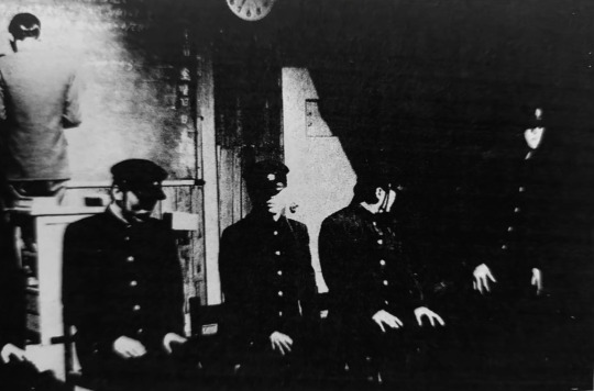
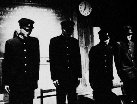

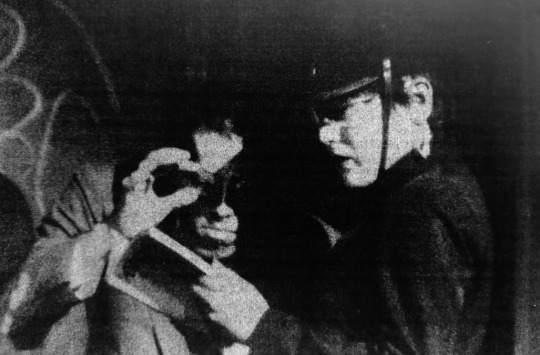


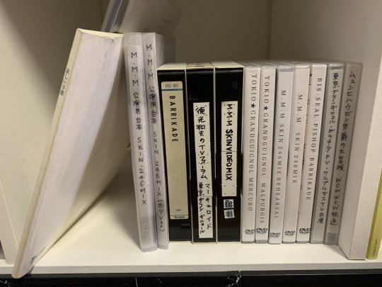
Photos from the elusive early-80s Tokyo Grand Guignol play Mercury, also known as Mercuro and Merbro. While the Tokyo Grand Guignol are more well known for their subsequent work in the original 1985 version of Lychee Light Club, Mercury was an ambitious debut effort that was as much Tetsuo: The Iron Man and Alien as it was Ranpo. In the two-act narrative, an unstable school teacher runs a health program where students volunteer to have their blood replaced with the outdated medicinal substance Merbromin. The Merbromin substance turns the students into sentient machines, with their organs being made “valuable” in how the doses of mercury turns their innards metallic. In the midst of all this, a mysterious transfer student infiltrates the school grounds to uncover the whereabouts of his missing sister. Plots ultimately intertwine, resulting in a nightmarish Oedipal bloodbath in a macabre science lab that’s riddled with many taboo secrets. The play contains several infamous special effects standouts. One of the centerpieces was an extended sequence at the beginning of the second act where the schoolmaster (performed by the now mainstream actor Kyusaku Shimada, originally working under the pseudonym Lovecraft Shimada) carries out a live vivisection on a student to surgically extract his pubescent urges, which had manifested as a chestburster. The screenplay is decorated with intricate surrealist details with characters speaking direct quotations from dadaist poets of the early Showa period, resulting in an experience that is as much nocturnal poetry as it is taboo horror.
The play only had one run in 1984, with a heavily truncated TV performance being done a year later on the “Youth Performance Special” morning Nippon TV program where the set pieces from the openings of the first act and second act are strung side-by-side. While a full video recording is known to exist of the play on both DVD and VHS, the recording has never surfaced. It’s a damn shame.
The only available bits of media in relation to the play to this day are the screenplay, a handful of grayscale photos and some parts of the soundtrack. The known songs that were featured in Mercury include:
1. Four Enclosed Walls - Public Image LTD
2. Sons Of Pioneers - Japan
3. The title theme of the 1956 film “Des gens sans importance”
4. Brilliant Trees - David Sylvian
Bits of media relating to Mercury’s short 1984 run are steadily being resurfaced every day. Two of the images in this post were digitized by yours truly. The source was the 28th volume of Yaso magazine, a volume that concerned underground theater which included and interview with Norimizu Ameya, the lead director of the Tokyo Grand Guignol.
480 notes
·
View notes
Text
yk what to all those people who think the manga panels hit harder for the ep 12 of the dunmeshi anime here's my theory DO NOT READ IF YOU DONT WANT AN IN DEPTH ANALYSIS:
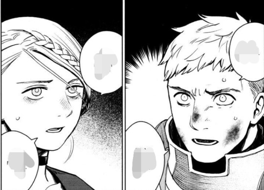
1) manga panels do not repeat that means that they have to be concentrated and well thought out to make the moment as gut wrenching as possible as can be, i have been rereading the resurrection scene to freshen up my memory and uh, look at that! no backgrounds! (the anime has those)
2) the grayscale does not distract from the moment that's a well known fact that's why older films seem sentimental, they had to put meaning in the actions not in the background (this is amplified in mute films where body language was the most important asset of an actor. as i previously stated there are no backgrounds or minimal anyways in the manga while the anime does have them here's a lil comparison (i took the anime clips from a reaction video)

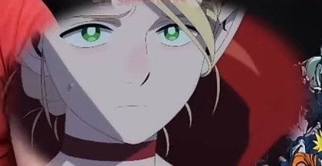
the grayscale gave us not only a full focus on their faces but also a more *just cried* look from marcille that was replicated in the anime but they went too soft on that shade of red so she doesn't look as devastated, notice how the manga encapsulated the feelings of determination and doubt with the backgrounds
3) line weight is an important part of art as a medium, everyone can tell what a couple of lines can do visually for a scene now compare the marcille from the anime screen above with this one
i took a scene where she wasn't as gloomy for this to show the difference, the line weight of the anime doesn't compare even with a simpler scene.
4) the framing of the scenes is also quite different. As i said im watching the episode from a reaction video so im sorry if im missing pieces but the hair letting down scene might have disrupted the pacing of the scene, i do get why people wanted it in, in the manga it was an in-between scene, the kind of panel that readies to the seriousness of the next panels while in the anime we don't. What we have in the anime is a shot from behind (panoramic of the whole set up from a middle level, not quite eye level + marcille steps into the circle, we can see failin) then a quick one from the front (hair already loose and ambrosia framing her face) then the ritual starts.
in the manga we get 4 kinds of shots: front full body (hair shot), panoramic from high up, panoramic from down low and close up of the face (doubtful expression); so while it might have looked extra cool it wouldn't have fit, they have time slots and all they even have less shots before the ritual! also the vibes are different in the anime she looks more confident in the result even though her voice betrays her more than once. something obviously impossible in a manga.
THAT'S ALL, FOLKS
#ep 12#dungeon meshi#delicious in dungeon#spoilers#dungeon meshi spoilers#delicious in dungeon spoilers#ep 12 spoilers#manga and anime comparison#analysis#/ᐠ。ꞈ。ᐟ\ rants#pls tell me#if u enjoyed it!#bye bye
13 notes
·
View notes
Text
Attack Dog - Rendering Breakdown
OK here's an attempt at explaining how I go with illustrations. This isn't necessarily an 'effective' way to paint, but rather it's a process to maximize my personal enjoyment. I encourage you to do the same! Find those steps you have the most fun with, and exploit the hell out of them.
For this post, I'll be going step-by-step for this illustration
1- Sketching
A Mess. I don't like making lineart unless I'm super in the mood for it. In this case, I couldn't be bothered to spend a lot of time in the sketch. I often use 3D models as a base for paintings because, if I'm making a painting I only want to paint, not to stress out on anatomy.
2- Blocking values
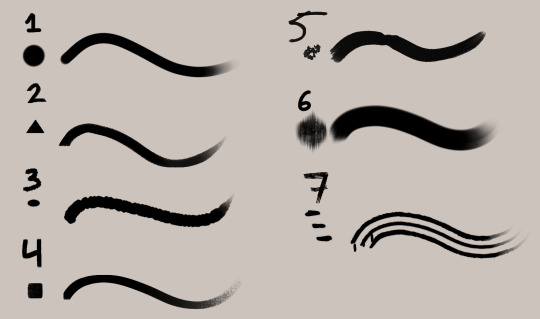
I only start painting with colour if I'm certain about what I want to do. In this case, I wasn't. When it comes to visual information, values (light and shadow) are more important than colour, so it's easier to block those out first than trying to improve the values in an already coloured piece.
This is a very insightful video if you want to see if a greyscale-first process could be useful for you. Marco Bucci's content in general is a treasure.
Here's a link to the head model used for light reference
3- Paintinggg hell yeah babyyyyy
Not much to say here except, look at a lot of reference. I only limit my canvas to one or two reference pics to not get it super crowded, but I'll always have more pictures open on my browser, tablet, etc.
There's this little app you can use to compile reference pics. I don't use it because the act of opening it is too much work for me but, it's a neat tool.
The main brushes I use for rendering are the following:
Regular round brush with pen-pressure opacity.
Custom triangle brush. It's just a triangle with some texture layered on.
Clip Studio Paint's textured paint. Unmodified.
Custom square brush. Same as the triangle, but it's a square.
Clip Studio Paint's gouache brush. Unmodified. Good for blending.
"Fur block-in" from this pack. Excellent for blocking in feathers.
"triple line" from this pack. Very good for adding texture.
You don't need this many brushes, but I like the variety to keep things interesting. I'd say that only #1, #2 and #7 are essential to me.
A quick trick I used for the muzzle was to make the wires with a white brush, on a layer with border effect.

I considered explaining how to shade feathers here but, it was making this post a little too long. Even more than it already is. But, let me know if a guide on drawing feathers is something you'd be interested in seeing!
4- Colours
For this one I kept it simple. I liked the values and I wanted to have a very stark contrast with the red blood. I made some quick tests with gradient maps trying out different palettes, using gradient maps and overlay layers.
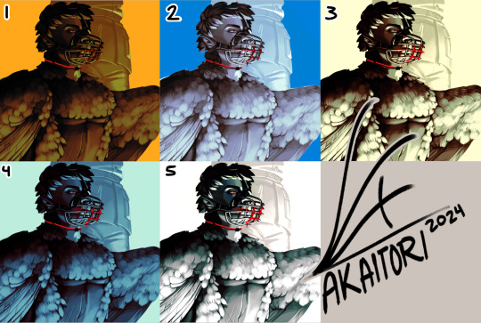
While I enjoyed #1, at the end I went with #5 as it worked better narratively. The clinical white and silvery shadows give a stoic indifference to the blood, which fits with Blackbird's character.
The muzzle and situation on itself aren't a canon event happening, so it also felt more fitting to keep a more stylized 'colouring' rather than actually putting in the character's colours and scene. For this colouring, I only used a single gradient map, but it's not rare if I end up using several, placing masks for areas of different colours.
When it comes to colouring greyscales in character colours I follow a different process, for which I'll use another illustration as an example.
(this is Loketh, he belongs to my partner)
So, for this drawing I also started with a grayscale, but started adding colour in much earlier.
1- Black and white base render
2- New layer with a flat colour, put it on overlay. This will serve as a base for colouring, kinda like glazing on a canvas for a traditional painting
3- Adding character colours, in a new layer on overlay mode. You can do this in a single layer, or make new layers for each new colour. Just keep it loose, no need to add all detail yet.
4- Colouring the shadows. I used a gradient map adjustement layer, set to overlay. Made the lights green, and the shadows purple.
5- Flatten and paint! Now this is the step to add all intricate colour details missing from step 3.
5- Post-Processing
This is a term more used in 3D renders, where it refers to colour corrections and final tweaks. Things like adding depth of field, motion blur, vignette, any final filter.
For almost all my art I'll add a grainy noise layer and chromatic aberration, I just think it looks neat. You can also add paper textures or flat colours on top of you image and set that layer to overlay, it helps to tie everything together.
AND THAT'S ITTT
I hope this was useful, and remember to just have fun with it :)
Further reading:
Marco Bucci's youtube account
Jason Rainville's blog with breakdowns of his illustrations
Sinix Design's video on colouring skin
Anatomy For Sculptor's 3D models for muscle reference (cw nudity)
9 notes
·
View notes
Note
Hi honey
Are you per chance taking commissions? I've got a specific vision of a wedding-dress ed that I am in desperate need of art for :)
(and if so what's your pricing like?)
Hiya! Generally I don’t do commissions but this sounds right up my alley so I’m listening!
Because I haven’t done commissions in about 3-4 years, I don’t have a pricing system in place and but I has estimates on how long I spend on a piece, depending on the style. The full-colour style I've done my other wedding dress Eds in takes me about 16h. The grayscale ones take a lot less because there’s less lighting and texture involved, so I'd estimate those take around 8h. It also really depends on the quality of the references I can get and how well they all match up regarding angles and lighting source. I think €12/h of work would be fair to me without getting too expensive
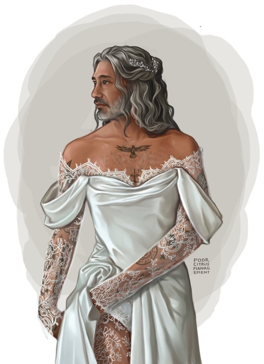

If you DM me and let me know your idea/send me any references you have, I can let you know whether I think I can do it and give you a closer estimate
16 notes
·
View notes
Note
your art is so gorg how do u choose colors???
hehe thank u :3 Hard to explain i kinda just go with vibes n shit its fun for me n i just kinda have developed an eye for what i like but!! one thing that i do if my piece looks messy is i try to make the amount of distinct colors Smaller like i try to avoid having colors that r too close to each other in hue and value but not quite the same (though i think this only works for me cos i dont shade at all so keeping the palette as small as possible looks usually good)
Oh yeah speaking of value color values r SUPER important- I recall seeing a video or a post abt it years ago it changed the way i view colors completely. I couldnt explain it any better than someone else already would have but basically you should try taking a look at your piece in grayscale..! Colors with similar brightness etc will still have different values from each other(think bright neon yellow VS bright neon blue)
I also used to play around with premade palettes quite a bit, think 3-5 colors w good contrast (I think that helped me understand values too) (I dont rly use premade palettes anymore unless sometimes when im planning a game or a website layout)
ALSO my pieces recently r suuuper filtered i play around w brightness saturation ETC whatever ibispaint has however the base colors have to work imo u cant fix a "badly" colored piece with any filters its more of an afterthought (n i worked Specifically Without Any Of That for a while...! so suppose that helped too)
Yay ok sorry for the ramble i doubt its helpful but thx for the fun question i love art...
8 notes
·
View notes
Text
part 2 of this ask
📝Process for hurt mezu drawing
here are the steps i dug out of an art server's wips channel lol
1. initial sketch
2. refine sketch. thats lines now babey. (omitted "the sleeves are KILLING ME WAHHH" stage that led to this)
3. grayscale, to use with gradient map (this is a more polished grayscale than I started with, i dug the working file out to get better images)
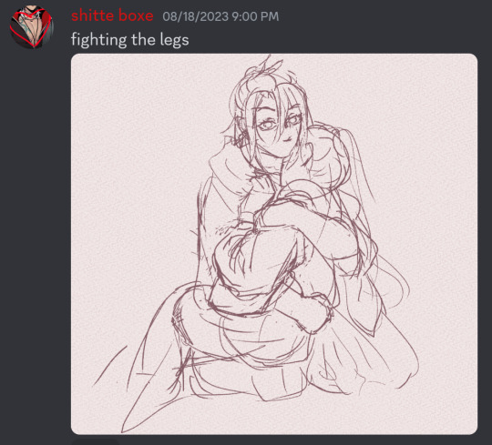
4. find nice gradient map (ended up being the same one I'd used for the piece i made right before. the goal is to make what's essentially an underpainting, not to color the whole thing with one map)
5. tweak and add colors that arent in the map with hard light layers & also sneak in a layer for special effect and atmospheric/ scenic perspective while you're at it
6. shading & more finishing effects. pretty much all of the shading was done with hard light layers! the only non-hard light layers I used for the shading were the particle effect layers & like one faint glow layer to fix some values. blood was done with linear burn
✨Inspiration for hurt mezu drawing
the coloring method (grayscale -> saturated gradient map underpainting -> additive color adjustments) is something I tried out with the piece i'd made right before (the one where gozu is holding mezu from behind) & turned out really well, so I wanted to keep going with it
I also wanted to draw them angstily again because it'd been a very long time. like half a year at least. angsting them is very enriching for my soul so I try to do it regularly, this one was overdue
subconsciously referenced the poses in the initial sketch from this old thing (feb 2021). i love doing this. all my for-fun works recycle old elements in some way. my favorite game is "what old art reminds me of what im doing rn" im so good at digging stuff out of my archives for it. everyone loves when i do this
the gangi-kozou panel also
i went through a "shade in bold red-orange & dark blue with hard light layers" phase in like..april/may of 2021. i still like that stuff a lot so I wanted to revisit it
💚Things you like about hurt mezu drawing
repasting the link there but the sixth image in the process is essentially the final so you can just look at that
the colors are nice!! I'm real happy with using more saturated colors n I think the warm vs cool balance works really well
the sleeves (man being dramatic on the sand meme)
no like fr look at the 2021 piece's kimono sleeves vs the one I just did 2.5 years later. so satisfying
Gozu's expression came out nice
i think the claws and flash lines successfully added Emphasis to Gozu's expression & the piece overall
the poses … the drama …. the brush textures are also good
⏳Things you’d do differently with hurt mezu drawing
add in a liiitle more contrast...aka use a wider range of values. Some lighter lights and darker darks. I miss my 2021 hard neon lighting
a bit more distinction between the characters and the background also
the composition isn't bad but it could be better. Should've thought more about the way the eye would flow around the image in the drafting stage (solid b&w color block thumbnails are good for this)
Moar Sparkles. (I put a solid amount of large & low opacity light bubbles in there & some finer brighter dots especially around the claw stems, but I think more clusters of tiny bright lights on the characters themselves would've gone hard)
💌Some favourite feedback on art
as the wise man Austin Kleon once said: keep a "praise file" of all the positive feedback you get (if you've never read "Steal Like an Artist," you must). so. i am prepared for this question hold on
tastes like sugar glass
multiple people have told me my art is soft & dreamlike
jayce you reblogged my touchstarved art with nice tags on april 10th ive got that saved love uou
umm theres a lot...anytime someone keysmashes or feels emotional because of my art i get happy ,,, lys messaged me about the hurt mezu piece that made me happy also,,,,,there is so much joy in the world
#shitboxposting#asks#shitbox drawn#JM SORRY I FEEL LIKE THE FORMATTING ISNT EASY TO READ NO MATTER WHAT I DO....AUGH#all my class work with actual conecptual meaning is monochrome what am i doing...man.......#i need to post more art and i also need to make more art. aghhh. boots up ultrakill and magical drop again#im actually Not sure how im going to afford the next few years of my life 😭😭 a bitch gotta have time to do fuck all but i need money..!!!!#whatever its fine. i have time to do fuck all right Now and thats what matters
5 notes
·
View notes
Note
For the fandom ask game!!
For Control: 1, 5, 6
For Alan Wake: 1, 2, 9
Control:
1: list 3 positive things about your current fandom(s)
it's absolutely full of extremely talented fans. Everyone makes such incredible fanworks
related to the previous one but the creativity of everyone, whether inspired by canon or more free-form things like fan-created documents or AWEs
3. It's a relatively small fandom so it feels more like a close-knit community
5: something you see in fics a lot and love
I love seeing depictions of what life in the FBC is like from day to day. There are so many interpretations but they're all super fun to read. Since the entirety of the game takes place in a crisis situation, it's interesting to speculate on what the average day is like.
6: something you see in art a lot and love
limited color palettes! Especially pieces that are grayscale with only red as an accent color! The art direction for Control itself is so good, it's no wonder it inspires fans
Alan Wake:
1: list 3 positive things about your current fandom(s)
Just like with Control, the fanart and fanfics are on another level of quality. Remedy just makes such inspiring games!
I love reading people's theories about the worldbuilding. There's still plenty of lore we don't know and it's fun to read different interpretations of what may be going on with specific characters or subplots!
the extreme enthusiasm the fandom has. this kind of overlaps to all Remedy games in general, but there's so much excitement surrounding Alan Wake 2 and it has endured beyond the hype of the initial release.
2: a headcanon you weren’t sure about at first but have come to like!
It's obvious just from Saga's mind place that she and Casey are close, but over time I've become more and more convinced that he's just been absorbed into her family now in some form or another.
9: a ship that isn’t your OTP but that you enjoy
I haven't delved super deep into ships in AW. My favorite is probably Saga and Casey, so I'd say one that I enjoy besides them is Alan and Alice because they've also gone through The Horrors for each other!
2 notes
·
View notes
Text
Grad School Q2 - Week 1
I might seem late with this but I had the day off from school for the holiday so it's technically my Sunday.
I don't have a lot to show. You think by the time you get to a graduate education you'd be past "syllabus day" but no, it never ends. I spent most of my first week writing. But, I want to start sharing some of my writing sometimes, so I'm going to include an excerpt.
Because of that this is a longer post than usual so.......
For one class we are doing a project over the course of the quarter that is a 6-8 page comic. My problem is that metric means nothing to me because my brain doesn't think in comic pages? I don't know how much of a story 6 pages is like I would if it was a written movie/TV script. I wrote out that script, here's an excerpt:
EXT. ABANDONED BARN - DAY
An extremely run-down looking barn stands abandoned in a field off the side of a road, surrounded by trees on an overcast day. Pieces of the wood siding have fallen to the ground.
NARRATOR (V.O.)
They say that the barn off highway 10 is haunted.
On the side of the highway, an OLD MAN has pulled off the road and has his hazard lights on. He looks disgruntled at whatever car problems he’s having, but for some reason looks up at the barn.
NARRATOR (V.O.)
Some people have seen the ghost of the farmer’s dead son, Tolko, running in and out of the barn.
The old man suddenly notices the small figure of a child darting into the barn from the crop of trees nearby. The old man looks around for any signs of other people, but there’s nothing, just the busy highway. Concerned, he makes his way into the field toward the barn.
That is roughly half a page of a script. I have thumbnailed that out and that translates to a grand total of 4 panels. The total script is 4.5 pages, which if I generously extrapolate that means this should be about 36 panels, but there's a bit of chatter in the middle which makes me think I can get it down to my ACTUAL goal, which is 30.
My professor was like, "You want to do 30 storyboards with backgrounds and color? That's a lot of work, you know?" and I was like, TELL ME WHY ONE OF MY PROFESSORS MADE ME DO THAT IN LESS THAN 3 WEEKS LAST SEMESTER THEN? I literally did 28 detailed boards in full grayscale in 2.5 weeks for ONE CLASS. Doing that here again (I'm going with monotone colors this time) in 9 weeks seems easy.
Storyboards aren't usually environmentally focused, so I guess making my goal for this semester to be background focused was counter-intuitive. But, I want to get better at backgrounds, goddammit! So, I guess I'm breaking all the rules with this one.
Personally, I've been working on editing some LV scripts which has come along great. Especially considered my first draft of one of these scripts was probably about 60 pages long (this is supposed to be a half hour of TV 💀) and I have edited all the way down to 35 pages. Still needs work but MUCH better, lol.
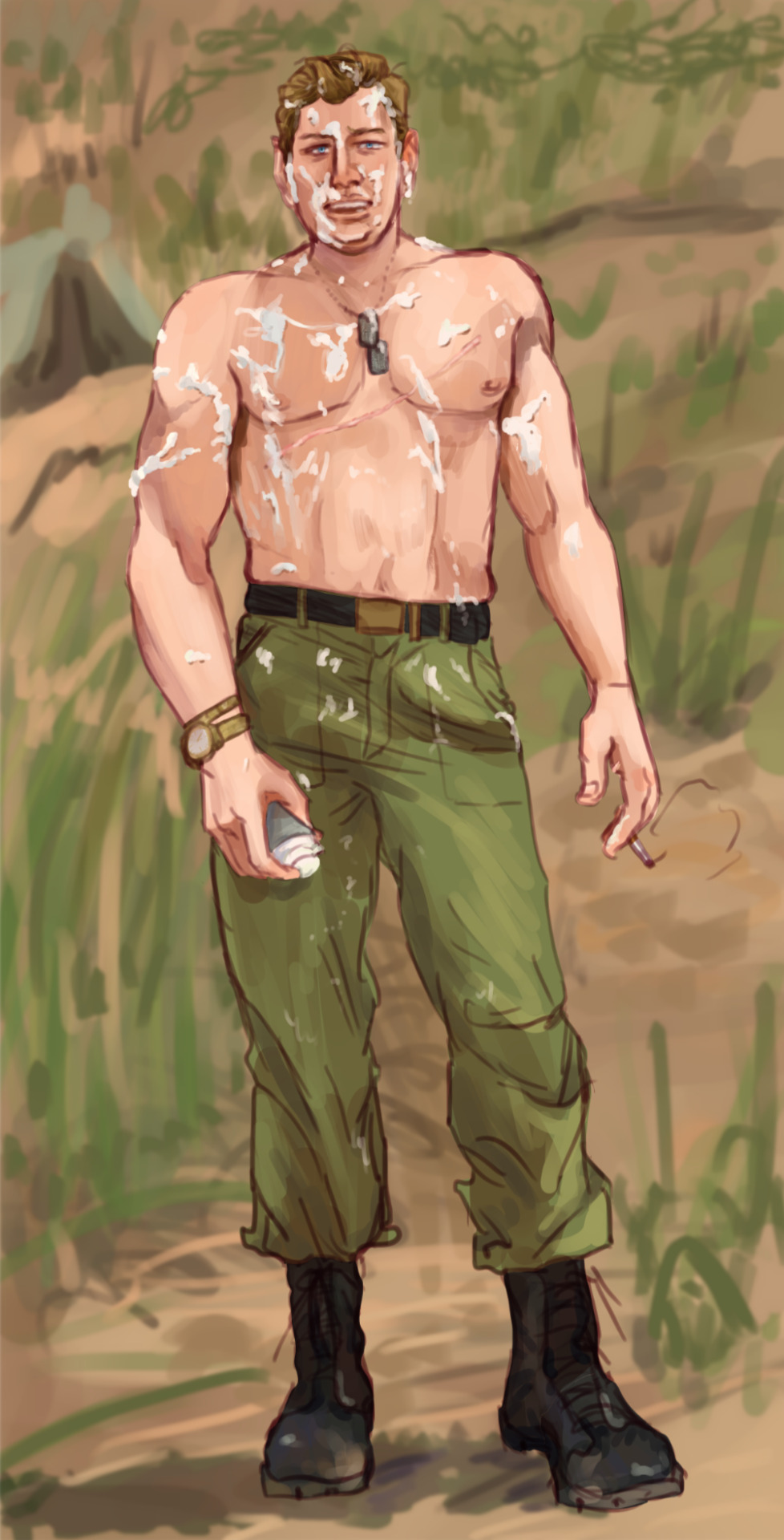
I am finally going to do the character outfit concepts like I have been wanting to do. I'll leave you with an extremely sketchy example featuring Morse because I was excited to visualize his flashback appearance. (Showing off his ribcage, scandalous!)

3 notes
·
View notes
Text
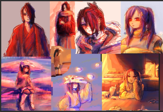
Okayyy, I grabbed a bunch of this year's (plus one from December, technically two) actually like "finished drawings" and ramble abt the good, the bad, and the ugly. I just watched an artists tier their art. So yeah lol maybe I'm in the mood to ramble abt mine lol. Below the cut because...so many pictures lol.

Like, don't get me wrong, I loooooove this Frances drawing, but like. It's kinda just there. Like I feel good when I see it. But I WANT IT TO FEEL MORE AAAAA. Like I'm sure abt almost all of these, I just wish I had given it an atmosphere. I actually think this has a cute light palette it actually kinda works. But I wish I had actual lighting in it <3. Where is the vibe and scene?! I think I should go old photograph. Which is what I wanted to do, but I have no idea how. I still plan on expanding out this drawing, maybe changing it slightly, so hopefully, I will do that better!! I also kinda put this Andy with it. Because I feel kinda the same abt it. I think both lack shadows too, which goes with lack of environment. But I think the soft feel of Andy's is nice! I'm glad I colored it. And actually think I like how undefined the background it on this one. It does something for me! Oh didn't mean it, but love the contrast of the complimentary book cover! Didn't intend that, just picked a book I enjoy and think Andy would enjoy. But like that affect.
Despite really feeling like Andy is still not mixed with the background, I actually really like this one! I think toneally it has a vibe. And it's just like a portrait so I cannot complain too much!

I really enjoy this Mary and Frank piece! I love the colors and like how its kinda painterly but still heavily influenced by the sketch and it can still be seen. I like that I attempted more usage of different hues, not sticking to the main color. Like Mary's sleeve? LOVE THAT. Same with the sweater detail on Frank! I put the Kik one with it because for a quick sketch turned painting I think it is good. I like the vibe. I think I should either heavily fix it or redo it. I think if I keep going at it, I can make it a piece I am really proud of!
Okay, admittedly, I put these together because they're kinda the same size but lol. Andy; tried something new, think I heavily failed. But I DO like the colors and like I tried texture, though you can tell I didn't know what to do with it lol. The Lincoln, this piece is rlly old, AND IT WAS BADDDD. I think the half assed fixed version is 1000% better. It's by no means perfect. I rEALLY like the shadow of his head on the pillow. But aha, just wish there was more. But overall not terrible! I like it for what it is. And has a special place for being like my first Lincoln piece that wasn't just his fatigues one. :")
LOVE THE VIBE, I like Grayscale, like the intense shadow. I think the shadows on him could be a but nicer of course. And I do think his hair was kinda poorly done but oh well. I am not the biggest fan of his face? It's not bad, but I think I have done better John faces. I do know; I detailed his face in color and I think I like that better lol.
Lincoln, like, I like the face and coloring of that but it's just so meh. It's a figure like I always do. I like the coloring a lot more when I went back and added deeper shadows. But idk. It's okay </3. And oh!! I group a different Lincoln picture with this one, it has no background but the shadows on his uniform are SO good. It made me loooovve the drawing. And is still a fave. It is what inspired me to add deeper shadows here.
And I've never shared this version of this John drawing. It's a shaving cream prank. Dear God. Help me. I love how John's body turned out. I think his face is nice; its okay. I think I sucked at again giving him a shadow. I couldn't commit to the main shadow and I think it just kinda sucked all life from it. With the Lincoln drawing I don't like the background. With the John one I am torn. I think I should have detailed the ground more? Maybe? Idk. These two, Frank by the water and Andy reading, were all close together and done in January, and they all kinda have the same bckgrnd theme. Idk how I feel abt that choice. For the guys' anyways.
Actually seeing all of these were nice! Because I actually do like nearly all of these pieces! And I feel nervous but very inspired to keep trying to motivate myself to finally take that final step. And maybe try to play into that for the entire piece, not just adding it at the end...and not adding it. I rlly want to try to get a bit more creative too, like interesting things not just person standing there. But idk.
If you read all of this. Omg thank you sorry for rambling your ear off!!! 🫂💗
2 notes
·
View notes
Note
hey sorry for bothering u but how did u do the gradient texture in the de "sing, muse, of the passion of the pistol" art
not a bother at all!! I LOVE getting questions about my art process so thank you for asking 😁 this got a bit long so i put it under the cut
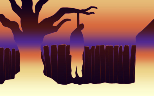
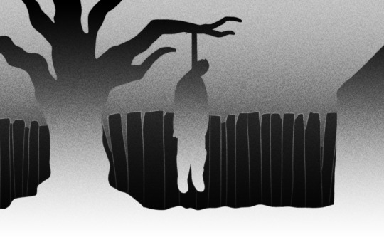
I originally did all those drawings in grayscale, so here's the image without any of the effects on it (and no text so you can see it better):
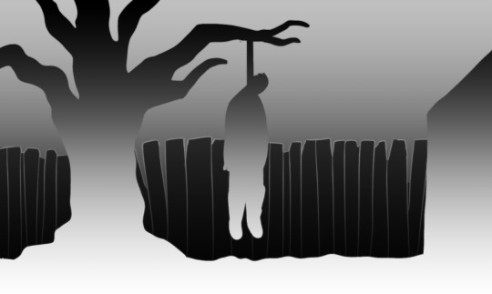
just a simple black and white gradient going one way for the foreground and the same gradient going the opposite way for the background. and the black fence to help break it up.
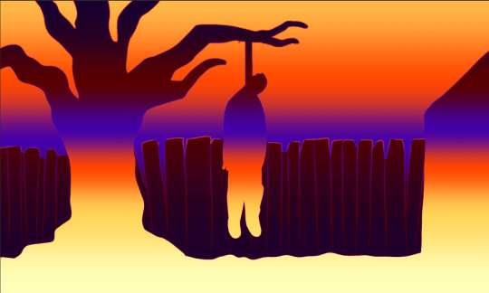
then I put a gradient map over it. I made a post showing how I use gradient maps once, but I didn't actually go into depths about how it works. idk how much you know about gradient maps, but for anyone reading this who wants to know how they work: a gradient map takes the colors that you specify in a gradient like the one below, and then it "maps" those colors to corresponding light and dark values of the image. the left side of the gradient gets mapped to the darkest parts of the image, and the right side gets mapped to the lightest parts.
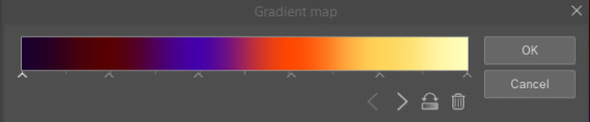
you can put a gradient map over anything you want, you don't have to start with a grayscale image. but since the gradient map only cares about the light/dark values, that's the only thing I worry about when I decide to use one for a piece. you also don't have to make the gradient dark to light like it is here. you'll get some pretty funky results if you put darker colors on the right side of the gradient or lighter on the left.
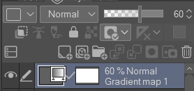
the gradient map is an adjustment layer that gets applied to everything underneath it, so in the final piece I've lowered the opacity of the gradient map layer to 60% to make the colors less intense. I could have just set up the gradient map with more muted colors, but personally I find it easier to use super saturated or intense colors and dial it back from there.
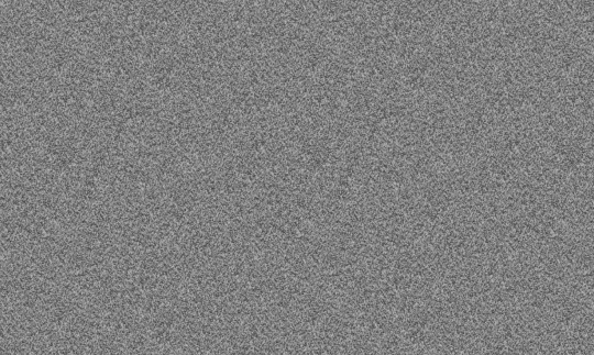
then the texture: in clip studio paint, you can add noise by creating a new layer and selecting filter > render > perlin noise. it will give you a bunch of parameters to adjust, but the only one I ever touch is scale. depending on the size of the canvas I usually set it somewhere between 3 and 10. for this piece I think I set it at 5. it will look like this:
I then set the blending mode of this noise layer to overlay and lower the opacity to 20%. also a protip for adding a noise texture: in csp and sai you can select a layer and then select edit > convert brightness to opacity. this turns all the white parts of a layer transparent and doesn't effect the black parts. depending on the blending mode you use for the noise layer, such as overlay, this can make your noise texture look just a little bit softer and less grittier if that's your desired effect.
so WITHOUT the gradient map, it now looks like this:
then, I make sure that the noise layer is underneath the gradient map layer so that the gradient map is being applied to it.
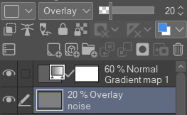

y voila! I hid the text layer for this but the text also underneath both the noise and gradient map layers.
hope this helps!!!
5 notes
·
View notes
Text
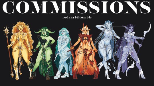

finally opening up commissions again! info under the cut <3
STYLES
Black and white: what it says on the tin - black and white with grayscale shading. Depending on complexity, prices start at:
bust (head, neck, no shoulders): $30
half-body (from waist up): $50
full body: $65
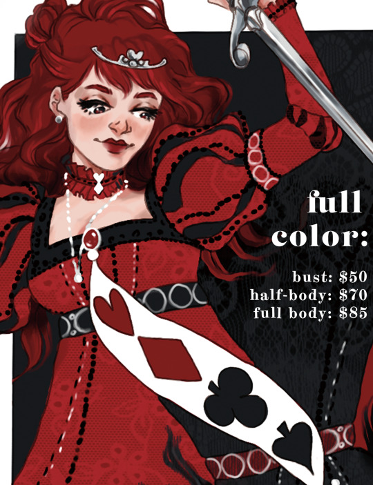
Full color: the rainbow is yours with a fully shaded, full color drawing. Again, depending on complexity, prices start at:
bust (head, neck, no shoulders): $50
half-body (from waist up): $70
full body: $85
What about backgrounds? Simple backgrounds (flat color, simple pattern, transparent) are free! Complex or detailed backgrounds are priced on a case-by-case basis.
I’m also happy to discuss drawing things not listed here! Wanted posters, character sheets, tarot cards - if you have an idea, let me know and we can negotiate.
I will draw:
NSFW + nudity (must be 18+)
Gore and body horror
Fanart
Celebrities
Original characters
Your D&D character (or party!)
Your trollsona
Multiple characters interacting - price will be negotiated depending on complexity
Props, weapons, extra elements such as wings, and complex outfits, etc are subject to extra charges based on complexity
However, I reserve the right to deny commissions!
dm me here on tumblr @ redaart or email me at [email protected]!
please include:
1. # of characters, type, and style: (ie: two characters, full body, full color.)
2. physical appearance. visual references highly preferred, descriptions work too! please include:
please specify if you’d like to leave any of these details up to me!
Hair color and style, eye color, skin color, ethnicity and/or fantasy race
Face/eye/nose/mouth shape (reference pictures work great here!)
For half-body or full body, please include body type
Any other relevant physical traits: scars, tattoos, body modifications, etc. These things can be subject to additional charges depending on complexity!
3. expressions or personality of the character / mood of the piece.
4. for more than one character: brief descriptions or reference images of how you would like them to interact! please also describe their relationship to each other.
5. YOU: your preferred name, pronouns, and age (if you are requesting NSFW art you must be over 18!)
tipping artists is not required but is appreciated!
fine print:
CORRECTIONS
all commissions can be subject to one major correction when the first sketch is delivered, and two minor corrections when the finished piece is done.
further minor changes will be subject to a $5 extra fee. major changes will be priced on a case by case basis.
PAYMENTS, USAGE, LEGAL STUFF
I take payment upfront via PayPal or Venmo. If you can’t make the whole payment upfront, we can discuss a deposit/delivery payment; however, this will be resolved on a case by case basis. Deposits and full payments are non-refundable.
The prices listed in this post are a starting point - depending on the complexity of your characters or design, the price is subject to go up.
FOR PERSONAL, NON-COMMERCIAL USE ONLY - contact me if you’re interested in commercial use and we can talk!
I retain the rights to use commissioned artwork promotionally on social media, you retain the rights to any original characters depicted in the artwork.
By commissioning artwork from me, you agree to these terms.
CANCELLATIONS
deposits are non-refundable! if your circumstances change and you can no longer make
if your situation changes and you can no longer make a secondary payment, i can work with you to deliver a simpler piece of art that will be covered fairly by the deposit.
HOW LONG WILL IT TAKE?
I will give you an estimated delivery date depending on the complexity of your piece and your position in my commission queue. If you need your piece completed by a specific deadline, let me know and we can negotiate it.
If I fail to deliver your piece by the decided delivery date I will offer you a partial refund depending on the severity of the lateness! This does not include additional time spent on corrections.
and that should cover it! please dm me or email me at [email protected] if you have any questions! <3
#commisions open#art commisions#art commission info#art#comms open#my art#fanart#original art#original character#ocs#oc art#redaart#fantasy#sci fi#horror#pinup girl
6 notes
·
View notes
Text
Please read carefully before commissioning a piece from me!
As always, if you have questions that aren't answered here or something below is confusing, just ask! I’ll be happy to help!
What types of commissions do you take?
I will be doing character Headshot commissions the most since they are the least likely to burn me out and I can churn them out quickly. But, I will occasionally be doing larger works. There will be fewer open slots for these. In general:
10 Slots for Headshots
3-5 Slots for Larger Commissions
What types of Backgrounds can I get with Headshots? Larger Commissions?
Available Backgrounds for Headshots (you can choose a background fill or a shape/color block in most of the following):
transparent (no background)
solid (1 color background)
2-color gradient
2-color pattern (additional charge*)
Pride flags
stylized Pride flags (additional charge*)
Larger Commissions can have the same backgrounds as above or a scene. The scene will incur an additional charge based on what type of commission you ordered (colored sketch✳, lines, flats, cel shading, or full render✳).
*See next section for pricing and add-ons
✳Colored Sketch and Full Render are exclusive to larger commissions and cannot be ordered in Headshot Commissions
What are your prices?
Prices may change depending on circumstances. Prices shown are BASE or starting prices and are subject to add-ons!
Headshot Base Prices:
Lineart: Starting at $20 USD
Flats: Starting at $25 USD
Cel-Shaded: Starting at $40 USD
Add-ons are charges incurred for more detailed work, special backgrounds, and/or currency conversion fees.
Headshot Add-ons:
Intricate details: $5 USD
(super-intricate headwear, tattoos, mech, and/or jewelry)
Patterned Backgrounds: $2 USD
Stylized Pride Flags: $3 USD
(Example: cyberpunk character with techy pride flag)
Currency Conversion Fee: 4% of overall price
(To make up for Paypal's fee, I'll be charging more for customers outside of the US)
Larger Commission Prices TBD*
Do you do refunds?
No. I work with you extensively throughout the process, updating you and getting critiques from you and implementing your suggested revisions; all so that your end product is something you are happy with.
I don’t consider the commission complete until you’re satisfied with your product. If you don’t like the finished product at that point, honestly, that ones on you.
Can I get a background with all types of commissions?
No; not all. If you order a Sketch or Lineart piece, you will not be able to get a special background. Lineart is always B&W/ grayscale.
How long does the process take?
I will generally reach out to selected commissioners immediately to let you know you've been accepted.
You'll get a sketch within 3 days, possibly sooner depending on how many commissions I have in waiting (Headshots are quick). Once you approve the sketch, I'll send you an invoice.
After I have been paid, please allow up to 14 days to get your finished piece (also depending on how many commissions I have in waiting). Headshots tend to be quick, but just in case.
If I need more time due to life events, I will reach out to you and we can discuss the next steps.
Terms & Conditions
You must be 18+ (or age of majority) to commission a piece; meaning you are legally able to have your own account with Paypal and similar sites.
(Yes, PayPal allows invoices to be paid with Credit/Debit if you do not have an account, but due to the nature of some commissions, I am a bit uncomfortable working with minors.)
I reserve the right to reject requests
I exclusively use Paypal. Please be aware of this.
Please do not remove my signature. It will be small enough that it won’t interfere.
Please do not feed my work to an AI or resell/ develop as an NFT.
What to Expect:
Most times, there will be a Google Form to fill out as an application for a commission. Please fill this out when it becomes available if interested.
If accepted, I will contact you via my comms email. You may need to check your spam folder (I don’t think this will be an issue but just in case). This is where I will ask you to provide as many references for what you want as you can.
I will reach out to you with an initial sketch for you to approve within 3 days of acceptance.
Once you approve the design, I will send an invoice.
Payment will be due upon receiving your invoice. I will not start work on your approved design until I have been paid!
Please allow up to 14 days from the day of payment to receive your completed piece (more for a large commission; I will give you a better estimate while in contact). I will reach out if I need more time.
Please consider crediting me if you would like to post the work outside of Tumblr. You don’t have to, but it would be nice!
Do you have restrictions on what you'll draw?
Yes. See Below:
Will Draw:
Your Ocs
Blorbos*
Your Fursona/ furries
Mech (super-intricate stuff incurs an additional charge)
Light Kink (leather gear, some props, puppy masks, collars, etc.)
Won’t Draw:
Racist, anti-LGBTQIA+, antisemitic, Islamophobic, misogynistic, and other hateful content/symbols
Gore/ Horror
Pedophilic or incestuous content
Abusive or sexually explicit depictions of real people/celebrities
Super sexually explicit or violent acts (See gore/horror and abusive acts involving real people)
I will literally draw anything that does not fall into the "Won't draw" category. You are not limited to options in the "Will Draw" category; I'm only including them as examples!
*Specific Media Exceptions:
Media that’s fine, I’m just not willing to draw (I have made it twelve years on this site without seeing any of these and I don’t intend to start [not judging you - do you little dudes/dudettes/dudenbies, just curating my experience thanks]):
Superwholock
My Little Pony
Miraculous Ladybug
Steven Universe
Homestuck
Undertale/ Deltarune
Tumblr Sexymen™
Media that I will absolutely block you for asking me to draw:
Harry Potter
Attack on Titan
Dream SNP
Copganda (yeah ALL those shows)
Military propaganda (like C.O.D., Top Gun, etc.)
2 notes
·
View notes
Note
Some asks ^^
Monster High: I’ve never seen g2. What makes Frankie stand out to you?
Ever After High: If you were a student, what would your fairytale be? Would you be a royal or a rebel?
Rainbow High: As a person totally new to this doll line, what specific dolls would you show me to demonstrate what you love about them?
OH OH YES OKAY I LOVE THESE THANK U SM
monster high: specifically what i love about G2 is what they did with frankie’s character :) i looovveeee frankie in G1 don’t get me wrong but in g2 they’re more autistic coded imo !!! so it’s something i feel i can relate to. i like the smart science persona they give frankie as well?? it honestly just makes sense to me for frankie to be this INSANE pillar of knowledge but still is SUPER bubbly and excited to be alive !!! (being that they’re basically a new born teenager) it kinda makes em a little more dorky too and i have a soft spot for major dork characters. a lot of people hate G2 and i totally get it but it’s fun it’s own way and kinda worth checking out imo
ever after high: oh GOD im not entirely sure what my fairytale would be, but i FOR SUREEEE would be a rebel, no doubt about it
rainbow high: this is probably my second favorite doll line at the moment simply because the base dolls faces and structures are so so gorgeous.
but if i was going to show specific dolls i would for sure show you my favorite, robin sterling: her clothes are absolutely gorgeous, i really really adore her robe, individual lacey socks, eye mask, fuzzy heels, i love it all so much but specifically her color scheme is just so to die for. something about the blue on her really just makes my brain explode ohhh my god. plus her face and hair are genuinely gorgeous.
another one i would show is the shanelle shadow high doll, while they both have similar high pony tails that’s not actually the reason hehe. one i ABSOLUTELY LOVEEEEE the colors on this doll, the white streak in the hair, the blueish gray eyes, the descending gray scale on the dress, seeing this doll next to other rainbow high dolls (same w any of the shadow high dolls) just makes them look completely out of this world and edited like, its so incredibly cool to see them take on this grayscale theme and have it look THAT jaw dropping next to dolls full of color. plus her fashion pieces specifically are so well done imo
and last, while i really love series 3 of rainbow high, series 4′s diversity is absolutely incredible, its really really nice to see such diverse dolls in a high fashion setting (because while barbie’s diversity is great, the fashion is not so much) the dolls in this line are just seriously stunning and so so pretty
BUT THANK YOU FOR ASKING OMG THIS WAS SO FUN !!!
6 notes
·
View notes
Last Seen Blogs
sowhumpful
So Whumpful

pacosemnoticias
𝕡𝕒ç𝕠𝕤 em 𝕟𝕠𝕥í𝕔𝕚𝕒𝕤
redcrackle-week
Red Crackle Week
linoholic
☀️

depresstest
depresstest