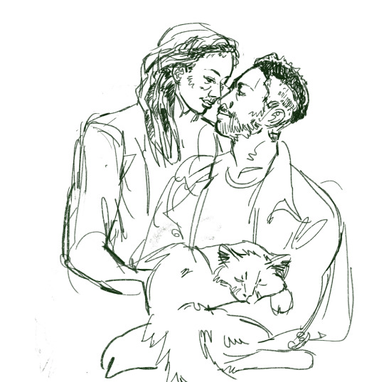
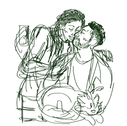
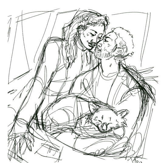
#i currently have...4 I think
Text

its actually the most self-indulgent day of the year!
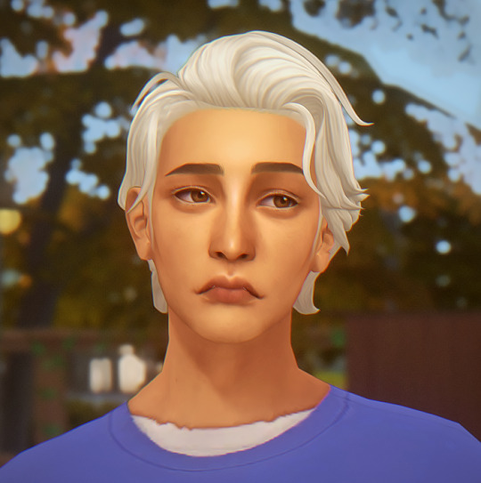
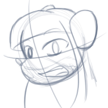
#one piece#luffy#trafalgar law#zoro#sanji#uh…#homestuck#:///// its 4/13 homestuck day and i will never tire of drawing some crossover between homestuck and my current interests#i actually have a whole page of human eustass kid and troll luffy but its like. implied nsfw?!?! idk i wasnt thinking clearly#sorry for the homestuck jumpscare
970 notes
·
View notes
Text
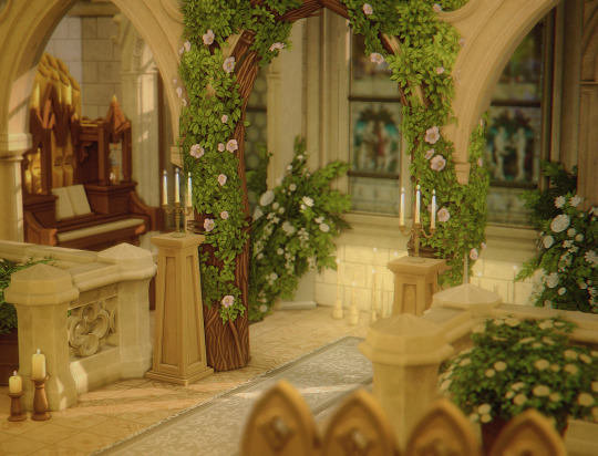
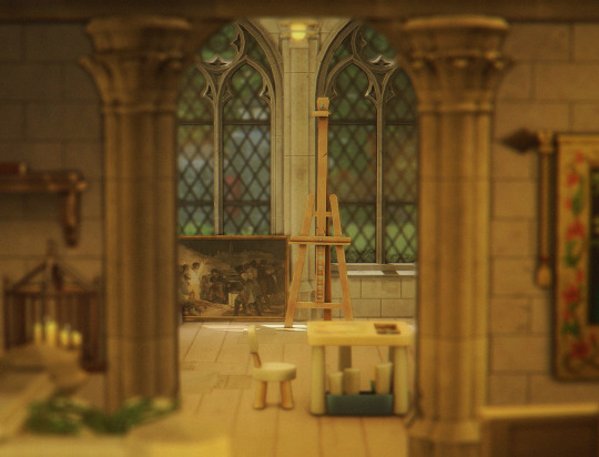
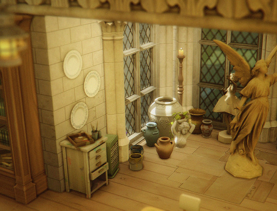
I turned my Henford's church into an art's centre so I could visit more - it was previously a wedding venue getting no use!
#I really love it#also leo&heidi are going back to henford for the spring!#im currently in the process of decorating their new home#they still have their brindleton house though!!#i loved the old henford cottage but it was getting a little small#i think i've found the perfect shell to work with ;-;#ts4#sims 4#the sims 4#henford on bagley
719 notes
·
View notes
Text
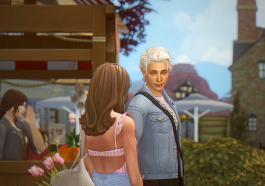


josie went to henford-on-bagley again to get some new plants before the fall crisp breeze starts setting in.
#shes got a decent garden so thats slay#i think i might have her move off her ranch now bc ... she has no animals and she def feels like she has less time for her horse pipi#ts4#the sims 4#simblr#sim: josie#sim: atlas#current save
567 notes
·
View notes
Text
I love when I see posts like "Share how many crochet WIPs you currently have! I have 5, it's so many!"
Like, girl, I have unfinished projects from over a decade ago that I refuse to frog on the off chance I decide to finish them. I've found years-old projects I forgot I even started and will impulsively just finish it on the spot. I've started three different projects in the last 2 months, including one I started yesterday, that I already know I may or may not finish within the year depending on motivation.
The number of WIPs I have is infinite.
#crochet#knitting#needlepoint#sewing#embroidery#shoutout to the time it took me 4 years to make my dad a hat. and like 6 years to make a turtle for a teacher.#i picked up yarn spinning for ONE day in like 2017. i have not done it since.#there's a half finished elephant amigurumi sitting in a basket and i started that guy in like 2011#i have two maybe three shawls i know of that are sitting unfinished in a storage bag#plenty of swatches of things that i start and lose interest in#currently i have a cardigan i wanted to make and started it and then got bored so i stopped#there's a hat i was knitting for my nanna that i started maybe 2 days before she passed#and that's sat unfinished i can't even look at it. i have no clue if i'll ever actually finish it.#there's at least one skirt i never finished sewing. and two skirts i have all the materials for but haven't started.#i know i have one beach cover up dress and one cover up skirt that i started in 2017 and didn't finish.#i think my oldest work in progress though dates back to when i was 9 or 10. i made a slipper. never finished the other foot.#that was in 2005 or 06. so literally i might have WIPs older than someone who is reading this.#and those are the just some of the ones i REMEMBER. buried in my yarn stash are probably others i've just forgotten.
283 notes
·
View notes
Text
tbh it does feel like the early setup for Bells Hells was a cool experiment but ultimately had some ongoing drawbacks because I do agree with Matt here that there has been time for watch conversations - there were plenty of opportunities for that or for just regular conversations in Whitestone, the Shattered Teeth, the Feywild, and their most recent long rest - but it's just not something the party got into the habit of doing because of the early pacing. It's just not a party that naturally falls into easy conversation with each other for the most part, and I think because he's never had to do this in prior campaigns, particularly this late in the game, Matt hasn't been very obviously laying out "anyone want to have a scene now, during downtime" the way one might with newer players.
#i'm actually thinking about this bc like. i moved to where i currently live shortly pre-pandemic#and as a result i keep having to like. forcibly tell myself it's ok you do not have the knowledge of someone who's been here 4-5 years#like it feels like that; delayed for valid reasons but also even with an opportunity to catch up there's a weird barrier psychologically#cr tag#this isn't a bad thing incidentally; i think that organically developed found family stories are good but not every story has to be that
73 notes
·
View notes
Text
cool dogs
#its so crazy how 2 of my current favorite things have dogs in them#heehaheha#im so nromal#ANWYAYS this is my first time drawing oatchi and i think i did a real good job#this isnt my first time drawing oddsock but i managed to actually make him look good this time so that counts for something i think#pikmin and lbp have had similar gaps between games which is funny i think#saba does not count#pikmin was winning by a singular year#pikmin 3 came out in 2013 and lbp3 came out in 2014#maybe lbp will take the lead if we dont get anything in the next year or so lol#anwyasy im talking too much. tag time#littlebigplanet#little big planet#oddsock#oddsock lbp#pikmin#pikmin fanart#pikmin 4#oatchi#oatchi pikmin#my art#i cant believe i forgot my fuckimg art tag
222 notes
·
View notes
Note
Since I’m guessing Tim’s kids are young, (like 10 or younger?) I think they should find Jason to be their cool teenage uncle and look up to him and wanna be like him because Tim would HATE that.
Tims kids only meet Jason bc while Tim may not be allowed to have any visitation rights somehow Bruce is still a trusted babysitter for the two kids and they both just latch onto Jason like he's the coolest motherfucker either of them have ever seen
#ask#anon#tims kids btw are 8 and 4 respectively#which tim somehow having a 4 year old hate him#its impressive#but yeah i also think the 8 year old is at that stage where#theyd hear about someone like red hood#and think he sounds so fregging cool#tims just seething#also i need to come up with names for these kids#and ngl im currently tempted to call them either#bluey and bingo or peper and george
176 notes
·
View notes
Text
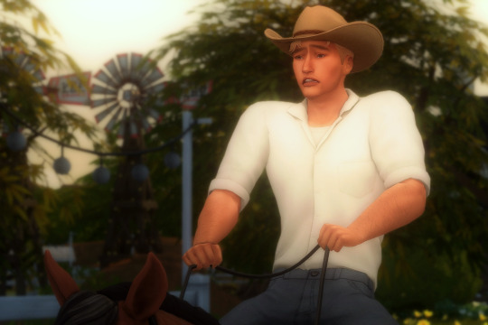


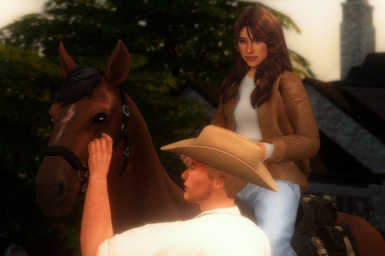

As you may know, we have found out that Vincent Kingsley is the biggest, most unexpected animal lover! Their Chestnut Ridge trip was coming to an end and he wanted to try out horse riding. And so they booked a session on the last day. It was certainly a new experience 😂
#ts4#sims 4#ts4 gameplay#ts4 legacy#postcard legacy#postcard gen 3#vincent kingsley#renee reichmann#another excuse to see him riding a horse and with that hat on 😂#the next post is story related im currently figuring out how to show it#this ones like a breath of fresh air#not think about the story#and see a bit of horse gameplay#hes giving off bryce energy haha#his clumsiness! never would have thought hed like animals so much#he does have a soft spot for them and thats so wholesome right?#he kept interacting with the horse when i wasnt controlling him!!!
110 notes
·
View notes
Text
What's the best comedy ever made and why is it Wooden Overcoats
#wooden overcoats#literally the people who created that show reached into my brain extracted the very essence of my sense of humour#and distilled it into a 4 season audio sitcom about undertakers#to this day it's the only podcast I've ever listened to in its entirety#(nothing personal I just find my attention wanders from podcasts a lot i lose the thread)#wooden overcoats though? have listened to it like 10 times in its entirety and am currently listening again#i should write more silly chapyard sometime#maybe even finish that spider au one of these days#mr. bees speaks#i tend to downplay how i sincerely think it's the Funniest Thing Ever Made when chatting to my brother#bc he was in an improv group with one of the producers/directors at uni and I think he would get legit weird and jealous about it sbshfhhdd
54 notes
·
View notes
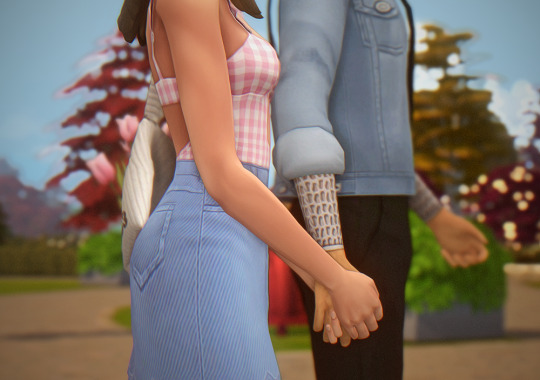
Text
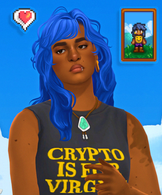
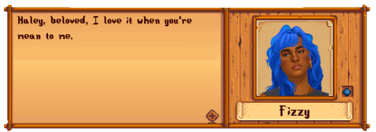
[stands outside haley's w a boombox at 3am] hey girl :3c
dyke farmer in front of the dyke house btw if you even care
#ts4#sims 4#simblr#*fizzysims#stardew valley oc#this isn't my simself btw#since my last post i made some minor tweaks to their face#i thought of changing their outfit to match my current stardew fit but i didn't feel like opening sdv to get a new screenshot#another vyxated serve btw w this cas bg#canonically fizzy stardew valley has an AWFUL haircut#but this will have to do#blue sonic hair ugh theyre so nasty#be honest guys you think haley want them
129 notes
·
View notes
Note
What's your opinion on how noelle seems to be connected to angels, holiness, jesus and etc vs kris being connected with demons, devil, and unholiness, and etc. And certain other deltarune characters following this trend, jevil, spamtom, ralsei, maybe susie idk.
Woah! O-O i guess the symbols do speak for themselves if i'm being honest!
I generally don't think of those characters like that (probably as a mental block since i like drawing them silly). But it is very obvious the game wants to portray Kris, Noelle, Secret Bosses, other characters, etc., in certain "dark" or "heavenly" lights. (with tons of religious motifs)
Kris: Red eyes, knife, creepy, possessed, no visible face, 2nd best
Noelle: innocent girl🧍♀️, innocent deer, best grades, in love
(of course there are more nuanced instances of these characters which will be explored more as the game continues, but Ch1&2 heavily points out main character traits like the ones above.)
I'm not sure why though .w. we haven't gotten much on what the overarching theme/narrative of the game will be regarding religious allusions... ¯\_ (ツ)_/¯ it'll probably come up later? I think the biggest mystery, for me, is what type of religion they practice and how it relates to Ralsei's "religion" on the roaring.
------
Maybe by the end, we'll fight god and expel the thought of Hell from the mortal realm. Or maybe the players are God??? And they fight us??? Or maybe we are a false God and they must rid us from this land. I bet $10 bucks there will be an epic battle with a god-like figure at the end :)
#i like to think logically with theory crafting like this. Like what would make sense for the game's story and its current themes. All that.#sorry this was a ramble#if we turn out to be the final boss- can I beat the shit out of Berdly? If we have to fight Kris- I will only be targeting Berdly :))))#this will be like...in the next 4 years i hope ;-;#bread#ask stuff
66 notes
·
View notes
Photo
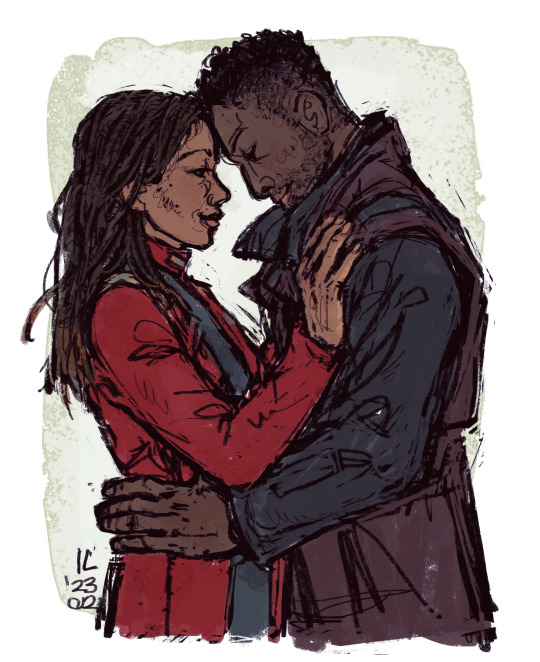
Micheal and Book <3
for starshaker for the @startrekwintergiftexchange ! :))
Sorry for the delay, I kind of went on an odussey with this piece but it’s finally here and I hope you like it! ^^
(Under the cut I included the 4 discarded sketches as a bonus :’D)
I discarded these bc I wasn’t happy with the likeness, and I tried that technique were you trace the structure of a face and the landmarks on it but I felt like it didn’t work for me, also I couldn’t make the pose work, my brain just refused it and also also I couldn’t draw grudge in a pose and prespective and style that made sense and was coherent with the rest of the picture, so I had to let this go and start over, it be like that sometimes :”)

#michael burnham#booker cleveland#star trek#star trek discovery#st disco#st dsc#it will be forever disco in my heart :(#digital art#fanart#no desciption this time besties I'm sorry my brain is fryed I'll probs add one later#micheal x book#help do they have a ship name??#disclaimer I haven't seen season 4 btw#just wanted to draw micheal's current look and book still has this coat I think#at least at the beginning of the season according to my ref searches#bookham#is their shipname maybe?
401 notes
·
View notes
Text


Instead of leaving a comment on a fic like a decent human being, I decided that it was a good idea to set myself up for an art project that is 50% landscape and fabric and colours I rarely-if-ever get to use oops X"D
On an unrelated note, did you know that @brightmouth 's Lessons in Idle Ecstasies is fucking great?? (All her writing is, really, I just have so much reading I need to catch up on, I've been too busy trying to figure out how to paint rocks and mountains and things I thought I knew how to paint ^^; )
#dincobb#cobb vanth#wip#marshmando#din x cobb#my art#landscape#I was thinking about posting this in the first place because well it's not much yet#like 1/4 of the whole thing if I can still count and my concept sketches are to be trusted but I'm so excited about this okay??#this is all very new territory for me as an artist#and I picked a small scene but I LOVE dream sequences and it was RED okay? I have a thing for that#plus i didn't know if I don't share it now when would I because I have zero idea still about the panel that brings Din in#and I'm pulling the biggest blank there I ever had so.... WIP for now#I always do this decide to make some fanart before I leave a comment on my fave fics and then maybe deliver??#ahem anyway I hope it's okay#I'm very very excited about this project I just really need to pull through#these are pics 2-4-5 I think in the current lineup#out of 12+1 but goddamnit Cobb is fighting me big time#the mandalorian#star wars#the mandalorian fanart#lessons in idle ecstasies
788 notes
·
View notes
Text


been trying to figure out a name for this guy for so long. pls help.
#i was thinking noah but i already have a sim named noah AND TECHNICALLY I CAN HAVE MORE THAN ONE but. yknow.#ts4#the sims 4#simblr#sim: atlas#current save
113 notes
·
View notes
Text

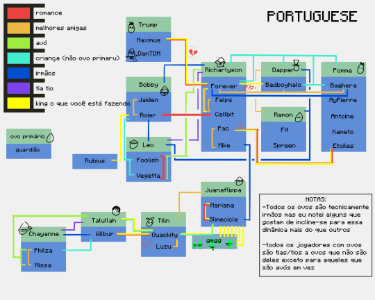


i've mentioned here and there that i made a relationships/dynamic spreadsheet. i have finally put it to use. look on my Works, ye mighty, and despair.
-extra note: i am not omniscient and i cannot watch every stream. i may have missed a sibling declaration or two.
-extra extra note: i currently speak only english and used google translate for the rest. if theres a translation error I'd love to know- i wont be able to go back and fix these, but im always so curious about how accurate google translate can be
extra extra note pt 2: do. do other languages use guardian as in "legal guardian" as in "not a family member but still Primary Caregiver of child" because i am suddenly aware those translations might not be correct. on the other hand tho if google translate decided that the parents are guarding warriors of the eggs im not going to argue
#qsmp#i should have added a ??? line for fit and philza tbh#look at just how beloved forever is <3#his dynamics have dynamics#he and richarlyson are also part of The Issue when compiling a fucking. whatever the hell this si#maybe a chart not a graph it is currently 4 am and im gonna schedule this#anyway i did legitimately consider making one of those classic family tree charts and just sticking richas in the centre so he wouldnt caus#too many lines to overlap but i think this worked out fine#absolutely delighted i thought of the columns it saved my ass#this server is Three Months Old#look at them founding those families#philever stans i see you and im sorry#if i included a heartbreak line then this would have been completely incomprehensible#fun fact to translate the silly 'king what are you doing' i made google translate#'chad what are you doing' instead so there would still be the grammar of a proper noun#but i wouldnt trick it into thinking king is an honourary title#i might not know the grammar of any non-english language but Oh Boy i know there are Traps#or maybe english's traps have just made me paranoid#either way#also. richas was added to bad's family art wall and bad baghs and forever have called each other family enough that#i made the executive decision to just adopt richarlyson out to the other two#richas called bad basically his mom tonight i can do what i want#and baghera gets to be part of that line because. honestly i wasnt thinking about him being Extra Canon Nephew#and i refuse to change it for reasons above re: it is 4 am; they are family#tho the thought of bad having three children separately attributed to him is hilarious.... maybe if i ever remake this ill do that#also note: i do know that foolish and bad had a kid called jimmy However i do not know what a jimmy is#so#scheduled post
92 notes
·
View notes
Note
The art style of Cloud Castle is absolute ass bro why are their eyes so big
Idk man it just looks.... off
I wish they brought back the og art style like Blue Scarab Hunt because that was gorgeous
Well if you’re referring to the book's artstyle as a whole, then calm down buddy the illustrations as a whole are pretty good all things considered (believe me some of the illustrations in the later books are waaaaayyyyy iffier)
But if you are referring to Danilo Barozzi’s illustrations in the book then uhhhhh… yeah I don’t blame you, I didn’t like the big anime irises either, she didn’t cook with this one,,,
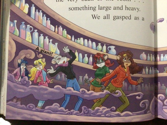
The interesting thing is Barozzi also did pieces for Secret of the Snow and those looked fine (she did well enough that I have to squint to determine which ones were done by her). My guess is either she did a lot of the illustrations for the latter half of SotS and we just got used to it, or it’s because the artstyle of special editions 2 and 3 were more… experimental? Books 4 onwards developed a very specific… look for the artstyle that adhered very closely to the main book illustrations of Spanish Dance Mission onwards, thus the illustrators had to follow suit, resulting in whatever looks off to look especially off.
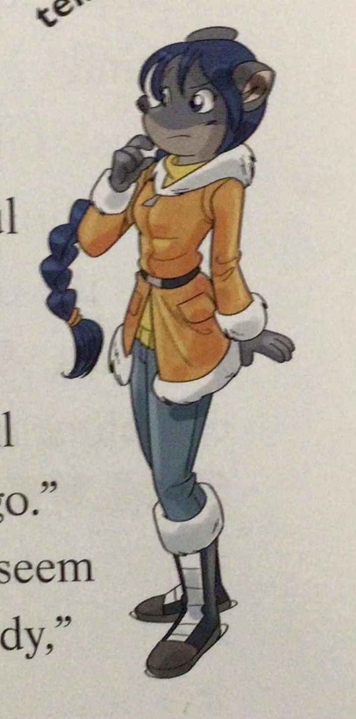
(Even with this set of pictures, I’m only about 70% sure these are Barozzi’s because of how alike yet different the styles are from each other in the book. The first one could be Barozzi’s, but it could also be Giuseppe Facciotto’s, since he also did illustrations for SotS and his stylization means he sometimes puts the eyes really close to each other in a way that’s weird but still makes sense somehow.)
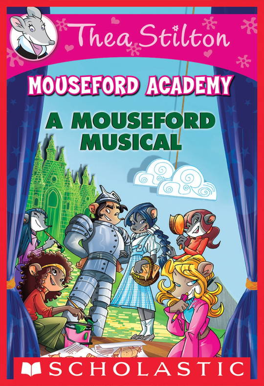
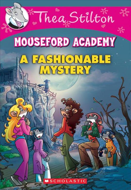
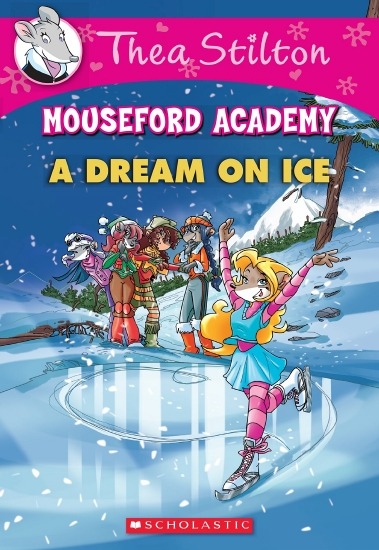
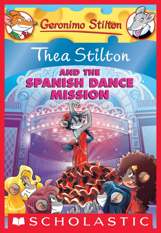
On the contrary, books 2 and 3 (and I would probably even include book 1 there) had a more experimental look to the illustrations, which seems to be based more on (and this is just a theory of mine) Giuseppe Facciotto’s iconic work for the covers of Mouseford Academy books 2-12, 14, 15 and 17 in the English books (he did waaayyy more covers for the Italian Mouseford books— he was basically the cover guy for the Mouseford books for a WHILE) as well as the books from Spanish Dance Mission to Lost Letters. If you’re wondering why those covers go as hard as they do, then now you know why.
(These aren’t all of Facciotto’s works for the covers we know in English but you can see that he popped off <3)
But yeah as you can see with special editions 2 and 3, the art direction seems to be heavily inspired by Facciotto’s artstyle.
However, when Barbara Pellizzari’s works became the aesthetic poster child of the books’ brand, that was reflected in the illustrations and how their aesthetic changed, as seen in the main books and how they look currently, special editions 4-9, and the Treasure Seekers trilogy.
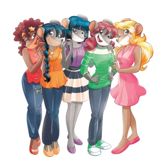
This new profile thing of the girls? This was done by Pellizzari (coloring was done by Flavio Ferron), and thus it became the main reference for how the girls look in the book’s illustrations.
And it’s not just in the general direction to the artists for how to draw the Thea Sisters, but also in the direction given to the colorists. Alessandro Muscillo was the colorist for the special edition books since book 1 and the Treasure Seekers trilogy, and you can see that the direction for the style varied through books 1-3, like maybe direction was experimenting with the mood the illustrations were to convey, beginning with the cartoony and bright colors of book 1, easing into the more grounded and layered palettes of books 2 and 3
Then book 4 was when they transitioned to using digital art /j
I jest, but seriously book 4 was the debut of the coloring style we end up keeping for the rest of the special editions and for all of Treasure Seekers, which is very… bright :D
(I would show more picture examples but I manually took pictures of my physical copies for the Cloud Castle and SotS illustrations and gwuh I’m too lazy to grab my entire collection just to take pictures,,)
Bright as in like… the colors are very defined and saturated. I dunno how to describe it, but when you see it, you get what I mean. It’s very bright and pretty and colorful and it stands out. There are still variations that happen on occasion (Star Fairies in particular uses a good dose of airbrush for the lighting and shadow effects, and Crystal Fairies looks like someone had a bit of fun using sparkle brushes), but other than that, it’s very bright. I don’t hate it, but I do acknowledge that yeah, if I was introduced to the series when it had fully transitioned to the new style, I never would’ve gotten into the series in the first place, because the older books had something that didn’t make it feel specifically catered to girls. The colors were bright, but not too bright. Colorful, but unified. They weren’t that complicated, and they didn’t have to be because the colorists (plural, there were at least 3 per book once upon a time) were popping the hell off with the colors they were given. But y’know, the newer books’ consistent style did give me a good spot to practice drawing mouse furries so I’m not complaining too much about the newer style, haha.
(Tiny baby E’s (it’s literally from 2020 what’re you on about mate) her first mouse Violet drawing using Barbara Pellizzari’s artstyle in Treasure Seekers 1 as an anatomy guide!!)
With that said tho, yeah I miss the old books -m- dunno if it’d fit the aesthetic of the special editions but m a n we could’ve had it and it probably would’ve looked cool
Also the illustrations go way harder in the older books, like Prince's Emerald? I've talked about Prince's Emerald and how it goes hard before, and I still stand by it and say that it does in fact still go hard
Maybe it won't fit the uh splash of color they gave the hardcovers, but imagine they grabbed Giulia Basile's coloring work for the graphic novels and used that as sort've a basis for the coloring style of the hardcovers. Not exactly the same-- would probably still add a touch of whimsical watercolor and/or paint to the very cel-shaded style, but we could've had something pretty dope -m-
Anyway that's my ramble simultaneously defending the hardcovers' artstyle and reminiscing on what could've been haha
#geronimo stilton#thea stilton#thea sisters#questions with e#rambles#the style of the older books is gorgeous but the main thing I'm wondering is can it pull off fantastical whimsy#that's the main thing i dunno if it can do (i would love to be proven wrong tho)#the style is so grounded that i'm wondering if it can pull off what the hardcovers needed it to do#which is convey the otherworldly fantastical thrill of exploring the fantasy worlds (which uh the newer books were able to do but#my main gripe is that fantasy and reality are near indistinguishable in vibes coloring-wise#sure there are sparkles and stuff is more saturated but the girls' dorm in book 4 still has the same-ish feel of the land of clouds#i dunno what it is. the bright colors just feel mundane somehow and don't take a shift when returning to reality)#looked at my books again and i think it might be the fact that the later books have no grounding color?#compare book 3 to book 5 and you'll see it the most distinctly methinks#the newer coloring style doesn't have a color that grounds the illustrations' palettes and thus everything's always bright 100% of the time#the girls' colors are always at their most saturated#like they're always under broad daylight in terms of lighting#it's not eyebleeding or anything but they don't look affected by the lighting in the setting they're currently in#and the result is it looks.... meh?#we get so used to the bright colors that they end up looking meh somehow#i'm not an art expert by any means this is just my observations as someone with a little too much brainrot
33 notes
·
View notes
Last Seen Blogs

woody2020
Untitled
feralfemmme
Venus
whatever-is-happening-here
whatever is happening here

tentenwind
Untitled

cursodereikionline
Curso de Reiki e Terapias