#i have very strong feelings and ideas about the colouring/art style/direction of each of the naddpod settings
Text

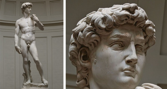
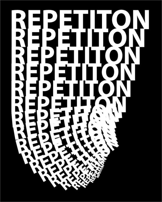
[ID: a coloured digital sketch of Hardwon Surefoot from NADDPOD during his vampire arc. He stares ahead of him with an expression of shock and horror. His lips and teeth are bloody; his hair and face are smeared and spattered with fresh blood. Behind him is a reference picture post-reincarnation. In comparison, Hardwon in Shadowfell is desaturated almost to greyscale, leaving only the red of his eyes and the viscera in full colour. end ID]
thinking about shadowfell a lot lately
#i have very strong feelings and ideas about the colouring/art style/direction of each of the naddpod settings#shadowfell in general and grimhawk in particular are deeply desaturated and the people consumed by it are as well; when bright colours#invade (such as our heroes) it looks deeply unsettling and eerie#unfortunately my brain works faster than my hands do lol#my art#naddpod#hardwon surefoot#naddpod spoilers#image description#art description
52 notes
·
View notes
Text
Loki is the latest Marvel Studios TV series in the long-running franchise and it’s currently ongoing with five episodes so far available to stream on Disney+ Hotstar Malaysia. For previous breakdowns of Loki episodes, check out Episode 1 here, Episode 2 here, Episode 3 here, Episode 4 here and Episode 5 here.
If you want a non-spoiler guide to Loki, you can head on over here.
Courtesy of Disney+ Hotstar Malaysia, we were lucky enough to be the only Malaysian media to participate in a roundtable interview with Loki Costume Designer Christine Wada and Loki Production Designer Kasra Farahani.
This interview with Loki Production Designer Kasra Farahani has been edited for clarity.
Keep in mind that we’ll be discussing some elements from all five episodes of Loki so far, so there will be spoilers below:
Q: You’ve previously worked on Black Panther and other MCU movies. How different was the experience of working on a TV set instead of a movie’s? Were there limitations?
Yes, I’ve worked on several Marvel projects. For me, this is the most fun one, maybe because I’m in a different position than I was on the other ones. But also, just because this project is unique in a couple of ways.
Number one; it’s literally in its own timeline from the rest of the MCU. It’s separate from the stories we’ve all enjoyed and seen in the MCU so far. The other thing that this one has that’s really great is the amount of visual and narrative variety. We have this kind of base in the TVA that we spend a lot of time in but also we have all these exciting different places in the world that the story takes us to. These were great worlds to design and to imagine.
In our case, there was no difference. The thing about the Marvel series is that it’s pretty much like Marvel movies; in terms of their creative ambition, in terms of the way they’re scheduled, the fact that we have one director.
There was not much about it (Loki) that resembled an episodic project, except for the fact that it was six hours of content that we were trying to make, so it’s a very long project.
In terms of resources, I didn’t ever feel that we were unduly stretched. Always, when you get a creative brief like this, there’s always a period at the beginning of every project where you’re reconciling the creative brief and the resources that you have. That has been the case for every project that I’ve ever worked on regardless of the size. There’s this beginning phase where that’s the case and oftentimes, it’s in that process where you come up with some very great creative solutions that are a direct result of some of the limitations, actually.
Yeah, I wouldn’t say that we had some extraordinary limitations in this case (for Loki), but that’s generally true for all projects, in my experience.
Q: What were you inspired by when making designing the sets of the TVA with its retro-futuristic and anachronistic aesthetics?
In the source material, the TVA had a lot of different things going on, but one of the strong themes also was this armada of desks, which is kind of typical of a post-war era bureaucracy look. There was a grain of that in the source material but a lot of it also came from the show’s creator and writer, Michael Waldron, who described in the original document I read before interviewing for this job.
He described the TVA as a kind of mix of Mad Men meets Blade Runner. Part of these two strong visual references for us. On top of that, me and director Kate Herron, even before we met and spoken to each other, were inspired by Terry Gilliam’s Brazil also as a strong influence because of the anachronisms that that story had and also because of the clear presence of this strong monolithic bureaucracy, which is something that we have in the TVA also.
For the TVA, we were looking a lot at wanting to create a world that had a paradoxical feeling, being an imposing monolithic architectural space that has brutalist elements in them and had almost Soviet modernist elements to them. The colour palette and the materials and the whimsical patterning were much more like American style modernism.
The result was hopefully when you’re in an environment like this, you don’t know whether to feel terrified or invited. Hopefully, it creates that feeling in both the characters and the audience; this kind of cognitive dissonance in not knowing whether they can trust the TVA or not. That’s the narrative objective.
The writers came up with these ideas and the idea with that was to kind of create the bubble gum wrapper in the Renaissance era (Loki Episode 2) and the futuristic shovel in the early 20th-century farm field (Loki Episode 1). These ideas were placed there to create a trail of clues for the TVA to follow before they have clarity on Sylvie’s identity. But for the anachronisms generally, that was something we tried to do throughout the TVA to have all kinds of strange things from different timelines and different worlds popping up in terms of props, like the Infinity Stones in the mail cart and stuff like that.
Q: What was it like working with Tom Hiddleston, who is a producer on Loki?
It was very exciting to have this opportunity to take the character and his storyline in a different direction. It became all the more exciting when I read the scripts and I saw the type of journey they were going to take the character on.
Tom is a professor of Loki, basically. After all, ten years or so of playing the character; he knows it better than anybody and he has an in-depth understanding of the character and his backstory; the character’s family relationships and he was really helpful in giving a little talk to all the department heads about the background of his character, which was very informative.
Q: Recently, Loki series director Kate Herron said that 90 percent of production sets were physical. Does this include the world of The Void, and can you tell us more about how you brought it to life?
That’s true. That was what was unique about this show, because of my own design approach, and my goal in creating this large monolithic brutalist environment, I felt strongly that the sets needed to be built kinda wholly and that they needed to have the ceilings in-tact. This was also supported by Loki cinematographer Autumn, in that the way of her own style of photography is very wide and low-angled photography, which is why for both of our creative goals, it made a lot of sense to build these sets like completed and 360-degree environments.
For the TVA, that was almost always the case, with the exception of when you saw outside a window. With the Void (in Loki Episode 5), a lot of that was built practically as well. What I can tell you is that we build a large piece of this landscape on a soundstage, which was about 150 feet by 200 feet of undulating wilderness terrain. In that, we would bring in these different scenery elements on different days to make it feel like different places within the Void.
For example, one day there was the bus stop terrain where we meet Loki. One day it was the giant head. One day it was the drive-in movie theatre where we find Sylvie. All of these things were brought in and we shot there over the course of seven days. The terrain was designed in such a way that depending on what angle you shot, it felt like a very different place. Backgrounds were put in during post-production in visual effects. The Loki palace, where the Loki variants kind of hang out, the bowling alley, all of that was also a 360-degree built set as well.
Q: What was the most challenging set of the entire Loki series that you had to work on?
We had a lot of very ambitious sets but I think the city of Sharoo at the end of Loki Episode 3: Lamentis was a very technical set. The goal was to create this virtual one-in, that appears as a single shot. This was a very involved and elaborate process of choreography, basically.
All the different departments were involved to make this happen because as we watch the sequence, we see tons of actors running around, there are explosions happening, the camera’s panning up to see the planet above crumbling and asteroids pelting the surface.
There was a lot of planning that went through at the very beginning. We brought the paper models of this to Autumn, our cinematographer and creative director, to use to plan some of their shots. One day, we had some more information that fed back to the art department where we developed more involved and elaborate drawings and models which again, fed back to them. In this way, we had kind of an iterative conversation to arrive at what the design was.
So, as we start to build the set, many of the department heads came to visit and check the progress. We rehearsed what the shot was going to be, so we could exactly fine-tune the set to meet the needs of this shot and see where the edits needed to be. In order to do this, we needed to adjust the exact width of the roads or move a piece of scenery here and then figure out exactly, okay, there’s going to be an explosion coming out of the ground here and another explosion coming out of the building here and this is when the camera looks up to the sky and sees the planet explode. This is where the window breaks and this is where the guy jumps out and grabs him and there’s a fight.
There are many, many people involved; Monique Garderton, our stunt coordinator, Kate Herron, the director, and also the special effects team, and of course, visual effects, deeply involved, and Richard Graves, who is kind of our AD (Assistant Director), the circus leader of all of it, organizing everybody to kind of work on this thing altogether. It’s the sort of thing that involves so many different departments that it can only really be discovered when working in a big group together.
I would say that was maybe the most challenging technically because there were so many logistical parameters and so many moving parts.
Q: What are your thoughts on diversity in the production of the creative industry?
I think that it is critically important. As somebody who is myself an immigrant, I was born in Iran and my family moved here when I was quite young. I’m super happy to see the direction that the industry is going in. I think Marvel has been particularly excellent in providing leadership in this way and I honestly have to give a lot of credit to Kate Herron, our director.
Almost more than any other project I’ve been on, she prioritised inclusivity and diversity. I mean, lots of people, don’t get me wrong, it’s on every project and on everyone’s mind, but I think Kate went above and beyond because it’s so fundamental to her worldview and she’s such a sensitive soul in this way. One of the many ways in that it was such a joy to work with Kate and I’m very proud of the many different ethnicities we’re representing, and how many women we’ve had. In our art department, we had close to fifty men and women.
It’s important and leads to better creative results that are more fully realized and more representative of what the fans really want.
14 notes
·
View notes
Text
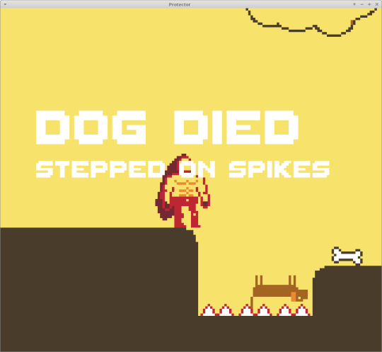
Belated Protector Postmortem
I made the game Protector for the 46th Ludum Dare game jam. I did not make a tumblr post about it during the jam. Don’t think Protector is my best jam game, but what can you expect from a jam game? Hardly a glowing endorsement, I know. Download it from itch.io at this link, or don’t.
With some distance, I think it’s interesting to tell you why I don‘t think Protector is that good... or maybe “good” is not the right word. Some friends and other Ludum Dare entrants had encouraged me (privately) to keep working on it after the jam and fix the bugs. In my opinion, Protector is fine the way it is (for a jam game anyway), but any more work on it will be a waste of time. There will be no post-compo releases of Protector.
If you are just getting started making games, Protector could be a good example of when to stop working on a prototype. But first, let’s do the usual “game jam postmortem“ song and dance.
Game Description
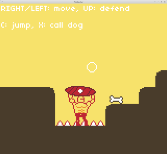
In this moody puzzle-ish platformer, you control an invincible character tasked with guiding a small (and very vincible) dog through the level. You cannot control the dog.
Instead you can pick up and throw a bone, but you can’t carry the bone. When you press the bone throwing button a second time, the dog will chase after the bone.
One the dog is running, you cannot stop it. You also cannot call the dog to return to you. You have to clear the path for the dog before you let it loose.
What Went Right
Scope: I scoped Protector aggressively minimal. I remember feeling a bit under the weather on the first day of the jam, so I decided to take it easy and submit something small. I was okay with submitting a small game in the jam category. I just had this idea I wanted to try out.
There is only one level, and it’s not all that big. I submitted on the morning of the third day, with everything I wanted in the game, without losing any sleep, and with some time to spare.
Theme: The idea was my own take on that last level in Bastion, when the kid carries the battering ram, but as an escort mission. The main character was supposed to be some kind of brute or barbarian loosely inspired by the barbarian class in Diablo II. Obviously you keep a dog alive, because that’s the theme of the jam.
Character Designs: I think nailed it with the brute and dog sprites. The brute is big and faceless, and the dog is small and cute. The proportions of the brute convey that he is strong and slow, and his shield (but no sword) should clue you in about his purpose.
Simple Dog Behaviour: The dog runs and bounces around pretty quickly. Once the dog is running, all bets are off, because you are too slow to catch up. You have to set everything up so the dog won’t kill himself, because he’s not a cat with nine lives. He is a dumb dog.
Any kind of AI or pathfinding would have made the dog less predictable, and the main objective of the game is to keep it alive (that was the theme of the jam), so simple, fast, predictable movement was key. The player has to be able to predict the dog’s path before it starts running.
Level Design: The level is not that big. There is a variety of obstacles and set pieces, and these are all easy for the player character to navigate, but potentially lethal to the dog. In addition to multiple platforming challenges, there are two unique “set pieces” that break up the monotony.

There are five different ways for the dog to die, and the level is constructed to make the player experience each of them once. Some are obvious, like the lightning cloud and the tower that shoots arrows, but the level is designed so that every player dies at least once. After mastering an obstacle once, it should pose no challenge on repeat playthroughs.
What Went Wrong
Controls: The controls are very simple, based on only the four arrow keys, X and C. These can be mapped to the left stick and first two buttons of a gamepad. In walk mode, the two buttons jump and call the dog, and the “up” direction is used to raise the shield.
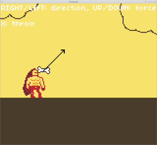
In throw mode, with the left/right axis controls the throwing angle, and the up/down angle controls the velocity. This control scheme feels too cumbersome. The X key is used for calling the dog and throwing the bone, based on context. This also feels cumbersome, but it makes it less likely for players to accidentally throw or call the dog when they want to jump. I still had to resort to putting the controls on the screen at all times.
For gamepad controls it would have made more sense to use the direction of the left stick for the throwing angle and velocity. For keyboard+mouse controls I could have implemented a mouse-based throwing system like in Gunpoint or a parabola indicator that shows where the bone will land. I could also have gone the other way with a Worms style throwing system in which the throwing velocity is proportional to the time the button was held. As is, the throwing uses the same buttons as platforming, but it doesn’t feel good.
Bone Physics: The bone physics was kind of bouncy and floaty. I implemented my own physics because the bone was the only object in the whole game that needs halfway realistic bouncy collisions. The player and the dog use platformer physics, so there was no need for a physics engine like Box2D, libODE, or pymunk. The bone is modelled like a simple spinning ball. I could have made the bone less bouncy to give the player more control, maybe even cheated by making it less bouncy only in the x-direction. I could also have gone in the other direction and modelled the bone as a rectangle or two balls connected by a line.
Dog Platforming: The dog sometimes gets stuck in a wall or on a ledge. This is bad. I could fix this by making the dog fall down or turn around when this happens, but that would make the problem worse. I’d rather have the dog (or the bone) stuck in a weird position until the player gets it out than having it sit inside a pit in an unwinnable position with believable physics.
The way bone physics and platforming work is very janky, but that is because the obvious fix would have unacceptable gameplay consequences.
Main Gameplay Loop: It goes like this: throw bone - move into position - let dog loose - wait for dog - retrieve bone - throw bone - move into position, and so on. There is no way to call the dog back because that would make certain puzzles too easy, no way to set multiple way points for the dog, no way to ask the dog to fetch the bone back to you, and no way to carry the bone - otherwise you could just walk over and drop the bone there.
The gameplay loop as it stands just doesn’t allow that many puzzles, and changes to the gameplay would make the current puzzles too easy. Adding more content is more or less incompatible with the current gameplay, and changes to the gameplay loop would break the existing balance.
Allowing the player to carry the bone, to use different tools than the shield, to call the dog back would destroy the game design.
What I Learned
Escort missions suck. I already knew that hidden complex systems are not fun, but even indirect interaction based on simple systems is hard to get right. Beyond that, I did not try anything new and outlandish. I just had the idea about the big protector and the little dog.
The most surprising thing was how poorly Protector was rated in the “Mood” category given the relatively high theme score. Having no sound really did me no favours, and neither did the GameBoy screen resolution or the 5-colour palette.
But importantly, despite all the gameplay shortcomings, this still works as a short game. If the game is short enough, it can be carried by novelty, and players will forgive janky controls, even if the controls are part of the game’s main difficulty. I relied on this insight in other jam games, but it does not translate to long-form games.
This is a bit meta, but it is important to understand when a game design does not work. To some degree I think game jams even encourage a kind of toxic positivity towards young people learning to program. By all means, you should encourage people who want to try their hand at game design, and you should not go out of your way to disparage teenagers learning to code or programmers who make programmer art because the graphic design in their enterprise software day job is done in a different department. All too often, instead of “keep it up“, we tell people who are getting started to keep working on their jam games. If a game has load of bugs, on some level it would be nice to have them fixed, and these bugs are an obvious starting point for a post-jam version of the game - but when I see buggy games with experimental gameplay ideas, I don’t always encourage the devs to keep tweaking the mechanics until it works. Some experiments have negative results, and that’s okay.
Some jam entries are great games, successful experiments if you will, but they can’t easily be made into longer games. That’s also okay.
Can We Fix This?
“But hypothetically” you ask me, “how would you turn Protector into a longer game if I hired you to be a game designer?”
Okay. Hypothetically. In this hypothetical world, you pay by the hour, no unpaid overtime, and no bonus based on how well the game sells ;-)
We need a story that glues all the levels together, and the dog platforming would be at most a third of the game. Maybe in some levels you and the dog fight side by side, maybe you explore some of the levels with the dog on a leash, maybe you tie the leash to a post at the level entrance and come back when you have cleared everything.
I can’t stress enough how important it is to have through-line that connects different types of gameplay, different set pieces and minigames.
In order to make the platforming and puzzle solving more interesting, you would have a different load-out in different levels. Some platforms are dog-only, and you would throw the bone (or a tennis ball) up there because you can’t reach it yourself. You would need a way to recall the bone (or tennis ball) or a way to recall the dog, maybe a dog whistle. Maybe you just have a limited supply of dog treats per level. Earlier levels just have the bone, and shield, later ones introduce mobility items for the player character, tennis balls, a collar, a leash, dog treats, a dog whistle, and so on.
It would be a fun idea (or a gimmick) to have most of the upgrades be for the dog, but that’s not very fun to actually play.
Another possible problem is if the dog handling becomes an afterthought, or a drag in the player, going back to fetch the dog after the level has been cleared. Escort missions are not held in high regard among players, so this could become a self-fulfilling prophecy.
With all these mobility items and larger levels, we would need an improved dog AI. We also could not have the dog fall into a pit of spikes, instead it should refuse to jump into unsafe distances, and somehow communicate to the player. We would also need a way to get the dog back down if it got up the wrong platform, and a way for the player to reset progress to the last check point or re-fill dog treats without creating an exploitable loophole where the player can just walk back and forth to the vending machine and win a level with infinite dog treats.
Oh no, the dog AI sounds complicated now. Complicated hidden systems are not fun, and training AI-powered animals is not that difficult code-wise, but it is difficult to pull off in a way that is fun and legible to the player. I still remember Black&White. Those animals were a gimmick. Somehow we need a way for the dog to communicate things to the player. Can the dog talk? Is there a bark code? Can the dog smell things?
One thing we absolutely must not do is vary the dog AI between levels. Players will have a really hard time as is, because the smarter the dog gets, the easier it becomes to accidentally mis-predict what it will do.
Think about all the parts of this rather comprehensive proposal: Complex AI, some kind of story, different controls, unlockable items, and level/puzzle design that integrates all of the above, all written from scratch or re-written for the bigger game. I’d rather spend the time on something else.
7 notes
·
View notes
Text
Artistic Beauty Branding
Concrete created BITE’s strategic positioning, brand story and model identification. The fashionable lipstick caps – created by the Vienna-based agency EOOS, reflect the person ways ladies apply lipstick. These parts gave BITE open-shelf appeal, drawing the attention of searching consumers who would then “discover” the product’s distinctive natural ingredients. Bare and Bloom Naturals is more than simply an all-natural tub & body company, we are a holistic wellness and life-style brand.
With a reputation like this, you’d expect the wonder model to be cruelty free and environmentally conscious. Bareminerals is all of those issues, but their web site provides an even higher perception into their brand’s commitment to particular social points. And if your precise line of merchandise doesn’t cover all of that, not to fear. Your web site is a superb platform to begin a dialogue about all beauty branding matters and, who is conscious of, maybe a while down the road you would possibly begin producing a line of magnificence products that you simply by no means considered.
Beauty products are huge enterprise, but you probably can afford to be playful and personal together with your marketing. 2) Consider the services or products you supply and think about what makes your offerings totally different from those of your rivals. If you offer a particular service that nobody else does, you may focus on that in your advertising.

Your brand is the face of your organization and something that individuals instantly associate together with your magnificence beauty packaging brands. Although there’s an countless number of intelligent ways that you can symbolize magnificence products in your emblem, in this industry, simplicity can be a unbelievable choice. One major element of brand strategy is establishing the model attributes of your beauty enterprise.
And she has carried out a killer job of developing a robust personal brand, especially on Instagram. She retains her private account separate from the salon’s account, but her personal account is the place she goes to express her style, her ideas, and to speak real speak. But if you're critical about rising your career, and especially when you personal your own enterprise, it’s extremely important to take serious care of your private model. A brand experience is a strategic journey consisting of the entire experience folks will have together with your model. The journey — from not knowing you exist, to purchasing from you, to exhibiting you off to their pals — is made up of a sequence of touchpoints.
And one of the simplest ways to do this is share your actual personality, opinions and sure even “messy life stuff” together with your followers. So, are you beginning to really feel impressed about the method to promote your personal brand to grow your business? Keep reading to study 3 powerful however simple ways to search out your unique voice as a beauty-preneur and share it with the world. More than ever, we wish to join with the person behind the business. And one of the most necessary ways to build your private model is communicating online. Any time you talk together with your clients and audience, whether it’s in-person, on Instagram/Facebook, via e-mail, in videos, etc, you're constructing your personal brand.
And “Which printer do I want to produce my own advertising collateral? ” The solely people equipped to answer such conundrums are magnificence insiders who've been the place I’m attempting to go. By reaching out to these folks—through Instagram, e mail, and Facebook teams such as Likeminded Bitches Drinking Wine, and meetups like OKReal and HER Global Network—I gained invaluable perception. A strong on-line presence may help appeal to stockists—so it’s price investing in social media spaces. You will need to work out what an authentic beauty model seems like for you. We collaborate with an array of energetic skills to concept and produce exhilarating creative content material for varied channels and mediums from consumer-facing magnificence property to back-end instructional materials.
For example, a luxury magnificence firm would possibly give consideration to Pinterest marketing as a means of reaching out to the prosperous ladies more than likely to purchase their products. You also need to determine on some advertising ways – specific things you'll do to hold out your strategy. Because the competitors is so intense in the beauty industry, it’s necessary to choose a emblem that can help communicate your company’s mission to prospective clients. For instance, an organization that makes anti-aging merchandise would possibly need to use images of youth to demonstrate its mission.
Our focus is on creating high-quality, natural, and luxury self-care merchandise by eradicating all harmful ingredients from cosmetics, specializing in sustainability at each stage of the supply chain. We have product lines geared in direction of men and women of all backgrounds and ages, in addition to children. Bare + Bloom will also provide versatile and personalised service, with custom subscription presents based on the individual wants and objectives of our clients. Our mission is to assist our shoppers make sustained constructive adjustments in their physical and emotional health, and of their lives general. We purpose to become a household name that folks look ahead to inviting into their properties each month.
Korean brand Then I Met You is owned by Soko Glam founder Charlotte Cho, who intends to maintain the brands distinct in order that they develop seperately. Consumers expect “a clear ingredient story” and sustainable practices as a given for startup brands. Dribbble is the world’s leading neighborhood for creatives to share, develop, and get employed. Bring the Parisian je ne sais quoi to our beauty mobile app Comme Ça is a cellular app that allows users to guide magnificence appointments at house or in-salon in a matter of minutes, hassle free. Biomoxi An authentic and hand-drawn tree for a skincare company. PEAK BOTANICS Formulate all natural, natural botanicals (plant-based products) made in Oregon.
Our strategic course of and shopper insights turn the usually subjective creative process into an objective one. The results have been award-winning, attention-getting, and revenue-generating for our purchasers. Each of our shoppers involves us at a different stage in the brand development course of.
Concrete art directed and produced a video to help the BITE and Amuse Bouche narratives across the hand-crafted, meals grade components with high influence colour. If you have Rhianna behind your brand, you may suspect slapping her name on the field would sell anything from dry shampoo to physique oil. But creating a robust brand is more than piggyback driving on somebody else’s fame exterior the sweetness business.
You will not have the ability to work with suppliers who only ship in huge portions, but you'll be able to see how the product does out there. While the pimples vanished, some gentle scarring remained, so I investigated extra natural fixes and eventually landed on tamanu oil. Also boasting antibacterial and hydrating properties, this oil has been utilized by ladies in Polynesia for generations to assist not simply with acne, but in addition scars. Whatever your goals are, it’s necessary to articulate them so you may make them a reality. It’s a mistake to dive into advertising with no plan, and it’s very straightforward to make a advertising plan that can help guide you alongside the way in which.
An absract emblem for massage center logo for massage heart that additionally sells beauty products . to make the emblem and the middle name associated the shopper needed some particular elements to be in the brand similar to for that i created a circle with some waves within the left and a lotus flower leaves in the proper backside nook . Skin product label and packaging design Logo and packaging design for a excessive finish luxurious brand pores and skin serum product. Amuse Bouche was the first major product launch for the company since its inception.
Fenty was now a major, mainstream model with these shades—and positioned as a high-end model at that. “Having cohesion and consistency reflective of brand identification and mission is essential,” says DeSalva. These three startup magnificence manufacturers have managed to do this, finding white area in a crowded market, in addition to a novel visual identity. Whether you need a new web site design, rebranding, packaging design, or logo design, we will create a strategy and visual id that may assist your small business make a stunning first impression. Contact the Aventive Studio team right here to learn more and get started.
Through skilled photos and behind-the-scenes snaps, she shows us that being a real human being as a enterprise owner, and being vulnerable, is one of the best ways to construct up loyalty and respect out of your clientele. We activate the proper magnificence hot spots based mostly in your brand needs—so you arrive at your imaginative and prescient on the quickest path to the best high quality. See how we used our framework to assist Theorie reimagine their model to create a memorable expertise that aligned their targeted customer with the brand.
We traded their muted, bamboo packaging for a cool, vibrant aesthetic that might set them aside and enchantment to a wider vary of beauty-obsessed customers. “I think that any magnificence brand that launches right now should have a clear ingredient story, except you're a Kardashian otherwise you're Rihanna with Fenty Beauty,” says Lilah b founder Cheryl Yannotti Foland. Lilah B promote multi-use products using "clear" elements, encouraging clients to recycle their old cosmetics packaging.
The frequency of assortment has elevated from monthly to weekly in only a few years, and Lilah b is devoted to continuing the scheme as a cost of doing enterprise. Nothing says "distinctive" like custom magnificence branding designed just for you by a professional designer. We’ve collected some superb examples of magnificence brand identities from our world community of designers.
1 note
·
View note
Text
Suptober Day 25 - Tattoos
“I want a tattoo,” Cas said one morning, completely out of the blue and while Dean was still dangerously in his first sips of his first coffee.
“You’ve got tattoos.” Dean bit back grumpily, though Cas knew better than to take his ire seriously before ten am.
“Yes. I want another one.”
“Okay...” Dean drew out the word like he was waiting for Cas’ point.
“Can I?”
Dean snorted and placed his mug down on the table, “I’m not your mother, Cas. You’re a grown ass practically immortal being. If you want a tattoo you don’t need my permission.”
“I know, but… would you help me? I don’t want to end up disappointed and I don’t know how to tell if a parlour is a good one or not.”
Dean squinted at him through the steam from his coffee, considering.
“Sure,” he said. Go grab my laptop, we can have a look around.”
Xxx
Dean was almost done with his mug and a lot more cheerful when Cas returned a few minutes later, he took the laptop and flipped it open, searching for nearby tattoo parlours and going onto their various websites.
“I don’t suppose sanitation really matters to you,” Dean said, flipping through some pictures of a studio before dismissing it. “Seeing as you can’t get infected and all, but it says a lot about how much a place cares about the art it makes. If you can stumble in there at three am and demand Bob Ross’ face on your ass then you’re not in the right place.”
“Why would anyone-?”
“People.” Dean answered with a shrug. “Those are the kind of places we went to get these,” he gestured at his chest, “but these are practical, they just had to be copied from a drawing we supplied, if you want an actual design, you need to find an actual artist, not just someone with a tattoo gun who can draw hearts and fancy swirls and a passable wolf.”
Cas wrinkled his nose at the thought. He did want a proper design, something beautiful, something meaningful, something his. But the task seemed monumental for him let alone a stranger.
“Here are the ones that look decent.” Dean said a few minutes later, showing Cas a set of six tabs. “What do you want to get anyway?”
“I don’t know.” Cas said, feeling touched that Dean was walking him through this but overwhelmed as he clicked on the first tab and a slew on images popped up. “How am I supposed to choose?”
Surprisingly, instead of mocking him, Dean smiled and shuffled his chair closer so he could see the screen too.
“Look through the artist portfolios,” he directed, pointing to the option at the top of the screen. “Most will have links to their own websites with more of their work. You’re not looking for the perfect design, just the perfect style. Some are better at portraits, others at more geometric stuff, some do different things with colour. You can narrow it down by crossing out the ones you don’t like.”
Cas nodded solemnly and turned his attention back to the screen. The first artist had lots of strong black lines and straight edges. The second a lot of portraits, neither of which really appealed to him.
He seemed to search for hours. Dean was refilling his coffee when Cas found what he was looking for.
“This one.” Cas said, looking up to see Dean jump at his voice. “I want her.” He tried to keep his tone neutral but from the slight crinkle at the edge of Dean’s eyes he hadn’t been able to hide the excitement in his voice.
“Alright, let’s take a look.” Dean said, leaving his mug at the machine and coming over to look at the screen over Cas’ shoulder. “Nice,” he agreed.
Castiel felt a warm buzzing in his stomach, he was glad that Dean liked it too. The image on the screen was a rose, not what Cas was looking for really, delicately done, with a fine outline, but it was the colours that were magical; midnight blue and deep, rich purples blended in the petals, with a shimmer that looked almost metallic, smudging across the lines slightly, not enough to ruin the image but just enough to be imperfect, to feel right.
Castiel booked a consultation for the following week.
Xxx
Cas sat in the waiting room of the tattoo parlour, tapping his foot nervously while Dean sat next to him. Dean had insisted on coming with him and Castiel hadn’t thought to object, the last time he’d gotten a tattoo he’d been alone, and although the pain was minimal compared to some of the torments he’d endured as an angel, experiencing it as human pain was different and he had wished for company, even if Dean only would have mocked him and compared him to an infant.
“What if it turns out bad?” He asked quietly, “I still have no idea what I want, what if I can’t think of anything? What if she doesn’t have the right colours, or-”
“Cas,” Dean interrupted patiently, “it’s just a consultation, no needle is getting near your skin without your say so. If she draws you something and you don’t like it, she’ll change it for you. If she doesn’t have the colours she’ll order them in and we can go back when she’s got ’em. If you don’t have any ideas we can talk it out. It’s gonna be fine”
Cas was grateful for the reassurance, but he was still nervous nonetheless. He just didn’t want to be disappointed. This felt important and he didn’t want to mess it up by choosing the wrong thing. The artist, Giva Chaudhary, was exceptionally talented, but none of the images in her portfolio had really spoken to him. He was worried that they would get there and she would be unable to produce the thing he wanted on his skin forever and he would either have to go home with nothing, or settle for something that was less than perfect.
“Mr Novak?”
Miss Chaudhary was a small woman who looked to be in her mid-thirties, her black hair was bound in a long plait and she had a smile that seemed almost too large for her face.
“Yes.” Castiel said, standing to shake her hand. “Miss Chaudhary, you work is beautiful.”
“Well thank you, but don’t bother with the ‘miss’, Giva is fine.”
“Cas,” Cas offered, and then, because Dean was leaning to shake her hand too. “This is Dean, a friend.”
“Moral support?” Giva asked, her dark eyes twinkling, “Understandable, a first tattoo can be a scary business.”
“It’s not his first,” Dean said immediately, “but this one’s important, he wants it to be right.”
Giva nodded and gestured them to sit, she did as well, laying a sketchbook and some pencils on the table in between them.
“So, Cas, do you know what you’d like?”
Cas felt himself flushing and stammered out an apology which Giva waved away, “Not a problem, that’s what these talks are for, yes? If we don’t figure it out today you can always come back another time. So what drew you to my work in particular?”
So Cas told her, he answered her questions and looked through her books. She made some further sketches as he talked, of nothing in particular, nothing important, and so her sketches, while lovely, were nothing like what he was looking for. Dean was quiet throughout, Cas kept glancing at him to gauge his reaction to each piece but he remained stubbornly neutral. This only added to his confusion, how was he supposed to decide if he didn’t know if Dean would like it or not?
“I wonder if I might ask your friend to go and get us some sandwiches from across the street.” Giva said after thirty minutes of light conversation and not much progress.
Dean was reluctant, but agreed when Cas nodded to him and left with a significant ‘call me if you need me’ look.
The second the door closed, Giva let out a long sigh. “Perhaps you can speak more easily now,” she said. “I notice you very much want his approval.”
“I trust his judgement,” Cas said, carefully.
“I don’t doubt his judgement, only that in this case, his opinion matters less than yours. He will approve the most if you’re happy.” Giva said with a kind smile, as though she saw this kind of thing all the time.
“You care for him deeply,” she said
“I-” there was no sense in denying it. “Yes. Dean and I… we’ve been through a lot.”
“Tell me,” Giva said, sitting back in her chair, sketchbook at the ready.
Cas cleared his throat.
“Err… Well… I suppose you could say I come from a very strict background,” he began, picking his words carefully. “When I first met Dean, more than a decade ago now, I pulled him from a dark place; it was a duty for me at the time, to keep an eye on him, look out for him and his brother, to try and keep them on the righteous path. Dean… Dean disliked being led.” He felt a small smile tugging at his lips. “I found myself admiring that, helping him more that I was supposed to and as I grew closer to Dean, I began to see my family for what they truly were. They tried to get me back, keep be under their control but I fought for my freedom because Dean showed me how.”
“Freedom is an important thing.” Giva said encouragingly as she sketched, “Worth fighting for. But it can be difficult if family disagrees with your choices.”
“I made many mistakes that I can never redeem.” Cas said, “A lot of bad decisions that got people hurt. Dean forgave me even when he had every right not to, while my family betrayed me, cast me out, hunted me.”
“A fall from grace, sounds like.” Giva muttered, Cas looked up sharply but the petite woman wasn’t even looking at him, she was focused on her sketch.
“That would be… incredibly accurate.”
“So why the tattoo now?” Giva asked, her pencil stilling for a moment, “This is your first important one, but you waited ten years?”
Cas tilted his head, formulating his answer before speaking, looking down at his own hands, “For years after I met Dean, my body didn’t feel like my own. Like it was someone else’s and I was just stealing his life. It has taken me a long time to… settle into my own skin, as it were. These clothes are his but they fit me now and so have become mine. My other tattoos are copies, but this will be the first thing about my body that isn’t inherited.”
Giva nodded again and asked nothing more, continuing to sketch in silence, she tore three separate pages from her notebook when she was done and laid them out one by one.
Cas didn’t even look at the third sketch, the second one was perfect.
Xxx
“So I drive all this way and I have to drive all the way back again in four days but you’re not gonna tell me what you’re getting?”
“I don’t want you to see it before it’s done.” Cas said, holding Giva’s sketch tightly to his chest. Before Dean had come back in with sandwiches, they had discussed minor tweaks and colours and Giva had given him the sketch to look over in case he wanted to change anything else before his appointment, she assured him that even the day of, if there was anything that he wasn’t certain of it could be changed to his liking as long as he told her before she got her needles out. In fact, all Dean knew about the piece was that it was going to be large and on his back, and that they would probably need more than one appointment to get it all done.
“If it’s Bob Ross’ face, I’m disowning you.” Dean griped.
“You don’t own me,” Cas pointed out. “So disowning me would be pointless.” And then, “and it’s nobody’s face.”
Xxx
It was worth the wait. That was all Dean could think a few weeks later when Cas dropped his shirt so that Dean could see the healed and completed piece. No wonder Giva had looked so pleased with herself after Cas’ last session, no wonder Cas had been beaming through red eyes.
Wings.
If Cas had asked his opinion he’d have said perhaps a little on the nose but he would have been eating those words.
They covered almost the entirety of Cas’ back with anatomically correct (he was assuming) detail but they were by no means static, the top half was full and thick with shimmering feathers, so dark they were almost black, but whatever ink Giva used caught the light, sending beautiful tones of blue, green, purple and magenta skittering across them. They swept down the curve of Cas’ spine where the feathers began to thin, hints of red and orange entered the mix, not enough to take away from the beauty of the above, just a subtle transition where some of the feathers were burning and curling into ash, then further down still those burnt and falling feathers twisted in the air, transforming into butterflies the same colour as the healthy feathers that weaved around the now bare bones of the wings.
“Holy shit,” he breathed. “Cas, they’re incredible.”
“I can’t manifest my wings,” Cas said quietly, “but I want you to see them as I see them. They are perhaps the thing I miss most about my old life; the symbol of what I was, powerful and grand and sure. But I’m not bound by their rules anymore. And what I am has changed into something more compressed, more human but infinitely more free. That transformation is largely because of you, Dean, and I can’t thank you enough.”
Dean barely realised he had reached forward to touch one of the burning feathers until Cas shivered under his touch, his fingers followed the wings in their progression, along their changes, they followed Cas’ story and he was the one who should be thanking Cas for letting him be a part of it. Without thinking, he dropped his lips to Cas’ shoulder and pressed them there. Cas turned to meet him and their mouths fitted together like they were made to, like they had done this before a thousand times, like, perhaps, they should have.
@winchester-reload
If you liked this, please consider buying me a coffee.
224 notes
·
View notes
Text
Week 1 - Start of Project
My chosen 10 words are:
Surface - The surface is the outside of anything. The earth, a basketball, and even your body have a surface. A surface is the top layer of something. - This can be expanded more than just seeing the outside of something, you can dive deep with in the surface of something or someone where there can often be more meanings for things or discover elements that make something whole.

Showing the surface and an insight beneath - powerful imagery impact
Insight into the anatomy of the surface -

Microscopic view of the ice surface - immersive and detailed look into what creates the surface/ exterior of something that can result in more beauty shining from beneath
Environment - The circumstances, objects, or conditions by which a person or more is surrounded by - country, buildings, nature, situations etc but also can mean the complex of physical, chemical, and biotic factors (such as climate, soil, and living things) that act upon an organism or an ecological community and ultimately determine its form and survival.


Palettes and Patterns - The range of colours used by a particular artist or in a particular picture that uses a repeated decorative design - some artists stick to one set of colours as their ‘trademark colours’ often playing around with the similar patterns but re arranging them with the use of layering, geometry and colour order. In other occasions patterns/ colour palettes would be often repeated and used with in a certain time period - e.g. the 80′s with lots of bold, colourful, crazy and detailed patterns- mainly found on clothing


Identity - Identity is who you are, the way you think about yourself, the way you are viewed by the world and the characteristics that define you. An example is a person's name or the traditional characteristics of an American. It can showcase the way people want to live their life as an individual, making it their own through self expression. It can also relate to people loosing themselves and detreating


Revolution - a sudden. complete or fundamental change in political organization - government or ruler and the substitution of another by the governed. It can also mean the activity or movement designed to effect fundamental changes in or about situations.

Interior/ Exterior - Interior commonly refers to the inside of something. E.G. An auditorium inside a Theatre or place that lies far inland from a coast or border is said to lie in the ‘interior’ of a country. On the other hand, Exterior is part or the surface of an outside appearance. Another example is representation (as on stage or film) of an outdoor scene - a scene filmed outdoors. It hand tie in with the word ‘Surface’ as it can be referred to the exterior of a person - their appearance
.
Urban - It most commonly is in relation to a city. In that sense, the term may refer to as an urban area, geographical area distinct from rural areas. urban culture, the culture of towns and cities.


Renaissance - The Renaissance was an Art period in European history marking the transition from the Middle Ages to modernity and covering the 15th and 16th centuries through paintings, sculptures/ statues as well as style of clothing.

Dystopia - It is an imagined state or society in which there is great suffering or injustice, typically one that is totalitarian or post-apocalyptic. It can branch of into many different situations - Environmental destruction, Nuclear Disaster, Government control, Religious Control, Technological Control, Survival, Loss of Individualism.


Repetition - Repetition is the simple repeating of a word, within a short space of words, with no particular placement of the words to secure emphasis. It can also be used with in art and patterns e.g. wallpaper repeat designs to create interesting and visually exiting arrangements. Repetition is also used in everyday life, people get advice to follow repeatedly to stay strong and keep going everyday. It also can come into terms with an activity of some sort that a person may do over and over again each day - watch tv, eat food, perform in a show etc
I narrowed my first initial 10 words down to the 5 that I am most keen to use as my theme for my project. I feel with these words, I would be able to come up with some interesting ideas and exiting outcomes.
Surface
Palettes and Patterns
Identity
Interior/ Exterior
Environment
Week 1 Evaluation
Media, skills, processes and techniques - Evaluative section on – Media, skills, processes and techniques that were used/explored – what was learnt – how wide ranging research informed this - and how these met the purpose of the proposal? First section – your planning, themes, specialism and how you have been working.
During this week I used the internet and my blog to research and present the first lot of work for my project. This gave me a look into different topics and words to look into to see what sparked my interests and could potentially be one of the words I pick for my theme/ concept for this project.
Purpose/ theme/concept – Evaluative section on the FMP development – the thought processes – the struggle to solve a problem the journey of change and learning – why decisions were made and for what purpose - what is the point/function of the work?. How the FMP could be further developed in ambitious and innovative ways?
The main goal this week in regards to FMP development was to explore the different avenues that I could take my project down and what I personally am starting to feel that could then lead me onto ideas etc.
One of the main themes that appealed to me the most is the ‘Patterns and Palettes’. I feel like this could be a really interesting route for me to go down and reminds me of the work im familiar working with - the word pattern reminds me of the sewing patterns and fabric designs i work with - on the other hand, the palette portion reminded me of the different use of colour combinations and look to a garment/ costume whether that be as a whole or a specific detailed section. This then led me on to having the idea of creating some form of garment that I could incorporate the patterns throughout the surface of the outcome.
What are you planning for next week? – How and what are you doing?
I am really keen on the whole garment design idea with the incorporation of the patterns and palettes so i am going to create a couple of rough designs experimenting with colour schemes and patterns. I will also include visual inspiration collages from ideas that inspire me to create my outcome as well as looking into colour palettes and what colour combinations compliment each other.
Further Research - Looking into style of garments
To get a further insight into the different style of garments created, I decided to look at some of the best garments/ dresses from the Oscars awards ceremony. This is one of the biggest events to happen every year and always a place to see fresh, new and visually exiting outfits.
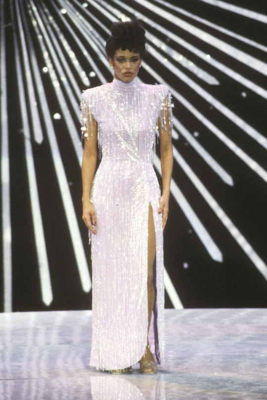
The first look that appealed to my taste was from 1982 where Debbie Allen was seen in a white, fully embellished slit fit dress. Although it a moderately simple dress, the fully embellished work on the piece as a whole takes it to another level of ‘Glam’ which is what I feel I am going into the direction for my creation.
Another garment that was embellished and very fitting with one of my chosen themes ‘Patterns and Pallets’ is this gorgeous embellished pattern dress worn by Jessica Chastain in 2013. Its very clear to see that the garment has many different pattern panels which creates such a stunning yet striking look as a whole but not overwhelming. I feel like this is my inspiration to move forward for my project and what i envision something similar to be as my final outcome.

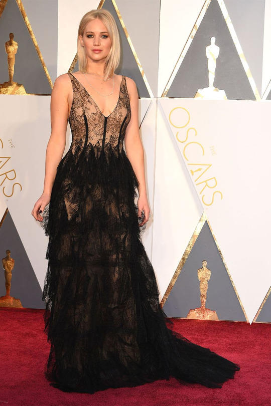
One of the more plain, simple but effective looks that I saw was a black lace and tulle fit and flare garment worn by Jenifer Lawrence in 2016. There is something really beautiful about the simplicity of the dress but also still feel very detailed with the design through the lace and pleats of tulle. I love the way the subtle lace top portion of the bodice gradually blends into the more elaborate bottom half of the dress. Again, this style is something id love to incorporate and maybe embellish the top lace part with beads and crystals so it would be coherent with the fully beaded bottom portion of some sort.
Lastly, one of my other favourites was a beautiful and simple shaped garment with 3D flower elements cascading all over the dress which was worn by Kate Blanchett in 2016. The 3D appliques add such a creative and almost artsy/ crafty style to the gorgeous simplicity of the dress creating a beautiful floral image to look at. This could protentional give me inspiration to add other 3D elements besides just the beads and crystals.

1 note
·
View note
Photo


31 Days of Apex: A Retrospection
I participated in the incredible #31DaysOfApex challenge hosted on Twitter, where fans created new content for every day of July based on a one-word prompt. I’ve signed up for/started lots of similar challenges in the past but always ended up having to drop out or trail off before the end... but this time, I managed to complete something for every day of the challenge!
My only goal was to make something by each day’s deadline, and it was a really interesting exercise both in technical skill and also in my management of not only my time, but my expectations and energy. Below, I go into more detail behind each piece.
To preface; the beginning of this challenge coincided with the beginning of a new personal time-management exercise where, for 5/7 days a week, I would only go on the computer at night. Combined with the deadline, this had an interesting effect on my time management and the quality of certain pieces.
Day 1 - Memory
From the start, I wanted to use the challenge as an opportunity to do more studies and to push myself wherever possible. This was the first piece I did and I had more time to work on it, so I used it as a digital painting study. I still think it’s a strong piece and it’s probably my favourite of the month.
Symbolically, this character’s backstory doesn’t match up with her own memories, so the idea is she’s missing information she can’t quite place or remember, and this both scares and comforts her.
Day 2 - Blood
Another digital painting and lighting study that didn’t work out as well as the first, mostly due to time constraints meaning I couldn’t scrap it and start again. While I don’t like how it turned out, I did learn a lot.
The character on the right is a field medic, and my intent was to show the calm after a successful rescue.
Day 3 - Mercy
Some days I relied more on the humour of a piece’s concept than the skill of its execution, though I also liked how this piece turned out artistically. After two days of intense studies, though, this was very quick and easy for me to turn out as it relied on existing skills.
Day 4 - Prize
This one thankfully came together very quickly, which I credit to the two previous painting studies making it much easier to achieve what I wanted.
The character is searching for the disembodied head of the man who killed her parents, who is now acting as a robot, hence the vaguely half-machine-half-human silhouette in her hand.
Day 5 - Family
Another quick, simple illustration under a time crunch.
The character framed by the nameless foreground figures has no memory of herself or her family.
Day 6 - Noise
For some pieces where I was under a time crunch, I experimented in an opposite direction; instead of studies, I played loosely with different techniques/brushes/etc to see what came out. This was a lineless style I ended up employing a lot when short on time. The piece pictured here was just one of four alternate colourways, presented in a pop-art style.
The character is almost always depicted with thick coverings over her ears, so I thought she might be sensitive to auditory overload.
This particular piece was retweeted by the character’s voice actress!
Day 7 - Mask
More relying on humour for lack of time/a better idea. A fun experiment in colour, though.
Day 8 - Healing
Another technically “easy” piece but with a stronger concept. It was actually pretty hard to get the reflection & condensation elements balanced right.
The character pictured has a narrative thread relating to an old ex he has trouble moving on from.
Day 9 - Weapon
While obviously another joke, and made to be finished quickly, it was surprisingly difficult to get the duct tape and knife to read clearly without over-cluttering the lineless image.
This little ‘bot is a drone used by one of the playable characters to hack areas of the map; it’s not NORMALLY an offensive weapon.
This image was promo’d in a video stream by the character’s voice actor!
Day 10 - Truth
I only had less than an hour to finish this one by the deadline, but I still tried to experiment with silhouette and colour. It was surprisingly hard to get the interior silhouette to be legible.
The outer silhouette is a playable character (not easily readible unless you’re familiar with his design) and the inner silhouette is his sister, whose disappearance he is trying to investigate.
Day 11 - Shield
A fun, self-indulgent one. Had a blast simplifying the game’s characters down into little caricatures.
The character in the centre has abilities related to shields and protection, so many other people were drawing him for the prompt; I wanted to try and flip it, so I picked other characters he would be friendly with, and picked a non-lethal, lighthearted setting.
Day 12 - Ruins
Short on time so did a quick lighting study.
A recent game plot has changed one of the areas of the map, submerging it in water and leaving it to “ruin”.
Day 13 - Hero
Another painting study. Really didn’t like how this one turned out, but had to turn in something, and I did learn a lot in the process. If I’d had more time I probably would’ve scrapped it and started again.
This characters had recently been revealed to have been manipulated by another character who used gas-based offenses, whom she admired.
Day 14 - Rest
I was going to be away from mt computer until after the deadline, so I decided to make a traditional piece. I ended up enjoying it so much I tried to take the time to do a few more traditional pieces later. This piece was sort of a comedy of errors; I had to do it while I was out, and the pen I had brought with me to ink my sketch ran out, so I had to make do with a blue ballpoint pen, and I was missing several colours of coloured pencil. I think the finished piece reflects how rushed it was, and it did’t meet my concept, but I do still like it.
Day 15 - Skull
Another quick one but I wanted to experiment with a different line style. Wanted a sort of “graffiti” effect.
One of this character’s skins includes a skull-shaped mask.
Day 16 - Growth
Extremely quick play on words because I didn’t have the time to work on anything meaningful and couldn’t think of anything better!
Day 17 - Home
Another traditional piece, this time by choice and with more time. Markers. It looks extremely like some janky art school homework on 2 point perspective because it extremely is. Perspective and backgrounds are very difficult for me - they just don’t “click” - but I had a lot of fun with this one. I kept my mistakes intact because I didn’t want to edit it too much. A lot about the technical perspective is wrong, but I think I achieved the “mood” I wanted.
This location is a bar owned by one of the player characters where many of the other characters are shown to meet.
Day 18 - Sky
Very happy with how this one turned out, even though there are still lots of problems. Markers again. There’s a lot I would fix next time, and I think technically it’s lacking, but there are some specific areas I feel happy to have achieved, such as the almost brushed texture of the curved metal above his shoulder and the values of the shadow/reflections on the underside of the head piece. I’m also happy with how I was able to draw from my shoulder rather than my wrist when inking the curved lines, something I struggle with.
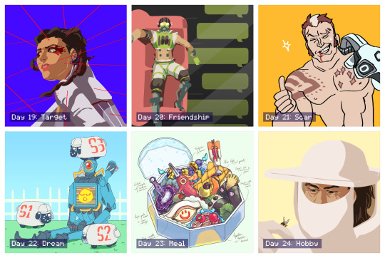
Day 19 - Target
An experiment in pushing the lineless style I’d already been playing with for a stronger likeness. The pose and expression in this could both be pushed more but I like the result.
This character had just learned that one of the other players, whom she had trusted, was actually sharing her secrets with her enemy, and she didn’t know which one it was.
Day 20 - Friendship
I had this one concepted from when I first looked over the prompts. It was a fun challenge trying to simplify all the elements into the lineless, blocky style while being legible.
This character has a strained relationship with one of his friends, and finally pushed her too far with his selfishness, and she now no longer responds to him.
Day 21 - Scar
Quick joke. This character was introduced briefly as a red herring for another character before being killed off. He was stabbed through the chest by another character’s hand, hence the scar pattern.
Day 22 - Dream
I wasn’t sure about this one while I was making it but I ended up liking how it turned out. I wanted to capture the character’s robotic legs bent at an unnaturally straight 90 degrees, like a Barbie doll. The flat background and lighting make it feel like an indoor stage. The little “electric sheep” are inspired by iDogs.
Day 23 - Meal
After a few days of not having time to really spend on any piece, it was fun to get to spend time on concepting and composing this. I always admired these kinds of watercolour-like food illustrations and this is the first time I’ve had any success in creating one myself. I concepted and sketched out the individual items traditionally before working out the composition within the box digitally.
Each food item/utensil is inspired by the different characters’ design elements. Only two of the now-current characters are excluded due to plot reasons. In particular, I like how one of the character’s dome-shaped shields acts as the base and cover of the box.
Day 24 - Hobby
Wasn’t a fan of how this one turned out. I think the likeness is a bit off, and his facial anatomy is skewed. But I also like how the general composition, tone, and bee turned out.
This character’s concept art originally imagined them as a beekeeper who would use smoke to fight.
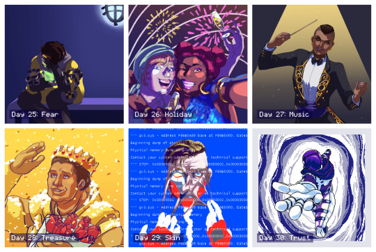
Day 25 - Fear
An incredibly rushed piece that I intended to go back in and add more detail to, similar to day 4, but I actually took a step back and decided I liked the blocky, flat-colour version.
This character is the youngest of four, all of whom are MIA or worse, along with his father, and his mother is losing her memory. He’s talking to her through a handheld holographic device. This piece gained more traction, most likely thanks to the subject matter since this is a popular character.
Day 26 - Holiday
I didn’t want to do a religious holiday like Christmas or Easter. A lot of other people also interpreted the prompt as a vacation, but I had already done a sort of “beach vacation” piece for day 11, so I instead went for a “public holiday” and chose NYE/NYD. This was fairly quick but the lighting was an interesting experiment. I knew this one wouldn’t be as popular because it wasn’t as “flattering” but I personally really like it. The girl on the left is kind of goofy and completely un-self-conscious and I think it’s captured here.
Day 27 - Music
Really didn’t like how this one turned out. I don’t think the likeness is good at all, the lighting is poor, and the gold detailing feels lazy. But I liked other elements, such as the pose and the clothing.
Day 28 - Treasure
This is my least favourite of the entire month, but I also had the least time available to work on it before the deadline so I had no opportunity to scrap it and start over, which I sorely wanted to do. The likeness is terrible, but more than that the base anatomy is off, the pose is stiff, and the lighting/colours are cheap. I wish I could’ve done better by this character; but, I am glad I had something finished at all.
Day 29 - Skin
This was probably my third attempt at this picture and I’m still not happy with it, but again, I had to finish something. I almost considered scrapping the concept entirely and choosing something easier but ended up seeing it through. The concept itself is actually recycled from an older piece of mine for an entirely different fandom, because I didn’t think I did it justice then, either. Would still like to revisit this concept with this character and take more time.
Day 30 - Trust
After a few days of feeling really dissatisfied and uncomfortable with the art I’d been making, I finally more time to dedicate to a piece, and I’m overall happy with how this one turned out. I decided to go for a different medium entirely with pixel art, which also gave me the opportunity to try and animate it. I started off confident and then started to get worried towards the end, but all the elements came together when I added the portal colour effects.
This is an alternate reality version of one of the player characters, who appears through a portal and allows that character to escape the facility she’s being kept in, encouraging them to trust the “voices” she hears which are actually versions of herself trying to help her.
This piece was retweeted by the official Apex Legends Twitter account!
Day 31 - Freestyle
I had this planned out early in the challenge and I’m really, really happy with how it turned out. It’s probably tied with my favourite along with the very first piece (how fitting). I was worried about how I was going to capture the movement without over-complicating the lineart, having so many people in one image, etc. before I realised the focus was entirely on gesture, and then everything clicked. I went for a thicker brush, which forced me to conserve my lines, and tried to simplify each character down to the bare minimum needed to recognise them. They’re also all wearing new non-canonical outfits so I used their familiar colour schemes for the same purpose. It’s not perfect, but I love it, and it’s everything I’d hoped I’d be able to end the challenge on.
I really, really enjoyed the entire month and the way it tied in with my new time management schedule. It gave me some achievable short-term goals which added up to this long-term achievement I can now look back on; I learned a lot both about balancing my energy and about technical skills, I found ways to stay motivated, and most importantly I learned to not get caught up on the individual slip-ups and pieces I didn’t like as much and to instead focus on the bigger picture. Thank you to everyone involved in organising and supporting this event! I found so many other incredible fanartists, writers, and content creators through this challenge and I can’t wait to see the bonus content released over August!
4 notes
·
View notes
Photo

Upon request, here is a rec list of fics where Harry and Louis fight or argue over the course of the fic. While there is at least a small argument between them in the vast majority of fics, we tried to narrow this list down to include fics where there’s either a larger fight or a bunch of smaller ones. Happy reading!
1) Forever, Uninterrupted | Explicit | 8578 words
Harry finds a mysterious picture in Louis' bag one night and drives himself crazy over it. It's definitely not what he thinks.
An excuse to write Harry in rut, because there's already so many heat fics out there.
2) Poppies In May | Explicit | 9457 words
And maybe he deserves it, Louis thinks bitterly. His hand curls around the fence tightly, and he feels like if he lets go he’ll slid onto the cold ground and never fucking get up again.
Maybe standing here, staring at Harry’s hunched over, retreating back is what he deserves.
3) 3B Neighbor | Explicit | 10407 words
A mysterious neighbour keeps slipping the worst sort of notes under Harry's door.
4) Rather This Than Live Without You | Explicit | 10715 words
Harry decides to give it all up. Louis refuses to be left behind.
5) We Should Get Jerseys | Mature | 12147 words
Harry is a hockey player, and Louis is his slightly melodramatic boyfriend.
6) No Bleeding Hearts | Explicit | 12651 words
“I’m going to come out,” Louis says abruptly. His grip on the controller is tight, knuckles whitening. He doesn’t look at Harry when he says it.
“What?” Harry says. Louis sucks in a breath through his teeth.
“When we re-negotiate our contracts. I’m going to come out.” Harry fumbles with the controller and manages to set it down on coffee table without cracking it in half.
“I don’t think that’s a good idea,” Harry says. Louis is still pointedly not looking at him.
“I’m not having this argument with you again, Harry,” Louis tells him. He leans forward and deposits his own controller on the table beside Harry’s before standing up. “I’m gonna go to the hotel.”
7) Know You Got That Thing (That I Like) | Explicit | 15798 words
Note: This fic has a BH mention.
In all the ways he thought about their reunion going, watching Louis finger himself open was not on the list.
8) Wait For Me (To Come Home) | Explicit | 16066 words
A future fic of time stamps where Louis finally comes to grips with a love he'd denied for too long.
9) My English Love Affair | Explicit | 19198 words
The thing about sleeping with a member of a famous indie band is that the inevitability of having a song written about you is most likely a hundred percent. The second thing is that in the end, nobody's supposed to find out it's about you.
The one where Harry writes a song about his English love affair and Louis sleeps with someone in White Eskimo and all he gets is a stupid song written about him.
10) Dance Like Warriors On A Battlefield | Explicit | 20083 words
Down in the arena, the triumphant gladiator places his foot on the back of the loser, holding him there as he waits for instruction on his next move. Kill or let live. It’s barbaric, really, the bloodlust involved in this sport. Louis is pretty sure that if it wasn’t for his distaste for the killing there would be a lot more blood soaking that sand.
As it is, his father rarely gives the kill order anymore. He gives the order to let the loser live. Louis rolls his eyes, turning away. He doesn’t miss the way the gladiator’s eyes linger on him.
11) Up To No Good | Explicit | 26525 words | Sequel #1 | Sequel #2
Harry doesn’t think of himself as a womanizer, not at all. Sure, he enjoys sex, enjoys how women feel underneath him, and by some people’s standards he has sex with quite a lot of people, but that’s no reason to tell him that he can’t have a female PA anymore.
It’s especially no excuse for giving him a male PA who’s possibly the most gorgeous boy in the world who won’t even let Harry look at him for too long.
Sometimes Harry hates his life.
12) All The Lights are Full Of Colour | Explicit | 26727 words
So, fast-forwarding eight years from the day Harry met Louis, he is now a twenty-seven year old owner of one of the most up-and-coming eating establishments on the London restaurant scene, father of two wonderful boys and… separated from his husband. Now, that last part definitely was never a part of the original plan.
13) Time Out | Explicit | 27539 words
Harry and Louis are perfect for each other.
Everybody knows it.
They know it, their friends know it, everybody knows it.
That's why Zayn, Liam and Niall won't let them get away with breaking up.
No chance in hell.
14) Carnelian | Explicit | 30631 words
Louis finds himself donating blood to the most beautiful being he’s ever seen.
15) Where The Lights Are Beautiful | Mature | 31170 words | Sequel
The accidental bonding a/b/o fic.
16) Close To Nowhere | Explicit | 34589 words
Louis and Harry are psychics who kind of hate each other. They go to Tennessee to investigate a haunting.
17) No Matter Where You Are (No Matter How Far) | Explicit | 35799 words
An Everest AU where Louis sets out to climb the tallest mountain on the world and meets a curly-haired guy named Harry who worms his way into Louis’s life. It’s not long before reaching the summit becomes the least of Louis’s worries.
18) The Things I’d Do To Wake Up Next To You | Mature | 36019 words
AU. Harry wakes up to a pregnant Louis Tomlinson and a wedding band on his finger.
19) Bloodsport | Explicit | 40283 words
“You know how our next game is against the Cardinals, right? You remember how vicious those guys can get. I wanted us to come up with some plays, maybe work on a block from the left--”
Louis stops when he hears a chuckle.
He doesn’t think he’s said anything particularly funny, so he turns to Harry, waiting for an explanation.
"‘S funny, ‘s all.” Harry throws his finished bottle somewhere near the other discarded ones. “This is the first time you’re talking to me in eight months, and it’s still about football.”
20) The Sweetest Incantation | Explicit | 40598 words
Harry is a witch who's still working on developing his powers and Louis is a werecat who falls into his life and turns it upside down.
21) Falling Into Place | Explicit | 40754 words
Louis and Harry spend nine years apart but inevitably find their way back to each other.
22) Another Hazy May | Explicit | 41043 words
Louis is a terrible poet and Harry lives in the now and they have six weeks to fall in love but, really, it only takes six seconds. Bookshop meets military meets summer romance AU ft. Malboros, the Backstreet Boys, and underrated literary devices.
23) Show Me Life Like I’ve Never Seen | Mature | 42953 words
Louis never expected to leave the small art studio three blocks down from his job with anything besides the painting he caught a glimpse of and simply couldn't forget.
24) Can I Not Like You For A While? | Explicit | 43346 words
Louis Tomlinson is awful. Harry is just as difficult, and they’re both terrible to each other. It makes being in the same acapella group together quite complicated.
25) Just A Feeling | Explicit | 43977 words
Note: This fic is a sequel to this fic.
The first time that Harry thinks about marriage in relation to Louis, he’s eighteen years old, standing in the middle of a crowded frat house, six drinks down and another in his hand.
It’s not the first time that he’s laid eyes on Louis. It’s not even the second time, or the third time, but Harry doesn’t believe in denying what his brain is trying to tell him, and his brain has been telling him that Louis might be the prettiest person in the world ever since that first fateful meeting, when Harry hadn’t been able to stop looking and Louis had ‘accidentally’ spilled his tea all over Harry’s lap in retaliation.
26) Love's Truest Language | Explicit | 48193 words
“I don't want your flowers.” Louis chided before directing all of his attention to the arrangement in front of him.
Harry laughed under his breath as he stood to his full height, “Who said anything about them being for you, love?”
27) Tug-Of-War | Explicit | 55475 words
Louis' husband dies suddenly and he is left with nothing. Well, not really nothing. He has Harry. And a St. Bernard puppy named Link, whom his late husband left behind for him. Louis takes care of Link and Harry takes care of Louis. Everything is okay until suddenly, it isn't.
28) Into The Midnight Sun | Explicit | 63523 words
It's 1983, Harry embarks on his first world tour and Louis is a budding actor in LA. Life spent apart isn't easily adjustable, but somehow they make it work.
29) Why Can't It Be Like That | Explicit | 63567 words
A fashion AU with a royal twist, where Louis doesn't need a stylist, Harry's thrilled to have a real life Barbie doll, and they're both very wrong about each other.
30) Perfect Storm | Explicit | 80230 words
What do you do when your best friend asks you and your (now) ex to be the best men at his destination wedding? You can either tell him the truth, tell him you’re not together anymore, and deal with the consequences, or you can pretend you’re still together and roll with it, just pray you don’t spiral. Fake it ‘til you make it. You know, for the sake of the wedding.
Harry and Louis choose the latter.
31) Pinkies Never Lie | Explicit | 83615 words | Sequel
AU in which Louis hates his job and loves Harry, Harry just wants a distraction, everyone else wants them to get their shit together, and Louis learns the hard way that new beginnings are only possible when something ends.
32) I Want You So Much (But I Hate Your Guts) | Mature | 83648 words
AU in which Louis gets accepted to play for the Manchester University Alpha-Beta Football Team. The only problem: Louis is actually an Omega. He is determined to make it big in the football world, though, and he can't do that bound to an Omega team. With the help of a faked doctor's certificate and some pretty strong suppressants he is ready to fight for his dream.
That Harry Styles (Alpha, second year and youngest football captain of the A-B team in ages) doesn't seem to like him complicates matters, though.
33) Electing Strange Perfections | Explicit | 84757 words
Back for the summer from university, 19-year-old Louis is faced with a massive problem: their new gardener is quite possibly the most gorgeous man he's ever met. Over the course of the summer, Louis and a 25-year-old Harry will learn that love can be found where you least expect it.
34) For Reasons Wretched and Divine | Explicit | 94655 words
Ten years ago, Harry Styles was just a nerdy kid with one friend and a debilitating crush on the captain of his school’s football team. He thought the stars were smiling down on him the day he and Louis Tomlinson were paired for their end-of-term Literature project. But because Harry’s life is decidedly not a fairytale, the budding friendship quickly leads to the least happy ending of all time.
Now, Harry Styles is a household name. Barely twenty-seven with two Grammy nominations to his name, the singer-songwriter is poised to take the music industry by storm with his highly anticipated third album. So, what happens when the best producer in the business is also the only person Harry’s vowed never to speak to again?
35) Blue Ice | Mature | 102967 words
An AU where Louis finds himself in a marriage he didn't bargain for.
36) A Taste Of Desire | Explicit | 104414 words
A Victorian ABO where Harry is the owner of the most successful cotton mill in Manchester, and Louis is an opinionated social activist about to disrupt Harry’s world.
37) Tainted Saints And Velvet Vices | Mature | 126056 words
A self-fulfilling Hogwarts AU in which Louis is new to seventh year and Harry is the resident devil-may-care Slytherin set to make his entire experience a living misery. Due to less than favourable circumstances they're forced to forge an unwilling, tentative relationship for their own survival. Repressed emotions, decidedly unromantic ballroom dancing, Triwizard Tournament tasks, creative jinxes and twilight flying above the Forbidden Forest ensue.
38) All I Want | Mature | 289307 words
When Harry and Louis got together it wasn’t under the best circumstances. Louis was taken by another. But go figure that the way they ended up together is the very same way it ended. And Harry left Louis. He left him with a lot more than he thought. A story about how people’s misconceptions almost destroyed a love that went beyond measure.
Check out our other fic rec lists by category here and by title here.
200 notes
·
View notes
Photo

𝕻𝖎𝖈𝖐 𝕬𝖓𝖉 𝕸𝖎𝖝 ︱ 09/09/19
𝕮𝖔𝖑𝖑𝖆𝖌𝖊
During our second day of the course, we were introduced to making collages, inspired by the way that the surrealistic artist Hannah Höch creates the majority of her artwork. Collages are a practice in which you collect pictures, shapes, etc. in a variety of different kind of mediums, and then putting them together to create something new. You can use different aspects of other peoples artwork/things that somebody else have created or produced, to make your own piece of art with a different meaning to what the initial meaning might have been.
To try this out ourselves, we cut out three random and automatically made shapes out of printed and patterned paper. Each one of us then laid out our three shapes onto a table at the end of the classroom. Now we could select three new shapes that you hadn’t made yourself from the selection laid out on the table. Once we had chosen our three new shapes cut out by other students in the room, we started looking through magazines to find objects, faces, body parts, letters, etc. to cut out and put together in a new but preferably odd way, to fit the theme of surrealism. A second theme that you could adapt was anthropomorphism, which could be done by cutting out different bodyparts from animals. For each shape, we made one character, leaving us in the end with three different and incredibly abnormal-looking creatures that we then sketched in a different style and then named. During the last bit of the lesson, we went over and evaluated what we had come up with and wrote down a few words that we thought described our sketches the most accurately.
𝕿𝖍𝖊 𝕭𝖗𝖎𝖊𝖋 + 𝕴𝖓𝖙𝖗𝖔𝖉𝖚𝖈𝖙𝖎𝖔𝖓
We continued elaborating a bit on the Exquisite Corpse game, now going over what we had done previously and evaluating what we did and why we did it. Through this, I was taught the importance of taking notes for you. Not only did I learn how it’s important to write down everything you feel is important information to keep in mind for the future, but also how helpful it can be to actually illustrate it in steps. It doesn’t only help with remembering it, it also makes it easier to figure out what is what once all my notes start building up throughout the course.
The picture above is a digitalized version of what I chose to illustrate in my notes on the Exquisite Corpse game, which just shows the way to fold the paper and how to draw each bit before giving it to the next person to continue.
𝕿𝖍𝖊 𝕭𝖗𝖎𝖊𝖋
We then went over the Brief. This mainly included learning about visual language. This included both understanding what visual language involves as well as learning about how you can apply visual language to context.
Here is a visual mind map sort of thing of what visual language includes:

Now, what do the individual words actually mean? Welp! I was smart enough to take notes, so here goes!
Tone: Tone, also known as shading, is an important aspect of drawing. It is used to guide and direct the viewer's eye. With shading, you can create different moods for your audience to pick up on. Light values often feel open, lighthearted, fun, calm, relaxing, welcoming, inviting, warm, gentle, etc.
On the other side, dark values can often feel uneasy or create an atmosphere of mystery, sadness or something ominous.
Connected to tone is the concept of contrast. Shortly put, it is the difference in light and dark values. Low contrast means that there isn’t much difference between the light and dark values. This can create a calm or subdued mood. High contrast results in very light and very dark values to be next to each other. That can create the mood and feel of excitement, conflict, agitation, drama or distress. Using contrast is incredibly useful for directing the viewer’s eye because naturally, out eyes move to where the highest level of contrast is.
Colour: An example of what colour could mean in the context of art and visual language, could be how stereotypically the colour red symbolizes something evil or bad, but let's break it down a bit more;
Colour is a very important factor in visual storytelling. Like tone, colour is most often used to create mood and emotion, as well as directing the eye and emphasizing different parts of the image or frame. There are fundamental tools that artists use to apply colour efficiently in their art. One of the first things that might come to mind is the colour wheel:

So why is the colour wheel so useful, and why do art teachers in secondary school never shut up about them?
Well, they allow us to clearly identify visually similar colours (which are also known as analogous). These colours are what you’d describe as fitting together. They complement one another really well, and the colour wheel makes it easy for us to see which ones do exactly that. They are close to each other on the wheel. An example of this could be red, orange and yellow.
Contrasting colours are further apart, and an example of this being blue and green.
Finally, there are also complementary colours which are opposite each other on the colour wheel, so an example of that could be red and green.
With the use of contrasting and complementary colours, it can really aid to direct the eye and our attention. Notice how super vibrant this combination appears to the eye? It’s almost as if they clash.
Like mentioned before, analogous colors do the opposite; notice how natural and cohesive they feel? Like they belong and/or fit together.
Like mentioned earlier about the red colour often signaling danger or something bad, each color on the wheel has its own individual influence psychologically. Here are some examples of this;
This colour comes across as being calm and relaxed:

Now, comparing this to this vibrant red colour, it appears much more alarming and alert!:

Shape: Similar to lines, shapes can be connected to feelings and what you read when you look at the different shapes. To give some examples to explain this, triangles can convey speed, action, and tension:

Circles normally appear more friendly:

Squares appear strong, reliable, and stable:

Shapes can also be seen when looking at or studying composition, as you can with for example lines. Shapes can be organic (curved edges and continuous) and geometric (sharp edges and angles)
Line: With line, you can do more than you’d think. You can essentially, when breaking it down, tell a story from a single line. Lines can have many different qualities. Some examples of this could be that you can change the direction in which the line is going and which way it points. You can also change the weight of a line to be either thin or thick. You can also vary the shape of the line as well as adjusting the pressure at which you are drawing. With these different quantities kept in mind, you can apply them to convey meaning.
To give some examples, you could make a line with the feeling of being nervous or distressed like this:

You could make a line with the feeling of being angry:

Or a line which expressed a feeling of being calm:

All of the principals shown above are all used to convey scenes, feelings, characters, and environments in films, drawings, animations, etc.
Form: This could be connected with things that are 3D, (threedimensional) meaning there is an aspect of extra depth that you can’t normally archive with 2D. This is emphasized by light and dark values. (low and high contrast)
Texture: There are two types of textures;
- Implied texture is basically texture that appears to be there, but it’s an illusion.
- Actual texture is texture that exists and can be felt by touch.
𝕰𝖛𝖆𝖑𝖚𝖆𝖙𝖎𝖔𝖓
During the evaluation of the class, we talked a bit about why this might be a useful thing to do the Exquisite Corpse in the future. I personally thought that it was very freeing to do. It allows you to let loose with ideas without having that inner voice nagging you saying “This isn’t good enough, that could be better.” The collaborative snapshot of the game definitely gives you inspiration for future ideas and art since you can compare what you did with what everyone else did. Of course, that could result in some toxic thoughts rather than anything that could be useful for oneself, but that is an inner battle every artist in every field has to fight over time.
1 note
·
View note
Text
Devlog #34 - Status Update, Character Design, and UI
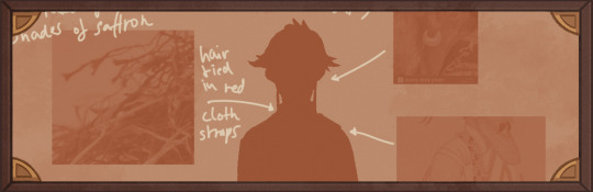
Hello! It's time for another update on the development status of Brassica. It’s also our first actual devlog purely about Brassica!
After working on separate projects for a while, we are now in the process of getting back on track working on the same game again.
Because of that we're happy to announce that the rest of Brassica's Act 2 will be released in March!
It grew a bit in size from what we originally planned but that just means more game for you~
The exact date will be announced when we can more clearly estimate how long the remaining tasks will take but we're in the process of finishing everything up so it shouldn't be too long.
As for Act 3, our current plan is to release it in April. From now on development should be a lot faster but because we mainly worked on it on the side until now, that is still only a rough estimate. We'll definitely keep you updated on any developments regarding the release dates though!
Well, and that's about it for the status update. Because it's been a while since our devlogs actually described much of our development process (and we haven't shared much about our thought processes behind Brassica), we decided to bring that back with today's devlog.
PECTIN will tell you a bit about Saffron and his design while eZombo describes the development of the UI.
So without further ado, here we go:
Art - PECTIN
Saffron is the curious prince the player takes control of in Brassica. Before I began concepting him Felix and I defined his character. At this point we already knew he would be one of the princes Sappho tricks into going on the journey. (And would then fall in love with another prince because YaoiJam'18). We soon agreed on naming him Saffron. So I already associated the colours of the spice "saffron" with him here.
We also wanted to make him a protagonist with his own personality. Thinking of the player who role-plays him we thought it would be cool to have his character split into three separate personalities he could have:
- the cunning and a bit wild prince
- the typical goody two-shoes type of hero
- and the soft boi who's overwhelmed by the whole predicament and really needs a hug
Another external influence was, my intention to try and fuse traditional things with modern sportswear. Brassica is a fairytale but it's told in a contemporary voice. That's where the idea came from.
...Okay. So I had his name, colours I could associate with him, the three archetypes and my goal to fuse sportswear with traditional clothing. Having all of these "pointers" I began looking for reference pictures. I browsed through online stores of popular sports brands to find things that would fit the character. Due to Saffron's character ranging from cute to rather untamed (in the sense that he would climb a tree without hesitation) I thought that wearing shorts would be most suitable and comfy. But for the top and the overall outfit I wanted to let myself get inspired by traditional elements. The name "Saffron" reminded me of the spice and then its use in Indian culture. I never designed a character with Indian influences before and thought researching into that would be interesting. I found a lot of stuff I could translate into the design. Even the leggings Saffron wears were intially inspired by my findings about Indian culture.
Here's a visual breakdown of what inspired what (excuse my srawly handwriting >-<):

During the process of drawing out his design, as I always do, I thought about how each component of the outfit would "flow". There're lot's of lines and intersections in his outfit that guide the eyes along the his body:

And here is our boy again as a sprite. Not much different right? Here I put one of his hands in his shorts' pocket, because I think it would suit someone who is either unsure and does that or feels liking hiding something.
That's it about Saffron! I could go on about his colours but I'll save that for when I explain the general artstyle of Brassica! :3
UI - eZombo
Because Brassica was planned as an entry for Yaoi Jam 2018, we thought about ways to keep the scope small. One idea we came up with was to reduce the size of the screen that shows backgrounds and characters so producing the art is a bit faster than filling a full HD 16:9 canvas. One inspiration for that was Sticky Zeitgeist by Porpentine & Rook but something like the Undertale console version where the graphics at the border of the screen change based on the in-game location was also something we considered.
When it came to actually planning the screen, Undertale's influence came through again, because the main area of the screen actually has an aspect ratio of 4:3. This obviously leaves a lot of unused screen space but one thing we knew we could definitely use to fill this was the text box. Having it separate from the main screen also made sure that it didn't overlap with the characters or backgrounds so the space that was reserved for that could be used to its full potential.
With two elements already on the screen, we still had the sides to fill with content. Just using graphics as borders definitely was an option but because Brassica's story plays out a bit like a road movie, we thought having a map of the game world would definitely add to the feeling of that. And to make the UI visually more balanced again, the last bit of free space was then filled with some information on the time of day and how many days were left for the quest of the princes which basically added all the important context for what is going on in the center of the screen.
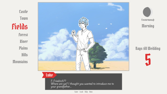
A first mock-up of the UI featuring a familiar face and St. Bernard...
Around that time, we also developed the idea of presenting the whole game screen like a paper or puppet theater. This seemed like a good way to bring all these different elements together while still supporting the colorful fantasy-ish look of the game art.
I did a quick sketch of how this could look, which turned the mock-up into this:
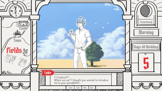
Aside from adding some more purely graphical elements, I adjusted the text box and the flag that showed the name of the character that is currently speaking.
The map was graphical now instead of just a list (which would have given away future locations) and I was overall fairly happy with the direction the UI was going in.
A few of the border elements overlapped with the main screen now but I tried to make sure it only happens in areas where we wouldn't put any focus.
After getting some feedback from PECTIN I then went on to work on the final lineart while also trying to simplify all the shapes. By then, the characters were also being concepted so instead of Luke I could put Ode into the mock-up (along with a reference for a possible background style).

As you can see, some unnecessary lines, elements, and text were removed to simplify the look of the UI and make sure that the important elements aren't overshadowed by anything else. Overall I tried to keep the lines clean without making them look overly sterile, so any round shapes are generally drawn freehand instead of using any vector shapes. Except for the compass, moon, and their enclosing arcs. Those just looked sloppy when they weren't exact. Not using fixed line widths was another way to make the lines more organic even when they were perfectly straight.
The idea to use different colored flags for each character also came into play now, although Ode's color here is actually used by Hans now…
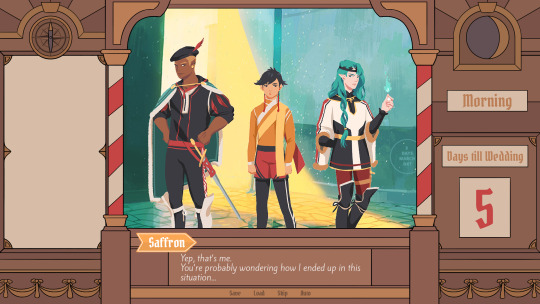
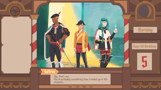
Colors were next on the agenda. First a basic pass, followed by some adjustments and line colors to make the lines fade more into the background. Having the concepts for the three princes was very helpful for this step because it was important that the UI colors fit into the overall color scheme while keeping the focus on the actual game art.
That's why red is only used close to the center and for important UI elements (the current location on the map is also marked in red). The rest of the colors are rather muted and monochrome on purpose with only a little bit of gold to break it up.
Throughout the whole process my main references were old paper theaters but especially during the coloring process I deviated from these references in favor of using colors that would match with most backgrounds.
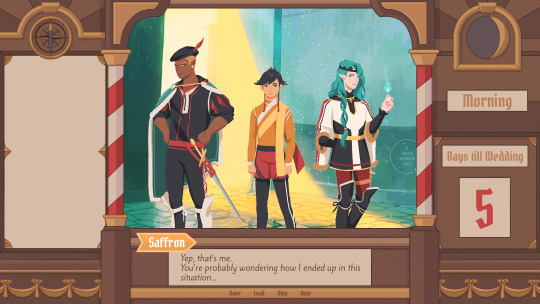
Once we were happy with the colors, I did a relatively quick shading pass, just adding shadows with a fairly abstract light source to keep most shadows parallel to the lines. I also added some subtle noise to make everything look a bit more organic.
For the most part it still looked too clean though, so PECTIN suggested overlaying the UI with some watercolor textures.

Which lead to this final mock-up and not only solved the problem but also gave the UI a more painterly look that didn't interfere as much with the general artstyle.
Well, but as always, there are still a few things that changed on the way into the engine.
The map was obviously added (which could probably fill a devlog by itself), the text on the side was changed to better reflect the current quest of the princes (although the other sign may or may not return in future acts...), I added a CTC icon and updated the quick menu (although I can't remember why "Load" was removed so maybe that will return again), but most importantly:
The text box was reduced from three to two lines of text. This wasn't as much an active decision as it was caused by the fact that small line spacing in Ren'Py cuts of parts of some letters until all lines of text are displayed. There are some games that still do this but personally I don't really like how it looks while the text appears. Increasing the textbox would have caused a lot of work because I would have had to shift around more elements of the UI to keep a balanced layout so it was simply easier to remove a line of text and increase the line spacing.
This had a pretty strong effect on the writing because sentences have to be fairly short now or if that doesn't work, broken up into multiple lines.
Even if it wasn't exactly planned, it still influenced the writing style of Brassica and further distinguished it from our other games (although there's more to say on that one) and in hindsight, only two lines of text also look a lot cleaner in this layout.
I could go on about the actual implementation of the UI but this has already been a pretty lengthy post so maybe I'll save it for another devlog.
But that's it for now! We'll be back in two weeks with some more development insights and our current status. We also plan to start posting these devlogs regularly again, so stay tuned for that!
As always, thank you so much for reading and we hope you could find a few things of interest in this devlog.
#brassica#fairytale#devlog#gamedev#game#development#otome game#romance#tutorial#visual novel#indiedev#indie#okay
8 notes
·
View notes
Photo

Books read in March
If there was a theme this month, it was: retellings. This was something of an unintentional theme, since what I read next depends a lot on what’s available from the library, but certainly a theme which is indicative of my tastes.
Favourite cover: Sherwood.
Reread: Nothing, too many other things to read.
Still reading: Stand on the Sky by Erin Bow.
Next up: Pride by Ibi Zoboi, Song of the Current by Sarah Tolcser, A Ruin of Kings by Jenn Lyons and Undying by Amie Kaufman and Meagan Spooner.
... and I just checked my library account and there are five more books waiting for me! FIVE. Why must you all be available at once?
(Longer reviews and ratings are on LibraryThing. And also Dreamwidth.)
The 100-Year-Old Man Who Climbed Out the Window and Disappeared by Jonas Jonasson (translated by Rod Bradbury, narrated by Steven Crossley): On his birthday, Allan Karlsson escapes from his nursing home and gets on a bus, taking with him a suitcase that doesn’t belong to him. The story alternates between Allan’s adventures in the present day, and his bizarre exploits throughout the politics and conflicts of the 20th century, travelling through (or trying to escape from) different countries, meeting an unlikely number of important world leaders and blowing things up. I listened to the audiobook, a format that I find much more conducive to being amused by this sort of story.
Dragonshadow by Elle Katharine White: Sequel to Heartstone, a fantasy retelling of Pride and Prejudice. Aliza has married Lord Alastair Daired. When Alastair and his dragon Akarra are offered a contract in the north, Aliza insists on coming too. Aliza is still processing the trauma of war, and adjusting to a new stage of life. It’s less common for fantasy to show the early days of a marriage (and of a pregnancy), which makes for some interesting territory to explore. As for worldbuilding, I needed a glossary or more in-text reminders. I enjoyed Heartstone more, but I want to see what’s next for Aliza.
A Sudden Spark of White Fire by Sangu Mandanna: Esmae, the secret twin sister of an exiled prince, has a plan to see her brother regain his throne. It involves going against the advice of the war goddess Amba, winning a competition, revealing her identity and pretending to take her uncle’s side. This hooked me from the very beginning. I liked the worldbuilding, the complex family relationships, the sentient spaceship, the prose and how some of the twists took me by surprise. It would have made an even bigger impact if it’d made me more invested in all of Esmae’s relationships, but I have high hopes for the sequel.
Possession by A.S. Byatt: Two English scholars investigate a relationship between two Victorian poets. I read this with delight, then disappointment, then an urgency that surprised me and then, finally, with bittersweet pleasure. Possession is about things I feel strongly about: libraries, poetry, fairytales, academic interpretations of past women, the joys of language and of narratives. It’s about the possession of, and the desire to possess, knowledge, objects, relationships, the full story. I like the parallels -- themes and variations -- between the two sets of characters. I have a lot of thoughts and feelings. I’ve bought my own copy and carefully bookmarked all the quotes.
Named of the Dragon by Susanna Kearsley: Lyn, a literary agent, is invited to spend Christmas with a couple of authors in Wales. The Overdrive description makes this sound sombre and creepy. But although Lyn’s backstory is sad, this story isn’t. It has warmth and a web of relationships like something from a comedy of manners. I liked the historical details about Tudor kings, the references to Arthurian legends, Lyn’s confidence in dealing with writers with strong personalities and the delight she finds in exploring coastal Wales. The mystery of her dreams and Elen’s fears was a good amount of suspense with a hopeful resolution.
The Tea Master and the Detective by Aliette de Bodard: A novella about a mindship and a scholar investigating a death. I read this not because it is a Sherlock Holmes retelling but because it promised one of my favourite things: an AI with feelings! Also: tea! It’s set in an unfamiliar universe -- “a galactic empire inspired by Vietnamese culture” -- and involves mind-altering substances, something I’m irrationally squeamish about. But being a Holmes retelling gave this story a comforting sort of familiarity and predisposed me to liking the characters. (Although I would have instantly warmed to The Shadow’s Child anyway. I just want ships to be happy...)
Circe by Madeline Miller: I impulsively borrowed this, and then doubted whether I’d like it. Was this going to be an exercise in watching everything go wrong? I kept reading because I’d become invested in Circe, and because the prose is so compelling. This is sharply written and unflinching about gods and mortals, but it is not as bitter as I expected. It’s a lot more hopeful -- a story about freedom, transformation and life in a way I found surprising and deeply satisfying. It’s also a fascinating and complex portrayal of Odysseus that focuses on the impact this charismatic and deeply flawed man has on others.
Jane by Aline Brosh McKenna (illustrated by Ramâon Pâerez): Jane moves to New York to study art and gets a job as a nanny. This graphic novel follows Jane Eyre loosely, which allows for changes that suit the contemporary setting and the format, and introduces a greater level of surprise for someone familiar with Jane Eyre. It’s not as complex or as serious as Charlotte Brontë’s novel, but it isn’t trying to be. There were a lot of things I really liked about the illustrations, such as their use of light, colour and perspective. I wasn’t such a fan of the way faces were drawn. Not quite my style?
A Study in Scarlet Women by Sherry Thomas: Very satisfying as a story playing with the Holmes-and-Watson mythos in some unexpected ways, as a murder mystery and as a story about the constraints and opportunities women in Victorian society had. Disgraced Charlotte Holmes runs away from home and tries to find a job in London. When one of the gossips responsible for exposing Charlotte dies, suspicion falls on Charlotte’s sister and Charlotte uses the persona of “Sherlock” Holmes to direct a murder investigation. I’d have liked to have seen more of relationship between the Holmes sisters. Maybe there will be more of that in the sequels.
Maskerade by Terry Pratchett (narrated by Nigel Planer): Another story about telling stories. Agnes suspects that Granny Weatherwax and Nanny Ogg have her in mind to become a witch, and she goes off to Ankh-Morpork to join the opera. After Lords and Ladies I wanted to read more about Agnes. I enjoyed the mystery, the play on The Phantom of the Opera, the further adventures of Granny and Nanny, and the appearance of some of the Watch. The conclusion to Agnes’ opera career was less satisfying.
Grumpy Fake Boyfriend by Jackie Lau: An introverted SF author agrees to pretend to be a boyfriend for a weekend. I liked the set-up and the way the characters discover that they don’t have to agree or have the same tolerance for socialising -- they can be themselves with each other. But on the whole, the execution of this romance didn’t really appeal to me.
Forever in Your Service by Sandra Antonelli: I had a mixed reaction to At Your Service, but liked Mae and Kitt enough to read the sequel. Sometimes I wanted it to slow down and explain things -- like characters’ thoughts, theories and feelings -- a bit more. That said, the tendency for understating rather than overstating is one I appreciate. And I like that, as Mae and Kitt navigate the challenges of Kitt’s job, their relationship is believably complicated. While this spy story isn’t quite my genre (I’m more of a cosy mystery or romantic suspense person), it certainly wasn’t boring or predictable.
Sherwood by Meagan Spooner (narrated by Fiona Hardingham): I love the way this twists and reimagines the Robin Hood story, putting Marian at the centre. Her grief, her history with Robin and her ideas about what he would do, her skill as an archer, her passion to fight injustice, her frustrations and discomfort with being a noblewomen, her relationships, her mistakes, her discovery that she’s the only one who wants to change things. Sherwood surprised me, gave me lots of feelings and made me stay up until 2am. It successfully does something different while still including much that is familiar. A poignant, compelling retelling. I was completely hooked.
#Herenya reviews books#Susanna Kearsley#Sangu Mandanna#Meagan Spooner#A.S. Byatt#Possession#Jonas Jonasson#Elle Katharine White#Aliette de Bodard#Madeline Miller#Aline Bosh McKenna#Jane Eyre#Sherry Thomas#Discworld#Terry Pratchett#Sandra Antonelli
4 notes
·
View notes
Text
Writer Notes: The Wicked + the Divine 35
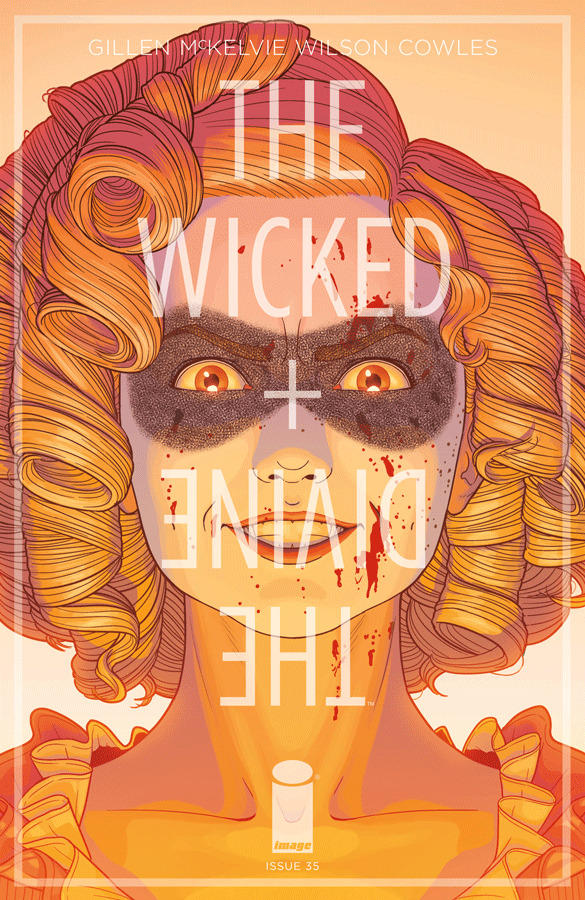
Spoilers, obv.
I suspect this may be shorter than usual. Or maybe not? When you've been working (and thinking) on something for a long time, you work past the need to talk about it. I've said it to myself so many times, I don't really need to externalise it. Whatever “it” is, is in the book.
I suspect this is going to grow as we progress across the final year. In a real way, we're at the point of the degree course when we're easing off. It's your project now. Make of it what thou wilt. Easy answers are a long way behind us. But there are answers, at least.
Jamie's Cover: with solicits going out earlier, we're always worried about putting something like this on a cover. Ideally, we'd want it to drop after Imperial Phase II dropped, so at least people would be suspicious of Minerva.
But it's a lovely image – I love what Matt's doing with the light, what Jamie's doing with the expression. Great stuff.
Yoshi Yoshitani: More great stuff. The playfulness of Persephone, the pose. It's just total joy.
Page 1-4
This looks familiar. Once more we return, again, right?
We were obviously planning this from the start, but by the time we've reached this point, Jamie's style has evolved to the point where the extra panels we need to add to the sequence would break the coherence entirely. So Jamie insisted on re-inking the whole sequence, and updating the Minerva panels (as she's seen in more panels later). I did say that if we were clever, we'd have drawn the whole thing back when we did issue 1. Jamie noted that he'd never have been happy printing four years old art in a book.
So yes.
I was originally thinking that this sequence would actually be the opening of Year 4, but when I did the tight plotting for this arc, I realised that you had to really start way back around 4000BC, to set certain themes in motion. I had the option to switch them until quite late though – they're similar lengths, and abstractly can be switched, with a few changes.
I didn't. It's the way to go. And it's a good way to make issue 2 hit hard, right?
It's an interesting thing to think about that those who are following this in singles will have read the 1923 special before this, so know exactly why everyone is here, while those following with trades will learn it in the NEXT trade.
Page 5
For those who follow the idea of page budgets, this counted as a half page.
When writing this first time I got the order the wrong way around, so Amaterasu survived rather than Susanoo. Always check this stuff.
It's another tour de force for Matt here, in terms of the intensity of effects going on. I feel terrible for all the people involved. Thinking through the psychology of this was always going to be the hard one. To pull the trigger, who had the hardest job?
Page 6
Yet again, just look at the reds. I've got an issue with a bunch of fire in, and this is really making me look forward to it.
Susanoo is a sweet one. Poor fucker.
Minerva saying “Necessity” feels like a necessary beat, right?
Page 7
This counts as a ¾ page for page budget.
Was waiting for the “Minerva emerging from fire” money shot for 34 issues (plus specials) and Jamie doesn't let me down. Had me thinking of “Figure covered in fluids” being one of those recurring beats in Jamie and my work. Persephone in the fourth trade, America in issue 13 of YA, Emily in Phonogram and so on.
It's the billow of the skirt, innit? Nice, Jamie.
8-9-10-11
Oddly, lettering this so you could work out who was speaking and who to was trickier than you'd think.
Set still getting her digs in now is very set. And, yes, I'm sure people will have a theory on who the fourth head is by now. If not, don't worry, we'll get to it soon enough.
Getting a little quality time with Ananke/Minerva was one of the writing challenges here – this is a scene which is pretty much showing methodology. When the pages came in for this, Chrissy said “I've been trying to make sense of what you meant by this for four years, but now I get it.” So I hope it hits the core beats for most people.
I do love this push and pull between Ananke and Minerva though. It's quietly horrible.
Pop-art head death there, and a return of the flying eyeballs. Also, looking at the various expressions of the heads in the backgrounds on page 9 is pretty impressive. Set in the third panel!
10-11 is the ritual. Trying to work out how much space for this and what you actually needed to show was key. Plus the timing of it – there's an argument you could have taken this longer, or pushed it shorter. Two pages felt right.
Good eye-to-camera at the end, which allows us to...
PAGE 12
...Have an interstitial...
PAGE 13-14-15-16-17
...and segue to Minerva's eyes in the present day. Linking sequence between scenes.
Due to the repeated pages in the first half being “free” (They weren't – Jamie chose to kill himself) this means that the issue is considerably longer than usual. Even so, there are a lot of fish to fry. This is obviously the problem of the structure of this arc – yes, there will be past and present content in every issue. Balancing what we do in each is basically the key... but it also means we have to choose our scenes very carefully.
Anyway – Minerva and Woden, facing off. Just letting two characters push and pull against each other – and, for the first time, really being behind the curtain “with” Minerva. Previously Minerva has been presented as a supporting character, based on her interactions with others (1923 is an exception). Here, Minerva is protagonist, and we get to see her work.
Minerva! Love the dyed bangs. Strong look. Also, great thoughtful expression on the end of the last page... and her making her move on the next page.
Woden calling her “Sweetheart” seems to be a minor peak Woden move.
This sequence is making me think that Minerva would be great at playing the party game Resistance. Tricky thing in this sequence is actually signalling lies to readers. Lies are really hard in comics. Like irony (as in, characters saying things they don't believe) there's certain parts of the readership who have huge problems with it. Signalling what you want to do is paramount, and tricky. I'm not sure there's a right answer.
Last two panels of 15 are particularly good for Jamie and Matt – firstly, we get the time based upon the sun coming up, which gives it an odd atmosphere. Guns out in a room? You'd think nighttime. But no, it's something else.
Secondly, with the steady angle, with Minerva having her back to Woden, we get a chance to see her think about what lie to tell. That's an “Okay – Woden knows about the heads. How could he know about the heads?” think...
Then over the page, making the lie, expression hoping she gets away with it... and then relief when she's called it right. Great steady-angle work by Jamie and Matt, and the sort of performance you can get from them. I wouldn't write this for almost anyone else.
(Favourite detail – look at the shoulders. From Woden's perspective, she's not moving at all. She's only giving facial tells.)
This sequence was also particularly picked over with C, in a line by line way, in terms of what information is being imparted. Minerva and Woden are both absolutely drilling each other for all the information they can get, so what IS being implied.
I laugh at Minerva bundling over to the computer the second Woden is gone. Plus great final expression there by Minerva.
18-19
In an issue that's set half in the past, and the half the present day stuff is with Minerva, we're in danger of losing our lead – so I definitely try and write Persephone particularly present where she gets it. This is an advantage of the captions coming back in – we can slow sequences down and make them feel like they last longer.
It's fun to do Persephone captions. Well, “fun”. You get to hit certain things directly that normally I'd only ever approach obliquely.
The weirdest thing of rewriting was Jon's line about being trapped underground – which was originally “Buried alive.” The question was whether anyone would take that literally, as the lab hadn't 100% been established as being underground. (and the stairs from the giant machine that lead to the lab go upwards, even though the whole thing is all underground.)
In short: in a plot as dense as ours, it's important to not confuse in any area except where you have to.
20-22
After a scene earlier of lying to someone's face, using the modern communication to do something exploring the same sort of thing seemed interesting. Also, efficient. For those following Page Budgets, the repeating panels of the phone aren't quite “free” panels, but they're relatively low energy panels. Plus it gets a LOT of information exchanged in a direct, quick way. Instead, we spend the effort on the expression panels, to show the journey that's NOT on the screen.
It's not stuff I'd do constantly, but I do like that we do it.
Nice Verðandi-shoulder-touch silent panel too. Yay Jamie and Matt!
23
I believe I originally wrote this for two pages, but with no captions. Jamie felt it was unnecessary, and they'd get a similar effect in a single page. The reason why I did it with two pages is that I wanted to slow the reader down in the process of discovery – there was a little bit more akin to the Rorschach scene in Watchmen, with the procedural exploration of the environment and trying to find a way in too.
In the script I said I may add captions at lettering, but reduced to a page, that felt like a necessary thing. It slows the eye, and lets us join Persephone in her internality.
(I actually wrote most of this as the opening of the next issue, before realising it didn't fit, which was nicely timed, as I realised that with some edits, it fits perfectly here.)
The mural introduced in issue 4, as coloured by Nathan Fairbairn.
Laura's glimpse back on panel 4 is one of my favourite minor moments – Matt's magenta behind the image really adds to it.
24-26
Minerva, in an issue of deniable manipulative shit, this is your most deniable and manipulative thing. Astounded, and I wrote it.
Last two panels call back to Imperial Phase I, for reasons which will become obvious.
Due to the way the pages moved around, Jamie suggested moving the reveal of the skulls to the previous page – they were originally on the final one, but the angle was nearly impossible to pull off, and worked better brought forward. You always want BIG information to be revealed on a page turn, but in this case, the panels are small enough to not register unless you're actively looking at them, plus the REAL meaning of them is only really get-able by those who recall a scene from issue 4.
Hence the flashbacks, to ensure people do recall them. We don't do a lot of this kind of thing, but as this has been a long time back, we felt it was worth really laying out the key facts, step by step. Also, free panels, for the page budget purposes.
(Of course, not for Matt, who is doing a really cool treatment here – the reds and blacks in one timeline, and the pink and blue dots in the flashbacks. Astounding. Give that man another Eisner.)
The “...but everyone else should be” has been sitting in my hard drive all that time too. Odd to hit this stuff as well.
I think I've said that Baal is one of my favourite characters in the whole series. Obviously much more to come here, and probably down the line. He was a character who was always going to become more central the further we got into this – you know I talk about knowing the characters arcs, but not always when the plots come to the top of the mix? There's certainly a take on WicDiv where this is revealed near the climax of Imperial Phase II along with the rest of it. I suspect that would have overloaded it – it needs space, and I'd hate to leave more than a month between this reveal and the What's-Going-On.
It always surprised me that more close readers didn't jump on a “Baal is Baal Hammon” argument, as there's stuff which I considered considerably more obscure that people were all over. He cries fire in issue 12, for example – though a lot of people were noting that 1920s Baal wasn't much like 2013 Baal after the Special. This stuff is fascinating, from my perspective.
Yes, Baal's hot stuff in the final panel. For those who are wondering about his Inanna tattoo, alternate covers aren’t strictly speaking canon, and gods have all kind of miracles available to them.
Next issue is two weeks late. As well as being one of the hardest issues we've ever done, there's been several real life disasters. Sorry for the delay, but we'll see you next week.
141 notes
·
View notes
Note
Hii I’m somewhat new to the fandom and ur blog really helped me dive deeper and so I’m here for a ship submission ✨
My name is Isabella and I’m almost twenty one. I’m non binary and I’m comfortable with all pronouns (I usually just tell people to use whatever makes them comfortable although I tend to use she/her more frequently out of habit) Im a gemini sun, sagittarius rising and taurus moon (I have no idea what my chart says about me lol but just in case?) I’m half indigenous Brazilian and half Dutch; I grew up in Rio, surrounded by waterfalls and concrete jungle. I now live in the Netherlands and I’m majoring in Art & Design
Physically I am a brunette and have a natural wolf cut (I shaved my head back in ‘20); my eyes are the colour of amber and I have one eyebrow piercing and two nose piercings and unfortunately my dad’s colonising blood was too strong and am as pale as Bella Swan lol I’d describe myself as plus size and overall I’m pretty confident over myself although I do hate on my tummy from time to time but I think I have great 🍒 and a good 🍑
I don’t really have a particular style; it really depends on the day. Today I’m wearing a black turtleneck and faded black jeans stained with acrylic paint and whatnot; yesterday I was wearing dark brown bell pants, deep blue tunic with white embroidery, big fluffy faux fur coat with a cheetah print and sandals (because the cold can’t and won’t stop me from showing my cute ankle/foot tattoos)
I’m romantically and musically very fluid, I love everyone and everything 😌 From GVF to Eminem, One Direction, Iron Maiden, Stray Kids, Pierce the Veil, Nina Simone — I could go on and on 😮💨
I collect cd’s and vinyls, crystals and books. I write poetry and paint in my free time. I’m obsessed with Greek mythology and even got Atlas tattooed at the back of my left arm. I love going on long hikes and I love to explore. Feel the dirt between my toes and the small stones under my heels
Although I suck at it, I love to dance to Brazilian folk music — especially if I’m zooted lmao. I love being surrounded by kids (I have more nephews and godchildren than I can count) and I honestly can’t wait to start my own family ugh<3 Sadly I don’t have any pets but my favourite animal is the Humpback Whale 🐋✨ (I want to get a dog as soon as I can 😔🙏🏻)
For a first date — no idea. I think I’d like to keep it simple; maybe go to a market to get some food and maybe some trinkets and then go to a lake to swim or something. Cooking together and making playlists for each other sounds good to idk
Anyway sorry for writing so much I got carried away lol thank you for taking your time to read all of this <3
Hello there! It means so much to me that you found something from our blog! I will gladly write you a ship. (And please, never apologizing for writing so much. I love getting to know all of you)
I ship you with Jake!

You give me edgy Josh vibes. You seem so sweet and so open and like you're totally not afraid to be yourself. And I think that's something Jake would really love. Like, I think he would love the parts of you that are creative and kind but also there would be so much more there to get to know. I think your music taste would really open him up to a lot of things he hasn't given a chance before. And he would probably love to watch you dance. He might even let you teach him how if he's had enough alcohol. I'm picturing the two of you having an amazing time together getting lost out in nature. Or searching around different record stores for a particular record. And then coming home and cooking together and just enjoying each other's company.
- ⭐
0 notes
Photo
Late last year, the new yet prolific animation studio, J.C. Stuff released a 12 episode anime adaptation of Children of the Wales. The Children of the Whales is a short yet popular manga series by Abi Umeda. Seeing advertisements for this boldly coloured and unique looking series, I decided to check it out, and see if it was as good as it looked.
Children of the Whales follows the inhabitants of the Mud Whale, a huge vessel that's travelled on an endless sea of sand for centuries. Among them are people with the power of Thymia, known as the Marked. For unknown reasons, the Marked have much shorter lives than those who are Unmarked. One of the Marked children and archivist for the Mud Whale, journeys to an island on a supply run. There, he meets the first person that the people of the Mud Whale have ever seen outside of their community. From there on, they start to learn about the wider world, and the threats it possesses.
Its main strengths are in its (generally) endearing and strong characters, intricate world-building and unique art direction. The animation style resembles that of an old map or picture, giving the sense that the Mud Whale is something mysterious and ancient. It also employs a lot of strange, surrealistic imagery to enhance the sense of spirituality and mystery of this ancient civilisation. Each of the central characters struggles with how to make sense of the culture and environment they grew up in. They gradually learn about the history kept from them as people from different lands come to their shores. The small details of the Mud Whales culture and how it functions gives off a feeling of realness to the world that draws the viewer in.

This is an ambitious series, which deals with an expansive world and tackles themes such as war and free-will. It might be a little too ambitious, considering its short length. And The story feels somewhat constrained by its short run and suffers in terms of pacing and fleshing out many of its supporting cast. It introduces us to many compelling and fun character we don't get to spend nearly enough time with because of the compact nature of the story. While it's an overall powerful and touching story, the series tends to become overdramatic to the point of ridiculousness at times, especially in the latter half of the series. One of the central villains is so over-the-top hammy and vicious that it becomes difficult to take him seriously. It can also be very bloody and violent, with some unexpectedly graphic death scenes.
Children of the Whales feels somewhat incomplete, due to the ambitious ideas it tackles in a short space of time. A second season would be very welcome. But we do get is a bold, beautiful tale with some flaws in its execution. Overall, I would recommend checking it out for the glimpse into a fascinating world with deeply lovable characters and a moving story. The Children of the Whales English dub is available on Netflix. You can watch the subbed version (which I think is much better performed) on Anime Dao.
3 notes
·
View notes
Text
Photographing Waves: One of The Most Rewarding Subjects
Waves are some of the most rewarding subjects for photography that I know. For starters, if you miss one, another will be along very soon! Of course, they are also unpredictable and can be dangerous. What is fascinating is that no single wave will be exactly the same as any other wave that has existed since the beginning of time. Mind-blowing stuff.
When you’re starting out in wave photography, it is helpful to have a rudimentary understanding of different types of waves and what you’re likely to encounter on different beaches. Wide beaches with shallow falls typically experience long, rolling breakers. These graceful waves are a pleasure to photograph. The curl of a rolling wave is attractive but this perspective can be elusive as the topography of the coast often fails to offer a side-on angle.
This story is brought to you by ELEMENTS Magazine. ELEMENTS is the new monthly magazine dedicated to the finest landscape photography, insightful editorials and fluid, clean design. Use the PETAPIXEL10 code for a 10% discount off the annual subscription.
Some photographers take to the water with waterproof camera housings and capture amazing moments within or even underneath waves (although not on the beaches where I make photos!). Obviously, this approach is for confident swimmers and, if you want to try it out, I strongly recommend that you first spend time getting to know your location and how to navigate the waves there safely. However, if it isn’t safe to swim or you’d simply prefer to stay on terra firma, don’t give up just because you can’t access the popular “curl.” A front-on perspective can also work; the moment a breaker starts to drop is often all that’s needed to break the line and add visual interest.
On steeper, narrower beaches, there may be backwash. This is when water that has travelled up the beach falls back with enough power that, when it meets another wave, the water is pushed upwards, creating a wall. This is a marvellous subject and you can go wide to show the impact in its setting or zoom in tight to explore the textures. “Clapotis” is a sort of backwash wave. This lovely French word describes the moment that a wave, having bounced off a quay or cliff, crashes into another wave. The shapes often seem to defy gravity. This sort of photography is more like sports or wildlife than landscape work. Fast shutter speeds, responsive focusing and quick reflexes are the order of the day. I suggest you use high-speed continuous or burst mode and run off 3 or four frames for each wave.
As with everything, it pays to know your location and to have done your research. For example, if the wind is blowing from the north, there’s little point in visiting a south-facing beach backed by cliffs. However, if the land behind the beach is flat, a strong offshore wind may be ideal as it will hold back the waves, making them pile higher, and you’ll get spindrift off the top. Equally, think about the tide and the light. There are usually fewer waves at low tide. Harsh midday sun is difficult, and you’ll likely need a polariser to mitigate the shiny patches of water whereas backlit waves can be gorgeous when the sun is low.
Point of view makes all the difference and there are so many variations on the standard, head-height position. If you can get low, your waves will stand proud of the horizon. Not every beach gets big waves, but they all get waves of some sort, even if just from the wake of passing vessels. If you lie on the beach, even small waves can look mighty.
Alternatively, try a higher point of view, a clifftop perhaps. Photos taken from above are no longer about the size of the waves. Instead, they make the pattern the star of the show. Waves leave in their wake wonderful shapes that we never see from beach level. Next time you watch the sea from a cliff, notice the beauty of a wave’s footprint.
The sea is always moving so shutter speed is probably your biggest decision; 1/800 or faster will freeze the waves, capturing all the detail. However, slower shutter speeds are also hugely enjoyable. I particularly like ¼” as it keeps the wave’s overall shape, but the details seem like brushstrokes. In my photos, “Theia” and “Twist,” the waves are the same basic shape, but one is caught at 1/800 and one at ¼”. While we’re experimenting, how about adding some intentional camera movement. I like shutter speeds close to 1” and subtle movement so that I can still see the idea of a wave within the blur. I prefer not to use a tripod for ICM. I’m not looking for perfection here – I want the result to look like a painting and paintings aren’t perfect, at least the good ones aren’t.
If you’ve ever tried to photograph waves and been disappointed, I suggest you try a longer focal length. It will suck the viewer into the action and the wave will almost certainly look more exciting. Most of my storm waves were captured using a 70-200mm lens. More recently, I’ve been using a 100-400mm. This is harder because, at 400mm, it’s difficult to see enough of the sea to find the best waves. I’m enjoying the challenge. Long focal lengths offer a way to create difference. The casual viewer will see the big scene, but they won’t notice the curious textures within a wave. For this kind of work, you have to compose like a photographer of abstracts, thinking only of shape and colour, rather than the subject as a whole.
So far, I’ve concentrated on waves alone but waves as they break against the shore also make exciting subjects, stirring our imagination with awe and even fear. As these photographs tend to reference scale and location, they are often more documentary in style; however, that’s not always the case. I happened to publish my photograph, “Face-of” during the voting for the U.S. presidential election. This was entirely coincidental (I’m British), but several people commented that the picture represented the clash of candidates and ideologies! People will always find metaphors in the sea.
I’ve outlined just a few of the possible ways to photograph waves. As with any subject, the best approach is to be open-minded and willing to experiment. Try everything and see what happens, then make changes based on your experience. Be prepared to make a lot of bad photos (remember, this is more like sports than landscape photography). Above all, make sure you take time to just watch and listen to the waves. The sea’s music is beautiful and inspiring and I firmly believe you will make better art if you let it into your soul.
Safety
I don’t want to spoil the flow of the article with a homily on safety but I feel it would be irresponsible not to mention it at all. Waves can be dangerous. It’s important that you know the relevant tides, wind direction and speed. Working on a falling tide is safest. If it’s not safe to get as close to the waves as you would like, come back another day with a longer lens. Trust your instincts – if you feel at risk, you probably are. Lens hoods are good for keeping spray off the lens and I recommend that you always wipe everything down with fresh water after you leave the beach.
The article is courtesy of ELEMENTS Magazine. ELEMENTS is the new monthly magazine dedicated to the finest landscape photography, insightful editorials, and fluid, clean design. Inside you will find exclusive and in-depth articles and imagery by the best landscape photographers in the world such as Freeman Patterson, Bruce Barnbaum, Rachael Talibart, Charles Cramer, Hans Strand, Erin Babnik, and Tony Hewitt, to name a few. Use the PETAPIXEL10 code for a 10% discount off the annual subscription.
About the author: Rachael Talibart is a professional seascape and coastal photographer. Her critically acclaimed photographs of the ocean and coast have been featured in the press all over the world. Rachael is represented by galleries in Europe and the USA, her work is frequently exhibited and her limited-edition prints are collected internationally. She is the author of three monographs, including ‘Sirens’ and, most recently, Tides and Tempests. Rachael owns f11 Workshops, providing location and online photography training and she leads international photography tours for Ocean Capture. You will find Rachael Talibart’s series “Oceans and Odysseys” in the ELEMENTS Magazine.
from PetaPixel https://ift.tt/3CnKEwH
1 note
·
View note
Text
Now at summer’s end.
Autumn has well and truly arrived with its very temperamental weather pattern, already disrupted by climate change. We need to be prepared, but with just a very small winter wardrobe it means layers when needed to keep the draughts at bay
As I start this blog from 28th April, the sun shines, but nights are cold. Today I spent the morning painting with a friend, Marguerite. We have quite different painting styles but it's a great companionship. Lots of chatting and cuppas too!
Wednesday half price beer evenings have returned to Potter's Bar, where the beer is brewed. We missed Dan and Catherine's company as they know so many folk, but not ideal for Eleanor in the evening. The beer and crunchy chips, enhanced with herbs were delicious around a fire indoors if chilly.
Marguerite came to paint with me at High Hopes... She certainly knows how to capture the scene

The afternoon found us playing petang on a new boules piste at the retirement village. Our worries about being a bit rusty were soon allayed and we certainly didn't let the French reputation down even with the distraction of wandering cows on pitch. A friendly and welcoming group with after match drinks too. Looking forward to the next game.
A trip to look at some completed shepherd's huts gave us a big insight into how rural folk really live. A huge farm, with horses, (who were a bit too friendly for my liking), dogs of all varieties, from mini to maxi... A huge, intimidating Great Dane, a bit scary for someone of my stature, and any other creature looking for a bit of TLC, wandering freely around. An amazing lady ran rural retreat holidays here, practising yoga with the donkeys, meditation with the horses. The mind boggles!
We then had an amazing curry at a local restaurant, whose owners not only supplied water for Tilia, but a blanket for her to repose on. A nearby table allowed Dan to change Eleanor Al fresco... Nothing like a bit of sun on the bum!

Hoping to meet some like minded people, I ventured to a local art class. My water colour needs some direction. I joined 4 others in the group. Teacher gave us each a board to rest on. I had paints but no paper... neither did she.. Well not to give away anyway. Thought the fee would have covered this. Another pupil have me a sheet so we could commence.
Saw nothing ready to paint. That's because the subject was from a beginner's book of water colour painting from which she started to demonstrate, passing the book around,
Not for me... so I went walk about and collected some blooms and foliage from the garden. How was I to know the gardener was watching?
I dutifully did my wash, then sketched my flora scattered on the table. I sorted my colours and splashed some on each flora. Teacher came to me after advising the others. She approved the mix and application. I then asked how to paint the details. 'Oh!,' she said ' you can leave it like it is. If you want detail you should have left blanks.'. Bit late to tell me now.. I obviously should have painted the hills and sky. Like a child, I scribbled all over it, had my scone and coffee, then went home and tore up my masterpiece. I won't be returning to copy birds next week. I prefer my own experimental attempts.
Still having problems with my super sonic hearing aid and no release from muzzy head, I returned to specialist in Hermanus. He advised that it might be a good idea to read the instruction booklet re. maintenance, I didn't know I had one. Think it's me that needs the maintenance. I must wait for return to Spain to have a sensor fitted in my really deaf ear that transmits to other ear thus equalising my hearing. This should remedy the feeling of disorientation. All clever but expensive stuff
Whilst we were in the Clinic Dan and Catherine collected a trailer for their bikes. It is Eleanor's carriage . We then bought some fish and chips and had a very blustery picnic on the beach. At least the rain let the sun have a turn of exposing itself. Eleanor was fascinated by the wild sea ,huge waves crashing over the rocks. It felt extremely healthy.
Next, shopping to complete an exhausting day then home to tea round the fire.
Eleanor had her first baptism in the warm spa waters of Caledon Thermal baths. As mentioned before, this beautiful historic town set in the Overberg region is blessed with mineral rich earth which provides the healing qualities of the water.
There are 4 baths of different temperatures and force. The top one is so hot and torrential its impossible to spend more than a couple of minutes in it. The others had varying degrees of heat. We chose to spend most of our time in the oldest original pool, a mere 40 degrees C. Such simple rustic surroundings with basic changing facilities. It was wonderful, and we all felt uplifted after an hour or so of wallowing. The only thing lacking was a tea room perhaps. It certainly got me moving again!
So back again hopefully soon.
4 days of constant, mainly torrential rain, meant I was able to finish some of the Thumbelina paintings for Eleanor's room. During this awful weather, our host's dog went missing whilst walking along the river. A search party was organised and advice of mediums sought. After searching through the night and the next 2 days, the worst was feared... The river was now surging and the 16 year old dog was blind and deaf. Then.. a miracle.. A young lad who was scouring the river saw her, marooned on a small island. He rescued her and there was a tearful reunion with owners. She is now recovering after vet treatment and had physiotherapy to help her recover from physical injury. The 3 mediums all had different predictions, but in each case their prognosis was right. This is an amazing gift of insight.

Walking Tilia, who has become very frisky of late, we encountered a gathering of cows enjoying their roadside munch. She usually ignores the horses who wander freely, but these creatures stirred her up resulting In high leaps and barking on her part and a stampede on theirs. No amount of calling would stop her. She then returned to taunt the rest of their gang on the other side of the road. A nightmare!

The following day I decided she would stay on the lead and learn some manners. Not an easy task for either of us.. She is very strong and wilful and my arms only stretch so far.
All going well.. Then a young coloured lad (they are brilliant horsemen) came galloping up the road with a small child hanging on to him.. They have no fear. The object was to round up another horse who was obviously not where he should be. This horse stood stock still then turned around toward the main road.. (Well mainish anyway) In the meantime Tilia was spooked and leaping up and down,taking my arm with her. Horse no. two then cantered along the mainish road with a few acrobats en route. Being market day there was some traffic disruption. Fortunately there are stop signs at all junctions, I think mainly because of the free wandering of animals. There is a huge awareness in drivers too, so very few, if any accidents. The horseman had circled on round the block at the speed of lightning and was now coming towards us to confront the bewildered horse. He leapt off, tied his stallion to telegraph wire and stood with his arms aloft.. Not quite sure why...Horse no. 2, ignored him and cantered off towards the market. Maybe his turn to give rides! Another galloping display, accompanied by barking dogs, concluded our supposedly dignified walk.
South African Mothering Sunday seems an appropriate time to finish this probably penultimate blog
I gathered some little white scented rosebuds from our garden and made a posy for Catherine from Eleanor. Dan also gave me a hand picked bouquet from his neighbours' garden... .not just greener grass, but also flowers grow better on the other side.
We lunched in Greyton at a lovely rustic restaurant 'Heart and Soul' offering a delicious buffet, which is paid for by the weight of your filled plate. Mine was pretty heavy. A short (now torrential) river walk then a little celebratory tipple at Columba completed a lovely day, during which the sun happily beamed down on us.

That's it for this time.. Enjoy your new freedom.
Love MnM xx
0 notes
Last Seen Blogs

6vviw-g7vlb
Dieta chetogenica alimentare
amalia-red-22
♡Red♡

pizzalort-blog1
meme up
pizzalort-blog1
meme up
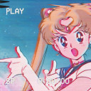
lacuranderita
Just a lil soul work