#i missed how sharp my art was when i used photoshop to draw
Note
Hi! I really love your work— do you have any advice for someone who doesn’t have a lot of experience drawing human forms/anatomy? I dont really know where to start 😅
Thank you!!!! ^_^
So first off, bear with me, I'm going to point you to some of my old old art. In general, any 'progress'/tutorial type stuff i post goes into the "wip" tag: freebooter4ever.tumblr.com/archive/tagged/wip
The rest of this discussion is going under a cut lol
I've been drawing since i was a kid - as my grandma likes to tell it i would sit quietly at the card table next to her and make her draw with me because "everyone can draw, grandma". Sometime around high school i got it into my head that i needed a 'class' to understand anatomy, as if it was just this magical thing i would suddenly understand. (college was useless) The truth is i didnt start getting better until recently, when i gave up trying to 'learn' anatomy and just started studying bodies. That sounds weird, but i don't know how else to describe it? If someone told me ages ago that i could learn anatomy the same way i self-disciplined myself into being able to pull out computer science concepts at the drop of the hat, i feel like i wouldn't have wasted so much time but anyway...
Check out any doodles before my mchanzo era for drawings that i did prior to getting serious about practice studies: freebooter4ever.tumblr.com/archive/tagged/mchanzo. Terrible anatomy. Atrocious. (with one exception that i still like which is a poster on sasha bees' wall hey bees if you're reading this) 2016 ish.
THEN 2017 i lost my job, moved away from pittsburgh, missed my DJ friends, watched a documentary on netflix about st*ve aoki (after watching everything vaguely DJ related on the streaming service lol), and the aoki drawing era begins: freebooter4ever.tumblr.com/archive/tagged/steve%20aoki. I joke that the way I learned anatomy was by becoming obsessed with a DJ who contorts himself into very strange positions and has photographers that take photos of him from LITERALLY every angle and who tends to walk around half naked an unusually large amount of time but like...that's literally what happened. Not that im saying you have to start drawing half naked DJ's...just find a subject you dont mind drawing hours of studies from and it makes it a lot easier.
When I'm doing 'studies' I tend to do two separate drawings. Initially I literally just 'study' what I'm looking at - I put it in photoshop and trace the lines that I see. I don't OUTLINE it, there is a huge difference. A lot of times the lines that stand out are not the outlines but rather a dominant shadow or sharp edge. After I feel like I've got a good handle on it, I do another drawing of the pose freehand. Then I take the original photo and put it underneath that drawing and check where I've messed up. If I'm completely off I throw it away and start again, lol. If there's a few errors I fix them. More and more lately I find that the freehand drawing is fairly accurate with anatomy unless it's an unusual or challenging perspective. I break this down more in this post using joe as an example: https://freebooter4ever.tumblr.com/post/633653906052923392/its-been-a-while-since-ive-posted-one-of-these
Those study drawings rarely see the light of day. I just delete them when I'm done because i didn't have an...aim...? For the drawing. They just were to learn.
The doodles that I post on here? Some of the simpler ones are practice sketches from gifs - i will have a gif running next to my drawing and will try to draw what i see, freehand. Some of the more complicated drawings/portraits are from photos - but there's usually something i see in the photo that i want to convey? Like light? or a specific part of anatomy? I dunno, i make shit up as i go.
AND THEN there's my favorite, when i have done all this practice and i can do shit like drawing characters from my imagination. Like kenny hugging his cat. These don't have any reference - im just relying on my memory of anatomy i've drawn in the past.
I dunno. Dont let bad anatomy get you down, just keep trying. My anatomy hero - a sculptor ethan idolized and i idolize by default - even said himself that he doesn't feel like an 'expert', and he's in his 40's and has been doing this shit for decades. Just draw!!! The more you do it, the more you'll start to see what you like, and how you can make it how you like even more. I still think my anatomy is bad, im still embarrassed by it. But i also know i've gotten better because i can see it now.
ANYWAY this is long, im exhausted, i have to go to bed now :) and i was serious about scheduling an abs livestream. Maybe this weekend if im ambitious.
12 notes
·
View notes
Photo

♪ Who d'you think you're kidding
He's the earth and heaven to you
Try to keep it hidden,
Honey we can see right through you ♪
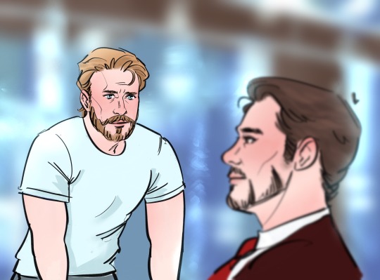
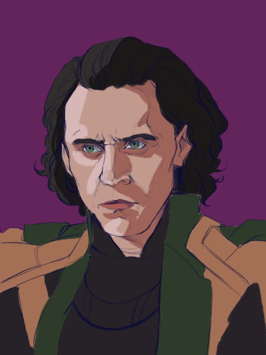
#ho-ney im starting to like this brush huhuhu#its SEXC#i missed how sharp my art was when i used photoshop to draw#stony#stevetony#superhusbands#iron man#captain america#steve rogers#tony stark#marvel#mcu#fanart#my art
2K notes
·
View notes
Text
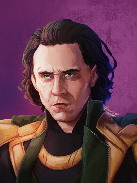
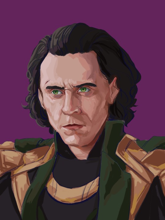
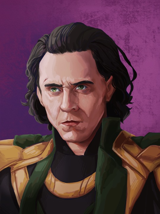
Painting Tutorial!
Hello and welcome to a kind-of tutorial for my colouring technique! I’d like to preface this by admitting that my art style is a mess of actual things I learned in art school mixed with ‘things that look good but idk why lol’ and some lazy shortcuts thrown in for good measure. If something doesn’t make sense it’s probably because it was never meant to, and I’m just winging most of this with no coherent plan. Cool? Cool.
Program used: Procreate (I use the same techniques in Photoshop, so they should work in programs like CSP, Krita and Sai)
Brushes:
-Derwent for sketching (Procreate default) or your favourite sketching brush
-GvW Elder 2. 0 1 for shading (from Georg’s free ink set)
-Basic round brush
-Basic airbrush
Step 1: The sketch (Derwent Brush)
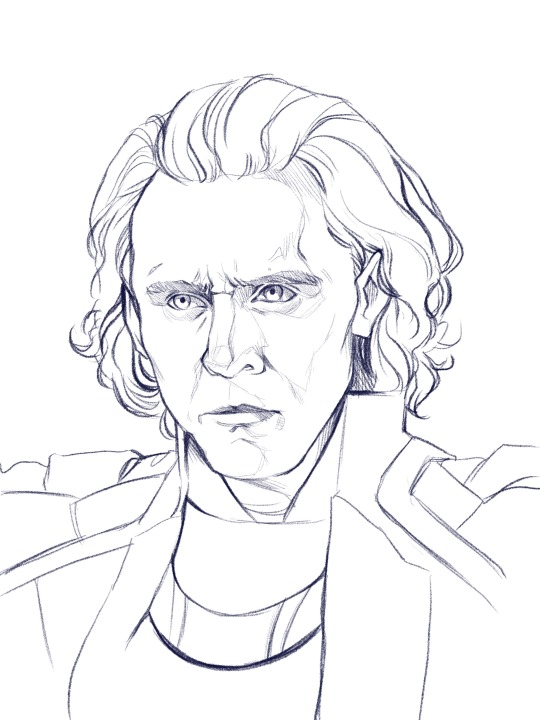
Today we’re painting my favourite murder boy, Loki! I won’t go into much detail about the sketch, because this is about colouring, not sketching. Make sure you have a solid sketch before starting on your colours. I know it gets frustrating to work on a sketch for so long, but anything you fix in this stage won’t need to be fixed later.
Use references for anything you’re not 100% sure about, and flip your canvas often to make sure nothing’s wonky. Your brain gets used to staring at the drawing, so flipping it lets you see mistakes you might otherwise miss.
I like sketching in colour because black just feels daunting to me. We’re gonna change the colour later anyway, so just pick any favourite!
Step 2: Clipping Layer
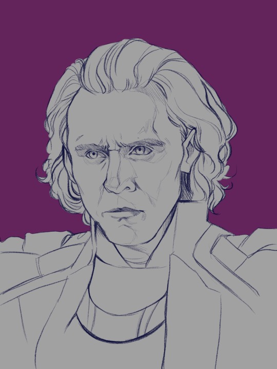
This is one of the most important stages. All your colour layers for the character will be clipped to this one so you don’t have to worry about going outside the sketch. I usually have a single clipping layer for organic portraits, but my lined pieces will have a layer for each section. We’ll be painting over the sketch eventually, so go ahead and clip the sketch to the base layer as well. It’s also time to pick your base background colour. I decided to go in a completely different direction than the reference image, so I’ll mostly be making the colours up.
Step 3: Base Shading (Elder Brush)
I know this looks like a big jump, but bear with me! All I’ve done is add basic shadows to the form. I’ve picked a midtone for each section of colour, and added a basic shadow and light.
Go ahead and start by locking your sketch layer and changing its colour. I’ve used dark reddish tones in the face, and left the rest blue. I like how the blue pops up here and there when I get to painting over the sketch.
To pick your light and shadow tones, look at the colours you’re using in the background. Something useful to remember is that warm lighting will cast cool shadows, and cool lighting will cast warm shadows. In this case, since the background has a cool tone, the shadows in the face will be warmer in comparison.
Always remember that your character and your background exist in the same environment; the colour of the background will influence the character. Here, the light source has a pinkish tinge to reflect the character’s environment.
Look at your reference to see where light hits, and squint your eyes to determine the big geometric shapes of the light and shadows. At this stage, stick to three tones maximum: a base, a shadow, and a light.
Step 4: The Shit Stage
This is when the feeling of ‘oh no this looks like garbage and I hate myself’ will hit. Don’t let it fool you! Paintings look like trash before they get better. In the early stages, you’re just laying in the foundation for the details that will come in later. Just push through!
Here, I’ve started adding tones in-between the light and shadows to make the shapes blend into each other and look rounded and softer. This is all done on a layer over the sketch, still clipped to the base layer.
I pick my midtones by zooming in and colour-picking at the border between two shades I’ve already laid down. It’s a little tricky since the brush I use doesn’t have an opacity setting, but I like the sharp chunky look it gives my pieces.
Remember: Skin is not one uniform colour, and light will peek through in some places. This is called sub-surface scattering, and it’s the key to beautiful, alive-looking skin. Light will scatter under the surface of the skin, and certain parts neighbouring the shadows will look more saturated because the blood vessels under the skin are illuminated. This piece doesn’t use bright sunlight, so it’s more subtle but still visible.
Notice the strip of warm saturation right before the shadow? It’s going to look orange under sunlight, but for Loki I’ve gone with a pink since the light is cool.
Step 5: Slightly Less Chunky
I like the chunky look in my paintings, but if everything is equally as sharp, nothing really stands out. A wise tip from one of my painting professors is to smooth out the shadows, but keep the lights sharp.
Use a mixture of more colour-picking and the blending tool to round out shapes. You can also use the airbrush if you’re more familiar with it.
Be careful of overblending! Blending too much is a common mistake in digital art, and can make a face look flat and off-putting. Blend some areas, and colour-pick them before going back over them in with your solid brush. This will make your shadows look softer, but not too soft.
Texture is extremely important and often forgotten. It gives your eye something to look at, even in a seemingly smooth space. Remember: Unlike in traditional art, digital media has no surface texture.
A smooth gradient on a cotton canvas is never completely smooth, it will always have the canvas texture underneath it that keeps it from looking too unnatural. In digital, you’re working from nothing. When working digitally, any texture you want, you need to create yourself. This is why depending too much on the blending tool will make skin look unnatural; you need to compensate for the lack of interesting surface underneath.
Step 6: Lighting
Interesting lighting can go a long way to make your painting spectacular. Note that the light source was chosen in the third step; this step simply enhances what you’ve already done.
In this piece, I’ve picked a primary light source (where the majority of the light is coming from) and a secondary light source to keep things interesting. Since the background is cool-toned, I picked a warm orange for the main light source to contrast it. The secondary light source is a cool blue, so it doesn’t quite have as much contrast. I want the secondary light source to be noticeable, but I don’t want it to be fighting for dominance with the main light source.
I clip a colour dodge layer on top of the colour layers, and put another unclipped colour dodge layer over it.
The clipped layer is the secondary light source, because I don’t want it to bleed into the background. Leaving the primary light source unclipped will give a glowy effect to the lighting, since the area around the character will also be affected. I use a large airbrush for this step.
If there are areas that need more contrast, you can deepen the shadows with a clipped multiply layer underneath both colour dodge layers.
Step 7: Details
This is the time to add little things like a more refined eye shine or little flyaway hairs. The eyes also looked a bit wonky to me, so I fixed them up. Not much else to say about this stage, just add little things that will tie the piece together.
Since the face is the focal point, it’s painted in more detail than the armour. If the piece was equally detailed everywhere, the viewer’s eye wouldn’t know where to look! You don’t have to slave away over details in areas where they won’t be noticed or would be distracting.
Step 8: Finishing Touches
This is the final step! Once the painting itself is done, I like to merge all my layers and apply a bit of noise to the whole image. I find it adds a bit of grain and texture that makes the piece even more cohesive. Don’t add too much though, or it will grey out your colours.
In certain pieces, I also add a slight chromatic aberration. I don’t add it to all my pieces, and I use it differently every time. Be careful though, it can become an eyesore if you overdo it! Keep it away from the focal point of the image (in this case, Loki’s eyes) or it can actually make the painting off-putting and difficult to look at.
Since my drawing program has a dark background, I like to export the image as a test and see if it still looks good in my photo gallery with a white interface. Sometimes things look really bright against a dark interface, but will look dull and too dark when put against white. If your piece needs adjusting, use the curves tool to adjust the contrast.
All that’s left to do is sign your artwork on a separate layer (so it can be moved or removed if need be), and voilà! A lovely portrait!
—
I hope you found this tutorial helpful! If you have any questions or comments, feel free to leave them in the notes or message me! If you’d like to chat about art, (or anything really) my ask box and messages are always open to new friends!
126 notes
·
View notes
Text
What’s next?
Well, I’ve found myself in quite the predicament here. The Modthorne recently resigned as a moderator, a long-time submitter just said his goodbyes, and now I’m stuck by myself with over a thousand letters to answer (and plenty more on the way, no doubt). On top of that, I’ve been attempting to balance my schedule between this blog, drawing things for my art blog, and a number of other creative projects. Not to mention all the real-life tasks to add to the mix.
Basically what I’m trying to say here is...

Much as I'm going to miss the Modthorne, I think it’s time for someone else to fill the empty seat here at Ask Ace Attorney! The thing is, I haven’t given much thought to who should take the Modthorne’s place when she retired, but I guess the best way to find a replacement is to subject a bunch of applicants to the same rigorous screening process that we subjected ourselves to when we started...answering these letters?
Nah, just joking. I’m going to do it in pretty much the same way the Mod did. After all, it worked out pretty well last time, wouldn’t you say?
So, if you’re interested in becoming a part of the de Modder line, the job requirements are as follows:
Fluency in English - Sorry if it’s your second language or you’re not entirely comfortable with it, but dialogue is one of the most important parts of the games. It has to be sharp and witty and without mistakes. Know your grammar and your vocab.
A firm understanding of the games/characters - This should go without saying. You can’t run a blog like this without having played all the titles and retained all the events. Understanding character motivation and voice is important too.
Time - Without the ability to devote an hour or so a day to the blog, you can’t do it. It’s that simple.
Love for the work - Running an ask blog always sounds like fun, but people will abandon it as soon as they realize it’s work. You won’t come into your stride if you don’t stick with it. You can trust me on that.
Respect for canon - The foundation of AskAceAttorney is the game series. It isn’t fanfiction or shipping wars or web comics or the anime or anything like that. The American localization is the canon used here, and while you can seek the anime, manga, or movie for reference, they aren’t the law. You aren’t here to invent character traits or off-screen events either. Understanding that is an absolute must because it allows for the entire audience to enjoy the blog, not just a sub-sect.
Understanding the difference between an ask blog and a roleplay blog - If selected, you’re here to answer letters in the format you’re used to. You’re not playing a single character or hosting conversation. You’re not inventing story threads. The idea behind the blog is fans writing celebrities and those celebrities writing back. Think of it like email or handwritten letters.
Image editing software - This is a vital tool for answering letters. You have to screenshot and crop letters, which is something a child can do, so you don’t actually need to know how to use the software, you just need to have it. There are free options out there, such as GIMP 2 and Pixlr Express, so you don’t even need Photoshop.
In case you’re wondering, these are the same requirements set forth by The Mod a couple years ago, almost ad verbatim, and I feel that they still apply to any new moderator of this blog. The main idea is also the same: Remember the “feel” of the games and try to emulate what already exists. That’s what we’re all fans of, after all. Respect for the soul of the blog and the game series is extremely important.
So, if this sounds like something you’re interested in, send an email to [email protected] telling me why you think you’d be good for the position and any other qualifications you might have. Can you make gifs? Do you make cool art that could be used as bonus content? Are you a freelance writer? Do you actually work for Capcom? Something else super cool? Remember, this email is how I’ll judge your personality, knowledge of the series, and intellect. Sound smart and quick-witted, but don’t try too hard.
I don’t need or want any personal information. I don’t even need to know your real name. All I care about is your ability to pretend to be multiple characters and anything else that might help with that.
If you think you’re a good fit but don’t know how to run a blog, apply anyway. More important than anything is a love of the Ace Attorney franchise and a love of this blog. I’ll also be there to help you get settled in should you end up being the winner -- it’s not a very complicated job, but there are some rules of thumb that I’ve picked up during my time here that I think will be helpful.
Best of luck to everyone who chooses to apply (whether it’s a hundred people or just a handful), and have some fun while you’re at it! Remember to take it seriously, but...not too seriously.

I’m look forward to seeing what sort of Ace-level talent I can find! Best of luck, and I’ll see you ‘round!
-The Co-Mod
#Mod Post#Co Mod#Mod Commentary#I just realized I might have to change my name until after the audition#Being a lone moderator and all
26 notes
·
View notes
Text
When I was heading to France last week, I considered taking my Nikon d750 with me, because I thought, not unreasonably, that France might be a photogenic country and that I might want to get some high quality photos of the place. I decided against it for a number of reasons, but one of the major reasons was that a couple of weeks ago I got myself a Pixel 3 phone, which reviewers have suggested may have the best camera on a phone out there. I’d previously had a Pixel 2, the former “best cell phone camera out there,” so I was curious as to how the Pixel 3 would improve on the camera.
So I left the Nikon at home and used only the Pixel 3 to take shots while I was in France. I ended up taking something around 500 pictures while I was in country (many of the best of which I have collected in this Flickr photo album), and can now tell you what I think about the experience. Here are my notes, in no particular order, with occasional art. Please remember that these thoughts are from someone who loves taking pictures but is not a professional photographer, so I’m not going to go into the weeds with technical issues and jargon. I’m mostly noting the experience of just trying to take pictures.
1. Overall I was very happy with the quality of the photos and the intelligence of the camera — the latter perhaps being a weird thing to say, but the fact is what separates the Pixel line of cell phones as cameras is not the hardware (which is mostly high-end but standard issue for a cell phone), but the processing Google applies to the photo data once the photo is taken. The camera makes choices, basically, about how it interprets the data you give it once you snap the photos.
And those choices are generally very good! There wasn’t a situation where I thought the Pixel 3 wasn’t capable of handling itself. As with nearly all cell phone cameras (and, honestly, nearly every camera, period), the Pixel 3 works best when it has a lot of good, bright, natural light, but it did very well inside and also very well in visually challenging environments with a lot of contrast between bright and dark (like, for example, the interior of the Notre Dame cathedral). Not every picture I took was perfect or even good, but the reason for that had as much to do (and perhaps even more so) with operator error as it did with the camera itself. Which is to say I can’t blame the bad pictures on the cell phone camera; a lot of it was me.
2. What do the photos look like coming out of the camera? Here are five, which I’ve not done any post-processing to (i.e., no tweaking with the various photo editors I have). These pictures were taken with the settings the Pixel 3 has right out of the box, including the HDR+ processing turned on, without zoom, and recording to jpg. Right-click on the pictures to get a larger versions of them (choose the “open image in new tab” option), and see the various details.
This slideshow requires JavaScript.
Right out of the camera, the Pixel 3 a pretty good job of things. The colors are correct and not overly saturated, and the HDR+ mode does a good job of bringing out details in shadows without making them look overly processed. Note in particular the picture of the musicians in the conference room; the light’s behind them and their faces are shadowed, but the Pixel 3 does a pretty good job of balancing the data so you can see their faces clearly. In the rose picture there’s decent depth of field — not a lot, but the Pixel 3 knows what it’s looking at. There are limits, and you can see some of the choices the Pixel 3 has to make in the photo of the Notre Dame alcove, but those limits mostly show themselves in challenging situations where most any camera would show limitations of some sort.
I personally do a fair amount of photo-editing of my pictures, both to bring up details and for aesthetic effect, and the Pixel 3 gives me a fair amount to work with, even as it records the data into a lossy format like jpg (there is an option to have the camera record in RAW — the lossless format that gives photographers the most information to work with — but I didn’t turn that on and don’t really plan to except on very special occasions, because the files sizes are huge). It’s a fact that for a lot of photos, I don’t really have to do much editing at all — I merely straighten out sightlines or crop for better composition as much as I tweak colors or bring up shadows.
Out of the box, the Pixel 3 takes pictures that are better than “good enough,” and that’s a good thing. For people who like fiddling with photos like me, what comes out of the camera is even better than that.
3. One of the — perfectly reasonable — knocks on the Pixel 3 is that where other high-end cell phone cameras have an optical zoom function, the Pixel 3 doesn’t, Google instead opting to try to deal with zoom through processing (involving the minute unsteadiness of the human hand, or something, to help fill in interpolative gaps). I used the zoom function a lot while walking around and trying to get details that would otherwise be too far away. My verdict on the zoom is: well, it does something, but razor-sharp details isn’t it.
This is again probably best viewed, so here are four photos at or close to full zoom, three of statutes or architectural details at the Louvre, and one, of that tower they have there in Paris. Again, right-click on the picture for details (or in this case, lack thereof). Again, these pictures are straight out of the camera and otherwise unedited:
This slideshow requires JavaScript.
My impression of these zoomed in pictures is that they don’t look like photos, they look like pastel drawings, or what happens when you use a very light “oil painting” photo filter from Photoshop or some other photo app. They don’t look bad? But at the same time, this is not what I want when I zoom in. I zoom in because I want a closer look at something, not an artful, detail-smoothed representation of that thing.
I read in a review of the Pixel 3 where a reviewer notes that the zoom works as intended up to about a 1.5x zoom, and after that things start getting overly interpretive. My experience has been that this estimation is largely correct. I have some pictures that are moderately zoomed in that are perfectly good. But too much zoom means you’re getting the AI version of impressionism. My thought on this is that this iteration of AI zoom is only the first, and that Google will probably get better at it as it goes along, because that’s what Google generally does. So two Pixel generations from now, this will likely be a solved issue (or alternately, Google will throw up its hands and just put an optical zoom on future Pixels). Here with the Pixel 3 and today, however, be aware that the zoom works up to a point (1.5x or so), and then it gets kind of wacky.
4. The only other real issue with the Pixel 3 that I’ve noticed is that it feels a bit slower than the Pixel 2; sometimes there seems to be a lag between when I press the button to take the picture and the camera registers the picture being taken. It’s a relatively small issue but it’s been noticeable to me, and I wonder if other people have been experiencing it as well. I’ve not missed any photos because of it, fortunately. But be aware of the possibility of a bit of shutter lag.
5. On the selfie front, the Pixel 3 features a “wide angle selfie” mode — an optical zoom out, if you will, thanks to two cameras on the front of the phone. This actually is very useful for when you’re trying to get a lot of people into frame while taking selfies:
Do be aware the the wide-angle selfie mode has some distortion. But then, selfie cameras have distortion anyway (it’s why your nose always looks big in a selfie), so I guess you pick your poison with selfie distortion. What I do know is that I’ve used the wide-angle selfie function several times already, so this was a smart add-on on Google’s part.
6. This is not meant to be an exhaustive review of the Pixel 3 camera, but one that touches on how I’ve been using it. I’m not covering a lot of the functionality of the thing — I haven’t used the video mode, or the panorama mode or tried the “HDR+ enhanced” mode, or sideloaded the apparently super-cool but not-officially-released “night mode” into the phone to try it out (the night mode apparently makes it possible to take super clear pictures in very low light, and the key as far as I can tell is a long exposure time, which, well, yes, it would be, wouldn’t it). I’m not covering any of those things because, as noted, this is not how I’ve been using the camera. I’ve been using the camera in a pretty straightforward fashion, as I suspect most people will.
And as a “daily driver” camera, the Pixel 3 really works. It takes great pictures and in all sorts of circumstances, and with the exception of the zoom above a certain point, steps up when you need it to (also, as an aside, the fact that the Pixel 3 comes with unlimited storage in Google Photos is a point well in its favor, since you can store your photos there and keep your phone’s memory relatively uncluttered). We’re now well past the point where the average person has to wonder whether they’re missing out on really excellent photos if they only have their cell phone with them. With the Pixel 3, the answer to that is definitively “you’re not missing out.” This phone will get that great shot for you, most of the time.
7. Does this mean I’m ready to ditch my dSLR for the Pixel 3 full time? No; the dSLR still has a better sensor, better lenses, and does specific things much better than the Pixel 3 does or will (like, sorry, Google, zoom). But this isn’t an either/or situation; this is a “this, and” situation. I no longer have one excellent camera and one camera that I just happen to carry around; I have two excellent cameras whose use cases overlap but are not a perfect circle on the Venn diagram. I don’t suspect I’ll ever stop using a dedicated camera for particular things where a high-end, single-use piece of machinery makes sense. But, as noted above, when I have my Pixel 3 with me, I don’t worry that I don’t generally have enough camera with me.
8. Does it make sense for people to upgrade to a Pixel 3? I’m very happy I did, but I also acknowledge I’m a tech geek with a particular interest in photography, and I have enough money to indulge in this sort of thing (my other phone stopped working, which prompted me to get the Pixel 3, but let’s not pretend there wasn’t a good chance I would have gotten one anyway).
If you already have a Pixel 2 (or the first generation Pixel), some of the new capabilities of the Pixel 3 camera are going to be available to you with software upgrades. So unless you’re already at the part of your upgrade cycle where you’re getting a new phone anyway, you can probably sit tight and be fine. If you have the latest generation of “flagship” phone from Apple, Samsung or any other high-end phone manufacturer, you’re also probably just fine. Cameras are the new hotness on phones and every manufacturer will tell you why their iteration of cellphone camera tech is the best. It’s getting a little silly (some upcoming phones will have up to five cameras on the back of a phone, which seems much of a muchness), but on the other hand if you’ve got a high end, recent phone, you probably have a very good cell phone camera no matter what. Finally, if you just don’t care about photos, either from your cell phone or in general, the Pixel 3’s camera capabilities won’t matter regardless.
But if you are looking to upgrade, do like taking pictures and want to have the possibility of taking genuinely good photos with your phone, are fine with Google knowing everything about your digital life, and (not trivially) have between $800 and $1,000 to splash out on a phone (or have Verizon, which will let you slide it into your existing plan for a monthly fee), then I can really very highly recommend the Pixel 3. Aside from (yes) taking some of the best photos possible on a cell phone, it is also otherwise a very solid high-end phone, with some features (call screening, I’m looking at you) that are amazing differentiators, and an operating system upgrade cycle that means you always have the best, most recent version of Android first.
For me, in any event, it’s been well worth the upgrade, and not just for the photos, although the photos probably would have been enough. I really like this camera, and I really like this phone.
Taking Pictures With the Pixel 3: Some Thoughts When I was heading to France last week, I considered taking my Nikon d750 with me, because I thought, not unreasonably, that France might be a photogenic country and that I might want to get some high quality photos of the place.
3 notes
·
View notes
Text
What Makes Vector Art So Special?
In the digital world, there are two main forms of art: Raster Art where we color in a fixed number of pixels on a screen like say with Photoshop and Vector Art where we color in mathematically defined shapes like with Illustrator. Raster art has its own special powers and allows the creation of photorealistic art with shading and incredible details, depending on the resolution. Both of these can be controlled with a computer to generate art using algorithms. However, only one of them is done independent of resolution—Vector Art.
What does this mean? It means that no matter how large we render it or how high the resolution, we get a crystal clear image with sharp lines whereas if you blow up pixel art larger than intended, you will start to see jagged blocks and artifacts. Since my art is vector art, I can make it the size of a billboard or large mural with no loss of clarity. Not only that, but I often hide tiny details that won’t even be visible at smaller sizes but become apparent when shown larger and thus adds a greater impact.
Yes, vector art is also limited and can’t do things that painters or pixel artists can do and it’s terrible at creating photorealism so the vector artist has to think differently. I don’t even try to be realistic and find it very liberating, opening a new kind of Impressionism and Abstraction that was not even possible before. This excites me because it allows the viewer to fill in the missing details with their imagination. Instead of a plain photo that anyone can take with their phone these days, you get a whole new thing that keeps certain aspects of the original image but introduces thousands of new details and shapes where the parts are almost as cool as the whole.
One more thing I love about vector art is the files are relatively small. It takes less information to tell a computer what you want to draw than to describe what you already drew. For example a circle can be described with a center point, the radius of the circle and the desired color, three pieces of information. But if you rendered it, you’d need to store the color at each location within the circle which could be in the millions for a large circle at high resolution. This allows me to create and store many thousands of works and easily keep backups!
For more details on our products and services, please feel free to visit us at: Limited Edition, Limited Edition Art, Low Cost Art, Mathematical Art, Michael McClard.
0 notes
Photo
Heaven Help Us
Happy Fake Your Death Day! :D
Or at least that's what I'm calling today. For those who don't know, March 22, 2013, is the day My Chemical Romance officially broke up. afterward, March 22 was a significantly sad day for the fandom. The day we remembered what once was. Deathday.
But that was before October 31, 2019. My Chemical Romance officially announced their Return.
The world is currently a very uncertain place, including MCR's own concert dates, but I personally take solace in knowing that the impossible already happened once. It can happen again. We, the MCR fandom, hoped and waited and prayed for six whole years. I'm sure plenty of others were like myself and were just starting to lose the hope we'd held onto for so long...and then it happened. It really did.
Moral of the story: Never lose hope. Good things come to those who wait. Have faith.
Naturally, I had to do something for today. I've done tributes for the 22nd before, but all pre-Return. I'd say it had to be something special, but that's not strictly true. For me, all my MCR artworks are special. I don't do them too terribly often because I want them to be done right. I want to put everything I can into them. I want them to be the absolute best they can be.
But I did know I wanted to draw all four of the main guys (left to right: Frank, Ray, Mikey, Gerard), since I've only attempted that one other time, and they came out much more chibi there. (Side note: I really need to find the time and patience to color that drawing at some point). This time I was hoping to still draw them in my style, but a tad more realistic. Or less chibi, anyway. While I was scouting out potential photos of the guys to use, among a few Danger Days/Killjoy pictures I was considering, I found this one that I really took a liking to. Largely this was because they didn't look quite as sour as they did in some of the other photos I was finding. They don't really look happy per se, but there's an almost hopeful or looking-for-guidance feel to their expressions that appealed to me.
And then the idea to call the finished piece "Heaven Help Us," after one of their songs and do something with angel wings in the background occurred to me, and I just had to run with all of it.
Naturally, I started by sketching the boys out. I ran into a little trouble with the proportions, and I'm very sure some of that leaked into the final product, but I did my best. I also did my best to capture their expressions, but I know I missed the mark on that in a few ways. Part of it is just there's only so much I can do with my style and expressions and still keeping them looking like guys and not little girls. (To which, I will admit, they probably do still look effeminate. That's just what happens to guys when I draw them in my style. )
I had to sit on the sketch for a couple of days after that though, both to figure out what I wanted to do beyond that and because I was just seriously lacking in the motivation to make more complicated art at the time.
Fortunately though, when I did come back to it, I was able to come up with a fairly solid plan. I decided I'd paint the background separately with gouache and then ink and color the boys on another piece of paper. Originally, the plan was to also then physical cut the boys out and put them on the background, but naturally, I procrastinated the entire time I was working on this project and backed myself into a bit of time-crunch corner, so I had to forgo that idea and combine the two pieces digitally instead. Although, if I'm being honest, that might've been for the better, as I keep trying to imagine cutting out and around all those tiny pieces and sections around the edges and the longer I think the more than sounds like a good way to get a sore hand and lose all of my patience while holding a sharp object. In other words, no thank you.
The background is definitely flawed, but landscape paintings aren't necessarily my cup of tea, so I went into painting it knowing that it didn't have to be perfect, it just had to be "close enough." The background in the original photo is a backdrop anyway (it's pretty obvious already but the harsh shadows the guys cast onto it really give it away), so I had a little bit of a leg up there. At least I wouldn't be trying to replicate an actual detailed landscape. So I went in with some yellow ochre, a rust-ish color, some white, and bit of a brown had leftover from one of my previous gouache painting sessions, and just eyeballed the features to the best of my ability.
It looks like it's half-finished without the guys in front, but even so, I was still pretty satisfied with how it turned out.
This project has also since reminded me I really need to find excuses to use gouache more often. It works so well for packing on color and blending but still having a lightness to it that acrylic paint just doesn't.
Anyway. While the background dried, I got to figure out what to do for my four boys.
I went back and forth a bit, but ultimately I decided to do most of the coloring with alcohol markers, except for the hair. The hair would be done with colored pencils. And I'd already decided I was not going to try to draw Gerard's shirt print and I'd just bring it in digitally. At the time, I was thinking I might do the same for Mikey's, but when I got to where I was almost done with the marker portions, I decided I'd take a risk and try my luck doing it by hand. I must say, I did better with it than I was expecting, so I call that a win.
It was a little tricky to figure out what colors to use for the markers and pencils since the contrast and lighting is...not strictly normal. From what I can tell, the light is coming from pretty dead-on, almost like it's right behind and above the camera, and it's very bright. So much so that is washes all of them out to the point they kinda look like they all have the same skin color, which I know isn't completely accurate. In some ways, this made shading easier and in some ways, it also made it more confusing. There are places I'd normally put shadows where there don't appear to be any in the reference, so I left them alone, but it almost felt wrong at times.
Gerard and Mikey's hair, in particular, was also a little tricky. Since this was around the time of Danger Days, Gee was dying his hair red and Mikey was dying most of his blonde. I had to get just the right shade of red and shade it appropriately, and it was actually more challenging than I thought it would be to get just the right shade of yellow and ombre balance for Mikey's.
After I spent an eternity on both traditional parts though (the background and the guys themselves), it was finally time to move on.
I scanned both pieces in and then booted them into photoshop. I cut the guys out of their plain white background and moved them onto the one I painted, then fiddled order with a Drop Shadow in the Blending Options to get those strong cast shadows behind them. They aren't a 1:1, but part of that is my proportions are different and also there was only so much I could do without just basically re-drawing the shadows in myself, which I wasn't too keen on doing.
And then I came back to the idea that had originally sold me on this picture: The angel wings.
While I was working on the other parts, I had gone back and forth over whether or not I wanted to include them, given how the original image looks and all, but once I saw what the final product looked like without them, I decided the wings were necessary.
I simply grabbed a pair from PixaBay, my public-domain0image-site-poison of choice, then duplicated it so each guy would have a pair, then adjusted them as necessary to make them look more realistic as in being attached to the guys. I knew this wouldn't be fully possible based on how they're standing, but I made my peace with that and decided to just go with what I could do within reason. Once the wings were placed appropriately, I then fiddled with the layer options until I landed on one (I think it was either Overlay or Soft Light, I disremember) I was happy with. You can still see the wings, but they're not too in-your-face and distracting. And really, I like this look because it makes me think a lot of the angel statues they've been using in their Return promo stuff.
That's really all there was too it. It took me three times as long as it should have because I was, as I said, just motivationally blocked (in working on bigger projects. I still wanted to create, but all I really wanted to make were simple things like the mandalas I've been experimenting with. I'm not sure what kind of selective laziness or creative block you call that ) for 80% of the time I was working on it, so it feels like this description should be a lot longer, but I think I've covered really everything that needs covering.
I could describe in greater detail how many colors the layering I used, but it seems unnecessary unless I'm going to document all the specific colors I used and all that, which, spoiler alert, I don't have the patience for.
And so, here it is.
Like I said, I know the world is a very uncertain place right now, but I'm still thrilled that today is no longer the sad occasion it once was. I'm so glad My Chemical Romance is back, even if the future regarding not only them (as there's still so much we don't know), but the rest of the world too, is foggy and seems a little scary right now. If nothing else, I can now at least listen to their music and know, this is not all there is. This is not the end.
In that vein, I leave you all with one of the most famous phrases from one of their songs: We'll Carry On. We will get through this, one way or another. May Death Never Stop You.
____
Artwork © me, MysticSparkleWings
____
Where to find me & my artwork:
My Website | Commission Info + Prices | Ko-Fi | dA Print Shop | RedBubble | Twitter | Tumblr | Instagram
0 notes
Text
How Do Professional Photographers Edit & Manage Their Photos?

Hello buddy, it seems you are related with photography and have interest on photo editing. Nowadays, photography and photo editing are knit in the same knot. Photography field is greatly dominated by photo editing. By editing photos properly attention of the viewers can be generated more effectively. That’s why every professional photographer in the world used to edit their photos. But only a few people know how to perform this with the perfection. Are you also enthusiastic about it? Then you are just at the right place.
Some Resources: Who Need Clipping Path Service [How to Choose]
This is the article where you can get how do professional photographers edit their photos. So, this article is going to be helpful for every photography loving people. From my 5 years of experience, I have pointed out 10 techniques that professional photographers used to edit their photos.Among thousands of image editing techniques in Photoshop, I have observed these techniques really work. One more good news for you. At the end of these techniques, I will share a piece of secret information with you. Why we are making delay then? Let’s make a dive into the main content.
Best Background remove service in NY
01. Dealing with the Image in Raw
This is the main foundation of professional image editing. Without a solid foundation it is never possible to edit the photo professionally. To start your image editing with the raw file. In this way, you get most detail to customize a photo. But what is the first thing to adjust in this case? Though there are no specific rules for this. Different photo editors do it in their own different way. My suggestion is to start with the color temperature or you can also start with the exposure. After this, you have to make the image flatten. Contrast’s also a key thing consider at the primary level.If the photo doesn’t have proper contrast,you have to increase the level of the contrast. In case, the photo contains natural contrast then you don’t have to follow this step.Otherwise, it will affect the image badly.
02. Utilize Healing Brush Tool
Healing brush tool is a great features of adobe photoshop. Basically, there are two types of healing brush tool is available in photoshop. As per my suggestion, you ought to go for healing brush tool rather than spot healing brush tool.The advantage of using this tool is you select the source point by yourself. Especially, when you want to fix the area like Acnes, Pimple, dark spot healing brush tool is the best option. Professional photo editors use this tool to get rid of the unwanted marks. So, to do the editing like professional photo editor you have to master the art of using this tool.
If You Looking For Tips For Change Background Color In Photoshop
03. Use Clone stamp tool
It is another tool almost all photo editors love to use. I personally love this tool to set the lighten of my image.You will be surprised to know that I use this tool both for skin and background. One important point to note here. Don’t set the opacity too high when using this tool. But professional photo editors don’t use this tool repeatedly. Just use this tool, when proper details are missing from a portion.
Resource about how to use clipping mask in photoshop
04. Learn to use Dodge and Burn
Dodging and burning is another favorite tool of professional photographer In photoshop, there are several ways to do this. It is better to use in the non-destructive way. In this case, you can use curve adjustment layer. Shadow, mid-tones, highlight you can modify all of these with this tool.There are some facts that you should keep in mind when you are working with this tool. Try to bring a sense of depth in the image by make it lighten or darken.
05. Separate the frequency
Best guide standard web photo sizes for webdesign and development
Do you want to make the skin smooth in the professional way? Then you have to separate the frequency. You can apply this technique on your cloths, background, sky etc.
06. Changing the blend mode of black and white layer
This an easy and elegant technique that professional photographers apply in their photo. Simply apply Black and White layer in the photo. After this,you have to change the blend mode into soft light. After doing that you may experience that there is too much contrast in the photo. Do you the solution of it? Set the opacity low as per your requirement.It brings a sharp look in the image.In this way, you can also control the luminescence of each color with this layer. Moreover, customizing the reds and yellows you can bring magnificent change in the skin color.Especially, this is a great technique to apply in the portrait and landscape photography.
07. Learn to use Level and Hue/Saturation layer
Trusted best picture editing service for professional photographers
Professional photo editors always use level and Hue/Saturation layer to adjust the light condition of the picture. Just adding the black & white layer and decreasing the opacity level may not satisfy you all the time. That’s why this additional step is needed.Let me tell you a hidden tips of this step how professional photographers actually apply a trick here. They add blue, magenta or cyan to the shadows, red, green for the shadow and green, yellow for the mid-tone this. Do you also want to effect highlights?Then change the red and yellow.
08. Highlights and Curves
Want to add contrast to make the look more elegant like professional? Enhance a curve adjust layer with your picture. The simple way to draw the curve in “S” form. But keep the shape of it small don’t make it too wide.To be honest, I love to humiliating my highlights.Move the top of the curves to right side. Also, move the bottom side to the left side. But this is not an obvious statistic. For some images, it might bring an odd look.
09. Layer Mask technique
This is one of the most important techniques that professional photo editor follows. At the time of image editing, most of us don’t want to make the changes universal. I often use this option for various portion of the image.Especially, when you editing modeling photo layer mask is must needed. Different parts of body contain different color. Add different hue/saturation adjustment layer for individual parts.After this, you need to mask out the area that you want to imply the effect.
10. Different types of Blending Mode
This is the last technique that professional photo editors follow. But unfortunately, this technique is underrated. There are some great blending modes available in photoshop. But most of the people are limited in using the soft light blending mode. Apart from this, other blending mode like soft light, luminosity can adjust contrast and saturation in a great way.Take different types of blending and change the opacity.Do you have any idea how many types of blending mode are available in photoshop?Photoshop offer 26 types of blending mode. It’s the time to show you creativity.
That’s it for today. I hope you have got the idea how do professional photographers edit their photos.By applying these techniques,you can sharpen your skill. If you don’t want to spend your time on photo editing, then you can take our photo editing service. Our professional photo editors will enhance the beauty of your photo. Want to see our quality? Let’s have a free trial now. At last Judge our best professional photoshop services
The post How Do Professional Photographers Edit & Manage Their Photos?
0 notes
Photo


Back to the basics. I’m still fairly new to digital art. I’ve been enjoying it but I’ve really missed the thrill of inking with a nib and ink. It’s been a bit of a re-learning curve. You can see the difference between the picture of young Thorin being a brat and older Thorin in the photo beneath it. It’s taken a few practice pictures but I’m finally starting to remember how to ink with nibs!
Holy crap. I wrote a novel about inking with nibs below the cut.
When you ink with a nib you are opening yourself up to oopsies! There is danger in every stroke you attempt! The most common sort of oopsies are:
dragging your hand through wet ink
catching your nib on the ‘tooth’ of the paper and splattering ink
if you don’t wipe your nib between dips, getting clots of ink could happen
warping your nib if you clean it too aggressively
spilling your ink -_-
failing to take a deep breath and exhaling slowly while you try to draw a long line and your line ends up wobbling or going off-course
You have to sit and really think about the order of the lines you’ll be drawing in order to avoid oopsies!
I’m right-handed so I tend to start in the upper-left of a picture and work my way to the right so there’s less chance of me dragging through wet ink. I use Paris Bleedproof paper which is smoooooth and beautiful and never catches my nib! I work with short strokes when I can and I take a moment to centre myself before I attempt long strokes. Each long stroke is also a brand-new dip into the ink so I don’t run out of ink mid-line.
I test the nib I’ll be using by drawing some warm-up lines on scrap paper or writing a sentence out. Nibs are ever-changing tools, btw. A brand -new nib needs cleaning to remove the manufacturer’s oils then I like to draw lines with it until that brand-new sharpness is dulled. OR I’ll save a brand-new nib for doing fine detail work. As you use your nib, it gets duller and duller. You can see your lines changing as you work. Back when I was inking comic pages, I’d have a few nibs lined up, ready to swap out when the one I was using got too dull.
I wipe my nibs off on an old piece of denim. I find I don’t get fuzz if I use denim. I keep the denim across my lap.
Pigment liners just can’t get as black as dip ink can get, imo. It doesn’t matter much anymore, when you can just scan the work and adjust levels in Photoshop, but when you’re photocopying your pages for zines and stuff, the dark lines copy over really nice.
I’m using Windsor Newton inks. They’re not bad? That darn ‘red’ that I bought, which was labelled ‘Scarlet’ is more of a ‘berry pink’. -_- As you can see from young Thorin’s cheeks above. -_- That is why I did not ink some crazy ass battle field picture for Tolkien week. It just wouldn’t have been the same with berry pink blood flying everywhere.
My default nib of choice is a Deleter G nib. It’s a good, general purpose nib that can get some good line variation if I want it to. I have used other nibs but a G nib is my preference for most pictures.
The nib holder in the photo above? That you can’t get just anywhere. It’s made out of balsa wood and is over a hundred years old and was given to me by my grandmother. ^_^ It’s so light in my hand!
It’s a pity some ancestor of mine chewed on it. Grandma said it hadn’t been her. Mmmhmmmmm... I have tried plastic nib holders but they feel so heavy and I can feel the line that runs up them. Blah.
Regarding the picture in the photo... the pencils will be posted on Thursday and the colour-inked version will be posted next Tuesday. Hopefully ‘berry pink’ is Thorin’s colour. XD
10 notes
·
View notes
Text
We were given the task of coming up with an idea and creating something for the young creative awards.
The first thing I am going to do is start with an idea list of different projects I could create.
Poster
Logo
Illustration
advertisement.
Typography piece.
Skateboard graphics.
Motion Graphic
Animation.
mid day drinking
Photography
Lighter Design.
Portrait Drawings
Life Drawing
Clothing graphics
Collage Work
Isometric Work
Architecture/Building Designs
Tattoo Designs
Some of these topics/Ideas are rather broad so I am going to look at three of them and think about what route I would go down If I was to go with the specified topic area/idea.
Out of the things listen the once that I would most like to create are, Isometric work, Illustrations and skateboard graphics.
Isometric Work.
I really like some isometric posters and design and have never really given it a try because I think it might be a bit hard to wrap my head around it with it potentially being almost 3d on a 2d platform but I could possibly make a Isometric character or buildings or some sort of scene there are many options and possibility as Isometric Work is more of a style but it is something I am interested in and would like to try out at some point.
Illustration Work.
I really like illustration and would like to make something within illustrator or Photoshop but I am not very good at digital drawing and would like to learn more about it and get better at using Wacom pads but I could also create anything under this topic like animation or character design or just nice poster drawings.
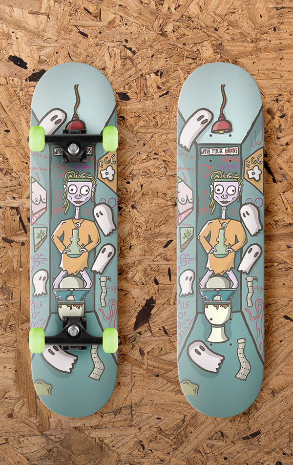
Skateboard Graphics.
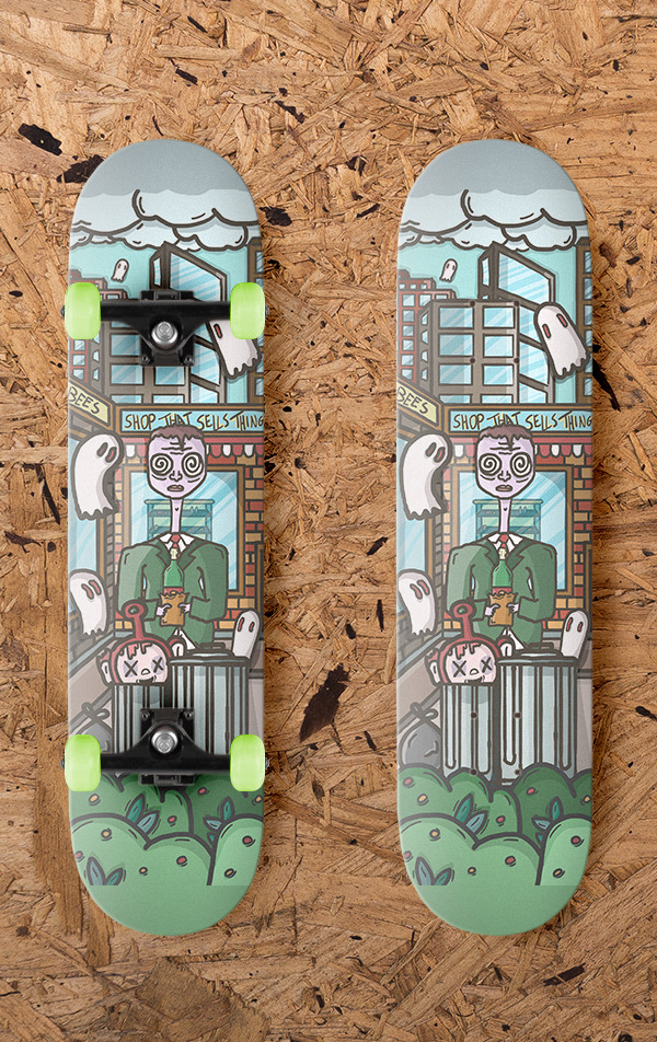
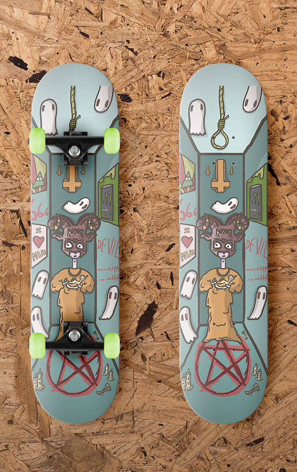
I like this idea and have been skateboarding for a few years and have always wanted to make some graphics for skateboard decks. I could do lots of things here and incorporate illustrations or isometric work but If I decide to go with this idea I need to think about If I want to create a deck for a specific brand or company or I could start a fake skate company or just design a set of board graphics.
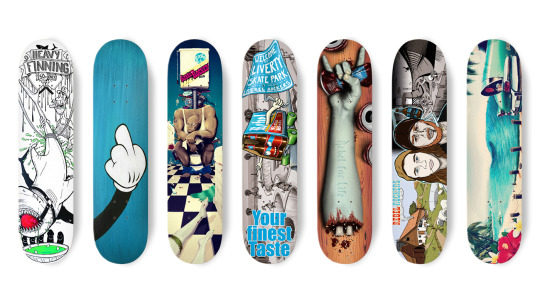
After thinking about each topic I am going to make skateboard deck graphics as I can go with anything form vector work to more traditional illustrations allowing me to keep developing my idea of what I am going to put on the boards and if I want to capture a certain brand or style.
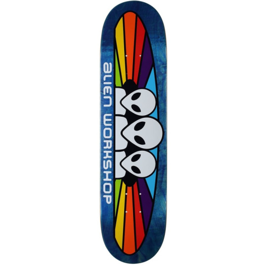
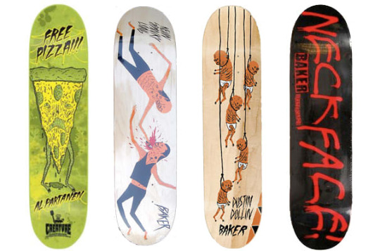
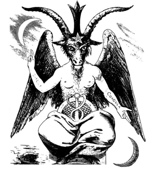
Neck Face
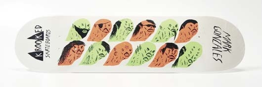
Neck Face is a anonymous graffiti artist and illustrator and is know for his more dark and grungy work which is also commonly comedic. He was born in California in 1984 where his work is featured on the streets but also in art galleries around the world, his first gallery show was when he was 18-years-old and was sponsored by Rich Jacobs and held at New Image Art gallery in West Hollywood, California. His drawing style is said to be rough and scratchy with bloody violent themes attached to his work. His first skateboard design was for krooked skateboards creating a pro model for skater Mark Gonzales. Neck face uses lots of mediums from marker pens spray paints and pencils but sharp metal masks, felt installations, and sculptures have been featured in his work.
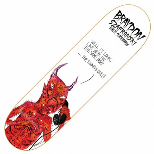
I really like this idea and look of dark illustration and would like to incorporate it in my work. His work also reminds me of other artists I like such as Lumps and Jenkins and Pollynor.
Pollynor
Lumps
Design process.
The artist Lumps dose not really have a specific he says he gets most of hist ideas from artist inspiration and constantly doodling in other words its more of a waterfall process. He usually starts with doodles then goes to sketches and then finally inking of digital tracing.
Christoph Niemann
Christoph is an illustrator, graphic designer and author of several books but out of these things he is mainly known for his illustrations. He was born in 1970 in Waiblingen in west Germany. He studied in Germany and developed his art but his career really took off when he moved to New York in america in 1997 and worked on and created many covers for the popular magazines and news papers such as the new Yorker, Atlantic monthly and the new York times. His work follows lots of different styles as he uses lots of things to create his work from pencils to paints and painting with coffee.
I do really like his illustrations and I think the reason why there so good is because of how creative and abstract some of the ideas are. He does things to help his imagination go wild and to help him create interesting ideas, for example he has multiple sketchbooks with one shape on the front and then he will fill the hole sketchbook with drawings incorporating the shape. One of the things he does to help his work be as creative as possible is that he says when things are going well you should always pick another direction allowing him to really experiment and create complex ideas.
The reason I am looking into this illustrator is because I watched a Netflix documentary and I really like the way he works.
His design process.
He usually does all his work in his office as he says he cant do it anywhere els and he will work from nine in the morning to six at night. He has everything he needs with him before he starts working allowing him to just start and create something. the thing that I like about his approach is that he doesn't plan or wait for inspiration to hit him he will just start drawing and let the ideas come to him, he says “you haft to trust that crazy things happen”. He dose not like to put words or titles to his work as he feels that the illustration should explain itself and represent the contents its associated with. When he works to deadlines he dose not allow himself to experiment to much and he will just jump right in by putting pen to paper. He says that its not about waiting around for hours waiting for inspiration to arrive its about turning up and starting because once you start creating something creations and ideas take place and this is something that I really like the idea of and would like to try in my work.
Now that I know that I want to make skateboard graphics and have some artist that I like that could help inspire me and influence my work I need to work out what work process I am going to use.
Agile
The agile process is essentially a process where you slowly develop an idea allowing yourself to go back and develop your work working with clients and getting feedback helping you create your finial piece that is suitable for the client or you design project. Essentially your not fixed on one pacific idea you are allowing yourself to develop it and change your idea before the final development process making it a safer working method when it comes to client work or product development.
Benefits: using this method can lead to better customer satisfaction, quicker development time as you may not need to go and change a whole idea because you are working with other minds or a client throughout the design process meaning you are both know the final look and outcome. Sometimes you need people to look at your work as others can help and bring ideas to the table or maybe point out flaws or things you missed.
Problems: You might not want to create exactly what you want. There is a chance that you might be relying on other people to do something and they might not be able to do it as well or as quick as you. Working with people can speed up the process of things but also slow things down if your working with people that do not agree with you or you do not like what they are doing.
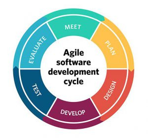
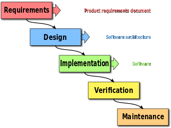
Waterfall
Waterfall is a method where you create a set idea and then develop it. This method can work well for projects that are for yourself and also clients if the clients trust in your ability to create what there looking for in one shot. One of the problems with this method is that is can be risky for example if your working with a client and they want a logo so you have an idea and make it then the client might not like it and you haft to go back to the drawing board wasting lots of time but if you use the agile process you can work with people to develop your ideas making it fit the brief resulting in happy costumers. Waterfall can work well but can also be very hit or miss I think it depends on the project your doing.
Benefits: This method can be quick as you do not go back as much as agile and you are potentially setting a goal and finishing it without time to converse or adjust. You are able to do things your way without someone telling you how they might want to build on your ideas/designs. If your using this method with a client it might mean there giving you full creative freedom meaning you can create what you want to make and how to do it.
Problems: Without involving others or conversing with your client as much it might mean you spend lots of time creating a final product and your client does not like It and wants you to try again meaning you have wasted time. Sometimes you do not see the faults in your work and having someone els look at it means that they might be able to help you or bring something to the table but if you are not getting others too look at it your designs might not be as polished as they could be.
There are different ways to plan out your work and your process an you can use things like action plans, lists, graphs and more. There are even webistes out there to help with teams devloping something or helping people get things done essentially using action plans.
Monday.com is a website that allows you to manage tasks so you can do things on the site such as check progress of tasks, set tasks and communicate with the people your working with. This site uses things like action plans and graphs.
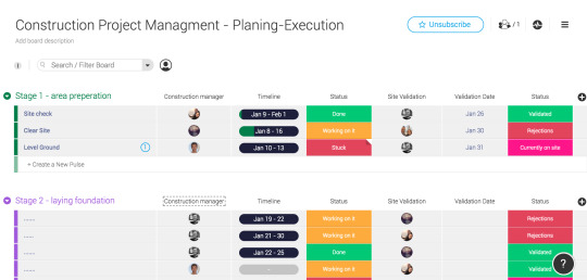
There are other sites that offer simular survices such as Mavenlink who also have features that help you keep track of time and budegets allowing you to not just manage your team but also finace.
Because I am creating this project for the young creative awards and there is no specific criteria I can just make what I want to make so I think the waterfall method will work well as I will create the idea I want to create with me being the only person that needs to be happy with the final piece I can develop it how I want. I would like to incorporate a bit of a agile work process into me development to as I feel it is a good idea to get other people opinions on my work which might help me create something that a larger audience likes other than me.
After looking into some artist I want to go down the digital illustration route and want to make something potentially dark and gory. Because these are skateboard decks I might try and incorporate some skate culture. I have been skating for a long time and am familiar with the background, skateboarding still has this rebellious reputation with more grungy brands like thrasher and enjoy promoting a look of skaters being influenced by drugs sex and just being general rule beakers. This idea is a little old fashion now as skateboarding welcomes everyone but this traditional outlaw skateboard scene is often portrayed in skateboard decks especially when there representing skaters for pro models.
I have not really done any illustration so I drew some illustrations to help me get used to wacom pads and start to get the hang of digital drawing. Here is one of the drawings I did.
I am thinking of going down the route of darker illustration for the skateboard decks so I made a mind map to help me think of visuals I can bring into my work.
I then tried to come up with five ideas in five minutes with the visual elements from my mind map in mind.
The one minute ideas that I came up with were.
1 Skeleton with a boner
2 Alien on the moon drinking beer in a deck chair
3 one planet eating another planet
4 the grim reaper cutting vegetables with its blade
5 Pervert ghosts
The Idea that I like and would like to develop further is pervert ghosts as I think I will be able to fit ghosts on a skateboard deck well and I also think it could be funny ghost spying on people in possibly dodgy situations.
I am now going to list some scenarios that you might not want other people to witness.
Being on the toilet
Sleeping
Having sex
doing drugs
killing someone
spiting in food
keying a car
illegal graffiti
littering
being sick
eating bogies
eating other peoples food
robbing a shop
smoking in work
cheating at video games
I then got my friend to look at the different options I had written down and she said she liked doing drugs, eating bogies because its relatable and also littering because its a common thing people do.
I like the idea of doing drugs, drinking in mid day so the next thing I did was create quick sketches of some of the things I listed here are the sketches.
After doing the sketches and just thinking off the top of my head I had three ideas for the skateboard decks.
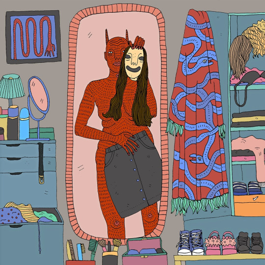
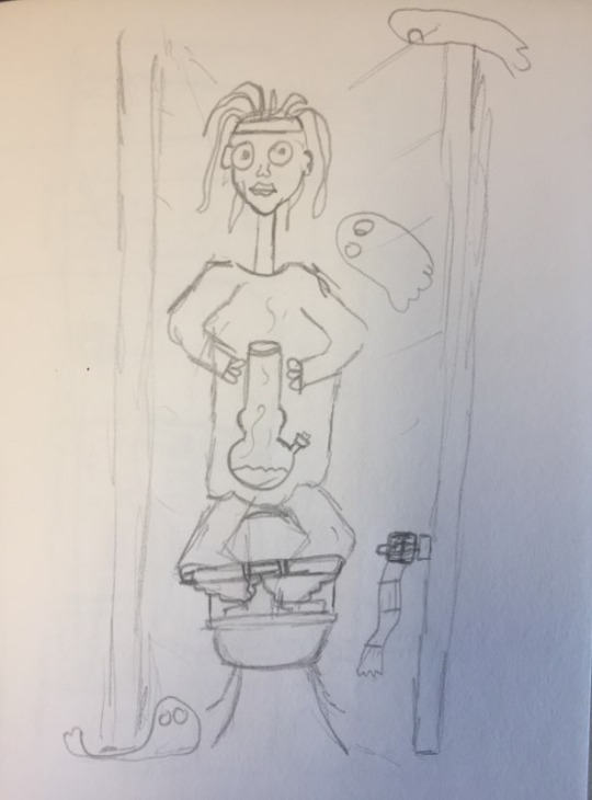
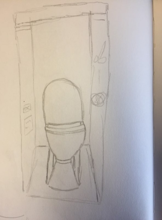
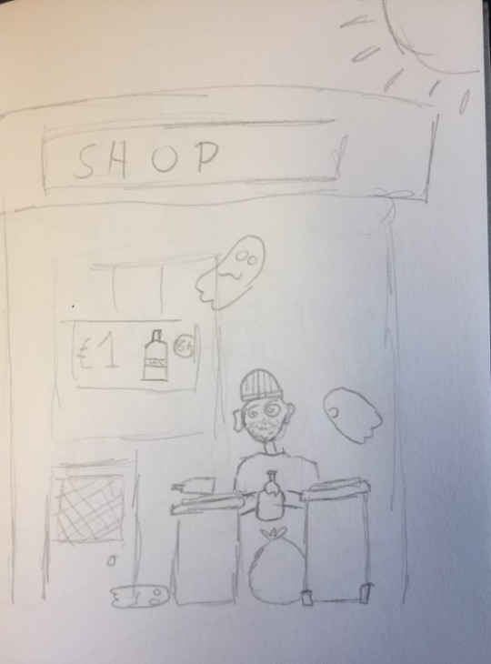
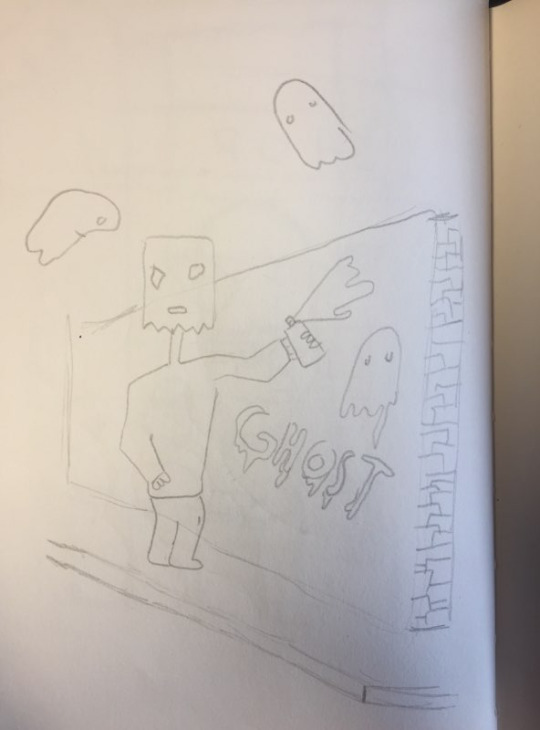
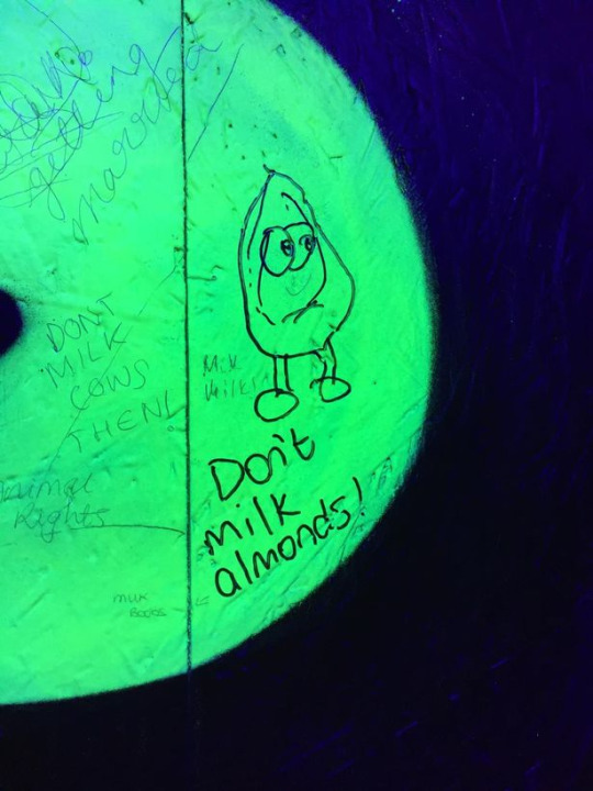
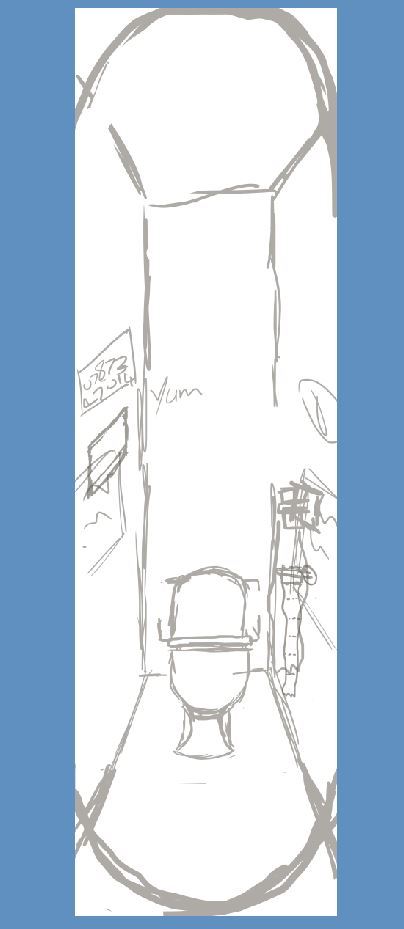
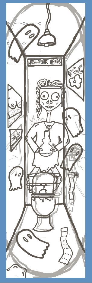
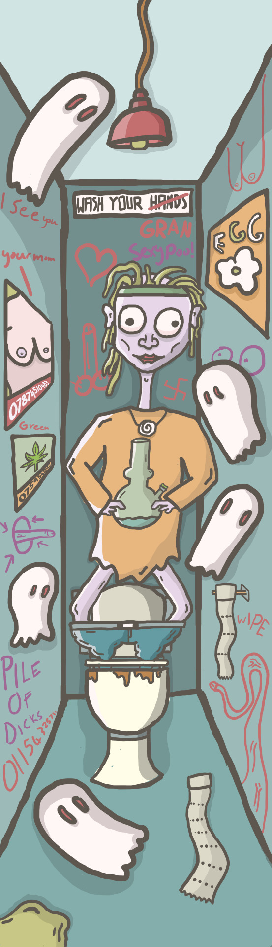
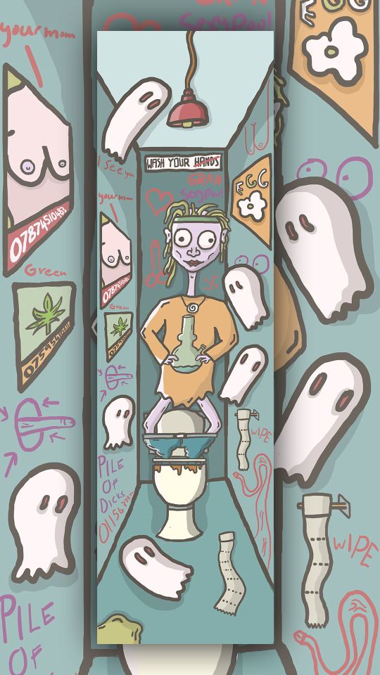
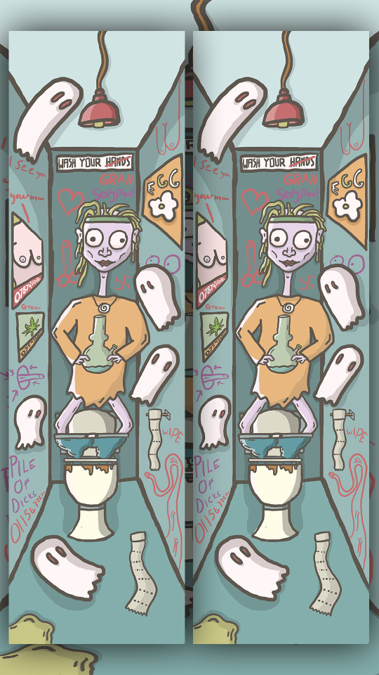
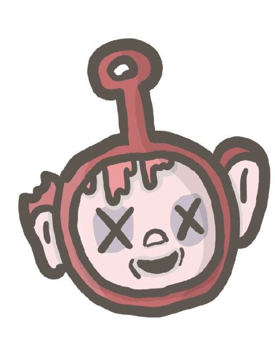
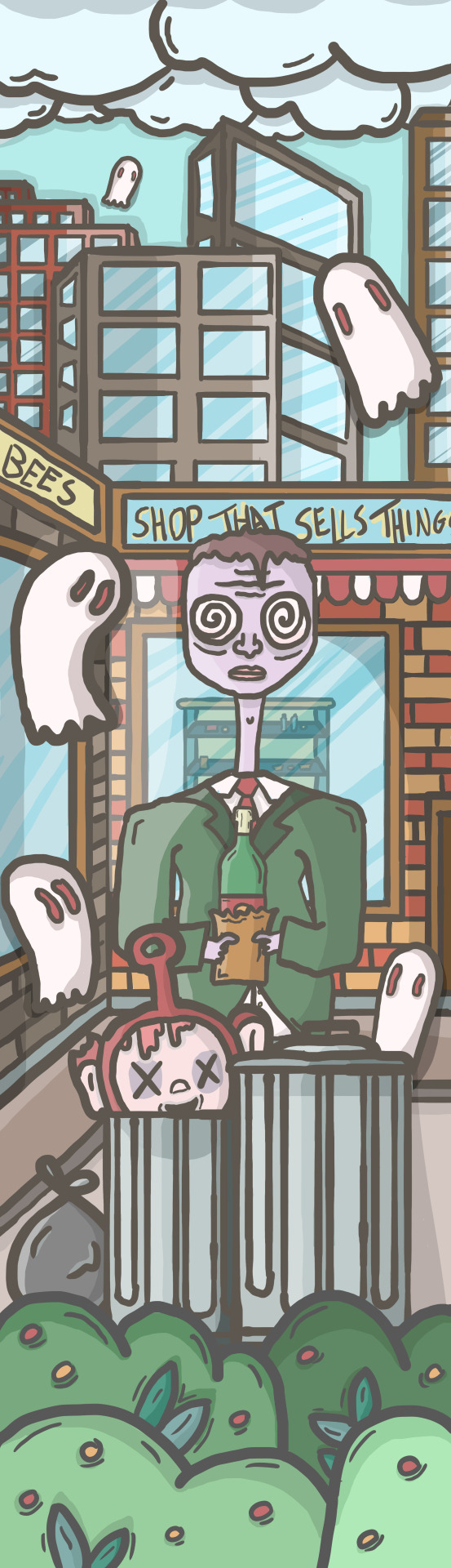
1- for the first idea I wanted to have someone in a toilet cubicle smoking weed out of a bong and then the person will have ghosts around them basically spying on the person. I want to make the artwork look scratchy and grotty like my artists and I also think it would be fun to vandalize the toilet with posters and graffiti. To make things a little more weird I had the idea to put the character with the bong inside the toilet instead of them siting on it.
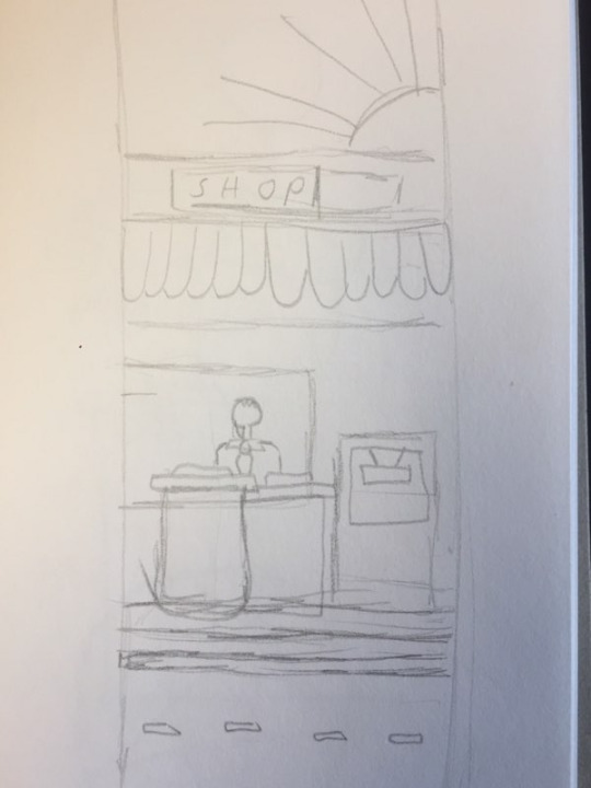
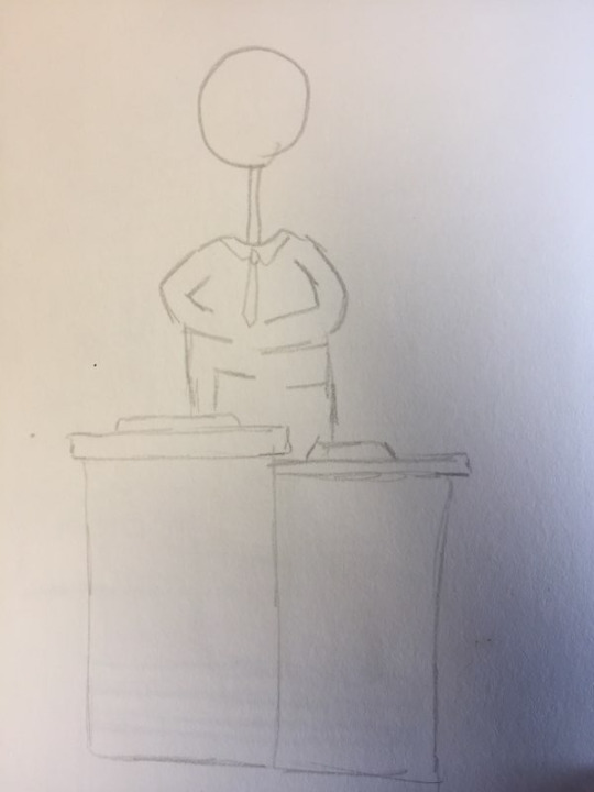
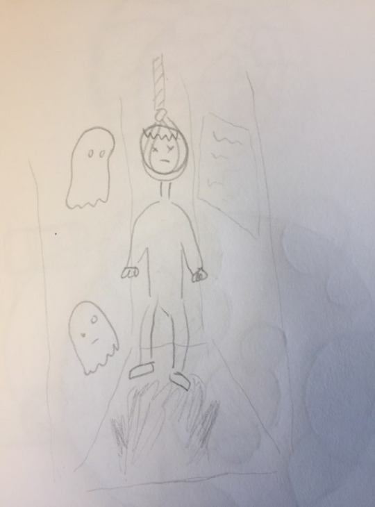
2- for the second Idea I wanted to make a business man that was sneakily drinking in the middle of the day behind some bins outside some sort of corner shop. And then I will follow the theme of pervert ghosts and out in ghosts spying on the character.
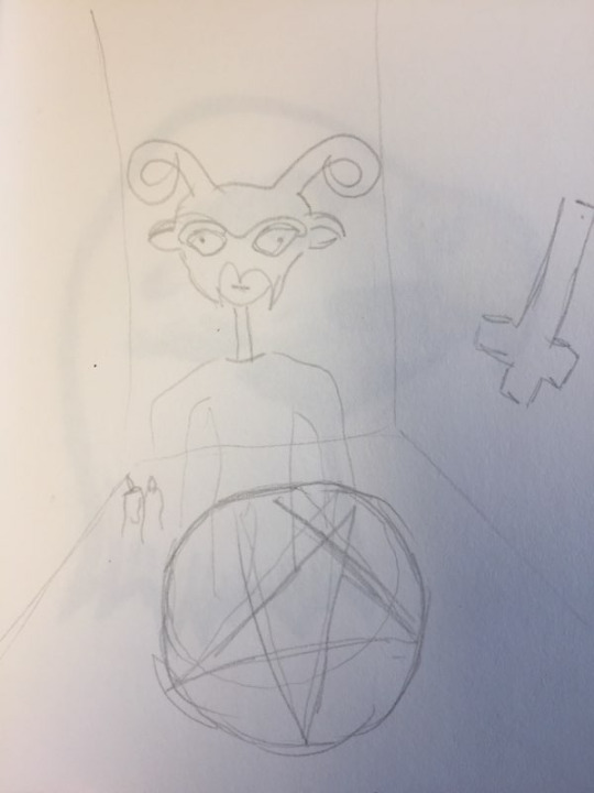
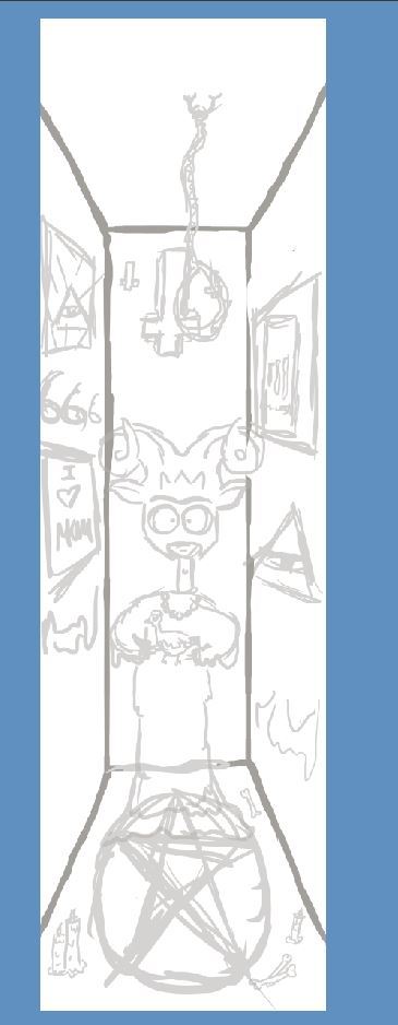
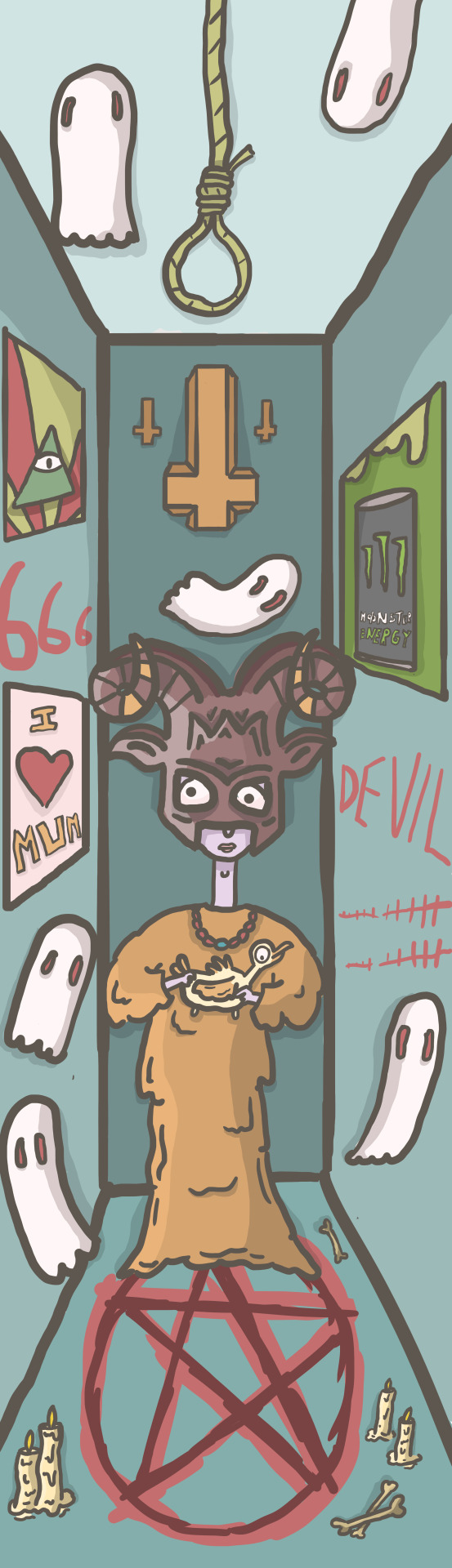
3- the third idea I wanted to draw was a character practicing Satanism so I want the character to have a goat mask on and then maybe a chicken that he is about to sacrifice and then the room the character is in will be filled with things that relate to satanism and the devil.
with my ideas and creation of the illustration I am taking more of a waterfall approach as this is just a project that I have come up with and am not creating it for anyone but me but I like to possibly bring some agile methods into my work to help potentially develop it.
Now that I have done the sketches and have my ideas for the pervert ghosts skateboard series/triptych I went into the design process where I used Photoshop and a wacom pad and pen to create the illustrations.
The plan is to take inspiration from the artists I researched and skate culture. I want my work to have a rough scratchy feel like lumps and pollynors work but I want to follow a design process that fits with christoph niemann so for he illustrations I have a idea but I am mainly going to be looking at my very rough sketches as a guide and the reason I haven't done more detailed sketches of what I want the final piece to look like is because I want to start drawing and hope that different ideas and elements of things I could add to the illustrations come to me as I draw hophally making something a little weird and wacky and this is an approach Christopher niemann uses in his work.
My design process.
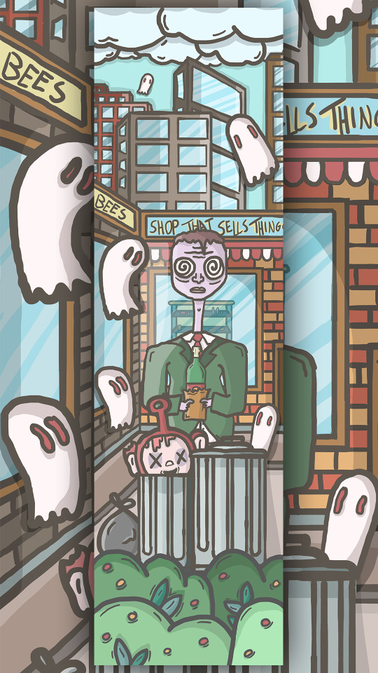
first thing I did was google the size of a skateboard deck for Photoshop and it said 9.5 x 33 inches so I used this but skateboards are a variety of sizes but I trusted google and used that as my dimensions. I then used my sketches as reference and started the designing. The process that I usually do is I would do a rough drawing of the thing I was trying to make in Photoshop to give me a rough guide for when I put in my line work. I then turned the opacity of that layer down and started putting in the line work. Whilst I did this I tried to not make the line work look too clean to fit the scratchy rough style I was trying to incorporate into my work so I would rarely hold shift when drawing lines and if I did I used the pressure sensitivity in the wacom pad to make all the lines different weights and thickness. After I had the line work down for the thing I was drawing I would create a layer bellow which would be the coloring layer, so I then colored in everything under the line work. I tried to make my color pallet for the three boards look a little grotty and dirty and then once I had done the coloring in I created two layers one for shadows and one for highlights. I would then work out where the light source is and using white and black to draw over the color layer and then turn the opacity of those layers down to create more depth and lighting. Then lastly I add another layer and draw in final shadows. When creating I am working of my minimal sketches in the hope that ideas come to me naturally but I will also be doing research to influence my creations. Another thing I will be always thinking about is that this is a skateboard design so the main focus of the illustration will be in the middle because the trucks of a skateboard cover the top and bottom section of the deck.
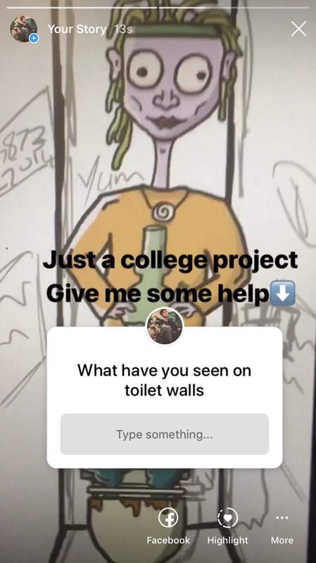
Once I had my ideas and rough sketches I started to create my first skateboard graphic of the character standing in a toilet. I started drawing the basics such as the things that I knew were going to be involved in the drawing such as the character the toilet and walls to the cubicle. I then started to think of things that could be added to the drawing and one of the main areas where I could just draw and doodle to try and make creations happen much like Christoph Niemann would was the vandalism I wanted to do on the toilet walls. Most of the vandalism will be coming off the top of my head but because I wanted to incorporate elements of an agile design process (involving others in my work) I showed people on instergram my work so far on the drawing and asked them about toilet graffiti to get some inspiration and possible thoughts of the project. The question I asked was what have you seen on toilet walls and here are some of the responses.
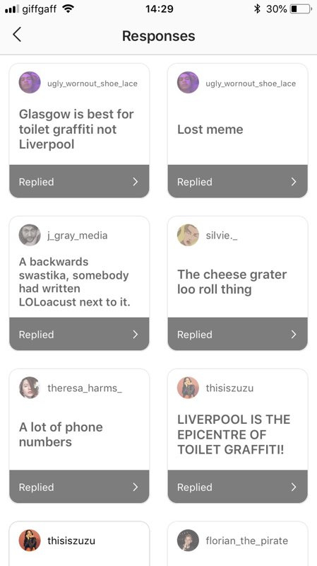
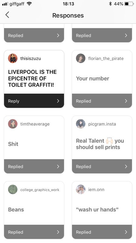
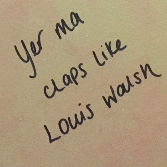
I also took a look in to Liverpool and Glasgow toilet graffiti as people were saying that these places had the best toilet graffiti. I was also sent these photos by people from Instagram as a response to my question.
After geting feedback and people involved to help inspire me I was ready to start coming up with the things to put on the walls. Some of the graffiti I came up with were things such as a dick snake, glory hole and a sign that said wash your hands and then hands had bee crossed out and replaced with gran. From this point on for the first board I did not do anymore research and I just drawed and doodled letting ideas come to me, Once I had the basic sketching and line work done for the toilet and walls I started adding posters to the walls and toilet doodles off the top of my head. Because I was working completely Randomly I didn't have very structured layers in Photoshop as I would have an idea start sketching it, then doing the line work, coloring and shading and then once I had finished that I would move onto the next drawing, I did this because I was just trying to start creating and get my ideas for the drawing down much like the artists I have researched but when I wanted to move certain parts of my drawings around I wouldn't know which layers where which so I spent some time grouping things so it would be easier to move around but it still got a little confusing but I was still following the idea of sketch, ink, color then work out where the light source is going from and draw dark and light sections to whatever I was drawing to give the illustrations depth. I was coming to the end of my illustration and I was almost finished but I asked for a second opinion making my work flow have a bit more of a agile approach and the advise that I got was if I was going to fill all the walls up with posters and doodles I should file other parts of the drawing up because I looked a little bare. I agreed so I decided to add some little extra drawings such as toilet roll on the floor and vomit and then where ever there were patches in the illustration where it did not look as full as the other parts I would draw a ghost to fill the space making the hole illustration look full and busy but hopefully not too crammed so you can understand what the drawing is.
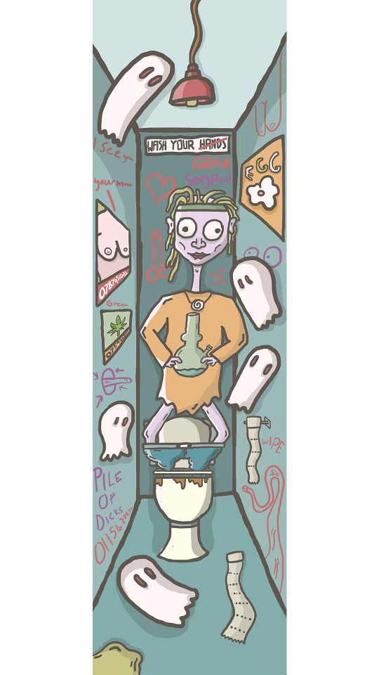
Here are the sketches layers the line work and then the final coloring in with black and white shading.
For the next skateboard design I wanted to try and plan everything out and just have a little bit more structer to my layers so I would get so confused on which layer and section I was working on and it would make it easier to go back and edit my illustrations which is something that I did a lot when I was drawing shadows and highlights so the plan was to simply keep things in groups and label all the groups and each group would have an outline inking layer a color layer a layer for shadow and a layer for highlights and then possibly another layer for touch ups and extra things I wanted to put in basically so I could go back and change or add things. I still went in with the same plan as the first illustration so I just drew the basics in a digital sketch form going off my very basic sketch and then started adding everything in working with each element or section one at a time.
Example of the process.
Inking/line work

coloring
Highlights and shadows.
for this illustration I once again let things just come to my head and drew everything how I wanted so I also didn't have a specific color pallet in mind I just picked colors that I thought would work with the idea that I needed to make all three illustrations look similar because its a trip tic of pieces and I wanted the colors to be a little bit more gross and dirtier..
Here are the sketch layers and final piece.

For the final illustration which is to do with satanism I used the same design methods as the other illustrations but for this one I had to do some research mainly looking at symbols and reading about satanism practices.
for this illustration I made the layout look simulat to the first one because I really liked having the walls that you could place things on. I added things like upside down corsses and some comedic things such as a poster saying I love mom. I also had the idea to add a moster energy poster and the reason for this is because one the drink is called moster but I remeber watching a video where a lady explains how the monster energy drink is satanic. Here is that short video.
youtube
Here is the sketch layers and final illustration.

Evaluation.
What were the final ideas.
The final idea was to create three skateboard illustrations to put on skateboard decks. The title for the three boards is Pervert Ghosts and the concept of the art is ghost spying on people doing things they maybe shouldn't be doing. I am also trying to represent skate culture and artwork and illustrations within the skateboarding scene.
For the first board I wanted it to be drugs related and because marijuana is popular in skate culture as skateboarding emerged from the more hippie surfing scene I decided yo have a character smoking out of a bong surrounded by ghosts in a toilet cubicle.
The second idea was to focus on daytime drinking as lots of business men potentially use drink and drugs to keep them going so I wanted to have a character in a suit drinking behind some bins surrounded by ghosts spying/perving on the character.
For the last board I wanted to explore Satanism as the concept involves ghosts and evolved from me doing idea generation within dark themes so for the last illustration I wanted to have a character sacrificing a animal like a chicken surrounded by artwork and items attached to the culture.
How did you arrive at these Ideas.
To come up with the concept and ideas I was exploring in all the different ways of idea generation and one of them was writing down an idea a minute and I did this with darker themes in mind and I came up with pervert ghosts. I then came up with the ideas for the illustration by doing more idea generation and looking at the different angles and topics I could work with that related to the concept of pervert ghosts.
What inspired me?
I have been skateboarding for a few years so I am inspired by the culture and skateboarding as a whole as it is something I enjoy to do but I also really like art attached to skateboarding and artists that work within street ware and skateboarding. So I looked at some artists that I liked and was inspired by there styles and work methods to develop ideas and the process to creating work.
what specific approaches did you practice?
I looked into different design approaches and I decided to take more of a water fall approach to my work as I came up with the idea and the artwork and final piece will just be for me and not a client but I did also try and bring some of an agile approach to my work as I think its useful to get other peoples opinions on your work and get opinions and tips so I mainly used a waterfall approach so I could create exactly what I wanted to make but then also bring in other people to help develop my work making it appeal to more people than just myself. After researching artist I took influence from there work flow and used it in my work for example there techniques in idea generation such as getting a pen and just randomly drawing letting the ideas come to you and trying to not give yourself to many specific boundaries so you can truly create what your mind can come up with.
What issues did I encounter?
I didn't really encounter many issues but one thing that I did on the first illustration was not label or group my layers making it really tricky for me to go back and redraw or edit certain bits because I was spending a lot of time trying to find the right layers.
How did you overcome them?
For the second and third illustrations I grouped and labeled the elements in my drawings and tried to follow a layer structure for each illustration putting coloring, line work, shadows and highlights into different sections.
what have you learnt during this project?
I have learnt more about different methods to develop ideas and also more about structuring your design process. I have also learnt lots about illustration such as using a wacom pad experimenting with brushes and pressure sensitivity and layer structure when drawing.
What do you like
I really like the first illustration from the character to the posters and graffiti on the wall I also like the scratchy more rough grotty art style I was trying to portray. I think the more dirty looking color pallets look good and I think I did some good illustrations with shadows and highlights thinking where the light source might have been coming from. I also think the composition was okay and I did a good job at keeping the main focus of the illustration in the middle as skateboard trucks would be covering the top and bottom of the illustration I especially think the layout of the second illustration looks nice with all the elements and layers with the bushes at the front and then the character and shops in the middle with a city skate at the top.
What do you not like.
I think the background of the first and last illustrations look very similar compared to the 2nd illustration and it just makes it look out of place because its a triptych they should all look similar so I should of eather made each illustration all in completely different looking scenes or have all three in a the box like room that the first and last illustration have. I also think the last illustration seems a little bare and not as full as the other too. Also the character is not very good and I do not like the goat mask I gave him. I am also not a huge fan of the colors in the second illustration as I do not like the grays in in the skyline I think there a bit too dark and I could of added brinks or more texture like the shops have but I didn't because its in the background so it doesn't have as much focus. I also think the color pallet for all three designs vary to much so I should of been more strict with my colors and stuck to a specific color pallet. I did try and use the same colors from across the illustrations as much as I could but I feel like there is too much of variation of colors throughout the three illustrations. Also the moc up that I made of the designs on skateboards the decks are a little to big leaving a small section at the top and bottom of the board with no illustration on it.

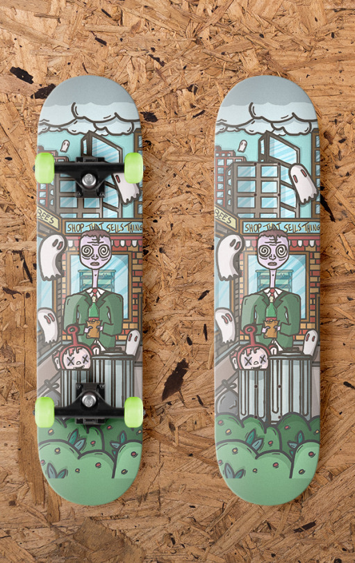

I uploaded my work to the young creative awards but I only uploaded my first illustration as I dint think the other too were as good or good enough.
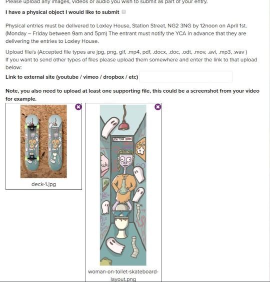

1 note
·
View note
Text
New to Krita Quick Tips
AKA things I wish I would have read/figured out when I first started using it months ago! Krita is a free and open source art program of wonders. Downloadable for Windows, Linux and recently Mac! They have a Tumblr
Stablizer
Krita has one and it’s built in! It’s BUILT IN. Pretty sure some other programs still make you get an extention. There are several options in the dropdown in case you don’t want it (default) or want smoothing instead. I have not played with smoothing but the stabilizer is a godsend. My personal main line preferences above, you may have to turn it off for small details or remove the delay. It will not make your lineart pefect but if your hand is just a bit shaky it can help you redraw that same line a few less times before it feels right.
References
Settings->Dockers->Reference Images and Check that box!

It shows up with my color selector dockers. The little dropdown with a house is where you will browse for your images. Default for me is the home/pictures location. Double click the image you want to use as a reference. You will have to double click each one but you can grab them all from different folders if you like!

Once you have the images you get this view. The dropdown with file names is how you switch between images. The little icon next to it lets you zoom in. The arrows and you can flip through them in order. What you can’t see is that it actually gives you a color dropper when mousing over the image at well! I’ve only gotten it to work with flat images.
Fill in Flats
Fill in flat colors easily?

Grow selection by x in order to get past the edges of your lineart. Also useful for other fill options.
Tiling and New View

I know it’s blury I wanted to keep image sizes small. So lumping these two together, how to title without doing it manually and how to get a new view of the same image.
Tiling: Make sure in Settings->Config->General->Window you have Multiple Documents Mode set to Subwindows. Go to Window->Tile and you’re done. It will use the currently selected window as the main window, all windows currently open show up when in the Window menu and the checkmark is the one currently selected for easy shifting. Newly opened windows will not shift tiling.
New View: This I got from a post I can’t seem to find but it’s somewhere in Krita’s Tumblr as they answered a question about it. Window->New View->File Name. Anything done in one view shows up in the other, so you can work on details but see if they look right over all. The two images to the right are two views of the same one image.
Patterns

Take a normal image and hit W
W just gives you the view in which you can better manipulate the pattern. Something to note is that it doesn’t work so well with transforming things. I generally create the pieces for the pattern and make the appropriate copies. Hit W and roughly move them around or transform them how you think the pattern will work, they will probably get cut off this way. Un W yourself. Use either the origonals or new copies and rotate how I I had roughly laid them out (making sure they are all 100% visible in the canvas space). Hit W again and move them into place. There may be a better way but I haven’t found it yet.
You can add these to your patterns either by saving them as png and importing them or through the quick add. Just click the little pattern square next to your gradient and the first tab will let you import. The second tab is quick add. Make sure you are Un W for both.
These are the main things I would have liked to know when I started out. Below the cut will be some random other things.
Palette
Setting->Dockers->Palette

I, for one, just like having one if I want to quick pick colors. The little icon in the bottom left lets you select different palettes like websafe, pixel art, photoshop, or make your own and save it.
Canvas Tweeks
Settings->Config->Display
If you saw in the above pictures my area around my canvas is a light purple color. This is a preference to the default that I can’t remember anymore. This is found under Canvas Border color. My squares are also slightly off color which might be harder to see. They are a slight green and red color instead of grey and white. These fall under Transparency Checkerboard Pattern and help a bit when coloring/hurt my eyes less. Green: #babdb6 Red: #e0d9d9
Brushes
This is my last little personal “tweak” off the top of my head. The brushes Krita comes with are actually exceptionally useful. All my lineart is done with the preloaded inking pens. (And flat colors with the fill brushes)

Ink brush makes wide lines that look a bit like painting. I favor this one the most.Ink circle looks a bit pixely but is a nice style for simple things or sketch-like images. Ink Gpen looks like my inking would if it were on paper, good for more controlled lines.
*Plug time*On top of the defaults I also use brushes from David Revoy, specifically the brush kit v8. These are a bit hard to show. 1f draw brush is what I use for most of my basic sketches. It’s like a really soft pencil. 1e rigger is what I use if I’m going to give a sketch a cleaner style. It’s like the sharp tip of a pencil. A lot of other brushes are good for shading. Many have low opacity so you’ll need some kind of color layor under them, even just white. The blenders are excellent. As are the stamps.
Also make sure to check out his site as it has other Krita tips, tricks and updates!*End Plug Time*
That’s it, those are my super beginner tips from a fellow super beginner. Hope they help! (Yes some of these things are in the Krita highlights but I missed them so others might too) Also remember the community of Krita is awesome!
#krita#quick tips#artists on tumblr#art problems#what do i tag this as#it's not really a tutorial or anything
42 notes
·
View notes
Text
When I was heading to France last week, I considered taking my Nikon d750 with me, because I thought, not unreasonably, that France might be a photogenic country and that I might want to get some high quality photos of the place. I decided against it for a number of reasons, but one of the major reasons was that a couple of weeks ago I got myself a Pixel 3 phone, which reviewers have suggested may have the best camera on a phone out there. I’d previously had a Pixel 2, the former “best cell phone camera out there,” so I was curious as to how the Pixel 3 would improve on the camera.
So I left the Nikon at home and used only the Pixel 3 to take shots while I was in France. I ended up taking something around 500 pictures while I was in country (many of the best of which I have collected in this Flickr photo album), and can now tell you what I think about the experience. Here are my notes, in no particular order, with occasional art. Please remember that these thoughts are from someone who loves taking pictures but is not a professional photographer, so I’m not going to go into the weeds with technical issues and jargon. I’m mostly noting the experience of just trying to take pictures.
1. Overall I was very happy with the quality of the photos and the intelligence of the camera — the latter perhaps being a weird thing to say, but the fact is what separates the Pixel line of cell phones as cameras is not the hardware (which is mostly high-end but standard issue for a cell phone), but the processing Google applies to the photo data once the photo is taken. The camera makes choices, basically, about how it interprets the data you give it once you snap the photos.
And those choices are generally very good! There wasn’t a situation where I thought the Pixel 3 wasn’t capable of handling itself. As with nearly all cell phone cameras (and, honestly, nearly every camera, period), the Pixel 3 works best when it has a lot of good, bright, natural light, but it did very well inside and also very well in visually challenging environments with a lot of contrast between bright and dark (like, for example, the interior of the Notre Dame cathedral). Not every picture I took was perfect or even good, but the reason for that had as much to do (and perhaps even more so) with operator error as it did with the camera itself. Which is to say I can’t blame the bad pictures on the cell phone camera; a lot of it was me.
2. What do the photos look like coming out of the camera? Here are five, which I’ve not done any post-processing to (i.e., no tweaking with the various photo editors I have). These pictures were taken with the settings the Pixel 3 has right out of the box, including the HDR+ processing turned on, without zoom, and recording to jpg. Right-click on the pictures to get a larger versions of them (choose the “open image in new tab” option), and see the various details.
This slideshow requires JavaScript.
Right out of the camera, the Pixel 3 a pretty good job of things. The colors are correct and not overly saturated, and the HDR+ mode does a good job of bringing out details in shadows without making them look overly processed. Note in particular the picture of the musicians in the conference room; the light’s behind them and their faces are shadowed, but the Pixel 3 does a pretty good job of balancing the data so you can see their faces clearly. In the rose picture there’s decent depth of field — not a lot, but the Pixel 3 knows what it’s looking at. There are limits, and you can see some of the choices the Pixel 3 has to make in the photo of the Notre Dame alcove, but those limits mostly show themselves in challenging situations where most any camera would show limitations of some sort.
I personally do a fair amount of photo-editing of my pictures, both to bring up details and for aesthetic effect, and the Pixel 3 gives me a fair amount to work with, even as it records the data into a lossy format like jpg (there is an option to have the camera record in RAW — the lossless format that gives photographers the most information to work with — but I didn’t turn that on and don’t really plan to except on very special occasions, because the files sizes are huge). It’s a fact that for a lot of photos, I don’t really have to do much editing at all — I merely straighten out sightlines or crop for better composition as much as I tweak colors or bring up shadows.
Out of the box, the Pixel 3 takes pictures that are better than “good enough,” and that’s a good thing. For people who like fiddling with photos like me, what comes out of the camera is even better than that.
3. One of the — perfectly reasonable — knocks on the Pixel 3 is that where other high-end cell phone cameras have an optical zoom function, the Pixel 3 doesn’t, Google instead opting to try to deal with zoom through processing (involving the minute unsteadiness of the human hand, or something, to help fill in interpolative gaps). I used the zoom function a lot while walking around and trying to get details that would otherwise be too far away. My verdict on the zoom is: well, it does something, but razor-sharp details isn’t it.
This is again probably best viewed, so here are four photos at or close to full zoom, three of statutes or architectural details at the Louvre, and one, of that tower they have there in Paris. Again, right-click on the picture for details (or in this case, lack thereof). Again, these pictures are straight out of the camera and otherwise unedited:
This slideshow requires JavaScript.
My impression of these zoomed in pictures is that they don’t look like photos, they look like pastel drawings, or what happens when you use a very light “oil painting” photo filter from Photoshop or some other photo app. They don’t look bad? But at the same time, this is not what I want when I zoom in. I zoom in because I want a closer look at something, not an artful, detail-smoothed representation of that thing.
I read in a review of the Pixel 3 where a reviewer notes that the zoom works as intended up to about a 1.5x zoom, and after that things start getting overly interpretive. My experience has been that this estimation is largely correct. I have some pictures that are moderately zoomed in that are perfectly good. But too much zoom means you’re getting the AI version of impressionism. My thought on this is that this iteration of AI zoom is only the first, and that Google will probably get better at it as it goes along, because that’s what Google generally does. So two Pixel generations from now, this will likely be a solved issue (or alternately, Google will throw up its hands and just put an optical zoom on future Pixels). Here with the Pixel 3 and today, however, be aware that the zoom works up to a point (1.5x or so), and then it gets kind of wacky.
4. The only other real issue with the Pixel 3 that I’ve noticed is that it feels a bit slower than the Pixel 2; sometimes there seems to be a lag between when I press the button to take the picture and the camera registers the picture being taken. It’s a relatively small issue but it’s been noticeable to me, and I wonder if other people have been experiencing it as well. I’ve not missed any photos because of it, fortunately. But be aware of the possibility of a bit of shutter lag.
5. On the selfie front, the Pixel 3 features a “wide angle selfie” mode — an optical zoom out, if you will, thanks to two cameras on the front of the phone. This actually is very useful for when you’re trying to get a lot of people into frame while taking selfies:
Do be aware the the wide-angle selfie mode has some distortion. But then, selfie cameras have distortion anyway (it’s why your nose always looks big in a selfie), so I guess you pick your poison with selfie distortion. What I do know is that I’ve used the wide-angle selfie function several times already, so this was a smart add-on on Google’s part.
6. This is not meant to be an exhaustive review of the Pixel 3 camera, but one that touches on how I’ve been using it. I’m not covering a lot of the functionality of the thing — I haven’t used the video mode, or the panorama mode or tried the “HDR+ enhanced” mode, or sideloaded the apparently super-cool but not-officially-released “night mode” into the phone to try it out (the night mode apparently makes it possible to take super clear pictures in very low light, and the key as far as I can tell is a long exposure time, which, well, yes, it would be, wouldn’t it). I’m not covering any of those things because, as noted, this is not how I’ve been using the camera. I’ve been using the camera in a pretty straightforward fashion, as I suspect most people will.
And as a “daily driver” camera, the Pixel 3 really works. It takes great pictures and in all sorts of circumstances, and with the exception of the zoom above a certain point, steps up when you need it to (also, as an aside, the fact that the Pixel 3 comes with unlimited storage in Google Photos is a point well in its favor, since you can store your photos there and keep your phone’s memory relatively uncluttered). We’re now well past the point where the average person has to wonder whether they’re missing out on really excellent photos if they only have their cell phone with them. With the Pixel 3, the answer to that is definitively “you’re not missing out.” This phone will get that great shot for you, most of the time.
7. Does this mean I’m ready to ditch my dSLR for the Pixel 3 full time? No; the dSLR still has a better sensor, better lenses, and does specific things much better than the Pixel 3 does or will (like, sorry, Google, zoom). But this isn’t an either/or situation; this is a “this, and” situation. I no longer have one excellent camera and one camera that I just happen to carry around; I have two excellent cameras whose use cases overlap but are not a perfect circle on the Venn diagram. I don’t suspect I’ll ever stop using a dedicated camera for particular things where a high-end, single-use piece of machinery makes sense. But, as noted above, when I have my Pixel 3 with me, I don’t worry that I don’t generally have enough camera with me.
8. Does it make sense for people to upgrade to a Pixel 3? I’m very happy I did, but I also acknowledge I’m a tech geek with a particular interest in photography, and I have enough money to indulge in this sort of thing (my other phone stopped working, which prompted me to get the Pixel 3, but let’s not pretend there wasn’t a good chance I would have gotten one anyway).
If you already have a Pixel 2 (or the first generation Pixel), some of the new capabilities of the Pixel 3 camera are going to be available to you with software upgrades. So unless you’re already at the part of your upgrade cycle where you’re getting a new phone anyway, you can probably sit tight and be fine. If you have the latest generation of “flagship” phone from Apple, Samsung or any other high-end phone manufacturer, you’re also probably just fine. Cameras are the new hotness on phones and every manufacturer will tell you why their iteration of cellphone camera tech is the best. It’s getting a little silly (some upcoming phones will have up to five cameras on the back of a phone, which seems much of a muchness), but on the other hand if you’ve got a high end, recent phone, you probably have a very good cell phone camera no matter what. Finally, if you just don’t care about photos, either from your cell phone or in general, the Pixel 3’s camera capabilities won’t matter regardless.
But if you are looking to upgrade, do like taking pictures and want to have the possibility of taking genuinely good photos with your phone, are fine with Google knowing everything about your digital life, and (not trivially) have between $800 and $1,000 to splash out on a phone (or have Verizon, which will let you slide it into your existing plan for a monthly fee), then I can really very highly recommend the Pixel 3. Aside from (yes) taking some of the best photos possible on a cell phone, it is also otherwise a very solid high-end phone, with some features (call screening, I’m looking at you) that are amazing differentiators, and an operating system upgrade cycle that means you always have the best, most recent version of Android first.
For me, in any event, it’s been well worth the upgrade, and not just for the photos, although the photos probably would have been enough. I really like this camera, and I really like this phone.
Taking Pictures With the Pixel 3: Some Thoughts
When I was heading to France last week, I considered taking my Nikon d750 with me, because I thought, not unreasonably, that France might be a photogenic country and that I might want to get some high quality photos of the place.
Taking Pictures With the Pixel 3: Some Thoughts When I was heading to France last week, I considered taking my Nikon d750 with me, because I thought, not unreasonably, that France might be a photogenic country and that I might want to get some high quality photos of the place.
0 notes
Text
What Makes Vector Art - So Special?
In the digital world, there are two main forms of art: Raster Art where we color in a fixed number of pixels on a screen like say with Photoshop and Vector Art where we color in mathematically defined shapes like with Illustrator. Raster art has its own special powers and allows the creation of photorealistic art with shading and incredible details, depending on the resolution. Both of these can be controlled with a computer to generate art using algorithms. However, only one of them is done independent of resolution—Vector Art.
What does this mean? It means that no matter how large we render it or how high the resolution, we get a crystal clear image with sharp lines whereas if you blow up pixel art larger than intended, you will start to see jagged blocks and artifacts. Since my art is vector art, I can make it the size of a billboard or large mural with no loss of clarity. Not only that, but I often hide tiny details that won’t even be visible at smaller sizes but become apparent when shown larger and thus adds a greater impact.
Yes, vector art is also limited and can’t do things that painters or pixel artists can do and it’s terrible at creating photorealism so the vector artist has to think differently. I don’t even try to be realistic and find it very liberating, opening a new kind of Impressionism and Abstraction that was not even possible before. This excites me because it allows the viewer to fill in the missing details with their imagination. Instead of a plain photo that anyone can take with their phone these days, you get a whole new thing that keeps certain aspects of the original image but introduces thousands of new details and shapes where the parts are almost as cool as the whole.
One more thing I love about vector art is the files are relatively small. It takes less information to tell a computer what you want to draw than to describe what you already drew. For example a circle can be described with a center point, the radius of the circle and the desired color, three pieces of information. But if you rendered it, you’d need to store the color at each location within the circle which could be in the millions for a large circle at high resolution. This allows me to create and store many thousands of works and easily keep backups!
For more details on our products and services, please feel free to visit us at: Mathematical Art, Michael McClard, Mural Art, Original Vector Art, Pixound.
0 notes
Text
What Makes Vector Art So Special?
In the digital world, there are two main forms of art: Raster Art where we color in a fixed number of pixels on a screen like say with Photoshop and Vector Art where we color in mathematically defined shapes like with Illustrator. Raster art has its own special powers and allows the creation of photorealistic art with shading and incredible details, depending on the resolution. Both of these can be controlled with a computer to generate art using algorithms. However, only one of them is done independent of resolution—Vector Art.
What does this mean? It means that no matter how large we render it or how high the resolution, we get a crystal clear image with sharp lines whereas if you blow up pixel art larger than intended, you will start to see jagged blocks and artifacts. Since my art is vector art, I can make it the size of a billboard or large mural with no loss of clarity. Not only that, but I often hide tiny details that won’t even be visible at smaller sizes but become apparent when shown larger and thus adds a greater impact.
Yes, vector art is also limited and can’t do things that painters or pixel artists can do and it’s terrible at creating photorealism so the vector artist has to think differently. I don’t even try to be realistic and find it very liberating, opening a new kind of Impressionism and Abstraction that was not even possible before. This excites me because it allows the viewer to fill in the missing details with their imagination. Instead of a plain photo that anyone can take with their phone these days, you get a whole new thing that keeps certain aspects of the original image but introduces thousands of new details and shapes where the parts are almost as cool as the whole.
One more thing I love about vector art is the files are relatively small. It takes less information to tell a computer what you want to draw than to describe what you already drew. For example a circle can be described with a center point, the radius of the circle and the desired color, three pieces of information. But if you rendered it, you’d need to store the color at each location within the circle which could be in the millions for a large circle at high resolution. This allows me to create and store many thousands of works and easily keep backups!
For more details on our products and services, please feel free to visit us at: Mathematical Art, Michael McClard, Mural Art, Original Vector Art, Pixound.
0 notes
Last Seen Blogs