#i tried out gradient maps for the first time for this
Text
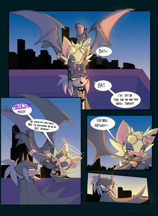
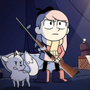
Dc au- two bats on a roof
(Rouge finds the whole ‘batman’ thing hilarious btw)
#She came to snitch on Shadow cuz she heard he’s after a chaos emerald and wants to use knuckles as a distraction so she can nab it💕#i tried out gradient maps for the first time for this#art#drawing#sonic the hedgehog#sonic#sth#doodles#sonic fandom#sonic fanart#digital art#sonic the hedgehog fanart#rouge sth#rouge the bat fanart#rouge fanart#rouge sonic#rouge the bat#sth knuckles#knuckles#knuckles fanart#knuckles the echidna#sonic au#sth au#sth art#digital aritst#sth fanart#sonadow harlivy au#knuxouge#knuckles x rouge
799 notes
·
View notes
Text

HES THE PUMPKIN HEAD GUY!
#artists on tumblr#digital art#my art#nitw#night in the woods#pumpkin head guy#fanart#illustration#art process#fake movie poster#tried out gradient maps for the first time#this is kinda late for halloween but I still like this sm#might make more fake movie posters in the future#not just for nitw hehe
73 notes
·
View notes
Photo
in the time we have left,
#been thinking about them lately... nothing specific just. ough.#also i think this is the quickest ive ever gotten a piece this size done :D tried out gradient maps for the first time too#arthur granvelle#figaro garcia#mahoyaku#mhyk#mahoutsukai no yakusoku#promise of wizard
11 notes
·
View notes
Text
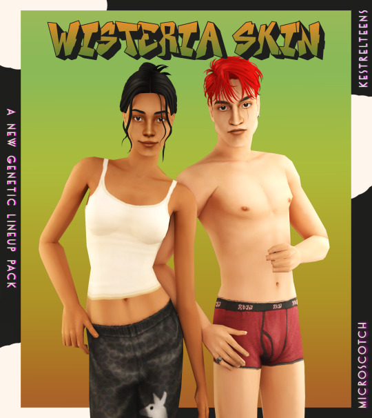


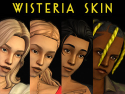
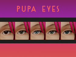
WISTERIA SKIN + PUPA EYES: A COMPLETE SET OF GENETICS
BOI that was an undertaking! but finally, and with lots of assistance from the wonderful @kestrelteens, this skin is completed. and it turned into an entire set of cohesive genetics, too! more info under the cut ⤵
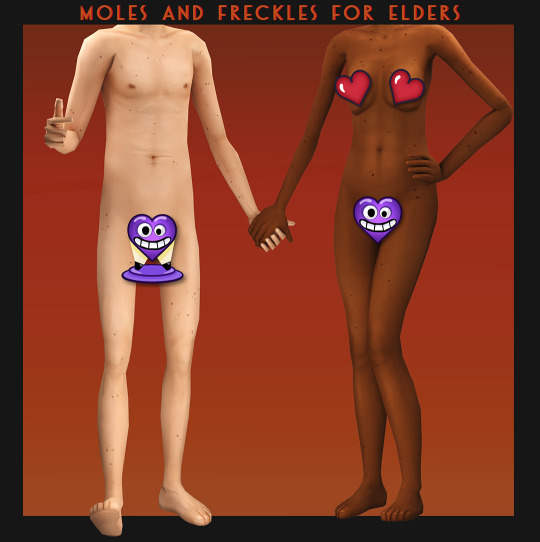
essentially this is a mix of woohoo on the beach (aka ios those darn skins slightly edited) and various other components taken from @obscurus-sims, @lamatisse and @buglaur, (such as collarbones and ears), and some moles/freckles for the elder bodies i snuck from @episims, and @sixfootsims tongue + teeth texture. lips are a nod to maxis and a blend of so much stuff that i dont even remember it.😅 also tried to eliminate the smeared lipstick texture under the feet, and p much blended every seam i could find.
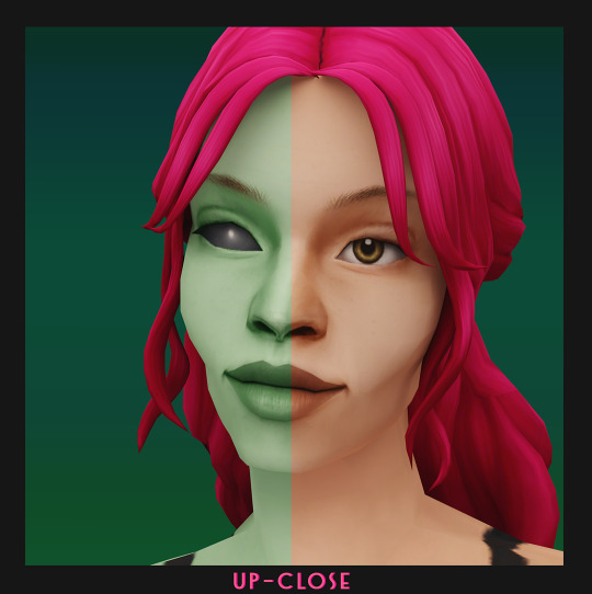
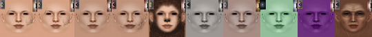
here's a swatch of the full range, which is more undertone rather than gradient based:

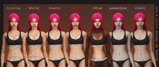
yay, first time doing supernaturals! 🌙 it was a lot of fun doing eye textures for them, here's the swatch:
NOTE: the zombie and vampire default come with an overlay mod! and the werewolf skins are correlated! please check out the hyperlinked instructions given by the respective creator ‼
also, i highly recommend downloading shasta's genie hair fix!
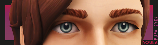
the eyes - squeas pupa eyes to be exact! come in 17 colors.

SO here are the downloads:
pupa eyes 👁 - custom / gen&town / defaults
wisteria skin 💗 - custom / gen&town / defaults / supernaturals / pngs for recolors + add ons :)
NOTE: these eyes are meant to go with the alien skin. 👽
dec 3rd update: EM chubby morph for shadowrealm has been fixed, feel free to redownload the non default version you're using!
for the database:
credit 🥰: serabiet, squea, obscurus, buglaur, themeasureofasim, sixfootsims, epi the phenomenal mod maker (and correlated werewolf skin maker!), withlovefromsimstown (plantsim textures), deedee(vamp cracks), platinumaspiration for more vamp cracks, veronavillequiltingbee (vamp overlay base), magical-girl-sandbox(bigfoot base), tvickiesims, lordcrumps, lamare & teaaddictyt for playtesting & feedback 💗
~~~~~~~~~~~~~~updates~~~~~~~~~~~~~~~
dec 3rd-- EM chubby morph for shadowrealm has been fixed, feel free to redownload the non default version you're using!
january 13th-- i noticed that the s3 range for females is a little too highlighted in the chest area, to the point that clothing where the skin texture mapping is just off the *tiniest* bit makes it clip with the neck, which also applies to a lot of ea meshes. i have toned down the shine and blended the neck down further for this range so that it looks better with differently mapped clothes :)
please redownload the natural defaults and/or non defaults. make sure to keep a backup of the previous version in case you end up not liking the changes ive made to this range!
#ts2cc#s2cc#sims 2 cc#sims 2 download#ts2 download#moncc#dl:eyes#dl:genetics#🍊#yes ofc the name is a desperate housewives reference
1K notes
·
View notes
Text

after 30 hours we’re done!!!
I love little pootis so much, a fantastic series. If you haven’t seen it yet I really recommend it!! I bought one of the plushies for my little siblings for Christmas hehe.
I’ve been wanted to make some fanart for it for a while, but I wanted it to be special! Since it means too much to me and my family :3 so I tried my hand at digital painting again! Here’s my process:

First I started out with the sketch and putting in the values, (that image is the scene I was referencing.) and since I have absolutely no idea how perspective works I just guessed and went “eh good enough.” I also used my radical composition skills to give the whole thing some life! (Golden ratio my beloved.) I should have gotten some reference images, first mistake, but I was way too excited lol.

Then I duplicated the layer and started painting over my sketch using some painting and blending brushes. Unfortunately I forgot to capture any in-betweens of this process so it makes it a little hard to explain. But once I got my values down and my painting rendered to point I wanted it to be, we started coloring!

And oh god! This is why the painting took 30 hours! This was my first time painting using this method, so I was so not ready for the coloring part. I’m in a love-hate relationship with gradient maps so the coloring was mostly done with blending modes, I think I used the linear light mode?
After watching a stupid amount of videos by Marc Brunet I finally got it! Used just one overlay layer and adjusted my colors and values as needed for this one. Used a couple gradients and other techniques to get the snow and the water looking how I wanted, and we’re almost done!
My favorite step! Adding a bunch of textures and sparkly stuff! It’s not for everyone but I really like it. And congratulations we finished our first painting yippee! Thanks for reading :3
little pootis by @quazies
#tf2#lil pootis#digital painting#tf2 fanart#creative process#daffys drawings#WOOOOO LETS GO BABEY LITTLE POOTIS FANART#also just gotta say I love Blootis so much he is just like me!!#Can’t wait to see what he does next. Love that guy. Oh and pootis too I guess
595 notes
·
View notes
Text
Today is the day I unleash my Mr. Bonzo fanart upon this webbed site.
This post is relatively safe up until the cut.
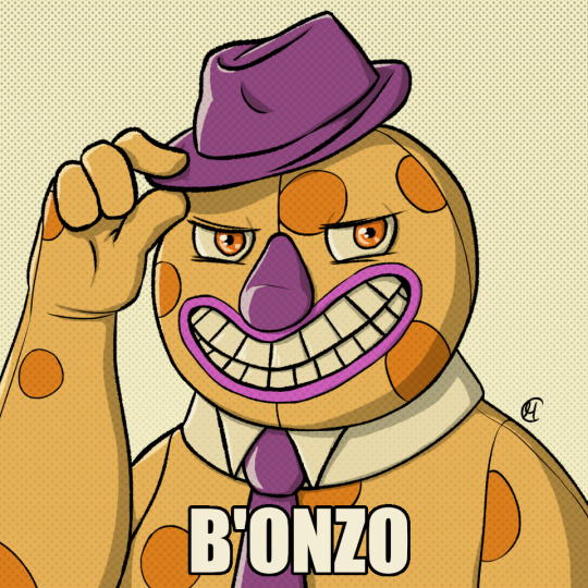
Is the *tips fedora* meme over a decade old? Yes. Do I care? No, absolutely not.
~
Now this is where I recommend "getting off" this post to anyone bothered by graphic depictions of body horror, blood, violence, or Mr. Bonzo (monster, not mascot like above).
I know the first image is silly, but I cannot stress enough how serious I am when I say:
Proceed at your own risk.
Now that you have chosen to continue, I have arranged the images in order of least to most vile and disturbing (though that might be slightly subjective on my part).
Remember that you can click off this post at any time.
Final warning: split tongue Bonzo.
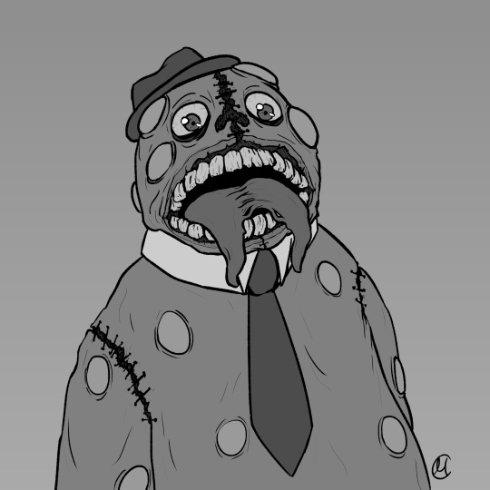
I tried channeling Julia Drawfee with the lineart a little bit. Didn't feel like shading that one, so it's a bit flat.
Where did I lose my colours? Plot twist: the first image in this post is actually the last I've made, so technically I gained the colours. I wanted it to have more of a cheery vibe, unlike the ones under the cut, which I wanted to be kinda dreary and I feel like adding too much colour can mess that up.
Alright, I'll address the tongue. Remember how his head splits in tmagp 12? Yeah, it's a nod to that and also I asked myself "how do I make his design worse than it already is?" and that's the only answer I could come up with. I debated adding stitches connesting the two halves of the tongue but couldn't figure out how, so you're welcome. It will be present in all the upcoming drawings as well.
~
The next one is bloody, but it's not that much worse than the previous one overall.
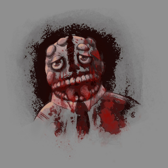
I was playing with filters after I was done with this piece, because I felt like it lacked something, but didn't know what. Really liked this one, I think it's some sort of a gradient map. It pixelised the image and adjusted the colours a bit, it also really made the blood pop out, though it covered up some of the details.
Why did he lose his hat? It's stupid and hard to draw.
You may have noticed the artstyle change a little, the previous images having neat lineart and little to no shading. That's because I am using different tools, sketchy and soft brushes, that allow me to experiment with lighting and textures more (plus the aforementioned filter altering the image even further).
~
Alright, I feel like this last image deserves a separate warning. It references episode 12 (spoiler ahead), specifically the moment before the bartender loses a hand, though it's not entirely accurate. It's rendered in more detail than any of the previous images, so keep that in mind before scrolling down.
Basically it's pov: Bonzo licks your hand.
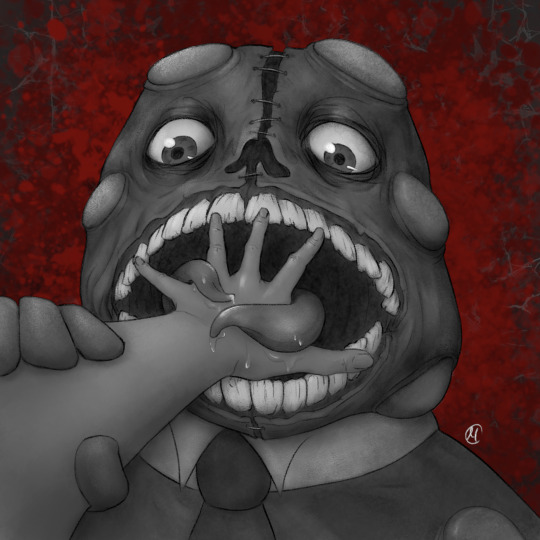
I feel like I could've made his tongue bigger in this one, it seems kinda small compared to his mouth. I really like how the skin on his face ended up looking. It took a lot of work.
The spit makes it look weirdly sexual, doesn't it? Listen, that was not my intention, but I'm not erasing it. I set out to make the worst thing I could and, though not without cost, I have achieved it.
I tried splattering Bonzo in blood, but it wasn't really working for me and it covered up a lot of the detail I liked, so I just put it in the background.
The human hand is drawn from reference, which I found by googling "hand reaching out away from the viewer". And let me tell you: google is shit at looking for drawing references, but I figured it was just going to be a sketch to explore an idea, so I didn't bother trying to get a better one. And then I fixated on it for a couple hours, you know, like a normal person.
I literally (and I mean no exaggeration) dusted off my drawing tablet after a few months of no use to spend the entire weekend, after tmagp 12 came out, glued to the screen making those images, except for the b'onzo one, which I made this evening.
Just to clarify: I drew all of those by myself. No filthy AI image generation is allowed in this house. I am capable of committing far greater sins than an artificial intelligence ever will.
The only thing left here is to extend my sincere congratulations/condolences to whoever got this far. It's up to you to either think you're brave or realise that you're foolish for doing so, but be comforted by the fact that at least you didn't make this post, which I cannot say for myself.
#this might be my worst post yet#i was so preoccupied with whether or not i could i didn't stop to think if i should (make bonzo worse)#do i regret it?#no#here's the sewage stew i promised/threatened you with a few weeks ago#the magnus protocol#tmagp#tmagp shitpost#long post#fanart#tmagp fanart#bonzo#mr bonzo#content warning#body horror#blood#violence#get bonzed#posts that would send me straight to a psychiatric ward were anyone i know irl to find out i made
14 notes
·
View notes
Text
Wanted to try out hard shading so naturally I gave Devï a wolf cut
I also tried gradient mapping on his hair for the first time. I do… not understand how it works…
24 notes
·
View notes
Note
the way you color things makes me want to commit crimes. any coloring tips for a baby digital artist who doesn’t know how to do the computer things good?
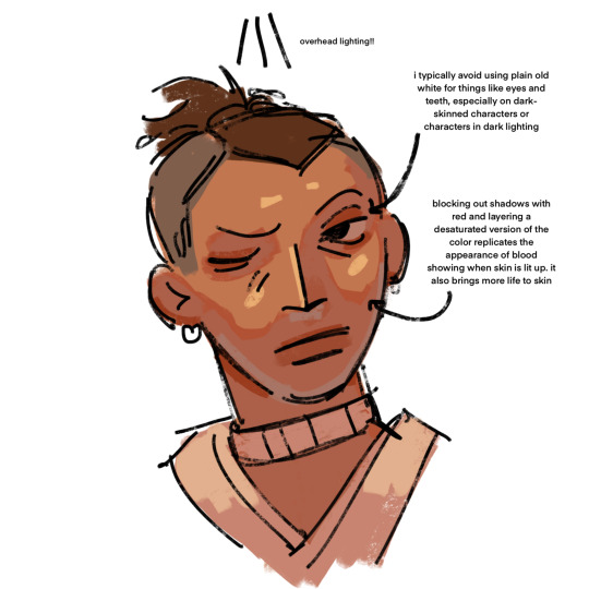
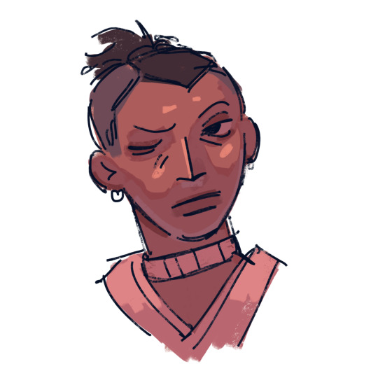
AUGH apologies for taking so long, i was in the middle of writing this answer and the whole thing was deleted as soon as i switched to another tab on my phone, and then the draft didn't save the second time i tried to write it. jfc at least i had it written out in my notes app the second time. anyway, thank you thank you thank you!! this was very nice to recieve, i love getting asks ❤️
i'm not versed in the arts of drawing on a computer, either, so i can't give tips in regards to specific programs (said in chronic procreate user voice) but i can certainly give universal advice keep in mind that i'm not professionally taught in the slightest so i lack much of the vocabulary to describe my methods, and remember that my word is not law!
in case of confusion, everything has been explained. i've added a cut because it got needlessly long. i've also added visual guides for certain tips, and image descriptions for each one
to be honest, much of what i do when picking colors is done with the help of gradient maps (more on that later) but when choosing my base colors i follow these rules:
1. you don't have to cell shade with purple + multiply and an add layer. that's the voice of lavendertowne attempting to take control of your body. stamp it out. (/j i love her)
2. bright, vivid colors!
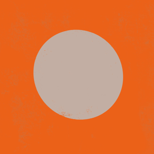
3. instead of shifting just the brightness and saturation when picking colors to shade, shift the hue, too! in the first image, we can see that the circle is dull and boring. in comparison, the second image pops!
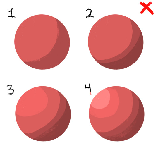
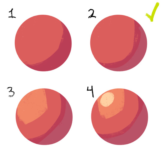
4. so, how does this work?
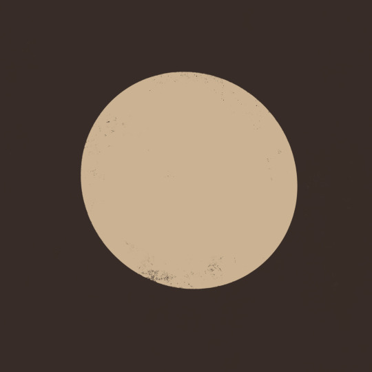
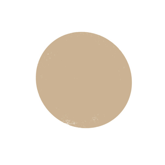
without getting too much into color theory--because while i've studied it before, i don't trust myself to articulate it properly without making a fool of myself--it's all about how colors interact with each other. for example, a beige circle looks lighter when surrounded by a dark background rather than just plain white.
in the same vein, surrounding greys/desaturated colors with warm colors makes them look blue, and vice versa.

5. blue/grey shadows and warm lighting!! or the other way around. actually, you can use any color for shadows and lighting, depending on your light source. is it sunny outside, or are they beneath white light?
6. for color picking, i reccomend avoiding using the wheel, instead opting for the rgb sliders or the hue saturation brightness sliders if you're dumb like me. this allows for precision in the colors you pick, and accuracy when putting together color palettes.
7. and, finally, the actual computer stuff: gradient maps! i looove gradient maps.
as far as i'm aware, procreate and krita have the gradient map tool. ibispaint does not. i am not sure if firealpaca does.
i usually use gradient maps to make my coloring more cohesive, rather than just slapping them on a monochrome drawing (which is also a totally viable method for coloring, but you'll be less precise, as gmaps only recognize values). when using gradient maps, i prefer to duplicate my completed artwork, lower the opacity of the duplicate on top of it (usually between 25 and 50%, depending on how strong i want the effect to be), and use gradient maps on the duplicate.
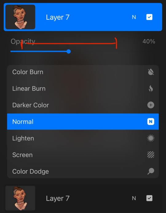
this makes my colors all nice and pretty!
11. if you use krita, it can be hard to find the right colors to use for your gradient maps. never fear! i'm here to give you the default templates from procreate, as well as a couple of the ones i've made.
if you have any more questions, or you want me to get further into a specific topic, feel free to send me another ask
11 notes
·
View notes
Text


process stages & comments below
( original painting )
process:
i did 70% of this (up to img #6) on my samsung tablet, on my train commutes, battling motion sickness & neck pain lmao
drawing on my tablet is still a lot harder & feels more restrictive for me bc i'm limited by unfamiliar software (still learning CSP) and lack of keyboard shortcuts (my digital art workflow for years). i also struggle with starting / continuing artworks on my tablet unless i've already planned / sketched most of the composition on my PC. likely because 90% of the time when i'm drawing on the tablet, it's on the train. hard to get in the zone as it turns out lol
this is the first full painting i've started and made substantial progress on purely with my samsung tab, so i'm happy it's starting to feel a bit more natural.
also first time i've tried doing a funky gradient map as a colour base. then applied colour on top with multiply blending mode. 10/10 would use fun gradient maps again - helped me introduce more colour variation bc i feel like my colours are usually quite flat by comparison
given the nature of the fucking bumpy melbourne trains & my broken commutes, i can still only do so much rendering on my tablet. the more refined painting will probably always happen using photoshop on my PC bc that's where i feel i have the most control
i tried not to overwork / overpaint it too much as i often tend to do, and kept the brush strokes rough and loose as much as possible. made sure my brush wasn't set smaller than a certain size so i wasn't tempted to go into fine detail. you can see i didn't refine harry's form/clothes much beyond img #4 because i didn't want to lose the soft/loose quality of the clothing folds. pretty damn proud of that shoe though. but then i posted it before i realised i forgot to paint in his fucking tie lmaoooo
but yeah, i got my tablet as a secondary drawing device to help me draw more often so i'm gonna keep trying to get the hang of it !!
composition/concept:
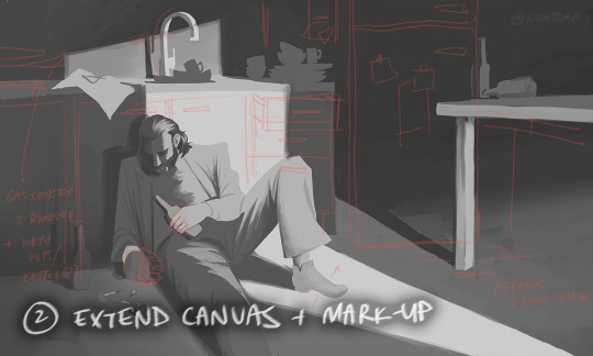
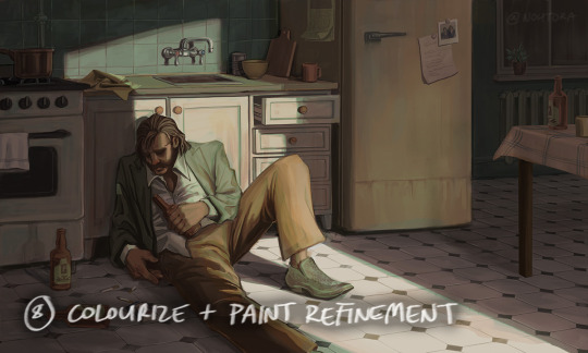
the pose was referenced from this shot of arthur in peaky blinders and i had a vision of HDB slumped over in his kitchen like this

the composition was built around that, and i had the idea of framing it him in shadow and having a strip of light from a doorway illuminating his body. evidence of his drinking and smoking are kept in the shadows.
the original idea was to have a silhouette of someone standing in the doorway (likely jean finding him), but it didn't work with the overall balance & i felt like it interrupted the shape of the light too much / wasn't very legible at that angle. kitchen design was inspired by soviet & post-soviet era style kitchens.
*** feel free to send in an ask if you actually want me to explain how i did things in more detail. these are mostly thoughts for my personal reference
#disco elysium#harry du bois#art process#nohtora art#nohtora wip#sorry my notes aren't comphrensive/intelligible - it's more for me to remember & not a tutorial#always welcome to ask further though <3
59 notes
·
View notes
Text
lo: the two shots I made for the short film project 'pathfinder' directed by NAZ NXT (ناز ) for a little contest that a certain animation discord was running.
the film was planned to be a 2D-in-3D project, but the 2D animators all ended up dropping out in the end. the main thing I worked on was sculpting and painting this mountain, and doing the lighting and broader environment.
here are some still shots of the mountain under more naturalistic lighting (some WIPs from earlier in the project):


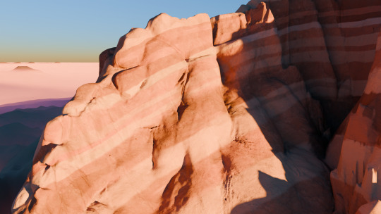
the main ridge in the foreground here involved a massively complicated UV unwrap as I tried to get the texture coordinates even and non-overlapping everywhere. later I simply resorted to projecting the texture along the axis of the syncline-anticline fold system (I decided 'oooh what if there was an anticline fold' when I was texture painting), which actually worked just fine! because that's how geometry works! if I'd done it that way on the other ridge, and done a separate unwrap for the details texture, I could have saved myself a lot of trouble. lesson learned lmao!
geologically this is a tad questionable - this isn't really how sandstone strat would tend to erode. when I was sculpting, I hadn't really decided on the underlying geology, so I couldn't really take that into account. that said, for a first time making a sandstone mountain entirely by hand, I'm pretty happy with how it came out! if I were to do a project like this again, I would probably create a worldspace shader to show the rock strata so I could see them while sculpting.
the images above use a Nishita sky, but Naz wanted something more dramatic, so for the final film, I made this wonderful sphaghetti of a shader:

which essentially maps the sky into polar coordinates and creates the sun, and the glow around it, using various combinations of noise and gradient maps. I'm really happy with how it came out.
for the contest Naz edited together a trailer as our submission - not sure if he's planning to upload it anywhere. in any case, though we didn't manage everything we set out to do, this project was still a lot of fun and I'm very happy with the bit I did.
12 notes
·
View notes
Text
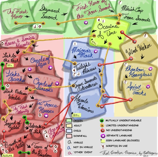
I am posting this before I fiddle with it more and lose my goddamn mind: The Zelda Timeline, as I am using it for this Link's Meet 'verse.
Text description/summary under the cut as best I can do with how complex this is, but in brief this maps out the timeline order of events, languages, scripts, which events happen in which timeline, and mutual intelligibility.
The top portion is the "Origins" section, coloured green, and includes the entries:
The First Hero
Skyward Sword
The First Hero of the Four Sword
Minish Cap
Four Sword
The First Hero of the Four Sword is marked as a separate language, because in this work he's Picori, so he speaks the Picori language not a version of Hylian.
The First Hero and Skyward Sword speak similar language, but not the same; Skyward Sword and Minish Cap era would also be similar, but some difficulty understanding eg. Spanish and Portuguese or Spanish and French degrees of separation.
Ocarina of Time is marked out separately as the spoke from which the rest branch off. It's of limited comprehension with Twilight Princess, Link to the Past, and Minish Cap, and none with Wind Waker.
In Adult Timeline, coloured blue (right hand side), there is:
Wind Waker
Phantom Hourglass
Spirit Tracks
Linguistically, this section is isolated in every respect except for the script. Phantom Hourglass and Spirit Tracks are isolated languages (which absolutely can happen while using the same script), and Wind Waker lost the language in common use in Ocarina of Time and therefore has no comprehension going backwards or across to Twilight Princess or Link to the Past, despite similar degrees of remove in time.
In Child Timeline, coloured yellow (center), there is:
Majora's Mask
Twilight Princess
Four Swords Adventures
Hyrule Warriors
Linguistically, this section is a gradient, disregarding Majora's Mask which gets a separate language tag bc it's not Hyrule. Twilight Princess is of limited comprehension to Ocarina of Time and Four Swords Adventures, but likely is unintelligible to Minish Cap and Hyrule Warriors and vice versa. In every instance, each entry on an orange line gets progressively less similar the more points you move away from the origin.
In Downfall Timeline, coloured red, there is:
Rauru & Sonia's Hyrule
Link to the Past
Oracle of Ages (purple)
Link's Awakening (purple)
Oracle of Seasons (purple)
Link Between Worlds
Tri Force Heroes (purple)
The First Calamity
Legend of Zelda
Adventure of Link
Age of Calamity
Breath of the Wild
Tears of the Kingdom
Let me start with the BOTW/TOTK question. "10,000 Years" is the kind of statement that places the story in mythic history: whatever accurate information it may have, the time period is not necessarily one of them. As such, I match the Imprisoning War to the war referenced in LttP, and the FIrst Calamity to Hyrule's "Golden Age" post LbW and before LOZ, matching it up by a few generations to the original time period of AOL's Zelda.
Several locations here are not in Hyrule, and therefore get the purple marker for separate languages; several others are close enough in time to be considered the same language. LOZ/AOL and BOTW/TOTK are canonically less than ten years apart; LttP and LbW are presented as similar enough maps and worlds that it's likely been a century or less different. Similarly, due to the time periods likely matching up, LttP and LbW are comprehensible with TP , OoT, and FSA but not with HW and neither is LOZ/AOL. Finally, I consider the time period gap between LOZ/AOL and BOTW/TOTK to be signficant enough to render it incomprehensible, in much the same way OoT and WW are.
Other Language Matters:
Because several of my Links use sign language, I made notes about who, in what era, was using different ones. Because the notes are primarily for art purposes, I gave them as glossed entries, which is to say when I draw Kokiri signing, he will be using ASL as a stand in for Gerudo sign language; then I draw Prince or Rabbit signing, they will be using BSL for Hylian sign language. When I draw Hateno signing, it will be AUSLAN, which is derived from BSL (whereas ASL is derived from French Sign Language and therefore is not related.) This is not meant as an exhaustive list, but only as notes of the ones I have decided on.
With regards to the script notes, it is absolutely possible for them to both come and go in that way and to cross time periods. Marked are:
Ocarina of Time Hylian
Ancient Hylian, as of WW
Gerudo Script
Twilight Princess Hylian
Skyward Sword Hylian
Link Between Worlds Hylian
Ancient Sheikah script, as of Breath of the Wild
Zonai script
I may or may not attempt to do something with the unintelligible scripts of LttP, LA, and HW but for now this is the extent of my decisions about timelines and languages going on! This will be relevant, to some extent, to who can read each other's writing.
#Zelda Timeline meta#Zelda AU#my Linkverse#That Broken Promise#my art#yes I drew all of that freehand#including the handwriting#Post Its and String jokes#LOZ
13 notes
·
View notes
Text
OH ALSO as a fun little side project. ive been making a big google doc full of different artistic techniques by tearing apart clip studio paint’s settings to find niche opportunities and going on an odyssey through Youtube Search “Art Tutorial/Coloring Tutorial/How to Draw People/How to Draw Hair/How t”
It’s a passion project of mine, to make a collection of different methods of drawing because I realize a big plateau for artists is when they keep thinking “what do I want to draw” instead of “how do i want to draw.”
Honestly, it’s been pretty interesting so far! A couple tips that I’ve learned so far:
For watercolor (in clip studio paint), don’t rely on the brush’s watercolor edge. Seriously, you’ll get the edge every single time you make a brush stroke. INSTEAD go to layer settings -> border -> watercolor border so you can make a block of watercolor color and then adjust the border from there. You get much more control and can adjust blurriness, opacity, darkness, etc.
Holographic textures. I’m still looking into different ways of doing this, but gradient maps seem to be very popular. For those who dont know, gradient maps take a set greyscale tone and assign it a color (this color’s tone does not need to be equal to the grey tone).
Actually, on the topic of gradient maps. I only learned a few months ago that people color greyscale paintings using gradient maps, and that’s one of the methods used to make it not look god awfully muddy.
So I found this tutorial on Youtube about someone who shades by progressively making the shading change to a contrasting color and I. Am fascinated by that. Will get back to yall when I experiment with that. (For credit’s sake, the tutorial was made by @bluebescuits and can be found here, set to the beginning of that part of the video https://youtu.be/zZEF7SEh2S4?t=428)
COLOR JITTER. there are so many possibilities with this one. One thing I was doing back around artfight was selecting areas of light and using a HEAVILY color jittered brush to color it in. Then, select the shaded areas and do the same. Afterwards, I’d turn off the color jitter and just start rendering using whatever color I wanted. Usually, indigo/blue/purple colors would be used moreso for the darkest spots because they have a darker tone by default, and yellow/pink would be used for the lightest colors.
Because I’ve talked about color tone a few times, I feel like I need to include this Youtube tutorial, “HOW TO HYPERPOP (draw with saturated colors)”: https://youtu.be/NKV2VWWleBk It’s what originally inspired me to make this google doc, and absolutely exploits the tone-color relationship do make some REAL interesting art. I’d tag the creator, but I don’t think they have tumblr, but they’re badjaune on ig/twitter
ill get back to yall when i figure out how to do those parallel scribble/hatching painting look. i will crack the code on that one i want it so badly
ALSO this was the one i meant to add first and then almost forgot to add it. It’s fairly popular on tumblr but i don’t care it’s a very rad tutorial by @ratpunksdraw (found here https://www.tumblr.com/ratpunksdraw/689762046030577664/tutorial-under-cut-paper-textures-brushes?source=share ) which details how they make a quick frankly very good looking paper texture on their artwork + has image resources and i’ve tried this before for an artfight attack and it was fun as hell and not hard at all i would recommend this
#sketchmre tutorial#i GUESS#thats the tag now#for the 20 of my followers who draw#enjoy#i am investing way too much time into this#dwarfed only by the quite frankly embarrassing amount of time i spent researching stays and corsets so i could design undergarments for my d#nd party
8 notes
·
View notes
Note
Hi!! I'm really new to digital art (drawing on a tablet thingy connected to a computer) and I was wondering what apps you recommend? Thanks!
Hii!! I've tried a handfull of apps and these are the ones i like the most:
Medibang : free, can get a lot of brushes from its site or elsewhere, updates regularly. Its doesnt have gradient mapping feature (or it has and i couldnt find it??help) thats a minus but I like and use this one the most.
Painttoolsai: not free but easy to pirate, used it a lot while i was new to digital art. Its pretty easy to use when u get used to it. Not sure how to import brushes tho i couldnt figure out back then and im not using it now so.
Photoshop: not free and not that easy to pirate (i pirated it before and it somehow failed after a few months not sure how that happened). Its hard at first but after one or two tutorials it gets easier. I dont know most of it features but the ones i learned are enough for me. I reccomend this one for how many things you can do with it.
Clipstudio: not free but like others you can pirate it somewhere. Didnt use this one a lot but its pretty usefull. It would help a lot with drawing manga or comic. İf you buy it it has a lot of brushes (like a lot. And i love them for it). I couldnt get used to it so im not using is that much but its better than medibang and pts imo.
Alpaca, gimp others: tried these ones as well. They have their uses and they are easy to understand but i wouldt recommend them. İ tried medibang the same time i was trying these and i found medibang much more easy and usefull (tho they might have changed and gotten better idk i havent used them for at least 3 years i dont keep up with their updates)
This got a bit long but i hope this was usefull :D!!
For short: photoshop > clipstudio > medibang > pts > others (IMO)
#ask#btw the ones i said i pirated i dont have thrm anymore so dont sue me#i pay for photoshop now dont come for me adobe#drawing apps
5 notes
·
View notes
Text
i dont intend to say this like im putting myself down but when im burnt out or in an extended art block i do often look to what i have done in the past- maybe as a "was i doing something back then that i miss doing now?"
my art has shifted a lot over the years. im sure anyone whos followed for a long time would say so. ive gone through phases and styles and vibes of many kinds and theyre all very different. and theyre all times that sometimes i look back and think "maybe i should do that again". of course i need to avoid getting overwhelmed with the "i want to do this- no this- maybe that-".
But the hardest "change" in my art was probably a year ago when all that stuff happened with wcrp. which i wont reiterate- but it was forced. that was the big thing. and i think its whats hurt now that i have this burn out settling and i am looking at old art. I did hit a burn out last year after wcrp when i quickly dove into other fandoms like half life- i did what i often did, where i overexerted myself from hype and quickly burned out. but then i picked up mcyt which has been going strong for a year after leaving it for many years back.
when i look at whats changed about my art from then to now, i notice one big things, which i felt was obvious (and i deliberately did this)- i was going into that fandom simple. first it was a lot of lineart, no color. then i started adding some one flat color to bodies and sometimes minor effects done with the help of gradient maps. then i started using thicker brushes where i could, knocking out the need for clean details. then i started using the binary pen. i had a few detailed drawings in between but really so much of what i have done has been so simple.
and as i said, i did this on purpose. i got into this right after half life and i knew i was burnt out but i really wanted to draw anyways, so my plan was to do it like that! i wasnt very good with humans either so i didnt want to focus too hard on it anyways. and i certainly have liked this method. i enjoyed finding a way to draw that IS simple and doesnt put a lot of strain on me... it helps me no longer be a perfectionist as much as i used to
but at the same time its taken away some aspects that i liked about my art from 2020-early 2022. which was that i was so much more detailed than ever. my warriors art was very detailed, the designs were intricate, i drew a number of scenes just for the rps i loved, etc. i experimented quite a bit with coloring and shading and i still love a number of looks i tried, and i keep wanting that back. (ex 1, ex 2, ex 3)
interestingly i actually started to simplify that style too, esp as i got deeper into my own rp, and i know full well it was because i was also getting tired. used a lasso tool for markings, used less layers, dropped the texture and using a thin pen brush to make sketchier lines. (from this -> to this)
THE problem with these notes about simplifying stuff is that like. i rush things. i rush them SO much. and this has always been my biggest struggle, and what leads to annoyance with my current art and also to burn out.
Burn out, caused by how much i am drawing, because im fast. drawing fast because i want to make content for the fandom i am focused on. art block because im not happy with my art, but im also too impatient to slow down and take my time and REALLY remember and realize what it is i want out of my art!
its a never ending cycle and sorry we're at the end of the post because i dont have a solution lol
1 note
·
View note
Text
Project 03 - growth
So over the last week I wanted to do something involving animation. I was inspired by the stop motion workshop to do a stop motion with the teddy bears & then i thought to explore different types of animation too.
Here was my finalised storyboard/plan of everything that I wanted to include in it however I did remove some parts after starting the process.
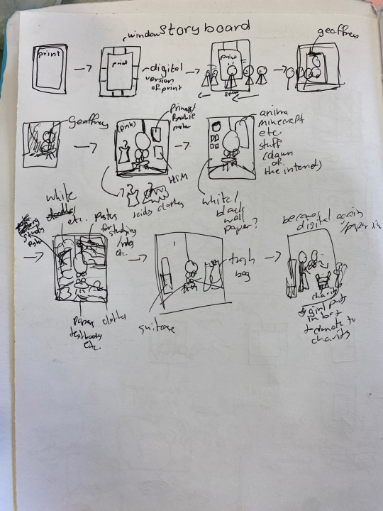
The first part of the animation I planned to do a rotoscope with @k00283533 as the model. To make the background work easier I thought to keep it green and then green screen the background later, however if I were to do this again I would not do that bc it was tedious af and provided a much lower quality result
I first converted the video of nikola into a gif, imported it to procreate and started my rotoscope process. This was the first time I ever did something like.. animation-y so it was pretty exciting. The experience made me realise just how rough animators have it because it took so incredibly long to finish one scene of her walking that I decided to scrap the second part I had planned.
An obstacle I had was exporting it as a gif, though I exported my animation with max resolution it was still at a much lower quality than when I played it in the app. I tried different ways to keep the quality at least somewhat satisfactory but I couldn't find anything online to fix the problem. I concluded that it was just gif files doing their thing, so to combat this I ended up just screen recording the animation as I played it in the app (and... it worked) (surprisingly)
This is the lower quality gif export version of the rotoscope part

At this point I realised I made a huge mistake by putting green as the background, I used the app VN Editor & it's chromakey function to remove the green but with the low quality gif it just did not work as I wanted it to. I had no way to remove the background HOWEVER thankfully when I screen recorded it the chroma key worked at least somewhat better than before, and I managed to adjust the spill to take out as much green as possible
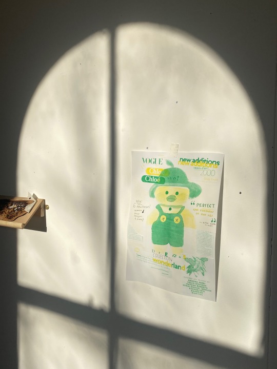
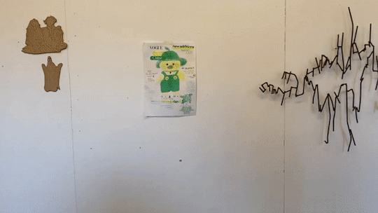
I then did my background & took my print from before into the animation & 'digitised' it to make it more cohesive with the entire thing but I didn't really know how to adjust the lighting/filters to make all the separate parts fit. I explored filters, graphs and gradient maps but since it was my first time doing it I definitely struggled, I feel like if I did more animation projects in the future I would get more experience but overall I did have fun trying this out!
For the next part of this animation I will be doing a stop motion to showcase the teddy bear living through the stages of growth in a young child, which I'm looking forward too since its my first time doing this type of stop motion (as the only experience I had was with sand in the stop motion workshop!)
3 notes
·
View notes
Text

New to life, Rakesh has never had chocolates before.
I tried out a gradient map for the first time with this!
#rakesh#kadonul#artists on tumblr#accessible art#described art#my ocs#cs#closed species#species#valentines
4 notes
·
View notes
Last Seen Blogs

pleasantlygeneralarbiter
Untitled
willcalvillotx
CalvilloTX

aleeskincare
Sữa rửa mặt cho da dầu

officialhomestuckfan-blog
Just Your Average Homestuck

tershine
tershine