#making the transparent image was the more time consuming thing. the background could be done in a mere moment.
Text
I keep seeing my new icon & thinking it's one of my friends. Help.
#speculation nation#also i defaulted to nonbinary bc it's what ive done in the past but i could also do genderfluid or maybe bisexual#i personally rly like bisexual vash headcanon too so like. yeah?#i also identify with gay tho but also Eh on making it the rainbow background#overall my gender and sexuality is fluid which means many potentially applicable things#for now we have nonbinary vash. but i could Easily change the background.#making the transparent image was the more time consuming thing. the background could be done in a mere moment.#i could play around with this immensely. and i know i will.#putting vash in front of stupid backgrounds seems like a great way to spend my time#later tho. im gonna try writing now hehe
4 notes
·
View notes
Text
Sign the petition to demand the creation of a new international law requiring fast-fashion garments to come with a statement of the human cost and environmental harm caused by their creation.
We all know fast fashion is bad for the planet - slave labor, environmental waste, air and water pollution, and unsustainable practices are just a few of the ways they impact our planet, our health and our lives. To date, the fast fashion industry is the 2nd largest consumer of water and is single-handedly responsible for 10% of global carbon emissions (that's more than all international flights and maritime shipping across a year combined). Even the simple act of washing these clothes releases 500,000 tons of microfibers into the ocean each year - that's equal to 50,000 plastic bottles. Fast-fashion is the 3rd leading cause of the climate crises we face, yet is rarely addressed.
Knowing these stats is one thing, and understanding them is important. Being aware of them is somewhat informative. But as long as we keep turning a blind eye to the issue, the stats are only going to get worse, and nothing will change for the better. Ignoring the issue or brushing it under the rug won't help anything. So what if we could see the real-world damage done by each of the garments we buy?
In the same way that cigarette packets have shown the harm their products do to our bodies ("SMOKING KILLS", lung cancer visualizations, etc.), what if fast fashion manufacturers & retailers had to show the harm their products do to our planet?
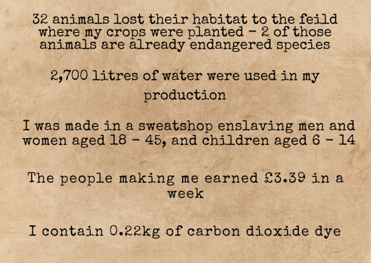
[Image ID: A type-writer font has been used on a brown craft paper background. The text reads: "32 animals lost their habitat to the field where my crops were planted - 2 of those animals are already endangered species. 2,700 litres of water were used in my production. I was made in a sweatshop enslaving men and women aged 16 - 45, and children aged 6 - 14. I contain 0.22kg of carbon dioxide dye." End ID.]
This is a mock-up of a label / statement for a single T-shirt, with researched statistics and educated estimates for the information I couldn't find a calculated answer for.
Now imagine labels / statements like this for every single piece of clothing: how many toxic chemicals are in those new jeans? How many litres of water did that shirt take to make? How many animals were skinned to make those cute fur-trimmed boots? How many children made that jumper? How many people were forcibly removed from their homes, so production companies could plant crops to grow the materials used in clothes manufacturing? How many families were evicted for no reason other than corporate greed? How many trees were cut down? How many animals were displaced or killed?
Would you really want to buy those items of clothing if the answers to those questions were staring you in the face?
If this information was stated in clear, accessible ways on both the website and the ticket on the actual garment, this would dramatically reduce the number of people buying fast fashion items. It would also reduce the profits being made by fast fashion companies, and could lead to many of them being forced to choose between changing and becoming sustainable, eco-froendly and ethical brands, or shutting down due to being boycotted.
Who would really want to knowingly buy things that are made by slaves, or which cost a family their home, or which contributed to deforestation? Who would continue to buy fast fashion items knowing this is the damage caused by them, when sustainable alternatives are an option?
Whether it's second-hand fashion at affordable prices, or investing more money in sustainable products which were made with high ethical standards and which cost more money due to the fact their price accounts for the time it took a person to make that item... we can say for certain that sustainable shopping is going to become much more popular if people know how important that change is. Sustainable items last much longer than fast-fashion items, which by design are created to self-destruct, as they are made to be worn a few times and then discarded in order to be replaced by the next trend's items - and as trends speed up, these items become weaker and weaker. This then leads to people spending more money in order to keep up with the newest trends, and to keep replacing clothes they throw out after a few washes.
In contrast, buying sustainable items which are designed to last years means people won't have to spend money on new clothes every few weeks, which means they'll ultimately save money in the long term and actually be able to afford those pricier items which will last much, much longer.
Now, despite the amount of harm the fast-fashion industry causes to people and the environment, the last thing we should be doing is getting angry at those who continue to buy them. Being the target of anger doesn't make large populations change their behaviour - even a cursory look through history books will tell us that much. Neither does being the target of resentment or blame.
But guilt? Shame? Those are two of the most powerful emotions to magnify when you want change to happen in waves.
And frankly, if people feel ashamed of buying something, or if buying something makes them feel guilty... they're going to stop buying it.
Those aren't the only emotions that should be felt, though. Because only feeling guilt and shame leads to feeling hopeless, scared, anxious and depressed. And we don't want that. No matter how bad things get... we don't want that.
The only other emotions to provoke are hope and pride.
If there's no hope for the future, how can anyone be expected to imagine a better one?
You wouldn't think it, what with all the climate crises and disasters we experience around the world and the total lack of commitment made by billionaires, multimillion-dollar companies and corporations and politicians.
But it's true. Scientists in Scotland have discovered bacteria which eat plastic and speed up the decomposition of it. ‘Ecocide’ is now punishable by law. Some countries within the EU are already close to meeting their 2030 goals years ahead of schedule! Thanks to scientists and small, individual changes made on a massive scale by ordinary people who are making small adjustments to our everyday choices, we can and are healing most of the ozone layer before 2050. That is something we should all feel incredibly proud of.
So imagine how much we could speed that process up if more people made those changes. Imagine how much sooner we could heal our planet if billions of people made those changes, rather than millions. Imagine how much sooner we could be seeing the effects of a healthier planet if fast fashion companies were forced to choose between going green and transparent, or closing altogether due to a lack of interest from consumers. Imagine the changes we could create if corporations made massive changes in a short amount of time, in order to save their own profits.
Imagine more labels like this, sitting alongside each other on every single piece of fast fashion clothing. A statement like this beneath every item of clothing on fast fashion websites, which transparently states the harm done.
If every single fast-fashion company and store had to display this on their clothing, on their racks, on their websites, and if there were legal punishments for those who tried to evade or lie... fashion would turn a lot greener very quickly. We'd start seeing more and more labels with "I'm made from 6 plastic bottles! I used to be a newspaper! I had 0 pesticides used on me in my production! I only contain natural dye made from berries, beans and sustainably grown flowers. I was made from apple skins and corn! The people who made me get to go home to their families every night, have days off and the adults made £150.35 each in 1 week! The animal who made the wool for me is free-range and well-cared for! I came from a small family farm, and was created with a closed-loop water system!”
That'd be a much better civilisation to shop in, don't you agree?
That is hope for the future.
That is motivation, which can fuel ordinary people to do extraordinary things and create changes they thought were impossible.
If you want to be a part of creating this change, sign the Change.org petition which demands the the creation and implementation of an international law which will require all fast-fashion products to be displayed with a statement which states the harm done to people and the planet by that garment being made & shipped.
#fast fashion#fashion#climate crisis#climate change#climate action#climate catastrophe#environmentalism#environment#environmetalists#enviromental#sustainability#sustainable#economy#ecofriendly#ecosystem#europe#earth#ecommerce#society#socialist#sociology#social justice#social media#slave labor#children#child labor#children's rights#environmental justice#petition#petitions
29 notes
·
View notes
Text
The Magic of Background Removal: From Simple Tricks to AI-Powered Wonders
Background removal is a powerful image editing technique that allows you to isolate a subject from its background. This can be used for a variety of purposes, such as creating product mockups, adding people to new scenes, or simply cleaning up a distracting background.
Traditional Techniques: The Old-School Way
In the past, background removal was a tedious and time-consuming process that was often done by hand. This involved using tools like the lasso tool or the magic wand tool in Photoshop to select the subject, and then painstakingly erasing the background. This could be a very difficult task, especially for complex images with hair or other intricate details.
The Rise of AI: Background Removal Made Easy
In recent years, the rise of artificial intelligence (AI) has revolutionized background removal. AI-powered tools can now automatically remove backgrounds with a high degree of accuracy, even for complex images. This has made background removal more accessible than ever before, even for people with no experience in image editing.
How Does AI Background Removal Work?
AI background removal tools use a variety of techniques to identify the subject of an image and remove the background. These techniques include:
Machine learning: AI algorithms are trained on a large dataset of images with labeled foreground and background objects. This allows the algorithms to learn to identify the difference between a subject and its background.
Edge detection: AI tools can also use edge detection to identify the edges of the subject. This can help to make the separation between the subject and the background more precise.
Color analysis: AI tools can also analyze the color of the subject and the background. This can help to identify areas that are likely to be part of the background and remove them.
The Benefits of AI Background Removal
There are many benefits to using AI background removal tools. These include:
Speed and accuracy: AI tools can remove backgrounds much faster and more accurately than traditional methods.
Ease of use: AI tools are very easy to use, even for people with no experience in image editing.
Versatility: AI tools can be used to remove backgrounds from a wide variety of images.
Popular AI Background Removal Tools
There are some popular AI background removal tools available. Some of the most popular options include:
remove.bg: This is a free online tool that is very easy to use. It simply uploads your image and remove it. bg will automatically remove the background.
Photoshop: Photoshop has a built-in AI background removal tool called "Select Subject." This tool is very powerful and can produce excellent results.
GIMP: GIMP is a free and open-source image editing software that also has an AI background removal tool called "Foreground Select." This tool is not as powerful as Photoshop's "Select Subject" tool, but it can still produce good results.
The Future of Background Removal
AI background removal is still a relatively new technology, but it is rapidly evolving. In the future, we can expect to see even more powerful and accurate AI background removal tools. These tools will make it even easier to create stunning images with transparent backgrounds.
Conclusion
Background removal is a powerful image editing technique that can be used for a variety of purposes. AI has made background removal easier and more accessible than ever before. With the continued development of AI, we can expect to see even more amazing things from background removal in the future.
1 note
·
View note
Text
The source of the distortion became quite unmistakable. The phantasmal transparent images of more than a few bottles of beer and glasses of Scotch crowded around where Bobby was resting against the bar, a more solid bottle clutched in his hands and more than halfway drained. Grey politely dispelled the images with a blink though he could not entirely dismiss the effects as the memory wobbled some around its edges and all things softened and fuzzed when not under immediate scrutiny.
“Lemme borrow Caleb a second,” Bill's voice cut through the hazy neatly and clearly and suddenly he was there, lifting Jo to perch her like a little bright canary on Bobby's knee. His face much closer this time Grey could see his eyes were in fact blue and that when he grinned a dimple formed in the laugh line of his cheek. There was also a mole above the left corner of his mouth. “You watch Jo okay Bobby? And Jo, you watch Bobby here make sure he doesn't get into trouble.”
Someone laughed, perhaps Caleb or perhaps Bobby but the memory was fading as Bill pulled away leaving that last clear image of himself in Bobby's mind. A good humored father and hunter, by all appearances strong and capable, straightening back up and standing tall before the image froze. It flattened and stretched thin into a photograph. Then the edges of it browned, darkened, scorched as fire ate its way into view consuming the memory and reducing it to ashes that fell out of sight.//
Grey did not speak as he rose from his chair and went to his canvas, donning his painter's smock. Bobby was sitting in silence at his desk, pouring more of his cheap Scotch. While Grey carefully coated his canvas in white gesso, slightly watered, pausing only to let the acrylic dry. Fortunately it dried quickly and he did not have to stay idle for long, applying another two layers then when those had each dried using the fine sandpaper to rub down the rough canvas to a more smooth and even surface, careful all the while not to over do the sanding and lose the tooth of the canvas. While he was working Bobby once again was on the phone though Grey paid no attention to the conversation.
That done, the canvas now primed, Grey selected a charcoal pencil and sharped it quickly to a sharp point with his knife. No background, he decided, just Bill. He began to sketch lightly to suggest the hunter, portraying him from the waist up in the center of the canvas. As it was just a sketch Grey did not bother with a great amount of detail just capturing the general shape and suggestion of the man and his clothes, hinting at facial features to be better developed later. The sketch unnerved him somewhat. It appeared ghostly and haunted with the sketchy lines over the white. He decided not to fix the drawing and have it blend into the initial under painting he would do. Noticing he had missed his water glass he quickly summoned it and set it aside, wetting his selected brush slightly.
Lean first as always, he mixed the sienna and umber and a touch of titanium white on his palette diluting it appropriately with his turpentine. With his damp brush and chosen mix he slowly he blocked in the background in the initial scrub. He kept it loose, feeling for the tone of the canvas. When the background had been laid he selected a larger brush and smooth it out into a flat and simple color. It looked pleasing enough around the sketch. Not too dark and not too light, warm enough to bring a little life from the sketch. Judging by the light in the windows he was almost out of time for today and could not continue. He needed to be getting back anyway. Jo would be missing him. He cleaned his brush and set it aside.
“Bobby? Can I leave it set up here?” Grey asked. “I can move it if you need the space,” He turned as was surprised to see the hunter was already watching him. Typically nobody but Jo ever watched him paint. Well sometimes Amon though he did not appear over interested when he did likely given to wolf eyes not being as good with color distinction.
“Sure,” Bobby agreed. “Leave it be. When you come back just knock again. I'm generally always here and if I head out for more than just going into town I'll let you know.”
“Thanks,” Grey said, moving to depart by going out the door to preserve some of the normalcy between them. And so began the long process of painting the portrait.
Grey did not keep count of the days. He would spend most of his time in love with Jo, living cozily in their happy house with their precious dog baby underfoot. The year though did not seem to want to behave nicely. Instead of being a blissful dream Grey's mood tossed and billowed in tempest churns. The lows came rolling in darkly, choking him at points, eating him from the inside, throttling his creative process with their heartless cold hands. Despair was poison to the creative process, taking a tortured artist and leaving them simply tortured as Grey felt now.
Some days it seemed like the brush strokes fell to heavily, his arm was made of leaden weights and clumsy. Some days he couldn't get to Bobby's at all though he knew the paint was dry and the painting itself was waiting patiently for its subject to be revived into color which Grey to his own mind had not the skill or power to do, failing Jo here secretly as he was failing her more openly at their home.
//”Son are you doin' okay?” Bobby asked once as they both sipped on whiskey looking at the painting which despite two months remained only the blocked in base colors with no distinct features. Bill was a faceless blob of flesh tones wearing equally blobby shades that should have been a jacket, jeans and shirt. The effect was disturbing and in Grey's eyes a nightmarish mockery of the intentions Grey sat out with.
“I'm fine,” He told Bobby miserably, curling closer to the glass of bourbon as if to take warmth from spice and burn of it and comfort from its subtle vanilla notes. “Just waiting for the last coat of paint to dry.”
They sipped in silence before Grey, looking over his shoulder at the work in progress, shuddered and muttered grimly. “He doesn't have any eyes...”
“You'll get there,” Bobby offered with conviction. Grey silently doubted.//
The struggle against the tar pit that had formed and almost swallowed him down continued as she seasons passed. Spring rode high and merry, turning into a summer of confusion, paling into an autumn that bleed its colors most brightly into the winter that crouched harshly on the part of the world he chose to live in. Christmas time was approaching and thankfully, despite the best efforts Grey's own moods had taken towards drowning him, the painting was nearly complete.
Each stroke of the brush had been much harder than it needed to be. Several times in agonized Grey had harassed Bobby into looking closely at the now colored canvas, squinting into the minute details that the shadow struggled to get perfect. A fold in the leather of Bill's jacket was adjusted twice, the texture of the leather rendered painstakingly. Bill's beard created with small strokes of the tiniest brush layered over and over each other seeking depth. Though the edges as with all oil paintings were blurred and softened Grey had gone privately and inwardly into a panic that the small details such as wrinkles not be lost nor the delicate and frighteningly difficult eyelashes that hooded blue eyes become a blubbering mass. Every play of shadow and light was considered, reconsidered, considered again until Grey wanted to jerk out fistfuls of his hair. And then he could do no more. He stood back, watching Bobby study the canvas, ill at ease and nauseous.
“I don't know how you did it,” Bobby said slowly, his eyes not leaving the painting. “But it's him. By God, that's Bill almost as fully as if you had snapped a picture of him. Like a damn snapshot.”
Grey didn't realize he was staggering backwards until he had already collapsed into the chair that thankfully had been waiting behind him seemingly in precognition of this moment. He looked from Bobby's queerly blank face to the painted face on the canvas, back and forth between the two, judging himself whether he had achieved his gold of bringing the image as close to life as possible. Even though self-doubt was flailing him currently with lashes from its whip, he did think he had. It was a suitable present then. Perhaps this would do some good towards remedying some of the harm Grey had put Jo through this year, maybe it would balance the strife he had unfortunately loaded onto her shoulders though she carried it without complaint to him. Grey put his head in his hands.
“You all right there boy?” Bobby asked.
“Fine,” Grey murmured, squeezing his eyes tightly shut to put a stop to the river of tears that threatened to come bursting forth in salty cascades. “It's just your eyes get tired when you're staring at lines and colors on a canvas for so long.”
“Oh, to be sure,” Bobby said, leaving him to get a hold of himself with as little interference as he could. Grey heard a weighty inhale. “God damn it boy,” The hunter groused. “What's anybody else supposed to get her for Christmas this year or ever again? You better give her your present after everybody else has a chance to give their gifts.”
Grey was startled but then laughed shakily. “Tell Dean and Sam to get theirs in on time then,” He said, wiping his eyes. “Because this is in her hands Christmas night no matter what.”
Christmas as it turned out was not to be a family affair this year. The hunting side of the family suddenly got very busy, apparently not only was Krampus real but he was angry as well as some Icelandic prankster spirits becoming geographically displaced and were now roaming the east coast having begun their US tour on December the 12th but it had taken everyone this long to figure out what they were. Fortunately by Harry's research, relayed to Jo over the phone the night before, the Yule Lads should depart on their own starting Christmas day so besides making sure no one offended or bothered the sprightly little goblins to the point their giantess mother hopped the ocean to wreak havoc, no action was needed by her. Sam and Dean were already taking care of Krampus of course.
The monster side of the family only made themselves known in short drop in visits. Shada popped by Christmas Eve with Ombre with a small gift load and left with a jolly haul of her own. An offer to stay had been turned down, apparently the sister shadows were interested in caroling this year, presumably because Shada had decided she and Ombre looked much too cute in their winter wear to not show off to as many people as possible. Amon also showed up, late into the night. Demons did not keep Christmas as a holiday of course but the visit was much appreciated regardless, brief though it was. Waving good bye to him from the steps Grey was started to see the big wolf bounding into the late gloom towards the silhouette of an extremely large elk. “Definitely not one of Santa's reindeer,” Jo had laughed quietly when Grey described the sight as they were settling into bed.
“You didn't even ask me if it had a glowing nose.” Grey teased, squeezing her to him while Nana jumped up and snuggled down on his other side. The bed would be slightly crowded tonight.
“Did it?” Jo asked, pulling the large pillowy golden retriever plushie he had given her earlier in the month to her side and settling in to sleep in a cozy soft space. Grey reached across to snag his Nintendo DS from the nightstand. Later, after Jo had drifted into sleep, he would turn it on and play Animal Crossing and perhaps Cooking Mama though regardless he would remain on watch to ease Jo out of any nightmares that may try to visit this night and to bring her gently out of her sleep paralysis whenever she woke.
“No,” Grey replied, grinning. Jo laughed and kissed him good night for the second time.
1 note
·
View note
Photo
Planning
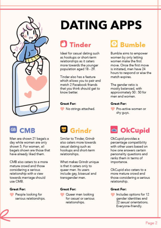
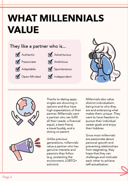
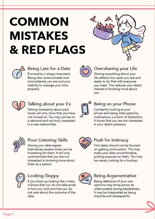
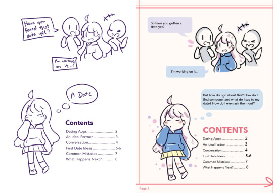
Our group initially planned on creating a guide about dating for Millennials in Singapore. We first came up with the overall content and sketched the layouts of our assigned pages. I was tasked with the Cover, a Comic as the Premise and Content Page.
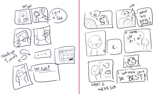
I first came up with 2 comic strip drafts and explained the story to the group to get feedback. They liked the story on the left, which depicts a main character finding a date through a dating app. This established the art style that we were going to use as a cute, cartoon-ish style. Then, I proceeded to draw out the more concrete draft, with a proper layout and text:

Next, I worked with my group to come up with a general colour scheme. We knew we wanted to use soft colours, and the initial palette was based on pastel pink, purple and blue.

After Feedback 1:
The first feedback was that the comic may be too time-consuming to do. Hence, I decided to scrap it for a much shorter premise for the book. I felt that was enough to introduce our main character, as well as convey our idea of a said main character wanting to find a date.
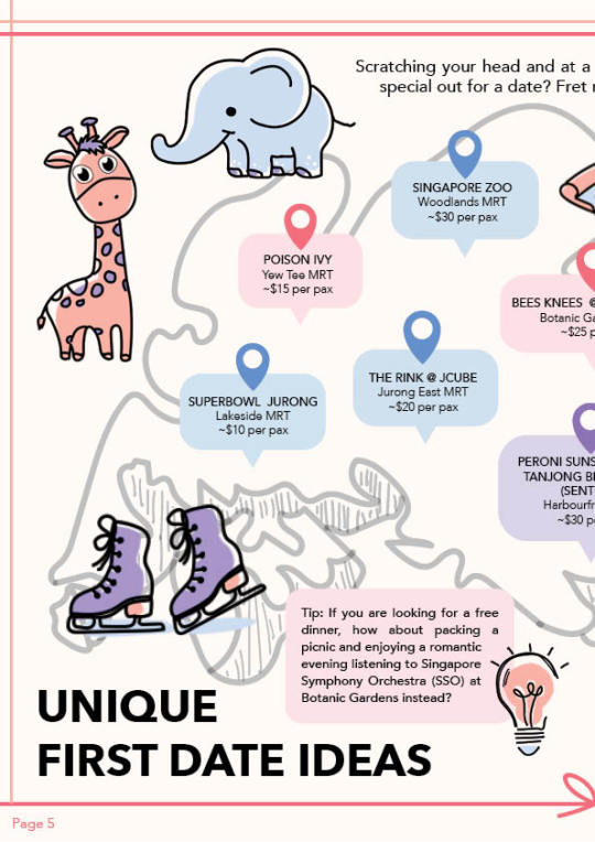
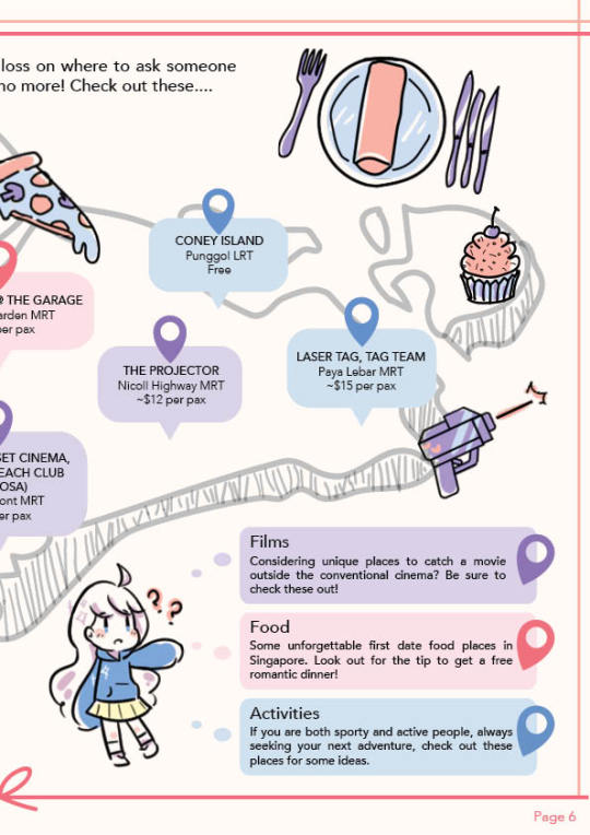
Our e-book underwent some restructuring in terms of content and flow of pages. We brainstormed and researched for content together to determine the final content flow. We decided to combine the content page with the “comic” so that pages 5-6 could remain a spread of a map. Hence, I came up with a second draft of the content page:

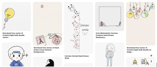
I next worked on character designs. I got inspiration from Pinterest for the stylistic direction of our e-book. I especially liked the style that utilises minimal colours, with cute, hand-drawn, cartoon-ish characters and objects.
My initial idea was to make the main character androgynous, as seen in the first comic sketch. However, I noticed that classmates were more likely to see the character as a girl and suggest adding a male character as a counterpart in their initial feedback. With these references and feedback, I proposed the main character (coloured):

Whilst creating the cover page, I felt that the colour of the girl’s hoodie did not stand out because the cover had a lot of pink and white elements. So I chose a darker shade of blue instead. I also did up the graphics for the content page:
Art Direction and Graphics
With my pages settled, I begin my role of maintaining the art direction of the e-book. I compiled a list of graphics of the girl that my members needed for their pages so that I may start to draw them. I also devised a way to keep the style of icons as similar as possible. Because there are many people working on the design, having everyone submit their own completed graphics would have been rather disastrous for the art style. Since most of the group enjoyed creating flat icons, I proposed that they sent me the vectors of their icons and I would add colour to them.
I did this by importing the vectors (without fill) from Illustrator to Photoshop and colouring on a layer beneath the vector outlines. We decided to standardise a basic black stroke for our icons. By standardising the colour palette to just 3 colours and applying colours in a stylised manner, I managed to achieve a style that worked coherently despite different people handling the outlines. The colours chosen were analogous colours that complemented each other and of different tonal values to ensure that the coloured icons did not look too flat.

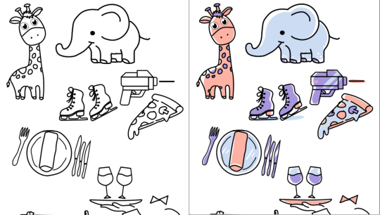
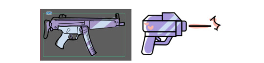
We encountered the problem of different art styles when one particular line work stood out more than the others. It did not really follow the cutesy style we had going. To solve this, I worked with the groupmate to select some references from Google and redid the graphic in a more suitable style:

Compiling the e-book
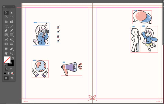
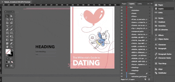
Whilst the rest of the group were working on their pages, I set up the InDesign document to be used and inserted completed graphics first. I created a border made of red-pink lines and a ribbon and included page numbers and a Snow background in the Master page. I also set up character and paragraph styles to standardise the text in the e-book.


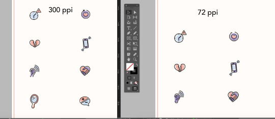
After my group members transferred their Illustrator files to me, I coloured and exported the icons in .PNG as it preserves transparency. Most of the graphics were done in 72ppi as the e-book was not meant to be printed, and that resolution was good enough for web-browsing. However, I found that some icons lose a lot of quality when exported and recoloured them in 300ppi instead. (It is a bit difficult to tell from the image below, try this link instead)
Our group met up on Zoom to work on the e-book together. Since only one person could work on the file at a time, I shared my screen with the group and started compiling all the content. Everyone chipped in by giving feedback on where edits should be made to improve the design. For example, the content on page 3 was divided into 2 sections but did not have a clear-cut distinction between the sections. Some groupmates pointed this out and I added a pink divider to solve it. This was a team effort.
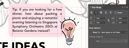
I utilised the text wrap function of InDesign to subtly give text boxes a more interesting look. Since the initial idea was to have a lightbulb overlap a text box, I decided to wrap the text around the lightbulb’s bounding box.
After exporting the e-book to .pdf, I opened it on my macbook preview and found that the colour had changed slightly. I did a bit of research and learnt that different software rendered colours differently. I then tried to open it on the Google Chrome browser and the colours looked correct. Remembering that our e-book was to be viewed on both laptops and mobile, I opened the file on the Google Chrome browser on my iPhone, and it seems the colour looked different as well. The page was more yellowish and the pink was duller. This could be due to the settings for my device’s screen. Therefore, I concluded that the e-book should be viewed on the browser of a laptop or desktop.

After Feedback 2:
One main feedback we got concerned the map page. The outline of the map appeared to be too light and difficult to notice, and the legend looked too much like the bubbles accompanying the geotags.
To fix this, I worked with my groupmate to come up with a few edits to the design of the map. We removed the waiter graphic and shifted the legend down. We also added more content to explain the 3 different categories we had. Finally, we changed the colours of the corresponding geotags on the map to further emphasize that they belonged to their respective categories.

Another feedback we got was the inconsistent spacing between the heart-shaped bullet points and the text beside it, which I promptly fixed.
Challenges
One of the biggest challenges I faced was collaborating on the style for the e-book. Up until now, most of my design works have been solo projects which gave me full control over the design. However, with groupmates, we have to adapt to each other’s styles and sometimes that involves sacrificing our own preferences.
To make things easier, I proposed the workflow and a simple style that I felt was both appealing and easy enough to work with given our project constraints (deadline, inability to have physical meetings, lack of software for some members). I was lucky to be in a very helpful and accommodating group, though keeping the style consistent was a rather persistent problem we faced. Since I was in charge of compiling most of the pages and graphics, it was extremely time-consuming.
Another problem we faced was broken links when passing the InDesign documents around. We did minimal transferring of files. When we did, we found that links sometimes got broken. To fix this, I suggested using InDesign’s package function and explained to the group why links broke and how to fix them. We zipped the packaged folders before sending them to other groupmates. Since I am working on an earlier version of Indesign, I learnt that I should use the .idml files to open the document instead.
Design Document
I helped out with the Design and Layout, Production, and Reflection sections of the design document. Since I handled most of the InDesign and compiled graphics, I helped to add the more technical parts of the design document. I also explained the design principles our group used in our e-book.
Workspaces
Better quality gifs can be found here: ID | PSD
4 notes
·
View notes
Text
My Independent Publisher Roadmap:
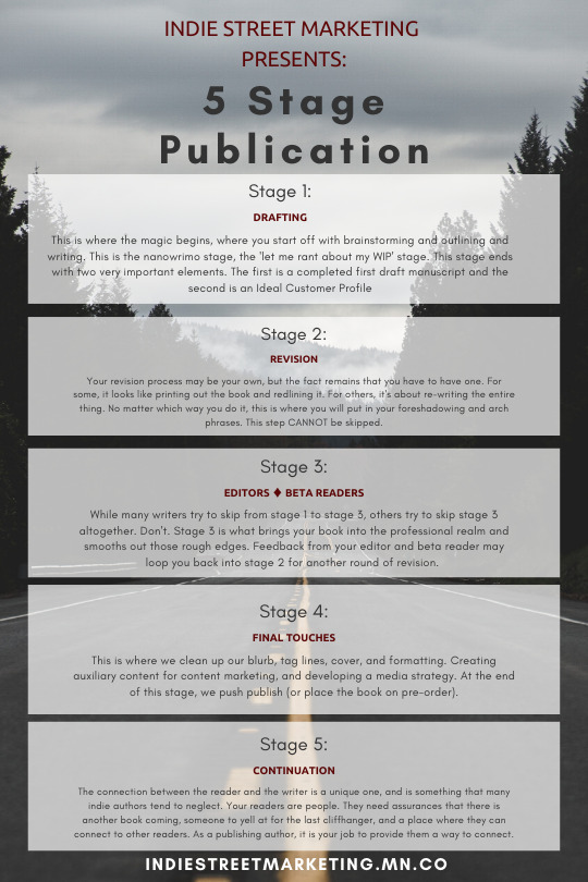
[Image Description: Indie Street Marketing branded infographic (red and black text and an empty road in the background). There are five slightly transparent gray boxes in the foreground that contain the five stages of publication as determined by indiestreetmarketing.mn.co. All content in the infographic is also provided in the following text. End.]
for @reshiramgirl88
Oh god, I’m sorry this is so long. Worth the read though, I promise!
Five Stage Publication:
Stage 1 - Drafting
[Image Description: This is where the magic begins, where you start off with brainstorming and outlining and writing. This is the NaNoWriMo stage, the 'let me rant about my WIP' stage. This stage ends with two very important elements. The first is a completed first draft manuscript and the second is an Ideal Customer Profile]
So this is the stage that a lot of writers get stuck in. It’s the quicksand sinkhole of starting over with a new project. There’s nothing wrong with living in this stage, but if you want to actually publish a novel worth reading you have to have two things:
1. A Book.
2. An Audience.
One of my favorite quotes is:
“You can always edit a bad page. You can't edit a blank page.”
― Jodi Picoult
You have to have a book in order to publish and sell a book. This is the hard part for a lot of authors, the part that they get bogged down by for years and years trying to make their debut novel some perfect specimen of literature.
Guys, my friends, my fellow authors; do not allow yourself to be bogged down by the weight of perfectionism that accompanies years of reading ‘the greats’ and thinking you’ll never be one of them. A favorite line of mine from Charles Bukowski goes:
“ don't be like so many writers,
don't be like so many thousands of
people who call themselves writers,
don't be dull and boring and
pretentious, don't be consumed with self-
love.
the libraries of the world have
yawned themselves to
sleep
over your kind.
don't add to that.
don't do it.”
The second part of stage 1, the part that is almost unheard of with writers who are just starting out or plan to publish traditionally, is the ideal customer profile. I’m actually posting a series on the ICP in a few days so I’ll give you a basic rundown and link back to it here when it comes out.
Essentially, your ideal customer profile is a character sheet for the person most likely to enjoy and cherish your work the way it was meant to be enjoyed and cherished.
It’s important to develop your ICP near the end of stage one because moving on to stage two without it means missing huge opportunities to throw in the little nods and subtle glances that will really thrill your audience.
Stage 2 - Revision
[Image Description: Your revision process may be your own, but the fact remains that you have to have one. For some, it looks like printing out the book and redlining it. For others, it's about re-writing the entire thing. No matter which way you do it, this is where you will put in your foreshadowing and arch phrases. This step CANNOT be skipped.]
I used to write a book and then think it was done.
I used to write a book and then put it into a spell checker and a grammar editor and think it was done.
I used to read through it over and over and over and then ignore it for months as I tried to figure out where the missing part of the story was.
I’m not saying these methods are invalid. I’m just saying that after I learned to pull up a blank document side by side with the original and then write the whole thing out again many of the pains of plotting disappeared and my work moved into the professional arena.
Maybe it was the way I had to focus on the words as I read the story again, or maybe it’s because I’m a chronic underwriter and re-writing gives me a chance to unpack certain lines to expand the story.
I think it might be a little bit because revising is a lot like moving houses. You have to decide what to pack up and what to leave behind, and when you’re done you’re left with a newer, cleaner house and a sense of exhausted accomplishment.
Stage 3 - Editor/Beta Reader
[Image Description: While many writers try to skip from stage 1 to stage 3, others try to skip stage 3 altogether. Don't. Stage 3 is what brings your book into the professional realm and smooths out those rough edges. Feedback from your editor and beta reader may loop you back into stage 2 for another round of revision.]
So my first comment here is directed more towards stage 2 and how important it is.
I’ve beta-read too many books that didn’t go through the revision process. I’ve seen too many authors kill their own work over comments from beta readers that could have been avoided if the author revised their work before placing it into the hands of someone who could hurt them.
The connection between an author and their editor/beta reader is a very emotional one. My editor and I are sharing a hotel room at a writer’s conference in a few weeks. My beta reader is refused to talk to me for a week because of how I left the cliff hanger at the end of the last book.
These two people are your gatekeepers.
Where traditionally published books have agents and publishers to keep the tide of bad writing decisions from seeing the light of day, indie authors have their own poor judgment and a burning desire to see their works in a published form.
Your editor can save your asses (literally, the word was suppose to be assess and I accidentally deleted an S during the final touches stage. My editor caught it before I sold too many copies).
Your beta reader can warn you if your character’s personality changed halfway through or if the room for your final confrontation is a blank white box in their minds because you maybe forgot to describe it every single time your characters were in there before.
Stage 4 - Final Touches
[Image Description: This is where we clean up our blurb, tag lines, cover, and formatting. Creating auxiliary content for content marketing, and developing a media strategy. At the end of this stage, we push publish (or place the book on pre-order). ]
This is my golden stage.
This is what I’m going to college for and what I plan on building a media and consulting company around. This is something I’m going to be posting a lot about so I won’t say as much here.
If you have questions on stage 4 publications pls send them to my ask box, I am always ready to help with the marketing.
Stage 5 - Continuation
[Image Description: The connection between the reader and the writer is a unique one, and is something that many indie authors tend to neglect. Your readers are people. They need assurances that there is another book coming, someone to yell at for the last cliffhanger, and a place where they can connect to other readers. As a publishing author, it is your job to provide them a way to connect. ]
Continuation is really almost an extension of stage 4. It’s the engagement side of being an author. It’s where the fandom is born.
This is where I think a lot of authors make their last mistake. Those who manage to get themselves to this stage tend to drop the ball because The History Of Authors clearly states that we are ethereal and unknowable creatures who mustn’t interact.
Times are changing, folks. Technology is changing us. We are a social bunch and we want that connection. We want the validation. We want the community.
An author that can give their audience a sense of belonging, who can engage them openly and respectfully, and who can make them feel as though they are remarkable is going to be the author who has the competitive advantage.
tldr: come ask me questions about author marketing.
#original#writing advice#publishing advice#indie street marketing#ISM advice#I'll tag other people later#when i have the spoons for it
12 notes
·
View notes
Photo
well, here we are. it’s been a whole decade, and i gotta say, the 2010s were definitely the most formative years of my life, especially in terms of art
i’ve only drawn more and more over the years, so as time went on it was harder and harder to choose pieces i thought were best and most representative. and i’m glad to see such a remarkable change after all this time
i started to take art seriously by 2011/12, and i think that shift in focus is visible. i started to join in and contribute to online communities, making valuable artist friends and giving myself a bigger motivation to draw rather than just for myself. i couldn’t be happier with the results :D
in-depth talk about all these years under the cut
i focused primarily on what i could find on my computer because 1. it was easier than digging through my hand-drawn art and 2. it was more organized and i could search them by the date. so that’s why it’s pretty skimpy for the first few years, in addition to me not drawing nearly as much as i am now
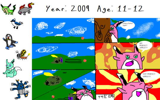
2009: so, i’m obviously a pokemon nerd. that wigglytuff comic is the only notable piece from ‘09 on my computer. i started off drawing digitally in MS Paint, with a mouse/trackpad, and i am not one of those savants who can draw clean lines with just that.
i had also been developing my own fakemon, heavily inspired by gen4 with a bunch of evolutions to previous pokemon. since i was now able to draw on the computer, i set out to make sprite art of all of my fakemon. i showed off a small selection of them, including my starter trio, a Ghost-type eeveelution, and an evolution to Heracross
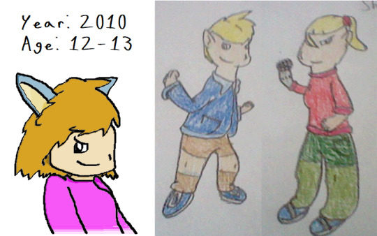
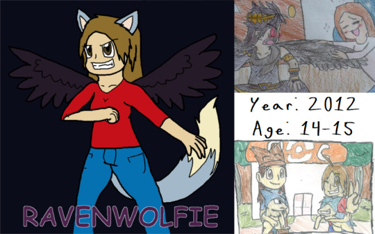
2010: late in the year, when i had turned 13, i finally decided to make myself a persona, and the character on the left in my attempt at drawing it and being Cool. obviously a huge difference in design is the lack of wings - those were not an initial idea and were added later on.
the other two characters were the protagonists of an old, long-dead story called the Legendary Spirits: John and Shala. i think by then i was just starting to write it and worldbuild, but only a couple years later i scrapped it completely and vaguely incorporated ideas from it in Legends: Children of the Dragons
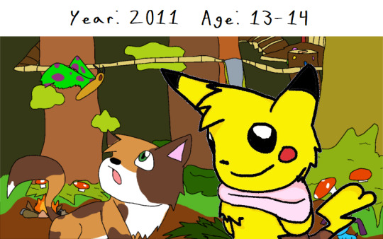
2011: most of my art from this time was either Warrior Cats or Animal Jam-related. the pikachu was actually my first drawing done with my Wacom Bamboo tablet, and i was really proud of it until i realized the Corel Paint Studio program or whatever sucked (or i was just bad at using it), so i switched back to MS Paint
the other piece of my Animal Jam character Ferret exploring Sarepia Forest was probably my first major digital art endeavor, and it’s been something i’ve been wanting to redraw for a couple years now, actually
2012: i joined deviantArt in late 2011, but didn’t really take off until 2012, so i redesigned my persona to be at least a little bit better. now i’ve added the raven wings! it was also around this time that i started getting involved with the pokemon nuzlocke community, finding the original webcomic and then diving headfirst into the fan-made adventures - i even started my own, but never posted it anywhere
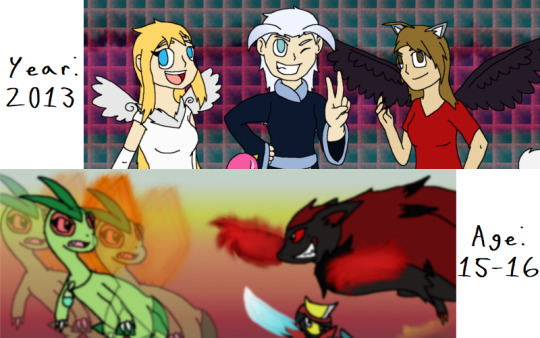
this is also where my “taking art more seriously” starts to come through, mostly thanks to my friend North and our constant involvement with anime and video games together. bonding over those things really drove me artistically, and it’s because of that that i suddenly had the thought to really practice art instead of basically just winging it
2013: this is when i actually joined my first community, that being the pokemon nuzlocke community in the form of the NOCT: the Nuzlocke Original Character Tournament. it was brand-new and an exciting prospect, so i took the opportunity, and i’m so glad i did. i had just started using GIMP for my Image Design class in highschool, so with only about a month of practice with it under my belt i used it for my entries in the tournament, mainly because it was just so much better than MS Paint. it had LAYERS and TRANSPARENCY, and as far as i knew MS Paint didn’t have anything like that. the picture at the bottom was part of my final round and last entry to the tournament, and just seeing my growth within the year was incredible.
and then, in the summer, i stumbled upon a little webseries called TOME. and that kind of changed my life forever. i got both of my best friends hooked on it too, and we all made OCs. mine just looked like my persona, AKA boring, but they got did look a bit better than the year prior
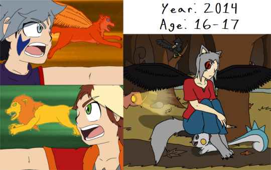
2014: even though beyblade was a big part of my life and a huge inspiration for my art since 2012, it started to consume more of my artistic drive in 2014, with the help of my friends, of course. we wrote fanfiction and drew comics and made self-insert characters and everything. so it was during that time i tried really hard to replicate the style more, and now bits of that have been incorporated into my current art style.
also, that december, i challenged myself to my first 30-day art challenge, of course starting with a pokemon challenge. later on in the challenge, with broader themes, i expanded my entries into full-fledged pieces with shading and detailed backgrounds, which i believe was a great step, since i still struggle with and avoid drawing backgrounds. even to this day, i’m very proud of my work in those last few entries
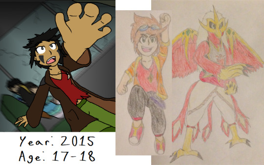
2015: the second NOCT, appropriately called the NOCT2, started this year, and after my experiences with it two years prior i was eager to join in again. however, i did not have as much time to set aside for this one, either because my ideas were too ambitious or because i was also graduating highschool and developing an animated trailer for Legends:Children of the Dragons for my senior project. it was also during this time i was developing a new original story with the help of my friend North called The Dark Side: War on Destiny, which actually came to be in late August 2014. i continued to expand on the lore and designed all of the characters, and so far those aspects have still being adhered to. the drawings of the main characters Kyle and his partner Guarudan are part of a larger 30-day art challenge i took on called OCOctober, where i drew a variety of my original characters throughout time, including my current ones.
this is also the year i started my annual art summaries, which is pretty cool, and i’m glad i’ve stuck with that since
2016: not much to say about this year, honestly. i was busy working and preparing for my first year of university, and i mostly focused on TOME and OC stuff. i think this is when my involvement in the tumblr fandom started to come to a head, and once again i’m very thankful for that
2017: this was an extremely hectic year, with university struggles and social shenanigans online eating me from the inside out. however, i made an extremely valuable friend in Mana, and we continue to collaborate on her original stories to this day. featured on this year’s slide is a scene from District of the Stars
also, even though i mostly frequented tumblr from 2014 on, i still contributed to pokemon collaborations on deviantArt, mostly for the Gotta Draw ‘Em All group
2018: again, not much to say other than i continued to grow. i used pretty much all of my free time during college to draw, and i strove to draw different things and focus on improving specific parts of my art, which i definitely think helped
2019: now we’re all caught up, and in retrospect i think 2019 was my most productive and proudest year for me in terms of art. even compared to the year prior, i see a lot of growth in coloring and shading, which is something i had been fiddling with for a couple of years. but this time, i’ve made all sorts of friends and colleagues, and i continued to strengthen those bonds
it’s crazy how much can happen in a few years, especially when ten years is almost half your life. my old art still definitely looks like it came from me, but my inspirations and growth definitely helped develop my style into something much greater, into something i can be proud of
okay, i think i’m done now. have a good day
3 notes
·
View notes
Note
I loved what you had to say in the last Ask you answered, that being said, how can a commoner such as myself grow from just reading Celeb mags and tabloids to truly understanding the industry and being more media literate. What steps should I take? What could I read to better understand this world? I really would like to follow what you did to become media literate.
“how can a commoner such as myself grow from just reading Celeb mags and tabloids to truly understanding the industry and being more media literate”
Well first off, we’re all “commoners” here. Both you and I.
Consider this: media literacy and the consumption of celeb mags and tabloids are not mutually exclusive concepts. Being more media literate does not mean foregoing the consumption of certain types of media. Consume all the media you want and can handle healthily!
I should clarify that in my example, being more media literate has allowed me to make better informed decisions for myself. My personal decision to stop following gossip mags, gossip websites, tabloids, etc was born from the acknowledgement that it brought a lot of negativity into my life and it didn’t contribute positively to building my world view. Recognizing the manufactured nature of celebrity gossip-centered media and how the messages they perpetuated were influencing my perspective was important.
Remember Kanye interrupting Taylor’s acceptance speech? I laughed at Taylor’s expense. I went “Yeah! Imma make Kanye memes about other things that are better than _insert something Taylor has done or attempted to do_”. Developing my media literacy has allowed me to reflect on how that was a very scripted publicity stunt, but just because Taylor and her team would have been in on it doesn’t absolve the negative impact it would have had on me and other impressionable viewers. The impact of that kind of engagement is that I go around with this normalized view of thinking it’s ok to try and tear others down, thinking it’s ok to make arbitrary comparisons between other people, between women, as though it’s a competition for which woman deserves recognition over everyone else. It’s gross and doesn’t align with my personal values. Without this recognition of how I’m being manipulated, I would have just been left to this reactive immaturity - behavior and attitudes that one might recognize as being the markers of a toxic stan.
Now if someone can subscribe to Just Jared, Just Jared Jnr, TMZ, Perez Hilton, Hollywood Life, E Online, Daily Mail, etc and be inundated with the sheer amount of manufactured media and not have it negatively influence their life and world views, that’s great. They can go do that if they like. But for me personally, years ago I would have seen the headline “Justin Bieber challenges Tom Cruise to a fight in the UFC ring!” and I would have spent so many brain cells thinking about all of it. It would have been like “What the fuck is wrong with Justin Bieber? What a stupid little shit. OMG. How can someone be so stupid. Did he get dropped on his head as a baby? Is it drugs? Does he have a shit mother? How does a kid turn out this way? What a fucking idiotic prick.” at the same time thinking “Man I can’t stand Tom Cruise, I would love to fucking see this fight. At the very least someone I don’t like is gonna get punched in the face. I may hate Justin Bieber but I kind of want to see him beat up Tom Cruise”. It’s like, why am I even thinking about this violence? I don’t even like violence. Yeah Justin and Tom’s public images both shit me, but now that I can recognize 1) the existence of a highly manufactured and controlled public image, and 2) the toxicity of the entertainment industry and how that affects stars, I can exercise more empathy towards both of them instead of wanting general bad things to happen to them. And now, I would see that same headline and I go “Lols, I wonder what they’ve both got coming up that they’re trying to promote. Ugh, so glad I don’t seek this shit out anymore” and I go about my day.
“What steps should I take?”
The very first step I would recommend is to watch this YouTube CrashCourse series on Media Literacy
youtube
“What could I read to better understand this world?”
Read everything? Seek out information and knowledge, cross-reference and fact-check. Develop your inductive reasoning through the pursuit of a wide variety of knowledge, across different domains. Study different domains. If not formal study, just take an interest and read and learn about different domains. Work in different jobs and industries. Experience life. Travel. Talk to people from many different walks of life and backgrounds. Build your world view. See a therapist.
“I really would like to follow what you did to become media literate.”
It’s an ongoing journey, just like any life skill. You don’t really become media literate and then that’s it, you’re now media literate, you just keep trying to improve and learn and grow. We’re constantly developing and evolving our social consciousness with each new experience at every moment of every day.
In the specific context of Camren, I can tell you that my journey basically consisted of consuming a lot of 5H/Camren content. Practically bingeing on it. Along the way I probably bought into a bunch of different theories and “exposing” posts, and because I hadn’t yet read or seen anything to contradict it, it may have seemed plausible at that moment. For me, after reading posts by @emisonme and @decoding1432 (and some other now defunct blogs) on PR manipulation in fandoms, including various astroturfing tactics that they employ, I started to then realize that I couldn’t take “exposing” posts at face value. But it was the post about how management manufactured the OT4 v Camila “feud” narrative, along with the paper trail of the transfer of the 5H trademark that really exposed the timeline of events and how it all contradicted the public narrative published by the girls, their teams, and celebrity news publications - that post really blew my mind and really opened my eyes to the manipulation. It was at that moment that the entire feud narrative was made transparent and revealed to me to be complete and utter bullshit, as well as the cascading implications of that. In that new light, I could then look back at all of the “exposing” blogs and posts that perpetuated the feud narrative for what they were - total crap.
21 notes
·
View notes
Text
9 Essential WEB SITE DESIGN Methods for DIY Beginners

Let’s get right down to it, shall we? Below are a few of the very most useful styles and guidelines to learn when building your first website:
1. SET ASIDE the Mouse, GRAB a Pencil
Your site may already exist as a lovely, complete entity in your mind which is the reason why you immediately leap into Photoshop (or worse, an internet browser and HTML) to plan it out. Whoa, whoa-cool your jets for another! Don’t place the cart before the equine. First, get out a pencil and pad of paper and start putting your ideas into something easily tangible. That is an important stage to map out the framework of your site using only rectangles, doodles and influenced ideas (categorized as wireframing). Things can be very tough at this time; no one’s heading to view it nevertheless, you.
It is more easily at this time to alter designs you originally thought works however now discover are cluttered and confusing in writing. This can save you many hours of disappointment instead of making the same finding after the site is coded and in a web browser. Plus, it can help significantly to create a web page when you have research at hand to seek advice from rather than moving in blind.
2. Follow a Hierarchy
It’s an undeniable fact that a lot of web surfers tend to only check out webpages rather than take time to read everything. You should be ready because of this by placing the most crucial content first. This means that a consumer can break down the most essential information on a full page all in a single screen on preliminary load, and never have to focus or scroll. That is, of course, easier said than done. Here are some tips to help you better understand the significance of the design theory:
Keep Content “Above the Collapse”
We call that preliminary display of loaded content “the fold”-and everything below it that must be scrolled to be observed is considered supplementary. Generally, your most significant information rests “above the collapse”. The crucial thing to perform within this area is to entice a consumer to do this or generate the motivation to scroll down further.
Utilizing a “Hero” Image
A common trend in web site design nowadays is to fill this “above the fold” area using what is named a “hero” image or banner. They are full-screen history images with very succinct and to-the-point overlaid text messages, usually combined with a call-to-action button. Feasibly the whole purpose of the net web page could be included within this banner area, although it also acts as a great primer for this content to follow.
“The Collapse” May Change With regards to the Device
Here’s where things become complicated-and why you shouldn’t overburden yourself attempting to match everything above this marvelous line. Concerning the user’s device, the display screen sizes could differ greatly. A jaw-dropping 5K screen has a vertical quality of 2880 pixels, whereas an iPhone 5 has not even half of this. This means that mobile users just aren’t heading to have the ability to fit as much content to their display real property. (More upon this later.)
3. Typography Is Your Design
Unless you’re owning a photography business, the text is the solitary most important component of any website, so it’s important to get this done part right. Your web page’s hierarchy is greatly reliant on the typography you select: how your headings, subheadings, and body text message follow an all-natural circulation and stay aesthetically distinctive in one another
Make sure the written text is legible (avoid flowery fonts!) and large enough (usually around 16px for your body).
Stick to only two fonts-and make sure they set well together!
Give your paragraphs some room to inhale between one another, and arranged enough top cushioning or margin on your headings to symbolize clear breaks in content.
Avoid long lines of text. It’s easier on the eye for paragraph lines to be approximately only 15 words long-and a little significantly less than that for mobile displays.
Serif fonts are usually best only in print-unless they may be found in large headlines on the net
4. Colors & Comparison Are Crucial
We’ve discussed color mindset at length, however, the idea bears duplicating. The colors you select for your website play a massive role in how users understand your brand, as well as how motivated they could feel in taking action (i.e.: buying things) through your website. Why? Well, every color evokes certain feelings, and either for their natural character or by social fitness, these colors have grown to be associated with certain types of businesses. If a children’s toy company or a financial consultant painted their whole website in the stark dark, it could send the incorrect indicators with their meant viewers. Around the flipside, a shiny orange or an enjoyable blue, respectively, would catch the perfect firmness and consciousness for his or her customers.
If you’ve already established the colors of your brand, use those on your website then. It’s best, however, to keep it at only three colors for your site; like fonts, you don’t want to overdo it here or your site could finish up with multiple personality disorder. Also, be skeptical of way too many splashes of color across your website; our eye is attracted to them like honey traps, plus they could interrupt the natural movement of your articles. Use color only once it is most needed, such as links or control keys.
In contrast, your text message must stick out from the backdrop. Using light greys, yellows or greens for your fonts will likely render them unseen on the web page. Black on the white background is the foremost combination of comparison and is normally what you ought to stick to.
Additionally, you want your text message to pop against background images. Using very occupied photos can distract from the written text, to avoid this issue either use less comprehensive photos or use an overlay of, say, rgba(51,51,51,0.5)to help soften the image within the text.
Contrast also is important in how users are attracted to certain important elements of your site. Your most significant call-to-action control keys must get attention through the use of contrasting colors. A blue “Buy Now!” button manages to lose its urgency and well worth it when it's swallowed by a niche site that uses blue everywhere-but a red button on that same web page grabs a user’s attention by shouting “Hey! Click me!”
5. Using Pictures
Deciding on the best images to use on your website partly boils down to your artistic aptitude, but there are also intellectual considerations to consider that should assist with your selection process. First of all, avoid embellishing your site with extraneous photos because they could look nice. Instead, think of how each image you utilize serves its purpose, and how it functions as content. A well-chosen picture can convey your brand, service, product, or audience a lot more effectively than words. Use photos to help your users understand something, to evoke feelings, or even to inspire trust and self-confidence; with them solely for visual reasons should be supplementary.
Understanding Document Types & Compression
There can be an extra step that must be taken for using images on the net. Those elegant photos you have from sites like Shutterstock and iStock could be very substantial (5,000+ horizontal pixels and 10+ megabytes in proportions) which is okay for printing, but they’re unfit for websites. Not everyone has superfast Dietary fiber Internet, and that means you must decrease the size of your images to support for launching times (not forgetting 40% of site visitors will leave if the website takes much longer than 3 mere seconds to weight!). Typically, you want to keep each of your images at no more than 500 kilobytes in proportions, though your average quality should of times be around 100 kilobytes.
JPEG is the typical format for photos. It is a lossy format, this means its image quality is reduced when compressed. If you’re utilizing a JPEG for a full-width history image I quickly recommend keeping its horizontal quality at a minimum of 1200px. For general purposes, stay away from any image with significantly less than 600px horizontal quality, as it'll likely show up blurry on modern displays.
PNG is the most well-liked choice for images or for images that want transparency. It is a lossless format, which is ideal for keeping image quality but may also greatly increase document sizes. Generally, you’ll use PNG images for illustrations, symbols, or smaller images that may be stacked together with other elements for their transparency. You’ll hardly ever need a PNG to be bigger than 1000px.
SVG (Scalable Vector Image) is a more recent format that is changing GIF and even PNG in some instances. SVG wonders that it could be as large or as small onscreen as you will need it to be, all while keeping perfect clearness and crispness (but still be a little quality). You should think about using SVG for just about any logo design, icon, or vector visual on your website; as high DPI shows are becoming commonplace, the sharpness of SVG provides the best image quality.
6. Mobile-First Design
We’ve now reached a period where most people consume online quite happy with their cell phones rather than on the desktop computer. As a total result, there is much larger precedence in web site design to tailor specifically to the mobile experience, which has resulted in the “mobile-first” design viewpoint.
This means that essentially, throughout your initial sketching and planning phase in some recoverable format, it is best to focus on the site’s mobile layout first. Only the most crucial content necessary for the functioning of your site will be displayed on smaller screens. This causes you to simplify your design and slice out any distracting elements immediately. Think back again to your “above the flip” content: if you first ensure that the important info can fit on the original screen of the phone, then you’ll know for several it'll fit on bigger displays. Once you’ve nailed the fundamental mobile layout, you'll be able to start adding in embellishments or bigger images for desktop displays.
Your mobile layout assumes a far more vertical design that inspires scrolling, as opposed to the wide landscape of the desktop. If, say, your product web page displays entries in a grid of 3 across on desktops, then usually your mobile layout will display them as only a single column.
Yes, which means that you essentially need to produce several layouts for every web page of your website. Fortunately, a worthwhile website contractor should provide reactive templates that change these designs automatically so you’ll then just need to fine-tune them.
7. Keep Things Aligned
When elements appear sporadically laid across your site it is often due to an alignment issue. Imagine your website on the sheet of graph paper. Individual it into even columns by sketching, for example, six right lines. You now want to ensure that the remaining sides of your elements are distributed and aligned to only these six vertical lines.
8. Keep It Simple
It is said that the best web site design moves unnoticed; it is a poor design that phone calls focus on itself. As stated earlier, the main facet of any website is merely its text message. If you can offer outstanding typography that is a joy to learn, you won’t do much more. Wanting to overdesign your site will just mess and complicate things.
Are the package shadows necessary? The crazy, ornate patterns? A large number of colors? Not probably.
9. Big Open up Spaces
Your articles need room to breathe. White space is the prevailing design choice for modern websites: wide, open up areas of nothingness to pad areas between content. It’s a far more pleasant way to process information, looked after stimulates you to eliminate superfluous text messages and images to keep carefully the site clean.
Get more advice Thought Media is a leading Chicago web design providing professional website development services, and one of the top SEO companies. The agency has worked with hundreds of clients all over the world! Creating high converting website designs, providing reliable website hosting, and successful Search Engine Optimization Marketing campaigns!
Conclusion
Web site design can be considered a sprawling field of technology to learn, ideas to practice, dialects to review, and artistry to understand. Only with experience will all of these components start to make sense, however, you already are well on the way simply by grasping the basics of why is a good website work. I am hoping that guide acts as your launching-off point, which offers you the self-confidence to consider your website into the own hands and build it just how that only a business proprietor knows best.
1 note
·
View note
Text
Importance Of Clipping-Path Solution
Clipping path is a prevalent technique used to remove background from images. Clipping path is done through Adobe Photoshop or Illustrator software. Clipping path service is essential when you need to edit photos. The clipping path service that is carried out by hand around the item can also impact the quality of your work.
Clipping path
A clipping path is also known as"deepetch" or "deepetch" in Adobe Photoshop. It's a closed vector path which removes or removes the background of a 2D image by using photo editing software. The clipping path encompasses everything that is within the path. Anything outside of the path will be eliminated or subtracted. This is a crucial technique for cutting professional images services. Remove backgroundand create transparent backgrounds, white backgrounds Background removal, Image masking, Photo cut-out, color correction Ghost mannequin, and other editing services for images and photos incorporate it.
You may effortlessly and professionally display your digital photo on another background, specifically on a white background which will help to emphasize your images online by making use of an online Clipping Path service. ClippingPathWise creates the contour cutout shape, shape, or contour manually. It is a careful selection of an object with the pen tool. So, if you need any kind of editing service for photos for your online business, you've come to the perfect place.
Different types of clipping path services
Fundamental
Basic clipping path is the most straightforward and inexpensive cut-out path to create. Basic clipping path is used to separate large items with few bent edges from their background.
A vital cut-out passage could be a benefit to cell phones, basic containers, books, paintings, and other framed items.
Simple
A clipping path that is simple is easy to create although it's more difficult than a simple cut-out path. This makes it slightly more expensive than the standard route for clipping. In addition, simple clipping paths can eliminate things with more bends and edges than essential clipping paths.
Simple clipping path used to take backdrops off of products like simple jewels or vehicles, furniture objects, and various other items that stand alone.
Moderate
A medium clipping path is utilized for objects with an intricate edge must be removed from its background. Medium clipping routes are frequently unclear enough that only two options are combined in order to get the desired outcome. As you will see, these routes are more costly than the simple and straightforward.
Complex

The objects that have convoluted edges, several holes, and maybe various components or different levels of transparency are clipped with a complex clipping path. Because these paths are time-consuming they can be more costly than simple and basic clips.
Anything that has hair or fur and photos with models, nets and groups of various, complex elements would necessitate a highly-skilled clipping route.
Multiple
A multiple clipping path can be a sophisticated one that includes extra carefully constructed routes within the product. Multiple clipping paths can be useful for fixing shadows , or altering the object's color.
Super-Complex
In some cases, an item requires numerous clipping paths that one or two cut-outs will not suffice. These images can be handled using the very complex clipping route, but it is more costly than other kinds. For the best results super complex, complicated, and various clipping pathways are able to be utilized in conjunction with image masking.
For the most part, images of products which require a complex clipping process include furniture with various cut-outs, really complex jewellery, pet kennels or even a bunch of fuzzy objects.
1 note
·
View note
Text
Meet The Founder Of Omnipresent, Aakash Sinha; The Man Who Aided India To Reach The Moon!
Regarded as one of the pioneers in robotics and drone technology in India, Omnipresent Robot Tech was established in 2009 with a vision encapsulating the potential of drone technology in the country. In an exclusive interview with Indian Business Times, the Founder and CEO of Omnipresent, Aakash Sinha, takes us through his momentous journey.
He has a technical background with MS in Robotics from Carnegie Mellon University in the US. To apply his knowledge and gain some experience with research, he took on the roles of Research Scholar and Robotics Research Scientist at Lockhead Martin, which is a company active in the Aerospace Technology space. Being fascinated by robots, he, then joined another American firm, iRobot Corporation which designs and builds consumer robots.
It was post this experience that he decided to take the plunge and establish his own firm under the moniker, Omnipresent Robot Tech in 2009. The idea was to make robots, which was his area of expertise by then, into flying drones for applications that the world would witness only after a few years. Starting from there, to being the man to develop software for the mighty Chandrayaan - 2, Aakash Sinha and Omnipresent have surely come a long way. During this interview, Sinha elaborates what Omnipresent does, what are the potential areas of applications that are yet to be explored and some valuable tips for all the budding entrepreneurs out there sitting on the fence. So, without any further ado, let us get into this adventurous journey which is bound to get you motivated to follow your dreams as well.
“This kind of technology (Drone Technology) is something that people call disruptive technology. It has the potential to fundamentally change the way life, business and work are conducted.” - Aakash Sinha told Indian Business Times.
Humble Beginnings
The first (of many) landmark achievements that came Omnipresent’s way was the application in one of India’s largest oil refineries. Aakash Sinha demonstrated the use of a drone to monitor the defects and real-time parameters in the refinery which was done manually prior to that. The problems with that were the risk of life (because a person had to climb on the towers without any dedicated safety equipment) and heavy dependence on the data provided by that individual. Now, as one could imagine, the room for human error and inaccurate reading or information is very high in such situations. The drone technology solved these problems by being unbiased messengers which relayed the real-time images and information about the situation of the components and monitor everything. Resultantly, the drones were able to bring forth the issues that even the refinery personnel were unaware of. Realizing the immense value of drone technology, Omnipresent bagged its first project with the oil refinery and never looked back.
“Won’t be surprised to see the consumer drone market flourish where everyone might own a personal drone just the way they carry their mobile phones. It could be their companion on a solo trip to click selfies, record videos and capture the moments on a vacation.”
Current Applications
Arguably the most prestigious project undertaken by Omnipresent was developing the software for creating 3D images from a regular pair of images by Chandrayaan - 2 through its Rover, Pragyaan to map out the surface of the moon. This helps the Rover to navigate its way around the obstacles and generate a 3D model of the terrain of the lunar landscape. By creating this model, it became easier to simulate the Rover and enable movement from earth remotely. The very same rover is being sent with Chandrayaan - 3 with a comprehensive tech support from Omnipresent. Evidently, it is an ambitious project and reflects the company’s vision to create something affordable and simple but effective.
Apart from this ground-breaking concept, the drones and robots from Omnipresent find usage in surveying, surveillance and inspection in large industrial establishments. The biggest industrial giants in India including Reliance, Adani and Aditya Birla Group reap the benefits of these services. Furthermore, Omnipresent has already secured projects from 6 State Governments in the areas of mapping, surveying and other sectors after having realised the potential of drone technology. The amount of cost and time saving through the use of drones is simply unparalleled and almost unthinkable just a decade ago. The other prominent services of Omnipresent entail cleansing of water bodies, enabling remote services during the Covid times, IOT (Internet of Things) based video analytics for vivid and sharp videos and images from the sites where drones are used, precision agriculture for spraying the right amounts of insecticides, pesticides, fertilizers and irrigation using drones and robots, detecting a failure in a crop to ensure quick corrective response.
“I see drones as flying robots. They can move by themselves and sense their surroundings. According to the situation, they can react as well. There was a tremendous need in India for something like that back when I started Omnipresent in 2009 and not a lot of people were doing it.”
Future Potential
The future prospects of drone technology are undeniably massive. As a matter of fact, we are at that stage of evolution of this technology that we can’t fathom the full-scale utilization of this technology. If you think we are exaggerating, consider the example of something we have all lived through, the Internet. Back in 1983, when the Internet is believed to be invented, could anyone have ever thought that it could allow us to watch someone a thousand miles away or get you anything you wish right at your doorstep? Even after almost 4 decades of the Internet, we are finding new applications. The drone technology is merely a decade old and the future is beyond comprehension.
However, we could see where it is headed and what the plans are for the next few years. In a few years’ time, drones will be used extensively for food and parcel deliveries, e-commerce and fast commerce, drone taxis which can cover hundreds of kilometres, mapping which would be used to measure every centimetre of ground in India and have the digital information available in any part of the country, complete overhaul in the drone-based agriculture which employs over half of country’s population, industrial assessments like communication towers, power lines, factory chimneys, cooling towers, surveying and constructing roads and highways as announced by the NHAI (Nation Highway Authority of India), Railway track maintenance, defence arsenal, passenger carriers for inter-city commute and much more.
The idea is to bring transparency for everyone involved so that the overall efficiency could be enhanced significantly. For the tech savvy, Omnipresent envisions that the most relevant future drone technology would be something known as the “Drone Nerve Center”. This could enable virtually any number of drones to be connected to a central headquarters to send and receive data and initiate the desired actions. Again, this software has been used in Pragyaan, the rover of Chandrayaan - 2, for perception and navigation. “All these are areas which we already know about and the trials have also begun in a few of these” – Aakash Sinha is confident that there will be at least 2 or 3 unicorns from this field in the immediate future and Omnipresent will be one of them. To put it simply, the possibilities are infinite.
“Not a lot of people know this, but Agriculture is a sector which will be highly driven by drones in a few years’ time. Over 50% of the Indian population finds employment in agriculture. Drones will be able to release adequate amounts of pesticides and diagnose problems in the crops timely, thereby cutting down input cost and boosting agriculture yield upto 20%.”
Commercial Drone Technology Requirements
Beginning to be used much more extensively, the Government realizes the potential and relevance of promoting drone technology in India. Consequently, the Govt. has announced a few relaxations to this formerly tightly restricted and regulated space. This has proven to be a boon to the companies in this space. The DGCA (Directorate General of Civil Aviation) has over 300 designated “green zones” where even the large drone (max weight 500 kg) would not require any permission to fly unto 400ft. In these areas, even long-range drone flights, night operations, variable payloads, deliveries and spraying are permitted. The “yellow zones” would require an automated permission to fly unto 200ft keeping 12 km away from the installations and airports. Furthermore, the drone weighing less than 250 g will not even require NPNT (No Permission No Takeoff) from the DGCA or the Government. Drone heavier than 2 kg would require a government-trained pilot but going forward, the Govt. might grant exemptions from these regulations on a case-by-case basis. Aakash Sinha has applied himself tirelessly to receive all the certificates and licenses to fly the drones legally in India.
“We must laud the Government for the visionary policy relaxations to allow drone industry to grow exponentially. From being a heavily regulated space, the drone industry has become almost self-regulatory. This decision will attract myriad new investors to this sector”.
Valuable Lessons for Upcoming Entrepreneurs
It is not every day that one gets the guidance of someone for free, who has achieved so much in his field of expertise. We recommend you make the most of it by trying to apply these words of wisdom by the man himself. During the interview, when asked about how an entrepreneur should go about building his business, handle the company/products and tackle the investors, Aakash Sinha had the following gems to share.
• An entrepreneur should not be passionate about the product blindly, but must have some actual data to ensure that the idea he is investing his time and resources in, has a chance to become successful.
• An entrepreneur must relentlessly focus on improving his/her product or services every single day.
• One must always look for the right investor and not anybody who is willing to throw his/her money around.
• Ideally, the vision of the company must align well with the investors to achieve maximum potency.
• Chase the big dreams but don’t think that you will always succeed, also be prepared for failures. Constant learning from failures are the stepping stones to big success.
“The future of drone technology lies in the software. With new requirements, you will relentlessly need to keep updating the software for drones. If you are someone who is interested in software programming, the drone industry is bound to be the future-proof space, especially in India” – Concludes Aakash Sinha.
0 notes
Text
Friday the 30th April.
In this session I had a tutorial to decide on a final design, this involved getting a mannequin and my toile and placing samples on the stand to see how they would look in practice. My goal for the end of the session is to have a final design finalised so I can my real pattern over the weekend and buy and needed supplies ready for printing onto my pattern pieces on Tuesday.
Once we decided on a final design we discussed ways to give the design more depth on the skirt, it was decided that a tulle, mesh or organza in a white or ivory would be best as it would still be subtle and delicate but give depth and the semi-transparent, showing all the layers underneath.
For Tuesday I need to experiment with which material of the 3 is best for the skirt and purchase it, then I need to prep the fabrics for my final to be scanned in ready to print.
Next week’s schedule.
Saturday 1st of May.
· Cut pattern out.
· Start experiments on netting, tulle and Organza.
Sunday 2nd of May.
· Experiment on final fabric with Machine Embroidery and embellishment.
Monday 3rd of May.
· Blog catch up.
Tuesday 4th of May.
· Print session, booked for 9.30am to 9pm.
· Have all fabric printed.
· Scan in final samples to be printed.
Wednesday 5th of May.
· Begin Machine embroidery.
Thursday 6th of May.
· Interim and tutorials?
· Machine Embroidery.
· Embellishment.
Friday 7th of May.
· Begin work on outer layers of skirt.
· Sew skirt pieces together.
· Sew bodice pieces together.
Saturday 8th of May – Monday 10th of May.
· Attach outer skirt to base layer
· Attach bodice to skirt
· Add invisible zip.
· Hem.
· Plan photoshoot.
update as of 13th of may.
Final making was delayed due to difficulty with free machine embroidery taking longer than intended, zip issues and minor changes for tis reason the piece was finished on the 13th instead and is pending review on the 14th.
The photoshoot plan has also been delayed until the 14th at earliest.
Photoshopping a rough final idea.
This is a rough idea of what I want to create for my final piece. I created it in Photoshop by scanning in samples and adding them to a scanned drawing of the final shape I did. I want text from poems on the bodice with hand embellished gold coins. The fabric will be floral and each panel will be different. The skirt Is going to have falling petals and maybe more embellished coins, the bottom of the skirt will also have coins dangling down.
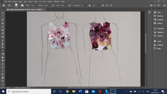


With this basic idea down I show to my tutors and we go through the good and the bad and create a final idea on a mannequin as the 3d idea will be easier to perceive than a flat photoshopped image. We keep the petal idea but break it up with a leaf emblem on the side panels, we keep the basic skirt idea but take away the coins and we decide to play around with having semi opaque layers for more depth. We like the text but want to only keep it on the front panel. We change up the samples a bit to add the fenced ideas in. Finally we keep the hand embellished coins but only on the front panel with the text.
Base design.
The dress shape is my take on the concentration camp uniforms which Is a high neckline with a basic 1940s skirt. Sometimes the dresses would have a suit like front to the dress but I chose the simpler look as I could do more with the front of the piece if I had one surface to work on. Here are the images I used as inspiration for the shape of the dress, it will have the neckline, back zip and sleeves of figure A with the bust darts and skirt style of figure B.
The skirt will have 3 layers, this is a conceptual choice and not one which would be historically accurate. It will be made of a netting, tulle or organza (this will be decided through experimentation) These layers will have petals on them and all 3 layers will be visible as the overlayers will not be opaque, this will layer petals and give the effect of falling petals, not only that but the petals layering in this way will also represent the time the Gypsies spent on the run away from or in camps due to the Nazi Germans and their allies.

The gold coins are a rather literal choice, they represent they Gypsies pride, a pride I have learnt a lot about in the book ‘fires in the dark’ The coins are to be hand embellished onto the front of the bodice and will be mostly covered by black embroidery thread to show how their pride is strangled by the Germans, they pride themselves in their wealth and the few clothes they wear for their uniqueness so being forced to wear a uniform in camps would be very demeaning and when the fear for their lives wore off they would feel too uniform, the only thig separating them from the others in the camp is their prisoner number and maybe the colour of their triangle (even then Gypsy women shared their black triangle with convicted prostitutes and criminals). The thread only mostly hides the gold however as you can take the clothes, money and possessions away from a gypsy but their pride is in their hearts and that is harder to remove so it tries to break out of the metaphorical prison it is put in when they were confined to these camps.
The front bodice panel will have machine embroidered text on it, some words describing the Gypsies struggle along with quotes from the 2 poems I have studied as their words are powerful, I won’t add my own interpretation of what happened there as I don’t want to speak FOR those who were there as I was not but I want to give THEIR voices a platform through my work, this way I am being a good ally. The text will be in the style of Maria Wigley who leaves the threads loose at the end of each word, this gives a crowded effect which I liked and want to include as It will show the cramped feeling of being stuck in a camp. My current sample of text embroidery was done by hand and while it was neat it was very time consuming and free machine embroidery is faster, the text will be rougher but this will fit as the text will seem like it is quickly handwritten , as if it was done by the writers of the poems.

The background pattern of the first panel.
Using a sample from a previous print session I plan to scan it in and use it again, the original sample was created with sublimation and netting (which represented fences) trapped between the print and fabric which added some subtle negative space. This piece shows the beauty trapped behind the fence but also showing through and fighting to get out.
This idea is the same on the back where I will create a more accurate fence negative space idea using photoshop, it is inspired by the sample where I cut paper strips to use as the more abstract fence as I didn’t have time in the session to cut an accurate fence. I really liked how the petals showed through the paper so it wasn’t completely white, this also shows how the sprit of the Gypsies refuses to he held by the fence. I will make sure when I do the photoshop that I lower the opacity of the fence a bit so that the petals show through a little bit.

The side panels are a stark contrast to the front and back in that they are muted and darker tones, this is a reminder of the dark theme while remaining linked to the nature theme. The leaf I used was older and broken which backs up the contrast between this and the delicate petals. The fact that it is the only leaves used in the whole garment helps them stand out. As I still want the panels to match each other I will keep the subtle pinks showing through on the original sample by scanning this sample in too instead of recreating it from scratch. This means the colour palette will not be too greatly affected by the sudden change and it will still be obvious that is part of the same garment. The placement of the leaves will be very intentional with the shape of the leaves matching that of my figure so the leaf works with the bodies natural shape to flatter it.
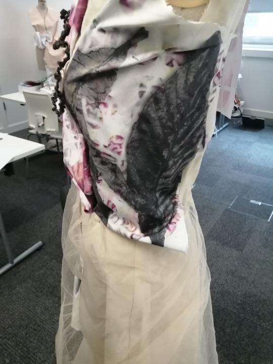
The skirt will have individual petals falling down it and the current idea for the overlayers is for them to have cut out printed fabrics pieces hand embroidered on.
There will be an invisible zip in the back of the dress, this is for practical reasons and it is not historically accurate for the time period but it is a necessary compromise for the dress to work.
Why petals?
I’ve used what flowers I had around me to create designs, the petals I had were rose petals in pinks and purples. These flowers represent the beauty that the Roma were able to see in the world, that ability to see they good in the world when all is lost is their strength and so they also represent their strength and inner freedom. This contrasts with the decayed leaf on the side panel, which while it works with the shape of the ribs.
Contextual research for final design.
Uniform in camps.
Here you can see an example of women’s uniforms in concentration camps, these are missing the blue and white stripes that come to mind when you think of what prisoners had to wear during these times but not all camps had that uniform. I took inspiration for the dress shape from these dresses, their shape is traditional to the time, I made a few changes to make it simplified and that was it.

Triangles, numbers and their meanings.
During world war 2 all the prisoners in the concertation camps were labelled with numbers and triangles, for Gypsies they were assigned brown or black triangles, the brown ones were for male Romani while women had black ones, the women were put in the ‘work shy’ group, the same category as drug addicts, beggars, lesbians and prostitutes as they all had to bear the same triangle, this would have been very demeaning to them as Romani women would not like to be categorised with unclean women like prostitutes. The only thing separating them from these groups would have been their numbers, Gypsies had a Z at the start of their number whereas other non-Germans would have a letter correlating to their country of origin like B for Belgian. While the thought of using a black triangle on my final piece crossed my mind it didn’t seem like my place to do something like even though the symbol has been reclaimed by some communities. Instead I will embroidery using black threads not only for contrast against the pink fabric but also to represent the colour of the triangle.
Maria Wigley.

I am inspired by Maria Wigley’s free machine embroidered text, her style is to sew each word in cursive and to leave the threads dangling on purpose , here is an example from her Instagram. I like this style because t creates a crowded feeling which matches my ‘trapped’ theme and makes the amount of text I will add look busier. Her work looks handwritten which is the idea I want on my bodice, instead of typed out style text it is more personal to have it look handwritten as the experiences shared by the poets I am using are personal.
Becky Earley
This piece by Becky inspired the side panels, her pieces always have very considered textile designs which match the shape of the garment and that is what I want to do with my piece, this will make the piece be more based around the garment form than the textiles being dumped onto a dress.

What challenges I will have to overcome.
With the invisible zip I will have to join the 2 pattern pieces of the back bodice and skirt to the zip and so it is not an easy thing to do as the extra fabric makes it hard to sew and as I have never (apart from in the toile) put a zip in before it could be hard, it will also be hard to line the zip up correctly one both sides of the waist seem, if it doesn’t match the dress zip will be wonky and it could be very noticeable.
I also have yet to decided how to add the 2 overlayers of the skirt to the waistline and to the zip and seam at the back, this will be something I will try and overcome by communicating with my tutors.
0 notes
Text
Best Oster Rice Cooker
Best Oster Rice Cooker
Your Ultimate Guide to Oster Rice Cookers
It doesn’t take an expert to know that rice is one of the most common and versatile staples around the globe. The preparation, recipes, and variety may vary from hemisphere to hemisphere, but we have found that one thing remains the same: to create good rice, you have to have a good cooker. So what exactly makes a good rice maker? This brand has the answer.
Oster technology is straightforward: all one has to do is prepare the needed amount of rice (the products usually come with a measuring cup), wash the grains with water, pop them into the cooker and with one touch, start the process. Whether it’s brown rice or white rice you prefer, this brand’s products can do them perfectly.
We take a look at the stars of this brand as well as the functions and features that make each piece an outstanding product.
In a Hurry? Here’s the Best Oster Cooker
Oster 6-Cup Rice Cooker and Steamer 4722
Check out the product review
Click here for best price!
Our Overall Rating:
3.8/5
The Oster 6-Cup 4722 may seem unappealing and simple because of its lack of bells and whistles. But when it comes down to it, this model is the greatest at what it does: cook rice. Perfect for small households or a solo dweller, this red-coated cooker does away with any complicated settings and opts instead for a more straightforward, easy-to-understand approach.
For a modest price, you’re able to get a cooker that also has a steam feature. While you’re preparing the perfect fluffy white rice, simply pop in the meat, fish, or vegetables of your choice to prepare a full meal without spending too long in the kitchen. This helps you save hours, money, and energy at once, which is a great deal in our books. Read on to find out more information about this model.
Which Oster is Best?
BEST OVERALL
Oster 6 Cup Rice Cooker and Steamer 4722
Check Price
This lightweight, compact rice cooker is our number 1 pick. With its simple and straightforward design, beautiful red exterior, reliable…
Full review > >
BEST LARGE CAPACITY RICE COOKER

Oster 14-Cup Rice Cooker CKSTRCMS14-R-NP
Check Price
If the Oster 6-cup models just don’t do it for you, worry not. The Oster 14-Cup Rice Cooker can solve your problems, giving you a larger capacity at a budget-friendly…
Full review > >
BEST DURABLE RICE COOKER
Oster Duraceramic Rice Cooker
Check Price
One of our top picks for small rice cooker models from Oster’s lineup is this beautifully sleek model: the DuraCeramic Rice Cooker…
Full review > >
BEST SIMPLE RICE COOKER
Oster 6-Cup Rice Cooker CKSTRCMS65
Check Price
Perfect for those looking for a rice cooker that cooks rice, food, and is straightforward plus easy to clean, the simple and durable CKSTRCMS65 model is fit for you.
Full review > >
About Oster
Oster has been around for a long time. Popular not only for their rice cooker models, but also for their blenders, toasters, and kitchen appliances, this brand is a reliable source of high quality kitchen equipment that doesn’t cost the earth. Anyone looking to enhance their kitchen routine could definitely use some help from Oster’s lineup.
Oster is one brand that, over the years, has stuck to their guns, prioritizing improvement on existing features over chasing the latest trends. As seen in our reviews, accessibility and convenience is the name of the game here: their appliances are straightforward, easy to use, and on top of that, inexpensive. Nowadays, when many people can’t afford to buy many basic necessities, having an affordable yet reliable appliance to cook warm meals is more important than ever.
Core Features of Oster Rice Cookers
Oster has become a household name for plenty of reasons. These features can tell you why:
Steams Food to Pair with Rice
These products come with a detachable steam basket in order to make creating full meals easier and less time consuming. Great for on-the-go workers who need a healthy alternative to fast food, this function cuts time and energy spent in the kitchen into half. Pair your fluffy white or brown rice with a meat or fish viand and veggies on the side, or cook a hearty egg and rice breakfast upon request.
Premium Pressure Cooking Feature
Most multi-cookers try to promise the best kitchen experience, but none can top Instant Pot’s features and technology that have been years in the making. Not your average pressure cooker, the instant pot smart features have helped them deliver a wonderful meal every time. Pressure cooking has never been easier with their products.
When you pressure cook, steam builds up within the pot. This creates a high-temperature environment that can cook your meat, vegetables, or any food faster. Aside from the feature to pressure cook, what makes instant pots stand out are their safety features that are built into a distinct smart program.
Budget-Friendly Products
For an incredibly low price, Oster appliances do the job, and really well at that. Some even have titanium-infused materials and a 10-cup cooking capacity. One of the top budget-friendly alternatives, Oster products are perfect for those who can’t afford to drop a hundred bucks on kitchen appliances. As long as they’re taken good care of, these products can last from months up to a year. If not used properly, be prepared to buy another one in a few months.
Reliable Performance
While many products tend to cost more and break down after short use, these top picks have simple functions that come with an affordable price range. Many prefer their simple and easy to use features because they know that is what makes great, fluffy rice with each try. With the simple process of washing the grains with water, putting them in the pot, and pressing a button, you’ll get warm, fluffy rice. The coating is different from usual stainless steel multi cookers, but the coating makes up for it and ensures well-cooked meals on each try.
Are Rice Cookers Worth Buying?
Are these appliances worth every penny? We say yes! Rice cookers add great value to your kitchen. Whether you’re a rice lover, or someone just looking to expand their taste, these kitchen tools are an easy to handle, affordable appliance. Oster appliances are especially great for beginners, because you get high-quality output without any complications. They don’t have the intimidating and sometimes complicated cook settings that many modern models have. Forget what rice cooker elitists say: if you’re starting out with cooking rice, then Oster products are definitely worth buying.
As the holiday season approaches, this complete review can also serve as a gift guide for your family members who have been dying for a sturdy and reliable countertop option. While they aren’t midrange multicookers, these rice cookers are great picks for those who wish to have a reliable appliance. You’re getting quality while spending little money.
Oster vs. Zojirushi Rice Cookers
While these brands seem to be at opposite ends of the spectrum — the usual Oster rice cooker prioritizing classic, no-fuss designs and Zojirushi innovation — they’re both contenders for the best electric rice cooker out there. If you’re the type who can’t decide which of the two brands to go for, we list down some quick features for each to help you make the right decision.
Zojirushi rice cookers prioritize innovation. Their best products, and our top picks, usually house a delay timer, automatic keep warm setting, and an average of 8 different cooking presets for white rice, brown rice, sushi rice, and more. Another benefit is their large size capacity. However, the typical Zojirushi rice cooker is a little hefty on the price tag, so make sure you have a few extra dollars to spare should you choose one of their models.
While social media can bombard you with different ideas of what a great appliance should be, the choice is ultimately yours. CNET writer David Priest lists both brands as some of the best for this year, and we couldn’t agree more.
How Do You Cook Rice in an Oster Rice Cooker?
With this brand’s lineup, cooking has never been easier. You won’t need to do a ton of research and get information overload just to try and operate their appliances, because they’re built to be straightforward and intuitive. Simply wash your rice, use the measuring cup that comes with the package, pop in your grains with the exact amount of water, press a button and wait.
Their cooking technology allows for perfectly fluffy and moist rice on every try. Many of their products also come with a tempered glass lid so checking on your grains is easier. Once the cycle’s done, the device will automatically switch to a keep warm feature.
Best Instant Pot Rice Cookers
ImageProductDetailsCheck Price

Oster 6 Cup Rice Cooker and Steamer 4722• Light & compact
• Includes an auto keep-warm function
• Comes with a steam tray

Oster 14-Cup Rice Cooker CKSTRCMS14-R-NP• Large capacity cooker
• Affordable price
• Can steam meat, fish, veggies, etc.
Oster Duraceramic Rice Cooker• 30% faster cooking
• Titanium non-stick ceramic coating
• Aesthetically pleasing design

Oster 6-Cup Rice Cooker CKSTRCMS65• Straightforward standard cooker
• Easier to clean
• Comes with a steam basket
#footable_3431.ninja_stacked_table > tbody, #footable_3431.ninja_stacked_table { background: transparent !important; } #footable_3431 td.ninja_column_0 { text-align: center; }#footable_3431 th.ninja_column_0 { text-align: center; }#footable_3431 td.ninja_column_1 { text-align: center; }#footable_3431 th.ninja_column_1 { text-align: center; }#footable_3431 td.ninja_column_2 { text-align: left; }#footable_3431 th.ninja_column_2 { text-align: center; }#footable_3431 td.ninja_column_3 { text-align: center; }#footable_3431 th.ninja_column_3 { text-align: center; }
Let’s Go Over Each Oster Cooker
Best Overall: Oster 6 Cup Rice Cooker and Steamer 4722
Check out the product review
Click here for best price!
Our Overall Rating:
4.5/5
This lightweight, compact rice cooker is our number 1 pick. With its simple and straightforward design, beautiful red exterior, reliable cooking settings, and durable features, you’re getting a sturdy long-term cooker for a low cost. We also named this model as one of our top picks for best cheap rice cooker models, and it’s one that’s highly-raved about, too.
As you may have guessed from the name, this rice cooker also doubles as a steamer. It comes with a removable steam tray that goes right on top of the inner pot. This steaming basket can cook your eggs, fish, meat, and veggies while grains are being prepared below. For anyone who wants to lessen prep time in the kitchen, this combo is the perfect hack.
Preparing rice is worry-free with this model. The cooker switches to the automatic keep warm function once your rice is done so it doesn’t get overcooked. It also has an auto shut-off function.
Pros and Cons of the Oster 6 Cup 4722 Rice Cooker
ProsCons✔️ Easy to use
✔️ Doubles as a food steamer
✔️ Can cook white or brown rice
✔️ Automatic keep warm✖️ Minimal capacity
✖️ Not suitable for big families
✖️ Lack of menu settings
✖️ Lack of innovative functions and features
#footable_3431.ninja_stacked_table > tbody, #footable_3431.ninja_stacked_table { background: transparent !important; } #footable_3431 td.ninja_column_0 { text-align: center; }#footable_3431 th.ninja_column_0 { text-align: center; }#footable_3431 td.ninja_column_1 { text-align: center; }#footable_3431 th.ninja_column_1 { text-align: center; }#footable_3431 td.ninja_column_2 { text-align: left; }#footable_3431 th.ninja_column_2 { text-align: center; }#footable_3431 td.ninja_column_3 { text-align: center; }#footable_3431 th.ninja_column_3 { text-align: center; } #footable_2598.ninja_stacked_table > tbody, #footable_2598.ninja_stacked_table { background: transparent !important; } #footable_2598 td.ninja_column_0 { text-align: left; }#footable_2598 th.ninja_column_0 { text-align: center; }#footable_2598 td.ninja_column_1 { text-align: left; }#footable_2598 th.ninja_column_1 { text-align: center; }#footable_2598 thead tr th.ninja_column_0,#footable_2598 tbody tr td.ninja_column_0{ background-color: rgba(137, 218, 129, 1); }#footable_2598 thead tr th.ninja_column_1,#footable_2598 tbody tr td.ninja_column_1{ background-color: rgba(227, 96, 96, 1); }
Best Large Capacity Rice Cooker: Oster 14-Cup Rice Cooker CKSTRCMS14-R-NP
Check out the product review
Click here for best price!
Our Overall Rating:
4/5
If the Oster 6-cup models just don’t do it for you, worry not. The Oster 14-Cup Rice Cooker can solve your problems, giving you a larger capacity at a budget-friendly price. Whether you’re making dinner for a large household or preparing meals for the rest of the week, this Oster model has got you covered. It comes with a steam basket, too, so making a full meal on the go is easier than ever!
While many large capacity appliances forget about incorporating design, this model doesn’t. Even though it can cook 14 cups, the model only weighs 5.7 lbs., so it doesn’t take up too much space on your counter. Its red finish also makes it an eye-catching addition to your kitchen (similar to our first model, number 4772). Its 7-cups uncooked rice capacity and 14-cup cooked rice capacity make it a huge bonus for large gatherings.
With its steam tray, it can also steam your meat, fish, eggs, or veggies. Once the cooking process for your rice has started, the steam will go up to the basket and heat up whatever you’re cooking. This combo is perfect for those who need to save time to catch an appointment or run an errand.
It’s likely this model’s biggest competition is the Hamilton Beach 20 Cup Cooked Rice Cooker or the Hamilton Beach 20 Cup Digital, products that are known for large capacity products. You can read our reviews and guides for Hamilton Beach products on our website. With a stainless steel 20 cup digital cooker, you’re getting even more space for extra rice. However, plenty of everyday home chefs don’t need this much cup capacity, so it all depends on your needs.
Pros and Cons of the 14-Cup Rice Cooker CKSTRCMS14-R-NP
ProsCons✔️ Super affordable
✔️ Can cook up to 14 servings of rice
✔️ Comes with a steaming basket for fish, meat, vegetables, and more✖️ Uses different measurements than normal cups
✖️ Only has basic cooking functions
#footable_3431.ninja_stacked_table > tbody, #footable_3431.ninja_stacked_table { background: transparent !important; } #footable_3431 td.ninja_column_0 { text-align: center; }#footable_3431 th.ninja_column_0 { text-align: center; }#footable_3431 td.ninja_column_1 { text-align: center; }#footable_3431 th.ninja_column_1 { text-align: center; }#footable_3431 td.ninja_column_2 { text-align: left; }#footable_3431 th.ninja_column_2 { text-align: center; }#footable_3431 td.ninja_column_3 { text-align: center; }#footable_3431 th.ninja_column_3 { text-align: center; } #footable_2598.ninja_stacked_table > tbody, #footable_2598.ninja_stacked_table { background: transparent !important; } #footable_2598 td.ninja_column_0 { text-align: left; }#footable_2598 th.ninja_column_0 { text-align: center; }#footable_2598 td.ninja_column_1 { text-align: left; }#footable_2598 th.ninja_column_1 { text-align: center; }#footable_2598 thead tr th.ninja_column_0,#footable_2598 tbody tr td.ninja_column_0{ background-color: rgba(137, 218, 129, 1); }#footable_2598 thead tr th.ninja_column_1,#footable_2598 tbody tr td.ninja_column_1{ background-color: rgba(227, 96, 96, 1); } #footable_3057.ninja_stacked_table > tbody, #footable_3057.ninja_stacked_table { background: transparent !important; } #footable_3057 td.ninja_column_0 { text-align: left; }#footable_3057 th.ninja_column_0 { text-align: center; }#footable_3057 td.ninja_column_1 { text-align: left; }#footable_3057 th.ninja_column_1 { text-align: center; }#footable_3057 thead tr th.ninja_column_0,#footable_3057 tbody tr td.ninja_column_0{ background-color: rgba(137, 218, 129, 1); }#footable_3057 thead tr th.ninja_column_1,#footable_3057 tbody tr td.ninja_column_1{ background-color: rgba(227, 96, 96, 1); }
Best Durable Rice Cooker: Oster DuraCeramic Rice Cooker
Check out the product review
Click here for best price!
Our Overall Rating:
4/5
One of our top picks for small rice cooker models from Oster’s lineup is this beautifully sleek model: the DuraCeramic Rice Cooker, made with Titanium Infused Non-Stick Ceramic Coating. You’ll know at first glance that this is a product that’ll last long. Its finish is not only aesthetically pleasing, but durable, too.
Not yet sold on this product? The DuraCeramic lasts eight times longer than other brands due to its high-quality materials and design. Not only that, you’re also getting 30% faster speeds when you’re cooking with the DuraCeramic. No need to worry about missed deadlines or late dinners, because this product can adjust to your schedule.
It still has the classic straightforward design that’s loved by many, beginners and rice cooking veterans alike. Just press a button and your cooking cycle will start. Once done, the cooker automatically switches to the warm function to preserve your rice’s temperature so you can leave it in the pot for hours and still serve it good as new.
Pros and Cons of the DuraCeramic
ProsCons✔️ One-touch cooking
✔️ Doubles as a food steamer
✔️ Non-stick coating that helps it cook 30% faster✖️ Lack of innovative functions and features
✖️ Lack of menu settings for different types of rice
#footable_3431.ninja_stacked_table > tbody, #footable_3431.ninja_stacked_table { background: transparent !important; } #footable_3431 td.ninja_column_0 { text-align: center; }#footable_3431 th.ninja_column_0 { text-align: center; }#footable_3431 td.ninja_column_1 { text-align: center; }#footable_3431 th.ninja_column_1 { text-align: center; }#footable_3431 td.ninja_column_2 { text-align: left; }#footable_3431 th.ninja_column_2 { text-align: center; }#footable_3431 td.ninja_column_3 { text-align: center; }#footable_3431 th.ninja_column_3 { text-align: center; } #footable_2598.ninja_stacked_table > tbody, #footable_2598.ninja_stacked_table { background: transparent !important; } #footable_2598 td.ninja_column_0 { text-align: left; }#footable_2598 th.ninja_column_0 { text-align: center; }#footable_2598 td.ninja_column_1 { text-align: left; }#footable_2598 th.ninja_column_1 { text-align: center; }#footable_2598 thead tr th.ninja_column_0,#footable_2598 tbody tr td.ninja_column_0{ background-color: rgba(137, 218, 129, 1); }#footable_2598 thead tr th.ninja_column_1,#footable_2598 tbody tr td.ninja_column_1{ background-color: rgba(227, 96, 96, 1); } #footable_3057.ninja_stacked_table > tbody, #footable_3057.ninja_stacked_table { background: transparent !important; } #footable_3057 td.ninja_column_0 { text-align: left; }#footable_3057 th.ninja_column_0 { text-align: center; }#footable_3057 td.ninja_column_1 { text-align: left; }#footable_3057 th.ninja_column_1 { text-align: center; }#footable_3057 thead tr th.ninja_column_0,#footable_3057 tbody tr td.ninja_column_0{ background-color: rgba(137, 218, 129, 1); }#footable_3057 thead tr th.ninja_column_1,#footable_3057 tbody tr td.ninja_column_1{ background-color: rgba(227, 96, 96, 1); } #footable_2788.ninja_stacked_table > tbody, #footable_2788.ninja_stacked_table { background: transparent !important; } #footable_2788 td.ninja_column_0 { text-align: left; }#footable_2788 th.ninja_column_0 { text-align: center; }#footable_2788 td.ninja_column_1 { text-align: left; }#footable_2788 th.ninja_column_1 { text-align: center; }#footable_2788 thead tr th.ninja_column_0,#footable_2788 tbody tr td.ninja_column_0{ background-color: rgba(137, 218, 129, 1); }#footable_2788 thead tr th.ninja_column_1,#footable_2788 tbody tr td.ninja_column_1{ background-color: rgba(227, 96, 96, 1); }
Best Simple Rice Cooker: Oster 6-Cup Rice Cooker CKSTRCMS65
Check out the product review
Click here for best price!
Our Overall Rating:
3.5/5
Perfect for those looking for a rice cooker that cooks rice, food, and is straightforward plus easy to clean, the simple and durable CKSTRCMS65 model is fit for you. Because of its user-friendly design, you can immediately start learning the ropes for this product and get right on to cooking.
To start, take 3 cups of uncooked rice to yield the maximum 6-cup measurement and wash your grains with clear water. The preparation process which includes rinsing out your grains should take less than 15 minutes, after which you can pop them in your cooker. Press the button to start cook mode. Wait a little longer and you’ll see the light switch to keep warm, which means you’re all set. Serve at optimal temperature using the included rice paddle/spoon.
This model even doubles as a steamer in case you feel like pairing that fluffy white rice with some chicken or beef. While it’s not a stainless steel finish, the non-stick coating ensures that your rice is perfectly fluffy and moist each time.
Pros and Cons of the 6-Cup Rice Cooker CKSTRCMS65
ProsCons✔️ Budget-friendly
✔️ Automatic keep-warm function
✔️ Doubles as a steamer✖️ Only has basic cooking functions
✖️ Requires more manual work than other advanced rice cookers
✖️ Rice can sometimes get burnt at the bottom
#footable_3431.ninja_stacked_table > tbody, #footable_3431.ninja_stacked_table { background: transparent !important; } #footable_3431 td.ninja_column_0 { text-align: center; }#footable_3431 th.ninja_column_0 { text-align: center; }#footable_3431 td.ninja_column_1 { text-align: center; }#footable_3431 th.ninja_column_1 { text-align: center; }#footable_3431 td.ninja_column_2 { text-align: left; }#footable_3431 th.ninja_column_2 { text-align: center; }#footable_3431 td.ninja_column_3 { text-align: center; }#footable_3431 th.ninja_column_3 { text-align: center; } #footable_2598.ninja_stacked_table > tbody, #footable_2598.ninja_stacked_table { background: transparent !important; } #footable_2598 td.ninja_column_0 { text-align: left; }#footable_2598 th.ninja_column_0 { text-align: center; }#footable_2598 td.ninja_column_1 { text-align: left; }#footable_2598 th.ninja_column_1 { text-align: center; }#footable_2598 thead tr th.ninja_column_0,#footable_2598 tbody tr td.ninja_column_0{ background-color: rgba(137, 218, 129, 1); }#footable_2598 thead tr th.ninja_column_1,#footable_2598 tbody tr td.ninja_column_1{ background-color: rgba(227, 96, 96, 1); } #footable_3057.ninja_stacked_table > tbody, #footable_3057.ninja_stacked_table { background: transparent !important; } #footable_3057 td.ninja_column_0 { text-align: left; }#footable_3057 th.ninja_column_0 { text-align: center; }#footable_3057 td.ninja_column_1 { text-align: left; }#footable_3057 th.ninja_column_1 { text-align: center; }#footable_3057 thead tr th.ninja_column_0,#footable_3057 tbody tr td.ninja_column_0{ background-color: rgba(137, 218, 129, 1); }#footable_3057 thead tr th.ninja_column_1,#footable_3057 tbody tr td.ninja_column_1{ background-color: rgba(227, 96, 96, 1); } #footable_2788.ninja_stacked_table > tbody, #footable_2788.ninja_stacked_table { background: transparent !important; } #footable_2788 td.ninja_column_0 { text-align: left; }#footable_2788 th.ninja_column_0 { text-align: center; }#footable_2788 td.ninja_column_1 { text-align: left; }#footable_2788 th.ninja_column_1 { text-align: center; }#footable_2788 thead tr th.ninja_column_0,#footable_2788 tbody tr td.ninja_column_0{ background-color: rgba(137, 218, 129, 1); }#footable_2788 thead tr th.ninja_column_1,#footable_2788 tbody tr td.ninja_column_1{ background-color: rgba(227, 96, 96, 1); } #footable_3038.ninja_stacked_table > tbody, #footable_3038.ninja_stacked_table { background: transparent !important; } #footable_3038 td.ninja_column_0 { text-align: left; }#footable_3038 th.ninja_column_0 { text-align: center; }#footable_3038 td.ninja_column_1 { text-align: left; }#footable_3038 th.ninja_column_1 { text-align: center; }#footable_3038 thead tr th.ninja_column_0,#footable_3038 tbody tr td.ninja_column_0{ background-color: rgba(137, 218, 129, 1); }#footable_3038 thead tr th.ninja_column_1,#footable_3038 tbody tr td.ninja_column_1{ background-color: rgba(227, 96, 96, 1); }
Oster Cooker Comparison
Oster Rice CookerModel NamePriceFunctionalityQualityTotal RatingCheck Price on Amazon
Oster 6 Cup Rice Cooker and Steamer 47229999

Oster 14-Cup Rice Cooker CKSTRCMS14-R-NP9988.7
Oster Duraceramic Rice Cooker8888
Oster 6-Cup Rice Cooker CKSTRCMS658.5787.8
#footable_3431.ninja_stacked_table > tbody, #footable_3431.ninja_stacked_table { background: transparent !important; } #footable_3431 td.ninja_column_0 { text-align: center; }#footable_3431 th.ninja_column_0 { text-align: center; }#footable_3431 td.ninja_column_1 { text-align: center; }#footable_3431 th.ninja_column_1 { text-align: center; }#footable_3431 td.ninja_column_2 { text-align: left; }#footable_3431 th.ninja_column_2 { text-align: center; }#footable_3431 td.ninja_column_3 { text-align: center; }#footable_3431 th.ninja_column_3 { text-align: center; } #footable_2598.ninja_stacked_table > tbody, #footable_2598.ninja_stacked_table { background: transparent !important; } #footable_2598 td.ninja_column_0 { text-align: left; }#footable_2598 th.ninja_column_0 { text-align: center; }#footable_2598 td.ninja_column_1 { text-align: left; }#footable_2598 th.ninja_column_1 { text-align: center; }#footable_2598 thead tr th.ninja_column_0,#footable_2598 tbody tr td.ninja_column_0{ background-color: rgba(137, 218, 129, 1); }#footable_2598 thead tr th.ninja_column_1,#footable_2598 tbody tr td.ninja_column_1{ background-color: rgba(227, 96, 96, 1); } #footable_3057.ninja_stacked_table > tbody, #footable_3057.ninja_stacked_table { background: transparent !important; } #footable_3057 td.ninja_column_0 { text-align: left; }#footable_3057 th.ninja_column_0 { text-align: center; }#footable_3057 td.ninja_column_1 { text-align: left; }#footable_3057 th.ninja_column_1 { text-align: center; }#footable_3057 thead tr th.ninja_column_0,#footable_3057 tbody tr td.ninja_column_0{ background-color: rgba(137, 218, 129, 1); }#footable_3057 thead tr th.ninja_column_1,#footable_3057 tbody tr td.ninja_column_1{ background-color: rgba(227, 96, 96, 1); } #footable_2788.ninja_stacked_table > tbody, #footable_2788.ninja_stacked_table { background: transparent !important; } #footable_2788 td.ninja_column_0 { text-align: left; }#footable_2788 th.ninja_column_0 { text-align: center; }#footable_2788 td.ninja_column_1 { text-align: left; }#footable_2788 th.ninja_column_1 { text-align: center; }#footable_2788 thead tr th.ninja_column_0,#footable_2788 tbody tr td.ninja_column_0{ background-color: rgba(137, 218, 129, 1); }#footable_2788 thead tr th.ninja_column_1,#footable_2788 tbody tr td.ninja_column_1{ background-color: rgba(227, 96, 96, 1); } #footable_3038.ninja_stacked_table > tbody, #footable_3038.ninja_stacked_table { background: transparent !important; } #footable_3038 td.ninja_column_0 { text-align: left; }#footable_3038 th.ninja_column_0 { text-align: center; }#footable_3038 td.ninja_column_1 { text-align: left; }#footable_3038 th.ninja_column_1 { text-align: center; }#footable_3038 thead tr th.ninja_column_0,#footable_3038 tbody tr td.ninja_column_0{ background-color: rgba(137, 218, 129, 1); }#footable_3038 thead tr th.ninja_column_1,#footable_3038 tbody tr td.ninja_column_1{ background-color: rgba(227, 96, 96, 1); } #footable_3447.ninja_stacked_table > tbody, #footable_3447.ninja_stacked_table { background: transparent !important; } #footable_3447 td.ninja_column_0 { text-align: center; }#footable_3447 th.ninja_column_0 { text-align: center; }#footable_3447 td.ninja_column_1 { text-align: center; }#footable_3447 th.ninja_column_1 { text-align: center; }#footable_3447 td.ninja_column_2 { text-align: center; }#footable_3447 th.ninja_column_2 { text-align: center; }#footable_3447 td.ninja_column_3 { text-align: center; }#footable_3447 th.ninja_column_3 { text-align: center; }#footable_3447 td.ninja_column_4 { text-align: center; }#footable_3447 th.ninja_column_4 { text-align: center; }#footable_3447 td.ninja_column_5 { text-align: center; }#footable_3447 th.ninja_column_5 { text-align: center; }#footable_3447 td.ninja_column_6 { text-align: center; }#footable_3447 th.ninja_column_6 { text-align: center; }
Final Note
If you’re on the search for a versatile rice cooker but don’t need all the frills of modern kitchen appliances, each Oster rice cooker offers a variety of different pros and cons that will help you make the right decision. At the end of the day, the perfect appliance should enhance your everyday life, not hamper it. Once you’ve made the choice, just head over to Amazon and purchase your new kitchen appliance.
Looking for a different brand for your countertop? You can read our full review of the top rice cookers here. We also have products, reviews, news and more about everything rice.
source https://www.weknowrice.com/oster/best-oster-rice-cooker/?utm_source=rss&utm_medium=rss&utm_campaign=best-oster-rice-cooker
0 notes
Text
9 fie-minutes thumbnail sketches, mirror flipped. These are mostly to generate ideas, not to be used as is.
I’m working on developing a bat-person for my next more illustrational image, like my Ant Man. Normally, at least up until recently, I’d just do one drawing, and just have at it until I was finished. There’s be tons of editing, tweaking it out, and learning from mistakes, trial and error. But I’d be essentially running with the first idea I hooked onto. That works well enough, but there are some simple preliminary steps I could take to help generate a more original creation.
Research / References
The first thing I did was download a bunch of pics of bats and put them in a folder. Then I studied them a bit. I noticed their ears almost always have striations in them, the noses could take any possible grotesque configuration, and the molars were often double-pointed like a twin mountain peak. I tried to grasp the angles and perspectives of their open mouths. Here are some examples.
There were also a couple masks that were quite good, and also let me know what’s already been done before, and hence doesn’t need me to do it again. These, as good as they are, are a recipe for what not to do.
So, I don’t want mine to be a sort of blood-thirsty demon out of hell. Neither mask uses the large, decorative noses bats have, and both exaggerated the size of the mouth and teeth. The eyes are on the front, as opposed to the side, and both have a very large dome-shaped top of the head, which is completely unlike a bat. Pink, which works amazingly here, is sorta’ taken, as is the army green. I’m thinking I’ll go rich beige colors. They also both look male, despite the one being pink.
Thumbnail Sketches
This is the most important part because the idea is to not repeat yourself, in which case you try out some different possibilities. My sketches were just 5 minutes each, so all six took about a half hour. That’s time well spent if I then have a bunch of ideas to work with.
Normally I’d draw the creatures at a 45 degree angle, or experiment with other angles. But here I’m not doing that because I want to be able to combine different sketches, and so it’s better if they are all front and center. So, for example, I could do something like this:
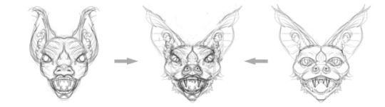
In this sample, the center image is a combination of the better parts for the ones on the sides.
I don’t think I would have come up with the center bat, above, without going through this process. It’s a feminine bat person, with eyes towards the sides, and ornate nose, and a large but not grotesque moth. The ears meet in the middle, and it doesn’t have a bulbous head. I could bat up the ears more, and they could even bee semi-transparent, which would be much harder to do with a mask than a painting (if it’s backlit, I can have warm light coming through them). This mixing and matching stage can be a bit time consuming, but it’s also fun.
One can also simple overlap the heads to see what happens. Here are a few examples of doing that:
The mirror technique
I noticed that a lot of digital painters use the new Photoshop mirror function to draw a half a head and have the other half appear in real time. I can’t do that with my version, but I find an older technique I used to do with tracing paper when I was a kid works even better for me. This is just to make a sketch, then flip it, and overlap it onto the original. Now both sides are the same, but there are new variations, and because it’s perfectly symmetrical, it’s easier to combine with other sketches as I did above.
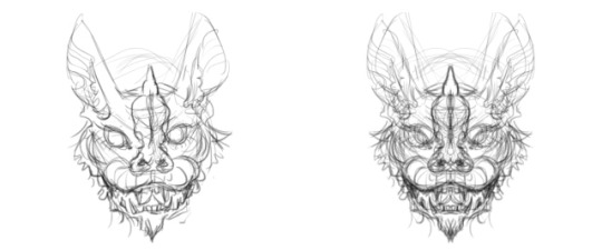
Here’s a 5-minute sketch, on the left, and then right flipped and laid on top.
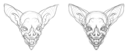
And here’s another. This one’s a bit too like the masks.
What’s next?
I’m planning on making three composite versions from the 9 sketches. I’ll choose the best one, and then draw over it to make changes. After that, I’ll use the basic design and make a version that is off center, at more of a three-quarter angle. I don’t want it to be just a head, so I may put part of a bat wing in the background, and a bat hand in front.
Stay tuned to see how this develops
~ Ends
And if you like my art or criticism, please consider chipping in so I can keep working until I drop. Through Patreon, you can give $1 (or more) per month to help keep me going (y’know, so I don’t have to put art on the back-burner while I slog away at a full-time job). See how it works here.
Or go directly to my account.
Or you can make a one time donation to help me keep on making art and blogging (and restore my faith in humanity simultaneously).

How to come up with more creative creatures I'm working on developing a bat-person for my next more illustrational image, like my Ant Man…
0 notes
Note
❛ you know i will always love you. ❜
ANGST FOR SHIPS SENTENCE PROMPTS .
Funny, how Genji had tried relentlessly all his life to run from the Shimada rule that condemned him within dragon engraved walls that caged him in, all just to find he has to return. To swear in for life, pledge your allegiance and utter devotion to the clan was something many foolish men had done to prove themselves to be worthy of the power and title of the prestigious group, so many people trying to get in when all the youngest son had ever wanted was out. The only way out of the clan was death - and ever did Genji deliver, or rather, his brother.
He was free from the tyranny that was his family expectations, but what freedom could death possibly offer? Plagued by phantom pain and surreal nightmares all throughout his rebirth, he often ponders and yearns for the sweeter release that was death for good. Shed of his name and background, Genji was finally liberated, but why did freedom make him suffer so much?
Yet, all in all, he finds that deep in the darkest crevices of his slowly beating heart, he cannot forgive nor forget the wrongs the clan had done to him. Vengeance is a heavy storm that violently consumes him and despite his reawakening over two years ago, he cannot find the quelling of peace even if he is no longer under the Shimada control.
They must pay.
Perhaps he had been more transparent than he realized he let on, making to leave in the dead of night and a voice that provided him temporary solace at times garners his attention just before he exits the back doors of the Gibraltar base. He doesn’t look back, only pausing for the briefest of seconds with his fingers going lax on the handle. Is it due to guilt? Longing to be away from the cursed home for a little longer? The loss of courage when he’s been found out? He does not know, so he cannot speak. All he knows is that her words ring heavy on his conscience and reverberate in his ears, echoing in his heart. He is blessed to have been granted the privilege of such an honor, but...a thing like him, is undeserving of such darling affections.
The least he can do is spare his...other, a final glancing look, red eyes glowing in the dimly lit sector and she is a sight for his sore eyes, looking almost as fatigued as he felt, but even in the state of her exhausted distress, and the disarray of her clothing and sleek ivory locks swept into a low ponytail over her shoulder, she is still beautiful.

It’s an image he imprints into his brain, a picture he hopes he can revisit if he should close his eyes. He says nothing, merely turning his head forward once more and he pushes the door open and letting in the brisk air of a spring night, stepping into the dark as it slams shut behind him.
0 notes
Text
Photo Manipulation Assignment
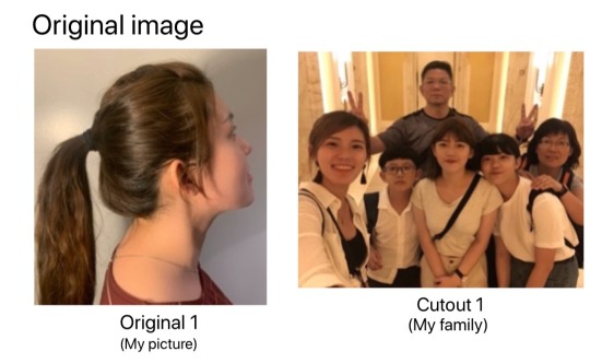
1) Edit 1:
Edited Image title: Miss distance of the family
Original images used in editing: Original 1, Cutout 1
Design inspiration:
I want to use overlay images to create my photos. The first photo is me and the second photo is my family in Taiwan. I want to edit this combination photo using "Photoshop".
What I want to explain is that although I am studying alone in Canada, I still think about my family all the time. Sometimes it is unavoidable for a person to feel lonely in Canada, because of the support of my family, I have an inexplicable motivation to move towards my dream.
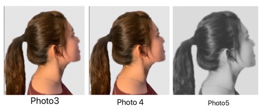
First, remove the background of the original 1 using the back removal tool (photo 3), and use the blur tool to modify the facial features and face shape (photo 4), and then change the photo to a black and white photo. Because black and white photos can make people feel like "missing and remembering." After turning the photos to black and white, add a little depth of field and reduce the sharpness a little (Photo 5).

The next thing is to edit the image in my mind, first remove the background (photo 6) of the original picture (cutout1). Use the blur tool to blur the photo, which can make the photo look more like memories and warmer. After that, the color of the color photo is lowered, and the brightness is increased, and the contrast is also reduced. (Photo 7)

Then overlap photo5 and photo 7. First, remove photo 7 from the background and add a little halo. The halo color I chose was light gray, and then increased the transparency a bit (Photo 8). But you will find that the photo in the middle is still very eye-catching. So I used the imitation chapter tool to adjust the more prominent parts and sharpen the middle picture a bit. (Photo 9)
The case of my creation is an art photo, and this picture tells me how much I miss my family far away. Both photos are real and become a real miss after being combined. I think the art photo is the source of inspiration from the author, even if the reader can't see the original photo itself. It is not news, and it is not necessary to state the facts.

2) Edit 2:
Edited Image title: Breath of autumn
Original images used in editing: Original 1
Design inspiration:
This photo was taken by my family to enjoy the "Sabino Tree". The mother in the middle of the photo is my mother. A Sabino Tree is a tree that turns golden yellow every fall and winter, which makes people feel very romantic. At that time, the news said that there was a place in Huwei ( A Part of Taiwan) filled with orange plumeria pine, so my mother drove immediately. But as soon as we arrived at the destination, we only saw a lot of people, but didn't see the "orange leaves" mentioned in the news? The editing software I used this time was " Befunky ". I want to use this editing software to present the main scenery.

First, brighten the brightness of the original picture, then darken the tone bar, and adjust the color temperature to a warmer tone (photo 2).
After that, I "sharpened the picture". I choose to sharpen the picture because I want to make the scenery more realistic, and the leaves will look more realistic (photo 3).
Finally, I used the brightening tool to make my mother's face more eye-catching and used the elapse tool to adjust my mother to look thinner and taller (photo 4)
-Explain what you did and why you made the changes. Do you think your edited images could confuse or misguide the audience if they can't see the originals?
According to Editing 2, everyone saw the news and then went there. When they arrived at the place, they just saw many vendors selling fruits and souvenirs. This news will give consumers a feeling of being deceived. In my opinion, photographs can be altered to a certain degree in post-production such as changing the brightness, contrast, etc. to improve the quality of the picture。But if you want to edit photos, you must consider morality and realism. Like arbitrarily changing the background and characters, and even misleading the audience.
My idea is that art photos can be edited endlessly. Just publish the finished art photo. Art is a combination of imagination and aesthetics. No matter what editing the author makes, it is done through his imagination.
- If you are a press photographer would you use your edited images as news photographs? Is it ethical news media to publish your edited images and to present them as press photographs? Please elaborate on why your photos should or should not be used by news media?
News photos are about "facts", not false. I don't approve that the photos used in the news have been changed. If the news uses edited photos, it will definitely be very disturbing to consumers.
This is a good example (Editing 2 ): my family and I saw in the news that the place was full of Sabino Tree, but as soon as we reached there, it was not. In my opinion, maybe the news had been bought or sponsored.
- What are the main differences between art and press photography? Are your edited and unedited images press or art photographs?
Photojournalism is to document reality, although it is not. I don't think photojournalism should use edited pictures. If you use edited pictures, it will become "fake news".
Art photography is very different from photojournalism. Art photography is a style created by "aesthetics, beauty, art, imagination". The first edited picture was an artistic photo, created through my imagination and combined with inspiration. The second edited picture should be classified as a news photo. I want to express that most of today's news photos in the society are edited, no matter whether it is a landscape photo or a portrait photo. This makes viewers fall into myth.
0 notes
Last Seen Blogs

sixteenseveredhands
Artifacts, Arthropods, and Anthropology

ratpoison2
ADumbLesbian

hibiscusbrew1
Hibiscusbrew

yuusakuhanazawashole
... Yuusaku-dono?
dog1teeth
|| dogteeth ||