#retired 2020
Photo

Crumble Dog (Retired 2020)
#retired 2020#crumble#dog#retired jellycat#jellycat#jellycat london#jellycat plush#plush#plushblr#safeplush#jellycat collector#plush collector#stock photos
102 notes
·
View notes
Text

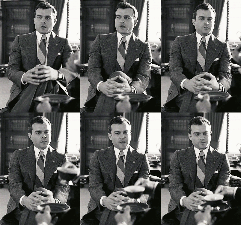






Alden Ehrenreich as Senate Aide
OPPENHEIMER (2023)
#filmgifs#userfilm#filmedit#alden ehrenreich#oppenheimer#Christopher nolan#2020s#Oscar winner#biopic#guys#black and white#characters#coming out of retirement to make a set of my maaan
212 notes
·
View notes
Text
I need all of you to look at Vale's Misano 2020 helmet real quick.

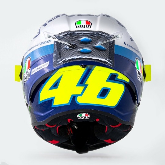
Yep. That little blue pill is Viagra. With one pill already missing from the blister pack.
Apparently the "La Doppia" refers to the double header San Marino GP that took place due to the pandemic regulations, and also just a reference to "second rounds" I suppose. Aldo Drudi, Vale's long time collaborator and helmet designer said that the viagra was a reference to how he was an old man at 40 and would need some extra energy for the double race.
Apparently when Vale set the fastest lap during FP3 of the Misano GP, the commentators talked about how he was "riding hard".
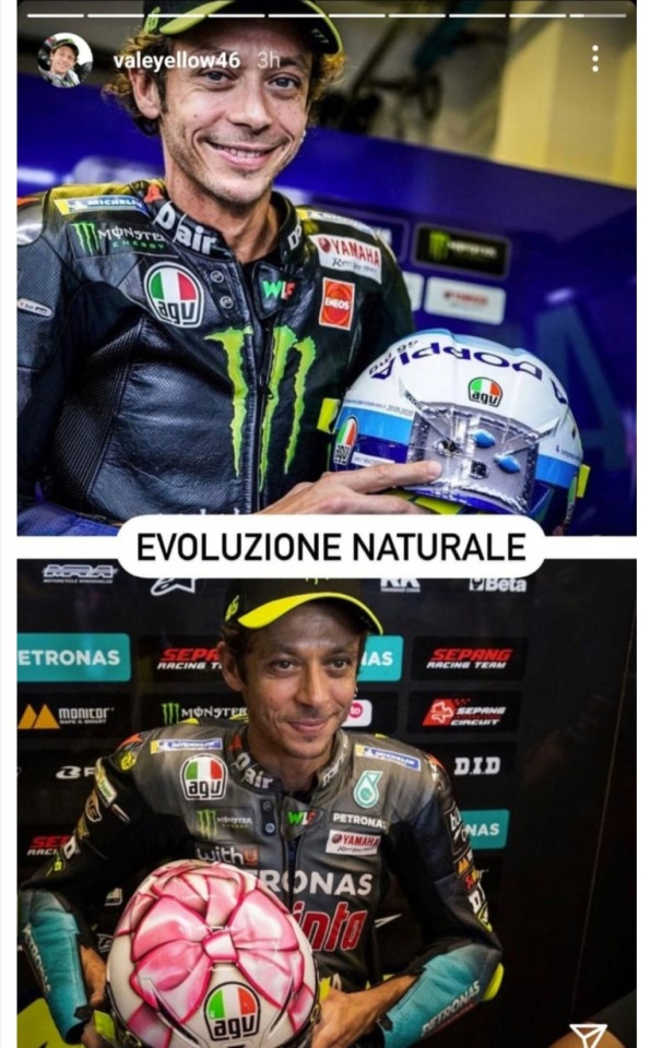
Also because he's a cheeky little fuck he posted on his ig about how his Mugello 2021 helmet announcing Francesca's pregnancy with their daughter was a natural progression of the Misano 2020 Viagra helmet. It's stupid but who else would dare to do something like this.
#he needs to be in jail#never stopped laughing at his own ass#most unserious man ever#also while looking around for this helmet I found this automotive advice blog from India#and one contributer had written a long emotional post about his retirement and how much Vale meant to them#crazy because I didn't expect him to be big in India#but he is#apparently when Vale was in Delhi for auto expo in 2010 they hung around his hotel lobby to meet him#which was such a cute detail#:)#also I guess my helmet obsession is never ending I suppose#valentino rossi#vale#viagra helmet#misano 2020#San Marino GP 2020#motogp
83 notes
·
View notes
Text

Jellycat of the Day | 10th January 2024
↳ Bertie Bear | 2020 Retired Design
"Classic cuddles."
#bertie bear#jellycat#jellycats#jellycat retired designs#retired designs 2020#teddy bear#bear plush#soft toy#stuffed animal
70 notes
·
View notes
Text
No. 1 - Lufthansa
We begin with a large fish even by the standards of the large pond in which we operate. A very intentionally chosen large fish. Deutsche Lufthansa is Germany’s flag carrier and the second largest carrier in all of Europe by passenger volume. In 2018, they unveiled a new standard livery for their fleet of airplanes, and it...well. It’s this.
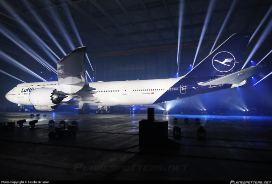
Even the presentation - good lord, is this an auto show?
My feelings on Lufthansa’s 2018 livery are visceral. There’s no mental evaluation required, no taking it in, thinking about the choices made - I look at the modern Lufthansa livery and immediately, profoundly know that I hate it. And that’s not just because of the specific choices made - which are bad - but because of the space they occupy amidst a creatively barren wasteland within livery design. This is going to be a very long post, which isn’t standard for this blog, but my goal for an introduction is to break down exactly the sort of design that made me feel the need to start doing this to begin with.
But in reality that’s only the beginning. Yes, Lufthansa’s livery is specifically disappointing, but it is so much more than that. It is the purest distillation of the greatest challenge aviation faces today, far weightier than scheduling issues, outdated IT, and runway incursions. It is not the worst example of it, not in the slightest, but it is a large airline which has a very textbook presentation of symptoms and thus feels like a great example to describe exactly what I hate about this sort of design. Let me explain.
Essentially, airlines have found a formula. It goes as such:
Almost entirely white body. (There is a name for this trend: Eurowhite.) In some cases, there may be a colour on the underside, generally either a light grey or whichever secondary shade the airline has committed to. In the case of this Lufthansa livery, it is just white.
Aside from the white body there will be either a single colour (generally some dark blue, or less often some sort of red) or a few colours, usually but not exclusively on flag carriers to match their national branding. (The proliferation of red, white, and blue flags out there means that a disproportionate number of airline liveries are these colours.) Unless it is literally just a white plane meant to be as generic as possible for short turn-overs when leasing, it will at least attempt to have some sort of design, but it will be minimal, and:
All of the detail will be on the tail. There may be coloured winglets or engine nacelles, but other than that it is only at the rear of the plane that you begin to see any interest. Usually this is just a logo, though it may be an abstract design which looks like a default tumblr header. It will often only be on the tail, with nothing at all on the body proper.
The name of the airline written in a sans-serif typeface which is set as default on at least one word processor. Rarely will anything creative be done with this. It will (usually, except in egregious cases) match the impotent attempt at graphic design which has been confined to the empennage and it will have all the charm of a large retail chain’s flyer describing the benefits you’ll definitely totally get if you work for them - sickeningly corporate. Low-cost airlines may slightly vary the theme by putting their website onto the livery, either towards the back or just instead of the airline’s name. The brave will also write it on the ventral fairing, but most don’t even bother with that simple act. Some airlines have their name written in the language spoken in the country they’re based in, usually beside the English text, but most are only in English despite operating in countries where this is not the most widely spoken language.
Not every livery which has these features is badly designed, as seemingly small changes can make all the difference. There is the occasional livery that fits most, if not all of these features that has some clever tweaks or design choices which makes me actually think it’s fine, acceptable, maybe even decent. (I have taken the initiative of making sure a few of these are among my early posts, just to demonstrate that it can be done). And some airlines depart from this entirely and come up with something even more hideous. Yet I somehow find myself respecting even these more than I do Lufthansa.
The Corporate Standard Livery Design (Lufthansesque design, if you will) is - and I do not think I am being dramatic at all here - an epidemic. Taxiing through most airports, you sometimes have to actually try to tell the planes parked around you apart in the sea of red, blue, and mostly white. And I spend a lot of time looking at planes.
These liveries do not only fail to inspire me. They instill in me a profound disgust. They are not trying to be good. They are trying to be what I described earlier - decent, not worth complaining about, because that’s cheaper and easier than designing something good. Graphic design is not anyone’s passion here. They’re just trying to toe the line. They’re so poisoned by the modern minimalist-design brain virus that they don’t realise that to be acceptable a livery this simple needs to do something interesting. There must be a creative decision made somewhere, a compelling feature, or you may as well be flying an MLA-formatted plane. In their striving for adequacy they become not just ambient, but lukewarm. They are a bottle of water which has sat in the sun for so long that when you drink it, even though you’re overheating and parched, it feels only negligibly better than the air you’ve been breathing in.
To be fair, I do not only hate the Lufthansa paintjob because it exemplifies whatever-ness. Even in an industry saturated with gross in-flight nothingburgers served with some stale biscuits and a paper cup of Lipton tea, Lufthansa manages to offend in specific and unique ways.
Throughout its long history Lufthansa has had a handful of different liveries, but from 2018 onwards this has been the situation. They’ve never been brilliant, but it’s only gotten worse over time. I normally would commit to a separate post for historical liveries, but in a move that I don’t foresee becoming particularly common I’d like to talk about the history and evolution of Lufthansa’s liveries from the golden age to now - the fall, if you will.

(image: lufthansa bildarchiv)
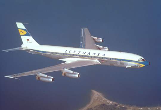
Their early liveries were already pretty much plain white or metal, but they still had a few features that made them seem a bit less like photocopy paper which was meant to be printed plain blue but only got through a tenth of the sheet before ink ran out. To begin with, they used a lighter blue and combined it with a vivid yellow to add some actual visual interest. The layering of the yellow over the blue where it curves around and below the nose and on the ends of the tailplane actually draws the eye. The font choice is nice and legible, spaced apart in the center of the fuselage. I imagine it was easy to read even from far away. (Shame it’s a bit blocked by the wings from some angles, though.)
(image: lufthansa bildarchiv)
This early 707 design keeps the cheatlines extending past the nose but makes them sharper than the ones on the Connie to match the sleek profile of the jet. Back when this plane was painted adding white to your plane was a choice rather than the thing everybody was doing, which allows me to respect it for the choice it was instead of considering it the factory default. The bottom half, denoted by the cheatline, is left unpainted, which only adds to the sleekness of the overall profile, and the text is clear and plain but still aesthetically pleasing. The 707 is by modern standards pretty antique-looking; you can take one look at one and tell it isn’t particularly streamlined. This paint scheme, though, makes the plane look sharp and aerodynamic, despite not being revolutionary. I would go so far as to say I like this particular livery. This is, unfortunately, as good as it gets.

Oh. Oh no...
Let’s assess the damage here. The cheatlines now simply meet at the front without wrapping down to the belly of the plane and the nose is a simple black tip. I like it when airlines paint their planes’ radomes, and I wouldn’t mind it here if not for what it was replacing. The font has been replaced with a generic sans serif font which is closely spaced and put up into a corner, like the name on a homework assignment - it’s not really part of the total package, just there for administrative purposes. Most upsetting to me is the tail. While I wouldn’t say I love the little section on the old plane, it at least felt like it belonged there, creating a second blue-and-yellow layer above the white. Its placement on the fin above where it begins to taper gives the plane a bit of an aerodynamic feel. It’s certainly not changing the world, but it feels at home in the livery.
The new fin is a sharp downgrade. With nothing to mark the transition the fin abruptly goes from the white of the upper fuselage to a shiny blue which contains an enclave of the only yellow to be found on the entire aircraft. This makes the yellow stand out, as it has nothing to tie it in with the rest of the plane, and the fin itself feels almost like it’s been Frankensteined onto the fuselage from a different plane by a different airline. There’s nothing to mediate the transition from a block of white to a block of blue, like how the cheatline separates white and grey. It just is blue now, stop asking questions. This also means that the only part of the plane that the eye is really drawn to is...the tiny portion of the whole that is the fin, which may as well be floating detached in midair.
This is foreboding. Knowing what I know now, it feels like looking back at when a romantic partner began to act strange years later, after the divorce, as you walk by the house he bought with his mistress.
(image: g najberg)
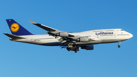
The most recent, and only, time I flew on Lufthansa was in 2014 and was aboard one of their 747-400s. (Actually, if you’d still like to fly on a passenger 747, Lufthansa is basically your only option.) At the time, they looked like this. This is...just sad. They got rid of the cheatlines, because that’s trendy now, and they painted the whole plane white and made an attempt at lip service to the old metal lower half by painting just a bit of the plane grey, like if a human stepped into a puddle of paint that only covered the very sole of their foot. And I’m being generous by showing a 747, a plane which inherently makes any livery look less boring by being interestingly shaped itself, instead of the classic slightly pointy single-decker tube. Not to mention the double-decker design makes the text vertically centered instead of the default Lufthansa look of awkwardly shoved nearly all the way up the fuselage.
In defense of the modern livery, it’s possible to argue it’s an improvement on this. Honestly, looking at them next to each other, it’s difficult to pick out which one I find less defensible.
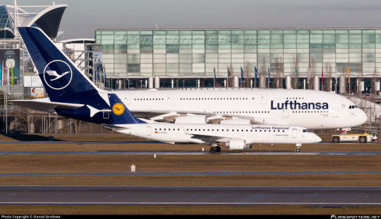
But then you see D-AIDV, an A321 painted in a heritage livery, and you feel the immediate, visceral “no!!! no go back!!!” as you remember that this is a false dichotomy and we could have something so much better if they weren’t peer-pressured into generic modern design.
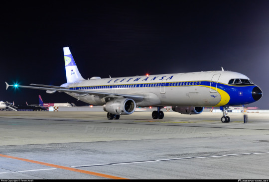

And for what? For this?

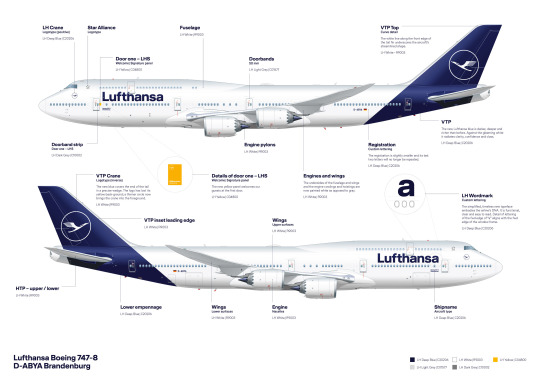
(image: hvdfonts)
For the third time, I remind you of what we have been reduced to. We have achieved a state of reductio ad absurdum where this barely qualifies as a design. This plane is more or less a white blot. You can put as many insets as you want and it is still a white blot.
I am relatively sure that the font used is literally Helvetica. EDIT: I have been informed that it is not, in fact, Helvetica, but a custom typeface that happens to look almost exactly like Helvetica. This is, in my own opinion, worse! They did apparently use Helvetica in the past, though. Here is a very detailed description of the design process of the font, which manages to contain a grand total of zero ideas.
I would hate this on its own already, but it’s also so closely spaced and located so far up that it makes me feel like I’m suffocating. In my own experience as a dyslexic person, kerning is the single weightiest feature when it comes to if I can easily read something or not. While Helvetica, ugly though it may be, is generally considered a very legible font, any benefits from that are more than cancelled out by committing to making sure the entire name of the airline fits between the frontmost two doors with room to spare. It feels almost hostile.
Now, all given, I at least somewhat enjoy the shade of blue used for this livery, which is darker than the normal fare. I do miss the way the grey broke up the endless white space, though, and I mourn the yellow even more - in addition to being something to look at, losing it has also lost any visible reference to the flag of Germany, the country for which Lufthansa is the flag carrier. They don’t even have the black part of the German flag despite that being basically free. If they went for black instead of dark blue I would honestly respect this a hell of a lot more. One of the most recognizable flags in the world and instead your airline looks like a discount SAS.
Yeah, I said it. If we want to go even further with comparisons by including airlines that aren’t Lufthansa, this is basically the SAS livery. Except not, because the SAS livery does a lot that this doesn’t.
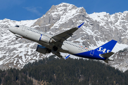
This is about Lufthansa, not SAS. I’ll look at SAS soon enough, because comparing their look to Lufthansa’s has made me appreciate it in a way I never used to. But I don’t think I need to elaborate too much for it to be clear why SAS’s livery works and Lufthansa’s doesn’t, despite the superficial similarities. SAS took their absolutely horrid previous livery and turned it into something which might not wow anyone but at least feels uniquely theirs, while Lufthansa had something which accomplished much the same and then diluted it into nothingness, Eurowhite writ large. Two washes and you’d wonder if your Lufthansa flight is actually a Smartlynx lease.
The way that the blue slices into the bottom of the fuselage and doesn’t fully cover the tailfin is...something? It’s a design element. It’s not nearly enough to save it, but it’s a design element. However, this presents another issue specific to Lufthansa’s paint job, best demonstrated with a specific plane:
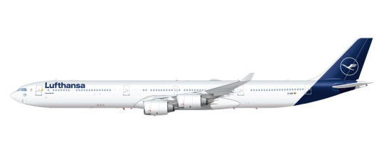
(image: lufthansa)
Lufthansa is the world’s largest operator of the Airbus A340, a somewhat eccentric airplane which is perhaps best thought of as a four-engined A330. I love this airplane, and am delighted seeing it overhead on my walk home from work, because Lufthansa is kind enough to operate a daily service with it to my home airport, but that’s beside the point. The point is this: what I have pictured is specifically the A340-600, which is the world’s second longest in-service airliner. Yes, longer than the A380 and the 747-400, and, in fact, only shorter than the 747-800. With a plane this long, the Lufthansa livery creates an incredible look of rear-heaviness. This plane looks like it should uncontrollably pitch up until it’s perpendicular to the ground every time it takes off. Of course this effect is less pronounced on shorter aircraft, but it’s still there, and I dislike it.

You can barely even tell there’s paint at all on a much smaller plane! And the white bit on the front of the rudder which looks okay on a conventional empennage looks downright horrible when it’s only on the very tip of the t-tail’s forward point.

Oh, and when you take the windows out for a freighter conversion it gets even worse.
This is a generic-brand airplane. It genuinely reminds me of generic branding. There is a specific brand that has this exact appearance and I can’t remember what it is but it’s right there and I’m fairly sure I’ve seen it at CVS. I don’t think that’s what you want to go for when designing an airline livery, especially for an airline representing a country, but if Lufthansa wasn’t going for that they’ve failed.
__________________________________________
Overall, Lufthansa’s livery is superbly boring and not terribly well thought out. It’s not worth this absolute dissertation on its own, but I’ve singled it out to complain about general trends, and for that I probably owe it an apology. Said apology is predicated on the fact that it is still a very underwhelming and bad design which could have used a lot more thought. There are a million ways this could have been made decent, and none of them were implemented because that would have taken effort and time and creative vision. I think this post actually required more time and effort than Lufthansa put into designing their planes.
That said, Lufthansa gets a final grade of D. It’s...bad, it definitely is. There’s the vague flavour of the start of something, like the very distant smell from a barbecue happening three blocks away, but is that really even a redeeming factor?
No. The second-largest airline in Europe should be able to do better. If I have to stare at rows upon rows of their planes any time I’m at a German airport, they should have the decency to make them interesting to look at.
#tarmac fashion week#region: europe#region: west/central europe#lufthansa#region: germany#grade: d#era: 2010s#era: 2020s#era: 1950s#era: 1960s#era: 1970s#era: 1980s#era: 1990s#era: 2000s#retired liveries#flag carriers#double sunrise#long haul#lufthansa group#lufthansa line#scandinavian airlines system#deltalike
183 notes
·
View notes
Text

(Retired) OC from homebrew Cyberpunk 2077 TTRPG. His name is Szybki (Quick) and he likes cowboy hats
#cyberpunk#cyberpunk 2077#cowboy#art#digital art#original character#gayguy#used all brainpower and created a personal babygirl#he's retired now but he kicked ass hard#rpg#ttrpg#cyberpunk 2020
21 notes
·
View notes
Text
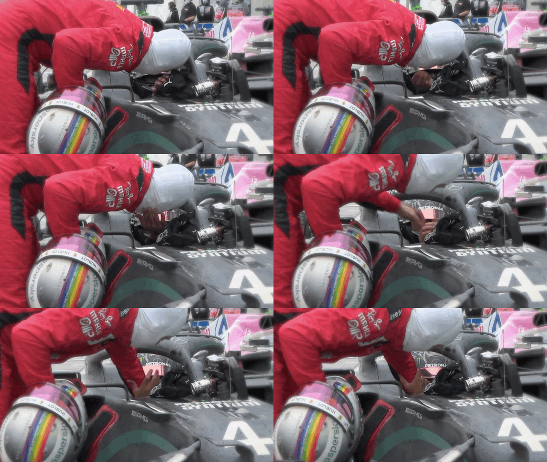

turkey 2020
#sebastian vettel#lewis hamilton#sewis#my gifs#turkey gp 2020#i miss them okay#also I need a part 2 in 2022#I can't have seb retire and never have a sewis podium again
353 notes
·
View notes
Text
telemetry doesn’t lie. he goes on throttle meters before everyone else, even before his own previous laps. if that’s not enough for you, he also doesn’t bother to counter steer which every driver does instinctively to prevent a crash — the most blatant evidence that he had no intention of saving it.
let’s put that into plainer words. perez cheated in monaco. the only thing he deserves is a DSQ, and certainly not respect from his teammate.
he chose to fuck over his team and his teammate because he couldn’t cope with the fact that he’s simply not good enough. at a time when the championship was still very close.
perez is the selfish one. perez is the one who put his team in a untenable situation. he has none of my sympathy and all of my scorn.
btw RBR, max told you where he stood, what he would not be willing to do. you asked him anyway, and all he did was remain a man of his word. so have some shame too.
#max verstappen#he did nothing wrong#checo perez is a scumbag cheater and that’s really the bottom line#this mess is the colossal failure of perez and rb#this mediocre second driver should have retired in 2020#take your equally untalented counterpart carlos with you too#f1blr
134 notes
·
View notes
Text
.
#called my mom at 7am out of a desperate need for validation#had a 37 minute long convo that amounted to ‘you should look into therapy’#(in a much nicer and more constructive way it was actually a very good conversation’#and she told me that she’s been in therapy for the last year#and that it did wonders for her mental health#and that she went from being on the verge of divorce#to looking forward to spending her retirement with my dad and expanding her home business to cover health insurance#since my dad is currently unemployed and most likely isn’t getting another job (industry and & age related reasons)#and ofc I’m glad to hear that they’re doing better#but I’m wondering if she got thru everything she needed to in therapy#and if she’s sorry about last winter#when for two days in a row she screamed at me for hours on end#about what a failure I am and how much I’m a drag on the family#how I was responsible for their impending divorce#and she was going to gift my dad divorce papers for Christmas and it would be my fault#how I looked like a clown at my recent graduation#and a bunch of other things#if she’s sorry for how every year since I was 14 she’s screamed at me about how I’m responsible for their being on the rocks#how it’s my fault my siblings will grow up in a broken family and we’ll have to sell the family house of 25 years to pay for the divorce#for when in April 2020 she tried to [redacted] herself in front of me while telling me it was my fault and I’d pushed her that far#all while I whisper-screamed for her to stop bc it was midnight and my siblings weee sleeping in the next room#she has never apologized for any of those and I don’t want to bring it up now#bc I don’t want to relive the past#but I wonder#mother mention cw#negativity cw#divorce cw
13 notes
·
View notes
Photo

Bashful Dodo (Retired 2020)
#retired 2020#retired jellycat#jellycat#jellycat plush#jellycat london#jellycat collector#plush collector#plush#plushblr#safeplush#stock photos
56 notes
·
View notes
Text

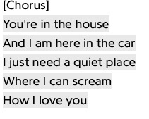


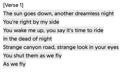

alpha and omega - supernatural / i want you - mitski / fast car - tracy chapman / diary of a wimpy kid; rich and famous - u/judeggrogg / brando - lucy dacus / graceland too - phoebe bridgers / dead of night - orville peck / you are jeff - richard siken
#happy two year anniversary to the greatest american mass hysteria#moonstone's word webs#word webs#word weaving#wordwebs#wordweaving#supernatural#destiel#november fifth 2020#november 5th 2020#spn 11x23#supernatural 11x23#mitski#retired from sad new career in business#fast car tracy chapman#diary of a wimpy kid#lucy dacus#lucy dacus home video#phoebe bridgers#graceland too#punisher phoebe bridgers#orville peck#richard siken#youre in a car with a beautiful boy#thats where queue loved me
54 notes
·
View notes
Text

Jellycat of the Day | 26th October 2023
↳ Bashful Dodo | 2020 Retired Design
"Do, do make friends with a dodo!"
#bashful dodo#jellycat#jellycats#bashfuls collection#jellycat retired designs#retired designs 2020#dodo plush#soft toy#stuffed animal
78 notes
·
View notes
Text
No. 8 - Flair Airlines

I’m pleased to announce that this post is my first second ever request! (Sorry about the bumping back in the queue. Blame jetBlue, not me.) @fungaloids has requested that I cover Canada’s most complained-about airline, so let’s see if the self-proclaimed only ultra-low-cost carrier in Canada can add my opinion of their livery to their 15.3 complaints per 100 flights!
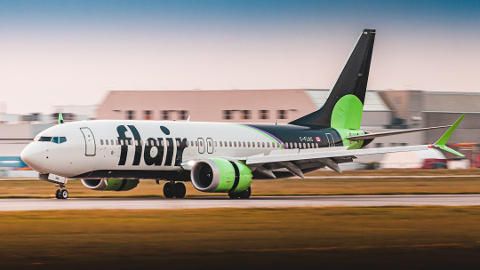
Being a relatively new carrier, you might not expect me to have anything to say about the history and evolution of Flair’s livery, but I really feel like I need to talk about the utter whiplash this airline has inflicted on me. My familiarity with Flair was only in passing beforehand, so I don’t know if Canadians have had to experience this in real time, but this company has existed since 2005 under two names and has had three liveries, none of which remotely look like they belong to the same airline.
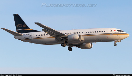
This cannot possibly be the same airline, right? This fully-servicable-yet-entirely-generic livery with what looks like a hotel logo badly centered on the tail is Flair? No, seriously, that tail looks like it’s photoshopped on badly but this is allegedly a candid photo.
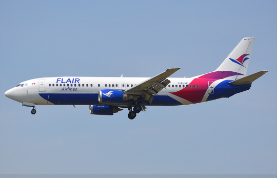
(image source: johnnyw3)
In 2017 they rebranded to this very...different look. I’m not here to talk about this but I must say it while I’m here - I enjoy the belly-centric livery and the blocking of contrasting colors here but I cannot get over how bad the wordmark is. This is a wonderful example of a livery being somewhat interesting but not very good.
Just a year later, Flair, formerly a charter operator, decided to begin scheduled service as an ultra-low-cost carrier. Clearly this set their financially minded brains churning, and what they churned up was toxic sludge.

It only took them two years of the blue and purple to decide that wasn’t the move and rebrand again to a color scheme of black and what they themselves describe as “acid green”. And I...
Oh. I’m angry at myself for this. I like it?
Let me explain myself.

I think this design is delightfully tacky in the best of ways. I like it when low-cost carriers lean into the fact that they don’t need to take themselves seriously. I think billboard-style liveries are excellent on carriers like this. We've gone from that utterly generic wordmark to this huge bold easily recognizable affair that spans the height of the fuselage, with the ascenders and big circular dot on the 'i' as a nice little pop-art-looking touch. It's a tiny detail but I also love how they lined up the crossbar on the f to be just above the windows. The huge and legible airline name keeps the white bits of the airplane from being too unbroken and boring, and the bright color scheme pops vividly.
I don’t think any other airline uses these colors, at least not that I’ve seen. The tiny bit of purple is a very classy touch, and I love the way the green is used to accentuate the black. They’re basically separate blocks, not mingling - one on the body and one on the nacelles and winglets - except for the big spotlight of bright searing green right on the horizontal stabilizer, like it’s going “look! You use this to pitch the plane up and down!”. The black section of the belly is visible from the side and helps keep the front of the plane from looking empty without creating clutter or taking away from the primary design on the tail. The entire design has a delightful pop art vibe to it, and like I said, it suits Flair’s business model to not brand itself in too self-respecting of a way. I even like the website on the belly. You can even advertise to people on the ground when you fly over them! Now that’s hustling.
This livery gets a B+.
But wait...what’s this? Well, as it turns out, Flair might have an all-737 fleet (very typical for this business model), but they operate two types of 737, and each has its own livery. What I just showed you is the livery they use for their 737MAX 8 aircraft. But what about the 737-800 NG which make up the rest of its fleet?

Well, she sure did sit in a pile of green. That said, this....is worse.
It maintains the pop art look, which is good, because I’d be furious if it didn’t, but aside from the painted radome (always a good feature due to how it makes airplanes look sort of like a little dog) this is a downgrade in every way. (To be clear, I think a painted radome would look weird on the MAX livery so I’m not mad they removed it; I just like it on the NG livery.)
It just feels like a bunch of unrelated bits merged together. It has that thing I hate where the tailfin is a different color from the main fuselage with no transition. The main thing here, of separating the plane into three vertical blocks, would be solid if there was anything which transitioned the fin to the main body (Uzbekistan Airways does a solid job of this, but it could literally be a teeny stripe and it would work), but it just feels like the black gets overpowered by the white and green and the reduced contrast honestly robs the green of its punch.

Also, they removed the text on the belly. Come on, Flair.
Overall, this livery just feels a lot less dynamic than the MAX one. I’m finding myself relieved that they seem to be phasing it out for an all-MAX fleet, with only two left in service. The phase-out was assisted, presumably, by the fact that Flair just had four of their leased aircraft repossessed by the lessor for defaulting on payments. Whoops!
The 737NG livery gets a C.
That gives Flair an overall GPA of B-, according to my calculations. It feels right, although I do feel pretty disappointed that I ended up more or less liking it. I feel like getting yet another complaint would be on brand for them. Does that count as a complaint? I don’t know. The livery’s good.
Thank you again for the request! I greatly enjoyed reviewing this very green plane.
#tarmac fashion week#requests#grade: b+#grade: c#region: north america#region: canada#era: 2010s#era: 2020s#flair airlines#low cost carriers#ultra low cost carriers#retired liveries
43 notes
·
View notes
Text
Not sure if this has been brought up before, but I don’t think that there’s that significant of a secret behind the mural man. LIke? Apparently the political figures of Vinyl City are determined not by public voting (alone) or running for candidacy, but through the Lights Up competition for a combination of 1) completing the arena, 2) ‘lighting up’ the stage as the competition implies, and 3) passing the final vote from the NSRtists and the Head. If there was only 5 musicians and a head with NO vacancies, why would any of the Charters vote ‘yes’ to the contestant/s if there’s a risk in getting replaced?
I would think that the mural man filled in that 6th artist slot present even on DJ Subatomic Supernova’s satellite, and I suppose the mystery then would be if their absence was either through retiring, quitting or simply the end of their term as a Charter. Like, instead of an election season or whatever, Vinyl City holds Lights Up Auditions during a set period during that 6th Charter’s crossover or something; on the satellite again, it’s not as if we see the mural man’s name in 6th (we see Bunk Bed Junction’s), maybe they’re already gone or are archiving stuff from their district. Does Tatiana temporarily hold ‘charter’ to the district? Does she hold the platinum disc until a new position is filled? Is Festival Plaza that district that once had mural man as a Charter? Do you think with the Rock Revolution and the subsequent approval of indie bands that the position was left empty or even completely abolished?
idk, lmao-
#mural man#no straight roads#nsr#i mean i could be completely wrong on 1) this being a thing that's been mentioned and 2) clearly not knowing the mystery enough#i mean i played the game back in 2020 and only noticed it playing it again this year 2023 so lmao#a little bit blinded by the tatiana fight because i cannot carry a rhythm for my life and only like idk... sometime recent#that i got the achievement for 'don't get knocked out idiot' lmao#but like i just wanted to think about the politics (even if surface level) of vinyl city lmao- it's just so odd#take out the music part of their political system and you've essentially got idk a talent show arena election system#without that extra slot of ambivalent 'i'm retiring/quitting/ending my term' charter seat#it's like 'who hasn't met the standards of chartering their own district'
17 notes
·
View notes
Text
ok wait another thought from the podcast. seb actively using the word “recover” to talk about him leaving ferrari and the toll those months took on him. i’m just so happy that he’s in a better place now and is excited for the next chapter instead of it being something he has to recover from. that’s why despite the shitty car and fluctuating results i think he’s always going to appreciate the two years at aston. he got to heal before leaving the sport he loves behind and now he gets to leave on his terms - and in a far happier place in his life
#sorry i just#IMAGINE if he retired after 2020 and how hard that recovery would be#it pains me to even think about#sebastian vettel#seb#he’s so well adjusted it’s incredible#seb week
41 notes
·
View notes
Text
i miss the old tumblr so much
#and im not talking about interaction so don't come at me lmaoo 🔪#but like when all moots were still around.. like yk my gen of writers from 2020-21 if y'all are reading this i miss you#like the community was so big and so loud and everyone supported each other!! we'd have huuuge ass chats and would talk for hours in nets#now no one bothers to hype each other up anymore :( no one plays ask games or drops in to say hi#and no one's happy about other writer's success or maybe im just hallucinating???#idk there's just a lot of negativity (from anons and within writers etc) now#and a lot of lil groups too!! also a sense of inferiority and superiority i feel :((#back in 2021 we had sooo much fun and it wasn't so.. lonely being here?#idk i just miss it.. and im like 70% sure ill also 'retire' once cmi is finished#ill try and post some stories ive been looking forward to before that but#yeah i feel like the chapter's slowly closing 🥺 i just miss ppl a lot idk if y'all are here pls say hi!! 🤍
9 notes
·
View notes