#I do the drawings in my sketchbook before uploading and colouring
Text
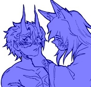
Sanegiyuu WIP I am growing more comfortable with digital art now I think, I’ve done a few practices I’m very happy ///^•^///
In my sanegiyuu loving hours again they just make my day
#kimetsu no yaiba#demon slayer#artists on tumblr#demon slayer art#giyuu tomioka#kny giyuu#kny tomioka#tomioka giyuu#sanemi x giyuu#sanegiyuu#kimetsu no yaiba sanemi#demon slayer sanemi#sanemi shinaguzawa#demon slayer shinazugawa#digital wip#digital art#digital illustration#digital artwork#digital artist#I do the drawings in my sketchbook before uploading and colouring#and this was actually a massive one#and like idk how I did it#one moment I was sketching something and then I was done in what felt like 5 minutes#which ik it was not 5 minutes#the hyperfocus goes hard for sanegiyuu#so does the back pain TT
139 notes
·
View notes
Text
𝐓𝐀𝐊𝐄𝐍 - 𝐒𝐋𝐈𝐏𝐊𝐍𝐎𝐓

𝐏𝐚𝐫𝐭 𝐬𝐢𝐱 𝐨𝐟 𝐓𝐚𝐤𝐞𝐧.
𝐖𝐚𝐫𝐧𝐢𝐧𝐠𝐬: Mentions of kidnapping, mentions of injury and Sid mocking your moans.
𝐖𝐨𝐫𝐝𝐬: 1116
𝐀/𝐧: HALLO! Im currently sick so uploads might be more frequent for the next couple of days. MAY OR MAY NOT!!
NOT PROOFREAD‼️
I woke up in Chris's arms, his mask was slightly off centre and I could see his lips.
"Stop staring," he groaned as he sat up.
"Wasn't staring, I have fixated eye syndrome," I said.
"Mhm, sure," he grumbled.
He got out of the bed and walked over to the door, "come on."
I furrowed my brows but followed him despite my grogginess. He took my wrist in his hand and pulled me towards the kitchen before pointing at a seat, "sit."
I did as I was told, guaranteed, I felt somewhat safe around Chris but I still didn't know what any of them were capable of if I didn't obey them. He opened one of the top cabinets and pulled out a first aid kit.
"Couldn't you have done this in your room?" I narrowed my eyes at him.
"Mick told me he wanted to show you something today so it's better if I do it in here," he shrugged.
"Any heads up on what it is?"
"All he said was he wanted to show you something."
I just nodded and held out my hands to him. He removed the bandages and took a look at them, the swelling had gone down and the bruises had gone a different colour whereas the scabs and cuts were very visible but completely fine.
"You won't need them re bandaged but go careful," he said as he put the box back in the cupboard.
"What happens if I don't?" I raised an eyebrow.
"Attitude," Mick warned as he entered the room, "you need to go get dressed."
I turned to look at him, he was just wearing his mask and a pair of black sweatpants. Me on the other hand, I was still wearing Chris' boxers and shirt. I got up from my seat and shuffled my way through the halls until I reached an open door, I peered inside and saw Sid sat on a roof swing while flicking through a comic.
"Has that one got words, Ivy League?" I smirked.
"Fucking Christ, you scared me," he placed his hand on his chest, "only a few but you said it counts."
I rolled my eyes then studied his room from the door, "you just gonna gawk at me or invite me in?"
"Wanna come in?" He offered.
"Yes, thank you," I replied and sat on his bed, "do you know where Mick is showing me today?"
"Nope. Did you have fun last night?" He smirked.
"What do you mean?" I avoided eye contact.
"Please, Chris. Fuck me, Chris," he mocked me with a laugh.
"Shut up!" I gritted my teeth at him.
"Fuck, ahh~ Chris," he continued his mocking.
I got up from his bed and started to walk towards the door, "wait, Y/n don't go. I was just joking."
"Mhm."
"I'm sorry," he said quietly.
I stopped in my tracks and walked back into his room. I one again looked around, my eyes landing on a sketchbook on his desk, "can I see?"
He nodded and went back to reading his comic. I flipped through the pages, some had drawings of flowers, some had drawings of bugs while others had drawings of... body parts.
"I'm a boob guy," he whispered in my ear.
"Stop doing that!" I gasped and swatted his chest.
"You like them?" He asked pointing to the sketch of boobs.
"They're very real looking, I'll give you that," I nodded slowly.
He rested his head on my shoulder, watching as I flipped through the pages. His arms held my waist tight, I could tell he just wanted some comfort — and I didn't blame him because I did too. However, our wholesome moment was cut short by Mick calling my name.
"Mick needs me but I'll be back," I waved to Sid.
I ran down the hall before running directly into Mick - who was now wearing a plain black shirt- "where were you? And why haven't you changed?" His blue eyes bore into my soul, staring into me as if he wanted to know more about me.
"I couldn't find my room," I replied shyly. I'm not gonna lie, Mick scared me - he was at least six foot five with black hair and blue eyes. Every time he looked at me, his eyes held one emotion — what emotion it was was hard to determine without seeing the rest of his face. It could be anything from hatred to admiration or annoyance to lust.
"It's just down here," he replied, grabbing my arm and leading me to a door with so many fucking locks on the outside.
"What should I wear?" I looked up at him.
"There should be a knitted sweater in there, so wear that with anything," he said before closing the door behind me.
I went over to the closet in the corner of the room and opened it to find a few of my clothes from my house and some clothes I hadn't seen before and amongst all of them was one knitted sweater. I grabbed that along with a pair of mid-rise jeans and my favourite Converse shoes.
"Im dressed!" I yelled to Mick on the other side of the door.
He let me out and held my wrist tight, pulling me towards two big wooden doors.
"I thought I'd take you out to the garden today, Clown gave me the green light to," he said, this time, a smile was evident in his eyes and slightly on his lips from what I could see.
I also smiled, for the first time in what felt like ages, I was finally allowed to go outside.
From the second I stepped foot outside, I didn't want to leave. I could hear the birds, I could see the sky and the minimal clouds, I could smell the fresh rain that must've fallen the previous night and most importantly of all, I could feel again. I could feel like a human and not just an object that had been stolen, I could feel... feelings again — happiness, anger, contentment and fear. "Look here," Mick said as he dragged me - again - towards a flower bed.
"Are these your flowers?" I asked while inspecting all the different kinds.
"Yep, all of us got to add a couple pieces to the house that we thought you'd like and I chose these and something else you'll see later," he replied.
"Mick, they're lovely!" I beamed as I hugged him tightly.
I could tell he was unsure about the hug but he nonetheless hugged me back, rubbing soothing circles on my back with his thumb.
Once again, our sweet moment was cut short by someone yelling our names.
#slipknot#sid wilson#joey jordison#paul gray#chris fehn#jim root#craig jones#shawn crahan#mick thomson#corey taylor#author#ao3 writer#writer#issie https
12 notes
·
View notes
Text
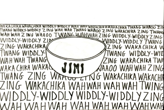
Project: Movement
Poster No.2: "Jimi Hendrix's Favourite Meal"
Basically this poster is referencing the onstage gimmick of playing the guitar with your teeth, a technique Jimi Hendrix was well known for. I figured since he did it so often, surely his favourite meal would be a bowl of guitar strings.

I started off by drawing it in pencil on my sketchbook and went over it in black marker. I took a photo and uploaded it to Photoshop so I could enhance it digitally, which is something I never considered doing before until I did the Graphic Design workshop. For some reason I thought I would have to draw designs digitally if using photoshop.
The colour palette I chose is a tribute to the colour of Hendrix's attire and guitar from his 1969 Woodstock performance. I also found the pattern for his guitar strap and used it for "Jimi" written on the bowl. I chose the colour gold for the strings as it's a symbol of achievement and success.


The words written in the background are onomatopoeias of guitar sounds you'd mostly hear when soloing and playing with a wah wah pedal. The words gradually increase in size to show the volume increasing as one gets more and more immersed with the guitar while playing. Turning the amp up to 11!
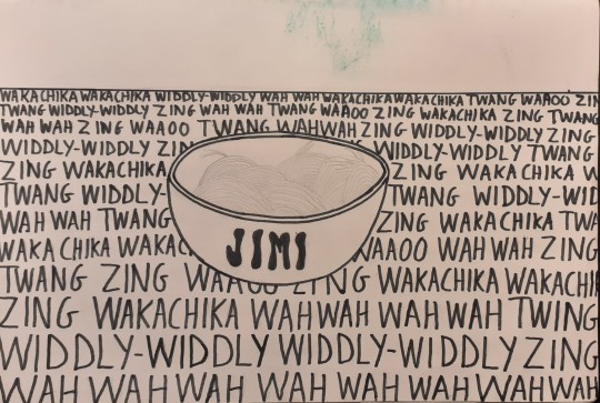

An earlier unfinished version of the poster before I decided to hand draw it.

2 notes
·
View notes
Note
hi, sorry to bother you and i hope you havent been asked this before, but how do you make your transparent edits?
I have been asked this before how dare you
jk, a full and VERY DETAILED explanation is under the cut
So after I’ve chosen which request/comic page I want to work on I either go to the tf2 wiki or to the tf2 comic site itself. Either page is likely to have the higher quality image, it differs per comic. Which is funny cause I uploaded some of them to the wiki myself. I do this so that the png will eventually also be of high quality.
Then I crop it to be a nice size and to remove any unnecessary background stuff.
I then use this app [i do almost everything on my phone] "Background Eraser" to remove the bigger chunks of the background.
After that, I plop the original image and the now partially finished in Autodesk Sketchbook as 2 separate layers. The background I usually make black, because the comic outlines usually are black as well. If not, I change the background to whatever colour was used for the lines this time. I do this because it makes it easier to see the stuff and "residue" pixels that aren't supposed to be there, which I then erase.
When that's done, I usually add a grey layer in between the png and comic page to see if I erased the lines properly. It sometimes happens, especially with older comics, that I remove lines because they're thin or because the older comics were a bit more "sketching" with the lines rather than the current comic's cleaner look. I fix this by either copy pasting it from the comic image, or draw over it myself. This step is usually repeated one or two times.
I remove the layer with the comic page and the grey layer after this, and then duplicate the layer with the png. I then set the duplicated layer to full brightness, and duplicate it about 15 times. When it's fully bright against a black background you can very easily tell if there are any pixels "left over" in what is supposed to be empty/transparent space. Select those pixels, switch back to the png layer and remove them. I usually do this twice.
Then I export it, send it to my laptop and that's where I check if the quality is still proper and how much it aligns with the comic page, using paint.net. If I hide and unhide the layer a couple times and you cannot or barely tell the difference, then it's good!
Usually the png is done by now, but sometimes I also 'fix' certain things, still using paint.net. Most fixes are skin colours, mostly demoman's, and adding certaing things that have been cropped out by text bubbles, the borders or other stuff.
And then I queue or post it.
so...when I say I do pixel by pixel work....I really do mean it
btw if you want me to add images just say so
10 notes
·
View notes
Text
The Tale of getting Hawk and Flo Made Part 1
Greetings dear reader, I am HeaddyPidgeon. I make a webcomic series currently called Hawk and Flo 2: Ice Cream Truck of Doom. Now you may have read my comic before or you may be someone who has never even heard of me until now (that being the more likely case). Now you may have noticed the eponymous 2 in the Hawk and Flo 2 and come to the conclusion that there is a Hawk and Flo 1. Well you would be correct dear reader there technically is a Hawk and Flo 1.... It just isn’t finished even though it technically was finished 2 years ago.
What the heck does that mean. it’s finished and it’s not finished at the same time? how is that possible?!. Well the reason why is because during the Pandemic I completed Hawk and Flo: Last Space Wizard. It was Inked, coloured, lettered with all of the bells and whistles added from the comfort of my own bedroom. The physical manuscript version is finished. The digital version which I sometimes refer to as the webtoon edit is still in production. When I made the physical version I thought I could just scan the pages and then upload it on the internet, but that sadly didn’t work which meant that over 200 pages then had to (and still have to be redrawn all over again from scratch. Ouch
This is but one chapter in the story of what might be one of the worst production hells in the history of fiction writing let alone comic books. Behind every piece of art there is an artist, behind every novel there is a writer and behind every story there is the story of how it gets made. Let it be known throughout the cosmos that whilst in the year 2022 we’re getting to see the brother and sister from Bermuda fight space armies and crack jokes. Getting it up and running in the first place was a daunting, absolute, nightmare of a quest undertaken by an individual with absolutely no clue what he was doing and whose only credentials were..... ok basically nothing.
I’ve only really been at the process of trying to make my comics for a few years now, Last Space Wizard may have had it’s first chapter in November of 2021 but before that I was pretty terrible. So Terrible that I realised I needed to practice at making comic books before I even got onto the internet. if I was aware of how truly awful I was at doing it all The Internet was certainly going to have had a field day with many of my earlier attempts at comics. Now the (not so) strange thing is I studied English so the stories themselves were pretty well written. The Jokes landed the characters were likeable, it’s just everything else was terrible. The art was terrible, My Lettering was completely Illegible, I couldn’t even draw anyone moving. So my first ever attempt at a Hawk and Flo comic was a script I had from a complete Turkey of an episode I had called ‘My Worst Fear’. I considered it the worst script I had ever written for anything but because the characters mostly stood around and talked I threw caution to the wind and gave it a go. i Showed it my friends and they found it hilarious which is what encouraged me to try learning to draw on my own. I started with A3 sketchbooks I'd buy from the Range. I would then turn on them on their sides then draw all of the action (or lack thereof in my case I was so bad it wasn’t funny) big and bright because I struggled a lot with drawing small and my consistency was awful. So when I very first started I drew character design sheets then I would trace my own drawings so it would turn out consistently LOL.
We all have to start somewhere If somehow someway I one day take off as some kind of famous writer/artist know this I had no idea what I was doing I’m just as clueless as anyone else. It’s just I understand I'm getting older, after trying and failing so many times to look for artists to draw my comics, whether it be my ex girlfriend, or friends I knew from High school I realised the only way any of this was ever going to get made was I had to do it myself. It came with some heartaches, i’m still gutted that I wasn’t able to get my comics off the ground at the time the storm Area 51 event happened in 2019. it would have been so perfect if a series about space armies invading planets came out that day... but It wasn’t to be I wasn’t ready to be out there. When I tried to scan my sketchbook art I just wasn’t able to do anything with it, the pages weren’t edited out properly and none of it was the right format. So when I got better I started drawing on A4 sheets of paper which I then couldn’t get to upload due to file size limits and such so I had to start doing everything digitally. I couldn’t figure out how to scan and upload my A3 books or A4 manuscripts I still don’t know how XD. Shout outs to anybody who did figure that out I still haven’t to this very day.
3 notes
·
View notes
Text
Okay!! Hello again! Ever since last summer I’ve been working on a little project of mine that I’d like to show you all. It’s called The Entertainment Area(a place of wonders and youth) or simply TEA. Originally it was meant to be a webcomic but after certain mishaps (like my drawing tablet breaking down) I was unable to actually make the digital art style necessary to upload it. Instead, I decided to start it all off with a little story book in a sketchbook I have. It may take a while for me to finish but I trust myself into finishing it
*What is The Entertainment Area?*
Well like I said before, it was originally suppose to be a webcomic about a far away land of fun and joy. It’s kind of like a town and a carnival combine. In this world there are of course the citizens of the area but the main characters are also known as the Virtuosos and the owners of the place. They’re also the ones who handle all the activities there too! Considering they spend time doing activities as well
The following Virtosos are:
Adam and Eves: The wrestling virtuosos
Ace Hop: The Story virtuosos
Sally: The candy clown virtuoso
Darla: The Dance virtuoso
And Willy-Walter: The animator virtuoso
*When will the character designs be show?*
I have them already made. But an my problem is that I need colour theory and design for them. I can already tell you now that Willy-Walter is in all black and white but other than him I’m still fixing up their looks
*Is there an official release date for it?*
No not really. I’m trying to save up money to get a new tablet in order to go back to digital drawing but other than that there is no specific release date for the comic
*Is there any sensitive content?*
Nothing but a few dark jokes and a very small hint of violence. I don’t (and never will) draw Nsfw of my characters or use suggestive images as bait so please remember that :)
Anyways that’s as much as I can give you all at the moment. I Hope to grow a bigger audience by next year (at least) but for now I’ll try my best to keep posting. Stay safe out there and be nice to your neighbour. Bye bye ❤️❤️❤️
0 notes
Text
'the space in between' zine


Lockdown has often felt heavy and dark, but for me, it was also a time for reflection and nostalgia for more exciting times. I also had lots of time to watch movies, I watched one in particular about two people who meet on a train and get off in Vienna. One character says, “I believe if there's any kind of God it wouldn't be in any of us, not you or me but just this little space in between. If there's any kind of magic in this world it must be in the attempt of understanding someone sharing something.” It stood out to me and I took it with me the rest of Lockdown. I began to think about how we share things, and how we love when we aren’t able to see one another—hence the title of the zine, ‘the space in between’.
I’ve tried to explore love and our minds in a few ways. We cleaned our house during isolation and I came across a bag of love letters that belong to my mother. For the first page, I scanned in all the postage stamps that were still attached to the envelopes. I then created a simple watercolour painting of hands not quite being able to reach each other, and layered this over the background of stamps. I turned down the transparency to evoke a feeling of wistfulness, as we read some of the letters and found that most contained the feeling of yearning for another. Moreover, one of my mother’s friend’s had doodled all over the back before sending it to her. He created a small cartoon of a funny-looking man whom he called the ‘Potty Panty Man’, I thought it was sweet and wanted to expand on the character. I created a story that he was yearning for love, as my mother friend may have been, and was in search of his ‘Panty Woman’. I scanned in parts of the letter and drew the character digitally into a photo that I had taken of a draped white sheet. I tweaked the hue of the picture to better fit the colour scheme of the character and the zine, and copied in my mother’s friend’s writing (as seen in the third page).
The fourth page is a scan of a painting I had done for the GCSE art course in acrylic. It was a copy of an edited photo of Frida Kahlo, with her head and arm cut out and removed. I wanted to improve my abilities to notice tone, and felt that using an achromatic colour scheme would be useful. I also like the message of ‘loosing your head’, although it may be a bit blatant, it seemed to relate to the darker feelings that Lockdown has brought and perhaps also the much tougher side of missing someone. Page 5-7 focuses on this. However, I interspersed the two black-and-white pages with a short animation I created. I thought about where my mind goes when I think about love, and what my ‘dreamscape’ might look like. I’ve included my original notes on this at the end. I think if I were to do this page again, I might have wanted to create an actual landscape using clay and other sculptural mediums as to emphasise this. Furthermore, I wanted these three pages to be relatively coherent, so for page 7, I edited a photo using Procreate. Since my painting of Frida had no head, the photo is only of a head.
I laced song lyrics throughout as I spent lots of time listening to my favourite albums. I pulled ones that felt relevant to the photos I had taken. For example, pages 8-9, I used cut outs of eyes and mouths with magazine style text that read the lyrics of Frank Ocean’s ‘Thinkin Bout You’. The song reminisces on a past love, and the lyrics explore the need to rekindle that love, and if it is even possible for the speaker. Personally, I think that our eyes and mouths are the most emotive areas of our face, and it is widely known that ‘eyes are the window to the soul’. I wanted to create a simple two page spread with this as the focus. I took photos of myself making faces I thought correlated to that of feeling in love, then edited them into black and white to fit with the other photographs I had included in the zine.
For page 10, I found an artist named Sophie Bryant-Funnell, who uploaded a series of her sketchbook pages to an online archive. For each page she chose a collection of items that reminded me of being a child, Blackberry phones, old perfume and rollerskates. I really enjoyed her use of sweet, bright colours and wanted to replicate that same feeling of child-like excitement. Over 2020, I kept in contact with friends by sending small gifts and letters. I was sent many things also, I arranged them on a piece of paper and painted them in watercolour. The last page again, features lyrics and a photo also from my original GCSE portfolio. It was apart of an exploration of Henry Moore’s work, however I think it didn’t really suit his style—which is much more morose.
Overall, I tried to be conscious of the textures I wanted to use throughout the zine also, much like the transparency of the easier watercolour. I used mostly fluffy and soft fabrics, which also feature of the front and back covers and avoided too many harsh lines which is why I opted for watercolour for most of the drawings I did.
2 notes
·
View notes
Text
What we left behind
5sos x reader
warnings: swearing, divorce, angst (oh so much).
A/N: GUYS OMG THIS IS MY VERY FIRST SERIES AND IM SOOOO EXCITED :3
Couldn't have done this without my boo @aspiringwildfire
-FLASHBACK-
“Happy Birthday, Enid!” Everyone yells after I blow out the candles, tossing up confetti they held in their hands.
“What did you wish for, Ed?” Calum asks, face covered in frosting from the chocolate cupcake.
“You know I can’t tell you, Cal!” I giggle slightly, turning towards the slice of strawberry cake in front of me.
“I can’t believe my baby is 7 today!” My mum says, suddenly behind me and nearly squeezing the life out of me.
“Hey, Ed! Let’s go play!” Michael exclaims on the other side of the yard, holding a yellow ball in his hands. A quick giggle escapes my lips as I quickly move out of my mum’s arms, running over to where he stands, followed by Calum and Luke.
“Be careful of your dress honey!” My mum hollers as we chase the ball, her words barely reach my ears as I focus on beating the other team.
We played football until the sun set, the only time we took a break was when people left and I had to say goodbye to them. Daryl came out and brought us inside for dinner, only us four and our parents remain to finish the celebrations.
“Eat up kids, we’ll set up the tent in a bit.“Liz says, setting down a box containing a large Cheese pizza in front of us.
-After finishing the pizza and getting the tent set up, we settle in our sleeping bags, the only source of light being the lantern in the middle of our circle.“Did you have a fun birthday?” Michael asks, stopping his game of ‘Crazy Eights’ with Calum.“
I had a blast! You three made it great” “
Aw, Ed! We’ll always be here to make your birthday awesome” Luke exclaims, pulling me into a tight hug. The others soon join, causing a dog pile and loud laughs to erupt from all of us.
Once the laughter calmed down and we resumed our previous games, a thought ran through my head “Hey guys? Can we all agree to remain friends no matter what?”
“Of course! Nothing will tear us apart” Calum says, earning agreement ‘yeahs’ “We’re gonna be best friends for life!” Luke hollers
.-10 years later (2012)-“Come on,Becks! We can’t miss this!” I exclaim, grabbing the hand of my best friend, weaving through the crowd outside the building and stopping in front of the stage, waving at the boys while they are getting their instruments ready.
“Oh! Here are our seats” She points to a round table filled with chairs right in front, our names scribbled on paper.
“Hey girls,”Joy says, taking a seat in her designated chair, Mali following right behind her.
“Everyone else is right behind us, “Mali says, motioning to the door where the familiar heads of the Hemmings’ bobs over everyone else.
-
Once everyone got settled in their chairs, Luke taps the microphone lightly.
“Hello, we are Five Seconds of Summer and welcome to our show!” Luke says into the microphone, earning a round of applause and a ‘whoop’ from me.
“1,2,3,4!” Ashton exclaims before the music begins, filling the nearly empty space with the beginning of ‘Unpredictable’. My foot starts to tap at the beat, unable to contain my smile when Lukes’ voice fills the room.
“She sit at home with the lights out” Rebecca sings lowly next to me.
“Seeing life in different colours” We finish together, pretending our hands are microphones.
-
“Thank you for coming! This has been Five Seconds of Summer! Good night!” Luke exclaims into the mic before walking off stage.
“Alright, let’s go see our boys,“Liz says as she stands up and heads to the doors where the boys went off from.
“Mum!” Luke exclaims, running to her once we all enter their changing room. All the boys greet their families before I’m swiftly picked up by Ashton and spun around.
“Alright,put her down before you hurt someone, “My mum says, stopping Ashton from spinning my brains out and gently places me on solid ground.
“So, food anyone?” David receives shouts of agreement in return.The parents walked ahead to the cars while we took our time heading out.
“Oh boys! I made some gifts for you” I dig around my bag before finding the plastic baggy, taking out four bright bracelets, each one having a letter for each boy. Rebecca takes two and puts them on the right boy’s wrist.
“Are these friendship bracelets?” Michael asks, twirling around the orange one on his wrist.
“Yeah. I just thought that you boys are gonna make it big someday and I just- don’t want you to forget about the little people” I awkwardly shuffle my feet across the concrete floor, suddenly feeling embarrassed that I even did this.
“I love it! What better way to signify our friendship than with a bracelet!” Ashton tugs me into a hug, squeezing me tightly.
“Alright you kids, let’s go!” Liz says from the end of the corridor, motioning with her hand to come.
“We better go, don’t want an angry Liz on our hands” Calum comments as we all walk towards the door.
[1 month later]
I hum quietly as I braid Becks hair, the two of us deciding to have a sleepover at my house.
“Have you been watching the videos they upload? They’re gaining a lot of views” She says quietly, busy drawing in her sketchbook.
“I know, it's about time people realize their talent”
A knock on my window makes us jump as we turn to it and see Calum’s face pressed against it.
“Cal, what are you doing?” I question once he’s inside.
“ You won’t believe the news we just got” Becks and I share a confused look before returning our attention to the bouncing boy.
“Well? Spill dude” Calum gives her an unamused look, but continues to bounce.
“Okay so we’ve been getting a good number of views on our covers and earlier we got an email asking if we’d be interested in opening for this group-”
“What group?” Rebecca asks, curiosity getting the better of both of us.
“One Direction” Both our jaws drop at the name.
“That’s amazing Cal! I told you you boys would get famous one day!”
“We sign the contract tomorrow and start working out a setlist”
“When do you guys leave?” Calum nervously swallowed at the question.
“Three months” I feel my heart drop at how soon they’ll be leaving.
“Senior year starts in three months…”
“We know, but this is such a great opportunity and this is the boost we need to become famous”
“I’m so happy for you guys!”I exclaim overly eager, earning an odd look from Rebecca.
“We just knew you would be!” He flashes us his award winning smiling before slipping back out the window.
“Alright, spill. That was such a fake congratulations.”
“I’m- I’m happy for them”I fiddle with the brush I was holding.
“Bull. Shit. I’ve never seen more forced joy than right there.”
“What’s gonna happen when they leave for tour? We’re gonna stay behind while they go off and make a name for themselves.”
“Aren’t you happy that they got this opportunity? This is what they want” I sit on the edge of my bed and she joins, placing a hand on my shoulder.
“Yeah but- I can’t help but think that it was supposed to us 6. Forever. No one and nothing can come between us”
“They’re still your boys. Now-” She stands, grabbing my hands on the way. “Let’s go get some ice cream and watch movies.. We can deal with this later” I laugh but follow her out to the kitchen.
[5 months later]
“Any response yet?” I simply shake my head at my mum’s question, returning to the book I was reading. “They’ll text back. Just got to be patient honey.”
“Yeah” I reopen IMessage and all texts to them since they left have all been left on read and I can’t figure out why. “I’m going to hang out with Rebecca for a bit” I say after reading her text, receiving a simple ‘mhm’ from my mum.
<
“And they haven’t even said a simple ‘hi’ or ‘ thanks’?” Rebecca questions, popping a crisp in her mouth.
“Nothing. Did- Did I do something? Should I have sent mail or-”
“Ed stop. You did nothing wrong, okay? They’re hormonal teenage boys, we should really expect this behavior.. But that by no means excuses their rudeness.” I go quiet, opting to play with my sandwich.
“They’re performing in Sydney in two weeks.. I was thinking of stopping by” I casually say, not looking up from the food.
“Alright.” I look up at her, shocked by her response. “I don’t agree with this idea but I’m not not gonna let you do this- definitely not alone.” She puts her hand over my own, offering a soft smile. “Now. About this Art assignment”
\night of concert\
“Okay, the plan is as follows: we go to the concert. Park where we see tour buses and wait. Find the boys and talk. Ending the night with pizza, candy and scary movies at my place.”
“Sounds like a well thought out plan.” I take one last look at myself, adjusting my top before turning to my brunette friend. “Ready?”
“Ready” We loop arms, skipping the whole way to her car.
..
“Damn, they are loud” Becks jokingly says from our position against the car, listening to our boys play.
“They sound good (feels good hehe :D)” I comment, pushing some of the gravel around with the toe of my combat boots.
We remain in a comfortable silence until the doors swing open and familiar voices fill the air. I look over at her, wide eyed.
“Now or never babe”
“What do I-”
“Hey boys!” She screams, making them all turn around, alarmed looks on their faces.
“Uh- Hi” Luke says, waving awkwardly in our direction.
“Enid here would like to talk to you boys. In private”She nudges me forward and I take timid steps to them.
“Let’s go in the bus” Ashton opens the door for everyone before closing it behind him.
“So-”
“Why’d you guys do it? Why did you just up and ignore me?” They nervously look at one another before Calum steps forward.
“We- uh got busy?”
“If you wanted to still be my friend you would’ve made an effort” I state, crossing my arms across my chest.
“We do it’s just that-” Luke begins but I cut him off, anger starting to run in my veins,
“What happened to ‘remain friends no matter what’”?
“You don’t understand, our life is so crazy now! We still consider you a friend, not best friend but, friends. Why are you still upset about this? It’s not like we completely abandoned you” Michael says from his position in a chair.
“ You couldn’t say ‘hey thanks!’ when I congratulated you?”
“Yeah bu-” Ashton tries but I cut him off.
“You could’ve tried.. But you ALL decided I wasn’t worth the effort!” I take a few slow breaths to try and keep calm “I tried to keep this friendship when you guys left but, not much I can do when you won’t even try”
“We still want a friendship. It’s just gonna be a little different now” Ashton says, taking timid steps towards me.
“No. If you wanted a friendship you would’ve kept up with it. None of you even reached out when my parents went through a horrible divorce. I really needed my best friends support but I got nothing.”
“We didn’t know your parents divorced Ed” Michael explains, all four of them clearly looking distressed.
“Stop. Stop right now. Our parents all still talk so you would’ve been told about it but sure, let’s play dumb. Also, that nickname is reserved for close friends and none of you are that.”
“ Alright,let’s all calm down and think about this rationally.” Ashton says, trying to mediate the best he can.
“I’ve already said everything that I wanted.Goodbye” I quickly leave the bus, practically diving into the passenger seat.
“How did it go?” At the sound of her voice I immediately break down in tear, sobs shaking my whole body. “Oh honey no shh” She brings me into her side, rocking us slowly. “They didn’t deserve your friendship. You’re too kind and you need someone who will love you for yourself and not make you cry like this.”
“I’ll never trust them again”
-
AND THAT’S PART 1 HOLY SHIT I’M SO EXCITED. please let me know your thoughts but be nice cause I’m a small bean :3
#5sos#series bitchessss#yasss#calum hood#ashton irwin#luke hemmings#michael clifford#loml#ty for reading <3
22 notes
·
View notes
Note
Ok, so here are the questions 1. How much time does it takes you to fill a sketchbook?? 2. What brands of sketchbooks are your favorites and why? 3. What is this medium (and it’s brand) you use to fill space with gold? 4. Where do you inspire from? You can upload like four or seven drawings a day, where do you get all the inspiration from? I’m a really big fan of yours, your art is amazing. Thanks for your time 🎀
I usually fill about 2-3 sketchbooks a month! I try to work on several at a time that vary in sizes, because switching up what I’m working with helps me stay motivated to finish the whole thing! I have filled a sketchbook in 5 days before, I was sick with the flu and didn’t leave the house like, at all tough D:
I don’t think I have one favourite, but I’m currently using this dylusions creative journal which I really like, the paper is very smooth and it’s also pretty thick and holds marker very well! I really enjoy the Rendr series of sketchbooks for markers as well, because you can draw on both sides and it never bleeds through! Lastly I really like the Handbook Artist Journals, the paper is smooth with just a bit of tooth and they’re a good size! I also like plain ol XL Canson spiral sketchbooks :D!
I have a couple different gold mediums, including a gansai tambai starry colours watercolour set! I also use Dr. PH Martin gold caligraphy ink, and a sakura gelly roll gold gel pen!
I get inspiration from all over the place : D! A lot of my work, especially my characters, their world, and stories are inspired very heavily from my dreams! I’ve been keeping dream journals since I was in highschool, and it’s always been my biggest pool of inspiration! I’m also very inspired by music and films! Some of my currents music faves are 4lung’s entire discography, pengosolvent, and the twilight saga: breaking dawn part 2 soundtrack (it’s a bop, i promise). Some of my all time fave movies are: PMMM: Rebellion, Coraline, The Virgin Suicides, Moon, Moana, and ofc 2001: A space Odyssey
thank you for the questions and the kind words!! i hope u have a rad day!!
12 notes
·
View notes
Text
My Muse | Kim Mingyu | Oneshot
Title: My Muse
Pairing/Characters: Kim Mingyu x Reader
Synopsis: One day Kim Mingyu is caught sketching a very familiar face into his sketchbook.
Genre/Warnings: Fluff, female reader, high-school!AU, non-idol!AU
Words: 1250
POV: First Person

The bleachers were empty and the field remained unused during my free period. My timetable was the best thing I could’ve asked for. Every day I started with my least favourite subject and ended with my best. During my class’ free period we were allowed to wander around the school due to our teacher’s lack of care. The rule was ‘as long as none of you kids cause trouble, you can do what you want.’
My favourite place to hang out during my free period was at the bleachers, stationed away from the school at the football field. It was always quiet where I was due to me and one other student being the only people there during those times. His name was Kim Mingyu. Although I had some other classes with him, the thought of interacting with him never crossed my mind and he seemed to think the same. We didn’t run in the same crowds, we didn’t even spare each other a glance and I guess when we were alone during our free period, we just enjoyed the silence the isolation gave us.
He sat at his usual spot, close to the bottom of the seats, while I continued with my routine of pacing and jumping from one bench to another on the set of seats above him. He never seemed to mind the continuous padding sounds coming from my pacing, or the occasional shake of the metal seats from my jumping. I just needed to keep active. I would usually play an audiobook while I moved around but today my earphones had broken so I was left to relish in the quietness.
I looked down to Mingyu and watched as he sketched away. All he does during our free periods is sketch. Anything from landscape to animals or people. I wondered if he lived in his own world while sketching. I know when I listen to my audiobooks, I get lost in the reader’s voice and transported into the piece of literature.
I sat down from my standing position and sighed. This wasn’t as enjoyable without my books. I bent down to ruffle through my bag and see if I had anything to keep me occupied but as I looked up, I noticed a familiar face being drawn into his sketchbook. The person in his drawing looked exactly like me but with a superhero costume. She was flying in the sky whilst beams of power shot out of her palms and at the villain, towering over the buildings of the city.
‘Do I say something? Why the hell is he sketching me? And as a hero?’ I stood up and moved closer to the boy hoping he wouldn’t hear me whilst I tried to get a closer look. As soon as I attempted to take a quiet step towards him, he turned around quickly, inspecting me. His expression was then written with shock as he looked at my face and then at the character in his drawing.
“Hey were you sketching me? Becau-”
“It’s not what you think. Oh my god. That’s so crazy, you look exactly like the character I was drawing. I mean, obviously it was a made up character, I didn’t draw this with you in mind. Not to be rude or anything.” He look flustered, as if he had no other words to say.
“Well there has to be some sort of explanation for this. You can’t just make up a person in your head that looks exactly like another person in your class.” I placed my hands on my hips and narrowed my eyes at him. I had no idea what exactly he had planned with the drawing but I was suspicious of him. I jumped from bench to bench, moving closer to where he sat before landing next to him and taking a seat.
“Look… uh… Mingyu right? Look man, I have no idea what you plan on doing with… that but it better not be for some weird creepy after school thing. I don’t judge people on what they do in their spare time unless it involves me.” I gave him a hard look and never broke eye contact. He seemed to be playing the same game as me as he glared back.
“I don’t know what you think I do with my sketches but this is a whole misunderstanding. I was using a character description one of my friends gave me to draw for our english assignment. We’re supposed to create a character for a fictional novel. It just so happens you fit the description.” He pulled a piece of paper out of his back pocket and showed it to me. The only things written about the hero’s physical appearance was the colour of her hair, eyes and the type of costume she wore. If anything, more than half the girls in the school could’ve fit the description.
I gave the paper back to him and looked over at the drawing. “The description doesn’t mention the hair length, the body proportions or even the visible birthmark I have right there.” I pointed at his drawing and he blushed. “Well I don’t know what to tell you since I’m pretty sure I did make this up myself.
“Oh yeah, I bet you did. Newsflash buddy, my parents did it first.”
“Are you calling me unoriginal?” He closed his book, placed his pencil behind his ear and stood up, towering over me.
’Two could play at that game.’ I stood up and kept a hard gaze on my face, not breaking eye contact as I tried to seem intimidating. He and I realised I was still looking up at him due to my small stature compared to his. He smirked at my attempt to outdo him with my own intimidation.
Not willing to lose, I stepped up onto the bench and smiled smugly. The smirk on his face turned to a scowl as he looked up at me. He then followed suit and we were back to our staring contest. I moved up to the next set of seats, with him stepping up next to me, causing a cycle to break out.
We reached the top of the bleachers and there was no where else for me to go. Mingyu took the his final step up and smiled smugly, before moving his face closer to mine. “I. Win.” He studied my face a moment longer and pulled back, opening his sketch book again and flipping to a new page. He pulled the pencil from where it sat atop his ear and took a seat.
“Keep that look of defeat on your face. I need a reference for when the villain kicks your ass.” My mouth dropped at his words and he laughed at my reaction.
“So you admit you used me as a reference!” I grinned in triumph as I sat down next to him. “Looks like I win.”
He rolled his eyes, studied my face and went back to drawing. “I’m being completely honest though. I really didn’t mean for my character to look like you. I guess I must���ve been sketching you subconsciously since we have some classes together. But since you pointed out your similarities, I guess I could use a reference model.”
I blushed and went along with it, watching as he worked diligently. Eventually, the bell for next period rang and we both stood up to move to our separate classes.
“Until next time, my muse.”

I’m back with a Mingyu oneshot and lemme tell you I am letting my Artist!Mingyu headcannon live.
HOPEFULLY I won’t take a long time to upload a new one.
I’m thinking- A Junhui series, Jihoon series or a Wonwoo oneshot but ¯\_(ツ)_/¯
Request here, follow here and read my other works here !!
AO3: Junshuji
#Thewritersnetwork#write-svt#my work#kim mingyu#kim mingyu oneshot#kim mingyu one shot#kim mingyu imagine#kim mingyu imagines#kim mingyu scenario#kim mingyu scenarios#seventeen scenario#seventeen scenarios#seventeen imagine#seventeen imagines#seventeen oneshot#seventeen one shots#seventeen au
2 notes
·
View notes
Text
Reflect & Progress
Throughout my Unit 8 project so far I have encountered many successes and also many problems. I have found that my success has been in my recent character design and also my ability to identify what works well. I have made sure to be thorough with the design of my characters, documenting each step of the process in my sketchbook, from initial sketches to the final outcome. I think this has been a very successful method as it really allows me to reflect on each step of my work in detail. Lastly, I think that I have used the action plans very successfully, as I always make sure to plan what I am doing before the lesson. This has helped my organisation skills greatly, and has gave me a guideline of what needs to be done and by when.
I have also learned many new techniques and skills, mainly digitally, which I think has really developed and enhanced my style of work. An example includes the use of the brush tool behind a Fine liner drawing in the ‘Multiply’ mask on Photoshop. This has been very helpful through my project, as I have used it for a large variety of work, first with my responses to the artwork of James Gulliver Hancock, but later used on the digital colouring of my characters. Other techniques I have learned/tried include the various printing workshops including screen printing and lino printing, as well as cyanotypes. These were completely new processes to me and so they have really helped me to experiment and try new things.
I have focused on three main artists for my project, them being James Gulliver Hancock, Kate Sutton and Linzie Hunter. I discovered these at the beginning of the project when I decided what it was that I planned on doing. I think that these artist’s styles are both similar to my own, and are also very relevant to my target audience and my theme. I tried a variety of these artist’s best processes, including typography, character design and building illustration, which improved my responses massively. I think that having artists to be inspired by and to reference to has really enhanced how I have went around my project.
As well as my successes, I have also encountered a fair amount of problems over the time creating my project. I have definitely struggled with work load, as the method of illustration I have practiced has took a lot of time to do. I have therefore also struggled with time management and completing things at a quick enough pace. I think that the biggest problem that I have encountered is my struggle with uploading frequently and consistently on my blog. As there is a large workload, I often forget to blog my newer work, which results in it appearing quite disjointed overall. This is going to be something I will be working on in the following weeks, as I want my blog to boost my project and I want it to flow properly.
To overcome these problems, I have discovered different methods that have helped me. To combat my struggle with the work load, I have adapted my project slightly to make things easier to complete on time and still to the best quality. For example, I have recently reduced the amount of locations I am focusing on from 5 to 4 whilst creating my characters, as I felt that this would not only allow them to get them finished quicker so I can start my booklet, but I would also be able to look into the separate locations more with less of them. I have plans to overcome my blogging problem by setting reminders on my phone to tell me to blog each day. I think this will help me upload more consistently and will properly document my progress throughout these last weeks. I have dealt with smaller problems with my physical work as well, like changing the colours of my work if it prints differently to how it looks on the screen. This has ensured my work is completed to the highest standard I can achieve.
I have always made an attempt to challenge and push myself to create my best work. In this project I have tried various new things that I think have really developed me as an artist, as well as playing to my strengths and focusing on the things that I love to do. I think the mixture of these new and old skills and techniques shows through my work. An example of somewhere I have challenged myself is when I was creating my lino print. Trying a brand new process is quite daunting, as I was afraid that my outcomes would not be as good as I wanted them to be. I think I really pushed myself for my lino prints, as I tried many times to get the cleanest and boldest print I could. When taking these into Photoshop, I explored the many ways I could enhance my original prints. This was a way to challenge myself as I had never done anything similar to this before.
To move forward from this point, I intend to speak to my tutor more about my intentions with my project from here. I think having more feedback will definitely improve my work ethic and how much is completed. It will also give me some sort of plan for my final outcome and the details of it. I am creating a guide/booklet for my outcome, along with a series of promotional posters. My role and identity in this project is to be both the author and the illustrator of this guide. From here I will develop my project title, which will be a big decision. For my final products, I will need access to the large printer to achieve prints large enough for my display, and also access to computers for most lessons/frees. I will also re-visit my proposal which I wrote at the beginning of the project, and see if my ideas have changed in any way.
2 notes
·
View notes
Text
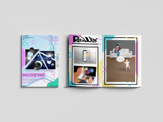
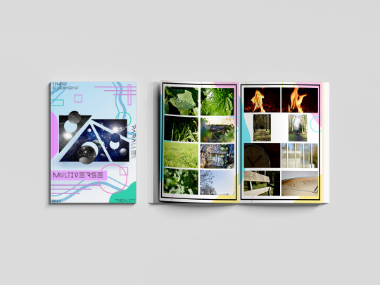
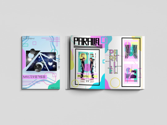
EVALUATION !
This project is called MULTIVERSE, and my task was to create a zine using a collection of words linking to this topic that was given to use on google classroom. With these words, I were asked to pick out a minimum of 12 words and did so, but I only dedicate my zine to four words out the 12, and those four words were PARALLEL, REALITY, TIME AND ELEMENT, all the work I create during this project was created using the programs of adobe photoshop, illustrator, Lightroom, InDesign and procreate.
A zine is a small looking magazine that norThis project is called MULTIVERSE, and my task was to create a zine using a collection of words linking to this topic that was given to use on google classroom. With these words, I were asked to pick out a minimum of 12 words and did so, but I only dedicate my zine to four words out the 12, and those four words were PARALLEL, REALITY, TIME AND ELEMENT, all the work I create during this project was created using the programs of adobe photoshop, illustrator, Lightroom, InDesign and procreate.
A zine is a small looking magazine that normally is used for advertisement or to spread the word about something, In my case, it was to show artwork that portrays word that I have chosen.
A big part of this project was researching because I need to first research about zines as I didn't really know what they were I also need to research how to make one and how they work so I was able to create mockups and outcome that are the right size after doing this it helped me a lot to understand zine, and I was able to get on with creating, but then I knew it was time to create the outcome to go in my zine so I had to research and look up a lot of artist and designers for inspiration the pain website I used for inspiration was Pinterest due to me being able to create a board that I could go back to and inspire me.
The artist that I research that helped me a lot would probably be Ranganath krishnamani because he enables me to find a style that I like and help me open my mind to think or outcomes that I create this artist help me with the topic of reality as he a series of outcomes called a shift in the playing field and before I found him I knew I wanted to use social media and technology in my outcome, but didn't know how to do it so when I found his work it inspired me and I was able to think of loads of different ideas.
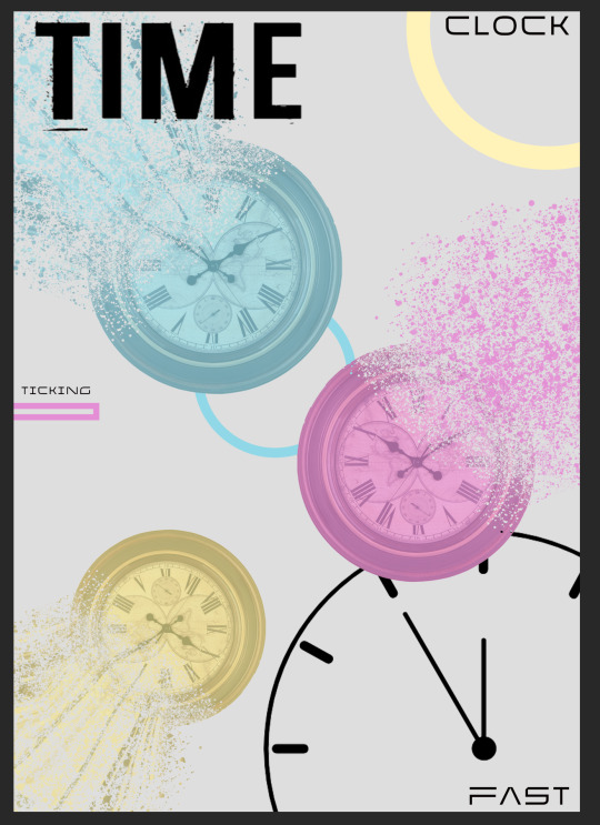
Each page in my zine is dedicated to a topic of my choice and the target was to show that word through artwork, for example, the word PARALLEL I used images such a building and shapes line and by doing this I put art together that represented parallel another page in my zine was about time so I used a lot of clocks to show that topic, the big part of this project is the MARS side or it MATHS ART RELIGION AND SCIENCES so another thing I had to have it mind was making sure I was showing this throughout the project and in my outcomes.
With me creating my zine I thought they would be a load of different problems doing it but in fact, there wasn't that many the main problem that I came across was one finding artist that had focused on the word time as I was really struggling with inspiration I need someone to inspire me but after a lot of searching on Pinterest and Google I finally came across outcomes that inspired me but was still unable to find an artist that focused on the topic time another struggle and I think the last struggle I had was trying to keep a team throughout my project and in my case, it was a colour pallet I wanted to use my colour pallet through but sometimes it would fit with the aesthetic so I have to think and think until I come you with and outcome using the colour pallet that I choose but overall the journey of my project had many ups as i was creating consatly but had some down fulls exspesaly went I have a brain block on ideas but came over quickly due to looking at pintrest the that got the ball rolling so a smooth journey i would say with this project.
As this project had a task that was very different from the other projects that I have done there was a lot of learning involved and learning new skills and techniques including different programs to learn such as in design and new techniques on photoshop the main skill that I learn that I’m really pleased with was the dissolve effect/liquefy effect on photoshop that is used in my time poster in my zine another new technique that I approached was a log print/rubbing this was another technique that I used on my time pages for my zine and it was interesting to learn a new skill and in the future, I may want to learn about wood printing similar to linocuts and screenprinting but using wood. Are used a lot of old skills that I have collected over my time at college including collage thing halftoning and just my way of laying out my artwork and also a big part of graphics and getting my topic out there was using typography and I learnt a lot about how important typography is and I learn every day when creating new outcomes.
My favourite skill overall that I have learnt would be the liquefying effect on photoshop and also photography. I knew a lot about photography as I have grown up in a photographers household but I learn a lot more about capturing the topic of something through a photograph and I also learn a lot about Lightroom as that is where I edited the photos. With photoshop I watched many videos on how to do the liquefying effect and now I have that skill which I’m really happy about. I mentioned in my blog that I wanted to learn the program in design and I’m learning as I go along and I’m still figuring out the program watching videos but hopefully, I will be able to use that throughout my time at college and after and hopefully mastering it similar to illustrator and photoshop.
Due to us being a national lockdown the college isn’t open so we have been having to work from home and to present our work we have been using the website Tumblr I created account name is multi-verse and was adding all my outcomes and journey throughout this project onto my blog I really do prefer doing it a digital way rather than writing in a journal and sticking stuff in a sketchbook as one it gives you better quality pictures and it also allows you to choose statics and have a theme of your whole website page. Are used different ways to show my work and the journey of here the most common way was doing screenshots of how I got to an outcome and explaining step-by-step how I did it I also uploaded videos on my blog for me drawing on my iPad which is a cool way of seeing the development of an outcome. By doing all this work in this type of way I feel that I have displayed multi-verse and the project brief well on my blog and I feel that if someone was to look at it they would get an understanding of what it’s about and know what it’s about. Because especially at the beginning of my blog by explains a lot about space the multi-verse and theories delving into the more science and maths side of it and then as you go along through my blog you see research in me developing outcomes and by doing this I was able to develop outcomes to the best of my ability and be pleased with the outcome is at the end and then look well done.
With my blog I started off with a brain block I didn’t know what to do so the first thing I did to plan for this project was create spider diagrams that I could put all different connotations of my chosen word onto and search pictures on Pinterest and add them to the board by doing this I was able to refer back to them when I had another brain block further into the project. I also created a layout of how I wanted my zine to look and this helped me have a strict approach onto the scene as I knew that I wanted it to look like that so I stuck with that and as it was on my blog I knew that that’s what I showed that I wanted to be like so I wanted my outcome to show that I had followed my planning. And there are many different ways once I finish my outcomes that I evaluated them but normally I would just put my outcome on my blog and explain what my intentions were and what context I wanted to show and talk a little about the piece of artwork. One thing that I find it’s really important with any project is you try and see your work from someone else if you and try and give yourself critical feedback so you can push yourself and work harder I always do this on every topic are normally I get my family members to look at my artwork and say things about them and things that I need to change and things that are good so I work on it until I’m happy and pleased with everything on the page.

With this project a big part to me was the context as I wanted to show the words well through using artwork I feel the best piece of our that does show context is my reality pieces because you can see many different feelings and emotions through that piece of artwork and people can link personally to it where is with the other ones they do show context but not as deeply as the reality pages. But overall this project has worked really well and I’m really happy with how my final mock ups came out each page portrays a word in a good way and you know what the theme of the pages I’ve used many different skills and techniques including digital drawings typography log prints etc, but there are weaknesses to my outcomes and I would like to work on them in the future if I had the time and that would be maybe changing the theme of the background within the project as that was one thing that I was wary about and was concerned but the reason I chose are quite bold and colourful background with me looking at the word multi-verse and focusing on the word multi and thinking of loads of different colours so I had different approaches to the topic and they link back to everything which I think is a good thing to have but I play to my strengths which is always a good thing as you know that there will be a good outcome at the end by also worked on my weaknesses and learn new skills which I will use in further projects.
#MULTIVERSE#END#OF#PROJECT#EVALUATION#HAPPY#ZINE#PARALLEL#TIME#REALITY#ELEMENT#SKILLS#LEARNT#PHOTGRAPHS
0 notes
Text
Page to Screen- Evaluation
For this project, Page to Screen, I had to develop some outcomes based off a novel that has been made into a film. The main focus of this project was target audience so my experimentation was reliant on in depth research in association with the target audience of the book/movie. The book/movie I received was Harry Potter and the Deathly Hallows which was difficult to pinpoint a target audience for because it is a story loved by so many people of different genders and ages. The outcomes developed were digital pieces of work in the form of a movie poster, a book cover and an animated gif.
To arrive at these outcomes I had to go through experimentation and research, looking at artists such as Lotte Reiniger (a well known silhouette animator in Germany) and many processes including lino cutting, screen printing and papermaking. Doing research allowed me to explore and experiment with my artwork to find out what fit best with Harry Potter. Throughout researching I decided to dip into the aesthetic of real life witchcraft and started to completely reimagine the Harry Potter aesthetic. I didn't want to stray too far from the dark personality the books had already set out, and I had to keep the target audience in mind. Would they be attracted to something so different from the original style? Would the audience read/watch the story in the same way if the artwork was different? Would they be confused that the artwork did not match the story even though it will still based on witchcraft? These are all questions I answered by doing research on redesigned book covers and film posters and understanding how other artists reimagined the artwork.
The target audience for Harry Potter was so wide it was difficult to design a cover and poster that would appeal to all ages equally. To overcome this issue I looked at the differences in designs between books and posters aimed at a younger audience against books and posters developed for a more mature audience. I noticed that book covers made for adults were more refined and detailed whereas children’s covers were more about large simple shapes and bold colours which would naturally grasp a younger audience’s attention. I experimented with posters and book covers directed at both groups of target audiences and decided to make the book cover for adults, opting for a simplistic but detailed layout, and the poster for a younger audience, making this look more magical with bolder colours and larger shapes.
This project really made me think about who I'm making this artwork for. In previous projects I was making the artwork to just complete a project. However, in this project I valued the processes behind developing target audience profiles because it allowed me to create art that had a purpose and I had one main goal to work towards which was “will this attract the right target audience?”. I will take this new learning away for future projects and set a target audience if the project does not already ask for it. I have found my outcomes are much more thought out and suitable with a clear target audience in mind.
Throughout the page to screen project I have used a wide variety of materials and both simple and complex processes, each have helped me develop experimentation to lead me to my final outcomes. Typography processes and techniques used on Illustrator at the beginning of the project really helped me to understand the links the audience automatically makes to a movie based on the fonts on the poster (if a poster has a western font the audience immediately knows it's going to be about cowboys).
My hand based processes haven't been as developed in this project as my digital based processes, which is something I will take with me to new projects and focus on creating more hand based textures to use. Throughout the project I have been filling up a small booklet with collages, screen and lino prints, typography experimentation and illustrations which has served as a creative way to get ideas down and to just experiment with available materials whilst on my offsite weeks. I have also experimented with making my own paper which then led me to develop some minimalistic posters using screen printing techniques. I used my screen prints in multiple developmental pieces which shows my ability to incorporate both hand based and digital techniques to produce a well refined piece of work that attracts the target audience.
My focus for this project was on digital based processes because I wanted to pick up old skills that had started slipping from me during lockdown and further develop those skills. To create most of the digital drawings I used a mixture of Adobe Illustrator and Adobe Photoshop. I used Illustrator for vector outlines and typography, and Photoshop for adding colour or editing an image (for example using image, adjustments, hue/saturation). I really enjoyed using digital based skills because I was able to continuously develop posters and book covers by swapping and changing parts that would evolve into a new design. To create the digital drawings, like the skull, I used my touchscreen laptop and digital pen on photoshop.
As a result of the pandemic we had to be split into offsite and onsite groups. To make it easier to showcase our work we had to set up Tumblr blogs where I creatively analysed research and my personal practical development. Having an online blog worked well for me because I was able to focus on writing the information on my posts instead of finding ways to creatively show my analysis within my sketchbook, and a blog looks much cleaner, neater and more professional. One thing I've learned with keeping a blog is I have to be more organised, so if I wanted my posts to run in order I had to plan ahead and get those posts out before other work. An example of this is uploading my screen prints before I can upload poster experiments with them so that I can show where they have come from. For my next project I will aim to organise my work in a way that makes the blog flow and transition between processes and practical work seamlessly.
The biggest part of research that helped me the most was visiting the Harry Potter Studio Tours. I was able to fully understand and see the aesthetic and style that the films were adapted into. I gathered many images that I used and referenced from as well as a great amount of knowledge about the books and films.
A weakness within my project is not adding in all the research I've been doing onto my blog. Whilst I have kept up with including research on main processes and artists, I will work towards having much more in depth research on everything I look at in my next project. However, a strength is that I have been undergoing lots of experimentation exploring different styles, compositions and design techniques to produce the best outcomes that I can. This project has proved to be a challenge for me in ways to do with not being at college every week as well as opening me up to new ways of producing art for the target audience.
0 notes
Text
True Crime and Serial Killer Art
Speaking on social taboos, the subject of death and surrounding issues regarding it remain one of the most prominent today. In multiple different societies there have been traditions to avoid omens relating to death or the deceased. The indigenous Shuswap people of Canada treat widows and widowers as unlucky to hunters and seclude them from the tribe. Among the Agutainos of the Philippines, widows may not leave their huts for seven days after a death, and it is said whoever looks upon her perishes suddenly. Although we have eased on the idea through the centuries and built a much more sound understanding of it, it still remains a subject that we don’t talk about on a regular basis, despite its presence and inevitability within our own lives. More than half of Britons are unaware of their partner’s end-of-life wishes and I’m assuming some don’t even know their own.
The reason is we don’t want to die. It’s simply in our nature to survive for as long as possible. But there remains an interesting case about dying that both intrigues and disgusts us. Murder.
In 2015, Making a Murderer was uploaded to Netflix, an episodic documentary detailing the story of Steven Avery, a man convicted for the murder of Teresa Halbach and the case surrounding it with the overarching question on whether Avery’s conviction and imprisonment was wrongful. The series received around 19.3 million viewers in the US alone, all watching the evidence unfold on whether Avery was wrongfully convicted or not, a real person in real life. The series was basically reality television at its logical peak, directly dealing with life and death. It’s interesting, we understand these subjects as demanding respect and reverence, but can’t help but gawk. Despite being a taboo, death fascinates us to no end, especially the subjects of these crimes or murder cases which breed intrigue into the reasoning on why we would kill our fellow humans.
This fascination is manifested within the True Crime genre, a non-fiction literary and film category in which actual criminal activities and details are analysed and recorded for entertainment. The genre appears in many forms, literary work such as the Vincent Bugliosi’s Helter Skelter detailing the Manson murders, television such as the previously mentioned Making a Murderer, films like the dramatized Zodiac by David Fincher retelling the Zodiac Killer’s crimes, or podcasts like the popular Serial which narrated the real life murder of Hae Min Lee. In other words the genre has spread itself over all media and has become virtually inescapable to most media-watching people and we can’t help but continue to watch due to a shared sense of morbid curiosity or perhaps an infatuation with these characters.
Nowadays the documentary works account more sensationalist crimes and focus more on the profile of the committer rather than the crimes and victims themselves. The serial killers or mass shooters are displayed as psychologically layered and charismatic characters rather than morally reprehensible killers. People like Ted Bundy, Jeffry Dahmer, and John Wayne Gacy are seen as pop culture figures subject to their own biopics and documentaries exploring their every move as if they were celebrities. Some murders even went on to inspire popular movie franchises such as Ed Gein, whose grisly habit or creating trophies from his victim’s skin and slight oedipal relationship with his deceased mother inspired famous movie villains Leatherface, Buffalo Bill, and Norman Bates. We’re infatuated with these people and their crimes, the idea of them taking the life of someone else and defacing their corpses is so alien to us as regular minded individuals that we can’t help but stop, stare, and shake our heads. But some people take it further than simply looking at a distance.
Hybristophilia (also known as Bonnie and Clyde Syndrome) is which one feels arousal and facilitation for someone who has committed a serious crime such as armed robbery, rape, and murder. The paraphilia can be experienced in either passive or aggressive ways, with passive hybristophiliacs often writing romantic or sexual fan mail to notorious criminals, sometimes even developing a romantic relationship with them resulting in marriages behind bars. Most hybristophiliacs have delusions about their idols, rationalising their crimes, believing they would never harm them, thinking they can change their lovers for the better, or actively putting themselves into positions in which they can be seduced or manipulated. Aggressive hybristophiliacs are different as they are willing to help their lovers with their criminal agenda via luring victims, hiding evidence, or even helping commit the crimes. They are attracted to their partners due to their psychotic actions and are unable to understand that they are often being manipulated or abused as well. Psychologist know little about this paraphilia but hypothesise that the hybristophiliacs are submissive victims, narcissistic enablers, or vicarious thrill-seekers. Some believe it’s the natural pinnacle of the ‘caveman’ mentality, where traditionally masculine and aggressive figures are seen as more attractive than others.
In this age it’s much easier to see examples of this paraphilia. On blogging site Tumblr there is a fandom of often teenage girls who obsess over Eric Harris and Dylan Klebold, the perpetrators of the Columbine high school massacre, and create video and photographic montages and tributes to the deranged teenagers they saw as outcasts and underdogs, even affectionately referring to themselves as ‘Columbiners’. Other internet communities such as ‘Incels’, a group of sexually frustrated men, herald Elliot Rodgers, a misogynistic mass shooter responsible for the 2014 Isla Vista killings as a saint figure due to him sharing some of their views. This is the case for many murderers online. You can type in the name of a famous serial killer into Tumblr and find blogs and posts dedicated to him, even sexual fanfictions between them and a non-descript self-insert character designed to represent the reader. Some of this worship is either ironic, for humours effect, or simply just to be edgy, (which is why I found interest within this) but many of them do see a small piece of themselves within these people, a cut of self-loathing outcast and edgy passion they can identify with. Because often the idols they herald are youthful and full of hate, and this overly emotional position can lead them to creative outlets.
For example, the previously mentioned Columbine shooters often expressed themselves through their uncommon fashion choices, enjoyment of alternate music, radical political opinions, and a series of videos for a school project entitled Hitmen for Hire in which the two swore and yelled violent statements at the camera in between acting out shootings on students in the school’s hallways. The video is embarrassing to watch and is reminiscent of many people’s cringeworthy teenage years when they thought rebelling against the norm was the coolest and a completely new idea, when in reality it always comes off as lame and a massive blunder in the future. The same goes for Isla Vista killer who wrote a 107,000-word manifesto entitled My Twisted World: The Story of Elliot Rodger, in which Rodger’s discusses key events in his life that led him to his delusional and psychopathic state. I haven’t read the entire document as I don’t have the ten hours it takes to read, but from the experts and snippets I have seen the document reads horribly and in explaining himself and trying to spur sympathy or profess his superiority, Rodgers comes across as a whiny, unaccepted 14-year-old too big for his britches rather than a twenty-two-year-old adult.
The reason I draw attention to these people is that I’m interested in the theme of creativity within murders and mass shooters. Many serial killers either produce drawings and paintings before or after they are incarcerated, drawings and paintings that are documented online. They range in quality and merit, with some being near photorealistic recreations, highly stylised sketches, and colourful and detailed paintings while others are the most basic of sketchbook doodles. But there always remains something interesting to each one, whether it be the execution (of the art, not the killers) or the subject matter. For example, John Wayne Gacy’s works were deeply rooted within pop culture with him painting figures such as Charles Manson, Pennywise the Clown from Stephen King’s It, the titular Seven Dwarfs from Snow White and the Seven Dwarfs, and punk singer GG Allin. He even showed a small knowledge of the artworld with a grotesque painted recreation of Salvador Dali’s In Voluptas Mors. Another murderer who had a passion for the pencil was Danny Rolling who’s highly detailed and meticulously sketched pencil drawings show elements of surrealism, gothic and heavy metal imagery, and some running themes of popular figures such as Hitler. The drawings are disturbing yet technically impressive and stylistically interesting (some are even for sale online) and perhaps if he wasn’t a psychopath he could have found success.
There’s a particular work by a particular murderer I would like to look at. Richard Ramirez AKA the Night Stalker was an American serial killer, rapist, and burglar who operated in the Southern California area between June 1984 and August 1985 before being convicted of thirteen counts of murder, five counts of attempted murder, eleven counts of sexual assault, and fourteen accounts of burglary. Ramirez’s art was poor, mainly done on notebook paper with biro pen or coloured crayon and featured themes similar to the previously discussed killers, pop culture icons and gothic/heavy metal imagery to create unthreatening and frankly lame pieces. But one stands out from the rest by evoking an unsettling feeling within the viewer, an untitled drawing depicting Ramirez’s favourite actress Abigail Breslin. The drawing appears to be almost entirely made with black biro sans the lips which are a shade of deep crimson and scrawled with an unidentifiable material (possibly felt tip), all drawn on a piece of thin, folded, off-white paper. While the technical style of the portrait is poor and hasty, I find an infatuating quality surrounding it, one element is drawn from the style itself. It is a simple line study and form register, featuring no shading what so ever and sparse detail, for example, the ears are left blank, the natural flow of the hair is only alluded to with some scattered lines, the nose is only represented by a single line, and the eyes are totally undetailed except for a pair of pinprick pupils. Another factor is how some of the lines in the image falter before they can connect, examples found in the left shoulder line falling just short of the neck, ponytail trailing off into noting and right corner of the dress missing a connection. The most prominent feature of the drawing is the lips, almost grotesquely oversized and curled upwards in a sickeningly dead smile at the viewer, the deep red almost seeming like a bloody gash in the otherwise plain white image. The blood red slit for the mouth, the dead and unblinking eyes and the not-all-there composition make the image deeply unsettling even without the context of Ramirez’s heinous crimes and the knowledge that the subject was less the sixteen-years-old when Ramirez drew her. Paired with that knowledge it is a horrifying piece that can make the skin crawl.
While some might think that writing about and shinning a light on these deranged killers to advance my own visual art may be amoral or at least cause for concern, the idea is one I wanted to explore at the start of this project. I want to learn how one can be different, break taboos, transgress standards yet still be accepted, this is a good way to explore that. In dealing with this unspeakable yet fascinating taboo of murder and sexual assault I’m gaining key information and a creative stake in my project that will hopefully help advance it in a visual and conceptual way. Also, creating work based on serial killers is very edgy.
I would also like to stress that I do not support any act of murder, rape, or other crime done by anyone mentioned in this document.
2 notes
·
View notes
Text
colour and shape
Context
My work is about colour and shape within botanical drawings, I wanted to do this in the Bauhaus style because it would combine lots of bright colours with the usually delicate and detailed botanical illustrations and bring a modern element to them, I added de stijl colours to these in shapes because this added another layer of skill and understanding of the Bauhaus movement as a whole.
Research
I feel that I did enough research because I was able to come up with several ideas, thumbnails and mind-maps before choosing my final idea, also I was constantly thinking of ways I could improve my work and add things to it by taking images and uploading them to my blog, looking at more botanical books and artists. Talking to the lecturers also helped me to bring my idea together more and have a better outcome.
Problem solving
At first I didn’t really know how botanical books were structured so I went out to scarthin books in Cromford and brought one which really helped because it showed that there is usually a page of illustrations along with the family name to the flowers and some facts about them on the page next to this.
I also found it difficult to choose whether to make a book of my own so I made a miniature, but this helped to decide against it because it would have been to time consuming for what we needed.
Practical skills
When making my pieces I feel that my practical skills were good because all my illustrations were hand draw and coloured without using a light box and you can tell each flower from one another easily with the colours and shapes I was able to put across in my work, I found that the more flowers I drew the easier it got because I was more used to the kind of shapes similar shapes they all had.
Planning and production
When planning my piece I used my journal this was very handy because I could jot things down quickly and easily so I could remember things without having to write a big paragraph, I also feel like my time management has been a lot better because I write plans for the day a lot more so I know what I want to get done and I usually meet this plan if I can.
Evaluation
I was always trying to evaluate my work throughout the making process because this allowed me to think about what I could improve before I made it which would make my overall outcome better this was in my sketchbook, blog or journal and really helped a lot, talking to the lecturers also helped to decide on things and evaluate my work.
Presentation
My really like my presentation because I feel like it shows off my work in a really neat and tidy way while still looking professional and good as a whole in the exhibition and as a piece of work it also captures the Bauhaus style because it is simple but effective.
0 notes
Text
Sketchbook Update
This is my last lot of sketchbook uploads, I have almost finished my second sketchbook, I have done some artist research and tried to apply some of that to my sketching, I have also done some more observation and imagination sketching, as I have found that this was a lot of fun.
This was the first one I have done since the last update, I had a can of 7up with me and I chose to draw it through observation and then try and turn it into a little robot. I made some iterations before I moved on to the final design, I really liked the way it turned out, it sort of makes sense on why it looks that way and I even gave it a nice pose. This was mainly inspired by Sketchy Trav’s artwork, where he would make something completely creative out of nowhere and dedicate a page to one character design.

Next, I went on to draw my friends from observation and then turned them into little robots as well, I really like how these turned out, as well as giving them similar designs but having a good enough distinction between the both. The first one is more round and bulky, trying to give it a more stereotypically masculine design and the other quite sleek and pointed, trying to give a more stereotypically feminine design. I then redesigned them in pen without using any pencils, in the same way, that Kim Jung Gi would without any pencil work. Hoping that this would improve my confidence with linework.
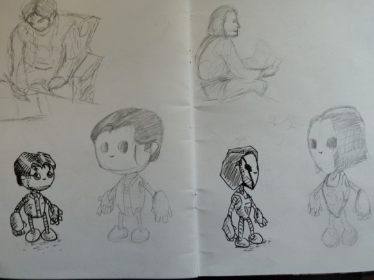
I next went on to do some artwork inspired by Terrance Whitlow, I don’t have the exact tools that he had but I managed to get some equipment similar that should hopefully do the trick. I had some markers to colour and to blend, I had a tipex pen do help with lighting and also had a white gel pen for thinner lighting lines. I also had a sharpie and a blending pencil (for the tipex). I then used a fine liner to add any small details later on.

This was the first artwork I did in this style, I remade Robot Noah but without any linework, I sketched out the rough shape and blocked it all in with the red marker, then I added lots of tipex and smudged it in to give a highlight, then added the shape and kept refining it as I went along and then finally got to this finished piece. I really like how this turned out, for such a messy picture it turned out a lot cleaner than I expected and I really liked the result.

I then went and did the same with the ninja turtle that I created earlier on in the sketchbook, I added a few more colours into the mix as well, to give it some warm highlights and cool shadows, as well as mixing in some colours to get some others. I also really liked how this turned out too, it almost looks like a painting but it was all done with markers and tipex.

Next I tried to also imitate Kim Jung Gi’s process with drawing with pens straight away, I drew my friends with bird heads and some odd quirk about each of them, one with multiple arms and one with multiple heads, I added some speech bubbles to give it more characters and throughout this process I had to try and train myself to live with each pen mark as I couldn’t erase any of it, so if I madea mistake I’d have to try and work around it. It turned out really well.
Next, I made a lot of random cuttings from this red card that I bought from the shop, then I stuck it onto the paper and used them to make some faces or draw whatever I could see in my mind when looking at them. I quite enjoyed this little task and I even added some shading and higlights as well.
0 notes
Last Seen Blogs
cigars0n1ce
Undo.
purple-st4rz-556
certified stupid idiot
nclex-license
nclex license
elise-charlotte-charlie
Live my life with a sharpie marker approach...
raspberryplays
RaspberryPlays