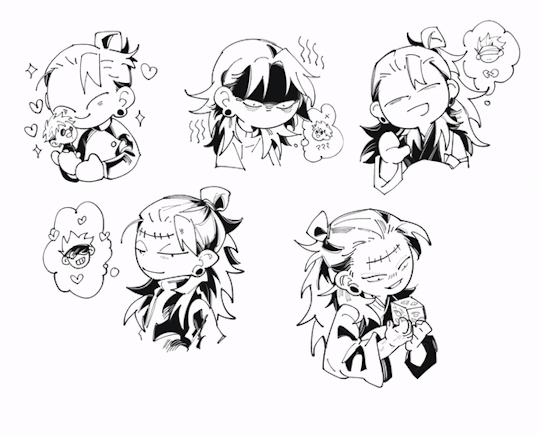
#I dont like my art style is so messy but yeah
Text

So.. things happened + I got a job so I haven't been able to draw anything in weeks 🤧🤕 anyway I'm SO happy bc the new season is literally in front of us and the P4 countdown illustrations feel like heaven🤩 so I needed to do something to express my joy (lol) so Ive just made this sketch on my phone with my finger and ngl it's an horrible way to draw, dont recommend🙅🏻♀️🙅🏻♀️ but yeah, thats it. I will do the other boys neeext
#kuroshitsuji#black butler#kuroshitsuji fanart#黒執事#black butler fanart#gregory violet#I'm very happy for the new season! 😭😭#I dont like my art style is so messy but yeah
18 notes
·
View notes
Note
hello hi!!! grfhvhghr i am in love with your artwork so much you cant believe-- i wanna ask if you have any tips on how you lineart and colourpick?? no pressure to answer tho, have a great day/night!! again, love your art <33
hi!! thank you for your kind words!! since i got asked about these a lot, im answering this for all the other ask asking about lineart and colour tips too! You can see some previous post here.
also i could only give out tips that work for my drawing style - which is heavy lineart / colours pop up the line (believe it or not it's American comic book style. ppl cant understand why my art doesnt really look like usual anime/ Asian webtoon style, even though it is still clearly anime / Asian webtoon style, but when i told them it's because im drawing these by studying American comics, no one believes it either lmao.
i do study but i do my own things too, so most of my art inspo is really unexpected to ppl, but they r really where i learn things from, cuz i dont even go to art school TT_TT).
Changing the brush size will help you achieve thick/thin lines better without having to put pressure on your wrists. Keep your hold relaxed and let bigger brush size give you the thick strokes.
I like messy sketch, to me the sketch is just an outline shape to fill details in when i do the line, it also gives more freedom to wriggle as i draw! cuz i dont really plan out everything from the start, just wing it as i go, so a lot of my work is actually very spontaneous.
that leads to this point: when you do the lineart you should start deciding which colour style you want from it to adjust the details amount. the ink shadow blocks in my art aren't there randomly, i adjust them to best complement the shape language and colours.
for piece where i want the line/shadow to...idk hit (?), the colours are almost flat with textured brush adding depth to them, so the inking is the shading, thus there are more details in the lineart / ink blocks.
for the video above and piece like this where i want the colours to be clear and pop out, the use of ink blocks are minimized and i do the shading during colouring process. but! the ink blocks can still make some places pop very nicely! just use in moderation!
when doing the base it's good to keep the colour on the left side of the colour wheel (low saturation), but as you do shading and lighting, try to spread out evenly so it won't look washed out.
toggle around with hue and saturation slider as you go! the key is always adjusting! you're making hundreds of decisions at once, being conscious of your choice in why a line or a colour should be in a certain way will help improve your process a lot! (i think you can tell which art i turned off my brain and just draw for stress relief ........ which is also a valid way to draw and sometimes the result might surprise you! but for more serious stuffs i try to be aware of most of the move i make. it's problem solving, yeah?)
i find that one way to keep your art from appearing too...yellow in the end (which is sth that haunted my ass for a long while) is always aim for cold tone, so if you accidentally make it warm either way in the end it won't be too warm (and yellow :cry:)
well that's all the stuffs i can think on top of my head. sorry i can't give more advice on colour picking cuz it's sth i don't really know how to give advice on???? i think my colours now are still pretty lame haha........ if there are still any questions i'd gladly answer within my ability, though im very slow to answer ask ( i do read and be happy at all of them tho!)
#art tip#ask#anon#albi’s art#ALSO I AM SERIOUS ABOUT THE BRUSH SIZE THING SAVE YOUR WRISTS NOW. TODAY. DONT LET IT HURT THEN TRY TO FIX IT LATER#aughhhhhhhhh *rub my wrists*
291 notes
·
View notes
Text
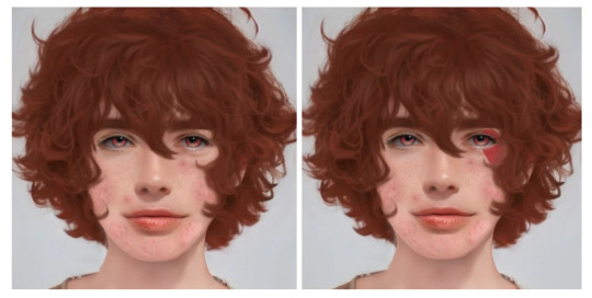
Realistic Ace Trappola + Headcanons
Ace headcanons + realistic artwork done with Art Breeder and edited in Clip Art Studio:
Okay so getting straight into it, this is my first post about my headcanons and realistic versions of twisted wonderland characters and the first one being introduced is *drumroll* Ace Trappola! Ace fans, you eating good tonight my chickies (that sounds so weird if u dont think of chickens right away LMFAO).
Sidenote: When headcanoning Ace and all my other characters, I take both factual and some of my personal thoughts/beliefs of the character to construct my headcanons.
So for Ace, its evident that I gave him acne due to reasoning such as his diet (fav food being cherry pie and mentioning his liking towards burgers) plus he is literally a teen boy that also has no women in his life and stereotypically the mother is the one to bring up looks as an issue, so without this Ace probably would have never gotten the right treatment for his acne.
He’s already a red head so I added on that by giving him freckles. Also, it's known that redheads are more prone to acne, so another note as to why I gave him acne.
For his features for a realistic rendition, I went with a heart shaped face (because Ace’s card suit is hearts) but his widow's peak is hidden beneath his bangs. He has a snub nose shape which is quite round and slightly upturned. He has thicker eyebrows cause we all know bro don’t give a shit about his appearance.
For his hair I went wild, it's extremely fluffy, a bit curly and like shoulder length when wet. Bro has had like two haircuts his whole life and probably smells foul. I also tried to keep to the original style pretty closely without it looking really weird like bro came straight out of an anime.
I didn't draw the bodies for any of them but Ace is more lanky with long legs and a rectangular body shape, but he has pretty big feet and hands.
Yeah and he's got a light British accent gang I’m sorry 😭 – he uses slang often as well.
Without & With Face Makeup:
Personality and backstory headcanons + a bit of character analysis:
Okay so Ace is one of the very first characters we meet in the game and a good one at that, a lot of people just put him in the category of “dumb friend with one brain cell”, and yes that's kinda true but every person had a reason to be the way they are due to personal experiences. We know in canon that Ace has always lived with his father and older brother but due to the literally no backstory on his mum, I’m saying his parents are divorced which he has much more time with his dad, also by his mannerism being so straight to the point and not sugar coated, this could be due to him being raised in an only male household. Which could also hint to why he “didn't feel committed” to his former relationship in middle school, he was so new to this type of love and got scared. After all he is just a teen, cut my boy some slack. (#1 Ace defender)
Due to this relationship with his mother and seeing how his parents fell out of love, fought or similar, he’s very bad with women which is why he has only male friends. The only way he would have a girlfriend (or woman friend) is if they were not sensitive to his zero-filter way of speaking and even tell him off for it. (not me doing this since my yuusona is a girl 💀)
It's still mentioned that the whole family gets together around holidays (although this could possibly just mean his grandma and such and not the mothers side) so maybe the divorce wasn't messy and they just didn't love each other anymore, which happens all the time with quick relationships.
Ace is also pretty immature and not into deep and emotional conversations which is common with teen boys (especially around his age group). So not trying to hate, but all those scenarios made up with him comforting the reader and helping them feel better, in reality, he probably wouldn’t have gotten why you're so sad and not really know how to comfort you. Which is completely fine! He's not fully grown in body or mind and people need to accept this.
He definitely makes your mum jokes and sex jokes, bro cannot stop himself laughing when a teacher says anything sex related. He's highly competitive and will sulk if he loses a basketball game or bet with a friend.
Also despite being not very empathetic (not on purpose though), he appreciates the little things. For example, he’d appreciate you remembering his birthday or always having a spare pencil for him in class as you know he always loses his. He really appreciates those friends and even though he lacks in some areas, he will always protect them and stay by their side no matter what.
In conclusion, he's just some teen boy who's still learning about life and people. I had a lot of fun making the realistic design and giving him more depth as a character and I'll be doing this for the rest of the cast and after that maybe side characters?? Only if you guys want it though, I’ll also one day release my yuusona 😞. (she’s my queen get ready yall (hi i’m the 10/10 editor and assistant 😋)) (together, we are big brain)
My editor/assistant cause I can’t grammar or spell to save my life: @cyb3rpnnk
SIDENOTE: DO NOT REPOST MY REALISTIC RENDITION OF ACE OR ANY OTHER CHARCTER I DO AS YOUR OWN. EVEN THOUGH THE BASE WAS MADE WITH AI IT IS STILL MY CREATION!
However you are permitied to use my headcanoing as your own for art or stories or whatever, just not my realistic rendition.
Hope you enjoyed my take on realistic Ace and my headcanoning!
#twisted wonderland#ace trappola#twisted wonderland headcannons#twst headcanons#twst hcs#twisted wonderland imagines#twst imagines#realistic twisted wonderland#twst art#twst fanart#disney twisted wonderland#twisted wonderland fanart#twst wonderland#twst grim#yuusona#twst yuu#twst ace headcanons#twst ace trappola headcanons
43 notes
·
View notes
Note
Howdy! I was wondering if you had any tips for how to improve my drawings? I love your art style (and just your art in general), and I was wondering how you make the lines like that, it’s hard to explain but your lines are messy(?), you don’t seem to worry about getting every line to be absolutely perfect, I have trouble with that on my art and I know imperfections in the art give it flavor and character, but when I’m drawing it’s hard to ignore and just keep drawing, especially on digital art. Sorry for rambling but yeah, if you have any tips on how to make my art look better or how to not stress as much about making perfect lines I would love to know! Thank you so much for reading this and have a nice day (or night)! ((P.S. I love your art, some of your stuff has genuinely helped me identify more about myself and it’s helped me through a bit of a rough time irl, I’m gonna stop now before this ends up being an essay lmfao, but seriously tysm!))
Hello Candle!
I dont worry about things being perfect no, it slows me down and it adds nothing to the art.
My main goal when drawing is to capture feeling and energy first. Then I worry about how readable and clean the lineart is second. A messier style benefits me on that. Since then i can get extra messy if i want the energy to feel chaotic, or really really clean and precise if i need it.
So my advice to you is to work out your poses and expressions, ask yourself if it captures the mood you want. One thing I always try to do is make sure you can understand the mood of the comic without a single word of dialogue.
27 notes
·
View notes
Note
hi i'm the guy who wrote a whole ass essay about my fav ships, with Nene as an unwilling match-maker. headcanons for the Shinonomes bc i love them;
- Akito can draw, courtesy of having an artist as a sister. Like, if he decided to pursue art instead of music, he could. His art is almost on par with Ena's. I think that when VBS was too lazy to do a choreography for a song they want to upload on social medias, they'd make Akito make an MV for it lol (ofc the others would help him make it, n25 style)
- I think it's pretty much canon that the Shinonomes have sweet tooth, especially for pancakes and cheesecakes, but i want to expand on that; New dessert shop down the street? they'd already bought the entire menu by the end of the week. New dessert recipe on trend? when Shinonodad (i forgor his name) came home, the kitchen was messy af and the culprits were on the sofa, eating said dessert while watching netflix or smth.
- Adding to that, everytime it's like, Valentine's, or White Day, or any celebration day where cafes and shops would have like, couple discounts, Ena and Akito would pretend to be couple just to get that discount or free dessert. it's the only time they were nice to each other. Mizuki caught them once. She took a photo of them and sent it to the Kamiyama gang gc. An died laughing. Nene said that's actually genius.
- Everytime N25 had a meeting, at one point they'll get the honor of witnessing the fight of the Shinonomes first hand. like, it's so common for the Shinonomes to fight in the dead of night that at this point, Mizuki already prepared popcorns.
- None of them are a morning person. At 6 AM every morning, you will witness the waking up for school Akito and just finished school Ena. They either stare at each other before having a mutual understanding, or the other would somehow trigger the other and they would have a boderline almost physical fight.
- also yes they have fist-fighted each other for at least 5 times in their life. And i just know one of the fight was bc one of them ate the other's cheesecake.
- Akito is trans-masc and Ena is trans-fem. They traded genders.
- They also traded clothes.
- When they came out, Shinei (shinonodad, i remembered his name finally) actually doesn't really care. for how much he's an asshole, he still loves his kids. Shinei just goes "oh, ok" and hugged them. Shinei's not the best parent but he's trying.
- Shinei actually bought Akito a binder. Akito cried.
- WLW and MLM hostility. that's them.
- Akito knows how to style hair. He taught Ena how to do it.
- ENA GOES TO VBS' CONCERTS AND AKITO ALWAYS WAITS FOR N25'S SONGS PREMIERES. they'd rather die than admit that tho.
ok yeah this is getting long enough. i love the Shinonomes sm.
-- also can I call myself unofficial mod Tsukasa from now on :D?
i love. everything. about this. also call yourself whatev you want (im a lil confused about it but as long as no ones going after my name(iwillfindyou(iamtherealakitoshinonome))). ive read so many sad headcannons about akito being able to draw really well, and ena getting so upset about it that he just stopped all together. dont get me wrong, i am an angst enjoyer but man. one of the serious fights theyve had was over akito supposedly "stealing" the only thing ena enjoyed. :( - 🥞
OUGHFHFHHFHFHFGHGHG.... this is all so real I'm sobbing - mod ena
#mod akito#prjsk#project sekai colorful stage#proseca#prosekai#prsk#project sekai#proseka#project sekai colorful stage featuring hatsune miku#project sekai headcanons#proseka headcanons#shinonome ena#akito shinonome#shinonome akito#ena shinonome#tagged by mod rui#mod ena
29 notes
·
View notes
Note
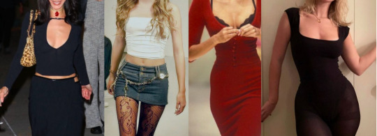
I don't know why but I love this ask so much so what outfits do the LIs typically wear? im ready to faint over how G and Victoria dresses up
Sooo I made collages and basically like an essay i went a bit overboard (oops)
So I thought hard about what the ROs look like and my biggest thing was that I wanted to make sure the gender selectable ROs still have their own unique presence and they're not some interchangeable variable. Gina and Griffin dress pretty differently and have a different identity, especially when you consider what it means to be a woman in the music industry (some context changes in the story if you choose Gina instead of Griffin, some of her actions are out of her feeling like she has just as much right to take space in a male-dominated art form, especially given that she is also married to Victoria, a woman)
Griffin does not have this problem since he's 1) a man and 2) he and Victoria present heterosexual
GRIFFIN/GINA
(Griffin on the left/Gina on the right, both in the middle)
G either dresses like the textbook definition of a 'rockstar' with the leather and fishnets and ripped jeans and all orrrr like a 18th century era gothic victorian butler. Literally no in-between.

For both Gina and Griffin, having so many tattoos becomes part of their image. Griffin wears a lot of muscle tees while Gina wears a lot of sleeveless tops, halter tops, corsets, anything that really enhances their arm sleeve.
The middle is the Victorian Butler style I mentioned lol, since they both dress like that as their "formal" attire or for shows. A lot of ruffles, very 18th century gothic. One thing is that I feel like Gina wears more red, she wears more tight fitting clothes, lower cut clothes. Griffin's shirts are also pretty revealing, very much low-cut V's, muscle tees that show the side of his whole chest. G isn't shy about the human body and they've gotten shirtless on stage many times (both male and female/ think Victoria from Måneskin.)
That slowed down a bit since Misfit Alley went mainstream. Their label and team had them tone down a bit to be more digestable to the masses.
Their hair is long for both female and male. Griffin keeps his in a loose knot/bun at his neck, and Gina does the same, but also a single braid down her back (sometimes).
Some things that they wear often: a lot of rings, G has knuckle tattoos and they wear a lot of jewelry. They have a signature leather jacket that's pretty roughed up, wear a nose ring, and pretty scruffed up boots.
SEVEN
Female Seven and Male Seven dress pretty similarly. Seven dresses more grunge and Kurt Cobain was the direct inspiration for Seven's style. Female Seven also dresses a bit like an art teacher lol
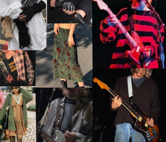
A lot of oversized clothes, slouchy, worn bigger, muted colors, a lot of layers. Female! Seven wears a lot of long skirts, cardigans, funky patterns, big boots. They dress pretty much the same both on and off stage.
At first male!seven was going to have short cropped hair but it doesn't suit him. His hair is more like:
very messy and such yeah. female! Seven keeps her hair down, kinda messy and looks uncombed (seven is very clean i promise lmao)
Things they wear often: Seven sometimes fingerless gloves, part of it because they can cover the tattoo of MC's initials, but sometimes they forgo it completely. Sometimes it's a whole arm sleeve. Surprisingly, Seven doesn't have a LOT of tattoos, it's more dainty, tiny meaningful tattoos scattered around their body.
AUGUST
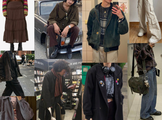
August is like Seven in that they wear big, slouchy clothes but where they differ is that August is more academic and put together. They also like to wear the art teacher skirts. Scoopneck sweaters, cargo pants, and they prefer long-sleeve and long bottoms, usually they don't have much skin showing.
Things they are always seen wearing: headphones around the neck, they dont go anywhere without them.
ORION
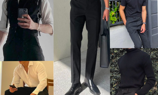
Orion is pretty self-explanatory. He wears mostly slacks, sleek boots and a vest. Very professional dressing. If he is going to wear something casual, it'll be something like the right. Still fancy pants, but a clean black shirt. You won't really see him in anything less than 'business casual.'
Things always seen wearing: a watch lol
SEBASTIAN

I don't know how else to describe Seb's style as anything other than just basic. A T-shirt and jeans and he's good to go. Even the images I chose are a bit too stylish for him. Like, he's really just a basic guy. He doesn't think too hard on his outer appearance. Literally just...a Guy.
Even funnier when he's surrounded by people wearing fishnet tights and chains and a bunch of patterns and accessories like he stands out, oddly enough lol
The image in the middle isn't exactly how he looks in my head, but pretty close. Just a very unassuming but kind looking person. Also his hair is like that, just golden blond.
VICTORIA
Victoria has a very classically simple style. Sleek lines, tight dresses. It's not too out there, unlike G. Very simple. She dresses a bit like the second picture for G's shows, a bit edgier and leaning a little into the flamboyance. She tends to set trends and is looked at in Hollywood as someone pretty stylish. Victoria's body type is on the curvy side, more the farthest right than the other three, a bit bustier. She's a simple but effective dresser.
She loves heels, loves a square neck (farthest right). she loves a good form-fitting dress lol
--
IK its a lot but i would be doing this whole story a disservice if i made them boring dressers! so im not sorry !
211 notes
·
View notes
Note
hi! I saw your post about critiquing another persons art work and it made me realize i dont like my current drawing process
Mostly because I have shaky hands and don’t really like line art because it takes me too long and i still dont like how it looks so im trying to switch to a more painterly style
Do you have any advice? Particularly on defining 3d forms?
P.S.
(I love your art style! You draw so beautifully and I love how you stylize anatomy and hair particularly)
yeah i feel you, i think everyone starts digital art with a lineart heavy style in mind and then gradually drop it as it is pretty hard to master
i'm not sure i'm the best person to ask about defining 3D forms as i myself struggle with that, but i thing that i noticed is that if you don't have a stable base or foundation to paint over then the process will become exponentially harder. So what i do is i make sure i have a cohesive sketch. Not a clean one, not a pretty one, but one where i am sure where everything goes and one that helps me predict and better visualize how things will end up once i get there. If the sketch is so messy to the point where i can't tell a leg apart or i don't know the general form of the fabric then i'll have a much, much harder time rendering later on.. So i think making sure the "skeleton" of your art is set in place. Again it's not about it looking good or clean it's about knowing what you'll be doing with it in the later stages.
But let's say you do have a clean sketch, or even lineart. I think the easiest way to give form to your subject is by choosing a light source ( it doesn't have to be dramatic, it can just be ambient light ) and then paint shadows in the areas where light can't reach. It depends on your style really, but for me i use a darker (but still saturated) color under the chin, under the eyes, where the bangs/hair meets the face and for the nose area i kinda just make a blob (i don't paint noses that much as you might have noticed bdshj but you know,, check out other artists you like and examine how they handle shading). Just try to think of everything as oversimplified shapes. limbs are cylinders, the torso is like a parallelipiped or a box or a sack of beans or whatever you see fit, the head another box etc... just keep it simple, Less is more
Oh and also, for a painterly style, i suggest avoiding overkilling it with the rendering. Let the brush strokes speak for themselves and keep it vague/ abstract. Our brains are smart and they loove filling in blanks for us if they're given some general information so let the viewer do the hard work, don't explain everything.. this is also a good way to practice developing an artstyle but i'm getting off topic if i wasn't blabbering enough already. A painterly style is imperfect and messy and vague at times and you should let it be that way, don't force perfection onto it as you'll deprive it of humanity
these are my two cents on the matter hope it made sense and helped in any way? if not you can always watch yt videos or listen to more qualified people than me
#sinix marco bucci ahmed aldoori#i think that's the holy trinity#they explain stuff pretty well#also don't forget to analyze other's work and see what They do#no need to reinvent the wheel u know#ask iztea
20 notes
·
View notes
Note
Any advice on how to draw backgrounds? Gotten to the point in my art where im semi confident in drawing poses and expressions but backgrounds?? girl help i can only somewhat draw a tree
oh hell yeah i love backgrounds, ive been working on more interiors lately (when not overburdened by sbc work lol) but im assuming you're asking about nature so that's how im going to answer it as okay so:
-first of all find yourself a good TEXTURED blending/smudging brush because it will save your life. i use these rock texture brushes from This Studio Ghibli pack, it's $6 and i HIGHLY recommend the whole pack because it's the main one i use for most of my bg foliage/grass ect and i love it dearly

-find references either in irl photos or other artist's work. if using another artist's work watch their speedpaints or look at what you like about their art style and techniques and steal it. im serious. obviously don't trace it and pass it off as something of your own but look at how they do the aspects you struggle with, and try to incorporate that
for me, that struggle is forest foliage because i have a hard time filling out the spaces without everything looking like same colored blobs, so i looked at how my buddy hannah mudshadow does bgs because she's really good at filling out a scene and making it look natural, and i noticed she uses a lot of abstract shapes instead of trying to render every leaf, so rather than doing my base work for bushes/trees with a leaf brush, i use a chunky scatter brush now and it looks really good, and then i can go and add some leaf brushes on top of that for more definition in areas that might catch light ect so that will give it the thick, bushy .. bush look without looking crowded or too shaped
-nature is messy as hell and things are never going to be perfectly shaped and toned unless you're drawing perfectly managed hedges or something. got some dirt brown on your green bush? those are dead leaves now. accidental weird texture on your tree? the bark is gone there, something ate it. bushes and trees have dead branches that just hang out there in them, grass grows long and sometimes a deer or whatever doesn't eat the whole patch so there's long uneven sprigs sticking up. petals fall off flowers. trees have huge webs of branches
-don't try to detail everything. make things further away more abstract and messy to give the illusion of detail. throw a gradient over it for some slight tone variation or something so it;s not completely flat but ppl are going to look at your subject and see the rest of it with the corner of their eyes, so you don;t need to fully render every flower in the field. here's some examples of that
the cactuses in the far BG are just V and Y shapes, the joshua tree in the middle distance is dark with some light blobs right on the edge where the needles would catch light.
this is from 2021 so be nice to me but as the flowers go back in the distance, i stop rendering their petals and start doing blue dots with white dots, and then even further away i just sorta blend blue and green together to give the illusion of a field of flowers.
-i dont know what your style is, but i personally hate using a ton of layers and tend to merge them as i go, but for the most part i draw every panel of SBC bg on the same 1 layer, going back to front (start with sky, mountain, bg grass, foreground grass and cactus, then go back and scatter foliage as necessary) and it keeps my stuff loser and i tend to get less precious about making things look perfect. i also work very fast because i am unironically really lazy at art and am desperate for shortcuts.
-oh yeah one more thing. assuming you draw cats, cats are SOOOOOO small in comparison to literally everything. as warrior artists i think our perspective gets a but confused sometimes (i am certainly guilty of this too!) and there is absolutely nothing wrong with this because sometimes that's just how you have to build your scenes, but it really makes me laugh when i see scenes of like, rusty jumping off his fence to go into the woods, but the fence is only a bit taller than him. so try to remember things are huge and cats are small as hell
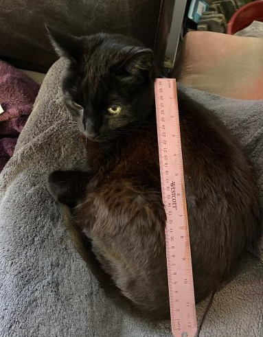
na'ni's a huge cat, all things considered but look at her compared to my small aloe plant

or the cedar tree in my front yard.

absolutely microscopic. don't look at my slippers.
so yeah. i hope this helps, it's not so much a tutorial because i don't think i'm the best person for tutorials because honestly i dont know much and this is all stuff i've picked up on, like i dont know shit about composition or values or color theory but this is important stuff to keep in mind about the environments themselves. don't worry too hard about colors at first because you can always change it by adjusting your curves n stuff. or slap a filter on that bad boy. or dont. also pay attention to your horizon line because it helps angle the rest of your piece. but look up tutorials for that because i only started learning about it like a week ago
55 notes
·
View notes
Note
YOUR TAAAAGS YOUR TAGS YOUR TAGS YOUR TAGS. ok. off is kind of hit or miss for most people because its so weird and vague and i am extremely biased bc its one of my favorite thinfs ever BUT. i am going 2 say i think u will love it actually. its got soooo many fairytaleisms. its got tragedy. its got extremely morally grey characters. theres no good guys or bad guys. ITS GOT WEIRD LITTLE GHOSTS !!!!!! look at these bitches i used 2 doodle the off spectres in my notebooks like constantly they feel like home 2 me
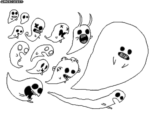
the art style is so unsettling and creepy. its got sketchy lines and weird freak of nature characters. i am going to be EXTREMELY selfish here in saying that i think u will very much enjoy the art style and also i want 2 see how u would draw some of the characters bc ur style is very monochrome and messy (<< i mean this in a beloved sense i love your linework so much) and i think it fits the vibe so perfectly. on a completely unrelated note are you still taking commissions.
ITS GOT ONE OF THE ALL TIME BEST OSTS EVER BTW. i still have the main battle theme (which is called pepper steak btw. best name for a song ever) as my ringtone on my phone. my video game ost rank goes 1.portal 2 2. off 3. undertale 4. minecraft. the off ost holds higher regard in my brain than undertale. shaking your shoulders it fits the vibe of the game soooo perfectly.
i will not get into the story too much here bc i already talked about some vague spoilery stuff in that post and i dont want to tell u too much more in case u do play the game urself BUT. ohhh my god. i could talk about the story for hours. u can ask aster after we finished the game we sat on call for like 2 hours while i walked her through my personal take on the ending and then she gave me her thoughts on the ending and EVEN THOUGH WE PLAYED THE GAME TOGETHER AT THE SAME TIME (i streamed it for her) WE HAD DIFFERENT OPINIONS ON THE END. ITS SOOOOO FUCKING GOOD its one of those things where like. its so open ended that nobody ever gets into fights about what the "right ending" is because. well. there isnt one UGH i love that shit.
also zacharie is here. he is such a beloved character to me hes been one of my biggest huge comfort characters since like. 2015. i love him. hes like sans undertale for people in 2008. he was the original sans undertale. i think they would be best friends
oh also despite the fact that the setting is very much like. weird abstract, sort of fantasy sort of industrial, the main character is a fucking baseball player. hes so out of place its so funny
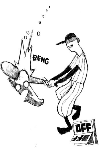
^ official art btw. to give u a taste of mortis ghost's art style. its so silly and weird i love it so much
OK THAT WAS MY OFF PROPAGANDA SORRY FOR INVADING UR INBOX I LOVE YOU also ive been in a huge off mood for like 3 days now and have not been able to talk about it so im EXPLODING now
OHHHHGHGHGHGHHH. MACKERELLLLLLLLLLLLLLLLLL MAC U CAN'T DO THIS TO ME..... ohhhh my god. ok. ok yeah im pinky promising u right now i WILL play it. like. SOON. it looks so good hooly shit. game that i can TELL will rearrange my brain. also it looks SO nice... i like the art style so much. mac u are GETTING me here u KNOW what u are doing. u cant just go ros theres an unsettling morally gray tragic game with an incredible ost and weird art and NOT expect me to go fucking bonkers.
#also i trust my frebds implicitly... i loovelovelove. consuming media my friends enjoy esp. if they think ill like it too.. its so cool.#anyway .OUGH.THERE ARE WEIRD LITTLE CATS TOO????#ok god currently i'm playing through final fantasy 8 (LONG GAME) & watching adventure time & rereading magnus chase & doing#one million other things but i WILL make time for off. i want 2 soo bad...#mac tag! 🦈
5 notes
·
View notes
Note
exaggerating our features in a way that seems like.. characaturey
not rendering textured hair but cleaning up straight hair
not a lot of diversity with your portrayels of black characters, you reuse the same features for them
i recommend varying skin tone with both cool and warm tones
Thank you! Firstly i want to clarify thats NEVER my intention. And i mean, NEVER. Im not sure what i may have done to portray that, and I’ll be more cautious in the future. I do tend to make things in my art like poses and expressions and differing features (eyes, nose, ears, headshape etc.) to make each character distinct from one another, but i’ll be extra careful with it going forward. The second one i dont usually do fully rendered stuff, i have a very messy style but i’ll keep that in mind! I dont recall doing something like that but obviously i forget things easily so thank you for the note :) 3, i dont really draw other characters other than Gus and Mattholomule, and i guess my most recent had an oc of mine, ive had her awhile and i should probably revamp her a bit. So yeah with the very few examples and having those two characters have similar features, i can see how that put you off. Again, i try to make all of my characters look different in shape and personality so I appreciate this heads up! I try my best to change it up with hairstyles and such but it definitely needs work!! Last part is a good tip, i usually stick to a certain colour tone in my art thats a bit on the warmish green side so yeah i’ll try to change that up too ofc. This is the first time someones been honest and brought this criticism up and so i appreciate it, thank you! I’d hate to have been unknowingly doing things wrong and upsetting anyone because thats not my intention. It never was and i only want to improve in my skills in general and get better at things! Again, im sorry that my art made you feel this way. It means a lot that you said something because the thought of my art doing harm in the way it potrays POC is an awful thought and never what I wanted to show in what i do. Thank you anon :)
#i hope this suffices#thanks again for telling me i just#Really hope you didnt get the wrong idea from my art#I do NOT condone drawing POC in a way that offensively carcraturizes them.#I feel strongly about it and take everything like this to heart#Its super important and i only want to improve
10 notes
·
View notes
Text
wow pinned post!
[Profile picture description: An image of KAITO, an anime-style character with fair skin, short messy blue hair, and a headset, against a muted genderfluid pride flag background. End ID]
[Header description: a digital drawing of a glowing white butterfly perched atop the spherical knob of a brass cage. Also atop the cage is a decorative horn to one side of the knob; the entire cage is coated in a translucent, glowing white filigree pattern that varies in opacity, getting brighter towards the butterfly. End ID]
helix or leucine or kamino, they/them mostly, minor, east asian, adhd diagnosed autism vibechecked by every autistic person i know, disabled and a mobility aid user, very queer, also a median system that mostly uses i/me dwai
tealblood, prospit dreamer, mage of light ✨
i try to put image descriptions on my posts with images whenever possible and i use tonetags when i feel like tone is unclear. posts with undescribed images are tagged #no ids
i talk in caps and i dont tag weaponry or most "creepy crawlies"; i tag arthropods as #bugs for my own usage though. most common triggers + foo d and fire are tagged #cw trigger or #trigger mention
im buddhist and talk abt that + my interest in other religions under #religion
my occasional vents are tagged #vent, block that if u dont wanna see them
i reclaim cripple and queer
dni in a nutshell: dont be awful or assholeish or exclusionary (esp militantly so) thanks, more detailed dni in my carrd
i draw things sometimes (usually in autodesk sketchbook) and thats under #helix draws, sloppy stuff is under #helix doodles
i dont make much music but what i do is under #helix composes even though the only thing there rn is not an original composition
i answer mostly non-askgame asks under #helix answers and other talky talking is under #helix talks
i have so many fandoms a list can be found in my carrd although it is probably not complete also i have ocs in some of the fandoms and ocs in my own universes; here is a list of most of them
for whatever reason my current hyperfixation is now Homestuck (at A6A6A5 rn), and i have special interests in biology, costuming/textiles, and linguistics as well as old sci fi, social justice, and US politics i think?
pfp by @prosekai-pride, header my own screenshot redraw from the silksong trailer
my carrd hasnt been seriously updated since i was in a big "heck yeah art is my Thing" phase sorry about that lmao
#pinned post#helix talks#i am writing this what is for me late at night as a morning person bear with the. absolute rambly nonsense
5 notes
·
View notes
Note
Hey man Yknow what I’m actually kinda curious about what the basic plot of Roseverse is ngl. I mean from what I’ve seen habit is a big ol Grumpus muppet kinda fellow(BASED AS HELL BTW) soo ermmm, lore. Plz? *Looks at you with big ol eyes*
Okay I was gonna reply to this with a whole comic but it's taking a wHILE and I don't wanna keep you waiting THAT long so. Here's an answer in text for now!!
Roseverse didnt start out as an AU. It was a bunch of loose ideas all the way back in late 2021 for an idea I was struck with like when that Greek dude with the bathtub and the gold cried EUREKA! Except, you know, instead of making a huge scientific discovery I just made a bunch of nerd shit instead. Which is SOOO Haiderrrr /lh /affectionate
The idea was " What if Habit and Kamal were childhood friends"? ( Plaintext: What if Habit and Kamal were childhood friends? ) And so I worked off that basic premise. I took Habits diary pages, analysed them, and drew and thought out what he'd be going through and looked like at the time, with Kamal as well to mutually play off of each other. I did this ALL with my very good friend @prrusten 's help, hell we didn't even mean to make something so big, we were just talking and having fun and hitting it off!
But yeah. Here we are...Almost 3 years later! And now it's become a whole AU called Roseverse, after its Flower Kid sona/insert, Rose T. Flower. But it's not actually about him HwjjskHAKSJSJ--and its branched out beyond just Habismal though TBH Gillis is still the MOST underdeveloped character in the whole thing LOL I'll think of ideas for you one day someday muscleman. It's changed a lot too. There was a phase with Mad Scientist Kamal and everything. I don't think I'll ever post everything aha! But I will surely share content while I can.
Infact one of the changes is Habit's design...! You've seen some ofthe newer refs as opposed to Grumpus looking Habit, he looks more like a marionette. I still dearly love the old design...but messy stuff just happened and I feel immensely wrong using it again for newer art now. So I needed a specific revamp to indicate change for me. I don't really wanna get into every detail but I'll make a appropriate post about it one day or like update my pinned when I'm ready and know.
Here's a little drawing for you in the meantime Sharko! An old one but I think it still carries the spirit of the whole thing:
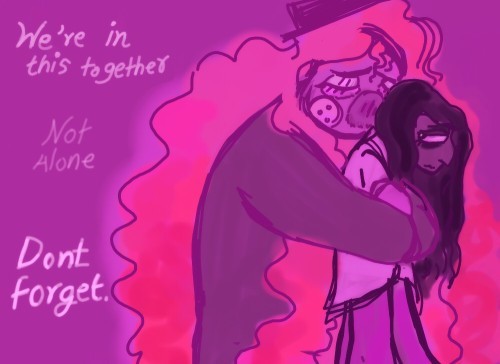
[ ID: Simple styled and digital colored art of Dr Habit and Kamal Bora from Smile For Me. It is in mostly dulled purple and pink tones. Habits hair gives a burst of rose and pink against the other tones.
He is closing his eyes and has caught Kamal in a hug from behind, leaning into his head. He looks worried. Kamal looks back at him, visibly tired, but there is a spark in his eye. Here his hair is long and falling down.
Whitish-purple text reads ‘’We’re in this together.’’ Then more transparent, ‘’Not Alone’’ and finally in bold clear text, ‘’Dont forget.’’ end ID]
And a song I more newly associate with Roseverse vibes...
youtube
[Thumbnail ID: A screencap from the anime Clannad. A man kneels on the ground to tightly clutch a little girl who hugs back. The background is sheer white snow. End ID]
[ VD: The music sounds melancholic, with twinkling noises throughout, and a slowly played track with echoing ambience. End VD ]
-
Morning edit: Aw Sharko.. I'm sorry this happened right after I told you about it but I've decided Roseverse will be shutting down and I shall post no further content of it for the time being. I will still continue like, using this blog for S4M stuff and make fanart in the Canon style sometime later but yeah man... :") (teary smile emote)
#hmmm hope the music VD works#Its not a lot but its something#anyway thank you so much for taking an interest in my stuff#it means so much to me#because i get really nervous and worried people will just never like it#i say#txt#roseverse#s4m#smile for me game#au#ask#roseverse intro#dr habit#kamal bora#habismal#childhood friends
6 notes
·
View notes
Text
i’ve been very slowly cutting things out of my life. i kinda feel bare right now in the sense that im very lonely and stagnant, not much going on, but im still open to vulnerability, change, and creation. i keep thinking about my future lately. i was doing pretty good at living in the moment but i have this creeping feeling that i need to figure some stuff out...
i’m not really sure about music anymore. i find it enjoyable to make. im proud of myself for what ive done, even if it is kinda shitty. ive heard myself grow musically and vocally over the past year. and im like this with painting as well. ive seen that ive grown a bit, but i still find what i make pretty mediocre. and im fair with myself, i realize ive only been doing these things for a very short amount of time.
the thing about painting is that with the process, its not something i always enjoy. sometimes i get the urge to start and then i do it and im like im not even having fun. like the motivation is there but the joy is not. i dont really get it tbh. i decided maybe the way i was approaching it and the techniques i was using was probably what was making it so burdensome. i have yet to try my new approach (which is a much more messy and flowing style) because ive been so busy with work and ive had absolutely no days off. luckily this week i have a bunch of time and im excited to do some art.
on the other hand, ive been writing my novel pretty steadily. almost everyday, but not quite. sometimes its a bit difficult to get into the mood but once i do i can write for awhile. especially on the train i find it pretty easy, and then i get to my stop and im disappointed because i wanted more time to write.
AND THEN, im working on fashion. i spread myself a little too thin, i think. the thing about fashion and writing is that they are both things that come very naturally to me. (unlike painting, and even less with music.) painting is something that i struggle with and i know i am decent at drawing, but when it comes to music, im completely in the dark with it. vocally, musically, structurally. i could of course teach myself, but i think the whole overwhelms me. its a lot to learn and do and while i feel excited about it at times i cant tell if its because i feel like i need to do it because of an identity thing, or if i genuinely really love it. most of the time i think i do it because im like, well wouldnt be really cool to be an musician and have an album and music videos and perform? and like right now, yeah, that does sound fun as hell. but occasionally i will feel indifferent. or like its just not for me.
but back to fashion, im enjoying it, as little work as ive put into it. i want more time to work on it because what i have done ive enjoyed. i think the thing that triggers all these thoughts in me so often is capitalism... in an ideal world id have all the time to do everything i want, and no pressure at all to feel like i need to do things because of money, success, etc... i could just do them because i love them. its extremely hard for me to see past the capitalist lens. i want to be able to tell if something is right for me or if im just coming about it wrong. over the years my ocd mind has been so plagued by this way of thinking that i feel like ive hardly gotten anything done at all. im really tired of it, honestly. the only good part is that ive crossed a bunch of stuff off my list of things that i thought were right for me but actually arent. like acting for example, ive fully decided that isnt for me, lol.
anyway. i just needed to share and i forgot my journal at home so i had no other place to put all this.
1 note
·
View note
Note
HELLO i really like your watercoloury art style, i was wondering if you've ever made any posts about your technique/materials/general tips?? love your karen art she is so wonderful she holds my heart in her hands
thank you so much !! :'0
i do have kind of a process for some of my art but the watercolor karen was a bit different since it is ACTUAL watercolor and i just enhanced a bit the colors and the warmth on laptop afterward !! i can still give u more details i’ll put them under a read more !
Material
the paper was a sample i got in an art shop. it was really thick and grainy. 600g/m² from the brand hahnemühle if i remember properly. it is an expensive block but maybe u can find a big enough sample to do art on it in an art shop !!
watercolor wise i have a box of 24 colors from the brand van gogh !! it is personally a good middle ground in term of price and quality for me
the only difference is the red. i had a red tube from winsor and newton bc i wanted a more saturated red (i dont have the exact name of the color rn but i’ll be able to edit that tomorrow with the exact name)
brushes wise i just have art shop brand brushes. as long as they stock up nicely on water, i have different sizes and the hair doesn’t part after a few strokes im not really demanding.
also i used some faber castell watercolor pencils !
Process/ technique/ general tips
that part might be messy algfjdlg but here goes
process wise i did my sketch on laptop, printed it and used a light table to put the sketch on paper. now that i remember the paper was kinda too thick for that so i just copied it on paper mostly. then one evening i just did all the painting. the next day i scanned it and color corrected it ! thats the gist of it.
now for general tips its just. dont be scared to go apeshit thats the great thing about traditional art i would say agfdjgkdfj. like i didnt follow perfectly my lines the colors were the ones i planned and still i v much love it.
i would say too that ppl tend to not put a lot of saturation in watercolor stuff because it is a technique that u can take ur time with and correct easily overtime. i always try to put a LOT of paint personally. this one is kinda hard to describe but yeah dont be scared to really. Go In with watercolors it can really stand on its own.
also i am personally a big lover of mixing watercolor and pencil escpecially for contrasting colors. like how i added light blue in the red of the jacket or green in her hair. i love doing that and the mix of the two is the best way for me.
it is what i can tell you from the top of my head rn but feel free to ask more details if i was too vague or what akgjdlkf
#ask#platonce#i do have a more defined process when it comes to digital art#(except the last karen one that one i really just. did whatever i just wanted colors and textures)#but yeah traditional art is my place where i just. do on the vibes#i v much like it
3 notes
·
View notes
Text
(A lot of this info can be found on that, but since it’s really messy I’ll also put it here. Also yes I did steal (with permission) ....most of this from @asksharkmc)
Asks are: open!
Am I on hiatus?: yeah, unfortunately.
Rules
Look. No NSFW. No. This is an 11 year old orphan. No.
This ask blog is 16+ unless I, the mod, know you.
This blog will deal with heavy topics.
...please dont....make them eat any stones./j
These rules are subject to change as i will be adding to them
This is run by a single person, do not expect often updates.
.....mayir is both ELEVEN and ACE. please refrain from shipping them with anyone
Keep asks and things of the like on brand for this ask blog, ie. No crossovers that aren't minecraft related unless talked about extensively with the mod of this account (sal)
Character Info
Name: mayir
Age: 11
Gender: nonbinary (they/them Pronouns)
Species: tropical mermaid
Current Vibe: calm...ish.
Blog Info under the cut
This is a hobby-type semi-casual blog. For the most part it’ll be simplistic in nature and art style unless I’m feeling particularly energized. It’s all for fun.
There are plot and character points to discover, and things that will develop over time with interaction. For the most part, these are all character-based, but I do have external lore for the world set up as well. It all depends on what happens!
This is a semi-rp blog, meaning not all my responses will be 100% drawings. Sometimes characters will continue to speak outside of the drawn responses.
I’m fairly lenient, so I take M!Anons as long as they’re not too over the top, and I personally love character interactions. Rp threads/interaction threads are encouraged, just know I might not 100% draw your character if I’m not sure if I can draw them correctly.
Also I *for the life of me* can not draw open mouths. Its one of my struggles and honestly I just got over my need for bases.
Character Ref Sheet (kinda bare bones tbh)

#minecraft ask blog#mayir!#mermaid#art ref#info post#god i need to clear up rules#minecraft#aaaaaa#what do i do with this#shit well guess this is my life now#time to throw it in the fuck it bucket!
6 notes
·
View notes
Text
since i only have 3 oomfs from twt here (n I also assume they dont go on tumblr a bunch) ill just say some of the ideas for the art of the untitled logs I been keeping on my mind for a month now 🤧
.
art direction wise: itll be very focused on stippling for the 'pictures' taken by the camera, since pictures look fuzzy n crunchy if you look hard enough, which will be interesting to do with a pen I gotten recently, a pilot 0.38. but for the other ways to go by the art and how it'll be done will be somewhat different. the 'pictures' will be in these rectangular boxes to signify they they were taken by a camera (though not too strict on that aspect since i dont want it to be the same rectangle) but if I'm drawing a character talking from memory it'll be very gestural with simple indicators to what a thing is. a single pen stroke for the hair, n will just look very clean. but if it's of a fight scene then that's where things get interesting.
.
i will mainly use printer paper for the 'pictures' n other not very detailed or heavy handed works, but for a fight that needs that sort of reworking because of how I want it to look in the sketch, then the inks, and the (very very Very minimal) color placement will be more important. which i have more somewhat thicker paper I nabbed from school for another use but never got to. and regarding color, I've always been interested in the high contrast, inspired by pitch canker with the usage of reds black n white he does and haruko ichikawa, the mangaka of land of the lustrous. but how I'd intend to use high contrast is for something with a impact or the drama, shock of the sorts, with a whiteout pen for drawing very minimal detail. like if I want to emphasize the face or even the body, showcasing their strength or emotions while they're the black silhouette with the background being one solid color of white or red. but if i do want to draw all the pen strokes n detail then I'd wouldn't do the stippling, it'd be more reminiscent of BLAME! from tsutomu nihei, messy detail and most importantly: Cool as hell. it is the big inspiration for TUL anyway so why not go all out. i use crosshatching for my shading, so it may or may not work out? as crosshatching isnt very known to be Messy, moreso Perfect and Precise but ill manage.
.
back to the very minimal color usage I said I'd do: why so? well it may have something to do back to pitch canker again and another visual style that is very much so Cool. at least to me.. let's say I want to emphasize a character bleeding out, ill only do black and white as i actually dont have many pen colors besides the ones I Stole from school or i was given to by my parents, and also cuz BLAME! god damn it! ill use a blue pen, if you're wondering. or a character has a color code in mind, if they feel like a Phosphophyllite cyan then ill use that color to assign them with.
.
also. acrylic paint. that high contrast style I'd need to use a better paper for? yeah that's a big reason why, i only have blue Vermilion (because I'm DUMB and didnt realize it wasnt a good shade because walmart is SILLY) yellow black n white. obviously I need to make these drawings all in one thing so it wont be on a canvas. i described the idea I have for creating the one and only TUL book on twitter but I basically need the following: holepuncher, black n white paint, wire, scissors, ceral box, and the Prayer i have if i actually get far into making the untitled logs in the first place. itll be a book all compiled of the loose leaf, printer and slightly better papers all given 5 holes (I don't trust loose leaf with only 3) with maybe 130 pages. 100 pages isn't actually that much if you're making many different scenes in a span of 2 or 3 logs with 10+ drawings in there so, it'll be a moderately ok size for a handmade book made from paper and a ceral box with black paint on it.
.
that's the end of the more physical work needed for TUL, and my thought process really (i felt very rambly). thank you.
0 notes
Last Seen Blogs