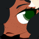
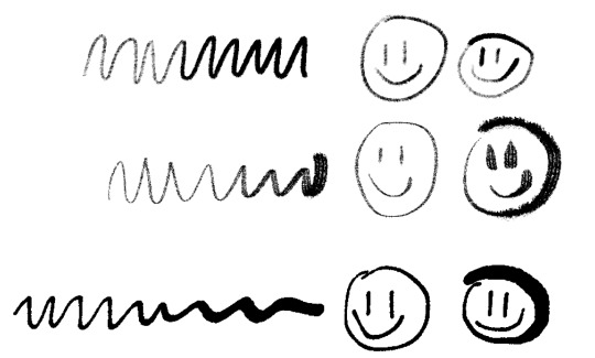
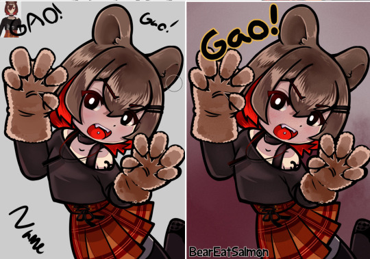
#I personally love drawing thick lineart!!
Photo


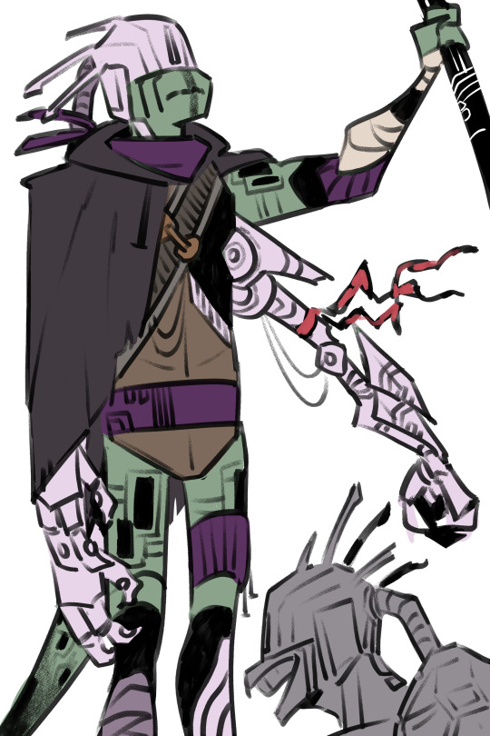
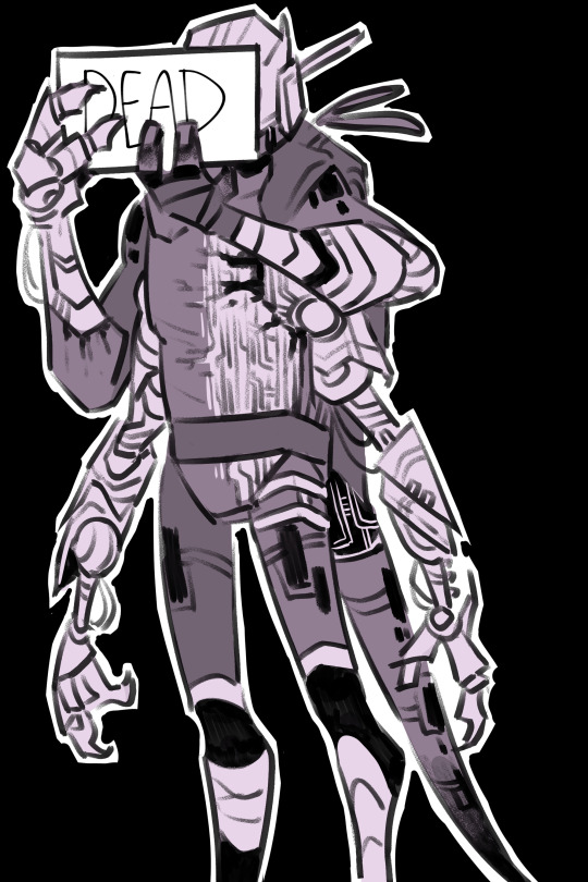

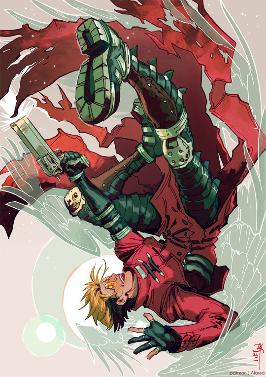
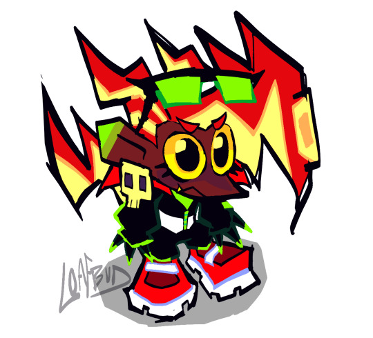
playing around with future donnie’s design and all i can say for sure is this:
1) lose an arm gain three
2) dies
#my bribe has been fulfilled good bye forever folks#ignore how i my lineart is nonexistence i dont actually know her#tried playing around with thin lines though and honestly its kinda fun#personally i prefer the thick ones but thats just me#anyway#future donnie at your first#his design was so fun but also a PAIN TO DRAW THOSE STUPID ROBOT ARMS#hashtag suffering#its ok he dies real soon so its fine <3#ft some conceptualizing scenes from tltc#hopefully#rottmnt#tmnt#donatello#future donnie#future michelangelo#mikey#bad future timeline#i love her actually sm bad future my beloved#kk im done
4K notes
·
View notes
Note
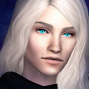
Please, can you tell me more about Dae-Hyun? I will take literally anything. His favorite color, his hobbies, what flavor body wash does he use, what does he wear when he’s not butchering, please anything.
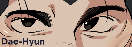
for sure !! here's a batch of dae-hyun facts
Dae-Hyun doesn't really pay much mind to a favorite color, but he does tend to have more fondness for anything white, brown, soft yellow, and pale/muted greens. he loves anything earthy when it comes to colors, something easy on the eyes. that's not to say he dislikes other colors, but heavy saturated tones can give him a slight headache.
as for body wash, he tends to pick unscented ones. working in the butcher shop can leave a copper scent linger on his skin, with something that strong, he tries to eliminate it as much as possible. unscented washes make him feel overall cleaner, while scented wash makes him feel like he's trying to cover up the smell, instead of getting rid of it. though, it's mostly in his head. his natural smell is pleasant, though mostly undetectable.
when off the clock, he wears loose-fitted, thick clothes. due to his stature and size, it's often already hard to find anything that fits him. he has to find anything in tall variants and those options are pretty limited, but he tries to pick things like pull-over sweaters, and loose pants. when he's out and about, he'll typically wear a pull-over with some chinos without pleats, and home something more like a short-sleeve henley and sweatpants.
his hobbies are pretty tame; listening to music, sewing, charcoal drawing, but he especially loves watching old korean movies and tv shows. his mom and dad would watch with him as a kid, and while he's not watching what they did back then all the time, he still has a fondness for shows and movies from the older era, especially tragic love stories. he loves the interpersonal relationships and depths from them, feeling a lot more personal than what he sees in modern shows, western or eastern.
along with these hobbies, it all links to creating something. quietly making his mark in his own world, not really even sharing it to others. he loves drawing pretty faces with smokey charcoal, it brings peace of mind. he loves the shading process especially, his lineart isn't the sharpest but he still makes overall coherent pieces with indirect ideas and feelings through his visuals. since dae-hyun is pretty stoic, and doesn't have a lot of close relationships, he uses his art to express himself. it's his outlet, that his other hobbies don't really compete with.
𖦹 Join our Discord server to get early access to art, polls, headcanons and more! 𖦹
#yandere#yancore#yandere imagines#yandere scenarios#yandere oc#yandere x reader#male yandere#//mun kiki#yandere drabbles#yanderecore#yandere headcanons#mun kiki art#mun rose writing#dae-hyun#yandere art
222 notes
·
View notes
Photo

something that is fun for me is taking pets i never liked and trying to make them appealing to me personally in some way. just some minor tweaks here and there can make "Ugly" pets much more cute. make myncis a little less squat and a little more dynamic with more curls in the design here and there, or give poogles a droopy face that sorta reminds me of eeyore. it's little things like that.
of course, if you already love them how they are, maybe it's me getting my grubby hands all over them and ruining them. i hope not!
also, i know poogles don't have noses. i think it makes their design worse tbh. on their old art, there's this little scribble that looks like a tiny nose, which i thought was cute. so i gave them a nose.
anyhow, besides all that, i wanted to try keeping my lineart as it is on the first pass just to see how it turns out, but unfortunately the fun part of lineart to me is making it thick and chunky. i like to linger on it. oh well.
i don't think i'm ever going to get bored with drawing neopets. i'm sorry that it's all i've been drawing for months at this point. i've been really into drawing cartoony stuff in general, and these designs are Literally Perfect for that, in my opinion. it's ridiculous how fun it is to draw a silly cartoon.
88 notes
·
View notes
Note
Hi I just wanted to say I love your art sm and you actually helped me get back into drawing a ton, for a while I had this weird idea in my brain that I HAD to draw semi realism/realism otherwise every man I drew would be horribly twinkified and I'd never be able to draw the characters I liked, but I just drew my first ever man I'm happy with in a style that isn't semi realism and a lot of it was inspired by the way you don't always close your lines w lineart and don't use a ton of pen pressure sensitivity and your art comes out incredible. Those were things I always did but would try to stop doing because people told me they were stuff you "weren't supposed to do" and it just ended with me being frustrated whenever I drew and hating my art. But seeing you do it and make absolutely gorgeous stuff really gave me that confidence to just say fuck it and do it anyways and I'm starting to actually get in the flow of drawing again, so thank you :)
This is so so cool! I struggled for About Ten Years with not being able to line in a way I liked, and I’m so glad that my way of doing it is inspirational to someone else! I hope you figure it out faster than I did haha.
Style wise, it kinda just happens, I don’t think many people fit super neatly into boxes anyway, so don’t stress over it, I definitely don’t know what my style is defined as haha! I thought it was semi realism til I googled it HAHA. I copied artists like makani and coey, reapersun and loish when I was a teenager and it definitely swayed my style!
Also I relate extremely to not really vibing with how other artists do lines. For me personally I THINK its because I think in shapes and not lines, and I started out painting and working in tone. Like real life doesn’t have lines, and when you paint it’s generally just varying between soft and hard edges, using the colour and tone to do the lifting for you. It’s way harder to figure out where to put a line, or what things need a line and what doesn't, if you’re not used to thinking that way.
I definitely ink more like I paint, kind of thinking about planes and shadow or overlap more than the outline? Like I draw the top curve of the cheek, then the jowl, then the chin, it kind of feels like cutting a 3D shape out in the space…? But I think that’s why mine are often choppy haha. In traditional art I always preferred a square brush, which carries over to my preference for minimal width variation on tablet.
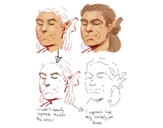
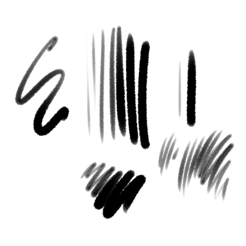
Saying that, I *do* sometimes work more with width, though it's still messy and choppy haha. my trick with those is that I always choose a brush that has a fairly consistent minimum width, I can draw with a fairly fixed line, but also press down a little to get the variation when I want it. (As opposed to brushes that kind of go really thin and really thick with little effort, like a brush pen, I just don't have the control...) Below are my main blobby inkers, I can pretty comfortably draw a fixed width face, but I can make it wider if I want.
Anyway I went off on a tangent, I hope you can make art in ways that feel natural to you! And I hope making art brings you joy!
Some artists I love the lines of are linnea sterte, steven sugar, momopachi, jadenvargen, artharakka, beidak-art, pien-art, wombrion!
81 notes
·
View notes
Note
Really love your art ❤️ the wings you draw looks amazing 👏 how does one draw them? 👀 do you use any references?
Oh my god, this ask is making the circle full fr. ;; Thank you SO MUCH, Anon!! I've had an enormous wing kink most of my life, but scared of drawing and avoiding them for uh.......... most of my life lol. So reading this means A LOT.
TLDR - yes, use refs of all sorts of birds! use gradients! don't overdoit with brushstrokes! wings are paperthin!
In 2021 I said fck it and-- asked my partner, @lesoldatmort, who's a wing-master to teach me how to wings. And the answer was simple - use refs. I did! And it looked better than before. But. Uh.
Most of my wings looked like-- pillow sheets? Or. Pillows. Blankets. Puffy and thick. (Rafe from December, 2020)
So the biggest trouble for me personally (and for my partner, who was trying to knock it in my thick skull), was to get the wings as thin as possible. And use refs. And draw a lot of wings.
The biggest and best advice I got from my man, was to think of wings as of paper. Flat and thin. And use gradients for the sections instead of too many brushstrokes for each feather. Actually, save on the brushstrokes where you can.
January 2022 this was the best I could do. And that's after a LOT of interference from my partner, who kept nagging me to get rid of brushstrokes and add. more. gradients.
In June I decided I'm cracking the case. Gave up on trying to paint too much, because I prefer lineart 95% of the time anyway and drew the Howl piece. Still too many brushstrokes, but I used vulture photos as a reference for this one. Adoration is from this time as well. Used a pinned down bald eagle as a ref for Zack's wing.
In summer, I did some more random studies, kept looking at wings very closely. Looked at other artists drawing them. In September I was lucky enough to get cmed to draw safer Sephiroth. And that was probably the final moment I gave up on too many details and brushes and started stylizing the hell out of it. And using gradients. And lasso tool. As my partner's been telling me for almost two years at that point. Thin. Finally.
And then I just kept going. Simplifying the hell out of them............
And here we are. I have a problem. It's called a wink kink. And I'm loving it. <3
A few months ago, due to a gender crisis, lol, I even started using the name "Alas" along with Alassa. Which supposedly means "wing" in latin.
So... Thank you for coming to my ted talk and personal vent and rant. Sorry this got so long! However, seeing somebody asking me specifically about wings in my art... feels like reaching a finish line after years of whining. Thank you so much! ;; <3
164 notes
·
View notes
Note
I love how you portray some of the mercinaries in your work and I love how expressive you make them! Its very shapely if thats the right word.
Do you have any main inspirations when drawing?
thank you!!! your work rules btw ;;
i place a big personal empahasis on shape-e-ness and try to pay a lot of attention to silhouette and posing...i'm eternally jealous of people who can maintain good posing (BONUS if it's naturalistic), good simplification of forms, sexy lineart AND keep their characters lively and animated! i think mine get very stiff sometimes but urghh...we try we try
UMMM if we're talking about characters...it feels kinda lame to say as it's so 'generic', but Disney! the design work and simplication of forms are so perfect in certain films that I think it's really worth studying as a masterclass on posing and clarification. Some of my favourites are 101 Dalmatians and The Sword in the Stone although big shout-outs to Atlantis, Emperor's New Groove and Herclues.
I really love mid-century modern too so that influence creeps in a lot, especially if I'm doing toonier stuff. I'll revisit UPA films or their descendents (Dexter's Lab / Powerpuff Girls / Johnny Bravo) quite often. I really like the clean lines, graphic shapes, strong poses and recycling of colour palettes that define these guys.
Of course, there's a tonne of modern/contemporary artists I really like - some I've had the pleasure of working with (crazy ;;) ... I reccomend checking out Juliaon Roels, Julien Rossire, Meg Park, James Woods and Ami Thompson ...ah the list really could go on!!
Recently I've been reading original Asterix et Obelix and Marsupilami to study the linework. I'm really enjoying the thick-to-thin, the gag?...oriented posing and acting and the simplification of fabric and hands.
#asks#i really like talking about styles and art and what i like about x or y#it was very hard not to get out loads of pictures and arrows and obsess over some elbow fabric folds from 101 dalmatians in this post#and go full...sunny in philadelphia pinboard meme#anyways hopefully a fraction of this emerges in my art
54 notes
·
View notes
Note
Hi :) just wanted to drop in to say I really love your art, the way you use lineart and colour are like, insanely beautiful. I'm curious what brushes you use for lineart? Hope you have a nice day!
Hello!
Thank you very much, I'm super happy to have such a positive response to my art ^^💜💜💜
Talking brushes: I mostly use a default pen with a fuzzy texture, the exact type is not that important, it cam be noise or a spray tex. of sort)
Now what I feel has a more profound effect is the exact proportions of pressure, sharpness and density. Here the preferred setting I use in SAI2:

I'll try to break it down a little so it's not just useful for SAI2 users, for I do not know the ins and outs of how other programs approach this.
I set to to have round tip with no sharpness, and both minimal density and density amp set to 0, which results in it corresponding directly to pen pressure. The additional size and density scrollers set quite low too. That, together with high stabilization and low tablet sensitivity (smt you can do in your tablet settings, you can play with them too!) makes the brush rly easy to control for both opacity and thickness. Which is what I personally prefer (it gives a soft pencil feel I think) You'd need to set your density settings higher if you prefer a more opaque lineart brush.
I do advice playing with them yourself to get the feel for it, it's honestly very useful to understand and develop intuition for.
Now another "tool" I absolutely cannot live without is this pesky lil boi:
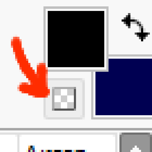
The "switch to transparent" tool is like, A Beast, and I don't see a lot of talk about it's versatility. I set it to my hot keys and use it more that undo tool :D
To elaborale: I find it helpful to use the negative space (or erase) the lines I draw in a particular way to give them a more unique value that it would have by itself. I'll try to demonstrate:
So, the gist of the technique comes down to subtractive shaping of form, in combination to usual additive approach. Now, this is a specific trick I find rly satisfying to my style of drawing that works well with my brush preferences, which is by no mean universal, but what I would encourage to take away from this if you're not doing it already is to think of erasing as not just a corrective tool, but also an artistic one!
(Note: switching to eraser does similar thing- the only downside is your brush settings and texture would have to match with it, which can be a hustle)
I hope this isn't too elaborate of a response, and hope it is at least somewhat helpful X3!!
Good drawing you Ya'll and first of all: have fun!
Have a nice day~
38 notes
·
View notes
Note
do you have any advice or tutorials on how to draw (specifically color) like you do? i admire your artstyle a lot and I want to learn how you do things ( ˶ •́ ω •̀ ˶ )
got this question a few other times so ill attempt to explain how I personally color (๑•﹏•)
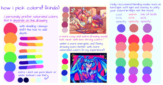
whipped up a small guide (?) but ill explain in more detail some stuff here
• when picking shadow colors i specifically aim for cooler colors (i use very cool ones for the darkest shadows)
• i dont use pure black or white since it can make the drawing look more flat for an artstyle like mine!
• tip for backgrounds, try making the colors blend together more (with blending modes if u want!) so that the characters stand out more. i also make the character + anything i want to stand out more bright and saturated
• adding onto the last point, i reccomend using complementary (aka opposite colors) for contrast
• i dont really do this myself cuz i forget but make sure u dont get caught up in details! a good tip is to color your sketch so you can play around with the colors more easily and to make sure your drawing has good contrast from a distance
• little bonus lineart tip.. line weight! i reccomend finding more in depth videos about this but a simple explination is: thicken your lineart in places where parts are heavier (ex. bottom of a lock of hair or thick shirt) and for anything you want to stand out especially w backgrounds, then the lines thinner for small details
• also just a personal touch of mine, little doodles like stars n hearts really help everything come together and fill in empty space!
these r just some things that have helped me with my art, remember these arent rules! experiment with ur art till u find something you like, study others artwork, take tips from others and adapt them to your own work!!
im not good at explaining but i love rambling about art and i hope u can find a few things in here useful (´ . .̫ . `)🫶
#also sorry 2 the people that asked me this same question in the past#took a lil while to respond but yeah!!!#non art stuff#gonna use this tag for anything yk non art related just for easy search :^)
35 notes
·
View notes
Note
Any tips on how to emulate isat's art style?
Hi!
I am but a humble mimic, I sense there are folks who can tell you more accurate details BUT I also love explaining steps I make while making my own art so I'll tell you how I improvised~!
Firstly, I found the wiki (no, not the Fandom one) for all the references. I tried to study how the characters work and I used a lot of just color picking to get the grayscale hues accurate
The lineart is obviously much thinner than what I went for and it seems to use a crispier brush for it to resemble pixel-esque kind of vibe but I wouldn't know which brush it is, I assume it's a custom/adjusted brush!
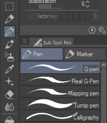
What I used was "Real G-Pen™" in Clip Studio Paint!
What's fun about this brush (and superior to G-pen brush) is the fun little texture it has that also resembles some of the crispiness but I think the ISAT one has a much finer texture, to give it the aforementioned pixel like vibe.
The thick line I used was just my preference but if you use Real G-Pen with smaller scale and basically only mild pen pressure, you get similar results to the OG style:

(some of the Sif's images has their lineart thicker in some places to give just a smidge of lineweight feel, enough to work with the depth but I demonstrated here how it looks with basically no pressure applied, it has a bit of that crisp and you can probably get a better one if your canvas was bigger than mine here (just under 1200px lol))
I then color picked from the original images to get the flat colors in!
What I did for shadows is just use the layer set on multiply above all the flat color layers, color pick from the white base gray (that Sif mostly has haha!) and use the that shadow for just about anything. I think I also played around with Overlay in the bigfrin image? you can play with layer settings too and see how it works! You will notice that depending on the mood of the scene in the game and the emotions of the characters take priority over how all of this works.

This isn't 100% as it is in the official artwork but I rolled with it most of the time!
You can throw some adjustments and extras here and there if you want it to resemble the dynamic party portraits even more (the extra line strokes, adding a bit of weight to the line, the white line strokes on clothes and hair...)

You essentially end up with something like this!
For the white outline, you can either copy the base color layer (if it covers the whole form) or the lineart layer but move it under the base color and use the border option:
Regular portraits don't seem to have that outline but I like it a lot personally, it makes the image pop XD
That's basically it! I love how simple and effective it is!
How you stylize the character and how you draw them is all up to you!
Many credits to insertdisc5 since I basically just tried to mimic their style with some liberty sdhjdfg
15 notes
·
View notes
Note
yo what procreate brush do you use for lineart it looks really cool :o
hi there -- i use a variety of brushes depending on the mood, so i'll make a nice lil compilation of my brushes to cover whichever one you're curious about!! thanks for ur interest 🥰
first off, the very recent BIC pen mimic i got from here:
and it looks like this:

it benefits from a lighter colour (can be used with grey/unsaturated colours), it's worth trying out a few for fun. its grain blend mode (brush -> brush studio -> grain) is set to multiply, so i think that's where it gets its light-to-dark gradient from.
then, there's this one:

which is an edited version of the default Tamar brush. i added jitter settings, which are the reason for its wiggles, and pen sensitivity. i love to use this one to give more simple drawings some extra flare.
and its sibling:
this one is basically the same, but with NO jitter and added stabilisation. :-)
the last one on this list:
i call her 'derwent highpressure 2 2 2', aka this is the culmination of me repeatedly editing & refining the default Derwent brush. the pressure sensitivity is super high because i wanted to get a range of pen thickness without affecting my sore hand too much. it's got a small amount of texture & jitter to it, and i'll be honest, i don't remember what the original one looks like.
to absolutely Anyone: i really encourage playing around with procreate brush settings because, although they're a bit difficult to comprehend at first, they're pretty open in terms of how you can mould them. plus, you can employ personally made textures & shapes (or free ones) to add subtle effects. it's fun! i have a whole dock of speech bubbles, decals, a watermark brush, body hair & feathers, etc. :-)
#procreate#procreate brush#brush settings#artist#sketch#sketching#doodles#original art#art tutorial#AMA
235 notes
·
View notes
Note
How do you make such beautiful boarders? is it easy for you, if yes can you tell me how 'cuz it's hard (and time consuming) for me
If you're referring to lineart, the only kind of advice i can give is to draw lineart as though it's a sketch (if you do have a sketch layer under lineart)
I know that sounds vague, but it can mean different things for everyone! For example, if you prefer your sketch over your lineart, consider incorporating how you draw your sketch lines into your lineart (e.g., if you use messy, squiggly thick lines for sketching, use those messy, squiggly thick lines for lineart).
For me personally, I stopped using sketching layers because I find it easier to love how my art turns out if I just draw everything on one layer haha
If you're referring to the borders around lineart on characters, what I personally do is make the lines more bolder/thicker along the outside, and make the lines thinner on the inside — I erase parts of the outer lines to give them sharp, angular edges :]

Of course, all this goes down to personal preference and your own artstyle's unique traits!
TL;DR— I know you said "boarder" but i assume you're referring to lineart (my apologies if I've mistaken, though!)
But (if you sketch before drawing the lineart), take what you love about your sketch lines (line thickness, shape, etc) and use those as your lineart lines
17 notes
·
View notes
Note
I love your art! I want to get out of realistic digital art, do you have any tips on drawing stylized stuff like you do ? (also what brush do you use for lineart im in love with it)
thank you so myach!!! im a strong believer in learning realism before stylized since its nice to have those structured principles carry over, but id say its all simplification and condensing everything into lil shapes! my current learning goal is just get better at thick, confident lines since thats a style i really enjoy. BUT i am not very qualified to speak on this im sorry :generic_crying_cat_emoji:
i only use 2 (two) brushes for everything i ever do (though i may have messed with my personal settings a long time ago, i really cant remember sdglkj):
shading and blending: nuruyu厚ぬり角
lineart: 万年筆風▲改

8 notes
·
View notes
Text
Progress talk thread
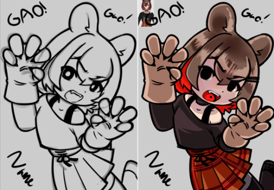
I like to take a lot of backups as I draw so we I can show off my widdle Lilly wips!! I'm drawing again that means I get to talk about drawing again yahoo
Lately when starting a drawing I've been trying to block out very rough thumbnails as seen above! I usually just start drawing like, the head, and trying to then figure out a body under neath and line by line it all ends up pretty similar to my past stuff because it's just not planned out! I don't know where the road is taking me!
So by starting out and trying to throw together the general pose with just a blown up light brush I'm coming up with much more interesting piece! I can figure out the general shape of the entire piece and then start working on top. No making a shoulder then drawing the hand over it and then erasing the shoulder and getting frustrated because it just doesn't look connected right because I didn't plan it out… where does this drawing end? where's the limits?? where am I going?? So my current workflow involves
Make the dimensions of the piece roughly (just throw a coloured rectangle down) -> very roughly block out the shape of the body within it
This also has the benefit of inspiring me to fill in the blanks with a pose I didn't initially expect! The body is reversed from my initial vague idea because seeing the blobs made me go OH IT'D BE COOL IF I DID IT WITH THE BODY FACING THIS DIRECTION ACTUALLY LET'S MAKE THAT WORK!! If you look at the initial you can kinda see it looks more like she's looking down at you with the raised arm being the one facing you.

Anyways after doing my personal Holiday pic the other day, I was like, it would be cool to do a small run of postcards to send to people yahoo!!
I checked the sizes of postcards and none were even close! They all had like an extra inch on of extra space on the bottom whoops! I free style my rectangle sizes when planning an illustration and I guess they're closer to square than the ideal rectangle! Whoops!
So for this one after getting the initial sketch down I thought, hey how close is this to 5x7? AND LO AND BEHOLD IT WAS THE SAME ISSUE!!! So I took filling out the extra space as a challenge. I'm trying to be more dynamic with my art after all!
I spent time adjusting the piece in sai2 using the transform tool with it's perspective skewing on. I wiggled and rotated and pushed n pulled and you get what you see above. A much more dynamic piece filling out the canvas!
The thing that took the most time in this phase was getting the skirt to a shape I found acceptable.
Up next was moving towards making it a finished piece!
Thick lineart is something I've been deciding if I want to stick with or not but honestly it's my natural state! I love thick lineart!! I grew up on manga I wanna see some black lines!!! In the future I wanna go back to colouring lineart as well but for now I believe I need to lean into my natural tendencies for thick lines!
I threw down my lineart to a mostly acceptable state, and brainstormed ways to fill the empty space surrounding Lilly. I found there was just a lot of empty space in the bottom left and I didn't really solve that in the final, but that's ok. It's something I'm trying to be aware of as I actually attempt illustrations. I want to finish pieces right now, I'm not in a place where I can let perfectionism slow me down.
Currently my layers are (face) and (lineart)
I throw down some flat colours, a light layer above and for once I tried a shade layer too! It might of been a multiply layer. It was probably was. Anyways this is what I was happy with before moving forward with refining it. I'm currently going with more focus on like, backlighting/rimlighting because it's easier to make it work with my no context existing in da void illustrations haha.
To refine it, right now, I'm playing around with mainly using one layer. So I slammed together my layers other than the face (I made that mistake with my previous piece and that's how we ended up with the eyebrow incident. I wasn't going to put myself in a place where I had to erase an eyebrow again) and started sculpting!
I think sculpting is the best way to describe it, really. It's a lot of slamming down chunky lines, and since the lineart is on the same layer, I'm constantly pushing colours out and finding the ideal shape of both it and the lineart. It helps me push my shapes even farther and let the colours take priority when they need to. Instead of them being separate things I worry about they're all just one big piece!
I was a bit worried about merging the plaid pattern down as well, but I did my best to get the skirt in a place I wasn't going to adjust much after the merge. That was the biggest priority of the previous step really.
It's a lot of fun! I recommend people try it! Try sculpting your lineart a bit!
I added the necklace accessory after since I knew trying to fit it in earlier would also be a pain in the ass haha. I'm not a one layer purist! I'm just having fun!
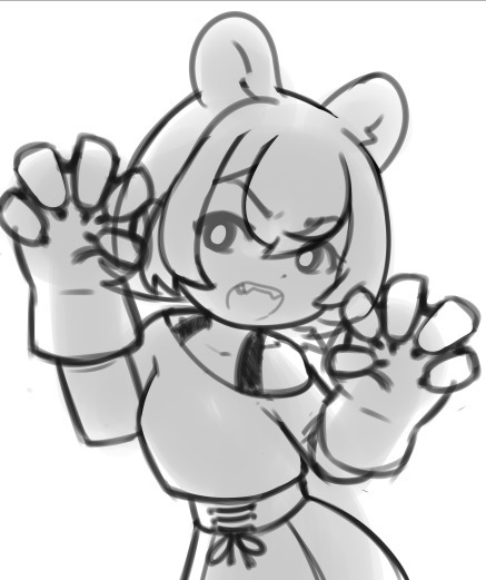
The background, I went in with no idea for a bg. So this is what we get. I think it works fine for this piece, it's a vtuber attacking you with big fluffy bear claws with no context other than that they are a bear and they're going to fucking get you. Red fits, Lilly has a very orange/red hued design and it's an aggressive attack so the mood works. I could of even gone harder and made it look a bit more splattery but I wasn't sure if I was going to fill up the bottom left space or not.
Looking back maybe I could fit in her name on a cool blood splatter there but I am not a graphic design major my brain is growing slowly in this department thank you
Also fluffy claw gloves usually have much less defined fingers but I couldn't make mitts look good with my initial plans so I stuck with my initial idea!!! Thank u.
Anyways follow Lilly [Twitch]
15 notes
·
View notes
Text
How to give good feedback on art (from an artist)
I often see people talk about how they want to leave good comments on art, but don’t know how/don’t know what to say. As an artist, here’s what I often look for to have something to say to other people!
The composition of the art – how different elements of the piece guide your eye, how certain parts are brighter against darker backdrop/darker against a bright backdrop. What catches your attention? How have they put the piece together to make this happen?
The lighting/shading – how have they rendered the piece? Do you like how the lighting is bright, harsh lines, or how it’s gently blended in? Do the shadows add extra depth that makes the whole piece look more 3D? Did they use funky, unconventional colours to shade?
The lineart – is it smooth? Sketchy? Are the lines thick or thin? Do they use lines at all? Are they in a colour other than black? How does it add to the piece? Do they just outline a piece, or add texture with lineart as well?
The colours – have they used a pallet of complimentary colours? Do they remind you of something specific – perhaps to the fandom, or to a season, an aesthetic, etc? Do they only use one colour? Do they use unconventional colours? Do they have one pop of contrasting colours against a monochrome background?
The anatomy – do they stick to exact proportions? Do they lean towards a more cartoon sizing? Is it like Powerpuff Girls, or like Tim Burton? 90s anime, or modern day anime? Do they make things very angular, or really smooth? What about it do you like specifically?
The texture – in the frame of digital art especially, have they used a specific brush to create a certain effect? Do you like how sketchy it all looks, or how they’ve blended the colours together? Does it look like watercolours bleeding, or a stamp/print made over the entire piece? Is it all rough, or super smooth?
The details – talk about how you love the tiny pattern on a blanket, or the multiple earrings in the characters ear. Talk about how you like how they’ve done the hair, or the little glint of light against a ring. Talk about the celtic patterns in the body, or the crooked teeth in their smile. Little things that jump out to you.
How it makes you feel – anything at all, but try to explain what in the piece evokes it strongest. Are you hit with isolation by the lonely figure in a wind-swept hill? Or joy, does that bright smile make your heart swell? Try and pick something out and babble about that.
Any meaning you can pick out – a little more tricky and often quite personal, but if you can pick something out that you think you can interpret, talk about it! I don’t think people ever get offended, even if you’re wrong – it’s interesting to see how other peoples brains work, and what they take away from something you’ve made.
Anything that stands out to you as a signature of Their Art – typically for artists you’ve followed for a long time – when you look at a piece, do you think ‘oh, this is by X’. How do you know? Is it how they draw the mouths? How they shade? The anatomy? The details? The colours? The composition? The expressions? Tell them!
I try to mix and match a few of these, focusing on things specific to the piece. Talking in depth about a piece helps an artist to know you haven’t just glanced it over and gone ‘oo cool!’ and moved on. If you want Tumblr to continue having a thriving art community, it’s beneficial to engage in and spread art around, as well as letting the artist know their work was seen and appreciated. They put the work out there for you to see for free! What can take you a few minutes of your day can make their entire week. Go support your artist friends!
#art#artist#artist on tumblr#feedback#art feedback#digital art#original art#traditional art#tumblr artist#tumblr advice#advice#yeah okay that's enough now I think#this isn't me saying 'you have to tell these things to artist every time'#god knows sometimes I see a piece and just reblog it cause I think it's cool but don't have the energy to give proper feedback on it#it's more a guide in case you WANT to do that but don't know how or don't know what's effective yknow#also as a disclaimer you really. Don't have to do this to me at all. I don't want to make ti seem like I'm annoyed people don't do that#I'm not! I'm not. Don't worry. thumbs up for you#also massive one - don't??? critique??? Pieces???? Unless specifically asked to????#I have an artist friend and we share our sketches and doodles and pieces together and we tend to just froth over them#sometimes we might go 'oh this looks a little wonky?' or ask for specific feedback but like. even with both of us doing art. we don't just.#insert out critiques into pieces. it's rude. it saps motivation. don't do that innit
128 notes
·
View notes
Note
Listen, can you tell me more about your art process? Because honestly everything from your sketches to the final product is amazing and I'm really curious to know how you go about it.
i am finally neither drunk nor hungover so i can reply to this properly! honestly, never expected an ask like this bc this is like. for the good (tm) artists. i started drawing in february, as well as this blog, and i'm still finding and changing things!
either way, what i strongly advise to think about first is a good idea and a good composition: first more important than last, but a drawing can just be hard to look at if it's not well-organized. for some reason, i like to do triangles with a detail in the center to which attention will be naturally drawn.
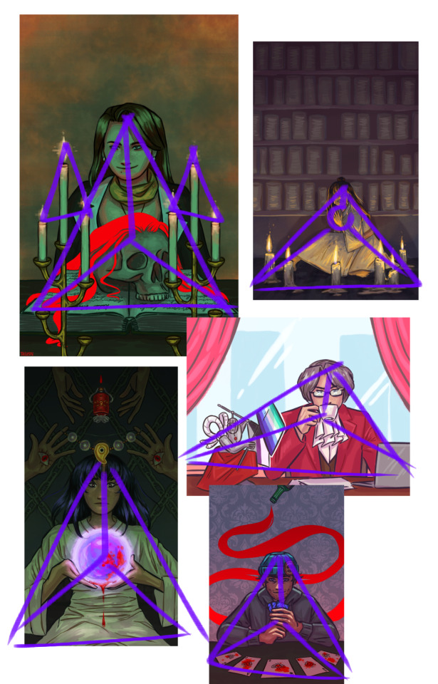
once i figure out what i want, i start doing multiple sketches: a very rough one with no reference and very thin repetitive lines, then a better one with references and corrections, and then a finer one, with thick strokes. here, you see the final sketch (still not lineart, though), and this is also where i put a base in the background: i find working with a white bg to be inconvenient, and it does add somewhat of an undertone.

then i do the lineart in thinner and better strokes! i'm still playing with the brushes and customizing them, but here are the ones i use rn in ibis paint:


i later go a layer below lineart and fill in the simple colors. even if i plan on making the light green later or using some interesting shadow colors, right now i imagine the lighting is simple and white. i put on the basic shadows by using the multiply layer and some dull pinks.
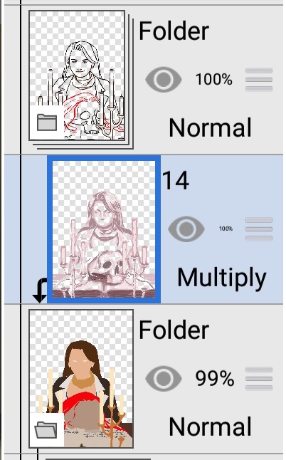
as you can see, i also color the lineart later with a clipping tool. frankly, by this point, the drawing looks bad. that's where i use the multiply layer again:
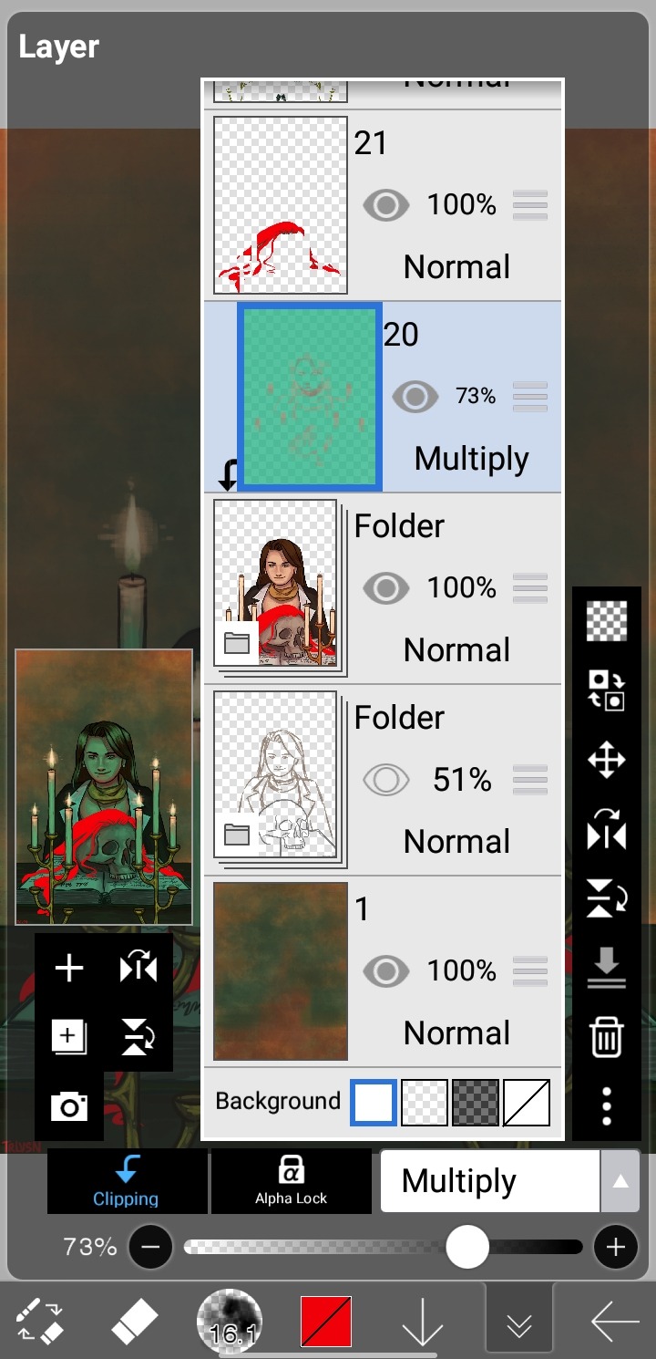
in this case, i added light by coloring some parts of the layer with a lighter contrasting color, but sometimes i just erase parts for really bright lighting in an otherwise dark setting, like in the beanix, kristoph and maya drawings in the first picture.
i add light with a normal layer by color-picking, and sometimes just go over the whole thing with a normal layer as well to correct small imperfections. i only use stuff like blurring and hard light layers for the candles, as i like to keep a certain roughness to the drawing.
uhh, what else is there? i do love doing a spot-the-symbolism moment like, everywhere, especially in the fey clan pieces... but i feel the most important part is painting not an image, but a character. this is why I'm so fond of painting from a live model: you don't capture a singular moment, you compile millions of images into one, this capturing the essence of the person, locking time with paint. that's, of course, not the case here, i just like to talk.
either way, just have fun with it!! duplicate your drawings to experiment, use clipping tools, learn some composition and color / shading basics, make things stand out!!
and thank you so much for the compliment:)
30 notes
·
View notes
Note
I absolutely love your line work in the Likewise time lapse. may I ask what program/brush / settings you use to achieve it so I can use it for my own lineart ? thank you
ah thank you! but my answer is actually pretty boring! (in an interesting way? i hope?)
i used the default CSP "Pen" > "G-Pen" brush for that. with low stabilisation so i could use my wrist a lot
the bad news is i don't use any special brush, i just use whatever comes to hand. the good news is, what you're probably noticing is my line weight! and i cheat my line weight! and you can too!
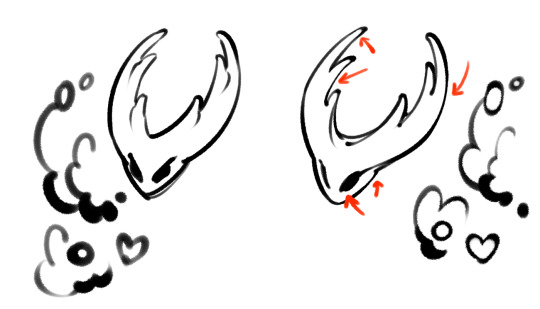
...i just go back over my lines after i'm done doing the outline. and i make it thicker and thinner depending on how much emphasis i decide i need. like this:
when i'm inking, i ink in one specific thickness, THEN i just go over/emphasise the parts i decide need to be thicker.
hopefully this helps! i really don't use any special brushes, i just go back and personally thicken the parts i need to stand out more.
i also use my line weight to imply shadow sometimes. i'm still experimenting :^)
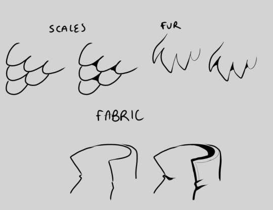
i tend to add details (like fabric stitching, or in above, the softer/minor fur detail) in thinner lines so that they stand out much less than the main outlines. they draw less attention from the eye.
the inside of the ears are like caves with shadow in them, so i go back and add more black there to make it look like they're in more shadow.
the snout of this dog is a main facial feature, AND it's long and thus closer to the camera, so i thicken its lineart at the end to make it draw the eye to the face. i do this with human noses too sometimes
a bonus example of how the "heavy ink" pretends to be shading:
all i did for these was just add more black, but it really adds to the illusion that the stand-out pieces are casting a shadow
hope this helps somewhat! sorry i couldn't give you a simple brush to use but i really just go chunkify my lines manually. it's kinda fun! if you squint you can catch me doing exactly this on the Likewise timelapse (though because i'm used to doing this i sometimes do it on the fly. i recommend drawing a whole thing in one singular lineweight, then going back to beef-up the lines you think should be more emphasised. the trick is only beefing those bits! it is very tempting to thicken everything. remember you're playing with emphasis! which parts need GUSTO??)
#gmtxt#gmask#anonymous#art timelapse#digital art#artists on tumblr#digital inks#??? idk which of these tags are good to use#anyway i hope this helps!!
12 notes
·
View notes
Last Seen Blogs