#I wanted to reuse a color palette from last year that I loved and this is the result ^_^
Text
Do you care for a cigarette?
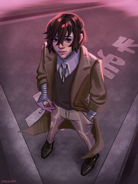
#I wanted to reuse a color palette from last year that I loved and this is the result ^_^#actually part of a larger project but life makes me incapable of drawing rn#so have this completed piece of an uncompleted whole for now! I will probably repost it once I’ve got the rest#bungou stray dogs#bsd#bsd fanart#dazai osamu#osamu dazai#bsd dazai#you can probably guess who he is looking at 🤭#I promise the perspective /doesn’t/ make more sense with the rest of the artworks. I found cool pose refs and thought: why not#my art
439 notes
·
View notes
Note
how has deja evolved over the years? i swear she gets redesigned like every few months /pos lol
LMAOOO ud be right cause shes changed stories each year (im painfully indecisive), this year is the only story ive genuinely been interested in exploring since i finally landed on a genre i think would fit her best? and i consider her redesigns to be a sort of progression into how ive grown as a writer and maybe as a person since shes been with me for so long lmao
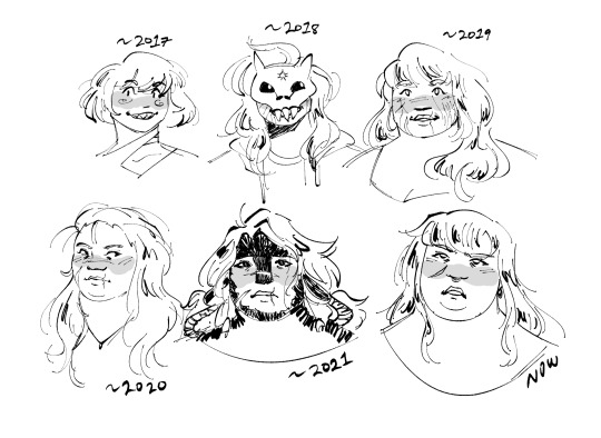
ill place this under read more cause ill go into condensed detail about her evolution for her characterization, her design, and a small timeline for her story contexts but tl;dr shes grown so much and has gotten way more complex. i love her so much
2017-early 2018: she actually started out as a sona concept! design wise, nothing really special tbh, i was throwing stuff i really liked. for 2017, she was just a throwaway concept, but i was rapidly improving towards the end of that year...
mid-2018: ... that i ended up reusing her concept as a character concept, and during that year, i made an au with a friend that spiraled into something that lasted about the next 2 years, that then included her as one of the main characters LMAO. i wanted to draw crazy hair and also a cute mask, so i did. i ended up making it so that the masks were to both hide her identity (shes a fugitive in the au) and to be some sort of metaphor. her personality was very outwardly sweet, but she could also kill you so it best to not get on her bad side, but she was also in a constant learned helplessnes. big deja year
2019: design wise, i removed the mask, made her fatter (despite me not knowing how to draw fat people yet), and made her sorta baby-faced, since her character is a lot more childish during this bit? story wise, her story was included in an anthology about different kinds of love in a post-apocalyptic fantasy world. during this time, i was going through a Lot mentally, and it sorta marked the beginning of a really horrible period in my life thats still kind of ongoing, so i used her story in a more experimental sense so i can figure out different workarounds in an escapist way? this is also when i started pairing her with her now-partner-in-stories, lualhati, and from this point, lulu and deja are inseparable
2020: for this year, i was sorta putting her story off? i was really struggling to figure out what to do with it other than the deja/lulu love story, but at the same time, that marked me going through a journey of adding fat people to my work. dejas always been small fat, but her body hasnt actually been drawn well enough. we all start from somewhere though. she was a lot more calm in this version, and is sort of a leader figure for a village in a fantasy world. but i wasnt really feeling it.........
2021: last year was when i really started digging deep into what i wanted to do. i wanted weird gay trans cathartic art. so dejas story was that. still wasnt really feeling it, but u can tell i was really experimenting trying to land on something i was passionate about. while i did like her design since its a turning point in my art, and its visually loud (the color palette, holy shit), IT WAS SO HARD TO DRAW? i understand that 2021 me was really going at it with very loud and distinct designs, but the reason why i didnt even draw her for months after was because she was so fucking hard to draw. and i didnt put enough effort to portraying her fatness (which will soon become a very important aspect of her character). but were about to pull a gamer move
2022: up until now, since 2018-2019, i wasnt really satisfied with her story. it didnt really fit what i wanted, bc i was mostly concerned with how other people would react if i talked about them, especially since deja/lulu have always been very personal to me. but i had a vision. where deja and lulu are in a revenge drama thriller in a city in the middle of nowhere. and i havent stopped thinking about it day and night ever fucking since. i brought back a lot of elements from past designs (mostly cause i thought theyd look great, i was right), and im finally getting to a point where im figuring out how i draw fat people. now, dejas characterization came really easy to me (hypervigilent, short-tempered, mysterious, a second away from realizing shes trans). her story explores themes surrounding violence, secrets, and suffocating marriages, and while its a far heavier story than the past ones, its the first time ive been genuinely excited to see how its grown. i could ramble about this all day lol
deja is a growing character and she keeps getting better and better every time im exploring her, and she genuinely means the world to me. thank u for reading this if u have decided to read this
#i started answering this at 9 pm and now its midnight hi. im possessed by ocs#if u actually do read this i encourage questions about deja and lulu cause their storys been sitting in my brain for a week now oops#deja (deja/lulu)#also hi icarus my friend seven :o) hope ur doing alright#hyperfixings
11 notes
·
View notes
Text
A Day for Romance
fandom: Stony (Steve x Tony)
summary: Tony and Steve didn’t have a romantic Valentine’s day in years and when Tony decides to fix it, something unexpected stops him.
length: 1 831
a/n: Happy Valentine’s Day, everyone! I know some people dislike this day, but for me, it was always more about celebrating all kinds of love, not only the romantic one, but love to your friends, to your pets, to everyone who you hold dear to your heart, and to yourself! So, treat yourself today, because you deserve it! if you like this fic, don’t forget to show me some love, feedback, reblogs and likes are appreciated and needed!
—————
A Day for Romance
"Tony... What's that?"
Steve found himself not able to stop smiling. There was some feeling coming back, one he didn't feel quite in a while, or at least not as prominently as now. Giddiness? Yes, that was the word.
By Tony's smile, twitching and spreading and the happy sparkle in his eyes, Steve could say that Tony felt the same, pleased that his Valentine's surprise worked out so well. Every day, their bedroom presented quite simple, with crumpled sheets, lone clothes here and there, organized in a modern, minimalistic style and with few heartwarming accents like their wedding photo on the nightstand, or more humoristic ones, meaning the tie with a ducky pattern, looped over the wardrobe handle. This was like cupid decided to drop by, got drunk on Tony's scotch, and vomited everywhere.
"Oh my gosh, how did you even - " Steve laughed, still not believing what he was seeing. He was an artist and had a good eye for color, but it was like Tony used the whole palette of red and pink shades and sprinkled random Valentine's day accents all over their bedroom, from the cheesiest giant pastel pink teddy bear, ending on the enormous deep red bouquet of royal roses.
"I decided that we didn't have enough of romance in the past Valentine's days and decided to make up for it," Tony said, sashaying over to Steve, his hips doing some magic movements. To cut the sugar down, Tony chose to wear a simple, black suit, that made him stand out nicely.
"Make up for it?" Steve asked in humor. "More like cramming last five years into it," he answered himself. It wasn't like he and Tony lacked romance in their relationship, it just simmered down into something more steady and comfortable in the last years. Being together for almost a decade developed their relationship from the wild and not having enough of each other into a sturdy and comfortable feeling of knowing that the other person would be always there. The love was still present and growing, not needing outbursts of feelings, but small everyday gestures of devotion. That's what their last Valentine's days embodied which took a form of a shared dinner over a movie and cuddling on the couch while in sweatpants. And it was as good as during the early years of their relationship when they had decided to meet in a hotel under fake names, romance each other all over again, and spent a wild night together.
"Are you complaining?" Tony asked, pressing himself to his husband and grabbing by the collar, pulling him down. "Because if you are, I am not above spanking you to put you back in order, soldier," Tony purred out, their lips brushing together.
"No, sir," Steve denied with a smile, moving his face to match Tony's, lips getting closer and closer. "And I gotta say, you clean up rather nicely," Steve said, meaning that it has been a while since Tony wore a suit, not for a formal event, not for a public speaking, but just for his husband.
"Wish I could say the same about you, but there is an awfully lot of clothes on you for me to be sure," Tony breathed out. Steve wouldn't call a t-shirt and jeans a lot of clothes, but the message was well received. Their lips finally met, slow and passionate, and they stumbled together, falling on the, of course, rose petals covered bed, making them fly everywhere. Greedy fingers went into motion, peeling clothes of each other, lips wanting more and more -
"ACHEW!" Steve turned his head away, blocking his mouth with his hand.
"Uh," Tony blinked, his tie and dress shirt halfway off, "bless you."
"Thanks, babe," Steve rubbed his nose, trying to cease the tingly feeling. "Where did we stop?"
"Hmm, somewhere here," Tony smiled charmingly, pointing with a finger to his neck. Steve leaned down eagerly, ready to suckle and kiss the offered skin, when the irritating feeling came back and he straightened up abruptly, sneezing again.
"Steve? What's wrong?" Tony asked, lifting on his elbows and sounding alarmed. It wasn't like Steve to get sick all out of sudden.
"Nothing, it's nothing - " Steve tried to brush it off, but another sneeze happened. And then another one. And then he felt his throat becoming tight and eyes water and all of this was oddly familiar and disturbing.
"Oh my God, get out!" Tony panicked, not liking what he was seeing, and easily identified as an allergy attack. Roses? The scented candles? The new silk sheets in red color sprayed with essentials oils? There were too many variables and there was no time to analyze them all before Steve's head would swell like a tomato.
"Dohny, I'm fined -"
"You are not fine!" Tony decided, batting Steve off of him and pushing out of the bedroom, "Claritin is the kitchen cupboard, take it!" he ordered in a firm voice which was a total contrast to the half-naked torso and loose tie. Before Steve could react, Tony slammed the door shut, needing to air the room out first.
Well, that killed the mood quickly.
One cleaning and few pills of Claritin later, they ended on the couch, Steve's head settled on Tony's lap, as he still felt a bit fuzzy. Tony put some movie on, but Steve didn't pay attention, going over what just happened.
"Ugh, this sucks," Steve said in dismay, sniffling, the stuffiness in his nose not going away yet.
"The movie? I can change it," Tony said, gently playing with Steve's hair.
"No, not that -" Steve lifted himself to look better at his husband. Tony's gaze followed him and there was some surprise in his eyes, as Steve looked irritated. Irritated with himself. "You wanted to do something nice and I feel like I ruined it."
"Define 'nice'," Tony grinned, using air quotes at the second word, showing that while it was supposed to be nice, at first, he got carried away and crammed as much Valentine's day gadgets as he could fit in their bedroom just because he could, which pretty much caused his husband to suffocate, literally. Steve didn't reply, just jutted his bottom lip forward, feeling that he ruined the day. "Hey, don't make that face," Tony said softly, framing his husband's face with both hands, thumbs brushing below the jawline tenderly. "I can always reuse that stuff next year," he grinned, trying to fix the mood.
"Sure, just this year, we ended in the same spot, as last year," Steve sighed.
"It is a good spot. Comfy," Tony replied, rubbing Steve's cheeks playfully before letting go. He patted his lap back, urging Steve to lay down again. Steve's eyes followed the movement, and then he slid his gaze up, all over the expensive suit and white shirt with undone top buttons, no sight of the tie, his gaze heating up. Such a waste. It all could very well lead in one direction if it wasn't for a question burning in the back of his head.
"Do you think the serum is wearing off?" Steve asked, words running together.
"Pshhh. What?" Tony snorted in humor, but his face changed when he saw how alarmed Steve looked. "I don't know. I don't think so? But we don't exactly have anyone else to compare, you're one of a kind," Tony smiled kinder.
"I shouldn't have any allergies. I remember having allergies, but it all stopped since I took the serum and - " Steve rambled, spiraling into something bad. If his allergies came back, who knew what would come next. And when. And that really scared him.
"Hey, shhh," Tony took Steve's hand and squeezed it, trying to get him back. When their eyes met, Steve's blue ones showed a lot of uncertainty, while Tony's brown ones were calm. "I understand you are worried, but it was one thing, Steve. One thing that was easily fixed with some pills for allergies."
"What if it is not one thing?" Steve asked in a sad whisper.
"Then it will be more things and I will love you just as much I love you now," Tony assured, bringing Steve's hand closer and kissing his knuckles. That made Steve smile. "You still love me too, even if I changed, right?" Tony asked, meaning the flow of time and what it was doing to him. His hair became a bit more grey, eyes were set deeper and more often there was some sort of pain in his bones, one he didn't remember having. It was all part of life and couldn't exactly be stopped.
"You're always beautiful to me," Steve said honestly, meaning every word. He was seeing the same Tony was, but in contrary to Tony, Steve appreciated every change. It made Tony real and tangible and warm, and Steve didn't want a frozen perfection, almost unnatural. The day Steve had found his first grey hair among blonde ones, they both had celebrated, Steve maybe a bit more than Tony, relieved that even if it happened slower, he was aging. He didn't want to live forever and he certainly didn't want to live without Tony and it gave him hope that he won't have to. Just losing the serum was a different story. A one that had danger written all over it.
"That's sweet," Tony smiled, "and you will be always handsome to me, even when you sneeze your lungs out and get teary-eyed," Tony joked, meaning the allergies attack.
"Ha-ha," Steve fake laughed, causing Tony to laugh back, just real and honest. Beautiful. "No need to rub in my face that I ruined our Valentine's day."
"And night. I don't think it is safe to go to the bedroom yet," Tony pointed out, not wanting to risk another attack.
"Right," Steve sighed. Sleeping on the couch was not an option, but maybe they could use one of the guest floors in the Tower. Still, the mood was gone. Seemed that it wasn't a day for romance after all. Tony didn't like Steve blaming himself over something so silly and decided to fix the mood.
"Friday, dim the lights, cue some music," he said, and when the first notes of a soothing melody started to seep in, the lights got softer, Tony stood up and spoke again, offering Steve a hand. "May I have this dance?"
Steve chuckled softly, looking at his husband's calm and smiling face. Tony had this almost magical ability to fix things for Steve. After all, his husband was a mechanic, building and fixing was his thing and it went further than machines.
"You know I will step on your feet, right?" Steve asked teasingly, accepting the hand, and stood up.
"I wouldn't have it any other way," Tony kept smiling, putting his arm around Steve's shoulders, Steve drawing his husband close and holding him by the hip. Pressed together, gently swaying to the music, they celebrated Valentine's day just as they liked - intimately and close.
#stony#steve rogers#tony stark#SUPERHUSBANDS#valentine's day#fluff#romance#slice of life#comfort#no tickling#fanfiction#fanfic
34 notes
·
View notes
Text
Were Rampage’s Monsters Really Based on King Kong, Godzilla, and The Wolf Man?
https://ift.tt/eA8V8J
If the release of Godzilla vs. Kong has you feeling nostalgic for the golden age of giant monsters, you’re not alone. There was a time when it felt like giant monsters ruled TVs and theater screens everywhere. They were even prominently featured in one of the most beloved arcade games of the 1980s: 1986’s “smash-em-up” Rampage.
Actually, there were quite a few years after Rampage‘s release when it remained one of the best ways to live out your giant monster fantasies. Later games would more fully realize the “destroy everything” philosophy that Rampage was built on, but it took a long time for another game to come close to matching (must less surpassing) Rampage‘s simple and satisfying gameplay. For years, it was the best way to let gamers play as Godzilla, King Kong, and even The Wolfman (despite the fact the games didn’t use those names).
But what if I told you that all of those years we spent pretending that Rampage‘s characters were based on some of the most famous monsters in movie history may have been based on a lie? Were two of Rampage‘s main characters really based on the leads of Godzilla vs. Kong? The answer is more complicated than you probably thought…
Yes, Rampage’s George is Based On King Kong
This one probably won’t come as a surprise to anyone, but Rampage’s iconic giant monkey (we know him more fondly as George) is indeed based on King Kong.
“I’m a huge fan of Harryhausen and Willis O’Brien so I made George an ape,” says Rampage designer Brian Colin on the inspiration for the character.
While it seems simple enough to suspect that King Kong was the inspiration for a giant ape wreaking havoc on a city, we’re about to discover that such assumptions are not as simple as they seem. Besides, George isn’t exactly a 1:1 copy of King Kong. Their physical differences are slightly different and George even has an origin story that suggests he was turned into a monster as the result of an experiment with a vitamin gone wrong.
One other interesting thing to note is that the version of George seen in the Rampage movie looks noticeably different than the character’s big-screen inspiration. Well, it turns out that there’s a pretty simple reason for the change.
“We just wanted to separate ourselves from every other monster movie that had ever used a gorilla, King Kong obviously,” said Brad Peyton of the character’s design while also noting that they made him a rare albino gorilla to help explain why The Rock’s character may have felt more of a need to protect him while he was young.
Still, it’s fair to say that those times you imagined you were King Kong when you were playing Rampage were not in vain as the game’s creators were apparently dreaming of the same thing.
Lizzie Isn’t Based On Godzilla but Another Giant Lizard…
While it’s difficult to buy into the idea that Rampage’s Lizzie isn’t actually based on Godzilla given that Godzilla is on the first ballot of any monster Hall of Fame ceremony, Brian Colin has previously revealed that the character was actually inspired by the design of the creature Ymir from the comparatively obscure 1957 Ray Harryhausen monster film, 20 Million Miles to Earth.
It probably sounds wild to think that a giant lizard in a monster game could possibly be a nod to anything but Godzilla, but as you can see in the comparison shot above, it’s hard to deny the design similarities between Ymir and Lizzie.
According to Colin, the decision to base Lizzie more on Ymir than Godzilla can partially be attributed to the logistical issues presented by portraying Godzilla and Kong as physically similar characters in a video game.
“Lizzie had to be a lizard, but she had to fit the same frame and size as George,” says Colin. “There’s no way Godzilla could fit inside that frame! Godzilla smashes buildings but Godzilla, ya know, has an ass the size of Boston! We couldn’t do Godzilla in that game even if we wanted to.”
Considering that some have already pointed out that Godzilla vs. King Kong hardly feels like a fair fight on the basis of their size difference alone, Colin may have been on to something there.
While this may break some people’s hearts, Colin has also reportedly stated that he was “not a Godzilla fan or a kaiju fan,” which probably made it that much easier to pass up the opportunity to make a game that unofficially stars the legendary monster. Of course, nothing is preventing you from pretending Lizzie is Godzilla as you likely already have been during these years of blissful ignorance.
Ralph Is Based On a Last-Minute Effort to Conserve Memory (With Maybe a Little Wolf Man Thrown In)
Ok, a giant monkey and a giant lizard are obvious enough candidates for a trio of monsters, but what about Ralph? Who is he based on?
The answer to that question is kind of strange, but the first thing you need to know about Ralph is that he’s in Rampage due to some technical shortcomings that required the team to reuse some assets.
“Ralph is Ralph because he’s just George with the head swapped out and a different color palette. That way we could squeeze three monsters into the game without using three times the sprites,” Colin has previously explained.
Well, that makes sense, but why is he a wolf? Some have speculated it’s because Rampage was supposed to be a Universal Studios monster game at some point and that Ralph was going to be based on the Wolfman. However, Colin has previously said that rumor is “hogwash.”
Still, it’s highly likely that the decision to use a wolf as the final creature was at least partially inspired by Colin’s love of classic monster movies and the designs of those creatures. Future Rampage games even make subtle jokes that reference classic werewolf horror films. Besides, there are few giant monster movies that actually star werewolves.
cnx.cmd.push(function() { cnx({ playerId: "106e33c0-3911-473c-b599-b1426db57530", }).render("0270c398a82f44f49c23c16122516796"); });
Interestingly enough, the only giant monster movie I could find starring a werewolf was the 1983 “fan film” Legendary Giant Beast Wolfman vs. Godzilla (aka Godzilla vs The Wolf Man). While it seems impossible that anyone on the Rampage team was even aware of that film’s existence, it’s interesting to note the design of Ralph is somewhat similar to the design of the wolf in that movie and that it and Rampage seemingly marked the first time anyone showcased a giant wolf and a large lizard on the same screen.
The post Were Rampage’s Monsters Really Based on King Kong, Godzilla, and The Wolf Man? appeared first on Den of Geek.
from Den of Geek https://ift.tt/3m7FpcN
3 notes
·
View notes
Note
in terms of design advice, any ideas for a broke college student apartment room? 💕💕
college is a weird time because you are kind of a grown up but also definitely not! and your interests and tastes will change so rapidly in the next few years. so honestly it’s a great time to experiment and be creative. this advice all depends on your particular space, but in any small space everything that can be double duty, should be double duty (night stand is also a tv tray/laptop tray, art is also bulletin board or jewelry holder), the more uses you can get out of something, the better! going vertical on the walls where you can get away with it is amazing. here are a few easy and cheap ways to upgrade and some basic design principles:
take this design quiz to find out your style (plug in a fake email) and then google or pinterest away. you’ll see repeat themes (for ex. major bohemian trend is macrame, which easily DIYable, or MCM is all about legs and clean profiles). maybe that would be fun post - to highlight different styles and trends. but here are some upgrades that translate to any design style for cheap:
PLANTS
don’t go to a nursery and drop a hundred dollars you don’t have. a plant or two or three you really love will change the vibe of the whole space, and give you something to take care of, which is ofc good for your mental health. tips for getting plants and planters on the cheap!
think of a relative or friend who already has houseplants and ask for free ones next time they’re splitting. i literally did my entire garden this way in my first place.
look on like FB marketplace or whatever your swap site is because people are often selling plants or cuttings for a discount.
i have literally split the cost of a plant with a friend and then split it in half, like a baby before Solomon
pothos plants of any kind are easy to take care of and can split into smaller plants pretty regularly.
succulents are usually a few dollars at the store and everyone loves them! start with one simple succulent.
herbs! if you get herb garden seeds or plants you literally make what you eat!
if you have pets, make sure they are pet friendly.
i do not spend a lot of $$ on planters! i use terra cotta because 1. they’re cheap as hell and 2. cute! some of my favorite planters are terra cotta pots kristina painted for me! you can also thrift pots, which i would encourage, or reuse food containers by putting small holes in the bottom.
create hanging plants by making yarn macrame holders! youtube is your friend on this! you can get a ceiling hook for like $3 if it’s a solid ceiling (drywall) and super easy to patch up when it’s time to leave.
ART
function + form. something organic that you can change out inspiration or art, like a cork or inspiration board (look on like a varage sale or in a thrift store for this). you can get four12x12 cork boards from target for $7 and create something like this from two of them, which is in and of itself a piece of art (and you can take it down w/out damaging walls)

other cheap things i have done for art:
calendar or magazine pages in thrifted frames (my favorite cheap tricks is to get matte black or white craft paint for $1.25 from wm or target and paint a bunch of odd frames to unify them)
a picture ledge like this from ikea is your best friend because you can interchange the art to be whatever you want!
embroidery hoop fabric bulletin boards
seriously, posters are cool. get a cheap poster online and hang it with washi tape. it’s not precious. if you want something more grown up, try to thrift a frame for it for cheap. if you don’t like the color of the frame, paint it! if you can’t hang something heavy like this on the wall, use command velcro strips OR set it on top of a dresser or bookcase and lean it against the wall.
i love tassels and buntings. just google either of those and you’ll get thousands of cheap ideas. in my last bedroom i just had a bunting i cut and made over my bed and it acted like a bedframe and i loved it.
just free prints from the internet hung up with little clips like this ($2 from target) or bulky push pins – those holes are so easy to patch!
when my kids were little until two weeks ago i had an entire wall covered with their artwork. i’m saying maybe go to the thrift store, get some ugly canvases with your friends, and have a painting party. everyone brings a $4 thing of acrylic paint and a brush and have a party. good memories + new art for everyone. swap at the end!
pictures! actually print out those pictures and tape them to the wall with washi tape. you can also do something like this with push pins for as big or small as you want to make it (i have this in my living room
here’s a proper primer on the 7 elements of design, but you can skip that and go here if you want!
BALANCE
white space and focal points. in the same way that you need to break up one massive wall of text into digestible paragraphs, you also need to break up the focus in your room. a FOCAL POINT is a statement area in your room (i.e. the window, over your bed, your desk) that your eye is drawn to, and where you want your eye to be drawn to. ideally rooms should have ONE focal point (that’s like the adverb room for writing) but in a dorm apartment, that isn’t practical because it HAS to be multifunction. the important takeaway is that white space on your walls is okay, and important. it gives you a soft space to land, visually, which is important in making you feel more relaxed and even productive.
groupings – grouping like with like makes great sense organizationally AND design wise. a collection of postcards will look amazing on the wall together rather than spread around the room.
LAYERS
adding layers can make a space feel luxurious – curtains, rugs, extra throw pillows or an extra blanket on your bed or chair. plants are great for this, but fabrics and baskets can add another layer. these can be pricey so i would a. raid your mom’s house if that’s an option and ask if she needs ‘x’ rug or curtains anymore. you can also thrift curtains for cheapppp or even look for clearance fabric – once you wash the curtains they really are safe to use. clearance frabric can be hemmed without being sewn and hung with curtain rings if you need to. and $5 tension rods can work as a curtain rod inside a window frame if needed. i could do a whole post on this but a cheap rug next to your bed and something soft on a window can do wonders! dude i have also bought cheap cotton weave cloth from walmart and used rit dye to make turqoise curtains and i loved for years. see also: RIT DYE
so decorative pillows are expensive as HELL but regular, cheap pillows are like $4. i get cheap fabric or thrift fabric and sew my own, which you could do by hand, really, and use the pillow stuffing to make it. ikea also sells great cheap pillow covers!
COLOR
gosh there are no hard and fast rule here but here is a great primer series on color theory for design that you can translate to your room
simplifying a color palette will feel more calming to you, and so will using cool colors like blues and greens. but again, no hard and fast rules. repeat a color or element (shape, pattern) throughout a room 3x (ex. i have a blue rug and that same blueish tone is in a chair and also on a bookshelf. they don’t have to be the same blue, just color family, and it makes it all seem more intentional)
HOW TO DO IT CHEAPLY
buy secondhand. there are entire thrift makeover and upcycle youtube channels that are amazing! same for diy blogs.
reuse and repurpose what you have. i turned a dvd player box into a toy oven for my kids and they used it as a play kitchen for four years. my bookshelf that stores our games in my living room was $12 from salvation army - i just painted it and added casters for $15. my dresser was a thrift from the REstore, a habitat for humanity store. my end tables are actually butcher block pieces that were in my dad’s factory for forty years. i love bringing old things back to a different life. and you don’t always need a ton of tools to do it.
barter and trade. i traded a one of my kid’s dressers for the hutch that holds our toiletries outside of our upstairs bathrooms.
sell and repurchase something that works for you. i sold my old bookshelves on fb marketplace and bought another that actually works better. this isn’t applicable to everyone!
make muffins for someone in exchange for their sewing skills or knowledge. i’m teaching my friend to sew right now! libraries often have classes and such to learn new skills.
OK so i have rambled enough. i could ramble more. i hope this gets you started and if you have more specific or follow up questions, on this or organization side of things, let me know! remember these are all just guidelines and the most important thing is having a space you love, that makes you feel comfortable and that you’re proud of and happy in. comparing yourself to others isn’t always the best and you can make it a space you love no matter where you are.
164 notes
·
View notes
Text
SnK S3E13 Poll Results (Manga Reader Version)

The poll closed with 539 responses. Thank you to everyone who participated!
Please note that these are the results of the manga reader poll. Anime only watchers are suggested not to read if you do not wish to be spoiled about certain events! Anime only viewers, click here to view your poll results!
RATE THE EPISODE
534 Responses

WIT kicked off the arc fantastically according to the viewers! This episode got overall positive reviews, with 95% of respondents giving it a 4 or 5 rating.
An ideal opening episode in my opinion!
Incredible start for possible the best season yet ♥
Awesome opening episode to set the stage for the arc to come. Pacing was just right, imo.
HYPE MY SOLDIERS
I think it was a great ep and did pretty well with the chapters it adapted. The dialogue was there and so were the scenes, the ending hyped what is coming so much so I'm already in love!
Lack of creavity when it come to the OP and ED visuals, but the ep overall was good.
The soundtrack slaps, voice acting is on point, and the animation proves to be very promising. Overall, it's a great episode to start off the second cour!
Awesome episode with awesome soundtrack.
One of the best episodes of the whole series, which was surprising.
RATE THE OP
533 Responses

Overall respondents liked the new Linked Horizon opening, which was a great summary of the current arc, but overall it fell flat as a song that most would be willing to label as their favorite.
OP depicts the upcoming battle well!
Great adaptation, just wish the opening was a little more original
It is the worst OP of all. The song is disappointing; it sounds like typical, boring song from random shonen series.
The opening definitely had some parts to it that felt recycled from previous openings, but I guess it's just Linked Horizon's way of linking them all together.
SPACE OPERATION RAINBOW!!!
To me it looks like they ran out of time to make an OP so they slapped a green filter on what they had done already.
RATE THE ED
530 Responses

The 104th-centered still-frame ED has some mixed reviews with most of the fandom sitting somewhere in the middle between loving and hating it. Respondents overall are leaning more toward the positive, however.
ED is perfect with the time skip just over the horizon
WE GOT A FEW NEW SAWANO TRACKS. HOW ARE YOU FEELING ABOUT THEM?
530 Responses
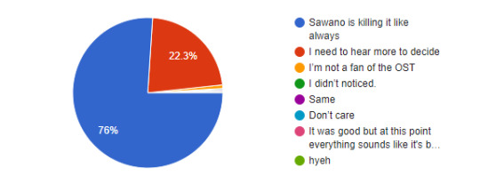
Well over half the fandom are already pumped for new music from the series’ composer Sawano Hiroyuki! A whopping 76% already feel that he’s killing it. 22% need more time to decide how they feel. A small sliver of respondents don’t really care for the OST. Who hurt you?
ost perfect as usual
It was good but at this point everything sounds like it's been reused a bunch of times. Hopefully we get some new great tracks later on..
Hyeh
The bassline in the new rendition of "Attack on Titan" (or however Sawano spells it) is amazing. I cannot wait for the S3 soundtrack to be released.
WHICH OF THE FOLLOWING WAS YOUR FAVORITE MOMENT?
532 Responses
The scene with the Beast Titan appearing with his army of titans took 30% of the vote, with Levi attacking Reiner as a close second with 22% of the vote. 10% overall liked the entire episode, and 7% favorited the cliffhanger staredown. We can all agree the battle to come has us all hyped!
I repeated the scene where Reiner appears until the end of the episode tons of times already
Did they really had to skip Levi's frustrated expression after he failed to kill Reiner? It was my favorite moment…
Levi attacking Reiner and everything after that has become one of my favorite scenes in the series. Damn!
Nice Erwin Screentime, nice Levi nyooming behind Eren
Best girl makes her appearance
the last three minutes of the episode where the warriors show up was fucking amazing
ON SCALE OF ARMIN TO ERWIN, HOW GOOD ARE YOU AT GIVING ORDERS?
526 Responses

The majority of respondents relate to Armin’s timid nature a bit more when it comes to overall confidence in giving orders. Just a small 6.3% of you guys feel you have the charismatic swag that Erwin brings to the table.
I loved Armin giving orders politely.
How was Armin overcoming social anxiety a billion times cooler then eren flying over a 60m wall, becoming a titan and basically saving humanity.
ON A SCALE OF 1-5, HOW MUCH DO YOU WANT TO GO HORSEBACK SURFING?
528 Responses
This was in no way a serious question. But at an almost even split, 35.8% of voters would totally try their hand at horseback surfing, while 35.2% would never risk their life doing such a dangerous activity!
HOW DO YOU FEEL ABOUT THE ANIMATION QUALITY IN PART TWO SO FAR?
529 Responses

Overall respondents are pleased with the animation in the first episode of the RtS arc, with 54% stating that it’s the best animation they’ve seen from the series yet. 42% feel it could be better, but is also not the worst. A small percentage don’t find the animation all that impressive.
I can’t believe how clean all of the animation is looking. SUPER impressed with the difference in art-style compared to season 1 as well.
The animation is on the highest level.
i miss the thick lines the show used to have
i really love the colour palette of this season and the op especially.
IMO the color tones on this episode could've been handled better, it was too gloomy on some scenes :(
The animation & art style was almost as good as season 2’s (which is one of my favorite pieces of animation of all time) but still lacked in some areas.
Looks like they went all out with budget on this season and I'm loving it
WHAT DO YOU THINK OF THE CG COLOSSAL TITAN IN THE OPENING?
532 Responses

57% of respondents aren’t too upset about the GCI Colossal Titan in the opening and say they don’t mind either way. 35% aren’t happy at all with the decision to make the Colossal CGI, while a few actually find the effect super cool.
ON A SCALE OF 1-5, HOW EXCITED ARE YOU TO FINALLY SEE THIS ARC ANIMATED?
533 Responses

The overwhelming majority are extremely excited to see this arc animated after all these years. With its high levels of action and drama, it’s no surprise to us to see that the fandom is looking forward to getting this arc in an animated form!
IVE WAITED MORE THAN 2 YEARS FOR THIS IM NEVER BEEN SO FUCKING HYPED IN MY WHOLE LIFE
I've waited so many years that I'm satisfied and ready to pass now that my favorite arc is being animated
HOW DO YOU FEEL ABOUT THE ADAPTATION OF RTS SO FAR?
532 Responses
67% of respondents are feeling very satisfied with the way the arc is unraveling in the anime, finding that it’s a very close adaptation of the original source material. 23% feel that it’s still too early to judge the adaptation properly, and a few less feel that the adaptation so far is somewhere between good and bad.
Fantastic adaptation.
Good pacing jumping right into the action, while staying faithful to the manga.
Overall very good, but could be a TAD better
I think the adaptation so far has been great, but I need to see how the action is handled before I say for sure whether it's well adapted or not.
It was ok.
It was very well-adapted! All the important details were there and nothing important seemed to be missing, which was something I was sad about in the last arc. It seems like everything I want will get covered.
How do we come back from there without breaking my heart?
PART 2 IS SLATED FOR 10 EPISODES. DO YOU THINK THIS WILL BE ENOUGH TO ADAPT THE ARC WELL?
531 Responses
Voters are confident that WIT knows what they’re doing by shortening the amount of episodes that will air for this action-heavy arc, with only ¼ of respondents feeling that they haven’t given themselves enough screen time to cover every last detail. 10% don’t want to say either way.
i was disappointed in knowing it was a 10 episode arc, but seeing the quality and taking into account that this is an action-heavy arc, i'm bouncing off of the walls to see what wit has underneath their sleeve. hopefully they don't ruin the best arc
one advantage of the short season is that they cant draw out the serum bowl for too long. God, that was a painful wait when the manga was dropping those chapters.
Really well done, the pacing in particular was great. After seeing it I was convinced 10 episodes was perfect for this arc. A 6-4 split is perfect.
WHAT DO YOU THINK ABOUT THE VERY SPOILERY OPENING?
532 Responses
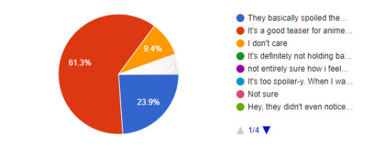
61% of respondents agree that the opening, while spoilery, is a great summary and teaser of what is to come for those who only watch the anime. Without context, they can’t know what every last symbolic image in the opening means, after all! 23% of voters expressed distaste at how much WIT is spoiling the viewers, however. 9% aren’t even concerned about it.
The whole opening was just one big “fuck you” to people who don’t read the manga.
it only becomes obvious b/c manga readers keep pointing stuff out. Yes, the intros have always hinted at things but it goes so fast that I don’t think every person will know exactly what something means if they’re anime only.
The Opening is good representation of this phase of the story ending.
I don't get why people are making a big deal over the "spoilers" in the opening when they're not even anime-onlies themselves in the first place.
Man, it only seems spoilery for those of us who know what's coming. Anime onlies don't understand the context of the images, so they can't recognise them as spoilers unless it's directly identified as such! We gotta stop judging this stuff from the perspective of someone who already knows what's coming.
It's definitely not holding back on the indications that'll happen in the arc
HOW DID THE NEW ED MAKE YOU FEEL?
527 Responses

61% of manga readers felt nostalgic seeing the images of the 104th during their trainee days coupled with a somber song. 20% felt sad about the ending, and 15% were just disappointed with the entire thing.
Lazy ending.
WHAT DID YOU THINK ABOUT THE RED EYES ON THE TITANS?
533 Responses
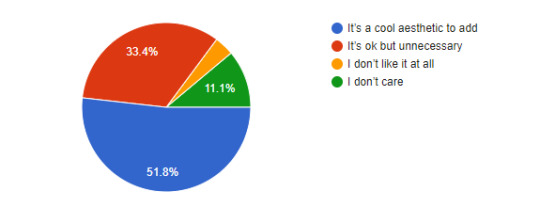
Just over half of the fandom feel that the red-eyed pure titans was a cool aesthetic to add to show that they are under some form of control by a shifter. 33% feel it’s a cool addition, but not really necessary. 11% don’t care.
I was on board with the red eyes until the cart titan also had them. No longer made any sense.
I don't get why Pieck's eyes are red when she's not a mindless being controlled by Zeke…
Like the red eyes but why does Pieck have them too.
WHICH SCENE FROM THE PREVIEW ARE YOU MOST LOOKING FORWARD TO?
530 Responses

Perhaps unsurprisingly, over half of the fandom is most hyped to see the Eren vs. Reiner showdown in Shiganshina. Although not far behind, 28% of respondents are excited about Erwin’s badass unhooding moment as he challenges Reiner.
THUNDER SPEARS FOR NEXT CHAPTER!!!!!!!!!!
ADDITIONAL THOUGHTS ON THE EPISODE?
Even though I totally know what will happen, the episode is written and directed in a way I still get goosebumps and forget I actually know what will happen. And the music, oh god. That's amazing. These two together have a really good effect.
I need the next one RIGHT NOW.
AAAAAHH!!!!
It was an introduction episode, so imo, it's just there to put the basis for the rest of the season. There was a good balance between the "emotionally charged" scenes and the more quiet ones, all this accompanied with an increasing tension in the background.
I wish theyd reanimated the scene of armin talking to eren about the opening instead of just reusing the animation from season 1.
that Zeke smile is like : hey there, i am here to euthanize you all. Love it !
I'm buying tickets into denial islaaand, bye, bye!
Airpipes. AIRPIPES. p.s. cracking soundtrack
Reiner has been enjoying himself some Marley protein, he extra swole now.
Armin was the MVP
PIECK!!!
I don't like the fact that WiT decided to spoil a lot. Some anime onlies already have guessed that Armin is going to be burned and then will become the next CT. So the serumbowl won't be as emotional and exciting for them anymore. I don't understand why WiT decided to do such thing. Don't they want anime-onlies to enjoy the show?
Exactly as expected you'll find a strange titan next to the beasty
I love Mikasa’s improved design and hope they show more of her working in a team like the manga. Focusing on the mission ect without pandering
RIP nameless soldier killed by Reiner.
Very happy to get a glimpse at best girl Pieck
Really no questions about our exactly right girl in this poll ? I am dissapointed :/
Watching this episode is bringing back all the suspense and awe I felt when I read this part in the manga. What a treat to be able to relive it!
They did a great job at keeping the tension and the "well shit everything's about to go wrong" from chapters 73 and 74, and managed to make the explosion at the end worth it, despite the fact I still think Reiner's continued survival throughout the arc is stupid and wish the anime had changed it so it'd be more believable, but here we are.
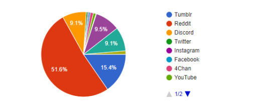
WHERE DO YOU PRIMARILY DISCUSS THE SERIES?
514 Responses
Thank you to everyone who participated! We’ll see you again in a few days!
17 notes
·
View notes
Text
11 Questions
tagged both by @yaboybergara and @ricky-goldsworth which is great because that gives me 22 questions mwahhahaha thank you folks!! <3
RULES
1. always post the rules
2. answer the questions given by the person who tagged you
3. write 11 questions of your own
4. tag 11 people you want to get to know better (or however many you want)
now, see, I don’t know what to ask........ so I’m gonna be a little shit and tag folks to pick 11 of these 22 questions and answer them too. nini and gray pls don’t sue me for reusing your questions, thank fdgkfndgfdsk I’m tagging @kaylotta, @queerunsolved, @haunted-gays, @thatmademadej, and @i-am-ghost-proof-baby <3 if yall wanna do it, of course. no pressure.
this is incredibly long (and uncomfortably honest). let’s go lesbians let’s go
first, nini’s questions:
1. How many pets have you had in your life?
one. I’ve always wanted them but my mom and I have always lived in tiny apartments and had no way to care for a pet so it wasn’t until I was 17 that we adopted a kitten!! his name was merlin and he was the laziest, moodiest lil ball of fluff I’ve ever met. I.. had to give him away a year later because we moved to a place even smaller that wouldn’t allow pets so long story short I’m scarred for life and don’t think I can ever take any more pets without feeling guilty to my bone
this is merlin btw I love him with all my heart and he now lives in a farm. as far as I know anyway.. :(
2. Do you believe in destiny? Why?
mmm interesting question. weird, metaphysical theories aside, I don’t believe anything is set in stone per se, but I do believe that some things are just... meant to be? in a way? for example, you can’t tell me ryan and shane weren’t meant to be friends and find each other in such an unlikely place as they did. one of my mottos, completely stripped from context because it’s from a rather pretentious tv show, is “the universe is rarely so lazy”. meaning that good things happen for a reason, and that you trailed that path for that to happen. yknow what I’m saying? I can’t really explain this without writing a 10 page essay because that’s just how my gemini ass thinks
3. If you could chose one person on the great beyond, would you take the chance to talk to them?
you mean someone who has passed away? oh yeah, I would talk to my grandmother. she was raising me and died when she was 4 and that changed not only my entirely life but our whole extended family dynamic... so many questions.
4. From all your hobbies, which one would you love to make a living of?
oh man, writing. I’ve been dreaming of being a writer ever since I was 9 or something. never panned out but that would certainly be the dream. if I could work with videos, subtitling, tv shows, cinema etc that would also be dope as hell!
5. What’s your favorite color palette to wear?
fkgjfsdgiusfdksd I have no fashion sense whatsoever, idk? I do like to wear dark clothes (because weight..) and reds (because pale).
6. What’s your opinion on queerbaiting?
I don’t have the time for it. for starters, it’s something that usually comes from people with very poor writing skills that can’t come up with plots interesting enough to keep viewers/readers hooked in. that already says something. no offense to anyone who is a fan of shows like these, but when it’s mostly written by white men I just don’t have any high hopes for it. you can ask flavs what my reaction was like when I realized the character I had headcanon’ed as wlw in hannibal was actually a wlw. I couldn’t believe it, because what???? since when does that happen, especially in a show run by a white man??? kjdfghsjgd
I think this is part of a bigger conversation but my point is, don’t fall for it. I know it’s all part of the fight for representation, asking big names to produce big shows with lgbtq+ characters in it and so on, but for the love of god, watch something else too!!!! let GOT rot and die!!!!!!!!! look up different, smaller, cheaper shows, that’s where you find lgbtq+ content creators!!!!!! there’s so many wlw webseries out there, you wouldn’t believe it. you have a choice. don’t give any more of your time and love and word-of-mouth to shows/movies that clearly have no interest in being more diverse. they don’t deserve you.
and that’s not to say any of it is on us. quite on the contrary, they’re using us. but aside from calling out their bullshit, we do have a chance to boost lgbtq+ content creators. don’t let them fool you into thinking they’re doing you any favors, or that they’re our last chance so we should be paying attention to what they’re doing/saying. fuck them!!!! you can’t queerbait me because I don’t trust you or give you the chance to do it. and you can shove your very straight, very white shows where the sun doesn’t shine, @ hollywood.
7. Is there a language you would love to speak?
french and korean, mostly. I can understand a little bit of both, but I really wish I was fluent :( oh, will to live and learn, where art thou...
8. Do you have, like, a dream so wild you think it’s impossible?
kjgnsfdkjhjjs having enough money to support myself and my mother??? I don’t have any big, wild dreams, I think. just.......... living comfortably would be a+
9. How many AUs of your own life do you have in your head?
oh man. I keep thinking about living somewhere in idk iceland or scotland just like... tending goats or something. that’s the most comfortable version of myself I can think of.
I also like to imagine if I could handle being a film director, because that sounds like fun. maybe a screenwriter? anything creative in films, really.
there’s also the unattainable dream of having a wife and idk maybe adopting a kid? and we’d just. support each other. and love each other. and that’s just. I. [cries]
I like to think how things would be if I were actually hot and not socially awkward.. I’d be someone completely different, basically lol
10. If you were to meet your younger self, do you think they would think you cool or not?
oh god, younger me would hate present me D: I had such high hopes for myself, I had lots of dreams lol never in a million years did I think I’d be where I am today...
11. Not a question, but please add something postive about yourself, something that you love about you.
IDJFSSIODUGSDFKGDSJ IT’S LIKE YOU KNEW I’D BE A NEGATIVE FUCK, NINI. I................................ I like that I have an easy time with languages? or with classes in general. I like to learn from people, I’m just really unmotivated to leave the house lol
now onto gray’s q’s:
1. What’s your favourite music video of all time?
straight-up impossible questions right out of the gate huh I SEE YOU, GRAY. I SEE YOU kjdfgjfsdhgkdsjfs
I’ll have to go with a few,
“prototype” by viktoria modesta is just GORGEOUS. I can’t get over this video & song and it’s been years.
youtube
“jackpot” by block b looks creepy as shit but the context makes it such a clever yet fun video. take into account that these guys were screwed over by the kpop company that created the group, and that the lyrics talk about hitting jackpot in an industry that’s savage to say the least. to me this video is a visual representation of what a dangerous trap entertainment companies are in the kpop industry, and it also ties in with the groups’ story of being made into dolls by a company and then telling them to fuck off in the end lol
youtube
“treat me like your mother” by the dead weather. I don’t know why I just love it. (cw: gun violence)
youtube
“emperor’s new clothes” by panic! at the disco. I MEAN, LOOK AT IT.
youtube
“manyo maash” by puer kim. I just love the aesthetic?
youtube
honorable mention: “tick tick boom” by the hives because that’s a banger. ba dum tssss.
2. What’s a favourite memory of yours?
I have plenty of good memories, thank god. I think one of my favorites is just hanging out with my friends in 2008-9; one of their older brothers was driving us around town, we were listening to the white stripes at full volume, singing along, all sitting pressed up close together in his shitty car. man, my teenage years would’ve been fantastic if I had stayed there with them!!
3. Do you play video games? If so, which one’s your favourite?
I DO!!! I mean, not as much as I’d like because a) no money to spare on games/consoles, and b) I suck at basically everything. but I’m obsessed with paladins these days, and I’m also a big fan of LOTRO. I like horror games--mostly the resident evil and silent hill type--and fps. I grew up playing some tomb raider, medal of honor, resident evil... oh, those were the days.
4. How did you first get into [your fandom of choice]?
with bfu it was that kind of thing where I’d see a meme or two cross my dash and it was always this ridiculous screenshot, or those “that’s it, that’s the show” kinda things with dozens of thousands of notes... until one day I was incredibly anxious, and I needed to watch something or I’d never finish the assignments I had for college. so I just thought “oh hey I should check out that unsolved thing people like so much, it’s buzzfeed so it’s probably good bg noise to work with” lol and it did work, and I did finish my assignments, and that means that I first watched the show barely paying any attention to it because I was busy doing something else. but ryan’s and shane’s voices helped me relax and to this day they still help a lot with my anxiety, to the point that I need to keep coming back every minute or so during episodes because I get distracted just listening to their voices and not absorbing a word lol
5. How did you first get into fandom in general?
uhh.. well, I was a big “pottermaniac” (that’s how I called it) since I was 9, but that was before I realized fandom was a Thing on the internet too. I remember when I was maybe 10 or 11, I entered a chatroom (god, those were wild) just in time to see someone saying in all caps HARRY POTTER IS GREAT AND YOU’RE ALL DUMB FOR NOT SEEING IT or something fkdsjgfdugfsdk and it was this girl using the nickname fawkes. she was older than me, I think that 15 or something, and we exchanged addresses (!!! how am I alive!!!) and were pen pals for a while. but it took me so fucking long to actually find the fandom online that I think my first brush with it was with the arctic monkeys forum I found online in 2008, where I mistakenly said I liked “the muse” and people laughed at me so I never went back to it lol then in 2010 I found out about kpop and that’s when I really dived head-first into fandom life. took me long enough (tbf I was very against the notion of being a “fan” because I was an idiot).
6. What’s at the top of your bucket list?
great fucking question. no idea. I guess.. traveling overseas? if we’re talking wild, distant things. but closer to my reality, getting a job that pays me at least the minimum wage disjgdfgkfsdk #fuckinternships
7. What’s something not many people know about you?
I love dancing and miss it like hell.
8. What’s your favourite medium for storytelling - movie, book, television, musical, comic, internet video, video game, something else? Why that medium?
ohhhhhhh this is an interesting question. as much as I love writing, and think that’s one of the best things we humans have ever come up with, I do love.. musicals? not necessarily theater--although that’s great and I’d sell my soul to see chicago live--but I love the idea of telling stories through music. I really wish we could bring back the custom of telling stories orally, and through music, and that we could as society agree that collective singing is beautiful and should be reintroduced in our day-to-day lives. sure listening to (1) artist singing is great but hAVE YOU TRIED SINGING ALONG DURING A CONCERT WHERE EVERYONE ELSE IS SINGING TOO? best fucking feeling in the world.
we had two bands in brazil, in different periods of time, that were so incredibly famous they’re still cornerstones in our music history. one was legião urbana, some folk-ey rock band that had a couple of songs telling these really long stories that I LOVE with all my heart. faroeste caboclo is our bohemian rhapsody, most people my age or older know the lyrics to it. and mamonas assassinas was this comical (?) rock band that sang dumb, fun songs that usually told stories too and that was the best. I miss that kinda thing.
9. What’s your favourite food?
red meat, mainly churrasco. but I also can’t live without chocolate milk AND the whopper. capitalism has me by the stomach.
10. Do you have a joke to share?
fjgfsdgskfdgfsk I don’t.. it’s been so long since I last tried telling a joke, I don’t think I know any?
11. What song/artist helped you through your struggles?
pitty has been a big part of my life for some 14-odd years now. “be ok” by ingrid michaelson and “starlight” by muse were my anthems when depression hit hard during my teenage years. the white stripes has also been a constant, with gems like “blue orchid” and “a martyr for my love for you” turning into sort of theme songs for certain parts of my life. choi sam helped me through college. and even though they were a huge disappointment to the point that I stopped listening to them altogether, block b gave me a good 4 or 5 years of distraction from life.
5 notes
·
View notes
Text
Ludum Dare Development
Game design and game development rush

Previously, I talked about my first takeaway from ludum dare. This time, I would love to explain a bit more how the game development experience happened.
The first step was to discuss what to do. At first, it was not all that clear what we wanted to do. The only thing we knew was that, Michael - my Ludum Dare partner in crime, was doing the programming leg of work, and I would take care of the artwork. Luckily, Michael is an experienced game designer and he had a better picture of how to put things together.
Defining the idea of the game was easy at first. Michael runs Silverware Games, and one of his upcoming games is called Matchy Star. This is a game we both have been working on this year, and we really like it! I asked if we could use that IP for the LDJAM, and he was ok with the idea. When thinking of business development, whenever you work up a pipeline to expand intellectual property, there is something known as brand extension. This is building upon what you already have to make that brand world grow; as a result, you create more from the same idea. The goal is to generate more data on top of the content you already have, meaning you widen your opportunities – either grow your network, or grow your sales. So I figured, this can only benefit the studio in the long run. It is meant to be a free game after all.

We defined a concept that would suit the theme, which this time around was “The more you have, the worst it gets”. I made a comment about how cute it would be to see Matchy Star interacting with the little stars he picks up in the game, worked it all from there. Matchy’s Kooky Cookies resulted in this crazy cute clicker game, you must help Matchy protect his stash of cookies from the cookie banditos. In theory, something short, fun and cute.
Personally, I love the work Jim did on Matchy Star, so I decided to reuse some of the original assets of the game – the characters only. While Michael challenge was to build up a clicker on the idea, my challenge was to build up around a game that we wanted to reference with new take on it somehow. I thought it would be simple, but it sort of became a tad more complicated than I had expected.
I get started on defining perspective and colors. One thing I wanted from the get-go was to make Matchy’s Kooky Cookies a complementary experience. I love Matchy Star, so I did not want to redo the most important assets, and I did not want this game to compete with the original vibrant look of the original game. Getting a cute mute like palette was not easy, I can do the job of a technical artist, but colors are always a challenge for me.

Once finished, the kitchen felt empty. That’s why I decided to include details from the Silverware Games world: a mug with ‘Composition J’ art, a cereal box inspired in ‘Don’t Shoot Yourself’ called Shootios, and ‘Matchy Star’ fridge magnets. I figured not many would get the references, but I still wanted to include them. Also, last but not least, the new company logo as cabinet lettering! Because apparently that’s a kitchen decoration thing - the more you know.

Afterwards, designing the transitions screens was easier. Already had a palette in place, and we had no time, it resulted in minimal effort as default. I ended up including few: tutorial, rounds, score and credits. Tutorial was a challenge, what seemed simple for us did not for others, and we were so very lucky to receive as much feedback on the process to make it better understood.
Once everything was assembled, we experienced people experiencing problems here and there, we tweaked until build felt much more enjoyable. We also took in a lot of great ideas for future builds, including future games. Game jams provide experiential learning that, unlike any textbook, this is something you would rarely ever forget. You learn from what you do, and what you get to see others do, a fantastic experience I recommend anyone that works in the game industry to do.

Personal note here, thanks to Michael for having infinite patience to my relentless and sometimes irrational perfectionism. Game development is not about making things perfect, but making things work as you want them to, and you build up on that one fix at a time. It is good enough not when there is more to add, but when there is nothing left to take away – rude awakening to take from game development. I need to become more comfortable with troubleshooting design dilemmas, understanding simplicity and focus in design.
I was not expecting to end this blog with a life lesson, but there you go. Matchy’s Kooky Cookies is free to play, so you can go ahead and check it out right here. Comments and votes are welcome!

I have not slept for days! Feel free to say hello to zombie Say right here :3
#saywat#saywatpersonal#saywatbusiness#saywatgames#business#marketing#game development#video games#Video game industry#videogames#videogames industry#indie games#independent games#game design#graphic design#games#games industry#ludum dare#ludum dare 40#ldjam#ldjam40#ld40#matchy star#matchy's kooky cookies#game jam#video game jam
8 notes
·
View notes
Text
Ash’s Inktober Art Supply Megalist
a Because Inktober is such a huge event and because it’s relatively new and doesn’t have a huge masterlist of art supply lists associated with it, I have decided to post and maintain a masterlist of art supplies ranging from inks, pens, and sketchbooks to use as well as art supply stores online and other useful hints based off of my own, my friends, and other helpful artists who have given me pointers on this site.
INKS
Author’s Note: Anything called India Ink is waterproof by default most of the time. Shellac based ink tends to have a sheen, though there are exceptions. Most if not all color ink aside from black and white will not be light fast.
Dr. PH Martin’s Black Star India Ink
It is water proof and lightproof and does not contain a sheen like most other illustration inks, which means it won’t have light reflections when you scan or photograph your work. I have used it in dip pens and brushes, and it works well even when diluted with water to create shading effects. It has a rich black tone.Not entirely copic proof.
Koh-I-Noor Water-resistant Inks
These inks are water-proof and ideal to use in dip pens. It isn’t lightfast, at least the color versions aren’t, but the black and white inks are. Black and white are opaque colors while the other colors (numbering 17 in all) are transparent, similar to watercolors. Unlike a few others on this list, they come in plastic bottles rather than glass.
Yasutomo Black Sumi Ink
It’s a good brush ink, although there are some drawbacks. One would be the fact that if exposed to air long enough it will get thick, as well as the fact that it has a strong scent due to the fact that it does contain various eye and skin irritants, so don’t get any on your hands. It is very waterproof though, and works nicely if you know how to use it. It is not copic proof. It does come in a plastic container. There’s a vermillion color I haven’t used, but looks nice and bright.
Windsor-Newton Inks
Basically the go to for all and any illustration inks you’ll ever worked with. This is the ink you’ll use in art class (at least the art classes I’ve been to). They come in two different sets, though you are most likely to see the first set. They also come in metallic colors, which is a good thing if you want to go fancy. They are waterproof, but not light proof, so care must be taken when displaying them. They come in glass bottles that do not tip over.
Deleter Black 4
The ink for manga artists. It’s not only a rich solid black, it’s also resistant to fading from erasers, as well as being copic/marker proof. Excellent to use with dip pen and brush. Also waterproof, like most Deleter brand inks.
Keimei Manga Pen Ink
Not only is it waterproof and copic proof, it also has a matte finish, excellent for scanner in your work.
PENS
Staedler Pigment Liner
Lightproof, waterproof, and smear proof. Similar to microns, but from what I’ve heard better. It is erasable though on certain surfaces. Does not bleed through and won’t dry out for 18 hours if left uncapped.
Sakura Pigma Microns
Won’t feather, won’t bleed through, and a favorite of many artists. It is not Copic proof however, so try to use them after using copic. I’m not too big of a fan of these, as the think nibs do break if you use them on sharp curves and such.
Marvy Le Pen
This is becoming a surefire favorite of mine. Not only is it quite cheap, it’s also waterproof and copic proof (the permanent pen however, is not copic proof). It has a stronger nib than the Micron and it does comes in a brush tip, unlike a few others.
Windsor-Newton PITT
One of the more famous pens used for illustration, the PITT pen comes in a variety of nib sizes as well as brush pens. They are waterproof, lightfast, and acid free. They are not copic proof however, and should be used after a copic drawing.
Pentel Technica Stylo Pen
I think these pens are servely underrated. Not only are they a cheap alternative to a lot of other pens on this list, they are also waterproof and copic proof. They come in a variety of sizes and excellent with any medium, including watercolors. However you need to watch out as the ball point can get clogged up. I own at least four and they have lasted me for at least a year.
Pentel Color Brush Pen
Waterproof and really neat for those who like using brush pens, these are nice for those who travel around and use ink. It’s technically a brush pen with a reservoir of black ink you can squeeze out. Warning, there’s a few setbacks, as it does take a while to dry if laying in thick amounts of black ink. It is not copic proof, but can be used on top of copics. A good note of caution is not to squeeze too hard as the ink will drip right out. If the ink runs out, you can refill it with your own ink.
Copic Multiliner
If you are using copics, you should definately have a number of these at your disposal. They are waterproof, smearproof, and won’t bleed through paper. The other good part is the fact that they come in a SP version which can be refilled and reused, although they’re more expensive.
Sakura Gelly Roll
The white pens are excellent for making highlights and contrast.
Watercolors and Markers
Copic Markers
Literally the go to markers and my favorite markers to use overall. They come in a wide variety of colors and types and can be refilled. However they are pricey, but I feel like all in all they are worth the extra cash. Many come in pre-made sets in certain color combinations, though I would start in either a blue palette, a red palette or a grey palette to test them out. Like many markers, they will bleed through, and I would use either marker paper or a thick paper to use them on.
Sharpies
Not too much of a fan of these. but they are cheap and found everywhere. They come in a range of sizes and types, but like most markers, they bleed through paper. They are waterproof and fast drying.
Windsor Newton Watercolors
These come in either pans or tubes, but I use a mix of them. The ones I use are cotman, which are the cheaper version and comes in a plastic travel palette kit which can be put in a lot of places. I have added a number of tubes, due to the number of colors avaliable. They have rich and vibrant colors. The pan colors don’t mix as well in my experience, but the tube colors work lovely. The fact that they come in travel kits is the main reason why I put them on here.
M. Graham Watercolors
A professional set of watercolors, and they have super rich colors. They only seem to come in tubes, which aren’t as good for travel.
Ecoline Liquid Watercolors
I wasn’t sure to put these in inks, but given that they are called watercolors, I’m putting them here. They are dye based and bright and come in wide mouth jars. They can also be dluted with water. Unlike any of the watercolors here, you can use them in dip pens and airbrushes.
Sketchbooks
Author Notes: The paper to get is paper that is 100 gsm and up, as anything 100 gsm and up will hold to water better. The higher you get the better the paper will hold to washes and won’t buckle.
Moleskien Cahier Journal
I personally find the whole Moleskien brand pretty expensive, but they are recommended by the Inktober site. However, you’ll need to watch out as ink won’t dry fast and markers will bleed through the paper
Bee Creative Mix Media/Marker
I really like this paper as it’s thick and holds up to watercolors and markers well. It also doesn’t warp as badly as the watercolor version of this sketchbook. It has a thick black cover but it is wirebound so watch out for shoving it into backpacks and bags.
Bee Sketchbooks
These tend to have thicker paper, and good tooth for pen and ink, copics and illustration.
Canson Sketchbooks
A lot of these are good for watercolors and pen and ink, especially the Mix Media Art Book, Artist Series Mix Media, and the field books. The XL series is also great for those looking to save a little for a big bang.
Derwent Sketchbooks
These are a thing, but unfortunately the only one I can find at the moment is one that has premade designs in it.
Online Stores
Oozak
I have used this store in the past and it has some great deals on Copics
Jetpens
A new store I have discovered, it offers a large variety of pens, inks, and nibs
Blick’s
A very famous art store, they do offer gifts in your online purchases and have some good shipment deals
Poses and Reference
Senshi-Stock
Offers a lot of awesome poses, must be on DevArt to view. They also have a Pateron if you want to support them.
Pose-Maniacs
Rather limited, but good for some poses
Photo Reference for Comic Artists
A site I just discovered which has lots of royalty free pose references ranging from action and everyday to clothing reference
Music
Dark5 Radio
Offers dark syth-techno tunes
Electronic Gems
Some really good tunes here
Artzie Music
Mainly Future Funk and Vaporwave
Walt Ribeiro
Ever wanted to hear “Take on Me” done by an orchestra? This is the place
NOTES
Have at least two erasers at your disposal, one of them should be a kneaded eraser as they lift graphite marks and do not leave a dusty mess.
It’s alright to draw with pencil first
Take breaks to drink water and stretch every 30 minutes or so
It’s good to invest in B nibs and manga art nibs if you plan on using bottled ink. Maru and school points are the best for manga and illustration style.
Round and liner brushes are the best brushes to use for inking lines
You can plan ahead your drawings, sometimes it helps.
Listen to music while drawing helps in getting some ideas.
Official Page for Inktober
Thanks to @ancaxbre , @ayasunflower ,and @ps-art for suggestions
#inktober#art supplies#inktober art supplies#ink#copic#art#art supply masterlist#inktober masterlist
22 notes
·
View notes
Text
Arplis - News: Valentines Day | All on Prime
Hi friends! How was your weekend? It was our first basketball game of the season and our team won! What a great start to the season! Yesterday, after church was a birthday party for one of Jordans friends (thankfully, shes on the mend) and she had so much fun seeing her friends after missing three days of school last week!
Sunday night, I didnt feel like it, but I did all those Sunday evening things that set the week up for success clean kitchen, laundry, lunch prep, fridge clean out & making a plan for the week. To keep myself going, I just kept thinking how much Ill appreciate having those things done when Monday morning hits.
Ive been using Sunday to meal prep and plan for the rest of the week. I write out on paper my schedule for the week and the top things I need to do each day. Even though I keep a calendar on my phone, having it written out where I can see it and actually cross things off feels so good!
Next month is a big one for us! Its Valentines Day, Jordans birthday, and then my birthday all within a week!
I wanted to have Jordans party at the neighborhood park, but Houston weather is too tricky in mid-February, so I just booked a jumpy place. It was the same place we went to for her friends birthday and the kids had a blast! I was looking at Jordans face while she was bouncing so high and the JOY was incredible!
Now that my holiday storage closet is all nice and organized, Im more pumped to add some decor for each season. I didnt have much for Valentines day, but I found some really darling things on Amazon that arrived in a jiffy, thanks to PRIME! I love adding even just a little bit of festive decor around the house.
It doesnt have to be much, but I think the kids appreciate it too.
VALENTINES DAY ALL ON PRIME
Tulip Wreath Valentine Banner Corkcicle Kitchen Towels Apron Table Runner Buffalo Check Pillows Valentine Pillows Faux Fur Blanket Front Door Decor Valentine Paper Pom Decor Eyelash Mug Pink Matches
Tulip Wreath Yall already know how much Im loving my tulip wreath and Ive enjoyed seeing it in your homes too! You can always tag me on Instagram and Stories @honeywerehome and I can share! I have the darker red/pink wreaths on my front door, and bought the white/light pink for my kitchen. It looks absolutely gorgeous and I love how often I get to see it!
Valentine Banner I usually add a banner above Jordans bed for the holiday and its an easy, inexpensive way to add some Valentine decor!
Corkcickle As a gift or for yourself, a corkcickle is awesome! And pink for Valentines Day.

Triple isolated, it will keep your drink cold or hot for 9 hours. The silicone bottom is slip proof- good for putting on the bleachers at the ball fields with your drink of choice. Shhh, I wont tell!
Kitchen Towels Ive done away with paper towels over here and dont really miss them. We use kitchen towels and cloth napkins now. Having a set of each you truly like using or displaying is so nice!
Apron Ive come to enjoy putting on an apron, especially when we bake. It does help save all that flour from getting on your clothes, plus it looks absolutely adorable! The one above is only $17!
Table Runner Dang, this runner is cute! Hearts on hearts, but more styles available.
Buffalo Check Pillows &Valentine Pillows Pillows are an easy way to update your decor. I like the mix of buffalo check with the Valentines script pillows.
Faux Fur Blanket We can never have enough throw blankets around here. Not only do we cuddle up with them, they also make great decor over chairs, in baskets or folded neatly on the couch. This one is extra furry and soft.
Heart Envelope Door Decor I just bought this adorable heart exploding envelope and its the cutest thing! Its really large, so it makes a big statement and the quality is so good! Ill be happily using it year after year.
Valentine Paper Pom Decor If you really want to add some pizazz, this paper pom pom display will do the trick!
Eyelash Mug How sweet is that eyelash mug?! The detail is so cute with the gold handle.
Pink Matches Every.single.evening I light candles in the living room and one in the kitchen. The kitchen candle is my reward for cleaning up every night. The living room candles help me relax after what is usually a hustle of a day. I thought these pink matches make the cutest decor and would be a lovely gift, not to mention, useful! They come in every color.
VALENTINES DECOR IN OUR HOME
I switched out the Christmas decor for a fresh pink palette that works for Valentines Day on through Spring.
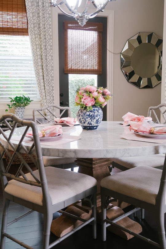
Vase Table Chairs on sale Plates on sale Buffalo Check Napkins Washable Placemats Faux Peony Bouquet

Vase Faux Peony Bouquet
How gorgeous are these faux peonies?! I put two bouquets in this vase and I love how it looks! As much as I love fresh flowers, a good set of faux flowers is great to have on hand because they last year after year without any maintenance.

Buffalo Check Napkins Washable Placemats Faux Peony Bouquet
Buffalo Check Napkins Washable Placemats
I need washable placemats since I have two messy eaters at my family table. These wipe up easily and the wood grain and pink color is really pretty in person. Before I ordered these, I read tons of reviews on placemats. These had over 500 positive reviews and only $11 for a set of six!
We do actually use the cloth napkins. Theyre nice and big, 1212. I can just throw them in the washing machine and reuse.
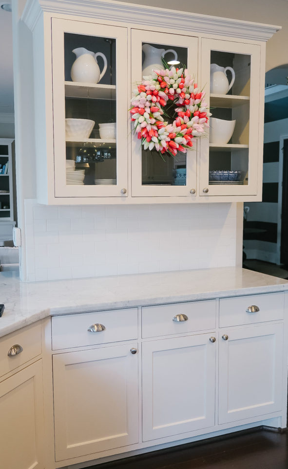
Tulip Wreath
Im so happy with how this tulip wreath brightened up our kitchen. I was able to easily hang it from a suction cup hook, but on regular cabinet doors, you could try using a command hook.
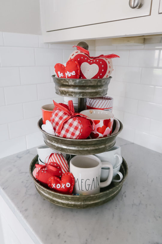
Three Tier Tray Rae Dunn Mug Similar Hearts
The three tier tray got a holiday makeover! I had her all dolled up for Christmas in December, then she was looking pretty bare after I took those decorations down. Adding a few felt hearts and Valentines inspired mug was all it took to brighten it up again!
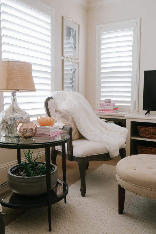
Throw Blanket Similar Chair Side TableSimilar LampOttomanBraided Rug
We can never have enough throw blankets at our house. This white one is light and fluffy fuzzy goodness on one side, and cozy sherpa throw on the other. You can machine wash it and dry it on low. It has over 4,000 positive reviews on Amazon and is only $28 for the 5065 inch.
Throw Blanket

Heart Envelope Door Decor Shelf/Toy Box
This door decoration is so darling. Its a sturdy burlap material and the ribbon has a wire to hold its shape. This could easily work as a front door decor in lieu of a wreath, but Im thinking Ill be putting in in Jordans playroom.
My mom gets credit for putting that toy box together. I ordered it three weeks ago and it had been sitting in the box unopened because the thought of assembling it was daunting! But, she and Jordan got to it last week and I came in at the end when it was almost finished! Thanks Mom!!
Are you adding any Valentines decor touches to your home? Are you ready for Spring decor? I kind of have a mix of Spring and Valentines decor going on with the pink vibes and hearts here and there. But, Im liking how it brought back in some fun after taking all the Christmas decor down. The house was looking kinda bare for awhile!
I cant let today pass without paying respect to Martin Luther King, Jr. I so admire his courage and leadership and always think of how many lives he deeply touched during his time and on into today. We are better because of him.

The post Valentines Day | All on Prime appeared first on Honey We're Home.
Arplis - News
source http://feedproxy.google.com/~r/Arplis-News/~3/SlU_VZM10rs/valentines-day-all-on-prime
0 notes
Photo


Artist: Jenny Rask
Exhibition: Limbo
Media: Sculpture
Gallery: LBSU School of Art, Werby Gallery
Website: www.jennyrask.com
Instagram: jjennyraskk
Jenny Rask is a third year graduate student, in her last year to complete her Master of Arts degree. She in the CSULB, School of Art for Sculpture; her favorite type of sculpture is installment pieces, that include items that she has either found off the street or was given to her by people she knows. Along with being a graduate student, she is also a single mother to three children and she also has a job. On her free time she lets her mind wonder about her next project and she never turns it off, to ensure she never dims her creativity. She first got interested in looking at these items off the street by photographing trash and turning something forgotten into beautiful pieces of work. She is very easy to talk to but gets confused with what she wants to say about her piece, so in order to help the audience she has a note pad and will write down words that help her describe her pieces and ideas. She often finds inspiration based off the items she finds and lets those items create the piece, rather than her having a specific idea and then finding the pieces to go along with it.
The sculpture that Rask provided in the gallery, was a little all over the place in the sense that it was both organic and man made. This piece was not painting and hardly had any media on it, so from and outside view the audience at first glance has a hard time at what they are looking at but once one takes a closer look at it, they will see the beauty of it all. The sculpture had very a very natural color palette; it used various shades of greys, browns, whites, and hints of blue. The piece itself had all sorts of different textures from the fluffiness of the stuffed animals, to sleekness of the still, to the roughness of the rocks and branches. The sculpture also played with levels, many things stayed at eye level but if you took a closer look other items such as the steel beams, were hanging from the ceiling. Also, things such as the pieces of gravel were scattered on the floor and skateboard was off to the side. All of the items are at a different stage in its lifetime and that helps create certain energy of melancholy in the exhibit. The sculpture ties in many different elements of nature and man made, some are as tiny as a plant that you can only see very up close to the first thing you see if a ducks body with an unfinished head. The sculpture brings a lot of contrast into the space and hopes that everything will be noticed.
Jenny Rask’s sculpture titled Limbo, explores the idea of how everything in life is going at different paces just as the items in her sculpture are all intersecting at different time frames. She describes her work as somewhat childlike because just as child does for random objects, she forces trash to turn into art. Rask sees trash as beauty and really picks up on the energy of things and tries to convey that into her sculptures. This sculpture forces the rebirth of old items to transform into a new installment piece. The sculpture itself is all natural in the sense that nothing is permanent and she honestly loves that because that’s what the idea of limbo is about. She doesn’t mind if anything falls out of place because just like life nothing is permanent and it is always changing. Along with all her old items, she always has one new item; in this piece it was the gold lamp she was borrowing from a friend. She curates all her trash and stores them in a room, where they will all be reused at some point. She doesn’t think of herself as a hoarder but hopes to have a bigger room for more storage space.
From a religious stand point I think this sculpture is beautiful and unique because everything in it is not the same and that in a way is how limbo is described. Limbo is a place in between Heaven and Hell and you can end up there for various reasons, not all bad but it helps you decide why you’re there or what left you have to finish. Her work resonates with this idea of unfinished business in the sense that all the items are all half done and looking for a way to be reborn. For me personally this resonates with me in my own life because of how I view life right now. I personally want to have everything fall into place but I just feel so jumbled and crammed into society that I feel like an object that needs to find a way to reborn. I have no idea what I want in life or where I’m going so just as the trash once was, it will soon find a sense of belonging. This sculpture is very hopeful because it shines light that anything and everything can become art.
0 notes
Text
2018 Fall Decorating Ideas
Happy Fall 2018, everyone! It’s a pleasure to be back with a new “Fall Decorating Ideas” post for you guys and this Fall special is extra special because it features my favorite Instagrammers – many that have been featured on my “Beautiful Homes of Instagram” blog series. Gratitude doesn’t even describe what I honestly feel for each and every one of these wonderful friends. The moment I told them that I thinking of doing our annual “Fall Decorating Ideas” post, they immediately said they would love to share their homes with you here on Home Bunch, and it’s thanks to these talented homeowners, designers and Instagram influencers, that this post can easily be one of the best sources for Fall decorating ideas. So please make sure to follow them on Instagram to see their latest pictures and feel free to see their complete house tour by clicking on “Beautiful Homes of Instagram” under the last picture of most of the participants.
Now, find a comfy spot because this is a really long post (here you will find fall decor ideas for every room of the house!!!) and start pinning! Fill out of Pinterest boards with the most beautiful Fall decor of 2018!
2018 Fall Decorating Ideas
@simplysoutherncottage:
“Although the inside of my home is neutral, the outside is FULL of color starting with my cheery front door! Again, my front door is a unique identifier of my home that immediately is associated with Simply Southern Cottage. I wanted a door color that outwardly displayed the overflowing joy I have in heart and Lemon Twist by Sherwin Williams was the perfect color! (Door was crafted by a local artisan, Webster Door Company and gas lanterns by Copperworks Lighting, also local.)
I have NO floral design experience other than things I’ve made for my home, so honestly I don’t know how these swags and wreath were formed from my hands! I sourced all the florals from Michaels and one Friday evening, I sat down to see what I could make. And this is the result! I LOVE the way these turned out and did surprise myself! The buckets and grasses were also sourced at Michaels and were in the 80% off summer clearance section!” – Sara
Follow @simplysoutherncottage on Instagram.
Fall Porch Decor
House Paint Color: Extra White by SW
Swing: Lowes
Rug: Orian Rugs Acena Silverton
Follow @simplysoutherncottage on Instagram.
Fireplace
“Mantel Original to the home. When I style areas of my home for Instagram or for other pictures, it’s very important to me to create spaces that immediately identify my cottage to the reader. Like when someone sees the picture, they immediately know it’s the Simply Southern Cottage or Sara’s home. Again, I chose to go the neutral route and incorporated much of my existing décor. The mantel surround is original to my cottage and is 92 years old! I did add the gas logs during restoration.
@simplysoutherncottage.
Mantel
Last year for Christmas, I utilized dried hydrangeas everywhere in the cottage. I saved them to reuse and ended up making this unique fall garland! I took nine feet of rope and wired dried hydrangeas and pine cones, interwined with rag ties from white fabrics purchased at Goodwill and yard sales. All other accessories were sourced from thrift stores and yard sales. Pillow are Michaels after Christmas clearance last year.”
@simplysoutherncottage.
Sign
Sign: Simply Inspired Design Co.
@simplysoutherncottage.
Kitchen
“This space is a complete rework from the original kitchen layout. Triplet windows were a must for me to be able to look out on the surrounding historic homes and historic park that is just across the street!”
Sign: @SimplyInspiredDesignCo
@simplysoutherncottage.
Countertop
Countertops: Cambria Torquay.
All Walls: Snowbound
All trim: Alabaster by Sherwin Williams
Wreaths and swag: Michaels
@simplysoutherncottage.
Tablescape
“In keeping with the neutral theme in my home, I wanted my fall décor to reflect the same peaceful calming atmosphere. Thus I chose to incorporate white pumpkins, muted green eucalyptus and lots of white and off-white into my tablescape. It’s also very important to me to stick with a budget when I style. I found some AMAZING Maple Leaf by Salem plates at Goodwill that are perfect for fall. They integrate flawlessly with my color palette. In addition, I created “faux” napkins by cutting off the fabric from a bedskirt (also found at Goodwill) and folding like a napkin. I purchased small pumpkins from the Dollar Tree and painted them with Rustoleum chalk paint. Honestly, I couldn’t be more pleased with the way this turned out! It’s simple and serene with lots of rich texture and depth.” – Sara.
@simplysoutherncottage.
Plates
Maple Leaf by Salem plates and bowls (discontinued from the 1950s or 60s).
Stems in vases: Dried flowers-clearance from Hobby Lobby, Berries-Michaels.
English Countryside (larger white plates) by Mikasa.
Wood ceilings are original to the home.
@simplysoutherncottage.
Placemats
Placemats: At Home Water Hyacinth.
@simplysoutherncottage.
Glass Jars
Large glass jars: Hearth and Home Collection from Target.
@simplysoutherncottage.
Silverware
Silverware: Belle Rose by Oneida (discontinued).
Crystal dumbbell knife rests-vintage.
@simplysoutherncottage.
Books
Pumpkins, books, corbels-all old and I’ve had forever.
@simplysoutherncottage.
See @simplysoutherncottage on Beautiful Homes of Instagram.
@lifeoncedarlane:
Follow @lifeoncedarlane on Instagram.
Console Table Fall Decor
Follow @lifeoncedarlane on Instagram.
Keep it Natural
@lifeoncedarlane.
Fall Kitchen Mantel Decor
@lifeoncedarlane.
See @lifeoncedarlane on Beautiful Homes of Instagram.
@pamela.saumure:
“Autumn in Ontario, Canada is amazing! From the brilliant colours of the leaves, the abundance of seasonal produce, to the crisp mornings and sweater weather, I am so blessed to be able to enjoy all of it.
I found these tin pails at Dollarama that hold a large pot of mums nicely.” – Pamela.
Follow @pamela.saumure on Instagram.
Fall Front Porch Decor Ideas
“I’ve always found decorating for fall fun although I like to keep decor simple. I add some colourful mums from our local nursery that compliment the exterior colour of the stone, and add pumpkins from Michael’s.”
Follow @pamela.saumure on Instagram.
Naturally Beautiful
@pamela.saumure.
Fall Kitchen Touches
Any copper that I have stored away over the summer, makes its appearance in the kitchen when fall arrives. The warm copper shades mix well with neutrals and other metals.
@pamela.saumure.
Kitchen Details
Range: Lacanche
Island Pendant Lights and Counter stools: Restoration Hardware
Quartz countertop and backsplash: MSI Stone Statuary Classique
Copper pot: Vintage market, Nice, France
@pamela.saumure.
Hydrangeas
I welcome fall into our home by clipping large bunches of Limelight hydrangeas from the garden and filling up various vases. You’ll find a vase filled with hydrangeas in almost every room of our home. I create vignettes by adding some neutral colour pumpkins like these from Pier1 Canada, creating quick and easy fall decor.
@pamela.saumure.
Decor
Cutting Board and Tray: HomeSense
Pumpkins: Pier1 Canada
@pamela.saumure.
Fall Dining Tablescape
Creating tablescape decor is becoming a favourite of mine. I find it fun and even a little therapeutic, changing the decor with each season.
This fall, I brought the outdoors in by layering dried hydrangeas on top of various soft shades of green stems. The pumpkin filled lantern centrepiece is surrounded by various sizes and shapes of loose pumpkins and enough greens to fill in any gaps. This dining room table decor will remain until Thanksgiving, when it will become more formal replacing the lantern and pumpkins for candles and fresh flowers.
Dining Chairs: Korson Furniture
Hutch: Custom
Chandelier: Feiss
@pamela.saumure.
Sunroom Decor
I gave our sunroom mantle a quick fall look by adding orange dollar store pumpkins that I chalk painted in white and grey for a more neutral look. I switched the summer florals and lanterns to basic black lanterns to give the room a simple, cozy, rustic feel.
Wicker Chair: Wayfair Canada
@pamela.saumure.
Dining by the Lake
“My family enjoys dining outdoors on the patio by the lake. The cooler fall breezes, and stunning fall colours really add to the ambiance. I like to create a natural look for the table decor by using hydrangeas and other greenery from my garden.”
@pamela.saumure.
Decor
Dining Table, chairs and pumpkins: Pier1 Canada
Placemats: IKEA Canada
Napkins: HomeSense
Dishes: Kate Spade
See @pamela.saumure on Instagram.
@sweetthreadsco:
I love to make a warm fall welcome to our home with planters filled with white mums and heirloom pumpkins straight from our local pumpkin patch. Front Doors by ThermaTru; Welcome mat from Target; Lanterns from Ikea.
Follow @sweetthreadsco on Instagram.
Dining Room
I keep my dining table simple with a striped runner and simple centerpiece of fresh eucalyptus and heirloom pumpkins. I love the color of the blue/grey pumpkins as they are neutral and simple for the fall. Dining Table was a DIY; Chairs are from Restoration Hardware; Vase is from Target; Paint is Alabaster by Sherwin Williams.
Follow @sweetthreadsco on Instagram.
Centerpiece
A simple centerpiece of fresh eucalyptus and heirloom pumpkins set the tone for our informal dining space.
@sweetthreadsco.
Breakfast Room
Our breakfast room is kept simple and neutral with a wooden dough bowl centerpiece picked up from the Nashville Flea Market filled with a heirloom pumpkin, mini ghost pumpkins and magnolia leaves. Wall Clock from Pier1 Imports, Table is a DIY, Chairs are from Restoration Hardware; Chandelier is from Creative Co-op; Paint Alabaster by Sherwin Williams.
@sweetthreadsco.
Keeping it Real
I love our dough bowl picked up from the Nashville Flea Market! I change it up every season and always fill it with neutral pumpkins for the fall season.
@sweetthreadsco.
Fall Fireplace Decor
I love adding subtle touches of fall such as this pumpkin pillow and tweed pumpkins on our mantle. Pillow from Linen & Ivory; Pumpkins from Target; Paint Alabaster by Sherwin Williams.
@sweetthreadsco.
See @sweetthreadsco on Beautiful Homes of Instagram.
@sugarcolorinteriors:
How Megan Decorates: “I’m keeping it simple for fall with new baby. Fall makes me think of lattes, candles, and cozy throws. I changed out the art to this pear print and added a mini pumpkin. It wouldn’t be cool weather without something furry too. Shiplap is 10” pine painted in Sherwin Williams Marshmallow.”
Follow @sugarcolorinteriors on Instagram.
Shiplap Paint Color
Shiplap paint color is Sherwin Williams SW 7001 Marshmallow.
Follow @sugarcolorinteriors on Instagram.
Master Bedroom
Paint color is Accessible Beige by Sherwin Williams.
@sugarcolorinteriors.
See @sugarcolorinteriors on Beautiful Homes of Instagram.
@becky.cunningham.home:
This is our dining room…decorated in a Vintage French Country Farmhouse style with a perfect mix of vintage and new. The farmtable is custom built by my husband, painted in Bistro White by Valspar. The chairs are a set from many years ago. The French blue cabinet and bench are favorite antiques from local shops. The Toole chandelier is from Aidan Gray Home. Our buffet side table is custom built by my husband and painted in a custom mix of our own creation. The wooden Mango urns on the farmtable and wooden candlesticks are from Purple Rose Home. The mirror, French wash board, harvest basket and kitchen scale are antiques from flea markets. The Jute rug is from Rugs USA. The fabric pumpkins are from Flax and Willow.
Follow @becky.cunningham.home on Instagram.
Wall Color
Our walls are painted in Cotton Fluff by BEHR.
Follow @becky.cunningham.home on Instagram.
Hutch
@becky.cunningham.home.
Dreamy Vintage French Country Farmhouse
@becky.cunningham.home.
See @becky.cunningham.home on Beautiful Homes of Instagram.
@finding__lovely:
Follow @finding__lovely on Instagram.
Ruth Eileen Photography.
Home-Sweet-Home
Follow @finding__lovely on Instagram.
Ruth Eileen Photography.
Living Room
@finding__lovely.
Ruth Eileen Photography.
Just Lovely
@finding__lovely.
Ruth Eileen Photography.
Fireplace Wallpaper Inspiration
@finding__lovely.
Ruth Eileen Photography.
Simplicity
@finding__lovely.
Ruth Eileen Photography.
New Kitchen on the Block
Pale Grey Kitchen Cabinet Paint Color: Sherwin Williams SW 7015 Repose Gray.
@finding__lovely.
Ruth Eileen Photography.
Kitchen Decor
@finding__lovely.
Ruth Eileen Photography.
Island Decor
@finding__lovely.
Ruth Eileen Photography.
Breakfast Nook
Breakfast nook and kitchen walls painted in Benjamin Moore Chantilly Lace.
@finding__lovely.
Ruth Eileen Photography.
I Spy with my Little Eye
Front Door Paint Color: Benjamin Moore 703 Catalina.
@finding__lovely.
Ruth Eileen Photography.
See @finding__lovely on Beautiful Homes of Instagram.
@house.becomes.home:
Follow @house.becomes.home on Instagram.
Modern Farmhouse Inspiration
Follow @house.becomes.home on Instagram.
Pumpkin Centerpiece
@house.becomes.home.
Textures
@house.becomes.home.
Kitchen Shelving Decor Ideas
@house.becomes.home.
Fireplace Decor
@house.becomes.home.
Pumpkin Staircase Decorating Ideas
@house.becomes.home.
Entry Vignette
@house.becomes.home.
Doormat
@house.becomes.home.
See @house.becomes.home on Beautiful Homes of Instagram.
@blountdesigns:
Follow @blountdesigns on Instagram.
Fall Front Entry
Follow @blountdesigns on Instagram.
Foyer
@blountdesigns.
Living Room
@blountdesigns.
Silver Decor
@blountdesigns.
Perfection!
@blountdesigns.
Add a Little Drama
@blountdesigns.
Golden Vibes
@blountdesigns.
Side & Console Table Decor
@blountdesigns.
White Mini Pumpkins
@blountdesigns.
Dining Room
@blountdesigns.
Thanksgiving Dinner
@blountdesigns.
Happiness
@blountdesigns.
Fall Bathroom Decor
Paint color is Sherwin Williams Perfect Greige.
@blountdesigns.
See @blountdesigns on Beautiful Homes of Instagram.
@janankissler:
Follow @janankissler on Instagram.
Wreath
Follow @janankissler on Instagram.
Close-up
@janankissler.
Classic
@janankissler.
Fall Foyer Decor
@janankissler.
Kitchen Island
@janankissler.
Baby Eucalyptus
@janankissler.
From Dining Room to Living Room
@janankissler.
Mantel Decor
@janankissler.
Greenery
@janankissler.
Pumpkin Fall Mantel Decor
@janankissler.
Centerpiece
@janankissler.
Faux Greenery & Pumpkins Centerpiece
@janankissler.
Dough Bowl Centerpiece
@janankissler.
Wine Room
@janankissler.
Magic Pumpkin
@janankissler.
See @janankissler on Beautiful Homes of Instagram.
@sanctuaryhomedecor:
Follow @sanctuaryhomedecor on Instagram.
Kitchen Prep-Sink
Follow @sanctuaryhomedecor on Instagram.
Dream Kitchen
@sanctuaryhomedecor.
Kitchen Decor
@sanctuaryhomedecor.
Beauty
@sanctuaryhomedecor.
Foyer Design
@sanctuaryhomedecor.
Books
@sanctuaryhomedecor.
Desk
@sanctuaryhomedecor.
Decor
@sanctuaryhomedecor.
White Pumpkins & Blue Hydrangeas
@sanctuaryhomedecor.
Roses
@sanctuaryhomedecor.
Pastels
@sanctuaryhomedecor.
Copper-inspired
@sanctuaryhomedecor.
Sprayed Pumpkins
@sanctuaryhomedecor.
See @sanctuaryhomedecor on Beautiful Homes of Instagram.
@reems_design:
Follow @reems_design on Instagram.
Peace-of-Mind
Follow @reems_design on Instagram.
Leaves
Follow @reems_design on Instagram.
Natural Fall Tablescape
@reems_design.
Dining Table
@reems_design.
Buffet
@reems_design.
Family
@reems_design.
Elements
@reems_design.
Autumn
@reems_design.
Neutrals
@reems_design.
Fall Colors
@reems_design.
Master Bedroom
Paint Color: Benjamin Moore Classic Gray.
@reems_design.
See @reems_design on Beautiful Homes of Instagram.
@crateandcottage:
Follow @crateandcottage on Instagram.
Tablescape
Follow @crateandcottage on Instagram.
Colors
@crateandcottage.
Beautiful & Inspiring
@crateandcottage.
Arrangement
@crateandcottage.
Breakfast Nook
@crateandcottage.
See @crateandcottage on Beautiful Homes of Instagram.
@plankandpillow:
Follow @plankandpillow on Instagram.
Dining Room
I like to take a minimal approach when decorating. Almost all of our house is white, and feel like that is one way to bring out the “modern” in modern farmhouse. For our dinning room table, I used simple white plates and bowls with a touch or organic accents.
Wall Color: Sherwin Williams Creamy
Light: World Market
Center Table Arrangement: Pier 1
Table: Coast to Coast Imports
Sequoia Dining Table Cabinet: Crate & Barrel
Follow @plankandpillow on Instagram.
Porch Swing
I used simple clay pots, which provide all the Fall color I was looking for. To keep it clean and simple, I went with classic white mums. The front door is a very warm tone. For this reason, I chose simple Autumn green leaf wreath.
Paint Color: Valspar Cream Delight
Windows: Plygem
Door: Mahogany with clear poly from DSA
Doors Wreaths: Hobby Lobby
Plank and Pillow.
@decorandmoredesigns:
Home exterior paint color is “Grey Tabby” by Glidden.
Follow @decorandmoredesigns on Instagram.
Front Porch
Follow @decorandmoredesigns on Instagram.
What Inspires You
I love decorating with mums and cabbage plants this time of year!
@decorandmoredesigns.
Flying Leaves
@decorandmoredesigns.
Grey Pillows
Grey checkered pillow shams are from Ikea.
@decorandmoredesigns.
Doormat
Door mat is from Target and wreath is from Hobby Lobby.
@decorandmoredesigns.
Welcoming
@decorandmoredesigns.
Welcome Home
We actually had these same flower pots flanking our front door this summer, but to add a fall touch I added a small cabbage plant into the pot as well.
@decorandmoredesigns.
Front Door
@decorandmoredesigns.
Foyer
Wall Color is “Damask Silk” by Glidden.
Throw Blanket is from The Paint Fox Home.
Pillow and large pumpkins both from HomeGoods.
@decorandmoredesigns.
Thankful
Dining Room wall color is “Zeppelin” by Glidden.
@decorandmoredesigns.
Traditional Fall Colors
I thought it would be fun to decorate with some traditional fall colors this year since we are all so used to seeing the muted neutral colors- which is also beautiful! Most of my decor is used year round and reused for years to come- especially these staple chargers plates!
@decorandmoredesigns.
Cute as a Button!
All of the pumpkins above are from the Target Dollar Spot or the Dollar Tree- ranging from $1-$3 a piece!
@decorandmoredesigns.
It’s a Deal!
I love finding great deals on seasonal decor and this entire place setting is about $5 (minus the white soup bowl which is from Macy’s).
@decorandmoredesigns.
Laundry Room
“Pumpkins” pillow is from Big Lots and small white pumpkins are from the Dollar Tree.
“Laundry Sign” and Magnolia wreath are both from Hobby Lobby.
@decorandmoredesigns.
Paint Color
Laundry Room paint color is Glidden “Polo Blue”.
@decorandmoredesigns.
See @decorandmoredesigns on Beautiful Homes of Instagram.
@my100yearoldhome:
Follow @my100yearoldhome on Instagram.
Fall in Love
Follow @my100yearoldhome on Instagram.
Hues
@my100yearoldhome.
Enchanting
@my100yearoldhome.
Felt Pumpkins
@my100yearoldhome.
Bon Appétit
@my100yearoldhome.
Outdoors
@my100yearoldhome.
From Above
@my100yearoldhome.
Real Beauty
@my100yearoldhome.
Outdoor Tablescape
@my100yearoldhome.
See @my100yearoldhome on Beautiful Homes of Instagram.
@mbridgewayscentedmarket:
I’ve added Fall colors with artificial stems throughout my home and splashing with buffalo check.
Follow @mbridgewayscentedmarket on Instagram.
Dining Room Hutch
“So easy to have a beautiful dining room on a budget! I found this hutch and the chairs from a thrift store. They were banged and scratched…nothing a little chalk paint couldn’t fix! They came out amazing! For half the cost of buying new.”
Follow @mbridgewayscentedmarket on Instagram.
Fireplace Decor
Easily stack fall bushes (bush over stem) to create a luscious, full garland. Wire a bush on each end to drape. Tuck in some artificial pumpkins and it’s amazing!
@mbridgewayscentedmarket.
Farmhouse Bedroom
Fall decorating is so easy. I use a plain white comforter and add color by folding blankets at the foot of the bed and seasonal pillows. I love a bedroom filled with natural light.
@mbridgewayscentedmarket.
Handmade Candles
As you can see the candle pillars are keeping the leaves from falling off. Fall blankets and lots of baskets create a warm cozy fall feeling.
Candle is made by @mbridgewayscentedmarket.
@cynthia_weber_design:
Follow @cynthia_weber_design on Instagram.
Photo for @bradshaws1895.
Photography: Nina Polidoro.
Fall Picnic
Follow @cynthia_weber_design on Instagram.
Photo for @bradshaws1895.
Photography: Nina Polidoro.
Baskets
@cynthia_weber_design.
Photo for @bradshaws1895.
Photography: Nina Polidoro.
Vintage Rug
@cynthia_weber_design.
Photo for @bradshaws1895.
Photography: Nina Polidoro.
Let’s Eat!
@cynthia_weber_design.
Photo for @bradshaws1895.
Photography: Nina Polidoro.
See @cynthia_weber_design on Beautiful Homes of Instagram.
@linenandbasil:
“I typically like to decorate with the traditional colors of fall; Oranges, browns, greens. Faux pumpkins, and wheat straw are two my favorite ways to brighten up a room with seasonal colors. Throw a plaid blanket over a chair, or drape it over a basket and it’s instant visual comfort.

” – Jenny.
Follow @linenandbasil on Instagram.
Living Room
“I typically like to start decorating for fall after Labor Day has come and gone. Living in the south, it can be hard to get into the mood with the temperatures staying warm into late October. However, once I do finally decorate, it doesn’t take long to get right into it!” – Jenny.
Follow @linenandbasil on Instagram.
Color Scheme
@linenandbasil.
Shiplap
@linenandbasil.
Fireplace Mantel Log
@linenandbasil.
Metal Olive Bucket
@linenandbasil.
See @linenandbasil on Beautiful Homes of Instagram.
@style.and.grace.interiors:
Follow @style.and.grace.interiors on Instagram.
Wicker Baskets
The hanging wicker baskets are from Kirkland’s (last year).
Follow @style.and.grace.interiors on Instagram.
Florals
Faux Florals inside the baskets are Hobby Lobby.
@style.and.grace.interiors.
Hello, Pumpkin!
All the pumpkins are from HomeGoods and Michaels.
@style.and.grace.interiors.
Florish
@style.and.grace.interiors.
Urns
The large urns are from Home Depot.
@style.and.grace.interiors.
Layered Mats
The welcome mat is from Kirklands. The larger outdoor mat is from Target.
@style.and.grace.interiors.
Timeless
@style.and.grace.interiors.
See @style.and.grace.interiors on Beautiful Homes of Instagram.
@thedowntownaly:
Follow @thedowntownaly on Instagram.
White Kitchen
Follow @thedowntownaly on Instagram.
Hood Mantel & Corbels
@thedowntownaly.
Farmhouse-Fresh
@thedowntownaly.
Harvest
Follow @thedowntownaly on Instagram.
@the.executive.way:
Hello, everyone! I am Lindsey Sinclair of- @the.executive.way First, and foremost I am so honored to be part of this ‘Fall Feature’ Thank you Luciane for thinking of me.
Fall is my favorite time of year, I love everything about it; I love the weather, the colors, the smells, the cozy knit pillows, blankets and sweaters. Anyone who follows my instagram account, would probably notice I love decorating with natural items such as reclaimed barn wood, birch logs, and beautiful flowers. And fall is the perfect season to do this. I can not wait to share my home, and rustic style with you all!
Our home was a Custom Build.. 4 bedroom, 3 1/2 bath, 3220sq ft (925 sq ft basement) two-story home.
Exterior: Hardy Plank brand/color: James Hardie/ Chesnut Brown. Stone Style/Brand/Color: Legerston/Boral Cultured Stone/Black Rundle. Window/Door trim brand/color: Roofmart/Antique Brown. Roof Brand/color: Cambridge/Weatherwood.
Follow @the.executive.way on Instagram.
Front Porch
Follow @the.executive.way on Instagram.
See @the.executive.way on Beautiful Homes of Instagram.
@cindimc.ivoryhomedesign:
Follow @cindimc.ivoryhomedesign on Instagram.
Porch
Follow @cindimc.ivoryhomedesign on Instagram.
Naptime!
@cindimc.ivoryhomedesign.
Porch Swing
@cindimc.ivoryhomedesign.
Kitchen Hutch
@cindimc.ivoryhomedesign.
Dining Room
@cindimc.ivoryhomedesign.
Farmland
@cindimc.ivoryhomedesign.
Whitewashed Brick
@cindimc.ivoryhomedesign.
Daydream
@cindimc.ivoryhomedesign.
See @cindimc.ivoryhomedesign on Beautiful Homes of Instagram.
@mygeorgiahouse:
Follow @mygeorgiahouse on Instagram.
Fall Goals
Follow @mygeorgiahouse on Instagram.
Porch Bench
@mygeorgiahouse.
Made with Love
@mygeorgiahouse.
Farm Fresh
@mygeorgiahouse.
Hang in There
@mygeorgiahouse.
Styling for Fall
@mygeorgiahouse.
Great Room
@mygeorgiahouse.
Fireplace
@mygeorgiahouse.
Stone
@mygeorgiahouse.
Mantel
View of Kitchen
@mygeorgiahouse.
Well-Balanced
@mygeorgiahouse.
Paint Color
Sherwin Williams SW 7044 Amazing Gray.
@mygeorgiahouse.
Furniture Arrangement
@mygeorgiahouse.
Hardwood
@mygeorgiahouse.
Dining Room
@mygeorgiahouse.
Table Decor
@mygeorgiahouse.
Wall Decor
@mygeorgiahouse.
Foyer
@mygeorgiahouse.
BeautiFall
@mygeorgiahouse.
Basket & Pillow
@mygeorgiahouse.
Console Table
@mygeorgiahouse.
Paint Color
Sherwin Williams Amazing Gray SW 7044.
@mygeorgiahouse.
Pumpkins
@mygeorgiahouse.
Beautiful Bedding
@mygeorgiahouse.
Bedroom Decor
@mygeorgiahouse.
Front Door
@mygeorgiahouse.
Stone Flooring
@mygeorgiahouse.
Gather
@mygeorgiahouse.
Sharing Love
@mygeorgiahouse.
See @mygeorgiahouse on Beautiful Homes of Instagram.
Many thanks to all of the Instagrammers for sharing the details above. Make sure to follow them on Instagram for more inspiration!
Exciting September Sales!
!function(d,s,id){var e, p = /^http:/.test(d.location) ? 'http' : 'https';if(!d.getElementById(id)) {e = d.createElement(s);e.id = id;e.src = p + '://' + 'widgets.rewardstyle.com' + '/js/shopthepost.js';d.body.appendChild(e);}if(typeof window.__stp === 'object') if(d.readyState === 'complete') {window.__stp.init();}}(document, 'script', 'shopthepost-script');

JavaScript is currently disabled in this browser. Reactivate it to view this content.
Thank you for shopping through Home Bunch. I would be happy to assist you if you have any questions or are looking for something in particular. Feel free to contact me and always make sure to check dimensions before ordering. Happy shopping!
Joss & Main: Must-Shop Sales: Up to 80% Off!!!
Wayfair: Up to 70% OFF – Huge Sales on Decor, Furniture & Rugs!!!
New Fall Decor: Joss & Main.
Serena & Lily: Huge Furniture Sale! Up to 60% Off!!!
Pottery Barn: Warehouse Sale – Up to 75% Off
West Elm: Bedroom Sale – Up to 70% Off.
Caitlin Wilson: Beautiful Rugs & Pillows.
Anthropologie: Sale 20% Off Furniture + Decor.
Urban Outfitters: Hip & Affordable Home Decor.
Horchow: High Quality Furniture and Decor. Up to 55% Off!!!
One Kings Lane: New Fall Arrivals!
Williams & Sonoma: New Sales every week.
Nordstrom: Up to 40% OFF!
Neiman Marcus: Designer Sale: Up to 40% OFF.
Pier 1: Big Furniture, Rugs and Fall Decor Sales!
Posts of the Week:
Beautiful Homes of Instagram.
Modern English Tudor Design.
Beautiful Homes of Instagram.
Interior Design: Ideas House Tour.
Florida New-Construction Family Home.
Southern Beach House with Modern Interiors.
Interior Design Ideas: New Coastal Farmhouse.
Custom Home with Artisan Craftsmanship Interiors.
Traditional Kitchen Reno Ideas.
Interior Design Ideas: New Orleans Home.
Texas Gulf Coast Beach House.
Neutral Home Interior Ideas.
Beautiful Homes of Instagram: Reno Inspiration.
Palm Beach, Florida Home Design.
Painted Brick Exterior Home Renovation.
Rustic Modern Farmhouse.
Beautiful Homes of Instagram.
Interior Design Ideas: Colorful Interiors.
Interior Design Ideas New Home Inspiration.
Beautiful Homes of Instagram: Andrea McQueen Design.
Grey Kitchen Paint Colors.
You can follow my pins here: Pinterest/HomeBunch
See more Inspiring Interior Design Ideas in my Archives.
Popular Paint Color Posts: The Best Benjamin Moore Paint Colors
2016 Paint Color Ideas for your Home
Interior Paint Color and Color Palette Pictures
Interior Paint Color and Color Palette Ideas
Inspiring Interior Paint Color Ideas
Interior Paint Color and Color Palette
New 2015 Paint Color Ideas
Interior Paint Color Ideas
Interior Design Ideas: Paint Color
Interior Ideas: Paint Color
More Paint Color Ideas
“Dear God,
If I am wrong, right me. If I am lost, guide me. If I start to give-up, keep me going.
Lead me in Light and Love”.
Have a wonderful day, my friends and we’ll talk again tomorrow.”
with Love,
Luciane from HomeBunch.com
Interior Design Services within Your Budget
Come Follow me on
Come Follow me on
Get Home Bunch Posts Via Email
Contact Luciane
“For your shopping convenience, this post might contain links to retailers where you can purchase the products (or similar) featured. I make a small commission if you use these links to make your purchase so thank you for your support!”
from Home http://www.homebunch.com/2018-fall-decorating-ideas/
via http://www.rssmix.com/
0 notes
Text
Restoring an 1806 Home to Showcase Mexican Culture (and Tequila)
Arturo Lomeli says the Mexican town of San Miguel de Allende is “one of the most photogenic places I have ever seen.”
He loves the community so much that in December, he bought an 1806 home there and has hired a team of architects, designers and skilled workers to restore it.
But Mr. Lomeli, the founder of the tequila brand Clase Azul and a resident of Los Angeles, does not plan to move in. Instead, he intends to use the house to promote Mexican culture and his tequila, offering consumers the chance to paint the handmade bottles that his tequila is sold in.
A Mexican artisan takes 11 days to make each bottle. The process involves mixing soils to create a base that’s poured into a cask mold, polished, glazed, painted and baked in an oven heated to more than 2,100 degrees Fahrenheit.
“We want people to keep these bottles forever and reuse them as vases, lamps and other decorative objects,” Mr. Lomeli said.
Restoring his house in San Miguel de Allende, which has Unesco World Heritage designation, has required similar handiwork.
The city, in the mountains about 170 miles north of Mexico City, was once under the radar, but is now a mainstay for tourists and has drawn international hotel companies, including Belmond and Rosewood, to open properties there.
The Clase Azul house is expected to open to the public by late summer.
Jonah Flicker, who writes about spirits, said that Clase Azul was one of the leaders in the premium tequila category, in large part because of its beautiful and unique packaging.
“The bottles are pretty eye-catching to both consumers shopping at stores and checking out what’s behind the bar, and the liquid inside is considered to be of pretty high quality,” he said. The prices — ranging from $70 to $1,800 a bottle — “can be outrageous,” he added, “but it’s a very drinkable tequila without any harsh burn.”
Mr. Lomeli described San Miguel de Allende as having a magical feel, with its cobblestone streets. “It has the best restaurants and art galleries,” he said. “I love it there personally and also wanted my business to have a strong presence there.”
The quest for the perfect house took several months, but his broker, Richard Trejo, eventually stumbled upon the property that Mr. Lomeli wanted.
“Richard sent me pictures, and I was instantly attracted to how traditional it is,” he said. (He would not disclose what he paid for the property, but the senior director of marketing for Clase Azul, Jose Martinez, said that similar houses in Mexico cost around $1 million.)
A short walk from the city’s historic downtown, the 5,540-square-foot home has 10 rooms on three levels.
While it is not known who originally lived there, Mr. Lomeli’s architect, Elias Rizo, well known in Mexico for his work on high-profile residences, including a contemporary house last year near Guadalajara, said that the construction was typical of a San Miguel de Allende house from the early 19th century.
It has 28-inch-thick adobe walls; a 375-square-foot interior patio with vine plants; arches everywhere; 13-foot-high curved ceilings; and wrought-iron balconies.
Characteristic of Mexican homes, the floors are made of clay tiles, and all the rooms surround the patio. “To this day, the central patio is the heart of every typical colonial house in Mexico,” Mr. Rizo said.
San Miguel del Allende’s colonial architecture was financed by the silver mines in Guanajuato State, he said. After the mining era ended in the early 20th century, the city became a ghost town. As a result, unlike many other cities in Mexico, it never became modernized.
“Luckily, even though there is more development now, the foreign as well as indigenous local residents strive to preserve the traditional architecture,” Mr. Rizo said.
Both he and Mr. Lomeli describe the renovation, expected to take five months, as more like a restoration — to present visitors with a house that looks almost as it did when it was new.
Norma Barbacci, a preservationist who has worked on projects in and around San Miguel de Allende, said that the home, similar to all of the city’s colonial architecture, was an artifact. “It’s integral to the identity of the city,” she said. “Preserving it means keeping history alive.”
Workers are cleaning and repairing every wall, beam and floor. They’re also removing the greenhouse roof that now covers the patio — it was added at some point after the house was built, but the original intent was to have an open patio where families would gather to socialize, dine or soak up the sun. “We want it to be as grand as it once was,” Mr. Rizo said.
The new incarnation will favor a neutral color palette and incorporate antique rustic wood and stone floors.
Mr. Lomeli said he planned to showcase art — sculptures, paintings, photography and site-specific installations by artists who are actively working in Mexico — and host food tastings and dinners that focus on regional Mexican cuisine.
Although it’s not a home he will live in, he does plan to spend time there interacting with visitors. “It’s my house, and it’s a place where everyone is invited,” he said.
Sahred From Source link Real Estate
from WordPress http://bit.ly/2LLKhnH
via IFTTT
0 notes
Text
Pure Atmospheres: 7 Interior Design Trends Spotted at Imm Cologne
Stacey Sheppard is a UK-based freelance writer and author of the popular award-winning blog The Design Sheppard. She specializes in writing about interior design. She has a particular penchant for kitchen and bathroom design but also has a keen interest in surfacing and materials. When she’s not working she can be found manically pinning inspiration for her own home renovation project. You can follow Stacey on Twitter @StaceyJSheppard and Instagram @StaceyJSheppard.
Imm Cologne is an international furniture and interiors fair that takes place in Germany every January. This year a total of 150,000 visitors made their way to Cologne to be inspired by the interior design world and to find out what the design trends of tomorrow will be. And in this respect the show definitely delivered.
Trend Atmospheres was a real highlight this year. The newly designated exhibit premiered in Hall 11 and took the form of an immersive presentation of the emerging trends that we can expect to see in interiors this year.
Developed by creative director Dick Spierenburg in collaboration with Dutch stylist Floor Knaapen, Trend Atmospheres showcased seven different stages, each visualizing a different interior trend. The presentations focused on three factors – color, materials and product trends – and incorporated numerous products from the premium design brands who were exhibiting in the Pure Atmospheres section of the fair.
The show’s new hotspot featured products from the likes of And Tradition, Dedon, Ghidini, Interlübke, Jab Anstoetz, Ligne Roset, Menu, Normann Copenhagen, and Rolf Benz amongst others. It provided a great starting point for visitors who were seeking an overview of what’s happening in home interiors right now.
What was really interesting about the way that the trends were presented is the fact that they were personified. Each trend was described as a person and details were given about their personality traits, their likes and dislikes, their interests, where they find their inspiration and their strengths.
So let’s take a look at each of the seven trends that were presented.
The Materialist
The Materialist is a purist who loves experimenting, research and originality. They feel overwhelmed by the images and colors that we experience in the digital world and this leads them to seek out and surround themselves with nature and simplicity. They love going back to basics and therefore find materials like wood, leather, cork, and paper very appealing. They like to explore the reuse and circularity of materials and employ smart thinking in order to find solutions for materials.
The Minimalist
This person is a lover of modern refined shapes, straight lines and graphic solutions. They are not a big fan of color though. They get excited by materials like glass and stainless steel mixed with marble and concrete. They are inspired by the future and are always looking for new technologies and gadgets. They long for visual relaxation after a hard day at work so less is definitely more.
The Nightrider
The Nightrider is a brave and confident person who likes to live life on the edge. They are always looking for challenges. They never sleep, preferring to dive into the night for glamour and drinks. They love darkness, mystery and moody atmospheres, both at home and in public spaces. They gravitate towards blue steel, denim, graphite, navy tones and precious materials like silver, gold and crystals.
The Nordic New
This person wants to create the good life and is seeking out the sunny optimism of the 1950’s. They create their own dream world that is harmonious, peaceful, fresh, positive and bright. Inspired by Nordic living, they always look to the future and are not afraid of new technologies. They love soft pastel shades, soft tones and shapes, soft materials, clean lines and clean finishes.
The Romantic
This person is strongly focused on feelings, sensuality and softness. They are a sensory person who likes comfort and coziness. For them, emotional experiences are the key to happiness and they love sunsets and nostalgic moments. They like to be surrounded by velvet, lots of cushions and feminine shapes. They appreciate designs in shades of red and pink, combined in an exciting way.
The Traveler
The Traveler is a contemporary nomad who is always looking for the next adventure. They love to meet new people and explore new cultures. They try to stay young and healthy for as long as possible. They love natural shades and shapes, including tropical bright ones. They are drawn to patterns that include birds, flowers and jungle prints, in fact no pattern is too crazy.
The Collector
The collector is an art lover and modernist who is drawn to older designs and patterns. They have a critical eye and are always looking out for the next collector’s item. They are inspired by the likes of Ettore Sottsass, Andy Warhol and Gerrit Rietveld. They particularly like fixed shapes, playful bright color palettes, and long-lasting, timeless furniture.
Seeing all these trends in one space was such a feast for the eyes. Each trend is visually so different but it really did feel like there was something for everyone. I saw bits of myself in each of the personalities described.
via http://design-milk.com/
from WordPress https://connorrenwickblog.wordpress.com/2019/02/01/pure-atmospheres-7-interior-design-trends-spotted-at-imm-cologne/
0 notes
Text
How My Kids’ Capsule Wardrobe Simplified My Life (& Laundry)
New Post has been published on http://healingawerness.com/news/how-my-kids-capsule-wardrobe-simplified-my-life-laundry/
How My Kids’ Capsule Wardrobe Simplified My Life (& Laundry)
I must admit… when the capsule wardrobe trend took over Pinterest, I was mostly uninterested. As a mom, I based my wardrobe much more on function and flexibility. Times like pregnancy and nursing required certain types of clothes and limited my options. Then, I discovered the concept of a kids’ capsule wardrobe. Freedom from endless laundry, shopping, and the great seasonal switch-out? Yes please!
I can honestly say, this is one “mommy hack” that changed my life.
The Great Laundry Monster
I used to joke that based on the amount of laundry I was doing, there must be people living in my house that I hadn’t even met.
Then I figured out the real problem:
Kids’ clothing apparently has the ability to reproduce. That was the only answer that made sense. I’d buy a couple pairs of jeans and a few dresses for the girls and suddenly the clothing monster was peeking out of every closet and drawer.
Of course, their clothes weren’t actually reproducing, but the kids were constantly getting t-shirts from community activities and hand-me-downs from friends and I’d keep everything “in case they could use it one day.”
Does This Bring Me Joy?
I’ll also admit that I rolled my eyes more than once while reading The Life Changing Magic of Tidying Up. It’s a great book, but the idea of talking to clothing seemed a little unusual. I also realized that the great majority of things that are necessary to my daily life don’t bring me joy (laundry, kids’ toys, etc). I figured the KonMari system must not work for moms.
It wasn’t until I was helping my kids deep clean their rooms at the change of seasons that I realized the value of her system. Their clothes may not bring me joy, but they loved certain items and were only wearing those items the majority of the time anyway.
I was sorting through piles of clothing from all seasons. It all fit in the drawers so I left it there in case they needed it (because where we live, you really can have all the seasons in one week!). But they were choosing the same 5 outfits most of the time and they were stressed out with all the clothes.
And I was stressed out with all the laundry. Something needed to change.
Switching to a Kids’ Capsule Wardrobe
I realized that all of the things that made a capsule wardrobe difficult for a pregnant/nursing mom made it perfect for kids!
They changed sizes and needed new clothes at least once a year anyway.
They choose the same outfits over and over.
Having too many clothes was completely overwhelming them.
How We Switched
I decided to do a combination of the 40 Bags in 40 Days Challenge and Project 333 to pare down all of the kids’ clothes. Rather than going through stuff and seeing which items to get rid of (always tougher), I took everything out of all their rooms (very KonMari of me) and only allowed the things in that we were keeping.
Step 1: Make a List and Check It Twice
Instead of just looking through clothes and deciding if they liked an item or not as a criteria for keeping it, I made a list of what each wardrobe would contain. If something didn’t fit into that list, it didn’t stay. In other words, they kept two pairs of jeans for the spring and summer wardrobe. I let them pick their two favorite pairs of jeans and the rest were donated.
This list will certainly vary based on your own lifestyle, kids’ ages, school (uniform or not), etc., but this is what worked best for our family…
The Capsule Wardrobe Master List for each child included:
10-12 shirts
2 pairs of jeans
4-6 pairs of shorts
2-3 swimsuits
2 pajamas
2-3 dresses for the girls
6 pairs of socks (more on my sock system soon)
sneakers
dress shoes
sandals
slip on shoes
10 pairs underwear
1 light jacket or sweatshirt
Full disclosure: I also kept a handful of other items that they can still fit into for a fall/winter wardrobe. I also kept a few items that aren’t worn regularly: a suit for the boys, wetsuits, snow suits, camo gear, jujutsu gi, and two pairs of much older clothes for camping.
Step 2: Choose a Color Palette
My kids typically chose to wear their 2-3 favorite colors 90% of the time. I focused their wardrobes on these colors. The boys both chose blue and red so I built around these and added neutrals like gray and white.
The girls all chose pink and aqua so I built around this with neutrals like gray and white. They also had a few dresses that matched the color palette. These could be worn alone or with leggings and a cardigan for cold weather.
Step 3: Get Rid of the Extra
If clothes didn’t fit into the master list, they were gone. This was the toughest part. Especially because it meant donating a lot of clothes before I’d filled in the gaps. But as soon as the extra clothes were gone, it was like the weight of the world (or at least the laundry) had been lifted off my shoulders and theirs.
I did this at the changing of the seasons last year (this is round two of seasonal wardrobes for us) and it was magical. I sorted the clothes into piles:
Keep pile – Smallest pile
Donate pile – This was by far the biggest pile. I only donated the clothing that was nice enough that I’d still want my kids to wear it.
Reuse pile – Second smallest pile. I still have trouble throwing things away and wasting. We reused the clothing that wasn’t nice enough to donate or wear. We cut it into cleaning cloths, paint rags, and other household items.
Sentimental pile – This was actually a small bin in our attic where I kept the few items that were sentimental to me. These included the baby outfits all the kids wore (that weren’t good enough to donate anyway), clothes I wore as a kid that they wore too (3 items total), and a few other small clothing items. This bin will stay in our attic and I’ll probably eventually turn these items into a quilt when my kids get older.
Step 4: Fill in the Gaps
This part was the most fun! Looking at the master list for each child, I made a list of all the items I still needed for each of them. I checked a local consignment store first and then turned to online shopping for the remaining items. The list kept me from buying extra clothes we didn’t need and made it easy to find the clothes we did.
Step 5: Kid-Friendly Folding
There is heated debate about if kids clothing should be hung up or folded. Obviously, this is based on personal preference. My kids prefer folding to hanging clothes up, so that is what we did.
These kids’ capsule wardrobes fit into a single drawer easily. I taught the kids the “KonMari” method of folding… or at least my interpretation of it based on her description. It basically means folding clothes and stacking them horizontally in a drawer instead of in piles. This lets the kids see every item so clothes don’t get lost at the bottom of the drawer. It also seems to be easier for them to put clothes away with this system.
Shopping Tips
I found secondhand and consignment clothes locally for many items. I also used three main online sources that for filling in gaps in the capsule wardrobes. They are:
Primary: Hands down my favorite online resource for kids. They carry only high quality staples in solid colors and most are gender neutral. They have pretty good prices and were perfect for solid color shirts, shorts, leggings, etc. TIP: Use the code ��AFF20PCT” to get 20% off and free shipping on a first order.
Hanna Andersson: More expensive than Primary but I love that they have organic clothes for many items. Their leggings last forever and my girls love their jeggings over regular jeans. I get underwear, undershirts, and PJs for all of the kids here since this reduces their exposure to non-organic clothing by at least half. Their clothes also last a long time. I’ve had friends have their items last over a decade and for multiple children.
Thred Up: An online secondhand store that is searchable. I’ve found great deals on some name brands on this website. This link will give you a $10 discount on your first order.
Benefits of a Kids’ Capsule Wardrobe
My only regret is that I didn’t start doing this sooner. Having these capsule wardrobes for kids have greatly simplified our life and laundry routine. This type of minimalist wardrobe is perfect for kids because:
It Tames the Laundry and Bedroom Messes
I’m not sure how the kid clothes managed to multiply and take over their rooms and the laundry, but they did. Since switching, this hasn’t been a problem at all. I’m washing much less laundry and the kids aren’t overwhelmed when putting clothes away.
More on my laundry routine soon, but I also found that keeping one laundry basket in each of the kids rooms simplified laundry. Now, the girls bring their clothes down, I wash it in one load and they take it back up and put away. Same with the boys. Their wardrobes don’t contain any white clothing (this was intentional) except underwear and undershirts. Because of this, I can wash all girls’ clothes together and all boys’ clothes together. There is no need for color sorting and it saves a lot of time!
I fact, it took me more time to photograph and write this capsule wardrobe post than it does to do my laundry now!
It Makes the Seasonal Clothing Changes Much Easier
I used to dread switching clothes with the seasons. I had to pull everything out of the attic, sort it, fold it, and it took hours. Now, I just evaluate which clothes will still work in the next season and add the items we need. Usually jeans, undershirts, underwear, and short-sleeved shirts can move into the next season if they still fit. With kids, we have to change out clothing every season anyway (or as they out grow it) but I actually look forward to it now.
It Simplifies Picking Outfits
My kids used to somehow always pick clothes that didn’t really go together. They’d end up with a red shirt and orange shorts or patters that didn’t mix. Now, everything coordinates and picking outfits is so much easier. The only rule they have to know is to pick one solid color and one pattern for each outfit or two solid colors. Jeans go with everything. (Secret bonus: I like all of the items in their wardrobes too so I don’t cringe like I did when they always seemed to pick the one shirt that I didn’t like and wear it constantly.)
We Have So Much More Space!
The kids’ favorite part about the new system? They can put their clothes away in under ten minutes and they have so much more space. Our girls’ room has a big closet that was always full of clothes. They always wanted to turn it into a playhouse and play in there but it always ended up a mess with clothes falling off hangers. Now, the closet is a playhouse and their capsule toys (more on that soon) are in there. They happily play in their new-found play space for hours.
Kids’ Capsule Wardrobe: The Bottom Line
I absolutely love this system and found the method that works perfectly for us. The specifics of our system won’t work for everyone, but the basic idea will:
Choose clothes intentionally and of high quality.
Absolutely use hand-me-downs and secondhand items when possible but pass on the ones you don’t need.
Fill in any gaps with high quality items that you and your child both love and that can last and be passed down to other children.
Check out the details of our kids’ spring and summer wardrobes here:
Final Tips for Kids’ Capsule Wardrobes
I learned these tips the hard way and they won’t work for everyone, but I’d personally recommend:
Not including white in kids’ wardrobes except for dress clothes. Totally personal preference but it simplified my laundry with my tribe of tree-climbers and fort-makers.
Spending a little more on high quality items that last. I used to keep all hand-me-downs and buy everything secondhand to save money. Except my stress level was through the roof and nothing matched. Now, I find we spend the same or less on staple clothing items that last longer and that the kids love.
Use online discounts and sales to save money. I wait for sales from our favorite shops and combine with discount codes to get most clothing at 20% or more off retail (sometimes as much as 50%!). Our favorite shops are Primary (use this affiliate link to get 20% off as a new customer), Hanna Andersson, and Thred Up (use this link to get $10 off a first order).
Also, I’m the first to admit that I’m not a fashion designer or anywhere close. I don’t claim to have made perfectly fashionable wardrobes for my kids. These are just their capsule wardrobes that they like and feel comfortable in. I’m not giving fashion advice, just sharing what worked for me!
Whew – your turn! How do you handle kids’ clothing? Share your best tips for others in the comments!
Source: https://wellnessmama.com/195162/kids-capsule-wardrobe/
0 notes
Last Seen Blogs

rey-mazing
trips and falls cutely

real-fire-emblem-takes
Inbox open :)

rainyswriting
rainywrites


nagisalt
nagisa-kun!!!