#The other two were drawn on the 3DS
Note
Hello, hope this finds you well!
As a film enjoyer and small artist I was absolutely mesmerised by the animation work in ATSV all around but The Spot in particular stood out to me! I was curious how the process of animating his scenes went especially with all the portals, which I assume many of which were painted in afterwards? Was the way the team thought out his scenes different from other chatacters?
Apologies if I'm asking about something you didn't work on but I thought asking was worth a shot! Anywho thats it, may you have a lovely day!
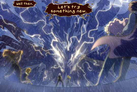
good question, and thank you! i haven't seen much talk about spot but a lot of development went into his look
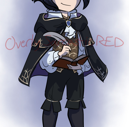
for posing, we took a lot of inspiration from the artist egon schiele, an idea from humberto rosa. we wanted spot to look awkward by making him feel like a loose yet controlled sketch, exaggerating his weird long and lanky proportions into very squared off and angular shapes
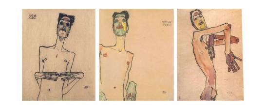
for the portals, they had to be created in anim first and then fx did a pass on them to add all the little extra swirly bits, and then comp did another pass on them to integrate them into the scene. every element that you see in a shot had to be created in 3D in order to move properly down the pipeline so that the other departments knew what to do with the scene, because they don't always look at the animation playblasts, what matters is what's published in the scene file. we can draw over our shots to try things out quickly but eventually had to put in the work of making them real 3D assets. every portal that you see on spot's body and floating off of him was placed by an animator
near the beginning of production, a lot of tests were done to make spot's face portal more expressive, mimicking mouth and eye shapes as a part of his acting. it was decided that simpler was better in this case, so it was mostly just kept as an oval instead

in order to make a shot like this work in 3D, we used two spot rigs here and a portal tool that let us flatten the geo of the second spot down to 1 pixel so that only his hand can be seen while animating in and out of the portal. nothing is painted over here, this is pretty much 1:1 to what's in the maya scene
in order to progress spot's power throughout the movie, we needed to add more body spots in the india sequence, similar to the second to last pose here (art by aymeric kevin):

our anim tech lead emmanuel gatera worked with rigging to update spot with the ability to turn sections of his body black with the use of a boolean, since it was impossible to add enough spots to totally cover his hands and midsection. he did still need a lot of spots along with the booleans though, i think it was somewhere around 80 (we had library poses for them, didn't need to bring them all in and manually place them in every shot haha)
and finally forget what i said about having to create everything in 3D because the final stage of spot's power was the exception to that rule since he was only in a small handful of shots. nideep varghese animated this shot with the regular spot rig and drew over it entirely in 2D, which the fx department recreated with about a bazillion layers of hand-drawn fx by arthur muller, srdjan milosevic and filippo maccari. lighting/comp by craig feifarek
362 notes
·
View notes
Text
Choose your favorite!

Vote in the other polls!
What fans say:
Kung Fu Panda:
Honestly iconic. The progression of story, the message, the acting.
The way this movie balances tone is nothing less than astonishing to me. It's funny and lighthearted but also intense and dramatic and neither ever take away from the other. Every joke and emotional beat lands excellently. Not to mention. The fight scenes SLAP. And so does the score!!
It's just GOOD. I love how all of them were insanely genuine. Po genuinely wanted to be a Kung Fu master. The Furious Five genuinely wanted to be the very best like no one ever was. And Tai Lung genuinely wanted to kick the shit out of anyone that even looked at that dragon scroll. But seriously one of the best movies.
Treasure Planet:
The setting and focal relationship!
WHALES IN SPACE. Second best treasure island adaptation (#1 is muppets). The song The Song!!
Where do I begin with this movie? It blends CG and hand drawn animation beautifully. All of the backgrounds are gorgeous. There are so many cool alien designs. The score is absolutely perfect. The amount of detail put into the design and worldbuilding shines through. All of the characters are so much fun to watch, especially Long John Silver and Captain Amelia. This movie takes at least partial responsibility for my love of space/sky pirates. Also it was actively sabotaged by Disney so I need to vouch for it at every chance.
Space pirates in a classic novel. It's gorgeously animated with a blend of 2d and 3d. Also, LONG JOHN SILVER HAS A 3D HAND thats hecking impressive for a main character to be a blend of the two in 2002. Did I mention the twink protagonist and malewife for the rich halfwit son? The aliens are beautifully unique, and a mantis guy floats off into space. from a pirate ship. because they aren't just space pirates, they're aliens and cyborgs on pirate ships going through space. Which fucking rocks.
It's a genuinely creative adaptation of Treasure Island that has so much heart and incredible animation. It helped pioneer 3D animationa nd it was the first feature animated film to utilize both 2 and 3 D animation
The animation is so good, and the way that the antogonist isn't black and white, he genuinely cares for the protagonist <3
Pirate ships in space!
Watched this on loop as a kid, gave me solace for not growing up with a dad
It fucks
The ☆A n i m a t i o n☆!! And captain Amelia
It's so fun looking, cool character design. It's funny, it's emotional. I love it so very much please aaaaaaa
How this movie looks is absolutely amazing. A space-steampunk pirate story with fantastic visuals and (mostly) great characters. The vibes this movie has are off the charts. Jim is the bad-boy-good-heart kid, the doctor is a silly-goofy-but-oddly-competent support and Silver is a complex father-figure-who's-made-mistakes. Also MORT the cute little jelly that won me over in 0.5 seconds flat. I am also a slut for a good soundtrack and this one SLAPS. I will stand by my opinion that the Russian version of the song I'm Still Here did a better job of fitting the montage and the mood. That's a hill I will die on.
494 notes
·
View notes
Note
Hello i hope your having a wonderful day/night! Idk if your open to request right now but I hope you are! if your not then I'm sorry!! 😰 but may I request a Jessica rabbit type reader x wally daring?? You do this then thank you sm!!

summery: reader who's like Jessica Rabbit and how'd they'd be with Wally. gn! reader btw
tw: mentions of creepy male behavior.
a/n: my requests aren't open but I was surprisingly inspired by this. I haven't watched Who Framed Roger Rabbit in so long but I feel like I did a really good job! ALSO! I'm going to mainly write in headcanon style because for some reason I find it easier even though this is like...my third time writing headcanons lol.
wc: 0.5k
Master List

❥When you moved into the neighborhood, you immediately noticed that you were a bit…different. Flatter than the other residents…as in they were all 3D while you were 2D.
❥Everyone flocked you, curious as to how that was even possible. So you explained how you came from a town that was a bit more…animated. They were in awe as you told tales of your hometown. Even commenting on how they wanted to visit some day.
❥Even with all the commotion of your new neighbors, you couldn’t help but keep your eyes on a certain yellow puppet. He watched from behind the others, gaze never leaving you. You couldn’t help but let your ego grow a bit, flaunting a bit more than you already do.
❥All the attention your first day left you a bit overwhelmed. Yes, you’ve dealt with crowds before when you worked as a singer at a bar in your hometown, but this kind of attention was different. It wasn’t the perverted stares you grew accustomed to. In fact, that was a bit of the reason why you left.
❥Even though you were overwhelmed the first day, you couldn’t help but appreciate how kind your new neighbors were. Once they learned that you were a singer they just had to have you perform (a bit to Sally’s dismay. But you're the new neighbor so she can let you have the spotlight this time).
❥As you sung a love song, your gaze was once again drawn to who you’ve come to know as Wally Darling. A fitting name, truely. His stare was intense as he watched you. You’d think you’d be creeped out by it, but you didn’t. In fact, you felt flattered. Compared to the creeps at the bar who’d oogle at you without shame, who’d cat call, who’d stare at you like you were lesser for whatever reasons…Wally’s stare was nothing like that. A bit empty, sure, but it wasn’t disrespectful or perverted.
❥Day by day, you found yourself growing infatuated with Wally. You wanted to spend more time with him. Get to know him better. Maybe even entertain an idea of something more.
❥It didn’t help that you caught on to his small shows of affection. His stare lingering on you being the tell-tale one. But you also caught him touching you, whether it be a pat on the shoulder or a short hug. How he gifted you things, sometimes a drawing, or just something that ‘reminded him of you’ (which made you feel more confident at the fact that he thinks about you).
❥You were the first to finally make a move. The entire neighborhood knew about the flirting you two participated in, not like you were keeping it a secret. But you could tell that Wally didn’t seem like he was going to do anything further than that.
❥Let’s just say everyone was relieved when you two became partners. Only to realize they’d have to deal with even more lovey dovey flirting afterwards.
622 notes
·
View notes
Text
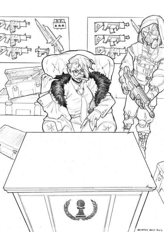
TIME FOR A PROCESS POST let's talk abt getting from this (client sketch - which, btw, i know other artists have talked about this plenty, but i LOOOOOOVE a client sketch as early direction on a commission. LOVE it)
to this!
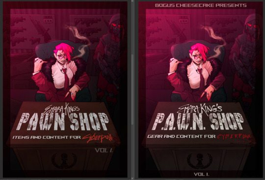
at first we didn't know if the title was going to go across the desk, or over the central figure (emara's) head against the back wall. so there was a 1st version where we were favoring a higher title, then we started favoring the desk so we scrapped the clutter + centered it more

i used clip studio's 3D models (particularly for the chair, guard, + weapon crates) and perspective rulers to help with laying everything out at this stage, tho i abandoned the 3D pretty early on bc it's a bit too clunky for me. maybe i'll find it quicker to use w more practice!
(the rest under the cut!)
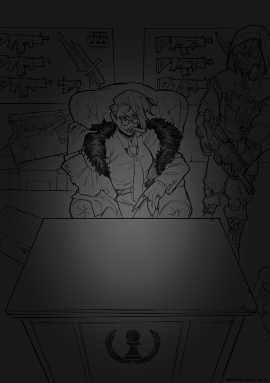
once the basic layout was approved, i threw together a value study to explain how in the final image all the clutter of the bg detail would be unified and pushed back. lately i find myself thinking abt value earlier + earlier in the process; planning ahead saves me a lot of time!
i fiddled with starting to refine things digitally, but then i got A BRAND NEW LIGHTBOX delivered in the mail with perfect timing (lmao) so i just ended up printing off the digital sketch, finalizing in pencil, + scanning back in

then comes five billion different steps of locking in values, again. i did everything greyscale first, but i didn't worry abt getting things super polished at this stage bc i knew color would factor in a lot to later decisions

this is the point at which presenting these wips "step by step" is kind of misleading; i didn't do these stages one at a time, but rather had a BUNCH of different lighting/shading layers that i kept toggling on and off as i worked to make sure everything was coming along well.
(to get some of these caps i actually went into the main file again and turned a bunch of stuff on/off just for the sake of getting specific examples, because actually when i was actively working on it there was rarely a point where i was actually working on something with "all lighting turned off and just the shading on," or anything like that; but i AM interested in showing what effects different lighting/shading changes had on the base colors, even if i wasn't really making these changes in a rigid order.)
i.e., just for the sake of interest, here's how the flat colors look without those adjustments!! but i honestly never looked at it like this on its own for long...i had all the shading/lighting turned off so i could see what i was doing while flatting, but i was constantly checking back and forth.
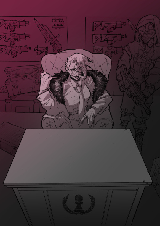
then tones added on top (which were actually just two copies of the tone folders in the above posts, set to linear burn and overlay) -
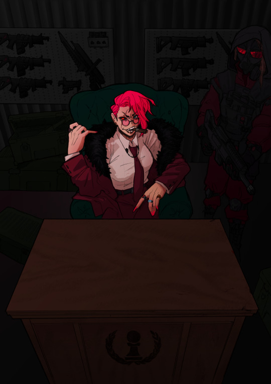
which makes it get HORRIFYINGLY dark, but that's when we go in and add a bunch of lighting adjustments.

the most obvious lighting change above is the big burst of hot pink light from the corner, but there was also some masked overlay + burn layers to pop out the guard + emara and make sure they were pulled out from the bg. if this were a standalone illustration, i maybe would have let the bg (and all that painstakingly drawn detail..........) stand out a little more, but a cover functions differently, and i wanted to make sure the eye goes to the title first. that means sacrificing bg detail even if it looks sick lol
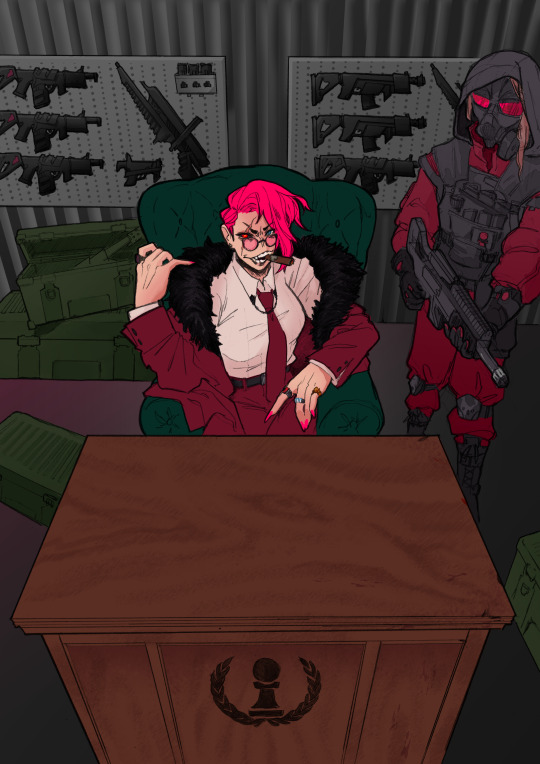
then final touches! a lot of my very last touches are things that are close to invisible; gradient maps on very low opacity, noise, a little bit of scribbling on upper layers. the typesetting was all by the client, except for the lettering for "emara king's," which i did myself!
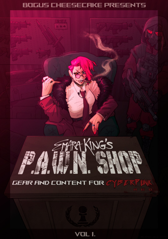
finally, here's a comparison of ⬅where i left off one night close to the deadline thinking "it's probably done, but i'll sleep on it just in case," then all the adjustments i made the next day with fresh eyes.➡ and that's it!!! phew!!! that's how i make a cover!
#my art#process#wip#tutorials#<- not really but. i just figure someone browsing my tutorials tag might be into this#i am so so so so so fucking mad that i didnt think to turn timelapse recording on for this#bc a timelapse wouldve been so fucking sick. but i can at least share this
596 notes
·
View notes
Note
This is probably a weird question, but what are some tips you could give on character design? I've been trying to feel confident with my own designs, but they feel kind of bland... what kinds of things would you suggest to help make designs stand out more?
Hoo boy. Hm. I feel like I am not the right person to ask about this because objectively I do almost nothing you're "supposed" to, but if it's working I guess that means I might be onto something?
A lot of my design considerations are practical. I don't want to give anybody a design that's going to be a nightmare to draw over and over again. I've done enough commissions in my time to know when somebody is overdesigned and therefore hugely annoying to draw, and that's a no-no. So I tend to stick with simple patterns at most, not too many layers, no need for five million belts, no need for incredibly intricate hairstyles, etc. This is a practical consideration for the medium of comic art, but other mediums have different considerations - 3D-modeled art, for instance, can overdesign the characters as much as they want because they only need to model them once, and a lot of visual novel characters are limited to a very small handful of poses and some interchangeable expressions, meaning it isn't prohibitively complicated to make them a little Extra. The most time-consuming and frustrating commissions I've ever done were for characters who were frankly never designed to be drawn more than once. A quick sampling of highlights for the design features I swore to myself I would never deal with again-


So on a basic level, if you're designing a character to draw over and over again, it needs to be something you're willing and able to draw over again. Intricate patterns, a lot of interlocking plates, anything with lace - those are all things I try to avoid.
I've often seen the advice that character silhouettes should be super visually distinct, that characters should be very strongly shaped like different things. I think that's great if your style is that flexible, but if you kind of want everybody to be shaped like a human being with a skeleton, this advice is not very useful.

I think a diversity of body shapes is great, but the style I favor requires the anatomy to at least sort of makes sense, which means while there can still be a lot of variation in the distribution of muscle and fat, everyone's bones are gonna be in roughly the same place. I can't just draw a square and fill it with a dude. So instead I try and distinguish my character silhouettes in other ways.
Everyone's hair is different, and because most characters have big hair, this plays a large part in their silhouette. Falst and Erin both have short hair, but Falst's is a bristling mane while Erin's is usually more swept and soft-looking. Dainix and Kendal both have long hair, but even when Dainix's hair is loose it doesn't hang or flow the same way Kendal's does - it gets in the way, drapes in front of his face and overall doesn't move the same. Alinua's hair is bouncy curls. On top of that, everyone's outfits are fairly simple, but no two of them are exactly the same - Erin has a monopoly on poofy sleeves, Kendal has cuffed boots and the back-slung sword, Dainix has the poncho and the poofier pants, Alinua has the v-neck top with slightly pauldron-y shoulders and the slippers, Falst's clothing is ragged at the edges, etc. Even without getting into their distinct color palettes, everyone's at least a little bit distinct.
And this is another place where I purposefully try to avoid overdesigning. If everyone has too much going on it can circle around to being hard to tell the characters apart, because too much is happening. Who can pay attention to the fact that one character is sleeveless and one has asymmetrical boots and one has a mullet when everybody is wearing eight layers of embroidered fabric with four belts and half a breastplate on top?
Avoiding same-face is hard, and I'm not very good at it. But I do try to make sure everyone's face shape, nose and eyes are at least slightly different from everyone else's. It might not show from a distance and it might not be as extreme as a pixar design sheet, but it's something.
Ultimately the main consideration I keep in mind when designing characters is - perhaps a bit redundantly - their character. Who they are as people, and how that will impact the way they look. Everybody stands differently, and shifts their weight differently when a situation is changing.
Despite both being short, lightweight guys with short hair, Falst and Erin are wildly different people and are not going to dress the same, make the same facial expressions or hold themselves the same way. Despite both being tall, long-haired, generally friendly warrior badasses, Kendal and Dainix carry themselves very differently and react to things in very distinct ways. Tess and Erin have the exact same haircut and nobody noticed for ages because of everything else.


The designs aren't complicated, and compared to some, they aren't even that distinct. But I try to make sure that their personality is visible in every aspect of their design. Every "why?" in their design has an in-character answer, and since they're all quite different on the inside, keeping things simple means that starts showing through on the outside.
This is also how I can visually distinguish between Vash and Kendal, who have the exact same body and clothes.


we can never underestimate the importance of ✨body language✨
388 notes
·
View notes
Text
Glitter and Memories
Word Count: 735
Warnings: None
Cater Diamond x Fem!Reader
︶꒦꒷♡꒷꒦︶︶꒦꒷♡꒷꒦︶︶꒦꒷♡꒷꒦︶︶꒦꒷♡꒷꒦︶
Cater flashed his signature grin, his eyes twinkling with the same mischievous spark that had first drawn you in. “Today’s the day we let our creativity run wild,” he declared, spreading an array of art supplies across the table.
You couldn’t help but laugh at the enthusiasm he exuded. “And what exactly do we have planned, Diamond?”
With a flourish, he presented a scrapbook, its pages blank and waiting to be filled with memories. “We’re going to capture the magic of our everyday moments,” he said, “and maybe add a little twist.”
The afternoon sun streamed through the windows, casting a warm glow over the glitter, glue, and colorful paper that surrounded you. Cater’s excitement was infectious, and soon you found yourself fully immersed in the project, cutting and pasting with more gusto than you’d ever thought possible.
As the scrapbook began to take shape, Cater paused, a thoughtful look crossing his face. “You know what this needs? A centerpiece that truly pops.”
You raised an eyebrow, intrigued. “Oh? And what might that be?”
With a mischievous glint in his eye, Cater reached under the table and pulled out a miniature volcano kit, complete with baking soda and vinegar. “Remember making these in school? Let’s recreate that magic.”
The next hour was a blur of laughter and creativity as you both constructed the volcano, decorating it with an extravagance that only Cater could inspire. And when it came time to make it erupt, you both held your breath, counting down before pouring the vinegar into the crater.
The reaction was immediate, a frothy explosion of glitter-infused lava that spilled over the sides, much to your delight. Cater’s laughter mingled with yours, the sound as bright and vibrant as the sparkling mess you’d created. As the glitter from the volcanic eruption settled, Cater turned to you with a playful challenge in his eyes. “I bet you can’t make a more extravagant page than I can,” he teased, his competitive streak shining through.
You accepted the challenge with a smile, knowing full well that Cater’s artistic skills were top-notch. “You’re on, Diamond. Prepare to be dazzled.”
The two of you dove into the task, each trying to outdo the other with elaborate designs and creative use of materials. Cater was a master of color, his pages a vibrant tapestry that told stories without words. You, on the other hand, had a knack for storytelling, your pages weaving narratives that brought smiles and occasional laughter.
As you both worked, your shoulders brushed, and every so often, Cater would lean over to plant a quick kiss on your cheek, leaving a faint smudge of glitter in his wake. “For good luck,” he’d say, though you both knew it was just an excuse to be close.
The hours slipped by, marked by the soft sound of scissors cutting paper and the occasional burst of laughter when one of you made a particularly bold artistic choice. “Look at this,” Cater said, holding up a page where he’d managed to create a 3D effect with layers of paper. “It’s like we could step right into the scene.”
You admired his work, genuinely impressed. “It’s amazing, Cater. But wait until you see what I’ve got planned for the next page.” You revealed your surprise—a series of photos from your first date, carefully arranged to tell the story of that magical night.
Cater’s eyes softened as he looked at the photos, and he reached out to trace the edge of one with a finger. “That was a good night,” he murmured, and you could hear the love in his voice.
“It was the start of something wonderful,” you agreed, feeling a warmth in your chest that had nothing to do with the room’s temperature.
Eventually, the scrapbook was filled to the brim with memories, each page a testament to the bond you shared. Cater closed the book gently, his hand lingering on the cover. “This is more than just a book,” he said, looking up at you with earnest eyes. “It’s a piece of us.”
You nodded, feeling the truth of his words. “And we’ll keep adding to it, page by page, memory by memory.”
Cater pulled you into a hug, the kind that said everything without a single word. And in that moment, surrounded by the chaos of your creative endeavors, you knew that this was exactly where you were meant to be.
#twisted wonderland#twst#twst x reader#twisted wonderland x reader#twst x you#twisted wonderland x you#twisted wonderland fanfic#twisted wonderland fluff#twst imagines#twst fanfic#twst fluff#twisted wonderland x female reader#twst x female reader#twisted wonderland imagine#x female y/n#Cater twisted wonderland#female!mc#f!mc#Cater Dimond x f!reader#Twisted Wonderland#disney twisted wonderland#twst wonderland#Twisted Wonderland Fluff#x female reader#cater dimond#cater diamond x reader#twisted wonderland Cater#twisted wonderland Cater Dimond#twst cater#twst cater diamond
40 notes
·
View notes
Text

Post 1110
Fast and Furious Before; and After--not so much....
Dylan Cage Godwin, South Carolina inmate 391723, born 2002, incarceration intake August 2023 at age 20, scheduled for release April 2024
Failure to Stop for a LEO
In November 2020 -- behaving as if he were in sort of 'Fast and Furious' movie -- Police said an 18-year-old drove more than 160 mph during a chase, hit a Marion police cruiser and two other cars, and afterwards was found hiding in bushes.
Dylan Cage Godwin, then aged 18, of Gastonia, North Carolina, was driving 101 mph in a 60 mph zone on Hwy 501 Bypass Sunday around noon, police said. When an officer attempted to pull him over, Godwin — driving a Camaro — accelerated to 150 miles per hour.
Godwin made a U-turn near the Latta exit and started heading south again, according to the police report. Godwin allegedly 'lost gear' of the car and it stopped moving. The officer pulled in front of him to block the southbound lanes when the Camaro moved forward and hit the police cruiser, police said.
The officer told Godwin to roll down the window with a gun drawn, and Godwin put the car back into gear and drove off, police said. Godwin took the Marion exit and headed towards city limits and went into oncoming traffic. Two officers swerved out of the way.
In the area of Kimball Drive and the Food Lion parking lot, Godwin rear-ended a pickup truck and hit another car head-on, according to the police report.
Godwin and a 17-year-old juvenile got out of the car and ran behind a probation office. Police said the juvenile was held against his will due to Godwin driving at speeds over 160 mph, which stopped the juvenile from leaving on his own, according to the police report.
Godwin was eventually found in some bushes in the 200 block of Warwick Avenue.
Godwin was charged with failure to stop on command, driving without a license, speeding more than 25 mph over the speed limit, third-degree assault and battery, reckless driving, driving on the wrong side of the road, failure to stop for a blue light, resisting arrest with a deadly weapon — second or subsequent offense, hit and run, kidnapping, and contributing to the delinquency of a minor.
Godwin completed his education and received his high school diploma 3 months into his incarceration.
3d
46 notes
·
View notes
Text


UH-OH! a comic about being trans. by me. part one of probably three :]
i felt bad about being transmasc so i decided to just give up and write about it until i hopefully didnt. i feel a little better getting this all on digital paper but there's still. a lot to draw. so. oops
i'll be posting the next parts. whenever they're ready (which will hopefully be soon) and linking them all here, so whenever you want just check back with the base post and i'll prolly add some links and maybe clean things up. yay!
text transcript / partial ID under the cut!
transcript:
looking back, there were a few signs i might have been trans.
[a sequence of events showing little me flinching and going "ow" at being called his deadname, little me reading a book and going "haha im like a tomboy but i dont like sports or being active or anything im just. a boy. haha", and little me having an active breakdown, crying and holding his glasses, with partially obscured text in a dark cloud around him. the only text visible shows his thoughts, and shows he's worrying that he's sexist for mostly only liking and relating to boy characters.]
...some.
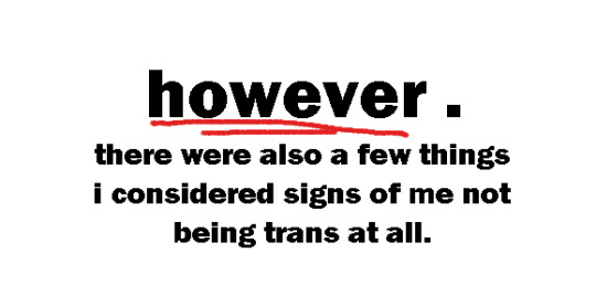
however.
there were also a few things i considered signs of me not being trans at all.
EXHIBIT A:
[a drawing of little me, looking at his 3ds. he's thinking "as long as i make sure that i always play as the 'main girl character' in these games i wont cry because im a girl because i wont be me as a girl i'll be Them. roleplaying. as them".]
no dysphoria.
[caps] EXHIBIT B: [end caps]
[a crude drawing of little me staring at nothing. he's thinking "i don't hate women. and i don't like being mean to other people."]
[caps] I WAS A FEMINIST. [end caps]
and not toxically masculine.
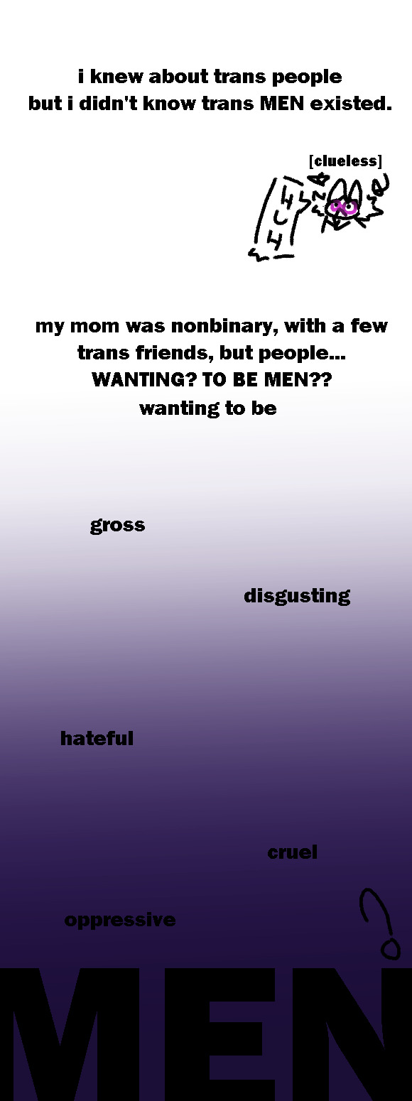
i knew about trans people, but i didn't know trans MEN existed.
[a drawing of little me, with the caption "clueless". he's staring slightly up, and saying "huh?!"]
my mom was nonbinary, with a few trans friends, but people [caps] WANTING??? TO BE MEN??? [end caps]
to be
gross,
disgusting,
hateful,
cruel,
oppressive,
men?
[the background slowly gets darker until it reaches the final word, and that word is a significantly bigger font than the rest of the words.]
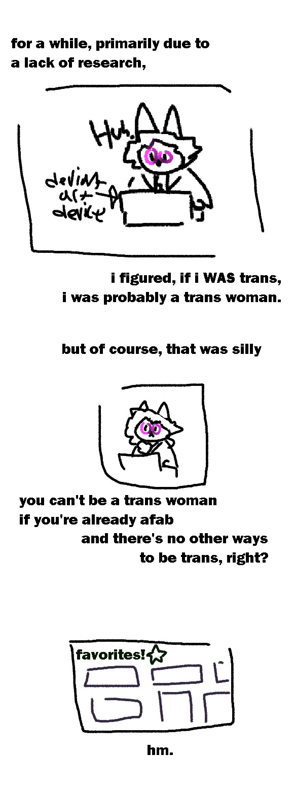
for a while, primarily due to my lack of research
[drawing of little me, staring at his computer (which is labeled "deviantArt machine") and going 'huh'.]
i figured, if i WAS trans, I was probably a trans women.
but of course, that was silly
you can't be a trans woman if you're already afab.
and there's no other ways of being trans,
right?
[a crudely-drawn drawing of a deviantArt favorite's tab. none of the favorited pieces have any detail, though several are the same width and length as classic deviantArt stamps.]
hm.
hmmmmm...
[a crudely-drawn drawing of a representation of one of the favorited stamps. it's a massive, pink stamp with the text "SHE/HER!" in it in all caps and pink lettering. bottom text states it is a "she/her pronouns badge by ...", though the rest is cut off.]
HMMMM...
[a picture of a mouse hovering over the 'favorite/unfavorite' button. the star is filled in, indicating clicking it would unfavorite the piece.]
[two wordless panels, side-by-side, showing little me staring at his screen, hovering his cursor over the unfavorite button.]
[two more panels, showing that little me has unfavorited the she/her badge. the panel showing his face shows he is grinning wildly, his hair has poofed up in excitement, and his glasses are now blue-ish purple.]
OHO!!!!!!!!!!!!1
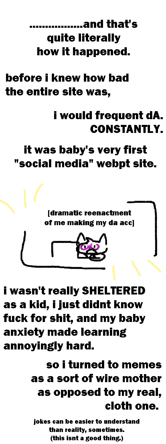
.................and that's
quite literally
how it happened.
before i knew how bad the entire site was, i would frequent dA. CONSTANTLY.
it was baby's very first "social media" webpt site.
[a drawing of a tiny, cartoonish kitten with a small turf of hair, staring at wonder up at a computer, one hand on the mousepad. it is labeled "dramatic reenactment of me making my d a account."]
i wasn't really SHELTERED as a kid, i just didnt know fuck for shit, and my baby anxiety made learning annoyingly hard.
so i turned to memes as a sort of wire mother as opposed to my real, cloth one.
jokes can be easier to understand than reality, sometimes.
(this isnt a good thing.)
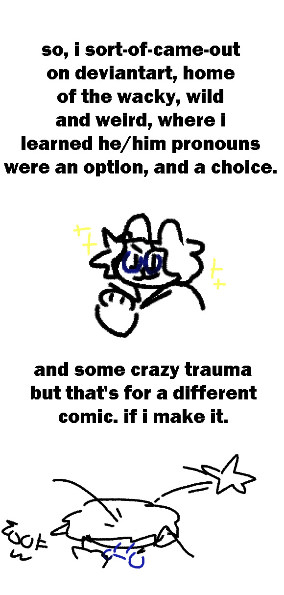
so, i sort-of-came-out on deviantart, home of the wacky, wild and weird, where i learned he/him pronouns were an option, and a choice.
[a drawing of little me, with blue glasses, gazing up at the sky and smiling triumphantly.]
and some crazy trauma but that's for a different comic. if i make it.
[a drawing of little me being hit with a cartoonish star, which is meant to represent the trauma.]
sooo...
that's it, right?
[little me, with a cartoony bandage on his head, gently rubbing his wound.]
my mom was supportive & anyone who wasn't ...isn't in the picture now
that's the end
...right?.
end transcript.
#trans#trans man#transmasculine#ftm#comic#webcomic#klug's sketches#hoo boy this is rlly fucking personal so im a little scared BUT#im happy w it and that is what matters
39 notes
·
View notes
Note
what is your most favorite form of animation in your opinion?
OHHHH WHAT A THOUGHT PROVOKING QUESTION!! i love this!
the famous Eliza copout answer would be to go “ALL OF THEM”, and there is genuine truth in that! but i can’t entirely kid myself, i’m such a sucker for traditional hand-drawn animation. part of that comes from a sense of familiarity, but i really, REALLY love how inescapably human it is. there’s a human touch in every pencil stroke or brush stroke on a cel, etc., etc. i’m incredibly big on feeling a connection with the artists that made this possible, the demonstration that yes, this literal feat of magic is possible and here is someone physically doing it right now… not to say other mediums are exempt from this (which is a point i’m about to indulge in shortly), but, at least for me, i just feel the most powerful connection with traditional animation. actually getting to see the pencil lines on paper. seeing where the cel paint has maybe begun to smudge or chip with age or human error. it’s a living archive of human touch. and i love how that is able to translate in the actual product itself—not just talking about looking at relics! (which is another benefit: physical relics!!!)
BUT! i have to say that i am also a HUUUUUUUGE fan of puppetry and stop motion. the day the stigma of puppets being scary dies is the day i will be a free and joyous not-so-man.. and yes! this includes all puppets! like traditional animation, i LOOOOOVE how innately human it feels, maybe even MORESO than traditional animation. you always always always feel the human touch involved. that, and it’s just so CREATIVE! so many cool ways to make art!!! so many wonderful set designs you can have! so many creative PUPPET designs you can have! the challenge of making these characters or sets feel lifelike or, at the very least, convincing to your intent.
it’s a big reason why i love Popeye cartoons as much as i do, since they combine two of my greatest animation loves (traditional animation + physical 3D sets) and it’s truly a magical experience to see them together.
this is also where i take the time to shill Beany and Cecil. WATCH BEANY AND CECIL!!!!!!! more recordings have been recently uncovered and they’re wonderful!! reading Bob Clampett’s interview with Mike Barrier and Milt Gray and how he got emotional talking about his experience working on it made ME emotional! it’s one of the reasons why i love and resonate with his work so much, i definitely share a very similar reverence for stop motion and puppetry. tell me you don’t crack a smile watching this
youtube
and the great Frank Tashlin did stop motion of his own!! which, again, is why i love and resonate with HIS work so much too!!
youtube
BUT YES!! this is just a blip really—i love so many styles and mediums of animation for different reasons, and look forward to all the ways well be able to incorporate these various styles and techniques together. animation is such a great feat and so beautiful through its versatility; we’d get a lot more done if there were fewer arguments about what the Best way to animate is and, more accurately, how we can adapt and combine and innovate new ways to continuously reach new potential we’ve never seen before
18 notes
·
View notes
Note
If you're allowed to say, what aspects of Venus aren't you allowed to use? I suppose I was under the assumption that The Next Mutation was mostly free game to be used in other TMNT products. Or does Saban still own a lot of its constituent parts? Considering Ninjara's latest appearance since the Adventures series (unless you count the infamous furlough issues) is about to be in a background in DLC for Shredder's Revenge It's kind of bonkers how many disparate parts of this long-running series are not owned by Nickelodeon at this point and just held onto by various companies.
I don't have a specific list handy but the two main things I was told "no" on are we can't use the full "Venus de Milo" name and we can't give her a braided mask/bandana. At one point I tried to make her more visually similar to the Next Mutation version and they had me pull back from it. I originally wanted to reveal her true name as Mei, a nod to her Next Mutation name, but that didn't fly either.
I don't know the exact ins and outs of the legal aspects, it's all pretty complex and a lot of it seems arbitrary and more "better safe than sorry" than explicitly legally-binding, but yeah I think Saban still owns Next Mutation to some extent if not in full. Even the Next Mutation DVD set that came out recently-ish doesn't have Nickelodeon or Viacom anywhere on it.
I remember in the early days of IDW we were told we couldn't use Ninjara, but then more recently turns out we CAN use her! Another example of how arbitrary and malleable this stuff is, Lita was originally supposed to be Venus, I designed her as Venus (hence her yin-yang tattoo and tessen/fan weapons) and she was even written as Venus at first (it was going to be that Jennika would be a big tennis fan and named Lita/Venus after tennis player Venus Williams) but then at the last minute I was told we couldn't use Venus, so I had to rename her and change her into a new character. Then later it seemed like we COULD use Venus after all so I started working on introducing her again, but then after we'd already released images and promos from issue #127 there was a brief scare where it looked like we actually didn't have clearance for Venus AGAIN! For a minute I thought I was going to have to rename/rework Venus again into a new character, I thought I was going to end up with TWO almost-Venus-until-the-last-minute characters, but then at the eleventh hour things worked out. WHEW.
It's also weird even for characters that Viacom does 100% own, like for example we tried to use Tatsu from the 1990 movie but we were told no (so we changed it to Natsu who ended up working out pretty well if I do say so myself) because of likeness issues. We're generally not able to use any character that was originally played by a real person in live-action form whose face can be seen, like Tatsu, Keno, Danny, Vam Mi, etc. It's especially weird because Tatsu was used in the 2012 show and he's clearly based on the actor, Toshishiro Obata, but I think there are probably some weird byzantine stipulations like 3D CG models are okay but drawn media is not. It's all very weird.
ANYWAY!
38 notes
·
View notes
Text
TWIN PEAKS: THE MISSING PIECES (2014, Lynch) x
PERSONA (1966, Bergman) - near the end of both films
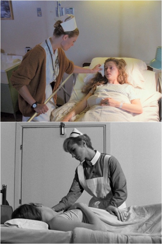
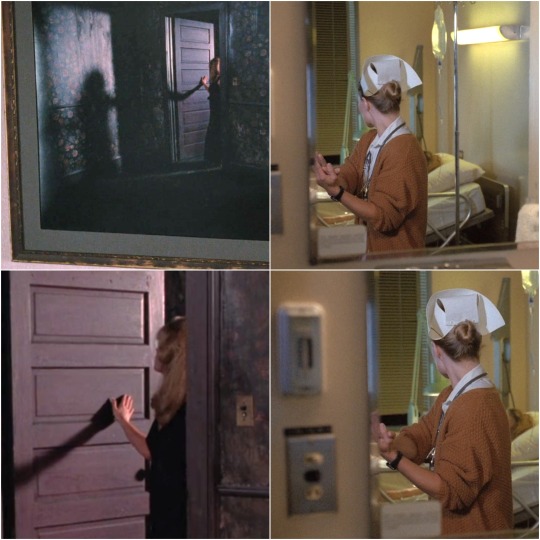
A nurse, in a distinctive nursing cap, cares for a largely mute patient in bed, & at some point is seen to take on some element of her identity...

Though the scene at the end of THE MISSING PIECES is short, it also parallels 3 other distinctive moments or elements from PERSONA: One, the nurse waves her right hand in front of Annie's face, just like the boy in the prologue to PERSONA waves his right hand in front of our face.
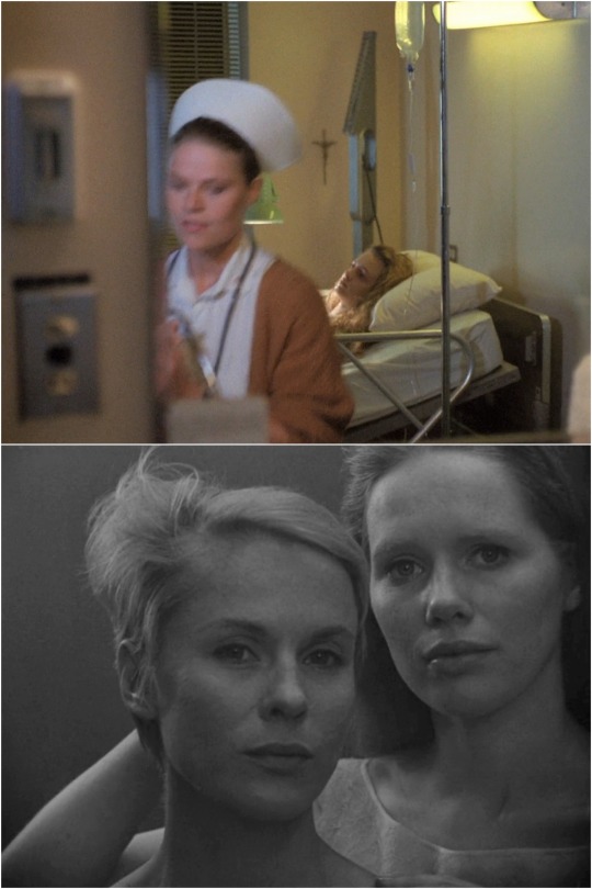
Two, we see Annie and the nurse reflected together in a mirror, just as in PERSONA we see Alma and Elisabet together in a mirror, in one of the most iconic sequences of that film. Notice also in the TP:TMP image above that there is a crucifix conspicuously hanging over Annie.
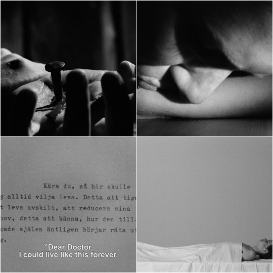
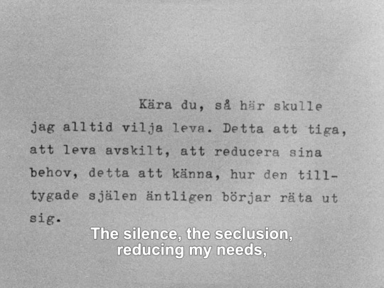
This crucifix brings out a third parallel, its Christian iconography echoing the Christ-like elements of PERSONA's symbolism, from that film's repeated imagery of a nail driven through a hand, to its moment of blood-drinking, to its mention of eternal life, & more...
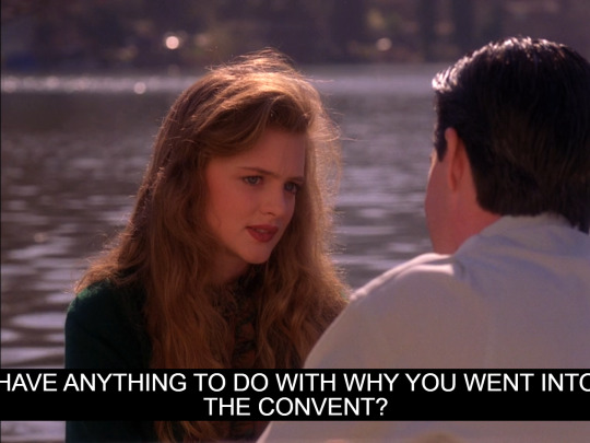

The distinctive nursing caps/uniforms worn in each film further draw out these Christian parallels by arguably evoking those of nuns' habits, a comparison underscored both in PERSONA by its nurse being referred to as "Sister Alma," & in TP by Annie's past life in a convent.
In addition to the world of religious symbols opened up by each work's implicit or explicit monastic references, the nun allusions also tie in themes of sisterhood, silence, and renunciation that are relevant to both works.

Indeed, Annie's situation at the end of MISSING PIECES seems to intentionally be suggestive of a type of return to this monastic state of silence, seclusion, and an absence of men, one steeped in Christian symbolism.

While neither Lynch nor Frost are practicing Christians (both seem more drawn to Dharmic religions), Annie's Christian faith is strongly emphasized in the series, carrying on a streak in TP's symbolism stretching back to MIKE's "face of God" soliloquy & forward to FWWM's angels.

While the Nurse-Annie scenes in TP:TMP may arguably be viewed as somehow less important to TP canon, given that they were originally deleted, it's important to note the very strong ways that scene parallels Laura's critical, Annie-featuring dream sequence in FWWM:

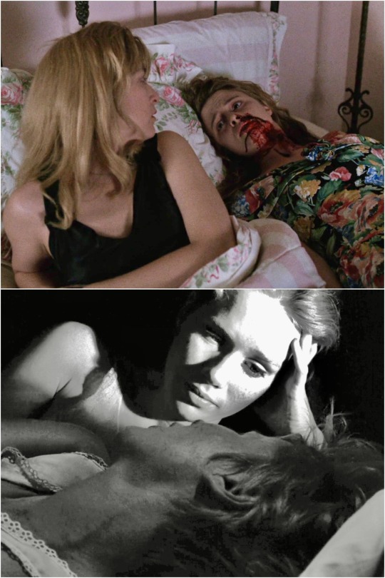
Consider the ways the Nurse-Annie scene mirrors the Laura-Annie scene. In each: 1). Annie recites the same statement. 2). The jade ring is then passed on to a new person 3). The ring-bearer then sees a reflection, looking back over their right shoulder into a room with a bed
Indeed, as regards the "mirroring" moment, the construction is remarkably similar: we see a rectangular frame with a ring-bearing blonde looking over her right shoulder into a room with a bed. In the case of Laura, her outstretched right hand touches her shadow's hand; in the case of the nurse, her outstretched right hand (as seen in the mirror image) touches her left hand.

(Like the Annie-Nurse scene in TP:TMP, the Annie-Laura scene in FWWM arguably evokes moments of PERSONA as well, albeit here the parallels are more tenuous...)

(It's also perhaps worth noting a connection between Laura & a nurse made in the pilot episode, where a nurse stuffed-animal (a sockpuppet monkey?) can be seen in her bedroom.)
Other minor observations:

-In one of the few other notable elements of mise en scène in the TP:TMP scene, a painting of a lake in a forest can be seen behind the Nurse as she stares down at the ring (just before looking in the mirror), arguably evoking another iconic PERSONA image
-The design on Laura's lamp post seen in several shots of Annie distinctly resembles a divided heart (much like the wreath on the Palmer House door, both suggesting Laura's "divided heart" necklace).
-Note also the 3D "flower" scrunch-flourish on Annie's dress evoking a blue rose.
Much more could be said about all of the topics herein, including especially the links between PERSONA & TP/Lynch generally, as well as the links between the Annie-Laura scene and the Annie-Nurse scene, each of which is deceptively deep.
To end, here's a 2018 quote from Lynch on what motivated his choice to return to TWIN PEAKS: “For a long time, no itch. But at the same time, there’s a thing in FWWM where Laura is in her bed and she's visited by Annie. Annie says, ‘I’m in the Black Lodge with the good Dale. Write that in your diary’. That little bit right there held a string of dreams"

20 notes
·
View notes
Note
Yo :3
So uh, I’ve been looking through your art and I am absolutely in love with it. I love your use of colors and lineart (ESPECIALLY v1 but I’ll get to them). This will mostly just be me rambling about it cause :]
Dude how the fuck do you get emotion so well done. V1 is immaculate, like look at this shit

You can feel that it’s alien to non robots, but is genuinely curious. I absolutely love how you draw poses. Especially since the characters don’t have faces, body language is key. They feel like they have a personality with each drawing. Always hunched down and extended with no regards to social norms. The attention to detail is what really makes it, the thicker outlines on the character make them pop more, and your take on V1 is clearly thought out well, along with your ultrakill characters.

LIKE LOOK AT IT‼️
IT GENUINELY LOOKS 3D‼️‼️


While my favorite is v1, Micheal in your aus is especially well written and drawn. His design reminds me a lot of the corpse of king Minos / Minos prime. which I like! It highlights their contrast, how Minos tried to reason with a higher being on an equal level. Micheal acted instead, deeming himself unworthy of said higher being. Both genuinely cared for their citizens, both were royalty. Minos spoke out, Micheal stayed isolated, which only further deteriorated him, unlike Minos, who instead was proactive, reaching out to other layers and kings like Sisyphus. Sometimes you need to know what it’s like to feel consequence in order to succeed. But in the end, both of their bodies are left to rot, unable to succeed.
Also I really like this one of v1. Their silhouette is distinctive and you’re good at posing :3
Sry. Idk if this is weird or creepy, but I thought I’d share my thoughts with you since I like analyzing stuff.
THE WAY THIS MADE ME SO EMOTIONAL THO....WTF THANK YOU SO MUCH......it's absolutely mind-blowing to me that you pay attention to these little details because i absolutely try to add all of these things intentionally, but i find myself thinking like 'will anyone even care??? about these tiny things???' so it means more than i can say to see that someone does!!!!! like i'm so happy to know that my characterization of v1 comes through, because i really do have a very clear idea in my mind of its behavior and personality that i'm trying to convey through still images. v1's movements are bird/raptor-like and while i give it a very sophisticated, sentient mind, its intelligence is nonhuman and it is a being that absolutely doesn't conform to our standards. v1 is something new, and i want it to be something that clearly has an internal life and a bright mind, yet exhibits very little corresponding human behaviors. plus, it's a bit odd because of its somewhat corrupted software, and so i wanted too for its little hunched posture to show it's sort of a machine gone feral (in the traditional, once was domesticated but is now on its own sense lol) - it was made with a humanoid body shape and so SHOULD stand up straight, but it doesn't anymore. because it doesn't want to. and so!!! i really do draw v1 with a LOT of intention and i put plenty of thought into posing it correctly to both convey its character and its emotion in the piece...and since it's my favorite, i'm so glad i'm doing it justice!!
AND YEA!!! michael definitely has parallels to minos (which i started to think on when i realized their head shape is....kinda similar lol i swear i was just going for crown + blindfold for mike's helmet but oops!!) and i do like their throughlines as fallen rulers, plus their sort of opposing yet ultimately disastrous relationships to their own corpse - minos is separated from his and must watch as it mindlessly tears his city apart while michael is trapped in a flesh prison of his own body, forced to stay within it as it rots away. they are two rulers that would have done anything for their people, and yet both failed them despite again taking opposite paths. minos really had no hope, the external forces of heaven coming down on him in their full authority, though he will forever blame himself. michael departed despite, with god's disappearance, being essentially the highest in heaven - he believed only god could save them though, that he could never become a king from a prince (again, due to heaven's own hierarchy). their meeting would be nothing but utter disaster, but it does make me consider their interactions a little more closely when michael decides to test minos prime's strength (because while michael would have a lot to say about how minos failed his people by defying god, minos would have much to say in turn about a prince abandoning his people at their weakest)
BUT FOR REAL....this message was so amazingly kind and i want to thank you again for sending it my way. it just made me!!!! feel so happy to see that my art is loved and that the work i put into it really means something. honestly it's the best thing i could ask for <3
#like both of these things make me so happy bc!! bc#v1 is my favorite so i want to convey it properly#and i really have. become attached to my ocs#so!!! it's important to me that i get them both right#and im glad you get what im trying to say aaa#sorry if im too sappy but this really made my week lol#cake answers#long post
36 notes
·
View notes
Text
Todays rip: 27/12/2023
Mr. Rental [B Side] ~ Out of Options
Season 1
No Album Release (Read More)
Options - Mr Rental: The Video Game
Ripped by NBGMusic
youtube
Yeah, I missed yesterday's post. My bad - you're getting two posts today instead. For such an occasion, I wanted to feature two rips of vastly different sides of the SiIvaGunner spectrum. And, well, I feel like it's been a while since we've covered something truly deranged and out-there, hasn't it? Excluding Your Rip's Shit, Mr. Grinch, which arguably does count, the last time we truly went into the trenches of SiIvaGunner's absurdity was, like...waterwraith pokos from a month ago? Regardless, its time we drop all this Christmas spirit for just a second and reminisce upon the true best SiIvaGunner story arc - the Mashup Crusaders arc.
The strange name of today's rip, Mr. Rental [B Side] ~ Out of Options, is one that I promise does make sense in the storyline's context. Though Season 1 is many things good and bad, one thing it will always have over the channel's later years is that air of surprise and experimentation, with tons of independent ripper-driven passion projects and shitposts coexisting with few things actually planned for the channel's long-term future. That's part of how I've been able to feature so many memorable rips from the Season despite its short 9-month run and often underwhelming rip quality, how we got excellent rips like Collision Chaos Good Future JP [CD Beta Mix] and Can't Say Goodbye to Yesterday - as performed by Bob Dylan, and indeed how we eventually arrived at the Mashup Crusaders arc. Born from the mind of one NBGMusic and based loosely on the meme-happy qualities of the Mr. Rental Facebook page of 2016, it was a series of rips follow two different incarnations of the aforementioned character across two different games. And while one was a lighthearted spoof of the Looney Tunes series, of what I'm going to unofficially label the "A-Side" of the story, it was the B-Side that immediately grabbed people's attention.
Indeed, though the Mr. Rental seen within the A-Side story was a kind soul, with his rips depicting him helping SiIvaGunner's memes good form and aids in ripping, the B-Side depicted a destructive, chaotic force of nature, in a fully animated and "voice acted" MS Paint-drawn world. Mind, this was long before the Christmas Comeback Crisis, and just after The Reboot had ended - the "Mr. Rental: The Video Game" rips were some of the only times we'd be seeing full-on animated depictions on what we presumed was the continuing story of the SiIvaGunner channel.
In the end, the Mashup Crusaders arc was moreso just NBGMusic's little playground to express his opinions and sense of humor as a ripper more than an actual continuation of the core storyline of the channel. But the popularity of the character he'd created was undeniable - through the sheer force of repeated shitposting, Mr. Rental had become a somewhat core cast member of the SiIvaGunner story. And I feel like Mr. Rental [B Side] ~ Out of Options was the moment where that status was wholly cemented - the episode where, after hearing one too many low-effort mashups (Snowball Park - Super Mario 3D World, anyone?), Mr. Rental goes on a killing spree and declares his intentions to wholly eradicate mashups from existence.
Beyond being just a genuinely really funny series of rips, it was with this episode that things really began to get interesting. Because from time to time, this crazed Mr. Rental would begin appearing in other rips on the channel, proudly declaring his intentions - most famously in a simple mashup of Super Mario 3D Land's theme and Chip tha Ripper, with him literally shooting the rip to death eleven seconds in. From this silly side project, the community suddenly had a sort of villain character present within the channel's inner workings - and this was long before the concept of Figments and the in-canon inner workings of SiIvaGunner would become clarified within the lore later in Season 2 and Season 3.
Though the Mashup Crusaders arc sadly didn't get the proper wrap-up it deserved, all of the excitement and surprise that surrounded it will forever be some of my fondest memories with Season 1 of SiIvaGunner. Before the Christmas Comeback Crisis, before Wood Man, before Haltmann, before the King for a Day and King for Another Day Tournaments, and before the SiIva AI - when all we had was SiIvaGunner, Chad Warden and The Voice Inside Your Head, it was such an exciting time to learn that the wheels inside of the SiIvaGunner storyline might still be spinning. Even if it took the form of an Australian rental service mascot declaring war upon low-quality rips.
#todays siivagunner#season 1#siivagunner#siiva#tentative rip name#NBGMusic#mr rental#mr own#siivagunner lore#siiva lore#christmas comeback crisis#siivagunner ccc#ms paint#Youtube
8 notes
·
View notes
Text
[ KAORI ♡ LIGHTSTICKS ! ]
— OVER the course of KAORI’s 12-year career, she has had a total of TWO lightsticks released. she is currently the only japanese solo artist to have a lightstick of her own, making KAORI even more unique within the japanese music industry. her lightsticks have frequently been the topic of conversation across many interviews within the japanese media.

GEN ONE :: THE ORIGINAL !
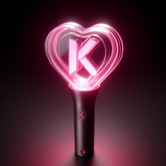
conceptualized in 2013, what would be known as the “KAO-BONG” was released in february 2015, a day after KAORI’s 20th birthday. the lightstick was met with positive reception from fans, who were surprised that KAORI was receiving an actual lightstick. the original was rather simple in its design and functions (it only had two colors, which were KAORI’s official ones), so the selling point for fans was mainly the box that it came in. it had a sleek, cylindrical design and was painted black and pink. the top was heart-shaped, referring to how both KAORI’s birthday and the lightstick’s release fell close to valentine’s day. additionally, it was rather rare to receive a photocard alongside the lightstick, and owning an original is now a bragging point amongst fans. a lot of memes also popped up during the first generation’s heyday, with fans joking about how the lightstick was so big that it could be used as a weapon.
at some point, KAORI began to dislike the black color palette of the original, and requested for a newer version of the KAO-BONG to reflect her newer image. however, the original still has a special place in her heart, and she appreciates all the love her fans had given it.
— INCLUDES !
A HAND WRITTEN “THANK YOU” CARD !
3 STICKERS !
A PIN !
A WRIST STRAP (IN EITHER BLACK OR PINK) !
2 DOUBLE A BATTERIES !
A PHOTOCARD (POSSIBLY) !
GEN TWO :: THE BELOVED !

released on valentine’s day 2020, fans were quick to express how much they adored the design upgrade, selling over 800,000 units within its first week. fans were pleased to see that AVEX kept the 3D aspect of the original KAO-BONG, and were thrilled to see the reflective effect that the new one had. the box it came in was unique in its design, and further added to the love fans had for the lightstick’s second generation. rather than standing upright like many lightstick boxes, the box for the KAO-BONG 2.0 laid horizontally. baby pink, shaped like a heart, and printed with gold text, it was meant to look like a heart-shaped box of chocolates—something that you would actually receive on valentine’s day. the lightstick was encased in a mold and surrounded by pink paper, which really made it look like chocolate.
the lightstick itself was chocked full of new functions. once you powered it on, it would light up from the base upwards, almost as if it was filling the lightstick. it came with a myriad of different modes and colors, as well as bluetooth recognition, but there were two functions that really stole the show. when the power button was held, the “K” inside the heart would spin, causing the light to display every color at once. that (along with other functions) could also be triggered with voice recognition, which was particularly exciting to fans. additionally, like the photocard in the first generation KAO-BONG, getting a candy heart wrist strap for the second generation was rare, and you would often see fans begging for one across social media.
definitely KAORI’s most commercially successful lightstick so far, the second generation is a favorite amongst fans, and a personal favorite of KAORI herself. although some fans want to see a third generation, most agree that this one simply cannot be topped.
— INCLUDES !
A HAND WRITTEN (+ SIGNED, PREORDER ONLY) VALENTINE’S DAY CARD !
3 HAND DRAWN STICKERS !
3 CANDY HEART PINS !
A PEN !
A POSTCARD !
A WRIST STRAP (POSSIBLY THE CANDY HEART VERSION) !
2 DOUBLE A BATTERIES !
1 OF 3 RANDOM PHOTOCARDS (POSSIBLY 2) !
#🍬 … KAORI !#MISC !#LIGHTSTICKS !#fictional idol community#jpop oc#jpop oc soloist#koc soloist#koc#kpop oc#kpop oc soloist#kpop solo artist#kpop soloist#kpop female soloist#jpop idol oc#jpop solo artist#jpop soloist#fake idol#fake jpop idol#fake kpop idol#fictional idol oc#fictional idol soloist
10 notes
·
View notes
Text
Astronomics Game Art : Designing Mining Equipment! Pt 2
Brainstorming and feedback loops
One of the first steps of designing is always brainstorming -- sometimes this starts before research, sometimes I research first, and often I go back and forth, letting brainstorming push me to the limits of my current knowledge and then taking to the internet to open up new territory. For the equipment for Astronomics (demo on steam right now!), while the design team had a few key assets they were looking for, they were also still brainstorming and so we were all kind of discovering what the equipment part of the game could be as a whole.

For me, that brainstorming usually looks like a LOT of very rough drawings. I usually have my research sketches open nearby for reference, and I try and draw small enough that i can see all my brainstorming and seek out possibility spaces between ideas.
Above is my first VERY rough brainstorming page, and on it you can see art from two passes - the softer, lighter drawings are the open-ended thinking; the darker clear lines are the second pass, where I start filtering, choosing which pieces to take to the rest of the team to start conversations with.
You can see how we would collect feedback above - i would write notes and do additional drawing on top of the submitted artwork as we went through things in screenshared video meetings, and then have these with me as I iterated further.
One thing you might notice is that these are all drawn with straight lines -- Astronomics is a low-poly 3D style game, and it was fun to think about simplifying the shapes right from the beginning. While I didn't do all my drawing like this, it was a fast and quick way to get clean linework that had some connection to the style of the game long before we really knew anything about said style!
Speaking of style...
Next up, we had to make some big decisions. Astronomics has a lot of equipment with a big range of functions and scales and the most important thing was making sure it all read like equipment from the same manufacturer - that being CubeCorp, as you'll see in the demo. I narrowed it down to three possibilities:

I went in three directions -- "Star Wars" style, all panel lines and chamfered edges and a sense of overall complexity; "Safety" style, with safety bars and frames around everything, focusing otherwise on simple, chunky shapes; and "Modern" style, exploring simple silhouettes with hidden complexity.
(none of these are official names for known styles, eg, the star wars style didn't actual aim for matching the style in those films particularly -- these names were more mnemonic devices to help me quickly sum up what I was thinking in a punchy way, and help my coworkers refer to the styles more easily in conversation while we discussed an debated direction together.)
In the end, what we chose was mostly Safety-styled, but elements from both other directions made their way in too!

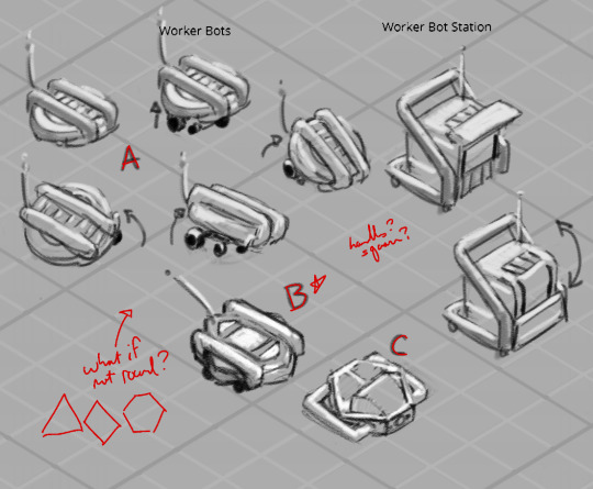
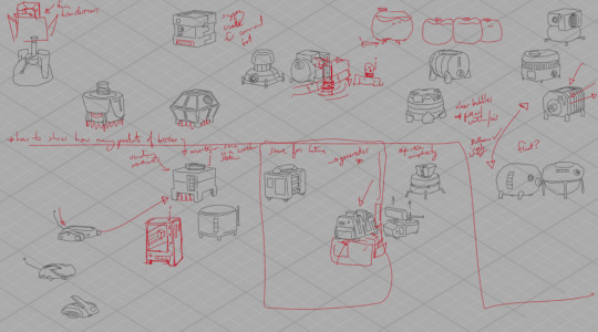
And here was my first sheet ft a pass on the drill, pump and vaccuum, containers for solids, liquids and gasses, a worker bot, a worker bot home, and a robust scanner machine.
A few things we were thinking about: we wanted there to be a sense of a unit of size that everything fit into - CubeCorp, remember? - and so even our most complicated equipment needed to pack down into that cube. That meant that we were going to be animating equipment essentially unfolding, so I tried even at this stage to think about what that could mean for the drill and pump and vaccuum, and you can see packed and unpacked states up there for each design.
They also were likely to be carried around by our little darling worker bots -- so everybody needed feet the bots could squeeze between to get underneath. Speaking of, they probably went through the most designs of everything, and what's in the demo does not appear in these pages at all, haha, but here, a few more passes:


In fact, you might not be able to find any of these exact designs in the demo -- that's just the nature of concept art in games! What the game needed then and what it needed later -- as the game design itself was developed -- well, it changed, as it often can! I think it can be easy from the outside to assume that everything anyone thought of was eventually brought to life, but that rarely ever happens. Concept art is a process, and so even if these designs didn't make it into the game, they were an important step along the path towards designs that did, and they taught us a lot about what we did and didn't want Astronomics to look like!
Read the full article
8 notes
·
View notes
Note
What are your thoughts on Sonic Superstars as a whole?
I liked it! It's simple and fun, it serves its purpose as a classic game and captures the feel of the 2D main titles well in a cool new 3D way in gameplay, controls, music, plot, animation, etc. Definitely prefer Mania, especially since I replayed it earlier in the year to refresh myself on it but that doesn't mean it's bad in comparison like some are saying. It holds up against all the other classic games well, I think, so I consider that a win.
I had fun with it. I had to play single player but I feel it would've been a little more enjoyable on multi because it definitely felt like some parts were designed with it in mind, such as the length of the bosses and how much damage they can take, as I can imagine it would've been over in seconds if four players were all fighting it at once if they hadn't. True or not, some feel they drag on a little too much on single player.
The bosses ranged from enjoyable to frustratingly difficult because of how long they were. I can imagine that isn't so much of a problem with multiple players. The actual stages were almost too easy in comparison, they lacked the challenge Mania constantly offered but it made for nice relaxed gameplay in comparison where I could just sit back and enjoy, (which I'd been wanting after the nightmare difficulty of Final Horizon lol) so it's not terrible.
The Eggman themed stages like Pinball Carnival, Press Factory, and Egg Fortress included basically all my favorites and that's not even just my bias, they were the most fun for me gameplay wise too- and they also looked really fucking cool. I always love when Eggman's love for carnival shows and the dark industrial pollution of Press Factory was so awesome and my element, I enjoyed the look and the stakes of act 2 🥰💜
The new robots and boss designs both the funny huge animals and ones Eggman got to pilot were really cool too! And Eggman's adorable model and all his animations were just so precious, he's so full of life and charm and character and made me so happy. 💕 I wish he'd gotten more drawn animation and context in the plot in game but combined with the prequel comic, manga, and Trio of Trouble, it was a good amount.
Admittedly, I haven't played all of the game yet, only the main story mode, so I can only speak for that. I skipped all the extra optional acts and haven't played Trip's and the Last Story. Mostly because I got the game a couple days early but was in a rush to be somewhere, so I only played what I had to get the Eggman related stuff I needed, make my video, and be on my way. XD After main story, I didn't mind spoiling myself the rest.
I find it odd how Eggman is completely absent from Trip's and the Last Story, I hoped to see more of how Trip joined his side and I also feel there at least should've been a bit of context provided for how the dragon got out to fight because it was strange how it just appeared out of nowhere and went just as fast. I didn't expect crazy depth from a classic game but that was a little too random to just throw at you like that lol
But other than that it pretty much gave us just about everything I expected and I'm happy with it. I kinda don't think it was quiiite worth £60 as I enjoyed Mania more and that was way less expensive, (though maybe that's too soon for me to say as I haven't played the other two campaigns), so I say unless you're super eager then maybe wait for a price drop- but I do recommend the experience for a nice little fun time with a faithful classic feel!
11 notes
·
View notes
Last Seen Blogs
closewithghosts
It Can't Rain All the Time

endofgreenofficial
endofgreen official website
micronecro
lets play find my active

danyvallejo
Dany Vallejo

cith34
Books, Coffee And Nature