#a little bit greyscale
Text
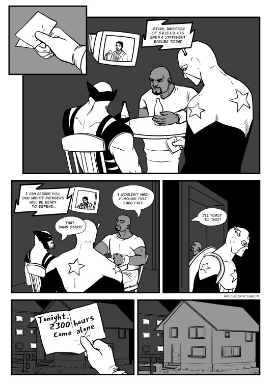
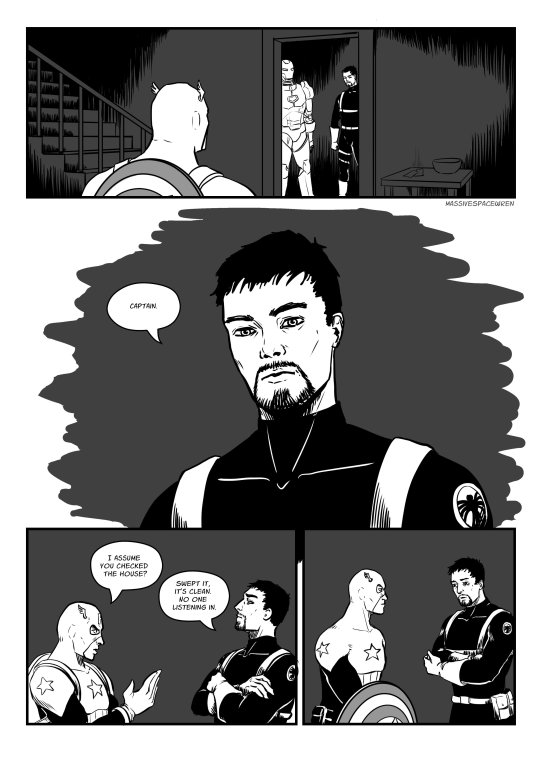

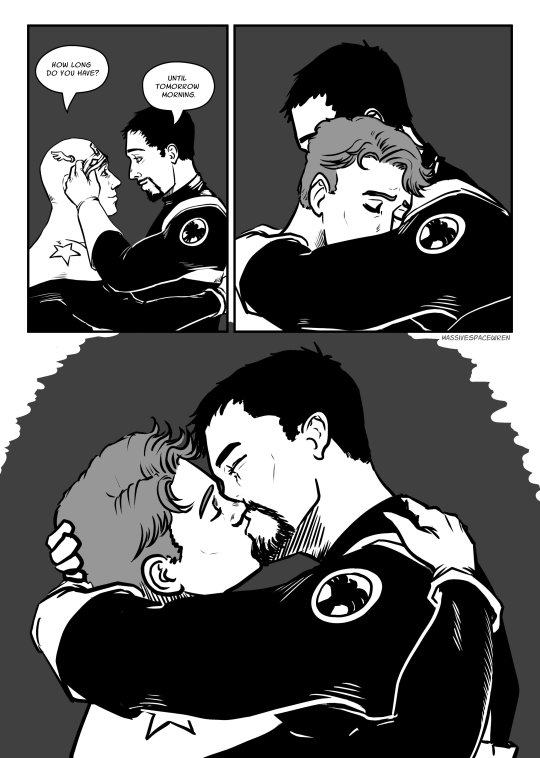
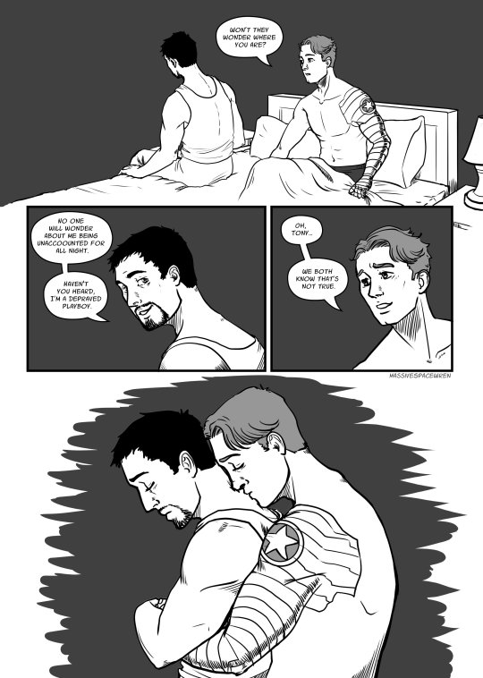
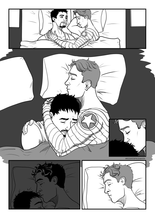

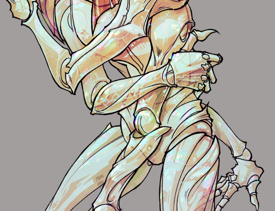
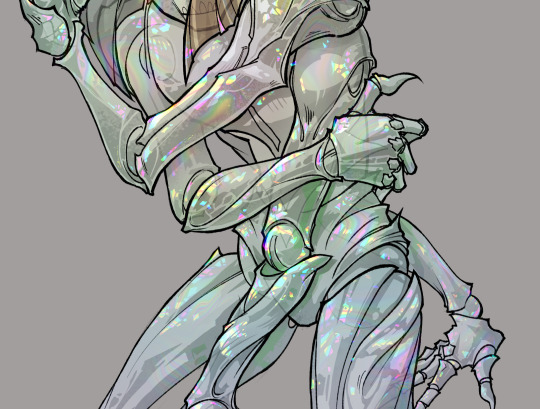
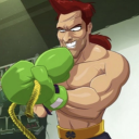
Buck/Tony Fancomic set in 616, during the time Bucky was a vigilante Captain America and Tony was secretly helping and protecting him while being Director of SHIELD.
You can also find it here on AO3 (where it's probably nicer to read).
I started this for an inktober ages ago and finished it way later for @ladydarkphoenix-blog for the @what2finish charity auction.
#winteriron#starkbucks#buckytony#tonybucky#ironwinter#fancomic#art by wren#digital art#lineart#a little bit greyscale#616winteriron#616#marvel comics#long post
160 notes
·
View notes
Text

look at them having a completely normal non-manipulative friendship what good friends they all are. look at those happy smiles and ignore the red lines im sure the red has no symbolism at all hahaha
#mishapen draws#qsmp#jaiden fanart#took a few days to figure out exactly what i wanted to do with this and im really happy with where it turned out :]#i normally dont put so much effort into a piece but i wanted a cool new banner#my fave detail is absolutely the little bits of red though#if you look very closely there's a little bit of red in the cucus smiles and eyes#(and a little bit of red on the arm behind cucurucho's back- hiding evidence)#and the red that emphasizes jaiden's smile is extra bright red#enjoy the island etc etc#i dont normally use texture backgrounds or leaf brushes but i totally get why people do holy crap they're SICK#the perfect lil bit of background noise hehe#i had a lot of trouble with the colours until i put a greyscale filter on everything and realized that jaiden's values blended her into#the bg. it got a whole lot easier when i paused to figure out the values and then added the colour#overall i think im happiest with jaiden's face though she just. she looks so happy#but that fucking red.....#okay tag ramble over godspeed nerds remember that if your colours look fucked up you may just need to experiment with the values
236 notes
·
View notes
Text
hazbin hotel is the exact opposite of "bad idea good execution" bc all the pieces are there for something so good but it's made by someone insufferable and she forgot to put the Good in it
#im not a hazbin anti (bc i dont base an identity on hating something)#(bc thats stupid and exhausting)#BUT#every little thing i see of it im like wow this could be good. if anyone competent had touched it#i call this the yansim principle.#it could be good. all the little bits are there to make it good#but its not.#also the character designs r bad#yes yes silhouettes nd all that yes#but im concerned the creator doesnt know that there are colors that are not red or blue (or greyscales)#not rbable bc this is mostly just a personal opinion and im not looking for an argument but <3
20 notes
·
View notes
Photo


Some possible* Tala stickers :D (Patreon)
#My art#Original#Tala#*I'm more just playing around with the idea of making some - personal stickers!#I mean I'm the biggest Tala fan anyway it's fine if it's for an audience of one lol#I finally got my hands on some sticker paper a bit back now it's just a matter of getting them the size I want and finding a good printer!#Ours is uh....well just don't look too closely at some of the greyscale pages I've posted they leave a bit to be desired lol#And that's just black and white I'm a little concerned what it'd do to pictures! :'D#Though I say that but it did print the art from Roundabout quite nicely so hmm! Maybe! But I do have other avenues if I want them :)#It's nice to have options!#For the time being they're just cute little guys of one of my cute little guys! :D In her doggy form and specifically her plush puppy form ♪#I really have been enjoying adding to her physical accessories haha - she's always got her little gold stitch/scar#And then her first accessory being the bracelet - and then her face mask - and now her ribbon! :D It's all very cute she's very cute#She's also good feral practice since I'm still not very good at drawing dogs or cats or the like :'D#I used references for that first one! Wowie!#I'm a fan of how she turned out overall :) I can still see some work I'd like to improve for her back legs but other than that :D#Baring her little teefsies hehe she's so scary ♥#My love of drawing plushies rears its head again - she is added to the list! No soft shading or lighting like MewTwo tho that's alright#The stitches are the really important part :) I like them!#I wish she could sit like that irl haha she's actually very stable to stand! A little awkward to sit#And finally a cutesy cartoony one :D She doesn't have paw beans irl either but come on I had to!#I debated whether they'd be pink or brown but I think I'm happiest keeping her palette simple :)#She's so cute <3
18 notes
·
View notes
Text

thinking about what a kensa squiffer would've been like...
#splatoon#splatoon 3#toni kensa#splatoon oc#minatoast#lizzy does art#hi everyone. i can already hear the comparisons to what game this looks like. LMAO. u can tag it as that if u want.#wanted to do limited color kind of thing. i think i did a little bit of cheating though (tone scrapers + some slight airbrushing)#if it's not already apparent... toni kensa is my favorite brand in splatoon LMAO im just!! obsessed with them#and i think it explains a lot about the visual aesthetics that im drawn to#it was fun to draw like this!!! i think i want to try like actual greyscale and not just b/w + accent only at some point#also when will they give squiffer a second kit!! i would humbly like an inkjet or trizooka as it's special#i think that it'd be really nice for squiffer to be able to poke longer range weapons and whatnot#i like the current kit it's a classic but i'd really like to have better entry tools what am i supposed 2 do with point sensor#ANYWAY!! im having fun with art :) im going to try and experiment with color and shapes!! hpoefully. u all stay swag!
29 notes
·
View notes
Text
i have too much free time and wanted to experiment. i used no sketch
#sparks creations#oc#its a one off oc just for this drawing#i wanted to see if i could render in whiteboard#like a painting almost#ended up with this#its cool#i had to screenshot the colors#send it to myself through discord#and convert them to greyscale on my phone so i could get the values right#from lightest to darkest it goes: yellow. light blue. green. purple. red and dark blue(they are basically the same). and black#do with this what you will gamers#her eyes are misaligned a little bit so she looks high XD
10 notes
·
View notes
Text

oc time (it is atlas and laika)
#ocs#oc#atlas#laika#cmdonovann#i love them your honor#sorry i cant elaborate on this pic even a little bit#i have many thoughts but none of them are coherent#anyway sorry for the weird crop there was text on this but i got rid of it lol#maybe ill post that version later#anyway really enjoy this style of coloring#where i just do it in greyscale and then slap a color or multiply layer on top#or a gradient map! even faster!#this is actually both (gradient map with color layer on top)#its a surprisingly fast and fun way of coloring#i could probably refine it a little on top of those layers but i dont have the time lol#im working on portfolio stuff so i got a bunch of pieces im trying to finish at once#anyway please hire me i will draw your ocs so so pretty just like this i promise#(my commission info is on my neocities site)#(cmdonovann.neocities.org/art-commissions.html)
6 notes
·
View notes
Text
gonna show u guys a little opalescent highlight hack i threw together today
rainbow gradient above your main figure (i usually have all my main figure folders/layers in one big folder, so i can clip gradient maps + adjustments to it!). liquify tool to push the colors around a bit. STAY WITH ME I KNOW IT LOOKS STUPID RN I'M GOING SOMEWHERE WITH THIS
THEN: set it to add/glow (or the equivalent in ur drawing program), lower the opacity a bit, and apply a layer mask. then u can edit the mask with whatever tools you like to create rainbow highlights!!
in this case i'm mostly using the lasso fill tool to chip out little facets, but i've also done some soft airbrushing to bring in larger rainbow swirls in some areas. it's pretty subtle here, but you can see it better when i remove the gradient map that's above everything, since below i'm working in greyscale:
more granular rambling beneath the cut!
u could also just do this with a brush that has color jitter, but what i like about using layer masks for highlight/shading layers is how simple and reversible it makes everything. i can use whatever brushes i want, and erasing/redoing things is super low stakes, which is great when i often approach this stuff with a super trial-and-error approach.
example: have u ever thrown a gradient w multiple colors over an entire piece, set it to multiply etc, and then tried to erase it away to carve out shadows/highlights? it's super frustrating, bc it looks really good, but if u erase something and then change ur mind later, u basically would have to like. recreate the gradient in the area u want to cover up again. that's how i used to do things before figuring out layer masks!! but masking basically creates a version of this with INFINITE undo bc u can erase/re-place the base layer whenever u want.
anyway, back to rambling about this specific method:
i actually have TWO of these layers on this piece (one with the liquified swirls shown above, and another that's just a normal concentric circle gradient with much broader stripes) so i can vary the highlights easily as needed.
since i've basically hidden the rainbow pattern from myself, the colors in each brushstroke i make will kind of be a surprise, which isn't always great -- but easily fixable! for example, if i carve out a highlight and it turns out the rainbow pattern in that area is way too stripey, i can just switch from editing the mask to editing the main layer and blur that spot a bit.
also, this isn't a full explanation of the overall transparency effect in these screencaps! there's other layer stuff happening below the rainbow highlights, but the short version is i have all this character's body parts in different folders, each with their own lineart and background fill, and then the fill opacity is lowered and there's multiply layers clipped to that -- blah blah it's a whole thing. maybe i'll have a whole rundown on this on patreon later. uhhh i think that's it tho! i hope u get something useful out of this extremely specific thing i did lmao
7K notes
·
View notes
Text
My Favorite Cheap Art Trick: Gradient Maps and Blending Modes
i get questions on occasion regarding my coloring process, so i thought i would do a bit of a write up on my "secret technique." i don't think it really is that much of a secret, but i hope it can be helpful to someone. to that end:

this is one of my favorite tags ive ever gotten on my art. i think of it often. the pieces in question are all monochrome - sort of.

the left version is the final version, the right version is technically the original. in the final version, to me, the blues are pretty stark, while the greens and magentas are less so. there is some color theory thing going on here that i dont have a good cerebral understanding of and i wont pretend otherwise. i think i watched a youtube video on it once but it went in one ear and out the other. i just pick whatever colors look nicest based on whatever vibe im going for.

this one is more subtle, i think. can you tell the difference? there's nothing wrong with 100% greyscale art, but i like the depth that adding just a hint of color can bring.
i'll note that the examples i'll be using in this post all began as purely greyscale, but this is a process i use for just about every piece of art i make, including the full color ones. i'll use the recent mithrun art i made to demonstrate. additionally, i use clip studio paint, but the general concept should be transferable to other art programs.


for fun let's just start with Making The Picture. i've been thinking of making this writeup for a while and had it in mind while drawing this piece. beyond that, i didn't really have much of a plan for this outside of "mithrun looks down and hair goes woosh." i also really like all of the vertical lines in the canary uniform so i wanted to include those too but like. gone a little hog wild. that is the extent of my "concept." i do not remember why i had the thought of integrating a shattered mirror type of theme. i think i wanted to distract a bit from the awkward pose and cover it up some LOL but anyway. this lack of planning or thought will come into play later.
note 1: the textured marker brush i specifically use is the "bordered light marker" from daub. it is one of my favorite brushes in the history of forever and the daub mega brush pack is one of the best purchases ive ever made. highly recommend!!!
note 2: "what do you mean by exclusion and difference?" they are layer blending modes and not important to the overall lesson of this post but for transparency i wanted to say how i got these "effects." anyway!
with the background figured out, this is the point at which i generally merge all of my layers, duplicate said merged layer, and Then i begin experimenting with gradient maps. what are gradient maps?
the basic gist is that gradient maps replace the colors of an image based on their value.

so, with this particular gradient map, black will be replaced with that orangey red tone, white will be replaced with the seafoamy green tone, etc. this particular gradient map i'm using as an example is very bright and saturated, but the colors can be literally anything.

these two sets are the ones i use most. they can be downloaded for free here and here if you have csp. there are many gradient map sets out there. and you can make your own!
you can apply a gradient map directly onto a specific layer in csp by going to edit>tonal correction>gradient map. to apply one indirectly, you can use a correction layer through layer>new correction layer>gradient map. honestly, correction layers are probably the better way to go, because you can adjust your gradient map whenever you want after creating the layer, whereas if you directly apply a gradient map to a layer thats like. it. it's done. if you want to make changes to the applied gradient map, you have to undo it and then reapply it. i don't use correction layers because i am old and stuck in my ways, but it's good to know what your options are.

this is what a correction layer looks like. it sits on top and applies the gradient map to the layers underneath it, so you can also change the layers beneath however and whenever you want. you can adjust the gradient map by double clicking the layer. there are also correction layers for tone curves, brightness/contrast, etc. many such useful things in this program.
let's see how mithrun looks when we apply that first gradient map we looked at.

gadzooks. apologies for eyestrain. we have turned mithrun into a neon hellscape, which might work for some pieces, but not this one. we can fix that by changing the layer blending mode, aka this laundry list of words:

some of them are self explanatory, like darken and lighten, while some of them i genuinely don't understand how they are meant to work and couldn't explain them to you, even if i do use them. i'm sure someone out there has written out an explanation for each and every one of them, but i've learned primarily by clicking on them to see what they do.
for the topic of this post, the blending mode of interest is soft light. so let's take hotline miamithrun and change the layer blending mode to soft light.

here it is at 100% opacity. this is the point at which i'd like to explain why i like using textured brushes so much - it makes it very easy to get subtle color variation when i use this Secret Technique. look at the striation in the upper right background! so tasty. however, to me, these colors are still a bit "much." so let's lower the opacity.

i think thats a lot nicer to look at, personally, but i dont really like these colors together. how about we try some other ones?

i like both of these a lot more. the palettes give the piece different vibes, at which point i have to ask myself: What Are The Vibes, Actually? well, to be honest i didn't really have a great answer because again, i didn't plan this out very much at all. however. i knew in my heart that there was too much color contrast going on and it was detracting from the two other contrasts in here: the light and dark values and the sharp and soft shapes. i wanted mithrun's head to be the main focal point. for a different illustration, colors like this might work great, but this is not that hypothetical illustration, so let's bring the opacity down again.

yippee!! that's getting closer to what my heart wants. for fun, let's see what this looks like if we change the blending mode to color.

i do like how these look but in the end they do not align with my heart. oh well. fun to experiment with though! good to keep in mind for a different piece, maybe! i often change blending modes just to see what happens, and sometimes it works, sometimes it doesn't. i very much cannot stress enough that much of my artistic process is clicking buttons i only sort of understand. for fun.
i ended up choosing the gradient map on the right because i liked that it was close to the actual canary uniform colors (sorta). it's at an even lower opacity though because there was Still too much color for my dear heart.

the actual process for this looks like me setting my merged layer to soft light at around 20% opacity and then clicking every single gradient map in my collection and seeing which one Works. sometimes i will do this multiple times and have multiple soft light and/or color layers combined.
typically at this point i merge everything again and do minor contrast adjustments using tone curves, which is another tool i find very fun to play around with. then for this piece in particular i did some finishing touches and decided that the white border was distracting so i cropped it. and then it's done!!! yay!!!!!
this process is a very simple and "fast" way to add more depth and visual interest to a piece without being overbearing. well, it's fast if you aren't indecisive like me, or if you are better at planning.

let's do another comparison. personally i feel that the hint of color on the left version makes mithrun look just a bit more unwell (this is a positive thing) and it makes the contrast on his arm a lot more pleasing to look at. someone who understands color theory better than i do might have more to say on the specifics, but that's honestly all i got.

just dont look at my layers too hard. ok?
2K notes
·
View notes
Text
asked for jmart valentines day prompts and decided to combine them into one little comic! <3 little late but better than never
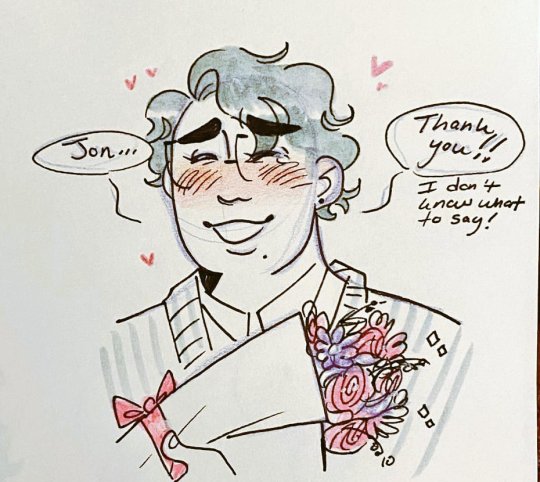

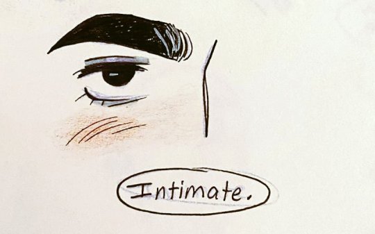


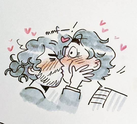
poor jon 🤭when he said intimate he meant more dear to martin's heart <3
[Start ID: Multipanel comic of Jon and Martin from the Magnus Archives for Valentine's day. Comic is in greyscale except for orange/pink of blushes and flowers. Jon is a thin Persian man with dark eyes and dark, curly hair tied back in a bun, there is a grey streak in his bangs. He has a beard and is wearing a blazer with a business shirt and tie. Martin is a fat mixed Polish/Korean man with dark eyes and short dark wavy hair. He has a beauty mark next to his lip and is wearing a striped, knitted cardigan with a business shirt, as well as browline glasses.
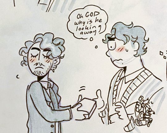
Panel 1+2+3: Martin smiles widely with a small tear in one eye, holding a bouquet of pink and purple flowers with a pink ribbon. He says, "Jon...thank you!! I don't know what to say!". Jon averts his eyes with a small blush and responds, "While flowers and chocolates are nice, I also wanted to get you something more...". It zooms in to one of Jon's eyes, dark and captivating. He finishes the sentence, "Intimate."
Panel 4: Martin blushes with a small frown, a couple sweat marks on his face. "O-oh?" he says, wary (but a little excited?) as to what Jon means by intimate.
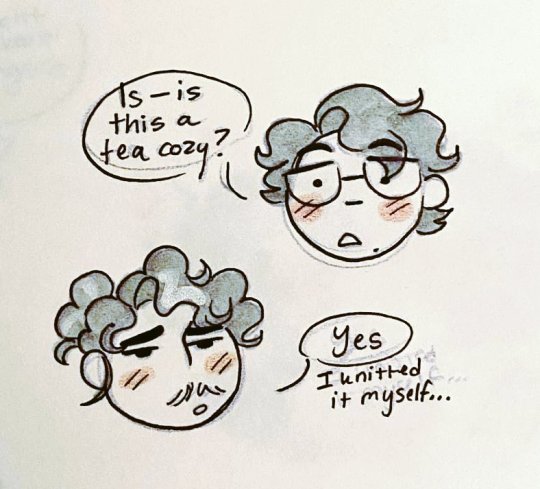
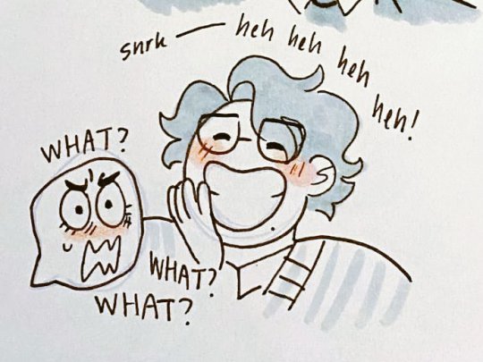
Panel 5+6+7+8: Jon chastely holds out a gift box to Martin, turning his head away and closing his eyes. Martin nervously reaches for the box, tucking the bouquet in one arm. He thinks, "oh GOD why is he looking away". Martin opens the gift box, his face and hand silhouetted, and finds a pink polka dot tea cozy inside - over it says ta-da with sparkles. Next panel has Jon and Martin as floating heads. Martin asks with a shock, "Is - is this a tea cozy?". Jon's eyes are half-lidded, a bit embarrassed. "Yes, I knitted it myself." He quietly adds on. Martin bursts out into laughter, holding a hand in front of his wide smile. "Snrk-heh heh heh heh!" Jon is just buggy eyes and a wiggly mouth, asking "What? What? What?".
Panel 9+10: Jon raises a hand towards Martin, looking flustered, a couple sweat marks come off him. "Wh-why are you laughing? Do you not like it? I can get you something-". Martin cuts him off by kissing his forehead, lightly pulling at his neck to bring him closer. He nuzzles into his hair with a smitten smile. "No, I love it." His sentence and the kiss are punctuated by a heart. Jon, under the effects of being kissed, promptly shuts up, blushing and looking starry eyed. His one eye is closed where Martin is kissing his forehead.
Panel 11+12: Martin pulls back, blushing madly. Jon stares ahead with large sparkling eyes, blushing greatly as well with a tiny frown. Mistaking it as discomfort, Martin begins to apologize. "Oh! Oh, I'm sorry! I totally kissed you without--mmf!" He is cut short when Jon turns to him, grabs his cheek and pulls him in to a hurried (and quite fish lipped) kiss. Martin's eye is cartoonishly wide and he is somehow blushing even more than he was before. Lots of hearts surround the two. End ID.]
aaaand bonus little doodle for reading the ID :3

[Start ID: Floating Martin head, he sighs with closed eyes and a tiny smile. He says "When you said intimate, I thought you meant like lingerie LOL". A tiny Jon in the corner screams in horror, "NOO!!" End ID.]
#the magnus archives#tma#jmart#jonmartin#teaholding#jonathan sims#martin blackwood#order up! art tag#this is so ooc but idccccccccc
2K notes
·
View notes
Text
home is where the heart is
↠ pairing: wonwoo x reader
↠ genres: fluff
↠ word count: 900~
↠ a/n: thinking abt bestfriend!wonwoo today 🥺 also ty to @hannieween who always reads all the little drabbles i type into her inbox, that’s how we ended up with this. she also helped write part of it, the an at the bottom will explicitly say which bits!! hope you guys like it uwu

bestfriend!wonwoo who keeps you company after your break up with your shitty ex boyfriend.
bestfriend!wonwoo who lets you lean on his shoulder while you guys watch the latest episode of bake off and you’re ugly crying with a tub of ur favourite ice cream.
how he tries to distract you the next day by inviting you to play mario party because some of the boys are over and he doesn't want you to wallow in your room by yourself.
the way, after the boys leave, he takes you into his arms while on the couch and letting you snuggle into the warmth of his chest as you sniffle a little. wonwoo smells like fresh laundry and he rubs a comforting hand up and down your back.
to you, wonwoo was home.
this is basically yours and wonwoo’s dynamic haha.
and he would never admit it out loud, but he honestly loves it. he loves as you ramble mindlessly, asking him pointless questions about nothing and everything at all. he remains quiet, but every now and then he’ll say is that so? setting you off on another tangent.
you laugh at your own jokes, which makes him laugh as well. it's the kind of laugh that makes his nose scrunch and makes him push the rim of his glasses up a bit.
and when ur away for the weekend, visiting ur parents, and wonu is home alone, the silence is deafening, and he misses you.
he misses you during breakfast, how you'd grumble about having to go to work and rant about the woes of capitalism and the five day work week.
he misses you when he's rewatching the previous episode of bake off on the cold couch alone, and how you'd be telling him about the history of shortbread and something about an alliance between scotland and france.
he misses you when he's out walking the dog after dinner and how you'd be talking his ear off about every little thing that happened to you that day, in chronological order.
wonwoo's life is quiet and greyscale when you're not there and he misses the colour of your laugh and your smile and the sound of your voice.
one night, he finally convinces you to go out to the movies with him. you've been feeling better lately, and you can't remember the last time you cried about your ex.
he buys you the biggest tub of popcorn, making sure the worker slathers it with extra extra butter (even though he knows its gonna give him a tummy ache later). and he watches you fondly as you try to choose between the buncha crunch or mike and ikes (his two favourites) before settling on both.
he also gets you a cola slushie, but your hands get cold from holding the cup, making you clasp them together between your thighs when you finally go to sit down, and he wishes, god how he wishes, he could just grab your hands to warm them up a bit.
you guys decide to see the latest action movie, a genre which you love, but sometimes you can't handle the blood and gore that comes with it. so when the bad guy's about to get sliced to hell, wonwoo quickly throws his hand up to cover your eyes.
you grab his hands to move it away because im a big girl, wonu, i can handle a little blood (except your pants are on fire and you absolutely cannot) but he knows this and does not budge.
and when the scene is finally over and he moves his hand away from your face, you're still holding on to it, not letting go
wonwoo sends you a look but you've got ur eyes glued to the movie, as if holding his hand is a normal occurance (it's not) and you're not freaking out like wonwoo currently is (you are, in fact, freaking the fuck out).
wonwoo settles back in his seat, loving the way your hands feel around his and laces his fingers with yours. you keep his hand in your lap, squeezing everytime sometimes stressful or surprising happens on screen and wonwoo rubs back and forth on the back of your hand when you do.
when the movies over, you still don't let go of his hand, and neither does he. not when you’re picking up ur bag to sling over your shoulder, not when he's picking up the empty food boxes to throw away, and not when you're walking home together in the cool of the night, as you rehash the movie ending, swinging your hands between you when you get a little too excited with your theories
you're both still unwilling to let go of each other's hands when you make it back to your shared apartment, as wonwoo keys in the door code, and it isn't until you're in the hallway, in front of your two bedroom doors, that you realise neither of you want to ever let go.
so you don't.
you let wonwoo hold onto you tightly while you tell him you had a lot of fun tonight and he replies saying he always has fun when he's with you. and you get on your tiptoes to press a soft kiss to his cheek, both of your cheeks warming up.
and it isn't until then that wonwoo let's go of your hand, choosing to instead grab your face with both of his and leaning down to kiss you sweetly
wonwoo tastes like a mix of movie theater butter, fruity candy and salted chocolate.
and best of all, wonwoo tastes like home.
a/n: this is my first time writing something in this sort of format! let me know what you think!! also the first part aboutt he rambling and the bit aboutt he cola slushie are courtesy of v, she's really fab and you all should go read her writing 👀👀👀
here are some lil extra bits that i didn't put into the drabble but i still think are cute to think abt hehe
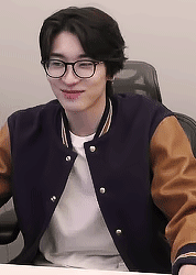
gif 1 by @jeonsupershy // this wonu when he finally gets the girl he's loved all his life
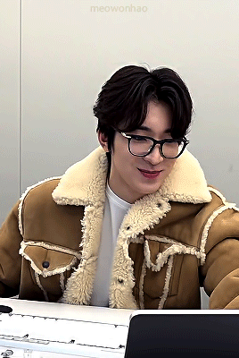
gif 2 by @meowonhao-main // this wonu when you shyly nod yes to wonu asking you out to a real dinner date
this wonu (yes, im obsessed w this photo leave me alone) when you climb into his lap to snuggle after a really shitty day at work

this wonu when you whine that his kisses are too sweet and you want him to kiss you like a man

this wonu when he's about to ask you to marry him and legally be stuck w his loser gamer ass for the rest of ur life
u when u say yes because he's YOUR loser gamer ass and u love him so SO much 🥺🥺🥺
#seventeen fic#wonwoo x reader#seventeen x reader#wonwoo scenarios#wonwoo fanfic#writing#mine#title: home is where the heart is#author: cvntrlseecvntrlvee#band: svt#member: wonwoo
170 notes
·
View notes
Note
So Warframe added a "Pom-2" Alternate 1999 computer (that's needed for weird void magic future science wizardry). Thoughts?
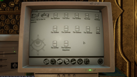

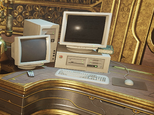
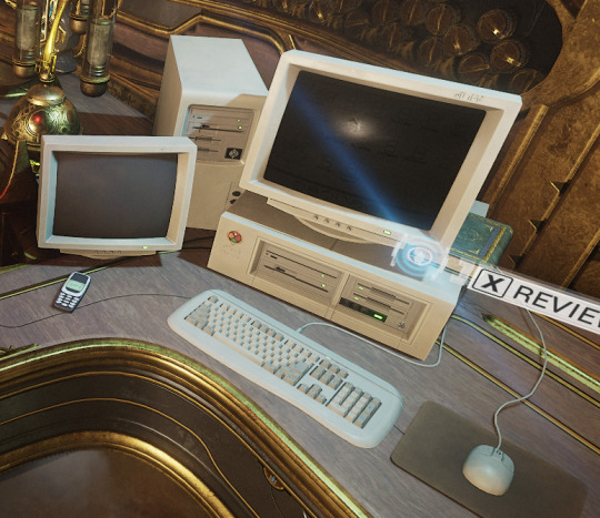
Only thing I have that's a sort of question mark is that I don't know of many setups that would have needed a 5 1/4" floppy in 99 (or why it has both the tower and the under monitor unit)
ugh. OKAY, so... the tower and desktop combination is just weird. I have, on one occasion, run a "server" that was two towers, and the original PC supported a DUAL-DESKTOP mode, but both types together? nonsense.
dual monitor was rare but possible in 1999 (win98 added native support), so I think the best interpretation here is that this is actually two computers. maybe the one on the left is missing the keyboard and mouse because it's being used as some kind of server for the other computer? I used a little case like that to run my first linux server, which was also acting as a router for my internal network.
The OS is weird. The icons above the menu-bar look like win98, the dialog box is windows 3.x, the menu-bar icons on the bottom are pure os X (although they remind me of like a web-TV kinda system, like hotkeys for email/internet/etc), but the greyscale is very classic mac system. Actually it kinda reminds me of C64's GEOS, but GEOS was very classic-mac.

Like most CRT-filters, they turned the scanlines up WAY TOO HIGH. No CRT I've ever seen looked that fucking terrible. The monitor buttons are a bit odd: You didn't get monitors with buttons on the front until long after they were all color... but maybe it's a color monitor that's showing a monochrome OS?
as for the floppies: yeah. There are multiple mistakes here.
5.25" in 1999 is just silly. If you still had 5.25" disk drives in 1999, you were intentionally doing some retrocomputing stuff. For reference, around 2001 my PC repair job would specifically ask me to copy data off 5.25" disks, because they didn't have any 5.25" drives anymore, and I was their only tech who did.
The other mistake is that they have THREE floppy drives. so the PC doesn't really support that, natively? You can do some tricks and make it work (The youtuber Tech Tangents did a video on how it could be done), but realistically two was the normal max.
The final mistake is that all the drive activity lights are on. Those are only supposed to be on while the drive is reading or writing... and I don't see any disks in those drives! Let alone a situation that would involve turning all three on at once (I don't think that's even possible on most floppy controllers!)
In fact, the main time you'd end up with the drive lights stuck on like that is when you've installed the drive cable upside down. That ends up with them getting stuck on and non-functional. So this computer looks, to me, like it was put together incorrectly and no one noticed.
I don't believe that font would be on a black & white retro computer. Nope. Too smooth and too big.
There's also a USB icon on that OS: I don't think there's ever been a monochrome OS that supported OS, and looking at that computer case I don't believe that it has USB. Maybe the tower would, but the desktop? no.
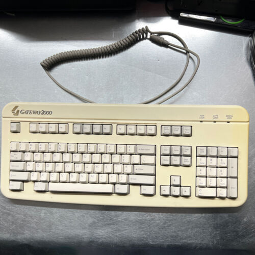
That keyboard is off a Gateway 2000 computer. Something like this:
161 notes
·
View notes
Text
Your Weekly TV Guide
On Monday you can expect:
2:30 PM: Villainsona ft. Villainsona
And Tuesday:
2:30 PM: In Stars and Time
Wednesday:
2:30 PM: ISaT
Thursday:
2:30 PM: Sona general goings-on ft. Villainsona
Friday:
2:30 PM: ISaT
Saturday:
2:30 PM: ISaT (blood warning)
Sunday:
2:30 PM: Star Control II
Thanks for tuning in! (Patreon)
#Weekly TV Guide#What does Monday's mean? :3c You'll see#You won't guess it lol#I had fun with it tho hehe <3#Lots of In Stars and Time this week! I got got 😔#Their designs are just so cute! I am weak#Little bits of other things too! Like the other instance of getting got lol it's fiiine#The blood warning is in greyscale but still! Keep an eye out!#Heh. Hehehe#Oh and technically Sunday's isn't done yet but I fully intend for it to be sometime this upcoming week so it's fiiiine#I got a little behind - had a not-as-good digital art day recently! :0#Still finished one of my behind-the-scenes yay <3 Just took a bit longer than I planned for lol#Which means I'm free and clear to work on some of my others now!#They're not time sensitive tho so my brain...#Well I'll figure it out somehow lol ♪#There are some that I'm really itching about so hopefully the others will get swept up with it haha
1 note
·
View note
Text
Another point I will stick onto my GreyScale Agent 4 Hijacked Security System Avatar Conspiracy Board.
EDIT: Saw the new info. A copy of Four is Still...in a loose sense Four, like have you seen the Lesser Four Copies? The way they all pose and how the last one is just pulled down in the Grey Ooze cause they weren't focusing on 8...It's like the main Copy has all of the Ogs agents skills and drive. Yet pieces of Fours funky personality from in-game cannon got carried over by the portion of Said Soul being drawn in to form a pallette!

Click or tap images tah read and zoom in...So yah gonna tell me non of this has any real correlation or claim? *jabs finger at the images below.*
EDIT: I WAS RIGHT!, so what if The Parallel Cannon is said to be just a copy surronded by lesser copies. Order still had to capture a fraction of Fours Soul and than Copy a template or construct of Four, in the process of also Greyscaling those copies and reprograming them into a Security Force for its own use!
Meanwhile the Original Soul Fragment was WAS USED, to form a Pallete.
So...yah. Its maybe not the full 4 BUT it's also still technically 4 to a degree!

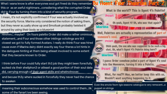
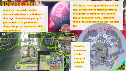
EDIT: Hmph. So I was pretty clam close to the lore!)
I am like 71% convinced that it is Agent 4. Despite. What. The. Game and Off the hook reacts to. Theirs faaaar to much evidence to not considered or convenience, me otherwise!
Another interesting detail is the very boss name itself...

And than these little tid bits below...theres far too much stuff HINTING AT 4...like we all know how Nintendo loooooves tah hide der lore.

EDIT: JUST LIKE THE JELLOTONS FOURS COPY WAS REPROGRAMED AND RECONSRRUCTED INTO A ROLE ONLY ORDER WOULD WANT.
And from dat ominoius statement Baby Order left on 4s Soul Weapon Pallete, I point to this other little fact.
Overlorder...so many little hints at the corrupted A.I twists what was going to be 4s job, or rather reaaaaally likes that idea.
And just inking goes for 4.
We or those who have read Marina's Dev Dairies know the rather horrifying and painfully traumatize process of being Sanitized.
And I point out GreyScaling sounds pretty similar no?
The memverse was made to REVERSE IT, or at least help bring life back to those poor empty husks. Yah, they legit said Husks.
I'm thinking Overlorder took dat Data and used it to form the Greyscaling process, taking advantage of the Glitch or Security Risk in the memverse and sucked up A Soul Fragment of Agent 4s portion via the Shellphone -to form the Copy Amalgamation of Parallel Cannon.
Ironically creating a Security System Avatar.
For its own purpose.
And may I point out, in my run after defeating Marina...it was them who I encountered next as if my 8 had activated the Avatar by excuting some form of alarm system built into the spire. And I recall that Marina made the whole thing to be repeatable, helping 8 or any Sanitized Octo regain their memories--yet when yah defeat dah boss, she reacts if she had never designed or even put in a template for that boss...unlike the other two. Which would explain dah new info e got on Order capturing and copying 4s Agent Skillset and Biodata for its own foul use!
-------(Edit: The famistu interview duddddes.)
A MUCH clearer new info about 4...
See dah part where der made out of sludge?
GREY FAMILIAR LOOKING SLUDGE. Grey Oooze...apparently capable of not only erasing memories and the conscious self, but also copying the Soul Fragments of captured victims when installed or pasted into it, thus creating an Artificial and rather freaky constructs or Avatars for Order to use...
A copy they maybe...but it still had to come from the Original Agent 4.
And I don't think Four would have willingly allowed the Corrupted Order A.i to use their biodata and skillsets for such a dark purpose.
IF yah think about it dis way, they had a fragment of der soul torn from themselves, thus becoming a victim and vulnerable to Greyscaling. THAN that Fragment was, forcibly copied without OGs Fours permission and most likely put through some kind of Greyscaling process, it's body and much like the Jellotons, was reconstructed and copied again tah be used as a weapon...
THAN that remaining OG Soul Fragment as turned into 4s favorite weapon...
Like hers how the describe Fours personality and traits directly from in-game lore:
"Agent 4 is described as a silent squid who goes with the flow even in raging waters, and values freedom and flexibility. They also "blast through any situation with ease." Agent 4 did not initially know who the Squid Sisters were, but later came to respect them after their journey in Octo Canyon. Agent 4, as seen in promo pictures and art, has a diligent work ethic, a lot of confidence, and is extremely free-spirited. Compared to Agent 3, they are shown to be more easygoing and relaxed, yet slightly upbeat in their mannerisms and are constantly depicted as smiling in official art."- Inkipedia
Now try and imagine how having a fragment of their soul captured would effect such a sunshine ray of an Agent... and I could see why Order made a moldable copy of Four. Four would rebel with all der might against Order, like Corrupted Order sounds like their worst nightmare...

And that is my thoughts on dah whole Agent 4 Thang.
#splatoon 3#splatoon 3 side order#inkling#splatoon3#new squidbeak splatoon#agent four#agent 4#splatoon theory#splatoon agent 4#side order splatoon#splatoon side order#parallel cannon#jelleton
98 notes
·
View notes
Text

Aromantic Pride Palette
I really enjoy drawing green landscapes and thought it would work well for the Aromantic Pride flag. I think I skimped a little bit too much on the greyscale elements, but I did my best to still include those desaturated tones while keeping the drawing aesthetically pleasing as I could. It's definitely a more subtle use of the palette though
.
Daily drawing 1715
#digital art#procreate#illustration#artists on tumblr#landscape art#landscape#artist#character art#original art#aromantic#pride#pride month#forest landscape#queer artist#my art
59 notes
·
View notes
Note
Hello!
Sorry to bother but do you have any digital art tips? I’m quite new to it and any tips, tricks or advice would be helpful! Your coloring style is very beautiful and I love it a lot!
thank you! 💚💚💚 sorry this is a bit late, hopefully there's still something helpful in it!
(also, it got pretty long, sorry!)
I think the biggest thing is to just take things slow -- digital art feels different than drawing traditionally, and it's SUPER easy to get overwhelmed by the billions of cool features that the digital world offers. (I say, as someone who spends a lot of time downloading cool brushes and textures...and then never using them ever.) there is a ton of really cool stuff you can do digitally, but because there's so much, I think it's really important to take time to figure out what is and isn't working for you. spend some time doodling without any intent to do a finished piece, figure out how you like to hold (or not hold) your tablet, what keyboard shortcuts you end up using a lot (and therefore might want to map to your pen/tablet buttons for quicker use)...that kind of thing!
everyone's workflow and preferred program and style are different, so it's hard to give hard-and-fast general advice. but the things that I think of as the essentials for learning digital art programs, and what I think of as a good order to focus on learning them in (although YMMV, especially depending on what kind of art you're doing):
brush customization (e.g. flow, opacity, softness)
layers and layer masks
selections and transformations (e.g. scale, rotate, flip horizontal/vertical, skew) (skew is underrated and I will die on that hill)
blending modes (e.g. multiply, screen)
adjustments/adjustment layers (e.g. hue/saturation, curves)
and I think most stuff after that is gravy! often very good gravy though! but yeah, as overall advice I recommend just taking things one little bit at a time, spending some time just drawing and messing around with each feature and what you can do with it. whether or not you end up incorporating any of it into your workflow, it's always good to try things out and just see how they feel! :D
and just so there is at least a little more concrete helpfulness in here, here's a few more specific things that I think are super important to keep in mind!
use! your! tablet/pen buttons! I mentioned this earlier, but they are extremely useful for keyboard shortcuts that you use often! most programs will also let you create new shortcuts for other things -- personally, I use the magic wand tool to fill in big color blocks a lot, so I made shortcuts for 'expand selection' and 'fill' and then mapped them to my tablet buttons.
flop your work horizontally often! when you're working on something, you get used to the way it looks, so seeing it mirrored is a quick way to see it with fresh eyes! in my experience, it often feels like this:
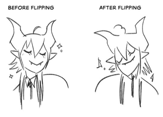
(a common thing is to find that everything is sort of 'leaning' too much one way, which is where skew really comes in handy!) (seriously, I love skew, it is my savior)

if you're working with color, keep a hue/saturation adjustment layer (or a layer filled with black or white and set to Color) on top and toggle it on occasionally to check your values! a lot of people who know a lot more about color than me (and are better at putting it into words) have written about why values are so important, so all I'll say is that the rule of thumb is that your image should still be readable in greyscale:

there are some exceptions and grey areas (do ho ho), but it's a good general rule to keep in mind! (some programs also have a colorblind mode, so you can check to see how your work will look to someone with colorblindness!)
and finally, here's some digital art programs I recommend, if you're still looking for a good one!
free: krita, FireAlpaca
paid: ClipStudio, Procreate (iOS/iPad only)
#art#...sort of#horizontally flipped mal isn't my favorite drawing i've ever done of him#but it's up there#anyway i do personally use photoshop#but i absolutely do not recommend it when there are better and free-er art programs out there#it is the equivalent of texting with a giant 90s-block phone that has been jury-rigged to somehow install whatsapp#because i don't NEED a new phone i KNOW how to use this one it's FINE#(oh god i've become my dad)#someday i will have to actually switch to clipstudio and learn new keyboard shortcuts :(
393 notes
·
View notes
Last Seen Blogs
magneto-burrito
Be Excellent To Each Other, But Also, To Yourself
reynard8bit
Reynard's 8-bit
peppermintpillz
Pepper

quybds-blog
Sans titre

biodanzar-blog
Danzar la vida