#but trying to make art is like throwing darts while blindfolded
Note
smell pickup line based on the gasoline one because i cannot get it out of my head.
you're a black sharpie and baby? I'm in my office cubicle trying to get high.
We can’t start smell posting it’s going to get out of hand.. too out of hand for a Sunday night
coughs. Anyway
Gabe is a gold sharpie.. like the one for the print signings (I am executed before I can continue)
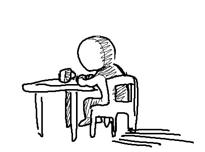
#we can smell post when I post. A fucking. Legendary clip. that is 1 of the reasons I even made this account#I didn’t find the source of it till like a month ago#but I have it now#it’s a special one it deserves an image to go along with it#but trying to make art is like throwing darts while blindfolded#could take months LOL#COUGHS ok guys no smell posting#you all have covid remember? you can’t smell anything#alright time for a bad tag#im not even a smell guy but there’s a secret switch in my head where if you apply something to gabe it suddenly will appeal to me#well not everything but#a lot of things I can make an exception for#it’s like a fuckin cheat code#this is a mostly innocent post I should stop now#see this is why we can’t do that#the tags speak.. too much. too much.#non voice post#ask#asks#edit: I should mention that the clip im talking about in the tags#is more of a funny clip than anything#he’s trying very hard not to laugh
39 notes
·
View notes
Photo

Musical artists that use #AIgenerated images for their cover art deserve to be hit by a bus.
The production process for #Mermaids was just as chaotic as “Kraken (Song 81).”
The original version of “Mermaids” was almost entirely different from what’s available today. After the original version of the song had been written, recorded and mixed, the only segment that sounded good enough to release was the “oh I think they like you” segment. Not wanting to release that segment alone because it was under a minute in length, the rest of the song was deleted and a completely new song was written around it. A week later, that new song was complete.
All in all, this fumble of producing a song, deleting a majority of it, and producing a 2nd song took about two weeks. Not bad, considering GoBoy 6 songs took twice that amount of time, even without any hiccups. On average, each GoBoy 3 song took four days to complete, GoBoy 4 songs took six days, GoBoy 5 songs took fourteen days, and GoBoy 6 songs took thirty days.
The original song title was “Sex with Mermaids.” Yeah, the daily work routine was getting to me around this time. Anything I could do creatively to add some excitement to my paper pusher life was a necessity.
This song is about a sailor introducing his comrades to a group of mermaids. These comrades understand the significance of this event, hence their willingness to travel through a raging storm. It’s quite possible that these mermaids only come to the surface during conditions that would be dangerous for humans. If it wasn’t for their sailor friend, they wouldn’t have the chance to experience such an event, as he might be the only human that these mermaids trust.
Regarding the waves and thunder sound effects: I worked as a sound designer for the film industry during the seven-year hiatus (more about the hiatus in posts 23 and 36) where I learned the utterly worthless skill of creating / manipulating sound effects. That skill was utilized in “Mermaids” (waves, thunder, creaking wooden boat, “heave ho” chant and laughing mermaids), along with other songs like “Magic Unicorn,” “Coffee Song,” “Food Song,” “Seattle,” and “Rebecca.”
Beat + bass + melody. That’s the style of GoBoy 5. While I’ve appreciated this minimalistic style for years, “Tell My Mama (Song 42)” was the first time trying it. I went whole-hog with GoBoy 5, in which most songs primarily consist of a beat, bass and melody (excerpt from post 80).
For GoBoy 5, instead of creating for the sake of creating, like I did for GoBoy 4, I wanted to make poppier songs that would appeal to a larger audience. Was that goal accomplished? Well, maybe, I guess. It resulted in the song “In Love (Song 82),” which everyone and their mother seems to like (excerpt from post 79).
GoBoy 5 ragdolled me. I remember wondering if I’d live to see the completion of the album. While the style is minimalistic, the writing and production processes were chaotic, akin to throwing darts with a blindfold on. Most songs turned into a puzzle once they reached the mixing phase, with a portion of the pieces being destined not to fit. It required constant compromising - discarding segments, restructuring, rewriting, etc. The combination of the difficult production process and temporary chaos at work left a blood-soaked trail behind me (excerpt from post 80).
In April, 2021, almost all of GoBoy 3, 4 and 5‘s songs were restructured to be under 3 minutes (preferably under 2m 30s), including this song. I became okay with releasing songs around the 2 min mark after realizing The Beatles and The Beach Boys had some songs around that length. In an attempt to increase replay value in this streaming era, most of GoBoy’s songs are now purposely around 2m 20s (excerpts from post 37).
A bass boost was added to songs 37-99 in Nov, 2021, while I was stuck at home with covid. As a result, this song feels more powerful. The bass boost isn’t a simple plugin nonchalantly added to each song. It’s a process that took about 3.5 hours per song, or one whole month to complete all songs. Admittedly, I pushed the bass boost a little too far for some of them. The bass in some songs sounds like a freaking earthquake (unnecessarily pronounced low frequencies 20 - 50 Hz). Might dial that back someday. The bass boost was also applied to every song on GoBoy 6 and beyond (excerpt from post 37).
0 notes
Text
Call me maybe
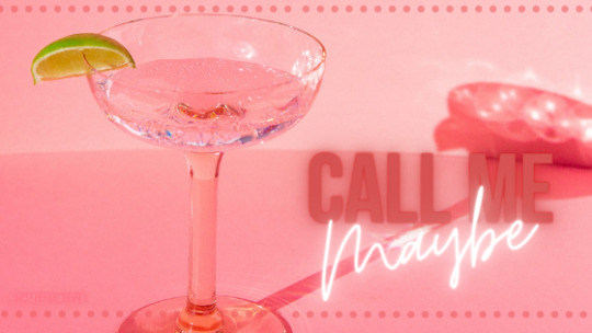
Grouping: Reader x Namjoon
Word Count: ~6.59k
Warnings/Themes: Club meet-cute AU, 1% angst +99% suggestive fluff, (legal!) alcohol consumption, language, flirting anxiety(?)
Summary: It all started with a stupid drinking game...
A/N: this is the One Direction wattpad-style fanfic that's been haunting me for so long. beware of that and the fact that this is unedited hahaha...

“You know the rules, girls. Whoever wins this round of rock-paper-scissors is It.”
You and your three friends, warm and bubbly from 2 rounds of shots at this point in the evening, assume your battle stances and stick your hands into the center of your table. Four hands make a square over the scattered layer of empty decorative shot glasses from the bar in the club.
There’s an air of electric excitement that comes with this game, lovingly nicknamed Hunter-Gathering. Whoever is It gets a target and has to pursue that target in hopes of bringing ‘home’ free drinks for everyone the rest of the night. But no matter how attractive the target is, you can't ever bring them home.
“Wait, wait!” Lia chimes in. “I can’t be It this time. I did it twice already and my ass still hurts from the last time.”
Dani nods seriously. “Fair enough. That means the odds are upped for the rest of you.”
“So, we’re just gonna ignore that ass thing,” another friend, Alexa, looks around the table with confused eyes.
“Do you actually want me to give you the details?” Lia smiles slowly at her from across the table.
Alexa’s face brightens with her own smile, worry evaporated. “You know what? I don’t! Never mind.”
The game begins and somehow you find yourself the lone rock amongst two pairs of scissors. Alexa and Dani laugh with relief because they don’t have to put in any work tonight. You roll your eyes to the heavens and silently question your karma.
“Are you ready to pick your target?”
“I don’t really have a choice, do I?”
“Nope!” Dani grins.
She steps forward and grabs a clean face mask out of her clutch bag and wraps it around your eyes, careful not to muss your makeup or hair. Three pairs of hands rest on your shoulders and you let them spin you lightly around a few times. Not enough to get you dizzy but just enough to make sure you don’t know what direction you’re facing anymore.
“Alright,” Dani’s voice sounds out over the music of the club. “Take your pick!”
You stick your hand out blindly and someone unties the makeshift blindfold. Everyone follows the line your hand makes all the way to a tall figure standing by the side of the bar.
He’s probably the most handsome man any of you have seen in a while. There's an intimidating aura emanating from him. You figure it's the understated all-black outfit complete with the heinously expensive watch he's wearing and the sheer height of him as he towers over people near him at the bar.
“Oh my god,” Dani whispers as you all take in the stranger’s face.
“We can finally get top shelf vodka,” Alexa pretends to wipe a tear from the corner of her eye.
“Not bad,” Lia hums in appreciation.
“Okay, why is everyone acting like I bagged him already?” Your voice grows high with nerves. “I'm pretty sure I have, like, a 2% chance of interesting him."
“What are you so worried about?” Dani crosses her arms at you. “Just do whatever you did to get those history nerds to help you out that one time."
"This is not the same thing. Those guys parted their hair 90/10 unironically and thought Diva Cups are for when you don't want to hold your pee when you stand in line for roller coasters."
"You're kidding," Lia gasps. You wish you were.
"Well, just pretend he's one of them anyway." Dani suggests, "Every guy is the same."
You can't argue with that logic.
“I mean, I can try flirting with him, but he’s probably so used to people throwing themselves at him. I don’t think anything I do would, like, make a dent, you know?”
“Babe, no. No—listen to me, okay?” Alexa takes you by the shoulders and forces you around so you can see how serious she is.
“Tonight is the last free night of vacation. After tonight, we have less than a day to get over our hangovers, pack up the Airbnb, and then catch our 6am flight back home to start the spring term. Our last night of freedom lies in your hands.”
“But, what if—”
“No ‘but’s. Do you see yourself? Do you see your skin in this fresh white two piece? Have you seen how your tits look in this off the shoulder top? That poor man doesn’t stand a chance!”
Lia murmurs her agreement in the background and Dani mentions something about fearing for the guy's soul. You think about the freakishly good pictures you all took in the stylish club bathroom when you first arrived.
“I see your point.”
You turn back toward the bar to review your target. He sips from a dark green bottle as he looks around at the people on the dance floor between your table and the bar. As he continues to scan the room, he locks eyes with you. You hold his gaze even though your instincts are screaming at you to duck for cover. Surprisingly, he gives a small smile and raises his bottle in salute.
"See, you got the hardest part down already. Just fake the rest until you make it."
You chance a look back in his direction only to catch him staring in the direction of the table. When he catches your gaze again, he whips his head away, cheeks tinging pink under the soft yellow lighting at the bar.
Alexa cackles and starts detailing all the drinks she wants made with the top shelf vodka. Lia and Dani discuss leaving early to go back and clean up the apartment so it’s clean in case you break the rules and bring this guy back for the night.
“Uh, aren’t you guys moving a little fast?”
“Aren’t you moving a little slow,” Alexa counters.
“Hold on, Lex.” Dani turns to you. “You know you don’t actually have to do this if you don’t want to, right? Hunter-Gathering is just a game, there's no pressure.”
For all their poking and teasing, you're reminded right then and there that your friends would never put you in a situation where they thought you were actually at any risk. The weight you felt on your shoulders lightens somewhat.
“No, no, I definitely still want to play, I just don’t want you guys to get your hopes up.”
“I believe in you.”
Lia bumps shoulders with you quietly. She’s not the most affectionate, so you know she really means it.
“I’ll do my best.”
You let them tweak you a little bit, fixing stray hairs and wiping away smeared lip gloss and hiking up your skirt, giving you their drink orders, before you grab your purse and phone and push in your stool.
When you finally make it to the bar, he’s in the same spot as you first found him in. He spots you once you get close enough and naturally makes room for you. You set your bag on the bar countertop before hopping up on the empty stool immediately in front of him. The movement causes your skirt to ride up even more and you’re glad you only let Lia hike it up one inch instead of three.
Dani's advice about treating this guy like any other scrub from school reverbs in the back of your head right as the nerves start to set in. With the guys in your art history class, your grade was on the line. There was no room for hesitation when you could barely draw a stick figure, much less write an essay analyzing what an old painting style could tell you about the dairy economy in a certain town like some of your classmates were doing. It was because you were desperate that you were suddenly able to transform into a femme fatale. It also helped that these guys quivered at any interaction with an adult woman.
Tonight's drinks are on the line, you tell yourself. As best you can, you try to trick yourself into entering the same mindset you were in when you would lay on the charm extra thick for the art history guys.
You let the corner of your mouth lift up in a coy smile while you survey the bar. The bartender is moving back and forth quickly to handle the high demand. A second later the girl next to you leaves her spot with a tray of 8 bright pink drinks, practically glowing in the dark. You wonder briefly if you should try to get a round of those for the table.
“—one of those before?”
His voice is deep and pleasant. When you give him a look over your shoulder, you have to suppress a gasp. Up close he's even more handsome. You really have your work cut out for you.
“What?"
"That neon pink drink," he nods back in the direction of the girl who'd taken the cotton candy pink drinks with her. "I was wondering if you'd tried them before."
“No, I haven’t,” you smile, letting your lips part slowly. His eyes dart from your painted eyes to the colored stretch of your mouth and then quickly back up. “Have you?”
“No. But I like to try new things.”
You purse your lips as if in thought, something you've seen other girls do while flirting with guys at school. “You must be pretty unpredictable, then.”
“Huh? Well, I wouldn’t say that.” He stammers a bit and nearly drops his beer bottle trying and failing to put it down. All the intimidation you felt coming from him earlier seems to have disappeared.
“I was just kidding.”
Like it has a mind of its own, your hand reaches out to rest on his arm reassuringly while you continue to laugh at him. His features clear up then and a relieved smile blooms on his face, bringing out an adorable dimple with it.
“You’re teasing me,” he realizes with a good natured huff and steps into your touch.
“You seem kinda fun to tease.” You let your hand linger a little longer before finally pulling it back.
“It’s kinda fun. You're pretty good at it.”
Oddly enough, this isn't as difficult for you as you thought it was going to be. In fact, you find yourself naturally tilting your head and fixing him with an intrigued look from under your lashes. He takes the opportunity to look you over as well, a small smile on his lips.
The personal attention does make you a little nervous despite the fact that it’s positive. So you dig in your purse to avoid looking directly at him for too long and to give your hands something to do. You brush up against a tube of lip gloss, pull it out, and reapply some to your lips.
You look back at him when you realize he’s grown quiet, only to find him following the movements of the gloss brush tracing the curve of your lips, cheeks dusted pink and eyes half-closed like he's in some sort of trance.
Experimentally you press your lips together and then purse them to make sure the gloss is distributed evenly. The man doesn't blink once. Suddenly, all his expensive apparel and large stature aren’t so intimidating.
"Is there something on my face," you smirk.
He slow blinks down at your mouth twice before realizing you're speaking again. His eyes grow wide and he raises a ringed hand to rub at the back of his neck. The movement rustles the hair covering his ears, revealing their pink tips. Cute.
"Just looking."
You laugh a little at him again. He marvels at the way the club lighting dances around in your glossy smile.
"So, how come I've never seen you here before?"
"Well...it's the first time me and my friends have come here."
"I see." He pivots to face you and leans his closest elbow on the counter of the bar. "Are you guys new to the area?"
"You could say that, yeah."
He raises an eyebrow when you don’t elaborate. Without looking away, he raises his hand to signal to the bartender that he wants another drink. When the bartender runs right over, you realize this guy actually might be a big deal. Silently you pull your card out of your wallet as the bartender makes their way over. You figure you’ll have to spend some money before you can really ask someone like him to buy drinks for your table.
"What'll it be,” the bartender asks.
"Two of those pink drinks please," he says and before you can place any order the bartender zooms away.
While the bartender starts preparing the drinks, you turn toward him.
"Who said I wanted the pink drink?"
He grins down at you, a dimple now popping up in each cheek. "Who said it's for you?"
"I'm pretty sure it's for me."
"And what makes you so sure?" He takes a step closer to you.
"Just a hunch," you hum before crossing your legs.
The white fabric of your skirt hikes up your thighs again with the movement. You smooth your palms over the soft material.
"Nice skirt."
"Yeah? You like it?"
"I like it," he admits quietly.
"And the top?" You gesture toward the pair of straps on the matching tube top, manicured nails gliding over your décolletage. He wets his lips.
"The top too."
He reaches out one large hand to one of the straps that have fallen over your shoulder. The drag of his fingers against your bare arm as he fixes it makes you shiver. You lament the loss of contact when pulls his hand back.
The bartender arrives with your drinks then, startling the both of you out of the little staring competition that had spontaneously started. The pink drink seems to glow from within, topped with whipped cream and full of little round ice cubes made from some sort of darker rose syrup floating in the liquid like lava in a lava lamp. The color barely prepares you for the thick sweetness that floods your mouth on the first sip.
"Oh, that's kinda..."
He huffs a laugh around his own first swallow and nods in agreement.
"Not what you wanted?"
"It's just really sweet. You like it?”
He shrugs. “It’s alright. But—"
The way he cuts himself off has you confused for a moment before he's reaching towards you cautiously. You're not too sure what's going on until you feel the pad of his thumb swipe over the corner of your lips carrying away some of the whipped topping from the drink. Your eyes widen when instead of wiping the cream on one of the cocktail napkins available on the counter he brings his thumb to his own lips. In a fraction of a second the cream is gone, but you're left feeling a rush of fluttering warmth on the side of your mouth and in the center of your chest.
"You think your friends would like these?” He slides his drink to the side so he can lean on his elbow and turn to you again. Now's your chance.
“Um, I don’t think this is really their style.”
“What is their style?”
You rattle off their drinks of choice, making sure to mention their favorite brands with a sigh. Of course, whenever you play this game, the brands can change depending on the budget of whoever’s buying. This time, you make sure to name drop as much as possible, per Alexa's request.
“Sounds like your friends really know what they like.”
“Yeah, they have really…unique tastes.” You falter a little under his amused stare. “But we don’t always drink that way. I mean, not every bar even carries all those to begin with.”
“That’s true.” He nods. “This bar has every single of them, though. Pretty lucky, huh?”
“Yep,” you chirp. You’re not sure if you’re in trouble or not because he’s still smiling. He seems to be onto the game, but doesn’t seem bothered by it.
“Well, it would be a shame not to welcome you all to the city. Get whatever you want. My treat.”
“Are you sure?”
You place your hand on his arm again and squeeze for good measure. You don’t miss the way his large bicep flexes under your touch. After a beat, he brings his hand up to grasp yours and holds it while signaling to the bartender again. You give him a blindingly bright smile and he strokes his thumb over your knuckles.
He asks the bartender to ‘take care’ of your table tonight on him, and you realize then that you’ve won the game. The victory isn't nearly as sweet as the pink drinks from earlier. The rules prohibit you from bringing him home or going over to his place. And even if it wasn't prohibited, your vacation is basically over.
“Where are you and your friends from?
You take his hand between yours and play with some of the rings on his fingers. They’re beautiful together in an eclectic way and you wonder if someone chose them for him.
“It’s a kind of small city, not like this one. It’s really just our university and then a few surrounding towns.”
“What made you guys move here then?"
"Oh, Right." You feel guilty. "Me and my friends are just here for vacation."
He blinks at you but takes the news in stride. "Well, if you want—I know the city pretty well since I have a place here—maybe I can give you a tour of the town later this week."
"I'd love that, I really would. But we're actually leaving tomorrow."
"For real?” His eyes grow wide and he looks down at your linked hands before looking over your face. You're shocked to see his features fall.
"Yeah, it sucks."
“Damn,” he smiles bittersweet at the floor. “I wish we’d bumped into each other sooner.”
“I absolutely agree," the sound of Alexa's voice rings loud in your ear.
“Uh, hello. Did you need me for something?" Your voice is high and tight as you fix her with an accusatory stare. You're not 100% positive, but it seemed like you and he were having a moment.
"No, babe, I just wanted to come over and show you my beautiful drink. I wanted to come show my gratitude to you both for making sure we have a good last night. The girls will appreciate that. Thank you, kind sir."
“Name’s Namjoon. And no need to thank me,” he smiles at the exchange between you two and sticks out his hand. Alexa daintily lays her hand in his and he lets out an incredulous laugh before playing along and raising it to his lips.
"What a gentleman," she coos before pinching lightly at the skin of your exposed back. It's a clear message just for you, telling you that there's about to be a change in plans. "What were you guys discussing?"
"I was actually about to offer up our booth. There's more than enough room for your table if you wanted to move. Me and my team—friends definitely wouldn't mind the company."
“You don’t have to do that!” You pipe up, suddenly shy. But it's quickly dashed away as Alexa pulls out her phone and opens up the groupchat.
"Let me just ask our friends if they’d like that."
You already know the answer, so you sigh quietly and gather up your card, phone, and purse. You can’t say you won’t miss the privacy from when it was just you and Namjoon, but you’re glad to be with your friends again as well.
The move from your little table to the VIP booth is lightning fast. By the time you get your own drink, Lia and Dani are already clutching their things and vibrating with excitement near the ropes leading to the VIP booth. A few of Namjoon’s friends are chatting with them from the other side of the ropes.
Once your group trickles in, you don't miss how they all arrange themselves in the booth so you're forced to sit on the end next to Namjoon with barely any space. The only options are to let one of your legs hang off the edge of the booth the whole time or sit practically half in his lap. Alexa winks at you over the first sip of her next very expensive drink.
Namjoon's friends are occupied by your friends re-telling some of the more exciting parts of the beginning of your vacation. Some story about how 'someone' lost their top while trying to jet ski. You send a weak glare to Lia as she tries to get them to guess just whose top it was. That's what you get for experimenting with spaghetti strings, you suppose.
"Do you guys like to dance," one of his friends says after a while of vibing to the music once the chatter cools down. Hoseok, you think his name was.
"Yes, definitely." Dani remarks while re-applying lip gloss. "You know who's a great dancer?"
"Who?" Hoseok looks around excitedly.
"She's gonna say me," you groan. "Which is not even true but let’s just all move down there already, no more 20 questions."
"Just one more," she pouts. "Namjoon, do you like to dance?"
He looks down at you once he's also out the booth, that little amused smile back on his lips.
"Well, it's not really part of my day job, but I don't mind it too much."
"What's your day job," you blurt out.
"I'm a...musician."
"A musician!" Alexa rushes over to you to link arms. "Did you hear that? Namjoon’s a musician."
"I don't recognize you," Lia says and Hoseok and another one of his friends burst into quiet laughter behind her.
"You definitely won't find Joon’s pics anywhere, that's for sure," one of his friends says. The rest of them dissolve into another fit of giggles.
The club lights hide the muted pink tinge his cheeks take on, and Namjoon leads the way to the dance-floor with a chagrined roll of his eyes.
"You think he's really a musician?” You whisper to Alexa and Lia. Dani is somewhere up ahead, already dancing.
"Maybe technically. Going off the way his friends keep laughing, he's probably, like, a failed SoundCloud rapper or something."
"No failed SoundCloud rapper wears Gucci like that," Lia motions with her chin to some piece of Namjoon’s outfit.
"That's true," you hum.
"Rich parents," Alexa says simply.
You and Lia consider it and then nod.
As you settle on the dance floor, you feel the rest of your nerves drift away. Lia comes over to take a selfie with you, and the two of you flirt with the camera until she's satisfied with the photos you've taken. She grabs your hand and makes a show of spinning you around and you figure that this is how the night will go before you stumble out around 2 or 3am and drunk pack for the flight home the next morning. You let her lead you back, further into the crowd before you bump into someone.
Namjoon's large hand comes to stabilize you at your waist and Lia acts like nothing happened before dancing away, phone light illuminating her sneaky smile.
"You good?" Namjoon's voice is soft in your ear.
"Y-yeah."
"You wanna dance, or should I let you go?"
Your friends shamelessly all look at the way he curves himself around you, all with their thumbs up in encouragement. You're reminded of the way you did the same a few nights prior when Dani was getting hit on by some cute guy at a different club.
At that time it felt fun hyping her up and watching her make a move, seeing how enamored this random guy was with your friend. Of course he is, you thought at the time, she's amazing. And you remember that this is probably what's driving them tonight as well with you and Namjoon.
You chance a look at him and realize that he's come to rest his cheek lightly near your temple, a soft look in his gaze as he awaits your answer.
"Sure, let's dance."
Namjoon was telling the truth when he said he wasn't all that into dancing. But he put in enough work to be able to follow you and meet you halfway while you were grinding on him to the music.
Even when you shyly stepped away after the first few dances to return to your squealing friends, you loosened up over time with more music and drinks and found yourself naturally ending up on him again. The first few songs turned into more and more and soon you were face-to-face, with his thigh wedged between yours and a heavy palm on your lower back guiding you to the beat.
You're not sure when you decided to abandon your friends and his, but at some point you did return to the booth under the guise of checking your phones. And you did check your phone first. But soon he was crowding you toward the wall by the booth and leaving you with no air of your own.
"You're really leaving tomorrow," he sighed into a bruise he was trying to leave near the hollow of your throat. "Or did you just say that because I was some creep at a bar."
"I never thought you were a creep."
He looks down at you with disbelief before getting distracted by your kiss-swollen lips.
"I mean it. I'm just a little shy sometimes."
"What do you have to be shy about when you look like this, huh?"
"Stop," you laugh lightly and look away from him.
He'd made a comment earlier about how much he liked the pristine white two piece you wore, but you'd been inching his hand up your skirt then. Now, one of his thumbs rubs an idle pattern just below the curve of your breast.
"No, but seriously. Are you actually leaving tomorrow?"
"Yeah. The new term starts for us all in a few days."
"So, leave in a few days," Namjoon whines.
"That's not enough time to get ready for the term."
"But I'll be so alone without you."
He gives you an exaggerated pout that splits into a real smile when you snort at his stupid expression. He pulls you to him just a smidgen tighter then.
"Does this usually work with other girls?"
"I don't know. Never tried it with other girls," he frowns a little at you.
"Sure."
"You know me and the team almost went to Club BigHit last Saturday?"
"Oh, really? That's kinda funny." You try to imagine what might have happened if he'd come to the same club you went to earlier.
"Yeah," Namjoon's voice grows quiet. "If I hadn't gotten sick then we would have met last week."
"Yeah, maybe."
"You sure you can't miss a few days of the term?"
"Yes, I'm sure." You let out an exasperated laugh. "You can't really be this upset that an actual stranger is just passing through your life."
"No, I know. I just—," he lets his head fall forward until he's touching his forehead to yours. "It was like something clicked when I saw you. I feel like I need more time with you."
"Oh," your voice comes out a little breathier than you expected.
The same look that had flashed across his face when you first came up to him finally gets to rest on his features. You want to let him down gently because you really can't play catch up during the first week of school.
"Tell you what. I can't miss the beginning of the term but if you make a song with my name in it and it gets...say, 50,000 listens, I'll buy a ticket that same day and come meet you. Wherever you are."
He pins you with a look then, inquisitive and dark. His eyes scan your open expression for something, before whatever he finds passes the test. He stands up tall.
"And it just needs to have 50,000 listens?"
In your mind you were thinking it would be too lofty for a failed SoundCloud rapper, but something in his tone sounds like he's rising to the challenge and it makes you nervous. You spent a lot on this vacation, you can't afford to actually fly out so soon if he somehow managed to get the listens and call your bluff. Besides, targets are off limits.
"Um, actually make that 150,000. And it has to have my area code in it too." You rattle off the three digits to him and he quickly types your conditions into the notes app on his phone.
"Is that it?"
"That's it, I guess."
"Deal."
Namjoon pockets his phone and leans back into your space. Any worries you had clawing to the forefront of your mind vanish when he presses soft lips to yours once more.
A month passes.
You don't end up having a one-night-stand with Namjoon because it wouldn't be fair to your friends when they'd clicked with a target but didn't take them home. That and because Dani got sick on the dance floor from mixing strawberry daiquiri with one too many pink drinks. But you do pass on your full number after he very nearly begs you to give it to him while packing into a cab.
And then he never used it.
It's not that you were expecting much, but when a month passes with not so much as word from him, you figure he forgot about you and your little bet.
Then 2 months pass.
Even though you know that you only spent a fraction of a day with him, you can't help thinking about Namjoon. Namjoon and his pretty eyes and pretty words that made you think there was some sort of connection there. You realize after the first two weeks back that you don't have his number but by the time 2 months pass, you realize that was definitely on purpose.
4 months pass.
You're over it, swamped with end of term work like finals and grading and putting in hours at work. But every time your friends suggest a little fun and hooking you up with someone, every time someone asked for your number at a coffee shop, you said no. Because you're over it and you're busy and not at all disappointed for how hard you fell for the lies some failed SoundCloud rapper fed you on a vacation one time.
19 weeks pass.
You're all in Lia's apartment, basking in the first few days of the end of classes even if it means finals are a few days later. Alexa is playing her favorite playlist on the speakers and you're taking a break to get some coffee going in the small kitchenette.
While the coffee machine starts up you wander back to the main room. Alexa is leaning over to turn the music up, one of her favorite songs just now coming up.
"Who's this again," Dani pipes up from her spot on the couch. "It's that one guy's collab with the Bulletproof Girlscouts, right?"
"Yep," Alexa checks the song title before sighing. "This song is so old now."
"True, but it's my favorite one on the whole album."
"I guess it really has been two years since his last album, huh." Dani muses and then goes back to her practice problem set.
You try not to laugh at how cute Alexa looks sulking because her favorite artist hasn't put out any music in so long.
"Why don't you just play his new stuff," Lia says.
"He's on indefinite hiatus. This is as new as it gets."
Lia picks up her own phone, showing it to the group.
"He released a new single this morning."
"What!"
Alexa scrambles from her seat to grab her headphones and jam them into her phone. You all know how she gets about her music and let her have a moment to soak up the new song while you get up to check on the coffee.
It takes a few minutes to get cups out and put everything together since everyone has different tastes, so you're in the middle of pouring creamer when you hear a chorus of screams.
"Why are we screaming?"
You rush into the main room again only to be bombarded with music from the speaker, this time turned up as high as it can go. What must be the new song comes through the speaker, the bass vibrating on the ground as the speaker pumps.
"Okay, yes, new song. It's good but I don't get—"
"Just listen to the fucking bridge," Dani's voice comes out incredibly shrill as she cuts you off.
The beat surges for the bridge and suddenly the lyrics turn into the artist growling about some girl he met at the club with the prettiest little white outfit he'd ever seen. Saying something that sounds oddly like your name, although you figure that can't be right. But then the next verse has your name in it too, and the next one, and the next one.
Your feet take you to where Alexa's phone is plugged in and you pick up the phone to look at the song. It's indeed a song by her favorite artist, a prolific and mysterious rapper who's never shown his face and who'd been on hiatus from making music. The song title is simple, a small string of numbers that look suspiciously like your area code.
When you let out a tiny gasp, your friends let out more excited shrieks. You ignore them in favor of thumbing through the music app to the artist's page where the new single lies at the top of his discography. To the right of all his songs are the stream counts. Most of his older songs have a few dozen million or so. This brand new one sits at a modest 4 million, but the numbers trickle up as the app updates them in real time.
"What the hell?"
"I know!" Alexa cries, tears shining in her eyes. "I can't believe we sat in a VIP booth with him and I didn't even recognize his stupid voice!"
"What are you gonna do," Dani smiles widely at your stunned face. "Are you gonna call him?"
"I don't have his number," you say simply. Your voice comes out monotone with shock.
"You didn't get his number?" Alexa starts crying for real.
"People are blowing my phone up about this," Lia says once the song ends and begins again on a loop. "You might want to turn off your phone. It's just a matter of time until people start snooping around."
"Right."
You grab your phone from your pocket. On instinct you scan through your socials one last time before turning it off. There's a startling number of texts, calls, emails, and notifications on your social media apps. Curiosity gets the best of you and you open up one of them only to find your name trending as the top hashtag. Clicking on it brings up a bunch of tweets both from fans raving about the new song and wondering who the muse is, to random accounts with identical names in the handle all claiming to be said muse.
"Oh my god, he tweeted!" Dani shoves her phone into your hands.
As of right now [2:38pm] we're at 5.76 million streams. That's more than 150,000...
"What does that mean," she asks you.
"It means...he wants me to fly out to see him. Today."
"Oh my god."
Alexa screams again and at this point you've lost count of how many that is. Lia gets out of her chair and tucks her chin over your shoulder to read the post herself.
"You need to go," Alexa shouts. "I'll help you pack, let's go."
"What about finals?"
"Are you—are you actually thinking of not going because of finals?"
"I mean—"
"If you want me die, just say that," she does something with her mouth that looks like a manic smile.
"What Lex means to say is that this is a once in a lifetime opportunity and I'm sure even the profs would understand."
You're not sure what to say. First of all, you still don't have his number. Second of all, you're not sure how to fight through all the other accounts claiming to be you to let him know you saw the song. Third, you don't even know where to fly to. Fourth—
A Twitter notification chimes from your phone and a deadly hush falls over everyone. You go to your DM inbox with shaking fingers only to find a message request from an unknown sender. When you open the request, it's from Namjoon's agency.
Good afternoon,
You are being contacted today because one of our artists wishes to meet you. If you consent to the meeting, please review the flight information and tentative itinerary below and respond with your address and contact information. Please also note that the travel plans are for today [MM/DD/YYYY], so your response at your earliest convenience would be much appreciated. If you would like to go but cannot make it today—
"Do you think they'll send a car or should I book her a ride to the airport now?" Dani turns to Alexa.
"They'll probably send one to make sure the schedule is followed."
"That's true but what about—"
Lia taps you on the shoulder, startling you out of your stupor.
"There's a convenience store two doors down. Whatever you buy we can put in one of my suitcases and you can just take that. There's probably not enough time to go all the way back to your place."
"I—yeah, okay."
7 hours later finds Alexa, Dani and Lia finished with studying for the night. The entertainment channel is playing on the TV and the three of them have their heads bent over their phones and laptops, refreshing all the major gossip sites for updates.
"Maybe she's not even there yet," Dani sighs when the page she just refreshed shows no new posts.
"Yeah, I mean we still don't even know where she is," Lia says while putting her laptop to sleep. "What if they made her sign an NDA?"
"Even if they did, she'd probably still tell us once she got there. She's probably just busy killing time on the plane."
"She's sleeping!" Alexa screams a second later.
"Huh? How do you know that?"
"Check his instagram," is all she says before frantically typing a message to you about souvenirs.
Lia looks over at Dani's phone as she pulls up Namjoon's page. The rest of the layout is bare given his up until recent hiatus and the fact that he never posted any type of selfie. The video uploaded a mere 20 seconds ago undoes all the previous minimalism of the entire account.
The post isn't even of Namjoon. It's a black and white 5 second video of the top half of your naked back and shoulders, the rest of your body covered by the sheets. One of your arms is raised to cover your head with a pillow. The only sign of Namjoon is the arm that reaches out from the bottom of the frame, making it clear that he took the video himself. His hand reaches out to trace a heart over the skin of your shoulder blade. The caption reads:
Thanks for keeping your promise
#networkbangtan#btscreatorscorner#hyunglinenetwork#bangtan scenarios#bangtan fluff#bangtan imagines#bangtan fanfic#bts fanfic#bts fluff#bts imagines#bts scenarios#namjoon scenarios#namjoon fanfic#namjoon imagine
176 notes
·
View notes
Text
long half-rant half-infodump about DIA
DIA is like if there was a super nugu group with an absolutely puny budget, except they have an IOI member who was on top of the world for a brief period during that group’s lifespan and still is a widely recognized face (more people know Chaeyeon than know DIA, for sure), a member who did really well on pd101 and was on unpretty rapstar and made a name for herself on those shows and through collaborations with people like Chungha (Huihyeon), a member who went on that ‘The Unit’ show and was a winner and a member of UNI.T (Yebin), they’re from a company that had successful groups in the past, they were the first IOI group to get a music show win (and even still only one other, WJSN, has since then, not counting the soloists).......
like, their most successful songs are surprisingly low budget and it’s weird, you know? Woowa is how i found out about them and that song is a bop but it clearly was on the lower budget side of things, and then something like Mr Potter is so strikingly bad because they attempted something really high-concept, but weren’t given even a fraction of the budget needed to pull it off (in terms of music video and outfits, not song. the song is fine, though also not something that really sounds up to the challenge of the concept they were going for. the choreo had backup dancers who were on stage for like two seconds... why?). WooWoo literally got them sued by an american singer, Tinashe, because the music video producer allegedly plagiarized one of her music videos to make that, lmao. and in a bunch of their music videos, they’re shaking their butts even though they’re not a group that really has any sort of “sexy” image (only some members can really pull it off i think... Huihyeon can do that kind of thing easily but some of the members are just too... cute lol) probably because MBK is hoping that they’ll just become popular overnight because of the ass-shaking like Hani and Momoland did, but they don’t have the experience and stage presence that Hani does (not that they dont have stage presence, im just saying that none of them seem to me to have a Hani-like stage presence. there’s different kinds of stage presences), and they dont have songs as sexy as any EXID song or as well-produced as Bboom Bboom. sigh...
I mention EXID and Momoland because both of those groups got popular because of songs produced by Shinsadong Tiger.... just like a bunch of DIA songs, including WooWoo and Woowa, the one that got their first win and their most recent one that got a lot of people to pay attention to them who werent previously aware of them. the difference is that even though Shinsadong Tiger did both Bboom Bboom and Woowa, Woowa sounds a lot cheaper. i think i like it more as a song, but it does sound cheaper overall. i know often kpop producers write songs and offer them to various companies, and the producers dont necessarily know who will get their song as they’re writing it, but someone like Shinsadong Tiger probably gets specifically commissioned by a company, right? like MBK probably came to him and said “you did a bunch of T-ARA hits, you’ve made unknown groups into mainstays, please give us a hit” and he said “okay, what’s your offer?” and MBK replied “100 dollars”. and they got a 100 dollar production job. the song is good because of the writing, the underlying song, but the way it was brought to life and promoted and especially how the music video and outfits look... it seems like a group that’s less popular than they actually are... you know what i mean? MBK’s putting in the bare minimum effort and just hoping that they'll blow up because of their already-popular members like Chaeyeon, or because of how they shake their butts in the choruses or something. they’re hoping that something like that will make them, and forgive me for using this expression nowadays, go viral... because that would absolve MBK of having any responsibility to actually put in the work and time and effort to try and promote them to make them become popular gradually.
it seems like theyre not trying to develop a group with a defined sound that builds up a fanbase that grows a little with each comeback, they’re just giving their group all sorts of comebacks in all sorts of styles with seemingly no consistent sound or theme that runs through their whole discography in the hopes that they’ll land on something that blows up eventually. they’re not trying to nurture a group to create and perform good art, they’re just throwing darts at a wall while blindfolded and hoping maybe they’ll accidentally get a bullseye, and they can brag and pretend like they knew what they were doing the whole time, when in reality they had no fucking idea and were frantically scrambling for anything that might make them an overnight success. i feel so bad for the members... especially since it’s now been over a year since their last comeback, which to my knowledge was one of their most successful so far... and yet...
6 notes
·
View notes
Text
I’m dealing with some serious crippling self-induced writers doubt right about now trying to tie together this goddamn forsaken latest chapter of Identity Theft. This will probably be deleted since it’s useless, dumb, and my word count is exceeding far beyond what I’m comfortable with. So enjoy some stupidity while I crawl in a hole and cry.
-- Identity Theft, CH29 --
It was around the time the sun had set, the starry night beginning to shine through the skylight ceiling that Tony had stepped away to make a brief phone call.
When he returned — not even a full ten minutes later — the group had huddled towards the largest wall of the room, having taped up his once framed and favorite Iron Man poster. The imitation design of the ‘Obama Hope’ campaign stuck out like a sore thumb against the sleek, gray walls, yet almost blended in perfectly with the bright red and blue garland hanging down from the ceilings.
A few feet in front of it, Sam was spinning Clint in a circle, the archer blind-folded from Bruce’s green striped necktie. His eyes nearly bulged out of his head at the sight, his hand barely managing to stuff his cell phone back into his blazer pocket.
“Hey!” Tony shouted, storming forward. “What’s this? What the hell is going on?”
Sam’s grin was all teeth, his hands firm on Clint’s shoulder as he forced him to come to a stop.
“Pin the tail on the Iron Man,” he explained with such nonchalance that Tony almost doubted his own hearing, going so far as to dig his index finger around inside his ear.
It took a beat for him to realize they were serious, even after he loosened the built-up wax that may have made him imagine such an absurd statement.
“You have got to be kidding me,” Tony muttered, affronted. “Should I even ask how you managed to get your hands on this?”
Natasha grinned at Tony’s disgruntlement, crossing her legs and letting her heel sit against Bruce’s thigh. “Pepper was gracious enough to offer it up as a party favor.”
Tony’s eyebrows shot up with a sense of shock he couldn’t articulate. Instead, he looked between the red, yellow and blue Iron Man poster to back at Natasha.
She smiled sweetly at him.
He turned to stare incredulously at Bruce, who — for someone who appeared highly entertained by the game — shrugged with remorse. Tony could see through his poorly concealed veil as if it were sheer lace; after all, it wasn’t like the others would risk a code-green by bullying his dress tie off of him.
“Alright, count of three.” Clint teetered his hand back, the dart clenched tightly between his fingers. “One...two...”
Tony snatched the feathered-tip dart from him before he could throw it. “You even think about it, Barton...”
Clint pulled the makeshift blindfold from his eyes, frowning with little heat behind the expression. If anything, he looked to be holding back a smirk that Tony was sure he’d easily wipe off his face with one blast of his repulsor beam.
“That,” he gestured to the poster with the dart, “piece of art was not created for your childish amusement.”
“Art, vanity—” Clint shrugged, snatching the dart back. “Do you even know the difference?”
Tony glared.
Clint smiled, the cocky smirk he had clearly been resisting finally pulling at his lips. Before Tony could even blink, he threw the dart forward, never once even glancing at the wall as he did. To no one’s surprise, it hit dead-center on the poster.
To Tony’s annoyance, the archer blew a puff of air at his fingers, further cultivating his air of arrogance.
“Okay,” Bruce got up from the sofa with a grunt, leaning his hands on his knees before standing tall. “That’s enough of that.”
Tony waved his hand towards his friend. “Thank you —!”
“Clint stole my turn two rounds ago, it’s time I get a shot at this.” Bruce smiled stupidly, enjoying the moment far more than expected as Sam wrapped the tie around his eyes.
It took an alarming amount of effort on Tony’s part to stonewall the argument, let alone resist the urge to tear down his poster so he could hang it over Pepper’s side of the bed later in the evening. The latter he still wasn’t one hundred percent positive he wouldn’t do once the party came to an end.
He settled on rolling his eyes, relishing in Bruce’s horrible aim when the dart he threw hit way above the top of the poster. He didn’t understand what it was about having the kid around that turned the rest of them into immature brats, but had to admit that there was no desire to fight it. If silly games made them happy, who was he to put a stop to that?
It was then Tony noticed the kid was strangely absent from the group and their childish shenanigans.
It didn’t take long to find him, sitting quietly on a love-sofa towards the corner of the room. On the glass table in front of him were numerous textbooks, and he chewed on the yellow pencil in-between his teeth with harsh concentration. It appeared he had been left alone, what with Wanda and Vision catching up away from everyone else, and said everyone else preoccupied tearing holes into the large print of Iron Man’s face.
Natasha cheered loudly as her dart hit square in the eye-slit. “Ten points for me!”
“Wait, we’re doing points?” Clint sat up straighter on the couch, frowning. “No one told me there was a point system.”
Sam scribbled something down on the nearest notepad, never looking up at Clint as he answered, “There’s a point system. You’re excluded from it.”
#fanfiction#marvel#mcu#fluff#tony stark#irondad#spiderson#clint barton#natasha romanoff#sam wilson#bruce banner#steve rogers
31 notes
·
View notes
Text
How to Adore the Seasons 2/4 (Adore-centric) - Mac
AN: Hi there friends! This is the second part in a four part series I’m doing where I pair up Adore with someone else and a season to describe how that particular person loves Adore. Idk if that makes sense. Oh well.
Summary: It’s Adore’s birthday, and Alaska has planned some surprises.
Summer (Alaska/Adore):
“She turned to the sunlight
And shook her yellow head,
And whispered to her neighbor:
“Winter is dead.” ― A.A. Milne, When We Were Very Young
Adore woke up to the sound of screaming.
Then she let herself slump back into the cool sheets when she figured out where, or more specifically, who the sound was coming from.
She groaned and pulled the blankets over her head, as Alaska poked at her with her nail-less fingers.
“Rise and shine bitch. Let’s go.”
“Mhhhhhmph.” Came from under the blankets.
“What? I can’t hear you.” Adore could feel the smile in Alaska’s voice, and it made her want to strangle the blonde even more than normal.
Adore removed the covers and pointedly looked, well tried to look, her eyes were practically glued shut, at Alaska. “I said fuck you.”
Alaska mocked offense, “Is that any way to treat your elders.”
“When they wake you up at 4 in the morning it is.”
“We gotta get going if we want to catch it.”
Adore wasn’t going to ask what they were supposed to catch. She wasn’t. She was going to go back to sleep. She wasn’t goin-“Catch what?” SHIT
“You’ll see.” Alaska said with a smirk that wasn’t altogether menacing, but definitely not reassuring. “But you have to GET UP first.”
They played tug-of-war with the blankets for a few minutes before Adore’s fatigued muscles gave out. “Fine. But fuck you still.”
Alaska gave a little victory dance that Adore attempted, and failed, not to laugh at. She then began traipsing about Adore’s room, throwing open curtains and humming some ridiculous song that Adore couldn’t be bothered to figure out. Adore took her sweet time getting up and dressed, pointedly ignoring Alaska’s huffs when she took too long. Just as the shirt went over her head, Adore’s world went dark.
“The FUCK?” Adore pulled at the blindfold.
Alaska batted her hands away. “It is a surprise! Keep it on.“
“If you make me fall, I swear.”
“I won’t. Just trust me.”
Adore bites her tongue on a smart reply and allows herself to be lead to a car and driven away. “If it were anyone else,” she mumbles to herself.
Adore hears Alaska fumble with something for a minute, then the unmistakable sound of a disk tray retracting, and suddenly the car is full of music. And curse Alaska for knowing all of Adore’s favorite music. She was really trying to be angry at the older queen, but the unconscious smile on her lips gave her away.
Alaska saw it, but wouldn’t mention it. She would however, file it away in her mind to be brought out at a later date. And that feeling that accompanied Adore’s smile would also need to be analyzed later. But now, now wasn’t about her.
Alaska kept checking her watch nervously, and gave an audible sigh of relief when they finally arrived. She hopped out and pulled Adore with her. The two walked only a few steps before they stopped.
“Just one more minute now.” Alaska said, mainly to herself. They stood side by side for what felt like ages, before Adore felt Alaska’s hands beside her face.
Adore’s world went from pitch black to full of color in .2 seconds. The sunrise filled the entire horizon line and Adore’s lungs to the brim.
“Wow.” Adore breathed.
“Yeah.” Alaska smiled.
The orange sun was just barely peeking its head up around the curve of the earth, but the color had spread already. Pinks and light purples mixed with blues and yellows around the edges of the horizon. The whole thing blended together to paint the most beautiful art piece either queen had ever seen.
The two stood there for what felt like ages but also only seconds. The sun was no longer eye level when Alaska slipped the blindfold back on Adore’s face.
“HEY!” Adore shouted in indignation.
“We aren’t done yet.”
Adore smiled. A full-unbridled one this time. If this next surprise was anything like the first she knew waking up at the ass-crack of dawn would be worth it.
They drove for a much shorter distance this time. Adore noticed, because she had only just started to get comfortable when Alaska came to a stop. They both hopped out, and Adore smiled again. Her favorite breakfast place. She could tell by the smell alone. It was only open one day of the week, and at the most awful times. As a creature of the night, Adore never could find herself awake before 11:00am, and thus, she missed her opportunity for the most delicious omelet every week.
Adore was ecstatic, and then she was confused. It was a Tuesday. This place was only open on Thursdays. Alaska, sensing the question at the tip of her tongue, tried to move them along by pulling off the blindfold and shaking her hands as if to say ‘ta da.’ Adore let it go for now, the rumbling in her stomach taking priority.
They entered the empty restaurant, picked the best seat in the house, and had their food within minutes of sitting down. Adore didn’t hesitate before digging in. Alaska, ever the patient one, was content to wait a few moments between each bite and just smile at the younger girl.
When Adore finally came up for air, Alaska spoke softly, “Happy Birthday Danny.” Adore beamed at her, and the older queen immediately burst into giggles. Adore looked at her confusedly until Alaska motioned with her hand at her own face. “You’ve got something right…” Adore struggled for a few moments before Alaska took pity, and wiped the stray cheese residue from her cheek. Adore and Alaska sat in relative silence afterwards. There was no rush, there was only time.
Adore isn’t sure how long they sat, only that when they finally got up, the newborn sun now hung high up above them.
Alaska re-did the blindfold and proceeded to take Adore to every activity Adore enjoyed doing, and even some things she had never done before. They went to a trampoline park, and got so incredibly sweaty that Alaska would definitely need to get her car deep cleaned. They had a picnic in the arboretum. They went zip-lining and swimming and talked for hours about the complexities of life, drag, and the pursuit of marijuana. Adore couldn’t remember a time she felt more understood by another person.
Till the last stop.
Adore let herself once again be blindfolded and whisked away to an undisclosed location. This time, when they came to a halt, Adore couldn’t even begin to figure out where they were. She listened for any identifying sounds, but her brain kept coming up empty. All she could tell was that they were outside. Alaska led her by the hand up a few wooden stairs, and then allowed her to stand by herself a few moments.
“You can take it off now.”
Adore did as instructed, and the resulting chant of “Happy Birthday” rung out. Adore spun around wildly, trying to get a glimpse of everything and everyone. All around her were the people she loved most in her life, a beautifully decorated park, and mountains of food. Before she could take it all in, her mother enveloped her in a huge hug. Bianca and Courtney followed next and squeezed the life out of her, whispering how proud they were, and getting a few jabs in here and there.
The party was magnificent. There was a pool and a gazebo and a food truck. Anything Adore could have ever needed was right with her. The party had Alaska written all over it.
Adore searched high and low for any trace of the blonde, but kept missing her. Finally she spotted the lanky queen, and Adore grabbed her friend before she could dart away.
“Hey Lasky. Uh. I just wanted to say thanks for everything today. You did so much, and I really have no idea why, cause its just little old me, but…but thank you. Really. For everything. “Alaska looked down at her, and for the first time that day, Adore could see some trepidation in her eyes. “Whats wrong Lasky?”
“I just…I didn’t want to tell you here. This is your party and you should be being happy with everyone.” Alaska looked this way and that, rather guiltily.
“What’s going on? You can tell me. Anything. You know that.”
Alaska looked unsure, but pulled Adore closer to her so she could whisper, “I’mmovingnextweektonewyorkforajobandiwantedtotellyoubuticouldntandimgoingtomissyousofuckingmuch”
“Wait, hold on, slow down. You’re moving?”
“Yeah.” Alaska was quick to clarify, “I wanted to tell you. All this time I wanted to, but I didn’t know how, and I knew as soon as I did it would be real.” The older queen looked devastated. “I’m just going to miss you, and I was scared I would lose you. So I put it off, and I think all those feelings bubbled up and then…this.” Alaska gestured to the party around them.
Adore looked at her long and hard. She wasn’t sure if she was angry or sad or happy. So she resorted to doing the thing she always did when she felt overwhelmed, she hugged Alaska.
It was a fierce, strong hug that left the two feeling equal parts better, and like they bruised some ribs.
“Ok.” Adore finally said.
“Ok?”
“Yeah. Ok. That doesn’t change anything. You are still my best friend. I still would do anything for you. I still think you are the most amazing person in this world. Nothing will have to change, except I guess that whole time change thing. But other than that, nothing has to change. You don’t have to lose me.”
Alaska’s face broke out into the biggest grin Adore had seen on her in a while. Alaska launched herself at Adore, and the two stood holding each other for ages, until Bianca yelled across the park at them to get a room.
They finally broke away from the embrace, but kept their fingers interlocked as they made their way back over to the others and they stayed that way till they reached the security line at the airport. And while they may physically have untangled their fingers at the gate, they would forever be intertwined.
#how to adore the seasons#mac#friendship fic#fluff#adore delano#alaska thunderfuck#rpdr fanfiction#adore delaska
7 notes
·
View notes
Photo

❛ if there’s one thing i learned over
the eons, it’s that you can’t give up
on your family, no matter how
tempting they make it.
INTRODUCING HAN JISUNG, OUR NEWEST STUDENT WITH THE POWER OF PORTAL CREATON.
WELCOME TO GUMI INTERNATIONAL SCHOOL FOR THE POWERED.
WHO ARE THEY?
PERSONALITY
(+) smart, heroic, compassionate
(–) overprotective, impatient, competitive
BACKGROUND
i.jisung was born first in a family of four, consisting of his father, mother, him, and his younger sister – jisoo. their family was not poor per se but the kids’ parents needed to work hard, with all their blood, sweat, and tears, to give them a decent life.
ii. the first born is every parents’ dream. he always excelled in everything he did. he is always his class’ top student. he never left competitions without a medal around his neck or a trophy in hand. he had worked multiple jobs at a time so that he could to earn money not just for him but for the ones he loved as well. he is the perfect son but that didn’t just come to be. his family was his motivation, to be able to give them a bright future ahead of them. that’s why he studied his hardest, trained his hardest, and worked his hardest.
iii. his powers emerge at the age of 14. it first manifested during an arduous time and the teenage boy longed for escape. his hands started to emit glowing orbs that flare and spark in hues of purple and blue, much like the sparklers kids hold during new year’s, when he brought them together it became bigger and bright. to his astonishment, the once firework like orbs have grown into a small aperture looking out to cheonggyecheon stream, the same vista, the same place where jisung loved to escape to. han jisung was a mutant and this scared him because there were heavy consequences that could potentially ruin him, so the boy kept it a secret for as long as he could.
iv. the year that jisung was eligible to represent the country for the olympics was the lowest state he’s ever been. secrets were never kept for long, they always find a way to become known. like every other olympian there are tests each one is mandated to take, one of which is the test to discover if one has the mutant genome. this is a mandatory test for all, as mutants who look to play sports professionally is looked down upon solely for the belief of the supposed advantage they have over non-mutants. it is no surprise that jisung tested positive for the mutant genome and that was when his life fell apart. it was his dream to join the olympics, he has trained for as long as he could remember, worked all he could to be able to pay for the cost of it.
v. for a time, the boy was lost, angry even, but he was able to spring back up when he met a fellow mutant during his junior year in high school. this person was able to turn jisung’s life around and that’s one of the reasons why he fell in love with them. he started to train in martial arts again, even his powers. until that hole inside him was finally filled and the old jisung was back.
vi. everything felt perfect until his significant other was taken from him, victim to a heinous mutant hate crime. the culprits were sentenced “not guilty” as the law favored them, the non-mutants. this ignited a fire in jisung, resulting into him tracking them down and ending them the moment he could. because of what had happened this influenced jisung’s decision to pursue law, hoping that a time will come where he can fully avenge the love of his life in form of saving others.
vii. before jisung could enter university, he decided to take a gap year to work and save up enough money to be able to shoulder the expense of studying. during this time, jisung took as many jobs as he could – legal and illegal – all the while, still training.
viii. a year after all the back-breaking work he finally was able to enter gumi, his parents were a bit skeptical on his choice when he’d passed other more distinguished schools geared for law. in the end, his parents trusted his decision and that’s how the boy found himself in gumi’s campus taking up political science. not long after his admission, jisung was recruited into alpha because he made quite a name for himself during his tournament days and fighting prowess, thinking the freshman would make quite the addition to their roster, and as expected the male did, and excelled in the monster games; earning him the title as one of alpha’s respected (and feared) members at present.
ix. jisung encountered kick at its early phase of distribution. his previous supplier when he’d worked as a dealer for drugs contacted him and asked if he wanted in. the boy obliged, money is money after all, and that was how jisung turned into one of gumi’s resident kick dealers.
x. now, jisung is at his senior year looking to graduate with latin honors and pursuing law school. incidentally working part-time at fast-food chain, mostly as a delivery boy. whilst dealing kick and teaching martial arts at the weekends on the side.
WHAT CAN THEY DO?
portal creation
jisung is gifted with the power to create a teleportation vacuum in which he could transport multiple people and/or objects between two non-adjacent locations. the boy can also close the portal at will, causing whatever that has not exited be cut off. his portals manifest in hues of purples and blues that open in the form of a tear in space, surrounded by fuming vapor and light leaks that glow and glint then closes back up until it fizzes out like a dying sparkler.
at first jisung could only open portals as big as basketballs from his hands and tear them open with extreme effort to get them bigger. the stretch was limited to the span of his arms and the opening was limited to distance of his hands could reach. for the boy it was like prying open a gateway that wants to close. with training and practice however, jisung was able to develop his portals and was even able to learn how to create teleportation vacuums much farther than him by throwing a small orb of energy similar to a glowing cherry bomb, that bursts into a portal when it reaches its destination.
non-mutant skills
master martial artist: jisung is proficient in several martial arts like karate, ninjutsu, and kyusho jitsu.
peak human physical conditioning: he was able to gain this from being trained almost his whole life to be an Olympic-level athlete.
weapons expert: through martial arts jisung was able to learn how to use various weapons and master the use of certain weapons namely – the katana, sais, and balisong. the boy’s personal favorite weapon to use are his twin sais.
proficient marksman: due to the training he’s received and nature of jisung’s powers he needed to be a skilled marksman. (e.x. throwing his sais or his portals open)
WEAKNESSES —
been there, done that
the most important and probably most crucial limitation of his powers is needing to see where he needs to open a portal to or having been there physically before. attempting to transport anyone or anything under these circumstances will result to whatever passing through the portal not making it out intact/cut in half. it will be much easier if the portals he create to are in his line of sight and if they are areas/places he’s very familiar with.
eyes, eyes, baby
at first glance you’d think jisung is completely normal but when you look at his eyes you’ll be able to tell he’s a mutant. after the first manifestation, the color of his irises started to shift from dark brown to the same hues of his portals – purple and blue. it was very subtle at first, barely even noticeable but as time went on and the more he tried to use it the more noticeable it was. because of the consequences of being found mutant, jisung started to wear contacts to hide them. it is able to hide his peculiarity but he is not able to portal with them. jisung’s peculiar eyes are key to his powers, if covered he won’t be able to see the portals and where they lead to. merely interfering with his vision could give the portal creator a hard time. he describes this like playing darts blindfolded during a hurricane.
land of far far away
the farthest he can go without exhausting himself is roughly within a 5-mile radius. any farther than that, jisung will have to create hand-opened portals and take more time as he’ll need to concentrate and visualize the place perfectly if not it will not work and his portals would just continue to fizz and spark between his hands.
i open at the close
jisung can only throw open portals in quick successions never two at the same time. doing so may risk those that enter to spatial splicing. additionally, it is not only jisung who can close his portals. anyone with the ability to control matter can forcefully close it with their power, e.g. telekinesis.
tick, tick, tick
the opened portals time to close varies in different situations. for distance-open portals, jisung is able to keep it fully open for roughly five seconds before it closes in on itself. hand-opened portals however are different, the boy can hold it open for as long as he physically can before it closes, it will be like walls closing in on the portal and jisung trying his best to keep them pried open. if jisung overdoes himself he could lose consciousness and his powers could go haywire.
size matters
the bigger the distance-opened portals the slower the time it takes for it to fully close. though the boy can close it at will, the time it takes to close is completely dependent on the portal’s size. given that, enemies are able to retaliate in that given time frame before the portal closes.
portal storm
the worst backlash jisung can ever have with his powers and evidently a situation he tries to avoid the most. if the boy pushes himself over the limits of his powers, he could fall unconscious and go into respiratory distress. during this time his powers will have a mind of their own, his hands blasting open portals all around.
training
to maintain jisung’s non-mutant skills and olympic-level condition, he needs to train as much as possible which is why he is a frequent body at the taeryung athletic center.
DID YOU KNOW?
need to be somewhere quick? need to get anything delivered? hit up the messenger of the alphas – just do keep in mind prices don’t come cheap.
1 note
·
View note
Text
Our Duplex Paint, Cabinetry, & Tile Choices (Let’s Just Say They’re Not “Safe”)
I’m not gonna lie. Simultaneously choosing a bunch of finishes – like paint colors for walls and ceilings and trim and doors, cabinets for two kitchens, and tile for six bathrooms (plus two mudroom/laundry rooms along with two kitchen backsplashes) has felt overwhelming at times. Heck, planning just one room, like a bathroom renovation on its own, can feel overwhelming… and here we are planning six different bathrooms, two different kitchens, and 10 other rooms simultaneously! But we’ve managed to keep our heads on straight (so far) and even have some advice to offer through it all.
So whether you’re working on a new construction and have to make a lot of decisions like this all at once, or just trying to systematically renovate your home while keeping each room in mind so it all ends up feeling cohesive without being boring or too repetitive, this post is for you. We actually talked a little bit in this week’s podcast about how we chose each side of the duplex’s (not white!) kitchen cabinets and tile, but we knew that collectively showing you a bunch of our selections all in one post – and breaking down our process for picking them – might help other people out there who have burning questions like these ringing in their ears:
“Is this tile/paint color/cabinetry the right choice?”
“Am I going to regret this?!”
“How is this all going to look together?”
“Am I being too safe and boring? Too out there and crazy?”
“I keep going round and round – how can I actually make a decision?!”
Basically, this is the stage where you’re past all of your inspiration gathering and general planning (we shared our duplex style planning with you here) and you’re trying to take those images you saw on Pinterest or in a magazine (or just that dream room that lives in your head) and make it a real room in your real home. How do you do that? You have to find actual products that you can buy and paint colors that will tie it all together (and did I mention there’s a budget that you have to work with too)?
So here’s what we do to keep things feeling organized and to help focus ourselves and visualize things a lot better – you know so it feels less like throwing darts at a board while blindfolded – and more like following a streamlined process of steps to narrow things down and picture them before you make any final decisions.
First, Make A List
Before you start attempting to making finish selections, you need to know what decisions need to be made. And what helps us to to keep things feel more manageable is to arrange that in the order that each selection needs to be made (with the most urgent ones up top). For example, with so many decisions ahead of us – rugs, furniture, art, bedding, the list goes on and on – we’ve chosen to focus on just the most urgent things that we need to select before any of that: paint, tile, cabinetry, plumbing, and lighting. These are the things that will go into each of the duplex’s freshly drywalled rooms to make them feel like actual rooms instead of white boxes (if you haven’t seen the most recent video tour, watch that and then come back to this post since it’ll make a lot more sense).
However you make and organize your list is up to you. For us, what starts off as a paper list often ends up as a spreadsheet once we start ordering. Here’s an example of one we used when ordered lighting for the pink house. Those first two columns (item & quantity) are the list we’re talking about. We took inventory of exactly what each space was wired for (did we need a pendant? a can light? a wall sconce? a chandelier? a fan?). It usually helps to walk through your space in person or look at a floor plan (or both!) to make sure you’re not missing anything.
The chart above is incomplete because at some point we typically move over to a more visual list, like a mood board, so we can better see how everything is coming together. Here’s one we’re in the process of making for the duplex, but more on that – and the actual items in it – in a minute.
Then, Pick Your Star(s)
We learned long ago that a room where too many things scream for your attention can get chaotic. Plus, choosing which pieces will be the focal point relieves the pressure to make every single item in a room “interesting” which can be a tiresome, budget busting, and sometimes impossible goal. So we often break design choices loosely into two categories: stars and supporting players. The stars are the items you want people to notice when they first walk in – like the bold wallpaper, colorful rug, large chandelier, or dramatic paint on the walls.
Some rooms have only one star, others may have several – that’s up to you. But pretty much everything else functions to support those items – like the neutral couch that falls into the background or the white wall that helps your starring artwork or chandelier stand out. For example, readers of our email newsletter know that we’ve been hung up on the idea of colorful doors in the duplex. In fact, we’re using one of the exact colors we saw in this showhouse that we worked on earlier this year (Sherwin William’s Oyster Bay), which is pictured below, for all of the interior doors on one side of the duplex.
We knew if the doors were going to be “stars” then the wall paint around them probably shouldn’t compete for attention. So all of the walls are going to be a very light warm gray (SW Spare White). The interior doors, all of which are solid wood five-paneled doors, are actually going up in the duplex this week and we snapped some in-progress photos over the weekend. They haven’t been painted yet, but I photoshopped the image below to give you an idea of what the other side of the duplex might look like. For that side we picked a muted pink tone (SW White Truffle) which should pair nicely against the same very light warm gray walls on that side (they’ll also be SW Spare White).
We also picked our stars for the bathrooms to help focus our tile shopping. We learned from doing the pink house that we prefer a fun tile floor versus a fun tile shower wall in a bathroom (we can enjoy our cool patterned hex tile floor in the master bath from any vantage point nearby, but the pretty accent tile that we used on the back wall of the hall bathroom’s shower is often hidden by the bathroom door swinging in front of it and the shower curtain itself. Choosing to focus on some playful and beachy floor tile greatly simplified the process of tile shopping because we could focus our efforts on finding interesting things for just that area, knowing that almost anything would work with some incarnation of white subway-esque tile on the walls of the shower.
Next, Give Yourself Limiting Parameters
Having a million ideas and possibilities is exciting at the start of a design project, but at some point you have to face reality and actually order something. So I know limits don’t sound fun, but they ARE YOUR FRIEND at this stage. Some parameters may be out of your control – like your budget, which clearly puts a cap on your tile’s price per square foot. Or your contractor’s requirement that you order lights from certain vendors or something like that. Plus, you may already know that you want only a certain color, or finish, or size.
Whatever parameters you’ve established, it’s helpful to use those to filter results when you’re searching online. Sites like Home Depot, Lowe’s, and Wayfair are becoming better and better about their search filters. USE THEM. This will save you time and keep you from going crazy.
One parameter we set for ourselves when shopping for floor tile was “no super small tiles like the patterned hex we laid in the master bathroom at the beach house.” As much as we love how that floor turned out – it was very, very, VERY time consuming to install compared to the other spaces where we used larger tiles.
Choosing larger tiles with interesting patterns instead of relying on smaller tiles isn’t a parameter that makes sense for everyone or every tile project – but it really helped our decision-making process when we imposed that limit on ourselves. And the good news is that we were still able to have some fun within that guideline. For instance, we discovered that The Tile Shop sells these long 4″ x 24″ porcelain tile planks in several hues (their display shows all one color being used together) but we realized it would be fun to use all three tones together. So we bought an equal amount of pink, white, and taupe tiles to create our own large-scale herringbone for one of the mudroom floors. This was us mocking it up on the store’s floor:
We also wanted extremely durable tile materials – porcelain and ceramic only. They’re both hardworking non-porous surfaces that are typically much easier to maintain than marble and cement tile (both of which are porous, so they can get stained and you need to worry more about sealing them, etc). So that material parameter immediately cut out a ton of higher maintenance (and higher budget) choices for us. So again, it really helped us focus on the best options for this project.
Lastly, Visualize Before You Finalize
By this point we often still have 10 million tabs open in our web browser with potential options. So after a couple of passes of nixing things we don’t feel strongly about, we usually find it helpful to visualize all of the pieces together. Believe me, you can go round and round liking 20 things and not knowing how they’ll fit together or how you’ll narrow it down for hours, clicking from browser screen to browser screen – and then you finally visually group them so you can see things together AND IT MAKES THE DECISION 100% EASIER!
The actual way that you choose to visualize them will vary – it may be a mood board of some sort (we use Photoshop) or you can just pin everything to a Pinterest folder to see them all together as a group. Heck, you can even print things out to make a collage and swap things in and out to see what combos you like most. However you approach it, just the exercise of viewing your top contenders together, and moving one thing in and pulling another thing out will help you see what works well together.
For instance, while we were sifting through tile options we kept a Photoshop file like this open – and we kept dragging different contenders in and out (this isn’t the final version below, btw – it’s what it looked like in the middle of the process). It was a quick way to evaluate what looked good together and what didn’t – and much easier than clicking from tab to tab in our browser, which can make your head spin and leave you feeling like you might never make a decision.
*Note: most of these tile choices will be linked for you later in the post*
As we got clearer and clearer on what we liked together, we moved on to creating the floor plan images that you saw earlier, where we just dragged selections into actual rooms on each side of the duplex. Not only can we see everything in one place, but we can also stay organized as to what is going where.
With two identical-but-mirrored floor plans, sometimes it’s hard to keep things straight, so this definitely helps us stay on top of where each tile or cabinet color (or door color) will go. Plus we have the added benefit of getting to see how everything will look all together on each side of the house.
So now that we’ve shared a little bit about our process for selecting items, we’ll tell you about the items we chose themselves!
Duplex Tile, Cabinetry, & Paint
We didn’t set out to create a “pink side” and a “blue side” but once we chose the two interior door colors, it started to naturally lean that way. But we still plan to inject both colors – along with mint and various neutrals and wood tones – throughout each side as we furnish and decorate. So, in the end, it won’t feel as monochromatic as this mood board suggests.
Here are the product links for you guys, as promised:
Mudroom floor in pink, white, and taupe
Master bathroom floor
Hall bathroom floor
Kitchen backsplash
Kitchen lower cabinets: Ikea Kallarp
Interior doors: SW White Truffle in semi-gloss
Interior walls: SW Spare White in eggshell (both sides)
Interior trim: SW Extra White in semi-gloss (both sides)
Kitchen backsplash
Kitchen lower cabinets: Ikea Askersund
Interior doors: SW Oyster Bay in semi-gloss
Mudroom floor
Master bathroom floor
Hall bathroom floor
The wood tone on both sides is just to represent the wood floors, which are oak hardwoods that we plan to sand down and stain with Minwax Provincial (the same stain we used for our own floors in Richmond).
You can hear more about how we chose the kitchen cabinetry in this week’s podcast, but we knew we wanted to do non-white cabinets on the lowers to keep things a little more unexpected and playful (if you can’t take a few fun risks at a beach house where people will only stay for a week, where can you?!). To stick to our tight kitchen budget, which is around 4-5K for each fully finished kitchen (including appliances), we wanted to work with the stock options at Ikea since we have been really happy with their cabinetry at the pink house. And we were psyched to find both a wood toned cabinet and a painted cabinet option that we loved. In one duplex kitchen we’re pairing this pink tile with these gray-turquoise flat front cabinets. We will probably do a few white uppers on each side too – maybe with some open shelving.
On the other side of the duplex in the other kitchen, instead of colorful cabinets, we’re pairing these beachy wood flat front cabinets with a similar tile, but in a blue colorway. We bought both tile choices from The Tile Bar and they look like cement tile, but they’re porcelain! Three cheers for easier maintenance and added durability.
Here’s a look at some of the other tiles that we purchased. Three of these are from Wayfair (top right, bottom right, and bottom left), since we had such good luck ordering tile from them for the pink house, and the one in the top left is from Home Depot. Both Home Depot and Lowe’s seem to be upping their tile game lately, so it was fun to find an option like this there! And all of this tile is porcelain – again: super durable – and it’s all specifically made for floors, since we don’t want to get anything too slick that’s not meant for that surface.
I know it all looks a little chaotic put together like that, but keep in mind that these are all going in separate rooms with a lot of “supporting players” – like white subway tile, very light gray walls, fluffy white towels, white vanities, and wood/neutral touches. So in the end they should add some fun and interest to each bathroom, but not be too overwhelming since they’re all going to be tempered by everything else in the room. Here’s hoping, anyway!
P.S. If you missed last week’s duplex video tour, go watch that because Sherry talks about a lot of plans we haven’t covered here – like the window we’re adding to each of the hall bathrooms – and the shelves we’re adding to each side of the master bedroom in front of the exposed brick chimneys. And just for comparison’s sake, you can check out how the pink house turned out. It feels a little more old/historic since there was more original stuff that we could save in that house. Sherry keeps saying that she thinks the duplex will feel like its playful younger sister with a beachier and slightly more colorful wardrobe.
*This post contains affiliate links*
The post Our Duplex Paint, Cabinetry, & Tile Choices (Let’s Just Say They’re Not “Safe”) appeared first on Young House Love.
Our Duplex Paint, Cabinetry, & Tile Choices (Let’s Just Say They’re Not “Safe”) published first on https://ssmattress.tumblr.com/
0 notes
Text
Our Duplex Paint, Cabinetry, & Tile Choices (Let’s Just Say They’re Not “Safe”)
I’m not gonna lie. Simultaneously choosing a bunch of finishes – like paint colors for walls and ceilings and trim and doors, cabinets for two kitchens, and tile for six bathrooms (plus two mudroom/laundry rooms along with two kitchen backsplashes) has felt overwhelming at times. Heck, planning just one room, like a bathroom renovation on its own, can feel overwhelming… and here we are planning six different bathrooms, two different kitchens, and 10 other rooms simultaneously! But we’ve managed to keep our heads on straight (so far) and even have some advice to offer through it all.
So whether you’re working on a new construction and have to make a lot of decisions like this all at once, or just trying to systematically renovate your home while keeping each room in mind so it all ends up feeling cohesive without being boring or too repetitive, this post is for you. We actually talked a little bit in this week’s podcast about how we chose each side of the duplex’s (not white!) kitchen cabinets and tile, but we knew that collectively showing you a bunch of our selections all in one post – and breaking down our process for picking them – might help other people out there who have burning questions like these ringing in their ears:
“Is this tile/paint color/cabinetry the right choice?”
“Am I going to regret this?!”
“How is this all going to look together?”
“Am I being too safe and boring? Too out there and crazy?”
“I keep going round and round – how can I actually make a decision?!”
Basically, this is the stage where you’re past all of your inspiration gathering and general planning (we shared our duplex style planning with you here) and you’re trying to take those images you saw on Pinterest or in a magazine (or just that dream room that lives in your head) and make it a real room in your real home. How do you do that? You have to find actual products that you can buy and paint colors that will tie it all together (and did I mention there’s a budget that you have to work with too)?
So here’s what we do to keep things feeling organized and to help focus ourselves and visualize things a lot better – you know so it feels less like throwing darts at a board while blindfolded – and more like following a streamlined process of steps to narrow things down and picture them before you make any final decisions.
First, Make A List
Before you start attempting to making finish selections, you need to know what decisions need to be made. And what helps us to to keep things feel more manageable is to arrange that in the order that each selection needs to be made (with the most urgent ones up top). For example, with so many decisions ahead of us – rugs, furniture, art, bedding, the list goes on and on – we’ve chosen to focus on just the most urgent things that we need to select before any of that: paint, tile, cabinetry, plumbing, and lighting. These are the things that will go into each of the duplex’s freshly drywalled rooms to make them feel like actual rooms instead of white boxes (if you haven’t seen the most recent video tour, watch that and then come back to this post since it’ll make a lot more sense).
However you make and organize your list is up to you. For us, what starts off as a paper list often ends up as a spreadsheet once we start ordering. Here’s an example of one we used when ordered lighting for the pink house. Those first two columns (item & quantity) are the list we’re talking about. We took inventory of exactly what each space was wired for (did we need a pendant? a can light? a wall sconce? a chandelier? a fan?). It usually helps to walk through your space in person or look at a floor plan (or both!) to make sure you’re not missing anything.
The chart above is incomplete because at some point we typically move over to a more visual list, like a mood board, so we can better see how everything is coming together. Here’s one we’re in the process of making for the duplex, but more on that – and the actual items in it – in a minute.
Then, Pick Your Star(s)
We learned long ago that a room where too many things scream for your attention can get chaotic. Plus, choosing which pieces will be the focal point relieves the pressure to make every single item in a room “interesting” which can be a tiresome, budget busting, and sometimes impossible goal. So we often break design choices loosely into two categories: stars and supporting players. The stars are the items you want people to notice when they first walk in – like the bold wallpaper, colorful rug, large chandelier, or dramatic paint on the walls.
Some rooms have only one star, others may have several – that’s up to you. But pretty much everything else functions to support those items – like the neutral couch that falls into the background or the white wall that helps your starring artwork or chandelier stand out. For example, readers of our email newsletter know that we’ve been hung up on the idea of colorful doors in the duplex. In fact, we’re using one of the exact colors we saw in this showhouse that we worked on earlier this year (Sherwin William’s Oyster Bay), which is pictured below, for all of the interior doors on one side of the duplex.
We knew if the doors were going to be “stars” then the wall paint around them probably shouldn’t compete for attention. So all of the walls are going to be a very light warm gray (SW Spare White). The interior doors, all of which are solid wood five-paneled doors, are actually going up in the duplex this week and we snapped some in-progress photos over the weekend. They haven’t been painted yet, but I photoshopped the image below to give you an idea of what the other side of the duplex might look like. For that side we picked a muted pink tone (SW White Truffle) which should pair nicely against the same very light warm gray walls on that side (they’ll also be SW Spare White).
We also picked our stars for the bathrooms to help focus our tile shopping. We learned from doing the pink house that we prefer a fun tile floor versus a fun tile shower wall in a bathroom (we can enjoy our cool patterned hex tile floor in the master bath from any vantage point nearby, but the pretty accent tile that we used on the back wall of the hall bathroom’s shower is often hidden by the bathroom door swinging in front of it and the shower curtain itself. Choosing to focus on some playful and beachy floor tile greatly simplified the process of tile shopping because we could focus our efforts on finding interesting things for just that area, knowing that almost anything would work with some incarnation of white subway-esque tile on the walls of the shower.
Next, Give Yourself Limiting Parameters
Having a million ideas and possibilities is exciting at the start of a design project, but at some point you have to face reality and actually order something. So I know limits don’t sound fun, but they ARE YOUR FRIEND at this stage. Some parameters may be out of your control – like your budget, which clearly puts a cap on your tile’s price per square foot. Or your contractor’s requirement that you order lights from certain vendors or something like that. Plus, you may already know that you want only a certain color, or finish, or size.
Whatever parameters you’ve established, it’s helpful to use those to filter results when you’re searching online. Sites like Home Depot, Lowe’s, and Wayfair are becoming better and better about their search filters. USE THEM. This will save you time and keep you from going crazy.
One parameter we set for ourselves when shopping for floor tile was “no super small tiles like the patterned hex we laid in the master bathroom at the beach house.” As much as we love how that floor turned out – it was very, very, VERY time consuming to install compared to the other spaces where we used larger tiles.
Choosing larger tiles with interesting patterns instead of relying on smaller tiles isn’t a parameter that makes sense for everyone or every tile project – but it really helped our decision-making process when we imposed that limit on ourselves. And the good news is that we were still able to have some fun within that guideline. For instance, we discovered that The Tile Shop sells these long 4″ x 24″ porcelain tile planks in several hues (their display shows all one color being used together) but we realized it would be fun to use all three tones together. So we bought an equal amount of pink, white, and taupe tiles to create our own large-scale herringbone for one of the mudroom floors. This was us mocking it up on the store’s floor:
We also wanted extremely durable tile materials – porcelain and ceramic only. They’re both hardworking non-porous surfaces that are typically much easier to maintain than marble and cement tile (both of which are porous, so they can get stained and you need to worry more about sealing them, etc). So that material parameter immediately cut out a ton of higher maintenance (and higher budget) choices for us. So again, it really helped us focus on the best options for this project.
Lastly, Visualize Before You Finalize
By this point we often still have 10 million tabs open in our web browser with potential options. So after a couple of passes of nixing things we don’t feel strongly about, we usually find it helpful to visualize all of the pieces together. Believe me, you can go round and round liking 20 things and not knowing how they’ll fit together or how you’ll narrow it down for hours, clicking from browser screen to browser screen – and then you finally visually group them so you can see things together AND IT MAKES THE DECISION 100% EASIER!
The actual way that you choose to visualize them will vary – it may be a mood board of some sort (we use Photoshop) or you can just pin everything to a Pinterest folder to see them all together as a group. Heck, you can even print things out to make a collage and swap things in and out to see what combos you like most. However you approach it, just the exercise of viewing your top contenders together, and moving one thing in and pulling another thing out will help you see what works well together.
For instance, while we were sifting through tile options we kept a Photoshop file like this open – and we kept dragging different contenders in and out (this isn’t the final version below, btw – it’s what it looked like in the middle of the process). It was a quick way to evaluate what looked good together and what didn’t – and much easier than clicking from tab to tab in our browser, which can make your head spin and leave you feeling like you might never make a decision.
*Note: most of these tile choices will be linked for you later in the post*
As we got clearer and clearer on what we liked together, we moved on to creating the floor plan images that you saw earlier, where we just dragged selections into actual rooms on each side of the duplex. Not only can we see everything in one place, but we can also stay organized as to what is going where.
With two identical-but-mirrored floor plans, sometimes it’s hard to keep things straight, so this definitely helps us stay on top of where each tile or cabinet color (or door color) will go. Plus we have the added benefit of getting to see how everything will look all together on each side of the house.
So now that we’ve shared a little bit about our process for selecting items, we’ll tell you about the items we chose themselves!
Duplex Tile, Cabinetry, & Paint
We didn’t set out to create a “pink side” and a “blue side” but once we chose the two interior door colors, it started to naturally lean that way. But we still plan to inject both colors – along with mint and various neutrals and wood tones – throughout each side as we furnish and decorate. So, in the end, it won’t feel as monochromatic as this mood board suggests.
Here are the product links for you guys, as promised:
Mudroom floor in pink, white, and taupe
Master bathroom floor
Hall bathroom floor
Kitchen backsplash
Kitchen lower cabinets: Ikea Kallarp
Interior doors: SW White Truffle in semi-gloss
Interior walls: SW Spare White in eggshell (both sides)
Interior trim: SW Extra White in semi-gloss (both sides)
Kitchen backsplash
Kitchen lower cabinets: Ikea Askersund
Interior doors: SW Oyster Bay in semi-gloss
Mudroom floor
Master bathroom floor
Hall bathroom floor
The wood tone on both sides is just to represent the wood floors, which are oak hardwoods that we plan to sand down and stain with Minwax Provincial (the same stain we used for our own floors in Richmond).
You can hear more about how we chose the kitchen cabinetry in this week’s podcast, but we knew we wanted to do non-white cabinets on the lowers to keep things a little more unexpected and playful (if you can’t take a few fun risks at a beach house where people will only stay for a week, where can you?!). To stick to our tight kitchen budget, which is around 4-5K for each fully finished kitchen (including appliances), we wanted to work with the stock options at Ikea since we have been really happy with their cabinetry at the pink house. And we were psyched to find both a wood toned cabinet and a painted cabinet option that we loved. In one duplex kitchen we’re pairing this pink tile with these gray-turquoise flat front cabinets. We will probably do a few white uppers on each side too – maybe with some open shelving.
On the other side of the duplex in the other kitchen, instead of colorful cabinets, we’re pairing these beachy wood flat front cabinets with a similar tile, but in a blue colorway. We bought both tile choices from The Tile Bar and they look like cement tile, but they’re porcelain! Three cheers for easier maintenance and added durability.
Here’s a look at some of the other tiles that we purchased. Three of these are from Wayfair (top right, bottom right, and bottom left), since we had such good luck ordering tile from them for the pink house, and the one in the top left is from Home Depot. Both Home Depot and Lowe’s seem to be upping their tile game lately, so it was fun to find an option like this there! And all of this tile is porcelain – again: super durable – and it’s all specifically made for floors, since we don’t want to get anything too slick that’s not meant for that surface.
I know it all looks a little chaotic put together like that, but keep in mind that these are all going in separate rooms with a lot of “supporting players” – like white subway tile, very light gray walls, fluffy white towels, white vanities, and wood/neutral touches. So in the end they should add some fun and interest to each bathroom, but not be too overwhelming since they’re all going to be tempered by everything else in the room. Here’s hoping, anyway!
P.S. If you missed last week’s duplex video tour, go watch that because Sherry talks about a lot of plans we haven’t covered here – like the window we’re adding to each of the hall bathrooms – and the shelves we’re adding to each side of the master bedroom in front of the exposed brick chimneys. And just for comparison’s sake, you can check out how the pink house turned out. It feels a little more old/historic since there was more original stuff that we could save in that house. Sherry keeps saying that she thinks the duplex will feel like its playful younger sister with a beachier and slightly more colorful wardrobe.
*This post contains affiliate links*
The post Our Duplex Paint, Cabinetry, & Tile Choices (Let’s Just Say They’re Not “Safe”) appeared first on Young House Love.
Our Duplex Paint, Cabinetry, & Tile Choices (Let’s Just Say They’re Not “Safe”) published first on https://novaformmattressreview.tumblr.com/
0 notes
Text
Our Duplex Paint, Cabinetry, & Tile Choices (Let’s Just Say They’re Not “Safe”)
I’m not gonna lie. Simultaneously choosing a bunch of finishes – like paint colors for walls and ceilings and trim and doors, cabinets for two kitchens, and tile for six bathrooms (plus two mudroom/laundry rooms along with two kitchen backsplashes) has felt overwhelming at times. Heck, planning just one room, like a bathroom renovation on its own, can feel overwhelming… and here we are planning six different bathrooms, two different kitchens, and 10 other rooms simultaneously! But we’ve managed to keep our heads on straight (so far) and even have some advice to offer through it all.
So whether you’re working on a new construction and have to make a lot of decisions like this all at once, or just trying to systematically renovate your home while keeping each room in mind so it all ends up feeling cohesive without being boring or too repetitive, this post is for you. We actually talked a little bit in this week’s podcast about how we chose each side of the duplex’s (not white!) kitchen cabinets and tile, but we knew that collectively showing you a bunch of our selections all in one post – and breaking down our process for picking them – might help other people out there who have burning questions like these ringing in their ears:
“Is this tile/paint color/cabinetry the right choice?”
“Am I going to regret this?!”
“How is this all going to look together?”
“Am I being too safe and boring? Too out there and crazy?”
“I keep going round and round – how can I actually make a decision?!”
Basically, this is the stage where you’re past all of your inspiration gathering and general planning (we shared our duplex style planning with you here) and you’re trying to take those images you saw on Pinterest or in a magazine (or just that dream room that lives in your head) and make it a real room in your real home. How do you do that? You have to find actual products that you can buy and paint colors that will tie it all together (and did I mention there’s a budget that you have to work with too)?
So here’s what we do to keep things feeling organized and to help focus ourselves and visualize things a lot better – you know so it feels less like throwing darts at a board while blindfolded – and more like following a streamlined process of steps to narrow things down and picture them before you make any final decisions.
First, Make A List
Before you start attempting to making finish selections, you need to know what decisions need to be made. And what helps us to to keep things feel more manageable is to arrange that in the order that each selection needs to be made (with the most urgent ones up top). For example, with so many decisions ahead of us – rugs, furniture, art, bedding, the list goes on and on – we’ve chosen to focus on just the most urgent things that we need to select before any of that: paint, tile, cabinetry, plumbing, and lighting. These are the things that will go into each of the duplex’s freshly drywalled rooms to make them feel like actual rooms instead of white boxes (if you haven’t seen the most recent video tour, watch that and then come back to this post since it’ll make a lot more sense).
However you make and organize your list is up to you. For us, what starts off as a paper list often ends up as a spreadsheet once we start ordering. Here’s an example of one we used when ordered lighting for the pink house. Those first two columns (item & quantity) are the list we’re talking about. We took inventory of exactly what each space was wired for (did we need a pendant? a can light? a wall sconce? a chandelier? a fan?). It usually helps to walk through your space in person or look at a floor plan (or both!) to make sure you’re not missing anything.
The chart above is incomplete because at some point we typically move over to a more visual list, like a mood board, so we can better see how everything is coming together. Here’s one we’re in the process of making for the duplex, but more on that – and the actual items in it – in a minute.
Then, Pick Your Star(s)
We learned long ago that a room where too many things scream for your attention can get chaotic. Plus, choosing which pieces will be the focal point relieves the pressure to make every single item in a room “interesting” which can be a tiresome, budget busting, and sometimes impossible goal. So we often break design choices loosely into two categories: stars and supporting players. The stars are the items you want people to notice when they first walk in – like the bold wallpaper, colorful rug, large chandelier, or dramatic paint on the walls.
Some rooms have only one star, others may have several – that’s up to you. But pretty much everything else functions to support those items – like the neutral couch that falls into the background or the white wall that helps your starring artwork or chandelier stand out. For example, readers of our email newsletter know that we’ve been hung up on the idea of colorful doors in the duplex. In fact, we’re using one of the exact colors we saw in this showhouse that we worked on earlier this year (Sherwin William’s Oyster Bay), which is pictured below, for all of the interior doors on one side of the duplex.
We knew if the doors were going to be “stars” then the wall paint around them probably shouldn’t compete for attention. So all of the walls are going to be a very light warm gray (SW Spare White). The interior doors, all of which are solid wood five-paneled doors, are actually going up in the duplex this week and we snapped some in-progress photos over the weekend. They haven’t been painted yet, but I photoshopped the image below to give you an idea of what the other side of the duplex might look like. For that side we picked a muted pink tone (SW White Truffle) which should pair nicely against the same very light warm gray walls on that side (they’ll also be SW Spare White).
We also picked our stars for the bathrooms to help focus our tile shopping. We learned from doing the pink house that we prefer a fun tile floor versus a fun tile shower wall in a bathroom (we can enjoy our cool patterned hex tile floor in the master bath from any vantage point nearby, but the pretty accent tile that we used on the back wall of the hall bathroom’s shower is often hidden by the bathroom door swinging in front of it and the shower curtain itself. Choosing to focus on some playful and beachy floor tile greatly simplified the process of tile shopping because we could focus our efforts on finding interesting things for just that area, knowing that almost anything would work with some incarnation of white subway-esque tile on the walls of the shower.
Next, Give Yourself Limiting Parameters
Having a million ideas and possibilities is exciting at the start of a design project, but at some point you have to face reality and actually order something. So I know limits don’t sound fun, but they ARE YOUR FRIEND at this stage. Some parameters may be out of your control – like your budget, which clearly puts a cap on your tile’s price per square foot. Or your contractor’s requirement that you order lights from certain vendors or something like that. Plus, you may already know that you want only a certain color, or finish, or size.
Whatever parameters you’ve established, it’s helpful to use those to filter results when you’re searching online. Sites like Home Depot, Lowe’s, and Wayfair are becoming better and better about their search filters. USE THEM. This will save you time and keep you from going crazy.
One parameter we set for ourselves when shopping for floor tile was “no super small tiles like the patterned hex we laid in the master bathroom at the beach house.” As much as we love how that floor turned out – it was very, very, VERY time consuming to install compared to the other spaces where we used larger tiles.
Choosing larger tiles with interesting patterns instead of relying on smaller tiles isn’t a parameter that makes sense for everyone or every tile project – but it really helped our decision-making process when we imposed that limit on ourselves. And the good news is that we were still able to have some fun within that guideline. For instance, we discovered that The Tile Shop sells these long 4″ x 24″ porcelain tile planks in several hues (their display shows all one color being used together) but we realized it would be fun to use all three tones together. So we bought an equal amount of pink, white, and taupe tiles to create our own large-scale herringbone for one of the mudroom floors. This was us mocking it up on the store’s floor:
We also wanted extremely durable tile materials – porcelain and ceramic only. They’re both hardworking non-porous surfaces that are typically much easier to maintain than marble and cement tile (both of which are porous, so they can get stained and you need to worry more about sealing them, etc). So that material parameter immediately cut out a ton of higher maintenance (and higher budget) choices for us. So again, it really helped us focus on the best options for this project.
Lastly, Visualize Before You Finalize
By this point we often still have 10 million tabs open in our web browser with potential options. So after a couple of passes of nixing things we don’t feel strongly about, we usually find it helpful to visualize all of the pieces together. Believe me, you can go round and round liking 20 things and not knowing how they’ll fit together or how you’ll narrow it down for hours, clicking from browser screen to browser screen – and then you finally visually group them so you can see things together AND IT MAKES THE DECISION 100% EASIER!
The actual way that you choose to visualize them will vary – it may be a mood board of some sort (we use Photoshop) or you can just pin everything to a Pinterest folder to see them all together as a group. Heck, you can even print things out to make a collage and swap things in and out to see what combos you like most. However you approach it, just the exercise of viewing your top contenders together, and moving one thing in and pulling another thing out will help you see what works well together.
For instance, while we were sifting through tile options we kept a Photoshop file like this open – and we kept dragging different contenders in and out (this isn’t the final version below, btw – it’s what it looked like in the middle of the process). It was a quick way to evaluate what looked good together and what didn’t – and much easier than clicking from tab to tab in our browser, which can make your head spin and leave you feeling like you might never make a decision.
*Note: most of these tile choices will be linked for you later in the post*
As we got clearer and clearer on what we liked together, we moved on to creating the floor plan images that you saw earlier, where we just dragged selections into actual rooms on each side of the duplex. Not only can we see everything in one place, but we can also stay organized as to what is going where.
With two identical-but-mirrored floor plans, sometimes it’s hard to keep things straight, so this definitely helps us stay on top of where each tile or cabinet color (or door color) will go. Plus we have the added benefit of getting to see how everything will look all together on each side of the house.
So now that we’ve shared a little bit about our process for selecting items, we’ll tell you about the items we chose themselves!
Duplex Tile, Cabinetry, & Paint
We didn’t set out to create a “pink side” and a “blue side” but once we chose the two interior door colors, it started to naturally lean that way. But we still plan to inject both colors – along with mint and various neutrals and wood tones – throughout each side as we furnish and decorate. So, in the end, it won’t feel as monochromatic as this mood board suggests.
Here are the product links for you guys, as promised:
Mudroom floor in pink, white, and taupe
Master bathroom floor
Hall bathroom floor
Kitchen backsplash
Kitchen lower cabinets: Ikea Kallarp
Interior doors: SW White Truffle in semi-gloss
Interior walls: SW Spare White in eggshell (both sides)
Interior trim: SW Extra White in semi-gloss (both sides)
Kitchen backsplash
Kitchen lower cabinets: Ikea Askersund
Interior doors: SW Oyster Bay in semi-gloss
Mudroom floor
Master bathroom floor
Hall bathroom floor
The wood tone on both sides is just to represent the wood floors, which are oak hardwoods that we plan to sand down and stain with Minwax Provincial (the same stain we used for our own floors in Richmond).
You can hear more about how we chose the kitchen cabinetry in this week’s podcast, but we knew we wanted to do non-white cabinets on the lowers to keep things a little more unexpected and playful (if you can’t take a few fun risks at a beach house where people will only stay for a week, where can you?!). To stick to our tight kitchen budget, which is around 4-5K for each fully finished kitchen (including appliances), we wanted to work with the stock options at Ikea since we have been really happy with their cabinetry at the pink house. And we were psyched to find both a wood toned cabinet and a painted cabinet option that we loved. In one duplex kitchen we’re pairing this pink tile with these gray-turquoise flat front cabinets. We will probably do a few white uppers on each side too – maybe with some open shelving.
On the other side of the duplex in the other kitchen, instead of colorful cabinets, we’re pairing these beachy wood flat front cabinets with a similar tile, but in a blue colorway. We bought both tile choices from The Tile Bar and they look like cement tile, but they’re porcelain! Three cheers for easier maintenance and added durability.
Here’s a look at some of the other tiles that we purchased. Three of these are from Wayfair (top right, bottom right, and bottom left), since we had such good luck ordering tile from them for the pink house, and the one in the top left is from Home Depot. Both Home Depot and Lowe’s seem to be upping their tile game lately, so it was fun to find an option like this there! And all of this tile is porcelain – again: super durable – and it’s all specifically made for floors, since we don’t want to get anything too slick that’s not meant for that surface.
I know it all looks a little chaotic put together like that, but keep in mind that these are all going in separate rooms with a lot of “supporting players” – like white subway tile, very light gray walls, fluffy white towels, white vanities, and wood/neutral touches. So in the end they should add some fun and interest to each bathroom, but not be too overwhelming since they’re all going to be tempered by everything else in the room. Here’s hoping, anyway!
P.S. If you missed last week’s duplex video tour, go watch that because Sherry talks about a lot of plans we haven’t covered here – like the window we’re adding to each of the hall bathrooms – and the shelves we’re adding to each side of the master bedroom in front of the exposed brick chimneys. And just for comparison’s sake, you can check out how the pink house turned out. It feels a little more old/historic since there was more original stuff that we could save in that house. Sherry keeps saying that she thinks the duplex will feel like its playful younger sister with a beachier and slightly more colorful wardrobe.
*This post contains affiliate links*
The post Our Duplex Paint, Cabinetry, & Tile Choices (Let’s Just Say They’re Not “Safe”) appeared first on Young House Love.
Our Duplex Paint, Cabinetry, & Tile Choices (Let’s Just Say They’re Not “Safe”) published first on https://landscapingmates.blogspot.com
0 notes
Text
Our Duplex Paint, Cabinetry, & Tile Choices (Let’s Just Say They’re Not “Safe”)
I’m not gonna lie. Simultaneously choosing a bunch of finishes – like paint colors for walls and ceilings and trim and doors, cabinets for two kitchens, and tile for six bathrooms (plus two mudroom/laundry rooms along with two kitchen backsplashes) has felt overwhelming at times. Heck, planning just one room, like a bathroom renovation on its own, can feel overwhelming… and here we are planning six different bathrooms, two different kitchens, and 10 other rooms simultaneously! But we’ve managed to keep our heads on straight (so far) and even have some advice to offer through it all.
So whether you’re working on a new construction and have to make a lot of decisions like this all at once, or just trying to systematically renovate your home while keeping each room in mind so it all ends up feeling cohesive without being boring or too repetitive, this post is for you. We actually talked a little bit in this week’s podcast about how we chose each side of the duplex’s (not white!) kitchen cabinets and tile, but we knew that collectively showing you a bunch of our selections all in one post – and breaking down our process for picking them – might help other people out there who have burning questions like these ringing in their ears:
“Is this tile/paint color/cabinetry the right choice?”
“Am I going to regret this?!”
“How is this all going to look together?”
“Am I being too safe and boring? Too out there and crazy?”
“I keep going round and round – how can I actually make a decision?!”
Basically, this is the stage where you’re past all of your inspiration gathering and general planning (we shared our duplex style planning with you here) and you’re trying to take those images you saw on Pinterest or in a magazine (or just that dream room that lives in your head) and make it a real room in your real home. How do you do that? You have to find actual products that you can buy and paint colors that will tie it all together (and did I mention there’s a budget that you have to work with too)?
So here’s what we do to keep things feeling organized and to help focus ourselves and visualize things a lot better – you know so it feels less like throwing darts at a board while blindfolded – and more like following a streamlined process of steps to narrow things down and picture them before you make any final decisions.
First, Make A List
Before you start attempting to making finish selections, you need to know what decisions need to be made. And what helps us to to keep things feel more manageable is to arrange that in the order that each selection needs to be made (with the most urgent ones up top). For example, with so many decisions ahead of us – rugs, furniture, art, bedding, the list goes on and on – we’ve chosen to focus on just the most urgent things that we need to select before any of that: paint, tile, cabinetry, plumbing, and lighting. These are the things that will go into each of the duplex’s freshly drywalled rooms to make them feel like actual rooms instead of white boxes (if you haven’t seen the most recent video tour, watch that and then come back to this post since it’ll make a lot more sense).
However you make and organize your list is up to you. For us, what starts off as a paper list often ends up as a spreadsheet once we start ordering. Here’s an example of one we used when ordered lighting for the pink house. Those first two columns (item & quantity) are the list we’re talking about. We took inventory of exactly what each space was wired for (did we need a pendant? a can light? a wall sconce? a chandelier? a fan?). It usually helps to walk through your space in person or look at a floor plan (or both!) to make sure you’re not missing anything.
The chart above is incomplete because at some point we typically move over to a more visual list, like a mood board, so we can better see how everything is coming together. Here’s one we’re in the process of making for the duplex, but more on that – and the actual items in it – in a minute.
Then, Pick Your Star(s)
We learned long ago that a room where too many things scream for your attention can get chaotic. Plus, choosing which pieces will be the focal point relieves the pressure to make every single item in a room “interesting” which can be a tiresome, budget busting, and sometimes impossible goal. So we often break design choices loosely into two categories: stars and supporting players. The stars are the items you want people to notice when they first walk in – like the bold wallpaper, colorful rug, large chandelier, or dramatic paint on the walls.
Some rooms have only one star, others may have several – that’s up to you. But pretty much everything else functions to support those items – like the neutral couch that falls into the background or the white wall that helps your starring artwork or chandelier stand out. For example, readers of our email newsletter know that we’ve been hung up on the idea of colorful doors in the duplex. In fact, we’re using one of the exact colors we saw in this showhouse that we worked on earlier this year (Sherwin William’s Oyster Bay), which is pictured below, for all of the interior doors on one side of the duplex.
We knew if the doors were going to be “stars” then the wall paint around them probably shouldn’t compete for attention. So all of the walls are going to be a very light warm gray (SW Spare White). The interior doors, all of which are solid wood five-paneled doors, are actually going up in the duplex this week and we snapped some in-progress photos over the weekend. They haven’t been painted yet, but I photoshopped the image below to give you an idea of what the other side of the duplex might look like. For that side we picked a muted pink tone (SW White Truffle) which should pair nicely against the same very light warm gray walls on that side (they’ll also be SW Spare White).
We also picked our stars for the bathrooms to help focus our tile shopping. We learned from doing the pink house that we prefer a fun tile floor versus a fun tile shower wall in a bathroom (we can enjoy our cool patterned hex tile floor in the master bath from any vantage point nearby, but the pretty accent tile that we used on the back wall of the hall bathroom’s shower is often hidden by the bathroom door swinging in front of it and the shower curtain itself. Choosing to focus on some playful and beachy floor tile greatly simplified the process of tile shopping because we could focus our efforts on finding interesting things for just that area, knowing that almost anything would work with some incarnation of white subway-esque tile on the walls of the shower.
Next, Give Yourself Limiting Parameters
Having a million ideas and possibilities is exciting at the start of a design project, but at some point you have to face reality and actually order something. So I know limits don’t sound fun, but they ARE YOUR FRIEND at this stage. Some parameters may be out of your control – like your budget, which clearly puts a cap on your tile’s price per square foot. Or your contractor’s requirement that you order lights from certain vendors or something like that. Plus, you may already know that you want only a certain color, or finish, or size.
Whatever parameters you’ve established, it’s helpful to use those to filter results when you’re searching online. Sites like Home Depot, Lowe’s, and Wayfair are becoming better and better about their search filters. USE THEM. This will save you time and keep you from going crazy.
One parameter we set for ourselves when shopping for floor tile was “no super small tiles like the patterned hex we laid in the master bathroom at the beach house.” As much as we love how that floor turned out – it was very, very, VERY time consuming to install compared to the other spaces where we used larger tiles.
Choosing larger tiles with interesting patterns instead of relying on smaller tiles isn’t a parameter that makes sense for everyone or every tile project – but it really helped our decision-making process when we imposed that limit on ourselves. And the good news is that we were still able to have some fun within that guideline. For instance, we discovered that The Tile Shop sells these long 4″ x 24″ porcelain tile planks in several hues (their display shows all one color being used together) but we realized it would be fun to use all three tones together. So we bought an equal amount of pink, white, and taupe tiles to create our own large-scale herringbone for one of the mudroom floors. This was us mocking it up on the store’s floor:
We also wanted extremely durable tile materials – porcelain and ceramic only. They’re both hardworking non-porous surfaces that are typically much easier to maintain than marble and cement tile (both of which are porous, so they can get stained and you need to worry more about sealing them, etc). So that material parameter immediately cut out a ton of higher maintenance (and higher budget) choices for us. So again, it really helped us focus on the best options for this project.
Lastly, Visualize Before You Finalize
By this point we often still have 10 million tabs open in our web browser with potential options. So after a couple of passes of nixing things we don’t feel strongly about, we usually find it helpful to visualize all of the pieces together. Believe me, you can go round and round liking 20 things and not knowing how they’ll fit together or how you’ll narrow it down for hours, clicking from browser screen to browser screen – and then you finally visually group them so you can see things together AND IT MAKES THE DECISION 100% EASIER!
The actual way that you choose to visualize them will vary – it may be a mood board of some sort (we use Photoshop) or you can just pin everything to a Pinterest folder to see them all together as a group. Heck, you can even print things out to make a collage and swap things in and out to see what combos you like most. However you approach it, just the exercise of viewing your top contenders together, and moving one thing in and pulling another thing out will help you see what works well together.
For instance, while we were sifting through tile options we kept a Photoshop file like this open – and we kept dragging different contenders in and out (this isn’t the final version below, btw – it’s what it looked like in the middle of the process). It was a quick way to evaluate what looked good together and what didn’t – and much easier than clicking from tab to tab in our browser, which can make your head spin and leave you feeling like you might never make a decision.
*Note: most of these tile choices will be linked for you later in the post*
As we got clearer and clearer on what we liked together, we moved on to creating the floor plan images that you saw earlier, where we just dragged selections into actual rooms on each side of the duplex. Not only can we see everything in one place, but we can also stay organized as to what is going where.
With two identical-but-mirrored floor plans, sometimes it’s hard to keep things straight, so this definitely helps us stay on top of where each tile or cabinet color (or door color) will go. Plus we have the added benefit of getting to see how everything will look all together on each side of the house.
So now that we’ve shared a little bit about our process for selecting items, we’ll tell you about the items we chose themselves!
Duplex Tile, Cabinetry, & Paint
We didn’t set out to create a “pink side” and a “blue side” but once we chose the two interior door colors, it started to naturally lean that way. But we still plan to inject both colors – along with mint and various neutrals and wood tones – throughout each side as we furnish and decorate. So, in the end, it won’t feel as monochromatic as this mood board suggests.
Here are the product links for you guys, as promised:
Mudroom floor in pink, white, and taupe
Master bathroom floor
Hall bathroom floor
Kitchen backsplash
Kitchen lower cabinets: Ikea Kallarp
Interior doors: SW White Truffle in semi-gloss
Interior walls: SW Spare White in eggshell (both sides)
Interior trim: SW Extra White in semi-gloss (both sides)
Kitchen backsplash
Kitchen lower cabinets: Ikea Askersund
Interior doors: SW Oyster Bay in semi-gloss
Mudroom floor
Master bathroom floor
Hall bathroom floor
The wood tone on both sides is just to represent the wood floors, which are oak hardwoods that we plan to sand down and stain with Minwax Provincial (the same stain we used for our own floors in Richmond).
You can hear more about how we chose the kitchen cabinetry in this week’s podcast, but we knew we wanted to do non-white cabinets on the lowers to keep things a little more unexpected and playful (if you can’t take a few fun risks at a beach house where people will only stay for a week, where can you?!). To stick to our tight kitchen budget, which is around 4-5K for each fully finished kitchen (including appliances), we wanted to work with the stock options at Ikea since we have been really happy with their cabinetry at the pink house. And we were psyched to find both a wood toned cabinet and a painted cabinet option that we loved. In one duplex kitchen we’re pairing this pink tile with these gray-turquoise flat front cabinets. We will probably do a few white uppers on each side too – maybe with some open shelving.
On the other side of the duplex in the other kitchen, instead of colorful cabinets, we’re pairing these beachy wood flat front cabinets with a similar tile, but in a blue colorway. We bought both tile choices from The Tile Bar and they look like cement tile, but they’re porcelain! Three cheers for easier maintenance and added durability.
Here’s a look at some of the other tiles that we purchased. Three of these are from Wayfair (top right, bottom right, and bottom left), since we had such good luck ordering tile from them for the pink house, and the one in the top left is from Home Depot. Both Home Depot and Lowe’s seem to be upping their tile game lately, so it was fun to find an option like this there! And all of this tile is porcelain – again: super durable – and it’s all specifically made for floors, since we don’t want to get anything too slick that’s not meant for that surface.
I know it all looks a little chaotic put together like that, but keep in mind that these are all going in separate rooms with a lot of “supporting players” – like white subway tile, very light gray walls, fluffy white towels, white vanities, and wood/neutral touches. So in the end they should add some fun and interest to each bathroom, but not be too overwhelming since they’re all going to be tempered by everything else in the room. Here’s hoping, anyway!
P.S. If you missed last week’s duplex video tour, go watch that because Sherry talks about a lot of plans we haven’t covered here – like the window we’re adding to each of the hall bathrooms – and the shelves we’re adding to each side of the master bedroom in front of the exposed brick chimneys. And just for comparison’s sake, you can check out how the pink house turned out. It feels a little more old/historic since there was more original stuff that we could save in that house. Sherry keeps saying that she thinks the duplex will feel like its playful younger sister with a beachier and slightly more colorful wardrobe.
*This post contains affiliate links*
The post Our Duplex Paint, Cabinetry, & Tile Choices (Let’s Just Say They’re Not “Safe”) appeared first on Young House Love.
Our Duplex Paint, Cabinetry, & Tile Choices (Let’s Just Say They’re Not “Safe”) published first on https://bakerskitchenslimited.tumblr.com/
0 notes
Text
Our Duplex Paint, Cabinetry, & Tile Choices (Let’s Just Say They’re Not “Safe”)
I’m not gonna lie. Simultaneously choosing a bunch of finishes – like paint colors for walls and ceilings and trim and doors, cabinets for two kitchens, and tile for six bathrooms (plus two mudroom/laundry rooms along with two kitchen backsplashes) has felt overwhelming at times. Heck, planning just one room, like a bathroom renovation on its own, can feel overwhelming… and here we are planning six different bathrooms, two different kitchens, and 10 other rooms simultaneously! But we’ve managed to keep our heads on straight (so far) and even have some advice to offer through it all.
So whether you’re working on a new construction and have to make a lot of decisions like this all at once, or just trying to systematically renovate your home while keeping each room in mind so it all ends up feeling cohesive without being boring or too repetitive, this post is for you. We actually talked a little bit in this week’s podcast about how we chose each side of the duplex’s (not white!) kitchen cabinets and tile, but we knew that collectively showing you a bunch of our selections all in one post – and breaking down our process for picking them – might help other people out there who have burning questions like these ringing in their ears:
“Is this tile/paint color/cabinetry the right choice?”
“Am I going to regret this?!”
“How is this all going to look together?”
“Am I being too safe and boring? Too out there and crazy?”
“I keep going round and round – how can I actually make a decision?!”
Basically, this is the stage where you’re past all of your inspiration gathering and general planning (we shared our duplex style planning with you here) and you’re trying to take those images you saw on Pinterest or in a magazine (or just that dream room that lives in your head) and make it a real room in your real home. How do you do that? You have to find actual products that you can buy and paint colors that will tie it all together (and did I mention there’s a budget that you have to work with too)?
So here’s what we do to keep things feeling organized and to help focus ourselves and visualize things a lot better – you know so it feels less like throwing darts at a board while blindfolded – and more like following a streamlined process of steps to narrow things down and picture them before you make any final decisions.
First, Make A List
Before you start attempting to making finish selections, you need to know what decisions need to be made. And what helps us to to keep things feel more manageable is to arrange that in the order that each selection needs to be made (with the most urgent ones up top). For example, with so many decisions ahead of us – rugs, furniture, art, bedding, the list goes on and on – we’ve chosen to focus on just the most urgent things that we need to select before any of that: paint, tile, cabinetry, plumbing, and lighting. These are the things that will go into each of the duplex’s freshly drywalled rooms to make them feel like actual rooms instead of white boxes (if you haven’t seen the most recent video tour, watch that and then come back to this post since it’ll make a lot more sense).
However you make and organize your list is up to you. For us, what starts off as a paper list often ends up as a spreadsheet once we start ordering. Here’s an example of one we used when ordered lighting for the pink house. Those first two columns (item & quantity) are the list we’re talking about. We took inventory of exactly what each space was wired for (did we need a pendant? a can light? a wall sconce? a chandelier? a fan?). It usually helps to walk through your space in person or look at a floor plan (or both!) to make sure you’re not missing anything.
The chart above is incomplete because at some point we typically move over to a more visual list, like a mood board, so we can better see how everything is coming together. Here’s one we’re in the process of making for the duplex, but more on that – and the actual items in it – in a minute.
Then, Pick Your Star(s)
We learned long ago that a room where too many things scream for your attention can get chaotic. Plus, choosing which pieces will be the focal point relieves the pressure to make every single item in a room “interesting” which can be a tiresome, budget busting, and sometimes impossible goal. So we often break design choices loosely into two categories: stars and supporting players. The stars are the items you want people to notice when they first walk in – like the bold wallpaper, colorful rug, large chandelier, or dramatic paint on the walls.
Some rooms have only one star, others may have several – that’s up to you. But pretty much everything else functions to support those items – like the neutral couch that falls into the background or the white wall that helps your starring artwork or chandelier stand out. For example, readers of our email newsletter know that we’ve been hung up on the idea of colorful doors in the duplex. In fact, we’re using one of the exact colors we saw in this showhouse that we worked on earlier this year (Sherwin William’s Oyster Bay), which is pictured below, for all of the interior doors on one side of the duplex.
We knew if the doors were going to be “stars” then the wall paint around them probably shouldn’t compete for attention. So all of the walls are going to be a very light warm gray (SW Spare White). The interior doors, all of which are solid wood five-paneled doors, are actually going up in the duplex this week and we snapped some in-progress photos over the weekend. They haven’t been painted yet, but I photoshopped the image below to give you an idea of what the other side of the duplex might look like. For that side we picked a muted pink tone (SW White Truffle) which should pair nicely against the same very light warm gray walls on that side (they’ll also be SW Spare White).
We also picked our stars for the bathrooms to help focus our tile shopping. We learned from doing the pink house that we prefer a fun tile floor versus a fun tile shower wall in a bathroom (we can enjoy our cool patterned hex tile floor in the master bath from any vantage point nearby, but the pretty accent tile that we used on the back wall of the hall bathroom’s shower is often hidden by the bathroom door swinging in front of it and the shower curtain itself. Choosing to focus on some playful and beachy floor tile greatly simplified the process of tile shopping because we could focus our efforts on finding interesting things for just that area, knowing that almost anything would work with some incarnation of white subway-esque tile on the walls of the shower.
Next, Give Yourself Limiting Parameters
Having a million ideas and possibilities is exciting at the start of a design project, but at some point you have to face reality and actually order something. So I know limits don’t sound fun, but they ARE YOUR FRIEND at this stage. Some parameters may be out of your control – like your budget, which clearly puts a cap on your tile’s price per square foot. Or your contractor’s requirement that you order lights from certain vendors or something like that. Plus, you may already know that you want only a certain color, or finish, or size.
Whatever parameters you’ve established, it’s helpful to use those to filter results when you’re searching online. Sites like Home Depot, Lowe’s, and Wayfair are becoming better and better about their search filters. USE THEM. This will save you time and keep you from going crazy.
One parameter we set for ourselves when shopping for floor tile was “no super small tiles like the patterned hex we laid in the master bathroom at the beach house.” As much as we love how that floor turned out – it was very, very, VERY time consuming to install compared to the other spaces where we used larger tiles.
Choosing larger tiles with interesting patterns instead of relying on smaller tiles isn’t a parameter that makes sense for everyone or every tile project – but it really helped our decision-making process when we imposed that limit on ourselves. And the good news is that we were still able to have some fun within that guideline. For instance, we discovered that The Tile Shop sells these long 4″ x 24″ porcelain tile planks in several hues (their display shows all one color being used together) but we realized it would be fun to use all three tones together. So we bought an equal amount of pink, white, and taupe tiles to create our own large-scale herringbone for one of the mudroom floors. This was us mocking it up on the store’s floor:
We also wanted extremely durable tile materials – porcelain and ceramic only. They’re both hardworking non-porous surfaces that are typically much easier to maintain than marble and cement tile (both of which are porous, so they can get stained and you need to worry more about sealing them, etc). So that material parameter immediately cut out a ton of higher maintenance (and higher budget) choices for us. So again, it really helped us focus on the best options for this project.
Lastly, Visualize Before You Finalize
By this point we often still have 10 million tabs open in our web browser with potential options. So after a couple of passes of nixing things we don’t feel strongly about, we usually find it helpful to visualize all of the pieces together. Believe me, you can go round and round liking 20 things and not knowing how they’ll fit together or how you’ll narrow it down for hours, clicking from browser screen to browser screen – and then you finally visually group them so you can see things together AND IT MAKES THE DECISION 100% EASIER!
The actual way that you choose to visualize them will vary – it may be a mood board of some sort (we use Photoshop) or you can just pin everything to a Pinterest folder to see them all together as a group. Heck, you can even print things out to make a collage and swap things in and out to see what combos you like most. However you approach it, just the exercise of viewing your top contenders together, and moving one thing in and pulling another thing out will help you see what works well together.
For instance, while we were sifting through tile options we kept a Photoshop file like this open – and we kept dragging different contenders in and out (this isn’t the final version below, btw – it’s what it looked like in the middle of the process). It was a quick way to evaluate what looked good together and what didn’t – and much easier than clicking from tab to tab in our browser, which can make your head spin and leave you feeling like you might never make a decision.
*Note: most of these tile choices will be linked for you later in the post*
As we got clearer and clearer on what we liked together, we moved on to creating the floor plan images that you saw earlier, where we just dragged selections into actual rooms on each side of the duplex. Not only can we see everything in one place, but we can also stay organized as to what is going where.
With two identical-but-mirrored floor plans, sometimes it’s hard to keep things straight, so this definitely helps us stay on top of where each tile or cabinet color (or door color) will go. Plus we have the added benefit of getting to see how everything will look all together on each side of the house.
So now that we’ve shared a little bit about our process for selecting items, we’ll tell you about the items we chose themselves!
Duplex Tile, Cabinetry, & Paint
We didn’t set out to create a “pink side” and a “blue side” but once we chose the two interior door colors, it started to naturally lean that way. But we still plan to inject both colors – along with mint and various neutrals and wood tones – throughout each side as we furnish and decorate. So, in the end, it won’t feel as monochromatic as this mood board suggests.
Here are the product links for you guys, as promised:
Mudroom floor in pink, white, and taupe
Master bathroom floor
Hall bathroom floor
Kitchen backsplash
Kitchen lower cabinets: Ikea Kallarp
Interior doors: SW White Truffle in semi-gloss
Interior walls: SW Spare White in eggshell (both sides)
Interior trim: SW Extra White in semi-gloss (both sides)
Kitchen backsplash
Kitchen lower cabinets: Ikea Askersund
Interior doors: SW Oyster Bay in semi-gloss
Mudroom floor
Master bathroom floor
Hall bathroom floor
The wood tone on both sides is just to represent the wood floors, which are oak hardwoods that we plan to sand down and stain with Minwax Provincial (the same stain we used for our own floors in Richmond).
You can hear more about how we chose the kitchen cabinetry in this week’s podcast, but we knew we wanted to do non-white cabinets on the lowers to keep things a little more unexpected and playful (if you can’t take a few fun risks at a beach house where people will only stay for a week, where can you?!). To stick to our tight kitchen budget, which is around 4-5K for each fully finished kitchen (including appliances), we wanted to work with the stock options at Ikea since we have been really happy with their cabinetry at the pink house. And we were psyched to find both a wood toned cabinet and a painted cabinet option that we loved. In one duplex kitchen we’re pairing this pink tile with these gray-turquoise flat front cabinets. We will probably do a few white uppers on each side too – maybe with some open shelving.
On the other side of the duplex in the other kitchen, instead of colorful cabinets, we’re pairing these beachy wood flat front cabinets with a similar tile, but in a blue colorway. We bought both tile choices from The Tile Bar and they look like cement tile, but they’re porcelain! Three cheers for easier maintenance and added durability.
Here’s a look at some of the other tiles that we purchased. Three of these are from Wayfair (top right, bottom right, and bottom left), since we had such good luck ordering tile from them for the pink house, and the one in the top left is from Home Depot. Both Home Depot and Lowe’s seem to be upping their tile game lately, so it was fun to find an option like this there! And all of this tile is porcelain – again: super durable – and it’s all specifically made for floors, since we don’t want to get anything too slick that’s not meant for that surface.
I know it all looks a little chaotic put together like that, but keep in mind that these are all going in separate rooms with a lot of “supporting players” – like white subway tile, very light gray walls, fluffy white towels, white vanities, and wood/neutral touches. So in the end they should add some fun and interest to each bathroom, but not be too overwhelming since they’re all going to be tempered by everything else in the room. Here’s hoping, anyway!
P.S. If you missed last week’s duplex video tour, go watch that because Sherry talks about a lot of plans we haven’t covered here – like the window we’re adding to each of the hall bathrooms – and the shelves we’re adding to each side of the master bedroom in front of the exposed brick chimneys. And just for comparison’s sake, you can check out how the pink house turned out. It feels a little more old/historic since there was more original stuff that we could save in that house. Sherry keeps saying that she thinks the duplex will feel like its playful younger sister with a beachier and slightly more colorful wardrobe.
*This post contains affiliate links*
The post Our Duplex Paint, Cabinetry, & Tile Choices (Let’s Just Say They’re Not “Safe”) appeared first on Young House Love.
Our Duplex Paint, Cabinetry, & Tile Choices (Let’s Just Say They’re Not “Safe”) published first on https://aireloomreview.tumblr.com/
0 notes
Text
Our Duplex Paint, Cabinetry, & Tile Choices (Let’s Just Say They’re Not “Safe”)
I’m not gonna lie. Simultaneously choosing a bunch of finishes – like paint colors for walls and ceilings and trim and doors, cabinets for two kitchens, and tile for six bathrooms (plus two mudroom/laundry rooms along with two kitchen backsplashes) has felt overwhelming at times. Heck, planning just one room, like a bathroom renovation on its own, can feel overwhelming… and here we are planning six different bathrooms, two different kitchens, and 10 other rooms simultaneously! But we’ve managed to keep our heads on straight (so far) and even have some advice to offer through it all.
So whether you’re working on a new construction and have to make a lot of decisions like this all at once, or just trying to systematically renovate your home while keeping each room in mind so it all ends up feeling cohesive without being boring or too repetitive, this post is for you. We actually talked a little bit in this week’s podcast about how we chose each side of the duplex’s (not white!) kitchen cabinets and tile, but we knew that collectively showing you a bunch of our selections all in one post – and breaking down our process for picking them – might help other people out there who have burning questions like these ringing in their ears:
“Is this tile/paint color/cabinetry the right choice?”
“Am I going to regret this?!”
“How is this all going to look together?”
“Am I being too safe and boring? Too out there and crazy?”
“I keep going round and round – how can I actually make a decision?!”
Basically, this is the stage where you’re past all of your inspiration gathering and general planning (we shared our duplex style planning with you here) and you’re trying to take those images you saw on Pinterest or in a magazine (or just that dream room that lives in your head) and make it a real room in your real home. How do you do that? You have to find actual products that you can buy and paint colors that will tie it all together (and did I mention there’s a budget that you have to work with too)?
So here’s what we do to keep things feeling organized and to help focus ourselves and visualize things a lot better – you know so it feels less like throwing darts at a board while blindfolded – and more like following a streamlined process of steps to narrow things down and picture them before you make any final decisions.
First, Make A List
Before you start attempting to making finish selections, you need to know what decisions need to be made. And what helps us to to keep things feel more manageable is to arrange that in the order that each selection needs to be made (with the most urgent ones up top). For example, with so many decisions ahead of us – rugs, furniture, art, bedding, the list goes on and on – we’ve chosen to focus on just the most urgent things that we need to select before any of that: paint, tile, cabinetry, plumbing, and lighting. These are the things that will go into each of the duplex’s freshly drywalled rooms to make them feel like actual rooms instead of white boxes (if you haven’t seen the most recent video tour, watch that and then come back to this post since it’ll make a lot more sense).
However you make and organize your list is up to you. For us, what starts off as a paper list often ends up as a spreadsheet once we start ordering. Here’s an example of one we used when ordered lighting for the pink house. Those first two columns (item & quantity) are the list we’re talking about. We took inventory of exactly what each space was wired for (did we need a pendant? a can light? a wall sconce? a chandelier? a fan?). It usually helps to walk through your space in person or look at a floor plan (or both!) to make sure you’re not missing anything.
The chart above is incomplete because at some point we typically move over to a more visual list, like a mood board, so we can better see how everything is coming together. Here’s one we’re in the process of making for the duplex, but more on that – and the actual items in it – in a minute.
Then, Pick Your Star(s)
We learned long ago that a room where too many things scream for your attention can get chaotic. Plus, choosing which pieces will be the focal point relieves the pressure to make every single item in a room “interesting” which can be a tiresome, budget busting, and sometimes impossible goal. So we often break design choices loosely into two categories: stars and supporting players. The stars are the items you want people to notice when they first walk in – like the bold wallpaper, colorful rug, large chandelier, or dramatic paint on the walls.
Some rooms have only one star, others may have several – that’s up to you. But pretty much everything else functions to support those items – like the neutral couch that falls into the background or the white wall that helps your starring artwork or chandelier stand out. For example, readers of our email newsletter know that we’ve been hung up on the idea of colorful doors in the duplex. In fact, we’re using one of the exact colors we saw in this showhouse that we worked on earlier this year (Sherwin William’s Oyster Bay), which is pictured below, for all of the interior doors on one side of the duplex.
We knew if the doors were going to be “stars” then the wall paint around them probably shouldn’t compete for attention. So all of the walls are going to be a very light warm gray (SW Spare White). The interior doors, all of which are solid wood five-paneled doors, are actually going up in the duplex this week and we snapped some in-progress photos over the weekend. They haven’t been painted yet, but I photoshopped the image below to give you an idea of what the other side of the duplex might look like. For that side we picked a muted pink tone (SW White Truffle) which should pair nicely against the same very light warm gray walls on that side (they’ll also be SW Spare White).
We also picked our stars for the bathrooms to help focus our tile shopping. We learned from doing the pink house that we prefer a fun tile floor versus a fun tile shower wall in a bathroom (we can enjoy our cool patterned hex tile floor in the master bath from any vantage point nearby, but the pretty accent tile that we used on the back wall of the hall bathroom’s shower is often hidden by the bathroom door swinging in front of it and the shower curtain itself. Choosing to focus on some playful and beachy floor tile greatly simplified the process of tile shopping because we could focus our efforts on finding interesting things for just that area, knowing that almost anything would work with some incarnation of white subway-esque tile on the walls of the shower.
Next, Give Yourself Limiting Parameters
Having a million ideas and possibilities is exciting at the start of a design project, but at some point you have to face reality and actually order something. So I know limits don’t sound fun, but they ARE YOUR FRIEND at this stage. Some parameters may be out of your control – like your budget, which clearly puts a cap on your tile’s price per square foot. Or your contractor’s requirement that you order lights from certain vendors or something like that. Plus, you may already know that you want only a certain color, or finish, or size.
Whatever parameters you’ve established, it’s helpful to use those to filter results when you’re searching online. Sites like Home Depot, Lowe’s, and Wayfair are becoming better and better about their search filters. USE THEM. This will save you time and keep you from going crazy.
One parameter we set for ourselves when shopping for floor tile was “no super small tiles like the patterned hex we laid in the master bathroom at the beach house.” As much as we love how that floor turned out – it was very, very, VERY time consuming to install compared to the other spaces where we used larger tiles.
Choosing larger tiles with interesting patterns instead of relying on smaller tiles isn’t a parameter that makes sense for everyone or every tile project – but it really helped our decision-making process when we imposed that limit on ourselves. And the good news is that we were still able to have some fun within that guideline. For instance, we discovered that The Tile Shop sells these long 4″ x 24″ porcelain tile planks in several hues (their display shows all one color being used together) but we realized it would be fun to use all three tones together. So we bought an equal amount of pink, white, and taupe tiles to create our own large-scale herringbone for one of the mudroom floors. This was us mocking it up on the store’s floor:
We also wanted extremely durable tile materials – porcelain and ceramic only. They’re both hardworking non-porous surfaces that are typically much easier to maintain than marble and cement tile (both of which are porous, so they can get stained and you need to worry more about sealing them, etc). So that material parameter immediately cut out a ton of higher maintenance (and higher budget) choices for us. So again, it really helped us focus on the best options for this project.
Lastly, Visualize Before You Finalize
By this point we often still have 10 million tabs open in our web browser with potential options. So after a couple of passes of nixing things we don’t feel strongly about, we usually find it helpful to visualize all of the pieces together. Believe me, you can go round and round liking 20 things and not knowing how they’ll fit together or how you’ll narrow it down for hours, clicking from browser screen to browser screen – and then you finally visually group them so you can see things together AND IT MAKES THE DECISION 100% EASIER!
The actual way that you choose to visualize them will vary – it may be a mood board of some sort (we use Photoshop) or you can just pin everything to a Pinterest folder to see them all together as a group. Heck, you can even print things out to make a collage and swap things in and out to see what combos you like most. However you approach it, just the exercise of viewing your top contenders together, and moving one thing in and pulling another thing out will help you see what works well together.
For instance, while we were sifting through tile options we kept a Photoshop file like this open – and we kept dragging different contenders in and out (this isn’t the final version below, btw – it’s what it looked like in the middle of the process). It was a quick way to evaluate what looked good together and what didn’t – and much easier than clicking from tab to tab in our browser, which can make your head spin and leave you feeling like you might never make a decision.
*Note: most of these tile choices will be linked for you later in the post*
As we got clearer and clearer on what we liked together, we moved on to creating the floor plan images that you saw earlier, where we just dragged selections into actual rooms on each side of the duplex. Not only can we see everything in one place, but we can also stay organized as to what is going where.
With two identical-but-mirrored floor plans, sometimes it’s hard to keep things straight, so this definitely helps us stay on top of where each tile or cabinet color (or door color) will go. Plus we have the added benefit of getting to see how everything will look all together on each side of the house.
So now that we’ve shared a little bit about our process for selecting items, we’ll tell you about the items we chose themselves!
Duplex Tile, Cabinetry, & Paint
We didn’t set out to create a “pink side” and a “blue side” but once we chose the two interior door colors, it started to naturally lean that way. But we still plan to inject both colors – along with mint and various neutrals and wood tones – throughout each side as we furnish and decorate. So, in the end, it won’t feel as monochromatic as this mood board suggests.
Here are the product links for you guys, as promised:
Mudroom floor in pink, white, and taupe
Master bathroom floor
Hall bathroom floor
Kitchen backsplash
Kitchen lower cabinets: Ikea Kallarp
Interior doors: SW White Truffle in semi-gloss
Interior walls: SW Spare White in eggshell (both sides)
Interior trim: SW Extra White in semi-gloss (both sides)
Kitchen backsplash
Kitchen lower cabinets: Ikea Askersund
Interior doors: SW Oyster Bay in semi-gloss
Mudroom floor
Master bathroom floor
Hall bathroom floor
The wood tone on both sides is just to represent the wood floors, which are oak hardwoods that we plan to sand down and stain with Minwax Provincial (the same stain we used for our own floors in Richmond).
You can hear more about how we chose the kitchen cabinetry in this week’s podcast, but we knew we wanted to do non-white cabinets on the lowers to keep things a little more unexpected and playful (if you can’t take a few fun risks at a beach house where people will only stay for a week, where can you?!). To stick to our tight kitchen budget, which is around 4-5K for each fully finished kitchen (including appliances), we wanted to work with the stock options at Ikea since we have been really happy with their cabinetry at the pink house. And we were psyched to find both a wood toned cabinet and a painted cabinet option that we loved. In one duplex kitchen we’re pairing this pink tile with these gray-turquoise flat front cabinets. We will probably do a few white uppers on each side too – maybe with some open shelving.
On the other side of the duplex in the other kitchen, instead of colorful cabinets, we’re pairing these beachy wood flat front cabinets with a similar tile, but in a blue colorway. We bought both tile choices from The Tile Bar and they look like cement tile, but they’re porcelain! Three cheers for easier maintenance and added durability.
Here’s a look at some of the other tiles that we purchased. Three of these are from Wayfair (top right, bottom right, and bottom left), since we had such good luck ordering tile from them for the pink house, and the one in the top left is from Home Depot. Both Home Depot and Lowe’s seem to be upping their tile game lately, so it was fun to find an option like this there! And all of this tile is porcelain – again: super durable – and it’s all specifically made for floors, since we don’t want to get anything too slick that’s not meant for that surface.
I know it all looks a little chaotic put together like that, but keep in mind that these are all going in separate rooms with a lot of “supporting players” – like white subway tile, very light gray walls, fluffy white towels, white vanities, and wood/neutral touches. So in the end they should add some fun and interest to each bathroom, but not be too overwhelming since they’re all going to be tempered by everything else in the room. Here’s hoping, anyway!
P.S. If you missed last week’s duplex video tour, go watch that because Sherry talks about a lot of plans we haven’t covered here – like the window we’re adding to each of the hall bathrooms – and the shelves we’re adding to each side of the master bedroom in front of the exposed brick chimneys. And just for comparison’s sake, you can check out how the pink house turned out. It feels a little more old/historic since there was more original stuff that we could save in that house. Sherry keeps saying that she thinks the duplex will feel like its playful younger sister with a beachier and slightly more colorful wardrobe.
*This post contains affiliate links*
The post Our Duplex Paint, Cabinetry, & Tile Choices (Let’s Just Say They’re Not “Safe”) appeared first on Young House Love.
Our Duplex Paint, Cabinetry, & Tile Choices (Let’s Just Say They’re Not “Safe”) published first on https://ssmattress.tumblr.com/
0 notes
Text
Our Duplex Paint, Cabinetry, & Tile Choices (Let’s Just Say They’re Not “Safe”)
I’m not gonna lie. Simultaneously choosing a bunch of finishes – like paint colors for walls and ceilings and trim and doors, cabinets for two kitchens, and tile for six bathrooms (plus two mudroom/laundry rooms along with two kitchen backsplashes) has felt overwhelming at times. Heck, planning just one room, like a bathroom renovation on its own, can feel overwhelming… and here we are planning six different bathrooms, two different kitchens, and 10 other rooms simultaneously! But we’ve managed to keep our heads on straight (so far) and even have some advice to offer through it all.
So whether you’re working on a new construction and have to make a lot of decisions like this all at once, or just trying to systematically renovate your home while keeping each room in mind so it all ends up feeling cohesive without being boring or too repetitive, this post is for you. We actually talked a little bit in this week’s podcast about how we chose each side of the duplex’s (not white!) kitchen cabinets and tile, but we knew that collectively showing you a bunch of our selections all in one post – and breaking down our process for picking them – might help other people out there who have burning questions like these ringing in their ears:
“Is this tile/paint color/cabinetry the right choice?”
“Am I going to regret this?!”
“How is this all going to look together?”
“Am I being too safe and boring? Too out there and crazy?”
“I keep going round and round – how can I actually make a decision?!”
Basically, this is the stage where you’re past all of your inspiration gathering and general planning (we shared our duplex style planning with you here) and you’re trying to take those images you saw on Pinterest or in a magazine (or just that dream room that lives in your head) and make it a real room in your real home. How do you do that? You have to find actual products that you can buy and paint colors that will tie it all together (and did I mention there’s a budget that you have to work with too)?
So here’s what we do to keep things feeling organized and to help focus ourselves and visualize things a lot better – you know so it feels less like throwing darts at a board while blindfolded – and more like following a streamlined process of steps to narrow things down and picture them before you make any final decisions.
First, Make A List
Before you start attempting to making finish selections, you need to know what decisions need to be made. And what helps us to to keep things feel more manageable is to arrange that in the order that each selection needs to be made (with the most urgent ones up top). For example, with so many decisions ahead of us – rugs, furniture, art, bedding, the list goes on and on – we’ve chosen to focus on just the most urgent things that we need to select before any of that: paint, tile, cabinetry, plumbing, and lighting. These are the things that will go into each of the duplex’s freshly drywalled rooms to make them feel like actual rooms instead of white boxes (if you haven’t seen the most recent video tour, watch that and then come back to this post since it’ll make a lot more sense).
However you make and organize your list is up to you. For us, what starts off as a paper list often ends up as a spreadsheet once we start ordering. Here’s an example of one we used when ordered lighting for the pink house. Those first two columns (item & quantity) are the list we’re talking about. We took inventory of exactly what each space was wired for (did we need a pendant? a can light? a wall sconce? a chandelier? a fan?). It usually helps to walk through your space in person or look at a floor plan (or both!) to make sure you’re not missing anything.
The chart above is incomplete because at some point we typically move over to a more visual list, like a mood board, so we can better see how everything is coming together. Here’s one we’re in the process of making for the duplex, but more on that – and the actual items in it – in a minute.
Then, Pick Your Star(s)
We learned long ago that a room where too many things scream for your attention can get chaotic. Plus, choosing which pieces will be the focal point relieves the pressure to make every single item in a room “interesting” which can be a tiresome, budget busting, and sometimes impossible goal. So we often break design choices loosely into two categories: stars and supporting players. The stars are the items you want people to notice when they first walk in – like the bold wallpaper, colorful rug, large chandelier, or dramatic paint on the walls.
Some rooms have only one star, others may have several – that’s up to you. But pretty much everything else functions to support those items – like the neutral couch that falls into the background or the white wall that helps your starring artwork or chandelier stand out. For example, readers of our email newsletter know that we’ve been hung up on the idea of colorful doors in the duplex. In fact, we’re using one of the exact colors we saw in this showhouse that we worked on earlier this year (Sherwin William’s Oyster Bay), which is pictured below, for all of the interior doors on one side of the duplex.
We knew if the doors were going to be “stars” then the wall paint around them probably shouldn’t compete for attention. So all of the walls are going to be a very light warm gray (SW Spare White). The interior doors, all of which are solid wood five-paneled doors, are actually going up in the duplex this week and we snapped some in-progress photos over the weekend. They haven’t been painted yet, but I photoshopped the image below to give you an idea of what the other side of the duplex might look like. For that side we picked a muted pink tone (SW White Truffle) which should pair nicely against the same very light warm gray walls on that side (they’ll also be SW Spare White).
We also picked our stars for the bathrooms to help focus our tile shopping. We learned from doing the pink house that we prefer a fun tile floor versus a fun tile shower wall in a bathroom (we can enjoy our cool patterned hex tile floor in the master bath from any vantage point nearby, but the pretty accent tile that we used on the back wall of the hall bathroom’s shower is often hidden by the bathroom door swinging in front of it and the shower curtain itself. Choosing to focus on some playful and beachy floor tile greatly simplified the process of tile shopping because we could focus our efforts on finding interesting things for just that area, knowing that almost anything would work with some incarnation of white subway-esque tile on the walls of the shower.
Next, Give Yourself Limiting Parameters
Having a million ideas and possibilities is exciting at the start of a design project, but at some point you have to face reality and actually order something. So I know limits don’t sound fun, but they ARE YOUR FRIEND at this stage. Some parameters may be out of your control – like your budget, which clearly puts a cap on your tile’s price per square foot. Or your contractor’s requirement that you order lights from certain vendors or something like that. Plus, you may already know that you want only a certain color, or finish, or size.
Whatever parameters you’ve established, it’s helpful to use those to filter results when you’re searching online. Sites like Home Depot, Lowe’s, and Wayfair are becoming better and better about their search filters. USE THEM. This will save you time and keep you from going crazy.
One parameter we set for ourselves when shopping for floor tile was “no super small tiles like the patterned hex we laid in the master bathroom at the beach house.” As much as we love how that floor turned out – it was very, very, VERY time consuming to install compared to the other spaces where we used larger tiles.
Choosing larger tiles with interesting patterns instead of relying on smaller tiles isn’t a parameter that makes sense for everyone or every tile project – but it really helped our decision-making process when we imposed that limit on ourselves. And the good news is that we were still able to have some fun within that guideline. For instance, we discovered that The Tile Shop sells these long 4″ x 24″ porcelain tile planks in several hues (their display shows all one color being used together) but we realized it would be fun to use all three tones together. So we bought an equal amount of pink, white, and taupe tiles to create our own large-scale herringbone for one of the mudroom floors. This was us mocking it up on the store’s floor:
We also wanted extremely durable tile materials – porcelain and ceramic only. They’re both hardworking non-porous surfaces that are typically much easier to maintain than marble and cement tile (both of which are porous, so they can get stained and you need to worry more about sealing them, etc). So that material parameter immediately cut out a ton of higher maintenance (and higher budget) choices for us. So again, it really helped us focus on the best options for this project.
Lastly, Visualize Before You Finalize
By this point we often still have 10 million tabs open in our web browser with potential options. So after a couple of passes of nixing things we don’t feel strongly about, we usually find it helpful to visualize all of the pieces together. Believe me, you can go round and round liking 20 things and not knowing how they’ll fit together or how you’ll narrow it down for hours, clicking from browser screen to browser screen – and then you finally visually group them so you can see things together AND IT MAKES THE DECISION 100% EASIER!
The actual way that you choose to visualize them will vary – it may be a mood board of some sort (we use Photoshop) or you can just pin everything to a Pinterest folder to see them all together as a group. Heck, you can even print things out to make a collage and swap things in and out to see what combos you like most. However you approach it, just the exercise of viewing your top contenders together, and moving one thing in and pulling another thing out will help you see what works well together.
For instance, while we were sifting through tile options we kept a Photoshop file like this open – and we kept dragging different contenders in and out (this isn’t the final version below, btw – it’s what it looked like in the middle of the process). It was a quick way to evaluate what looked good together and what didn’t – and much easier than clicking from tab to tab in our browser, which can make your head spin and leave you feeling like you might never make a decision.
*Note: most of these tile choices will be linked for you later in the post*
As we got clearer and clearer on what we liked together, we moved on to creating the floor plan images that you saw earlier, where we just dragged selections into actual rooms on each side of the duplex. Not only can we see everything in one place, but we can also stay organized as to what is going where.
With two identical-but-mirrored floor plans, sometimes it’s hard to keep things straight, so this definitely helps us stay on top of where each tile or cabinet color (or door color) will go. Plus we have the added benefit of getting to see how everything will look all together on each side of the house.
So now that we’ve shared a little bit about our process for selecting items, we’ll tell you about the items we chose themselves!
Duplex Tile, Cabinetry, & Paint
We didn’t set out to create a “pink side” and a “blue side” but once we chose the two interior door colors, it started to naturally lean that way. But we still plan to inject both colors – along with mint and various neutrals and wood tones – throughout each side as we furnish and decorate. So, in the end, it won’t feel as monochromatic as this mood board suggests.
Here are the product links for you guys, as promised:
Mudroom floor in pink, white, and taupe
Master bathroom floor
Hall bathroom floor
Kitchen backsplash
Kitchen lower cabinets: Ikea Kallarp
Interior doors: SW White Truffle in semi-gloss
Interior walls: SW Spare White in eggshell (both sides)
Interior trim: SW Extra White in semi-gloss (both sides)
Kitchen backsplash
Kitchen lower cabinets: Ikea Askersund
Interior doors: SW Oyster Bay in semi-gloss
Mudroom floor
Master bathroom floor
Hall bathroom floor
The wood tone on both sides is just to represent the wood floors, which are oak hardwoods that we plan to sand down and stain with Minwax Provincial (the same stain we used for our own floors in Richmond).
You can hear more about how we chose the kitchen cabinetry in this week’s podcast, but we knew we wanted to do non-white cabinets on the lowers to keep things a little more unexpected and playful (if you can’t take a few fun risks at a beach house where people will only stay for a week, where can you?!). To stick to our tight kitchen budget, which is around 4-5K for each fully finished kitchen (including appliances), we wanted to work with the stock options at Ikea since we have been really happy with their cabinetry at the pink house. And we were psyched to find both a wood toned cabinet and a painted cabinet option that we loved. In one duplex kitchen we’re pairing this pink tile with these gray-turquoise flat front cabinets. We will probably do a few white uppers on each side too – maybe with some open shelving.
On the other side of the duplex in the other kitchen, instead of colorful cabinets, we’re pairing these beachy wood flat front cabinets with a similar tile, but in a blue colorway. We bought both tile choices from The Tile Bar and they look like cement tile, but they’re porcelain! Three cheers for easier maintenance and added durability.
Here’s a look at some of the other tiles that we purchased. Three of these are from Wayfair (top right, bottom right, and bottom left), since we had such good luck ordering tile from them for the pink house, and the one in the top left is from Home Depot. Both Home Depot and Lowe’s seem to be upping their tile game lately, so it was fun to find an option like this there! And all of this tile is porcelain – again: super durable – and it’s all specifically made for floors, since we don’t want to get anything too slick that’s not meant for that surface.
I know it all looks a little chaotic put together like that, but keep in mind that these are all going in separate rooms with a lot of “supporting players” – like white subway tile, very light gray walls, fluffy white towels, white vanities, and wood/neutral touches. So in the end they should add some fun and interest to each bathroom, but not be too overwhelming since they’re all going to be tempered by everything else in the room. Here’s hoping, anyway!
P.S. If you missed last week’s duplex video tour, go watch that because Sherry talks about a lot of plans we haven’t covered here – like the window we’re adding to each of the hall bathrooms – and the shelves we’re adding to each side of the master bedroom in front of the exposed brick chimneys. And just for comparison’s sake, you can check out how the pink house turned out. It feels a little more old/historic since there was more original stuff that we could save in that house. Sherry keeps saying that she thinks the duplex will feel like its playful younger sister with a beachier and slightly more colorful wardrobe.
*This post contains affiliate links*
The post Our Duplex Paint, Cabinetry, & Tile Choices (Let’s Just Say They’re Not “Safe”) appeared first on Young House Love.
Our Duplex Paint, Cabinetry, & Tile Choices (Let’s Just Say They’re Not “Safe”) published first on https://ssmattress.tumblr.com/
0 notes
Last Seen Blogs

progressfactory-blog
Progress Factory

hangcrump1
تحلیل داده بنیاد

mzupscale2
Mz Upscale

stargureisu
🦇𝔖𝔱𝔞𝔯𝔊𝔲𝔯𝔢𝔦𝔰𝔲🦇

burstingwithbellies
Ɛ>>> Big tummys