#ikarnival
Text
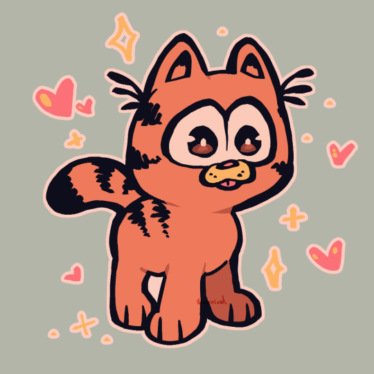
baby garfield added 10 years to my lifespan
#baby garfield#garfield#cat#garfield movie#artists on tumblr#digital art#ikarnival#ika's showtime#fanart
3K notes
·
View notes
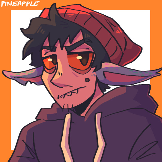
Text
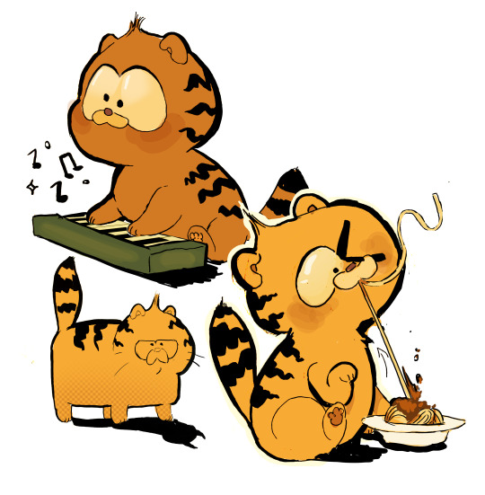
"what if garfield was an eldrich horrorfi-" what if he was a kitty who liked pasta...
#baby garfield#garfield#cat#garfield movie#artists on tumblr#digital art#ikarnival#ika's showtime#fanart
48 notes
·
View notes
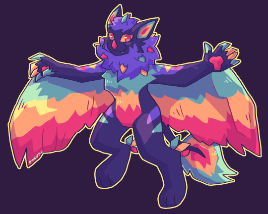
Text

Fourth attack! This one is for @ikarnival featuring their character Hex Grape!
Hex Grape goes by he/they pronouns so please be respectful!
#artfight#artfight 2023#traditional art#original character#anthro#ikarnival#other people's characters#Hex Grape#rabbit#dutch bunny#magical#pierce draws#mineral vulture art
10 notes
·
View notes
Text


first 9 art fight attacks of this year >:D
characters belong to spixxo, holycolin2015, ikarnival, missaroo, helmeyes, tytobitez, merpis, bleumoo, and xxshadowdoge99
link to my profile
22 notes
·
View notes
Text


Some of my art fights from this year including characters from
@cryptixotic
@porkchopphillip
@angel-inthe-attic
@kdoto
@ikarnival
11 notes
·
View notes
Text

gift for @ikarnival
132 notes
·
View notes
Text

Art fight attack on @ikarnival!
4 notes
·
View notes
Text

My first drawing of Loki! (designed obtained from ikarnival)
#art#artwork#myart#artist#oc#myartwork#original character#originalcharacter#myoc#myocs#furryart#furry#sfw furry#anthro furry#furry fandom#furry community#furry artist#artist of tumblr#artist on tumblr#furry artwork#furry art#my drawing#drawings#drawing#procreate#procreate art
4 notes
·
View notes
Text
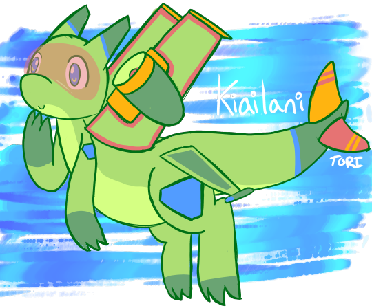
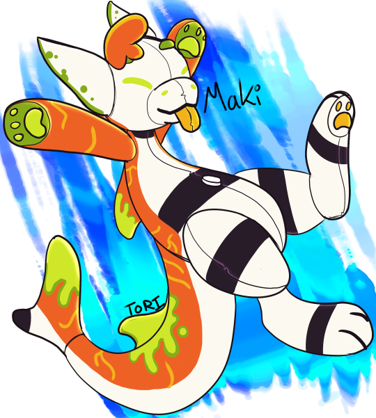


Oh yeah i have OCs
Kiailani the Airplane Dragon
Maki the Pooltoy Manokit
Namiki the Squid Dragon (designed by @ikarnival)
Aisling the Solarkit (species by @dont-jinxit)
these arent all of them but i really like these ones a lot <3
19 notes
·
View notes
Photo
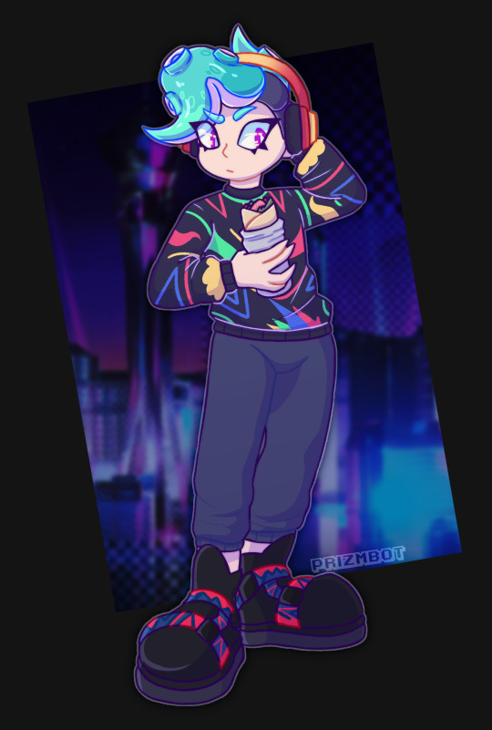
my part of the art trade for @ikarnival and their splatoon character Val! I love them so much, such a gay octopus I’d die for them.
#splatoon#splatoon oc#splatoon character#nintendo#nintendo splatoon#splatoon art#octoling#octoling art#art tag#prizmbotart
8 notes
·
View notes
Note
what/who are your biggest inspirations? :0

My team is full of really inspiring friends honestly, i love them all so much (site might be wonky, im rebuilding it soon asdf)
I also really enjoy these other cool peeps when i was on Twitter
@ikarnival (designed my squid dragon Namiki <3)
@piinkberri
@polygoncherub
@kitchikishangout
@dont-jinxit
@/Megasarts on twitter
@/ZipzapDidThat
@dreameleon
6 notes
·
View notes
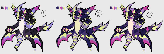
Text
how i make color palettes of my ocs before i pick one, an art tutorial?
hello, whenever i made a new design for myself i found a way to make lots of color palettes and pick one! i see this method more in paintings and rendering but not much on character designs? here are some examples i used that on.
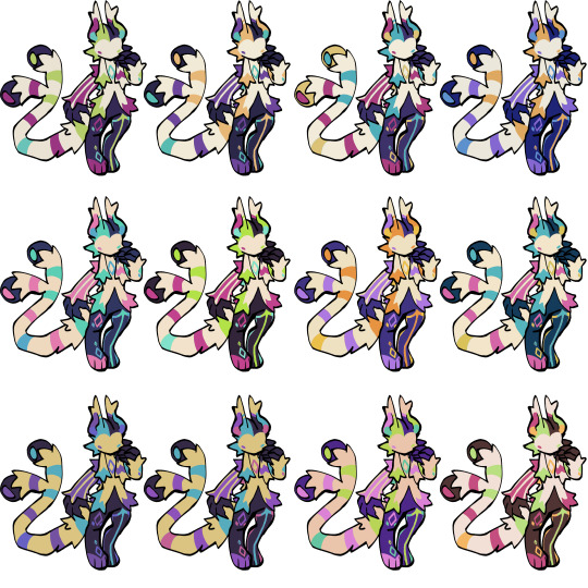
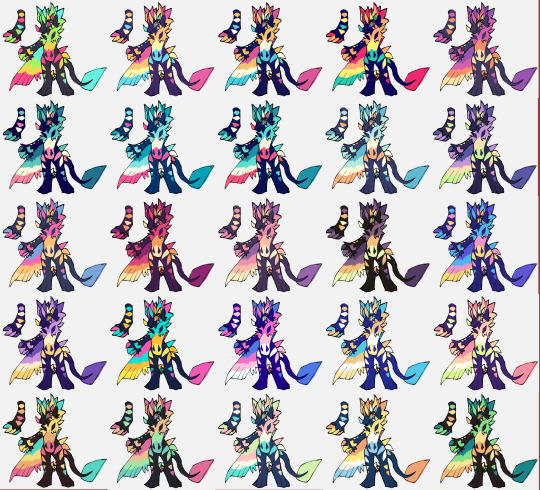
it helps me so much when i feel experimental with colors. here are what you need
a wip character design. sketchy or pixel art works better since the colors can have some anti aliasing issues
a program with gradient maps. i'm using clip studio paint but ik photoshop also has it. like i said this is used more on photos or paintings
and here's what you do!
draw your character. i'm making a new fursona for myself but anything should work.
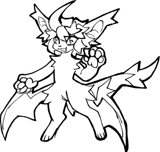
2. decide on their markings/color placement in grayscale. i recommend doing grayscale so you can easily see the values. split your grays into however colors you want. i like doing 5-6 the most. i reccomend duplicating the color layer if you wanna try multiple palettes.
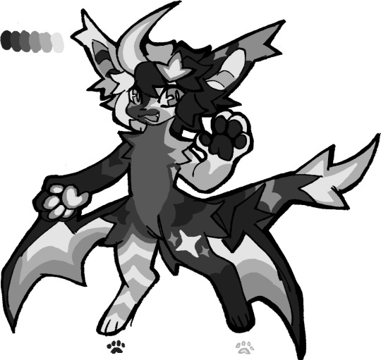
3. this part is program dependent but in csp's case go to edit > tonal correction > gradient map.
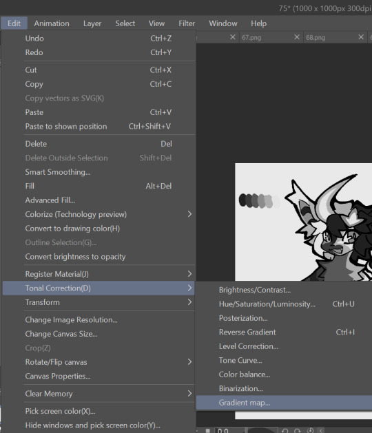
4. i made a few default 5 color gradient maps but if don't use gradients like me i reccomend making the graph like this so they become solid color. split the map into however many colors you used. i'll add a color to the red-orange one bc my character has 6 grays.
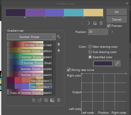
5. replace the colors by clicking below specified color. it all depends on your creativity and what you want. experiment til you like it.
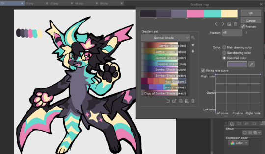
6. fuck around, try stuff, put them together to see if you like any of em. i made 9 to see if i can focus on one of them and i actually ended up loving the bottom right. it really makes them shiny
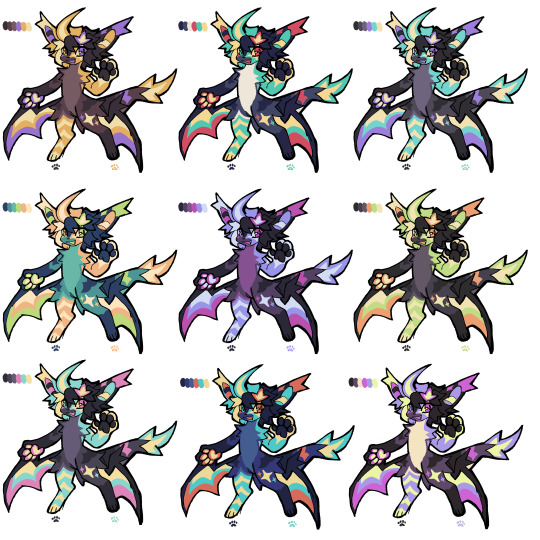
7. (optional) if you like a palette you can further and play with colors while keeping the palette. you can use color balance (in the same menu as gradient map in csp) or layers to mess around, have fun!
also a color tip because people seem to compliment that a lot in my art: digital art has millions of colors! don't be afraid of using wacky tones unless you're going pantone. if you want to get something physical i recommend being open to alternative colors as they tend to be more limited. i know whoever is doing it will try their best to keep the colors close.
color theory is something i don't...care much about mostly because this is something i'm doing for fun. i'll consider it in professional work.
#artists on tumblr#digital art#ika's showtime#ikarnival#art tutorial#art tips#drawing tips#art resources#clip studio paint
348 notes
·
View notes
Text
Friendly Fire for @ikarnival !
1 note
·
View note
Text

bnuuy to experiment colors with
#lopunny#shiny lopunny#pokemon#shiny pokemon#pokemon fanart#bunny#rabbit#anthro?#idk this mon looks like an anthro bunny#gen 4#gen 4 pokemon#normal type#digital art#artists on tumblr#fanart#ikarnival#ika's showtime
232 notes
·
View notes
Last Seen Blogs

kirstenrivera
Kirsten Rivera

mossy-green-aka-ferrythem
Some Guy Thing
i-appear-misssing
this is nothing like it was in my room
piratemadi
and thus, as always, to traitors
d1isky
my cool blog about whatever