#john workman jr
Text
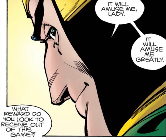
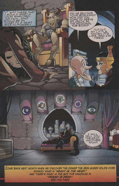
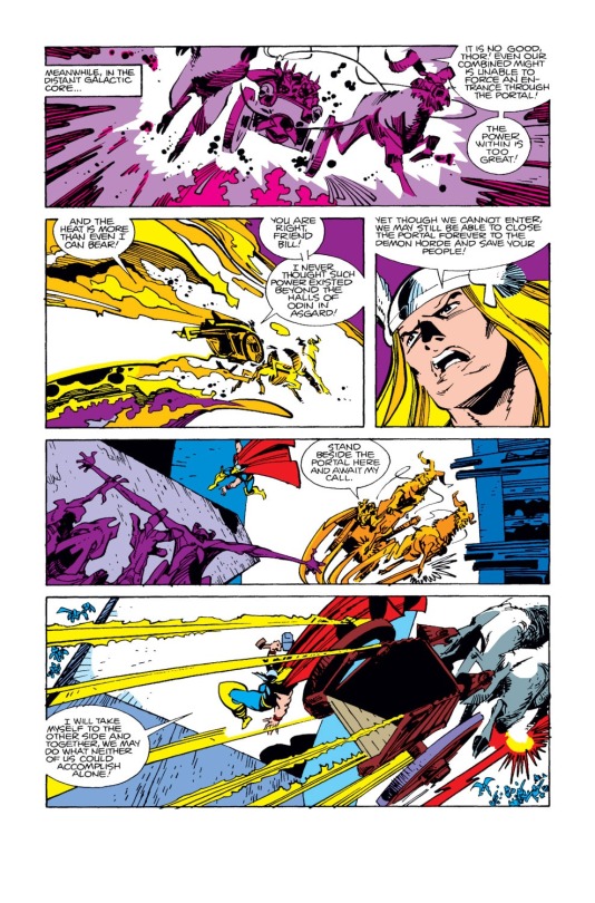
In their own way, Loki is deeply pure of heart.
Source: The Mighty Thor (1966) #340, by Walter Simonson (art and story), John Workman, Jr. (lettering), and George Roussos (colors)
#the mighty thor#loki laufeyson#loki laufeydottir#walter simonson#john workman jr#george roussos#I stand by this assessment
3 notes
·
View notes
Text


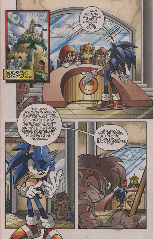
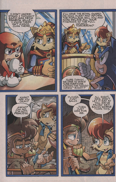


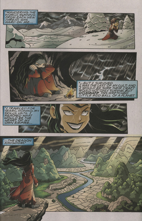
Sonic the Hedgehog #202 September 2009
"Dangerous Territory" (1-11 of 17)
written by Ian Flynn
pencil art by Steven Butler
inked by Terry Austin
colors by Matt Herms
letters by John Workman
"A Lonely Girls Story"
written by Ian Flynn
pencil art by Jamal Peppers
inked by Terry Austin
colors by Matt Herms
letters by John E. Workman Jr.
#sega#sonic the hedgehog#archie comics#comics#ian flynn#steven butler#terry austin#matt herms#john workman#john e. workman jr.#jamal peppers
2 notes
·
View notes
Text

Doom Patrol #78, "The Teiresias Wars Part Four: The Path of Vanished Alphabets" (1994) by Rachel Pollack (W), Ted McKeever (A), Stuart Chaifetz (C), and John E. Workman, Jr. (L)
18 notes
·
View notes
Photo

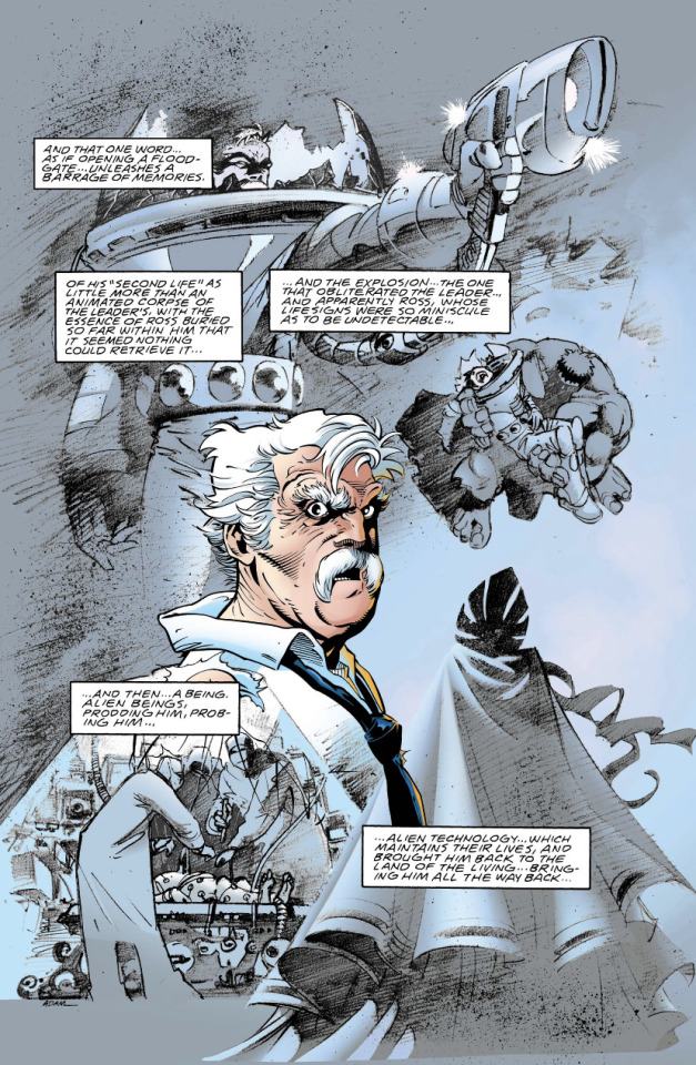
The Incredible Hulk #465 (1998)
#Marvel Comics#The Incredible Hulk#Peter David#dave brewer#andrew pepoy#matthew paine#john e workman jr#bruce banner#betty ross#betty banner#brucebetty
6 notes
·
View notes
Photo
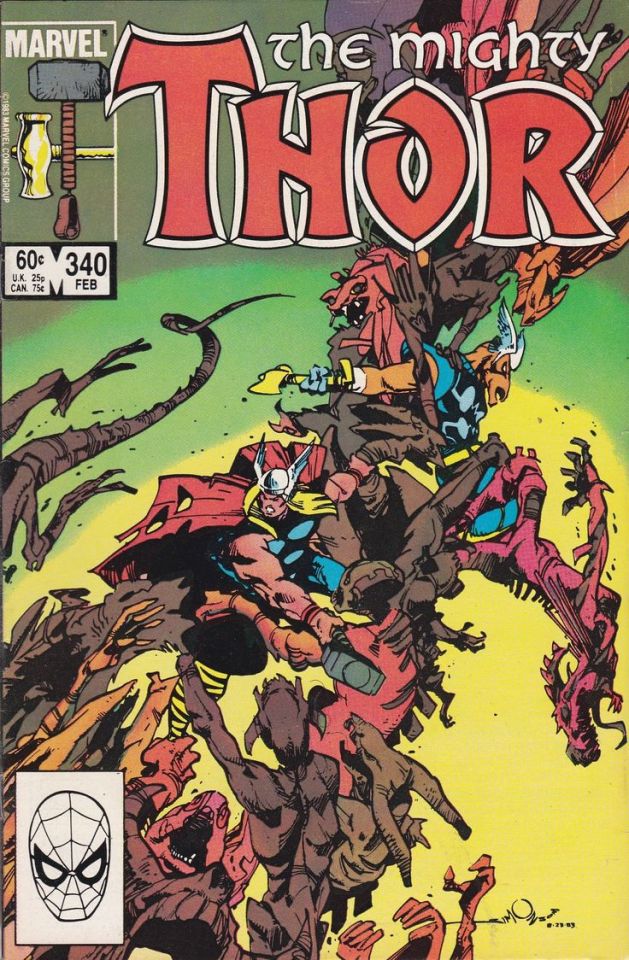

The Mighty Thor #340
by Walter Simonson, Georgr Roussos and John Workman Jr.
Marvel
13 notes
·
View notes
Text
Team Summit Motorsports Park Wins the NHRA Division 3 Team Finals!
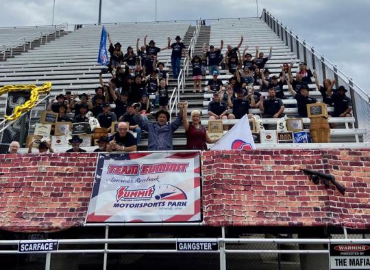
Thirty-two exceptional Edelbrock Super Series racers qualified to represent Summit Motorsports Park in Norwalk, Ohio at the North Central Division Summit Racing Series Team Finals, Sept. 13-17, 2023, at Lucas Oil Indianapolis Raceway Park in Indiana, and they all played a part in propelling the team to the 2023 Team Championship.
On Sunday, Jim Ring earned the win in Sportsman, which qualified him to race toward a World Championship at the NHRA Nevada Nationals, Oct. 26-29, 2023 at The Strip at Las Vegas Motor Speedway. Additionally on Sunday, John Boes earned the runner-up finish in Super Pro and Brandon Buchanan earned the runner-up finish in High School.
In a Summit Motorsports Park sweep on Saturday, Aubrey Collins won Best Appearing in Super Pro, Matt Ball won Best Appearing in Pro, Matt Short won Best Appearing in Super Bike and Scott Chitty won Best Appearing in Sportsman.
On Friday, Madie Fenn-Yasenosky won the Super Pro Bonus Race, Matt Ball won the Pro Bonus Race and Beth Hurst was the runner-up in the Sportsman Bonus Race.
The whole team, which rocked a Quarter Mile Mafia theme all weekend, featured Edelbrock Super Pro racers Jeff Fenn, Tim McGuire, John Boes, Austin Lenz, Lisa Boes, Madie Fenn-Yasenosky, Aubrey Collins, Greg Ross and Randy Scheuer; Edelbrock Pro racers A.J. Buchanan, Brian Green, Bryan Workman, Chris Howard, John Boes, Chuck Dague, Matt Ball, David Klippel and Robert Faurot; Wiseco/Cycle Tech Super Bike racers Craig Adams, Jason Keller, Ed James, Matt Short and Scott Sheppeard and Edelbrock Sportsman Delivered on Time by TFC Transportation racers Joe Galanek, Alyssa Galanek, Derek Simon, David Widmar, James Ring, Scott Chitty, Beth Hurst, Logan Buckley and Sandy Hensley.
“I am proud to say that Summit Motorsports Park has some of the very best racers in the country, and they continue to show that at every race,” said Bill Bader Jr., president of Summit Motorsports Park, who was joined by his wife, Jayme Bader, to cheer the team on all weekend. “The racers who worked hard all season long to qualify to represent America’s Racetrack at this prestigious race, and subsequently contribute to our team championship, proved what they are made of, and they deserve all of the attention and accolades they are sure to receive in the days, weeks, months and years ahead. We could not be happier, and this celebration will last a long time."
Summit Motorsports Park is at 1300 State Route 18, Norwalk, Ohio. For more information, visit summitmotorsportspark.com or call 419-668-5555.
Read the full article
0 notes
Text
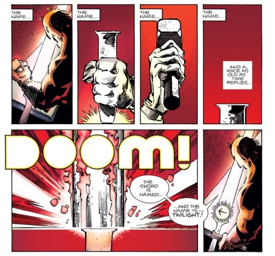
Just casually crafting the Twilight sword as a sub-plot. Very excited to see this relic in Doyle Dormammu's hands 🙏
Thor #343 (1984); Written/Penciled/Inked by Walter Simonson, Colors by Christie Scheele, Lettering by John Workman Jr
1 note
·
View note
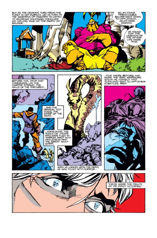
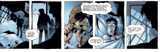
Text
As letras nos quadrinhos
Talvez o aspecto mais negligenciado das histórias em quadrinhos sejam o letreiramento (lettering, em inglês). Sabemos que as palavras são fundamentais pras HQs, mas não damos muita bola pra artesania envolvida no posicionamento dos balões, no desenho das letras, nas muitas vezes sutis escolhas envolvidas, por exemplo, na cor de fundo de um recordatório, e por aí vai.
Dave Gibbons, em seu livro How Comics Work, afirma que o letreiramento é como a trilha sonora dos filmes: se você percebe que ela existe, provavelmente algo está errado. É uma arte invisível, mas importante ao ponto de conseguir arruinar uma história, não importa quão lindos sejam os desenhos ou quão magnífico seja o texto.
Trago abaixo duas páginas de Thor #360 (1985), história escrita e desenhada por Walt Simonson, com letras de John Workman Jr.
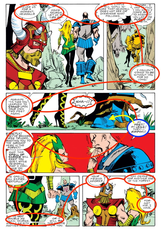
Percebam como o posicionamento dos balões nunca briga com as imagens: eles são sempre posicionados discretamente no topo, no fundo ou nas laterais dos quadros. Outra coisa que chama a atenção é como esse posicionamento torna a leitura fácil, confortável, natural e sem esforço. Levando em conta o "método Marvel", vou trabalhar com a pressuposição de que Simonson ficou responsável pelo posicionamento final dos balões, já que ele escreveu e desenhou a história. É bem provável que Workman tenha apenas "passado a limpo" as letras de Simonson já no balão pronto.
Mesmo quando o artista usa um truque como o do balão marcado com azul, nossa atenção não é desviada. É um recurso tão sutil que, sem perceber, invertemos a ordem natural (da esquerda para a direita) de "leitura" das imagens neste quadro específico: por conta do posicionamento da fala do Executor, nossos olhos são atraídos pra ele, depois pra mão da Amora, pro rosto dela e, finalmente, pros balões de texto na extrema esquerda, os quais, normalmente, seriam os primeiros a serem lidos. O posicionamento engenhoso de um pequeno balão nos levou a ler todo um quadro na ordem inversa da qual estamos acostumados. Isso sem mencionar a sutileza de conseguir posicionar, lado a lado no quadro, as palavras "My feet!" e o pé do Executor, que é justamente a imagem focal da página.
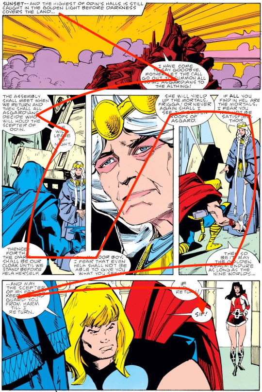
Na página acima, da mesma forma, o fluxo de leitura das imagens é amparado pelos balões, especialmente na imagem central da página, o close no rosto de Frigga. O posicionamento do balão no canto inferior esquerdo do quadro central, em conjunto com o balão seguinte, no canto superior direito, orienta nossos olhos numa diagonal ascendente, criando um efeito respeitoso, como se víssemos Frigga de uma posição inferior, o que condiz com a posição da personagem na história (ela é a regente provisória de Asgard naquele momento) e é realçado no quadro seguinte, em que Thor se ajoelha diante dela.
São duas páginas que mostram muito bem a arte sutil do letreiramento e a importância que o posicionamento dos balões tem para o sucesso ou o fracasso de uma história em quadrinhos.
1 note
·
View note
Photo

Thor vol.1 #369 (1986) - For Whom the Belles Troll...
#Sal Buscema#Walter Simonson#geoff isherwood#john workman jr#christie scheele#thor#marvel#1986#marvel comics#kossi#unn#gertha#troll#odinson
71 notes
·
View notes
Text
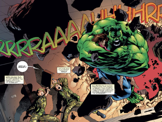
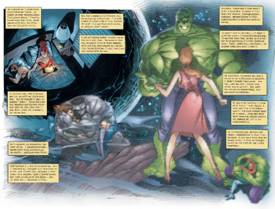

Just finished Peter David’s last Hulk issues from his original run, and they remain as moving today as they were more than two decades ago! Filled with beautiful art by Adam Kubert, Mark Farmer, and Steve Buccelato as well!
#peter david#rick jones#betty banner#thunderbolt ross#hulk#bruce banner#incredible hulk#adam kubert#steve buccellato#mark farmer#John e workman jr.#90’s marvel#90s comics
53 notes
·
View notes
Note
So is Superman: Year One done yet or what
All three issues are each the most Frank Miller shit in the world, each in totally different ways that clearly don’t belong together as a single story. It’s utterly bonkers, because the opening is for its sins still actually kind of a sweet little coming-of-age tale in spite of everyone talking like Frank the Tank only knows about Kansas from 1920s cartoons, then the second is the most off-kilter take on a college-age-Clark-Kent story anyone has ever seen which also reads like Miller weirdly apologizing for Holy Terror but not at all getting it, and the finale - in spite of Miller clearly having full creative and format autonomy - is visibly him going ‘oh shit, wait, I’ve only got one issue left?!’ and cramming in another miniseries-and-a-half worth of plot that reads closest to what you’d expect in the abstract of a comic called Superman: Year One, if that comic just stopped instead of ending and also was on so much cocaine. Neither fish nor fowl, offering neither the rat-fuck unhinged delights of the likes of All-Star Batman & Robin nor the blinding shock of realizing Frank Miller can in fact still write good comics of The Dark Knight Returns: The Golden Child, it’s not a comic I would emphatically recommend to literally anyone, but I can’t say it wasn’t one of the most memorable titles of the year for me.
John Romita Jr. innocent though, even if he does indeed draw kids with weird big heads and also sounds like an asshole in real life.
#Superman: Year One#Superman#Frank Miller#John Romita Jr.#Danny Miki#Alex Sinclair#John Workman#Opinion
21 notes
·
View notes
Text

I can only dream of being as loud and impactful as this sound effect…
Source: Thor (1966) #352, by Walter Simonson (art and story) and John Workman Jr. (lettering)
#not a villain#thor odinson#marvel comics#walter simonson#john workman jr#slowly reading my way through Walter Simonson’s Thor is teaching me so so much about lettering#and sound effects#what an absolute king
0 notes
Photo
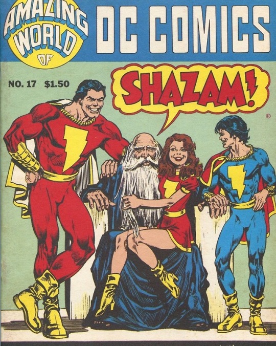
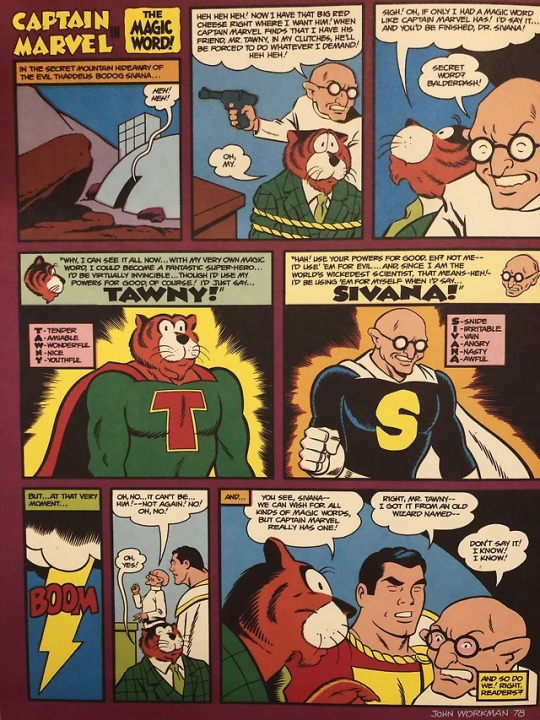
Vintage Magazine - Amazing World Of DC Comics #017
Pencils: Alan Weiss
Inks: Alan Weiss
Back Cover: John Workman
DC (1978)
#Vintage#Art#Illustration#Design#Comics#DC#DC Comics#Magazines#Amazing World Of DC Comics#Shazam#Captain Marvel#Captain Marvel Jr#Mary Marvel#Silvana#Dr Silvana#Tawky Tawny#Alan Weiss#John Workman#1978#1970s#70s
52 notes
·
View notes
Text
Doom Patrol #86, "Imagine Ari's Friends Part Three: The Cup of Knowing" (1995) by Rachel Pollack (W), Ted McKeever (A&C), and John E. Workman, Jr. (L)
16 notes
·
View notes
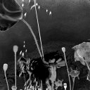
Photo
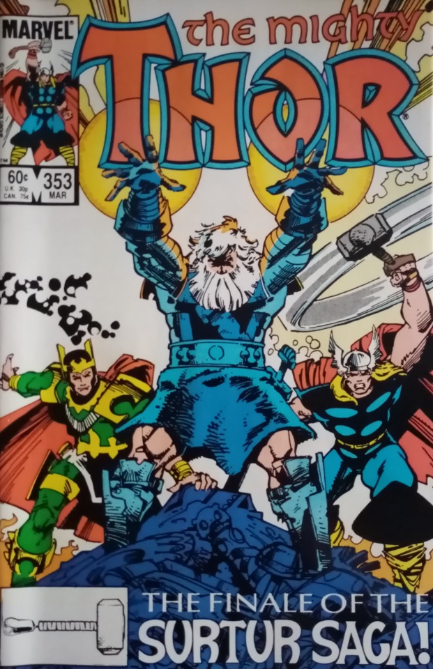
Thor Vol. 1, #353 (1985)
2 notes
·
View notes
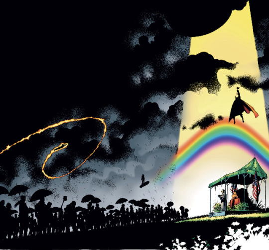
Text
Review: Superman: Year One #1
Review: SUPERMAN: YEAR ONE #1
[Editor’s Note: This review may contain spoilers]
Writing: Frank Miller
Art: John Romita Jr., Danny Miki
Colors: Alex Sinclair
Letters: John Workman
Reviewed By: Ari Bard
Summary
Iconic comic creators Frank Miller and John Romita Jr. give their take on Superman’s legendary origin! Superman: Year One #1primarily focuses on Clark’s adolescents as he comes to…
View On WordPress
#Alex Sinclair#Comic Reviews#Danny Miki#DC Black Label#DC comics news#Frank Miller#John Romita Jr.#john workman#Jonathan Kent#Lana Lang#Martha Kent#superman#Superman: Year One
10 notes
·
View notes
Last Seen Blogs
cosecaseacaso-blog
Levistico

born-famished-blog
Call me king, call me demon

ismariabaker-blog
Maria Baker

sakurapoolscans-blog
Sakura Pool Scans

ravespect0r
blogging like it's the 2000s