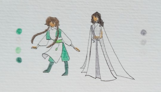
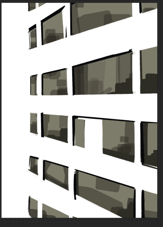
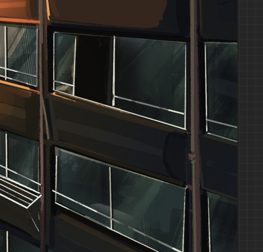
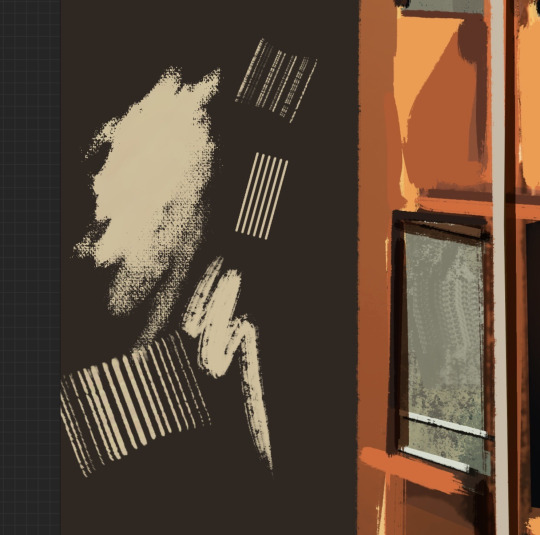
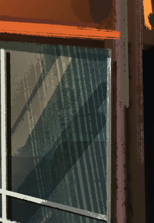
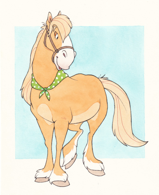
#just a reason to draw using a very pretty colour palette
Text

I'm back from the dead with no quality at all creations!‼️😘
someone better take ALL my drawing apps away from me or else I'll be making a whole ass summoning ritual.
"why are you like thi--" please don't ask. I don't know why either 😔
I swear I'll be drawing something sane soon...I just needa do thingz to keep me from losing my remaining brain cells.
on a sidenote; no, I don't hate akari. I very much love her actually! so much so that I'm willing to kill her off at any given moment<3
the ocs were not randomised. they're just my cherished 6 cuz they were my first moots;
@muitsuri ily, no questions asked. (precisely the reason why her and riri has the same linear color LMAOOO) 💕
@axolotl321 I ENJOYED DRAWING UR OC. I love the simplicity 💕
@tokito-dulya20 ur oc. I. love. ur. oc. BUT I DONT THINK I GOT THE DESIGN RIGHT..IM SO SORRY 😭
@silliestsakura urs had me the most conflicted, to say the least..i BALLED when I realized that the sketch from ur oc's school au didn't have a colour palette. the jawdrop dawned on me when it was too late and there was no more backing down..
@kiyokatokito AUAGAHAGA I WASNT SURE WHAT THE CURRENT COLORING WAS SUPPOSED TO BE CUZ THE OFFICIAL DESIGN HADNT BEEN RELEASED YET FOR AS FAR AS IM AWARE BUT--i just went f it and based it off @tokito-dulya20's artwork..
@cloudymistedskies I love mari, but I am NEVER drawing clouds ever again..(that's an exaggeration ofc, just for u I will)
yes, I drew all of this... monstrosity.
oh, and the reference used? .. i’m pretty sure that joke is well known, isn’t it? that one grave pic w a bunch of shtheads—
whoever would steal this? it's goofy as hell 😭
#❄️ 𝐫𝐢𝐫𝐢𝐭𝐬𝐮𝐤𝐢⎯⎯#❄️✏️⎯⎯#demon slayer#kimetsu no yaiba#original character#demon slayer oc#demon slayer x oc#kimetsu no yaiba oc#kimetsu no yaiba x oc#kny#kny oc#ds#kny oc art#demon slayer oc art#i think i got possessed by a demon#thats what compelled me to do this#send help
60 notes
·
View notes
Note
i love your korbat review! i hope it’s ok to request a color instead of a pet. could you review some UC grey pets? thank you!
(Similar to the species reviews, I'll do an overview of the color as a whole followed by my top three picks, plus a bonus extra least favorite.)

I'm not sure which member of TNT decided that there should be a paint brush for giving your pet clinical depression, but hey, I'm not complaining. I love neutral palettes, and the colour itself is super distinct—it would've been easy for this to just be a recolour ala silver, but instead they really went the extra mile in making it unique and distinct.
The only drawback to grey is that it has always been one of the colours impacted the hardest from customization. The entire point of the colour was less the palettes themselves (which are primarily, shocker, gray, sometimes with pink accents) and more the gorgeous artwork, which was incredibly expressive and sometimes outright beautiful. By making all the grey pets fit a rigid pose for customization, the colour ends up just being a recolour that happens to make your pet slightly depressed, instead of the full-on misery fest it used to be before conversion.
That said, I will defend customized grey pets a little—they do work as a great neutral base for customization and can look quite pretty when dressed up correctly. (Of course I, someone who has a converted grey Kougra, may be slightly biased.) Otherwise, this colour is best suited for UCs.
Favorite Species:
Yurble: The converted version is fine; it's not overly sad looking by any means, but that makes it a good base for customization. However, the UC version is the star here. What a fantastic design—the unfurled, limp ears are just perfection, and the long mane and drooping face are just wonderfully miserable. I also really like the pink eyes, which stand out nicely against the grey. The grey itself also has good contrast, with the dark eye markings really making the eyes pop.
Kougra: While this isn't the most interesting grey pet out there, I really like the overall look of the Kougra. The converted version doesn't look all that sad, but I like the subtlety stressed vibe and, like the Yurble, this makes it great for pets of any personality.
(Also, the customized version removes female Kougra's half-lidded eyes, which is a massive improvement across the board.)
Meanwhile, the UC is outright adorable, sporting a sitting pose, floppy ears, and an upward-looking expression befitting of a dog in one of those donation commercials. Once again, the pink eyes draw attention to the face, and the contrast between the shades of grey is good. I do think the stripes could've been a little drippy-er to really get that sadness down, but still, a very nice looking pet overall.
Acara: I was debating between the Acara and the Ixi for this, because I like both, but I have to go with the Acara for two reasons. First, the customized version looks pretty good—I appreciate the addition of tears to help make it look that much sadder, seeing as the pose is gone. It's not as neutral as some grey pets, but if you want a converted grey pet that still looks a bit sad, this is a good pick. Also, the pink ears and paws look lovely.
And secondly, the UC has a really neat thing conceptually wherein the horns are draped forward over the head instead of behind it. That's such a simple but fun visual touch, and like the UC grey Yurble's ears, it really helps to convey a sense of misery via the actual pet design. I also really like how it's leaning forward and looking up, like it's too tired to stand correctly. Great stuff.
Least Favorite Species:
Chia: Gotta give this one to the Chia. Even if you ignore the fact that it was made post-customization, meaning that there's no UC version to compare, it's also just really boring even by converted UC standards. There's no nice pink accents (unless you count the tongue), the hair looks fine, even the expression just looks more bummed out than depressed. I could've easily seen the feet being pink or the hair being mussy, or some deep shadows around the eyes; something to convey, well, anything, really. It's an alright customization base, but nothing more.
33 notes
·
View notes
Text

Here's Chloe's main miraculous design!
Naming Choice
The name she choses is Abeille Gardienne. Which roughly translates to Guard Bee, it may not be exact because I used a translater, since I can't remember any French.
There are two reasons why she chooses this name. One being that it's her literal role at this point for Dauge Noir and Mayura, she's guarding the akumas as well as them, therefore showing how they consider her a pawn in their game. An very important pawn, but a pawn none the less. The second reason being it's very simple and literal, which helps her to hide her identity. Her classmates and a good chunk of people around her believe that she's incapable of being anything but over the top and acting like a selfish, arrogant bitch. So by choosing something so literal it makes it seem like Chloe can't be Abeille Gardienne, because it's not her style.
Design Choice
Now you may be thinking she looks nothing like some Chloe would choose. And that, like her name choice, is the point. After Dauge Noir gives Chloe the bee miraculous back, Pollen helps Chloe research different bees, stating she doesn't have to be a honeybee. As well as this she's purposefully picking something that she would never wear, to make people think someone else is working with Dauge Noir, and it's not her.
I gave her sharp spiky armour to go with the whole guard theme. But also as another way to hide her identity because it's not something over the top, and a Queen-like outfit, so people think it's not her. Also to prevent people from getting close to her, so she's got spiked blades on her gauntlets, and on her pauldrons. I gave her armour some hexagonal patterns to associate with bees. And her skin is this pale teal colour in order to draw your eye to that area. Wings, because it's the bee miraculous. Also her eyes are dark black and the pupils are increasingly lighter shades of teal. I wanted this because I thought it looks cool, and if she's stood in the dark you'd see two little pricks of light. I also gave her mandibles because I think they look really cool, and bees have them, as well as the antennae. The bee miraculous is also in her hair, but I just changed the colours. Her hair is also a different colour and shorter to help hide her identity. After she gets injured, her design when using the miraculous doesn't change because she's so desperate to hide her injuries because she doesn't want anyone to find out so she can keep fighting and eventually get her parents back.
The Bee I designed the look after is the Neon Cuckoo Bee. I chose this bee because the colours are pretty and the total opposite of what she usually wears, so it's again helping to hide her identity. But also because Neon Cuckoo Bees are considered parasitic bees and they place their eggs with blue banded bees so their larvae feed off of the other bees larvae. As well as this some neon cuckoo bees can kill and replace the Queen of the hive. And at this point in the story Chloe is thinking some really horrible things about herself, like she believes herself to be nothing but a parasite that can't do anything but hurt others. So by choosing to look like a parasitic bee, it's her subconscious thoughts being shown to others, although they don't understand what bee she's looking like.
For weapons she has the spikes on her blades that can stab things, but also holds the venom that paralyses people when she uses venom. I didn't draw them here, but she also has a mace that has the same colour palette as her design. After her injury she also has the metal bar/spike that impaled her, so at some akuma fights the other miraculous holders see her just carrying this bloodied metal bar with her.
Powers/Story choices
For the powers, Chloe has venom, but also a power that allows her to control other people. I'm haven't fully decided how this secondary power works yet, I'm thinking mini neon cuckoo bees or flowers she can grow. So the bees would sting people, and the flowers would emitt a nice smelling perfume that makes her control people if they smell it.
When she's being Abeille Gardienne, she acts differently to when she's just Chloe. So she's more subdued and quiet. Only making grunts when fighting. Apart from when she has her breakdown on her birthday. Or when she occasionally has a conversation with someone. Again to help hide her identity. She will occasionally say bad things about herself if she gets brought up by another miraculous holder so it appears if she's another person. However her saying all these horrible things about herself doesn't help her already failing mental health.
Another thing, is that when she gets the bee miraculous, all the other miraculous holders (Dauge Noir, Mayura, Cat Noir, Rena Rouge, Carapace and Ladybug) have had their miraculous for at least a year. So they all have way more experience than her. That's why I gave her the mace, so she's relying on brute force and the akuma to get through the fight. Then after her injury it's even harder for her to fight, but she's still forcing herself to do because of the forced deal. Post-injury it's not uncommon to find her coughing and spitting up her own blood and she's often clutching her side where she was impaled, during akuma attacks.
You might also be thinking why I didn't choose Lila as Hawkmoth's helper. Well one because it's a Chloe-centric story, and it's more hard-hitting with Chloe. The second reason is because it makes more sense from Gabriel's perspective for the rewrite. Sure Lila may appear to be smarter and a better manipulater than Chloe, but Gabriel knows nothing about Lila. So he has no way to keep Lila loyal to him, whereas with Chloe he's known the Bourgeois's for years so he knows what makes Chloe tick and can keep her loyal by using the one thing she desperately craves against her. It's even more shitty of Gabriel to kidnap Audrey and Andre because it's just after Audrey and Andre start fixing their relationship with Chloe. This also leaves Chloe vulnerable to the public's negative opinions of her, and her parents are their to protect her. Therefore Chloe never gets a break after Miracle Queen, because she's being bullied in her everyday life and when she's Abeille she's being blackmailed by Dauge Noir with the threat of her parents lives being used against her. Most of her classmates and the school (apart from Sabrina and Adrien) turn to bullying her or straight up ignoring her.
Despite working for Dauge Noir and Mayura, Chloe does have moral code when she's Abeille. She won't go after civilians and when the akumas go after civilians she'll purposefully attack the akuma or put herself in the way so she'll take the blast. This usually infuriates Gabriel, and doesn't physically help Chloe because it sometimes tears the stitching of her side and hurts her alot. She'll also drop everything if a child and their parents ends up in danger solely because she doesn't want anyone to experience being without a guardian like she is. She considers the miraculous holders (apart from Adrien after she finds his identity) and the akumas fair game because they have the power to defend themselves. Also when she's up against the akumas and miraculous holders she's the weakest out of all of them because of lack of experience and her poor physical/mental health.
Over the course of the rewrite, a few people do find out Chloe's identity. Sabrina, Adrien and Miss Bustier find out Chloe's identity as Abeille because she ends revealing herself to them. She transforms in front of Sabrina because she's stuck in the room and could only get out by using the extra strength the miraculous provided, and she wanted to get Sabrina somewhere safe. Whereas with Adrien they end up fighting alone with each other and fight until the timers run out on both their miraculous. With Miss Bustier it happens during school on a day after her injury when she's alone because Sabrina is ill and Adrien is at a photoshoot. She accidentally detransforms in front of her because she's too exhausted to keep it up, due to her using the miraculous to hide her injuries.
Butler Jean, on the other hand simply figures out Chloe is Abeille because she's frequently disappearing when akuma attacks occur. Audrey and Andre also do figure out Chloe is Abeille because Gabriel as Dauge Noir couldn't keep his mouth shut and tells them, to see their reaction to him kidnapping them solely to blackmail their only child.
Sabrina and Chloe become better friends after Miracle Queen. With them hanging out more and Chloe doing things Sabrina likes, like watching ridiculous amounts of magical girl shows. Chloe truly cares for Sabrina in my au and after they repair their relationship, they start dating. Adrien also stays with friends with Chloe and they both have a close sibling-like bond. They relate to having to hide their identities, and when they head to akuma battles he discreetly helps her because after her injury she can't see out of her left eye. They also sit and binge watch horror movies. Together Chloe, Sabrina and Adrien with Pollen and Plagg help figure out Gabriel and Natalie's identities and confront them.
During this, Chloe starts to watch horror movies as a way of coping with her situation. She finds horror movies with supernatural monsters quite relatable in a way since she's now dealing Dauge Noir and Mayura who are quite otherworldly and etheral in their own ways. She gets into the first two Hellraiser films because the colours of Pinhead and Dauge Noir are similar. She also gets into cooking because of needing food for Pollen and to keep herself awake, so Jean helps her with cooking. Another hobby she learns is photography as another way of trying to cope, by trying to make the fleeting memories last. Another reason she starts doing photography is so if she ever finds her parents she can show them what she's been up to so they're not completely clueless as to what's happened over the time they've been missing.
I think either Andre or Audrey will be the next redesign up. Since I want to finish the Bourgeois family first and I've made some important changes to Audrey and Andre, then do the others. I'm really excited to do Gabriel's design though. I don't know when I'll get the next redesign out though.
#miraculous ladybug#chloe bourgeois#mlb au#ml au#miraculous au#miraculous rewrite#ml rewrite#mlb rewrite#ml redesign#miraculous redesign#mlb redesign#ml fanart#miraculous fanart#mlb fanart#miraculous fanfic#mlb fanfic#ml fanfic#Such fickle things au
36 notes
·
View notes
Note
Oh ho ho, now I'm curious, do you have any refs for anyone that might want to draw your OCs? Pictures or specific descriptions or anything of that sort? Just curious...
Thank you for the ask! I'm so glad it interests you!!
Well You See: I'm an artist. I should have references lying around. But if I were to present them, it would be some super sporadic stuff bc I never got around to drawing MOST of my ocs, for some reason...
That being said, I have a few things lying around. I'll post it here and maybe update when I make more.
(Also, I know the digital drawings suck. I have 0 experience with it. I am Trying Very Hard)
This is gonna be Long, so buckle up.
Dystopia WIP:
This WIP was originally concieved at a graphic novel, so I have a few drawings - especially a few rough sketches mapping out outfit shapes and colours. Let's go through the main cast:
Veta, Vi and Veo (aka the Communist Polycule):
Veera:
Alexis Ivanik:
Cristover (left) and Nester Kalenev (right):
I have a post explaining the significance of most of the colour palettes of the 3 WIPs here
Notes on the characters:
Nester, Cristover, and Vi are all guys. They're wearing skirts bc they're Fashionable. Vi has a beard
Vi's outfits are inspired by traditional portuguese costume
idc what you do with Alexis, they NEED to be wearing extremely over-the-top eyeliner at all times
Devourer of Souls:
So here is the Thing. Most characters in this WIP being female is a very recent development. Almost all except for Flick used to be guys. So the only pic of Seth is her as a man. Literally just picture her with longer hair and it's almost accurate.
Seth (very zoomed into a drawing I once made):
(pls don't forget that she's a cane user)
Flick (the people on the sides are Allana and Hunter, the two souls their body houses):
Notes on characters not pictured (Jane and Theo):
Theo and Jane are technically twins, and they have a Snow White/Rose Red motif
Theo has bright red eyes long white hair in a huge braid. She wears all white tends to prefer overalls
Jane has short red hair and white eyes, the inverse of Theo
Black and White
Considering this WIP is my main one and the one I've had the longest, I have shamefully little material on it that I like. And also, I've already reaches the limit on pictures I can post.
I mean, my icon is a drawing of Darius, and there's also the Great Reyna Picrew Show-Down, but otherwise? Almost nothing. When it comes to descriptions, it's kinda vague ig? But let me kinda compile a little bit. Here's the most relevant characters in order of appearance:
Johann:
[...] He was significantly older and dressed much more presentably. His deep black suit had a refined and expensive-looking cut. He carried an old walking stick, which might have been in fashion in the previous century, to complete the look. Besides that, he had a box-shaped camera hanging from his shoulder. His hair was almost completely grey and perfectly combed, which made him look organized and important.
When he walked closer, Darius noticed the strange shine in his eyes, his crooked nose, his lively smile. There was no doubt. He looked like all the pictures he'd seen. [...]
August:
He would almost be a perfectly normal person if not for his height. He wasn't a giant, but he had a considerable advantage over most people, although not at the expense of any muscle. His hair was longer than one would normally see in a man, almost shoulder-length. Otherwise, he looked pretty average, dressed in a half-opened shirt and very tight trousers. He couldn't decide if he should categorize him as "weird" or not.
Extra note: he wears a glove on his right hand that he never takes off. I once made a joke about the glove staying on during sex and it's 100% true.
Reyna:
[...] The girl was absolutely enormous. He'd never seen anyone so tall. She was taller than August, who was almost a giant himself. Even without heels, she was taller than anyone he'd ever met. And besides that, she was dressed quite scandalously. Her red dress barely reached the middle of her legs, leaving part of the knees exposed. The skirt was made of various layers of light fabrics, like chiffon and tule, all of them ending in excessive frills. It looked like a flower upside down. The dress had no sleeves, being held in place solely by two thin straps covered in glitter, reflecting the light of the sun. All of her seemed more suited to a burlesque show than a circus.
Diedrich:
His red hair, tied into a ponytail, fell down the side of his neck, like a small flame. He wore a crisp black suit, like any common man would. [...]
I can't believe I never actually described Diedrich. I know he's a POV character but still, wtf??
I mean, I guess there wouldn't be a point in describing him from Darius's or Reyna's POV because Darius spent years collecting pictures of him and Reyna has seen him every day for the past 5 years. But if you want an age range, he's 50 in the main story, just like Johann.
You know what? Hit me up if you want a drawing or better description. I'd be happy to do it for you, if you wanna actually draw him.
(if you're wondering why the descriptions are so weird about fabrics, it's because this is narrated by Darius and he's a tailor - he's really into sewing)
As for Darius himself, he's only ever described as "looking like Alphonse". And what does Alphonse look like, you ask? Johann describes him in relation to Diedrich (a description we don't have), and Diedrich feels no need to describe him because he's literally his son and he's known him since he was born. I need to fix this, holy shit.
Anyway, I hope this gave you better insight into how (some of) my ocs look! And I hope you had fun looking at sketches, zoomed-in pictures and 1 (one) fully fledged illustration of Flick.
Also, feel free to ask if you need more info! I can add it here to paint a more complete picture.
#this took WAY too long to compile#but it's nice#maybe I'll update it and make it a masterpost#who knows#writing#writeblr#my wips#black & wip#asks#the dystopia wip#devourer of souls wip#oc reference#my art#the images are behaving weirdly in the draft PLS HELP
8 notes
·
View notes
Note
Omg Lolly the first 6 minutes were uploaded in better quality by someone and include a few extra seconds where all new outfits except Luz's are on screen (presumably this shot comes after the intro montage but was cut before it for some reason?!)
https://www.youtube.com/watch?v=w8ovrHvJQg4
I have a hunch you'll like Willow's new look :D
Head full!!!! Thoughts many!!!!!
(Okay there's been another leak situation today but we're not gonna talk about all that here. I'm not sure if that quick second after the montage counts but I think it's alright to show since its not spoilery and we all kinda knew what the new outfits would be anyway. But just to be safe I'll put it under the cut.)
Willow flowy cardigan real!!! Its so pretty!!!! Thank god that shirt is a yellow rather than orange, that's so much nicer. I was iffy about the look before but now that I think about, she's really giving off autumn-vibes with this colour palette. Fitting. I think my least favourite part is the little leaf on her shirt (Willow has been playing animal crossing :D!!) is navy. Its throwing me off for some reason. But that's not a huge thing. Overall girl is DRESSIN. Love you Willow.
She's a shutterbug now!! That's adorable!!! Love the idea of Willow using photography as an outlet. Snapping shots of her friends and the palismen to express how much she loves them and pinning them by her bedside. Taking pics of human realm plants and wildlife and sunsets and rain and whatever else she finds beautiful and saving them to show her dads when she gets home.
Also...I have a strong feeling this is gonna be plot relevant...Willow's gonna snap a pic and there's gonna be something Weird in the background, I know it.
(Also we got those drawings they did of their families in high def and I just...she wrote "We're fine, Willow!" next to her dads. I wanna cry. Little Miss "not if I never look down" strikes again.)
ANYWAY there's other stuff to talk about here.
Unsurprisingly Amity looks FANTASTIC!! I love her outfit so SO much. She's such a fashion queen. Gus too oh my god!!! I love his jacket and his bracelets and he's wearing the little amplifier thingie as an earring!!! We love him!!!!
GOOD AFTERNOON TO HUNTER'S PANTS. This outfit was shown in the concept art for the panel and it mentioned that he sewed the patches into the knees himself. Sewing Hunter real. This puts the image in my head of Camila buying some extra clothes for the kids and she gets Hunter some ripped jeans cuz she's like "I'm pretty sure that's what teens are into right now." And Hunter grits a smile about it but he fucking hates them ("why the FUCK would they sell pre-ripped pants??") and takes it upon himself to fix the issue.
I love that Vee is here and helping in the portal process. I knew she'd be present this season but I didn't expect her to have such an active role in the kids efforts to get back home. But of course she's helping!! It's been months and they've bonded!!! Those are her friends!!!
It's so cute how the kids have clearly personalised the old shack to make into their own little hangout spot. The plants, the fairy lights, the pictures, the mirror the corkboard, the cooler, the attempts at wallpaper, the beanbag, even a fucking BASKETBALL HOOP. This is their place. It's absolutely for very serious portal constructing and plotting but they've clearly had a lot of fun over the months here.
Little bed for the palismen 🥺
Also...Flapjack keeps pecking at the floorboards. He was doing it in the montage too. There Is Something Under There and It Belongs To Caleb.
Anyway one shot. Yet so much to say. I love them all so much.
45 notes
·
View notes
Note
I love the different hairstyles and outfits you give Velvette! How do you come up with them?
I tend to do a lot of research into things cause I have far too much free time LOL(I also just generally love learning about stuff like this for character designing it feels very fruitful both in terms of knowledge, results and helps to strengthen a design). Queer history, fashion dolls, protective hairstyles, current & past fashion trends etc, all of these sorts of things I look into and consider how Velvette as a character would approach them. I know we know legit nothing about her yet and I'm worried we won't be knowing much in the program either, but I have my own headcannons as to how she approaches her appearance, fashion and the importance those aspects hold in her life. I see her as someone who's flexible and able to adapt as the time moves, given why she's stayed on top of the social media empire as the Overlord of it(Assuming she even is the Overlord of that anymore) and someone who isn't afraid to be their pure, unadulterated self. She's queer, trans, black, highly feminine and completely proud of those aspects about herself hence why she takes the extra time to make herself put together in cohesive & trendy outfits, show her culture through her hairstyle and decorate it accordingly to match her love for femininity with her charms, purses, hair accessories and makeup. I know some people would read that as vain or stereotypical, but given the hardships any openly queer, trans or black women go through in their life, Velvette has made it on top and has full right to be herself no matter how much that angers people. As a little side note, I also like to headcannon that she grew up in ballroom culture during the 80s and 90s where she was silenced a lot as many people were back then, yet another reason why she's proud to be herself and why she ended up as a doll in Hell because the term doll has often been used by trans people to refer to one another. I've taken inspiration from the lives of those who came out on top of adversaries, but given it the kind of twisted Hazbin spin to make her feel at home with her two evil bffs Val & Vox hence the hint of edge in her design with her sharp eye makeup, insistency to always wear platform shoes and the more gothic colour palettes she tends to lean towards. At this point it's basically an OC with how far she is from cannon, but I'd just love to see her be her own person in the program and get to explore these kind of aspects about her life rather than be third wheel to Val and Vox(Don't get me wrong I love them both, but she deserves time to shine).
TLDR: I love pretty women and she's gorgeous so I draw her looking cute
2 notes
·
View notes
Note
🏆 🐶 💤
hi. i'm going to be so normal about this. (← absolute lies, i'm talking about 💞grover💞-)
🏆: What would your F/O consider to be a "perfect day"?
this one took forever to think of tbh, but i decided that something congratulatory and fulfilling would probably make him really happy! sleeping in, waking up to a nice meal, something familiar and cozy like homemade pancakes and cream or omelette and toast... going out to do something lively like dancing or paintball-- then later in the day off to a sweet, fancy date in some quaint restaurant, chinese or italian food would hit the spot! the two of us hit up some stores to window-shop before going home, too. then cuddling at home, watching a movie on the couch and falling asleep in my arms knowing he has nothing to stress about the next day... yeah, that's a perfect day <3
🐶: Is your F/O more of a cat person or a dog person?
in terms of pets, he'd prefer a housecat, but i don't think he's that bothered about either-- he just prefers a more cleanly animal that isn't as physically demanding, though if he had the time he'd probably love to have a big ol dog too. definitely biased to cats tho (← NO reason /hj)
💤: What does your F/O wear for pajamas?
i gotta start this off by saying this man has THE most coordinated wardrobe of all my f/os— fits for DAYS and all in the same colour palette because he's just Like That. all this to say: 👏 seasonal 👏 pyjamas 👏 — or at the VERY least different ones for spring-summer / autumn-winter. super soft thermal button-ups for cold seasons, pink and white plaid-- oh, and slippers! definitely slippers. for warm summer nights he needs light clothes sooo *AHeM* lil pink shorts oh my goooddddd- probably some pretty, pastel tank-top and boxers combo but like. it'd look so adorable. i need to draw this now i NEED TO DRA-
#this took a hot minute to answer but im. being ao normal about this i swearrr#🪽 || cupid's game#💌 || q&a#⚖️ || as your lawyer and boyfriend
0 notes
Text
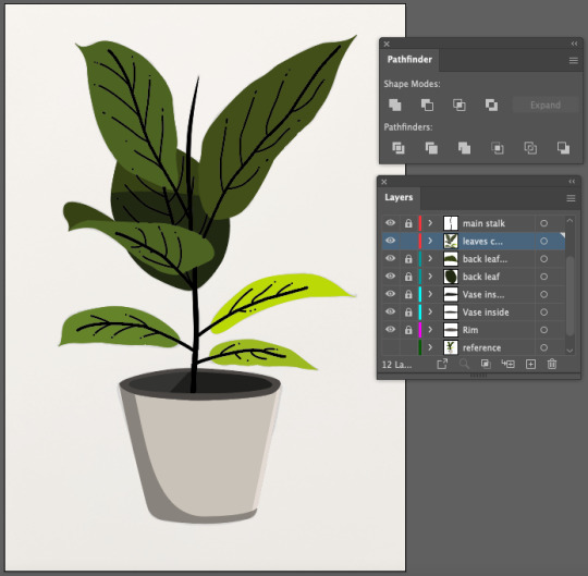
Fundamentals 1: Week 8
26th April
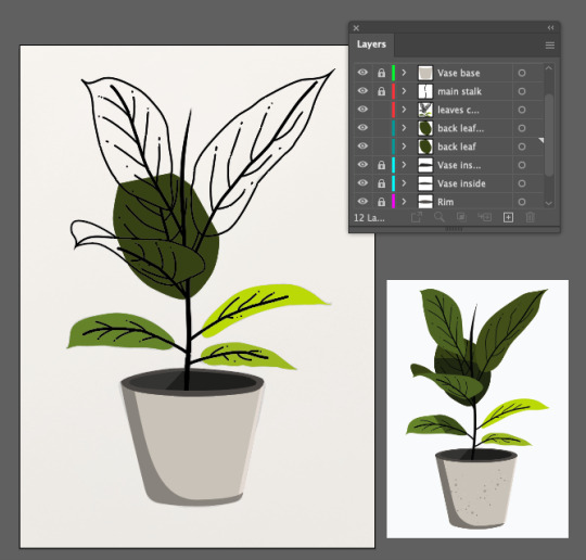
In this week's class we were given a homework task to recreate two drawings of our own choice on Illustrator. The previous post showed the first piece which was a silhouette-style drawing but we then had to choose a second piece that had colour and more specifically some elements of shading. I wanted to challenge myself and make sure I wasn't choosing a drawing that was too simple as the silhouette one was quite easy to do. While I had still had the theme of plants in mind I decided to use this illustration for my second piece.
Already I could see that I'll needed to be really organised with my layers as the pot and some leaves have multiple layers of colour but I was also confident in my abilities to execute this well. Due to the amount of colours layered on top of each other to create the shading on the illustration I realised that I'll also need to use my Pathfinder palette quite frequently. Luckily I got to use that a bit for the previous work. The first thing I need to do is draw the illustration on a piece of paper and map out where the shading outlines are, here's how it turned out:
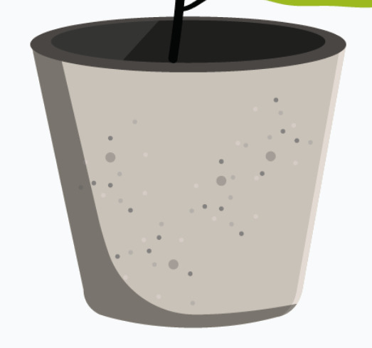
It was a fairly simple drawing to do which was a good start. I mapped out the shading outlines with a dotted line to avoid confusion with the actual outlines of the illustration. By this point I felt like it would've been difficult to draw on the anchor points and handles on top of my drawing as there are so many lines in the drawing which also wasn't on a very large scale, so I decided to skip that step. The next thing I did was take a photo of the the drawing and transfer it on to Illustrator. I set the opacity to a low level where I could see just enough of the referencing drawing to follow as a guide. I decided that I should draw all of the outlines first before getting into the colour. The first/easiest part of the drawing was the pot.
The pot wasn't too complicated as it only involved a few shapes which were easy to draw. The only tricky part of the pot was making sure that each side of the pot was symmetrical. I also realise now that I could've used other tools on Illustrator to make it symmetrical but I think I also enjoy the imperfect side of drawings so I was happy with how it looked. I think I'm pretty much just going in the order of what is the easiest/ simplest part to do firs then going up in levels of complication. The next thing on my list was the stalk in the middle of the plant. This was fairly straight forward but I realised I will have to either have seperate sections of the stalk or have the full shape and make sure that I have it in the background behind the leaf that is seen in front of it. I decided to keep the two halves of it as seperate shapes.
The last major step for the outlines was the do the leaves! This was actually quite fun until I reached the top half where I felt a bit confused on how I would draw the leaf that is underneath the other three leaves. For the meantime (for some reason) I decided to just simply draw the lines and when it comes to adding the colour later on I will be able to close the shape and have a better understanding on how the fill and layering will work.
So here's my completed outlined plant! Pretty happy with how it looks and I'm excited to start getting the colour on it. The only lines I didn't do were the shading lines, I think what I'll do is fill the whole shapes and then draw the shade outline while using my pathfinder to cut out the sections that I need. The first thing I did was fill the stalk in black and I also selected the stalk-ish parts of the leaves (lines in the middle) and increased the stroke size to make them look a little bolder than the rest.
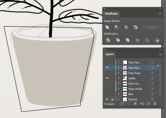
The first section to get coloured was the pot, as I felt more comfortable starting with this for some reason. I selected the outline and used the eyedropper tool to get the same colour as the pot from the original photo and quickly realised that the whole area would be this colour. But, this won't be a problem as I can use layering to make sure that the colours for the inside of the pot are simply positioned on top of the colour for the base of the pot.
Above are images of how I created the shadow on the pot by using the Pathfinder tool. You can see that my layers palette is growing already because I make sure that each seperate piece on this pot has its own layer (by using copies of the original pot layer), this makes it so much easier to rearrange them in the correct order. The next part was a bit hard to wrap my head around which was the inside and rim of the pot. I had to readjust my shapes that I created in order to get the colour fill into the right places as I was a bit lazy the first time around.
Once I had that sorted out I went and used the eyedropper to get the first two colours on for the rim and for the inside of the pot. I realised that trying to use pathfinder to cut into a shape with all of the different colours/ sections showing was actually a bit confusing so I get rid of the rim colour so I could focus on creating the shadow inside the pot first which you can see below.
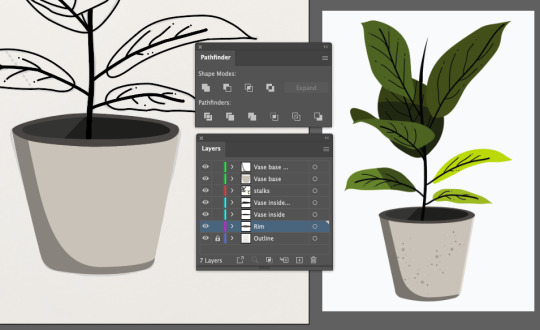
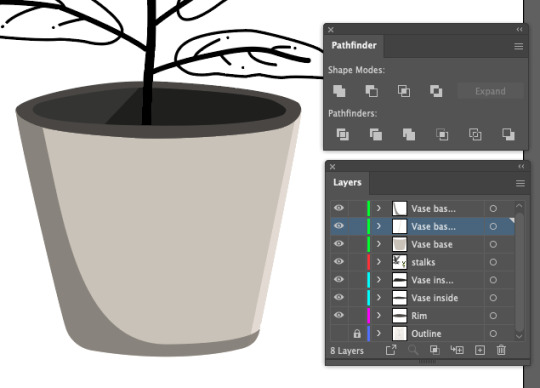
Once the shadow was looking good on the inside I placed the rim colour back on and the pot started to look a lot more like a pot. Was actually really excited about how good this was looking already and that I was feeling confident with the tools that I needed to use in different parts of this whole process.
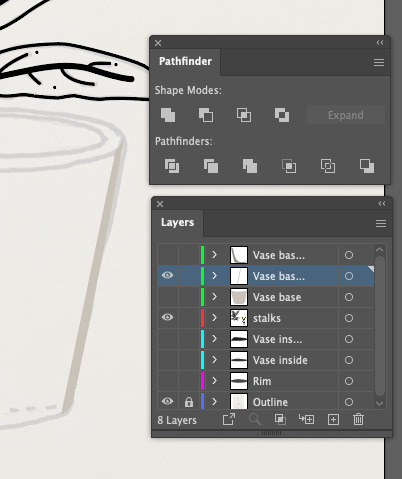
I did notice that I was actually missing a little highlight on the right side of the pot and felt it was necessary to add in so that I could have the complete look. Below you can see the process of using Pathfinder again to cut out the desired shape and then positioning that layer appropriately so that it shows on top of the pot.
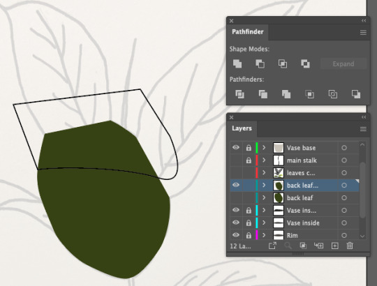
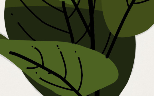
Now that I felt like the pot was done, I moved onto the leaves. The first few were super easy, using the eyedropper to get the right colours and just making sure there was no black stroke after adding the colours. Below you can see that I've reached the leaf that I was not in the mood for, as I needed to add a shade - but to be honest by now I've realised that its not actually that hard.
The first thing I did was turn off the leaves outline layer and the stalk layer so that I could just focus on this shape alone (the original hand drawn art is on low capacity in the background for tracing). Below you can see my process as I closed up the shape by just drawing straight lines where I knew the leaf was going to be covered by the leaves in front of it. I used Pathfinder to cut out my shape and added the darker colour in.
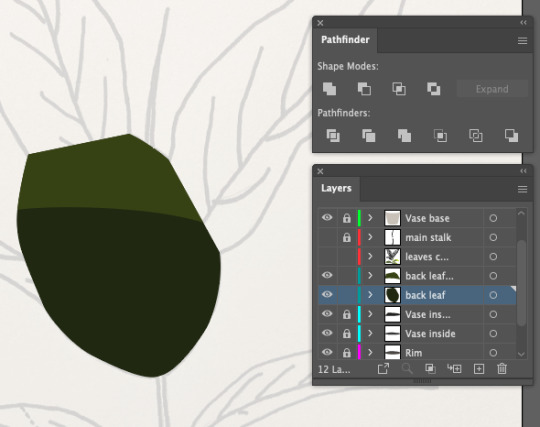
Once i was happy with that I turned the leaves and stalk layers back on and continued filling in the top two leaves with the appropriate colours.
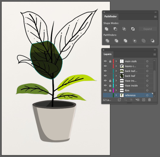
Although it looked finished I zoomed in and checked all the details to make sure everything looked tidy. I then noticed that a few black lines from the background leaf (seen below) were overlapping onto the front leaf. In order to fix this I just used the eraser tool on the selected lines as I felt that because it was such a fine detail that I shouldn't worry too much and just erase the small bumps with a simple tool.
The last thing that I wanted to do was go back to the pot and add the concrete-like texture which I noticed is in the original image. I liked the look of it and felt it would make my illustration look more complete. This process was pretty simple, I used the eyedropper tool again to get the right colours and roughly followed where the dots went and what sizes they were when putting them onto my pot.
So that's it. I've finished! The two images below quickly show that the comparison is almost identical which I'm really proud of. My illustration is on the left with the reference image on the right. Looking at it now I realised that I missed one little piece of shading on one of the bottom leaves BUT I am so happy with how it looks that I'm not entirely bothered by it.
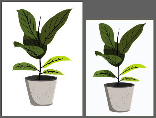
Although I put off this homework task for a bit too long I actually really enjoyed doing it and having the freedom to choose my own images to work on - I think that made me become a lot more invested in the outcome and making sure I understand the processes inside an out in order to do a good job. This task as well as the silhouette task both gave me a lot of confidence in being able to recreate an illustration in Illustrator. Even if it is a simple trace of an outline, I'm glad I can use that skill to fall back on if I need it and hopefully it can encourage me to improve my art skills so that I don't always need to trace images. This task also helped me find the fun in design. I currently see design as homework and lectures and assignments so having this opportunity to create something fun and interesting is encouraging me to try do more of these little illustrations in my own time. It would definitely help me refine my skills as I am about to move into branding in the second semester so I feel that having some confidence in my design skills will make a huge difference. Looking forward to making more fun illustrations in the very near future!
0 notes
Text
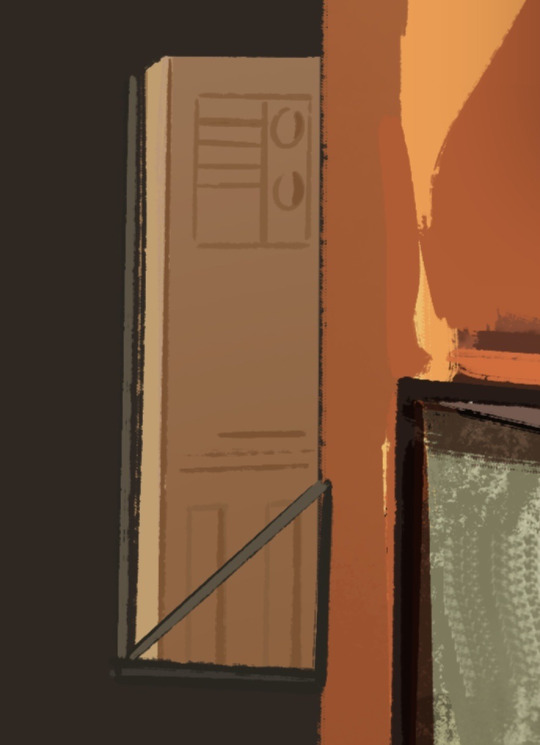
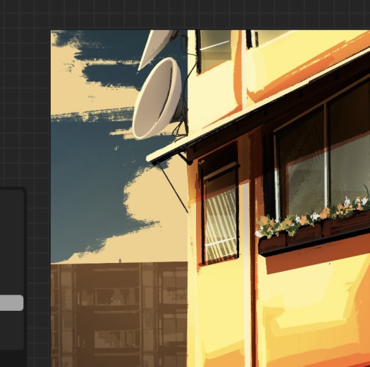
Art Process- Paper Planes (1)
I really wanted a painted, sketchy but still detailed look for these illustrations that would capture the essence of all the different pieces of concept art I have studied for this project.
To achieve that, I decided to work directly on top of the thumbnail sketch that I created initially and just use the ''COLOUR'' option in my blending settings to manually add all the colours necessary to both separate all the different elements (making it more readable and easy to navigate ) and also set the mood/atmosphere that I want for the illustration right from the beginning.


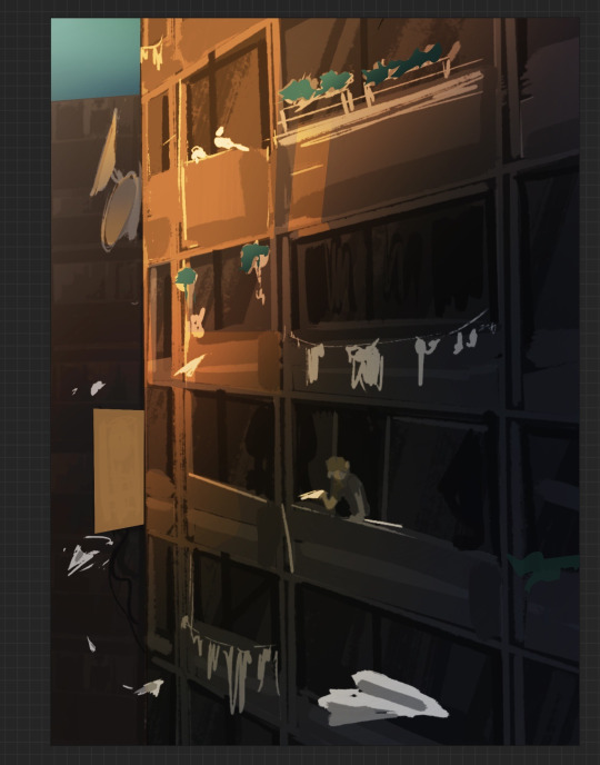
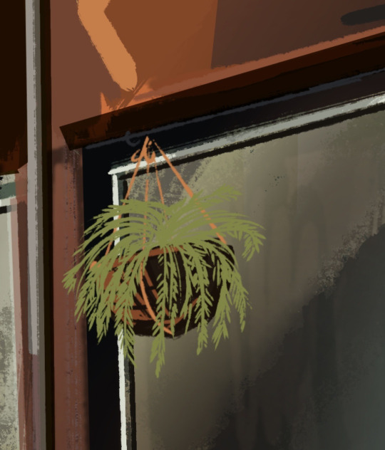
This is also where I started to refine some of the smaller details such as the satellite dishes, the air conditioner and some flower pots and hanging plants.
Being able to have all the different reference photos that I needed right next to me while sketching was very helpful since It allowed me to move back and forth between the pictures and my work very quickly and efficiently in order to correct any mistakes.

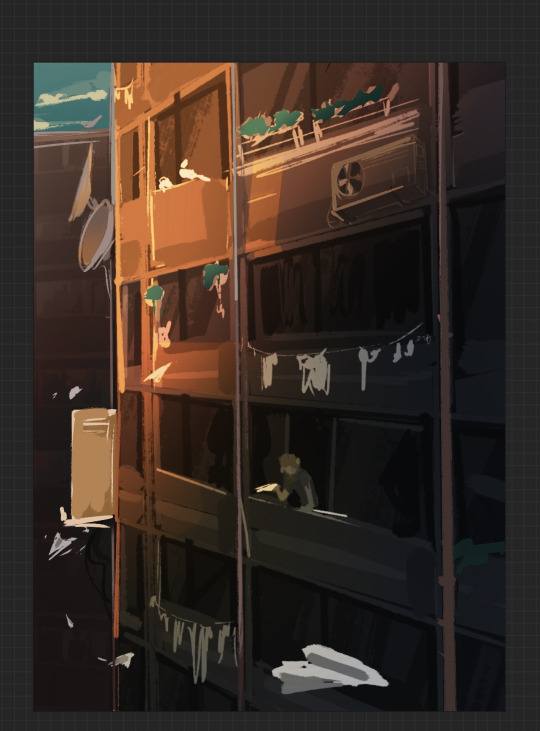
After that, I started working on the windows. This was very easy and quick since it is something that I have done before for one of my other projects and so all I had to do was repeat that process, but on a larger, more detailed scale.
I started by blocking in the shapes of the windows. I, then, added some random squares of colour of different opacities on top that would act as a rough interior for each of the ''apartments'' . This created a lot of dimension which looked even better when I added the glass-like reflections on top. As a final touch, I also added a white frame around the windows which really helped make them look more credible.
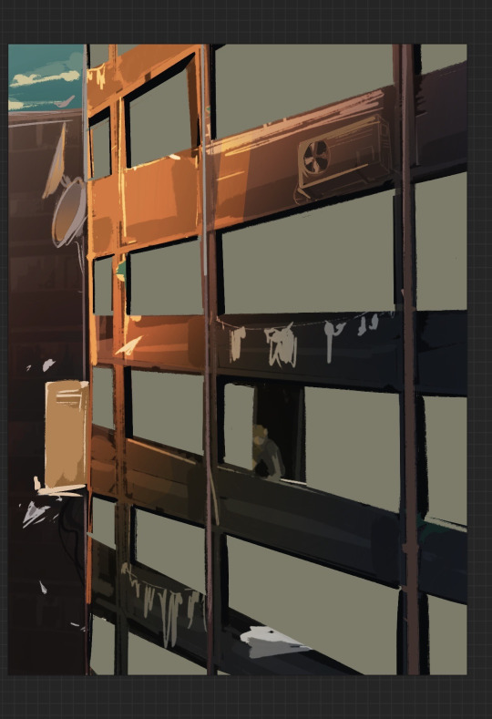

As I went along I also put in different textures and random brush strokes just to make sure that nothing looked too neat or perfect. Since buildings wear out and get old in time, this only added to the realism.
One of the biggest perks of digital art is being able to use so many unique and interesting brushes that allows for unique and interesting results.

Painting this felt like sculpting in a way since I kept erasing and adding bits and pieces until I was left with something solid enough for a base. Right from the start I tried to keep the colour palette consistent and simple so it wouldn't be difficult building details from there.

Since I based this building on the ones I used to see all the time in my country back in the day, I added all sorts of different elements that I could remember, even in terms of the building's structure.
Unfortunately, I was not able to add any clothes on the window clothing hanger . For some reason every time I tried to add something like a t-shirt or a pair of socks, they just looked out of proportion and out of place. I decided to just leave it empty in the end. This could be due to my limited understanding on perspective.


I was very excited to be starting on these smaller details since I don't usually do that in my concept art. I also think they convey the urban city aesthetic pretty well.
Making the air conditioner was extremely challenging since I had to work with a trickier angle. Fortunately, I managed to end up with something that looked good enough and it was then just a matter of how much detail to put without making it look too detailed in comparison with everything else.


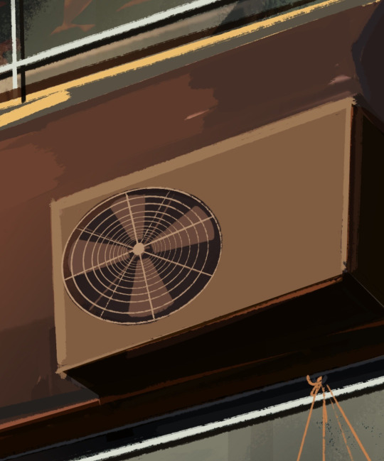
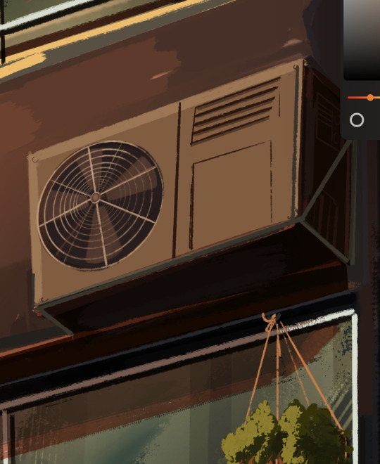
For the plants, I didn't bother with drawing every leaf individually but rather concentrate on depicting them as solid shapes that still showed the difference in texture. I especially like how the suspended baskets turned out. The concept art trials I did before starting my illustrations really helped me get more comfortable with things that I have never drawn before.
Since my pallet was mainly formed of reds, browns and yellows (basically, very sunset-y colours) , I tried to keep all the new colours I added on the warm side.


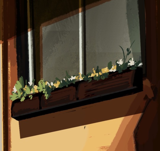
I then started adding the shading. Since I was working with a rather limited number of layers, this meant that as I kept progressing and adding new layers, I would also have to combine them and polish everything as I went along. I tried to not get too lost in the little details but rather concentrate on the artwork as a whole, but that was difficult sometimes since I wanted the illustration to look as organic as possible.
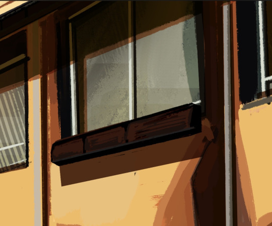

This is also where I started to work on the background. As I mentioned, I wanted a warm and tranquil atmosphere and so I changed the hue of the sky to something a bit more purple-ish (it is a bit hard to see but the sky is actually a gradient from dark blue to yellowish pink) , made the clouds more yellow (to look as if they are reflected by the sun) and even added some highlights to the building to separate it from the background.
0 notes
Text
A summary of changes
I spent the past couple of weeks on sick leave after having my tonsils removed, which means I had some spare time to take another look at my characters and their colours. I'm going back to work tomorrow, so let's take a quick glance at the tweaks (that may or may not be permanent.. man, I don't know anymore)!
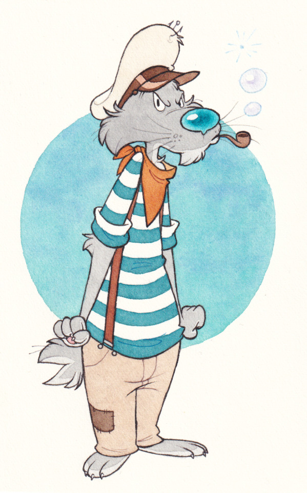
Boatswain got his baggy pants back, though somewhat lighter this time. I was going through my sketchbook and figured I liked those just a little bit more than the slim ones. Bos is small, so it's not odd for him to wear oversized clothes! I changed the bandana to an earthy orange & his cap is slightly off-white (dirty) now, with a brown rim. Went back to bubbles coming out of his pipe instead of regular smoke. The very, very first boatswain I've ever drawn was blowing bubbles!
I decided to keep the lighter beard, soles and toe claws, I believe they make him just a tad more interesting. Ol' gramps certainly enjoys having a full set of claws, no doubt about that. I keep making his nose turquoise instead of cyan. Maybe it wants to stay this way? I like both!

Captain's white cap got swapped for a dusty, dark blue one. I wanted each lad to have a different hat, just to highlight the difference between their ranks. Blue caps are generally associated with aviation, but I think it still works well for him! The little fish is made of cardboard. Packie draws them himself and glues them, then proudly parades with them on his head until they eventually fall off and he has to do that again, haha.
I experimented with his colour scheme for quite a bit, but eventually kept it as it was. Very minor change to the jacket colour. I also shaved the fuzz off his scarf and threw a checked pattern on it instead. He deserves fancy neckwear! I hope Sakura never discontinues manufacturing the particular pen I draw these lines with because the colour is just perfect.

The way I approached admiral was pretty intuitive. I didn't look at any older doodles of him and simply drew what felt right. His outfit lost some details this way. His white hat is here to stay - I just changed the shape and look of the badge a little; not sure if I want the rim to be this dark blue or brown. I made his shoulder insignia simpler, as I meant to do it earlier. Completely forgot that little buckle on the strap and the third row of buttons on his boobies. These might come back, I don't know yet - I'm sloppy, so I have to cover small details with masking fluid (that prevents them from being painted) and just like 90% of watercolourists... golly, I hate using masking fluid.
I had quite a dilemma with his gloves and boots. Ultimately made them much lighter and I think this is how I prefer them. They add some much-needed contrast as up to this point his colour scheme was on the darker side and, to be perfectly honest, I wasn't a fan of that. I believe I'm not skilled enough to make proper use of dark colours, especially in traditional media, but it's ok! I enjoy the vintage feel of admiral's current colour palette.
And as for the main colour of his uniform? I had to ditch that previous indigo because I couldn't stand how the paint handled :( The one you see here is a custom mix, which, hopefully, won't be too hard to replicate. What I like about it is that it looks like a duller shade of Prussian Blue. A colour I tend to use sparingly because it fades, but otherwise love very, very much!

Nothing really changed about Taffy except that I made her ribbon lighter here. For some reason my scanner wasn't happy about that! The purples are very pink-leaning in the scanned version, while in person they are considerably cooler. I like them in person, but here... not so much. It could be the paper though, so I'll give it another go once I use up this particular supply (I'm about to)!
Her eyes are ever so slightly green-tinted, but it doesn't show here, does it? I will add a touch more green next time. This thing is surprisingly hard to balance because with too much green in her eyes she starts to look kinda spooky.
You have to wait for a bit before you hit your final form, Taffy!
I like Mia's colours, but it took two attempts to get them right and my gosh, was the first try icky and clashing. I'm going work on her overall look at some point in the future. I hope I can push her proportions to be somewhat more cartoony & her face to be more expressive. I took a glance at my older doodles of her and she looked as if she was a Disney princess' horse, haha. We want none of that here! Silly & homely looking horses all the way.

Rookie didn't change much either, I only picked a more vibrant shade of yellow for her scarf. I'm most likely going to go back to the older, more toned-down version. I enjoy punchy & vibrant colours - just not on my little ol' characters!
I also didn't grab my best black for Roo, but thankfully I have a replacement. Notice the tiny white dots all over the black parts? This is an undesirable trait in watercolour, some pigments do it naturally, but in some cases it's the formula or paper (or both). Sometimes I'm tempted to colour her black parts with a pen, but I think that would look too harsh. But you never know before you try it!
*****
Whew! That's it for the changes. I know these may not look like much (and it's true), but in reality I ended up removing and replacing a good portion of my paints for better alternatives. This means I had to build a new palette from scratch, holy smokes. I'd better stick with these tweaks because I really don't want to do this one more time!
EDIT: Oy, one last thing I wanted to add - looking at those doodles, I realised I need to try and fix my inking. It's not very good! I typically ink with fineliners (that's the easiest and simplest way), then colour, then go over my lines again to make them darker and thicker. But it also gives them this unappealing, rugged look. Next time I'll do just a single round & see how that looks!
0 notes
Text
Final Design Elements:
Font Choice:
The typefaces/fonts I chose to use were ‘Handsome Pro Classic’, Handsome Pro Nib’, and ‘Articulat CF’. I used the ‘Articulat CF’ font for the more basic/simple elements of the text such as ‘Well the reason why...” and I used the more bold/fancy font for key words such as ‘Singing” to emphasise it further. I then added effects onto these to make it pop.
Colour:
I was pretty basic when it came to choosing my colour palette. I decided to go with red as throughout my research I found it was the most common colour associated with theatre, as well as it being a popular,ar colour in the 1970′s which was around the time she sang. I kept the monotone colours of black and white as well to create both contrast and balanced amongst the red.
Effects and Transitional Movement:
I found that my person Kiri Te Kanawa speaks very fast so at first I really struggled with transitioning/timing it right with the flow of the words matching the voice over. It took me some time to get it right but I just adjusted the length through the time stretch button and dragged things such as digital imagery on and off the page as well as colour blocks (backgrounds) and type. I mainly used the ‘Typewriter’ effects throughout my designs to keep it all cohesive and flowing however for the key words sometimes I used effects that gave off more of a vibe with the word and helped emphasise it further.
Digital Illustrations:
I created some digital illustrations as there were a few key words in my voice over that I wanted to imply through imagery. I created these digital drawings on Adobe Illustrator and then imported them across to After Effects. I am going to experiment with this and add effects to these to make them pop slightly more.
Background:
As for the background I kept it fairly simple fluctuating between both a solid white background and a solid red background to match my colour theme and change it up occasionally.
0 notes
Photo


Artists
I’m a very modern person. I grew up on illustrative children's’ books, cartoons/anime and comics/manga. So all of my utmost favourite artists are illustrators and/or animators of some kind, and have inspired me to become an illustrator and/or animator, in turn. I also love vibrant colours and horror, so anything that leads in either/both directions, appeals to me.
One thing going into this, is that I’m sure I’m supposed to choose classical or fineartists, who I’m admittedly not very interested in. Not that I think such a vast breadth of work is terrible, I just have a more active interest in artists I can be influenced in, more directly.
Although, because I’m very boring, I am fond of Alphonse Mucca’s work. I love incorporating warm colour palettes, thick and thin line variations, flowing hair, etc.
Hans Zatzka, has the whimsy and vibrancy I adore (not to mention that his painting Fairy Dance, reminds me of one of my favourite songs, Away with the Faeries by Inkubus Succubus.)
But, that wouldn’t be true to my own personal delights. So I’ll be picking the other artists from my world.
Tite Kubo
In another brief, we were told to not explore anything that incorporates abuse, the objectification of women, weapons and explosions, so I’ll assume that would be the same for all the briefs, Which, is a bit of a shame, because one of my biggest inspirations since I was 12, is Masayuki Taguchi (Battle Royale manga adaptation, one of the hundreds of Black Jack manga). His compositional skills and ability to illustrate highly detailed 19-paged comic chapters within a fortnight, overshadow his inability to draw kids, non-fine fabrics and unwillingness to draw multiple body types. Whilst I cannot use him, I also can
Instead, I’ll go with my art inspiration at age 14, Tite Kubo (AKA, the Bleach guy.) I’ve always been blown away by his ability to make all of his characters look attractive (even the ones who are supposed to be ‘ugly’,) interesting ways he incorporates languages, poetry, architecture, cultures, subcultures, different religion, fashion, pop culture, music, etc into his artwork, even when excluding story. Kubo’s modern art reminds me of a simplified version of Taguchi’s work, so he’s a fitting replacement. I know it’s a manga art style, but a large part of my artistic journey and personal delight would be missing, and my project would always have a void.
Designers
With designers, I wanted to pick one of each. As I tend to value trends/movements more than the individual designer, this will be pretty hard for me.
Chanel (Company)
Whilst on the surface, I should be more of a Vivienne Westwood type, I’ve been more fascinated and influenced by fashion moguls such as Coco Chanel. Or, more accurately, the company she founded and the efforts of her employees.
I grew up watching The Simpsons, so Marge wearing the iconic Pink Chanel Suit and being seen as the pinnacle of glamour, struck a cord in me, as an 8 year old. Even general pink suits make me think of high society types.
Digging deeper into the fashion gallery that Chanel’s company have kept a consistent uniform in their clothing line, which makes many of them recognisable as a Chanel, even at first glance.
They keep a steady profit, despite their lack of social media usage. Although, their marketing campaigns do have some appealing artists and graphic designers, such as Kerrie Hess (who I like,) creating art for them.
Another reason, is that I love the irony in how Chanel’s fortune has been distributed and the sense of self-deprecation I have in liking what the company has created. It’s not a secret that Coco Chanel used Nazi connections for her own benefit and was an agent of sorts herself. I tend to separate the art from the artist (and the vast majority of her employees are to be credited for the company’s iconography) so learning this fact hadn’t made me dislike the catalogue of clothes, but the fact that her wealth has been distributed to the [Jewish] people she so despised, makes me giggle.
Also, I love the perfume. It makes me feel pretty.
Mathiole
Partricia Urquiola
The duality of sterility and creativity in Partricia Urquiola’s works, compliments how I am very calculated and meticulous in how I create my personal art (to the degree of utter sterility at this stage,) but how my imagination runs wild.
Writers
Koushun Takami
My favourite novel is Battle Royale by Koushun Takami, and has been since I was 13. It’s meant a lot to me and got me through my coming-of-age phase. The novel posed a lot of critique about Japanese society, how far the individual will go for self-preservation and/or to protect a loved one, how regimes use the national social culture against the masses and/or isolate them from the ‘radical’, the multitude of different ways that fear and stress can have an effect on the individual (from the heroic to the downright disgusting,) and that you can never truly know someone (even your best friend.) It also helps that, whilst the cast are very trope-y and the main cast are a bunch of Gary/Mary-Sues, they’re all still very fun and unique and relatable. Takami’s writing style can be poetic and he’s great with creating individuals with their own unique voices in their POV chapters and roughly 36 of the cast of 42 have their moments to shine.
I also do not think he’s a perfect writer, by any stretch. The main characters are too perfect at everything they do and everyone loves them for existing, the female antagonist’s backstory is so laughably over-the-top and shoehorned into her final POV chapter (in some means to redeem her?) that I cannot take her seriously, Takami has clear favourites who’s propped up by their opposition being utter strawmen, those favourites also have more in-depth backstory and physical descriptors than even the main trio (which is terrible when one of the favourites existed for one chapter, half of which was a description of how utterly amazing she supposedly is, a quarter of it is fetishising her, then immediately dies), the ending is boringly predictable (even with the double-misdirect,) and some of the more interesting characters either die too early or were neglected to some capacity.
Battle Royale is absolutely a one-hit-wonder. Takami keeps stating that he wants to ignore Battle Royale and move on to complete his second novel but hasn’t released anything about it since it was announced like 20 years ago. Wrote a spin-off manga to explore some neglected characters (which I loved and was great, but retcons his pet favourite, in relation to one of the spin-off’s protagonists) and is currently releasing a sequel to Battle Royale (which seems bizarrely based on the rip-offs of this series, such as Dangan Ronpa and Squid Game) that even the long-term Japanese fans aren’t interested in, at all.
But it means a lot to me.
Smells
Peony
When I was in Primary school, we had these specialist soaps in our dank, run-down bathrooms. They were shaped like a teddy bear and may have been left-overs from Christmas stock. I always loved the smell of them and nothing and no one smelled quite like them. My family had very set smell preferences and my friends and their families weren’t very flowery. I was only 4-6 when the school had these soaps, so I couldn’t identify or articulate what this smell was.
Later on, I was introduced to Lily of the Valley and mistook the smell for that. I got many Lily of the Valley products, which gradually helped me realise that I hadn’t found exactly what I was looking for.
Now, I had been introduced to Peony flowers and smelled them, but I didn’t identify the smell directly from the flower. So I disregarded the flower quite quickly.
Eventually, I browsed through TKMaxxx to find some new candles and books, where I eventually found the Peony candle that smelled exactly like the soap I loved when I was young.
Ever since, I’ve been repeatedly buying that candle and keep the jars for decoration.
Clean Cotton
In my Japanese classes at Comprehensive school, my teacher always had the Clean Cotton Yankee Candle smell in the classroom. Even though I was one of two people who came to the class, I always enjoyed it.
Smoked Pumpkin
I found a cool-looking, giant Smoked Pumpkin candle from TKMaxx, that I bought for my new flat in Edinburgh. Due to complications, I had to immediately move back home. There, I wasn’t able to light the candle, since it made my stepdad feel unwell.
I’d still open the candle and smell it, when I was alone and the window was wide open.
I’ve kept the candle as a keepsake, since it represents a trend in my life.
Views
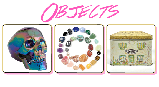
Objects
0 notes
Photo
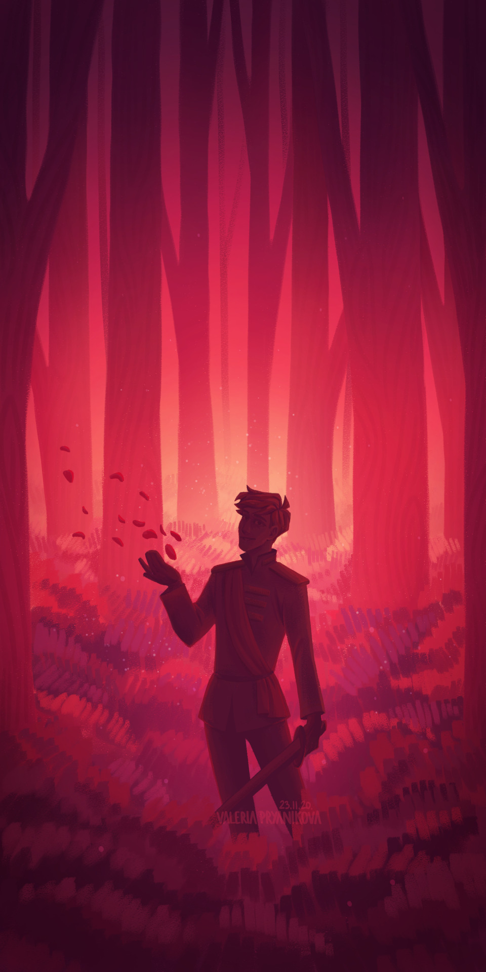
in the magical forest~
#just a reason to draw using a very pretty colour palette#also again me with my love to draw forests lmao#thomas sanders#ts roman#roman sanders#sanders sides#sanders sides art#sanders sides fanart#tsfanart#art#fan art#fanart#light sides#Illustration#forest
4K notes
·
View notes
Note
Hey! I just wanted to ask what kinds of brushes and watercolors you use for your drawings. I really like them! I’m also going to start to use watercolors to paint my traditional drawings. Could I have some tips as well?
Ok so this is a fairly long post. I tried to be reasonably thorough, and I talk about paint, brushes, and gave some tips, as well as linked some brilliant videos - hopefully that helped :)) feel free to ask for any clarifications though! /gen
Oh, I've accumulated a large amount of watercolours over the years. This is my currently most used palette, that i’ve assembled myself from different palettes throughout the years:

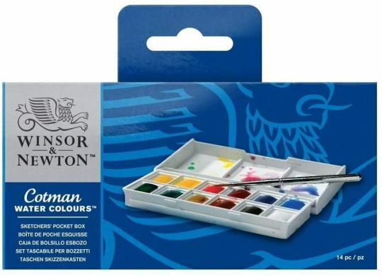
My first set of watercolours was a small Winsor & Newton set, which included these:
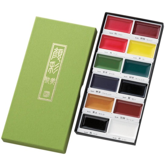
I then got this set of Kuretake for my birthday:
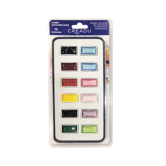
And I got some shiny ones from Creadu, though I'm not sure if they're available internationally:
As well as some singular pans also from Winsor & Newton:
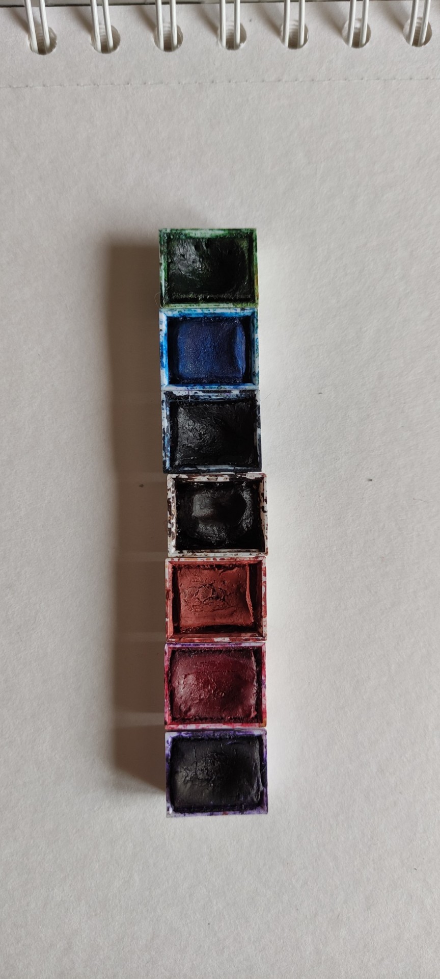
Then there's a set i have from my parents. These are older than I am, and some aren't very useable, over all they're pretty good, I'd say. I have no idea what the brand is, though, or what brand would be closest to them, so that I could recommend it.
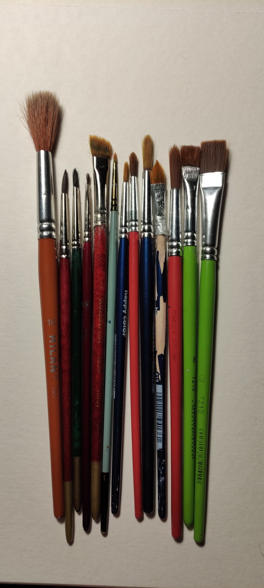
Regarding brushes, I’d say the more natural ones are simply incomparable to the cheap ones. I’d take 2 or even 1 good brush over a full set of those plastic ones anytime.
Here’s my full collection, though the plastic ones I use for gouache. They simply aren’t suitable for watercolours, regardless of how much scammy brands try to convince you.
And these are the ones I use fur watercolours:
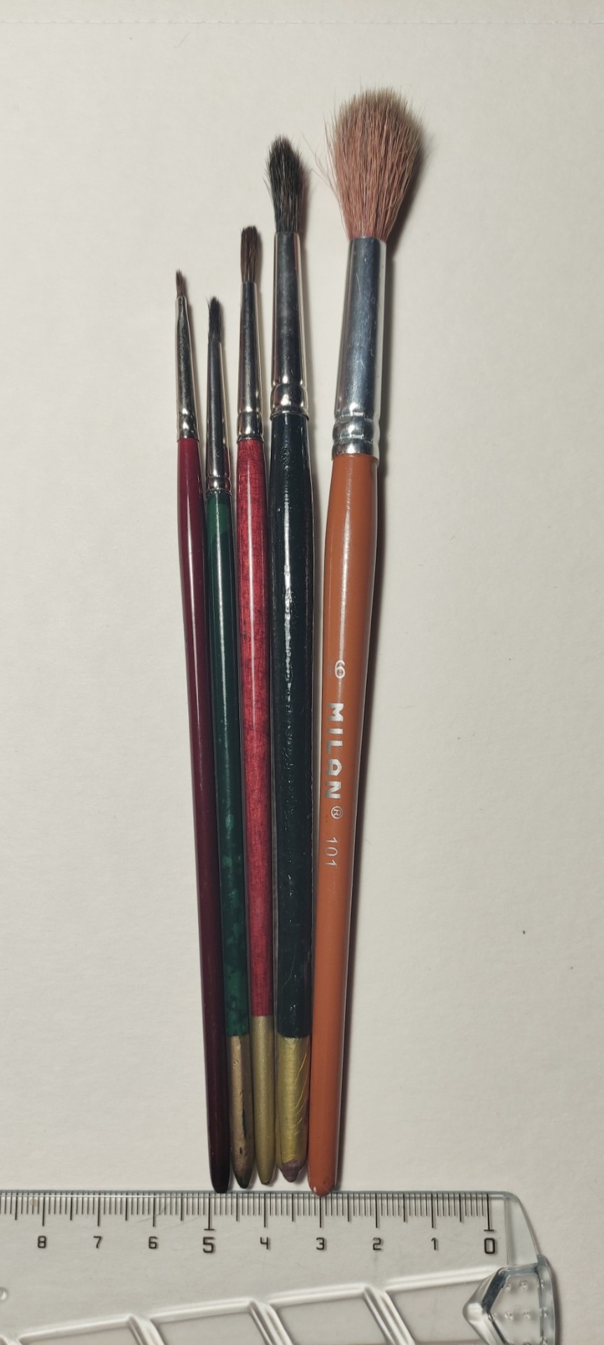
You can get some soft, round brushes for relatively cheap - you just need to find a nice art shop. regarding size, I’d probably get a size 6 if you want to start off with just one brush, and sizes 5 and 10 if you can go for 2. though that of course depends on how large you want your pieces, ect - but I feel like that’d be a pretty universal choice. I personally mostly use a 6, then go in with a 4 to add details, and add washes to the bg mostly with a 10 - my pieces are usually between half of an A5 sheet of paper, and an A4 one, so that should give you an approximate idea of what you might want to go for. You need to keep in mind, that most brushes - even the bigger ones - will have a fine tip, when wet, so there really isn’t much of a need to buy anything below a 2, especially at the beginning - simply don’t push down too hard.
In regards to art itself - don’t use white watercolours the way you would with other paints. Watercolour painting is using the negative space a lot of the time - the white watercolour is never going to be as vibrant and bright as the paper itself, not to mention it won’t be able to cover up the darker colours in the first place, seeing how it’s quite a bit transparent, as watercolours are.
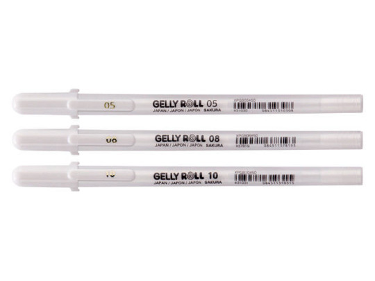
That being said, I highly recommend you use white gel pens! They can add a very lovely touch in general, not only in watercolours (you can see it in many of my pieces, seeing as I draw on a tinted paper a lot of the time). Personally, I recommend gelly rolls. I’ve bought a set of 3 a couple years ago, and they’re still working just fine. In my experience these are the only gel pens that actually work, though keep in mind I’m from Poland, so there might be something better over where you live.
With watercolours you neeed to start off with the lighter colours, and add more and more dark ones, making sure to leave the brightest spaces blank, and not paint over them. Be patient, wait for layers to dry, don’t rush it. Watch videos of how people paint with watercolours, observe, try to learn through imitation!
Aditionally, try not to use blatant, black paint. Try mixing a couple colours such as dark brown, dak blue, perhaps some red, a bit of yellow, ect - take your time time, and learn how your paint works, and how it mixes! Ultimately, you don’t really need black and white paints most of the time for watercolours, unlike in other kinds of paint.
Here are some videos I remember being helpful to me personally:
this video by Emily Artful is honestly one of the best videos on that matter that I’ve watched
This video, as well as this video by Kasey Golden are also very helpful
I remember finding this video by Laovaan helpful as well
(for the record, all these three creators are brilliant artists that have helped me learn the medium quite a lot
Ultimately my watercolour and brush collections and skill have been growing over the past, well, more than 6 years, so be patient!
I hope that was helpful, but again, if theres anything else I could help you with, feel free to ask me :)
And have fun!! Good luck, dear!! You’re gonna do great, I’m sure! :DD
#ask#asks#ask fern#art#art tips#watercolour#watercolours#watercolor#watercolors#water painting#water media#painting#painting tips#watercolour tips#watercolor tips#fernless rants
50 notes
·
View notes
Note
Can I ask you to make a guide about writing Akumatized Marinette fics in such a way that still keep all characters in-character?
I’ll do you one better!
Here’s My Five-Step Program on How To Write Akumatised Characters!
Feel free to use it however you like!
1. Have a clear idea of who your character is, what their drives and dislikes are, before you get around to akumatising them
For instance, Nino wants to have fun and to make his friends happy but hates being told what to do by authority figures. Mlle Mendeleiev wants to be regarded as a big deal in the scientific world and hates being ridiculed.
Though some of these drives and dislikes can be really ridiculous when it comes to some of these akumatised characters and can have little to no emotional weight because some episodes are comedy-oriented (M. Ramier likes feeding his pigeons, he doesn’t like being told that he can’t feed his pigeons, this is stupid but also funny) or just poorly written. Still, they all seem to follow that same basic formula.
2. Understand how we get to the akumatisation proper, or, what happens before the transformation
The characters about to be akumatised are being pushed to their limits. Why? It depends on the episode, but it’s usually a case of “the character can’t have it their way because of [reason] and that makes them angry”. What are they angry at? There’s no fixed rule here. Depends on the circumstances of the episode. They’re caught in a situation with an outcome that leaves them emotionally unstable and angry, is the point.
Watch Utena. Just watch it. It’s (maybe) the best anime ever. And Miraculous uses the basic mechanics of the Black Rose Saga without understanding what made it good in the first place. Without spoiling too much about that part of the anime, secondary characters with issues hinted at in the first arc come to the forefront of the show for one episode each, during which they are being pushed to their limits. They have a moment of Regressive Therapy with the arc’s antagonist who makes them expose their buried negative feelings and weaponises them to turn each of these characters into the “villain” of the week, if you will. In Utena, these characters, their desires, their fears, gives us a different perspective on the storyworld, the plot and the characters we’ve spent the most time with until then. It’s so good. Just watch Utena.
Anyway, Hawk Moth is a kind of devil figure there (all of this is very Faustian) using the moments of emotional vulnerability in these characters to trick them into striking a deal with him. He offers them the power to act on these negative feelings, and they must do his bidding in return (he can exert some control over them if this deal is agreed upon but that’s really murky).
Note that these soon-to-be-akumatised characters are not in the right mindset to fully realise what it is they’re getting into, unless they are Truly Evil. Hawk Moth is the one in control there, he is calm and manipulative, he is the one to define the terms of the contract, if you will. This makes me reluctant to call the great majority of the akumatised characters villains (but that doesn’t stop the show from treating them as such). They are blinded by their anger, and not in a position to bargain.
3. Understand what being akumatised is and what it does
“Hello, [villain name], I’m Hawk Moth. Are you sick of piles of owls constantly blocking your driveway?! Well then you gotta get Owl Trowel! Things are pretty unfair, aren’t they? I understand. I will give you the power to do [whatever], in exchange, you must give me the Miraculouses” Hawk Moth, in every episode.
Being akumatised is a twisted, dramatic expression of these negative emotions and frustrated desires, with an awful colour palette and character designs that range from “pretty good!” to “no.”
Now watch the original Sailor Moon anime. Some of the people working on it later moved on to make Utena. It’s mostly a very good show, and one Miraculous draws from a lot. It blends what was the norm in the magical girl genre until then (shows centred around femininity and growing up) with tokusatsu-type monster-of-the-week stuff. Notably, some of the villains of the week in the early seasons were humans whose desires and frustrations were used by the Dark Kingdom (the Big Bad) to turn them into monsters. The Sailor Guardians (our heroines) had to fight and heal them from that evil corruption.
Being akumatised is a physical transformation and a mental transformation as well, characters who wouldn’t hurt a fly as their regular civilian selves become unhinged and violent and drunk with power. This isn’t them anymore, not entirely. Does that mean an akumatised character’s actions are entirely divorced from what their regular selves think and feel? Not entirely. Alya really wants to know who Ladybug is, Ivan really wishes people would stop picking on him, Aurore really thinks she deserved that victory. Being akumatised means taking these feelings to the extreme and manifesting them physically while attaching them to an item the character has been shown to carry earlier on. Maybe that item is the cause of what upset the akumatised character in the first place, and turning that into a weapon… Sometimes. Maybe it’s something else. The show isn’t very consistent in that regard. You figure it out yourself.
Hawk Moth brings out the worse in these characters and then some, using his magic. He exerts some degree of control over his akumatised pawns though how much is unclear, and I think that’s a deliberate choice from the creative team. In this case, I think the ambiguity makes things more interesting than “bad man entirely controls people who are only puppets with no will of their own whatsoever”.
4. And Now How Would Other Characters React?
When akumatised characters have vengeance in their mind, they go after the person they think is responsible for whatever went wrong. Unlike our heroes and HM, they aren’t concerned with being secretive about who they are, since they are overconfident in their new powers.
The most common reaction to akumatised villains attacking Paris is: “running away and screaming and trying to get somewhere safer”.
How would individual characters react to an akuma attack? How involved were they with the person that got akumatised? Did they play a role in making that person upset? Did they suspect the person had these kinds of feelings before, or is it a complete surprise? What does it tell us about the relationship between the akumatised character and the non-akumatised character reacting to them? Find answers to these questions and you’ve got it all figured out. Refer to the show itself regarding characterisation, it may not be always consistent so pick what you like best, what would be the most interesting.
5. Now That You’ve Got It All Figured Out, Plan and Write the Damn Thing.
Only you can tell the story you want to tell the way you can tell it, so do it, rework it, show it to your friends and rewrite it again until you’re somewhat satisfied.
And voilà! Hope this was somewhat helpful!
#ml#miraculous#miraculous ladybug#ml analysis#ml writers#ml fandom#ml writing resources#gabriel agreste#nino lahiffe#akuma#akumatized villains
172 notes
·
View notes
Note
Hi there! Do you have any art/design tips or wisdom ya can bestow? Your art and designs are super duper inspiring and cool so i was just wondering!
Oh, well, that's certainly very flattering! Honestly I don't really know what to say without any specifics? I guess I can just throw out a few basic tips?
1. Save frequently. I guarantee you at some point in your life whatever program you're using will crash, and losing 5 mins work is preferable to suddenly losing 2 hrs work. Trust me, I've been there.
2. Don't do shadows/highlights in black/white. Generally they'll have a tint to them depending on the lighting, and things end up way too desaturated otherwise. Of course, you can cheat a bit. If I'm drawing in a more cell-shading kinda way, I tend to draw my shadows in pure black on a 50% opacity layer so I can see them very clearly while I'm drawing. Then, bump up to 100%, change layer mode to multiply, colorise and shift the brightness/hue/saturation until I hit something I like. Same thing with highlights but with screen. Then just make a few tweaks for any parts that look off.
3. If you want smooth/clean lineart, try to draw each line in one fast motion. Drawing slow makes you wobble, lots of short choppy lines is impossible to clean up. Don't worry if your lines cross 'over' or extend past where they need to go, you can clean that up with the eraser. Generally if you can draw it in one line, try to do so.
4. Use references. It's not cheating, I promise. If you have a specific pose in mind and a camera you can even use yourself! It's pretty much the only reason I ever take photos of myself.
5. If you're talking like... character design? I'd say the biggest tip is to think about shape... the kind of silhouette your character will make. Give them something distinctive. Maybe it's billowy sleeves, or a cloak, or a funky jacket, or a huge collar, or a puffy skirt, or anything that makes their figure stand out.
6. Second tip for character design is to pick a palette and stick to it. You don't want too many colours or things get muddled. So if you're designing a druid for example, don't use 15 different greens. Maybe pick a light green, a dark green, a brown or two, and then a neutral colour. Try to vary the brightness/darkness of stuff too. It'll create more contrast and make things pop. Of course, that's just a rule of thumb, main point is just not to pick a different colour for every bit of fabric.
7. Flip your canvas. Makes you spot mistakes, essentially tricks your brain into seeing things with fresh eyes. Just don't flip too frequently or you'll get used to both 'sides'. Generally just once when you've completed each stage? (sketch-lines-rendering? idk it depends on your process)
Hopefully that's at least some use? I've been meaning to put together another process video at some point, I've just been putting it off because I can't decide if I just want to throw music over it or talk...
9 notes
·
View notes
Last Seen Blogs

b29win-blog
B29.Win Cổng game Bom Tấn 2021
timmy-fiasco
fast and slow
honeylikesyanderes
honeylikesyanderes
habitodemeexpressar
Motivação

sam-squaredd
sam-squaredd