#letterset
Text
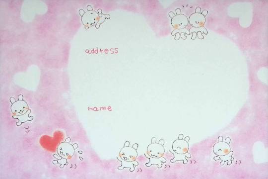
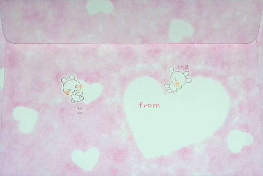
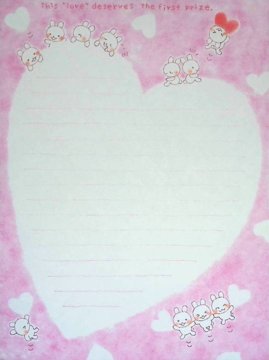
Unknown Letterset
(This is one of the sets that made me want to start this archive! It's one of my favorites :>)
554 notes
·
View notes
Text


57 notes
·
View notes
Text
horned lark stationery set will be in my shop on July 29!!
each set comes with four 5x8 in. double-sided letter paper and a matching envelope!
#bird#birdart#ornithology#hornedlark#letters#penpal#mail#snail mail#stickers#mailset#letterset#stationery#birdwatcher#birdwatching#handwriting
30 notes
·
View notes

Text
schoolwork with letrasets
2 notes
·
View notes
Text
Memøry Høuse / Event Invite

View On WordPress
#academia#acrylics#Andrew Morrison#Andrew Morrison Books#art#art collaboration#art exhibition#art project#collective memory#communist past#contemporary art#Gloucestershire#ink#Kerbstone Press#Lansdown Art Gallery#lettersetting#London#Maria Stadnicka#Mark Mawer#Memory House#painting#PhD studies#poetry#psycho-social methologies#psycho-social research#psycho-social studies#Romania#Romanian Diaspora in the UK#social memory#Stroud
1 note
·
View note
Text
Problem with Discord's new (and old) font(s) and its treatment of non-Latin text
Before getting into it, I'm gonna say that I'm not going to criticize its aesthetics or "readability". These feedbacks are rarely helpful from the designer's perspective especially coming from people who don't know much about what goes into designing a typeface, and because readability is really, really subjective.
I was happy to hear that discord was changing its font, especially when I found out that they are adding support for Vietnamese. Previously, discord used Whitney, a humanist sans serif font with Latin, Greek, and Cyrillic support. Unfortunately, Whitney doesn't support all Latin characters in Unicode, and crucially it doesn't support Vietnamese characters.
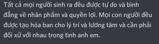
Text font not supporting a script is usually not a problem, the fallback font will take care of it for you. The problem occurs when there's partial support. Vietnamese uses Latin, but it also has a ton of precomposed vowels with diacritics. This is what Vietnamese looks like on my phone, where the font change hasn't taken effect yet:
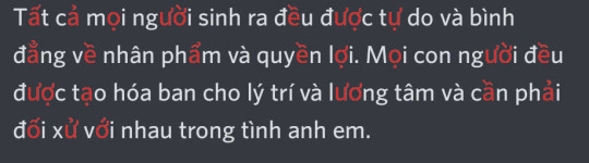
here's the same text with unsupported characters highlighted in red:
It might not look that weird because the fallback font on my phone happened to be somewhat similar in style to Whitney, but depending on the device it may be completely unreadable. I submitted a feedback a while ago asking them to address this issue
This is why when I heard that discord was changing its font to add Vietnamese characters, I was excited. This is what the same text looks like in gg sans.
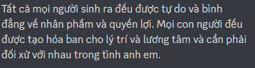
All characters harmonious!
However, after receiving the update I was disappointed because the new font now no longer supports Greek and Cyrillic. This alone is not really a big problem, because Greek, Cyrillic and Latin characters rarely occur in the same word. Although it is disappointing that they are no longer harmonious, it's not that big of a problem. The problem though, is that they decided to include Δ, Ω, μ, π (capital delta, capital omega, lowercase mu, and lowercase pi) into the font.
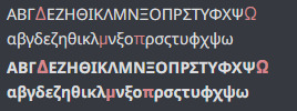
Depending on the device and rendering settings, it might look like it fits well with the fallback font, being almost unnoticeable, or so noticeable that it's hard to read. These four glyphs are often included in typefaces that only support Latin as they are often included in Latin lettersets because of their use in mathematics and science, so I thought it was simply an odd oversight.
Then I found out about this:
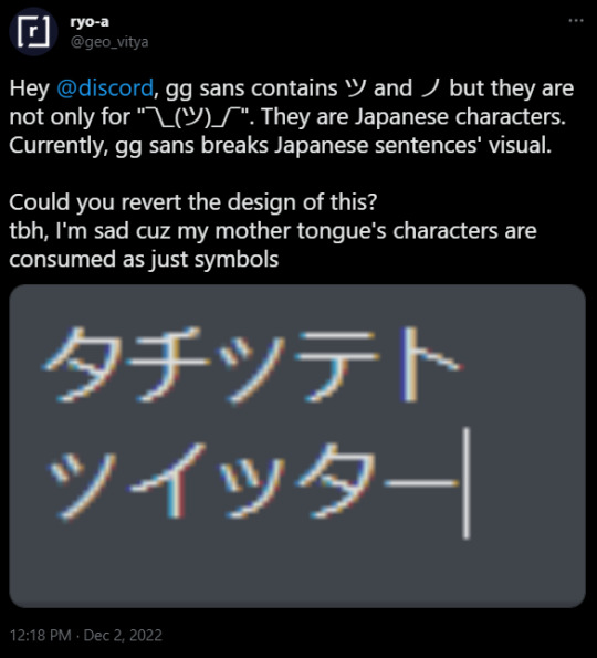
(As of 2022/12/3 9:22 pm UTC+9 I couldn't recreate this. It may be because of css setting or because they've already fixed it. I'm hoping it is the latter)
They decided to include katakana characters to be only used in the shrug emoticon.
I was massively disappointed when I heard this news because it means they did not care at all about global accessibility when making the new font. I was under the impression that they were doing it at least partially to address this issue. I was under the impression that maybe they've heard us complain and complain about the font only having partial support for Vietnamese. Maybe they've realized the core problem. But no, it's clear that they still don't know what the problem is.
Maybe I should have realized it sooner. Did you know, Discord limits the amount of diacritics that can be attached to a single character, even though in a lot of non-Latin writing systems diacritics are crucial because they represent vowels, consonant clusters, et cetera?
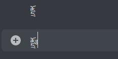
Moreover, did you know that Discord has a limit on how many diacritics you can have in a single message? This means if you have a copy pasta in abugida writing systems such as Devanagari, Thai, Khmer, Lao, Bengali, Burmese, et cetera, the vowel diacritics are just going to disappear after a while, rendering the text unreadable?

Affected portion underlined in red. I assume these are done to prevent zalgo, which really shouldn't be done by Discord itself, not to mention that typical "zalgo" diacritics are usually IPA diacritics with actual use, which can often stack in a zalgo-like fashion.
Did you know that Discord enforces strict text line height, even though some writing systems need more horizontal space than latin to be legible? Anything outside of the bounds are cut off and rendered invisible.
Anyway, do you remember when I said I wasn't going to talk about aesthetics and readability? I kind of lied. I am going to talk about them.
A lot of people seem to be saying that the new font is bad and that it's significantly less readable than the previous font. I have doubts about whether this is actually because of the font itself or because they're simply not used to it yet. My guess would be the latter. However, that doesn't mean the solution is to make these people shut up and wait till they get used to it.
There is no universal solution for readability and legibility. The truth is that different people have different needs, and this is no different when it comes to typefaces. Ideally, discord should provide an option to change fonts. Many platforms do. They've been refusing to implement it because, I dunno, brand image?
There is also a bigger problem with how UI designers design in general. They only design around Latin in mind, even though different writing systems use space differently. Many Brahmic scripts use ligatures and diacritics stacking above or below the main character. If you care about non-Latin scripts not appearing illegible, make it so that UI elements can accommodate for that, or something.
I'm bad at writing conclusions, so there you have it. Me rambling about a thing that I care about that apparently everyone else should too.
419 notes
·
View notes
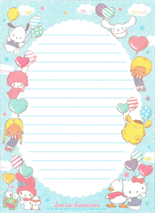
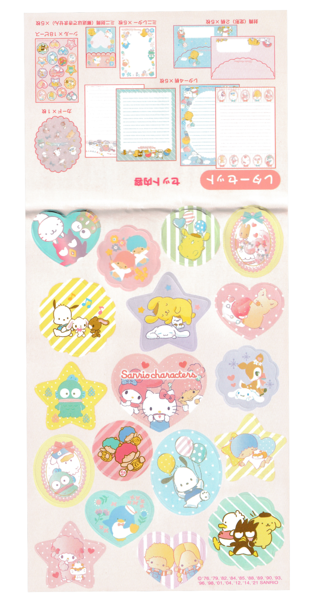
Text


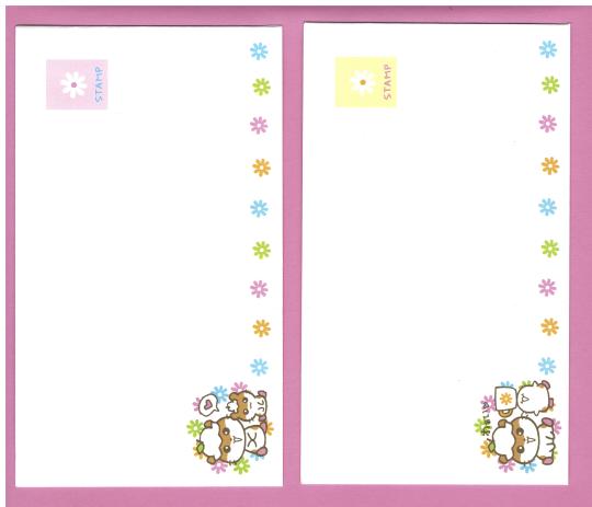
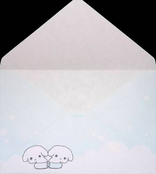
Korokorokuririn (Hello Kitty's hamster friend) became popular enough to get friends of their own! Here are some scans of some stationery I bought off ebay showing the various ham friends in cups!! (Top image shows the paper, bottom 2 images show the fronts & backs of the 2 different envelope types included in the letterset.)
#korokorokuririn#koro koro kuririn#korokoro#kuririn#hello kitty#japanese#letter set#stationery#hamster#friends#flowers
256 notes
·
View notes
Text
offical animal crossing letterset
5 notes
·
View notes
Photo

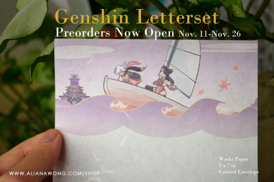
🌠Genshin Letterset **Preorder** NOW OPEN🌠
tis the Season...to get letter sets!! Cute stationery based off Genshin Impact’s Mondstadt, Liyue, and Inazuma. Feat. characters beloved by many.
Preorders last until Saturday November 26.⭐
⭐Each set comes with:
2 sheets of each design (Washi Paper!! soft!! wonderous..)
1 envelope (of random but matching color)
Total of 6 sheets, 3 envelopes All Genshin
Retweets / Reblogs always appreciated! twitt: x
⭐Shop Link <--
#genshin impact#原神#kaedehara kazuha#zhongli#diluc#venti#kaeya#beidou#stationery#shop#shop news#letter set#letters
36 notes
·
View notes
Text
Looking at lettersets at 4 am because I want to send love letters to my future partner is so very lesbian of me
3 notes
·
View notes
Text


Buru Buru Dog - San X
(give him his pants back!! :<)
54 notes
·
View notes
Text


24 notes
·
View notes
Text

WILLYS DE CASTRO
b. 1926, Uberlandia, Brazil
d. 1988, São Paulo, Brazil
Untitled, 1959
letterset on cardboard
Leon Tovar Gallery
6 notes
·
View notes
Text
Best Digital Marketing Agency in Bangladesh
What is Lorem Ipsum?
Lorem Ipsum is simply dummy text of the printing and typesetting industry. Lorem Ipsum has been the industry's standard dummy text ever since the 1500s, when an unknown printer took a galley of type and scrambled it to make a type specimen book.
It has survived not only five centuries, but also the leap into electronic typesetting, remaining essentially unchanged. It was popularized in the 1960s with the release of Letterset sheets containing Lorem Ipsum passages, and more recently with desktop publishing software like Aldus PageMaker including versions of Lorem Ipsum.
Why do we use it?
It is a long established fact that a reader will be distracted by the readable content of a page when looking at its layout. The point of using Lorem Ipsum is that it has a more-or-less normal distribution of letters, as opposed to using 'Content here, content here', making it look like readable English.

Many desktop publishing packages and web page editors now use Lorem Ipsum as their default model text, and a search for 'lorem ipsum' will uncover many web sites still in their infancy. Various versions have evolved over the years, sometimes by accident, sometimes on purpose (injected humor and the like).
1 note
·
View note
Text

Vladimir Dodig Trokut (1949--2018)
Diptych
30 x 30 cm each
Mixed Media
Akrilik na platnu + Letterset
Signed and dated / 2015.
0 notes
Last Seen Blogs

thrifttokyo
Thrift Tokyo

all-airport-transfer
Untitled
kyahaku
Kyanite

lauradesire
Un désir.

vacaseca
vacaseca = Gustavo Jabbaz