#p l traver
Photo
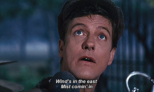
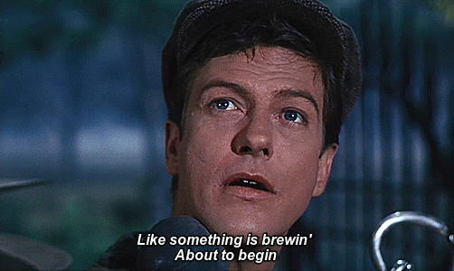


Dick Van Dyke in Mary Poppins (1964) dir. Robert Stevenson
#dick van dyke#1964#mary poppins#p l travers#robert stevenson#1960s#60s#comedy#fantasy#adventure#musical#dame judi dench#judi dench
216 notes
·
View notes
Text


Bedknobs and Broomsticks (1971, Robert Stevenson)
06/02/2024
#bedknobs and broomsticks#film#1971#robert stevenson#angela lansbury#david tomlinson#Live action animated film#the walt disney company#Mary Norton#walt disney#P. L. Travers#mary poppins#julie andrews#dubbing#academy awards#standing ovation#Irwin Kostal#Richard M. Sherman#Robert B. Sherman#2002#premiere#roddy mcdowall#1972#audio mixing#PAL#16 mm film#vhs#dvd#rotten tomatoes#Academy Award for Best Visual Effects
13 notes
·
View notes
Text
Mary Poppins (1964)
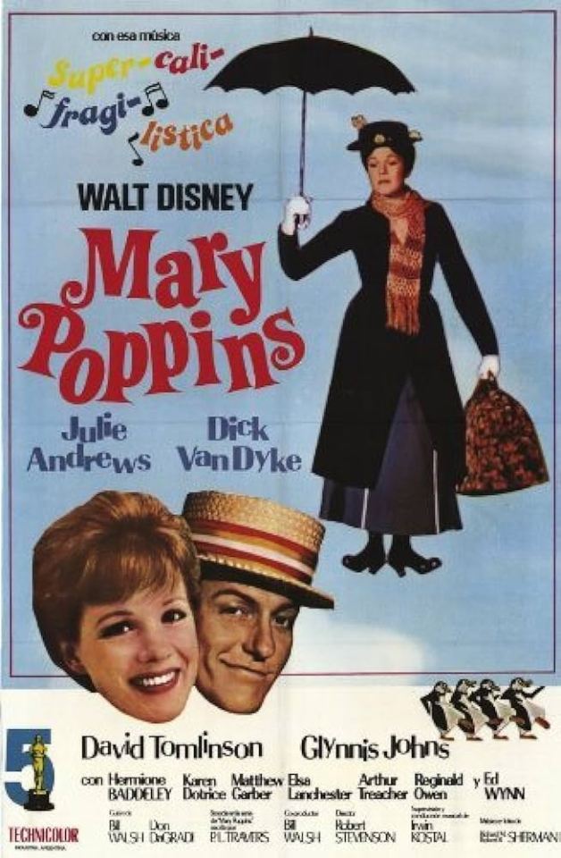
Mary Poppins by P. L. Travers (1934)
#Mary Poppins#Disney#Book#Movie#1964#1934#P. L. Travers#Children's stories#Pamela Travers#Julie Andrews#Dick van dyck
3 notes
·
View notes
Quote
We take the [soul's] road empty-handed... without even a map to guide us; not dreaming that we carry treasure, nor hoping that someone will run to meet us. Cast off hope, if you have it. The burden of hope is too heavy. The way itself knows where it is going. The way itself will lift us forward.
P. L. Travers
Someone quoted this but I don’t know what it’s from. I just liked it.
#the burden of hope is too heavy#cast off hope if you have it#not dreaming that we carry treasure#p l travers
93 notes
·
View notes
Text
Mary Poppins and Bert are either a bi woman/bi man couple, or each other's beards
#helps that the author of the original books was bi herself#mary poppins#bert mary poppins#julie andrews#dick van dyke#p. l. travers#p.l. travers#p l travers#pl travers#gay#bi#bisexual#bisexuality#lgbtq+#queer
17 notes
·
View notes
Text
The Winner this month is Boop!
My 37th Win A Commission story is Mary Poppins, by P.L. Travers OBE! If you’d like to see the original first chapter, my illustrations, and art explanation, please
If YOU want to find Cherry Tree Lane all you have to do is ask the Policeman at the crossroads.
He will push his helmet slightly to one side, scratch his head thoughtfully, and then he will point his huge white-gloved finger and say: “First to your right, second to your left, sharp right again, and you're there. Good morning.”
And sure enough, if you follow his directions exactly, you will be there — right in the middle of Cherry Tree Lane, where the houses run down one side andthe Park runs down the other and the cherry-trees go dancing right down the middle.
If you are looking for Number Seventeen — and it is more than likely that you will be, for this book is all about that particular house — you will very soon find it.
To begin with, it is the smallest house in the Lane.
And besides that, itis the only one that is rather dilapidated and needs a coat of paint.
But Mr. Banks, who owns it, said to Mrs. Banks that she could have either a nice, clean, comfortable house or four children.
But not both, for he couldn’t afford it.
And after Mrs. Banks had given the matter some consideration she came to the conclusion that she would rather have Jane, who was the eldest, and Michael, who came next, and John and Barbara, who were Twins and came last of all.
So it was settled, and that was how the Banks family came to live at Number Seventeen, with Mrs. Brill to cook for them, and Ellen to lay the tables, and Robertson Ay to cut the lawn and clean the knives and polish the shoes and, as Mr. Banks always said, “to waste his time and my money.”
And, of course, besides these there was Katie Nanna, who doesn’t really deserve to come into the book at all because, at the time I am speaking of, she had just left Number Seventeen.
“Without a by your leave or a word of warning. And what am I to do?” said Mrs. Banks.
“Advertise, my dear,” said Mr. Banks, putting on his shoes. “And I wish Robertson Ay would go without a word of warning, for he has again polished one boot and left the other untouched. I shall look very lopsided.”
“That,” said Mrs. Banks, “is not of the least importance. You haven’t told me what I’m to do about Katie Nanna.”
“I don’t see how you can do anything about her since she has disappeared,” replied Mr. Banks. “But if it were me — I mean I — well, I should get somebody to put in the Morning Paper the news that Jane and Michael and John and Barbara Banks (to say nothing of their Mother) require the best possible Nannie at the lowest possible wage and at once. Then I should wait and watch for the Nannies to queue up outside the front gate, and I should get very cross with them for holding up the traffic and making it necessary for me to give the policeman a shilling for putting him to so much trouble. Now I Must be off. Whew, it’s as cold as the North Pole. Which way is the wind blowing?”
And as he said that, Mr. Banks popped his head out of the window and looked down the Lane to Admiral Boom’s house at the corner.
This was the grandest house in the Lane, and the Lane was very proud of it because it was built exactly like a ship.
There was a flagstaff in the garden, and on the roof was agilt weathercock shaped like a telescope.
“Ha!” said Mr. Banks, drawing in his head very quickly. “Admiral’s telescope says East Wind. I thought as much. There is frost in my bones. I shall wear two overcoats.” And he kissed his wife absentmindedly on one side of her nose and waved to the children and went away to the City.
Now, the City was a place where Mr. Banks went every day — except Sundays,of course, and Bank Holidays — and while he was there he sat on a large chair in front of a large desk and made money.
All day long he worked, cutting out pennies and shillings and half-crowns and threepenny-bits. And He brought them home with him in his little black bag. Sometimes he would give some to Jane and Michael for their money-boxes, and when he couldn't spare any he would say, “The Bank is broken,” and they would know he hasn't made much money that day.
Well, Mr. Banks went off with his black bag, and Mrs. Banks went into the drawing room and sat there all day long writing letters to the papers and begging them to send some Nannies to her at once as she was waiting; an upstairs in the Nursery, Jane and Michael watched at the window and wondered who would come. They were glad Katie Nanna had gone, for they had never liked her. She was old and fat and smelt of barley-water. Anything, they thought, would be better than Katie Nanna — if not much better.
When the afternoon began to die away behind the Park, Mrs. Brill and Ellen Came to give them their supper and to bathe the Twins. And after supper Jane And Michael sat at the window watching for Mr. Banks to come home, and listening to the sound of the East Wind blowing through the naked branches of the cherry trees in the Lane. The trees themselves, turning and bending in half light, looked as though they had gone mad and were dancing their roots out of the ground.
“There he is!” said Michael, pointing suddenly to a shape that banged heavily against the gate.
Jane peered through the gathering darkness. “That’s not Daddy,” she said.“It’s somebody else.”
Then the shape, tossed and bent under the wind, lifted the latch of the gate, and they could see that it belonged to a woman, who was holding her hat on with one hand and carrying a bag in the other.

As they watched, Jane and Michael saw a curious thing happen. As soon as the shape was inside the gate the wind seemed to catch her up into the air and fling her at the house. It was as though it had flung her first at the gate, waited for her to open it, and then lifted and thrown her, bag and all, at the front door. The watching children heard a terrific bang, and as she landed the whole house shook.
“How funny! I’ve never seen that happen before,” said Michael.
“Let’s go and see who it is!”said Jane, and taking Michael’s arm she drew him away from the window, through the Nursery and out on to the landing. From there they always had a good view of anything that happened in the fronthall.
Presently they saw their Mother coming out of the drawing room with a visitor following her. Jane and Michael could see that the newcomer had shiny black hair — “Rather like a wooden Dutch doll,” whispered Jane.
And that she was thin, with large feet and hands, and small, rather peering blue eyes.
“You’ll find that they are very nice children,” Mrs. Banks was saying. Michael’s elbow gave a sharp dig at Jane’s ribs. “And that they give no trouble at all,” continued Mrs. Banks uncertainly, as if she herself didn’t really believe what she was saying. They heard the visitor sniff as though she didn’t either. “Now, about references — ” Mrs. Banks went on.
“Oh, I make it a rule never to give references,” said the other firmly.
Mrs. Banks started. “But I thought it was usual,” she said. “I mean — I understood people always did.”
“A very old-fashioned idea, to my mind,” Jane and Michael heard the stern voice say. “Very old-fashioned. Quite out of date, as you might say.”
Now, if there was one thing Mrs. Banks did not like, it was to be thought old-fashioned. She just couldn’t bear it. So she said quickly: “Very well, then. We won’t bother about them.
I only asked, of course, in case you — er — required it.
The nursery is upstairs — ” And she led the way towards the staircase, talking all the time, without stopping once.
And because she was doing that Mrs. Banks did not notice what was happening behind her, but Jane and Michael, watching from the top landing, had an excellent view of the extraordinary thing the visitor now did. Certainly she followed Mrs. Banks upstairs, but not in the usual way. With her large bag in her hands she slid gracefully up the banisters, and arrived at the landing at the same time as Mrs. Banks.
Such a thing, Jane and Michael knew, had never been done before.
Down, of course, for they had often done it themselves.
But up — never!
They gazed curiously at the strange new visitor.
“Well, that’s all settled, then.”
A sigh of relief came from the children’s Mother.
“Quite. As long as I’m satisfied,” said the other, wiping her nose with a large red and white bandanna handkerchief.
“Why, children,” said Mrs. Banks, noticing them suddenly, “what are you doing there?
This is your new nurse, Mary Poppins. Jane, Michael, say how do you do! And these” — she waved her hand at the babies in their cots — “are the Twins.”
Mary Poppins regarded them steadily, looking from one to the other as though she were making up her mind whether she liked them or not.
“Will we do?” said Michael.
“Michael, don’t be naughty,” said his Mother.
Mary Poppins continued to regard the four children searchingly. Then, with along, loud sniff that seemed to indicate that she had made up her mind, she said: “I’ll take the position.”
“For all the world,” as Mrs. Banks said to her husband later, “as though she were doing us a signal honour.”
“Perhaps she is,” said Mr. Banks, putting his nose round the corner of the newspaper for a moment and then withdrawing it very quickly.
When their Mother had gone, Jane and Michael edged towards Mary Poppins, who stood, still as a post, with her hands folded in front of her.
“How did you come?” Jane asked. “It looked just as if the wind blew you here.”
“It did,” said Mary Poppins briefly. And she proceeded to unwind her muffler from her neck and to take off her hat, which she hung on one of the bedposts. As it did not seem as though Mary Poppins was going to say anymore —though she sniffed a great deal — Jane, too, remained silent. But when she bent down to undo her bag, Michael could not restrain himself.
“What a funny bag!” he said, pinching it with his fingers.
“Carpet,” said Mary Poppins, putting her key in the lock.
“To carry carpets in, you mean?”
“No. Made of.”
“Oh,” said Michael. “I see.” But he didn’t — quite.
By this time the bag was open, and Jane and Michael were more than surprised to find it was completely empty.
“Why,” said Jane, “there’s nothing in it!”
“What do you mean — nothing?” demanded Mary Poppins, drawing herself up and looking as though she had been insulted. “Nothing in it, did you say?” And with that she took out from the empty bag a starched white apron and tied it around her waist. Next she unpacked a large cake of Sunlight Soap, toothbrush, a packet of hairpins, a bottle of scent, a small folding armchair and a box of throat lozenges.

Jane and Michael started.
“But I saw,” whispered Michael. “I’m sure it was empty.”
“Hush!” said Jane, as Mary Poppins took out a large bottle labelled “One Teaspoon to be Taken at Bedtime.” A spoon was attached to the neck of the bottle, and into this Mary Poppins Poured a dark crimson fluid.
“Is that your medicine?” enquired Michael, looking very interested.
“No, yours,” said Mary Poppins, holding out the spoon to him.
Michael started. He wrinkled up his nose. He began to protest. “I don’t want it. I don’t need it. I won’t!”
But Mary Poppins’ eyes were fixed upon him, and Michael suddenly discovered that you could not look at Mary Poppins and disobey her. There was something strange and extraordinary about her — something that was frightening and at the same time most exciting.
The spoon came nearer. He Held his breath, shut his eyes and gulped.
A delicious taste ran around his mouth. He turned his tongue in it. He swallowed, and a happy smile around his face. “Strawberry ice,” he said ecstatically. “More, more, more!”
But Mary Poppins, her face as stern as before, was pouring out a dose for Jane. It ran into the spoon, silvery, greeny, yellowy. Jane tasted it.
“Lime-juice cordial,” she said, sliding her tongue deliciously over her lips.
But When she saw Mary Poppins moving towards the Twins with the bottle Jane rushed at her. “Oh, no — please. They’re too young. It wouldn’t be good for them. Please!”
Mary Poppins, however, took no notice, but with a warning, terrible glance at Jane, tipped the spoon towards John’s mouth. He lapped at it eagerly, and by the few drops that were split on his bib, Jane and Michael could tell that the substance in the spoon this time was milk. Then Barbara had her share, and she gurgled and licked the spoon twice.
Mary Poppins then poured out another dose and solemnly took it herself. “Rum punch,” she said, smacking her lips and corking the bottle.
Janes eyes and Michael’s popped with astonishment, but they were not given much time to wonder, for Mary Poppins, having put the miraculous bottle on the mantelpiece, turned to them. “Now,” she said, “spit-spot into bed.”
And she began to undress them. They noticed that whereas buttons and hooks had needed all sorts of coaxing from Katie Nanna, for Mary Poppins they flew apart almost at a look. In less than a minute they found themselves in bed and watching, by the dim light from the night-light, the rest of Mary Poppins’ unpacking being performed.
From the carpet-bag she took out seven flannel nightgowns, four cotton ones, a pair of boots, a set of dominoes, two bathing-caps and a postcard album. Last of all came a folding camp-bedstead with blankets and eiderdown complete, and this she set down between John’s cot and Barbara’s.
Jane and Michael sat hugging themselves and watching. It was all so surprising that they could find nothing to say. But they knew, both of them, that something strange and wonderful has happened at Number Seventeen, Cherry Tree Lane. Mary Poppins, slipping one of the flannel nightgowns over her head, began to undress underneath it as though it were a tent.
Michael, charmed by this strange new arrival, unable to keep silent any longer, called to her. “Mary Poppins,” he cried, “you’ll never leave us, will you?”
There was no reply from under the nightgown.
Michael could not bear it. “You won’t leave us, will you?” he called anxiously.
Mary Poppins’ head came out of the top of the nightgown. She looked very fierce. “One word more from that direction,” she said threateningly, “and I’ll call the Policeman.”
“I was only saying,” began Michael, meekly, “that we hoped you wouldn’t be going away soon — ” He stopped, feeling very red and confused.
Mary Poppins stared from him to Jane in silence. Then she sniffed. “I’ll stay till the wind changes,” she said shortly, and she blew out her candles and got into bed.
“That’s all right,” said Michael, half to himself and half to Jane. But Jane wasn't listening. She was thinking about all that had happened, and wondering…
And that is how Mary Poppins came to live at Number Seventeen, Cherry Tree Lane.
And although they sometimes found themselves wishing for the quieter, more ordinary days when Katie Nanna ruled the household, everybody, on the whole, was glad of Mary Poppins’ arrival. Mr. Banks was glad because, as she arrived by herself and did not hold up the traffic, he hadn't had to tip the Policeman. Mrs. Banks was glad because she was able to tell everybody that her children’s nurse was so fashionable that she didn’t believe in giving references. Mrs. Brill and Ellen were glad because they could drink strong cups of tea all day in the kitchen and no longer needed to preside at nursery suppers. Robertson Ay was glad, too, because Mary Poppins had only one pair of shoes, and those she polished herself.
But nobody ever knew what Mary Poppins felt about it, for Mary Poppins Never told anything.

Mary Poppins Explanation
Alrighty! I’d been looking forward to drawing this story for quite some time! It’s not my favorite chapter of the book (like I said in the introduction), but it’s a fun little teaser all the same.
I like to imagine Mary Poppins is some sort of fairy that managed to survive past the Industrial Revolution via adaptation. She’s just too magical and strange to be truly human. Which I love! And she has too many crazy items in her possession and mysterious friends to be understood.
Jane, Michael and the twins (who aren’t in the movie! Probably for simplicity’s sake) are Sindh Pakistani. Pakistani people are the second largest ethnic minority in Great Britain (right behind Indians). Although the area wasn’t called Pakistan at the time. In any case, many sailors came over in the 1800s, settled down with local people, and started families. Since I headcanon the Banks just have a white male ancestor, they have an English last name, but are mostly Sindhi. They also have English first names because even today it’s easier to get a job if you have a name that sounds like it comes from the country you live in. However, that necessity and practice is slowly being put to rest :).
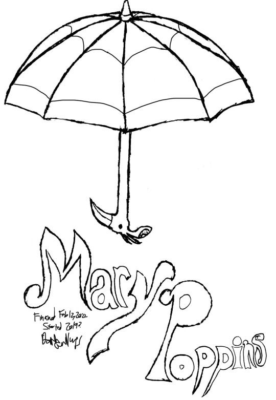
The first picture, I’ve had in my back pocket (not literally) for roughly two years. I think it started out at first as an exercise in perspective (umbrellas are odd objects) but then I realized I could draw Mary Poppins’ umbrella, and then I came up with a cute font for her name … but unfortunately I messed up on the ‘ppins’ of her name. So I drew it elsewhere on the page. Then this year, I edited the nicer one into position, and that was that! I just wish I had written the date I started :’). It’s bugging me a bit.
The second picture was pretty fun! I love how she travels via wind, I copied Mary Poppins’ outfit from the movie, and did my best to make her look like Julie Andrews. Probably the most annoying parts were figuring out the perspective for the railing and the pattern on her carpet bag. THAT took me a long time to draw, on this picture and all the following pictures. The pattern is really pretty though …
The third picture ended up a little more boring than I wanted it to? MP is wearing the same outfit, and I had trouble drawing the kids proportionally (I spend a lot of time drawing adults). Additionally, I couldn’t think up any designs for the table I wanted to draw. The armchair is coming out a bit warped, but considering it’s something that, in all dimensions, is bigger than the carpet bag (unlike a lamp), I figured that the only way for it to come out is if it was visibly warped. On the easier side of decorations, I drew a couple Sindhi designs on Jane’s clothes. Figuring how the split in her dress would look like when she sat in that position was somewhat difficult though lol.
The last picture was kind of sweet. Sliding up the bannister was just a piece of casual magic that I wish I could’ve joined in on lol. I wanted to include the twins, so MP is holding one and Michael is holding the other, while Jane holds the carpet bag. Jane already has her dupatta ff (because it’s rude for non-related men to look at her hair in public, but Michael forgot to take off his cap, the ṭopī. Silly kid. I just added the little magic symbols near MP’s fingers to show she was pushing them up the stairs. Funnily enough, this picture was the hardest to edit, because I drew it on yellow paper (it was already inside my notebook shrug) and then pencil dust kept dirtying it. But you can’t tell now!
I hope you enjoyed, and will read the book! The author, P.L. Travers, was oft-celebrated and quite famous, considering she was basically out as a lesbian during an unforgiving time. She even received an excellence award, OBE, from the crown! Just remember, there are some culturally insensitive parts in the original book that you should take with a grain of salt.
#win a commission#wac#mary poppins#p l travers#p. l. travers#p l travers OBE#p. l. Travers OBE#okay apparently nobody talks about her on here?#she’s a lesbian author with a troubled past#saving mr banks#I’m surprised she isn’t even a special interest to someone on here?#julie andrews#tried to make my lady look like her#not my best work#the kids are grandkids of Sindh (Pakistan) immigrants#they have a white paternal grandad thus the last name#the family is Muslim but since they’re never drawn outside the bunch don’t wear anything in their heads#well the last picture they just returned from an outing#Michael forgot to take his hat off but#Jane already has her dupatta off#(Michael has a Sindhi cap on)
9 notes
·
View notes
Text
In the long run, whatever it may be, everyone must become the hero of their own story; their own fairy tale, if you like, a real fairy tale.
P. L. Travers, “What the Bee Knows: Reflections on Myth, Symbol and Story”
0 notes
Text
Histoire de la
profession infirmière pdf
#http://vk.cc/c7jKeU#nofollow#<p> </p><p> </p><center>HISTOIRE DE LA PROFESSION INFIRMIÈRE PDF >> <strong><u><a href= rel= targe#<br> histoire de la profession infirmière en afrique pdf#<br> historique de la profession infirmière au marocl'historique de la profession infirmière#<br> profession infirmière et sage-femme pdf#<br> histoire de la profession infirmière en france#<br> histoire de la profession infirmière au cameroun pdf#<br> origine du mot infirmier#<br>#<br> </p><p> </p><p> </p><p>Remobiliser l'apport théorique sur l'histoire de la profession IDE S1. • Connaître le contexte histor#L'infirmier(e) à travers l'Histoire la profession : Art L.474 du Code de la santé école d'infirmier(e)s dans chacune des villes.L'histoire#souvent de façon empirique#L'origine des infirmières#en tant que groupe social#est apparentée à celle des ordres religieux. Après les grandes épidémies#la fonction soignante est#en Inde : première description d'un rôle infirmier. Le christianisme a influencé par la suite des soins infirmiers#ils sont devenus un devoir religieux. Sous l#</p><br>https://hunetubumad.tumblr.com/post/693052023553343488/parents-mode-demploi-joyeux-anniversaire-papa#https://jijepamuhabe.tumblr.com/post/693051943512342528/mode-demploi-moto-e4-plus#https://hunetubumad.tumblr.com/post/693052023553343488/parents-mode-demploi-joyeux-anniversaire-papa#https://hunetubumad.tumblr.com/post/693052023553343488/parents-mode-demploi-joyeux-anniversaire-papa.
0 notes
Text
Conseils accessibilité graphique
Je me dis que c'est le bon moment pour re-poster ce post de 2021 qui trainait dans mon ordi, suite au message de @petrichorpg !
Point à noter :
L'accessibilité, ce n'est pas tout ou rien. On peut améliorer beaucoup de choses et d'autres seront plus difficiles car nous n'avons pas les connaissances, les compétences, le temps ou l'énergie. Le plus important, c'est de s'y mettre.
Même si je suis un fervent admirateur du design dit universel (bon pour tout le monde), l'accessibilité a aussi ses besoins de personnalisation. Certains handicaps, maladies, neuroatypies requièrent des aménagements précis et qui n'iront pas à tout le monde.
-> Exemple : des personnes liront mieux en grand, d'autres en petit (vision tubulaire) ; un dark mode hyper contrasté conviendra bien à quelqu'un mais sera trop "bright" pour d'autres (c'est mon cas, j'adore le dark mode mais souvent, les textes sont trop lumineux pour moi).
Mais globalement, les conseils ci-dessous répondent à beaucoup de besoins et permettent d'améliorer l'accessibilité globalement. Ils sont majoritairement issus des recommandations internationales (et sinon, à travers mon expérience de graphiste).
J'ai encore pleins d'idées sous le coude mais bon, là j'ai déjà corrigé certains éléments de cette liste partagée en 2021. On verra pour le reste un jour aha
Je suis ouvert à toute question, clarification et correction en commentaire !
“Mais souvenez-vous que vous ne faites pas ce design pour des designers. Vous concevez un site pour des utilisateurices varié·es aux besoins divers, et avec différents outils pour y accéder.”
(terminologie : user -> utilisateur·trice / dys’ -> raccourci pour évoquer une partie ou l'ensemble des troubles d'apprentissage dont le préfixe est « dys »)
Typographies :
Textes tout en uppercase/capitales : À éviter sur tout un paragraphe, à garder pour de court mot ou court texte (1 ligne)
-> Pourquoi ? Globalement, les textes tout en capitales manquent de lisibilité à cause de l’absence des repères de lectures comme les lettres qui montent (l,d,k) et qui descendent (p,j).En majuscules, toutes les lettres sont à la même hauteur.
Textes tout en lowercase/minuscules : À éviter aussi, les majuscules servent de repère de lecture pour savoir quand une phrase débute ;).
Texte centré : Éviter les textes centrés quand ils sont trop longs (longues lignes ou beaucoup de lignes).
-> Pourquoi ? Les lignes d'un texte centré ne débutent pas aux mêmes endroits et la lecture en est impactée. À garder pour de très courts textes type 2 lignes (citation, titre et sous-titre court...)
Texte justifié : Éviter globalement (oui je sais, 98% des forums ont leurs textes justifiés aha....)
-> Pourquoi ? Sur le web, on peut difficilement gérer les espaces entre les mots. Un texte justifié va donc créer des espaces + ou - grands entre chaque mot pour combler l'espace et rentrer dans une largeur fixe, ce qui peut complexifier la lecture (l'oeil va plus difficilement sauter d'un mot à l'autre en gros).
Texte aligné sur la gauche : À privilégier au max, surtout les longs textes ! Je sais que le justifié rend plus "esthétique" car tout est aligné. Si on veut les garder, plutôt pour les textes de catégories et privilégier le texte aligné à gauche (dans le jargon on parle de ferré à gauche) pour la majorité des textes type annexes, rp...
Line-height (espace entre les lignes) : Pour les paragraphe, il est recommandé d'avoir un line-height de x1.5 de la taille du texte.
-> Exemple : paragraphe en 16px → 16x1.5 = votre line-height. Pour les grands titres, j'ai tendance à descendre à x1.3 généralement car normalement les titres sont courts et grands.
Letter-spacing (espace entre les lettres) : Éviter de changer les espacements de lettres, surtout sur ce qui est titre et paragraphes. Normalement une typographie a des espaces précis pour faciliter sa lisibilité. En ajouter peut créer des difficultés de lecture.
Niveaux de titres (ce qu'on nomme H1, H2, H3) : Choisir plusieurs niveaux de titres et s'y tenir. Il faut que chaque élément ayant le même niveau d’informations soit dans le même style graphique à chaque fois pour aider à comprendre la structure :)
-> Exemple : tous les titres d’annexes = tel css / tous les boutons = tel css / tous les sous-titres = tel css.
-> Partage d'infos en plus : les Hr ont aussi un rôle de structure pour les lecteurs d'écran (logiciel qui restitue vocalement ou en braille l'information écrite. Ils sont utilisés par certaines personnes aveugles, malvoyantes, qui ont des troubles cognitifs...).Je n'en parlerai pas dans cette liste car je n'ai pas de connaissance sur la facilité d'usage de Forumactif avec un lecteur d'écran.
Taille de texte : Sur le web, il est recommandé d'écrire en 16px minimum pour les paragraphes.
Accent et texte : Garder les accents sur les majuscules (À, É) facilite aussi la compréhension des textes.
Largeur de textes : Normalement sur FA, on n'a pas ce soucis, mais on conseille globalement d'avoir entre 50 et 70 caractères, espaces compris, par ligne pour une bonne lisibilité. Le but n'est pas de calculer chaque ligne mais de se rendre compte de ce que ça signifie visuellement ( j'utilise le site compteursdelettres).
Mise en valeur :
Changement de typographie : Éviter les changements de typographies dans des paragraphes pour mettre en valeur des éléments ! Plutôt utiliser le gras, une couleur différente ou un surlignement en couleur discrète (mais visible, faut juste pas que ça soit TROP visible).
Nombre de mises en valeur : normalement, une mise en valeur ne devrait pas être trop présente car sinon...ça voudrait dire que tout le texte est important aha. Restons utile et efficace : un peu de gras, un surlignement si besoin d'avoir 2 CSS de mises en valeur mais ne faisons pas un sapin de noël.
Italique : Utiliser l'italique avec parcimonie (manque de lisibilité sur certaines typographies). En général, l’italique sert pour des citations courtes, des mots en langue étrangère à celle du texte, des noms propres ou d’ouvrages, pas juste pour “faire joli”.
Soulignement : Éviter d’utiliser le soulignement pour des éléments non-cliquable. C'est un code connu et reconnu dans le web pour visibiliser les liens alors autant l'utiliser comme le cerveau s’y attend :)
Liens et infos :
Élément cliquable (bouton, lien, flèche...) : pas trop petit et éviter des éléments cliquables trop proches les uns des autres.
-> Pourquoi ? Une personne qui a des troubles de la vision ou de la motricité pourrait galérer à cliquer au bon endroit si c'est trop petit / trop proche d'un autre élément cliquable !
Lien et css : je conseille toujours de garder le soulignement pour les liens, c'est un code connu du web alors autant de ne pas réinventer la roue. On peut ne pas avoir de soulignement pour ce qui est "logique" (genre les menus, on sait globalement que c'est cliquable) mais un lien dans un texte, on garde le soulignement !
-> Note : Un lien en couleur seule n'est souvent pas suffisant, surtout si on utilise déjà la couleur et/ou le gras pour mettre en valeur (il y a des cas à la marge mais j'essaye de rester efficace).
Cacher du contenu : Éviter de trop dissimuler du texte dans des collapses/accordéons. Plus les textes seront cachés, plus ça créer un sentiment de “mauvaise” surprise chez les users qui se retrouvent à lire 4x plus de texte que ce qu'iels pensaient.
Renseigner ce qu'on va trouver : Sur de longues annexes, ne pas hésiter à préciser le contenu avec une introduction courte qui résume ou avec un mini sommaire. Pourquoi pas y ajouter des ancres (html) pour faciliter la navigation dans l’annexe.Liens entre les informations : Ne pas hésiter en fin d’annexe/contexte à mettre des liens vers d’autres sujets qui serviront à mieux comprendre ce que les membres ont lu juste avant. Pas tous les liens, juste ceux autour des informations évoquées au dessus. En gros, aider les users à mieux comprendre en leur indiquant où se rendre ensuite !
Plan de forum : Sur un site, on conseille d'avoir une page "Plan du site", qui récapitule toutes les pages. Je me dis qu'un post "plan du forum", spécifiquement pour la partie annexe, peut-être très cool.
Couleurs :
Contraste général : Ni trop fort, ni trop faible. Dans les recommandations officielles d'accessibilité, on parle de ratio de contraste. Il existe des outils pour tester les couleurs de texte sur les couleurs de fonds pour voir si on est dans les clous.
-> Comment s'y prendre ? Je vous recommande l'outil Color Contrast Analyser qui est un logiciel sur Mac et Windows : vous entrez la couleur de texte (1er plan) et la couleur de fond (2e plan) pour obtenir un ratio de contraste. L'objectif est de viser la conformité sur "texte normal" et "texte grand" du niveau "AA" (je conseille toujours le niveau AA car sinon on rentre dans des choses plus précises type si texte plus de 24px, on peut être moins contrasté etc...)
D'autres site de contraste (si besoin, je serais ravi de faire une vidéo pour montrer comment les utiliser) : Colorsafe.co ou Contrast-finder
Couleurs pures ou vives : Éviter les couleurs dites pures (noir #000 sur blanc #FFF, etc) ou très vives. Privilégier des nuances comme un noir coloré, grisé ou un blanc cassé, une couleur descendue et pas flashy, surtout pour ce qui est texte ! Même si le contraste sera bon, certaines couleurs trop vives peuvent entrainer des migraines ou autre sensibilité à la lumière.
Gifs : Éviter les gifs avec flash de couleurs ( type spot de soirées) ou flash trop rapides / répétition. Ça peut entrainer une crise d’épilepsie photosensible chez les personnes épileptiques (et aussi des migraines). Ou alors prévenir en amont. Donc à éviter sur des headers, à un moment c'était assez tendance.
-
Éléments animés : Toujours laisser la possibilité d'arrêter une animation (ex : un fond de forum qui bouge pour donner un côté grain de vieux film -> on a un bouton qui permet de stopper cette animation.) Ça peut être plus complexe à faire mais une animation qui tourne en boucle, niveau concentration, c'est chaud :/
Information et couleurs : Ne pas signaler une information uniquement par la couleur
-> Exemple : "info importante en rouge" ou pour diviser une liste d'info "en rouge les malus, en vert les bonus".
-> Pourquoi ? Les personnes daltoniennes verront le rouge jaune/marron ou rose (il existe plusieurs types de daltonisme).
-> Comment ? En plus d'une couleur, on peut accompagner d'un pictogramme, d'un symbole (triangle rouge = telle info ; carré vert = telle info), ou d'un mot, tout simplement. Ne pas oublier la légende ;) En plus, c'est top pour apporter un peu plus d'identité graphique !
Récurrence d'usage des couleurs : Utiliser chaque couleurs pour les mêmes éléments au fil des pages.
-> Exemple : Une palette avec du bleu doux , du gris perle et du bleu marine : le bleu doux pour tous les boutons et liens, le bleu marine pour tous les titres, le gris perle pour les separateurs....
Autres :
Poids des visuels : L'accessibilité concerne aussi l'accès à l'information quel que soit notre matériel ou notre type de connexion. Tout le monde n'a pas la fibre et des headers de 3 mo (oui j'a déjà vu :/) peuvent être très pénibles à charger.
-> Conseils : N'oublions pas de diminuer le poids de nos images en passant par des logiciels de compression (compress jpg ; compress png ; compress gif). Il est toujours possible de trouver le juste milieu entre qualité et poids !
Laisser la parole : que ce soit dans un post dédié, un questionnaire en ligne et anonyme, par MP au staff ou dans la fiche de présentation (le forum Maybe this time le propose par exemple), on peut intégrer la possibilité de faire des retours d'accessibilité ou préciser des besoins précis. On ne peut pas penser à tout et peut-être qu'un besoin remonté par un·e membre aidera d'autres qui n'ont pas osé en parlé !
Pour aller plus loin :
En anglais : conseils sur les couleurs pour les personnes avec des handicaps visuels
Designing-for-color-blind-users
Colour-accessibility
En français : accessibilité, design, webdesign
Le site design accessible
74 notes
·
View notes
Text
Collaborative Masterpost on Saint-Just
Primary Sources
Oeuvres complètes available online: Volume 1 and Volume 2
A few speeches
L'esprit de la révolution et de la constitution de la France (1791)
Transcription of the Fragments sur les institutions républicaines (1800) kept at the BNF by Pierre Palpant
Alain Liénard's edition and transcription of his works in Théorie politique (1976)
Some letters kept in Papiers inédits trouvés chez Robespierre, Saint-Just, Payan, etc. (1828)
Fragment autographe des Institutions républicaines
Une lettre autographe signée de Saint-Just, L. B. Guyton et Gillet (not his writing but still interesting)
Two files at the BNF with his writing (and other strange random stuff):
Notes et fragments autographes - NAF 24136
Fragments de manuscrits autographes, avec pièces annexes provenant de Bertrand Barère, de V. Expert et d'H. Carnot - NAF 24158
Albert Soboul's transcription of the Institutions républicaines + explanation of what's in these files at the BNF
Anne Quenneday's philological note on the manuscript by Saint Just, wrongly entitled De la Nature (NAF 12947)
Masterpost (inventory, anecdotes, etc.) - by obscurehistoricalinterests
Chronology
Chronology from Bernard Vinot's biography
Testimonies
Élisabeth Duplay-Le Bas on Saint-Just, as reported by David d'Angers - by frevandrest and robespapier
Élisabeth Duplay-Le Bas corrects Alphonse de Lamartine’s Histoire des girondins (1847) - by anotherhumaninthisworld
Many testimonies by contemporaries (in French) on antoine-saint-just.fr
Representations
Everything Wrong with Saint-Just's Introductory Scene in La Révolution française (1989) - by frevandrest
On Saint-Just's strange representation of "throwing tantrums" - by saintjustitude and frevandrest
Saint-Just as "goth/emo boy"? - by needsmoreresearch, frevandrest and sieclesetcieux
Recommended Articles
Bernard Vinot:
"La révolution au village, avec Saint-Just, d'après le registre des délibérations communales de Blérancourt", Annales historiques de la Révolution française, No. 335, Janvier-Mars 2004, p. 97-110
Alexis Philonenko:
"Réflexions sur Saint-Just et l'existence légendaire", Revue de Métaphysique et de Morale, 77e Année, No. 3, Juillet-Septembre 1972, p. 339-355
Miguel Abensour:
"Saint-Just, Les paradoxes de l'héroïsme révolutionnaire", Esprit, No. 147 (2), Février 1989, p. 60-81
"Saint-Just and the Problem of Heroism in the French Revolution", Social Research, Vol. 56, No. 1, "The French Revolution and the Birth of Modernity", Spring 1989, p. 187-211
"La philosophie politique de Saint-Just: Problématique et cadres sociaux". Annales historiques de la Révolution française, 38e Année, No. 183, Janvier-Mars 1966, p. 1-32. (première partie)
"La philosophie politique de Saint-Just: Problématique et cadres sociaux", Annales historiques de la Révolution française, 38e Année, No. 185, Juillet-Septembre 1966, p. 341-358 (suite et fin)
Louise Ampilova-Tuil, Catherine Gosselin et Anne Quennedey:
"La bibliothèque de Saint-Just: catalogue et essai d'interprétation critique", Annales historiques de la Révolution française, No. 379, Janvier-mars 2015, p. 203-222
Jean-Pierre Gross:
"Saint-Just en mission. La naissance d'un mythe", Annales historiques de la Révolution française, Année 1968, no. 191 p. 27-59
Marie-Christine Bacquès:
"Le double mythe de Saint-Just à travers ses mises en scène", Siècles, no. 23, 2006, p. 9-30
Marisa Linton:
"The man of virtue: the role of antiquity in the political trajectory of L. A. Saint-Just", French History, Volume 24, Issue 3, September 2010, p. 393–419
Misc
Saint-Just in Five Sentences - by sieclesetcieux
On Saint-Just's Personality: An Introduction - by sieclesetcieux
Pictures of Saint-Just's former school, with the original gate - by obscurehistoricalinterests
Saint-Just vs Desmoulins (the letter to d'Aubigny and other details) - by frevandrest
Saint-Just's sisters - by frevandrest
On Thérèse Gellé and Henriette Le Bas - by frevandrest
Saint-Just and Gellé being godparents - by frevandrest and robespapier
On Saint-Just "stealing" and running away to Paris and the correction house - by frevandrest and sieclesetcieux
How was/is Saint-Just pronounced - Additional commentary in French by Anne Quenneday
#saint-just#antoine saint just#saint just#to be updated#masterpost#refs#sources#frev sources#testimonials and commentaries
111 notes
·
View notes
Text


This is what I wrote about the Flower Witch Mary Bell (花の魔法使いマリーベル) movie on Letterboxd:
This is another Japanese magical girl series that came out around the same time as Sailor Moon but wasn't nearly as successful and memorable.
It picks up on a strand of the magical girl genre that puts the protagonist in a bit of a nanny or big sister role, which has its history going back to Mitsuteru Yokoyama's Comet-san and, before that, to his obsession with P. L. Travers' Mary Poppins novels.
It actually seems possible to me that the protagonist’s name is even a nod to Mary Pippins, but I’m just conjecturing.
The movie itself also contains a lot of references to East Asian phoenix mythology, particularly as filtered through Osamu Tezuka, which is always fun. Overall, it was cute but not particularly high-quality. Still, very interesting for me.
#Flower Witch Mary Bell#花の魔法使いマリーベル#昭和#showa era#魔法少女#magical girl#majokko#魔女っ子#retro shoujo#retro shojo#anime#animation#anime film#animated film#film#mary poppins
11 notes
·
View notes
Text
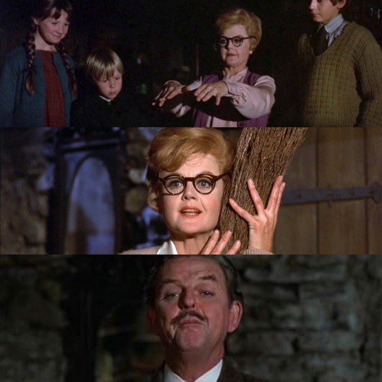
Bedknobs and Broomsticks (1971, Robert Stevenson)
15/01/2024
Bedknobs and Broomsticks is a 1971 film directed by Robert Stevenson. The film, which stars Angela Lansbury and David Tomlinson, was produced in mixed media by Walt Disney Productions and is based on the novels The Magic Bedkno; or, How to Become a Witch in Ten Easy Lessons (1943) and Bonfires and Broomsticks (1947) by the British writer Mary Norton.
The British government displaces children in the countryside to protect them from the bombings that the Nazi air force inflicts on London.
When a letter arrives explaining that Miss Price will not be able to have the last lesson of the witchcraft course, the woman uses the brass knob to travel to London and meet the headmaster of the school, Mr. Emelius Browne. So they go to the Portobello Road market to look for the missing part of the book - The Spells of Astoroth - but a criminal forces them to make a deal; in particular she takes them to an old bookseller, an accomplice of hers, and it turns out that he is the one who has the missing part.
The film was started by Walt Disney and his collaborators before P. L. Travers, author of Mary Poppins, gave the green light for a film based on her children's novel. After the great success of Mary Poppins in 1964, Disney pushed to have Julie Andrews in the leading role again. In fact, in Bedknobs and Broomsticks similar magic, music and animated segments appear - moreover directed by the same director Robert Stevenson - and co-starring David Tomlinson, who brilliantly played the part of Mr. Banks. For fear of being identified with the same figure and therefore making a duplicate of the same genre, Andrews refused; a few months later she changed her mind, but Angela Lansbury had already signed on for the part of the protagonist Eglantine Price.
In the Naboombu lagoon scene, the song that Angela Lansbury and David Tomlinson sing was supposed to be used for Mary Poppins, in the Magic Compass episode that took Mary and the children around the world.
The footage for Step, however, was not relocated into the film because it was incomplete, but the new edition includes several newly discovered songs, including an Angela Lansbury solo, Nobody's Problems.
In reconstructing the film, Angela Lansbury, Roddy McDowell and other actors were asked to re-dub their parts on some spoken tracks that were not restorable. Even though David Tomlinson was alive when the film was reconstructed, it was not possible for him to provide post-synchronization for Emelius Browne: so another actor was called in whose intonations, in some cases, were criticized because they did not resemble those of the Tomlinson original.
When the film was screened for the Academy following its restoration, the crowd erupted in a standing ovation after the song Nobody's Problems was performed.
After the premiere (where it was shown in the 139 minute version) the film was cut to 117 minutes.
Songs like A Step In The Right Direction and With A Flair were removed entirely, as was the subplot featuring Roddy McDowall's character, the central dance number to "Portobello Road", cut by 6 minutes, and a solo by Angela Lansbury in Nobody's Problems.
In Italy Bedknobs and Broomsticks was shown at the cinema in October 1972, a year after its release in the United States.
In the 1981 version, in addition to being cut by about 20 minutes which corresponded to the songs The Home Old Guard, The Age of Not Believing and Eglantine, the film featured a different mix.
The DVD, however, brings to light the 117 minute Italian edition (which becomes 112 due to the speeding up of PAL) restoring the lost dubbing parts starting from a 16 mm.
#bedknobs and broomsticks#film#1971#robert stevenson#angela lansbury#david tomlinson#Live action animated film#the walt disney company#Mary Norton#Bombardment#luftwaffe#london#witchcraft#portobello road#walt disney#P. L. Travers#mary poppins#julie andrews#dubbing#academy awards#standing ovation#Irwin Kostal#Richard M. Sherman#Robert B. Sherman#2002#premiere#roddy mcdowall#1972#audio mixing#PAL
5 notes
·
View notes
Text
hc that the one we saw wasn't the first time Crowley wore the nanny outfit, but actually was a nanny (as a hobby ig) back in the day and, looking the way he does and preforming a few miracles to entertain the kids, accidentally inspired the author (P. L. Travers) to write Mary Poppins
25 notes
·
View notes
Text
b.o.î.t.e
Et la prose du monde,
qui rebondit sur Ton regard Sombre.
J’ai Ta Beauté
qui
Dégouline le long de mes Coursives.
Épinglée dans ma boîte à
/ Travers /
Tu me remets D
R
O
I
T
E
Quand Tu - effleures
L’intérieur.
Être de dichotomie et d’infini,
Tu le sens le palpitant récalcitrant ?
Allez Oui - vas-y
Mord - Mord
Bien F.O.R.T
Corps
Trésor
Hommage aux lèvres qui se transent
/ Réunir ton ADN /
Tu devrais être
M
U
P L I É
T
I
Île, Alcôve ?
[ Muse ]
Grave dans le creux
Ton Nom d’Emprunt.
10 notes
·
View notes
Photo
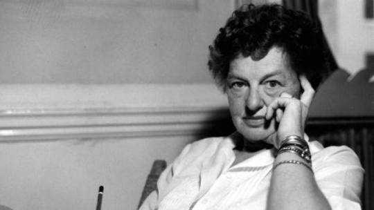
""When I last saw Gurdjieff, just before he died, he said he would give me something for the rest of my life. And he did. I know that somehow this has been received by me.”
(She did not try to explain what that “something” was.)
“How has it changed me? I don’t know, I feel myself not changed, but ripening. For me there are no answers, only questions, and I am grateful that the questions go on and on. I don’t look for an answer because I don’t think there is one. I’m very glad to be the bearer of a question."”
~ P. L. Travers
[Ian Sanders]
26 notes
·
View notes
Text
Hi I love spotting unexpected demonstrations of how everyone's always lived in the same world. I was reading a biography of George MacDonald (for school) and came across a quotation from Charles Dodgson describing how he met two of MacDonald's children in a sculptor friend's studio. Greville MacDonald, age 5, was posing for a statue of a boy with a dolphin that was later placed in Hyde Park…
And I said "hey, wait a minute, that statue sounds familiar."
And I looked it up and sure enough a Boy With Dolphin statue that is clearly based on this one appears (and comes to life) in a Mary Poppins book.
P. L. Travers wrote about a Greek statue-boy based on a statue of George MacDonald's son, which Lewis Carroll saw being sculpted.
Everyone has always lived in the same world, and the world just keeps being lived in. Nothing ever came from nowhere and nothing ever completely vanishes either, whether we know it or not…it just keeps GOING… I don't know. I have Feelings.
28 notes
·
View notes
Last Seen Blogs

leon123stuff
Untitled

maluornela
maluornelas


hiyamak
Hiyama Field Notes

carnivalsofsilverfish
Carnivals of Silverfish