#sans bios list illustrated
Text
August will be SANS MONTH where I try to color as many sans drawings as possible. I have WIPs that I've been chipping at for 2 years and I have to finish them
#quo rambles#current projects I'll do uhhhh#ink comic + speedpaint#dreamtale sans trailer#sans bios list illustrated#dreamtale storybook#errink i care on purpose#sticks hand in your skull#and that's all. I will probably want to do more but those are the particular projects
26 notes
·
View notes
Text
TRIPITAKA - the lost spiritual sequel to Cosmology of Kyoto was found

This post is a compilation of a series of tweets I have composed over a period of weeks during this summer.
For years, it was uncertain whether TRIPITAKA 玄奘三蔵求法の旅, by Soft Edge, had in fact ever been published. I remind the more absent-minded readers that this is the studio responsible for the mythical CD-ROM Cosmology of Kyoto, originally released in Japan in 1993, later published in the United States by Yano Electric in 1995. Knowledge of this their second and final production comes solely from the online CVs of producers Hiroshi Ōnishi and Mori Kōichi. No other information could be found online, and no actual copy of the game was known to exist.
Earlier this year, this disc surfaced at Yahoo Auctions. It sold for nearly $300 after 24 bids.

As suggested by its tile, which translates to Xuanzang Sanzo's Dharma-Seeking Journey, it was always assumed that the game illustrated episodes of the life of the celebrated Chinese Buddhist monk, particularly his 7th century pilgrimage to India. The captures printed on the back not only show a character highly reminiscent of the ancient scholar, they depict a variety of scenes taking place in China and India.
According to the severely incomplete archived version of PD Inc's website, the Japanese publisher responsible for this digipack, it was available for sale at museums hosting the 1999 Silk Road Journey To The West exhibition, which suitably matches the date printed on the back cover. However, this date presents yet another open question, as the Ōnishi-San and Kōichi-San bios both list it as a 1995 production.

The technical specifications may provide an enlightening clue, as they refer to Windows 95, 640x480px resolution and an 8-Bit color mode. This indicates that TRIPITAKA was indeed developed sometime between 1993 and 1995, although it was never published in the CD-ROM game circuit, certainly not in the immediate years after its development was completed. Combined with the data retrieved from the publisher's website, the edition shown here appears to have been produced solely for the occasion, as a means to diversify the museum shop catalog for this major exhibit, given the shared theme.
It would have been nearly impossible, had the program been in fact published in 1995, for a single copy to not have been spotted or mentioned online by the many Japanese collectors who have attempted to locate it for decades, unsuccessfully. On the other hand, a CD-ROM that was sold at a museum exhibit is likely to be purchased by visitors who were entirely unaware of the item's relevance as an elusive multimedia gem.
If a tangent is permitted here, both productions are inextricably linked with the museum space, and as far as I can speculate, Cosmology of Kyoto was, itself, also published with the intention of being made available in gallery stores in addition to computer game retailers. I say this because this was a production made possible by collaborative efforts including a variety of Japanese museums, to the extent these are referenced by name in the game's credits.
Considering the price at which the item was sold at auction, I was fairly certain that it was purchased by one such video game collector who knew exactly what they were bidding for. Later in July, I was able to locate the buyer and establish contact. Initially, the buyer was only able to produce this screenshot of the disc program launcher. The title reads "Cosmology of Asia", validating the claims that Soft Edge was in effect planning for series of edutainment software prior to its demise in the mid-90s.

In my second contact with the owner, I asked if he was available to produce a disc image and share it online for purposes of software preservation. The owner politely declined, stating that this was not something he was willing to do but offered to record the following gameplay video instead.
youtube
At a glance, the art style of Tripitaka is unsurprisingly similar to that of Cosmology. Most of its episodes occur during the day, whereas the latter was mostly played under the dark cover of night. The first scene depicts a dying Xuanzang reminiscing on his journeys in the company of a young chronicler. Structurally, both games are also nearly indistinguishable from one another, producing ample historical information for context, including detailed maps and chronologies.
TRIPITAKA was considered to be lost media for decades. As such, the importance of this footage could hardly be overstated. I would not hesitate to compare this development to the unearthing of Osamu Sato's Chu-Teng, the Eastern Mind sequel that was also deemed lost for many years, miraculously found during the time this blog was inactive.
I am delighted to have played a minor role in the unraveling of this thirty year old mystery, and can hardly contain my enthusiasm, as I now find myself equipped with sufficient information to produce a full post concerning a game about which I could not have written more than a sentence, just last year.
I would also like to thank the author of the @mendelpalace Tumblr for his timely alert regarding the Yahoo listing.
114 notes
·
View notes
Text
‘Ello, Tumblr!
(Screen)name’s Bibi Likes To Draw (you can call me Bibi) and I like drawing, animation and having a fun time with my art!
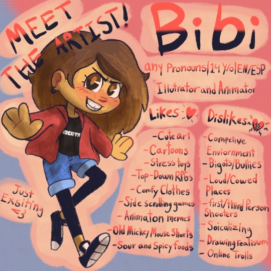
For my art look at the tag art and for my text posts look at the tag text posts
DNI Of You Are…
A Troll
Ableist
Homophobic
Transphobic
Aphobic
A Racist
A MAP
A Zoo
If You Use My Art, Here’s How To Credit Me!
If you use my art in a pfp or a banner, please credit me in this format: [original photo/photo] by Bibi Likes To Draw
For the blue space, if you are putting the credit in you intro post or tumblr bio, you can just do it as a mention, but if you are putting it on another social, make sure my blog link is there.
Feel free to redraw any of my art, just as long as you credit me with the aforementioned format on your post!
Do not just repost or trace my art, even with credit. Thx!
I Take Art Requests! Here Are Things That I Am Not Ok With Drawing!
NSFW (I’m 14!)
Ships with characters under the age of ten
Ships between adults and minors
Ships with power dynamics
Codependent ships
Incest
Excessive gore (light gore and other forms of horror are fine, just don’t ask for anything too graphic!)
Anything that insights hate or violence towards any sort of minorities
Stuff About Me/Favorites Lists
I use any pronouns, I plan to take commissions soon, (but not yet!) My birthday is October 16, I do animation and illustrate, and my favorite fandoms are as follows (current hyper fixation in bold);
The Owl House
Undertale
Pokémon
Yo-Kai Watch
Kirby
Mother/Earthbound
Gravity Falls
Big City Greens
Sans AUs/UTMV (yes, it is it’s own fandom, fight me)
Sailor Moon
Rise of The Teenage Mutant Ninja Turtles
Bendy and the Ink Machine
Baldi’s Basics
The Amazing Digital Circus
Super Smash Bros.
Bomberman
Epic Micky
And some of my favorite visual artists/animators are
@duchesscelestia
@zan-hoshi
@lamemummy59
Danna Terrace
Josh David McKenny (Pidgin Doll)
Cudlil
Ello Mellow
Nirami
Gigi
Fionapollo
Get Madz
@itsnicsalad
Kitten Sneeze
Dan Povenmire
Cinnamon_Mushroom :D
Twisted Doctor
Gooseworx
Aimkid
Most all of theses artists are either on here, YouTube and/or TikTok, so go show ‘em some love!
Also some of my favorite music artists/groups are
Jack Stauber
Toby Fox
Jaroslav Beck
Tom Cardy
The Greatest Bits
Keiichi Suzuki
Hirokazu Tanaka
Koji Kondo
Boom Kitty
The Living Tombstone
Hirokazu Ando
Jun Ishikawa
Gooseworx
Stuff I Make
Illustration and animation for the most part, but I plan to branch out into other creative endeavors soon! I am open to art requests!
My side blogs just for silliness! @bibi-likes-to-reblog, @ask-the-bombermen, @i-love-ac-bob,and @jokesupersmashbrospolls
My other socials: YouTube, Unvale
Any ways, have fun out there, random strangers on the internet! And may you day be better than the last!
#meet the artist#meet the artist meme#about myself#stuff i like#lists#favorite artists#my favourite#favorite#favorite music#digtal art#my art#art#art of me#pined post#masterlist#master post#updated#updated masterlist#masterpost
34 notes
·
View notes
Text
Savoir lire les étiquettes alimentaires
Aujourd'hui, j'avais plein d'idées de sujets à traiter mais j'ai choisi de m'arrêter sur la lecture des étiquettes des produits que vous pourriez acheter !
Nutriscore, application Yuka, label bio... de nombreux outils ont vu le jour ces dernières années pour nous permettre (normalement) de consommer mieux (nous reviendrons un jour plus en détail sur ces outils sinon vous auriez encore trop de lecture aujourd'hui 😅) mais savez-vous vraiment décrypter les étiquettes de vos produits ?
Aujourd'hui, je vous donne donc quelques réflexes simples pour améliorer vos choix dans les rayons de vos magasins préférés ! Pour illustrer cela j'ai choisi deux aliments qu'en tant que nutritionniste je déteste particulièrement mais que beaucoup adorent ou prennent par simplicité : le cordon bleu et le pain de mie complet (pour ce dernier on me dit souvent "oui je prend du pain de mie mais il est complet donc ca va")
Première chose à regarder : la liste d'ingrédients ! Trois choses à retenir :
plus la liste est longue, plus cela veut dire que l'aliment est transformé et qu'il ne contient pas forcément l'essentiel (et rappelez vous : aliment transformé = indice glycémique très élevé).
Les ingrédients sont toujours indiqués dans l'ordre de quantité contenue dans l'aliment (si vous voyez des aliments en gras ce sont toujours ceux qui sont potentiellement allergènes).
Elle doit vous servir à comprendre les valeurs nutritionnelles de l'aliment (un aliment qui indique un bon taux de protéine par exemple : si les protéines sont d'origine animale ou végétale : cela n'aura pas le même impact dans votre corps)
Voyons donc la liste d'aliments de nos deux produits :
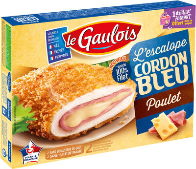
Viande de poulet traitée en salaison 58 % (viande de poulet : 50%, eau, fibres de BLÉ, dextrose, sel), panure 22% (eau, farine de BLÉ, levure, sel, épices), jambon de dinde standard fumé 10% (Viande de dinde : 8%, eau, fibre de BLÉ, dextrose, protéine de BLÉ, arômes naturels, sel, extraits végétaux (bette, carotte), ferments, gélifiant : carraghénanes, antioxydant : ascorbate de sodium), EMMENTAL fondu 10 % (EMMENTAL : 5%, FROMAGES, eau, BEURRE, LAIT écrémé en poudre, amidons modifiés, protéines de LAIT, sels de fonte : citrates de sodium, gélifiants : alginate de sodium), Huile de tournesol
=> Comme vous pouvez le voir, la viande de poulet (et encore on ne connait pas la qualité de la viande citée) ne représente que 50% de l'aliment ! mais on peut également voir que le dextrose (sucre) revient à plusieurs reprises. Des protéines de blé (= gluten) sont rajoutées ce qui peut faire augmenter la part de protéine dans les valeurs nutritionnelles mais ce ne sont pas forcément des protéines très bien assimilées par notre corps. pour le fromage, j'aime beaucoup l'aiment "fromages" sans explication (donc on peut avoir de tout dedans en gros). Enfin je ne parle pas des additifs (comme les gélifiants et autres) qui viennent compléter à merveille ce super aliment et l'huile de tournesol plutot à tendance acide gras saturé.
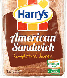
Farine complète de BLÉ 38%, eau, farine de BLÉ 25%, huile de colza, sucre, arôme (contient alcool), sel, vinaigre, farine de SEIGLE maltée, levure, gluten de BLÉ, extrait d'acérola. Peut contenir des traces d'OEUFS, SOJA, LAIT, FRUITS À COQUE, GRAINES DE SÉSAME.
=> j'en avais parlé dans mon article sur les pains mais lorsque vous mangez du pain complet NORMALEMENT les ingrédients sont de la farine complete, de la levure, de l'eau et du sel... dois-je vraiment commenter cette liste d'ingrédients ???
Partez déjà du principe que plus la liste d'ingrédients est longue, plus l'aliment sera transformé, plus il sera mauvais pour votre santé !
Deuxième chose à regarder : le tableau des valeurs nutritionnelles
Bien sûr la valeur énergétique est importante (kcal) mais attention cependant, maintenant que vous savez tout sur les indices glycémiques vous avez donc compris que ce chiffre peut dire tout et n'importe quoi et que l'impact sur notre corps ne sera absolument pas le même à valeur égale ! Des lignes pour moi très importantes :
La ligne "dont sucres" en dessous de glucides
La ligne "dont acides gras saturés" en dessous de lipides (cf mon post sur les lipides)
La ligne "fibres" : il est important d'avoir dans notre journée, pour la santé de notre intestin (microbiote) et notre santé en général, d'avoir minimum 25-30 grammes de fibres dans la journées et comme évoqué dans mon post sur les glucides les fibres font baisser l'indice glycémique d'un aliment.
La ligne "protéine" : comme évoqué précédemment, cela nous donne la quantité (et les protéines sont primordiales dans notre alimentation) et cette quantité doit etre mise en relation avec la liste d'ingrédient
Dans les deux premiers cas, dites vous que si c'est deux lignes sont supérieures à 50% de la quantité totale il faut les éviter à tout prix, conseil de nutritionniste 😉
Voyons donc nos deux aliments :


Bon ici, pour nos deux aliments, les deux premiers points ne sont pas dans ce cas, l'alerte était clairement sur la liste d'ingrédients et le fait que ce soient des aliments ultra transformés. Cependant, pour les protéines du pain de mie, nous savons désormais qu'elles proviennent principalement du gluten et donc qu'elles ne seront pas les meilleures pour notre corps et pour le cordon bleu elles sont animales mais la qualité reste à démontrer. Mais vous voyez si vous vous arrêtez à ce tableau vous pouvez penser que cet aliment est plutôt bon pour votre équilibre alimentaire.
Reparlons du NUTRISCORE de ces deux aliments : B !! Cela veux dire que ces aliments sont plutôt considérés comme dans la partie des aliments que l'on peut consommer régulièrement... alors que l'ince NOVA indique que ce sont des aliments ultra transformés... (pour comparaison, l'huile de noix très riche en omega 3 à un nutriscore de C alors qu'il faudrait à l'inverse en consommer beaucoup plus souvent car nous sommes tous en carrence). Attention donc à ces indications !!
Alors la prochaine fois que vous ferez vos courses peut être que vous penserez à moi, soit parce que vous allez mieux consommer, soit parce que vous allez mettre deux fois plus de temps dans les rayons et que vous allez me maudire !!
Et si vous avez des aliments que vous souhaitez que je décrypte n'hésitez pas à les mettre en commentaires ce sera avec plaisir !
#alimentation#nutrition#healthyfood#healthylifestyle#nutritionsportive#nutritiontips#nutritionniste#health#sport
10 notes
·
View notes
Text
FAQ (Frequently Asked Questions) / Guidelines
~ 2021 Edition ~
Last Updated: 03/20/2021
(Note - This is also on dA - but the format on that version is not correct due to site changes)
-----
Any updated portion will be indicated by double asterisks (**) leading and ending section.
[TL;DR - Please at least read the answers to questions 6, 7, 9, 11 and 12]
This post is split to three separate sections:
Guidelines - Questions for permissions on character(s) and limits on said permissions.
General FAQ - Questions centered on 7goodangel.
Character Specific FAQ - Questions on individual characters.
-----
GUIDELINES
1.Q: Can I draw your character(s)?
A: Yes. Please credit myself in the description when you post it (and/or tag me if you post it to a platform I'm also on).
Also refer to question 6.
2.Q: Can I write fan-fiction with your character(s)?
A: Yes. Please credit myself in the notes/description when you post it (and/or tag me if you post it to a platform I'm also on).
Also refer to question 6.
3.Q: Can I have your permission to make an alternate version of your character?
A: Yes. Please take the time to read the full FAQ / Guidelines prior to creating your variation. And have fun!
4.Q: Can I voice act as [character] for comics / stories / etc?
A: Yes. Please refer to questions 5, 6 and 8 prior to publishing works.
5.Q: Can I be the official voice for [character]?
A: There will not be any official voices for characters I have made.
6.Q: Can I write / draw NSFW (Not Safe For Work) of character(s)?
A: No. Please do not post any variation of sexual NSFW including character(s) online. Do not show in detail on any acts that would require a 'fade to black' treatment.
This includes but not limited to in$est, v0re, and r@pe.
General violence - i.e. battles / fights - is allowed, however, please contact me for any additional questions regarding to this topic.
7.Q: I found NSFW art / story on [website / app] with your character(s) - what should I do?
A: If the website does not allow NSFW in any aspect, report the piece using the correct filter. If the website does allow, then please ignore the item. Do not report art / stories on my or any artist's behalf (i.e. saying you represent the original artist).
8.Q: Can we include a character(s) of yours in a project?
A: Yes, as long as there is no monetization. (Refer to question 9)
9.Q: Can I sell products / commissions / etc. with [character(s)] in it?
A: Depends - Please look at the list below for clarification.
1) One Time Products / Commissions: If a product is only created one time - i.e. a digital/traditional art commission or a one time custom plush - and is not sold in mass production, that is okay. There cannot be a dedicated page for a product with a character of mine - even if the item is labeled "Made to Order" or "Custom Plush [Character Name]" or similar variations.
Refer to question 6 as well.
2) Mass Produced / Factory Made Products: No. Do not sell anything with any characters I've created that is massed produced. This includes but not limited to: TShirts produced on websites like RedBubble, Amazon, etc; Mass producing plushies either via factory or by hand (having many created prior to selling); Charms / Buttons / Stickers created in a factory to be sold.
3) Monetization of Videos / Patreon Support for Project / Kickstarter of Project: No. Do not include my character(s) in a project that is monetized. This includes but not limited to: dubbing comics / images / stories that I have created; dubbing comics / images / stories that include character(s) that are not fully distinguished from originals; creating a Patreon specifically around the project including character(s).
10.Q: Can I use [character(s)] as my icon?
A: Yes. Credit appropriately within your header / description (i.e. character by 7goodangel, art by [artist]).
11.Q: Can I repost your artwork to [website / app]?
A: No. Do not repost my artwork to other websites or apps.
12.Q: Can I do the lineart / color for a picture you've done traditionally / digitally sketched?
A: Please send me an ask on Tumblr or message me on dA if you plan to do this.
13.Q: Can I translate asks / facts about character(s) / etc to [language]?
A: Yes. Please give proper credit and links to original question.
14.Q: Can I create an ask/RP account for [character(s)]?
A: No. The only exception to this is if the version is a variation / alternate you've created or had permission for.
15.Q: Can I RP as [character(s)] in other ways?
A: You can RP as [character(s)] within private servers / chat rooms with prior noting that variation will not line up with original.
16.Q: Can we RP with [character(s)] in NSFW situations?
A: Refer to question 6.
GENERAL FAQ
17.Q: Where are you from?
A: Earth.
18.Q: Can we become friends?
A: There are no guarantees.
19.Q: How long have you been drawing?
A: Most of my life - but started to focus into current style in 2006.
20.Q: What programs / tools do you use for your drawings?
A: In the past, programs I used were Photoshop CS5 and Illustrator CS5. Currently, I use Clip Studio Paint. Traditional is mostly typical printer paper and mechanical pencils.
21.Q: Can you draw [character(s)]?
A: Not likely. If opened to suggestions - I may draw them if there is time. Please do not expect all suggestions to be fulfilled.
22.Q: What about pairings / ships?
A: I'm pretty neutral with most ships, except for dynamics like in$est, abusive or [adult x minor] (whether actual ages or coded like that).
(Note: Exceptions can/is more than listed.). Though I typically ship in more of a friendship way verses romantic.
23.Q: Are you okay with the ship FreshPaper / PaperFresh / Fresh x Paper Jam?
A: I am fine with others shipping this. I have my own interpretations for this ship that are different from most.
Refer to question 22.
CHARACTER SPECIFIC FAQ
24.Q: Is Paper Jam / Blue Screen a Sans?
A: No.
25.Q: Is there a biography for Paper Jam?
A: Yes. You can find here: https://www.deviantart.com/7goodangel/art/Paper-Jam-Bio-779347877
26.Q: Can we still use old design of Paper Jam?
A: Yes.
Note: Additional items can be added to this post, as well as edits.
#7faq#new-ish FAQ for the Tumblr!#now I can link to this one on my pinned post!#thank you dA for messing up your formatting... it's still over there -this is just formatted better XD#long post#(just in case someone doesn't want to see a long post)
76 notes
·
View notes
Photo
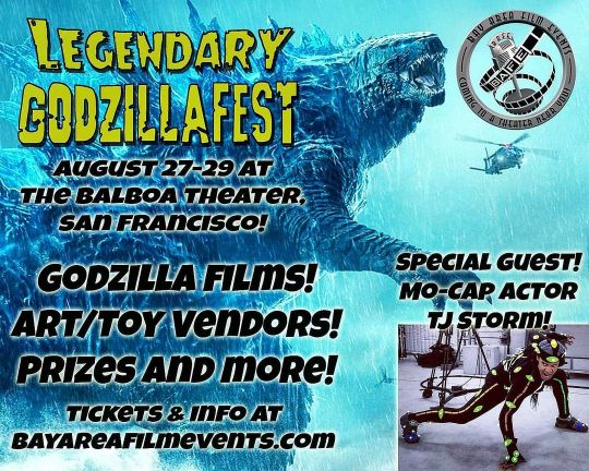
This weekend I'll be tabling at @BAFilmEvents #GODZILLAFEST at the Balboa Theater in San Francisco, CA! Come watch movies, check out artist and vendors, and get an autograph from special guest Monsterverse Godzilla mocap actor @stormzeye! I know I mentioned this event to many of you who attended the Night Market so I hope to see you there 😁 (be sure to say hi 👋!). Check the website for movie list and tickets: https://www.bayareafilmevents.com/godzillafest (will have link in my bio for IG) . . . #lenzations #illustration #godzilla (at Balboa Theater) https://www.instagram.com/p/CTAYHRFJxZf/?utm_medium=tumblr
1 note
·
View note
Text
5 BIPOC Graphic Designers to Educate and Inspire You
A crucial step in moving towards a better world is educating ourselves about systematic racism, inequality, and the role we each play in resisting and dismantling the institutions that oppress the most vulnerable groups in society. As we navigate the stressors of injustice in the era of heightened social awareness and an influx of information, education is more accessible than ever. Through social media sites, like Instagram, graphic design has become a useful tool for educators and artists to use their platforms to speak about culturally relevant social issues. As graphic designers challenge us to expand our minds, it’s important that sharing a quote on Instagram isn’t where our support and education end. As a starting point to your social enlightenment, here are 5 artists with aesthetically pleasing educational feeds you should be following.
1. @EiselleTy
Eiselle Ty is a San Francisco-based Graphic Designer whose body of work uses a 1970s color palette, textured backgrounds, and bold font to educate her audience about history, race, and politics. Her work informs her audience in a visually pleasing and relevant way by keeping up to date with current socio-political issues in the United States. Ty’s created a guide that explains code-switching which, as she explains it, is a “process of shifting from one linguistic language or dialect to another, depending on the social context or conversational setting.” In her bio, Ty shares an extensive excel sheet, a “Solidarity Checklist” that lists the names and details of victims, shares petitions to sign, resources to give back to, and even a list of Do’s and Don’ts when it comes to being an ally.
2. @FuturaFreeDesign
FuturaFreeDesign is the handle of graphic designer, Quentin Swenke, a Los Angeles-based graphic designer with an eclectic design style. His work ranges from community-based amplification such as his guide to Black-owned coffee shops in New York and Los Angeles to educational posts like his graphic on the importance of Juneteeth to his most popular design pictured above. ‘Go Harder for Breonna Taylor’ is an image that has made rounds on Instagram stories and feeds dozens of times, highlighting just how far an impactful design can reach. Swenke’s graphics range from funky to blinged-out typography, usually against blurred gradients or abstract backgrounds, similar to album covers or even a call back to the early 2000s. Either way, we’re here for it. He’s currently working on designing a merch collection that consists of t-shirts with conversation starters on racism and inequality.
3. @Annika.Izora
Annika Izora is a Brooklyn-based creative director, writer, and graphic designer who creates art that promotes rest and process, two ideas that have become almost mutually exclusive in an era of productivity. Lately, Annika Izora’s work has shifted to community-based resources, such as her latest series on ‘Creative Ecosystems and Funds,’ in which she informs her followers of resources available to creatives in the Black community. She also makes sure to note which resources are available to all BIPOC-identifying people. Annika also offers templates for BIPOC to share skills within their own creative communities. These templates aim to give BIPOC the ability to create their own creative ecosystems instead of relying on a structure that may keep resources out of these communities.
4. @ByKellyMalka
Kelly Malka is another graphic designer residing in San Francisco California. Her latest graphic, a 70s-themed quote by writer and activist Toni Cade Bambara adds to the ongoing conversation of politics, protest, and art. “The role of the artist is to make the revolution irresistible.” Malka also aims to give back to her community and has recently repackaged the graphic as a sticker. All proceeds go to Free Arts LA, an organization that uses art and mentorships as tools to help underserved youth in Los Angeles. Aside from her graphics, Malka also creates fun and quirky illustrations depicting women, eclectic home decor, and plants. The link in her bio provides more resources on supporting the Black Lives Matter movement.
5. @YumiSakugawa
Yumi Sakugawa’s work intersects the spiritual, the emotional, and the political and presents it through minimally-designed shapes and characters. As a comic book artist and illustrator, Yumi designs abstract embodiments of emotions, text-heavy posts focused on creative healing, and graphics related to current socio-political issues. During the Quarantine-period, Yumi launched a donation-based Zoom series, “Experimental, Mindful, Virtual Drawing” parties in which people of all artistic levels could join, draw, and practice mindfulness. An expert blend of spirituality, art, and the virtual climate the world had found themselves in at that moment, Yumi’s work continues to morph and shape to current events, and what seems to be an expression of a personal emotional journey. Her latest drawing party raised funds towards the organization National Bail Out and The Loveland Found
3 notes
·
View notes
Photo
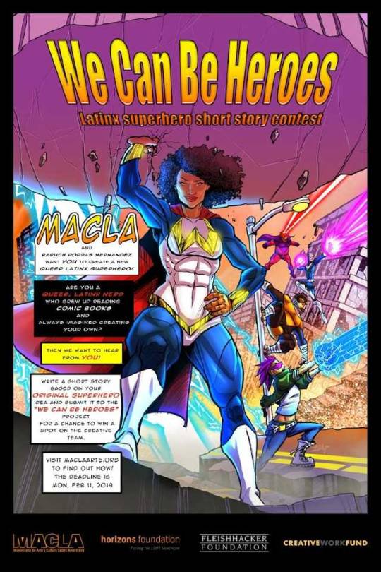

ATTENTION WRITERS!
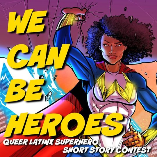
MACLA/Movimiento de Arte y Cultura Latino Americana and Baruch Porras Hernandez, (writer, performer, gay Mexican comic book nerd) are putting out a call to creators for a new Latinx Super Hero project We Can Be Heroes
We Can Be Heroes will spotlight 5 brand-new LGBTQ Latinx superheroes and YOU have a chance to be one of the creators! We are calling on all queer Latinx folks who identify as comic book nerds to enter!
We invite you to submit your original Latinx queer superhero creation for a chance to be a participating artist on this project. Winning artists get to create a brand-new queer Latinx superhero with us, become part of the We Can Be Heroes project, and receive an honorarium. Winning short stories get published with us and designed by a real comic book artist! All of this will culminate into a large comic book anthology/graphic novel with your character’s story, in which all new queer, Latinx superheroes meet at the end, and save the day!
To submit, simply write a 4-6 page, double-space, prose short story featuring your own superhero creation, along with a character description of that hero. The winning writers’ short stories will be published and be used as inspiration to introduce your character into a team comic book illustrated by a talented artist to be published by MACLA. We will check in with you twice and ask for your input: once with your character’s design and once with your character’s storyline in the graphic novel. Finally, excerpts from the final product will be read out loud, narrated to a live audience at MACLA in San José.
This new project at MACLA is made possible with support from the Creative Work Fund, the Fleishacker Foundation, and the Horizons Foundation and MACLA/Movimiento de Arte y Cultura Latino Americana.
Who is eligible?
In order for you to enter for this section you must identify as queer, this includes, gay, lesbian, bisexual, transgender and genderqueer Latinos. You must be Latino, or Latinx, which includes people from Panama, Dominicanos, Mexicanos, PuertoRiquenos, Cubanos, Chicanos, Salvadorenos, Gutemalans, Chilenos, etc.
What we need from you:
YOUR BIO, or ORIGIN STORY: Who are you? Please tell us as much as you can about yourself as a writer, person, and as a superhero comic book nerd. Not a comic book nerd, but love super heroes? That’s fine! This contest is open for all queer Latinos, so hey, go read a comic book, challenge yourself, you might write a story with a Latinx character so good, we will have to choose you!
STATS: Your writer’s resume, or C.V., if you got it. Or just a list of publications with links will also work. Being previously published is not a requirement, but if you have been published, tell us about it! Please also include links to your website if you have one, or Instagram page, or blog if you happen to have a superhero blog, or a social media space where you nerd out with other fellow comic book super hero nerds.
CHARACTER DESCRIPTION: Describe your character as much as you can. Height, appearance, hair, attitude, costume, superpowers, how do their superpowers work, what they do, do they have a catchphrase? Do they fly? How do they identify in the queer spectrum? Bi, queer, lesbian, pansexual, trans, non-binary, etc.?
SHORT STORY: Submit a 4 to 6 page (double-spaced) short story about your brand new original queer Latinx superhero. The main focus of this contest is the writing (aside from the art, the colors, and the fancy and/or sexy costumes). Great writing/storytelling is what has carried comic books as far as they’ve come, into our souls, into the mainstream, and even onto the Broadway stage. Make this story as creative as you want. We want to push the boundaries, we want you to have fun, and we want a new hero to inspire us all. Show us the action shots, bring us right to the splash page of this new hero’s story, show us the queer Latinx superhero we need.
Rules:
Origin Story must be included somewhere in the narrative. Does not have to be the main part of the story. How did this character get their powers? Was it cool? Was it an accident? Okay to make your character just be born with their powers, but tell us about it.
Character must speak about their Latinindad at one point in the story, or throughout the whole story. Totally okay to make your character monolingual Spanish speaker, or a Latina American who does not speak Spanish, immigrant, undocumented immigrant, third or sixth generation, etc.
Character must have a super power. We challenge you to create something new! Or adapt/innovate an already existing superpower to make it more interesting. We just want a good story. If you write a character who can control the weather (That’s Storm, she’s African, already exists, already world famous) or a Latina who has metal claws and is short and grumpy (that’s Wolverine, he’s Canadian, and says he’s good at what he does and like most white men won’t shut up about it) it might not catch our eye.
Character’s queerness must be present in the story and their actions. Pero, like, they don’t have to fly around with the rainbow flag, but also we’re interested in out loud and proud queer characters. There are not enough queer superheroes out there, especially not Latinx ones, (go read America Chavez, it’s GREAT!). Help us bring a new Latinx queer superhero to the world. This is a sex positive project, though the comic book will not be able to be too sexual, or show naughty scenes, show us some queer love, how do two queer superheroes find the time to make out, hold hands while they are flying, or how does our hero hold sit next to her girlfriend or partner to watch “One Day at a Time” on Netflix after saving the world?
Winner must either live in the San José/San Francisco Bay Area or be able to travel to MACLA to work on the project throughout 2018/2019 and be present at all three performances Aug 16-18, 2019 at MACLA.
Winner understands that their short story is just the beginning part of the project and will work with Baruch Porras Hernandez on edits and rewrites to come up with a finished story together before it is published and handed over to the artist.
Participating creators understand that we are not adapting your character from your short story into a comic book of their own, we are including your short story as inspiration to introduce your character to the other heroes when they meet in the final graphic novel. Participating artist will have input in how their character appears, is designed, and drawn, but the participating artist understands that the final decisions on the characters will be made by the lead writer Baruch Porras Hernandez and MACLA.
Submission deadline is on FEB 11, 2019
All submission must be entered via Google Form: https://goo.gl/forms/XBe65yQCDSNdiQ5b2
Check list:
YOUR ORIGIN STORY
YOUR WRITER STATS
YOUR CHARACTER’S CHARACTER DESCRIPTION
YOUR SHORT STORY.
Questions? Contact [email protected]
26 notes
·
View notes
Text
10 Best Vape Juice Package Designs

by Toro Imports
We love packaging design here at Toro Imports — as a smoke and vape wholesaler, we know how important design can be to make products appealing to potential consumers. Ugly packaging means slow-moving product, and a great design conveys a strong message. When a company introduces products with great design, it conveys the message that the company has good communication, a quality product, strong branding, a good understanding of its customers, and that it cares about the presentation of their product.
Vape juice bottles are items that customers tend to collect, after all. Who wants to add an ugly bottle to their collection? So, without further ado, here are 10 of our favorite vape juice brands with great packaging:
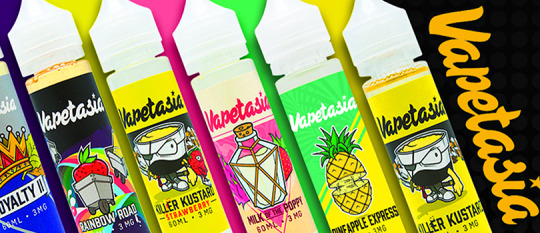
10. Vapetasia
Vapetasia is a brand with a fun aesthetic. The vaper demographic tends to be young, edgy, alternative adults who grew up with the Internet, Adult Swim cartoons, and skater brands like Savage, Thrasher, and Stussy. Vapetasia does a terrific job of encapsulating everything that this demographic finds nostalgic and fun without directly exploiting that nostalgia.
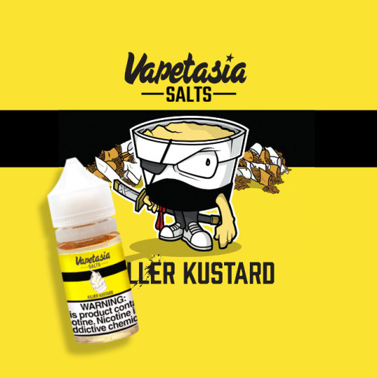
The mascot for the Killer Kustard line of vape juices by Vapetasia reminds us of the heroes of Aqua Teen Hunger Force, as a character that is personified food with a thick black outline and expressive features.
The Vapetasia logo itself is also fun, having two variations — the cloud which has icons from all of its juice brands:
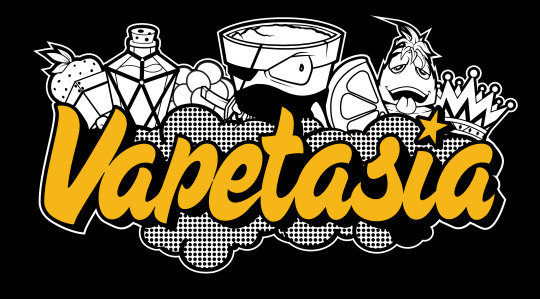
and the simple, iconic Vapetasia name. I have found that people wear Vapetasia branded swag freely, simply because even outside of its context as an e-juice brand, it is a groovy look.
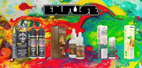
9. Enfuse - Pulp
We admit a personal bias here, because Enfuse is a brand local to Toro Imports HQ here in Houston, Texas. However, there’s a lot to be said for its logo and packaging design for their line of Pulp e-Juices.
While the Enfuse logo is simple and conveys what the brand is, the packaging for Pulp reminds us of packaging for food and beverages. The Pulp packaging is classic, readable, and beautifully conveys the flavor with its mostly bi-chromatic color scheme that makes the box itself into a watermelon and lemon hybrid.
The packaging is bright, appealing, and while not as cartoonish and playful as Vapetasia, still has its own crisp, minimal illustrations that make the bottles fun to collect as well as delicious to vape

8. Naked100
Naked100 is one of those brands that you can count on consistently flying off the shelves. Each bottle has a very minimal aesthetic that strives not to give the consumer more visual information than they require — the brand name, the e-juice line, nicotine strength, flavor, etc.
No additional design elements are ever added to the packaging, which makes the brand unassuming, yet very stylish.
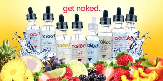
Naked100’s sans-serif font and minimal aesthetic remind us of Apple or Google, strong brands that also strive not to over-design their products. The brand is also careful not to under-design their packaging, either: all of their juices come in an eco-friendly glass bottle with very pale, subtle colors on the labels.
Aside from their innovative flavors, Naked’s sophisticated and thoughtful packaging makes it stand out from the competition as one of the best juices out there.
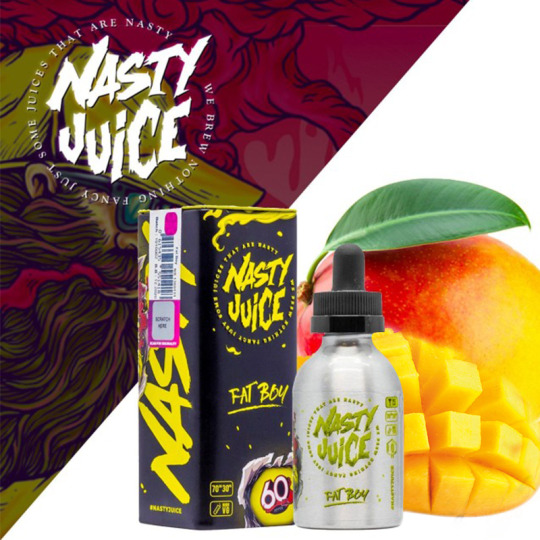
7. Nasty Juice
On the opposite side of the design spectrum from Naked100 is Nasty Juice. According to their company bio, Nasty Juice is a company founded on the idea of being an “obnoxious e-juice brand” with an “empowered sense of X-rated […] playfully daring spirit”. Standing out from other vape juice brands on this list, Nasty Juice vocally prides itself on its “exquisite advertising and top notch packaging”, which it easily accomplishes.
Nasty Juice, like Vapetasia, understands its alternative, millennial consumer base, diving into design language of skater brands and hip-hop aesthetic. Nasty Juice, much like RAW Rolling Papers, even produces its own skateboard decks and apparel with their signature fun illustrations. We love Nasty Juice not only because they are hugely popular, but because their thoughtful packaging and branding earns the popularity.

Just look at this guy. Nasty as can be.
While each of their line of Nasty Juices have unique packaging, every single bottle is easily identifiably Nasty™.

6. Nasty Juice x Kilo Collab
We just had to bring it back to Nasty Juice, because this collaboration between Nasty Juice and Kilo is absolutely stellar.
Nasty Juice tends towards its high-contrast, pop culture skater illustrations, while Kilo has a high detail, classical, almost baroque style of packaging. When you combine the two, you get this line of amazing illustrations and packages that remind us of Alphonse Mucha and vintage tobacco ads.
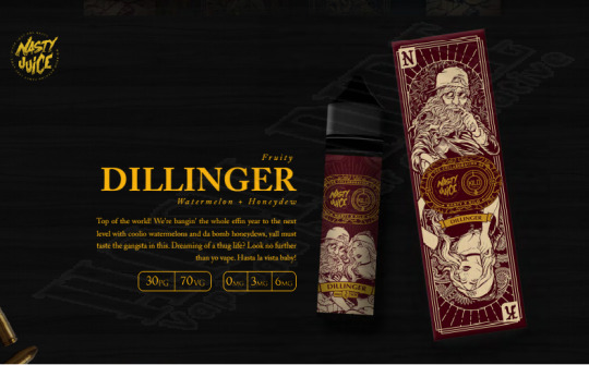
The packaging for the Nasty Juice x Kilo collaboration, to us, shows enormous respect and love for their consumers, knowing that the swag and bottles would be a lot of fun for fans of the individual brands to own. Kilo has a great aesthetic in its own right, but when combined with the powerhouse that is Nasty Juice, they come together to make a gorgeously detailed piece of artwork on every bottle.

5. Alternativ by Marina Vape Co.
Marina Vape Co. is a company that understands the other side of its consumer base that Nasty Juice and Vapetasia don’t quite reach — the sophisticated, yet edgy adults who are also likely big fans of the design of Naked100 bottles. While not quite as minimal as Naked100, the Alternativ juice line by Marina Vape Co. has a strong, informed design language of its own. Each juice is named after Greek letters, while using typography and design elements that are very much from the advanced digital age.
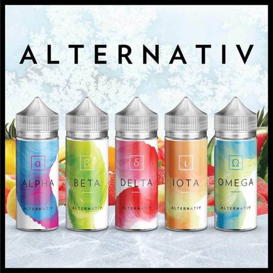
Alternativ e-Juices Alpha through Omega do a beautiful job of showcasing the transcendence of nicotine consumption from traditional smoking to high-tech vaping techniques, while also alluring the consumer with its fruity color schemes.
Like Naked100, the Alternativ vape juice packaging is not over designed, and only has some design elements that aren’t directly giving you information. We love the classy, stylish look of this juice line
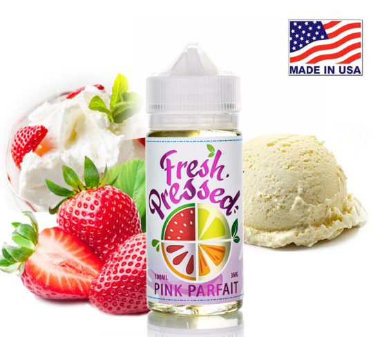
4. Fresh Pressed by California Grown E-Liquids
Going back to fun and illustrative, yet a little more modern, Fresh Pressed juices by California Grown E-Liquids reminds us of Enfuse Vapory’s Pulp juices. The logo condenses its flavors into one succinct space, and the entire aesthetic makes the juice line feel very “fresh”, as it claims to be.
The finish on Fresh Pressed bottles is glossy with contrasting metallic and glossy shine, and the illustrations are minimal, yet very appealing.
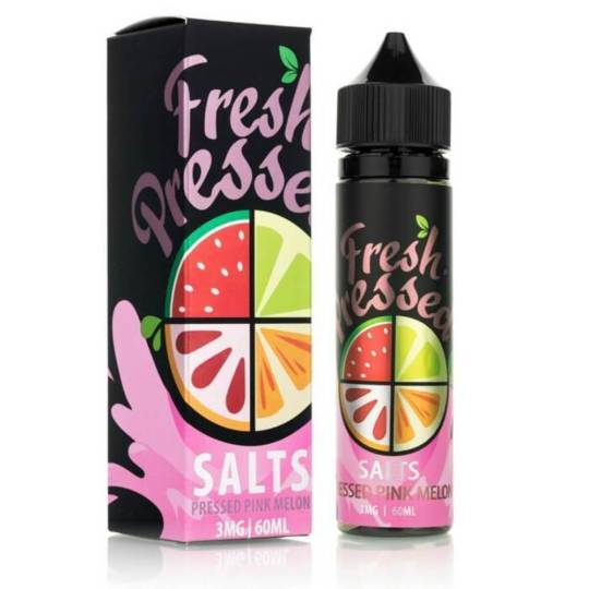
We are particularly big fans of the high-contrast packaging used for the Fresh Pressed line of Salts. Using its flowery, decorative logo splashed against a matte black background, this packaging is downright sexy.

3. Levels
While the packaging design for Levels is not very illustrative like other brands on this list, it is indeed thoughtful and intriguing. Utilizing design language of the 80’s such as Neon signage color schemes and fonts, Levels understands that its bottles need to earn their place in a customer’s vape juice collection.
This juice brand is for fans of the Terminator, the San Junipero episode of Black Mirror, and the more seasoned of their target demographic who actually lived through the 80’s.
What impresses us about the packaging for this juice brand is how it conveys a feeling, a time, and a place while giving us very little visual information besides lines and color, with no real change in color values or shading.
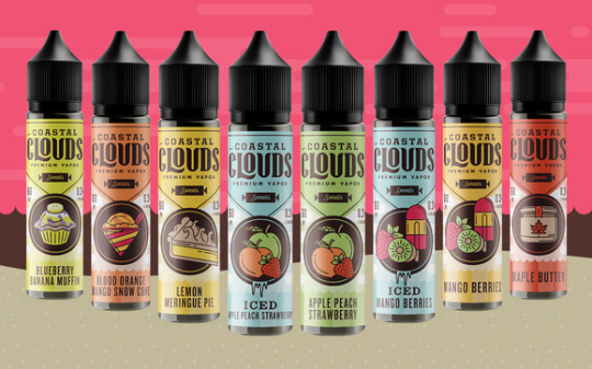
2. Coastal Clouds
Coastal Clouds is a hugely popular brand that positively flies off the shelves — in part, we believe, due to their amazing packaging and illustrations.
Like Marina Vape Co., Coastal Clouds utilizes a maritime design aesthetic, making consumers feel like they are inhaling fresh fruit right by the seaside. Coastal Clouds manages to work in the digital age information and inherent newness of vapor products in their vintage packaging feel seamlessly.
The old-school shape of the label and logo are vectorized, as are the illustrations of the flavors each bottle contains. The color schemes are muted, not overbearing, yet still ‘pop’.

Each design element on the bottle is perfectly balanced with the other elements. While some brands like Nasty Juice can tend to ‘crowd’ the information on their packaging against their vivid, detailed illustrations, all of the information on Coastal Clouds packaging is perfectly legible and beautifully described.
Also, they’re delicious.

1. Psycho Unicorn by Puff Labs
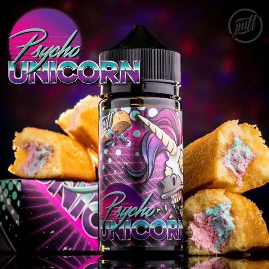
Psycho Unicorn earns first place on our list for design for making us stop and stare every time we pass their bottles in our store. We are suckers for vaporwave aesthetic here at Toro Imports, as is most of their demographic — making Psycho Unicorn by Puff Labs a clever play in packaging design.
One of the latest and greatest crazes in fashion and art nowadays is Glitch and Vaporwave. Psycho Unicorn perfectly merges design language from the 80’s and 90’s, a nostalgia factor for both sides of the vaping demographic spectrum. The illustrations for Psycho Unicorn are as appealing as they are hilarious, which shows that although they understand the importance of great packaging design, they don’t take themselves so seriously that they can’t inject humor in their product.
Psycho Unicorn is stylish, fun, and shows a deep understanding of their consumer base, which makes it our #1 favorite packaging design for vape juices.
#vape#vapelife#vaporwave#vapefam#vapefeed#vapeforlife#ejuice#vapejuices#design#bestof#bestoftheday#faves#aesthetic#branding#brands#listicle#breakdown#top10#bestofvape#vaporizer#smoke#smoking#cloudchaser#vapequeen
1 note
·
View note
Photo

Astrid Swan
2021 was a year during which I suffered from the side effects of a row of cancer treatments. This meant that I relied on plenty of streaming, reading and music that was not published this year, but came out a long time ago and functioned as confort. I also went through the making of my album D/other this year and finished and defended a doctoral dissertation, so my time for new creative efforts was very limited. Then there was Covid-19 always lurking, making me seek for those familiar comforts too. Still, I did find some brilliant new art this year and will highlight three books in my list below.
1. Red Comet: The Short Life and Blazing Art of Sylvia Plath by Heather Clark (2021)
Being that I am obsessed with all things Sylvia Plath, I had to read Red Comet the second it came out. This biography is over a thousand pages long (with endnotes) and I admit I was not sure if the world needed another Plath bio in 2021. But turns out we did need this one. Clark’s approach is both minutely in-depth and contextualizing in a manner that I have yearned to read about Plath but hadn’t until now. It appears that finally, enough time has passed and enough insight is available about the mid-20th century and what it was like for girls and women; or talented, creative women. I remember being told as a young university student studying American literature that Sylvia Plath cannot be studied from a feminist perspective. This upset me then and now. Clark’s book shows that in fact, a feminist understanding of the structures of society and culture in the US and the UK are helpful in seeing Plath and her life and art not from one angle but the multiple facets that constructed them. Clark elevates Plath into the status of one of the most important poets of the 20th century and backs up her statement with the evidence she pools from archives, through her analysis of poems and her readings of Plath’s diaries as well as all the material produced about her over the decades. Finally, a complex, multi-faceted artist who is also a mother is not just seen through mental-health struggles or her suicide. If you wish to call someone a genius, make it Sylvia.
2. Last Chance Texaco: Chronicles of a Troubadour by Rickie Lee Jones (2021)
Like Rickie Lee Jones songs, her memoir is full of characters that drive through the pages in their curvy pastel colored convertibles, say something funny and to the point and are never to be seen again. Still, more than this jazzy jive vibe, her memoir paints fragmented narratives of sorrow. Rickie Lee has been as wild a child as she appears in her songs. But this wildness appears a response to a family that didn’t hold together and was always changing places, cities and towns. Rickie Lee ran away from home many times. Sometimes she ended up somewhere exciting like San Francisco and other times a juvenile jail in the midlands. What this memoir illustrates is how a childhood forms us and tattoos patterns to us that are nearly impossible to escape. Against her stories from childhood and youth, the narrative of becoming a rockstar-musician in the 1970s is not as interesting, but luckily she doesn’t try to tell all. What is more important in her writing is the emotion she held: how the sorrow like a seed sown as a baby of a line of vaudevillians and runaways burrowed in her until she was nearly drowned.
3. Bechi by Koko Hubara (2021)
I’ve never had a novel dedicated to me until last spring. It’s amazing!
What an honor that it is that it is Bechi. Hubara‘s novel is about a novelist mother who has moved to Finland from Israel and her adult daughter whose experience of life differs greatly from her mother’s. The novel describes Shoshana‘s experience of Finland after leaving behind Israel and her relatives and their expectations. Also, the book addresses the silenced history of disappearances of Yemenite Jewish babies in the newly founded state of Israel.
This book should have won some Finnish literary prizes already. I hope they are coming. And also, it should be translated into English and published by FSG in the US. Just saying, that’s how good it is. The language of Bechi deserves a special mention. It is so visceral, embodied, poetic and flowing that the book is impossible to put down. It makes you feel like maybe you can be fed by literature afterall and need no other nourishment.
0 notes
Text
Europan 16 Living Cities Design Competition
Europan 16 – Living Cities, Design Contest, European Architecture Competition
Europan 16 – Living Cities Design Competition
8 Apr 2021
Europan is a competition of ideas followed by implementation processes
The competition is open to professionals of the architectural, urban and landscape design under 40 years of age. Students with a bachelor degree or equivalent can be associates, yet under the condition that the team representative is a graduated architect.
More info and registration on Europan-Europe
9 European countries proposing 40 sites are participating to the Europan 16 edition on a common theme: Living Cities – Metabolic Vitalities / Inclusive Vitalities
The 9 participating countries of the E16 session are: Austria, Belgium, France, Germany, Italy, Norway, Spain, Sweden, Switzerland
The 40 sites are: Agglomération du Niortais (FR), Almendralejo (ES), Aalst (BE), Alzira (ES), Aulnat (FR), Auneuil (FR), Barcelona (ES), Bassens Bordeaux Métropole (FR), Beizama (ES), Biel/Bienne (CH), Bitonto (IT), Carouge (CH), Douaisis Agglo (FR), Esparreguera-Colonia Sedo (ES), Ettlingen (DE), Fagerstrand (NO), Graz (AT), Grenoble (FR), Hjertelia (NO), Istres (FR), Karlskoga (SE), Klagenfurt (AT), La Porte du Hainaut (FR), Landshut (DE), Levanger (NO), Limoges (FR), Linz (AT), Madrid (ES), Namur (BE), Pont-Aven (FR), Quimper (FR), Région de Bruxelles-Capitale (BE), Risøy (NO), Roquetas de Mar (ES), San Donà Venezia (IT), Schwäbisch Gmünd (DE), Selb (DE), Varberg (SE), Västerås (SE), Wernigerode (DE).
Link to the map of the 40 sites proposed: https://ift.tt/2PEzfoS
Theme
In the conditions of the Anthropocene –a new bio-geological period where human activities on the global scale have a destructive impact on life on earth– how to face climate change and inequalities? How to imagine other possibilities to inhabit the planet Earth?
The Europan 16 theme focuses on living cities as a new paradigm, in which new kinds of synergies can be considered between the environmental, biological, social, economic, cultural and political dimensions.
This paradigm leads us to think in terms of co-evolution and interactions, and to work with regenerative project dynamics, combining metabolic and inclusive vitalities.
Link to the theme: https://ift.tt/3t57dBd
Calendar
Launch: April 5th, 2021
Submission: Sept. 17th, 2021 (before 23:59 pm UTC+2)
Results: Dec. 20th, 2021
There is no registration deadline (same than submission)
Link to the calendar: https://ift.tt/2PCLan9
Entry conditions
Europan 16 is open to any team consisting of at least one graduated architect, who may be in association with one or more professionals of the same or related disciplines within the architectural, urban and landscape field (such as architects, urban planners, landscape architects, engineers, artists) or from other relevant fields (such as sociology, geography, biology) and may further be associated with one or more students with a bachelor degree or equivalent (3 years of study) in architecture or related disciplines. The team may also have one or more contributors, who are not considered authors of the project. Every team member must be under the age of 40 years old on the closing date for submission of projects.
There is no limit to the number of participants per team. Multidisciplinary teams are strongly recommended with regards to the sites’ issues.
One team can submit a project on different sites in different countries with participation limited to one site in the same country.
Link to the rules: https://ift.tt/3rXKKoh
Registration form: https://ift.tt/3dFsXgA
The registration implies the payment of a €100- fee. This fee includes one Complete Site Folder and the printing –necessary for the evaluation– of the panels on a rigid support by the national secretariats.
The registration to additional site(s) costs €50- per site.
Submissions
Digital submission is compulsory. It includes the 3 A1 panels (visual elements), a 4 pages illustrated text (max) explaining the link between the project and the theme of the ongoing session as well as the implementation and building processes of the project, also documents proving the eligibility of the team members and finally documents for the communication of the project.
Link to the rules: https://ift.tt/3rXKKoh
Evaluation
One international jury is organised in each of the 9 participation countries of the session. The jury considers all the projects that comply with the competition rules. Its judgement is final. In the event of non-compliance with the rules, it has discretion whether or not to disqualify the entrant.
According to the country, the jury consists of 7 (or 9) independent members with no relation to a site proposed to the competition and is constituted as follows:
– 2 representatives of the urban order –or 3 in case of a 9-member jury;
– 4 representatives of the architectural and urban design (architects, landscapers, urban planners) –or 5 in case of a 9-member jury–, among which at least 2 architects;
– 1 public figure.
At least 2 out of the 7 members must be foreigners –at least 3 in the case of a 9-member jury.
Link to the composition of the 9 juries: https://ift.tt/3muoXDs
Prizes
Winner (1st prize) = 12 000€
Runner-up (2nd prize) = 6000 €
A Special Mention can be awarded to a project considered innovative although not completely adapted to the site. The authors of such proposals do not receive a reward but are part of the several results publications and exhibitions.
Communication of the results
At the national scale of the organizing 9 countries: The results announcement is accompanied with results ceremonies and presentations and/or workshops creating a first contact between the winning teams and the site representatives.
At the European scale: A European event called “Inter-Sessions Forum” is the link between a finishing session (E16) and the beginning of the new one (E17). This forum gathers the winning teams and site representatives of the finishing session (E16) and the site representatives of the new one around the results and first implementation steps of the projects awarded during the last session. Prize-winning projects are exhibited during this forum.
Europan 16 Living Cities images/information received 080421
Belgrade Building Designs
Beko Masterplan
Design: Zaha Hadid Architects
image : Zaha Hadid Architects
Beko Masterplan in Belgrade
Belgrade Architecture Tours
Serbian Design Competition:
Centre for the Promotion of Science in Belgrade Architecture Contest
Centre for the Promotion of Science in Belgrade
Centre for the Promotion of Science in Belgrade – Architecture Contest Entry
Design: Sadar+Vuga
CFPS Building Belgrade
Architecture in Serbia
Serbian Architectural Projects
Serbian Architecture Designs – chronological list
Belgrade Architecture Tours – architectural walks by e-architect
photo from guide
Belgrade Architecture Tours
Serbia Buildings
Tupalla Mosque, Tupalla village, Medvegja
Architect: Arber Sadiki
photograph : Albert Salihu
Tupalla Mosque
Beko Masterplan, Belgrade
Design: Zaha Hadid Architects
image : Zaha Hadid Architects
Beko Masterplan Serbia
Square Nine Hotel, Belgrade
Design: Isay Weinfeld
image courtesy of architects practice
Square Nine Hotel Belgrade
Architecture Competitions
Architectural Competitions : links
Architecture Competitions
Micro Nation Challenge 3 Inhabit Competition
Micro Nation Challenge 3 Inhabit Competition
Render of the Year award
Render of the Year award
Render Battle Architecture Competition
Render Battle Architecture Competition
Floating House Ideas Contest
Floating House Ideas Competition
Comments / photos for the Europan 16 Living Cities Design Competition page welcome
The post Europan 16 Living Cities Design Competition appeared first on e-architect.
0 notes
Photo

🇵🇷 Puerto Rico continues to be open for tourism, and the people of Puerto Rico are eager to welcome you to our island. Recent earthquakes impacted the southern coast of our Island only– and yet even in the Southern region, some tourism businesses remain open. This map illustrates the recent impact. Our beaches, restaurants, attractions, hotels and travel service providers are ready to share Puerto Rico’s unique culture and warm hospitality with you, your family and your friends. We hope this is helpful in providing you with timely information. We look forward to welcoming you to Puerto Rico soon! And if you are gonna visit PR 🇵🇷 Check out my #airbnbinpuertorico listing. Link in my Bio. #DiscoverPuertoRico #Repost @discoverpuertorico #AirBnBinPuertoRico #AirBnBPuertoRico #PuertoRicoAirBnB (at San Juan, Puerto Rico) https://www.instagram.com/p/B7cm9H2JVHa/?igshid=wrscm0s8ijdl
0 notes
Photo

What's on your travel hit list for 2020? ▲ A bit of Porto, Rome or Stockholm? Or maybe stateside to LA, San Fran or NYC? We've got plenty to keep you inspired with our illustrated city guides! They've got great tips for your trip and make a fantastic poster to remind you of the good times when you get home 🙌 ▲ What are you waiting for? Link in bio. . . . . . #hausofnomads #travelguides #thenativecreative #theculturetrip #letsgetlost #designcrush #wunderlust #cityguide #herblester #europeantravel #visitrome #londonlover #visitstockholm #nycity #portolovers #sanfranciscolove #visitedinburgh #parislovers #visithelsinki #veniceitaly #whereitravel #graphicdesigndaily #cityguides #designlifestyle #illustration_daily #indieretail #exploringfamilies #citylimitless #travellifestyle #familyfriendlytravel https://ift.tt/380yJoz
0 notes
Text
2018-04-01 03 SPORTS now
SPORTS
Barstool Sports
Girl Scouts Change Their Rules And Make It Okay To Sell Girl Scout Cookies In Front Of Weed Dispensaries
College Baseball Announcer Becomes Befuddled While Reading A Pitcher’s Bio Filled With Always Sunny Quotes
Rory McIlroy Announces Tiger Woods Is The Undisputed Greatest Player Of All Time
Is It Acceptable For Some Strange Lady To Take A Selfie With My Dogs Without Permission?
Michael Rapaport gives an inspirational Slam Dunk contest speech and his NBA mid-season awards
Deadspin
Counter-Strike Commentator Drops Racial Slur During Birthday Stream
John Sterling Is Very Happy That His Goofy Call Blighted Giancarlo Stanton's Dinger
Let Us Gawk Together At This Gorgeous Game-Tying Driving Bucket From Nuggets-Thunder
God Bless These Very Hyped Miami Baseball Bros
Fox News Host Laura Ingraham Is Going on ‘Vacation’ As Advertisers Bail
ESPN
Xavier promotes assistant Steele to head coach
Everything you need to know about the title game
It took some time, but Isner has finally found a groove
Watch: Miami Open Women's Championship
Kidd, Nash, Allen headline hoops HOF class
FiveThirtyEight Sports
Kansas Is The Only Final Four Team Playing Modern Basketball
Which Injury Will Affect The NBA Playoffs Most?
Your Guide To The 2018 National League
2018 MLB Predictions
How Our MLB Predictions Work
Reddit Sports
The love for the game never dies
Not sure if terrible clickbait headline, or breaking news..
fake it till you make it
Billy Monger race car driver who had both legs amputated 11 months ago after a crash finishes on the podium in his comeback race.
Most bizarre curling play of the year results in tie
SB Nation
College basketball coaching rumors: Fran Dunphy and Temple parting ways
Spurrier drops wide-open TD at South Carolina’s spring game
Michigan’s Mo Wagner is a joyful matchup nightmare
The Blackhawks’ viral emergency might not get paid at all
Mascot March Madness: The road to the Final Four
Sports Illustrated
How to Watch Loyola-Chicago vs. Michigan: Live Stream, Game Time, TV Channel
Sevilla - Barcelona | Alineaciones confirmadas
CONFIANZA: Zlatan Ibrahimovic cree que la MLS puede alcanzar el nivel de las ligas europeas
Virgil van Dijk's Smart Move May Have Been Quite Decisive in Win Against Crystal Palace
Watch: Steve Spurrier Drops Touchdown Pass at South Carolina Spring Game
The Ringer
‘Draft Class’: Next Piece for the Process Sixers, Final Four Prospects, and (Don’t) Stay in School, Kids
The Scene in San Antonio, and Another Final Four Preview
The Ringer Seeks a Senior Sports Podcast Producer
The Problem With Silicon Valley’s Internal Memo Culture
‘NBA Desktop’: Fultz’s Return, LiAngelo’s Declaration, and Wiggins
Yahoo! Sports
Huge rugby player has impressive workout for NFL scouts
Kevin Durant: I thought championship would fill void, but it didn’t
Tiger Woods on the Masters: 'I'm just there to win'
Updated list of Packers' unrestricted free agents
Kevin Durant says Thunder, not Celtics or Clippers, were second choice to Warriors in 2016 free agency
0 notes
Text
Custom Bikes Of The Week: 5 April, 2020
A wild new Vyrus superbike from Italy, a Honda XR600 built for a Spanish Dakar racer, and a stylish collection of custom motorcycle coloring pages from the British artist Ian Galvin.
Honda XR600 by Oscura Motorcycles Spanish off-road racer Joan Barreda Bort is a Dakar veteran who knows how to go quick off-piste: he races a state-of-the-art Honda CRF 450 Rally. But for his personal ride he’s picked something a little more stripped down.
Joan approached Oscura Motorcycles with a few requirements: it had to be a dirt bike, it had to be a Honda, and it had to be light and powerful. Oscura picked a machine that’s had racing success in its own time—the mighty XR600 that dominated the Baja 1000 for many years.
They’ve turned the XR from a 90s desert racer into a compact scrambler, with a few tasty mods in the mix. The tank was brought in from the UK, but the Alcantara seat and the subframe are custom. Oscura also fitted upside-down forks, and dropped the front wheel size.
The exhaust mufflers are from Termignoni, and are the same as those on Joan’s race bike. They’re attached to a set of custom headers. Other parts include new bars, bar end mirrors and a round headlight, and the bike’s been rewired too.
To our eye it looks like the perfect town and country scrambler, and it clearly handles well too—as demonstrated by Mr Barreda himself. [More]
Vyrus Alyen It’s an odd time for a brand called ‘Vyrus‘ to be releasing anything. But at least we can count on this boutique Italian company for one thing: their bikes are always wild. And the Alyen is probably the wildest yet.
The Alyen is a hub-centered steering oddity powered by a 1,285 cc version of Ducati’s short-stroke Superquadro motor. That’s the V-twin mill you’ll find in the Ducati 1199 Panigale, and it’s good for a hair over 200 hp. Here’s, it’s crammed into a magnesium frame, and surrounded by bodywork that looks to be mostly carbon fiber.
Vyrus have spec’d the Alyen with uber-desirable carbon fiber wheels from Rotobox, and Brembo GP4-series brakes. They haven’t listed what suspension components they’re running in their proprietary setup, but our friends at Asphalt & Rubber have speculated Öhlins.
As for the styling, it’s exactly as crazy as you’d expect from Vyrus. We’re seeing a KTM-esque LED headlight, hand guards with integrated turn signals, and sharp set of tail panels that are actually part of the exhaust system. We’re not sure if it’s mechanical art or just plain OTT, but it should be plenty fun to ride though. [More]
Triumph T140 by Ton Everaers Ton knows a few things about vintage Triumphs. He races a 1969 T150 in Europe, does the design for a Dutch Triumph owners club magazine, and works on classic bikes. He has a workshop called KRUK Custom, but this smart 1979 T140E scrambler was a personal project.
Ton had the idea to build a desert sled for a while, so when a T140 popped up for sale nearby, he jumped. The bike came with a TR7 Tiger head and a single Amal Concentric 930 carb already installed, and started first kick… but there were issues with the transmission. And it needed serious love elsewhere, like the brakes, shocks, clutch and electrics.
Most of the parts Ton used to bring the T140 up to spec came from his own stash. He kept the original Koni shocks, but sent them to a specialist for a proper rebuilt. The exhaust system was pieced together using off-the-shelf headers, and T150 mufflers modified with reverse cone ends.
Ton made the heat shield himself, along with the new seat pan and a host of brackets and trimmings. The lid on the air filter is a paint can, cut to size, inspired by a photo of an old desert sled that Ton was using as inspiration. Bits like the handlebars, mudguards and random service parts were all ordered online.
Triumph desert sleds will never go out of style, and this is a great example of the breed. [More]
Honda GB400 TT by Sam Troy The Honda GB400 TT was a factory-built cafe racer that came out in the 80s—long before factory-built cafe racers were a thing. It was a decent effort by Big Red too, albeit a little odd-looking by today’s standards. And it’s becoming more sought after as time wears on, so you want to be careful when customizing one.
Sydney-based Sam Troy did a knockout job with this GB400 TT though. The donor was in a bad way too: it had survived a number of falls, been left outside, and there had been some dodgy wiring work done.
Since this was Sam’s first build, he decided to tackle the job in chunks. First he got it running, then he sorted out the electrics for good. Then he handed the motor to Trev at Surfside Motorcycle Garage for a top end rebuild. Trev also tuned it to run with the Cone Engineering cans and XBR500 Blackwidow headers that Sam picked, and re-laced the wheels with spokes that weren’t rusted.
Sam rode it for a while before edging it towards the bike we see now. That included installing a Airtech Streamlining AJM7 fairing with a Gustafsson screen, and fitting lower bars and rear sets. Colourfuel handled the sublime paint job, adding a final classy touch to an already stylish cafe racer. [More]
Motorcycle Coloring Pages by Untitled Motorcycles and Ian Galvin With most of the world either practicing some form of social distancing, or in total lockdown, motorcyclists are uncharacteristically bored. Adam Kay of Untitled Motorcycles in London has one solution: line drawings of motorcycles for you to color in.
The collection includes nine illustrations of various custom bikes built by Untitled Motorcycles’ London and San Francisco branches—including their BMW R nineT, a Moto Guzzi, a KTM, and a couple of Triumph Thruxtons.
Acclaimed illustrator and artist Ian Galvin created the illustrations, and each one is 5000 by 3000 pixels in size, making them more than good enough to print out at home. Whether you’re looking for something fresh for your kids to color in at home, or your own boredom’s reached new heights, these should provide plenty of entertainment.
Head over to Adam’s Instagram feed and click the link in his bio to download them. [Via]
0 notes
Link
Si le sujet « vérité et connaissance scientifique » est un pilier de la philosophie classique et de l’épistémologie contemporaine, il se pourrait bien que, dans une ère de post-vérité, ce thème soit progressivement remplacé par celui de la chasse aux « fausses informations ». Pour le dire autrement, ce qui compte, ce n’est plus la quête d’un sens métaphysique ou une recherche de cohérence logique, mais qu’un énoncé tienne le plus longtemps possible à la Une de l’actualité avant d’être remis en cause.

En affirmant ceci notre objectif n’est pas de donner un blanc seing au relativisme ou d’abandonner la méthode scientifique, bien au contraire. Il s’agit de réfléchir sur la possibilité de redonner à celle-ci sa superbe ; d’autant plus qu’elle n’est plus simplement une affaire de scientifiques : les médias, les politiques, les ONG et l’opinion s’emparent immédiatement de la moindre expérience rendue publique et se trouvent engagés de manière quasi instantanée dans le processus de « vérification » qui passe d’abord souvent par l’acceptation. Ce qui montre la nécessité d’éduquer l’opinion pour lui apprendre à détecter les différentes typologies d’erreurs scientifiques. Voici donc une petite grille de lecture que nous avons établie en classant cinq grandes typologies d’informations scientifiques qui se sont révélées fausses…
Rétractation d’un article sur le réchauffement des océans : l’erreur scientifique
Fin septembre, le célèbre journal Nature a annoncé qu’il retirait un article qui avait fait énormément de bruit sur le réchauffement des océans [1]. Le papier en question soutenait que les océans se réchauffaient bien plus rapidement que prévu, ce qui laissait croire, d’après les auteurs, que l’augmentation de la température du globe était liée à un doublement de la teneur de CO2 dans l’atmosphère et plus élevée que ce que l’on pouvait imaginer. Or un économètre ayant débusqué des erreurs de calcul statistique dans le papier et l’ayant signalé, Nature en personne a demandé aux auteurs de retirer ce papier et ils se sont exécutés[2]. Rien de choquant a priori dans ce cas de figure, où la méthode du peer-reviewing –– la relecture par les pairs – a bien fonctionné. Signalons toutefois que la publication de l’article initial a donné lieu à un grand nombre de reprises dans la presse grand public, alors que la rétractation de l’article, elle, est passée quasi inaperçue. Certains commentateurs ont vu dans cet épisode une preuve que la thèse du réchauffement climatique est loin d’être assurée[3], d’autres, au contraire, ont soutenu que cette rétractation ne permettait nullement d’en douter[4]. Nous y voyons le processus naturel de la science qui repose sur la falsifiabilité des propositions. Ce qu’a parfaitement résumé Karl Popper : « Le jeu de la science est un principe sans fin. Celui-là se retire du jeu qui décide un jour que les énoncés scientifiques ne requiert pas de test ultérieur et peuvent être considérés comme définitivement vérifiés » [5]. Une citation que feraient bien de méditer ceux qui pensent que la nature d’une vérité scientifique se définit par son caractère irréfutable. C’est tout le contraire qui est vrai. Aussi, cette première typologie de « fake news » s’inscrit dans le processus normal des controverses scientifiques.
Nuage de « Tchernobyl » : la maladresse des experts et des décideurs
Le deuxième exemple dont nous voudrions parler nous pousse à élargir la cible de la communauté des scientifiques en y ajoutant les politiques. L’accident de Lubrizol vient de faire ressurgir de mauvais souvenirs dans l’opinion et notamment l’épisode de Tchernobyl. Or c’est un classique du genre que l’on ressort pour dire que l’état est le premier propagateur de fake news. L’opinion française notamment est persuadée que c’est lui qui a voulu faire croire que le nuage de Tchernobyl n’avait pas traversé la frontière. Or comme le montre la journaliste Géraldine Woesner dans un article très fouillé, on trouve ici un bel exemple de cacophonie de la part des services de l’État. Si les autorités ont bien annoncé dans un communiqué de presse l’arrivée du nuage, cette information n’a pas été communiquée avec suffisamment de détail par l’ex SCPRI[6] (Service central de protection contre les rayonnements ionisants), l’instance en charge et d’autres structures, telles que le ministère de l’Agriculture, ont « cafouillé » [7]. Ce manque de précision, sera l’origine de nombreuses critiques et notamment de nombreuses théories du complot. Nous sommes donc ici en présence d’une deuxième catégorie de fake news. Celle-ci ne regarde plus les experts, mais les instances officielles qui ne savent pas sur quel pied danser pour communiquer ce genre d’information et se trouvent dans une valse-hésitation. L’expert pris entre le marteau et l’enclume hésite entre rassurer et susciter une peur panique dans l’opinion. L’information scientifique en paye forcément les pots cassés.
« Ségolène Royal, les pesticides et le cancer » : la bêtise des politiques
Invitée à s’exprimer à propos de la consultation gouvernementale sur les pesticides, Ségolène Royal a déclaré que « Aujourd’hui, plus d’une femme sur dix est touchée par le cancer du sein, est-ce que vous vous rendez compte de ça ? C’est dû à quoi, cela ? C’est dû aux pesticides. » [8] Voici donc une énorme contre-vérité que n’ont pas manqué de dénoncer certains journalistes. Emmanuelle Ducros, par exemple, dans L’Opinion[9] oppose à l’ancienne ministre de l’environnement l’étude de l’Agrican en France et celle de la cohorte de 50 000 agriculteurs américains, deux enquêtes qui font référence en la matière et qui ne fournissent aucune preuve pour affirmer que les agriculteurs seraient davantage victimes du cancer que d’autres populations.
Cette catégorie de fake news n’est pas rare. Les politiques, et parfois certains médias, sont friands de ces déclarations qu’ils produisent parfois à dessein, parfois par inculture. Le problème étant, bien évidemment, que la propagation de telles nouvelles contribue à accentuer les peurs dans l’opinion et génère des comportements irrationnels.
« La liste bio des produits chimiques » : l’intoxication publicitaire
Récemment, les entreprises du bio se sont réunies pour faire passer une publicité sur laquelle on voit une liste de composants chimiques. Marcel Kuntz, directeur de recherche au CNRS a fait la recension de ce document pour European Scientist dont voici un extrait : « En résumé, cette liste a été « gonflée » avec des produits parfaitement naturels et habituellement consommés. On ne voit d’ailleurs pas comment les aliments bio pourraient éviter de les contenir ! Il n’y a donc pas lieu de monter une campagne de peur sur ces produits, sauf si on croit qu’une molécule est inoffensive si produite directement par une plante et devient toxique, tout en gardant la même formule chimique, par je ne sais pas quel sortilège, dès qu’elle est ajoutée par action humaine ». Dans cette catégorie on regroupera les démarches qui tronquent explicitement l’information scientifique ou la déforment pour faire passer un message publicitaire totalement faux. Ce n’est pas le fait cité qui est faux, c’est le message qui en est tiré qui est fallacieux.
« La carte du QI mondial » : la récupération idéologique par les ONG
Le dernier exemple que nous voudrions citer est moins une fake new que la récupération d’une information scientifique pour servir une idéologie. Une carte publiée sur Wikipédia établit une classification du QI. Les résultats qu’elle exhibe démontre que les pays du nord ont généralement un QI supérieur à ceux du sud. Or cette observation a été propagée abondamment sur les réseaux sociaux comme l’explique Le Nouvel Observateur[10] pour servir la thèse de certains mouvements suprémacistes blancs. Le docteur Laurent Alexandre, lui, n’hésite pas à dire qu’il faut carrément interdire la diffusion de cette carte.
Comme dans le cas précédent, ce n’est pas l’information qui est fausse, mais la récupération qui en est faite qui peut faire passer un message nauséabond. L’extrapolation et l’utilisation de ce fait par une idéologie qui veut donner une base de scientificité à sa thèse à la manière dont agissaient, par exemple, certains scientistes.
Cette liste illustre la variété et la diversité des fausses informations scientifiques. Tous les publics sont concernés, à commencer par les scientifiques eux-mêmes. La conclusion de cette petite revue est que chacun doit exercer à chaque instant son esprit critique pour juger et interpréter sans se précipiter. Dans un monde surexposé où l’information n’a jamais été aussi abondante, le doute permet de faire le tri et surtout de se méfier de ceux qui s’appuient sur ce qu’ils présentent comme une « vérité absolue », « un fait incontestable », pour imposer une idéologie politique. Aussi on voit bien que ce qui pose problème c’est moins le fait que l’information puisse être fausse – encore une fois, le propre de toute proposition scientifique, c’est d’être réfutable – mais c’est qu’elle puisse être interprétée et ou récupérée dans le cadre d’une démarche d’influence (médiatique, politique, idéologique.…) qui elle entend présenter une vérité absolue. Mais c’est là un vaste sujet sur lequel nous aurons l’occasion de revenir.
[1] Retraction Note : Quantification of ocean heat uptake from changes in atmospheric O2 and CO2 composition https://www.nature.com/articles/s41586-019-1585-5.
[2] Journal ‘Nature’ retracts ocean-warming study https://phys.org/news/2019-09-journal-nature-retracts-ocean-warming.html.
[3] https://www.climato-realistes.fr/retractation-dun-article-de-nature-sur-le-rechauffement-des-oceans/.
[4] https://www.iflscience.com/environment/retraction-of-2018-oceanwarming-study-is-not-due-to-climate-change-doubts/.
[5] Karl Popper, La logique de la découverte scientifique, éditions Payot, 2017.
[6] Le 19 juillet 1994, le SCPRI est remplacé par l’OPRI2. Celui-ci est intégré le 13 février 2002, à l’IPSN pour former l’IRSN
[7] « Dès le 30 avril, un communiqué du SCPRI envoyé à la presse confirme l’arrivée du nuage radioactif : on signale « une légère hausse de la radioactivité atmosphérique sur certaines stations du sud-sst, non significative pour la santé publique ». Suivi d’un autre, le lendemain : « Ce jour 1er mai 86, 24 heures, tendance pour l’ensemble des stations du territoire à un alignement de la radioactivité atmosphérique sur le niveau relevé le 30 avril dans le sud-est. Il est rappelé que ce niveau est sans aucune incidence sur l’hygiène publique. » Puis la radioactivité s’accroît dans l’est. Dans le nord-est, région la plus touchée, l’activité atteindra 25 Bq/m3. C’est effectivement rassurant : dans certaines maisons, l’exposition naturelle au radon peut atteindre 1 000 Bq/m3 ! La faute des autorités est qu’elles ne donnent pas ces valeurs, se bornant à transmettre des informations laconiques. En clair : les pouvoirs publics indiquent bien que le nuage radioactif a survolé la France et que les niveaux observés sont parfaitement rassurants, mais le public est prié de se contenter de cela. On s’inquièterait à moins… », in « L’increvable mythe du “nuage de Tchernobyl”, Géraldine Woesner, https://www.lepoint.fr/societe/l-increvable-mythe-du-nuage-de-tchernobyl-03-10-2019-2339144_23.php.
[8] https://rmc.bfmtv.com/mediaplayer/video/epandage-de-pesticides-5-ou-10-metres-ce-n-est-pas-suffisant-il-faut-100-150-metres-1191751.html.
[9] https://www.lopinion.fr/video/decryptage/pesticides-cancers-gros-bobards-segolene-royal-199762.
[10] https://www.nouvelobs.com/politique/20191004.OBS19315/pourquoi-l-emoji-carte-du-monde-est-en-train-de-devenir-un-symbole-dans-la-fachosphere.html.
0 notes
Last Seen Blogs

wolfieolfie
YEAHYEAHYEAHH

quartermind
...

personificationoftime-blog
Don't be late! Or is it perhaps early...?

games-in-bits
Games in Bits

deepikashomeopathy
Deepikashomeopathy