#typewriter font
Text





Typography Tuesday
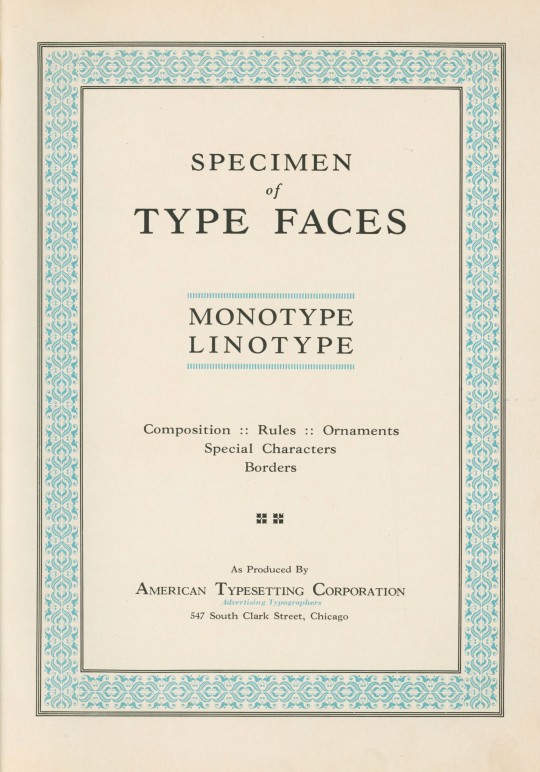
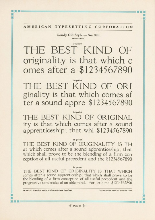
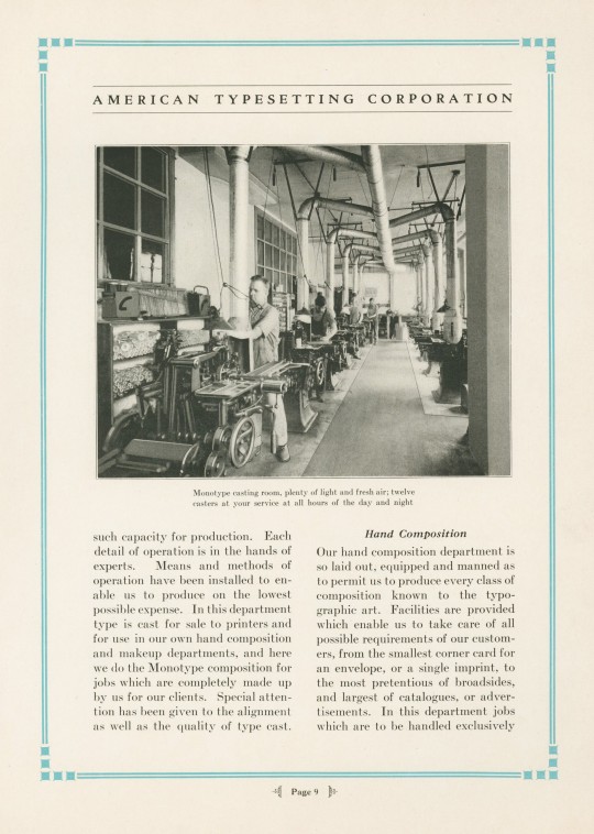
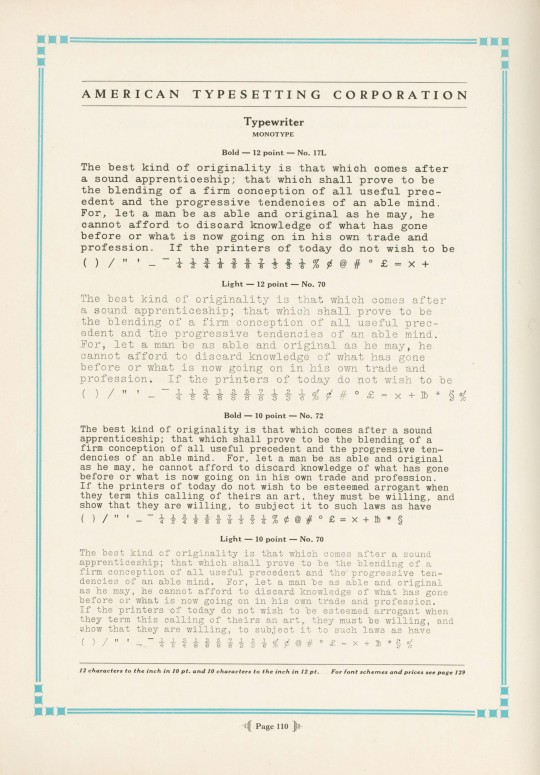
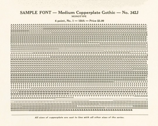
Specimen of Type Faces Monotype Linotype was produced ca. 1930 to display the range of typefaces used at the American Typesetting Corporation of Chicago, "the largest of its kind in the world," established in 1919. The plant operated 24 hours a day, offering day and night services. Their Monotype Department boasted ten keyboards and twelve casters, and their Linotype Department operated ten machines. The typefaces shown here are Goudy Old Style, Cloister Text (a Gothic face, not the Roman Cloister designed by Benton), Typewriter, Monotype Accents, and Copperplate Gothic.
View our other Typography Tuesday posts.
#Typography Tuesday#typetuesday#monotype#linotype#American Typesetting Corporatioin#Goudy Old Style#Copperplate Gothic#Cloister#Typewriter font#type setting#type composition#20th century type
74 notes
·
View notes
Text


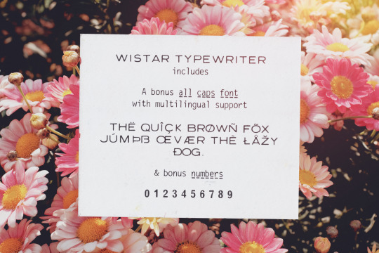
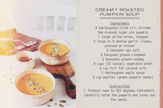
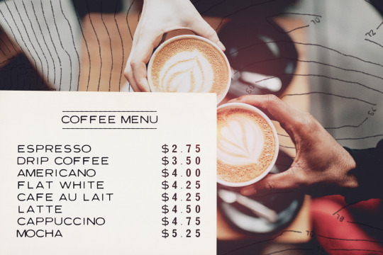
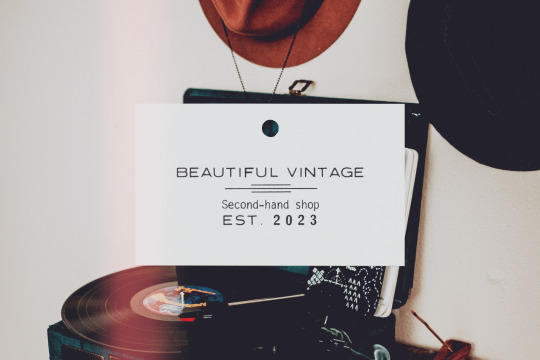

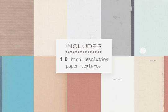
Wistar Typewriter is a monospaced typewriter font in two styles: Regular and Faded, in both vector and SVG versions, with dashed line and underline alternatives and a bonus caps font, for a total of 14 fonts. In combination with a set of vintage graphic elements and paper textures, this font family is so versatile and ready to use in modern and retro designs alike. This font is also very legible at a wide range of sizes and looks great in both long or short texts, in digital collages, branding and packaging, social media posts, logotypes, etc.
Included in this product:
Wistar Typewriter font family with 14 individual fonts, with a soft realistic texture
10 high resolution paper textures from vintage papers (PNG and JPEG files with minimum width of 1396 px, scanned at 600 dpi)
34 graphics from vintage materials ( in transparent PNG and Photoshop ABR files)
Get it at my website, Creative Market or The Hungry JPEG
2 notes
·
View notes
Text
Everyone gets “The 90s” look wrong so let’s fix it
If you weren’t here for part one, lemme sum it up real fast:

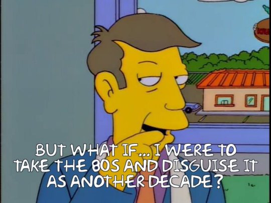
Okay, all up to speed? We’re being served 80s throwback stuff with the serial numbers scratched off, re-labeled as yo totally 90s. What we’ve got now isn’t completely wrong, but I’m telling you, there’s so much gold left unmined.
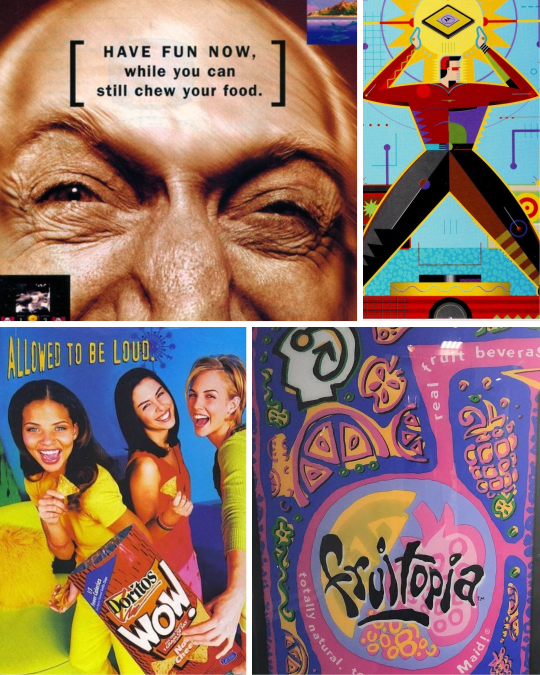
As we saw in part one with Memphis Milano, these things get messy. Trends don’t start and end neatly every ten years. The first wave of 90s throwback attempts focused on the early part of the decade, and nobody since really pushed to represent the other seven years. Well, if you really wanna do something, I guess you gotta do it yourself.
I have suggestions. Get your flannel ready, we’ve got a lot of ground to cover.

Analog Grunge
SURRRRRRRGE or uh, Grunge, is probably the look that defines the decade best. The big kickoff point here is Nirvana - after a shiny pop-dominated music scene in the 80s, Nevermind was like a breath of fresh smog.
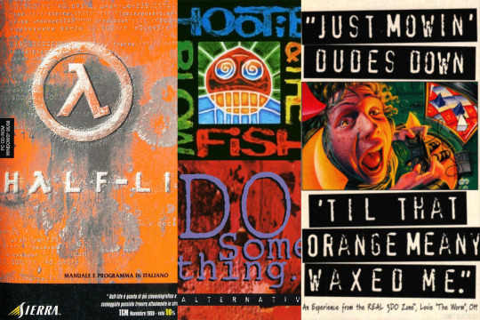
Your design has to look like it survived a nuclear blast, then was run over by your parents’ Buick a couple of times.
Rust. Dirt. Scuffs and scrapes. Signs of distress.
Handwritten or scribbled illustrations.
Low-rent aesthetics. Torn paper shapes, label maker or typewriter fonts.
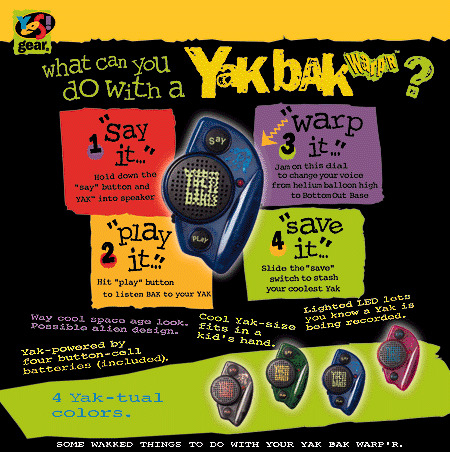
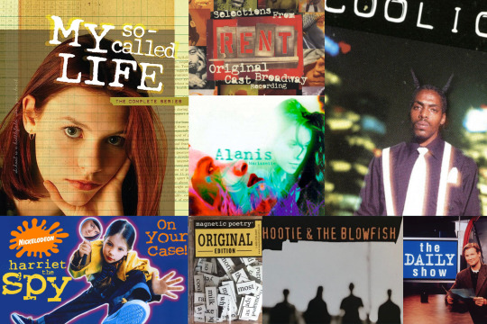
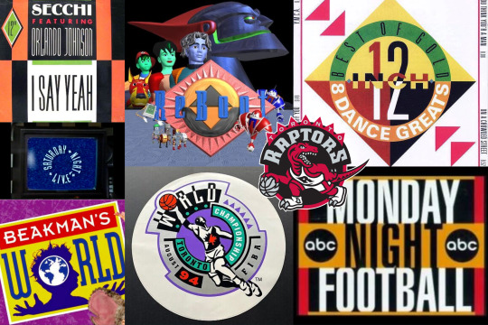
If there’s a Comic Sans for the 90s, it’s “distressed typewriter font.” Seriously, it’s mandatory. When I pulled images for this post I could not escape typewriter fonts. I don’t think you couldn’t call yourself a respectable designer without it. Just look at how much mileage old-timey typewriters and label makers got:
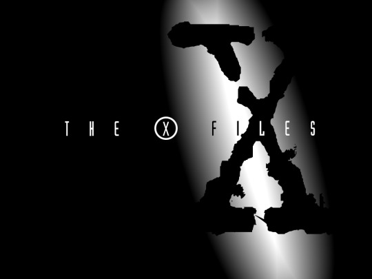
Hell, it’s the giant X in The X Files!
I think another component to Grunge is sort of an anti-digital, pro-analog message. My pet theory is home computers went from being a semi-common novelty in 1990 to an essential gotta-have-it purchase in every American home by ‘99. Desktop publishing apps made it almost too easy to make pixel-perfect, clean, uniform designs.
But digital perfection is the enemy of Grunge. Analog means authenticity.
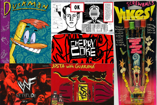
So you had a whole gaggle of designers running in the other direction. Sure you could use a computer, but your work absolutely had to look like it didn’t come from one. As much as possible, incorporate hand-drawn artwork, scribbles, dust and splotches. Write text with chicken scratch if you have to. As much as you could make your multimillion dollar ad campaign look like it came from the margins of some high schoolers’ math homework, the better.
Factory Pomo
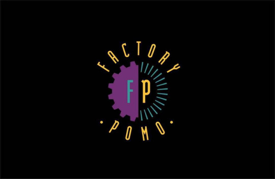
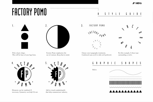
Not everyone was running away from digital, though. Many designers were embracing computer apps - and I think that’s where Factory Pomo first came into being. Graphic designer Froyo Tam designed the above logo as an example - Factory Pomo is one of those things that once you see an example, you can’t stop seeing it.
Strong, basic geometric primitives with inverted, contrasting colors
Tall typography
Art Deco style rivets and spikes
Want your logo to look futuristic and modern? Stick it in a circle and put some triangles around. Invert half the colors, then another half.
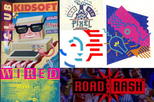
Max Krieger has a great writeup on the probable inflection point: Tomorrowland. As the story goes, Tomorrowland at Disney - the part of the park meant to look like it’s from the future - would very quickly look very outdated each time they tried to update it. Instead, in 1994 they decided to own being outdated. They came up with a ridiculously fun “timeless” futuristic look, mixing industrial design with Jules Verne. Factory Pomo’s signature was all over the blueprints.

The look quickly escaped the theme park and was especially prevalent in the booming mid 90s home computer market. It’s the Packard Bell cyborg, it’s the logo in Video Toaster. If you caught that The X Files logo earlier is both Factory Pomo with the tall type and X in a ring AND Grunge with the typewriter X in the background, you win 5 bonus Pogs.


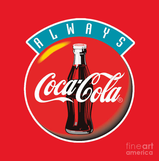
EDIT: aaaaaaa How could I forget the most famous example! The “Always Coca Cola” ad campaign!
Back to the name - “Factory Pomo” is a relatively new term - It didn’t get coined until 2017 through several Facebook design groups. It didn’t have a name for like... 25 years. How’s that possible, you may wonder? Weren’t designers following a defined style? Well, yes and no. I think people were designing stuff to look a certain way, but it’s less a game of “this is what the aesthetic looks like” and more like a game of telephone.
If you do an architecture tour in a major city, you’ll learn that every building and skyscraper is classified to a specific architectural movement. Every building that is but ones built in the last 20-30 years. Newer buildings have to wait a few decades for official classification. Historians need time and perspective to figure out what emerging trends in architecture are going on, whose work influenced who, that sort of thing.
Designing a logo for Slim Jims or Cherry Coke takes considerably less time than constructing a skyscraper, but I think the same principle holds true. It’s really difficult to tell what’s a trend and what’s a fad when you’re living in the moment. I couldn’t tell you what’s the defining aesthetic for the 2020s right now. It’ll be obvious in 2053, but right now, no clue.
Enough time has passed between the nineties and today that we can pick this stuff apart easily. Maybe if you’re lucky, you can be the first to classify these design movements, too.
Working on a part three! I’ll look into a few other trends and address the big question-- Is the Y2K aesthetic actually a 90s thing? More to come.
*A ton of these examples above are from the CARI Institute, which you should totally check out, they’ve been cataloging this stuff for years.
47K notes
·
View notes
Text
You guys are never gonna believe what I found online:
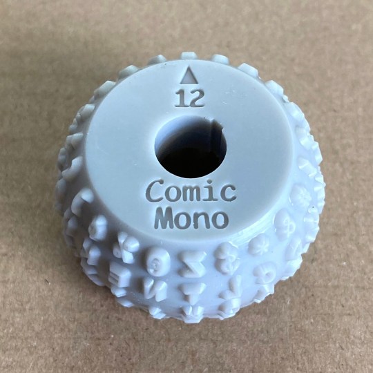
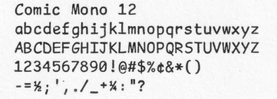
A 3D-Printed, Comic Sans Mono Typeball for an IBM Selectric II Typewriter! Why does this font actually look so natural and fitting for a typewriter?? And it's only $8! This guy is doing the lord's work.
#rambles#typewriter#ibm#ibm selectric#selectric#ibm selectric ii#typing#writing#font#fonts#comic sans#comic mono#3d printing
535 notes
·
View notes
Note
hi! may i ask how do you get the cool fonts you use on your art/character refs and such? the fonts you use look always so fun...
THANK U 🫶 i love fonts forever and always
heres a quick list of sites i use for fonts
fontspace ( heres one of my fave creators on there )
fontdiner
dafont
homestuck fonts ( sorry but not rlly )
speeches and cream ( halftone hospital is ... MWAH love it )
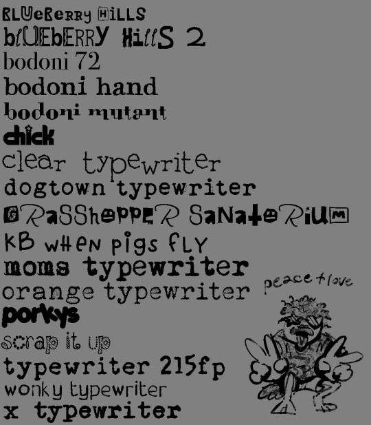
^ and a list of my most favorite and most used fonts : )
#✉️#Anonymous#i use typewriter fonts a lot ... im trying to get the energy of old childrens books and the like so thats why but they just look nice also#ive also made my own fonts but i dont . like them LOLLL
194 notes
·
View notes
Text

Font Pack #002 - Old Newspaper
I decided post the fonts that are part of my new Old Newspaper template (Template #005 by dailyresources). It is a premium psd template that can be found here.
I don’t own any of these fonts, copyrights go to their creators.
Please do not repost / redistribute.
Please, like or reblog if you download.
I hope you enjoy! ❤
Pirata One | Chonburi
Trocchi | Truetypewriter PolyglOTT
#fonts#font pack#free fonts#font help#free resources#resouces#hisources#evansyhelp#yourfonts#typewriter#typography#my creations#*#*mine
86 notes
·
View notes
Text
I CANT USE CSS ON ARTFIGHT...............
#I WAS REALLY HOPING TO FIX THE FUCKING. PARAGRAPH WIDTH. SIGH#idk why but it stretches across the ENTIRE page like. it takes up the full width of the browser and it BOTHERS ME. ON ALL THE PAGES#i could try manually putting shift breaks but im worried it might not look so good on mobile. ugghh... auyggghhh.....#im already learning CSS and API so i thought i could put it to good use but. AUGH#this whole time ive had to go into the inspect panel myself and change the padding so i dont have to read the length of the screen#like a fucking typewriter... i would have also loved to use custom fonts and animations......#i did find a guide for BBCode which the site uses on default and it covers basic styling but its not the same. sniffle#you CAN unlock CSS if you donate $25 to the page which seems fair. and if i could do it i would but. i do not have any way of#sending or receiving money online </3 i really need to figure out how to do that so i can set up comms like i said i would last summer#but it intimidates me.... and im already kept on a short leash when it comes to that so it feels like a lot of things could go wrong#i think toyhouse allows CSS or some sort of code...?? i remember seeing some oc pages with custom layouts#if thats the case i'll try fiddling with it but im not very familiar with using toyhouse so thatll take a while#(thanks again for the code sal ^_^ ill put it on my pin once its ready but im trying to learn my way around the site heh ;;)#at least i can use my pixel dividers.. ive been digging around for pixels to use and found some really cute ones#yapping
40 notes
·
View notes
Text
My gift to you all for the New Year is an actual updated bracket.


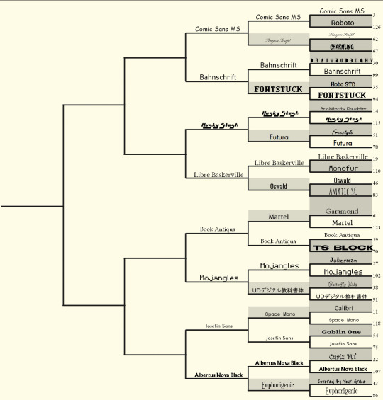
I know we're mid-round, but people were asking for it.
#i think i'll have all polls be on the same day this time round#man tumblr users sure do like their typewriter fonts
40 notes
·
View notes
Text

cool about it // boygenius - the record
#aesthetic#song aesthetic#lyrics aesthetics#lyric aesthetic#lyrics aesthetic#lyrics#song lyrics#aesthetic lyrics#boygenius#the record#phoebe bridgers#lucy dacus#letter aesthetic#typewriter aesthetic#aesthetic fonts#feel music#feelings#songs i like#julien baker#i know the end#the nightshift#nightshift#cool about it#purple aesthetic#paper aesthetic#pink aesthetic#moon aesthetic#pastel aesthetic#night aesthetic
109 notes
·
View notes
Photo
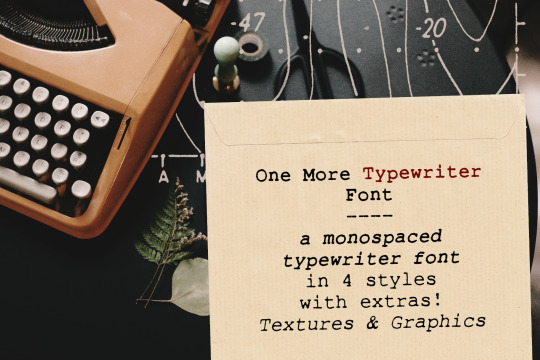


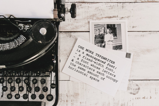

One More Typewriter font is a monospaced typewriter font in two styles: Regular and Italic, and two weights: Regular and Bold. This makes it versatile and ready to use in modern and vintage designs alike. This font is also very legible at a wide range of sizes and looks great in both long or short texts, in digital collages, branding and packaging, social media posts, logotypes, etc.
Included in this product:
One More Typewriter font family with 4 individual fonts: regular, italic, bold and bolid italic, with a soft realistic texture.
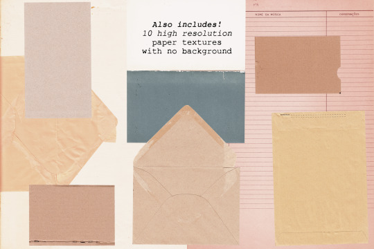
10 high resolution paper textures (PNG files with minimum width around 3000 px, scanned at 600 dpi)
26 science graphics from vintage material ( in transparent PNG and Photoshop ABR files)
Get it at my website, Creative Market or The Hungry JPEG
2 notes
·
View notes
Text

MOONLIGHT SYNDROME [1997]
#Moonlight syndrome#twilight syndrome#Human entertainment#Mika Kishii#Ryo Kazan#My gifs#Things i made#Had to find a typewriter font to mimic the english title fdjkhasdfjk#v: moonlight syndrome
94 notes
·
View notes
Video
AGUST D kinetic album art: process vid
⤷ total time: 1 hr, 7 min.
#i didn't record the logo making in illustrator#but that's the only thing i didn't catch!#bts#videos#agust d#bangtan#*process#*processvids#*ryengfxtalk#but yeah making the cover from scratch??#hard lol#but worth it i think#also finding the font for the typewriter words was rough#but then i was like oh lol#i'm dumb#anyways hope you enjoy the process!#shirleytothesea#annietrack#usersky#trackofthesoul#yoongi
141 notes
·
View notes
Text
okay but isn't this exactly how it went down:
5sos: *doesn't do collaborations much*
michael: yeah we collectively have this severe anxiety no one likes us
halsey:
roy:
calum's sister and gf both being musicians:
taylor swift inviting them to birthday her party in 2019:
the chainsmokers, being the only ones ever to convince them otherwise who INVITED THEM ON AN ENTIRE TOUR:
galantis: that was the best collaboration I've ever done! blew my mind how nice you guys are and how I learned from you this new experience of being able to be myself as a musician and not pressured by deadlines,, not having rules that 'it must be so'
michael: *still busy stressing about that one snare drum beat*
#michael clifford#galantis#rolling stone interview#lighter#5sos#5 seconds of summer#luke hemmings#ashton irwin#calum hood#okay at least michael talked about learning he can let go of these things and people like them?? bestie that's why you need collabs more#am literally doing the exact same thing as michael with my music rn though#sorry for the plain text. tried chat font and i can't with that much slab serif im sorry im an american typewriter for titles only girlie#did i just out myself as a typeface nerd? i think so. design school rewires your brain. or attracts the most picky neurodivergents
10 notes
·
View notes
Text

Font Pack #001 - Stranger Things Characters
I don’t own any of these fonts, copyrights go to their creators.
Please do not repost / redistribute.
Please, like or reblog if you download.
I hope you enjoy! ❤
GRAND HOTEL | ROSE
ENGINE | FIGA
MOONSHINER | COOKIE
ZNIKOMIT | VAST SHADOW
#fonts#font pack#free fonts#font help#free resources#resources#photoshop resources#photoshop fonts#evansyhelp#yourfonts#typewriter#dearindies#yeahps#typography#my creations#my fonts#*#*mine
60 notes
·
View notes
Text
26 notes
·
View notes
