#antihomophobe aktion
Text
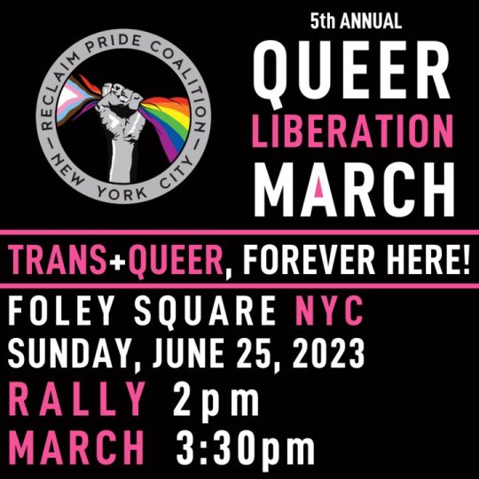
June 25, NYC - Queer Liberation March
139 notes
·
View notes
Text
Lamppost Stickers
Having at last finished my Master's dissertation, I find myself leaving Durham for - well, not the last time, I'll come back at some point, but certainly this is the last time in the near future I'll be spending a significant length of time here. And to commemorate my time here, I've decided to rate some political lamppost stickers I've seen in the last few days.
I'm not a graphic designer or an arts student (unless you count pure mathematics as an art, which isn't that unreasonable a stance I suppose), and I know nothing about colour theory save what tumblr has taught me, so don't expect that much insight.
Sticker #1: New Normal
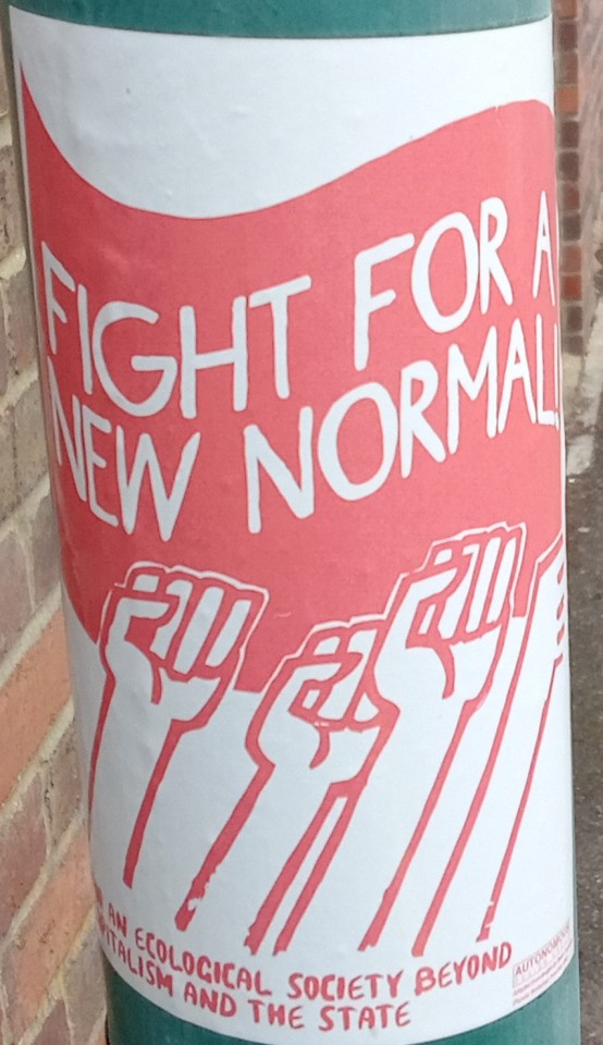
[ID: A white sticker on a lampost. On it is a red flag, with "Fight for a new normal" written on it in white; below this are some raised fists in red, and below that red text reading "For an ecological society beyond capitalism and the state"]
We're off to a good start here. Good choice of colours, a nice eye-catching statement to draw people in and a more detailed (but still not excessively long) statement explaining what the sticker's about. 7/10.
Sticker #2: Trans Pokémon

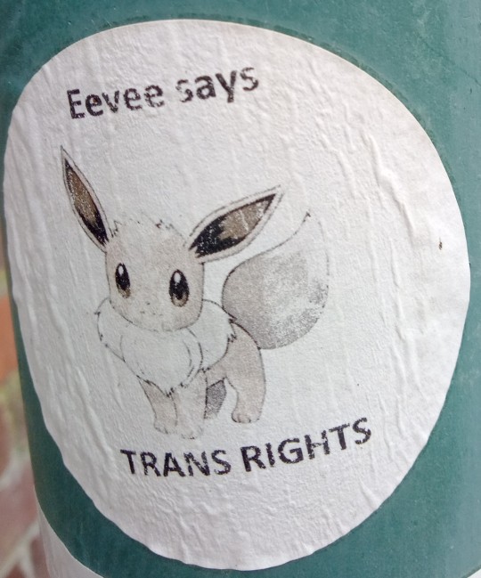
[ID: Two circular stickers, one with an image of the pokémon Pikachu in a baseball cap and the text "Pikachu says TRANS RIGHTS", and the other with an image of the pokémon Eevee and the text "Eevee says TRANS RIGHTS"]
A formulaic approach to producing a variety of stickers is an interesting methodology. The use of the images of well-known pokémon to draw people in is also interesting - super effective against people who know anything about pokémon, but not very effective against anyone else. Alas, I must deduct points for the use of eevee in place of the trans icon pokémon sylveon. 6/10
Sticker #3: Mysterious A
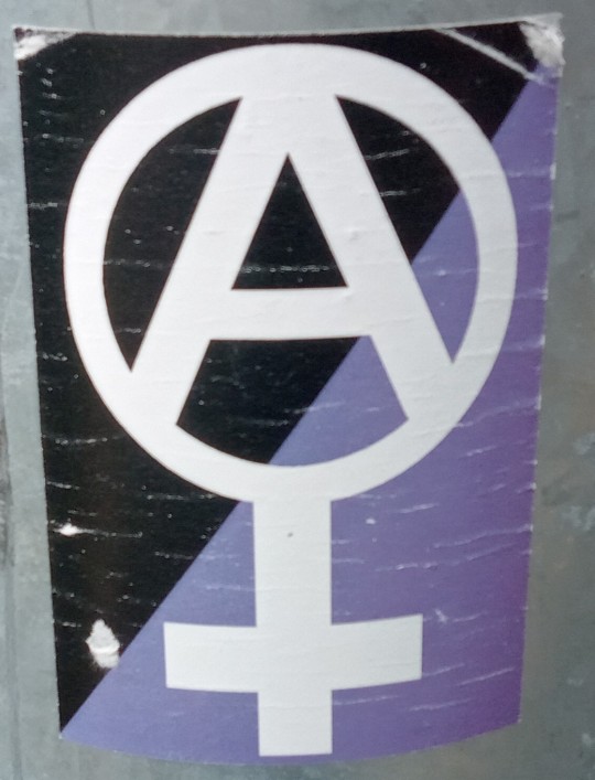
[ID: A rectangular sticker, with the background divided along the diagonal from bottom-left to top-right - purple below the diagonal, black above. Superimposed on this is a venus symbol in white, with a capital "A" (also in white) inset into its circle.]
The most important function of a lamppost sticker is getting a message across, and this one abjectly fails to do so to anyone who doesn't already know what it means. Seriously, what the heck does this mean? The colour scheme and the "A" make me think it's something about asexuality, but that doesn't really fit with the venus symbol. Maybe it's something about feminist anarchists, but from what I know of anarchism the 'feminist' bit would be redundant. The only reason I'm giving this any points is that I assume it's meaningful to some people. 3/10
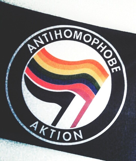
Sticker 4: Antifa Deluxe Edition
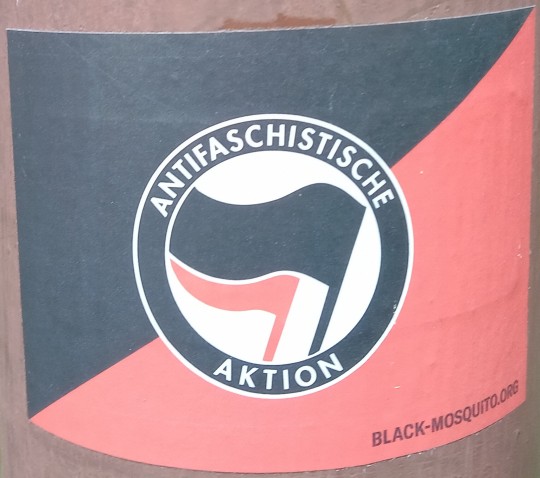
[ID: A rectangular sticker, with the background divided along the diagonal from bottom-left to top-right; red below, black above. Superimposed on this is the antifa logo; a black ring with the text "Antifaschistische Aktion", surrounding a black flag and a red flag (the red flag behind the black one) on a white background. In the bottom-left corner is written "black-mosquito.org", the website of the company that makes this sticker.]
Bold colours, historic and well-known logo, plus text that simultaneously communicates what the sticker is about, and that it isn't a solely anglophone thing. Excellent work. 9/10
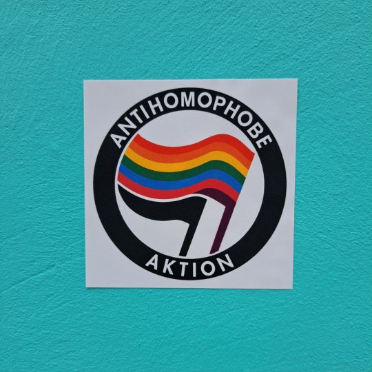
Sticker #5: Antifa, but Gay
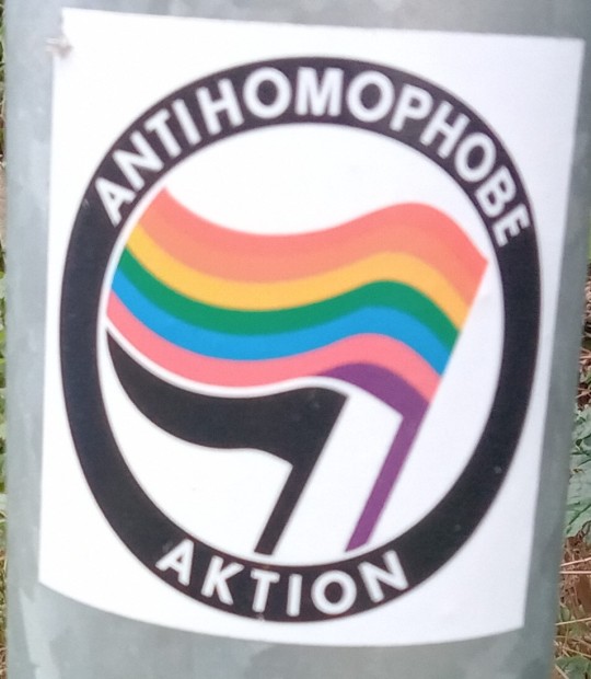
[ID: A variant on the antifa logo. The text in the black ring reads "Antihomophobe Aktion"; the front flag (which is usually black) now has horizontal stripes - red, orange, yellow, green, blue, hot pink and purple, with the purple stripe extending down the flagpole; and the back flag, usually red, is black.]
A variant sticker! A lovely way of communicating both the main message - i.e. there are people here willing to oppose homophobia by any means necessary - and also how the creator feels this attitude relates to the movement whose sticker it is a variant of. The rainbow flag is a bit odd, though - it's got the hot pink stripe of the original pride flag, and the other colours seem to match those of the original, but it's missing the indigo stripe and the hot pink is in the wrong place. Still, a strong effort. 6/10
Sticker #6: Antifa, but Trans
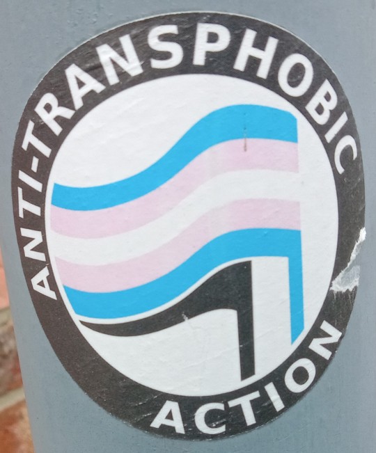
[ID: Another variant on the antifa logo. Here the text on the black ring reads "Anti-Transphobic Action"; the front flag has been replaced with the trans flag - horizontal stripes of light blue, pink, white, pink and light blue - with the light blue stripe continuing down the flagpole; and the back flag is in black.]
Again, love to see a nice variant. This one has the flag right, but for some reason has dropped the German text in favour of English - the German would be "Antitransphobie Aktion", so it's not like there'd be a comprehensibility problem.
The slight issue with this design is that it can be easily defaced, by someone scraping off the "-phobia" part. Fortunately, it can then be kinda un-defaced by scraping off the "anti-" part to just read "trans action".
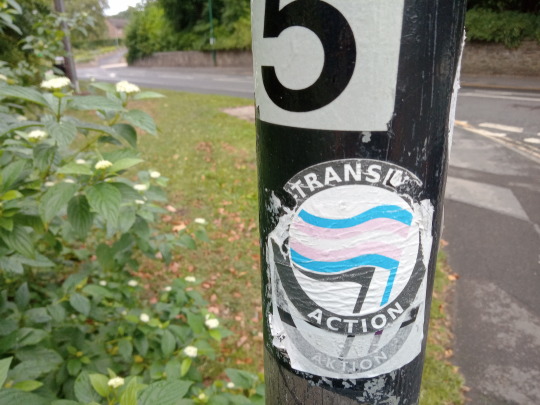
[ID: An example of such a defacing, with both "anti-" and "-phobia" scraped off so the sticker reads "Trans Action".]
7/10
Sticker #7: Wrong Country
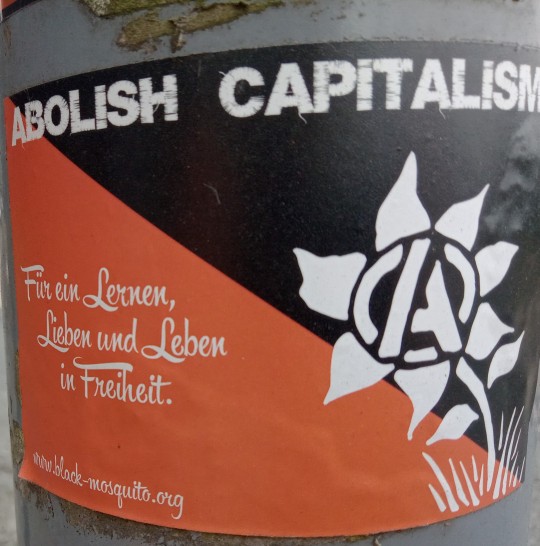
[ID: A rectangular sticker, with the background divided diagonally from top-left to bottom-right, red below the diagonal and black above. At the top in white block capitals is written "Abolish Capitalism"; on the left in a more cursive style is "Für ein Lernen, Lieben und Leben in Freiheit; and in the bottom-left is "www.black-mosquito.org". The right-hand-side of the sticker is taken up by a stylised flower in white, with white grass around its base and the centre of the blossom replaced by a capital "A" with circular arcs between its extremities.]
Here we see an ineffective use of German; instead of using it for a sentence with plenty of cognates so that the primarily English-speaking passersby can figure out what it means, they've used it for the explanation of why they want to abolish capitalism, leaving their sticker bereft of any persuasive capacity.
Also, I know the A is meant to be an anarchist thing, but it just looks like the Avengers logo. 4/10
Sticker #8: Wrong Country, Redux
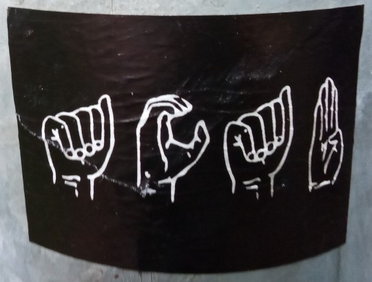
[ID: A black sticker, with the outlines of four hands in different positions in white.]
I really want to like this sticker. It's charmingly cunning to spell out ACAB in fingerspelling diagrams, presumably so that only those 'in the know' get the message and their opponents don't tear it down. In fact, there's just one teeny-tiny problem with this sticker.
It's in the wrong sodding language.
They've spelt it out in fingerspelling diagrams from American Sign Language, which is in no way, shape or form related to British Sign Language. This sticker would be more comprehensible to people in Paris than Durham, and anyone with a passing familiarity with the history of sign language should know that. I am baffled and confused by the existence of someone who knows enough about ASL to make or buy this sticker, but not enough to know that it isn't the same as BSL. 5/10
Sticker #9: Monochrome Anticommunists
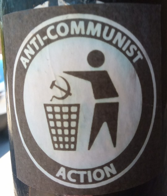
[ID: A variant on the antifa logo; the text on the black ring is "Anti-communist Action", and the flags have been replaced by a black-and-white cartoon of a person throwing a hammer-and-sickle symbol into a bin.]
Here we have a poorly done antifa variant. They got rid of the colour, so there's not that much to draw the eye, and they made the image very difficult to distinguish from an anti-littering sign - seriously, I fully walked past this one before my brain caught up to the fact that "anti-communist" isn't usually written on anti-littering signs, and then I had to go back and have another look before I saw they'd changed the piece of litter out for the USSR symbol. And again, they've inscrutably switched to English - except they've done a worse job of it than the trans variant did, because they screwed up the kerning on "action" so the tops of the c and the t merge together. 3/10
Sticker #10: Checkbox
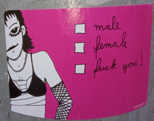
[ID: A rectangular sticker with a pink background. On the left in black-and-white is a cartoon figure, with shoulder-length hair, stubble, chest hair, a necklace, mascara, a fishnet sleeve on their right arm, and what appears to be a bikini with breast forms over ace bandages. On the right are three checkboxes, with messy cursive writing next to them reading "male", "female" and "f*** you" respectively. In small text on the bottom right is written "Trouble X".]
This is a masterpiece of lamppost sticker design. The buckwild gender presentation of the figure, combined with the rather blunt third checkbox, do an excellent job of conveying the message of the sticker; a transness-as-essentially-revolutionary-and-political vibe recieved by the target audience, and a we're-here-we're-queer-like-it-or-not vibe for everyone else. 10/10
(there were other lamppost stickers I photographed, including other political lamppost stickers, but I think this post is long enough to be getting on with.)
#mine#long post#I'm glad all the terf stickers got torn down before I got round to doing this#durham#lamppost stickers
0 notes
Photo

July 14 2019 - A woman deplatforms famous Brazilian Catholic priest Marcelo Rossi, who has previously called homosexuality a disease (to clarify, because people are apparently easily confused: she didn’t push him because of that remark, but it’s still funny). [video]
#antihomophobe aktion#direct action#brasil#brazil#2019#gif#homophobia#catholicism#deplatforming#karma#funny#antifa#antifascism#antifascist action#ação antifascista#antifascismo#lgbtqia+#lgbt+#lgbt#gay rights
185K notes
·
View notes
Text
The white masterrace disappears!
The Germans die out, but we don’t worry about it?
That's the best thing that can happen.
Let me explain why.
First of all, you should know that white people are black people who have lost their color in the course of time. The reason for this is the climate where people live. This means that if today black Africans immigrate to nordic countries, they become white in the course of time. This fact and the fact that also the forebears of all white people were all blacks should drive every fucking dirty racist into suicide. Another fact is that children with the highest possible genetic diversity are healthier and smarter. On the other hand , white people today are already suffering from massive genetic degeneration due to too little diversity ! If you look at that you come to the conclusion that it is the best thing that can happen when as many as possible black people come to nordic countries. Another wonderful side effect with mass immigration of POC is that it will be harder and harder for racists to let themselves be seen anywhere and they will be able to watch their supposedly so valuable pure masterrace blood disappear! Antifa and other leftist organizations have done a wonderful job of getting these ideas from the white masterrace out of people’s minds. I love you for that so much :)
Unfortunately, there is still a lot of work ahead of us. But time will help us because many now consider it to be completely normal that so-called racial mixing. Unfortunately, there’s still a lot of shitty racists to get rid of. What also helps us in the fight against racism is the growing lgbtq+ community and the low birth rates of white people. These problems have not only German shit country but all countries where white live! So it is our duty to fight for mass migration and a world without borders, and that globally. Without these racist fascist borders to exploit and exclude others, we would not have many of today's problems. Some Nazis believe that the elite want to mix races to exterminate the white ones! What use would it be to the present if you looked at the facts I called? It's completely natural that this happens so let it happen and help the nature elapsed time to catch up again. In nature there are no borders and states. If a donkey mates with a horse or a white horse mates with a black one, nobody gets upset . Why do people do that?
#161#afa#antifa#antifaschistische aktion#antirassistische aktion#antispeziesistische aktion#antispeciesist action#antihomophobe aktion#antihomophobic action#antifascist action#antiracist action#refugee welcome#support migration#support refugees#end white supermarcy#black lives matter#volkstot#outbreed#nie wieder deutschland#never again#fuck nazis#fuck racists#open borders#no borders#interracial#mixed#diversity#zukunft#future#ALF
1 note
·
View note
Photo
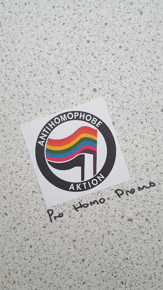
“antihomophobe aktion”
“Pro Homo Promo”
found in a bathroom stall in Mainz, Germany
436 notes
·
View notes
Photo
Jeden Tag zum internationalen Tag gegen Homophobie machen!
#antihomophobe aktion#internationaler tag gegen homophobie#fck homophobie#fuck homophobie#lieb doch wen du willst#pro homo#gay#lesbian#homo#lgbtq#lgbt#against homophobia#no place for homophobia#love is love
151 notes
·
View notes
Text
ok i went to a dance club for the third time in my life last night and it was the best experience??
good music
v cool people whomst I love a lot
the club has just great vibes tbh? it’s v small and there are stickers everywhere (antihomophobe aktion, fck afd, die partei, lefty stuff in general), plus posters of like The Who, Nirvana, Rolling Stones, Pink Floyd
they have a shot called Dead Nazi
maybe I should’ve led with that but yeah
#i got home at 3 am and woke up at 8 am slightly hungover#i went outside and enjoyed it? rare event#eule personal#alcohol tw
3 notes
·
View notes
Photo
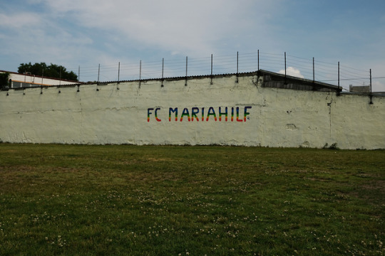
Am Samstag sollte in Simmering ein Match zwischen dem FC Mariahilf und dem FC Vatikan anlässlich des 20 jährigen Bestehens des FCM stattfinden. Das Spiel fand jedoch nicht statt weil sich der FC Vatikan von Regenbogen-Eck-Fahnen, dem Vereinsschriftzug im Regenbogen Look (siehe Foto), von einigen Fans mitgebrachten Transparenten sowie Pro-Choice Botschaften von drei Spielerinnen beleidigt fühlten.
Einige Spielerinnen des FC Mariahilf hatten um Unterstützung gebeten, deshalb waren einige Dynamas und mit etwas Verspätung auch zwei Sox vor Ort. Weder wurde vor Ort der Glaube der Spielerinnen des FC Vatikans zum Thema gemacht, noch wurden kirchenfeindliche Sprüche vom Stapel gelassen. Drei Spielerinnen hab auf das Selbstbestimmungsrecht über ihre Körper gepocht, der Verein hat die Eckfahnen durch Regenbogenfahnen ersetzt und zwei Transparente mit der Aufschrift “Against Homophobia” und “Antihomophobe Aktion” waren alles was es brauchte um das Spiel platzen zu lassen. Bezeichnend, dass der FC Vatikan diese Botschaften als gegen sich gerichtet wahrgenommen hat und dermaßen gekränkt war um das seit einem Jahr vereinbarte Spiel platzen zu lassen.
Einige Artikel zur Nachlese:
TAZ: Mariahilf!
Der Standard: Eklat in Wien: Vatikan-Fußballerinnen traten aus Protest nicht an
Heute: Eklat in Wien! FC Vatikan tritt nach Protest nicht an
Kurier: Skandal in Simmering: Der Vatikan pfiff seine Frauen zurück
Dynama Donau war vor Ort
Bericht von Birgit Rienzinger: Als der FC Vatikan nach Simmering kam und wieder ging
#prochoice#prochoiceisois#stopsexism#againsthomophobie#fussball#fussballliebe#simmering#fcvatikan#fcmariahilf
0 notes
Photo
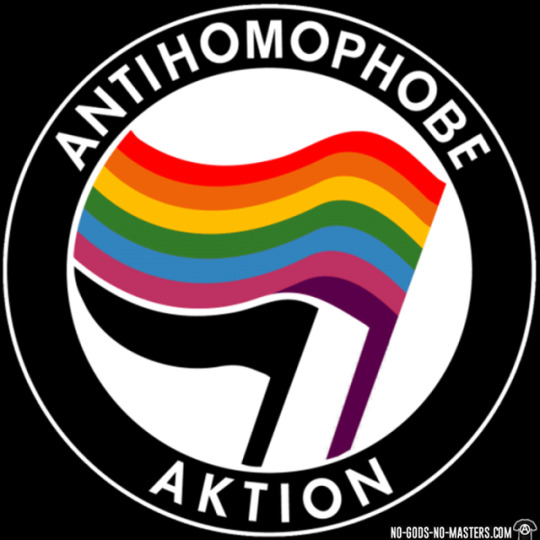
Activist tshirts - https://www.No-Gods-No-Masters.com - Antihomophobe aktion
25 notes
·
View notes
Photo

August 27, Modesto - Drown out their hate!
#antifa#antifascism#antifascist action#modesto#california#antihomophobe aktion#antitransphobe aktion#feminism#usa
148 notes
·
View notes
Photo
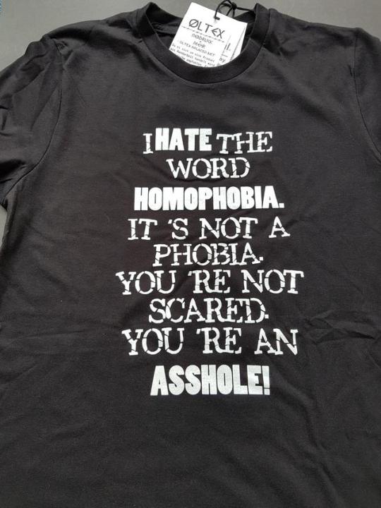
Wir haben ein neues Shirt von Öltex aus Leipzig bei uns im Shop!
https://black-mosquito.org/i-hate-the-word-homophobia-t-shirt.html
24 notes
·
View notes
Photo


June 22 2019 - A fascist trying to pick a fight at Bologna Pride gets more reaction than he bargained for. [video]
#antihomophobe aktion#bologna#italia#italy#pride#lgbtqi+#lgbt#azione antifascista#antifascismo#antifa#antifascism#antifascist action#gif#2019#self-defense#homophobia#bash back
97K notes
·
View notes
Photo

#161#afa#antifa#antifaschistische aktion#antirassistische aktion#antispeziesistische aktion#antispeciesist action#antihomophobe aktion#antihomophobic action#antifascist action#antiracist action#refugee welcome#support migration#support refugees#end white supermarcy#black lives matter#volkstot#outbreed#nie wieder deutschland#never again#fuck nazis#fuck racists#open borders#no borders#interracial#mixed#diversity#zukunft#future#ALF
2 notes
·
View notes
Photo

got this and a bunch of other antifa/leftist enamel pins & buttons in the mail from a comrade in Germany
http://commerce.madbutcher.de/
7 notes
·
View notes
Last Seen Blogs

ahmetcelikhk
İsimsiz

futuristicbasementhottub
Untitled


virtualphilosophereagle
virtual philosophere eagle

cm-imagines-07
Yes, I’m a genius.