#art tutorials and refs
Photo
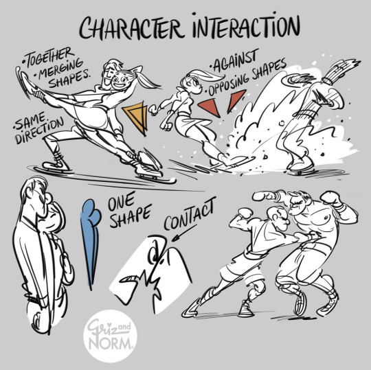
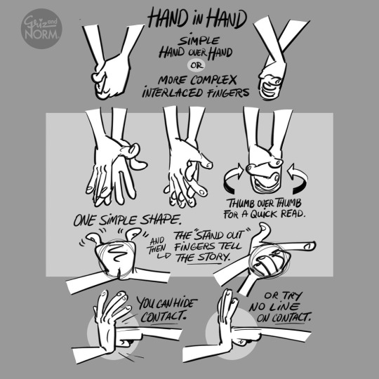
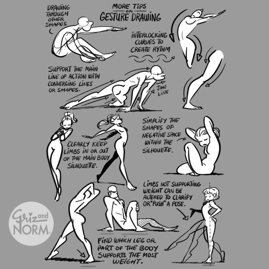
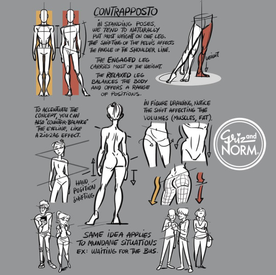
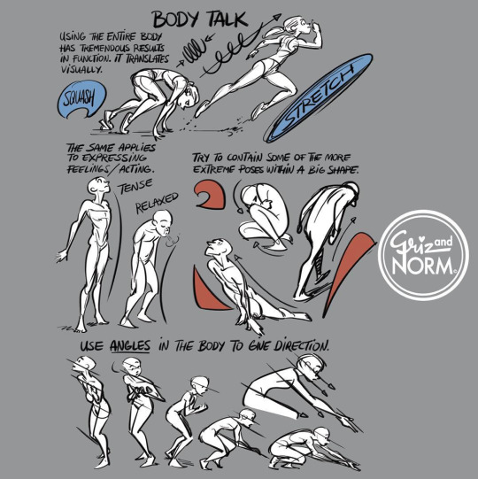
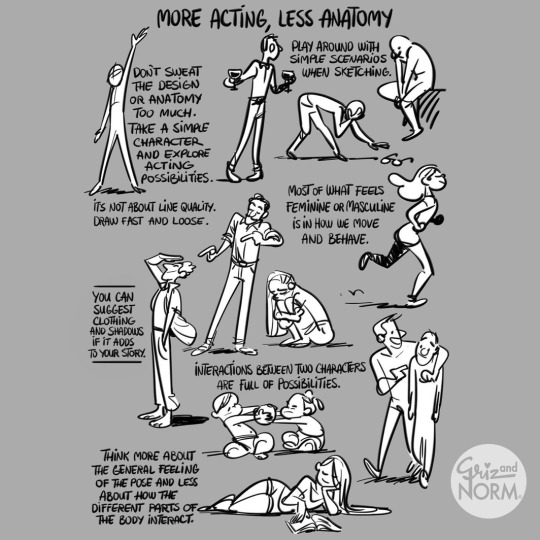
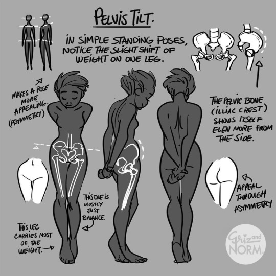
More art tutorials by Disney artists Griz and Norm Lemay
#disney#art tutorial#drawing tips#art reference#art ref#Griselda Sastrawinata#normand lemay#art#not concept art
46K notes
·
View notes
Text
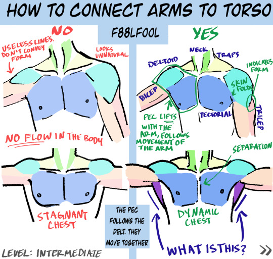
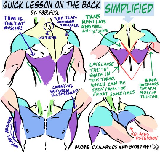
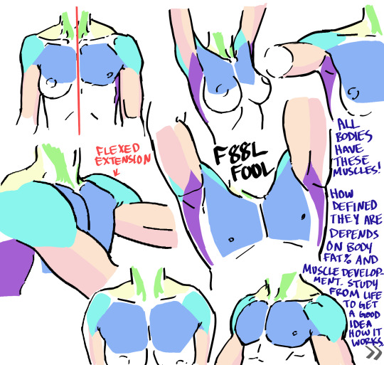
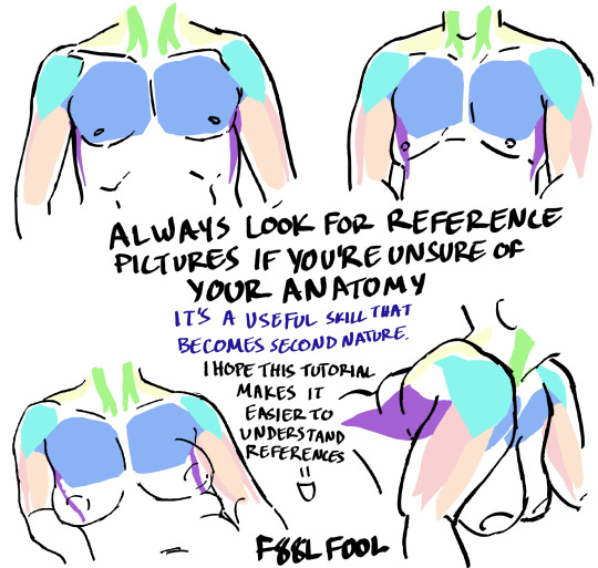
My first anatomy tutorial. How I connect arms to the torso. Simplified the muscles for better comprehension
PS. Pectoral is misspelled as “pectorial” in the picture. Don’t make that mistake haha
And I’d love to see the art made from using these as reference, you can message or tag me.. whatever you want
Edit: The extended names of the muscles:
Neck - Sternocleidomastoideus
Traps - Trapezius
Lats - Latissimus Dorsi
#pec-torial#pec tutorial#there i said it#also keep in mind each body (even the leanest ones) have fat on them#a reblog pointed this out and I thought it was a good reminder#none of these bodies have 0-1% bodyfat#art tutorial#anatomy#anatomy tutorial#drawing tutorial#drawing tips#muscles#muscle tutorial#art study#digital art tips#anatomy tips#art ref#art#reference#tutorial#art references#titorial#f88lfool
27K notes
·
View notes
Text
Highly suggest using it.^^
Follow me for more 🌿
#art blog#artistsupport#art help#beginner artist#artists on tumblr#art tutorial#artist spotlight#art tips#art tumblr#art ref
7K notes
·
View notes
Text
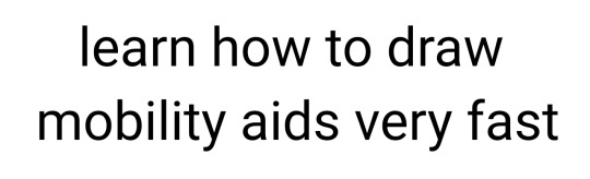


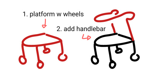
wheelchair, cane + forearm crutches, walker 90% chance if you're hesitant to draw mobility aids you're overthinking it. start somewhere. obviously these are not detailed references.
wheelchairs and walkers should be proportioned like chairs. in most cases canes are held on the opposite side of the painful leg because you want to put weight on the cane instead of the leg (dr house lied to you) but depending on the reason for the cane this can change!
[ image id: a title image that reads "learn how to draw mobility aids very fast" followed by three simplified drawings of different mobility aids broken down into two steps each. the changes made in each step are colored red.
the second image shows a wheelchair, with the steps "1. seat with footrest", showing a simple chair shape, and "2. wheels", which adds two large wheels to the back and two small wheels to the front.
the third image shows both a cane and forearm crutches, with the steps "1. stick", showing a single line of color, and "2. add handle", which shows a hand grip and a forearm rest on two different sticks. and additional label below this step reads "handheld stick height is where the hand rests at the hip" and "forearm stick height is the forearm".
the fourth image shows a walker, with the steps "1. platform with wheels", showing a backless chair shape with a wheel on each leg, and "2. add handlebar", which shows a handle raised above the seat. end id ]
✨ edited to remove italics for screen readers + also pointing out that I missed the handle on the forearm crutches! always use real reference photos when you can, this is just a starting point to help you understand the basics if you're not familiar :3
#are they perfect renditions? no. but first attempts at drawing anything rarely are#and tbf id rather people start drawing them and draw them badly than never draw them at all#art ref#tutorials#mobility aids#wheelchairs#canes#forearm crutches#walkers#sorry if there are typos blame the blindness#patch me through to palaven command
6K notes
·
View notes
Text


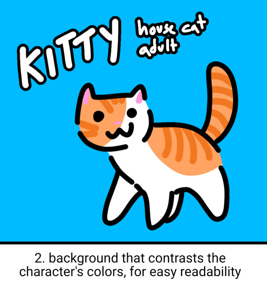


simple little ref sheet guide with some tips relevant for any amount of detail! With Art Fight season around the corner they're some good things to keep in mind :)
other miscellaneous tips
if your character has detailed markings that need to be accurate (like tattoos), place the reference for it on a rectangular transparent section so it can be selected easily for copy/paste!
if your reference is for art purposes, try to keep it relevant to art! lore can help, but a lot of backstory text can make it difficult to tell what's important when drawing them
important things to include as written details are heights, weights / body types, pointing out any intentionally unusual proportions, and other things that may be interpreted as an art style (or that your reference may not accurately convey)!
if you can't draw something the way you want others to draw it, you can just insert other photos / screencaps for others to reference!
always have a SFW version. not one with censor blocks over the bits, I mean one that doesn't have the bits out at all. put some underwear on that beast. it's common courtesy.
ADD ALT TEXT. write a description of your character! bullet point lists of succinct traits are clearest for artists to work with when commissioned. having both a written and visual reference makes it possible to verify things
2K notes
·
View notes
Note
Question: From your progress shots you seem to do everything in greyscale then add color. How do you do that? Is it a layer effect you apply so the colors take their place or something else? (gradient maps also confuse me so i have no idea if thats what your doing)
Sorry for the very odd question, its just that your art is so wonderful and amazing to look at that i was curious how/why you do the greyscale to color way.
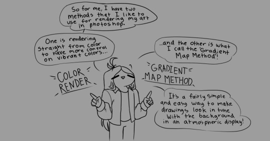


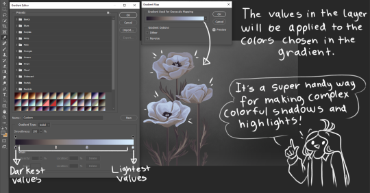

Also thank you!!
2K notes
·
View notes
Text
How to draw: The position of the Fingers in Hand Poses Correctly (FINGERS WORK TOGETHER)
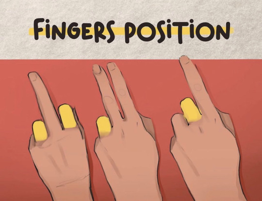
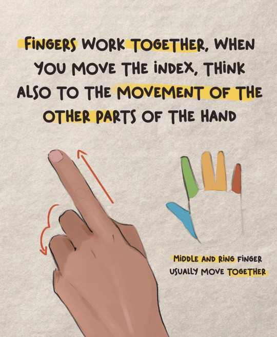
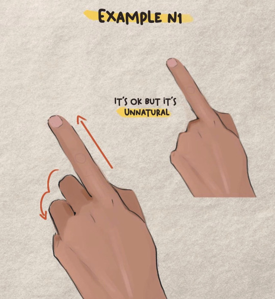
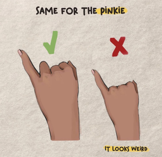
Credit: Valentart_
#random tip#random tips#hand#hands#finger#fingers#anatomy#human anatomy#pose#pose ref#pose reference#pose references#proportions#proportion#art tutorial#drawing tip#art tip#art tips#art tutorials#drawing#drawing tips#drawing tutorial#drawing tutorials#art#posing
1K notes
·
View notes
Text


Made another tutorial for a few pals. Hope theres no spelling mistakes lmao.
#artist#art#art tutorial#art tips#drawing tips#art reference#drawing reference#drawing tutorial#how to draw#how to draw people#art ref
456 notes
·
View notes
Text
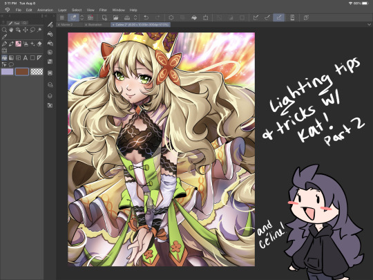
I’ve got 2 more lighting tips today: first one is something I call “soft rendering.” It gives that fuzzy, 90’s anime feel! I hope you all enjoy it! I’ll post the second lighting tip tonight!


#smkittykat#smkittykat art tips and tricks#digital art#art ref#art reference#art tips#artists on instagram#artists on tumblr#artists on twitter#digital art tutorial#art tutorial
485 notes
·
View notes
Text
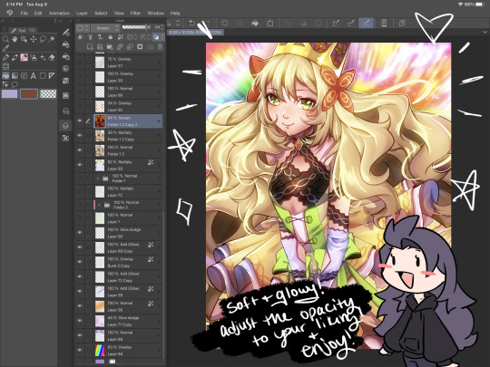
Thoughts and observations on universal calligraphy applied on neography.
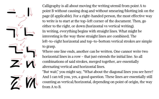

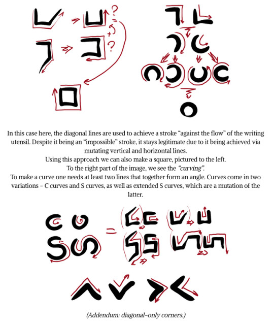


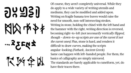
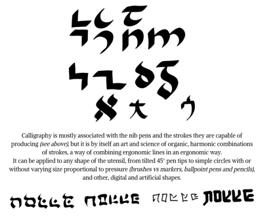

#conlangcrab#conlanging#conlang#constructed language#conlangcrab talks#linguistics#neography#calligraphy tutorial#calligraphy#conscript#art ref#art tutorial#thecrazyneographist
197 notes
·
View notes
Note
How do you draw Abodes Dreads/Braids? I'm a black creator and still (embarrassingly) struggle with them in the arcana style. (And in general XD) the way you draw her is gorgeous. And I must know the magic you poses.
Nothing to be embarrassed for! Unfortunately there's not much reference for black hair in the Arcana, so we all have to guess. I'd highly recommend looking at @kianamaiart and Simkray's hair brushes for other examples of stylising black hair (if anyone has examples of black hair in angular art styles, please share!!)
Anyway, I hope this helps!
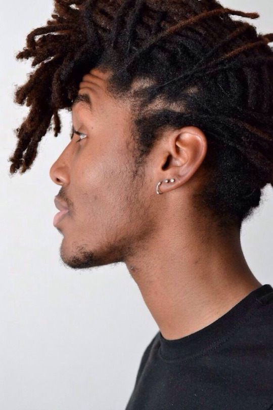
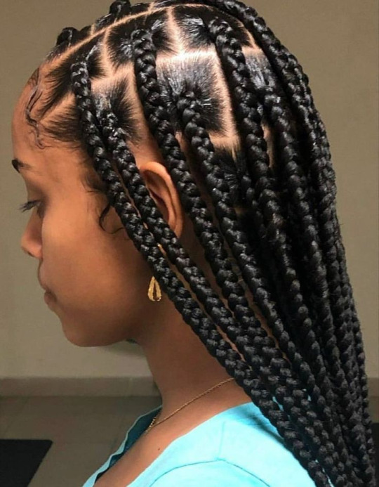
Dreads and braids are both segmented styles which makes their basic construction similar, however dreads are stiffer and hang less than braids, which are quite heavy
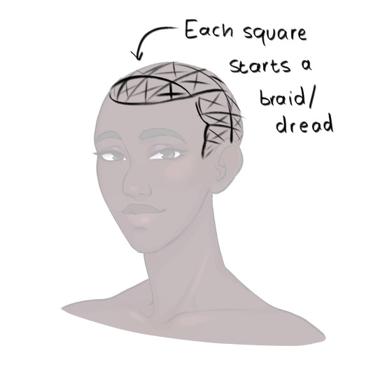
She usually pulls her hair back so I only have to pay attention to the hairline, but I draw each dread as a somewhat stiff tube. Where it connects to the scalp I feather in short, fine lines for the edges/thin hair that's attached to the skin.
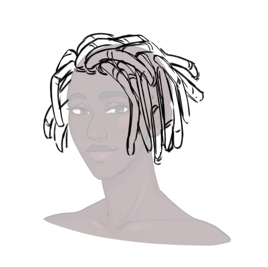
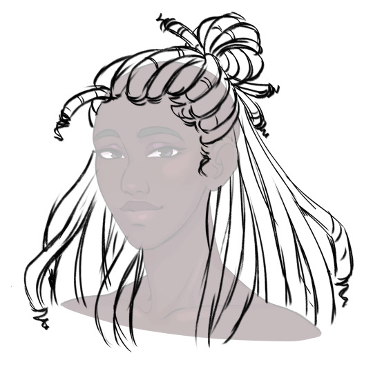
To show the twisted texture of dreads, I add curved lines along each one. For me, this is a good balance of detail for the style (though I can still get tired of lineart -_-)
Then, as a final detail, I give Abosede imperfect ends, topping most dreads off with a thin twist. This is optional as some dreads don't have this.
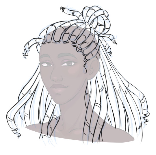
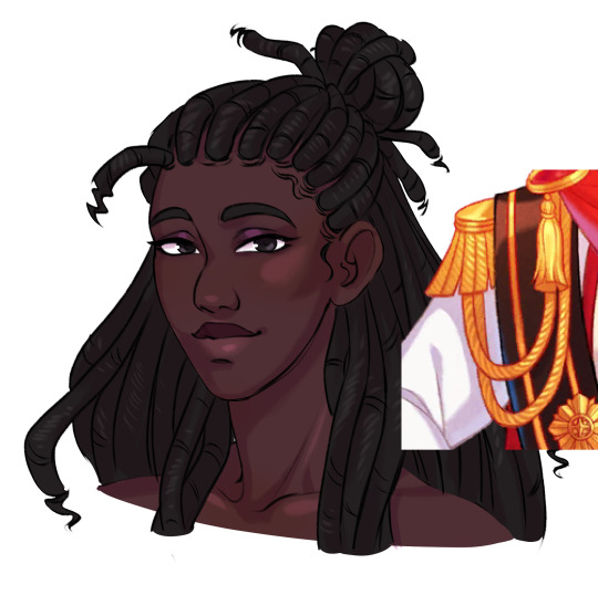
Then finally, for colour. I take reference for how they render ropes and add a series of light lines along each dread. Dreads don't reflect much light, so these are pretty faint.

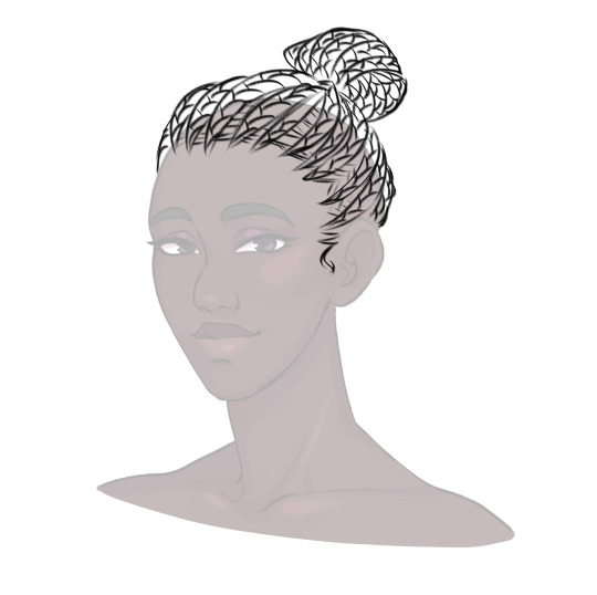
For some braided hairstyles, you just replace the tubes I use for dreads with a simple plait pattern (as seen in Lucio's masquerade outfit). If you're aiming for cornrows, instead of the segments, draw the tubes along the scalp with sharp ends. Then fill them with a plait pattern. For extra detail, you can hatch lines in between the cornrows where the hair is pulled into the braid.
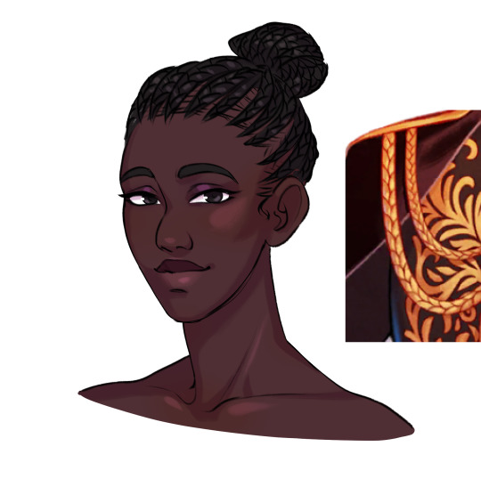
Braids have stronger highlights than dreads, and I tend to dot them in the centre of each part.
So this is my basic process. If you have more questions, feel free to ask!
#the arcana#the arcana game#hair tutorial#art ref#art tutorial#black hair#afro hair#art#i honestly haven't rendered abosede's hair much#mostly because there's so much lineart involved#for other art i tend to use braid/twist/loc brushes to make it easier#maybe i could try making some for the arcana style
3K notes
·
View notes
Note
May I ask on how you choose your colors when you color your art pieces? It is so pretty to look at the colors of your art, and I want to color like that, but color picking is very hard q-q
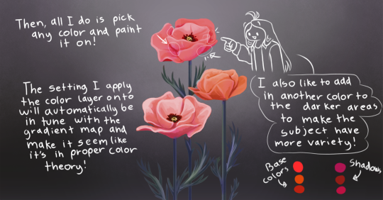
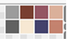
here's!! uh, the general areas in the color wheel where i try to pick depending on the vibe
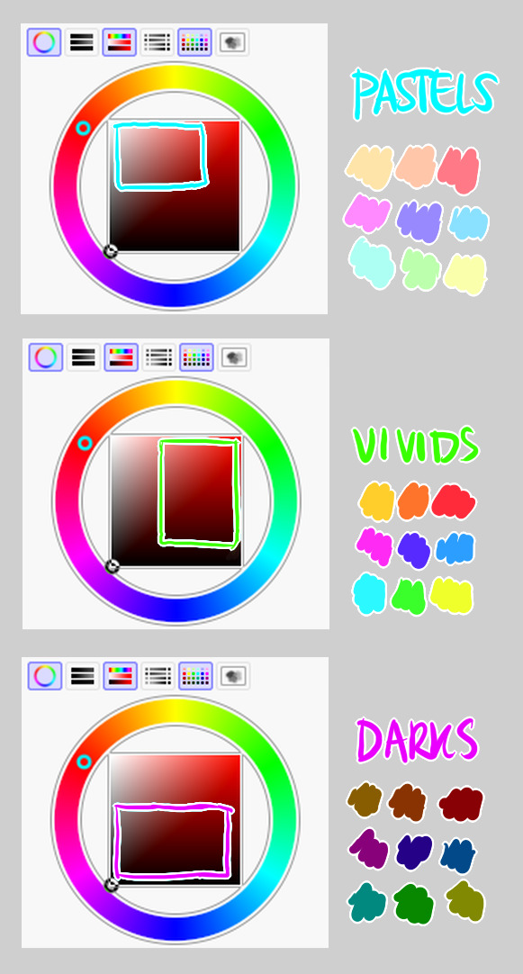
highly inaccurate because tbh i just color pick directly or try to guess the colors from my references and just adjust them to be a little bit more pastel or to the atmosphere
and if i have their colors memorized (such as ink or dream), i just pick by memory or by my modified colors LOL

color your scrunkly!
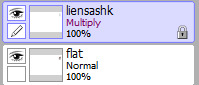
set your line work to multiply and lock opacity
i use warm tones for white ish colors so uhhh idk whatever warm color from here
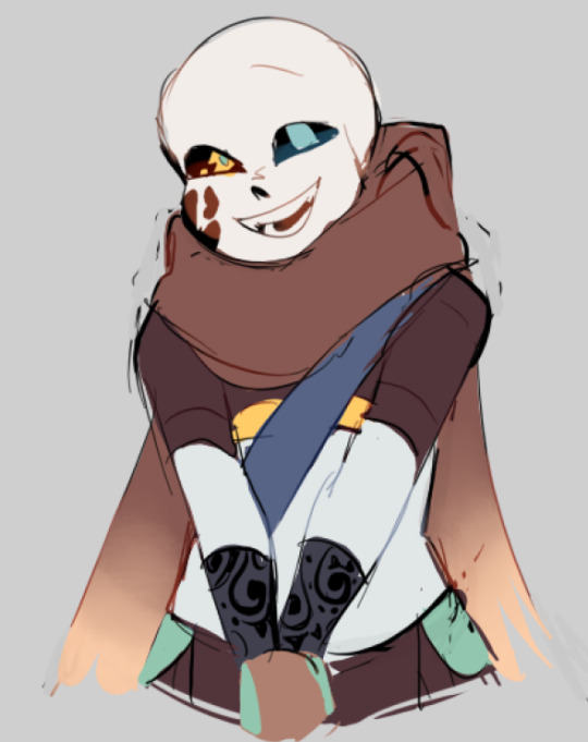

color the line work!!!!! ofc, shift the hue depending on the undertones of the surrounding colors
the skull color is a warm off-white, the undershirt is a blue-ish off-white, scarf is warm brown, so on and so on
the multiply function rly helps just blend things into the palette a little more, but if ur confident enough, you dont have to set it to multiply at all for extra variation
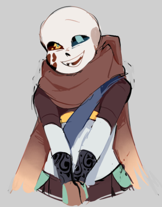
minimal shading by just taking the surrounding colors n adjusting the hue slightly n its value n saturation
gives it a very messy cel shaded look! been into it lately and stuff

and then i add a few overlays using the pin light layer mode!
i usually use these two colors together, it gives the right amount of pastel colors that really appeals to me
if you have access to gradient maps, i recommend using them lots!
it makes the pieces look a little more cohesive
the pin light layer mode imitates it n is very versatile if u cant use them though (like me when im just doodling on sai)
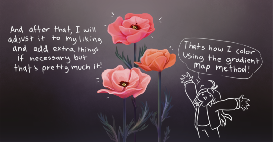
that's it!!! that's the basic rundown of how i color
i'm not very well versed in color theory so i can only do very basic color picking tips, but maybe next time i can offer ways on how to color more atmospherically!
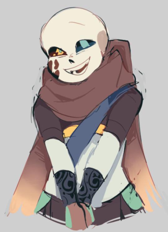
have a nice time coloring your blorbos ✨
#Anonymous#tutorial#ref#ink sans#kia doodles shit#i hope this heeeeeeelps somewhat!!!!!#art tutorial#coloring tutorial#art help#art tips#art advice
371 notes
·
View notes
Text
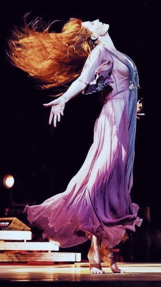
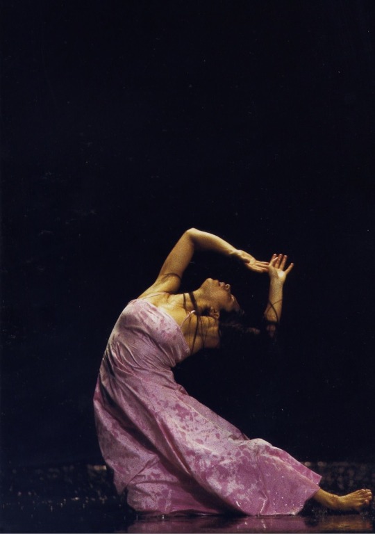
Struggling with finding unique or fluid poses?
Look at photos of Florence Welch or (ballet) dancers!! Both have very elegant and fluid poses that are dramatic and eye-catching which makes them great to reference or use for practice!


#artwork#art#traditional art#digital art#artists on tumblr#pose reference#art ref#art reference#art tips#art tutorial#art advice
732 notes
·
View notes
Text
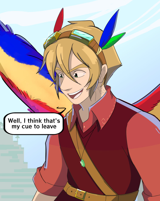
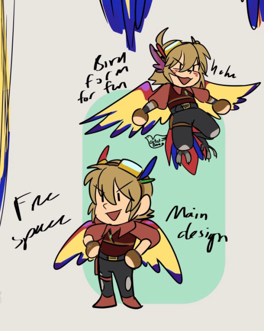
A pesky bird as appeared and he left me a present.....MY HOUSE!!!
Time to enter the void btw cuz life stuff happening again
#my art#sketch#digital art#grian#idk how to tag this cuz it's just grian#nothing specific#hermitcraft#idk#i've only seen his building tutorials and hermitcraft so#rn watching his evo stuff#may post his ref one day but idk#bird design is more for fun than actual use#he has like 4 references from his past content but only like 3 are visible in these doodles
217 notes
·
View notes
Note
Good day to you Luna!
Ive always enjoyed how you deaign your characters from the use of shape language to the use of color.
I noticed that many of your designs have around 6-8 (and more on your latest) colors in use at a time. I was always told that you should work with a limited pallete when designing characters, but you somehow designs lovely characters "breaking" that rule.
How do you do it? I always get overwhelmed if i have more than 5 colors in a designs but usually it lacks the contrast and "pop" that your designs have.
Also when you design characters, do you start with a theme, their personality or their role in a story?
COLOR THEORY
This is a great question! So when it comes to color in designs; character/backgrounds/props, generally less is more. You pick 3 colors : 2 right next to each other ( analogous colors ) : 1 on the the otherside of the color wheel ( complementary colors ). From there you want to vary the value/saturation. So there's a dark color - mid tone - highlight (usually the complementary color).
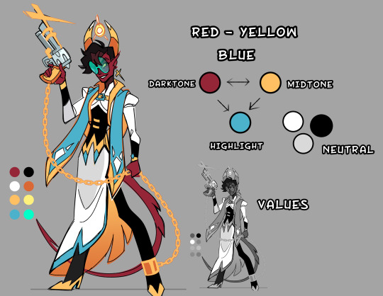
So It might seem like I have a lot of colors, but in actuality it's only 2-3 colors with varied saturation/values to create contrast.

You want a 2/3 ratio split of the analogous colors with the remaining 1/3 being the brighter complementary color to make little details POP. Now sometimes I will use 4 colors in a design, it still works because it's all about balance. I made a little crud pie chart for a general idea. Faye's main color scheme is blue -> green highlighted with red/purple/yellow. Her vibe is poisonous, and poisonous creatures tend to be colorful.
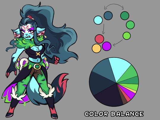
With the right balance you can make any color scheme work, you have to give each color their place, some are more dominate then others. If you make a design with every color 25/25/25/25 equal split, the design will come off as bland and nothing will stand out. But if you make it 40/40/20 suddenly that 20% stands out.

Thinking of palettes in terms of pie-charts will help out seeing the color balance in your design. Give it a shot if you're struggling with making your design pop!
#art reference#advice#coloring tutorial#character design#tips#ref#art#tutorial#coloring reference#color palette
605 notes
·
View notes
Text
Crisp those Lines!
Or: a small collection of suggestions for a crispy, neat lineart.
SO MANY OF YOU ASKED FOR THIS (it feels absurd to say, yes), so here you go.
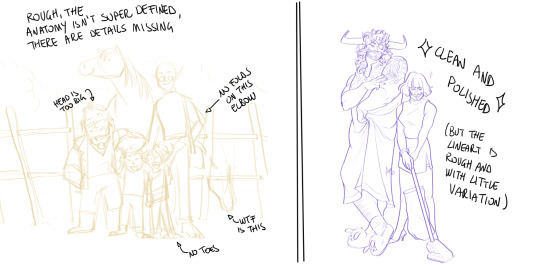
A premise: there's no right or wrong way of inking, and some of the following tips entirely depend on the type of inking I do. Which is neat and clean, with no blacks, and moreover: digitally. More under the cut because it's gonna be long and full of explanatory pictures. Here's an example:
SOFTWARES AND BRUSHES:
Let's address the elephant in the room: Photoshop SUCKS for inking and linework. The stabilisation of the brush there is SHIT. Good for colouring and painting and doing photobashing, but for Lineart you want it to be precise. Do yourself a favour and don't use Photoshop.
I generally use Clip Studio Paint, but i have to say that the best program for it that I've tried keeps being Paint Tool SAI 2. It has few functions, it's true, and I use CSP because it has more instruments. But if you don't want to pay much, SAI is incredible as for brush rendition and stabilisation.
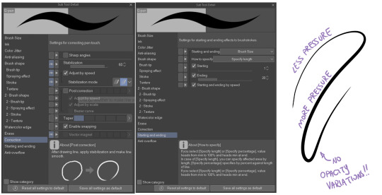
As for the brush: you don't need a fancy brush, anything in your software will go. What I use and what works best tho must have:
Tapered start and end.
High stabilisation (I go from 60 upward, lower it down for trees and grass or anything more natural that needs to be less neat and flowy)
Low tapering.
It must be set so that pressure controls only the dimension. The more you push on your pen, the bigger the line gets. No colour or opaciy variation!
On Clip Studio Paint, I use the G-Pen in the program. It's good as it is, but I think I did some variations as per here:
FILE DIMENSIONS:Better work larger and then resize down. Sizing files up digitally is possible, but it leads to unfocused images.
I generally work on files at 600dpi (300 is fine too, but don't go any lower. Particularly if that's something you want to print later on, any printing wants a minimum of 300dpi). in roughly an A3 format (bigger dimension is 43cm). Most pictures I upload here are 6000x5000 pixel.
A bigger file will give you more possibilities with brush sizes, and it'll be easier. Remember: digitally, sizing down is ok, sizing up is not something you should do.
SKETCH:
This is the suggestion I should follow but never do.
Having a clean, polished sketch simplifies your life A LOT. This is because if you don't have to worry about drawing details and fixing the anatomy of your drawing during the lineart, and doing it so GOOD because it's the lineart... You'll go that much slower and your life will be more complicated (it's not impossible, my sketches usually are very rough. I am ok with it, the most I do drawing wise is during the lineart... But I'm lazy, don't do like me. A good sketch will help you out.)
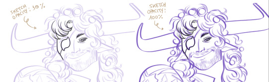
Compare the two sketches below:
Another note about your sketch layer: you know those memes that complains that the sketch looks good but when you hide it the lineart is shitty? That's easily solvable.
When you're inking, lower the opacity of the sketch layer down, A LOT. I generally go for a 30 or 40% opacity (depending on the colour of the sketch. the yellow sketch will go around 40% because it's less visible, the purple one lower).
When you're inking, you MUST see clearly the lineart you're doing. If the sketch isn't contrasting enough, you won't see clearly what you're doing... It's like trying to sketch with a dim light, not seeing the paper clearly. See the difference:
BEFORE YOU START:
You probably have read it everywhere, but it bears repeating: warm up your hand.
You're using muscles and for more than five minutes. The warmer they are, the firmer your hand is, the easier it gets controlling your lines. It also prevents you from damaging your wrist. Stretching is also great, and grippers are nice to have. Keep your hand fit!
As for warming up: I usually do some calligraphy exercises, practicing on flowy cursives. You want to practice varying the pressure of your lines in a single trait, hence why calligraphy is good. But generally, what you can do is...

PRESSURE VARIATION AND LONG LINES:
So. My main tip and trick is to vary the pressure of your lines. In the same line, and between different details. This will help making the lineart more dynamic and interesting.
A note: this works for semi-realistic styles. If your goal is obtaining a Cartoon Network style: they have generally little to no variation and it works. My suggestion would be to study the kind of style and effect you want to obtain, different styles will work best with different linearts. If you're aiming at hyperrealistic painting, there's no point in spending time over a lineart, for example, I inked the same lineart, but with a brush that doesn't vary it's dimensions with pressure, and not changing the dimension of the brush.
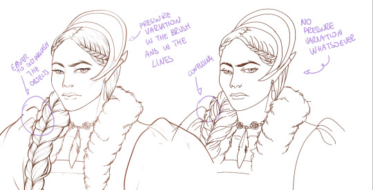
What makes my linearts look "flowy" and "neat" is the fact that I tend to draw less lines and longer, and pay attention when I stop, to start the line where I end it. This will give the impression of one continuous, single line, and make everything more fluid. See above in the french hood: on the right, I left the line rough on purpose, you can see where I stopped and started again. On the left, where I took care of it, you can't.
Generally speaking:
Thick, dark lines communicate that the object is close to the viewer (always keep the viewer in mind!) or in shadow. Lines should be thicker on the outside of your objects, to separate two planes, and in stuff closer to you.
Thin lines are delicate, they should be used in the background, for small details (see the hair, the lips, the small wrinkles around her eyes.)
As for line continuity: in both cases, the line of her face is one single line I drew. This can be obtained with a smooth result, particularly in curved lines, by getting the brush stabilisation on higher settings (80-100): sacrifice speed for accuracy.
MORE IS MORE, WHEN IT COMES TO LEVELS:
Particularly when there are two objects intersecating, or more characters interacting… Instead of inking all on the same level, I always do one level for each object, trace the WHOLE line as if there was nothing above, and then erase where it's not shown. This is a little thing, but pays off. Always in the drawing of above, the feather and the hem of the bodice were on separate layers, and then I erased the bodice under the feather. Take advantage of being inking digitally and not traditionally!

For many characters, here's an example of a vignette of a comic page before cleaning it up and erasing. Every single character and the weapons are on separate layers

For this it's very useful knowing your recurring mistakes. For example, I tend to draw heads bigger than they should. I know I do, so generally I keep the head on its own level, and the body on another, so it's easier to modify and size down just the head without getting crazy selecting only the lines you want with the lazo.
Again, you're inking digitally. It's not easier than traditionally necessarily, take full advantage of your instrument!
OTHER TIPS AND TRICKS:
High brush stabilisation sacrifices speed for accuracy. The line will lag a little from your cursor. Get used to watching the cursor and not the line, and trust that the line will follow.
GO SLOW.
Rotate and flip the canvas. Don't ask me why, but tracing long lines towards me is always easier than not the other way around.
Use the Free Transform, Warp, Distort etc etc and the Liquify to your heart's content if you notice the lineart has something wrong. The only cheating in art is using fucking AI generators (and AI pictures are not art, sorry not sorry)
References are your friends. Study how an artist you like does the lineart. Try and imitate them, and if you can and need to post them: tag them! (don't trace and sell it as your own)
Experiment with brushes, find one that you like for the effect you'd love. You do you, there's no right or wrong way of inking.
Remember to breathe when you trace those lines! (and to drink and do pauses and stretch, you don't want a tendonitis!)
Have fun. Lineart is not evil, lineart is your friend!
I hope this essay is exhaustive enough. I'm tagging ALL THE PEOPLE that requested it (and giving each of you a muffin).
@ndostairlyrium @narina-gnagno @salsedine @whimsyswastry @layalu @n7viper
If you have any questions, don't hesitate in asking!
#tutorials#lineart#inking#digital inking#digital art#tips and tricks#petrel explains#COME LO FECI (cit)#listen if we're mutuals and we chat... ask me to share my screen I don't mind the company when I work if it's not something I can't show#or if it's not too late at night for me#also I unironically like how Alyra inked without variation looks even angrier and more judgemental than normal LOL#also some spoilers for The Last Bacchae if you follow that#“Marmotta” means “Groundhog” in italian#art ref
122 notes
·
View notes
Last Seen Blogs

thebohemiandreamersblog
The Bohemian Dreamer
mastertheyoda
Master The Yoda
aphroditecentre
Aphrodite Centre for Humanity

printingservicesincalifornia
Printing Services Glendale Ca | Los Angeles | Pasadena
srldesigns6277
Always Be Yourself, Never Let Someone Change You