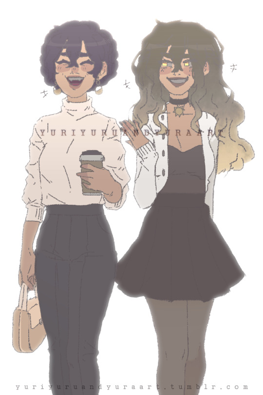
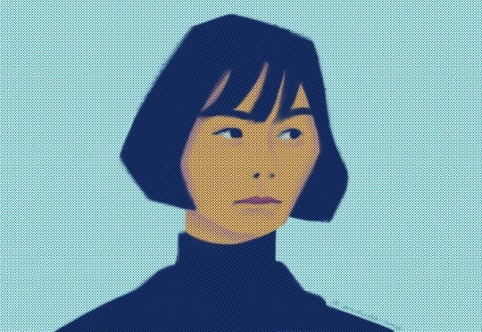
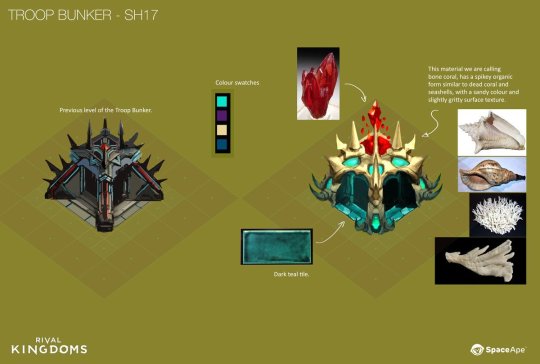
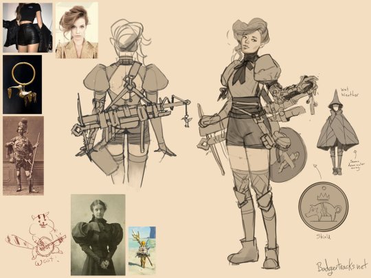
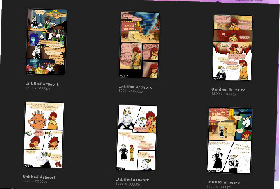
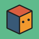
#i am finally happy with my art style!!
Text
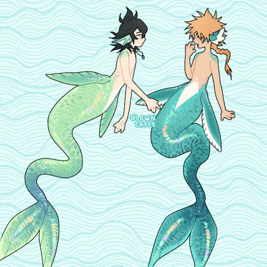
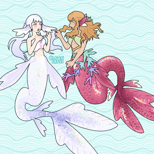
sea creatures!
#i am finally happy with my art style!!#wooooo!!!#black clover#black clover fanart#yuno grinberryall#yuno#leopold vermillion#leopold#noelle silva#noelle#mimosa vermillion#mimosa#merpeople#merperson#sea creatures#art#my art#anime fanart#fanart
192 notes
·
View notes
Photo
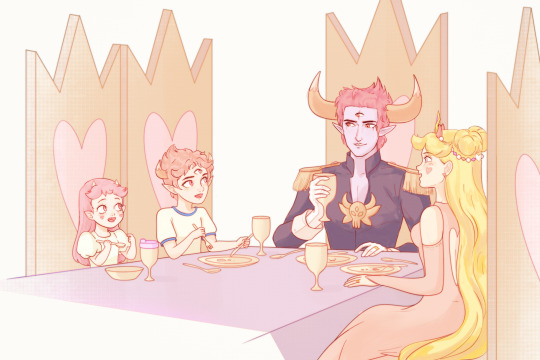

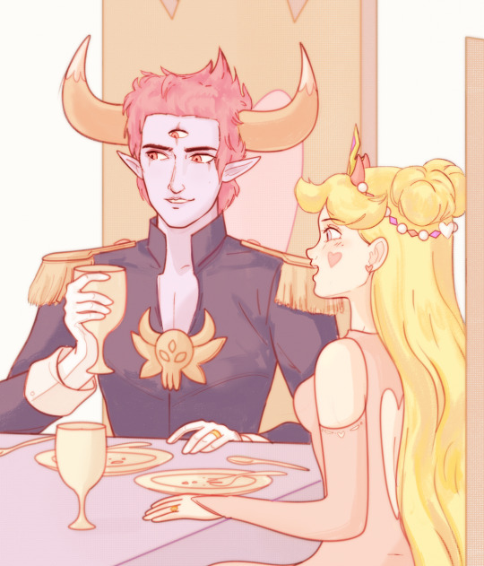
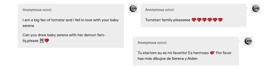
#I'm happy guys bc I got excellent grades in my final exams and this drawing turned out so cute c':#I am a free university student now :')#this is the last request for a while guys ♥ i did this in my style to make it special ///#i love y'all#now if youll excuse me I need to go and clean my bedroom#tomstar#startom#svtfoe#my art#artwork#fantasy art#fan art#disney#svtfoe fanart#demon art#kawaii
461 notes
·
View notes
Text
💙🌌💀🌌💙
#my art stuff#digital art#undertale#sans#human#humanization#gajinka#finally drew a human sans I’m happy with without copying someone else’s#I wanna do mars as well soon but I’m still figuring out how to deal with the sharp features#I can’t believe I forgot to post this the other day#I should draw a papyrus soon#I am gonna be completely honest and say that I’m terrified of drawing people of colour because I don’t know many personally#and looking things up can only take you so far. especially with mixxed info everywhere#and I’m prolly the most “woke” person in my family and I have a racist dad so it’s not like anyone of them would know any better#I just drew some hair that looked nice to me and picked a skintone that looked nice and gave him hazel eyes literally just cus I think they#’re pretty (and heterochromia on top of that but that’s just a sans vibe)#I know nothing about textured hair care so I couldn’t pic a style based on ease or anything etc etc#so if anybody has any thoughts on how to improve him. I’d love to hear feedback on it#I am literally the most white cracker you can find with straight blonde hair and blue eyes and all that shit so I know NOTHING about#anything else and I want to learn more from other perspectives in general#I know I could and maybe should have just kept this post as-is without adding all my hyper-worry (which really isn’t helping anybody)#but this is very outside of my comfort zone for character design and I’m terrified of designing anything without some kind of experience#TL;DR if this sucks in some way from a cultural standpoint please let me know#and… I shouldn’t apologize for the long ramble cus it’s my own post etc etc but I still want to apologize#and thank you. people often don’t read tags especially when they go on like mine do
83 notes
·
View notes
Text

If you can call what I've become "LIVING" 💀
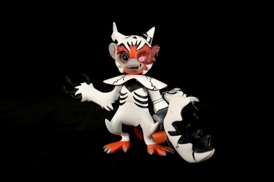
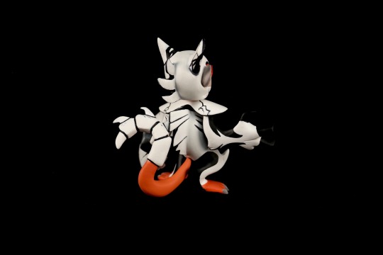
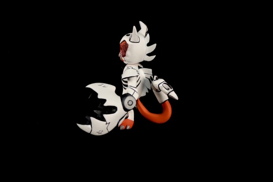
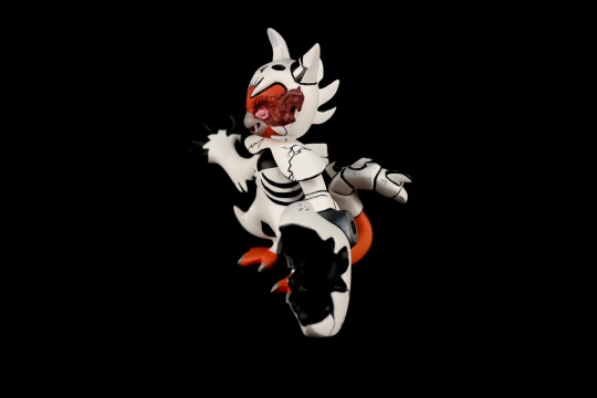
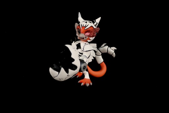
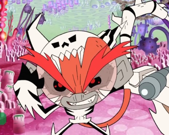
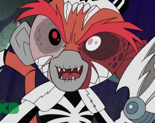
Mandarin from Super Robot Monkey Team has one of the coolest designs I have ever seen... I had to make a figure (to make up for him getting no official merchandise).
(Sculpted with paperclay, painted with acrylic)
#super robot monkey team#super robot monkey team hyperforce go#srmthfg#srmt mandarin#skelemandarin#my art#kin sculpts#...ok this is def up there with phantom as one of my best figures yet#i am very happy with how he came out : ]#if your wondering abt the inconsistencies w the screenshots his appearance changes every season#i modeled him after the style of s2 but timeline wise this would be right after the s3 finale#so he has his burn scar : )
90 notes
·
View notes
Text

My entry for käärijä this in your style hosted by @eurosluckka ✨💚
This was so much fun and a great way of getting back into art after 2,5 weeks without touching a stylus - thank you for hosting this fun challenge ^V^
#also I've wanted to draw something rusing this reference for ages now#and I am so happy I finally did it :3#I also have recorded for a speedpaint so I actually know how long it took#I am actually surprised it didn't take longer tbh#fair I had 5-10 minutes I didn't film so I'll run it up a little#it took around 4 hours in total#and it is dobble size the canvas I usually use#not too bad#käärijä this in your style#käärijä#jere pöyhönen#esc#esc2023#mine#my own art
73 notes
·
View notes
Text
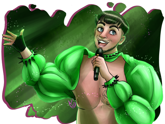
constantly vacillating wildly between ‘I love making all kinds of art in all kinds of mediums’ and ‘I hate having no art style and therefore no Brand Recognition’
#auropost#i envy artists who make One Style Of Art and build something out of it#but i could never. i feel trapped and stuck unless i am in constant change and this is just my lot in life !#it still feels like a miracle i now finally make a living out of my jack of all trades approach#i’m happy and engaged with my work and that’s all that matters
40 notes
·
View notes
Text
it's night time<333 (with a lil sibling bonding bonus: >;Dc)
studio au belongs to @zu-is-here
fem designs are made by me
#art#illustration#my art#studio au#utmv#nightmare sans#dream sans#nightmare#dream#fem!nightmare#fem!dream#man i am sO happy with how this turned out istg#every struggle i faced with the lineart was WORTH IT for the end result >:'D man i think this is my favorite drawing of the year so far-#bless the pencil tool in sai for not making the lack of pen pressure look obvious/pixelated i am so lucky hhh xD#i really wanna make everyone's studio au design more distinguishable/unique and different from each other#so as a lil heads up their hairstyles/faces/body shape will probably go through more changes before i settle on something final!#and even then they can and will change hair (by dying and or by cutting it)- and obviously different styles of clothing#because you can't convince me these popular rich actors don't have some sort of style/sense of fashion it's just. nah xDc#also night wearing suits/classy clothing supremacy<333 dream's summer look is by far my fav but nights autumn one?? regal. perfect<3#i hope you guys liked these drawings!! i'm pretty sure i can't recreate them if i tried tho hh xD
147 notes
·
View notes
Text
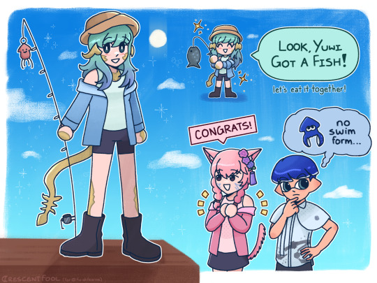
drew yuwi for @fwishfearme 💙 (ft. ahki from @cinnamon-quails and also.. my squid.. LOL)
#ffxiv#other's ocs#shirayuri fugetsu (lily)#ahki lihzeh (star)#splatoon oc#splatoon#minatoast#lizzy does art#i liked this enough to post this here hehe i had a lot of fun drawing this!!!#in the words of my friend... 'i love how u went 'i wanna do stickers and somehow made it into an artstyle'#i'm really happy with how this turned out!! i love drawing multiple things and arranging it like its a sticker sheet hehe its fun#and i think i am feeling very comfy in my style. pardon the fact that minatoast is VERY out of place (its my own oc bias lol)#finally my art looks icon-able enough... i am WINNING!!#also i am realizing there are a few other oc things i havent posted i'll try to remmeber 2 post them haha oopsie woopsie!
11 notes
·
View notes
Text


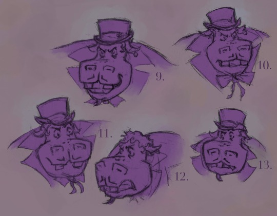
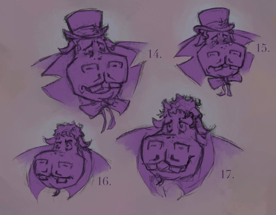
A bunch of Hypno sketches, experimenting with expressions
#sofia’s art#rottmnt#rise of the tmnt#rise hypno#hypno potamus#expressions#emotions#expression challenge - not an official one though just me making it up as I go along#this was a fun exercise#although i have not yet figured out how to keep his facial proportions entirely consistent#and a few look like they’re in a different style? oh well#1 is my favorite :)#I also like 5 and am happy with how 18 turned out#9 scares me /hj#looking at 14 and 15 makes me really want to give him a hug#I finally found the energy to post some art!!#I got really sick#it was scary#I’m not entirely well but I am a lot better
17 notes
·
View notes
Photo

Dev and Shane, but back in college!
#stardew valley#stardew shane#sdv shane#stardew farmer#stardew valley oc#sdv farmer#dev tag#shane#dev draws#I feel like I finally found my art style and I am so fucking happy yall
16 notes
·
View notes
Text
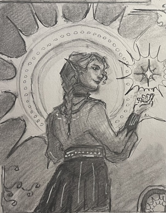
I just started a new sketchbook. These are some highlights from the first page...
#no because#i genuinely love the direction my art is going in#i am so happy with my style...#and expressions are FINALLY starting to click with me#holy crap#the motif of circles and halos that my art has gained recently too?????#loving it..
4 notes
·
View notes
Text

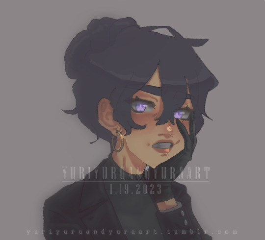
Han Yeo Jin stylization study
—
Please do not repost on or off tumblr; reblogs are always welcome 😉
#han yeo jin#bae doona#secret forest#stranger#forest of secrets#secret forest fanart#detectiveships#my art#fanart#digital painting#stylization study#yes I am finally dusting off secret forest studies and sketches that have been in my procreate folder forever#and accepting I will just never really get to finish them and publish them as is#although this one I'm pretty happy about as is#HYJ or bae doona are always a fantastic excuse to practice stylization#I'm still trying to figure out my style and how to go about stylization in general but this is progress :')#also was a great excuse to test drive procreate new halftone and chromatic aberration filters that came out when they updated it to 5#I know I shouldn't rely on filters but sometimes they just make the thing seem more finished or polished somehow lol#anyway art mumbling#hope you enjoy#sf3 when#i miss them#until then I be here sketching sketches and pushing shapes living off hwanghan crumbles
13 notes
·
View notes
Text

#i am finally done!?#happy birthday miku!#but like… 7 days late#i know it’s shocking but apparently art takes time!! (which i forgot!)#i WAS gonna add a background but the storage space can NOT handle it lol#hatsune miku#my art#i’m still trying to find my art style so ig this was a lot of experimentation and just trusting the process ^^’
1 note
·
View note
Text
Portfolio advice, from a lead who hires Concept Artists
(This was originally a twitter thread I wrote before the site self imolated, hense it's strange structure.)
I wrote this after a weekend of portfolio reviews -
1. Like a maths exam, please please show your working. I want to see thumbs options, mid options and of course a final design.
2. Arrange your portfolio, I don't want to bounce about between subject matter and pipeline. Your portfolio's narrative should be as strong as your work...
3. Please make worlds that excite the viewer, make them want to go in and explore them, explain to them the interesting parts of the town, or the way the character's hat unfolds. How will this draw the viewer in?
4. As I've said before the majority of your project work is explanatory not mood, make sure your portfolio contains explanatory work. Explained here -
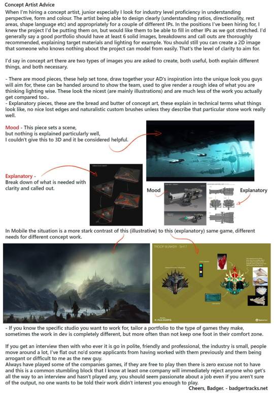
5. A lot of beautiful post apocolyptic paintings, , but 80% of realistic games and film, we just give the environment artists photo ref, they are capable artists in their own right. Different work in stylised where you do need to create rules for how things can be translated.
6. Production art contains call out sheets, material references and flat graphics. This doesn't have to be your final image, but it should support it.
7. Design characters on a swatch(es) of the environment they will be viewed in. Not on white. I make swatch backgrounds from screenshots, it avoids assumptions that damage readability.
8. Reverse of this, put people in your environments, show me the scale.
9. It's not a deal breaker for a review, but if you intend to get a job, please show me your work on a screen larger than a smartphone (print outs probably the cheapest option with the best battery life).
10. Please have your contact details clearly visible, and by that I mean email address, I will not pass your social media contact on, I cannot input your form into my tracking system. EMAIL ADDRESS emblazoned and bake it in, sometimes recruiters do funky stuff to pdfs
11. Your portfolio will never feel done, not to you anyway. You will have learnt from your latest pieces and want to apply it to older work. But we know art is a journey. Send your portfolio anyway. I've been in the industry 10+ years and my portfolio is still not 'finished'.
12. If you are applying to an environment centric Concept Art position then please vary your times of day! Golden hour is cool but show me some happy sunny days, looming overcast days, what about at night? Vary your weather too! Sunny snowy day? Rainy Spring day? Stormy night?
13. If you are applying for a character centric Concept Art role then please ensure your portfolio shows a variety of body types and ethnicities.
14. Designing characters for games?
Please show back views and feet (!) Many potfolios contain only front views.
This is a problem because:
You haven't shown you are considering the design from all angles.
In many games rear view is the main view.
Stop cropping feet.
15. If you are entry / graduating and looking at Portfolios to compare content and standard of yr own work too, look at hired grad/junior artists as opposed to seniors Seniors and leads often have old or personal work in their portfolio which isnt representative of the day job.
16a. Show clearly the intended use case for your Concept Art. Mention the game type in the description. Are these player character designs for a 3rd person adventure game? Then more back views please. Bonus points for diagetic ways of showing health / equipment / role etc.
16b. Are these designs for an FPS? Then really the player view of the gun needs to sell the player style/ choices, in an FPS your weapons are almost your character. Are these world designs? What's the view distance? For an RTS your shapes need to read from above & a distance.
16c. The lack of clarification means I am judging the design in isolation, which both harms the design (you might be considering the backview of a char as the main adventure character.) Or an NPC, their waist up expressions may be important for conveying exposition and mechanics.
16d. Concept art is not separate from gameplay, great concept art serves the game team before it is a good illustration.
17. Play games. A variety of games. Think about them. IMO to be a good concept artist you need to understand the common language & references used by your peers. Also understand the principles and common language your audience are used to. FPS design rules are v.diff from RTS.
18. There are many skills that are needed in concept art, please show them. For example: Graphic design - logos, liveries, typographic use etc. VFX concepts - Abilities, Ambience, motion concepts. Architectural knowledge - How buildings are built! & more but I'm out of space :O
6K notes
·
View notes
Text
Happy 2 Year Anniversary to The Chara Timeline ✨
I FINALLY made drawing references for you guys, yippie!✨
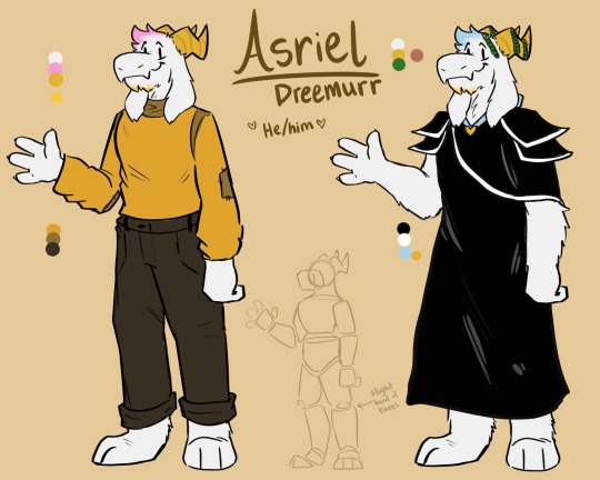
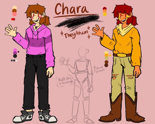
It’s wild how long I’ve been working on this comic without reference sheets. I’m never that consistent with my art style, so I figured it was a waste of time 🫥💀😔 this is my first full comic okay…
Thoughts and Feelings About the Comic Below ❤️💖💕💞
Wow. It’s been 2 years??? I thought I would be done with this comic in 2 months! I don’t know whether to feel worried or accomplished!!
(With months between each update, I understand why it’s been 2 years. I’m a slow writer and artist and well- many things have come up in my life that had to come first, like my sisters wedding! 💞 and college 😅)
I want to thank my family and friends (WHO DO NOT READ THIS COMIC- THANK GOD) 💕 AND I want to THANK YOU! The readers! 💐💐
You guys are relentless! I’m as impatient as traffic and yet you guys wait for weeks or months at a time for like 4 pages?! You guys don’t even complain!!! I truly want to thank you all for that ❤️ it helps me so much. Being busy and getting burnt out are common and it helps me feel relaxed that i'm not on a timer. Literally tho- you guys keep this comic chugging I swear. Tysm 💐
Unorganized rambling about the comic ahead :) ⭐️🔥
—
My feelings with this comic are actually so complicated. On one hand I hate looking at my older art because GOD IT LOOKS SO OFF I want to stab it, and then on the other hand I am so so proud of myself for even continuing it this far. Ngl the weird route has been one of my favorite parts of this comic. It took me FOREVER to figure out an ending, but damn do I still get chills >:) hehe.
I’m still miffed that I named this project “Deltarune: The Chara Timeline” I could have gone for something so much COOLER. Doesn’t help I use like 7 different titles for it either. We got Deltarune the Chara timeline, Deltarune chara timeline, THE Chara timeline, chara timeline, Ct??? Man,,, I’m crazy. I take after my family so hard. We have 3 names for each of our dogs 💀.
Comic/Animation Tip i have learned. It is VERY GOOD to make the character relatively simple in design. Shape language is also super important, ((but I never really got around to doing that before I was half way through the comic, woops.)) These things can make ur process go by so much faster. This whole comic has been a HUGE learning curve. LIKE OH MY GOD. I had to learn how to draw backgrounds, write dialogue, plan a story, learn how to draw fast and draw noses (which god damn I really still can’t). And I had to learn how the heck to squeeze art into a tiny page and make it not look grainy. It's intense!
Anyways.... this has been such an awesome opportunity! Thanks Toby Fox!
I totally ran out of “art time” for my iPad and wanted to finish this today. So it’s a bit rushed. I’ll add weapons and possibly the other characters later :)
Oh shi- I forgot to add this grainy image of the next few pages lmao
#chara is literally built like a rectangle. idk why ive never noticed that#a thick greenbean#and Asriel is kinda half and half when it comes to standing on his toes or regular foot. He has a more top heavy approach to his balance#bread#undertale#deltarune chara timeline#my art#chara#asriel#character sheets#character references#art#deltarune#happy 2 year anniversary!!!!#college chara#college asriel#darkworld
714 notes
·
View notes
Text


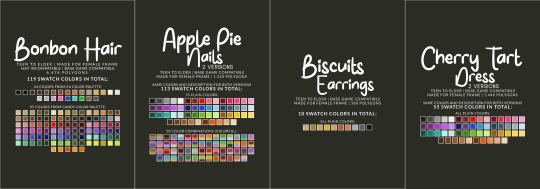
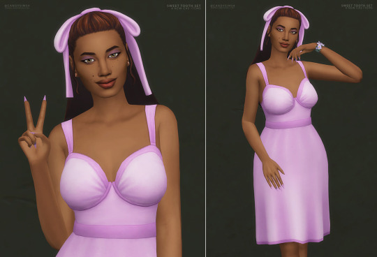
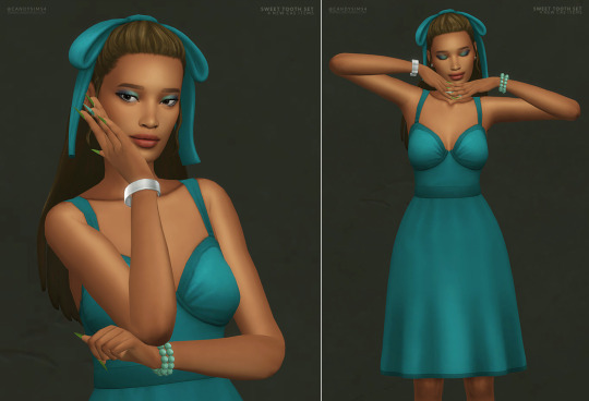

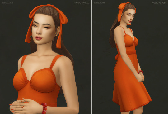


SWEET TOOTH SET
Oh my gosh, I am so excited about this new set and finally releasing it!
I seriously can't get enough of these pieces - they're just so cute! Every little detail is lovely, from the bow in the hair to the hearts on the nails.
AS IT’S TOO MUCH TEXT, I’LL LEAVE THE DESCRIPTION OF EACH ITEM PLUS THE CREATOR’S NOTES BELOW THE CUT.

ALL ITEMS ARE:
TEEN TO ELDER
BASE GAME COMPATIBLE
MADE FOR FEMALE FRAME
DISALLOWED FOR RANDOM
360º GIF & THUMBNAILS (HOSTED IN IMGUR)

MY SITE (NO AD.FLY): BONBON HAIR | APPLE PIE NAILS (TWO VERSIONS) | BISCUITS EARRINGS | CHERRY TART DRESS (TWO VERSIONS)
Free release on 17th October 2023
PATREON EARLY ACCESS + MERGED OPTIONS
TERMS OF USE | SEND YOUR FEEDBACK | REPORT AN ISSUE
Thanks to all the cc creators that I used in the pic. And thanks to @maxismatchccworld, @simblrcollective, @s4library, @wewantmods, and everybody who reblog this post!
If you’re a cc finds and want to be tagged when I post, please, let me know. You can send me an ask or in DM.
With your help, more people can know about my work! 💖 Love you all, XOXO 💖
DESCRIPTION OF EACH ITEM:
BONBON HAIR
HAT GAME INCOMPATIBLE
6.476 POLYGONS
119 SWATCH COLORS
- 24 plain colors from EA Color Palette
- 95 plain colors from my Candy Color Palette
YOU WILL FIND IN LONG HAIR OR/AND STRAIGHT OR/AND UPDO
APPLE PIE NAILS (TWO VERSIONS)
Same colors description for both versions.
1.320 POLYGONS
113 SWATCH COLORS
- 55 plain colors
- 58 color combinations
YOU WILL FIND IN ACCESSORIES/FINGERNAILS
BISCUITS EARRINGS
360 POLYGONS
10 SWATCH COLORS
- All plain colors
YOU WILL FIND IN ACCESSORIES/EARRINGS
CHERRY TART DRESS (TWO VERSIONS)
Same colors description for both versions.
5.446 POLYGONS
55 SWATCH COLORS
- All plain colors
YOU WILL FIND IN FULL BODY/SHORT DRESS
CREATOR’S NOTES:
Let's start with my favorite item of the set, Bonbon Hair. It's the cutest hair I've ever created, and I'm really proud of it.
The bow is adorable, and I was finally able to make a great 3D model of it. I'm really happy with how the hair looks - it's exactly what I had in mind. I hope you love it too!
One thing to note is that the bow on Bonbon Hair isn't removable and won't work with hats.
Usually, I prefer hairstyles that can be worn with hats, but for this one, I needed more space for the bow's texture. I also drew the bow's shadow onto the hair's texture to give it more depth and a better overall look.
I also made sure to keep the polycount low - around 6k polygons.
I could have made it lower, but it didn't look as good in movement. So, I kept it at a higher polycount to maintain good movement without too much distortion.
I designed the dress to complement the hairstyle, adding a bow at the back for an extra touch of charm and romance. I used a new mesh from the latest kit that I couldn't wait to franken-meshing with it.
My goal was to create a vintage silhouette and style, and while I'm not sure if it was successful, I'm very happy with the final result. At the end of the day, it looks cute, and that's all that really matters.
The nails are a kind of old wip that I finally decided to finish.
It's one of the cutest designs I've ever come across, and I was determined to recreate it in The Sims. I love a stiletto design, and for me, one of the best nail art is this one; it matches the nail's format and is so cute.
The nail includes two color options but only one spec option.
However, I plan to create additional versions in the future, including a glossy and matte finish, possibly as part of a mini set that I'm working on that will have this and other versions of some of my recent clothing designs.
Next up, we have the Biscuits Earrings. These were originally a work in progress meant for a different set, but while I was styling the Sims, I realized how well they matched with the current Sweet Tooth Set. So, I quickly finished them up and included them as part of the set.
By now, it's all. Unfortunately, I've been working very slowly lately; thanks to this heat wave, I feel most of the day like I'm melting. It's scorching in here, guys. I don't understand how a person can say global warming is a lie; really, how?!
#s4cc#ts4cc#s4mm#s4female#ts4mm#s4 cc#ts4 custom content#s4 custom content#maxis match#sims 4 cc#s4hair#s4 hair#ts4hair#ts4 hair#ts4female#s4 female#ts4 female#s4 clothes#s4clothes#ts4 clothes#ts4clothes#s4nails#s4 nails#ts4nails#ts4 nails#s4acc#ts4acc#s4 acc#ts4 acc#s4 accesories
652 notes
·
View notes
Last Seen Blogs

tiny-french-milf
Untitled
soilbearman
Unbetitelt
new--tomorrows
New Tomorrows

sexykeyboardplaya1967
Untitled