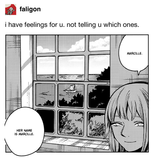
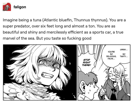
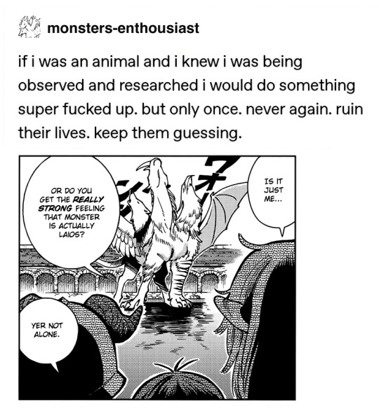
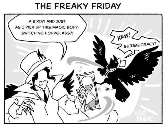
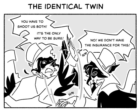
#i will go down with this fandom
Text
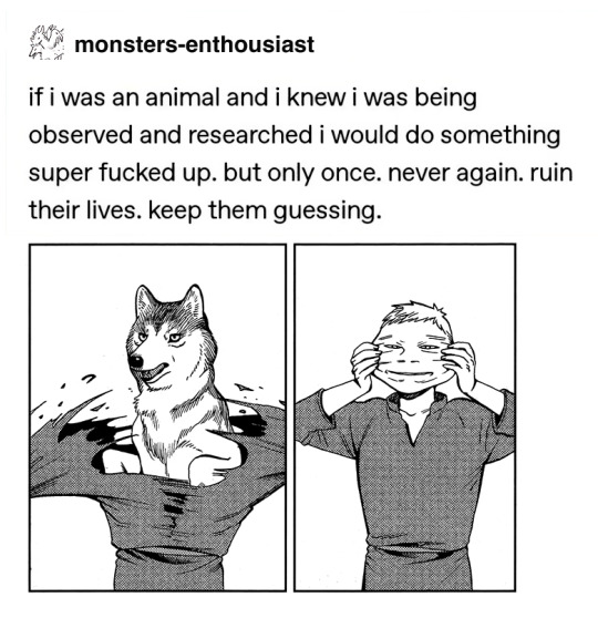
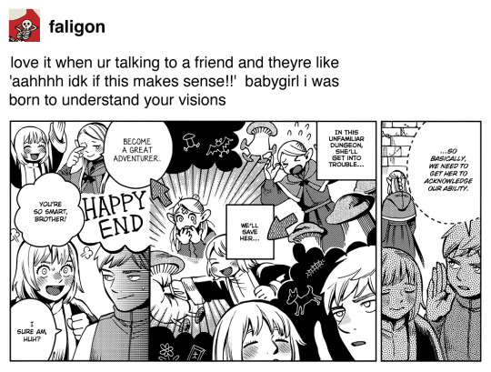
I think people have truly lost any ability to be patient with storytelling.
‘I don’t understand this’ They’ll explain it if you wait.
‘I don’t like how this episode left things hanging’ There’s a continuation next week.
‘This character is flat’ Wait for them to be fleshed out.
So many of the complaints I see about shows lately are people being confused by things THAT THE SHOW WANTS YOU TO BE CONFUSED BY THATS THE FUN OF MYSTERY AND FORESHADOWING YOU ABSOLUTE GOBLINS THE MAIN CHARACTER IS ALSO CONFUSED AND THEYRE GONNA DO A BIG REVEAL AND EXPLANATION LATER IF YOU WOULD JUST FUCKING WAIT
#i can’t anymore#anti fans#anti fandom#venting#I fucking hate impatient people#sit your ass down and wait#anticipation is fun#I’ve heard about so many people who gave up on wandavision after the first two episodes#because they didn’t understand what was going on#like#*sigh*#you weren’t fucking supposed to understand how stupid could you be to not get that#1k#10k#50k#100k
132K notes
·
View notes
Text
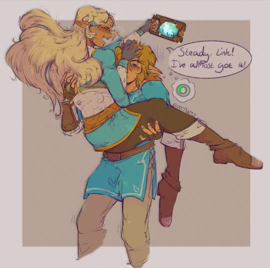
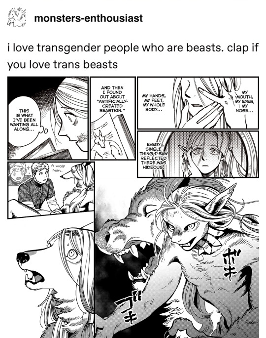
(pre-calam) filling the compendium :-)
+ closeup and the aftermath
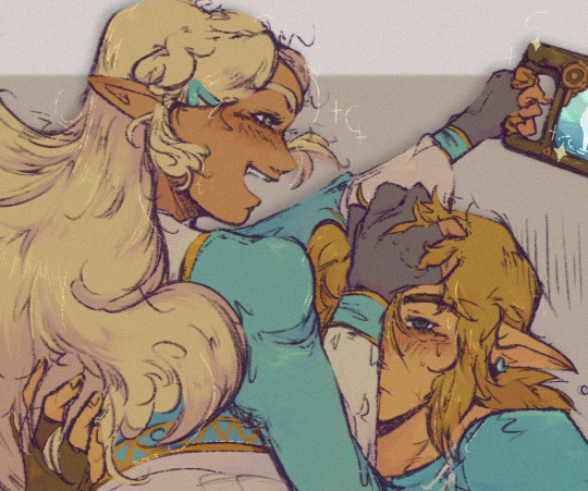
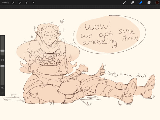
#i am PRAYING that this posts okay and nothing gets squished or looks ugly. but if it is youcant tell me because ill cry#okay. anyways.#zelink#zelda#link#loz#botw#totk#link botw#zelda botw#loz fanart#for some reason trying to format this became a sisyphean ass task so now i just want to post it and go lie down or something#“why use warm colours if theyre on satori mountain” idk.... i liked how they looked :)#ok what else. ummm. so we KNOW zelda filled the compendium like she was running the navy right#its really funny because i dont even think its ever mentioned other than like. maybeeee one throwaway line from purah?#but there was a fandom osmosis moment bcus everyone Knew she'd be on top of it. and its true. she would be.#my art
2K notes
·
View notes
Text
so about that twitter q&a...
#rottmnt#rise of the teenage mutant ninja turtles#casey jr#casey jones jr#sona art#holopossums#holopossum live reaction#listen i thought he'd be ~18 or so#i was in the ballpark#but considering previously stated that they aged him down#i did not think they'd go as old as 19-20#the fandom will go nuts with this information
2K notes
·
View notes
Text
Okay but the thing people aren’t talking about (and I need to talk about) is the Gods marked that box “Return to Sender.”
Let’s think this through. The gods knew what was in the box. (Athena was annoyed/insulted/whatever.) The gods who don’t just give demigods big scary weapons that might later be used against them? The gods did that?
The Gods. But no, not really. Just one God.
The God who didn’t like how that man laid hands on his boy. The God who rent the sky with rain each time Gabe degraded his son. The God who knew why Sally had to pick a man like that (probably told her to pick a man like that after the sundae incident) but caused the ground to shake each time that man laid a finger on his Queen.
Poseidon knew what kind of man Gabe was. And he had Hermes leave that box for Gabe to find. Poseidon let Gabe make the choice but Poseidon signed Gabe’s death warrant.
Thank you for coming to my Ted Talk.
#poseidon and sally#sally jackson#percy jackson#percy jackon and the olympians#pjo tv show#pjo series#pjo#pjo fandom#headcanon#i will go down with this ship#Sally Jackson Ocean Queen#queen among women#percy pjo
1K notes
·
View notes
Text
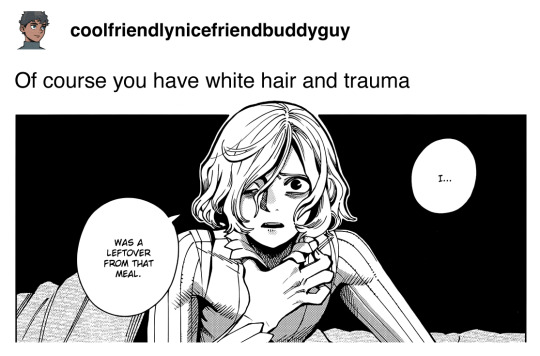
truly the judge of hell ever
#ultrakill#ultrakill meme#gabriel ultrakill#look. i wasnt planning to post anything in the fandom tags on this account BUT#i saw this and i had to immediately get this down#so here ya go!#bye im going back into the void
996 notes
·
View notes
Text

Please enjoy :)
Two more with spoilers below
#dungeon meshi#laios touden#falin touden#farcille#marcille donato#senshi#mithrun#chilchuck tims#lycion#kabumisu#laicion#spreading the laicion propaganda discretely...#don't mind me :)#kabru's username is a reference to another compilation by Fumifooms :)#edit: if you’re going to be a hater on any ship in the fandom; this post is not for you (certified: a multishipper)#this applies to everyone going “eww Marcille x Laios is heteronormative why would you ship it”. This is not for you (signed: a bi trans man#or anyone hating on the recent m/m popularity. Shipping is not a competition#you like a ship? Reblog art and share fanfics. Raise the voice and motivation of artists who do what you like.#don’t pull down others. Hate is a vicious self-aggravating cycle. Ship and let ship. Block what you don’t like#you know. Fandom etiquette.#I thought we were adults here.
2K notes
·
View notes
Text
yes, yes i know edgeworth’s big wet eyes and loser boy personality have captivated us all, but listen. listen.
phoenix wright
phoenix “genuinely unable to reconcile the girl on the stand with the girl he dated for eight months, a cognitive dissonance so profound it’s ultimately explained by them being literally two different people, but which he first sits with for five years and does not talk about at any point to anyone” wright
phoenix “don’t mention that name to me. i don’t want to talk about it. i don’t want to think about it. i am just going to keep myself in this state of perpetual crisis mode focus on other people’s problems until eventually i die and get to hang out with mia on the astral plane and never have to deal with any of these emotions ever again” wright
phoenix “overnight loses his career and reputation and sense of identity while gaining an adopted, probably pretty traumatized eight-year-old daughter, and rather than leaning on his friends for help, or getting therapy, or taking any time to process any of this, he *checks notes* spends seven years dedicating all his free time and energy to investigating the weird fucking circumstances around it and maintains a friendship with the guy he suspects was behind it all” wright
phoenix "runs across a burning bridge and falls through it, half a day after the game establishes that he is terrified of heights, because his friend is on the other side of that bridge" wright
phoenix “i sure felt surprised. maybe i had my poker face on” wright
phoenix “looking back on it that was actually a pretty dark period in my life” wright
phoenix “don’t ask me how i got started. i don’t remember” wright
phoenix “only you stood still, your eyes calmly watching” wright
phoenix “sometimes, life just sucks” wright
just
phoenix wright
crunchiest man in the world
and all i wanna do is chew and chew and chew on him
#ace attorney#where are all the people gnawing on phoenix's bones so white??#i need to find the phoenix bone-gnawing corner of this fandom PLEASE#this is me asking for the Phoenix Fic btw#where is the fic meditating on phoenix's whole mental state in general?#where is the fic about how it's phoenix's cageyness and poker face and flat affect under stress that is the hurdle?#the relationship ramifications of being actually really fucking hard to read when it comes down to it?#where is the fic about the week of his disbarment?#the one detailing the panicked blow by blow of it rippling through his social circle while he stands in the eye of the storm?#the one that ends messy and anxious and unresolved because it's week 1 of 7 years?#where is the birth of phoenix wright: poker legend fic?#where is the art school/theatre major phoenix fic?#no not the able to art/act phoenix fic but the kind of person who chooses to go to art school/study theatre phoenix fic#where is the supremely disinterested in pop culture phoenix fic?#where is the actually incredibly meticulous and competent phoenix fic?#capcom can tell me all they want that he's essentially an adhd disaster flying by the seat of his pants making it all up as he goes#but that's not what they're actually showing me#they're the ones who created an in-fiction legal system that functionally necessitates that#and the nature of the game is that phoenix is almost always proven right so rather than him coming off as hare-brained#his opponents rather just come off as short-sighted. either negligently or maliciously so#and the choices the writing makes in service of retaining mystery and audience suspense in fact function to make phoenix a person#who is astute and puts the pieces together but is cautious in his conclusions#i will grant them that phoenix does tend to lose sight of his overarching goal in getting drawn into proving or disproving minor points#the fact that edgeworth on the other hand never loses sight of this or where the various arguments stand in relation to it#is his sexiest trait as a character by far#but those minor points are actually functionally critical to the ultimate argument phoenix makes#so even though i do read that trait through the game mechanics i do also judge the other characters for being dicks about it#my point is phoenix wright does in fact have the character of a lawyer and is conventionally good at his job fucking fight me#my point is that you all have had 20 goddamn years to Rotate this man#my POINT is that there should be Intricate Fucked Up Meditations On Phoenix that rewire my fucking brain and i NEED to know where they are!
2K notes
·
View notes
Text
so on the subject of the "Crowley is secretly Revaan/Laverne/Levin/please Twst give us his name" theory, I think my feelings are best summed up as "I don't really buy it, but it's funny". like, in all seriousness, I'm not opposed to it; I have enjoyed the writing in Twst so far and I'm willing to trust that whatever happens will, you know, make sense and not be terrible. but I'm just not really convinced by the current evidence! maybe that'll change once we learn more, we'll see!
with that said, may I propose a few alternate theories about the possible Crowley/Revaan connection:
#art#twisted wonderland#twisted wonderland spoilers#twisted wonderland episode 7 spoilers#twisted wonderland book 7 spoilers#on this installment of things nobody asked but i'm going to talk about anyway#disclaimer that this is mostly a joke please don't get mad at me#(legit no shade to anyone) (speculation is one of the fun things about an ongoing fandom and you never know what'll turn out to be true!)#more seriously i do think there may be some connection that just isn't clear yet#but the more little breadcrumbs we get about what revaan was like the more i think crowley just doesn't act like him#i adore crowley don't get me wrong#(yes he's a dipshit. this is a feature not a bug.)#but like.#not to harp on the scene about lilia's nrc invitation (i am absolutely going to harp on it)#i do not believe that crowley would go through the trash to fish out the pieces and put them back together and save them#just because it was lilia's. just because lilia might want it again someday.#crowley can ✨yasashii✨ all he wants but we know what he's like#and i REALLY do not believe that lilia wouldn't recognize him. i didn't believe it before and i extra don't believe it now.#then again i do tend to be incredibly off about speculation so! who knows! i will trust the writing for now!#i do 100% believe that meleanor would fall in love with the world's biggest dumbass and then double down super hard. that part tracks.#that said i have decided that ambrose being revaan is actually the funnier option just because it would make crowley SO mad#it wouldn't make sense for him to be mad about it and that would just make him madder
3K notes
·
View notes
Text


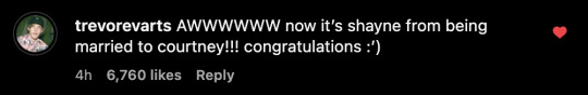


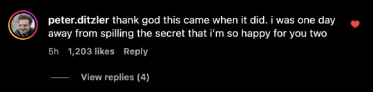

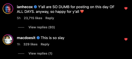


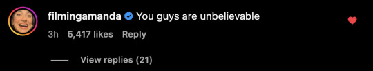

comments from smosh cast + crew on shourtney's wedding post!!
ft. mythical, thomas sanders, and www.chess.com?? lol
#courtney miller#shayne topp#smosh#shourtney wedding#shourtney#smoshblr#if i missed comments... umm im not going thru those comments again i cant think straight#thought it was funny how some of the smosh gang are also acting confused in the comments AS IF THEYRE NOT IN ON IT#theyre REALLYYY selling it if its just a prank#real or not i KNOW they were all laughing around the office abt this#the battle btw angela damien and sarah trying to get first LMAO#this day is going to go down in smosh history as the day the the fandom broke#tbh real or not im just really impressed with this whole thing#even if im dying for answers#head vs heart ykwim#“guys its literally april fools” vs “guys theyre literally married now”#now watch me try to tag as many ppls names as i can TT#angela giarratana#chanse mccrary#amanda lehan canto#anthony padilla#damien haas#sarah whittle#arasha lalani#noah grossman#olivia sui#trevor evarts#tommy bowe#ian hecox#spencer agnew
929 notes
·
View notes
Text

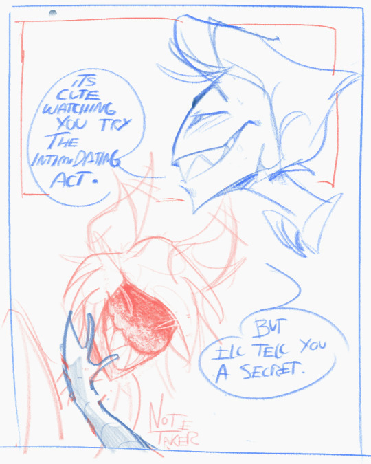
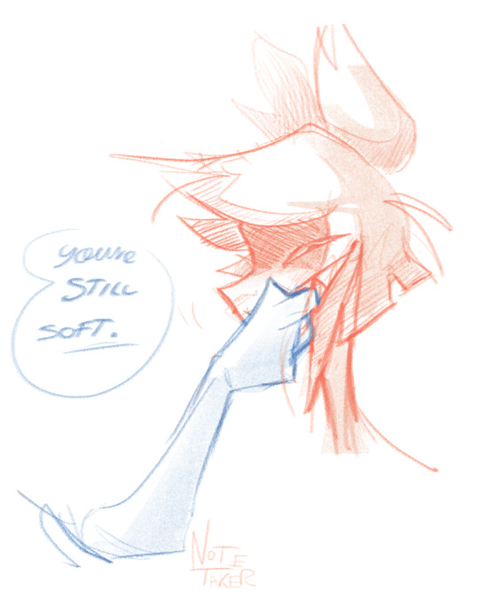
The ringmaster and the amphitheater. The chessboard and the player. Round and round they go.
#THE SILLIES. but also they have DEPTH. Which is INTERESTING#The circus man and the circus tent#theyre the circus duo#two ass CLOWNS is what they are#I find their dynamic very compelling. Its like#Lucifer is the devil from the BIBLE. yet Alastor gets offended by the unfairness of their power dynamic#MY MAN YOU WERE A RADIO HOST WHEN YOU WERE ALIVE#WHEN DID YOUR BAR GET TO THE FUCKING CEILING#Anyways. theyre fun. they have some fun things in common but theyd never admit to it. theyd be the friend to go bitch about someone#also im all for a qpr with these two#theyre so funny. imagine them as roomates#my art#art post#hazbin hotel#alastor#hazbin hotel lucifer#lucifer morningstar#I wonder if somewhere down in hell the actual lucifer is looking up at us judgementally#i wonder what would happen if I showed a priest from thousands years ago this content and go: yeah this is how the bible looks now#doodles#radioapple#appleradio#duckiedeer#hazbin alastor#hazbin lucifer#hazbin art#hazbin hotel fanart#hazbin hotel fandom#hazbinhotel#hazbin hotel alastor
517 notes
·
View notes
Text
why Aurora's art is genius
It's break for me, and I've been meaning to sit down and read the Aurora webcomic (https://comicaurora.com/, @comicaurora on Tumblr) for quite a bit. So I did that over the last few days.
And… y'know. I can't actually say "I should've read this earlier," because otherwise I would've been up at 2:30-3am when I had responsibilities in the morning and I couldn't have properly enjoyed it, but. Holy shit guys THIS COMIC.
I intended to just do a generalized "hello this is all the things I love about this story," and I wrote a paragraph or two about art style. …and then another. And another. And I realized I needed to actually reference things so I would stop being too vague. I was reading the comic on my tablet or phone, because I wanted to stay curled up in my chair, but I type at a big monitor and so I saw more details… aaaaaand it turned into its own giant-ass post.
SO. Enjoy a few thousand words of me nerding out about this insanely cool art style and how fucking gorgeous this comic is? (There are screenshots, I promise it isn't just a wall of text.) In my defense, I just spent two semesters in graphic design classes focusing on the Adobe Suite, so… I get to be a nerd about pretty things…???
All positive feedback btw! No downers here. <3
---
I cannot emphasize enough how much I love the beautiful, simple stylistic method of drawing characters and figures. It is absolutely stunning and effortless and utterly graceful—it is so hard to capture the sheer beauty and fluidity of the human form in such a fashion. Even a simple outline of a character feels dynamic! It's gorgeous!
Though I do have a love-hate relationship with this, because my artistic side looks at that lovely simplicity, goes "I CAN DO THAT!" and then I sit down and go to the paper and realize that no, in fact, I cannot do that yet, because that simplicity is born of a hell of a lot of practice and understanding of bodies and actually is really hard to do. It's a very developed style that only looks simple because the artist knows what they're doing. The human body is hard to pull off, and this comic does so beautifully and makes it look effortless.
Also: line weight line weight line weight. It's especially important in simplified shapes and figures like this, and hoo boy is it used excellently. It's especially apparent the newer the pages get—I love watching that improvement over time—but with simpler figures and lines, you get nice light lines to emphasize both smaller details, like in the draping of clothing and the curls of hair—which, hello, yes—and thicker lines to emphasize bigger and more important details and silhouettes. It's the sort of thing that's essential to most illustrations, but I wanted to make a note of it because it's so vital to this art style.
THE USE OF LAYER BLENDING MODES OH MY GODS. (...uhhh, apologies to the people who don't know what that means, it's a digital art program thing? This article explains it for beginners.)
Bear with me, I just finished my second Photoshop course, I spent months and months working on projects with this shit so I see the genius use of Screen and/or its siblings (of which there are many—if I say "Screen" here, assume I mean the entire umbrella of Screen blending modes and possibly Overlay) and go nuts, but seriously it's so clever and also fucking gorgeous:
Firstly: the use of screened-on sound effect words over an action? A "CRACK" written over a branch and then put on Screen in glowy green so that it's subtle enough that it doesn't disrupt the visual flow, but still sticks out enough to make itself heard? Little "scritches" that are transparent where they're laid on without outlines to emphasize the sound without disrupting the underlying image? FUCK YES. I haven't seen this done literally anywhere else—granted, I haven't read a massive amount of comics, but I've read enough—and it is so clever and I adore it. Examples:


Secondly: The beautiful lighting effects. The curling leaves, all the magic, the various glowing eyes, the fog, the way it's all so vividly colored but doesn't burn your eyeballs out—a balance that's way harder to achieve than you'd think—and the soft glows around them, eeeee it's so pretty so pretty SO PRETTY. Not sure if some of these are Outer/Inner Glow/Shadow layer effects or if it's entirely hand-drawn, but major kudos either way; I can see the beautiful use of blending modes and I SALUTE YOUR GENIUS.
I keep looking at some of this stuff and go "is that a layer effect or is it done by hand?" Because you can make some similar things with the Satin layer effect in Photoshop (I don't know if other programs have this? I'm gonna have to find out since I won't have access to PS for much longer ;-;) that resembles some of the swirly inner bits on some of the lit effects, but I'm not sure if it is that or not. Or you could mask over textures? There's... many ways to do it.
If done by hand: oh my gods the patience, how. If done with layer effects: really clever work that knows how to stop said effects from looking wonky, because ugh those things get temperamental. If done with a layer of texture that's been masked over: very, very good masking work. No matter the method, pretty shimmers and swirly bits inside the bigger pretty swirls!
Next: The way color contrast is used! I will never be over the glowy green-on-black Primordial Life vibes when Alinua gets dropped into that… unconscious space?? with Life, for example, and the sharp contrast of vines and crack and branches and leaves against pitch black is just visually stunning. The way the roots sink into the ground and the three-dimensional sensation of it is particularly badass here:

Friggin. How does this imply depth like that. HOW. IT'S SO FREAKING COOL.
A huge point here is also color language and use! Everybody has their own particular shade, generally matching their eyes, magic, and personality, and I adore how this is used to make it clear who's talking or who's doing an action. That was especially apparent to me with Dainix and Falst in the caves—their colors are both fairly warm, but quite distinct, and I love how this clarifies who's doing what in panels with a lot of action from both of them. There is a particular bit that stuck out to me, so I dug up the panels (see this page and the following one https://comicaurora.com/aurora/1-20-30/):

(Gods it looks even prettier now that I put it against a plain background. Also, appreciation to Falst for managing a bridal-carry midair, damn.)
The way that their colors MERGE here! And the immense attention to detail in doing so—Dainix is higher up than Falst is in the first panel, so Dainix's orange fades into Falst's orange at the base. The next panel has gold up top and orange on bottom; we can't really tell in that panel where each of them are, but that's carried over to the next panel—

—where we now see that Falst's position is raised above Dainix's due to the way he's carrying him. (Points for continuity!) And, of course, we see the little "huffs" flowing from orange to yellow over their heads (where Dainix's head is higher than Falst's) to merge the sound of their breathing, which is absurdly clever because it emphasizes to the viewer how we hear two sets of huffing overlaying each other, not one. Absolutely brilliant.
(A few other notes of appreciation to that panel: beautiful glows around them, the sparks, the jagged silhouette of the spider legs, the lovely colors that have no right to make the area around a spider corpse that pretty, the excellent texturing on the cave walls plus perspective, the way Falst's movements imply Dainix's hefty weight, the natural posing of the characters, their on-point expressions that convey exactly how fuckin terrifying everything is right now, the slight glows to their eyes, and also they're just handsome boys <3)
Next up: Rain!!!! So well done! It's subtle enough that it never ever disrupts the impact of the focal point, but evident enough you can tell! And more importantly: THE MIST OFF THE CHARACTERS. Rain does this irl, it has that little vapor that comes off you and makes that little misty effect that plays with lighting, it's so cool-looking and here it's used to such pretty effect!
One of the panel captions says something about it blurring out all the injuries on the characters but like THAT AIN'T TOO BIG OF A PROBLEM when it gets across the environmental vibes, and also that'd be how it would look in real life too so like… outside viewer's angle is the same as the characters', mostly? my point is: that's the environment!!! that's the vibes, that's the feel! It gets it across and it does so in the most pretty way possible!
And another thing re: rain, the use of it to establish perspective, particularly in panels like this—

—where we can tell we're looking down at Tynan due to the perspective on the rain and where it's pointing. Excellent. (Also, kudos for looking down and emphasizing how Tynan's losing his advantage—lovely use of visual storytelling.)
Additionally, the misting here:

We see it most heavily in the leftmost panel, where it's quite foggy as you would expect in a rainstorm, especially in an environment with a lot of heat, but it's also lightly powdered on in the following two panels and tends to follow light sources, which makes complete sense given how light bounces off particles in the air.
A major point of strength in these too is a thorough understanding of lighting, like rim lighting, the various hues and shades, and an intricate understanding of how light bounces off surfaces even when they're in shadow (we'll see a faint glow in spots where characters are half in shadow, but that's how it would work in real life, because of how light bounces around).
Bringing some of these points together: the fluidity of the lines in magic, and the way simple glowing lines are used to emphasize motion and the magic itself, is deeply clever. I'm basically pulling at random from panels and there's definitely even better examples, but here's one (see this page https://comicaurora.com/aurora/1-16-33/):

First panel, listed in numbers because these build on each other:
The tension of the lines in Tess's magic here. This works on a couple levels: first, the way she's holding her fists, as if she's pulling a rope taut.
The way there's one primary line, emphasizing the rope feeling, accompanied by smaller ones.
The additional lines starbursting around her hands, to indicate the energy crackling in her hands and how she's doing a good bit more than just holding it. (That combined with the fists suggests some tension to the magic, too.) Also the variations in brightness, a feature you'll find in actual lightning. :D Additional kudos for how the lightning sparks and breaks off the metal of the sword.
A handful of miscellaneous notes on the second panel:
The reflection of the flames in Erin's typically dark blue eyes (which bears a remarkable resemblance to Dainix, incidentally—almost a thematic sort of parallel given Erin's using the same magic Dainix specializes in?)
The flowing of fabric in the wind and associated variation in the lineart
The way Erin's tattoos interact with the fire he's pulling to his hand
The way the rain overlays some of the fainter areas of fire (attention! to! detail! hell yeah!)
I could go on. I won't because this is a lot of writing already.
Third panel gets paragraphs, not bullets:
Erin's giant-ass "FWOOM" of fire there, and the way the outline of the word is puffy-edged and gradated to feel almost three-dimensional, plus once again using Screen or a variation on it so that the stars show up in the background. All this against that stunning plume of fire, which ripples and sparks so gorgeously, and the ending "om" of the onomatopoeia is emphasized incredibly brightly against that, adding to the punch of it and making the plume feel even brighter.
Also, once again, rain helping establish perspective, especially in how it's very angular in the left side of the panel and then slowly becomes more like a point to the right to indicate it's falling directly down on the viewer. Add in the bright, beautiful glow effects, fainter but no less important black lines beneath them to emphasize the sky and smoke and the like, and the stunningly beautiful lighting and gradated glows surrounding Erin plus the lightning jagging up at him from below, and you get one hell of an impactful panel right there. (And there is definitely more in there I could break down, this is just a lot already.)
And in general: The colors in this? Incredible. The blues and purples and oranges and golds compliment so well, and it's all so rich.
Like, seriously, just throughout the whole comic, the use of gradients, blending modes, color balance and hues, all the things, all the things, it makes for the most beautiful effects and glows and such a rich environment. There's a very distinct style to this comic in its simplified backgrounds (which I recognize are done partly because it's way easier and also backgrounds are so time-consuming dear gods but lemme say this) and vivid, smoothly drawn characters; the simplicity lets them come to the front and gives room for those beautiful, richly saturated focal points, letting the stylized designs of the magic and characters shine. The use of distinct silhouettes is insanely good. Honestly, complex backgrounds might run the risk of making everything too visually busy in this case. It's just, augh, so GORGEOUS.
Another bit, take a look at this page (https://comicaurora.com/aurora/1-15-28/):

It's not quite as evident here as it is in the next page, but this one does some other fun things so I'm grabbing it. Points:
Once again, using different colors to represent different character actions. The "WHAM" of Kendal hitting the ground is caused by Dainix's force, so it's orange (and kudos for doubling the word over to add a shake effect). But we see blue layered underneath, which could be an environmental choice, but might also be because it's Kendal, whose color is blue.
And speaking off, take a look at the right-most panel on top, where Kendal grabs the spear: his motion is, again, illustrated in bright blue, versus the atmospheric screened-on orange lines that point toward him around the whole panel (I'm sure these have a name, I think they might be more of a manga thing though and the only experience I have in manga is reading a bit of Fullmetal Alchemist). Those lines emphasize the weight of the spear being shoved at him, and their color tells us Dainix is responsible for it.
One of my all-time favorite effects in this comic is the way cracks manifest across Dainix's body to represent when he starts to lose control; it is utterly gorgeous and wonderfully thematic. These are more evident in the page before and after this one, but you get a decent idea here. I love the way they glow softly, the way the fire juuuust flickers through at the start and then becomes more evident over time, and the cracks feel so realistic, like his skin is made of pottery. Additional points for how fire begins to creep into his hair.
A small detail that's generally consistent across the comic, but which I want to make note of here because you can see it pretty well: Kendal's eyes glow about the same as the jewel in his sword, mirroring his connection to said sword and calling back to how the jewel became Vash's eye temporarily and thus was once Kendal's eye. You can always see this connection (though there might be some spots where this also changes in a symbolic manner; I went through it quickly on the first time around, so I'll pay more attention when I inevitably reread this), where Kendal's always got that little shine of blue in his eyes the same as the jewel. It's a beautiful visual parallel that encourages the reader to subconsciously link them together, especially since the lines used to illustrate character movements typically mirror their eye color. It's an extension of Kendal.
Did I mention how ABSOLUTELY BEAUTIFUL the colors in this are?
Also, the mythological/legend-type scenes are illustrated in familiar style often used for that type of story, a simple and heavily symbolic two-dimensional cave-painting-like look. They are absolutely beautiful on many levels, employing simple, lovely gradients, slightly rougher and thicker lineart that is nonetheless smoothly beautiful, and working with clear silhouettes (a major strength of this art style, but also a strength in the comic overall). But in particular, I wanted to call attention to a particular thing (see this page https://comicaurora.com/aurora/1-12-4/):

The flowing symbolic lineart surrounding each character. This is actually quite consistent across characters—see also Life's typical lines and how they curl:

What's particularly interesting here is how these symbols are often similar, but not the same. Vash's lines are always smooth, clean curls, often playing off each other and echoing one another like ripples in a pond. You'd think they'd look too similar to Life's—but they don't. Life's curl like vines, and they remain connected; where one curve might echo another but exist entirely detached from each other in Vash's, Life's lines still remain wound together, because vines are continuous and don't float around. :P
Tahraim's are less continuous, often breaking up with significantly smaller bits and pieces floating around like—of course—sparks, and come to sharper points. These are also constants: we see the vines repeated over and over in Alinua's dreams of Life, and the echoing ripples of Vash are consistent wherever we encounter him. Kendal's dream of the ghost citizens of the city of Vash in the last few chapters is filled with these rippling, echoing patterns, to beautiful effect (https://comicaurora.com/aurora/1-20-14/):

They ripple and spiral, often in long, sinuous curves, with smooth elegance. It reminds me a great deal of images of space and sine waves and the like. This establishes a definite feel to these different characters and their magic. And the thing is, that's not something that had to be done—the colors are good at emphasizing who's who. But it was done, and it adds a whole other dimension to the story. Whenever you're in a deity's domain, you know whose it is no matter the color.
Regarding that shape language, I wanted to make another note, too—Vash is sometimes described as chaotic and doing what he likes, which is interesting to me, because smooth, elegant curves and the color blue aren't generally associated with chaos. So while Vash might behave like that on the surface, I'm guessing he's got a lot more going on underneath; he's probably much more intentional in his actions than you'd think at a glance, and he is certainly quite caring with his city. The other thing is that this suits Kendal perfectly. He's a paragon character; he is kind, virtuous, and self-sacrificing, and often we see him aiming to calm others and keep them safe. Blue is such a good color for him. There is… probably more to this, but I'm not deep enough in yet to say.
And here's the thing: I'm only scratching the surface. There is so much more here I'm not covering (color palettes! outfits! character design! environment! the deities! so much more!) and a lot more I can't cover, because I don't have the experience; this is me as a hobbyist artist who happened to take a couple design classes because I wanted to. The art style to this comic is so clever and creative and beautiful, though, I just had to go off about it. <3
...brownie points for getting all the way down here? Have a cookie.
#aurora comic#aurora webcomic#comicaurora#art analysis#...I hope those are the right tags???#new fandom new tagging practices to learn ig#much thanks for something to read while I try to rest my wrists. carpal tunnel BAD. (ignore that I wrote this I've got braces ok it's fine)#anyway! I HAVE. MANY MORE THOUGHTS. ON THE STORY ITSELF. THIS LOVELY STORY#also a collection of reactions to a chunk of the comic before I hit the point where I was too busy reading to write anything down#idk how to format those tho#...yeet them into one post...???#eh I usually don't go off this much these days but this seems like a smaller tight-knit fandom so... might as well help build it?#and I have a little more time thanks to break so#oh yes also shoutout to my insanely awesome professor for teaching me all the technical stuff from this he is LOVELY#made an incredibly complex program into something comprehensible <3#synapse talks
743 notes
·
View notes
Text
Fuck every percy jackson "fan" who is still complaining about percy & annabeths HAIR COLOURS being different then in the books. I hope Nico is blonde so that all of you cry and scream like fucking toddlers
#like actually#please STFU on pjo fanart#nobody cares that you are upset about annabeth not being blonde YOU DO NOT NEED TO COMMENT IT#like we get that you do not have the skill to make banger pjo fanart yourself (oh noo :((( poor baby)#but maybe your time would be better spent making your own fanart if you wanna complain about how the artist draws a certain character#contrary to unpopular beleif the world does not revolve around you#just because you don't like that leah jeffries is playing annabeth does not mean that the casting is gonna change#go sit in a corner and cry about it and stop having a meltdown in artist comment sections! Literally nobody gives a shit about your opinion#if you are actively bringing down the pjo fandom/tearing apart anything the new adaptation has to offer#then I will gladly inform you that you are NOT a pjo fan#you are an annoying piece of shit that cares more about accuracy then the actual story#percy jackson#pjo#percy jackson series#percy jackson disney+#annabeth chase#leah sava jeffries#walker scobell#leah is our annabeth
842 notes
·
View notes
Text
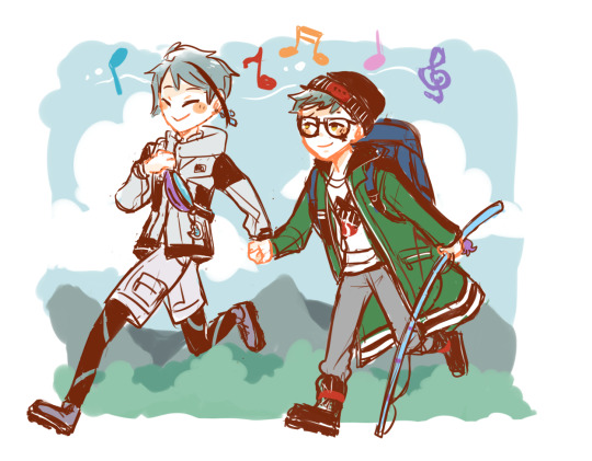
together let's go to the mountain ⛰️
#twst#twisted wonderland#treyjade#trey clover#jade leech#fanart#i don't know why there are less people in english fandom that ships them together#i am going down for them so hard just by being fed by all the fanarts from the japanese fandom#i love how they can support each others on the things they like#trey like cooking jade like eating#jade like mountaining trey can absolutely go along with him & match his pace with his physical fitness#plants? terrariums? mushroom? strawberries? no problem they both like to hang around in the botanical garden#trey giving mean eyes and show his meaner side oh jade would go absolutely ballistic#i just love them both together so much 🎶#they are my comfort ship#and how jade is the baby girl but he is taller than trey oh absolutely adorable
464 notes
·
View notes
Text
Hello OFMD crew! I love you and I'm happy you're here. 💕
#ofmd#our flag means death#I know it's been a rough few months with a lot of ups and downs#and just perusing the timelines I'm seeing a lot of people really feeling the Big Sads again#which is so so valid and I think everyone should really feel whatever they need to feel right now#but also know fandom isn't going anywhere#the show may be taking a breather but our heart is still beating strong 💗#sending so much love and hugs#I am grateful to all of you and my inbox/DMs are always open if you need someone to talk to
260 notes
·
View notes
Text
Ppl going "waaahh unpopular opinion but Alice is kind of annoying and obnoxious and I don't think I'd like be her friend irl" is so funny to me bc like.
God forbid a cast of characters be multifaceted and have actual flaws and unpleasant aspects other than "grr angsty hero" and "whoops i'm so clumsy". Sometimes character dynamics and arcs need to be prioritized above "who would i personally be niceys with irl"
2. bro just WAIT until you hear about season 1 jon lol
#the magnus protocol#tmagp#season 1 jon was obnoxious and sometimes a straight up ASSHOLE and you were supposed to find him kinda grating!!!#yes alice IS a bit annoying and too much sometimes (esp in the first episodes) and i love that <3#like. its p obvious that she uses the over the top-thing as a shield (to push ppl away/as a defense mechanism/to avoid being vulnerable)#we see her drop the act sometimes w ppl like teddy and sam who she actually feels comfortable around (and who know and understand her)#but like. she's stuck in a job she hates and is kind of afraid of (she KNOWS smth abt the horrors and is keeping her head down to survive)#(shes obviously afraid of sam going to far bc she KNOWS its dangerous)#so yes her act gets too much sometimes and yes sometimes she crosses the line into straight up mean (esp against gwen)#(but their dynamic is a whole other can of worms)#but like. i'm pretty sure its supposed to be seen that way. the audience isnt supposed to just find her kooky funny#the facade is supposed to be dismantled by the viewer etc etc#kind of like SEASON 1 JON the obnoxious bastard!!!!!!!#like. if you ever think alice is too mean towards gwen pls listen to s1 jon again and how he speaks abt martin??#from a position as his boss no less? ngl i wanted to throttle him sometimes#you kinda forget abt it in the later seasons and if you only engage w fandom content. but like. go back and listen to the shit#he actually says. jesus christ man. i remember kinda hating him in the beginning#and to be clear i love jon! i think hes a great character!#and like. its almost as if his early season personality and facade was an important setup for his character development#and relationships with the other characters???#but anyway 'alice is kind of annoying' is not an unpopular opinion its literally the FUCKING POINT#and both her and jon are my sweet baby angels <3#alice dyer#jon sims#(and obviouslyyy you're still allowed to dislike a character ppl can have their own opinions etc etc etc. i just personally find it funny)
185 notes
·
View notes
Last Seen Blogs

mayhemproduces
on the road to...
imux8
peace

windowtothewombwatford
Window To The Womb Watford

kevinjorg-blog1
Welcome to this place

pasionncturna
İsimsiz