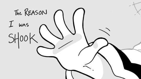
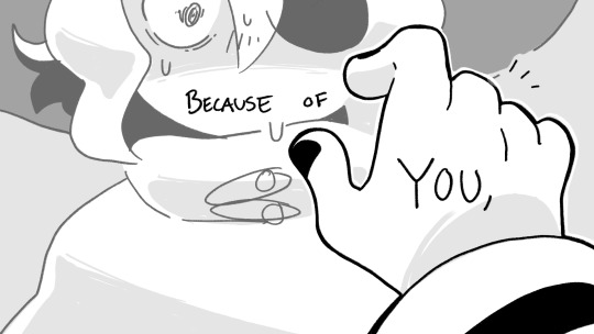
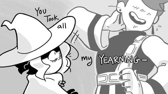
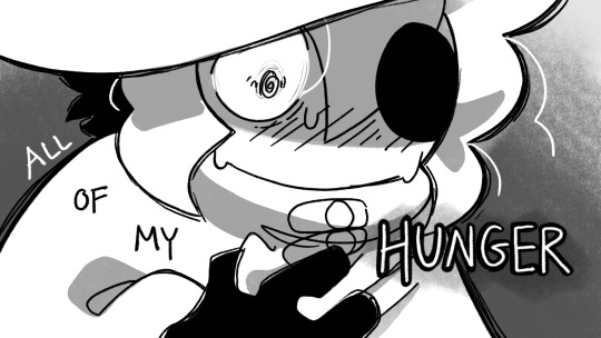
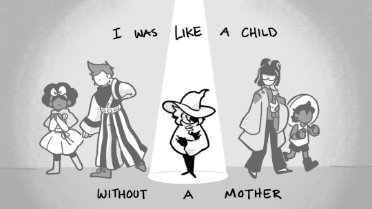
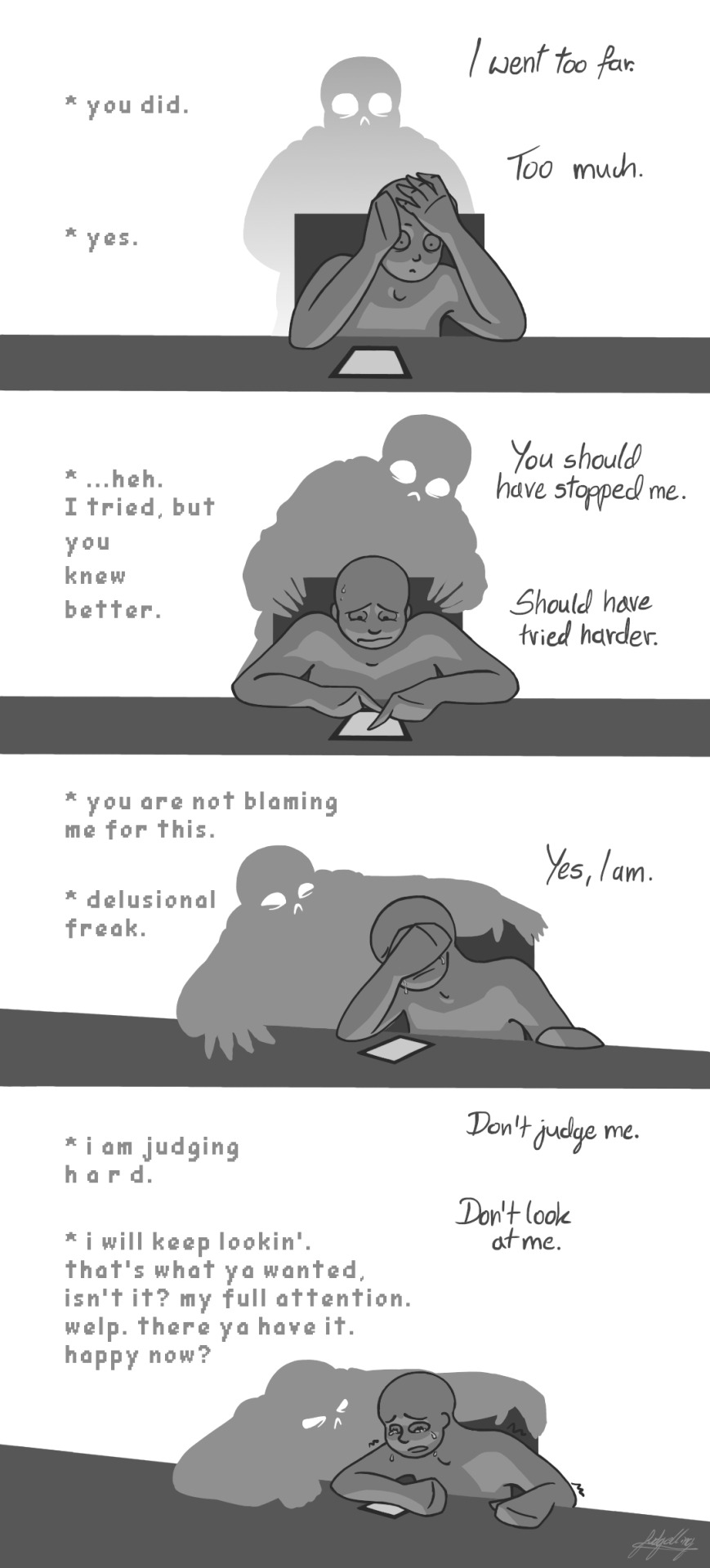
#i work faster
Text
Honestly the cliche advice is true. If you fill your life w things you’re passionate about, if you challenge yourself every day, if you give your own opinion of yourself more weight than you do other people’s opinions of you, you will actually thrive. Like no one can tell u anything
#I’m just in a whole state of mind rn#there will always be ppl who try to bring u down but pursuing the things u love will help u rise above it.#I absolutely still get anxious / annoyed at things but I’m over it sm faster. and soon it won’t bother me at all.#or at least it’ll have a healthy duration. bc negative emotion isn’t always bad. negative emotion is important and we should not ignore it#but overall!! preserving my energy better. just need to work on my knee jerk responses & I’ll be set#text
10K notes
·
View notes
Text
I think 90% of my gripes with how modern anime looks comes down to flat color design/palettes.
Non-cohesive, washed-out color palettes can destroy lineart quality. I see this all the time when comparing an anime's lineart/layout to its colored/post-processed final product and it's heartbreaking. Compare this pre-color vs. final frame from Dungeon Meshi's OP.


So much sharpness and detail and weight gets washed out and flattened by 'meh' color design. I LOVE the flow and thickness and shadows in the fabrics on the left. The white against pastel really brings it out. Check out all the detail in their hair, the highlights in Rin's, the different hues to denote hair color, the blue tint in the clothes' shadows, and how all of that just gets... lost. It works, but it's not particularly good and does a disservice to the line-artist.
I'm using Dungeon Meshi as an example not because it's bad, I'm just especially disappointed because this is Studio Trigger we're talking about. The character animation is fantastic, but the color design is usually much more exciting. We're not seeing Trigger at their full potential, so I'm focusing on them.
Here's a very quick and messy color correct. Not meant to be taken seriously, just to provide comparison to see why colors can feel "washed out." Top is edit, bottom is original.
You can really see how desaturated and "white fluorescent lighting" the original color palettes are.
[Remember: the easiest way to make your colors more lively is to choose a warm or cool tint. From there, you can play around with bringing out complementary colors for a cohesive palette (I warmed Marcille's skintone and hair but made sure to bring out her deep blue clothes). Avoid using too many blend mode layers; hand-picking colors will really help you build your innate color sense and find a color style. Try using saturated colors in unexpected places! If you're coloring a night scene, try using deep blues or greens or magentas. You see these deep colors used all the time in older anime because they couldn't rely on a lightness scale to make colors darker, they had to use darker paints with specific hues. Don't overthink it, simpler is better!]
#not art#dungeon meshi#rant#i'm someone who can get obsessive over colors in my own art#will stare at the screen adjusting hues/saturation for hours#luckily i've gotten faster at color picking#but yeah modern anime's color design is saddening to me. the general trend leans towards white/grey desaturated palettes#simply because they're easier to pick digitally#this is not the colorists fault mind you. the anime industry's problems are also labor problems. artists are severely underpaid#and overworked. colorists literally aren't paid enough to do their best#there isn't a “creative drought” in the anime industry. this trend is widespread across studios purely BECAUSE it's not up to individuals#until work conditions improve anime will unfortunately continue to miss its fullest potential visually#don't even GET ME STARTED ON THE USE OF POST-PROCESSING FILTERS AND LIGHTING IN ANIME THOUGH#SOMEONE HOLD ME BACK. I HATE LENS FLARES I HATE GRADIENT SHADING I HATE CHROMATIC ABBERATION AND BLUR
2K notes
·
View notes
Photo

Con O'Neill at MCM23
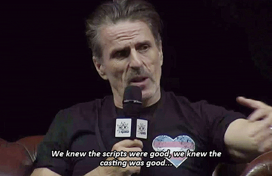
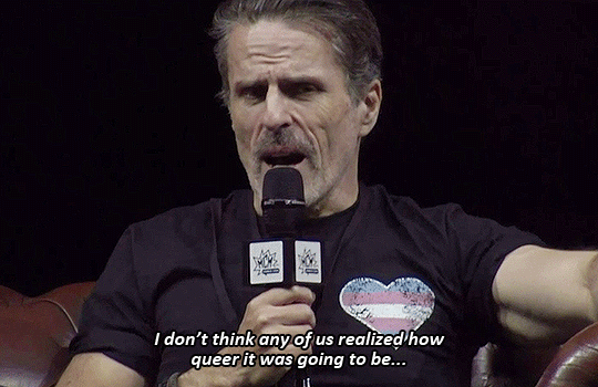
#OFMD#Our Flag Means Death#Con O'Neill#MCM23#ofmdaily#ofmdedit#ofmdblog#Edit#CONATHAN O'NONATHAN <3#Him wearing a trans heart too#Goodness gracious#I love these guys so so much#Also the devil works fast but the gif makers work faster PFFFF#WE REALLY OUT HERE ZOOMING
7K notes
·
View notes
Text
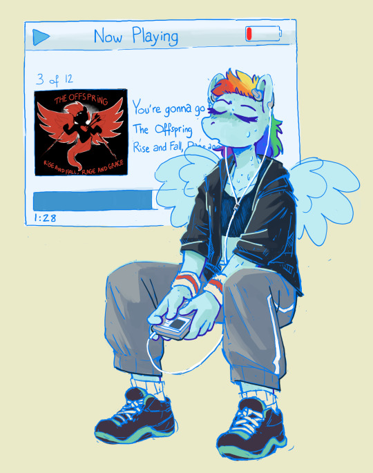
workout mix
#this was fun to draw but hhghrghrgh again i spent too much on it im so bad at just making satisfying doodles fast#like i wanna draw stuff as warmup thats fun to do & also ideally looks kinda nice bc THEN i need to try to get other more serious work too#but at the moment i just spend too long on the warmup & then fail to move on to something else hhhhhh#i'll get better i'll get faster i'm not dead yet#anyway yeah she's listening to you're gonna go far kid. you know why. my little pony rainbow dash you're gonna go far kid [explicit].#shevr#my lines#mlp
3K notes
·
View notes
Text

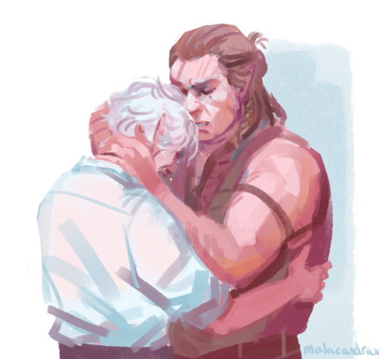
Every few months I'm like oh yeah! I can paint!
Some hurt/comfort speedpaints >:)
#halstarion#astarion#halsin#bg3#blood cw#blood#its actually my natural state of working i just always forget#its almost faster than inking ..#theres a sculptural element#so i make a mistake no problem just carve into it with the next brustroke#dont wanna draw fingers no problem just paint some rectangles and then some more rectangles on top for lighting
1K notes
·
View notes
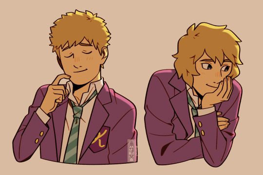
Text
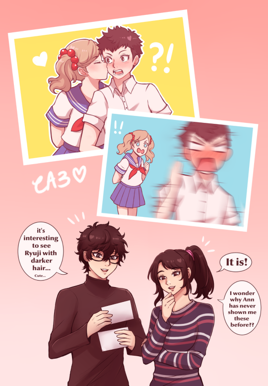
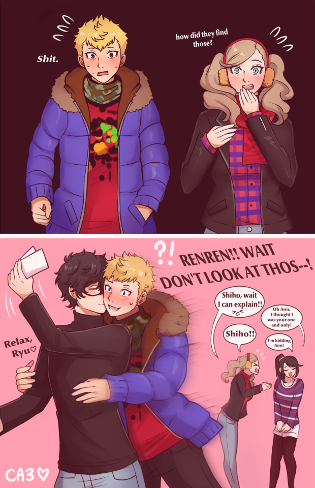
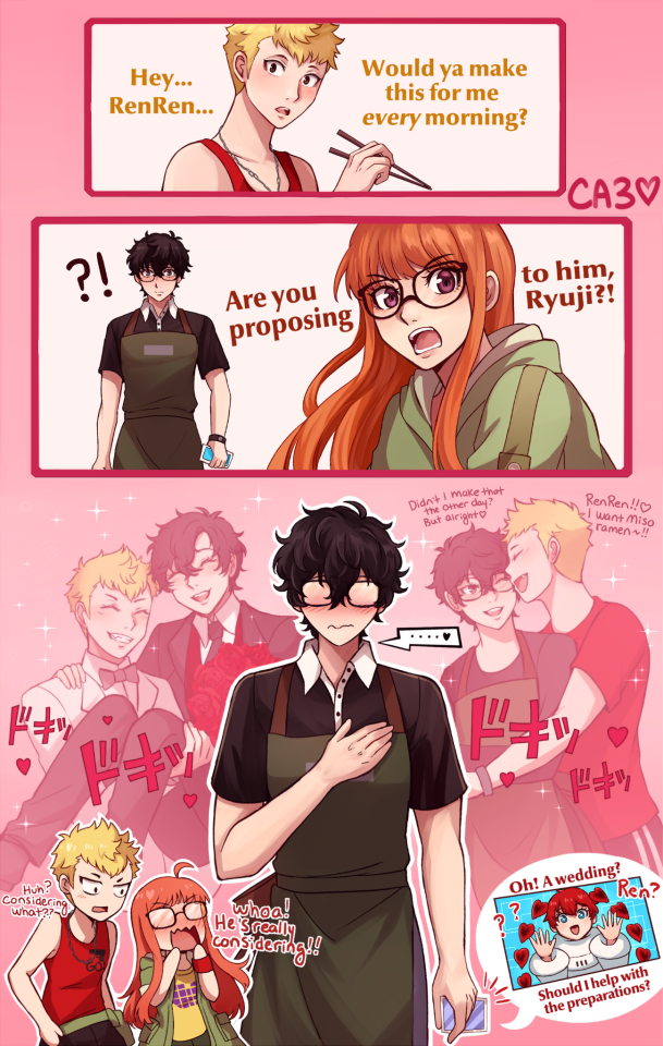
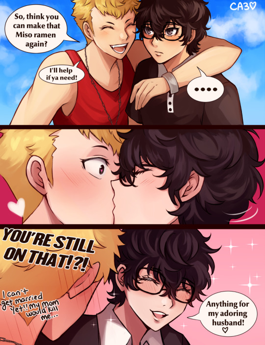
A Kiss Ryuji Week happened on Twitter... I participated as best I could!! Here are some (mainly) pegoryu comics I did!! Time to post on the actual day now ❤️💛✨️
#persona 5#persona 5 royal#persona 5 strikers#pegoryu#ca3 art#ryuji sakamoto#ren amamiya#akira kurusu#ann takamaki#shiho suzui#annshiho#futaba sakura#comic#sorry the quality kinda varying i had to work faster sksjsn but half of these were older wips that actually fit the theme of some prompts#so i kinda repurposed them#kiss ryuji day#kiss ryuji day 2024
801 notes
·
View notes
Text
Wip ;P
Song is “Time Machine” by Autoheart!
#In Stars and Time#isat fanart#isat#isat siffrin#isat isabeau#work in progress#wip#autoheart#I’ve been chugging through this one way faster than my Tales of Arise project#I think part of it is because the characters are simpler to draw and the original art style already has so much flexibility haha#and also in stars and time has had a serious iron grip on my mind ever since I finished it#it’s such a good game#go play it#pls#mewnia's pawprints
977 notes
·
View notes
Text
Here, everyone! Help yourself to a free Coffee yourselves while we wait for the update!

#Speed +1 to everyone who drinks - they'll get to their PCs faster lmao#stardew valley#sdv#stardew 1.6#stardew valley 1.6#stardew valley update#spark talks about nothing of relevance#I'm walking home from work now so I'll probably get to it after dinner#as a Shane enjoyer i am hard considering the Chicken Farm 💙
490 notes
·
View notes
Photo
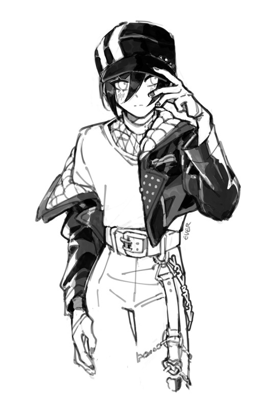

i am not immune to saiharas new uncharacteristic eboy drip
#danganronpa v3#saihara shuichi#ouma kokichi#saiouma#ever makes art#wheres the anon that asked if i draw saihara by himself. here you go#the zozo collab art dropped right as i went to bed#so i woke up to see a million pictures of saiharas new swag next morning LOL#the devil works fast but fanartists work faster#why is ouma painting saiharas nails? well they both have black polish in the art. and also maayan proposed more deranged AUs to me
2K notes
·
View notes
Text
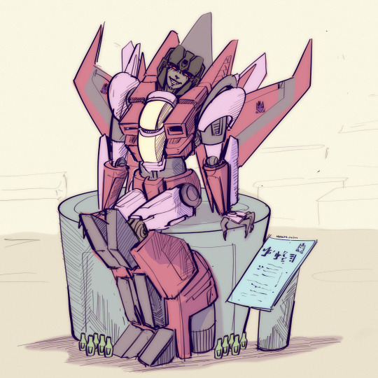
Fast sketch of an old oc of mine (She is dead and was sculpted in her crypt).
#oc#transformers#decepticons#autobots#maccadam#because I wanted to see if I can start working in sketch format to work faster#vengala
438 notes
·
View notes
Text

At the start of this project all I wanted was to 'learn how to draw' using comics as a medium and the MDZS audio drama as inspiration.
I've come *very* far from making simple, 3 panel black and white comics, and I truly do intend to go even further. Thank you to everyone who cheered me on throughout 2023, it has been an incredible year in so many ways I never could have imagined. I look forwards to drawing throughout 2024 B*)
#poorly drawn mdzs#art summary#It's so interesting looking back at how my style and technique changed throughout the year!#I used PD-wwx as the consistent factor (October is an exception) and you can see so many processes going on.#My little petri dish amoeba (with a little red bow to tell him apart from the other amoeba) <3#Whether it's getting new markers or trying out a new shading style - it's cool seeing a snapshot of my journey like this B*)#There's certainly been a slower curve to my overt improvement *but* I have become so much faster!#My life outside of drawing has been hectic and at several points extremely stressful this year. For all the work this blog has been-#-It has truly been a life saving anchor when the darkest of times have hit.#Love is hard work. Change is even harder work. Sticking to a goal I set out for myself and striving to keep going was worth it.#And I love drawing. I think there has always been something in me that longed for this. And it is finally tangible! I can draw!!!#I wanted to make a more elaborate year reflection where I looked back at my favourite comics and jokes.#but I'll leave that to the one year anniversary.#I have also been collecting a ton of statistics throughout the year and I am desperate to share them. I'm that kind of nerd B*)#I can never say it enough: Thank you all for the kindness and support. I wish everyone a lovely 2024!!!
638 notes
·
View notes
Text
The comic says it all, but you can check the tags for more context.
#sans x reader#sans x y/n#sansnomaly#ut!sans#sans undertale#look at me trying a different style#what no absolutely not because it is faster nooo why would you say that#I left the comic vague because it can also work as a dialogue after genocide#but it is a brief convo we had several days ago#wildly different context#sans you so mean#despite his efforts to shame me I actually calmed down and went ahead with posting that last pic#welp you failed again bby#so sad#my art
621 notes
·
View notes
Text
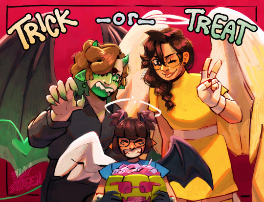
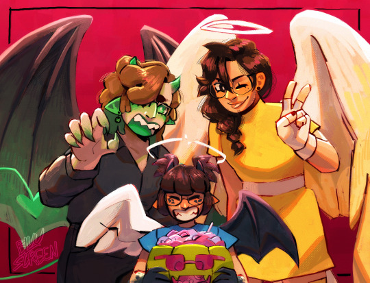
HAPPY HALLOWEEN ft. the misclick family <3 and gegg as the pumpkin
and here’s some extras :p

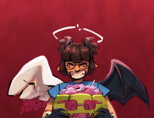
#.png#qsmp#qsmp slime#qsmp mariana#charlie slimecicle#el mariana#juanaflippa#qsmp eggs#slimeriana#fliporiana#fanart#IM SO HAPPY WITH HOW THIS CAME OUT!!!#as always my rendering skills could use work but i’m getting there i’m getting there#and yes i know it’s still a few days until halloween#consider i am impatient and finished this faster than i thought i would#mainly so it could get out of my brain and i could go start on a skin commission i have to do#i can’t do too many things at once or i’ll get overwhelmed and explode. in real life
632 notes
·
View notes
Photo


Testing my new tablet
#mp100#mob psycho 100#terumob#hanazawa teruki#kageyama shigeo#ruidraws#I'm drawing lineart so much faster now that I'm using a tablet with a screen#and the colors are correct 😭 I don't have to keep screenshotting and send to my phone to check#I wish I could draw all day but I got school work zzzzz bye
4K notes
·
View notes
Text


#alien stage#alien stage spoilers#round 6 spoilers#till#till alien stage#someone probably worked faster than me but these are the till stills that i REALLY liked#ill upload the ivantill gifs later
399 notes
·
View notes
Text
Drew this for twitter but I’ll post it here 2 :V
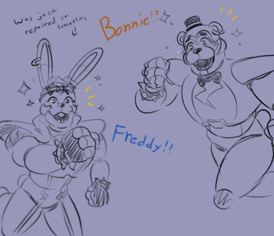
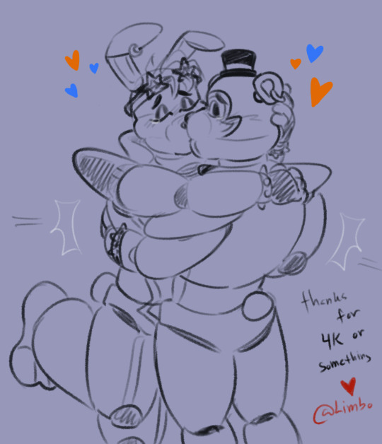
Was working on Glamrock blues again n it made me sad that I doodled wholesome fronnie to cope
#there are now 4 panels done….💀#wish I could draw faster but not only am I working on comms I’m also working a lot IRL 😭#ahhhh I wish I had an assistant#or if I had shadow clone ninjitsu#it’d still be slow but like not THAT slow#my art#digital art#digital illustration#fanart#glamrock fronnie#glamrock bonnie#glamrock freddy
509 notes
·
View notes
Last Seen Blogs

curiositiesbydickens
Tukang listrik karawaci

slipper007
There is seemingly nothing but chaos...
premikage
Guacamolikan

tenaciousheartnacho
Untitled

rex-wild
Rex Wild