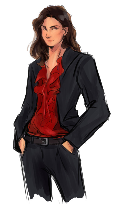
#i'll draw a better version later
Text

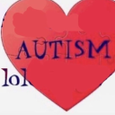
She's a lil hippie
#cookie run#cookiesona#cookie run oc#ppl need to make sonas more#like#making sonas for media i think has gold character designs?#suprisingly really helped me get over my identity crisis issues#because it like. Forces to think about who you are i guess?#or maybs#cookie go brrrrr#sunflower seed cookie#I'll draw a better version later
10 notes
·
View notes
Text
just a lil phoenix doodle <3
#top gun#top gun fanart#natasha phoenix trace#wishing i could be as hot as her#aviart#sorry about the bad quality lmao i'll post a better version with the rest later#also totally not just an excuse to draw women
143 notes
·
View notes
Text

#warrior cats#again#but this time it's crunchy!#tumblr hates this drawing apparently#anyhow it's firestar#as you may have expected#I had a lot of fun drawing the wood for the first two panels#the colors#not so much#firestar#bluestar#I'll try uploading a better quality version later#...maybe
25 notes
·
View notes
Text
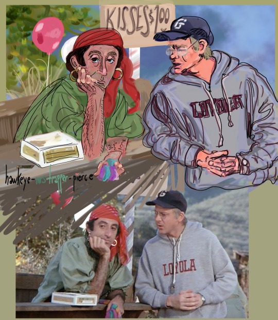
after a long hiatus: Klinger & Mulcahy Version 2, Digital only. Bonus reference pic included below for fun
July 6, 2023
(version 1 where Klinger is different but Mulcahy is the same will be linked here)
#well so i usually sketch and/or ink out the drawing but just did digital for this one#this one is version 2 - which i call it that bc it's the later version of klinger of layer a billion as i tried to get better proportion.#whereas the 'version 1' was from far far earlier in the process#and i feel like the version 1 klinger suits the mulcahy Way WAY better as a pairing but klinger 2 as a standalone isn't so bad#but i'll post version 2 as well bc i like his bored expression in that (bored bc no kisses for klinger 🥺)#anyways i'll link them both#i think i'll try to redraw klinger after i have more practice. coming back from a LONG art hiatus and diving into this was fun but uhh well.#next time i'm doing 1 character at a time i think. at least until i remember how to set up my referrence station better so i can draw easier#hawkeye-mrstrapper-pierce#mash fanart#klinger#father mulcahy
55 notes
·
View notes
Text
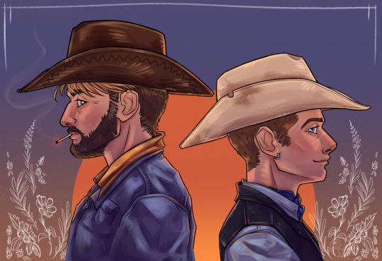
- Marten & Nohren -
#digital art#illustration#art#cowboys#original characters#my art#thought I might as well slap some colour on this now since i'll be away this week#i've got so many ideas floating around my head for story stuff I want to draw for these two#i've been writing them for almost a year now and i have a bunch of different AUs i'm excited to make designs for#the outlaws AU is one of my favourites though#excited to see how their designs change as i get more confident with drawing people#i'm not gonna info dump about them too much i think. I'll probably just let the story unfold trough the illustrations etc#cause idk if anyone's interested in the story stuff. i'm happy to answer if anyone asks stuff though#but the short version is that they grew up in the same town but didn't really get to know each other until later#Marten has a bad accident that leaves him bedridden for over a year while his father hides his condition out of shame#so Nohren takes a job as a hand at their ranch and figures out which room they're keeping Marten locked in#they become good friends and Nohren visits him in secret for almost two years while helping Marten regain some mobility#they take up the outlaw life after Nohren is seen with another man in town and decides he's better off getting out of dodge#Marten is torn about leaving the ranch behind but he comes along eventually#that's the very basic gist of it#they good kiddos#Marten#Nohren#Outlaws AU
33 notes
·
View notes
Text
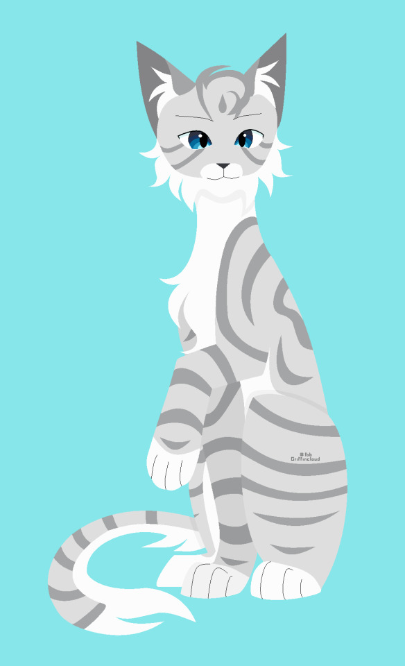
Going back to my roots and drawing on MS Paint
#Day 166#Warrior Cats#Warrior Cats OC#OC: Shiningdrop#Tumblr really killed the quality on this lol#Weird because this is the same file type and relative photo size at 1110x1826px#Maybe it's because the simplicity makes it more obvious to me?#I pulled out my old drawing tablet that I used from 2018-2021 and some of 2022 and how is this thing still alive#Like sure 3-4 years isn't a horribly long time but I took such horrible care of that thing and I broke my first one that I got#on christmas of 2016 after a year and my brother had the same second one and his broke a year in when he took much better care of it#I ended up spending 4 hours on this because I'm not used to MS Paint but using the tablet itself felt so natural#I'm using an actual tablet - like handheld device - for art now and so happy that Clip Studio's UI is exactly like the desktop version#because I'm so used to art program UIs made for desktop - not ones with everything hidden away in menus (well some things are)#But only a couple of things that are tucked away in menus I use frequently and it's become muscle memory#It really sucked learning to use the tablet at first but this challenge especially helped me get more comfortable with it#Turning this into a speedpaint that I'll add onto the post later#2023 Daily Drawing Challenge
9 notes
·
View notes
Text
brought to you by @lonelyfreddles:

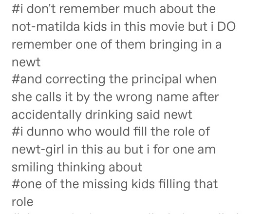
their creature isn't a newt this time tho
also uh. today i learned that if you use alcohol markers over a cheap ballpoint pen, IT WILL BLEED.
#unrelatedly happy birthday i think?? i have seen posts implying such#i might try to redo this later bc drawing it so small made it hard to do colors how i wanted#feel free to guess who's who lol#not putting this in my art tag bc i'll probably make a better version at some point yk#fnaf matilda au
6 notes
·
View notes
Text

Drew this a couple months (?) ago before art block hit like a brick, for Komaeda's birthday, and somehow forgot to post ಠ_ಠ
Well, it's never a bad time to post a Nagito.
Bonus unshaded version.
#danganronpa#super danganronpa 2#nagito komaeda#danganronpa nagito#sdr2 nagito#sdr2 komaeda#komaeda nagito#anime art#game art#idk how to tag#“I'll post this later...”#“Oops”#“It's been 4 months!”#Lowkey feel like drawing a new version of him because I feel like I can do better now#clip studio paint#tumblr artist#Also#I downloaded the app!#komaeda birthday#my art
4 notes
·
View notes
Text
Aw, what, I didn't post Zuka on here yet!? Heresy, I must fix that immediately!

Behold! Zuka, Saiyan of Yardrat!
#goldic's drawings#dragon ball oc#saiyan oc#ah yes creating this blog has given me the perfect excuse to post Zuka#I'll get better at drawing the yardrat armor I swear#the blue text is actually a link to Zuka's toyhouse page! he has lore to read too go read it#if you suddenly get inspired to draw something from reading zuka's lore: go for it; I'd love to see it#his lore isn't even done yet but there's still a lot to work with methinks#his main lore on toyhouse doesn't even include his Xenoverse lore cuz YES THIS CHARACTER HAS A XENO VERSION!#Xeno Zuka... looks basically the same right now BUT he's basically a different character compared to regular Zuka#and it's a whole thing I'll info dump about later (complete with in-game screenshots from Xenoverse 2) yippeee#edit: oh and if I got any of the canon lore wrong when throwing it into Zuka's lore lemme know so I can fix it
1 note
·
View note
Photo
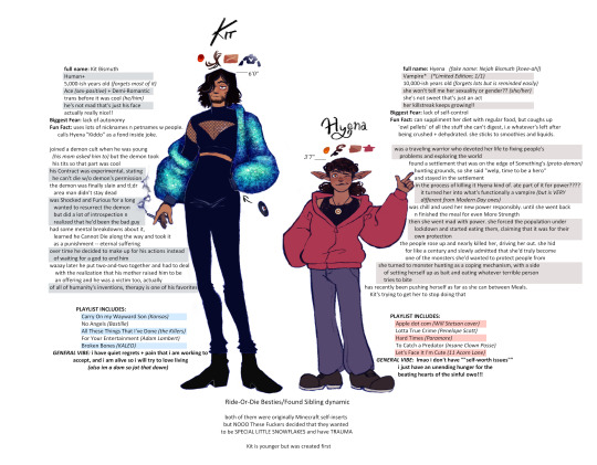
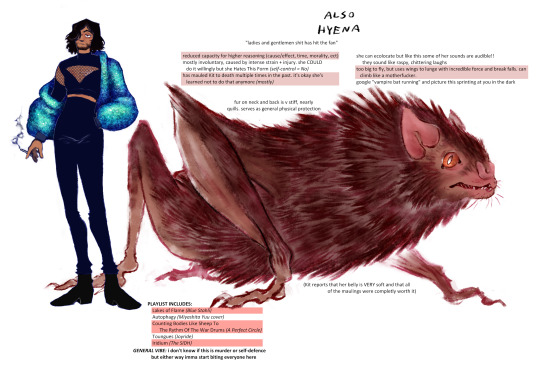
🎃 🎃 🎃 HAPPY HALLOWEEN 🎃 🎃 🎃
in celebration, i made a reference for a Really Big Bat and the Bat’s human(ish) pal. i love them dearly. have a group shot.
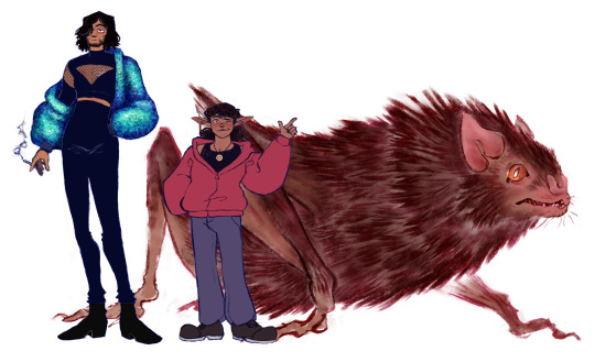
#eye contact#vampire#cackle draws#oc: Hyena#oc: Kit Bismuth#while drawing this i found one of my earliest versions of Kit lmao#he's hardly even the same character anymore#Hyena hasn't changed too much from her OG concept but she looks Much Better now#i'll try to add a readmore n slap the info in there later but i am. tired#if you see any typos No You Don't
2 notes
·
View notes
Text
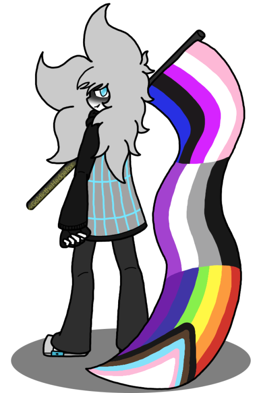
Happy Pride Month, bitches
#goldic's drawings#thrakkymor#sona#love how this image turned out#I posted a version with shading on Toyhouse but I'ma be real with y'all I don't like the shaded version as much as this#why yes the flag IS clearer than the version in my banner thanks for noticing; it reflects how comfy I am with it now#I know that I could just. put smaller versions of the ace and gay/lesbian flags on the genderfluid one#it just feels better to have it be one giant flag since all three aspects of my identity are equally important to me#tbh the rainbow one is there because I don't feel like making a mishmash of the Gay/Lesbian flags for my homo aspect#I'll figure that out later; for now enjoy the art#pride month#lgbtqia#genderfluid#ace#homosexual#goldic rambles
1 note
·
View note
Text
My Favorite Cheap Art Trick: Gradient Maps and Blending Modes
i get questions on occasion regarding my coloring process, so i thought i would do a bit of a write up on my "secret technique." i don't think it really is that much of a secret, but i hope it can be helpful to someone. to that end:

this is one of my favorite tags ive ever gotten on my art. i think of it often. the pieces in question are all monochrome - sort of.

the left version is the final version, the right version is technically the original. in the final version, to me, the blues are pretty stark, while the greens and magentas are less so. there is some color theory thing going on here that i dont have a good cerebral understanding of and i wont pretend otherwise. i think i watched a youtube video on it once but it went in one ear and out the other. i just pick whatever colors look nicest based on whatever vibe im going for.

this one is more subtle, i think. can you tell the difference? there's nothing wrong with 100% greyscale art, but i like the depth that adding just a hint of color can bring.
i'll note that the examples i'll be using in this post all began as purely greyscale, but this is a process i use for just about every piece of art i make, including the full color ones. i'll use the recent mithrun art i made to demonstrate. additionally, i use clip studio paint, but the general concept should be transferable to other art programs.


for fun let's just start with Making The Picture. i've been thinking of making this writeup for a while and had it in mind while drawing this piece. beyond that, i didn't really have much of a plan for this outside of "mithrun looks down and hair goes woosh." i also really like all of the vertical lines in the canary uniform so i wanted to include those too but like. gone a little hog wild. that is the extent of my "concept." i do not remember why i had the thought of integrating a shattered mirror type of theme. i think i wanted to distract a bit from the awkward pose and cover it up some LOL but anyway. this lack of planning or thought will come into play later.
note 1: the textured marker brush i specifically use is the "bordered light marker" from daub. it is one of my favorite brushes in the history of forever and the daub mega brush pack is one of the best purchases ive ever made. highly recommend!!!
note 2: "what do you mean by exclusion and difference?" they are layer blending modes and not important to the overall lesson of this post but for transparency i wanted to say how i got these "effects." anyway!
with the background figured out, this is the point at which i generally merge all of my layers, duplicate said merged layer, and Then i begin experimenting with gradient maps. what are gradient maps?
the basic gist is that gradient maps replace the colors of an image based on their value.

so, with this particular gradient map, black will be replaced with that orangey red tone, white will be replaced with the seafoamy green tone, etc. this particular gradient map i'm using as an example is very bright and saturated, but the colors can be literally anything.

these two sets are the ones i use most. they can be downloaded for free here and here if you have csp. there are many gradient map sets out there. and you can make your own!
you can apply a gradient map directly onto a specific layer in csp by going to edit>tonal correction>gradient map. to apply one indirectly, you can use a correction layer through layer>new correction layer>gradient map. honestly, correction layers are probably the better way to go, because you can adjust your gradient map whenever you want after creating the layer, whereas if you directly apply a gradient map to a layer thats like. it. it's done. if you want to make changes to the applied gradient map, you have to undo it and then reapply it. i don't use correction layers because i am old and stuck in my ways, but it's good to know what your options are.

this is what a correction layer looks like. it sits on top and applies the gradient map to the layers underneath it, so you can also change the layers beneath however and whenever you want. you can adjust the gradient map by double clicking the layer. there are also correction layers for tone curves, brightness/contrast, etc. many such useful things in this program.
let's see how mithrun looks when we apply that first gradient map we looked at.

gadzooks. apologies for eyestrain. we have turned mithrun into a neon hellscape, which might work for some pieces, but not this one. we can fix that by changing the layer blending mode, aka this laundry list of words:

some of them are self explanatory, like darken and lighten, while some of them i genuinely don't understand how they are meant to work and couldn't explain them to you, even if i do use them. i'm sure someone out there has written out an explanation for each and every one of them, but i've learned primarily by clicking on them to see what they do.
for the topic of this post, the blending mode of interest is soft light. so let's take hotline miamithrun and change the layer blending mode to soft light.

here it is at 100% opacity. this is the point at which i'd like to explain why i like using textured brushes so much - it makes it very easy to get subtle color variation when i use this Secret Technique. look at the striation in the upper right background! so tasty. however, to me, these colors are still a bit "much." so let's lower the opacity.

i think thats a lot nicer to look at, personally, but i dont really like these colors together. how about we try some other ones?

i like both of these a lot more. the palettes give the piece different vibes, at which point i have to ask myself: What Are The Vibes, Actually? well, to be honest i didn't really have a great answer because again, i didn't plan this out very much at all. however. i knew in my heart that there was too much color contrast going on and it was detracting from the two other contrasts in here: the light and dark values and the sharp and soft shapes. i wanted mithrun's head to be the main focal point. for a different illustration, colors like this might work great, but this is not that hypothetical illustration, so let's bring the opacity down again.

yippee!! that's getting closer to what my heart wants. for fun, let's see what this looks like if we change the blending mode to color.

i do like how these look but in the end they do not align with my heart. oh well. fun to experiment with though! good to keep in mind for a different piece, maybe! i often change blending modes just to see what happens, and sometimes it works, sometimes it doesn't. i very much cannot stress enough that much of my artistic process is clicking buttons i only sort of understand. for fun.
i ended up choosing the gradient map on the right because i liked that it was close to the actual canary uniform colors (sorta). it's at an even lower opacity though because there was Still too much color for my dear heart.

the actual process for this looks like me setting my merged layer to soft light at around 20% opacity and then clicking every single gradient map in my collection and seeing which one Works. sometimes i will do this multiple times and have multiple soft light and/or color layers combined.
typically at this point i merge everything again and do minor contrast adjustments using tone curves, which is another tool i find very fun to play around with. then for this piece in particular i did some finishing touches and decided that the white border was distracting so i cropped it. and then it's done!!! yay!!!!!
this process is a very simple and "fast" way to add more depth and visual interest to a piece without being overbearing. well, it's fast if you aren't indecisive like me, or if you are better at planning.

let's do another comparison. personally i feel that the hint of color on the left version makes mithrun look just a bit more unwell (this is a positive thing) and it makes the contrast on his arm a lot more pleasing to look at. someone who understands color theory better than i do might have more to say on the specifics, but that's honestly all i got.

just dont look at my layers too hard. ok?
1K notes
·
View notes
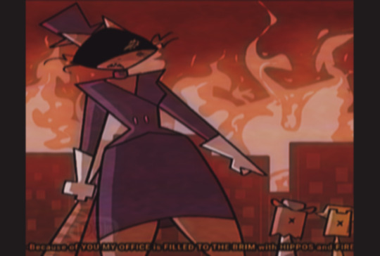
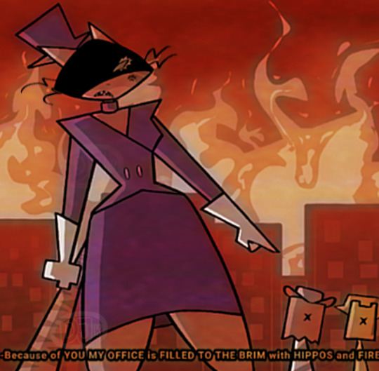
Text
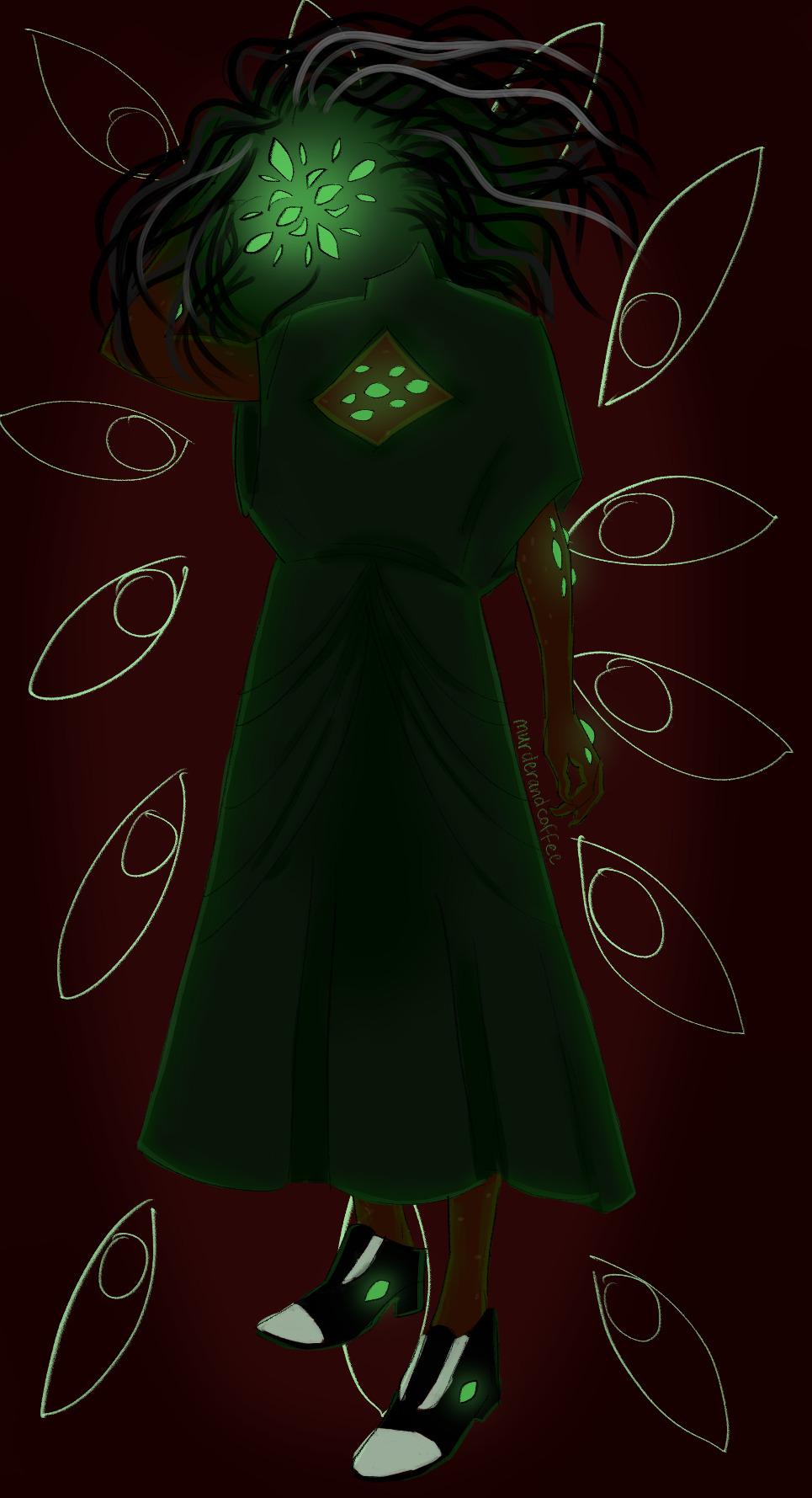
@vickozone the peer pressure intensifies (jk)
eldritch jarchivist in a dress with a boob/eye window, because why not
I'll draw a better, less eldritch version later
209 notes
·
View notes
Text
Does anyone else remember this show?
The other day I had a sudden memory of a show I used to watch as a kid, mainly because how weird and uncanny the series was. I got curious, and asked some of my friends if they had ever heard of it or seen it (maybe that way I could find some info about it) but all of them gave me a negative response.
I started doing some research on my own, but apparently it seems like barely a few people even know it, which makes this whole thing harder. Sadly enough, after some research, I only managed to get a few names (Gingi, Oliver and Karen) and a screenshot.
If someone knows something about this series, please contact me and tell me what you know!
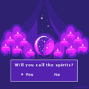
Okay so, happy two years of existing, Dialtown! I'm so happy to have found this game and eventually join the fandom! It's pretty chill here as far as I've seen, too.
I hope y'all like the drawing too! It took me so long to finish and I'm honestly really proud of it. I'll also be leaving another (better) version of the drawing just in case
That's it for now ig? See ya later
#dialtown art#dialtown fanart#dialtown phone dating sim#dialtown mayor mingus#dialtown mingus#dialtown phonegingi#dialtown gingi#dialtown norm#dialtown norm allen#artists on tumblr#art#digital art#fake screenshot
251 notes
·
View notes
Text
I feel like a lot of fanon tends to miss what seem to be three pretty crucial things about Teru, and it's weird because they are easy to miss, but they're also so important that without them he's very superficial. it's part of why he gets so yassified almost every time he's adapted (see: manga into anime into fancontent)
one is that this kid is smart. on my first watch of his debut arc I assumed he was psychically cheating to be one of Black Vinegar's top students. now though I don't think so: firstly, I'll admit, because he doesn't actually seem to have a way to do that except blackmailing other kids for answers or something; but secondly because throughout the series he's just good at figuring stuff out. he picks up complicated psychic techniques more quickly and frequently than anyone else, including Mob. he was the one who almost beat Shimazaki. he figured out that Psycho Helmet was Dimple from the fact that he was a spirit who knew Teru's name, not a lot of info to go on. he draws conclusions in the somewhat haphazard but very clever way a detective does.
two, he's motivated so much by anger. this one's something of a hot take but it's so there to me that I can't leave it out if I'm Teruposting. before meeting Mob yeah he thought he was special and important for having powers but he was also extremely lonely and subconsciously mad at everyone else for not having them. he's the only one who has to deal with Claw he's the only one who has to live alone because his powers make it dangerous for his parents, he's the only one strong enough to be the shadow leader. he'll do it because he's the Protagonist but god he's gonna be pissed the whole time. it's not what he wants (we only get to see what he wants later with Mob and Reigen and everyone else) but it's all he has for a long time. seventh division shows the intersection between I Should Be Satisfied Now Teru and I'm Better Than These Guys Teru very nicely
last and kind of most important is his thing for Mob. I absolutely believe ONE wrote Teru to be queer and he definitely had or has a crush on Shigeo, but I also think that at least part of said crush is him misconstruing his adoration and the pedestal he's put his friend on. until after the Confession Arc, the two of them getting together would be really tricky and probably not good. Mob still feels bad about what he did at Black Vinegar for most of the rest of season one, and the only reason Teru changed in the first place was because of the cavernous gap in power between the two of them. until he declares Shigeo his rival and realizes that he has faults and any destruction he causes isn't perfectly righteous, Teru can't love him.
there's as much to his character as there is to the other main characters, and I get the easy appeal of the flattened version of him but when he's flanderized into this sparkly gayboy who's also sad sometimes, it makes me sad.
#this has been in my drafts for months it needed to be finished#teruki hanazawa#hanazawa teruki#mp100#mob psycho 100#yaoi hivemind#<- they're the reason I added the last point instead of just writing the first two#not to add another character to this post but ummm Shou is also smart#Shou is the pre-planner he's a really good strategist#Teru puts pieces together as he goes & solves problems once they appear#Ritsu's weirdly psychological in his analysis of opponents but it works#and Mob fixes the unfixable#mob posting 100
534 notes
·
View notes
Text
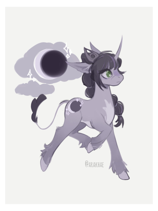
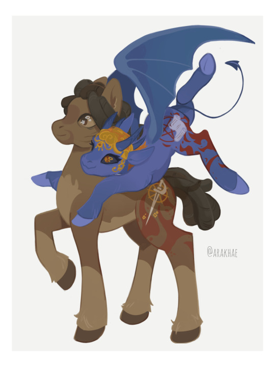
✨ My little cultist: tadpoles are magic ✨
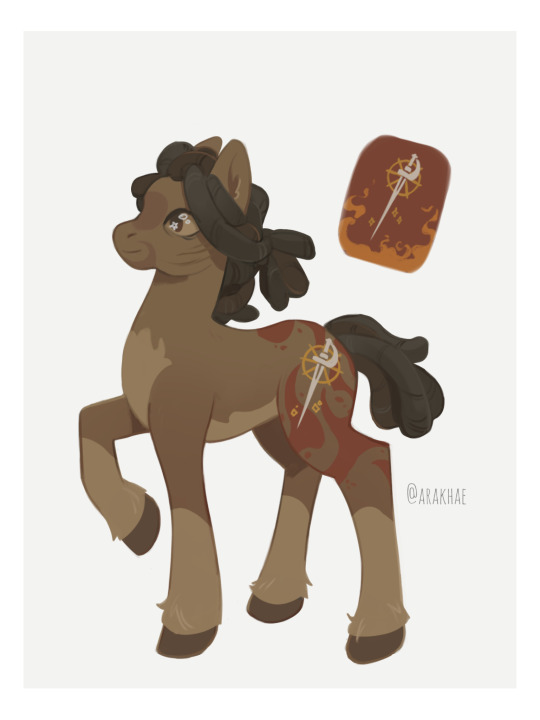
You didn’t ask me to, but I did it anyway! Let me introduce you to the pony versions of my favorite BG3 companions.
Ponyshart At first I wanted to give Shadowheart a cutie mark in the form of the spear of Selune, but in the end I simplified it to a lunar eclipse. I think it suits her no matter which path she chooses.
PonyWyll with Ponyzora // Wyll with dreadlocks>>>

Ponystarion
versions without wings + some more of my explanations + pony comms info ⬇️⬇️⬇️
Wyll w/o wings
I thought that it would be more suitable for the Hero to be a pegasus. I also wanted his cutie mark to very vaguely hint at a connection to Hell.
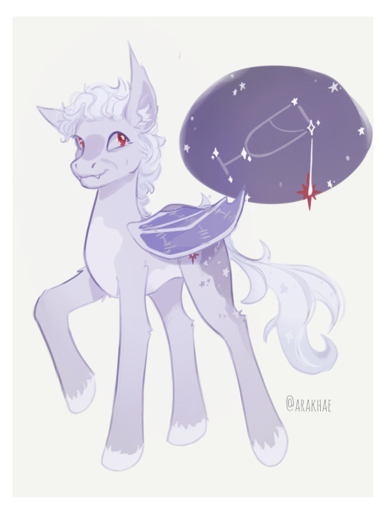
Astarion w/o wings

Astarion was the most difficult one. I thought for a long time about where I could put this damn scar and decided that it would be best to place it on the wings, because wings are in some way a symbol of freedom and all that. Of course, I don’t think that such a mark would have worked later in the ritual. But at least it looks good and symbolic. I also thought that his wings were so badly damaged that Astarion thought he would never be able to fly again, which is probably not true.
The cutie mark thing wasn't easy either. I wanted to have a star pattern and I couldn't think of anything better than trying to depict a constellation. I also think that his cutie mark was formed before he met Cazador, so it shouldn't contain anything related to that bastard and his influence. In the end, I settled on a light-hearted glass of wine, with just a little drop of sinisterness in it, literally, huh. Actually not very happy with the result, I should have done it better.
If you have any ideas or thoughts regarding pony versions of these or other BG3 characters, feel free to share. I think it's fun to create crazy crossovers like this and I'm interested in what others think about it.
Maybe I'll draw other characters later. But if you want me to draw a specific pony, you can pay me 15 USD and I'll do it (payment via boosty or hipolink(via paypal) after sketch). Just DM me!
#baldur's gate 3#baldur’s gate 3#bg3 fanart#baldur's gate iii#baldurs gate 3 fanart#baldur's gate 3 fanart#astarion#shadowheart#wyll ravengard#bg3 astarion#bg3 shadowheart#bg3 shart#bg3 wyll#my little pony#my little pony friendship is magic#mlp fim#mlp art#crossover#baldur's gate 3 astarion#astarion ancunin#astarion fanart#shadowheart fanart#baldurs gate wyll#pale elf#bg3#bg3 mizora
136 notes
·
View notes
Last Seen Blogs
urlocalsaltygirl
Daily Dose of Capitalism
moonlighsblog
Moonlighsblog
poorly-strung-thoughts-blog
Creative Meets Chaotic
laylamva
Do What’s Most Important Right Now!