#mangakas be like
Text
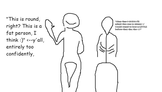
#artist fatphobia#i hope that thigh gap haunts your nightmares#mypost#bishounen caillou ranting continues#mangakas be like#meaniebitchcunthours
2 notes
·
View notes
Text
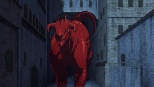
I love how the dragon in Dungeon Meshi doesn't have the usual lizard-y limb anatomy but something more along the lines of a large land mammal or even a sauropod +500 points from me
(also the way the fire breathing is explained is in line with a lot of spec evo stuff, cool)
#the suitcase chronicles#dungeon meshi#dunmeshi#dragon#like#the mangaka really really has a knack for good speculative biology#but the dragon really activates my neurons cause I've seen a LOT of great spec evo for dragons#and made some myself#so its like#yeah this is a plausible animal
1K notes
·
View notes
Text
Let's talk about Jump GIGA
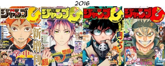

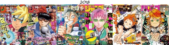
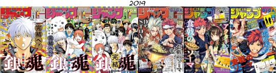
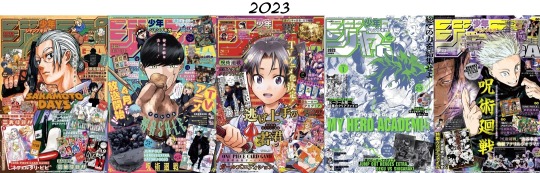
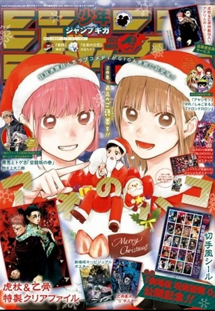
Jump GIGA covers, 2016-2024. Volumes are published (left to right per row) as Winter, Spring, Summer, and Autumn releases, with 2018 and 2019 briefly breaking the pattern by having three Winter and three Summer volumes each. 2023 has an Early Spring volume in addition to the standard four.
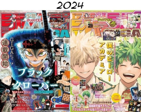
So, people have pointed out that the 2024 Spring cover is, uh, not like other covers.
But I've only seen comparisons to other MHA GIGA covers and MHA Weekly Shonen Jump covers. Out of curiosity for what GIGA's typical marketing aesthetics might be, I put together a comparison between all of Jump GIGA's covers to date.
And, um. Some things stand out, to say the least.
First, let me clarify what Jump GIGA even is: it is a seasonal magazine from Shonen Jump, published separate from Weekly Shonen Jump. SJ is an absolutely massive brand and they have a number of magazines serialized outside of the most well-known weekly magazine.
The content of Jump GIGA is primarily made up of one-shots and spin-offs. From the beginning, a lot of the appeal has been the cool cover illustrations which showcase special merchandise that comes with the purchase of GIGA. Usually the cover also promotes big things going on related to the WSJ series, like movie events, new games, or special figurines for sale.
The marketing aesthetic has been clear from the start: the cover consists of one core illustration and a number of ads surrounding it. Most often you get a cover illustration of a protagonist, and then ads and merch for other series, e.g. Food Wars protagonist cover with One Piece film promotion and Haikyuu!! merch.
The purpose of this marketing direction is pretty obvious. Spin-offs and one-shots are not likely to generate a ton of interest consistently, so they lure people in with the cool covers and tempting limited edition merchandise of the series they already know and love. In this way, highlighting one series with the cover and different series with the merch makes sense, because maybe somebody doesn't care about Food Wars, but they definitely want those Haikyuu!! stickers, stuff like that.
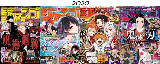
Starting from 2020's Autumn volume, you can see a shift. For the first time, basically all of the merchandise is for the cover series. The Demon Slayer manga had already ended five months earlier in May, but a two-chapter spin-off was scheduled for release in WSJ during October. This GIGA was released exactly one day before the second chapter was published and it capitalizes on the hype.
After this point, only MHA and Jujutsu Kaisen dominate the cover and the merch in quite this way, with Black Clover getting attention last volume as a way to highlight the fact that it actually switched syndication from WSJ to GIGA.
Anyway, most commonly the cover illustration is a solo shot of a core cast member (usually but not always the protagonist), and if it's not a solo, it's a big cast illustration.
Only a few covers focus on two characters, and usually it's a crossover as opposed to characters from same series sharing the limelight.
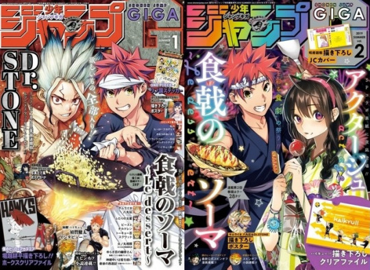
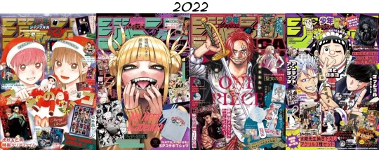
Here we've got Food Wars' protagonist with the main characters from Dr. Stone and Act-Age.
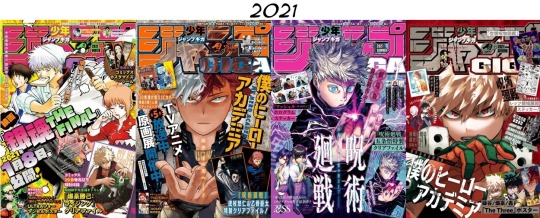
The two covers most similar to the Izuku & Kacchan cover are 2022 Winter and 2023 Autumn.
Winter depicts the main trio of Blue Box in a seasonally-appropriate aesthetic. Not gonna lie, this one kinda makes me laugh--Blue Box is a romance and sports manga, and even though Christmas has a romantic air to it in Japan, instead of depicting any sort of like, hesitant but hopeful romantic energy between the heterosexual couple that actually get together later in the series, they focus primarily on the two girls being cute with the guy is a wee footnote? I mean, all right.
Meanwhile, Autumn depicts one of the protagonists with the series antagonist with a typical cool action style. I'm not very familiar with JJK, but I hear these two have got Some Drama going on, so, there's that.
The merch itself has also evolved over the years. Stickers and posters were present early on, but they have since expanded to decorative folders and now acrylic stands and coasters. 2021 Summer sees the first time the cover illustration is marketed as merch, with the Jujutsu Kaisen cover included as a decorative folder.
Right after that, the Kacchan cover of 2021 Autumn is included as a poster alongside earlier covers featuring Todoroki and Izuku.
2023 Summer's cover is a huge, wrap-around MHA cast illustration and it was published three days after chapter 396 came out, strategically timed to highlight the big shift in the final battle as Ochako vs Toga ends and All Might vs. AFO begins. Merch includes a decorative folder of the wrap-around cover and character motif stickers.
And then we get this!?
A duo cover illustration where the cover art itself has been merchandised to hell and back!?!?
Acrylic stand and pin set!?
Double-sided coaster showing bkdk greatest hits!? With volume 29's river scene cover!?
There's also a double-sided poster featuring the Spring cover with the ninth popularity poll art and a decorative bag with the anniversary art. The cover art itself is plastered all over the volume, front, back, and spine, apparently a total of 19 times.
I honestly don't know what to say about this. It feels wild that this is actually what the cover is. Obviously it is a huge marketing push in anticipation of season 7, and Izuku and Katsuki are the most popular characters, but. it just feels... unique.
In the course of Jump GIGA's publication, this direction is kind of unprecedented. Genuinely no one could have expected this. This seems to be the first time there's been this much merch for a cover. And it was a solid fucking move, marketing-wise--it's sold out basically everywhere, everyone is talking about it. And even people who don't follow the series or ship these two can't help but comment on how strikingly romantic it looks!?
I don't know how much say Horikoshi had in what the cover was, but damn it sure feels like he drew this with immense affection. I kind of wonder if he personally pushed for it to be these two, rather than the typical solo shot, cast shot, or even a protagonist vs. antagonist shot.
I'm KO'd, man. idek if this post is useful to anybody I'm just on my hands and knees here.
Everybody knows what we're all here for, and it's these cute boys finally getting their happy ending.
#bkdk#i'm losing it#idek how to go on#they're so beautiful#I was trying to be all thoughtful and intellectual about what kind of marketing game GIGA plays in SJ's arsenal of branding#but#this is just such a divergence from their typical approach#why are there basically no other duo covers#did the other mangaka just not particularly push for it#did other duos just not serve as attention-grabbing enough#there's nothing else like it#what am I supposed to do with this knowledge
404 notes
·
View notes
Text
Everytime someone draws laios with the usual anime chiseled abs an angel dies
#dunmeshi#dungeon meshi#delicious in dungeon#laois touden#laius thorden#laius touden#me grabbing the fanartists rabid and foaming at the mouth: DO YOU NOT UNDERSTAND THIS SHIW AT ALL. ITS ABOUT DESIRE AND CONSUMPTION AND#EATING AND HEALTH AND HOW HEALTH IS RELATED TO THAT!!! AND THE MANGAKA SPECIFICALLY DRAWS THE CHARACTERS TO REPRESENT ACTUAL BODY SHAPES#BECAUSE THATS ALSO A HUGE PART OF IT!!! IS RECOGNIZING THAT BEING HEALTHY ISNT ROCK HARD ABS!!! THATS ACTUALLY NOT HEALTHY!!! AND SO HE#WOULDNT LOOK LIKE THAT!!! ROCK HARD ABS IS FROM DEHYDRATION AND A VERY CERTAIN DIET!!! THATS NOT HEALTHY?!!#laios touden
570 notes
·
View notes
Text


symmetrical tool headshots of the good omens and bad omens sillies 🤍🖤 one where they're normal and one where they're also normal nothing to see here forces of heaven and hell who want to put them on trial ;^PP
and also, bonus swap crow aziraphale and fem swap zira and crowley based on this drawing of mine!
#i just like character design ok!!!!!!!!!!!!!!!!!!!!!!!!!!!#i love thinking about how a person can still be that same person given a different role or body!!!!!!!!!!!!!!!!!!!!!!!!!!!!!!!!!!!!!!!!!!!#shoutout to ryoko kui mangaka of hit manga dungeon meshi she gets me on that!!!!!!!!!!!!!!!!!!!!!!!!!!!#her studies of the characters wearing different clothes as different fantasy races and the doppleganger chapter the world!!!!!!!!!!!!!!!!!!#hope u enjoy the little difference between all of them!!!!!!!!!!!!!!!!!!!!!!!!!!!!!!!!!!!!!!!!!!!!!!!!!!!!!!!!!!!!!!!!!!!!#good omens#den's bad omens#aziraphale#crowley#aziracrow#ineffable husbands#ineffable wives#ineffable partners#ineffable spouses#good omens reverse#good omens roleswap#fem aziraphale#fem crowley#butch aziraphale#demon aziraphale#angel crowley#sunnysidedraws#described#id in alt text
830 notes
·
View notes
Text
I don't know shit about one piece, all I know is that one piece artists will drop the rawest fucking art I have ever seen in my life and then I'll look at how the actual character is designed in the source material, and it's like this

#one piece#like seriously#i just saw art of luffy that was so insanely#raw#but he looks like#the dorkiest little weirdo in all of manga#in canon i mean#one piece artists are nuts#posts that wont do well bc it might sound complimentary but its also insulting#im insulting the mangaka#this is an embarrassing way to draw women#the fuck is wrong with her body
362 notes
·
View notes
Text
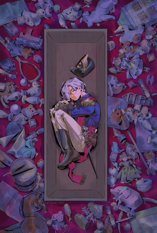
forgotten playthings, forgotten child 🧸
Jack from my series Lost & Found Children 🤍🖤
i hope to showcase more of my ocs in 2024 hehe! im FINALLY getting around to finishing art i left to rot in my folders (the pandora hearts drawing last month being one of em). if you saw the WIP of THIS particular drawing 2 yrs ago... no you didn’t 💔
my charas are very personal to me, but tbh ive always been a bit hesitant to share their stories. over time i realized ... it’s kind of a shame to not make art from one’s heart. which is something i regret a lot year after year whenever i make my yearly art summary reflection. i'm like damn i need to make more emotionally evoking pieces!!! so i'm gonna keep going in 2024 with that in mind ❤ i have to admit, although this drawing started 2 years ago, and there's a lot i would do differently if i were to supposedly draw it now - this concept goes pretty hard.

the final drawing stayed pretty close to the original concept which im so relieved for! i think part of the reason why i left it on the backburner for so long, was the fact that i included so many details, and i was unsure of how to colour the "background". (not to mention stuff like cons & real life getting in the way).
i'm glad for discovering a really handy watercolour brush, it's helped me a lot in my last few drawings, bc i dont have to colour in each detail. especially since the witch hat atelier: eternal ephemera zine piece i did. otherwise if i coloured this back in 2022 with my usual method, i'm pretty sure i really would have included a shading and highlight layer for each individual toy... HAHAHA. much to think about
oh yeah and in the last few days of drawing this i was listening to some visual kei bands. i love how some of the band members literally have been performing since like the 90s or something and DO NOT AGE and are literal vampires. every so often i fall back into visual kei (you can tangentially thank aggretsuko although yes i know it's not the same). and i kind of realized. i like Jack's edgy design so much because he looks like. a visual kei esque vampire.
#illustration#artists on tumblr#original#original character#my ocs#jack#i will post more on my ocs eventually... slowly.. this coming year#2024 will be the year of the oc..... definitely want to lean into developing my stories & charas & gothic aesthetic a lot more hehe#leaning into like. whatever late 2000s manga had going on with their dark aesthetics - pandora hearts. black butler. d gray man etc#those mangaka were drinking some good shit. permanently altered my little teenage brain forever#i also managed to record a timelapse of this drawing#but my computer cant handle timelapses on csp so i had to like. save this drawing in different parts#so ill have to stitch together the timelapse videos#sorry. got rid of the closeup bc it didn't look that great#ill post it in the read more later#lost and found children
299 notes
·
View notes
Text
I didn't want to make a fuss about it, because it's mostly personal opinions, but!
Spy x Family i's a "free to read" manga. You can stop reading it and come back any time without suffering anything for doing it, while Endo is an old person, so he can't "just draw" and have a chapter every two weeks without sacrifice.
Also, this manga was a monthly manga. The only reason we are having it biweekly is because it went so popular that Endo was pushed to make it biweekly.
We could have a manga like Chainsawman (also a manga that I really appreciate) that is "weekly", but is coming out biweekly, and most of the chapters are just a few pages with one or two dialogs in the whole chapter (very good chapters 😅 but like a 1 minute reading), but Endo is giving us chapters of about 20 to 30 pages with a lot of dialogs and pictures, so what are you crying about? Why don't you "just draw" your own stories biweekly for five years? Try to do the same without paying a toll, then come back and cry. If you can do this, then I won't argue, but I know that the ones that are crying now don't do anything like this.
And I'm not going to say anything about if you are actually buying the volumes, because that's even worse. As I said, it's a free manga.
Don't push artists over their limits, cause when they'll break of exhaustion, you'll lose everything, not a month or a week, but everything.
#spy x family#spy x family manga#sxf manga#sorry but all of this makes me angry#like do you even know what burnout is#do you think Endo or any mangaka or artist is your slave#you are talking about human beings not robots#if you want fast art just go and AI everything
346 notes
·
View notes
Text


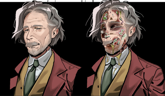
death mark 2 spoiler pile #2
aka my idea for a mildly different plot which is canon now actually they are patching this in as we speak
i don't like the konoe drawing i think i've invited demons into my home
#my art#body horror#insects#gore#death mark 2 spoilers#death mark#spirit hunter series#spirit hunter: death mark#shibito magire#dm2 au#i'm gonna start coughing up blood like a horror mangaka
148 notes
·
View notes
Text
"Maybe I won't lose all of my friends in the next universe..."

The next universe:

... "...but I was there. What did you mean you were alone?"
#BACK ON MY BULLSHIT ONCE AGAIN#i think mangaka's like to play a game#they see how much trauma they can stuff into the smallest body possible#whoever gets the shortest and most traumatized wins#asagiri is winning sorry isayama#bsd#jjk#bungou stray dogs#jujutsu kaisen#if you add in principal yaga than it's even numbers#bsd chuuya#the flags#bsd stormbringer#bsd flags#chuuya nakahara#chuuya#jjk shoko#shoko ieiri#ieri shoko#i think shoko and chuuya would get along.
220 notes
·
View notes
Text
Went down Ryoko Kui's work rabbit hole again . I don't play Baldur's Gate 1 and 2 but looking at her fan portraits makes me pretty excited to see her fan portraits for Baldur's Gate 3 ngl
Just lookit!!


Source
Just oughhh
She also drew Pathfinder: Kingmaker
Source
I respect her so much
#jade rambles#ryoko kui#she's THE MANGAKA EVER!!#is it because she plays these games? yeah most likely
398 notes
·
View notes
Text
I haven't seen any version of that meme with these two yet, so I decided to do it myself.
#my art#The Case Study of Vanitas#Vanitas no Carte#Veronica de Sade#Lady Archiviste#<- still tagging her like this to keep it (mostly) spoiler-free#Apologies to all my followers this is what I come back with after like 4 months ;v;#in my defense my favorite mangaka did the equivalent of kicking down the door waving a giant pride flag in her latest chapter#and I had to get this out of my brain somehow#*bows* I shall now go back to being absolutely demolished by school. Have a nice evening :')
145 notes
·
View notes
Text
jjba is one of those series thats like deeply and profoundly beautiful in near indescribable ways but also you cant take it too seriously because the series itself circles the wagon and takes itself SO serious it becomes ridiculous. and thus its incredibly genuine despite everything
#rejoice kars! you too can suffer!!!#idr who said it but on the topic of medias like. undertale is a great game but toby fox is so obviously a music maker first#araki is an artist first and a mangaka second and like#those specific circumstances lead into some of the most genuine pieces of media ever#zerav meta
754 notes
·
View notes
Text
kuusuke as a character is 1 billion times better if you view his words here as genuine (like how i do) . the way you see these scenes is very important to how his character will read to you in my professional opinion

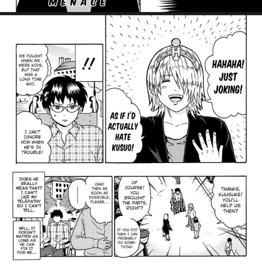
like 😕😕😕 he literally cares about kusuo so much. that’s his cute brother he couldn’t hate him even if he tried (and he knows because he DID try and that’s-) . he literally just wants to play around with his brother and have bonding time but he doesn’t know how to do that normally so he does it in his weird unintentionally destructive way but underlying everything is that familial love.
this post is so gibberish but yeah saiki kuusuke im your biggest fan in the whole wide universe….
#they’re literally siblings#the siblingest siblings to ever be created#kuusuke immediately becomes so much less likeable if you think he actually harbors any hatred towards kusuo#or worse if you in any way imply that he loves kusuo in any sort of perverted way (mangaka’s fault)#both of those are WRONG he simply loves his little brother that’s literally his cute baby brother#there’s something so deep and meaningful about kusuo and kuusuke’s relationship#and i struggle to put it into words but like. i care them so much 😭😭😭#PLEASE listen to me im normal im so so normal#talking at 42 words per second#saiki k got me fucked up#saiki kuusuke#kuusuke#that blonde IDIOT#the blonde guy from saiki k#weird headband ass
65 notes
·
View notes
Text
I've become such an extremely specific type of pervert after doing so much woodworking that I'm catching myself zooming in to see what type of hinges are on the cabinets in this Yuri manga
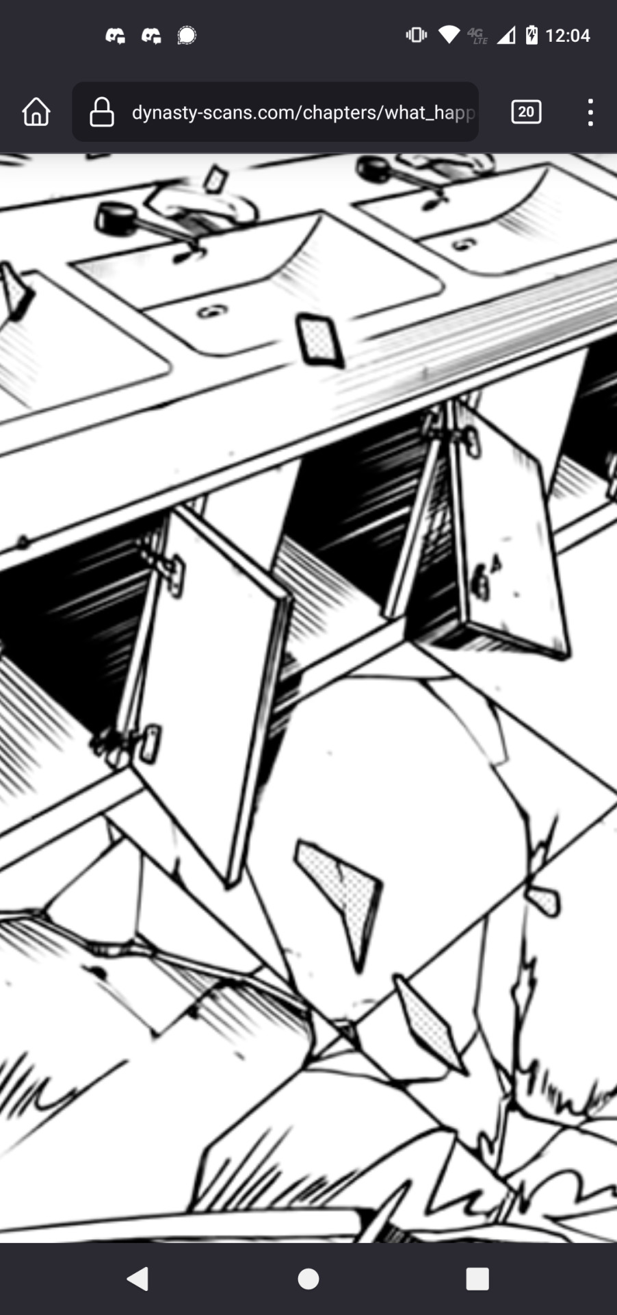
#I don't remember what they're called but they're a pain in the ass#Also Arai Sumiko really is such a better mangaka when she's not doing the music one that blew up#Like the first few chapters of that were cute and kinda different from other yuri#But now it's just dragged on and lost a lot of charm in the process and become just another standard Yuri#She's good at writing characters that feel very three dimensional in a short space#But when those chapters are just à few pages long there isn't much time for them to really develop#Everything else she's done is so much better ):#op
42 notes
·
View notes
Text
The most insane but at the same time my favourite thing about the ships in Dungeon Meshi is that you don't really have so much content in the majority of the manga UNTIL you reach certain later chapters and THEN all the little things between the characters before and after these chapters get a different light and you can't UNSEE the ship.
And that's why, dear friends who haven't read/finished the manga, when you see fans obsessed with dunmeshi ships you don't get how real the madness is here.
#yes this is mostly about labru#but also other ships because the mangaka doesn't care to show something like this in her story and you know good for her#honestly the way romantic feelings and such are showed in the story is so interesting because they never lead to happiness by their own#in contrary with most media that show romance is the only path to happiness#anyway i am obsessed with dungeon meshi#also love the ships labru chilsi farcille and the one with namari and the girl i don't remember her name#dungeon meshi
80 notes
·
View notes
Last Seen Blogs

nudes-we-like
Nudes We Like
letswonderspirit
Closeted Skeleton

qsmprambles
hehehehe

scottpartridge
jevablog